Preface: Explaining our market timing models
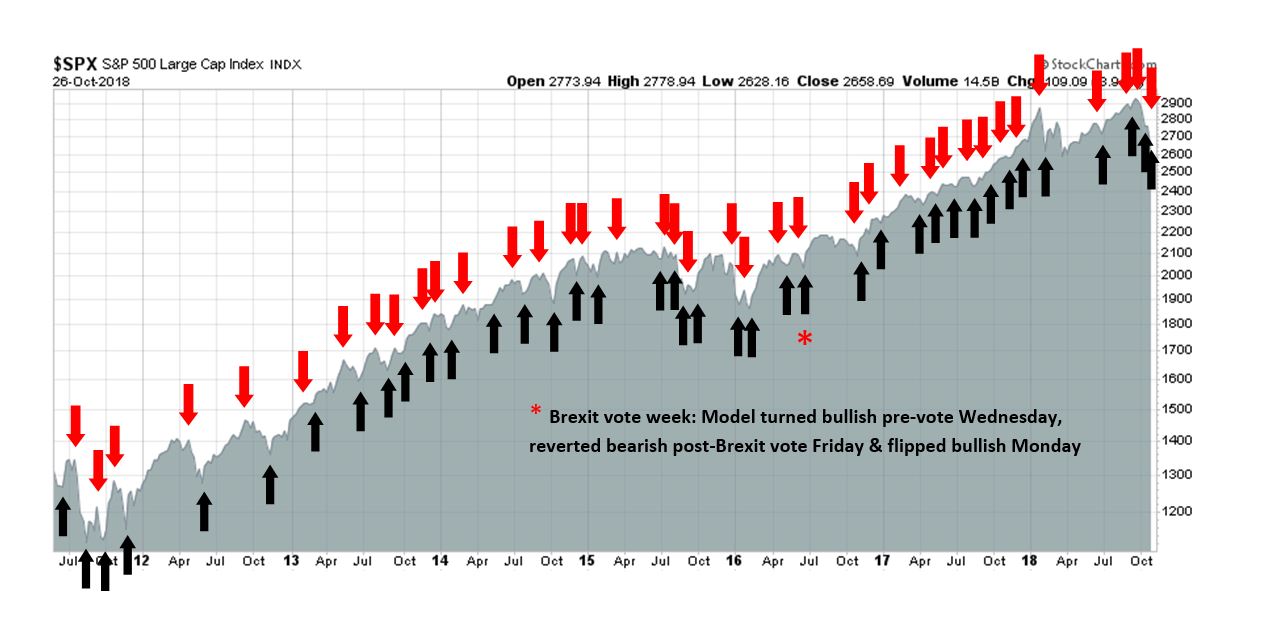
We maintain several market timing models, each with differing time horizons. The “Ultimate Market Timing Model” is a long-term market timing model based on the research outlined in our post, Building the ultimate market timing model. This model tends to generate only a handful of signals each decade.
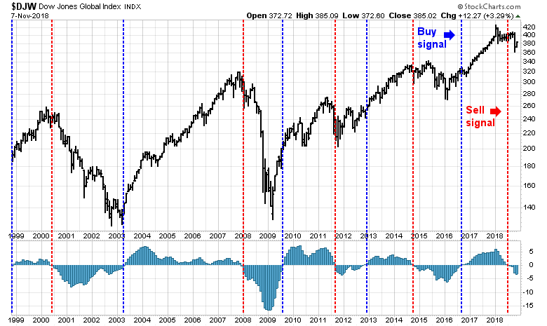
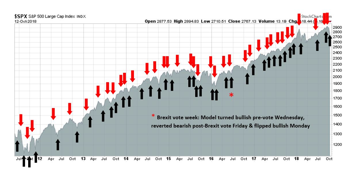
The Trend Model is an asset allocation model which applies trend following principles based on the inputs of global stock and commodity price. This model has a shorter time horizon and tends to turn over about 4-6 times a year. In essence, it seeks to answer the question, “Is the trend in the global economy expansion (bullish) or contraction (bearish)?”
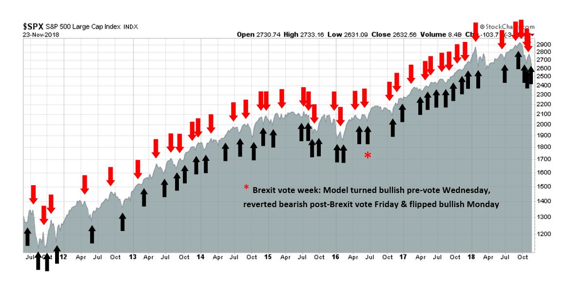
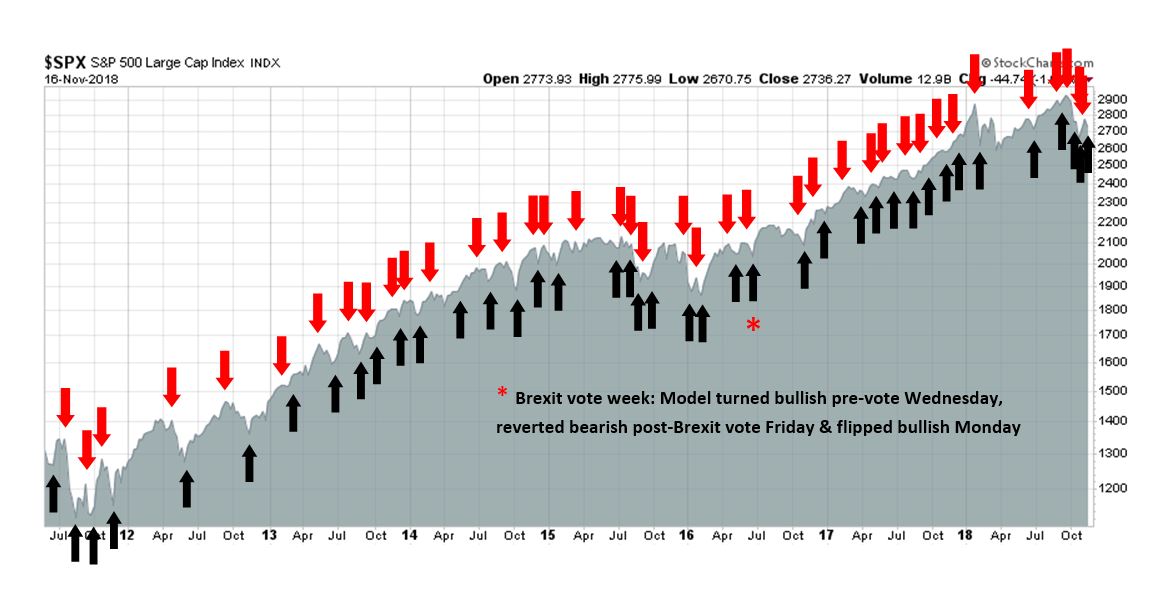
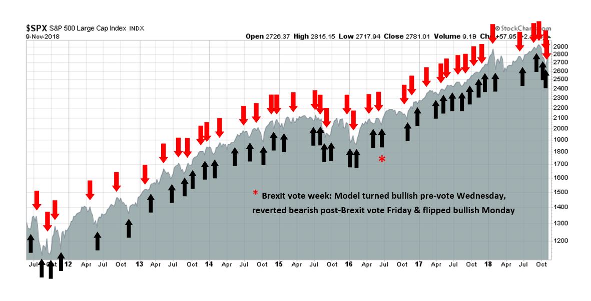
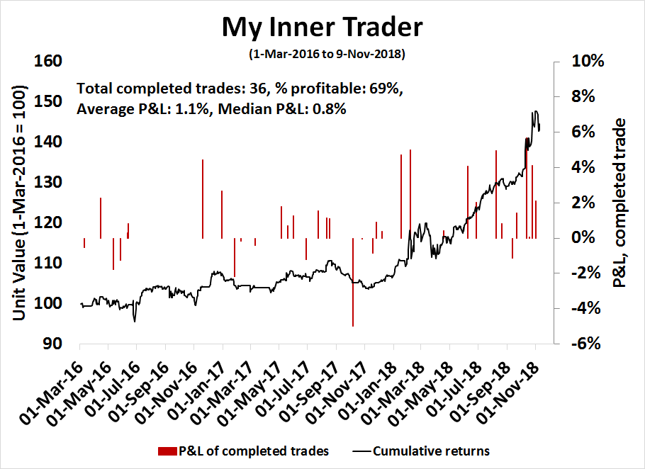
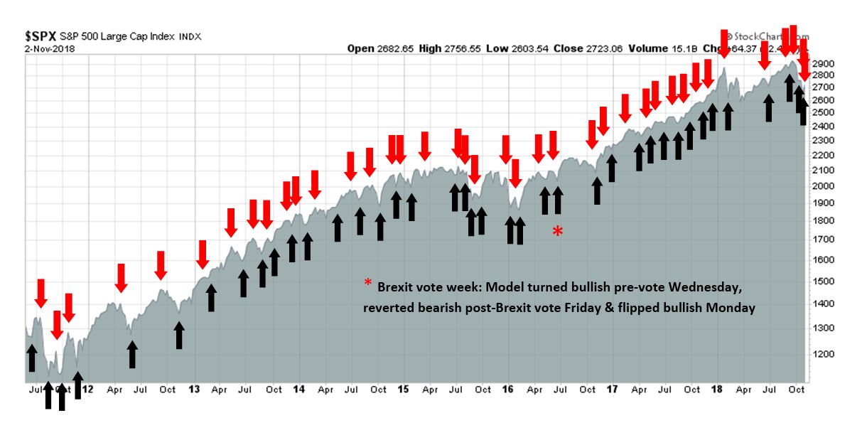
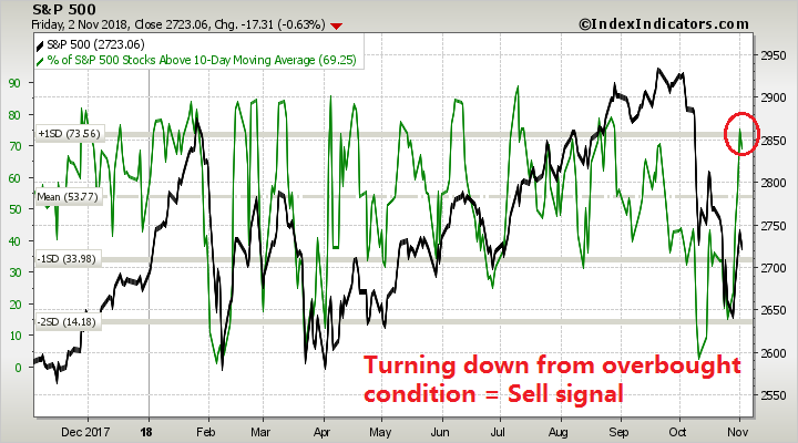
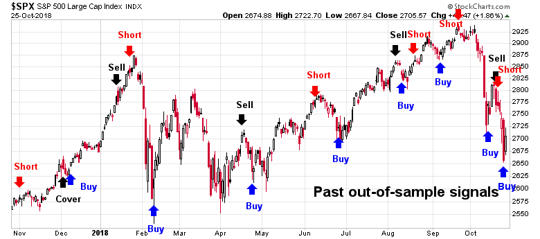
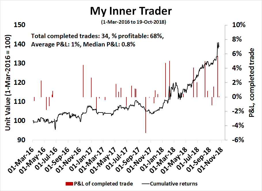
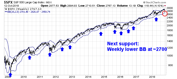
My inner trader uses the trading component of the Trend Model to look for changes in the direction of the main Trend Model signal. A bullish Trend Model signal that gets less bullish is a trading “sell” signal. Conversely, a bearish Trend Model signal that gets less bearish is a trading “buy” signal. The history of actual out-of-sample (not backtested) signals of the trading model are shown by the arrows in the chart below. The turnover rate of the trading model is high, and it has varied between 150% to 200% per month.
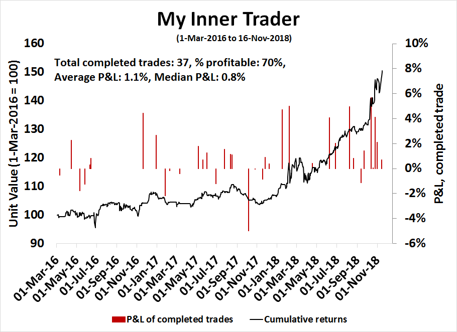
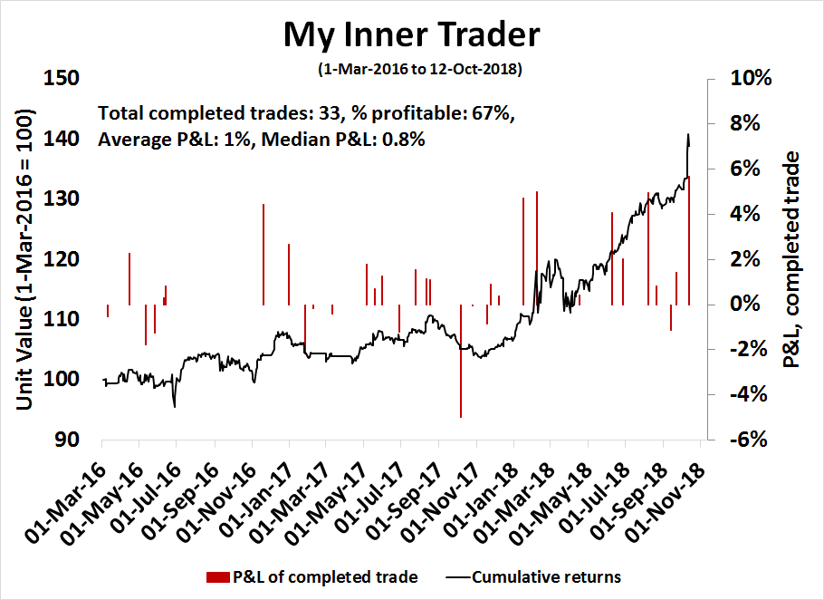
Subscribers receive real-time alerts of model changes, and a hypothetical trading record of the those email alerts are updated weekly here. The hypothetical trading record of the trading model of the real-time alerts that began in March 2016 is shown below.

The latest signals of each model are as follows:
- Ultimate market timing model: Buy equities
- Trend Model signal: Bearish
- Trading model: Bullish
Update schedule: I generally update model readings on my site on weekends and tweet mid-week observations at @humblestudent. Subscribers receive real-time alerts of trading model changes, and a hypothetical trading record of the those email alerts is shown here.
A smorgasbord recession?
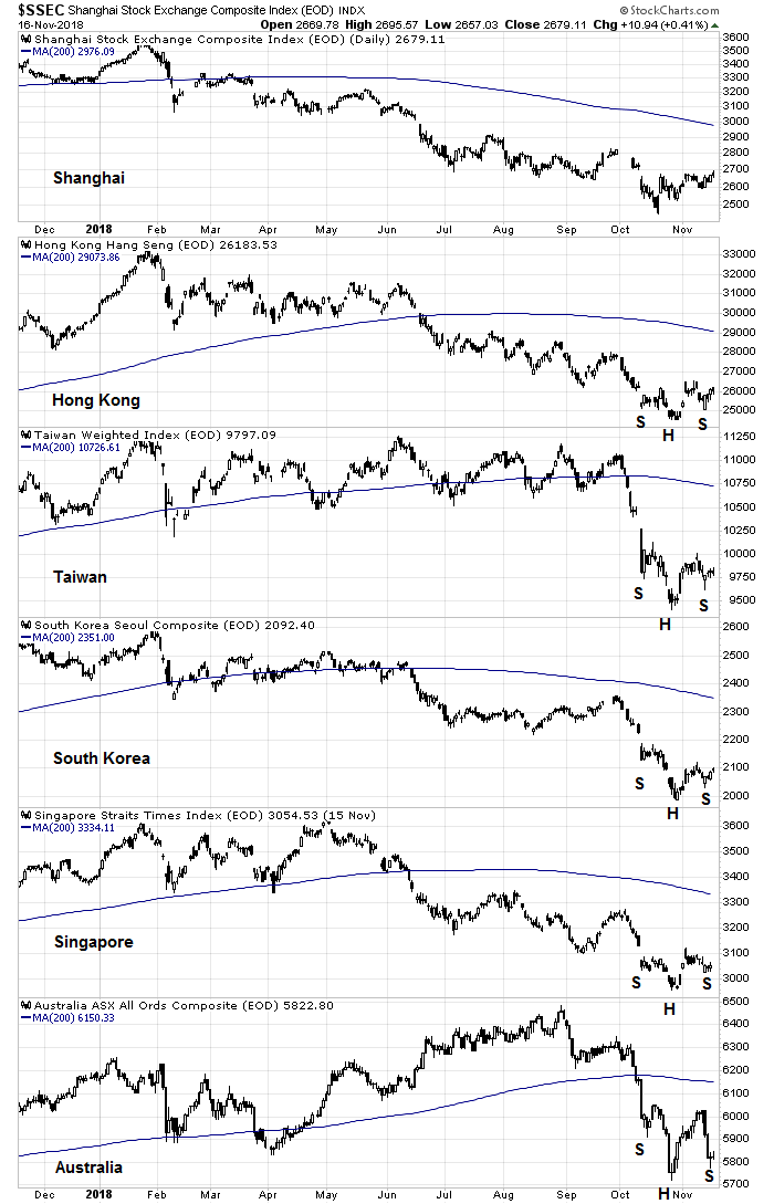
Callum Thomas has a terrific chart depicting the scope of the global stock market weakness. At the end of October, roughly 13% of global indices were above their 200 day moving averages (dma). Such readings are normally seen at intermediate term lows, or as part of a broad based bear market.
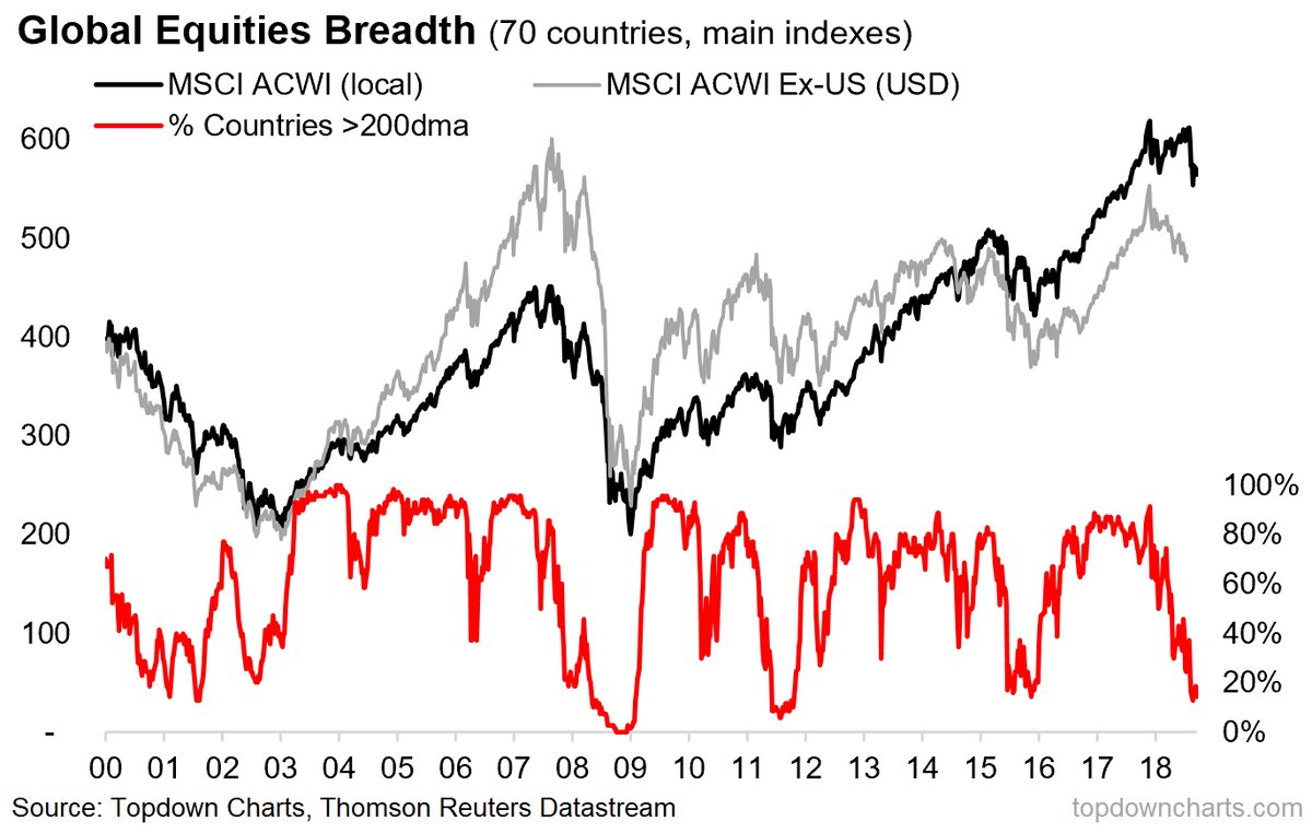
If this is indeed an intermediate low like 2015, or even 2011, investors should buy with both hands. On the other hand, if this is the start of a recession-induced bear market, investors should continue to de-risk their portfolios.
At this point, the lights on my panel of long leading recessionary indicators are currently flickering, but not bright red. Paul Krugman recently postulated;
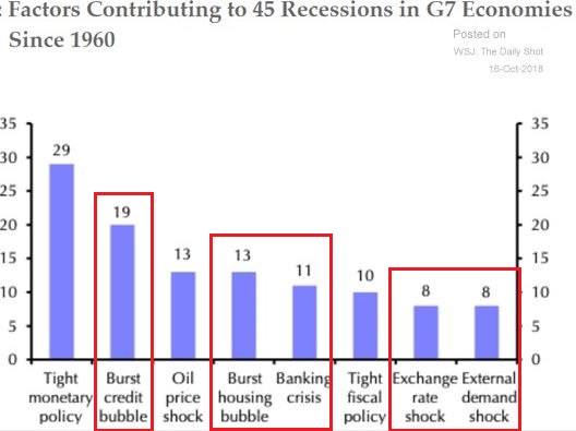
Right now there doesn’t seem to be one big thing setting us up for a crisis – not like the housing bubble before 2008, or the tech bubble of the late 1990s. But there are several smaller things: trouble in emerging markets, some softening of housing, commercial real estate, corporate debt. So we could have a “smorgasbord” recession like 1990-91, with several factors coming together. This could be a problem, because interest rates are still low and there’s not much room to cut.
Could we see a “smorgasbord recession” in the near future?
A wobbly US economy
Certainly, there are numerous signs that the American economy is looking a little wobbly. The cyclically sensitive housing sector appears to have topped out for this cycle.

The much watched 2s10s Treasury yield curve (red line) has not inverted, but the private sector yield curve, defined as the Baa bond yield minus the prime rate, has (blue line).
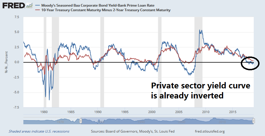
The 2s10s Treasury yield curve may not flash a recessionary signal this cycle because of the Fed’s quantitative easing (QE) and subsequent quantitative tightening (QT) programs. A study by Benn Steil at the Council on Foreign Relations found that the Fed’s efforts at QT have raised the 10-yield yield by 17 bp. If we were to adjust for the effects of QT, the current spread would narrow to just 6 bp, which is very close to an inversion.
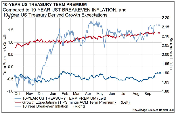
The term premium fluctuates with supply and demand for particular bonds. The Fed’s accumulation of longer-term Treasuries during nearly five years of Quantitative Easing (QE) was a big source of demand, and therefore lowered the term premium on longer-term Treasuries. (Former <Fed Chair Ben Bernanke explains this well in his blog.) Fed economists estimated that yields on 10-year Treasuries at the end of 2017 would have been around 85 basis points higher than their then-level of 2.3 percent had the Fed not bought such bonds.
On the basis of these estimates of the effect of central-bank asset purchases on long-term rates, we calculate that asset run-offs so far—$24 billion per month on average—have boosted 10-year Treasury yields by about 17 basis points.
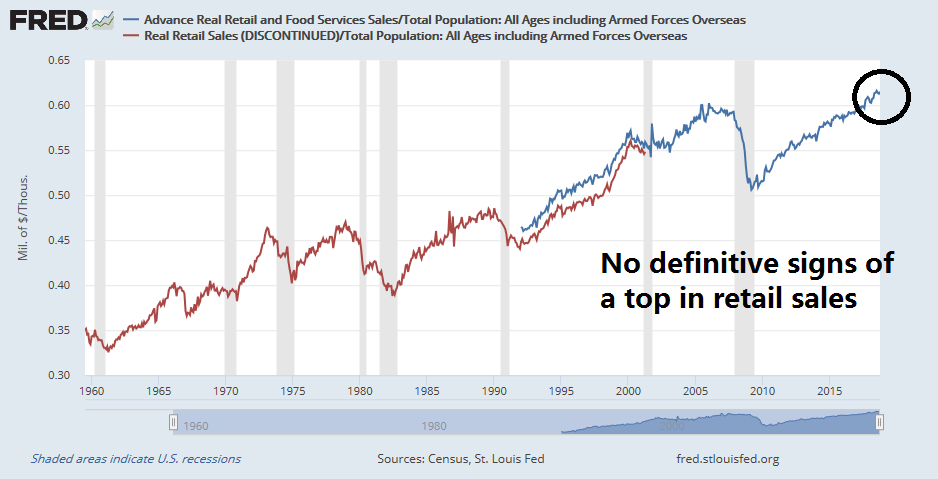
As well, retail sales may be topping out, though the evidence is not definitive. Retail sales to population made a top five months ago, but New Deal democrat indicated he does not want to call a top until he sees six months of weakness.
In a separate model, New Deal democrat also found that whenever the change in the Fed Funds rate exceeded the change in Non-Farm Payroll employment, a recession has been the result.
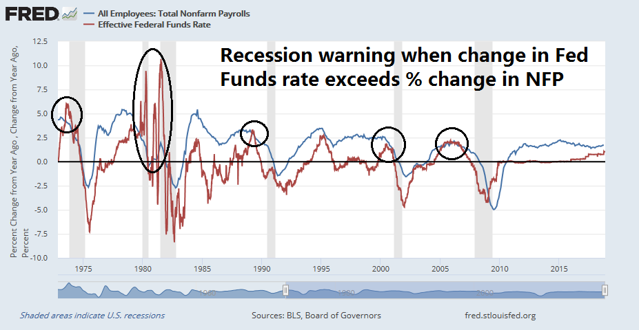
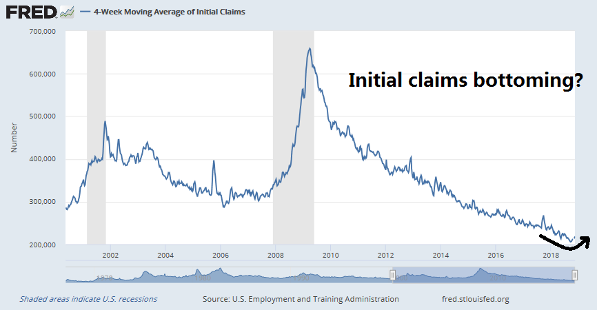
While the lines in the above chart are close, they have not crossed as a slowdown warning. However, the weekly reported initial jobless claims may be bottoming. If initial claims continue to rise, the weakness will eventually feed into the monthly NFP reports, and the blue line in the above chart, which represents the change in NFP, could fall enough to produce a recession warning.
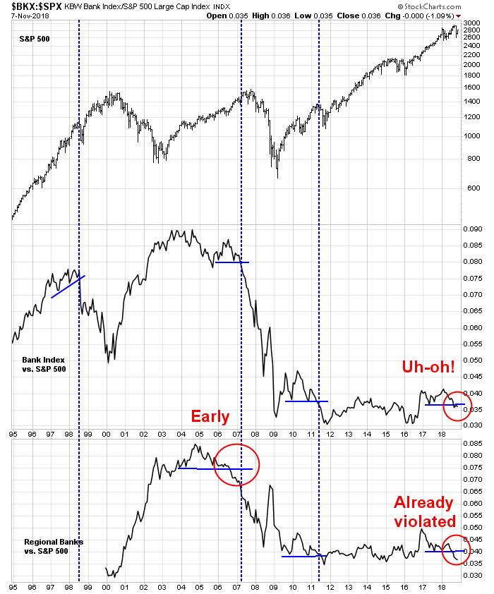
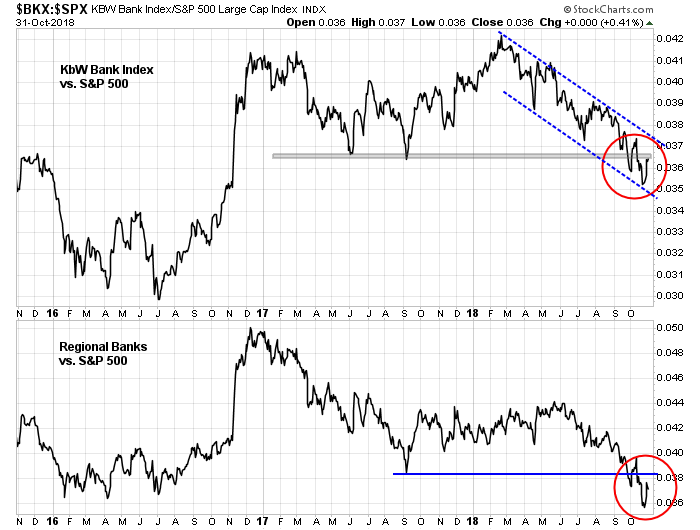
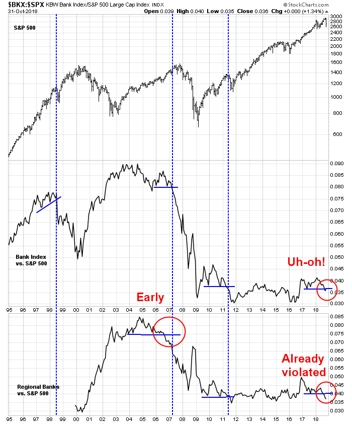
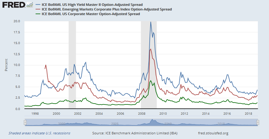
Not all the news is dire. The recent credit deterioration in former bellwether GE has led to rising angst about widening yield spreads. Both Scott Minerd of Guggenheim Partners and hedge fund manager Paul Tudor Jones have voiced concerns about turbulence in the credit market. Indeed, credit crunches have always part of past recessions. For now, anxiety over yield spreads blowing out appear overblown, as they are only edging up and levels are nowhere near levels seen in the last two recessions.
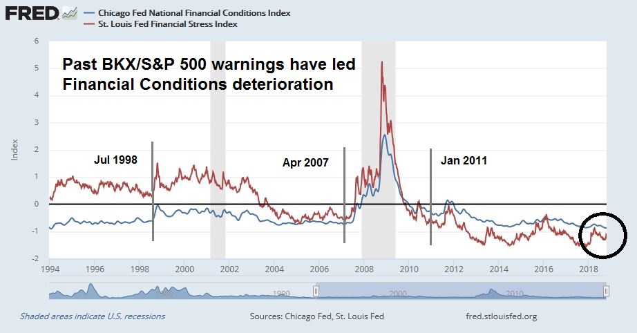
Similarly, financial conditions (low is good on the graph) have deteriorated but readings remain benign by historical standards.

In summary, long leading indicators of US economic growth are decelerating. While readings are not indicative of a recession, they are getting close.
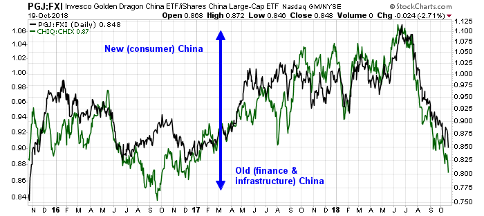
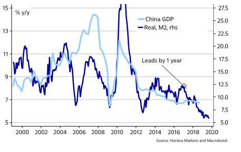
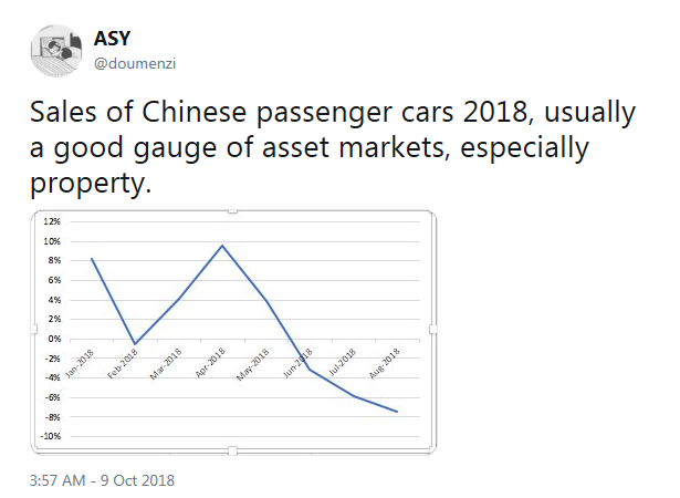
China weakness the next smorgasbord course?
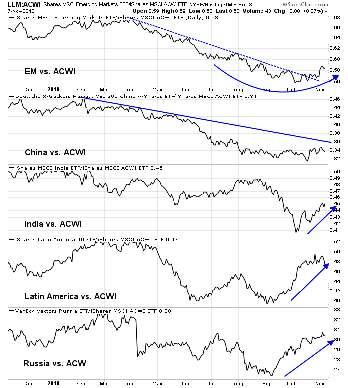
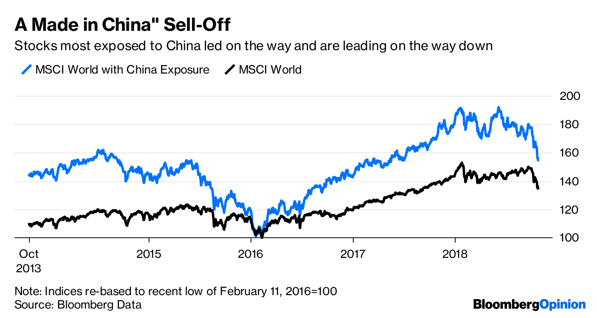
There is also evidence that the current risk-off episode could be attributable to Chinese weakness as markets have been moving based on news from China (see Was the market swoon made in China?). In that case, could Chinese weakness be the next course in the smorgasbord recession?
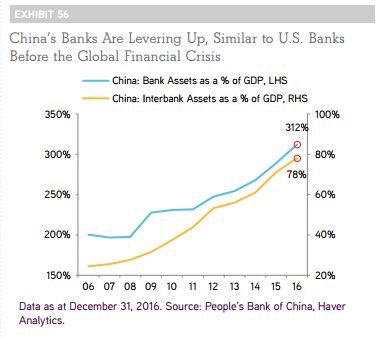
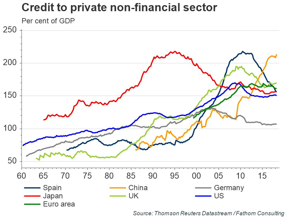
A market analyst would have to be living as a hermit in the last few years not to have heard the warnings about the rising debt levels in China.
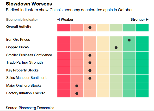
Even without the threat of a trade war, there are signs that China is weakening. Business confidence has plummeted to an all-time low.

There are also signs that China’s economy is hitting a debt wall. Fitch warned that China bond defaults are expected to rise despite policy easing:
Chinese corporate bond defaults are likely to continue to rise in 2019 due to high refinancing pressures, the government’s greater tolerance for defaults, and tight credit availability – despite the recent shift in the policy stance towards easing, says Fitch Ratings. Corporate defaults should remain concentrated in the private sector, which has benefitted less from policy easing than state-owned enterprises (SOEs) and local-government financing vehicles.
Bloomberg reported that, in the space of just 11 months, China went from no USD corporate debt to more distressed debt than all other emerging markets. A separate Bloomberg article raised concerns that Chinese companies have been acting like banks by pledging their own assets as insurance for other private companies. Such daisy chain style financing creates possible cascading defaults should any company fail, and the others do not have sufficient capital cushions to sustain the losses arising from default:
Moves by Chinese companies to guarantee each others’ debt have left the world’s third-largest bond market prone to contagion risks — making it all the tougher for officials to follow through on initiatives to sustain credit flows.
Private companies have long had to be innovative in getting financing in Communist-run China, where state-owned enterprises have had preferential access to the banking system. Extending guarantees to each other helped businesses boost some lenders’ confidence enough to extend funding to them.
But now that China is going through a record run of debt defaults, the links pose the risk of a daisy chain of distress. Price moves are reflecting that. Tire-maker China Wanda Group has seen a 16 percent tumble in its notes due in 2021 since end-September, thanks to having provided guarantees to iron-wire maker Shandong SNTON Group Co., one of whose units failed to repay a bank loan two months ago.
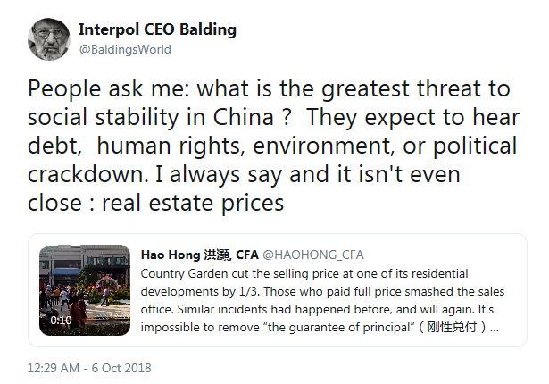
Already, we are seeing sporadic defaults in the most vulnerable parts of the market, property development. Caixin reported that the Shenzhen Stock Exchange delisted Zhonghong Holdings Group, a property developer, because of poor share performance owing to a debt crisis.
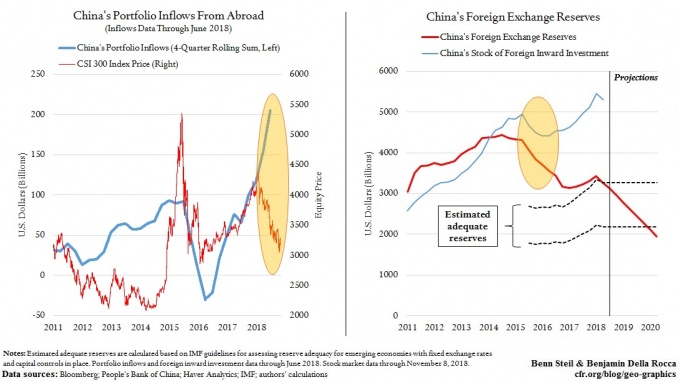
The latest World Bank statistics show that China has external debts of $1.7 trillion, composed of $1 trillion in short-term debt and the remainder in long-term debt. That figure is quite manageable in light of China’s large foreign exchange reserves. But a recent SCMP article highlights analysis from Daiwa Capital Markets, which indicated that China’s total external debt position, which includes direct and indirect debt, is really $3 trillion.
Massive domestic debt has long been a headache for Beijing, but it is China’s growing external US dollar leverage that is being underestimated and it could possibly trigger a major financial crisis, according to Kevin Lai, chief economist for Asia excluding Japan at Japanese investment bank and securities brokerage Daiwa Capital Markets.
China’s US$3 trillion dollar debt makes it especially vulnerable because of tightening US dollar liquidity, a weakening yuan and the ongoing US-China trade war, said Lai.
Global dollar debt outside America has risen to US$12 trillion today from US$9 trillion in 2013, according to Lai. Of that total, 25 per cent, or US$3 trillion, has been borrowed by China Inc and its subsidiaries in Hong Kong, Singapore and the Caribbean. China’s US dollar cross-border claims have risen faster than any other emerging economy’s despite its partially closed capital account…
The amount of dollar debt raised by China in its offshore centres that has entered its banking system is worrying given the prospect of further depreciation pressure on the yuan’s exchange rate, said Lai.
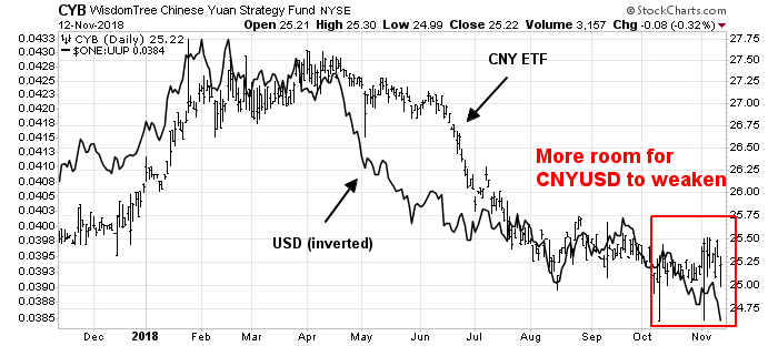
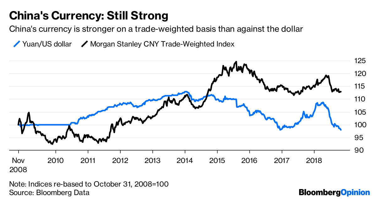
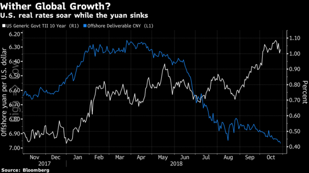
Such a high level of external debt makes Chinese corporations vulnerable to the Fed’s tightening policy. It also puts the PBOC in a bind. China’s economy is already slowing, even without the trade war. If the PBOC were to ease, the yuan devalues and raises the debt burden of Chinese corporations that borrowed in USD. If it chooses to defend the CNYUSD exchange rate, it risks capital flight, which also puts downward pressure on the exchange rate.
Trade war or peace?
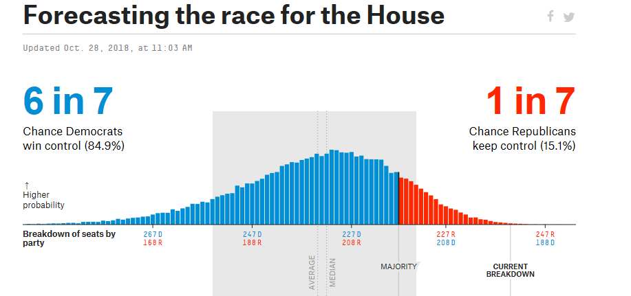
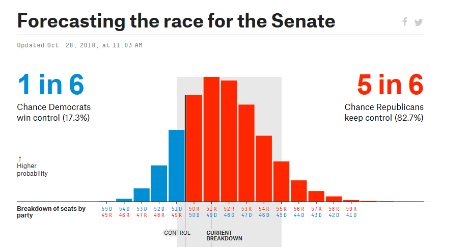
Then we have the trade war wildcard. Trump and Xi are expected to meet on the sidelines of the G20 summit in Buenos Aires on December 1, 2018. Expectations are low going into that meeting.
Mike Pence adopted a highly belligerent tone in an interview with the Washington Post while Pence was on his way to the APEC summit:
Pence told me in an interview that Trump is leaving the door open for a deal with Xi in Argentina, but only if Beijing is willing to make massive changes that the United States is demanding in its economic, military and political activities. The vice president said this is China’s best (if not last) chance to avoid a cold-war scenario with the United States.
“I think much of that will depend on Argentina,” Pence said. “The president’s attitude is, we want to make sure they know where we stand, what we are prepared to do, so they can come to Argentina with concrete proposals that address not just the trade deficit that we face … We’re convinced China knows where we stand.”
In addition to trade, Pence said China must offer concessions on several issues, including but not limited to its rampant intellectual property theft, forced technology transfer, restricted access to Chinese markets, respect for international rules and norms, efforts to limit freedom of navigation in international waters and Chinese Communist Party interference in the politics of Western countries.
If Beijing doesn’t come up with significant and concrete concessions, the United States is prepared to escalate economic, diplomatic and political pressure on China, Pence said. He believes the U.S. economy is strong enough to weather such an escalation while the Chinese economy is less durable.
As a result of the disagreement between the US and China, APEC participants were unable to agree on the wording of a final communique. The dispute is not just over trade, but a conflict over economic and regional dominance that may be the start of a new Cold War. Business Insider reported that China is building another structure in the South China Sea as a sign that tensions are escalating.
On the other hand, there are some hopeful signs of a thaw in relations. China has prepared some concessions ahead of the Buenos Aires meeting (via CNN):
The Chinese government has presented an offer to the United States to try to push forward stalled trade talks before the leaders of the two economic superpowers meet at the end of this month, according to two people briefed on the discussions.
The opening bid falls short of many of the core demands the White House has repeatedly detailed as must-haves in trade talks with Beijing, including addressing technology transfers and intellectual property theft, according to one of the people briefed. Instead, the proposal has been described as a rehash of previous commitments Chinese leaders have publicly announced, like selectively lifting tariffs.
Another sign of a thaw appeared when China approved the visit of American aircraft carrier USS Ronald Reagan and her strike group of escort ships to Hong Kong. This decision stands in contrast to the refusal of the visit of the amphibious assault ship USS Wasp last September.
More importantly, the SCMP reported that trade hawk Peter Navarro has been excluded from the guest list at the Trump-Xi meeting. While the list of aides to accompany Trump is not fully known yet, the most likely candidates are Larry Kudlow, John Bolton, Mike Pompeo, Steve Mnuchin, Wilbur Ross, Robert Lighthizer, and US ambassador to China Terry Branstad. Kudlow and Mnuchin are known to be trade doves, while Lightizer is regarded as a hawk.
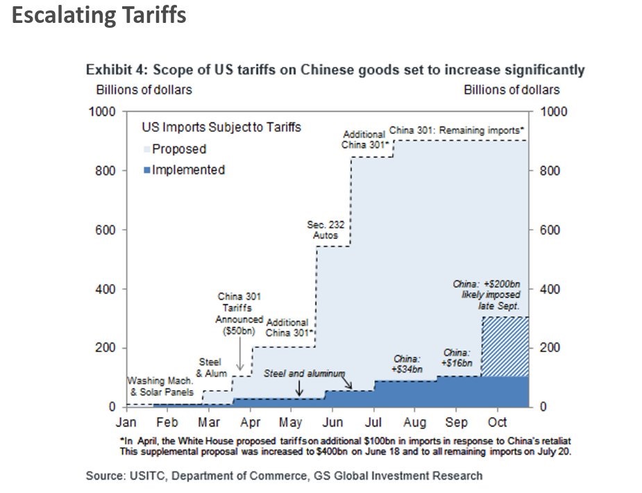
It is shaping up to be a battle of trade factions within the Trump administration as the American side heads into the meeting. US Trade Representative Lightizer fired a broadside at China last week. He released a report stating that China has not changed unfair and discriminatory practices that prompted President Donald Trump to impose tariffs on around $250 billion worth of Chinese goods.
The big picture issues appear to be intractable. In addition to a dispute over the trade deficit, the Americans wants China to change its economic development model. The probability of such an event is as likely as the US adopting a Canadian supply management system for milk and dairy products, which was an issue raised during the NAFTA negotiations.
(As a word of explanation, Canada made a political decision to control the supply of certain food products such as chicken and dairy products, because it believed that it did not want to subject important basics such as the food supply to the market volatility of supply and demand. Better to pay more for food to ensure a steady supply. As a result, farmers cannot just produce chicken, but they need to produce chicken under a government mandated quota. The US has similar supply management system, not in food, but in defense. Otherwise, the Pentagon would considering the purchase of the Eurofighter instead of fighter jets of domestic design.)
Which Trump will show up in Buenos Aires? Will it be the belligerent Trump, who is determined to reduce and eliminate the trade deficit with China, and to contain China’s threat to US dominance in key technologies? Or will it be the Trump who met KJU of North Korea, who decided that he liked the dictator well enough that he could do business with him? Were the rhetoric of the trade doves and hawks just playing a game of good cop-bad cop? While the Chinese and American negotiation teams are said to be in close contact in the period leading up to the summit, Axios reported that Trump was his usual enigmatic self when he discussed his preparations for his meeting with Xi Jinping:
I’m very prepared, I’ve been preparing for it all my life. It’s not like, oh gee, I’m going to sit down and study it. I know every detail. I know every stat, I know it better than anyone who’s ever known it and my gut has always been right.
Realistically, the best outcome would be an American decision to suspend the imposition of the next round of tariffs while both sides talk more. Will that happen?
Stay tuned.
The good news on China
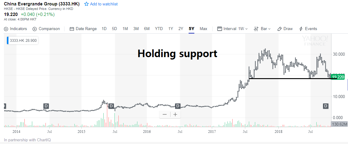
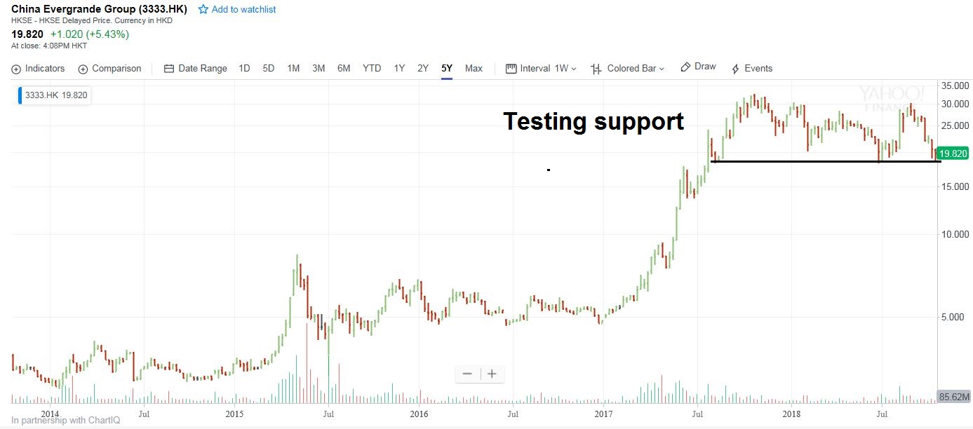
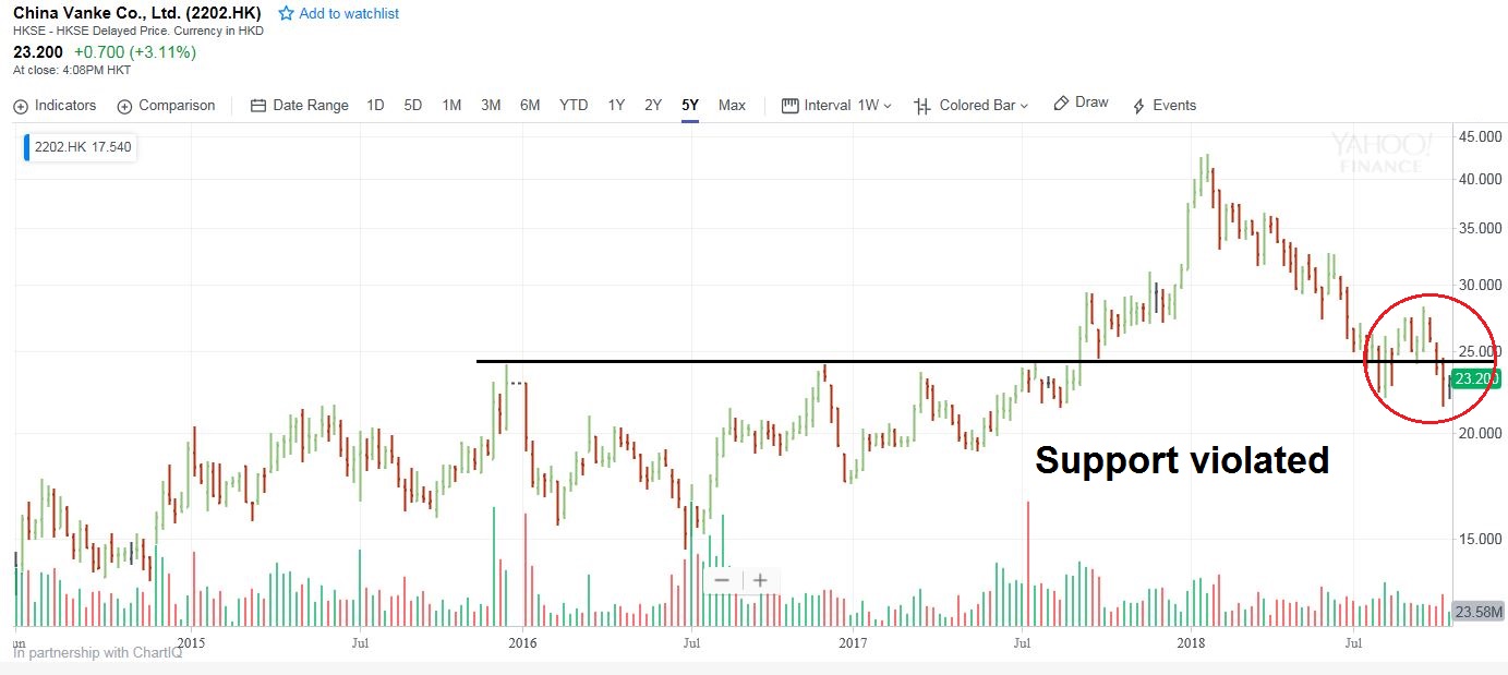
The good news on China is, despite all of the dire reports, there are no signs that the dam has broken. Chinese official statistics are notorious for their creativity, but real-time market signals indicate no signs of a disorderly unwind of the debt bubble.
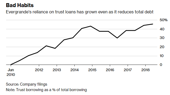
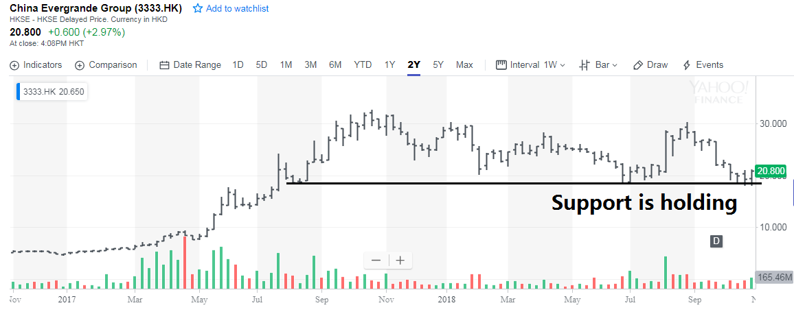
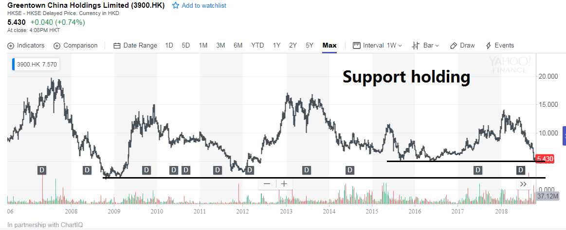
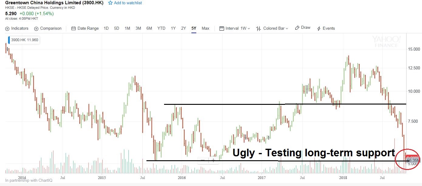
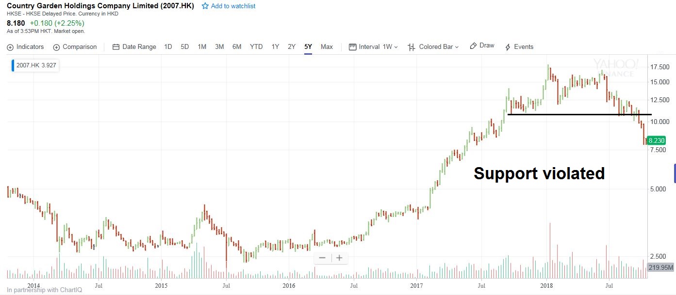
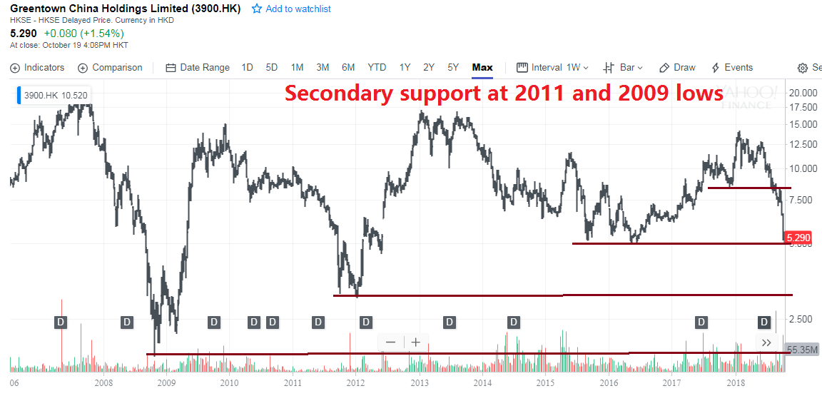
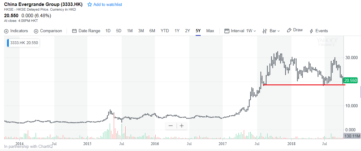
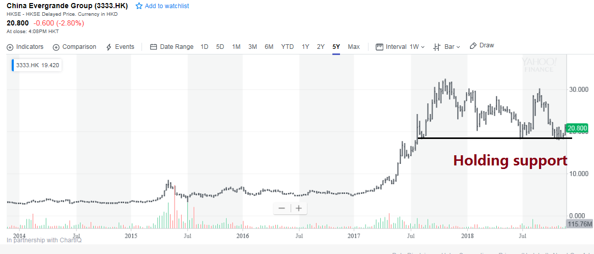
I have been monitoring the share price of key Chinese property developers, such as China Evergrande (3333.HK), which are highly levered. So far, the shares are holding support.
Alibaba is another useful canary in the coalmine for sentiment on the household sector. BABA skeptic Anne Stevenson-Yang recorded a podcast outlining her skepticism of the company. She believes that foreign investors are buying BABA as a proxy for exposure to the Chinese consumer without fully understanding the company. BABA’s accounts are highly opaque, and disclosure selective. As an example, she cited the case of surging sales, but falling margins. This development has never been fully explained, and indicates either some shift in BABA`s business model, or creative accounting by management. The share price of BABA have been falling, and the breach of support at 170 is disconcerting, but the the stock remains in a relative uptrend compared to other A-Shares, which is an indication of continued investor confidence in the Chinese consumer.

The Smorgasbord Recession verdict
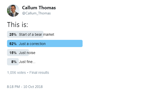
We began this publication with the rhetorical question of whether the market weakness in 2018 is a minor pullback like 2015 or 2011, or something far worse. Is there a smorgasbord recession on the horizon?
The jury is still out on that question.
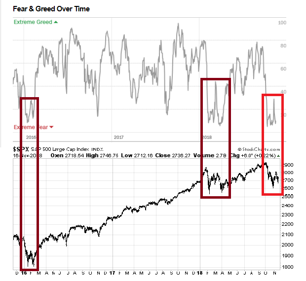
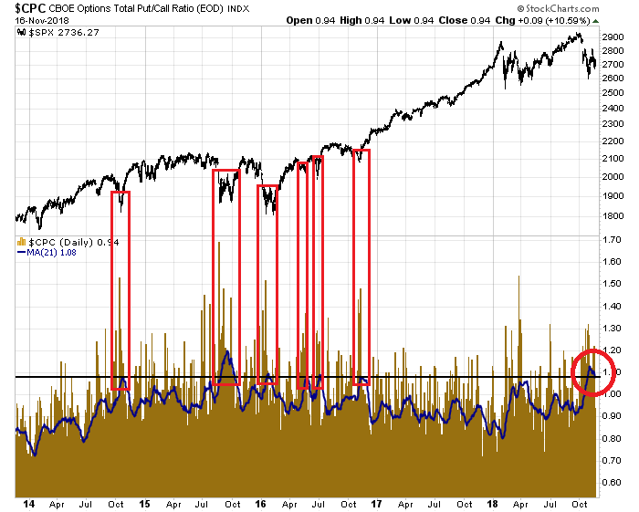
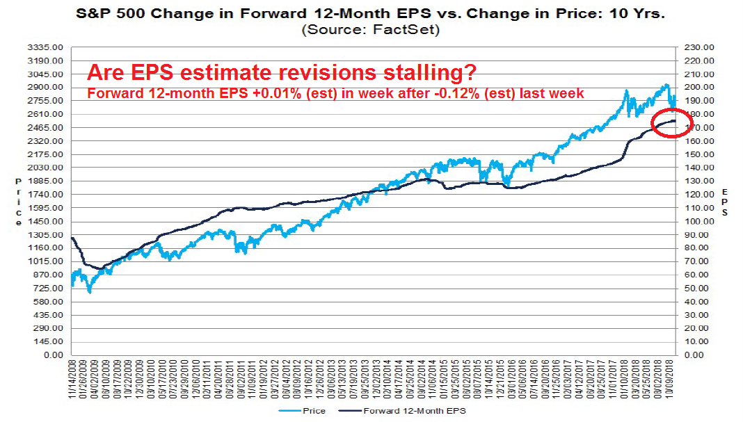
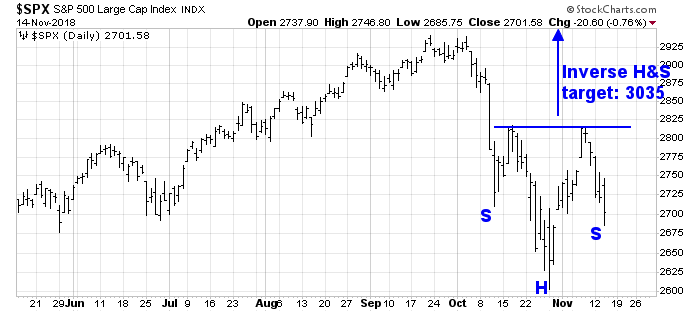
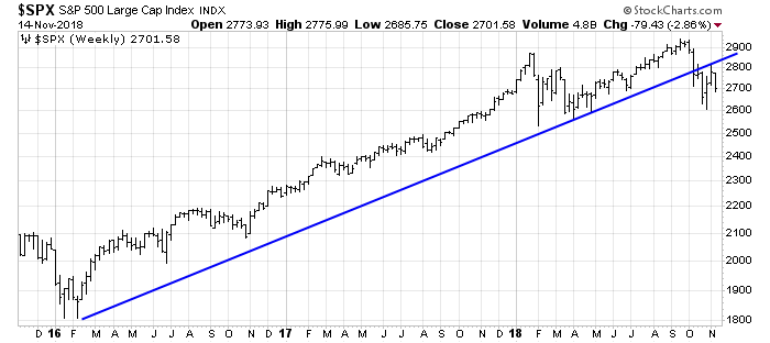
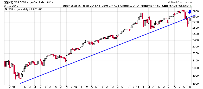
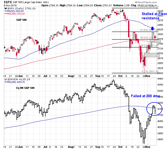
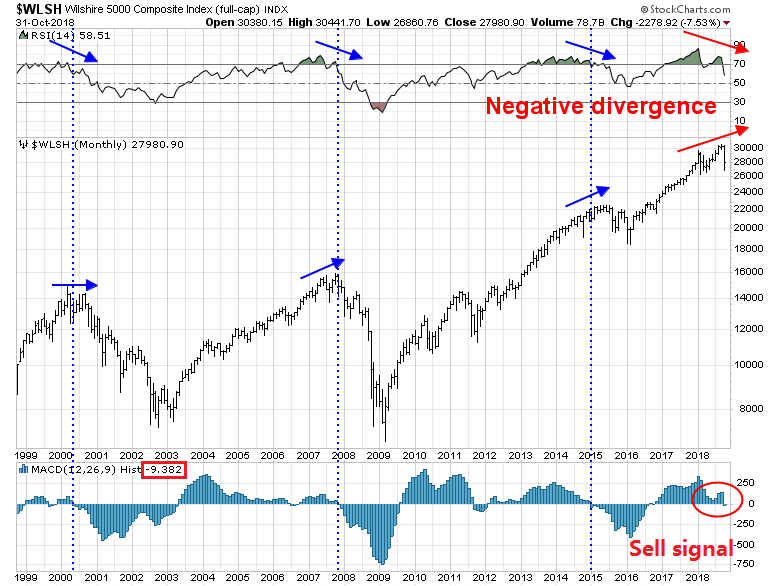
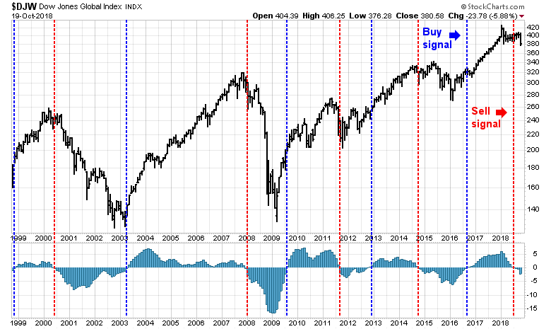
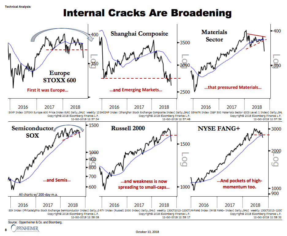
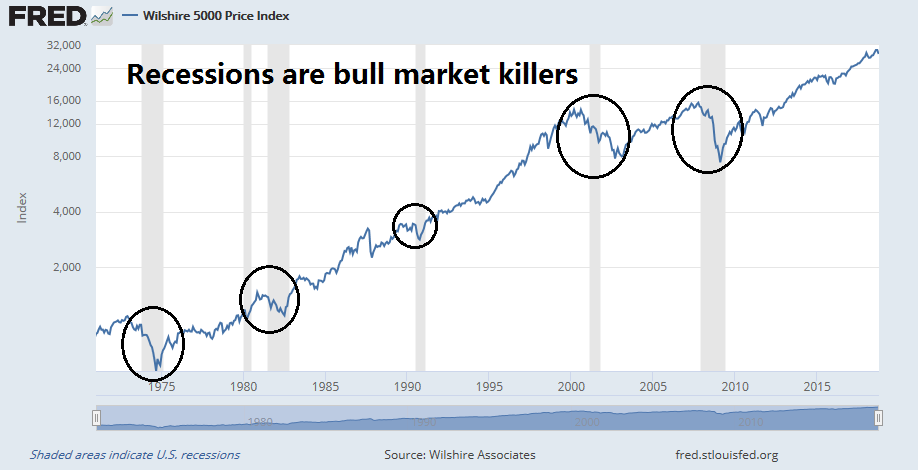
From a chartist’s perspective, the outlook appears dire. Both global and US equities have flashed long-term sell signals.


On the other hand, the macroeconomic outlook, as well as monetary and trade policy developments remain unclear. While risk levels are rising, they do not justify a recession call yet.
For the last word, I refer readers to the words of Brett Steenbarger at TraderFeed, who wrote the following last Tuesday night at the height of the market selloff:
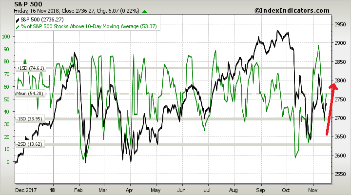
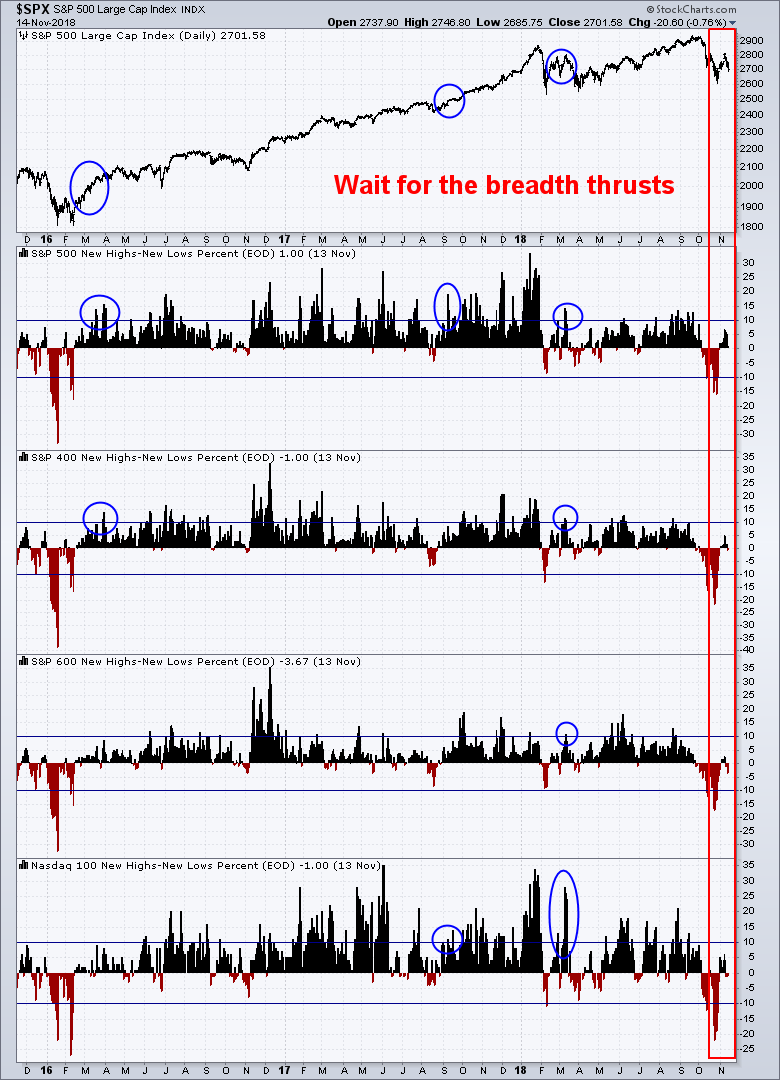
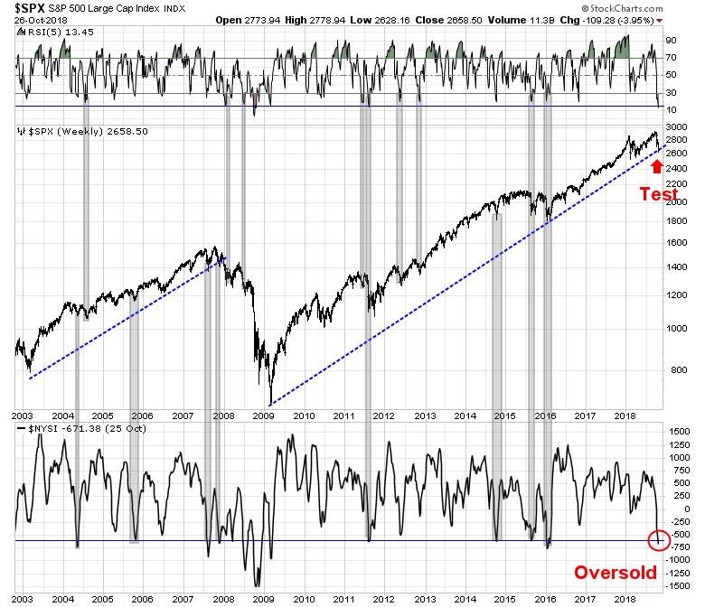
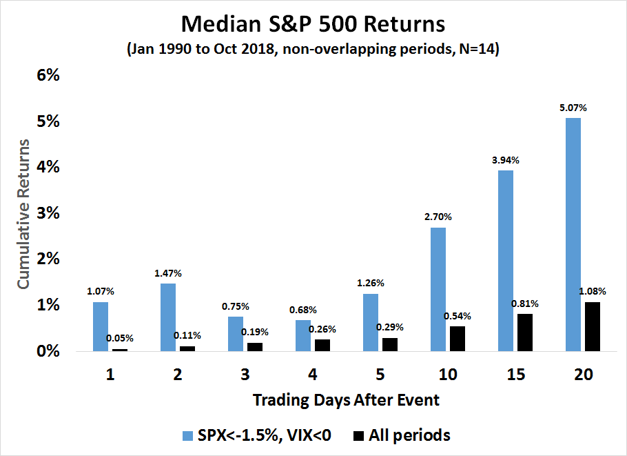
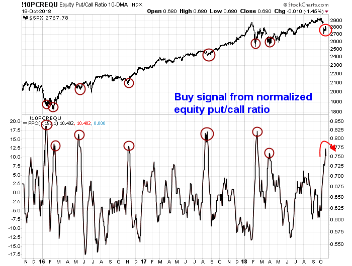
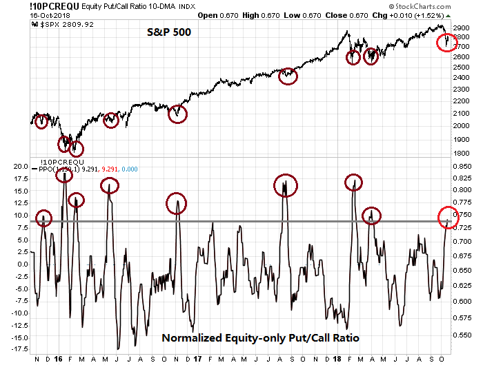
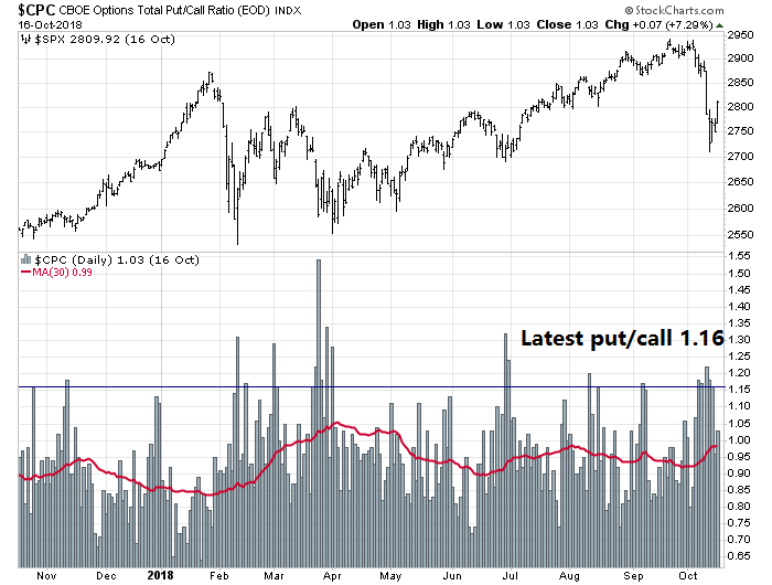
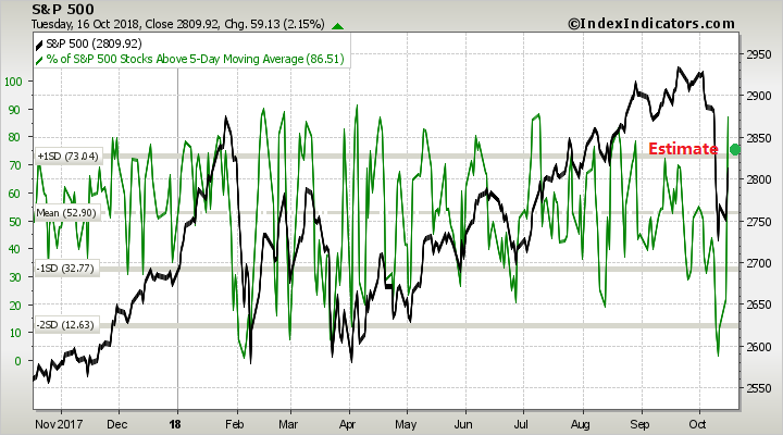
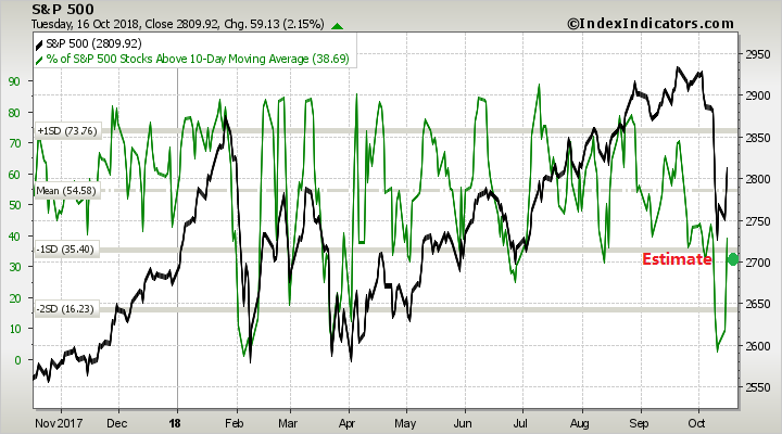
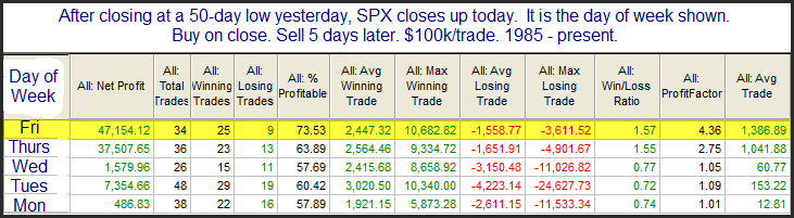
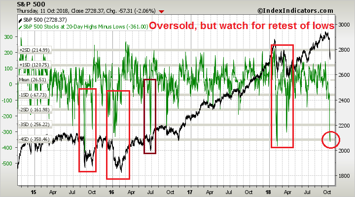
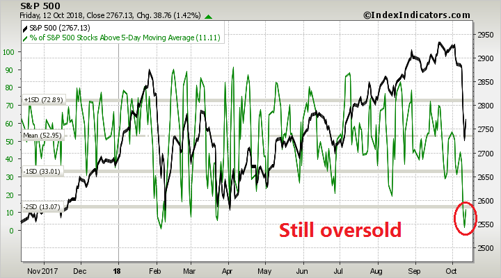
Yesterday, we saw fewer than 10% of all stocks in the SPX average trading above their three-day moving averages. The market is broadly weak in the short run. Interestingly, when we look at how the SPX stocks are trading relative to their 5, 10, 20, 50, 100, and 200-day moving averages, well fewer than 50% are trading above those benchmarks. So we’re very oversold on a short-term basis in a market that is also oversold on a medium and longer-term basis. (Data from the excellent Index Indicators site).
It turns out that this configuration has occurred 46 times since 2010. Ten days later, the SPX has been up 33 times and down 13 times for an average gain of over +1.63%. Many of the losing instances clustered in the 2011 period when we had some prolonged weakness. Similarly, when we take the data back to 2006, losing instances clustered in 2008/2009, so that there was a positive return over the next day or two from 2006-2009, but actually a negative average return over the following ten days.
So the market is likely to bounce, right? Steenbarger had a more subtle interpretation [emphasis added]:
There is a subtle but important lesson here. The human tendency is to make an assumption about whether we are in a bull or bear market and then extrapolate expectations on that basis. A better use of the data is to recognize that the kind of pullback we’ve seen is historically a very good buying opportunity in all but significant bearish periods. If we do not see a sustained bounce as we walk forward day over day, we can update our thinking to increase the odds that perhaps we’re in the throes of a bear. Conversely, if we see sustained buying, we can question the bear thesis as we walk forward.
In other words, let the market action in the days to come determine the answer of whether there will be a smorgasbord recession ahead.
The week ahead
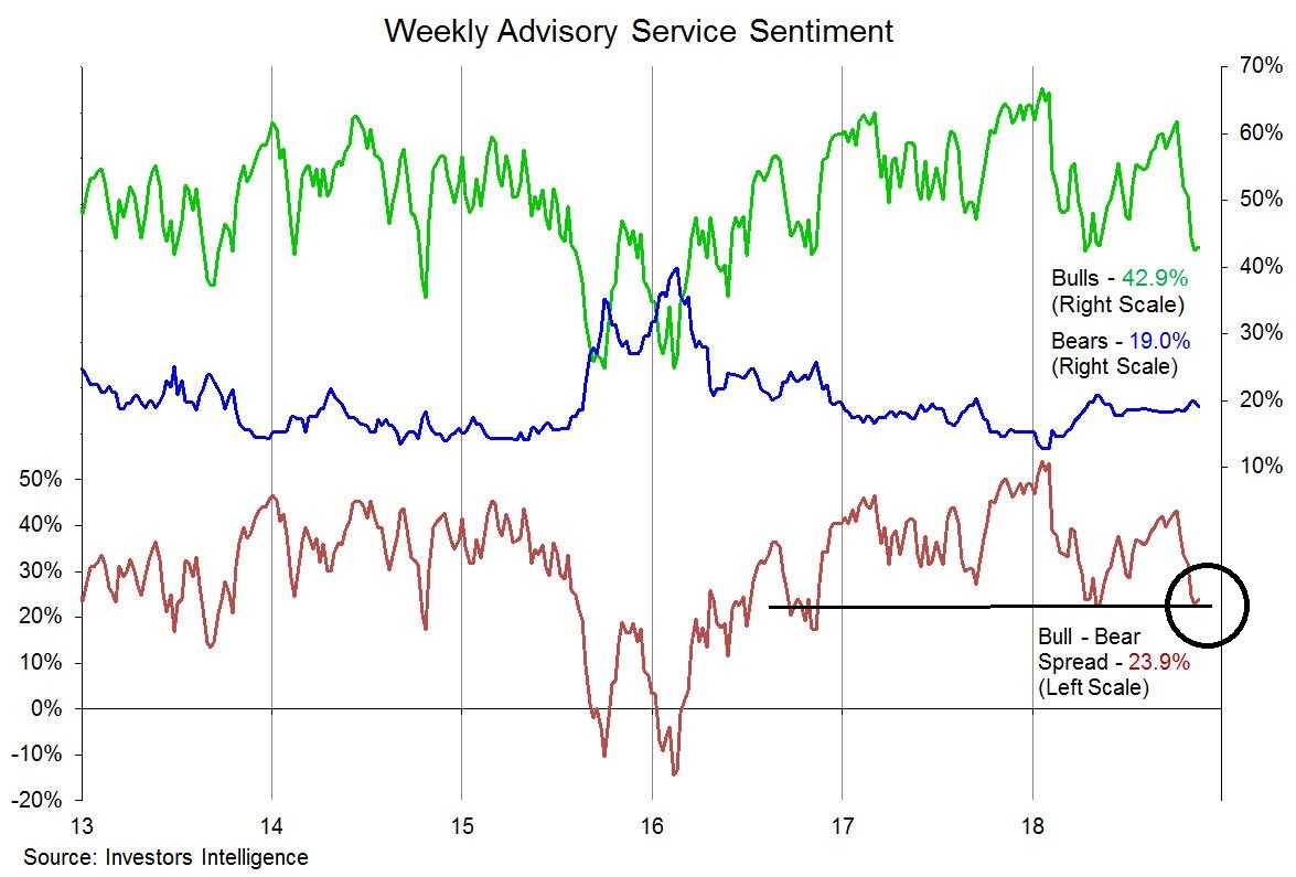
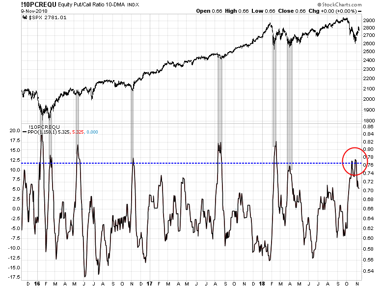
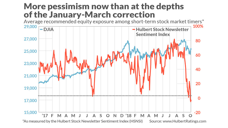
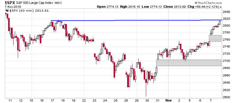
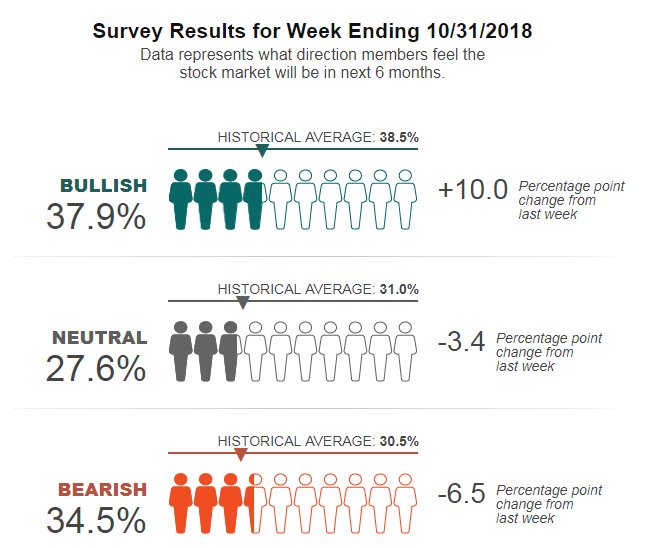
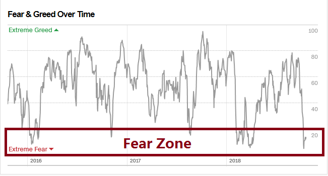
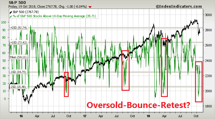
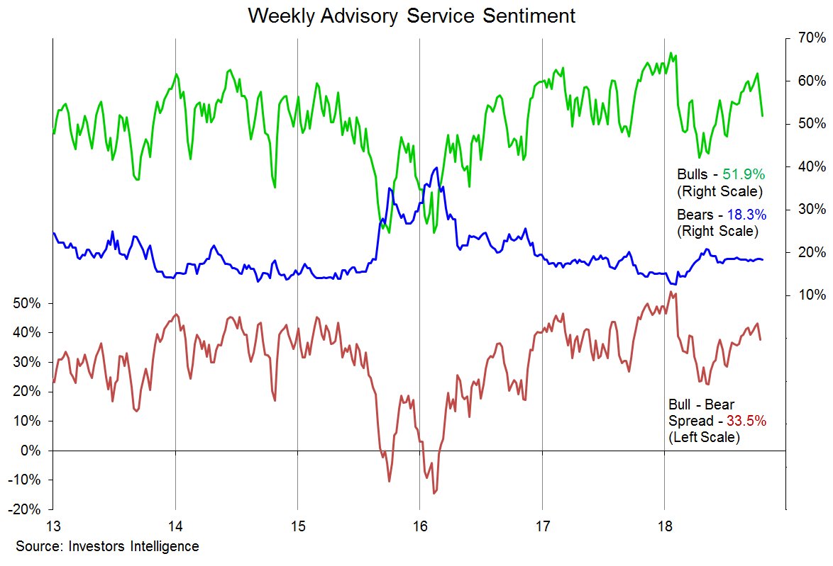
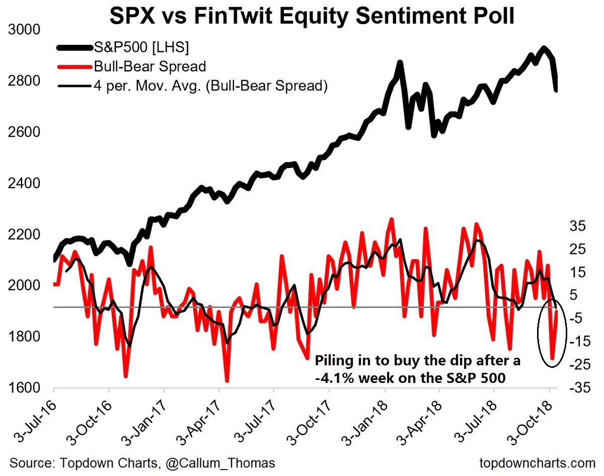
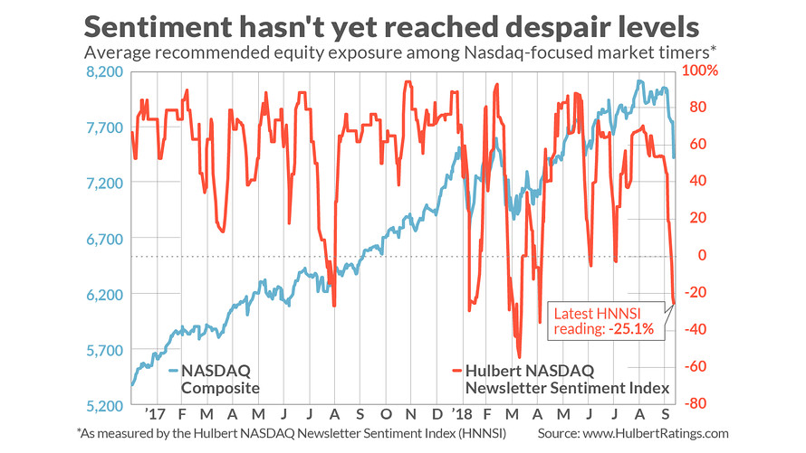
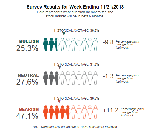
Looking to the week ahead, all of the intermediate term sentiment and technical indicators are screaming “rally imminent”. Let’s start with the sentiment models. The latest update from AAII shows that the bulls have panicked and stampeded over the bear camp.
Stockcharts has not updated their data, but the bull-bear spread is now -21.8. In the past, such episodes have resolved bullishly, with the exception of the 2008 crash. Even if you believe that this is the start of a bear market, past instances of such bearish excesses saw stock prices rising in 2007.

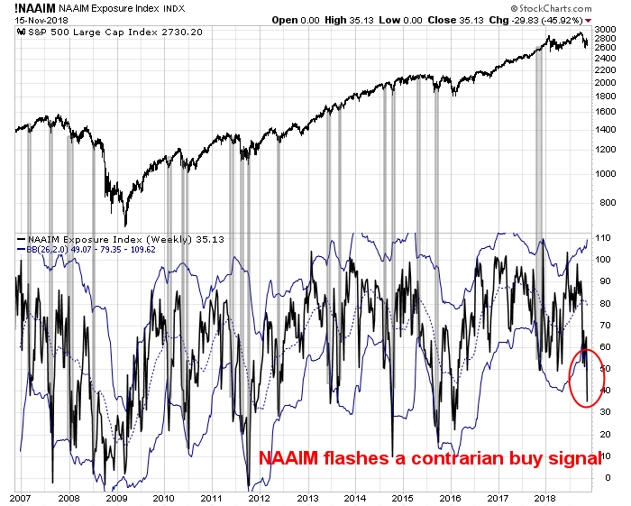
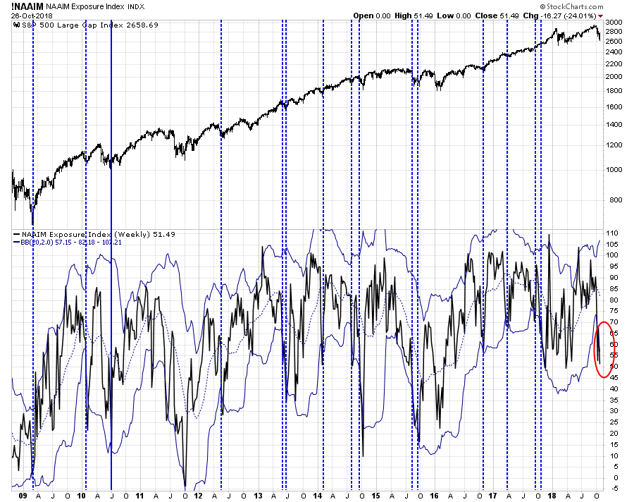
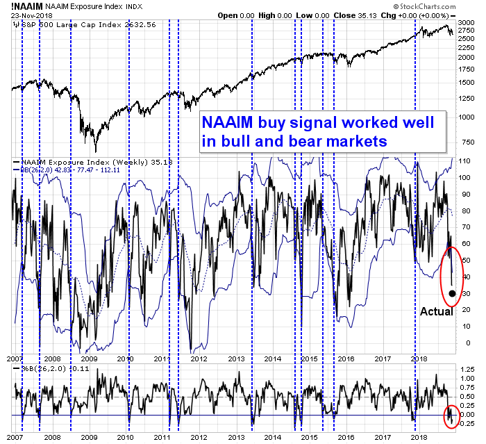
The NAAIM Exposure Index, which measures RIA sentiment, fell from 35.1 to 30.6 last week. In the past, the market has shown little downside risk and high upside potential whenever the NAAIM reading has fallen below its 26-week lower Bollinger Band. The previous reading of 35.1 was already below the lower BB, and the latest indicates an even more crowded short extreme.
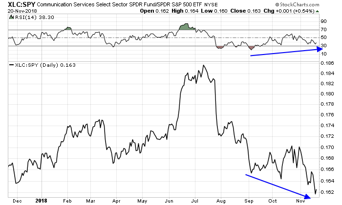
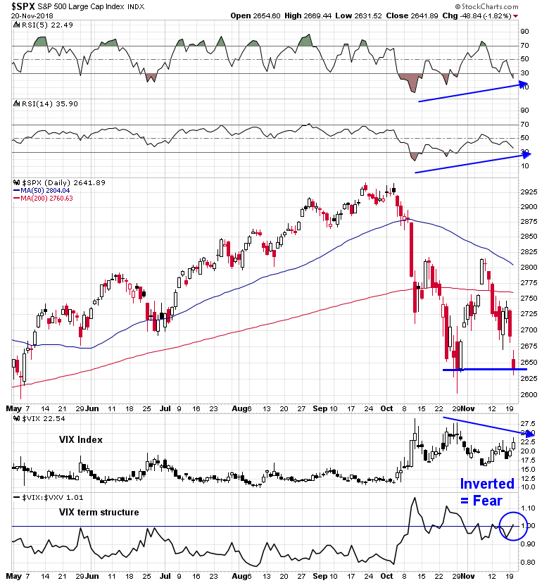
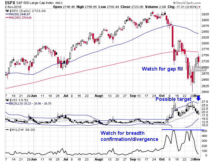
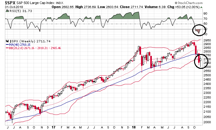
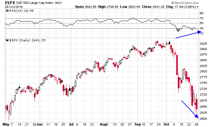
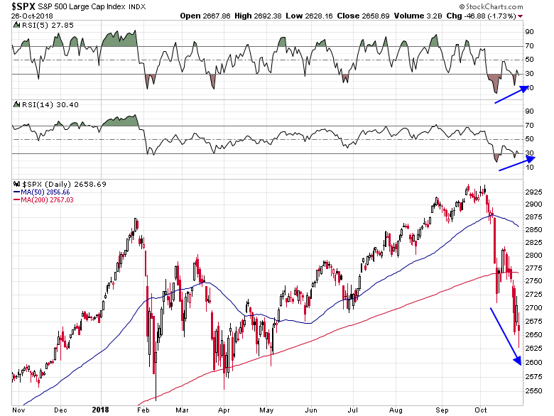
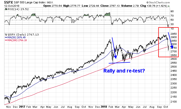
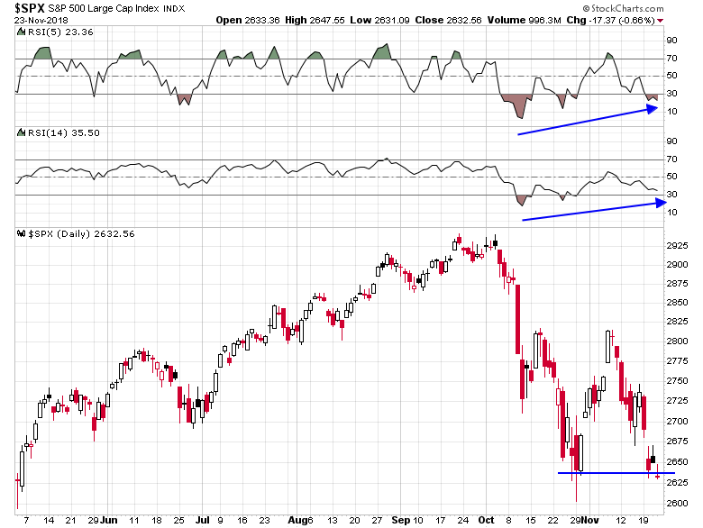
In addition, we are seeing positive RSI divergences across a variety of US equity indices. Here is the SPX.
Here is the NASDAQ Composite.

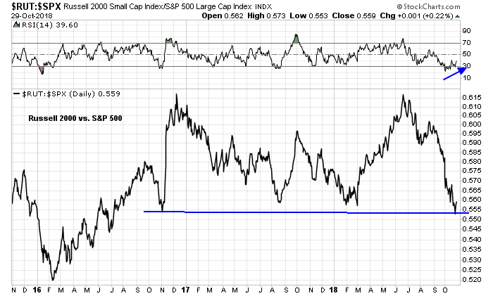
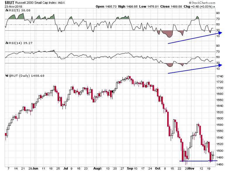
Here is the small cap Russell 2000.
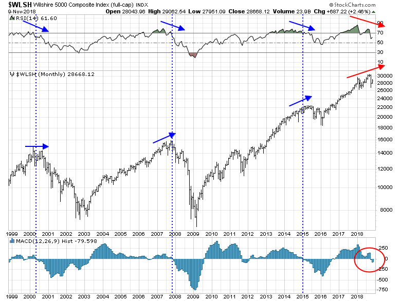
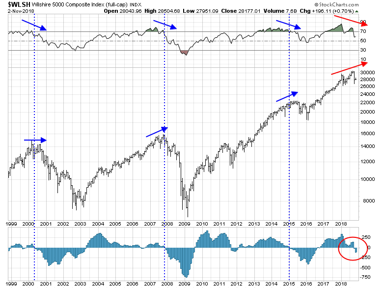
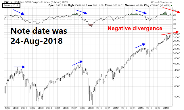
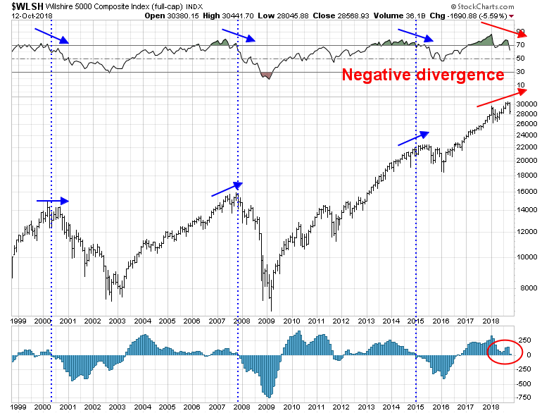
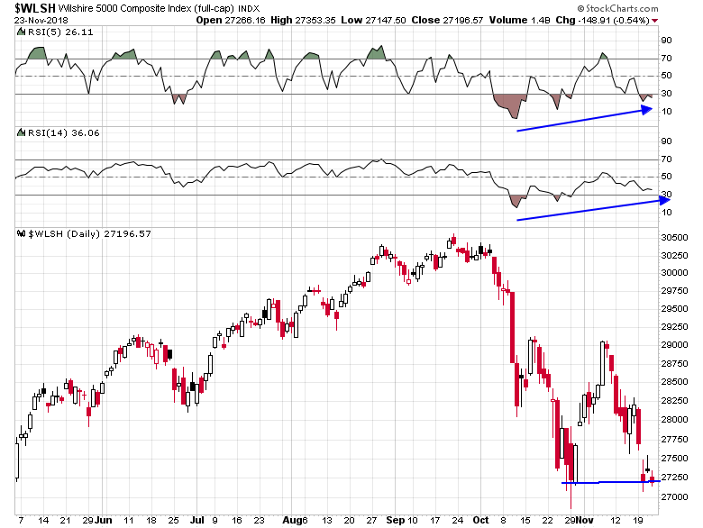
Lastly, here is the broad based Wilshire 5000.
To be sure, oversold markets can become more oversold. Even if you are bearish, the short-term risk/reward of being short here is not good.

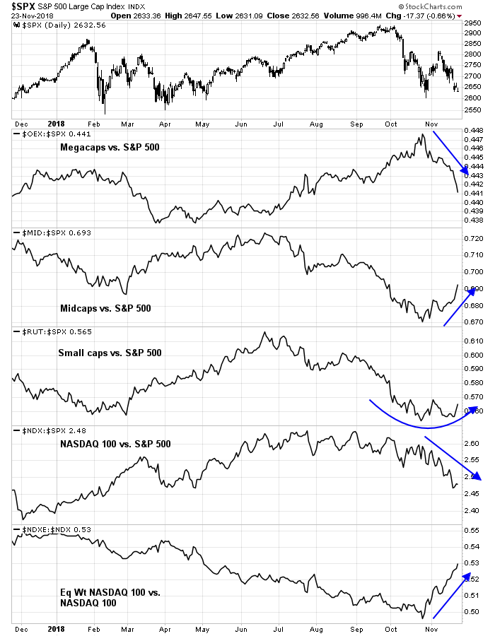
Risk averse traders who don’t want to take a directional bet may find better relative performance in the mid and small cap stocks with a long mid/small cap and short large cap pair trade.
My inner investor has been cautious since late August. My inner trader regrets that he was prematurely bullish, but he remains positioned for a rally.
Disclosure: Long SPXL