Preface: Explaining our market timing models
We maintain several market timing models, each with differing time horizons. The “Ultimate Market Timing Model” is a long-term market timing model based on the research outlined in our post, Building the ultimate market timing model. This model tends to generate only a handful of signals each decade.
The Trend Model is an asset allocation model which applies trend following principles based on the inputs of global stock and commodity price. This model has a shorter time horizon and tends to turn over about 4-6 times a year. In essence, it seeks to answer the question, “Is the trend in the global economy expansion (bullish) or contraction (bearish)?”
My inner trader uses the trading component of the Trend Model to look for changes in the direction of the main Trend Model signal. A bullish Trend Model signal that gets less bullish is a trading “sell” signal. Conversely, a bearish Trend Model signal that gets less bearish is a trading “buy” signal. The history of actual out-of-sample (not backtested) signals of the trading model are shown by the arrows in the chart below. Past trading of the trading model has shown turnover rates of about 200% per month.

The latest signals of each model are as follows:
- Ultimate market timing model: Buy equities
- Trend Model signal: Neutral
- Trading model: Bearish
Update schedule: I generally update model readings on my site on weekends and tweet mid-week observations at @humblestudent. Subscribers will also receive email notices of any changes in my trading portfolio.
The bull and bear cases
In my last post (see A step-wise market advance), I indicated that some of the concerns that overhang the stock market have been alleviated. Falling risk levels should act to put a floor on stock prices. Does that mean that stock prices are ready to rocket to new highs?
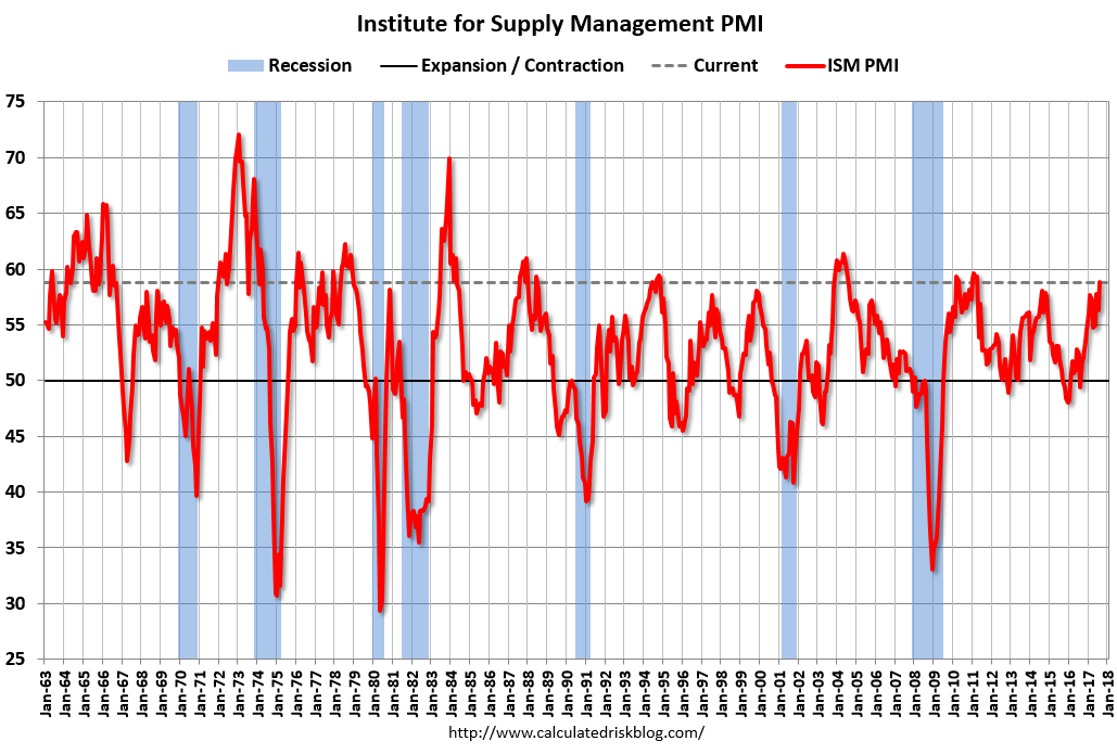
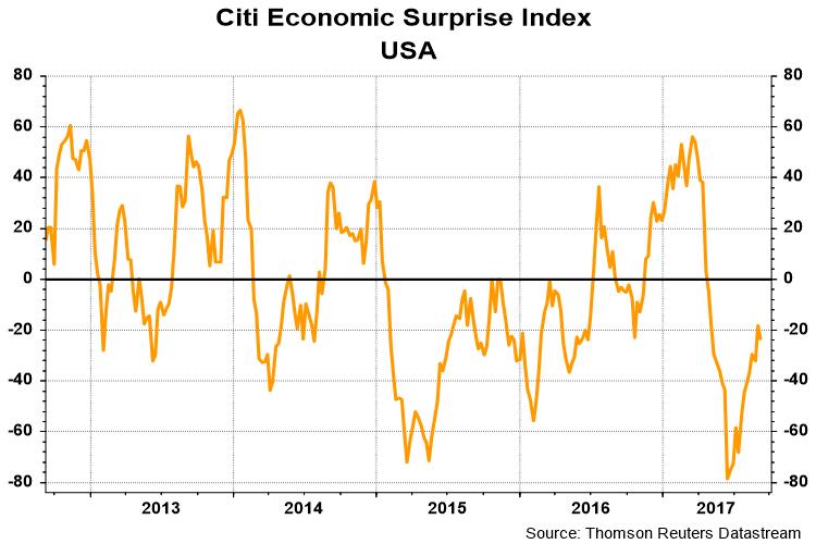
This week, I analyze both the near-term bull and bear cases for stocks. The bull case is based mainly on broad based fundamental momentum, such as continued improvements in ISM.
The bear case, on the other hand, is based on a case of bad breadth.
The bull case
The bull case for equities rests on a combination of positive fundamental momentum, and technical signs indicating that the worst of the decline is over.
Viewed through a fundamental and macro lens, it is difficult to be overly bearish on stocks in the face of improving macro momentum. The Citigroup US Economic Surprise Index, which measures whether macro indicators are beating or missing expectations, is rising.
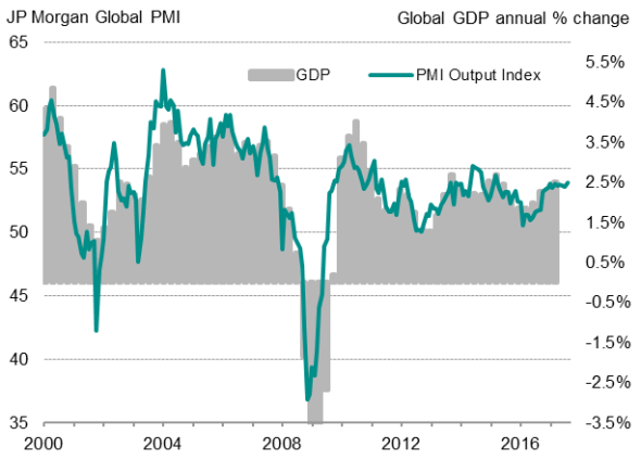
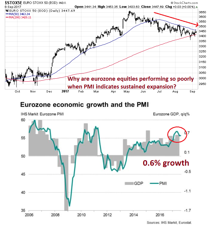
Better macro momentum can also be observed outside the US. Global PMI is strong, indicating robust global economic growth ahead.
From a bottom-up perspective, FactSet reported that forward 12-month EPS continues to rise, indicating Street optimism about earnings growth.
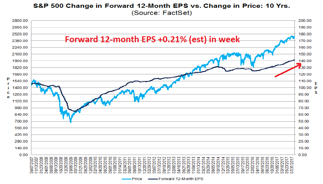
FactSet also observed that Q3 EPS estimates are falling at a far slowing pace than the historical average, which is bullish for positive surprises as we head into Q3 earnings season.

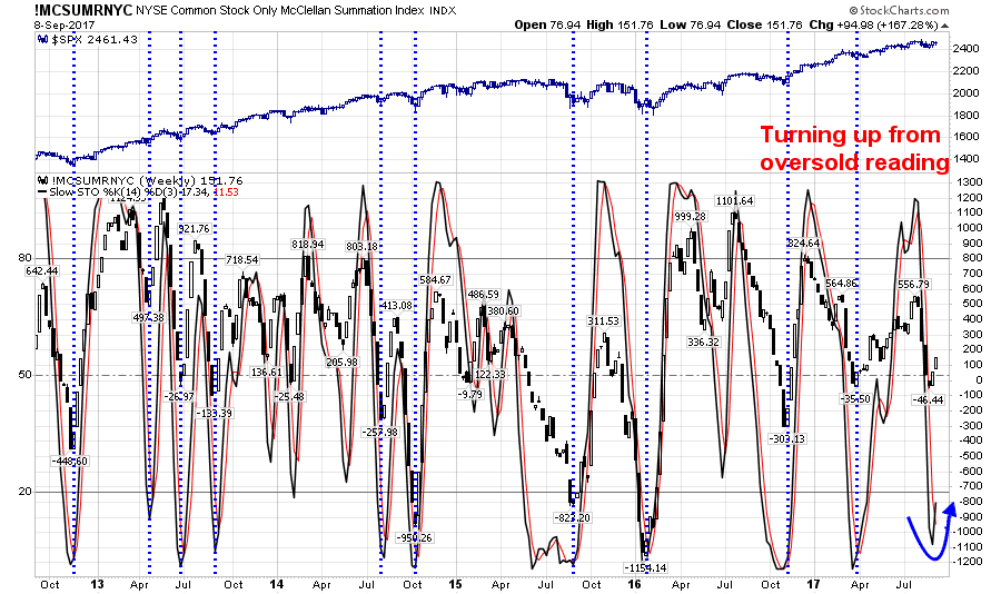
From a technical perspective, there are constructive signs that point to a market bottom. A number of indicators have reached oversold readings and begun to mean revert upwards. These conditions have historically marked decent buy signals.
As an example, the NYSE common-stock only McClellan Summation Index recently got oversold and turned up. The dotted vertical lines indicate similar conditions in the past five years, and they have all been either bullish or shown little downside risk after the signal.
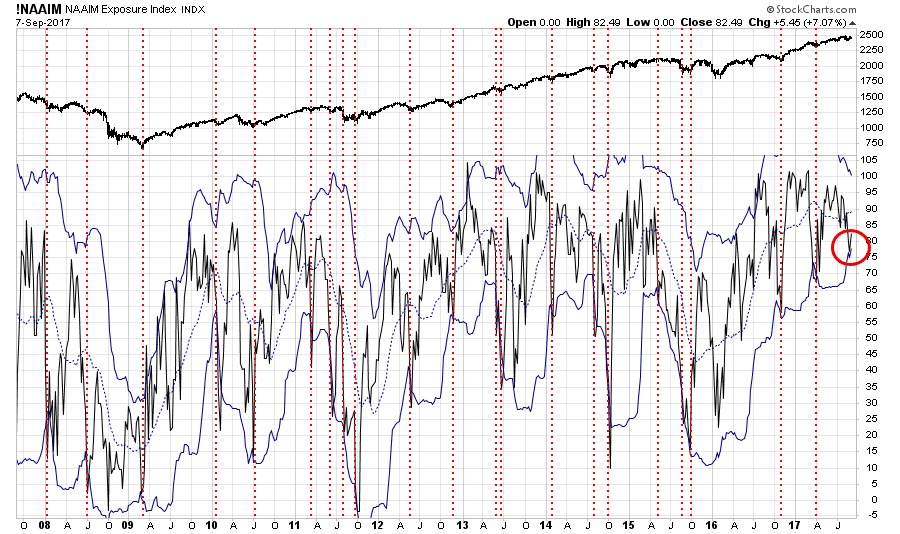
NAAIM sentiment reached a near buy signal two weeks ago and turned up last week. A buy signal is flashed when NAAIM sentiment falls below its lower Bollinger Band. In reality, the indicator did not actually breach its lower BB two weeks ago, but call it close enough for government work. Similarly, the vertical lines indicate past buy signals in the past, which have also been quite good.
Does that mean that the market is ready to go up, up and away? Not quite. Here is what’s bothering me.
The bear case
The main headwind for stocks rests on a case of bad breadth. I don’t mean just bad breadth in the form of narrowing leadership, though there are plenty examples of that.
The bull case for stocks rests on positive fundamental and macro momentum. A tour around the world, however, shows that non-US stocks are actually performing quite poorly in light of the bullish fundamental backdrop. Consider, for example, the eurozone. Can someone explain to me why The Euro STOXX 50 is in a minor downtrend and has difficulty regaining its 50 day moving average (dma) when the macro backdrop indicates a sustained expansion?
Across the English Channel, the FTSE 100 is also trading below its 50 dma. To be sure, the weakness in UK equities could be attributable to investor concerns over Brexit.

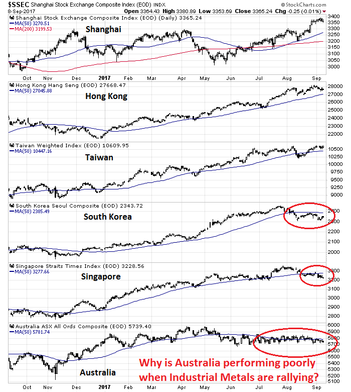
The view from Asia tells a different story. I tend to discount the Shanghai Composite because the Chinese stock market is just a casino and it is not indicative of economic reality. However, the stock markets of China’s major trading partners is a mixed picture. Hong Kong and Taiwan are performing well and have rallied to new recovery highs. The South Korean KOSPI is understandably lagging due to geopolitical jitters over North Korea. But why has Singapore fallen below its 50 dma? As well, the Australian market is surprisingly flat despite the stellar performance of industrial metals, which is shown in the next chart.
As the chart below shows, industrial metals have been soaring. This may be due to speculative demand from Chinese traders, as reports indicate that the price of many metals in China are trading above prices in the west. The industrial metal rally may therefore be a false positive signal of rising global growth.
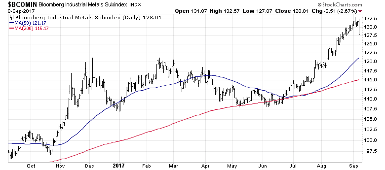
This is confirmed by the far more pedestrian performance of the CRB Index, which represents a broader index of commodities. While the CRB has recovered from the lows made in the summer, it has not strengthened sufficiently to breach its 200 dma.

This does not look like the underpinnings of a broad based and sustainable rally for risk assets.
Watch for the blow-off top
Longer term, the perennially bullish Scott Grannis outlined a possible blow-off top scenario in his post (see Something to worry about). In that post, Scott Grannis fretted about what might happen once confidence returns, as it seems to be happening now. He is worried about a reversal in what he calls “money demand”, which is the inverse of M2 velocity.
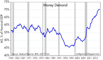
The above chart is arguably the most powerful illustration of how strong money demand has been in the past 8-9 years: the ratio of M2 to nominal GDP. Nominal GDP is a proxy for national income, and M2 is arguably the best measure of readily-spendable money. Think of this chart as measure of how much money the average person wants to hold relative to his annual income. It’s risen from 50% prior to the Great Recession to 70% today. That’s huge, and one of the defining characteristics of the current business cycle expansion—a massive increase in the demand for money…
We now may be on the cusp of a reversal in the huge increase in money demand. With increased confidence, the public is becoming less desirous of accumulating money balances. The growth of bank savings deposits has slowed significantly, and it is now less than the growth of incomes. People may now be desirous of decreasing their holdings of cash relative to incomes. But since cash can’t disappear, the public can only accomplish a reduction in their relative holdings of money by bidding up the prices of other things. Less demand for money means a lower price for money and a higher yield on money, plus higher prices for things and eventually higher nominal incomes. That’s another way of saying that a decline in money demand is likely to result in an increase in inflation—unless the Fed takes offsetting measures.
Once confidence returns, monetary velocity will rise, and all of those pent-up savings that is a major component of M2 will have to go somewhere. Some of it will go into spending, which raises growth; and some will go into investments, which raises asset prices. The result is rising prices and inflation.

There is technical support for the Grannis rising inflation thesis. Sector rotation analysis using Relative Return Graphs (RRG) reveal a theme of emerging late cycle leadership consisting of inflation hedge sectors.

From a different perspective, here are the market relative charts of gold, energy, and mining stocks in the US and Europe. They all show constructive patterns of relative bottoms and different degrees of emerging market leadership.

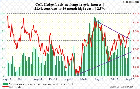
That said, the short-term outlook for inflation hedge vehicles is fraught with risk. Commitment of Traders analysis from Hedgopia indicate that large speculators are in a crowded long in gold. Tom McClellan also pointed out that the public is chasing gold, as GLD asset levels have surged.
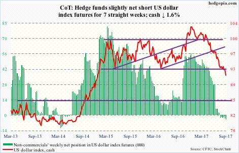
As well, there is a crowded short in the US Dollar, which is inversely correlated to commodity prices.
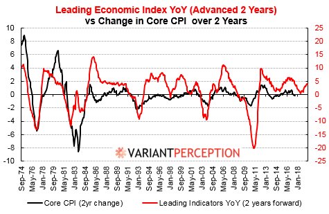
My base case scenario calls for several weeks of sideways stock market consolidation, followed by an upside breakout to new highs led by late cycle inflation hedge vehicles. Despite all of the recent hand wringing by Fed speakers about tame inflationary pressures, Variant Perception pointed out that inflation is just around the corner.
The week ahead
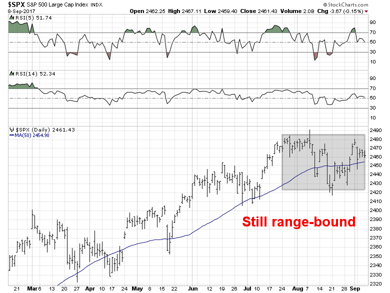
Current market conditions, however, show a market in need of a period of consolidation, as directional moves have been lacking in conviction.
The behavior of market psychology has been puzzling. On Friday, stock prices ended the day with a slight loss, in the face of a major hurricane about to hit Florida on the weekend, as well as a rumored North Korean missile test on September 9. The bears’ inability to push the market down in anticipation of bad news is bullish and indicates that most of bad news is already in the market. On the other hand, futures dropped after the close on Wednesday when the WSJ reported that Gary Cohn was a long shot to be the next Fed chair because of his post-Charlottesville criticism of Donald Trump. In fact, he was said to be more likely to get the electric chair than the Fed chair.
Bottom line: the market is directionless and reacts to the headline of the day.
Breadth indicators from Index Indicators provide few clues to market direction. Short-term breadth (1-2 day horizon) are in neutral territory, with a slight negative momentum bias.
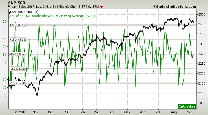
Longer term models (1-2 week horizon) are showing similar neutral readings, but with a positive momentum bias.

My inner investor is neutrally positioned at his investment policy equity weight. My inner trader is slightly short the market. He is inclined to tactically buy should prices weaken to the bottom of the range, and sell or raise his short positions should the market strength to the top of the range.
Disclosure: Long SPXU
Cam,
Thanks for another excellent analysis.
I think the Euro markets have been in a downtrend because of the currency’s appreciation.
I can’t paste it here, but I just plotted the DAX against EURUSD for the last three months, and it shows a near perfect inverse correlation.
Brian
Good analysis tho the title is misleading. Might throw non-subs off! 🙂
Could you reference example blow-off tops of the past, so we can refresh on what is expected for us?
Louis
Cam, has referenced this in the last three months or so, under a series of missives, titled “What you do not expect at a bear market bottom”, I think. He has also referenced Savita Subramaniam from B of A (and others), with expectation of final blow offs to be about 30% higher, than where we are, give or take, with valuations climbing unto nose bleed territories. I would send you a link, but do not remember the exact article. Such blow off tops were seen circa year 2000 and 2007, however, PE ratios in 2007 were much lower than in year 2000.