Preface: Explaining our market timing models
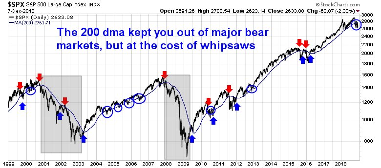
We maintain several market timing models, each with differing time horizons. The “Ultimate Market Timing Model” is a long-term market timing model based on the research outlined in our post, Building the ultimate market timing model. This model tends to generate only a handful of signals each decade.
The Trend Model is an asset allocation model which applies trend following principles based on the inputs of global stock and commodity price. This model has a shorter time horizon and tends to turn over about 4-6 times a year. In essence, it seeks to answer the question, “Is the trend in the global economy expansion (bullish) or contraction (bearish)?”
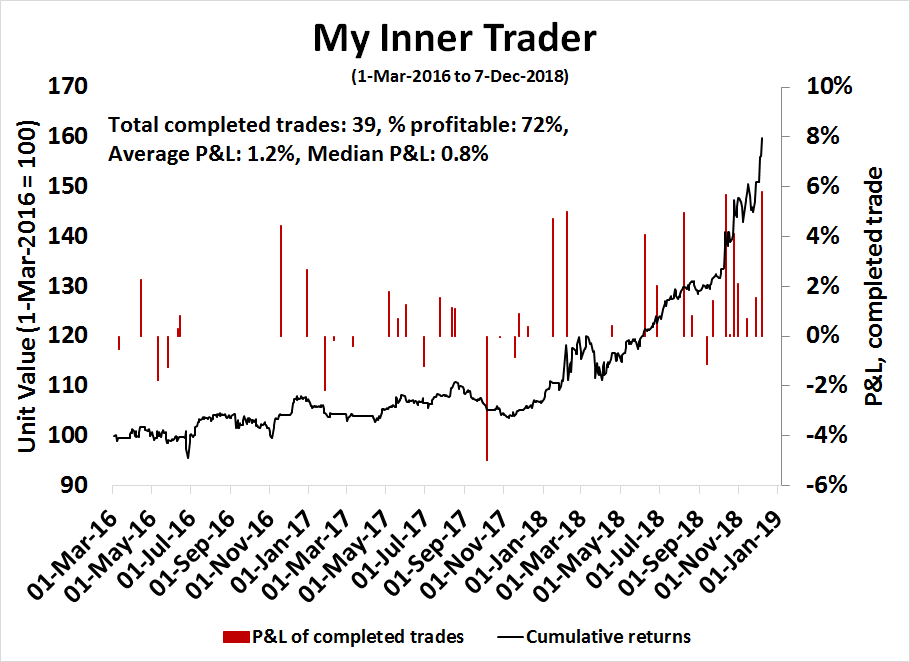
My inner trader uses a trading model, which is a blend of price momentum (is the Trend Model becoming more bullish, or bearish?) and overbought/oversold extremes (don’t buy if the trend is overbought, and vice versa). Subscribers receive real-time alerts of model changes, and a hypothetical trading record of the those email alerts are updated weekly here. The hypothetical trading record of the trading model of the real-time alerts that began in March 2016 is shown below.
The latest signals of each model are as follows:
- Ultimate market timing model: Sell equities
- Trend Model signal: Bearish
- Trading model: Bullish
Update schedule: I generally update model readings on my site on weekends and tweet mid-week observations at @humblestudent. Subscribers receive real-time alerts of trading model changes, and a hypothetical trading record of the those email alerts is shown here.
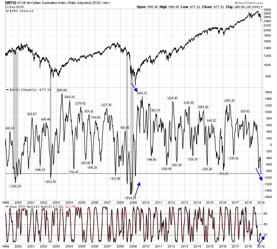
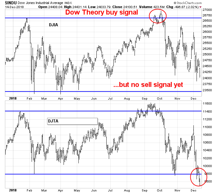
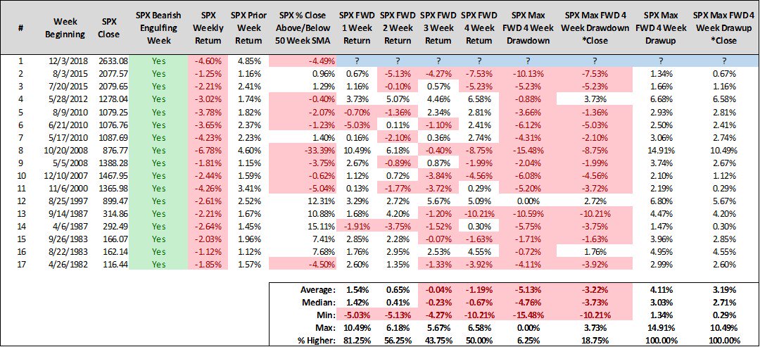
Bottom spotting
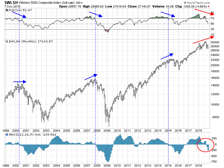
The outsized daily swings in the major US equity averages tell the classic story of a bear market. Normal bull markets simply do not experience consecutive multiple daily moves of 2% or more.
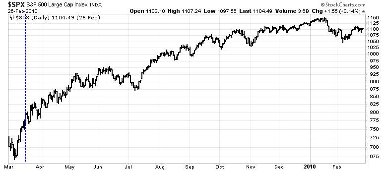
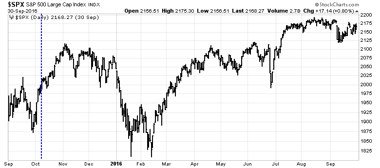
The market’s panicked price action is highly reminiscent of past panics in 1962, 2002, and 2015. In those cases, the market bounced, and made a lower low several months later. In all cases, stock prices were higher a year later.
My base case scenario calls for an initial low, rally, followed by choppy price action, and a final low within 6-8 months. The most recent exception to this rule was 2001-2002, when stock prices cratered in the wake of the 9/11 attack, but made the final low just over a year later. Arguably, the 2002 low was distorted by the 9/11 shock, and the market made a double bottom in 2002 within the space of three months.
At this point, market psychology is becoming its own reality, and psychology may wind up dominating intermediate term market action. This week, I go bottom spotting as I offer a checklist of the signs of a market bottom, and try to estimate the downside risk posed by the current bear market.
A market bottom template
In a recent Forbes article, Brett Steenbarger studied the psychology of past major market bottoms and found a number of common elements of an initial drop, rally, and a second decline that violates the previous low:
Perspectives from market history are helpful here. Nothing progresses in a straight line. If you look at the history of big bear markets, there is usually a harrowing initial decline lasting several months followed by a rally that retraces a decent portion of the drop, taking out the bears. It is from that lower high that the major part of the damage from the bear occurs. Let’s examine some examples:
Initial Drop: June, 1901 – December, 1901 – Dow 78.26 – Dow 61.52
Rally: December, 1901 – April, 1902 – Dow 61.52 – Dow 68.44
Bear Decline: April, 1902 – November, 1903 – Dow 68.44 – Dow 42.15
Initial Drop: September, 1929 – November, 1929 – Dow 381.17 – Dow 198.69
Rally: November, 1929 – April, 1930 – Dow 198.69 – Dow 294.07
Bear Decline: April 1930 – July, 1932 – Dow 294.07 – Dow 41.22
Initial Drop: January, 1973 – June, 1973 – Dow 1051.70 – Dow 869.13
Rally: June, 1973 – October, 1973 – Dow 869.13 – Dow 987.06
Bear Decline: October, 1973 – December, 1974 – Dow 987.06 – Dow 577.60
If we look at more recent bear market periods, a similar pattern emerges. The initial declines from March, 2000 to April, 2000 (particularly steep in the NASDAQ Index) and from October, 2007 – January, 2008 were followed by nice bounces (April, 2000 to August, 2000 and January, 2008 to May, 2008) and then by steep declines into bear lows (August, 2000 to October, 2002 and May, 2008 to March, 2009).
Here is where the psychology part comes in:
It isn’t necessary to resort to mystical wave counts, Fibonacci levels, and chart patterns to explain what happens in bear markets. It’s all about stopping out the crowds. The euphoric bullish crowds are stopped out on the initial down leg; the desperate bears are stopped out on the rally leg; and the now comfortable bulls (and remaining longer-term bulls) are stopped out on the bear move to lows.
Rinse and repeat.
In other words, bear markets are markets of maximum pain for both bulls and bears.
A market bottom checklist
I do not know if the market has made its initial bottom. My preliminary assessment of the market action suggests that it has not, but that is only a guess. Nevertheless, here is a checklist that the stock market is starting to make a bottom. Not all of them have to occur, but the more items in the list that have been checked off, the greater confidence I have the market has bottomed.
Wait for a Tesla blow-up. Every bear market and recession unwinds the excesses of the previous cycle. Tesla is one of the icons of the excesses of the current expansion. The company has never has been cash generative, and relies on its creditors to finance its growth and operations. As the credit cycle turns down, the market will be less inclined to extend credit to cash eating concept companies like Tesla. In addition, the company faces severe competitive threats from incumbent manufacturers in electric vehicles. Consumer Reports recently highlighted luxury electric cars being unveiled by established manufacturers like Jaguar, Mercedes, Audi, and Porsche, some of which are already in dealer showrooms. All of them are far less likely to suffer from production delays and quality problems that have plagued Tesla.
So far, the stock is holding up well. An implosion in a cash eating concept company like Tesla will be one sign of credit market capitulation.
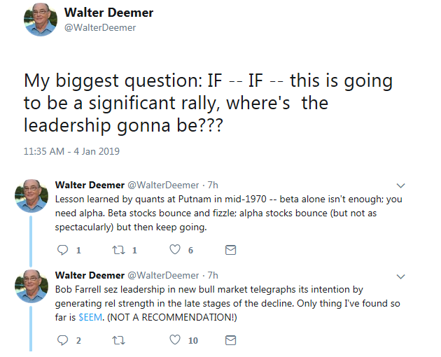
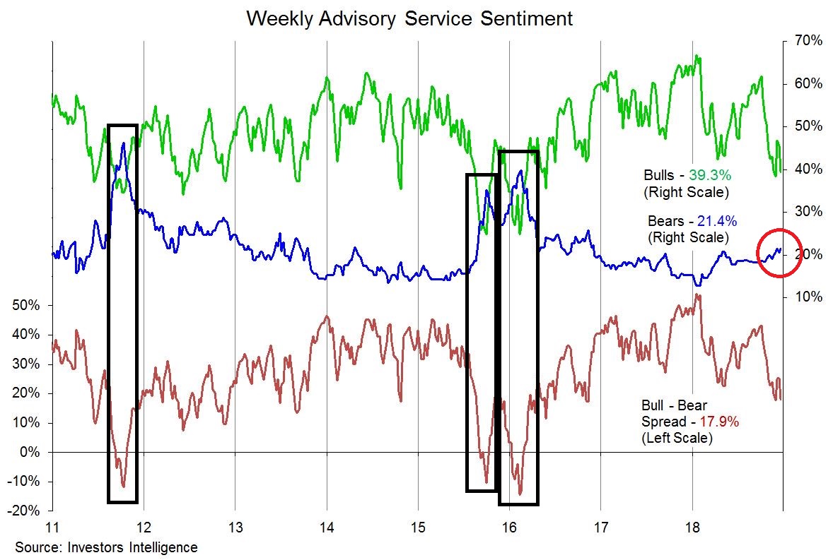
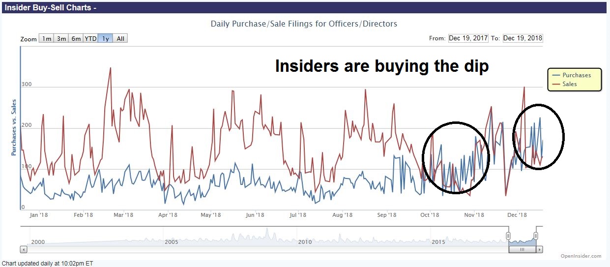
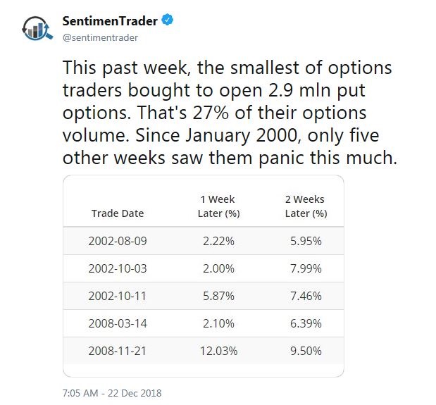
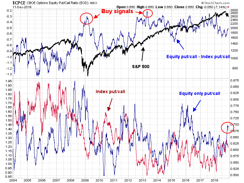
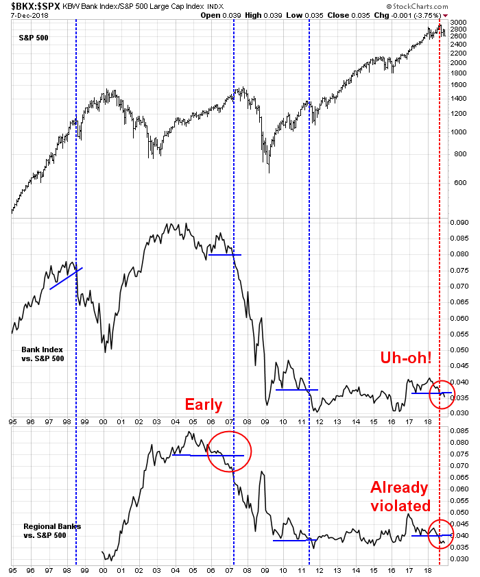
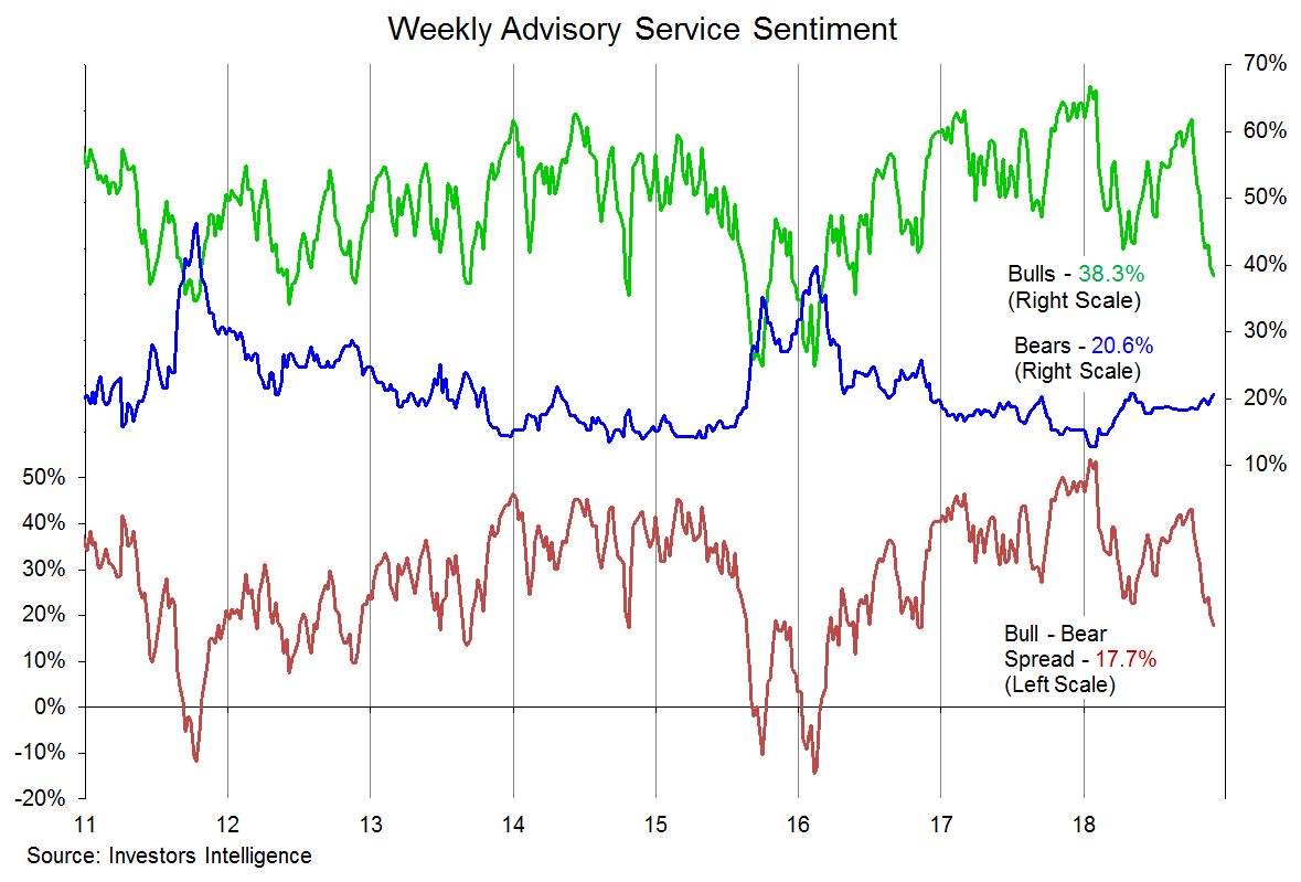
Wait for signs of investor capitulation: While short-term sentiment models have all reached off-the-chart panic levels, longer term indicators show that investor sentiment remain relatively complacent. At a minimum, I would like to see II % Bears rise above % Bulls as a pre-condition for a durable market bottom.
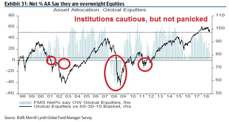
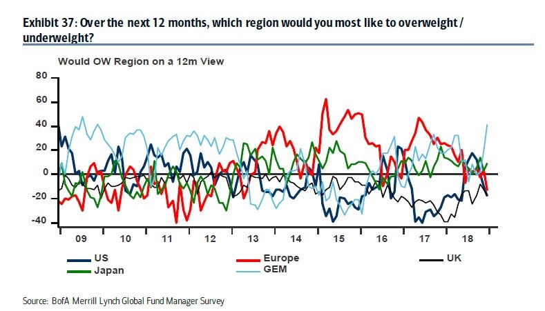
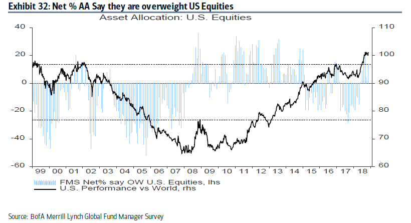
While institutions have become increasingly cautious, they have not panicked yet. One of the signs of institutional capitulation would see the BAML Fund Manager Survey show an underweight in equities.
Wait for absurdly cheap valuation. Scott Grannis recently observed that the equity risk premium (ERP), which he defined as the earnings yield (E/P) minus the 10-year Treasury yield, is cheap. While stocks are attractive, they are not the absurdly cheap levels that we would see during a market capitulation that takes out the “comfortable bulls” (in the words of Brett Steenbarger above).
How absurdly cheap? How about Apple (AAPL) at 100, when Buffett started accumulating his position, and where Berkshire’s holdings in AAPL is over 10x what it was when they began buying in early 2016? While those levels may only be a dream, such levels are possible during a market panic.
Wait for the high profile Berkshire rescue: So far, we haven’t seen a credit crisis yet. In past credit crises, Warren Buffett has managed to use the cash hoard and balance street strength of Berkshire Hathaway to rescue and backstop troubled companies at highly favorable terms. Examples include Goldman Sachs at the height of the GFC, and more recently Canada’s Home Capital Group, whose stake Berkshire exited in December. Watch for a Berkshire rescue as a sign that the credit risk frenzy has reached its peak.
How far down can stocks fall?
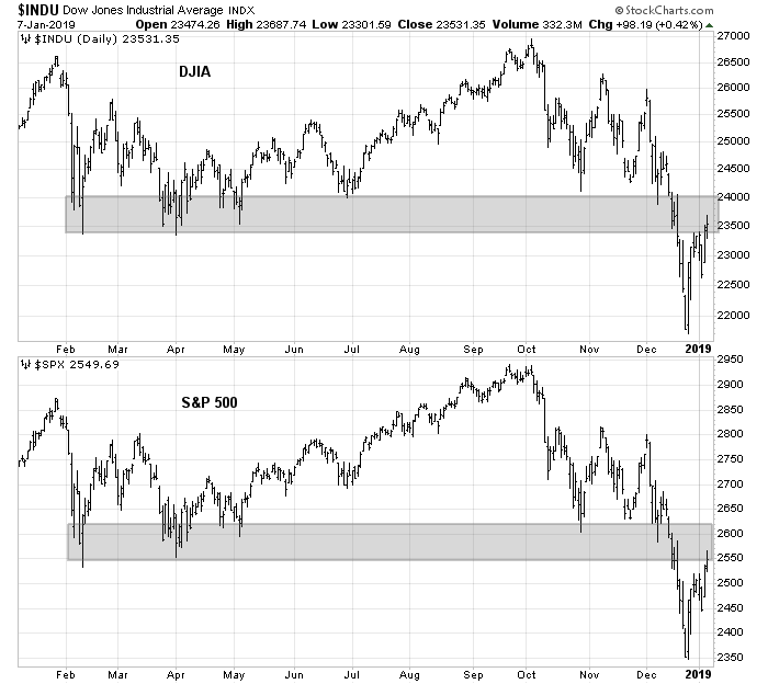
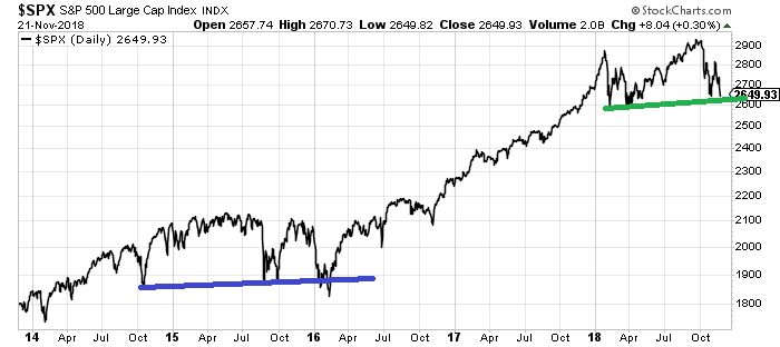
I am often asked about the downside risk potential in the US equity market. It is difficult to answer that question without knowing the fundamental reason for the bearish episode. From a chartist’s viewpoint, however, a reasonable round number initial downside S&P 500 target would be 2100, which represents both a Fibonacci retracement level, and a zone of resistance now turned support.
Much depends on the perceived reason(s) for the price decline. Until we can diagnose the fundamental reasons for the market weakness, it is impossible to determine and calculate a downside price target.
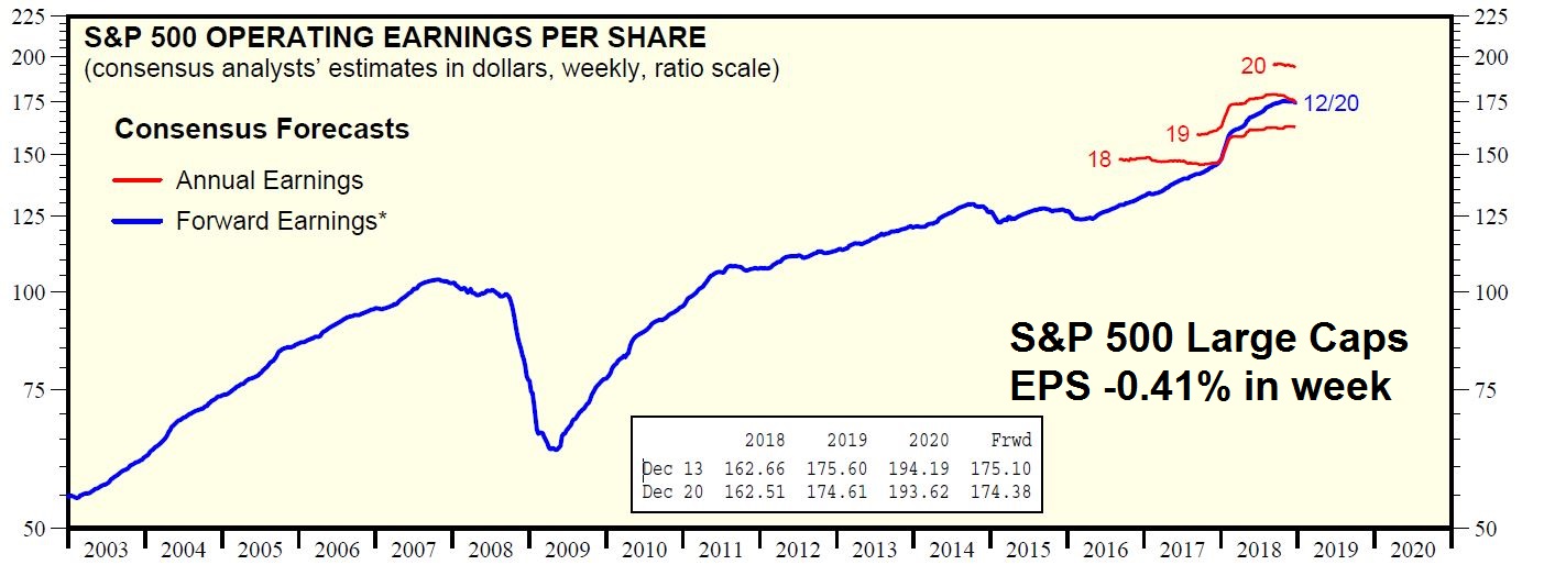
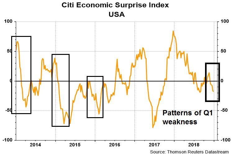
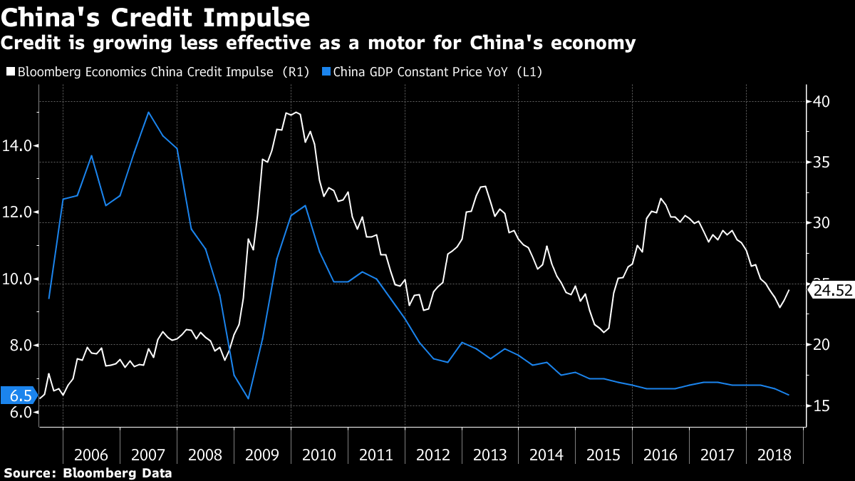
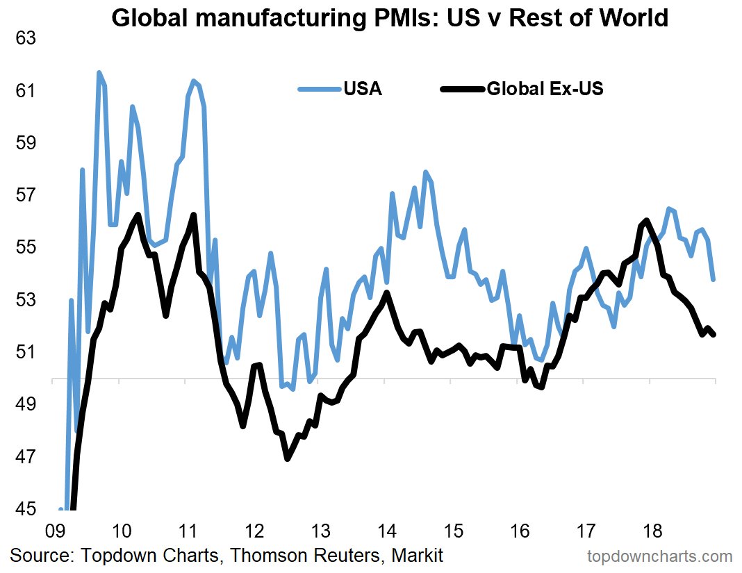
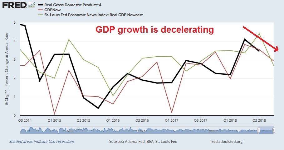
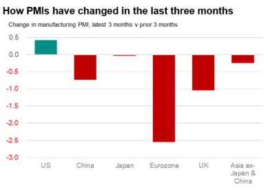
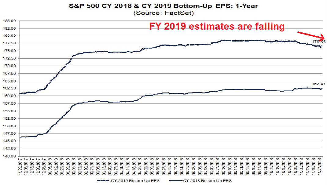
There are some good fundamental reasons for a bearish episode. Last week, I had attributed the decline to the market discounting an economic slowdown in H1 2019 (see What just happened in the stock market?). Further confirmation of this thesis came from two sources. Near Deal democrat, who has been monitoring high frequency economic data and splitting them into long leading, short leading, and coincident indicators, wrote this week that his short leading indicators has deteriorated from positive to neutral. The weakness that began showing up in his long leading indicators six months ago is now becoming evident in his short leading indicators.
As well, JPM Research pointed out that estimate revisions had been falling in non-US market for much of 2018, and the US is just now playing catch-up. Is it any wonder why US equities are under pressure and underperforming global markets in December?
However, a H1 slowdown does not mean a recession, but further growth deterioration into recessionary conditions is likely to exacerbate downside risk. However, all bets are off if the Sino-American trade truce heats back up into a trade war.
The tea leaves are mixed. Mid-level officials from both sides are scheduled to meet in early January. The Economist reported that China have prepared a series of concessions:
Chinese negotiators are focusing on two themes, according to people familiar with the talks. First, they are walking away from the “Made in China 2025” plan, a blueprint for turning the country into an advanced manufacturing power. Foreign businesses object to it because it specifies market-share targets for China in sectors from biotech to robotics. Chinese officials have already downplayed its significance, describing it as a vague, aspirational document. References to it have all but vanished from state media. Now, the government appears ready to rescind it formally. Even the Global Times, a nationalist state-owned tabloid, has called for a new plan.
Second, the government wants to show that foreign companies play on a level field. Liu He, the lead Chinese trade negotiator, has asked the central bank to devise guidelines for how “competitive neutrality” would work in China, according to someone briefed on the project. The idea, promoted by the oecd rich-country club, is that state-owned companies can form part of a healthy market economy provided they enjoy no special advantages. China will try to convince Mr Trump that it is serious about meeting this standard.
On the other hand, Reuters reported that the White House is considering an emergency executive order banning Huawei and ZTE equipment in American networks. Such a move would send a chilling signal to China that the Americans plan to shut them out of the crucial 5G market, and cripple Beijing’s industrial policy of migrating up the value chain, It would most certainly stall any progress in trade talk and heighten the risk of Cold War 2.0.
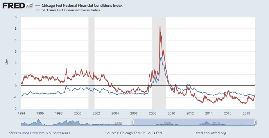
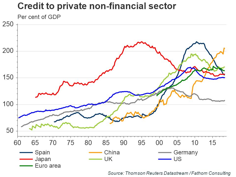
In addition, I had also highlighted last week a BIS paper that warned about financial risk, and how the financial cycle was different and distinct from the business cycle. Former Dallas Fed president Richard Fisher recent appeared on CNBC and worried out loud about the risk of possible financial contagion from Europe. Fisher stated that the ECB had pushed bond yields into negative territory for so long that it was bound to create excesses. Since the eurozone is the second largest credit pool in the world outside of the US, the risk of financial contagion is high should Europe plunge into recession.
Indeed, the risk of a European recession is rising. Bloomberg reported that over half of Germany’s small and medium sized businesses expect a contraction next year. If Germany, which is the locomotive of the eurozone, were to slow, what happens to the rest of Europe? What happens to its banking system?
Trump unbridled
The final risk posed to the markets is the unpredictability of Trump’s behavior. About a year ago, I suggested that 2018 would be the year of “full Trump” (see Could a Trump trade war spark a bear market?) which would signal an abrupt shift in policy after his dramatic tax cut victory. Indeed, the rhetoric on Trump specific initiatives, such as rising trade tensions, holding China to account, and the Wall, have become far more prominent in 2018.
The risk in 2019 is that “full Trump” becomes “Trump unbridled”, which will cause greater anxiety for the markets. To be sure, Trump did not cause the stock market to fall, but his recent behavior has rattled Wall Street that is likely to exacerbate downside risk, in a similar manner that the widespread use of portfolio insurance hedging techniques exacerbated price risk in the Crash of 1987.
Official Washington was recently unnerved by a series of events out of the Trump administration, such as the abrupt decision to pull troops out of Syria; the Mattis resignation; the impasse over the government shutdown in which Trump initially proclaimed that he would be glad to “own the shutdown” and later laid responsibility for the shutdown to the Democrats; the leaked story that Trump was so unhappy with Powell that he was seeking to fire the Fed chair; and Secretary Mnuchin’s bizarre announcement on Christmas Eve that he had consulted the heads of major US banks and assured that the market that there was plenty of liquidity when there was no apparent liquidity problem.
FT Alphaville nailed the issue on the head when it reported that Mattis was concerned about the lack of a decision making process within the Trump administration:
Last week after James Mattis resigned, Alphaville spoke to a former administration official who was familiar with the Defence Secretary’s relationship with President Trump. That conversation became a small part of a broader FT story, but what stood out for us was this: Mr Mattis wasn’t just concerned that the White House was making bad decisions. He was concerned that the process to make decisions had disappeared.
Here’s the former official:
I think over time it likely became more apparent to the secretary that the president had begun to seek out his counsel less on major decisions. And the manifestation of that was a widening in the rhetoric and the substance, in the policy decisions that were made not necessarily as part of an orderly national security staff or national security council process, but rather by either a small group in the white house or by the president himself… If you precipitously withdraw with no apparent process, do so via tweet, and not with the consultation of allies, not with the consultation of senior uniformed military personnel, that is anathema to both process and the ability to achieve a sustainable posture that defends the country.
The President of the United States is not Louis XIV, the Sun King of France who wielded absolute power at his whim and discretion, “L’etat, c’est moi.” The US government has a process to making decisions, and the process can help avoid bad decisions. If you don’t like the decision, change the process, or the people involved in the process:
Normally, US presidents stand at the end of a long chain of people preparing them to make decisions. Presidents get scenarios, consequences, precedents, and so even though they often make bad decisions, we seldom see them make disorienting, head-scratchingly weird decisions. On a football pitch, we might see a wing make a hopeless cross into traffic. That’s a bad decision. But we never see a wing, say, pick the ball up off the field and shower it with glitter. That’s a weird decision. It’s not how anyone does football.
Good process limits a president to actions that are possible and plausibly legal, with at least guesses on consequences, plans to carry them out and a gut check that we’re not all throwing glitter on a football.
FT Alphaville went on and dissected the unusual nature of the Mnuchin Christmas Eve incident:
In its annual report this year, the US Financial Stability Oversight Council worried about a couple of things, in particular non-financial corporate borrowing, and how that might feed into a stock-market slump. But the council didn’t show much worry at all about whether the six largest US banks could meet their immediate obligations.
Of all the things that have failed to improve over the last decade, exactly these banks are in fact better capitalised now, and subject to more careful macroprudential oversight. Look here: the Fed’s Comprehensive Capital Analysis and Review says the largest US banks held an aggregate capital ratio of 12.3 per cent last year. That’s great! It’s not 20 per cent, and we have quibbles about risk-weighting of assets, but still.
In evaulating these banks, the Fed even subjects them to hypothetical, stressful financial markets scenarios that are way worse than what we’re seeing in reality now: 2-1/4 per cent drops in GDP growth, 7 per cent unemployment, 30 per cent troughs in stock indices. And that’s not even the Fed’s worst hypothetical. Those banks that Steve Mnuchin called this weekend: they are the last item in a long list of what people in financial markets might be worried about.
And now, literally on the night before Christmas, after determining that a thing that is not a problem is not a problem, the Secretary of the Treasury of the United States of America is convening the President’s Working Group on Financial Markets, an organisation that doesn’t really exist. It doesn’t have an office, or legal authority, or even employees. There’s an executive order from 1988 that says the president can tell several department and agency heads to get together and talk, then report back to the president. The working group is a way for a president to say HELLO AMERICA I AM DOING A THING.
In other words, good processes keep you from making rookie mistakes. The current administration has demonstrated a series of rookie mistakes, starting with the ham-fisted implementation of the travel ban when Trump first assumed office.
Trump has been behaving like he is the chief executive of a company he controls, which he is not. He is the head of a government, and the government has checks and balances that he has chafed against. To be sure, he was elected to disrupt official Washington, but the lack of process and his assumption of king-like absolute power is leading to uncertainty. Markets hate uncertainty, and a year of Trump unbridled will raise uncertainty and lower equity returns.
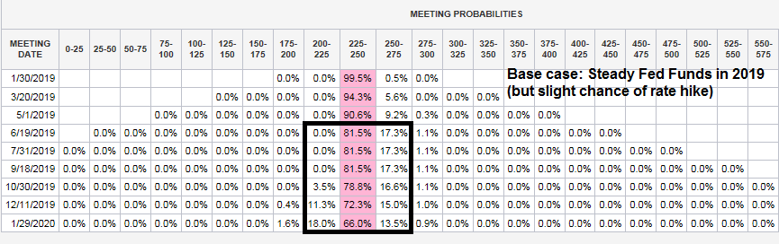
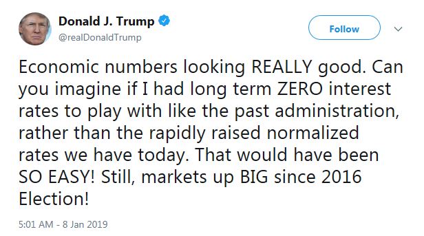
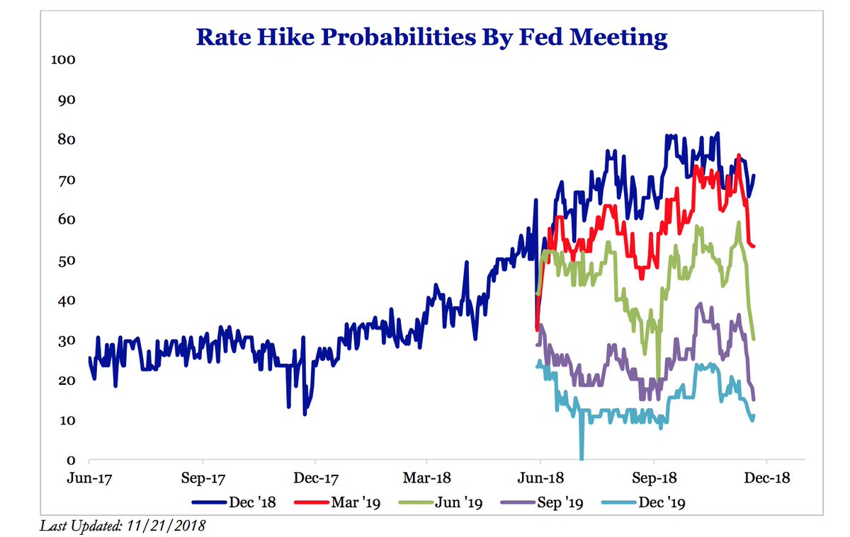
Consider, for example, Trump’s unhappiness with Jay Powell and the Fed’s decision to raise interest rates in December. There are reports that Trump and Powell are expected to meet in the next few months. There is little upside to the meeting and plenty of downside potential.
Here is how the meeting may be resolved. It is clear the Trump and the Fed are involved in a skirmish over monetary policy, but how do you downplay the skirmish in the aftermath of the meeting? Could Trump tweet a mis-characterization of what was discussed in order to declare victory and put himself in a favorable light? Even if an uneasy truce were to be achieved, could some future event cause Trump to violate the understanding and claim that the Fed is acting in bad faith? Worse still, what if Trump were to downgrade Powell’s position as Fed chair to governor and appoint a new Fed chair? Could Senate Republicans rebel and refuse to confirm the new nominee? There are actually two chairmanships, and the most important one is the chair of the FOMC. Could the members of the FOMC, composed of Fed governors and regional Fed Presidents, rebel and elected Powell as the FOMC chair? Just imagine the uncertainty and the market effects.
The markets would react badly even if Trump got his way and he was able to dictate monetary policy. In the modern era, only EM countries have seen the government dictate monetary policy. Argentina and Turkey are two examples that come to mind. The stock markets of those countries generally trade at single digit P/E ratios. Is that the outcome that Trump wants?
We haven’t even seen the Democrats take control of the House committees and launch investigations. The results of the Mueller probe should become clearer in 2019. In all likelihood, a 2019 year of Trump unbridled, with no government processes to constrain his actions, is going to create more volatility for the markets.
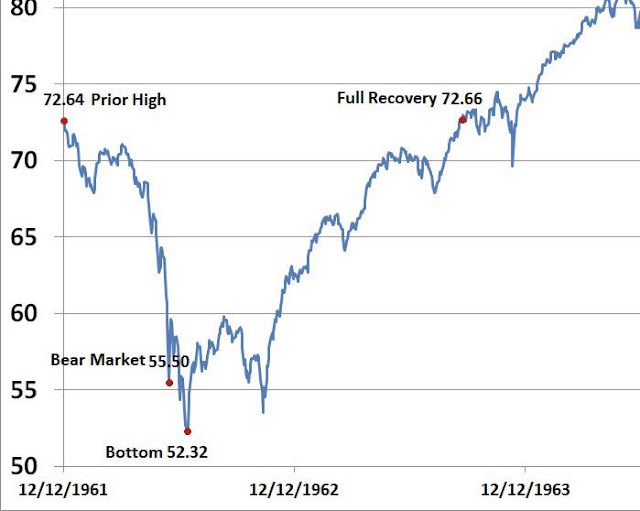
The 1962 market template
The stock market of 1962 may be a useful template for investors. While Trump is not JFK, and JFK is not Trump, a study of the market reaction to the Kennedy era may be revealing for insights into the market reaction to strong-arm presidential tactics against business, as well as market psychology when the economy sidestepped a recession.
JFK became President in 1960, and he was elected as an outsider and disruptor, much like Trump. Kennedy proceeded to embark on a serious foreign policy misadventure, namely the disastrous Bay of Pigs invasion of Cuba. Trump has alienated numerous allies, and parted ways with his Secretary of State and Secretary of Defense.
JFK went outside traditional norms and attacked the steel industry. He went on to send FBI agents into the offices and homes of steel executives. The steel companies eventually caved, but the “Kennedy Slide” began in December 1961, sparked by a “businessman’s panic” of what industries Kennedy might target next. The market bottomed coincided with the height of the Cuban Missile Crisis. 1962 was not a recession year.
 |
| S&P 500 |
Trump has broken virtually all the norms of Washington, and one of his signature initiatives is to strong-arm companies from offshoring jobs. He has attacked traditional allies, and spooked the markets with his protectionist measures.
History doesn’t repeat itself, but rhymes. While I am definitely not suggesting an end-of-world nuclear button crisis in the near future, the 1962 experience may serve as a useful roadmap for what investors may expect in 2019, even if the economy were to sidestep a recession. Trump’s unconventional approach to policy making is likely to keep the market on edge for 2019 and beyond.
In conclusion, the technical price action of the market is consistent with a bear market. I have offered a checklist of events that occur at market bottoms, but I do not know where the market may bottom out. Much depends on the fundamental drivers of the bear market, policy risk from both the White House and Federal Reserve, and how they are ultimately resolved.
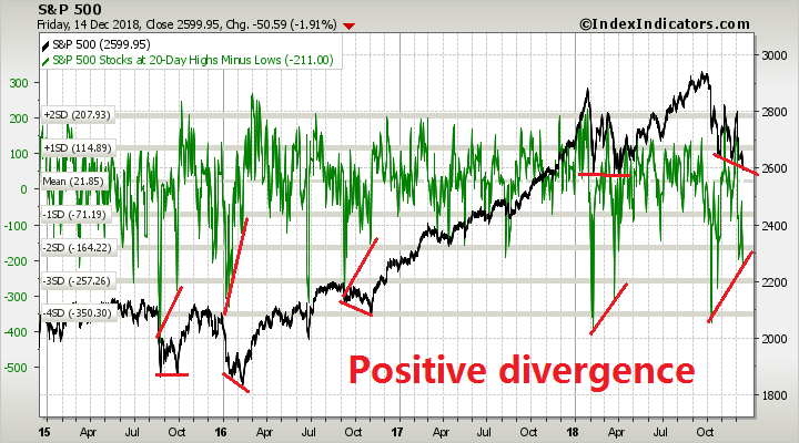
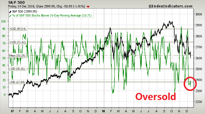
The short-term outlook
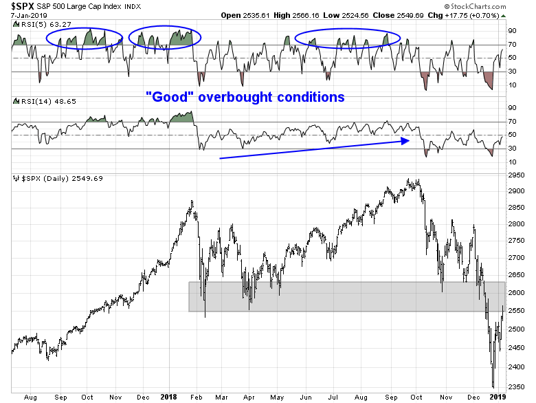
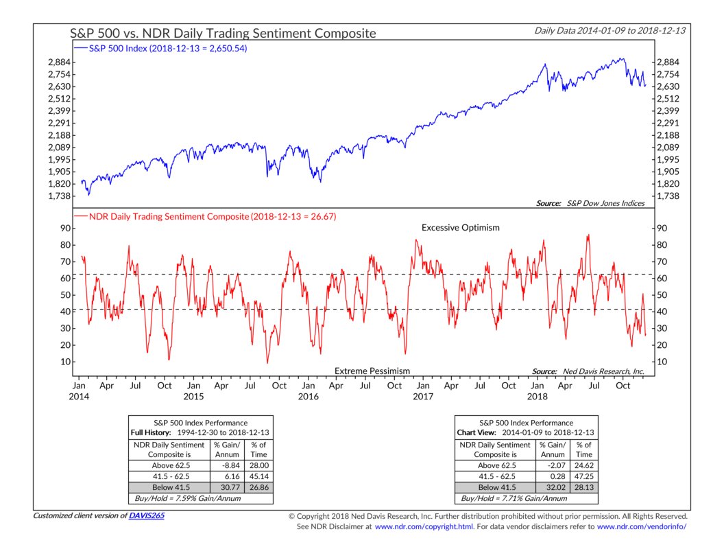
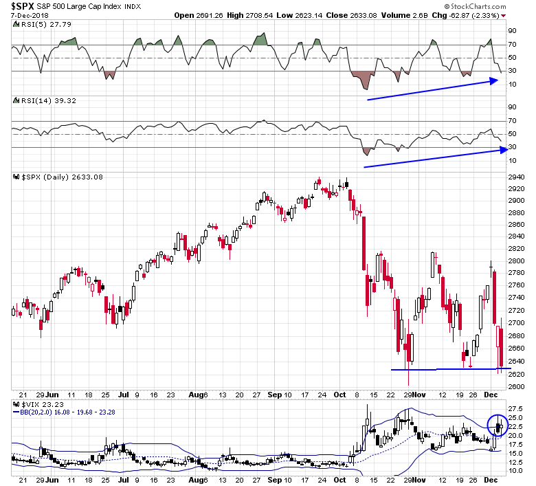
Looking ahead to the next few weeks, stock prices constructively bounced after experiencing a deeply oversold condition. Mark Hulbert observed that sentiment became even more bearish even after the nearly 5% rebound last Wednesday, which is contrarian bullish:
Early indications are encouraging in this regard, since the average market timer reacted to Wednesday’s big rally by actually becoming even more bearish. The Commentariat also appears to be solidly bearish, confidently announcing that the bear market remains alive and well, as evidenced on MarketWatch Thursday morning by Michael Sincere and Lawrence McMillan.
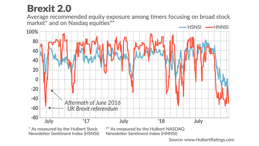
Hulbert’s sentiment readings of newsletter writers is in the bottom 4%, and NASDAQ timers is in the bottom 3%:
Consider the average recommended equity exposure among a subset of short-term stock market timers I monitor, as measured by the Hulbert Stock Newsletter Sentiment Index (HSNSI). This average currently stands at minus 15.6%, which means that the average timer is allocating about a sixth of his equity trading portfolio to going short.
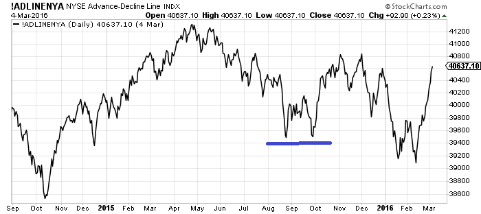
This minus 15.6% reading is one of the lowest on record. Only 4% of readings since 2000, in fact, were any lower. The last time that the HSNSI was as low as it’s been this month was February 2016, which was the bottom of the correction (some say bear market) that began in May 2015.
A similar picture is painted by the sentiment data for stock market timers who focus on the Nasdaq market in particular (as measured by the Hulbert Nasdaq Newsletter Sentiment Index, or HNNSI). They’re even more bearish than those reflected in the HSNSI; the HNNSI currently stands at minus 61.1%. Only 3% of readings since 2000 have been lower than this.
In addition, Friday’s rally carried the S&P 500 above a downtrend line, which is another constructive sign that further near-term gains are possible.
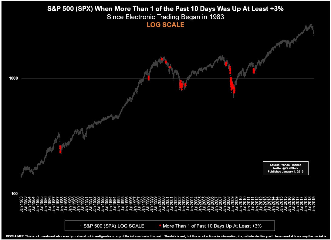
The bulls should temper their enthusiasm, however. Urban Carmel pointed out that 4-5% gains in a single day, especially after a long decline, are normally usually not indicative of the ultimate low. Here are just a few examples. Prepare for a brief rally, and then a re-test and likely undercut of the previous lows.
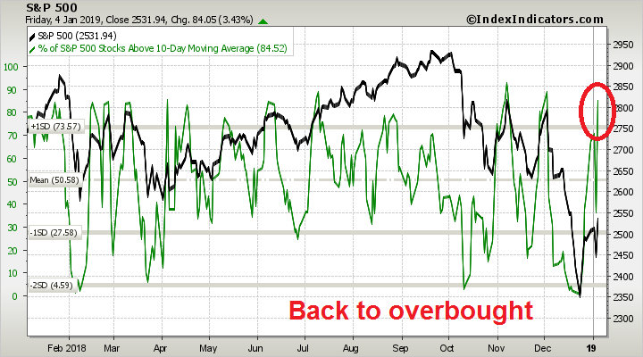
Past short-term bounces off deeply oversold conditions have typically lasted between two and six trading days. Further upside may be possible, as breadth indicators are not overbought yet.
There is more potential upside into the overhead resistance zone at 2500-2550.
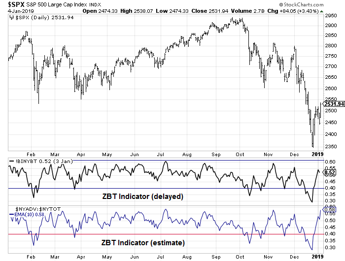
While V-shaped bottoms are uncommon, they are not totally unheard of. Last Thursday began the day 1 count of the Zweig Breadth Thrust setup signal. If the ZBT Indicator can rise above 0.615 within 10 trading days, it would flash a rare ZBT momentum buy signal. While I am not holding my breath for the buy signal, I am keeping an open mind.
My inner investor de-risked to a minimum risk portfolio several months ago. Given the recent fall in stock prices, his portfolio is actually underweight equities. Subscribes received an email alert last Wednesday morning that my inner trader was doubling up on his bullish bet, and he is nervously hanging on to his long positions.
Disclosure: Long SPXL, TQQQ