Preface: Explaining our market timing models
We maintain several market timing models, each with differing time horizons. The “Ultimate Market Timing Model” is a long-term market timing model based on the research outlined in our post, Building the ultimate market timing model. This model tends to generate only a handful of signals each decade.
The Trend Model is an asset allocation model which applies trend following principles based on the inputs of global stock and commodity price. This model has a shorter time horizon and tends to turn over about 4-6 times a year. In essence, it seeks to answer the question, “Is the trend in the global economy expansion (bullish) or contraction (bearish)?”
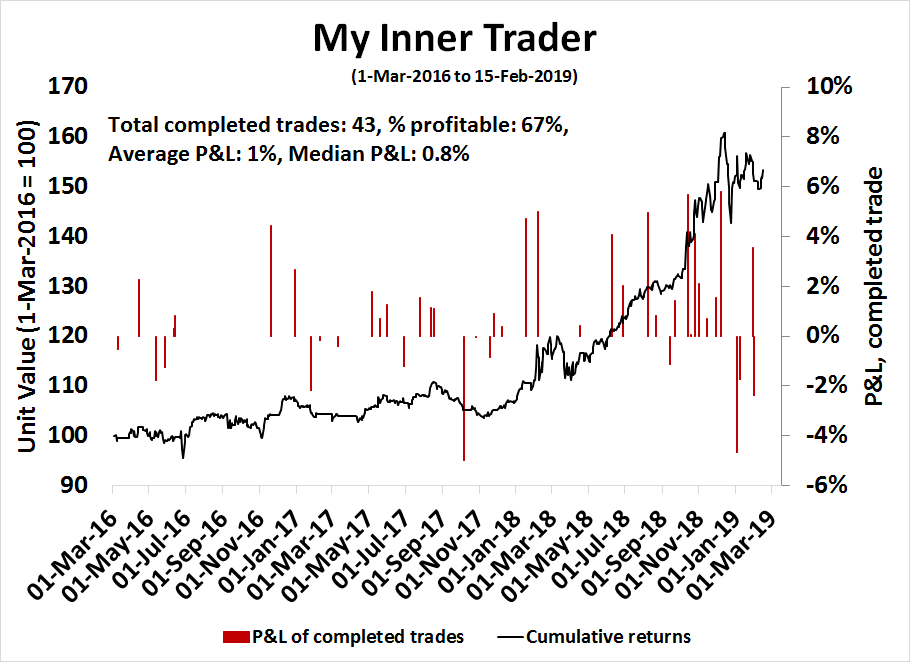
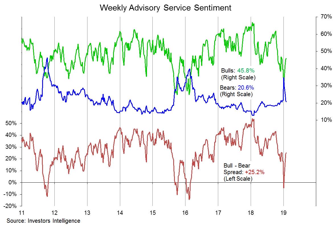
My inner trader uses a trading model, which is a blend of price momentum (is the Trend Model becoming more bullish, or bearish?) and overbought/oversold extremes (don’t buy if the trend is overbought, and vice versa). Subscribers receive real-time alerts of model changes, and a hypothetical trading record of the those email alerts are updated weekly here. The hypothetical trading record of the trading model of the real-time alerts that began in March 2016 is shown below.
The latest signals of each model are as follows:
- Ultimate market timing model: Sell equities
- Trend Model signal: Neutral
- Trading model: Bullish
Update schedule: I generally update model readings on my site on weekends and tweet mid-week observations at @humblestudent. Subscribers receive real-time alerts of trading model changes, and a hypothetical trading record of the those email alerts is shown here.
The elephant in the room
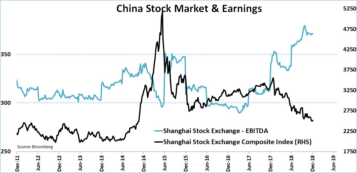
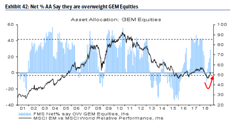
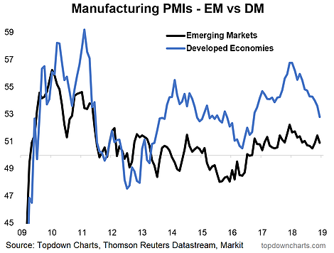
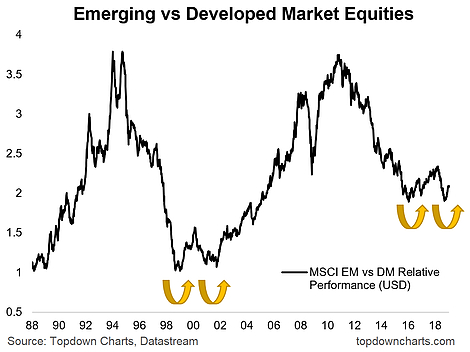
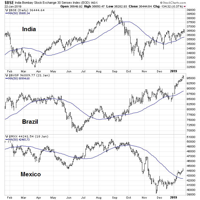
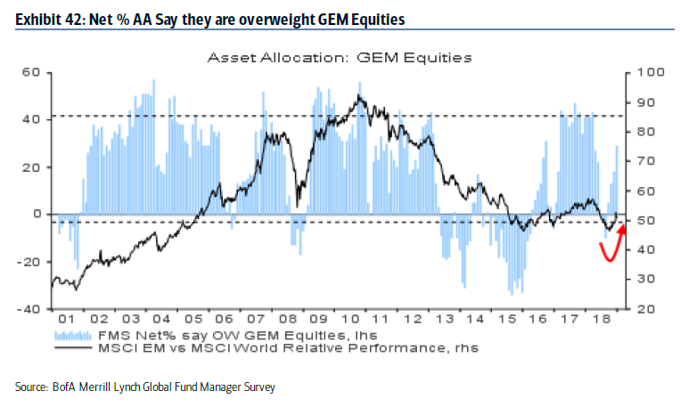
I pointed out recently that the latest BAML Fund Manager Survey shows that institutional managers have been stampeding into emerging market (EM) stocks exclusive of the other equity markets around the world (see An opportunity in EM stocks?). However, some EM countries are more equal than others. The chart below shows that while EM stocks have begun to outperform global equities (bottom panel), China continues to lag compared to other major markets like Brazil and India.
For investors, China is becoming the elephant in the room. The country accounts for roughly one-third of global GDP growth, and its economic growth rate is decelerating. Ken Rogoff stated in Davos that he thinks China is hitting the debt wall:
Harvard professor Ken Rogoff said the key policy instruments of the Communist Party are losing traction and the country has exhausted its credit-driven growth model. This is rapidly becoming the greatest single threat to the global financial system.
“People have this stupefying belief that China is different from everywhere else and can grow to the moon,” said Professor Rogoff, a former chief economist at the International Monetary Fund.
“China can’t just keep creating credit. They are in a serious growth recession and the trade war is kicking them on the way down,” he told UK’s The Daily Telegraph, speaking before the World Economic Forum in Davos.
“There will have to be a de facto nationalisation of large parts of the economy. I fear this really could be ‘it’ at last and they are going to have their own kind of Minsky moment,” he said.
How worried should you be about China?
China weakness everywhere
For global investors, the only question that matters for global growth is China. Right now, all signs point to a slowdown. I won’t bore you with Chinese economic statistics, which can be made up. However, we can consider other China-related free market indicators:
- Commodity prices
- Australian property market
- Korean exports
- German industrial production, whose capital goods are exported to China
- Chinese auto sales
China has shown itself to be a voracious consumer of raw commodities. For commodity prices, the industrial metal to gold ratio is a cyclically sensitive indicator of industrial demand, net of commodity price inflation (red line). This indicator has also shown itself to be highly correlated to risk appetite, as measured by the US equity to UST ratio (grey bars). Current readings indicator continued demand deceleration.
We have all heard about how China’s great big ball of liquidity leaked out and went into real estate in Australia, Canada, the US, and other places with golden visa programs, like Portugal. Property prices in Australia, which has been an outsized recipient of Chinese hot money, has been tanking. I can also personally attest to similar conditions in Vancouver, and Toronto.
South Korea is one of China’s closest trading partners. The latest figures show that its exports, which are also correlated with global EPS growth, have collapsed.
The same could be said of German industrial production, and M-PMI.
What about the Chinese consumer? Hasn’t Beijing been trying to rebalance growth away from credit driven infrastructure spending to China’s household sector? The weakness in Chinese auto sales tell a story of a stressed out consumer.
In addition to these signs of short-term weakness, another source of concern is the Sino-American trade war, which remains unresolved.
China’s long-term challenges
While these short-term worries are spooking the markets, it is impossible to understand China without first analyzing her long-term challenges before drilling down to the shorter term policy responses to those problems. As I see it, China’s long-term challenges are:
- A looming middle-income trap
- An overleveraged economy
- The rising tension between Xi Jinping’s desire to retain tight political control and the urgency to address the challenges of excess leverage and slowing growth
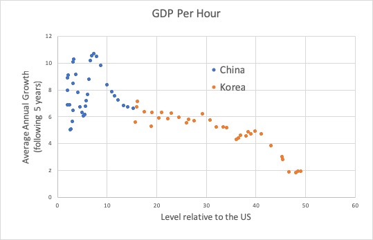
A fast growing EM country hits the middle-income trap when its growth slows after reaching middle- income levels as they encounter developmental roadblocks to achieving high-income status. According to World Bank estimates, only 13 of 101 middle-income economies have achieved the transition to high income for the period from 1960 to 2008. Antonio Fatás of INSEAD summarized China’s challenge with falling growth rates using South Korea’s development path as an example.
Fatás added the following caveat:
In summary, the deceleration of GDP growth rates in China can be seen as a natural evolution of the economy as it follows its convergence path, in particular if we use recent decades in South Korea as a benchmark. Let’s not forget that South Korea is one of the best performer for countries in the range below 50% of the US GDP per capita. So using South Korea as a benchmark we might be providing an optimistic benchmark for Chinese growth.
China is following the well-trodden development path followed by South Korea, Taiwan, and other Asian Tiger economies. China is running out of cheap labor fast, and its import substitution strategy of producing cheap imitation goods has also near the end of its useful life. Beijing’s policy response is to raise development by migrating up the value-added chain with an industrial strategy intended to achieve dominance in STEM research (see How China could dominate science from The Economist). One major leg of this is the China 2025 initiative, which is running into US and other Western objections about intellectual property theft and market access by Western companies (more on that later).
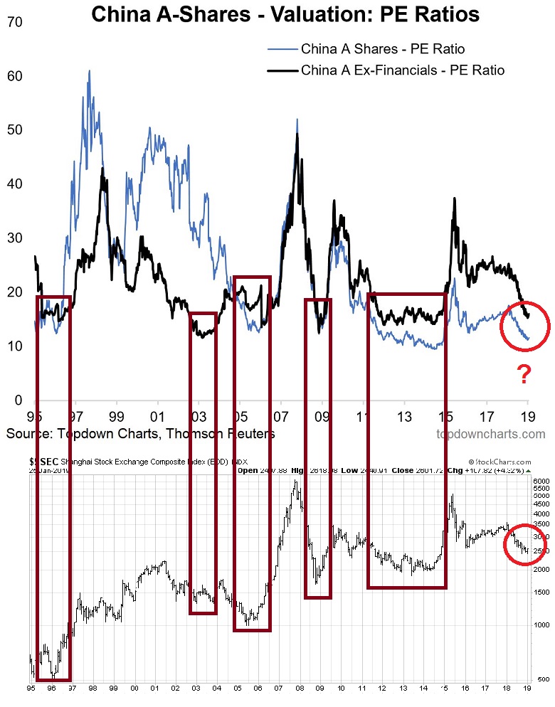
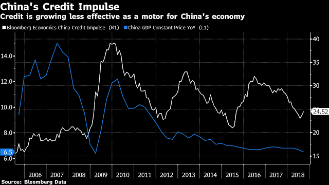
In addition, as the China bears’ favorite chart shows, China’s policy response in the wake of the GFC of a shock-and-awe campaign of credit driven infrastructure stimulus has left in its wake a risky debt buildup.
Additional efforts at credit driven stimulus are becoming less and less effective. Additional credit creation is resulting in less and less GDP growth.
Beijing’s policy response is to try and gradually let the air out of the credit balloon through a deleveraging initiative. The idea isn’t to crash the economy, but to slow credit growth to manageable levels, to the unregulated shadow banking credit market back under the formal banking umbrella so that credit can be more easily controlled, and to use specialized tools to target stimulus when necessary.
The shrinking private sector
The rise of Xi Jinping as Party Secretary has given rise to a number of difficult policy trade-offs. Xi ascension was followed by an anti-corruption campaign, which was done to both root out corruption, and to consolidate power. Slowly but surely, Xi has consolidated power and control of the economy with the Party. That’s where the policy trade-offs come in. Xi’s power concentration is creating headwinds for the growth engines of the Chinese economy.
First, the change in regime has given greater power to the State Owned Enterprises (SOEs) at the expense of Small and Medium Enterprises (SMEs). The government recognizes that SMEs represent the engine of economic growth, but a desire for Party control is stifling their growth outlook.
Xi’s power consolidation is squeezing out the private sector to the benefit of the SOEs. A recent Forbes article entitled “Friends Don’t Let Friends Become Chinese Billionaires” tells the story:
China Daily reported Friday that unnatural deaths have taken the lives of 72 mainland billionaires over the past eight years. (Do the math.)
Which means that if you’re one of China’s 115 current billionaires, as listed on the 2011 Forbes Billionaires List, you should be more than a little nervous.
Mortality rate notwithstanding, what’s more disturbing is how these mega wealthy souls met their demise. According to China Daily, 15 were murdered, 17 committed suicide, seven died from accidents and 19 died from illness. Oh, yes, and 14 were executed. (Welcome to China.)
I don’t know about you but I find it somewhat improbable that among such a small population there could be so many “suicides,” “accidents” and “death by disease” (the average age of those who died from illness was only 48). I’m only speculating but the homicide toll could really be much higher.
Is it any surprise that a recent Barron’s article reported that about half of high net-worth Chinese individuals have either emigrated or want to emigrate?
About 53% of high-net-worth individuals surveyed said they had no plans to emigrate to other countries, while 38% said they were considering a move abroad. Nearly 9% said they had non-Chinese citizenship or were in the process of application.
The top destination for rich Chinese to emigrate was Europe, with 30% of respondents picking the region. Australia and the U.S. tied on the second spot (28%), followed by Canada (27%) and Singapore (11%).
At the same time, the PBOC’s efforts to slow credit growth are also hitting SMEs much harder than SOEs. In general, SOEs are more creditworthy because they have the implicit backing of the government, while SMEs have to survive on their own, which is creating a credit crunch for smaller Chinese businesses. Bloomberg reported that some companies have resorted to creative financing techniques to tap credit markets:
The practice is one of several strategies for debtors to enhance their appeal to creditors, including one where borrowers guarantee each others’ debt. Use of stock as collateral for loans has also sown the seeds for volatility in stocks.
Another even more imaginative technique is to use the structured finance tactic which sparked the GFC of slicing up a bond into different credit tranches, where the issuer buys the most junior “equity” tranche in order to secure financing. With all this inventiveness at work in Chinese finance, what could possibly go wrong?
Lower rated private companies and local government financing vehicles, or LGFVs, have been the main users of structured issuance, observers say. One popular method is for the borrower to put up the money for the subordinated tranche — the first to absorb losses — of the asset-management vehicle that buys the bonds.
Another key plank of Beijing’s policy response is to refocus growth towards the Chinese consumer. As Michael Pettis has pointed out in many past occasions, the success of such an initiative requires the redistribution of income away from the entrenched interests of Party cadres in the large SOEs to the household sector, which is a difficult task in the best of times.
This cannot be said to be the best of times for the Chinese consumer. A weak job market is pointing to weak income growth.
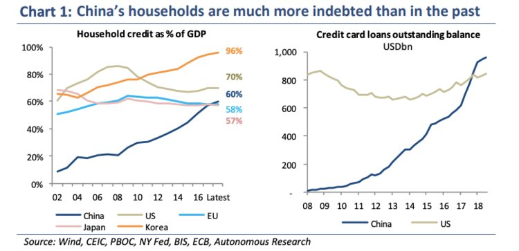
At the same time, households have been raising their debt levels in order to consumer, and to invest (mostly in property). Bloomberg highlighted how Chinese consumers have been piling on debt, and their debt capacity is well on its way to reaching their limits.
In short, don’t expect too much help from the Chinese consumer.
Short-term policy response
In response to the latest slowdown, Beijing has responded with a small stimulus package of tax cuts, and targeted top-down credit growth aimed at SMEs. However, don’t expect the latest round of stimulus to have the same effect as previous efforts. China’s total tax intake is relatively low, which puts a limit on the effects of a tax cut.
On the credit front, banks are caught between top-down directives of lending to small businesses and maintaining the credit quality of their loan portfolios. Reports are emerging that many SMEs simply do not qualify for bank loans, and they must turn to the shadow banking system for loans at much higher rates. Instead, banks are instead lending money to subsidiaries of SOEs incorporated to qualify as small businesses.
The trade war wildcard
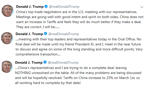
In addition, China is trying to conclude a trade deal in order to alleviate the negative effects of the trade war. The latest Bloomberg report the discussions as recounted by Wilbur Ross indicates that both sides are talking, but they are “miles and miles” from reaching a resolution. China has reportedly offered to eliminate the trade deficit within several years, but the issue of China’s industrial strategy and intellectual property protection remains a sticking point. The WSJ reported that American businesses raised the China 2025 strategy as a concern:
In a joint report to the U.S. Trade Representative, the U.S. Chamber of Commerce and the American Chamber of Commerce in China say Beijing’s ambitious plan to become a global technology leader is being widely implemented, casting doubt on efforts by Chinese officials to play down its significance.
There is evidence of “a deep, concerted and continuing effort” by provincial officials to pursue the central government’s Made in China 2025 plan, which seeks to make China a leader in electric vehicles, aerospace, robotics and other frontiers of manufacturing, the two business groups say.
Reuters reported that American negotiators have demanded regular reviews of Chinese trade reform practices, much in the manner of an arms control treaty:
The United States is pushing for regular reviews of China’s progress on pledged trade reforms as a condition for a trade deal – and could again resort to tariffs if it deems Beijing has violated the agreement, according to sources briefed on negotiations to end the trade war between the two nations.
A continuing threat of tariffs hanging over commerce between the world’s two largest economies would mean a deal would not end the risk of investing in businesses or assets that have been impacted by the trade war.
“The threat of tariffs is not going away, even if there is a deal,” said one of three sources briefed on the talks who spoke with Reuters on condition of anonymity.
CNBC reported that George Soros went even further and labeled Xi Jinping the “most dangerous enemy” of open societies. He went on to warn that the US and China are in a “cold war that could turn into a hot one”.
Apocalypse Not Yet?
For investors, the critical question is what happens next in China. The biggest issue China faces is that it is running out of bullets. FT Alphaville characterized China’s dilemma as “cakeism”, or the desire to have your cake and eat it too.
Alphaville sat down with economist George Magnus, a former senior adviser to UBS Investment Bank and the recent author of “Red Flags: Why Xi’s China is in Jeopardy.” He describes what’s happening in China this way: “At the moment, we’ve got an incoherence of policy. It’s confusing to us looking at it from the outside. It must be incredibly confusing if you are an entrepreneur or small business on the inside.”
China’s version of “cakeism,” he says, centers around the leadership’s conflicting commitments to de-risking the financial system on one hand and on the other, hitting elevated growth targets north of 6 per cent. “You can’t really have a determined effort to deleverage the economy and not expect it to have a material impact on economic growth,” points out Magnus.
Its debt-driven growth model is reaching the limits of usefulness. Tightening put the brakes on growth. Without large scale credit growth, which will exacerbate their real estate bubble, the economy will crash. The tools available to tinker at the margins, such as rebalancing to household consumption, and an industrial policy to escape the middle-income trap may have long-term benefits, but will not help in the short run.
Will China crash? The current policy response is another effort to kick the can down the road yet one more time, though this round of stimulus will be less effective than past efforts.
So Chinese officials have been presented with a choice: play the long game and work towards shifting the economy towards a more sustainable path, or sidestep short-term pain and prop up growth now.
Of course, China wants its cake. And just like the Brits, it wants to eat it, too.
So blame “cakeism” for why the stimulus measures that China has rolled out since the summer have done little to boost the economy. Rather than a full-scale stimulus programme, China has favoured a more piecemeal approach this time around, including liquidity injections into the financial system, cuts to the amount of cash banks have to hold as reserves and infrastructure spending.
But by asking banks to lend more to private and small companies (by cutting the reserve requirement ratio), and simultaneously urging banks to raise more capital and pay attention to their bad debts, officials are “not speaking with the same tongue,” says Magnus. Ultimately, this could lead China to fail on both fronts.
My base case scenario is no crash in 2019. The limited stimulus package announced by Beijing will have some effect, and it will likely buy the country another two or three quarters of growth. At the same time, China is desperate to reach a trade agreement with the US.
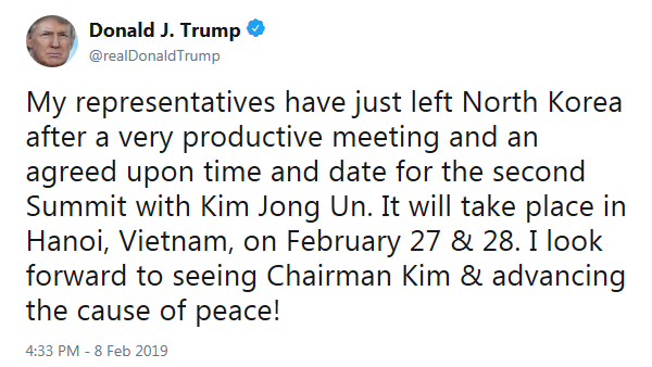
The Trump administration has also shown that it is highly sensitive to stock market movement, and it is also eager to reach an agreement. As one simple example, after stock prices weakened on Tuesday, January 22, National Economic Council director Larry Kudlow appeared on CNBC to sooth markets and deny reports that a planned meeting between Chinese and American negotiators had been canceled. This is a signal that American negotiators are sensitive to pressure from Wall Street to make an agreement.
Expect difficult negotiations to last right up to the March 1 deadline, but a limited deal to be signed. But that will not be the end of the story. The next battle will be over review, enforcement, and verification of reform initiatives.
The fundamental nature of the Sino-American relationship is changing. Years of negotiation with past administrations have led to a sense of promise fatigue from both sides of the aisle. A consensus is emerging that China is becoming a strategic competitor. Cold War 2.0 has begun, and 2020 will be a difficult year for US-China relations as aspiring candidates will try to show how tough they are on China.
Apocalypse Not Yet. Though the short-term policy solutions doesn’t address the longer term problems.
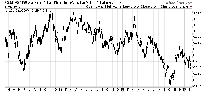
While this is my base case scenario, other more bearish outcomes are possible, I can offer two sensitive real-time barometers that can warn of an impending crash in China. The first is the AUDCAD exchange rate. Both Australia and Canada are similar sized economies with high exposure to resource extraction industries with some key differences. Australia is more sensitive to China, and its exports are mainly in bulk commodities such as coal and iron ore. The Canadian economy is more sensitive to the US, and its exports are tilted towards energy. A disorderly breakdown in the AUDCAD exchange rate would be an early warning signal that something is breaking in China.
In addition, the stability of the Chinese financial system is highly sensitive to the health of its property market. Should highly levered property developers such as China Evergrande (3333.HK) break long-term support, it may be a signal of a Lehman-like moment in China’s banking system.
The share price of Alibaba, which is a key barometer of Chinese consumer spending, is also performing well relative to the Chinese market.
Should any of these key real-time indicators weaken significantly, it would be time to run for the hills.
The week ahead
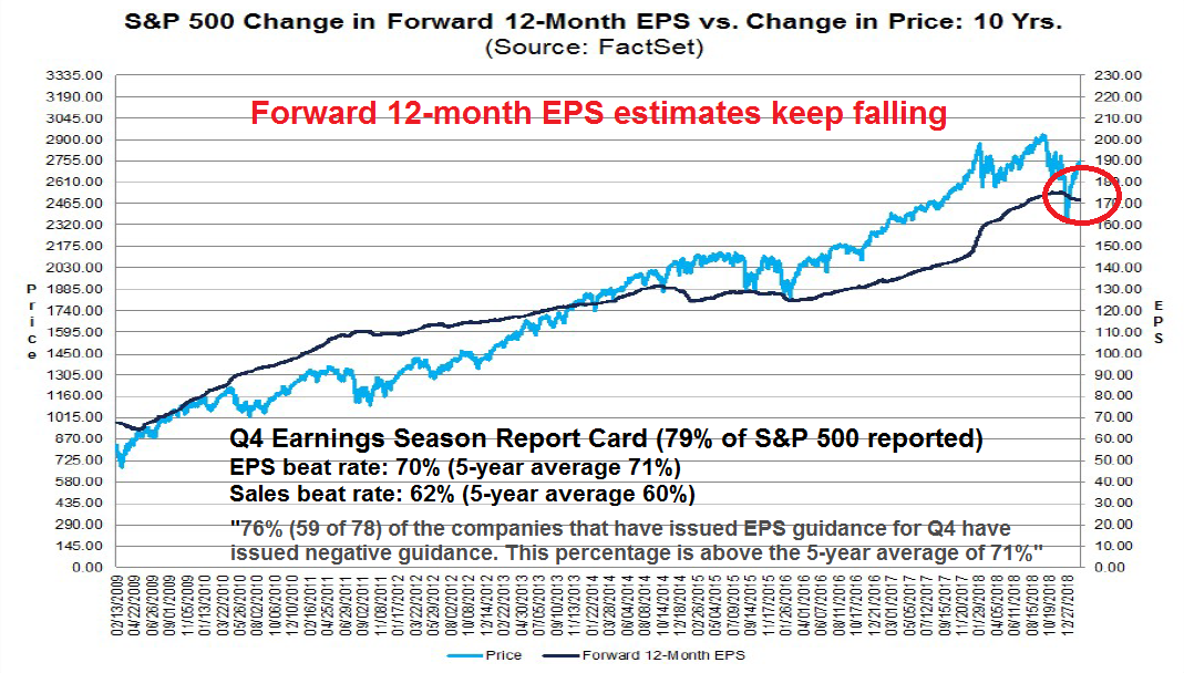
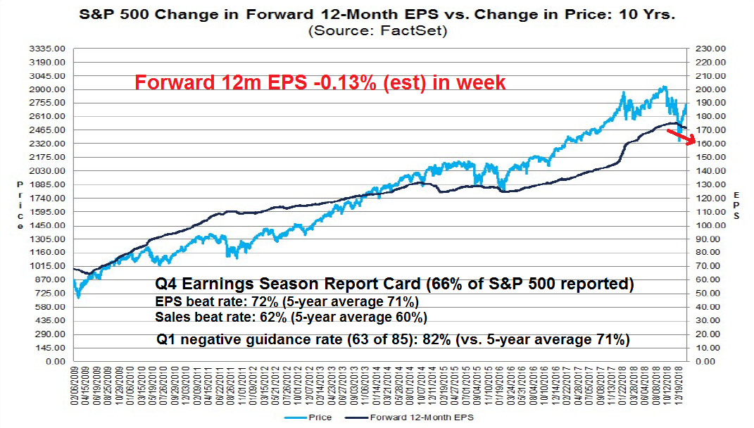
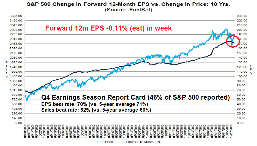
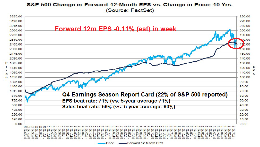
Looking to the week ahead, the bulls can celebrate as the market seems to be sailing through earnings season well. The latest update from FactSet shows that the EPS and sales beat rates are coming at roughly their historical averages, though forward 12-month EPS are still being revised downwards.
That said, the market is not reacting to bad news. The stock price of companies that beat are being rewarded, but misses are not being punished.
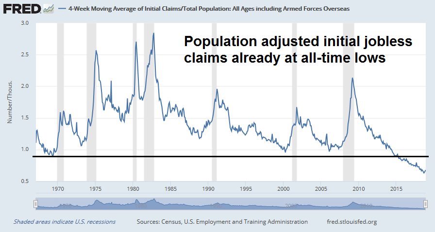
The partial government shutdown has hampered the release of many key economic statistics. However, much was made about the sub-200,000 print last week of initial jobless claims representing a 50-year low, I would remind readers that the population adjusted initial claims has already been making fresh lows for quite some time.
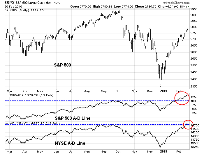
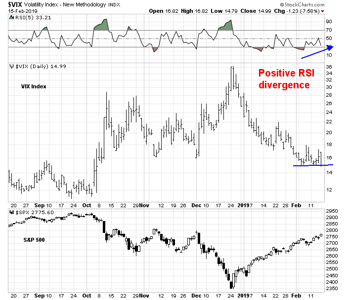
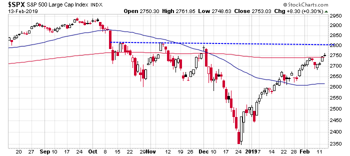
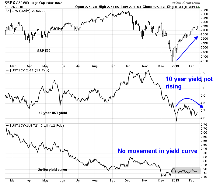
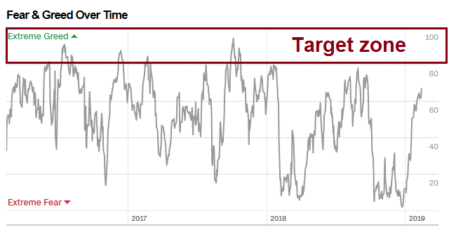
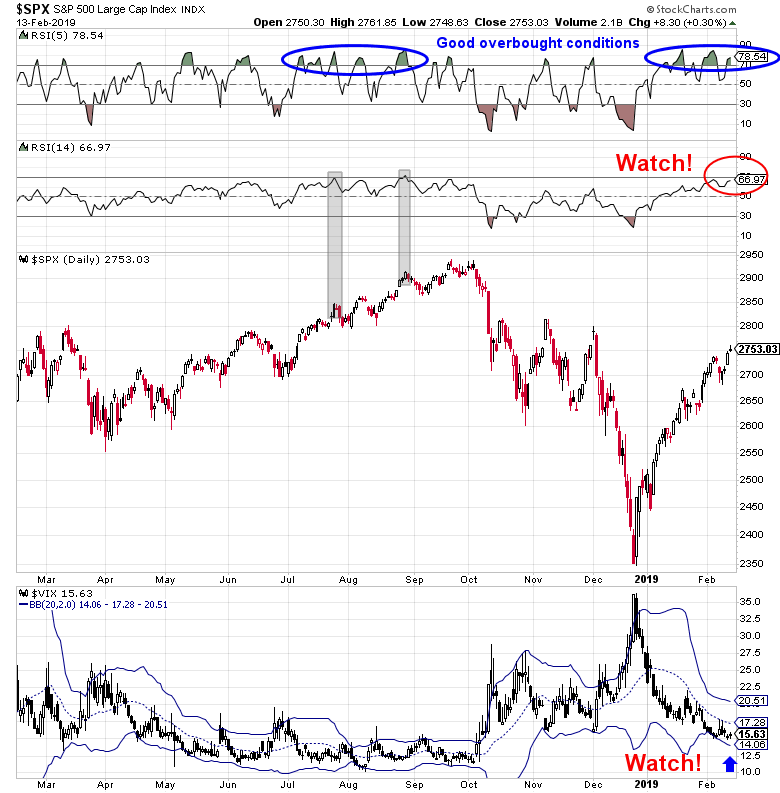
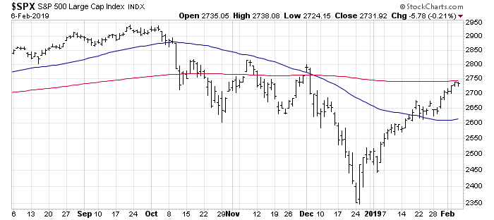
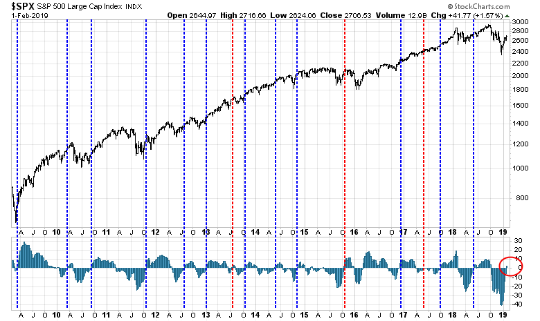
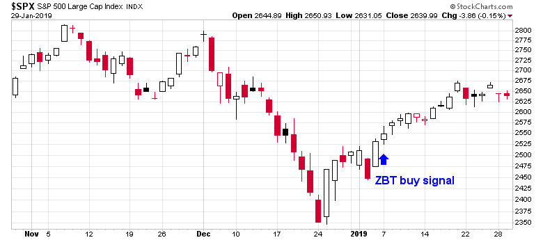
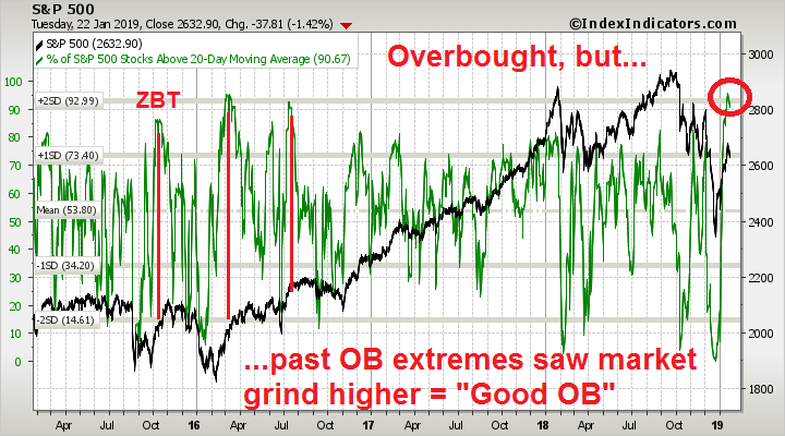
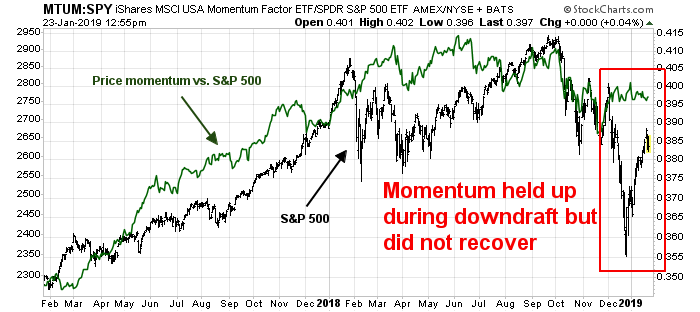
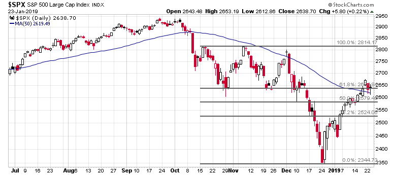
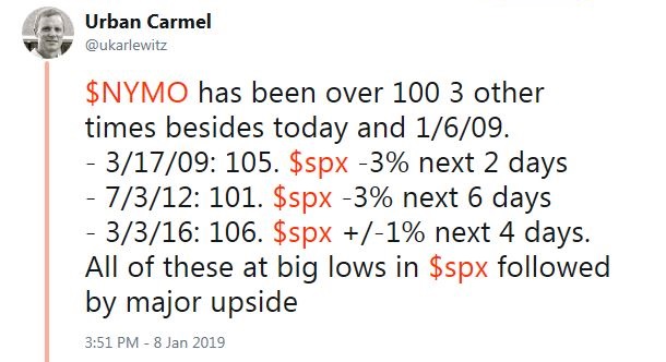
In the very short run, stock prices may be due for a pause. The market is nearing key resistance levels while exhibiting a negative divergence in RSI-5. Friday’s lack of bullish reaction to the news of a legislature truce which re-opened government is another warning sign that the market may be about to stall.
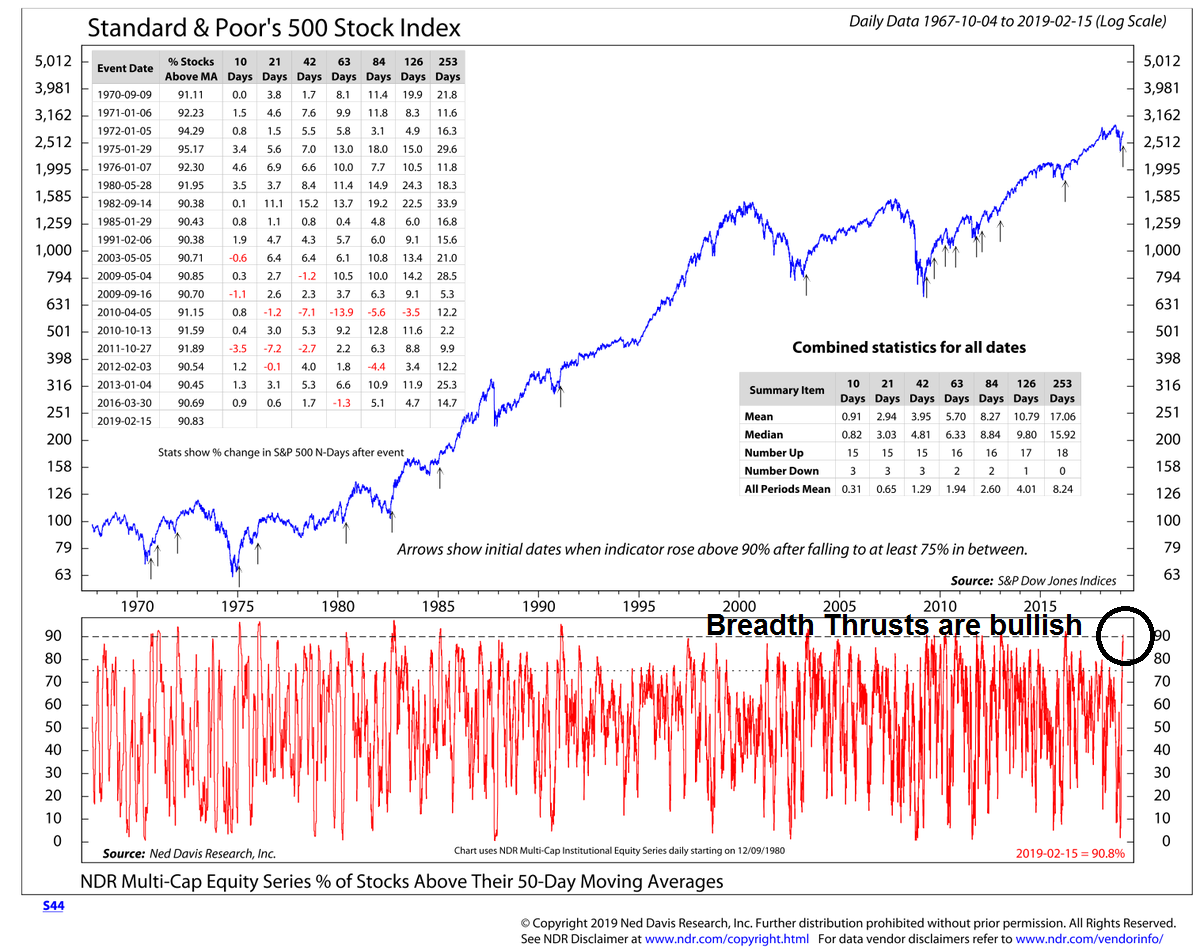
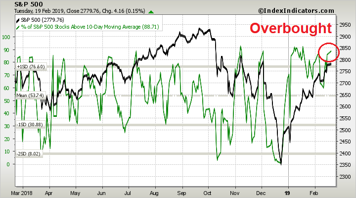
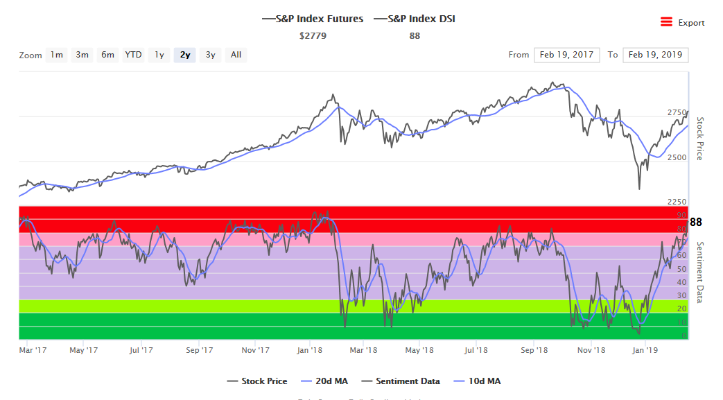
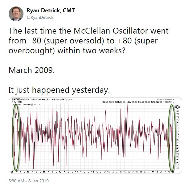
Short-term breadth is back at or near overbought levels. While the market could stage a minor advance early next week, the combination of near overbought readings, negative divergence, and the proximity of key resistance levels argue for a pullback of unknown magnitude.
My inner investor is neutrally positioned at about target asset weight levels. My inner trader is long the market, but he is getting ready to reverse course next week.
Disclosure: Long SPXL