Preface: Explaining our market timing models
We maintain several market timing models, each with differing time horizons. The “Ultimate Market Timing Model” is a long-term market timing model based on the research outlined in our post, Building the ultimate market timing model. This model tends to generate only a handful of signals each decade.
The Trend Model is an asset allocation model which applies trend following principles based on the inputs of global stock and commodity price. This model has a shorter time horizon and tends to turn over about 4-6 times a year. In essence, it seeks to answer the question, “Is the trend in the global economy expansion (bullish) or contraction (bearish)?”
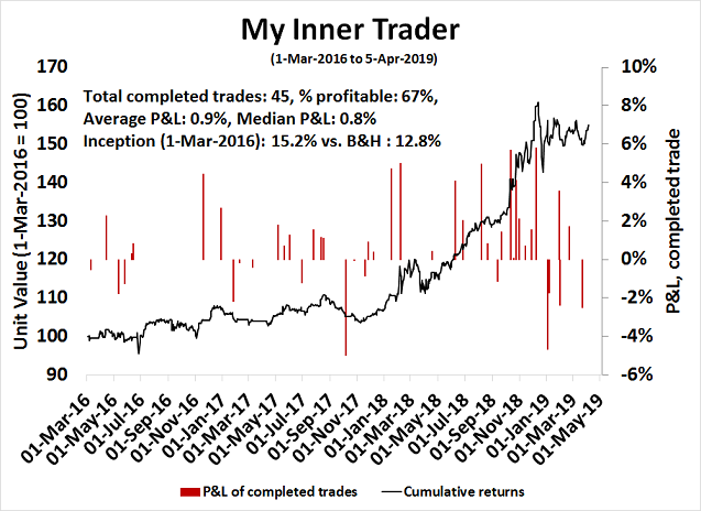
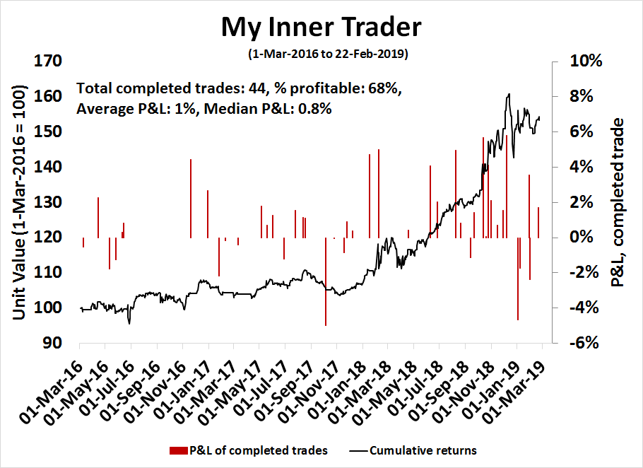
My inner trader uses a trading model, which is a blend of price momentum (is the Trend Model becoming more bullish, or bearish?) and overbought/oversold extremes (don’t buy if the trend is overbought, and vice versa). Subscribers receive real-time alerts of model changes, and a hypothetical trading record of the those email alerts are updated weekly here. The hypothetical trading record of the trading model of the real-time alerts that began in March 2016 is shown below.
The latest signals of each model are as follows:
- Ultimate market timing model: Buy equities
- Trend Model signal: Bullish
- Trading model: Bullish
Update schedule: I generally update model readings on my site on weekends and tweet mid-week observations at @humblestudent. Subscribers receive real-time alerts of trading model changes, and a hypothetical trading record of the those email alerts is shown here.
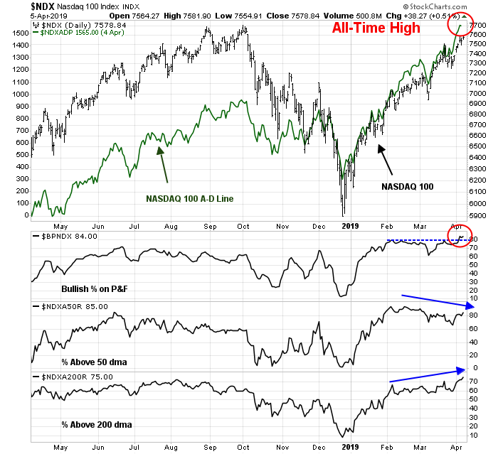
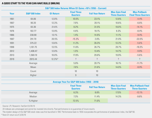
Melt-up ahead?
The recent equity rally has raised the scores of all models across all time frames to bullish. The Ultimate Market Timing Model, the Trend Model, and the Trading Model are all upgraded to bullish.
While this is not my base case scenario, there is a decent chance that the stock market may melt-up in light of the Fed’s extraordinarily dovish statement last week. One parallel to the market hiccup of late 2018 would be 1998, when the Fed stepped in to rescue the financial system in the wake of the Russia Crisis.
A melt-up in the current environment would be supported by the combination of loose monetary policy and easy fiscal policy.
The Fed’s about face
Fed chairman Jerome Powell made his position clear in his opening statement from last week’s post-FOMC press conference:
My colleagues and I have one overarching goal: to sustain the economic expansion, with a strong job market and stable prices, for the benefit of the American people. The U.S. economy is in a good place, and we will continue to use our monetary policy tools to help keep it there.
As long as inflation expectations remain under control, the Fed will focus on policies to “sustain the economic expansion”. This shift in policy made a number of market analysts rather uneasy. The comment from currency strategist Marc Chandler is an example of that view:
The median forecast shaved this year’s GDP to 2.1% from 2.3% and next year to 1.9% from 2.0%. The forecast for 2021 was unchanged at 1.8%. Long-term growth is estimated at 1.9%. This is the disconnect: An economy expected to grow above trend but still requires easy monetary policy.
The Powell Fed is starting to look like the Greenspan Fed. Instead of taking away the proverbial punch bowl just as the party gets going, the Greenspan Fed saw every risk as an opportunity to ease. While it did rescue the economy from the Russia Crisis in 1998, it ultimately inflated a stock market bubble that ended with the NASDAQ top in just under two years.
Could that be the template for today? The last three recessions were not directly attributable to the Fed action. The Great Financial Crisis (2008) was a financial crisis, the NASDAQ top (2000) was the result of a popped market bubble. and the mild recession of 1990 was sparked by the combination of the S&L crisis and the Iraqi invasion of Kuwait.
Easy fiscal policy = Reflationary
In addition to an easy monetary policy, the markets can also look forward to an easy fiscal policy, which should be stimulative. The Trump administration has abandoned all Republican fiscal orthodoxy by proposing a budget that will not balance for 15 years. The fiscal deficit will go out as far as the eye can see, even with rosy growth assumptions.
A major factor in the deficit are the Trump tax cuts. Moreover, Trump wants to spend more on the military, and less on everything else. Even if Trump gets his entire wish list, namely:
- Congress approves all of his budget priorities, such as Medicare cuts;
- The economy achieves the rosy growth assumptions higher than market expectations; and
- He wins a second term.
His own OMB projects that he will leave office with a higher debt to GDP ratio than when he assumed office.
Are you worried about the deficit, or just the wrong kind of deficit?
MMT ascendant?
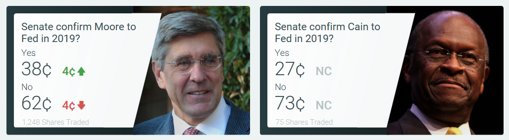
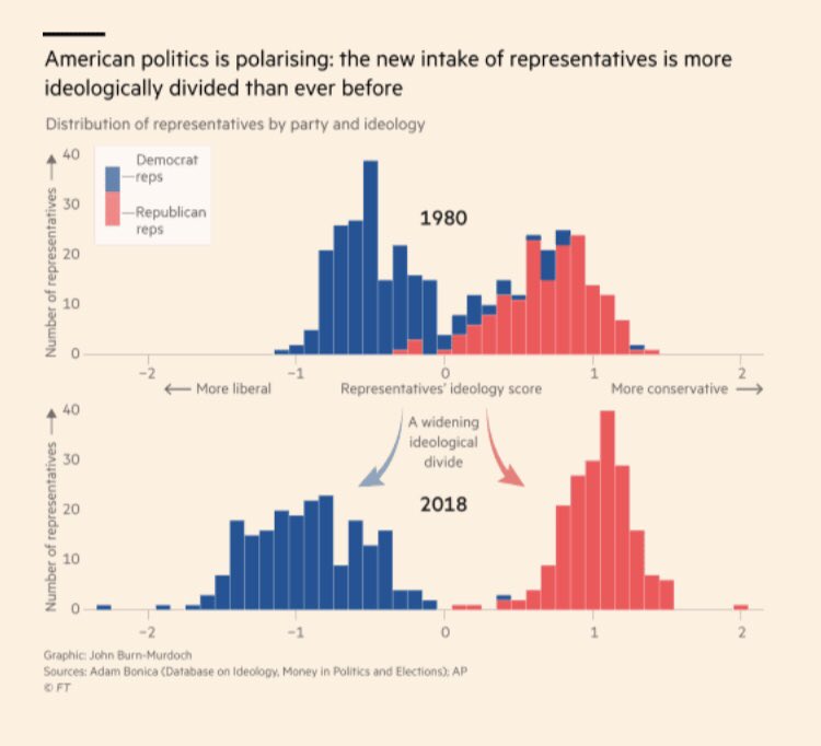
What if a Democrat wins the White House in 2020? This chart of how American politics has been polarized serves as a useful guide to future policy. If a Democrat were to win control of the White House, policy would take a dramatic lurch leftward. In the current political climate, that means the likely ascendancy of Modern Monetary Theory (MMT) as a policy framework.
I have written about MMT before (see Peering into 2020 and beyond and The boom of 2021) so there is no point in repeating myself. There has been much criticism voiced of MMT as an economic theory, but what we are concerned here is not whether MMT is a viable theory, it is whether its framework will be implemented, which would result in greater fiscal stimulus.
Some of the criticism confuses MMT, which is a description of an economic framework, with the policy initiatives of the Democrats, such as the Green New Deal. The greatest practical impediment to the implementation of MMT is the requirement of a close coordination of fiscal and monetary policy. Even then, this Barron’s article outlines the limits to the independence of the Federal Reserve:
Central bankers have no popular mandate. They are not elected and are only indirectly accountable to the public. Yet they are granted the “independence” to take unpopular decisions, at least up to a point. Their independence isn’t guaranteed, nor does it always mean the same thing at different points in time. Rather, it is contingent on circumstances.
As Philipp Carlsson-Szlezak and Paul Swartz of Bernstein Research put it in a recent note, “Central banks cannot escape their political underpinnings.”
In the years after the financial crisis, the political environment probably constrained the Federal Reserve’s ability to boost the U.S. economy. Things may now be shifting in the other direction.
Consider Fed Chairman Jerome Powell’s latest experience testifying before Congress, which occurred this past week. On Tuesday and Wednesday, he took questions from the Senate and the House, respectively. While many of the questions focused on technical issues, such as the implementation of the new Current Expected Credit Loss accounting standard, the optimal level of bank reserves held on deposit at the Fed, and the Fed’s process for vetting proposed bank mergers, several members from both parties pushed Powell and his colleagues to focus on raising wages and altering the economic split between workers and investors.
Political priorities change. The Fed sails in a sea of political winds that cannot be ignored.
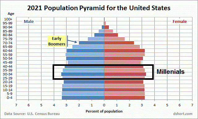
A clash of generations
Analyzing theories like MMT to determine whether they represent good policy is futile for investors. Even if it turns out to be bad policy, the consequences won’t be felt for years, and investors should instead focus on the likelihood of its implementation, and its fiscal effects.
Here are two perspectives on MMT that represent some out of the box thinking. Srinivas Thiruvadanthai, Director of Research at the Jerome Levy Forecasting Center, wrote a Twitter thread that framed MMT as a generational conflict between Baby Boomers and MIllennials:
My pet theme: inflation is everywhere and always a political phenomenon in the current context of clash of generations, between Millennials and Boomers. In a way reflected in AOC vs Schultz.
The Boomers are entering retirement and sitting on assets that are richly valued. Inflation is poison in more ways than one. In fact, rising wages are poison because it cuts into their living standards. They want sell down their big houses and downshift.
The same thing happened in Japan but was decisively won by the retirees because they were preoponderant. In contrast, the Millennials are more or less the same size as the Boomers. So, the clash won’t be so decisively settled.
Ironically, Boomers when they were in the same position as Millennials today, i.e in the 1970s, won the battle decisively because they were dominant demographically. That is one reason why we had inflation.
The point being economic theories don’t have as much influence as people think. People use them to rationalize whatever policies favors them. Part of the reason for MMT gaining strength is it appeals to a constituency and the increasing divergence of interests.
As Millennials grow older and participate in the political process, their influence will grow. Over time, they will flex their political muscles, and the implementation of MMT will deliver the inflation that will favor their generation at the expense of the older Boomers. Whether that happens in 2020, or in the years beyond, is an open question. The midterm election of 2018 saw more Millennials participate in the political process, and expect that generation’s political power to grow as time goes on.
Even if the Democrats win the White House in 2020, the biggest practical obstacle to their ambitious legislative agenda is the Senate, as Bloomberg explains:
The sweeping liberal ideas backed by many of the party’s candidates — Medicare for all, a “Green New Deal,” and a $15 federal minimum wage — would struggle to get past a Senate where Republicans are likely to retain powerful influence over what legislation becomes law, even if a Democrat defeats President Donald Trump and takes office in January 2021.
Some Democrats are sounding warnings about the expectations being raised among the progressive voting base that helped the party gain control of the House and who’ll be crucial to any chances of winning the White House.
The Senate is going to make or break the progressive agenda in 2021, regardless of how well we do at the top of the ticket,” said Adam Jentleson, a former spokesman for Senator Harry Reid of Nevada.
The problem is math and congressional procedure. In the best case scenario for Democrats — another wave election that consolidates the party’s hold on the House and wins them a majority in the Senate — any far-reaching changes still would struggle to get 50 votes in the Senate, let alone the 60 votes needed to advance most legislation.
Dutch Disease?
For another perspective on MMT, FT Alphaville characterized the USD’s global reserve status as a Dutch disease:
Imagine that you are the finance minister of a small, developing country that has just discovered an ore belt rich in cobalt, a metal that has more than doubled in price over the last five years. You, a capable technocrat, are familiar with Dutch disease. You know that the sudden discovery of reserves of a high-value commodity can cause sclerosis in other industries, particularly manufacturing, as happened in The Netherlands after the discovery of natural gas in the late 1950s.
Now: imagine you are the Secretary of the Treasury of the United States of America. For “cobalt-rich ore,” substitute “dollars,” or “dollar-denominated assets,” or perhaps just “Treasuries.” You still need to worry about Dutch disease. We just never talk about it that way, because the whole framework of booming-commodity-sector analysis is a condescension we reserve for developing countries.
Remember, one of the principles of MMT is a government that runs deficits and borrows in its own currency is only limited by inflation, and the willingness of investors to lend to it in that currency. The US is in a unique position as the producer of a global reserve currency, which suggests that its debt limit is far higher than what normally might be expected under a standard economic theoretical framework, such as the one outlined by Rogoff and Reinhart:
America creates about a quarter of global GDP, but well over half of the currency reserves of the world’s central banks is socked away in dollars — $6.6tn of $11.4tn. The dollar is by far the dominant currency for international credit. Dollars are so important as an invoice currency for global trade that shifts in the value of the dollar are an effective predictor for international trade volumes. So many currencies are either explicitly pegged to the dollar, or tied to it through trade, that 50-60 per cent of global GDP swings with the dollar, making it part of a “dollar zone.”
The dollar is universally a store of value, a medium of exchange and a unit of account — all the things we consider “money.” It is arguably the only currency that is all three of these things. The United States Treasury is not the only place to get dollars. The United States isn’t even the only place to get dollars — foreign institutions create dollar-denominated assets, for example — but it is the best place to get dollars.
Inflation is ticking up, but in a Dutch disease fashion:
So let’s go back to the original research on Dutch disease. We have a basic model of an economy where the export of a single commodity raises the exchange rate, discouraging the export of manufactured goods. If the commodity is the dollar, then demand for the dollar raises the value of the dollar itself — this isn’t too hard to wrap our heads around, and since 1980 the dollar has appreciated, even as the US has declined as a share of global GDP.
We’d expect to see inflation in nontradable services, like medical care and college tuition, but not in tradable goods, like t-shirts and TV sets. And we’d expect a decline in the value added to GDP from manufacturing. None of these are dispositive, and Alphaville is sadly not an econometrician. But they have all happened.
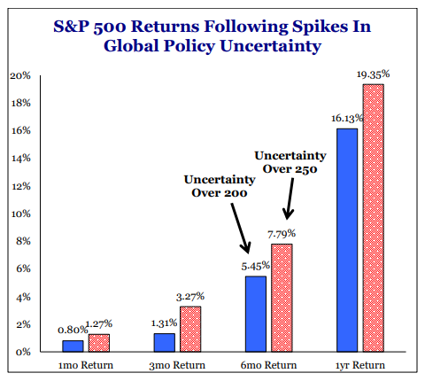
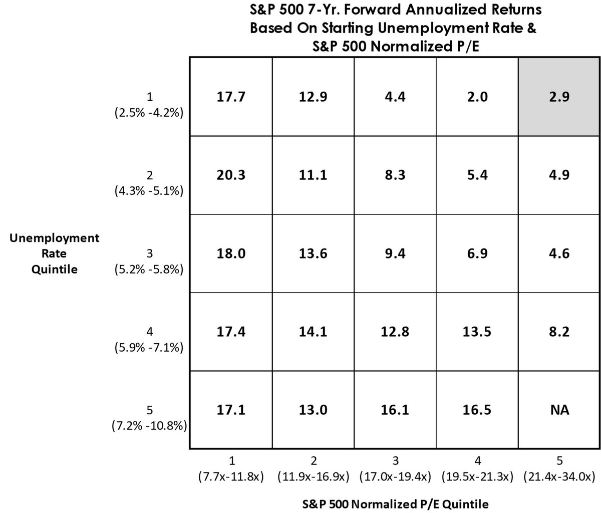
Bottom line: If MMT is framed as a clash between generations, then its influence is likely to grow over the next decade. Moreover, the position of the USD as a major global reserve currency also facilitates the implementation of MMT, as debt capacity is likely higher than predicted by standard economic models.
Green shoots
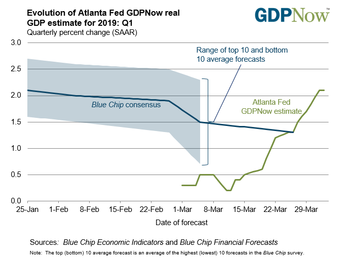
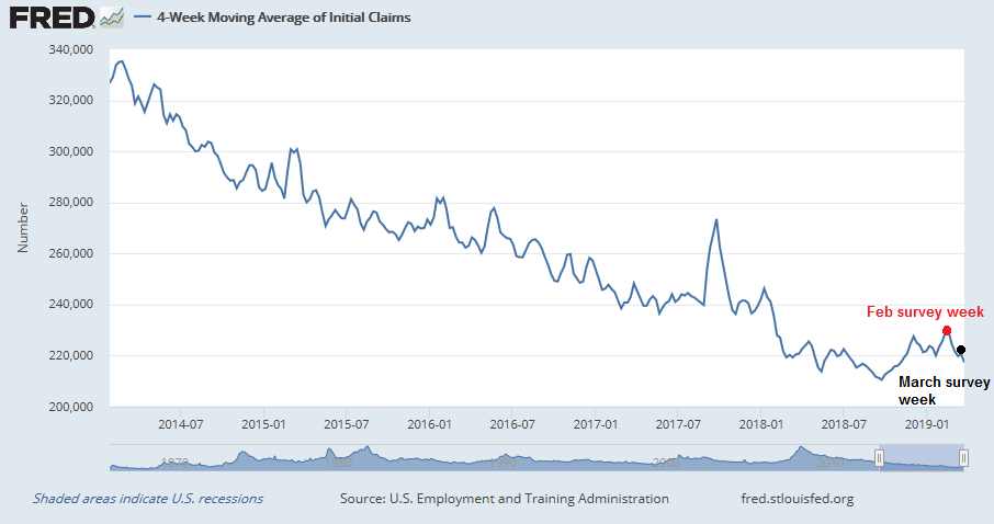
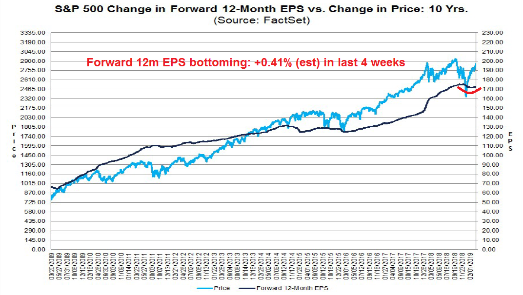
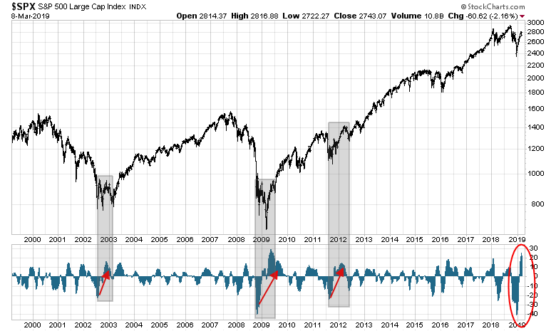
I have been calling for a brief market correction over the next 2-3 months because of short-term economic weakness. So far, stock prices have not reacted to the fears of a slowdown. While a correction may still occur, its likelihood is diminishing because I am seeing green shoots of growth.
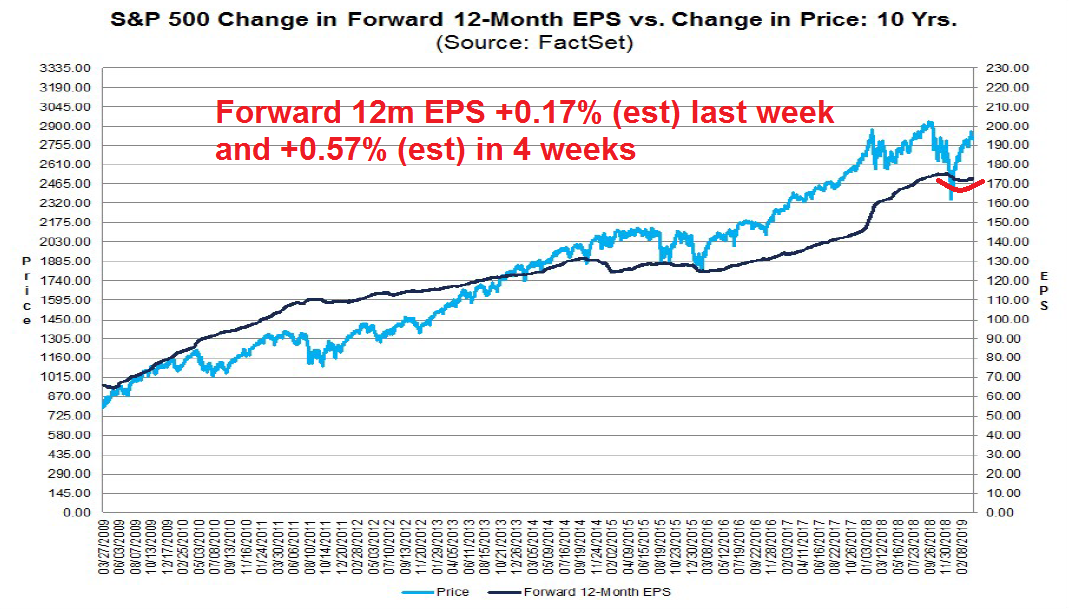
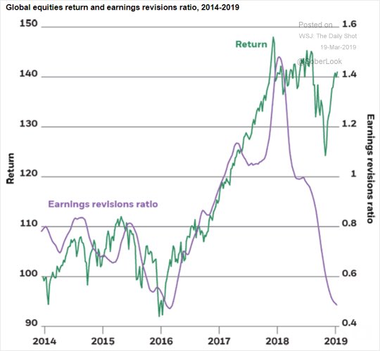
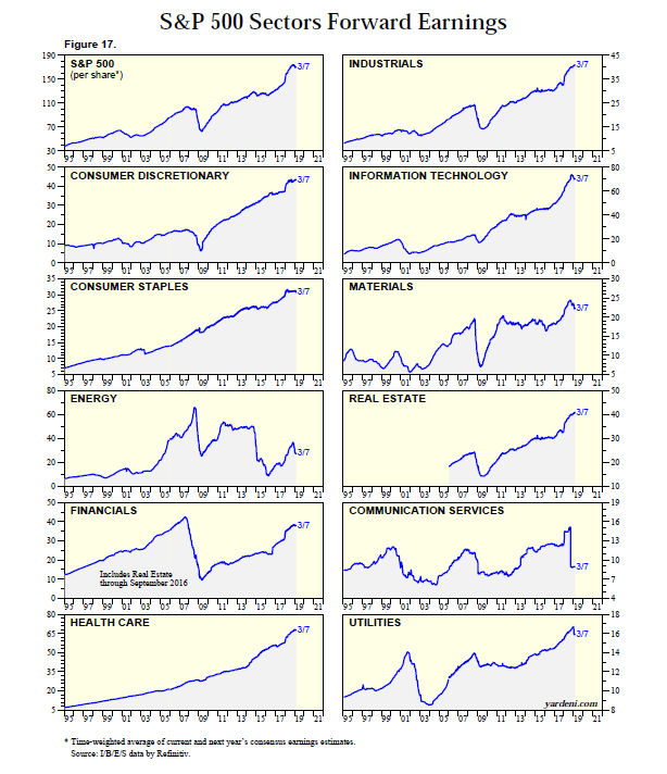
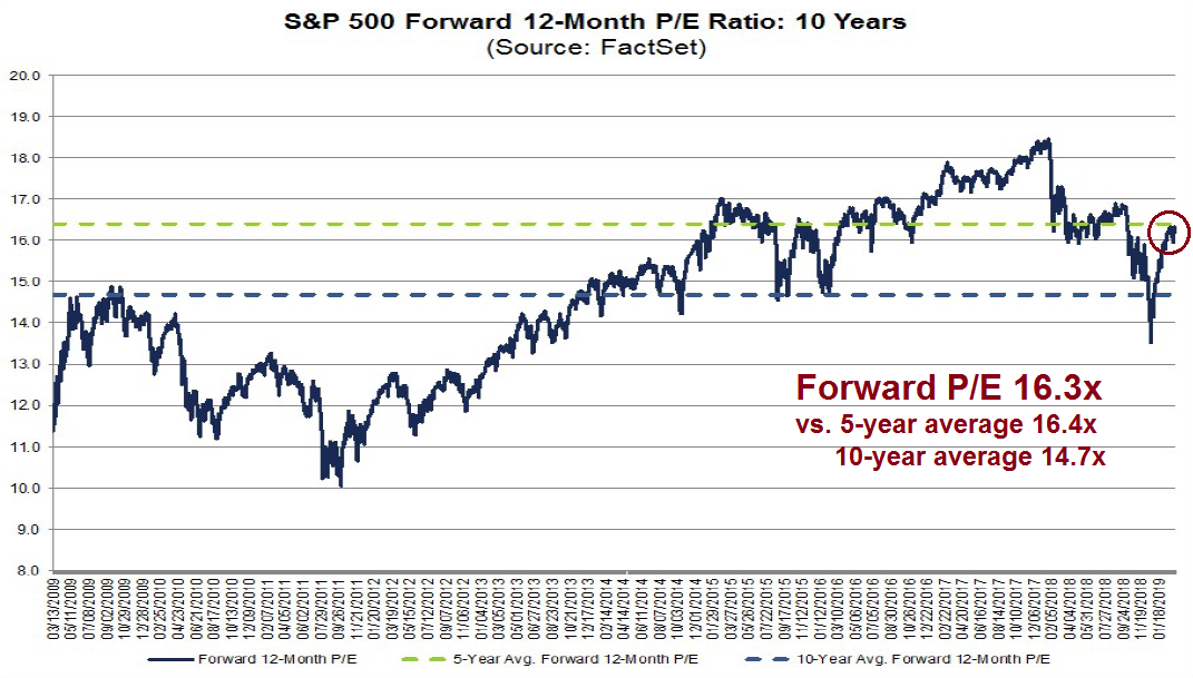
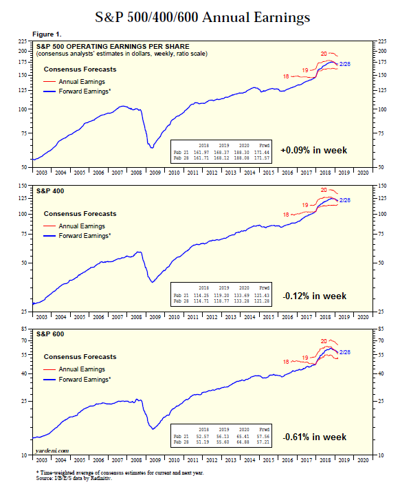
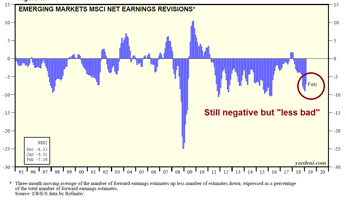
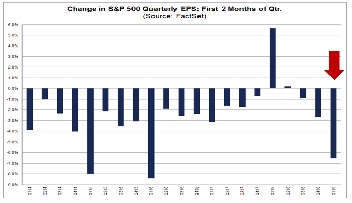
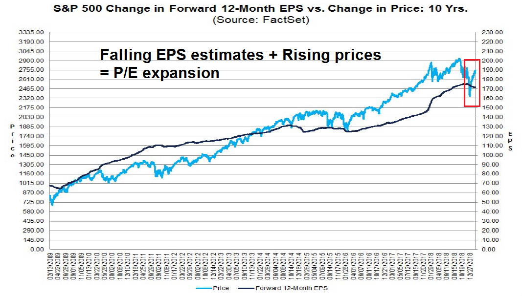
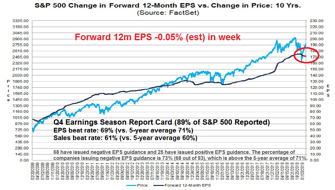
In the US, the latest update from FactSet shows that forward 12-month EPS are bottoming. Forward EPS estimates were declining for most of 2019, but they bottomed and began turning up in the last few weeks, which is a sign of improving expectations.
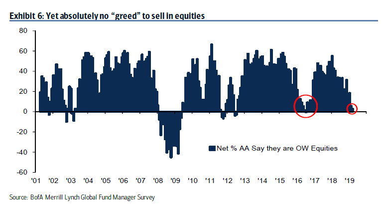
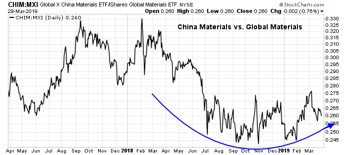
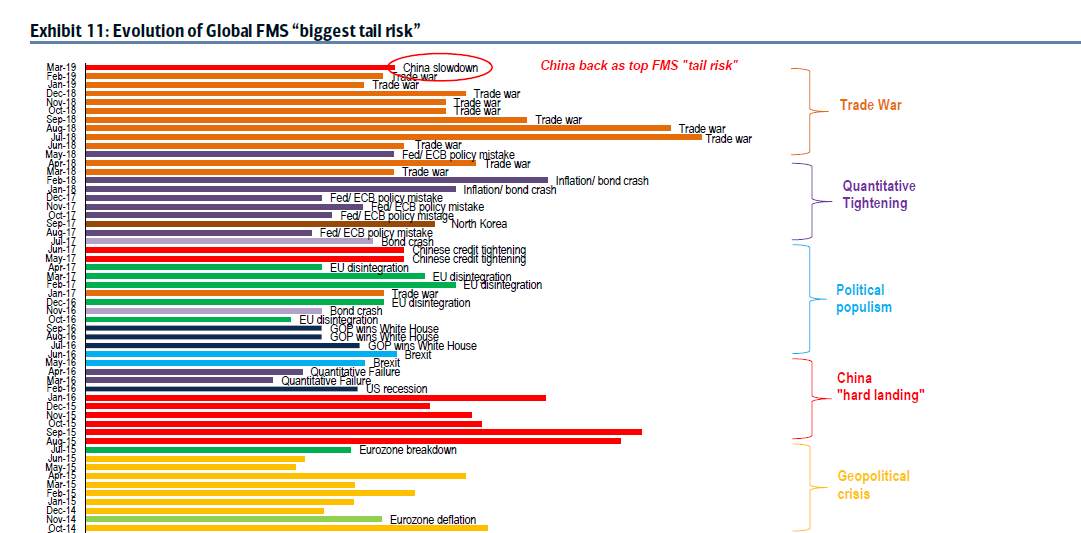
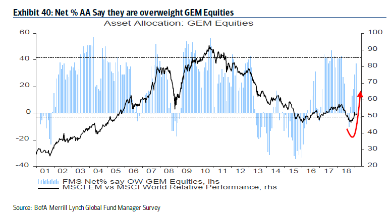
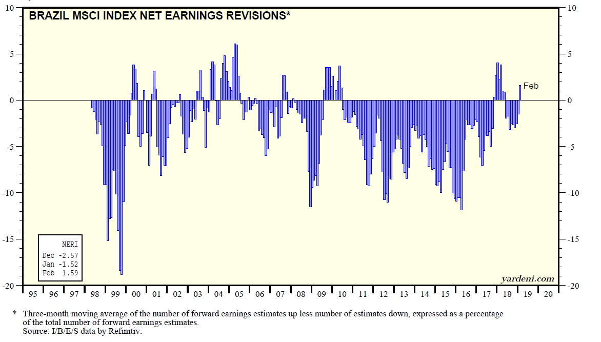
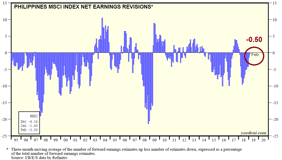
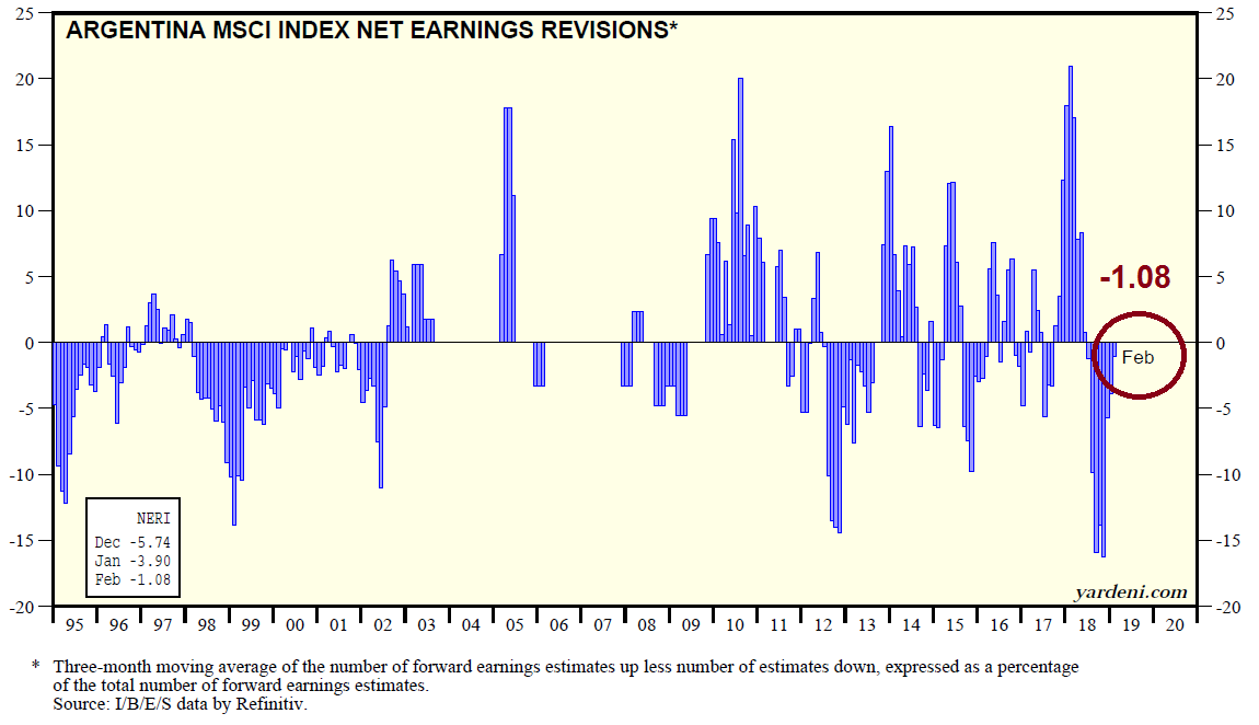
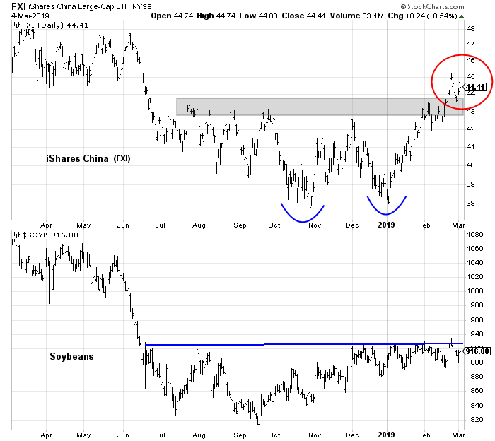
Over in Asia, the risks to China is highlighted by the evolution of the biggest tail-risk in the BAML Fund Manager Survey, which is the risk of a China slowdown.
In response to the well-known slowdown in China, Yuan Talks reported that Beijing is already enacting stimulus policies to cushion slowing growth:
China will not let economic growth slip out of a reasonable range despite the additional downward pressure, said Premier Li Keqiang on Friday at a news conference at the conclusion of the annual parliament meeting.
China lowered the economic growth target this year and set it as a range, which is actually a signal of stabilisation for the market, said Li. China is target a GDP growth range of 6 – 6.5 per cent this year.
Li said China can resort to quantity-based or price-based policy tools such as banks’ reserve requirement and interest rate tools to to boost the economy, which bolstering higher expectations for more stimulus policies.
One timely data point is South Korean exports, which is a sensitive barometer of global and Chinese growth because much of South Korea’s trade is with China. The March 1-20 year-over-year export statistics are improving. Exports were -4.9% v -11.1% in Feb. Exports to China was -12.6% v -17.4% in Feb.
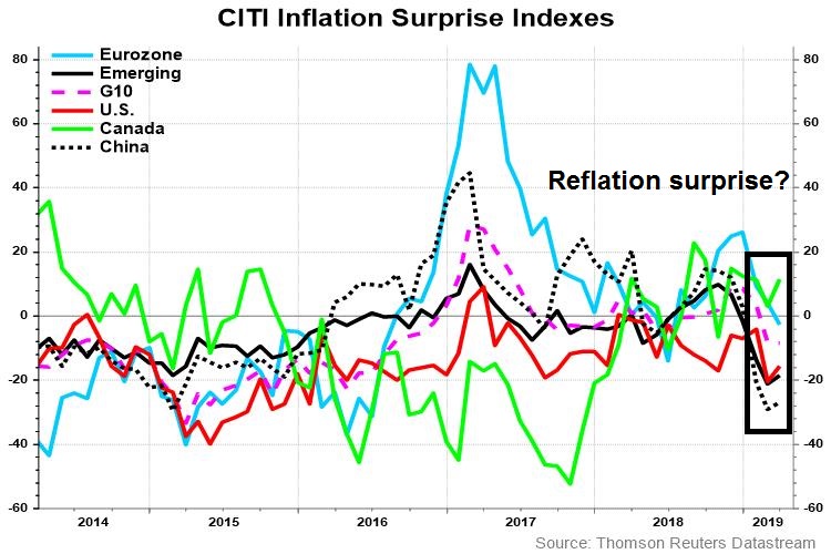
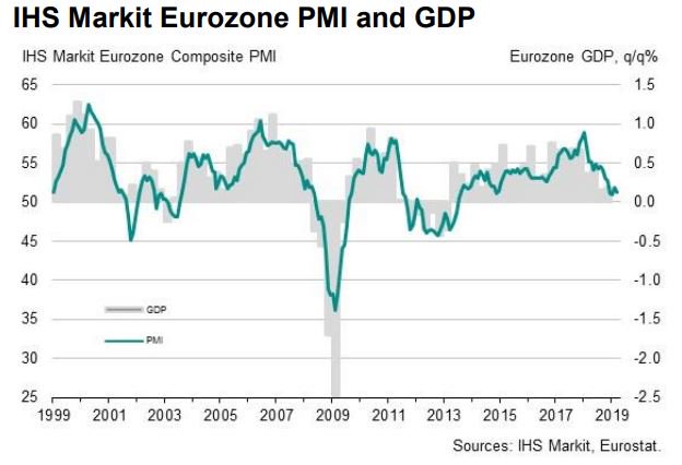
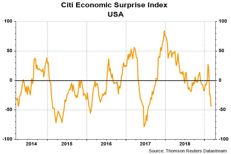
In Europe, top-down economic indicators are also improving. The Citigroup Europe Economic Surprise Index, which measures whether economic releases are beating or missing expectations, has bottomed and started to rise again.
There was also a silver lining in Friday’s disappointing eurozone PMI. While headline PMI declined, it was attributable to weakness in Germany and France, and from the manufacturing sector. IHS Markit did report some good news: “Elsewhere, the rate of output growth accelerated to its highest since last September as service sector growth hit an eight-month high.”
The slowdown in eurozone manufacturing may be reaching its nadir. China Beige Book found that Chinese headline growth is highly correlated to German IFO with a one-month lead. The nascent turnaround in Asia is good news for eurozone manufacturing exports.
Technical analysis review
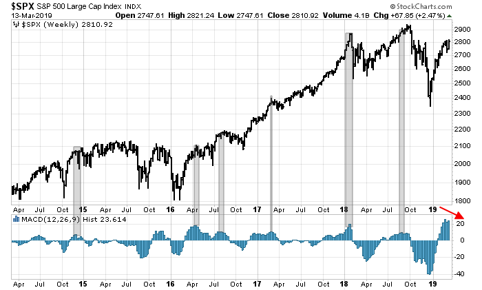
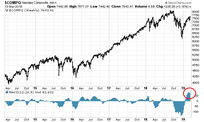
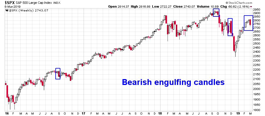
There is an additional technical perspective to the melt-up bull case. Regular readers will recognize this monthly price chart of the Wilshire 5000, which was prescient at spotting a negative RSI divergence last August and flashed a sell signal (see Market top ahead? My inner investor turns cautious). The vertical lines represent buy (blue) and sell (red) signals based on zero line crossovers by the monthly MACD histogram. While I am not in the habit of anticipating model signals, the market is 3-4 months from a buy signal at the current pace. Past buy signals has been a highly effective at spotting long dated profitable uptrends.
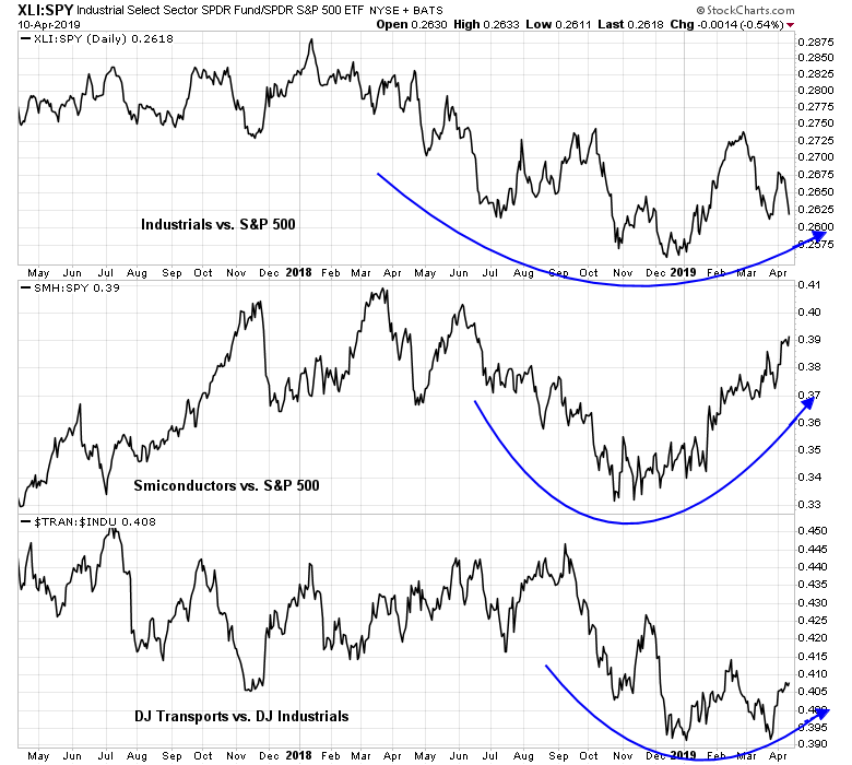
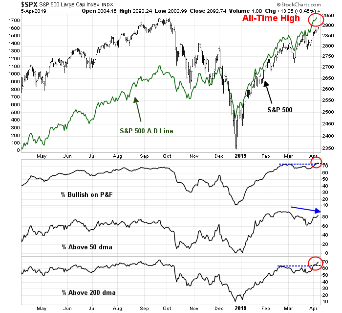
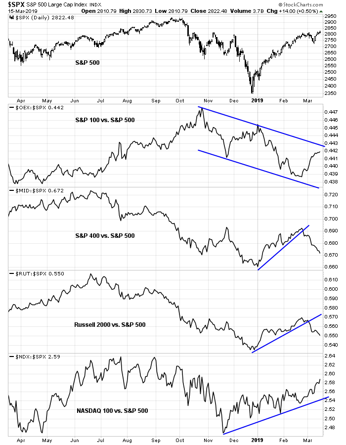
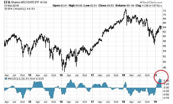
In addition to US stocks, the technical condition of stock markets around the world have improved sufficiently that all trend model scores have been upgraded. None of these formations appear bearish. At worse, they can be characterized as “constructive”, which calls for accumulation instead of an outright buy signal.
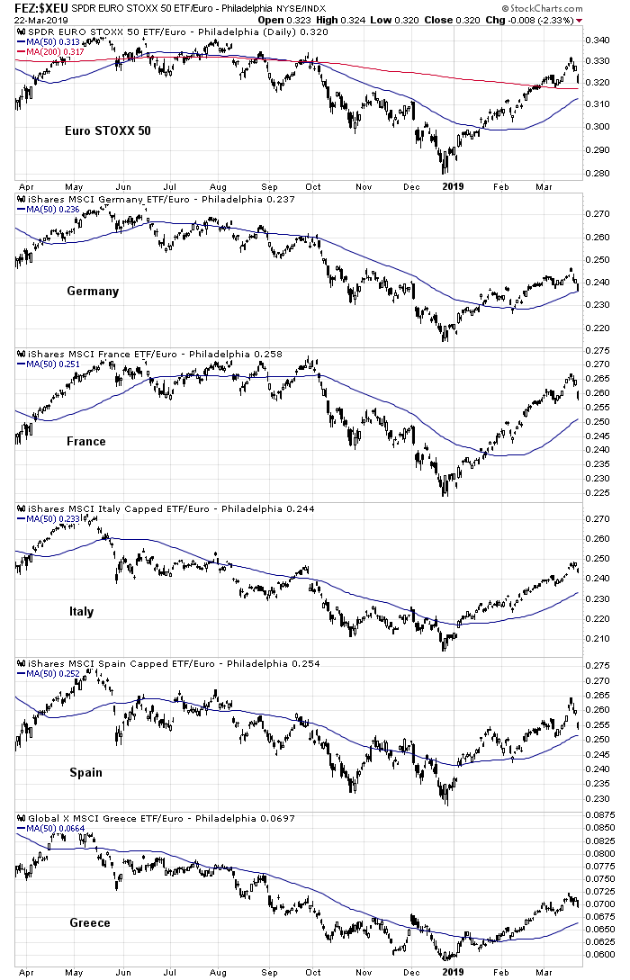
Here is Europe. The weakest markets seem to be the core European countries of Germany and France. Peripheral Europe is behaving even better than core Europe.
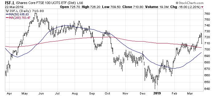
UK equities are also performing well, despite Brexit anxieties.
The markets of China and her major Asian trading partners have also recovered.
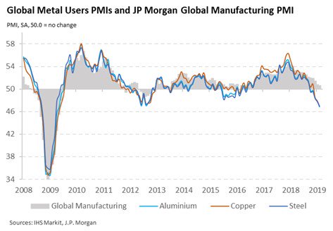
Lastly, commodity prices, as measured by industrial metals, and the CRB Index, are in the early parts of uptrends.
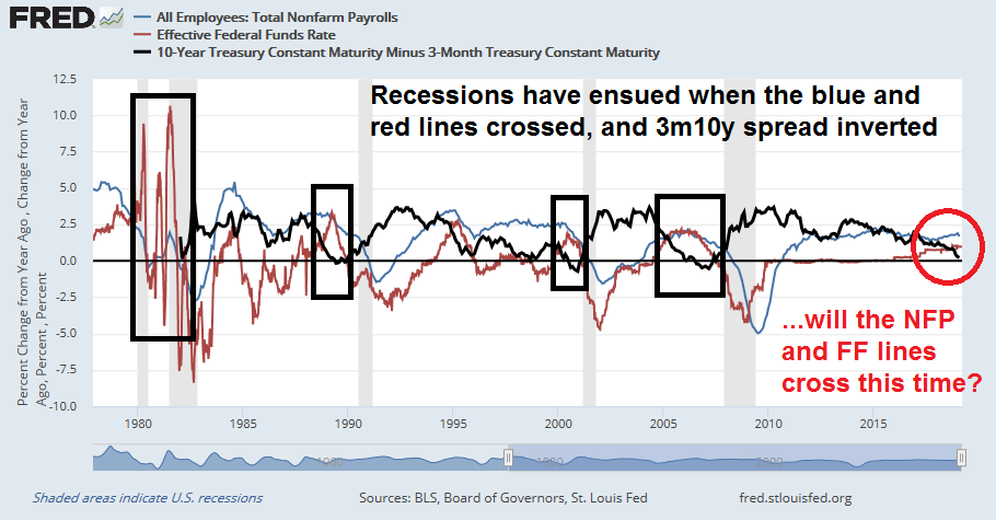
What about the yield curve?
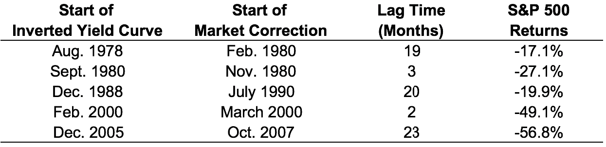
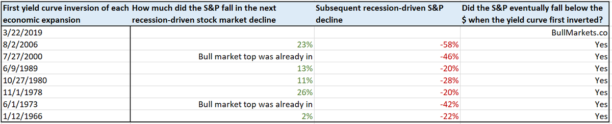
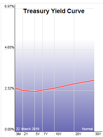
Some market anxiety has arisen recently because of the behavior of the yield curve. In particular, the belly of the curve has inverted. The spread between the 10-year and 3-month T-Bill is now negative, and the 2s10s spread has fallen to 11bp, which was the level last seen at the height of the December market sell-off.
Should you be worried? A flattening or inverted yield curve is a bond market signal of slowing economic growth. As the theory goes, as the Fed raises rates, the long end of the yield curve falls to reflect lower growth expectations. An inverted curve has been an uncanny signal of impending recession in the past.
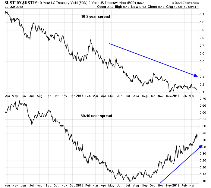
This time really is different. The Fed has given a dovish signal, and the belly of the curve has fallen faster than the front end. Moreover, while the 2s10s spread has been flattening, the 10s30s has steepened in the last few months.
Which yield spread should you focus on? The short end and the belly of the curve, which is most affected by Fed policy, or the long end, which is mostly determined by the market? The answer is both, but I am skeptical of a recession signal from a flattening or inverted yield spread that is unconfirmed by the other, especially when the Fed is dovish. I was far more concerned about recession risk last year when the 2s10s and 10s30s were flattening in lockstep.
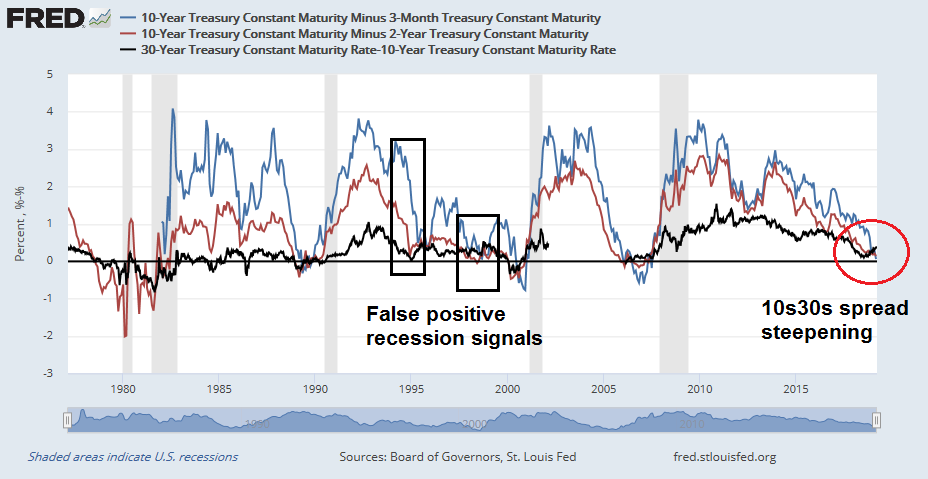
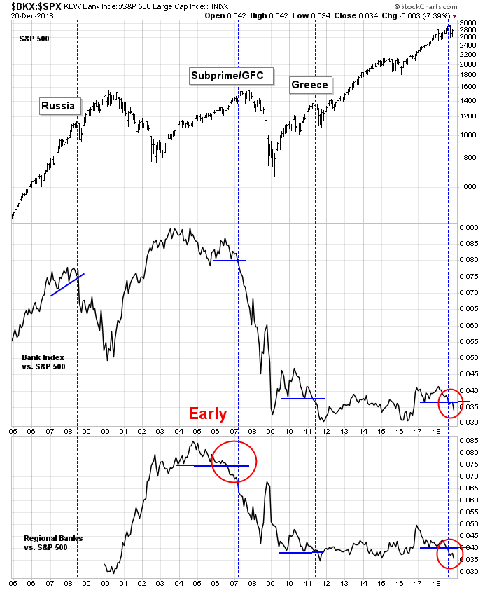
The following chart of yield curve recessionary signals indicate that false positives occurred twice in the 1990`s when inversions or near inversions in the short end were not confirmed by the long end. The first was in late 1994, when the Fed adopted a dovish tilt after a series of rate hike, and in 1998, when the Fed stepped in to rescue the financial system in the wake of the Russia and LTCM Crisis.
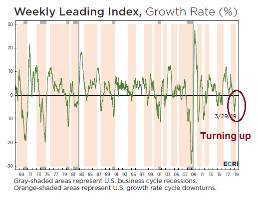
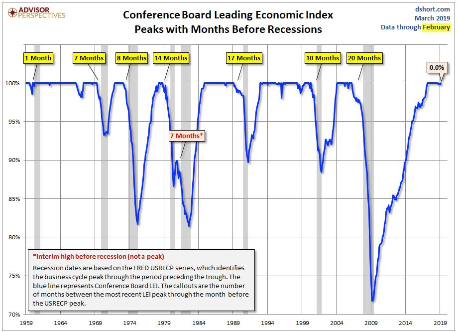
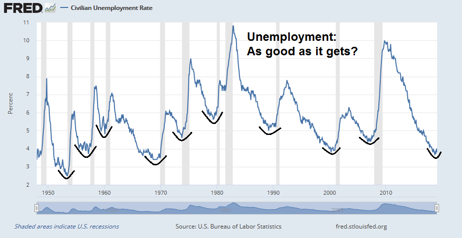
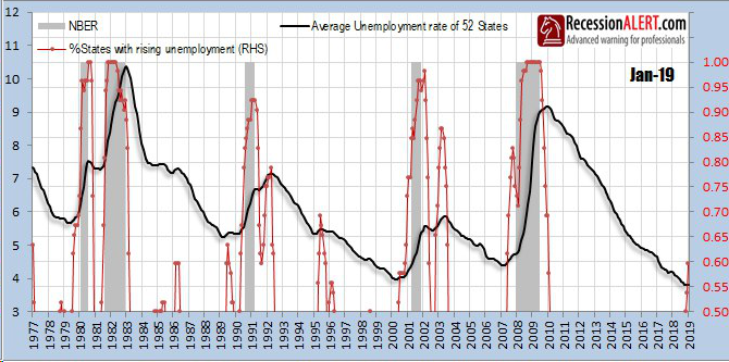
It is also difficult to believe that a recession is imminent when the Conference Board Leading Economic Index is so strong and shows no signs of deterioration.
In conclusion, the combination of accommodative fiscal and monetary conditions may be setting stock prices for a market melt-up into 2020 of unknown magnitude. The market has shrugged off slowing growth fears, and early signs of a pickup are beginning to appear. While a correction may still happen, I would regard any weakness as an opportunity to buy.
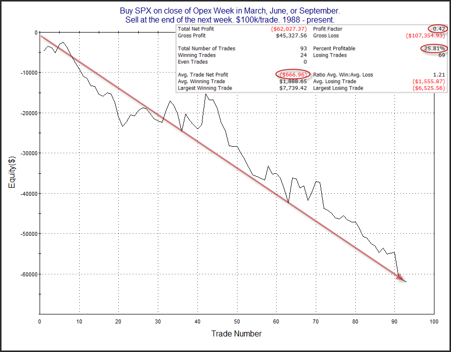
A “show me” week ahead
Looking to the week ahead, it is instructive to see how sentiment has shifted in a single day after soft flash PMI data from Europe, and the inverted yield 3m10y yield curve. Subscribers received an alert that my inner trader had taken an initial long position in the market, and the pushback was considerable.
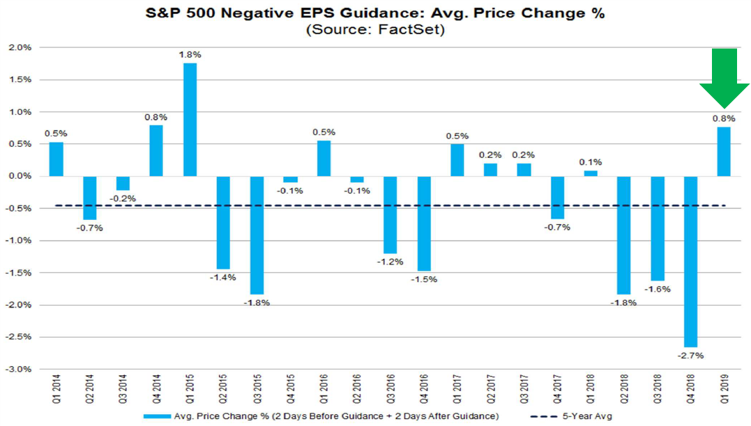
FactSet reported that the market has not been reacting to negative earnings guidance, which may be a sign that a slowdown is already priced in. This interpretation should be given greater consideration as forward EPS estimates are now bottoming out.
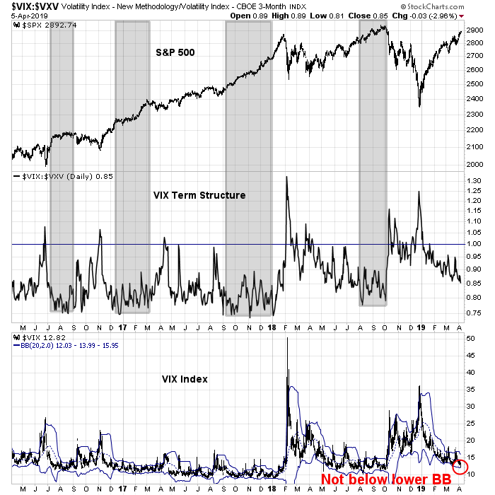
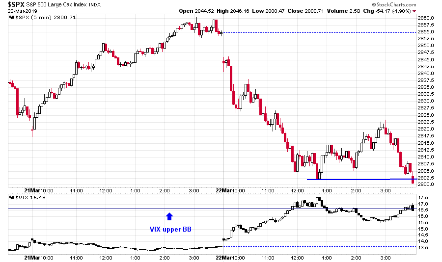
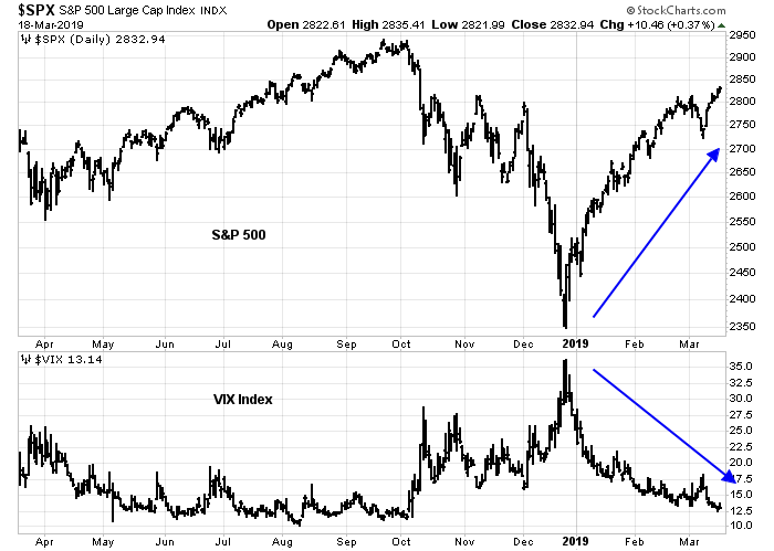
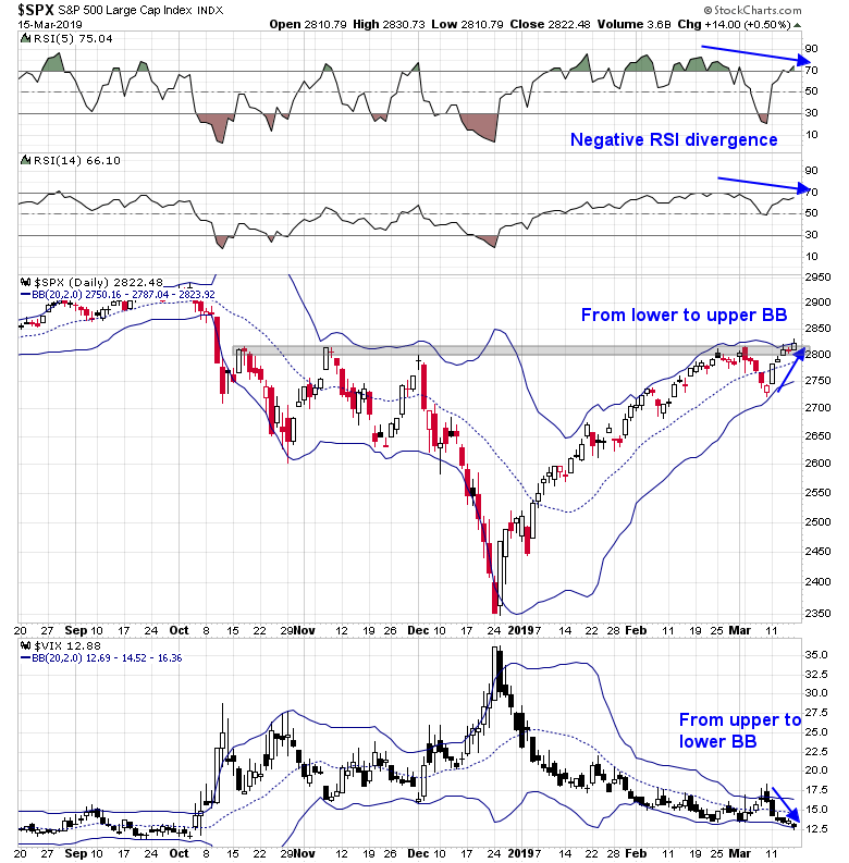
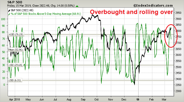
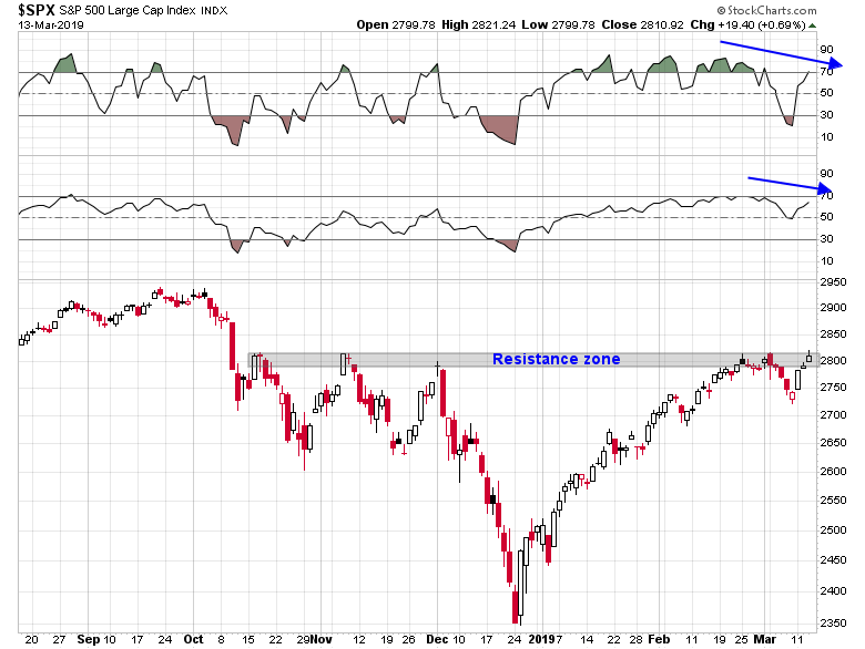
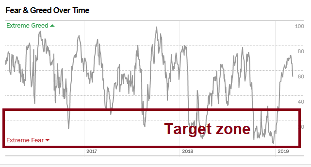
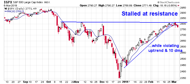
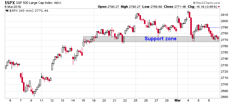
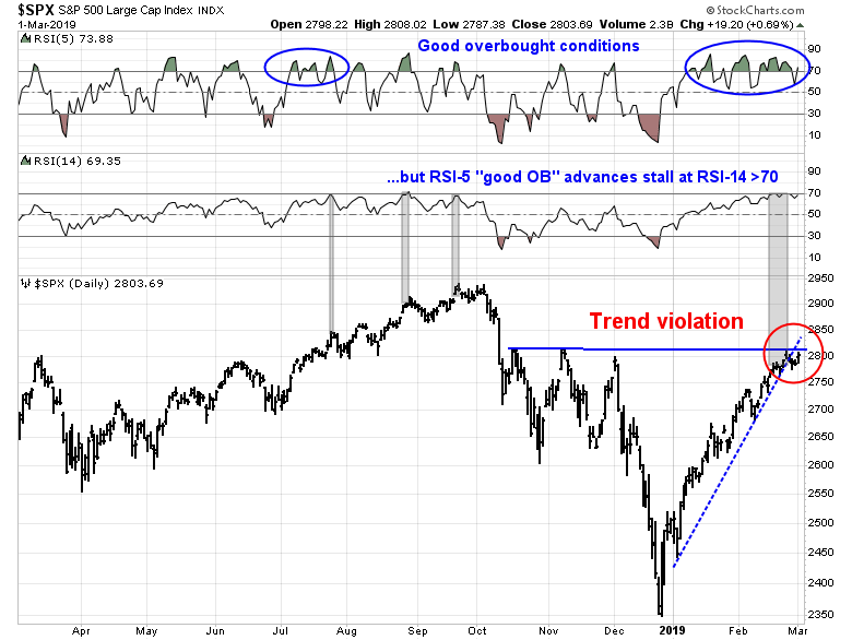
From a technical perspective, the S&P 500 pulled back to test a resistance level turned support, as the VIX Index neared its upper Bollinger Band, which is a sign of an oversold market.
The VIX Index spent much of Friday above its upper BB, which is one mark of an oversold market, but pulled back below the key level just at the close. Here is the 5-minute chart.
After the market closed, the news that Robert Mueller submitted his report hit the tape, which may serve to spike volatility next week. On the other hand, the news that Mueller has recommended no further indictments. such as Donald Trump Jr. or Jared Kushner, may be interpreted positively and spark a risk-on rally.
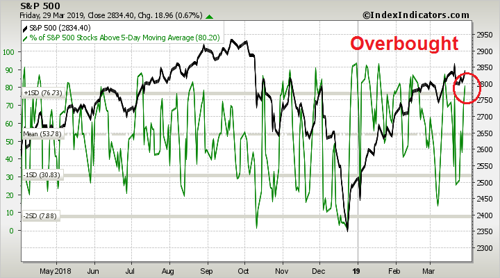
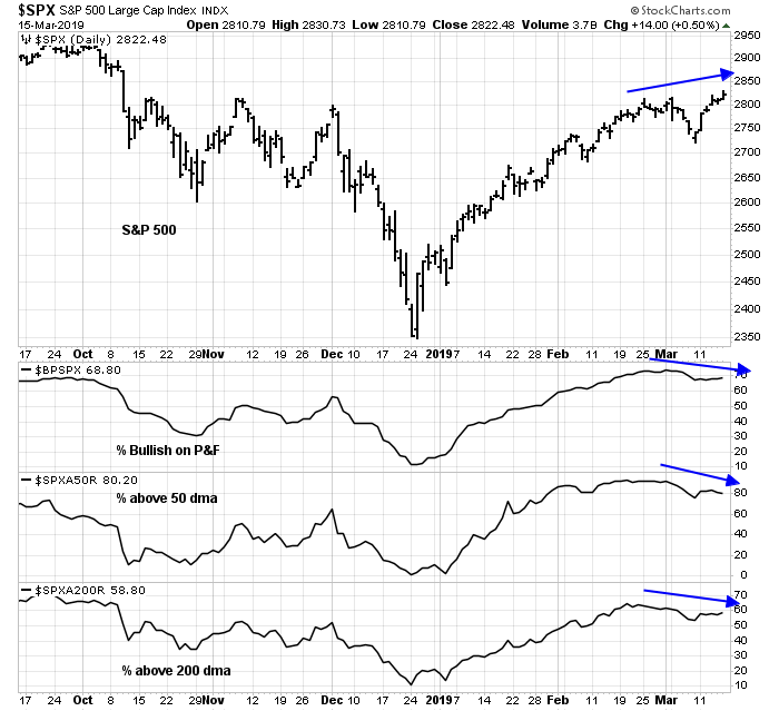
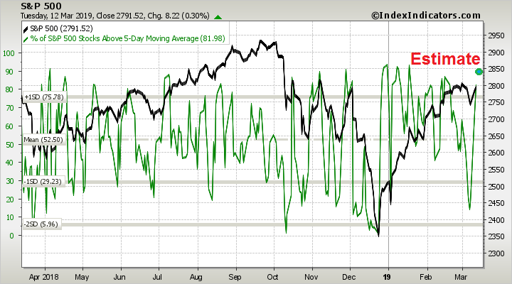
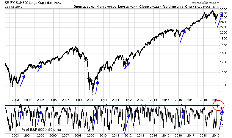
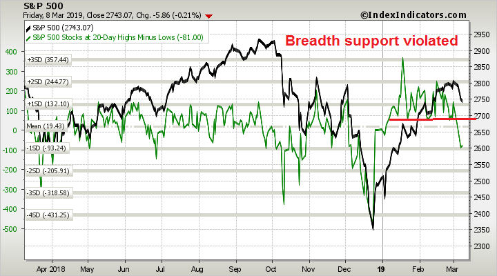
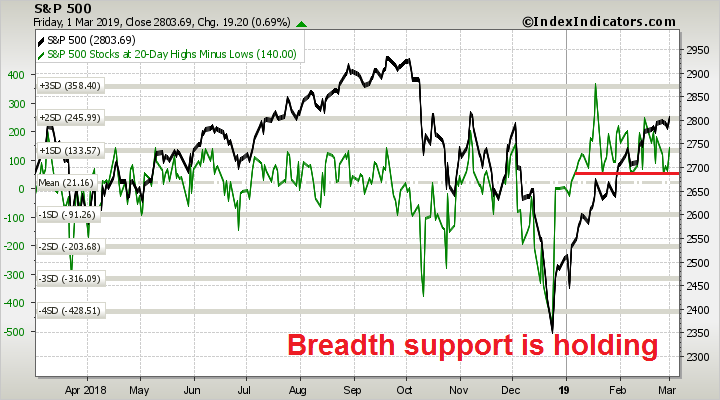
Short-term breadth deteriorated to mildly oversold condition as of Friday’s close. While the market can go lower, the 1-2 day risk/reward is tilted bullishly.
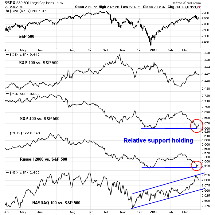
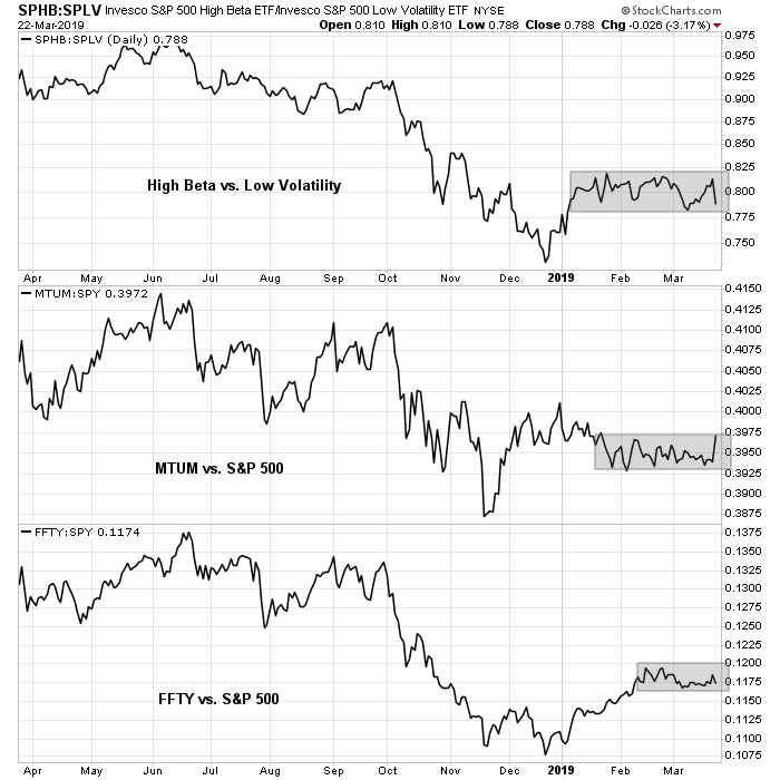
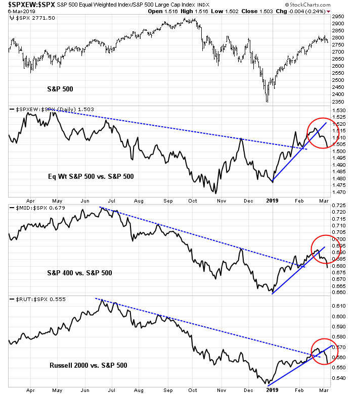
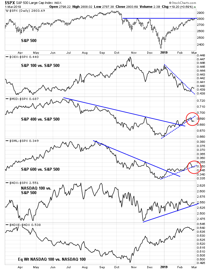
The upcoming week will be a “show me” week that may yield insights to a lot of unanswered questions. The chart below shows the S&P 500, and the relative performance of different market cap segments of the market. The answers may give some clues to the future direction of the market:
- Can the resistance turned support level of ~2800 hold?
- Are mid and small caps, which have been underperforming, hold their relative support lines?
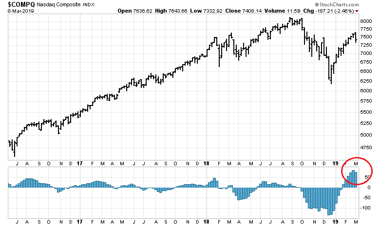
- NASDAQ stocks, which have been on a tear and appear a little extended, continue their market leadership status?
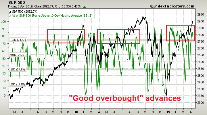
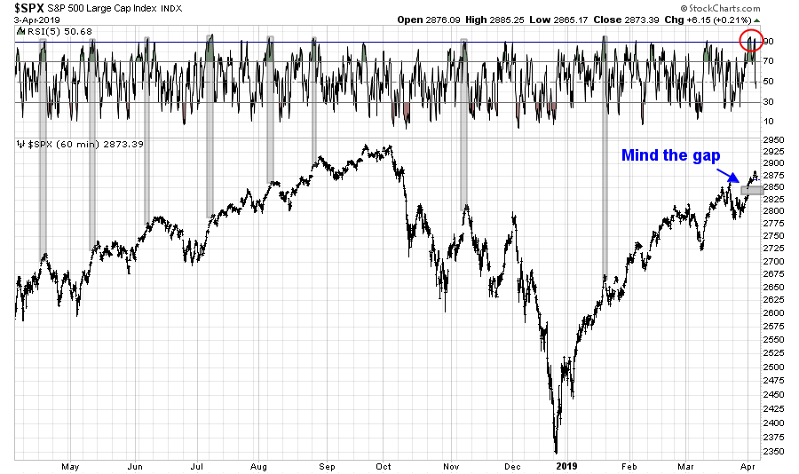
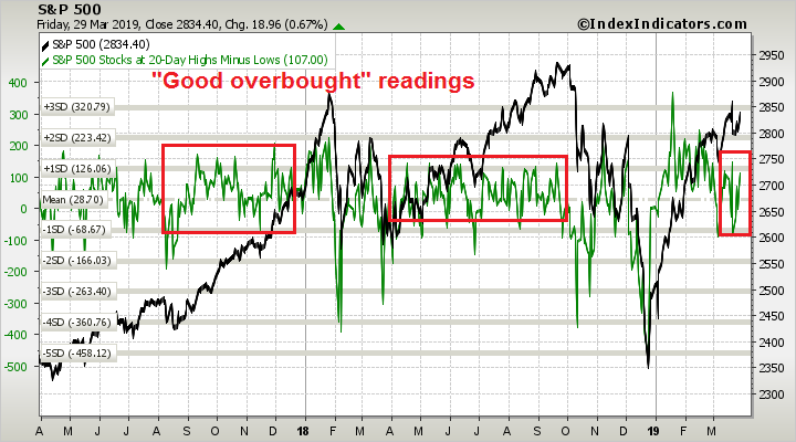
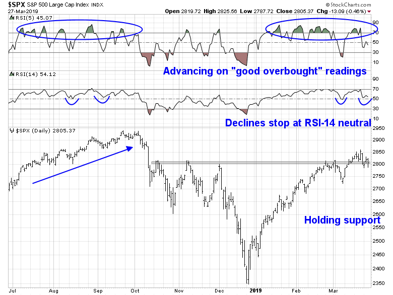
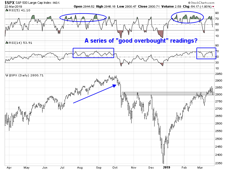
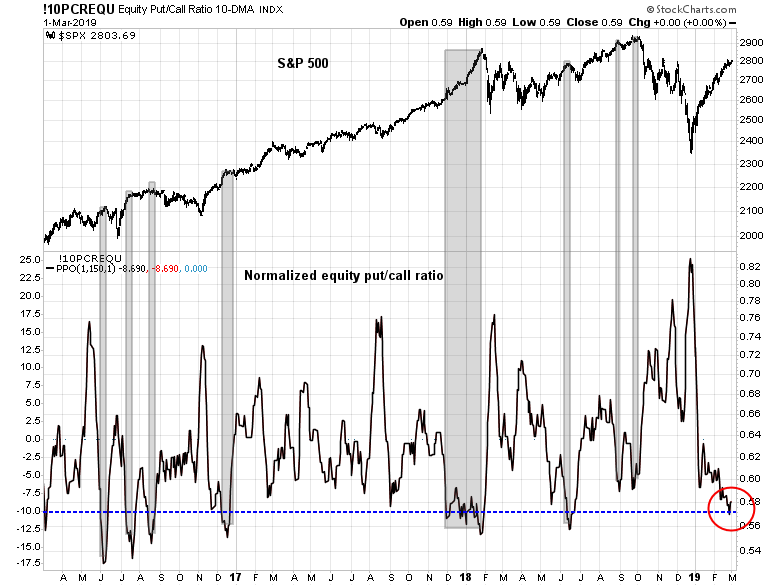
Do the bulls still have control of the tape? Is the market rallying on a series of “good overbought” readings on RSI-5, only to see any pullbacks halt with RSI-14 at about the neutral 50 line?
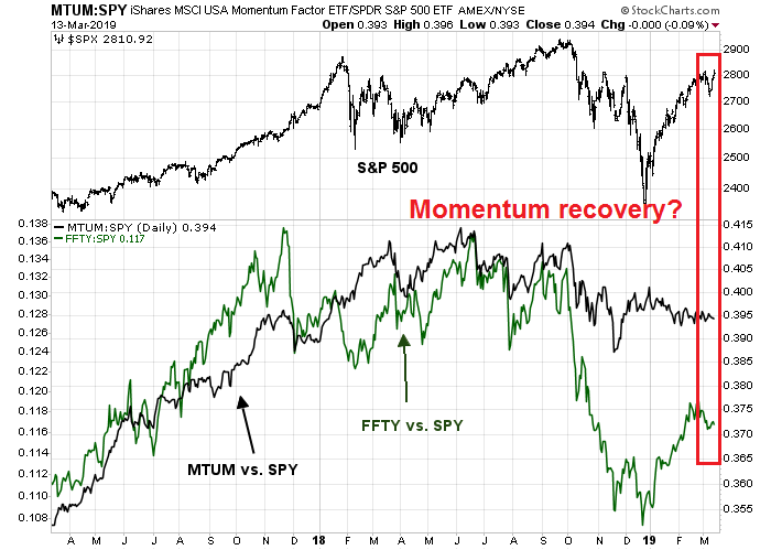
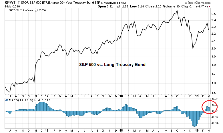
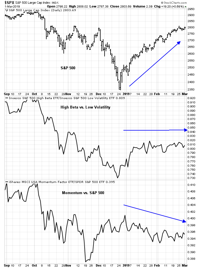
If the bulls were to maintain control of the tape, I would like to see better performance by equity market risk appetite factors. So far, the relative performance of high beta vs. low volatility, pure price momentum (MTUM), blended momentum (FFTY) are all range bound. Can they break out of their ranges? In which direction?
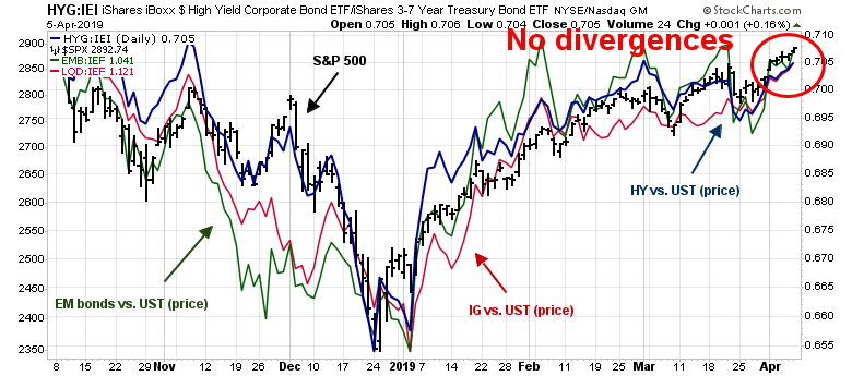
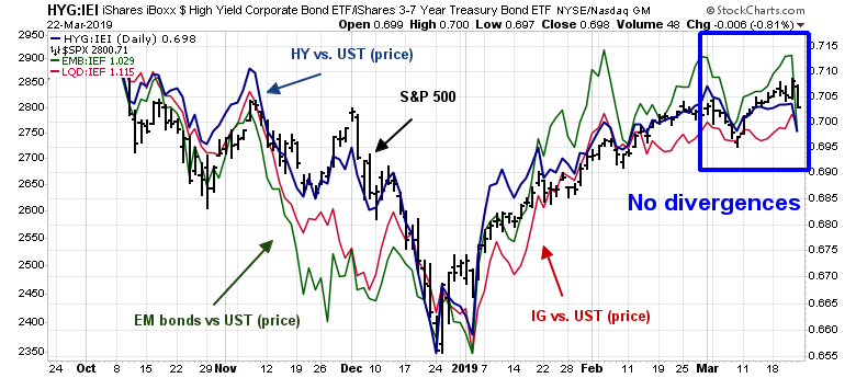
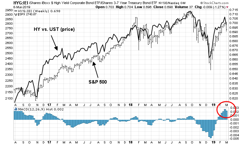
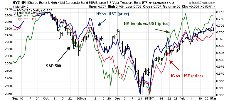
Credit market risk appetite indicators have not given many clues. The duration adjusted price relative performance of high yield (junk bonds), investment grade, and EM bonds are all tracking the stock market. There are no significant divergences.
Finally, much has been made of the poor recent performance of the DJ Transports by some technical analysts. Can the Transports hold their absolute and relative support levels? That will also provide another clue to future market direction.
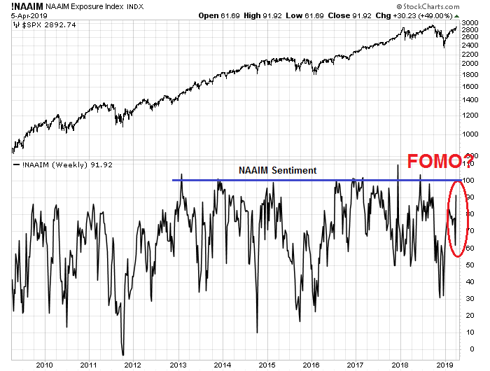
My inner investor was neutrally positioned at his target asset allocation weights. He allowed his equity weight to drift slightly upward as the market rallied and he is not trimming those positions back. His view is to remain cautious by avoiding being the FOMO buyer, but to buy any dip that occurs.
My inner trader is giving the bull case the benefit of the doubt. He covered all of his short positions on Wednesday in the wake of the dovish FOMC statement. He has taken a small initial long position in the market.
Disclosure: Long SPXL