Preface: Explaining our market timing models
We maintain several market timing models, each with differing time horizons. The “Ultimate Market Timing Model” is a long-term market timing model based on the research outlined in our post, Building the ultimate market timing model. This model tends to generate only a handful of signals each decade.
The Trend Model is an asset allocation model which applies trend following principles based on the inputs of global stock and commodity price. This model has a shorter time horizon and tends to turn over about 4-6 times a year. In essence, it seeks to answer the question, “Is the trend in the global economy expansion (bullish) or contraction (bearish)?”
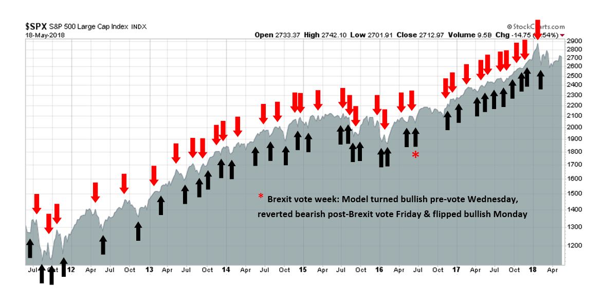
My inner trader uses the trading component of the Trend Model to look for changes in the direction of the main Trend Model signal. A bullish Trend Model signal that gets less bullish is a trading “sell” signal. Conversely, a bearish Trend Model signal that gets less bearish is a trading “buy” signal. The history of actual out-of-sample (not backtested) signals of the trading model are shown by the arrows in the chart below. The turnover rate of the trading model is high, and it has varied between 150% to 200% per month.
Subscribers receive real-time alerts of model changes, and a hypothetical trading record of the those email alerts are updated weekly here.
The latest signals of each model are as follows:
- Ultimate market timing model: Buy equities
- Trend Model signal: Bullish
- Trading model: Bullish
Update schedule: I generally update model readings on my site on weekends and tweet mid-week observations at @humblestudent. Subscribers receive real-time alerts of trading model changes, and a hypothetical trading record of the those email alerts is shown here.
Institutions and the pain trade
The BAML Fund Manager Survey (FMS) is one of the most interesting surveys around, as the frequency is regular (monthly), extensive, and it has a long history. For readers who are unfamiliar with the survey, it reflects mainly the views of fund managers with global investment mandates.
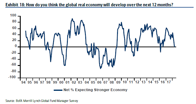
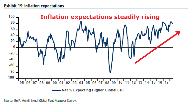
Reading between the lines of the latest FMS results, I found that institutional managers are positioned for a late cycle inflation surge, but they are starting to de-risk their portfolios in anticipation of weaker growth. To summarize, institutional managers believe that:
- Growth momentum is slowing, but
- Inflation expectations are rising, but
- The day of reckoning, as defined by either a recession or even a yield curve inversion, is still a long way in the future.
Fund managers have positioned their portfolios:
- In commodities, which I interpret as positioning for a late cycle inflation surge, but
- They are de-risking by selling equities,
- Selling their emerging market (EM) positions, and
- Buying bonds, but
- Portfolio risk appetite remains above average.
The highlights of the consensus portfolio bets amount to long energy, short USD, and short bonds. This analysis is highly speculative, but if I were the market gods and I wanted to inflict the maximum level of pain on market participants, here is what I would do.
What institutions believe
Let`s start by unpacking the FMS results. Institutional investors believe that the economic cycle is in the late phase of an expansion. Growth momentum is slowing.
Inflation expectations are rising and they have been steadily increasing for several years.
Here is a possible anomaly. Even though managers believe that they are seeing classic signs of a late cycle expansion, the median manager believes that a yield curve inversion, which has preceded past recessions, will not occur until some time in 2019. How late cycle can the markets be if a yield curve inversion is that far off?
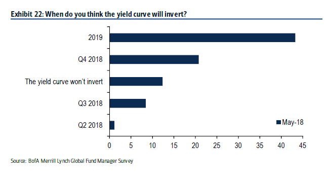
As well, the median manager expects the next recession will not occur until late 2019.

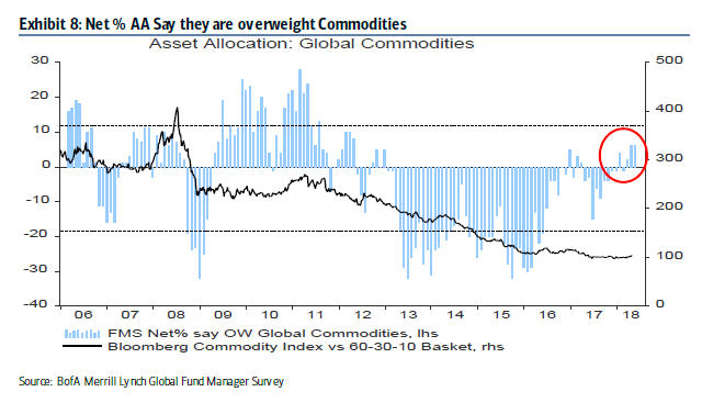
Buying inflation hedges, but de-risking
In accordance with the belief in rising inflation expectations, institutional managers are overweight late cycle inflation hedges such as commodities, though positions are not excessive.
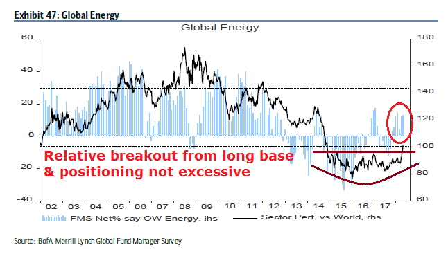
Similarly, energy stocks have staged an upside relative breakout from a multi-year base. Managers are also overweight, but positions are not extreme.
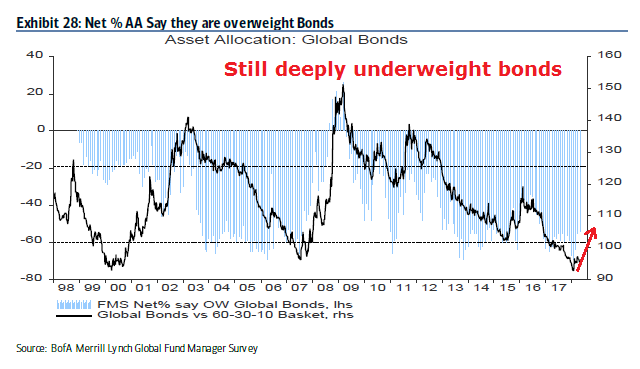
Risk on? Not so fast. Managers have begun to de-risk their portfolios by unwinding their extreme underweight bond positions, though they remain deeply underweight.
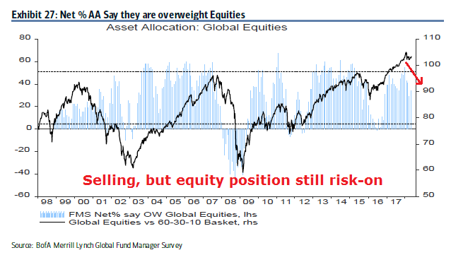
At the same time, they have begun to lower their equity weights, though their positioning remains risk-on and above average.
The de-risking starts with a sale of their high-beta EM positions.
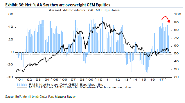
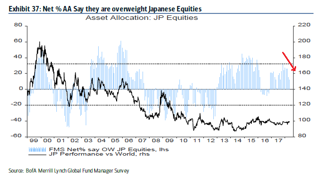
The equity weights in most developed regions have been falling.

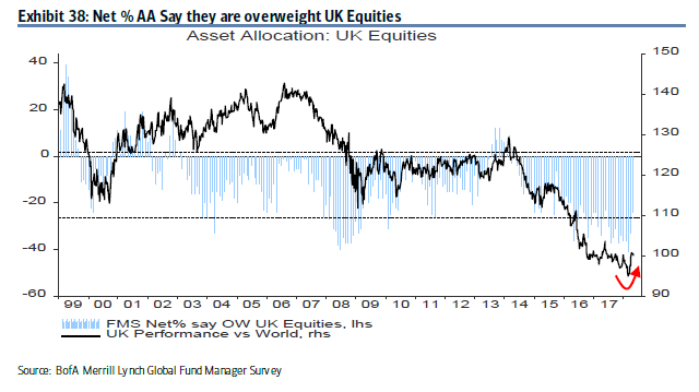
The only major exception is the UK, which enjoyed a rebound. However, the weight of the UK in the MSCI All-Country World Index (ACWI) is only 5.8%.
The weight of US stocks, which has a 52% weight in ACWI, has been mixed. While US portfolio weights have been trending up for the past few months, it ticked down in the latest month.

How can managers be selling stocks while you espouse a belief in rising inflation, and overweight commodities? Shouldn’t they be buying beta instead of selling beta under these circumstances?
How the pain trade could develop
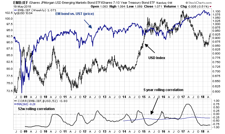
One of the clues to the pain trade comes from the recent EM weakness. What was unusual about the sale in EM positions is that that rush for the exits was not accompanied by other signs of risk appetite pullback. The chart below shows the price performance of US high yield debt relative to their duration equivalent Treasuries, and that of EM bonds. Note the yawning price gap that began in early April.

The weakness in EM debt can be attributable to the strength in the USD. As the USD rises, the risk of a crisis in overly indebted EM countries with USD denominated debt rises. The bottom panel of the following chart shows that the history of EM debt relative performance is negatively correlated with the US Dollar.
Here is how a pain trade might develop. What if the US Dollar were to strengthen further? Continued intermediate term USD strength makes sense from a technical perspective. The RRG chart, which is used to measure group rotation, shows that the USD is the only currency that is in a leadership position. All other currencies, which includes gold, are either in the weakening or lagging quadrants.
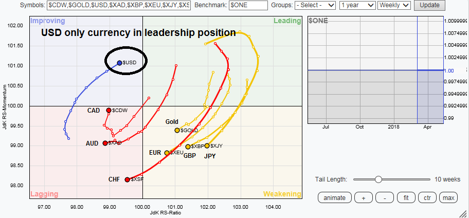
The recent USD strength caught most market participants by surprise. The USD is currently overbought, and a minor pullback or consolidation would be no surprise. What if it paused briefly here and continued to rally?

Commodity prices are historically inversely correlated with the USD, and further USD rally would cause managers with overweight positions in commodities and energy stocks considerable pain.
But first, a USD pullback
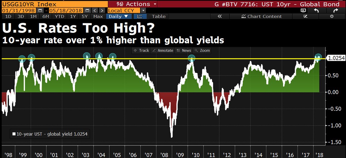
To be sure, the market gods are tricksters who like to draw their victims in so that they can suffer maximum pain. The USD rally is probably unsustainable in the short run, as the spike in US yields have pushed the greenback up against other currencies. The differential between the 10-year Treasury note and other global yields has reached 1%, which is extreme by historical standards. Something has to give, and expect some pullback in Treasury yields, which would weaken the USD.
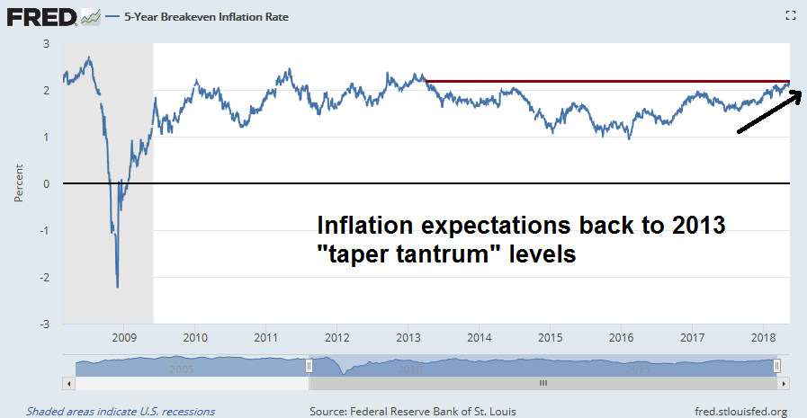
At the same time, there is ample evidence that inflationary pressures are rising. Inflation expectations, as measured by the 5-year breakeven rate, is back to 2013 “taper tantrum” levels.
The combination of near-term USD softness and rising inflation expectations should draw in buyers into inflation hedge vehicles. In that case, watch for gold prices to stage an upside breakout from a multi-year base should the USD decline. In the interim, gold’s ability to remain in an uptrend in the face of USD has to be regarded as constructive for the precious metal.

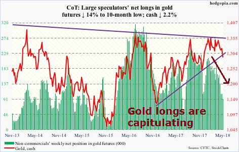
A summary of the latest Commitment of Traders from Hedgopia shows that large speculators are bailing out of their long gold positions. This is a sign of capitulation, and counter-trend USD weakness that buoys gold prices will be another source of trader pain.
At the same time, the erosion in large speculator long positions in crude oil even as prices advanced is a sign that oil prices are climbing the proverbial Wall of Worry.

All we need is one or more catalysts, such as a falling USD, or tighter supply from Iranian oil embargoes, to spike the oil prices. CNBC reported that Paul Hickey of Bespoke indicated that the current combination of rising oil prices and rising USD, while unusual, has historically been bullish for oil prices:
When we looked back at these prior periods in the market when you see these simultaneous rallies, crude oil has had a little bit better-than-average returns. The energy stocks have done really well going forward as well as the overall stock market.
A separate CNBC article indicated that expectations are building for $100, or possibly even $150 oil prices:
- The geopolitical risk premium in oil has driven crude prices to nearly four-year highs and shows no signs of abating.
- The U.S. exit from the Iranian nuclear deal, the rocket attacks between Iranian and Israeli forces and the general belief among the U.S., Saudi Arabia and Israel that Iran’s regional expansion needs to be stopped all argue for a continued rise in the price of crude.
- President Trump’s position on Iran has emboldened both Israel and Saudi Arabia, together, to challenge Iran more openly than at any time in the last four decades.
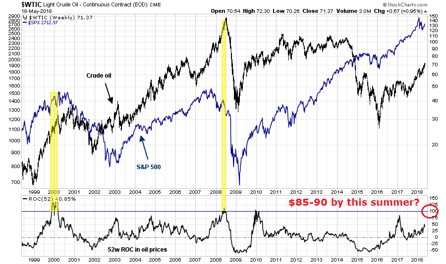
I have pointed out before that one-year changes in oil prices of 100% or more have tended to coincide with stock market peaks, largely because of a combination of the recessionary effects of higher oil prices and the Fed reacting to the leakage of commodity inflation into core inflation statistics. All that is needed is a WTI price of $85-90 by this summer.
Under such a scenario of near-term USD weakness, and upside breakouts in gold and oil price spikes, it would draw in the FOMO traders in a bullish stampede. Evidence of rising inflation and inflation expectations would likely result in a Fed-induced tightening cycle that puts upward pressure on the USD.
That’s how the ultimate pain trade would develop. One particular point of vulnerability are the EM economies. Bloomberg reported that Carmen Reinhart stated that EM countries are highly exposed in the current environment:
While money managers from Goldman Sachs Group Inc. to UBS Wealth Management still tout investing opportunities in emerging markets, the asset class has one notable critic: Harvard professor Carmen Reinhart.
The Cuban-born economist points to mounting debt loads, weakening terms of trade, rising global interest rates and stalling growth as reasons for concern. In fact, developing nations are worse off than during their two most recent moments of weakness: The 2008 global financial crisis and 2013 taper tantrum, when equities endured routs of 64 percent and 17 percent respectively.
“The overall shape they’re in has a lot more cracks now than it did five years ago and certainly at the time of the global financial crisis,” Reinhart said from Cambridge, Massachusetts. “It’s both external and internal conditions.”
Edward Harrison at Credit Writedowns suggested that Fed chair Powell is prepared to throw the EM economies under the bus. These countries are on their own if there is a crisis. In a recent speech, Powell stated:
Monetary stimulus by the Fed and other advanced-economy central banks played a relatively limited role in the surge of capital flows to EMEs in recent years. There is good reason to think that the normalization of monetary policies in advanced economies should continue to prove manageable for EMEs.
It also bears emphasizing that the EMEs themselves have made considerable progress in reducing vulnerabilities since the crisis-prone 1980s and 1990s. Many EMEs have substantially improved their fiscal and monetary policy frameworks while adopting more flexible exchange rates, a policy that recent research shows provides better insulation from external financial shocks.
Translation: The Fed is only responsible for the American economy. EM countries are on their own.
In addition, some Fed researchers published a rather timely discussion paper on the effects of Fed tightening cycles on foreign economies [emphasis added]:
This paper analyzes the spillovers of higher U.S. interest rates on economic activity in a large panel of 50 advanced and emerging economies. We allow the response of GDP in each country to vary according to its exchange rate regime, trade openness, and a vulnerability index that includes current account, foreign reserves, inflation, and external debt. We document large heterogeneity in the response of advanced and emerging economies to U.S. interest rate surprises. In response to a U.S. monetary tightening, GDP in foreign economies drops about as much as it does in the United States, with a larger decline in emerging economies than in advanced economies. In advanced economies, trade openness with the United States and the exchange rate regime account for a large portion of the contraction in activity. In emerging economies, the responses do not depend on the exchange rate regime or trade openness, but are larger when vulnerability is high.
Ouch! As a reminder. Even though the FMS shows that institutional managers are de-risking, their portfolios remain in a risk-on mode.
Should the pain trade scenario develop as I outlined, the fake-out begins with inflation exposure in institutional portfolios growing as the USD initially weakens and commodities rise, drawing the momentum players. Once it becomes an unbearable crowded long, interest rates would rise, the USD rally, and the trade would reverse itself, causing much pain and misery.
Near-term bullish
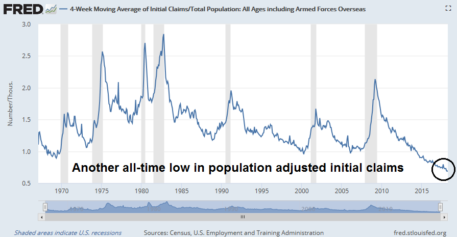
In the meantime, the near-term outlook is still bullish. The 4-week moving average of initial jobless claims, which is inversely coincident to stock prices, fell to another cycle low and to levels not seen since 1969. Population adjusted initial claims is already at another all-time low.
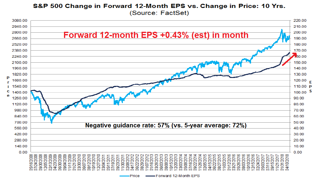
Forward 12-month EPS estimates is another indicator that is coincident to stock prices. The latest update from FactSet shows that forward EPS continues to rise, and Q2 guidance is better than the historical average.
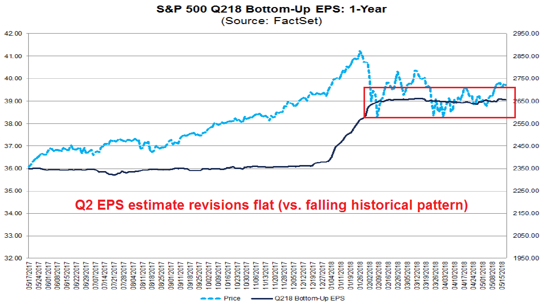
Drilling down further, the evolution of Q2 EPS estimates is encouraging for the growth outlook. Historically, Street analysts tend to be overly optimistic about earnings. Initial estimates tend to be high, and they slowly deteriorate over time. Q2 2018 EPS breaks that pattern. After an initial ramp because of the tax cut, estimates have stayed flat instead of degrading.
The week ahead
Looking to the week ahead, it’s hard to discern likely market direction despite my bullish intermediate term outlook. The bulls can be encouraged by the recent upside breakout from the downtrend (solid line), and stock prices appear to be in a rising channel (dotted lines). As well, last week’s weakness was halted at the 50% retracement level.

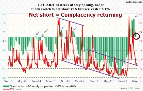
The latest CoT data shows that large speculators have moved from a net long to a net short position in VIX. Complacency is returning to the markets, but readings are not extreme and rising VIX shorts can be interpreted as a sign of positive equity price momentum.
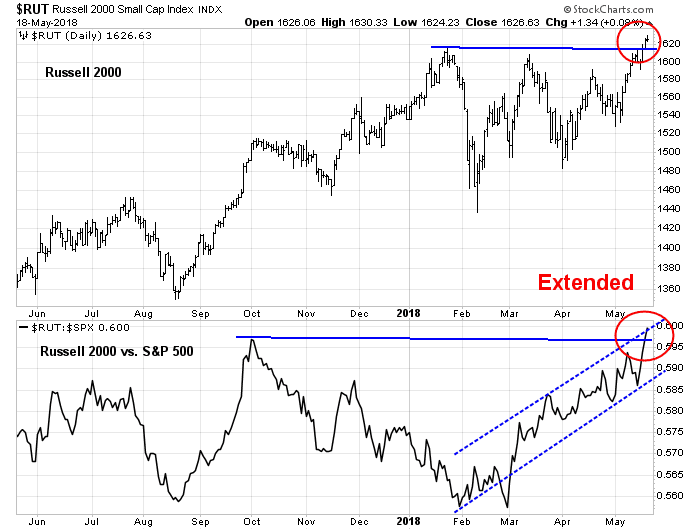
On the other hand, the current rally off the bottom has been led by small cap stocks, and the small cap move looks extended and due for a pause.
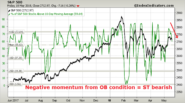
In addition, breadth indicators from Index Indicators show that the market is working off an overbought condition and exhibiting negative momentum, which is short-term bearish.
These kinds of market conditions call for a careful assessment of risk and reward. While my inner trader is leaning bullish, this is not the time to take excessive risk, and he prefers to step back and he is prepared to be not fully invested should the market rally from these levels. At the same time, he is keeping dry powder to buy the dips should they materialize.
My inner investor remains constructive on equities.
Disclosure: Long SPXL
In assessing the BAML charts, one should reflect the change in the price of the asset to indicate if institutions are actually buying or selling when the index level change might be the only thing making portfolio weighting shifts.
For example on the Europe chart, the level of institutions overweight stayed the same from 2013 to 2015 while the price of the Europe Index versus the World fell dramatically. Therefore portfolio managers were buying heavily as stocks fell.
Contrast that to early 2016 to now when the Index price versus the World is about the same while the overweight managers has tumbled. In other words they are selling heavily.
Reading both lines in relation to one another is important.
You will note that the question generally ask if the manager is over or underweight (vs. a benchmark). As well, the solid line shows the relative performance of that asset class compared to the benchmark. In the case of Europe, managers have been steadily reducing their weight while relative performance has been fairly flat.
I hope that is what I said, maybe in a confusing manner.