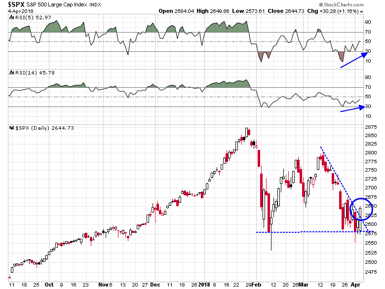
Mid-week market update: It is encouraging that the stock market held up well in the face of bad news on global trade. Global markets adopted a risk-off tone on the news of Chinese trade retaliation, but the SPX managed to hold a key support level and rally through a downtrend line.
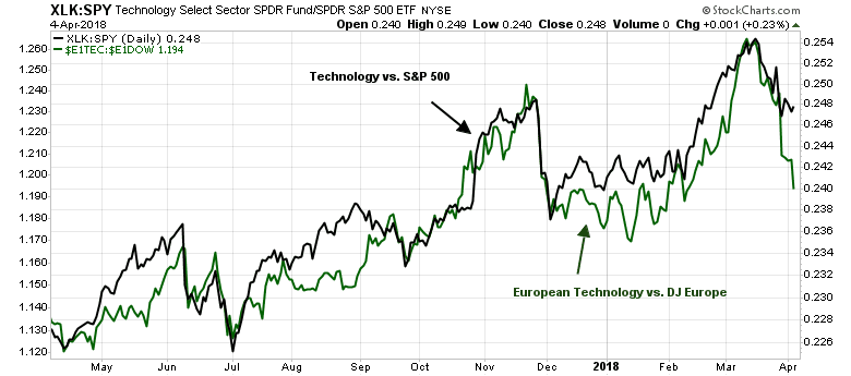
Looking over the past few weeks, equity market weakness really started rolling when technology stocks rolled over in March. The carnage was not just confined to Facebook, or Amazon, but to the entire technology sector and globally. The relative performance of European technology stocks (green line) paralleled the relative performance of US technology.
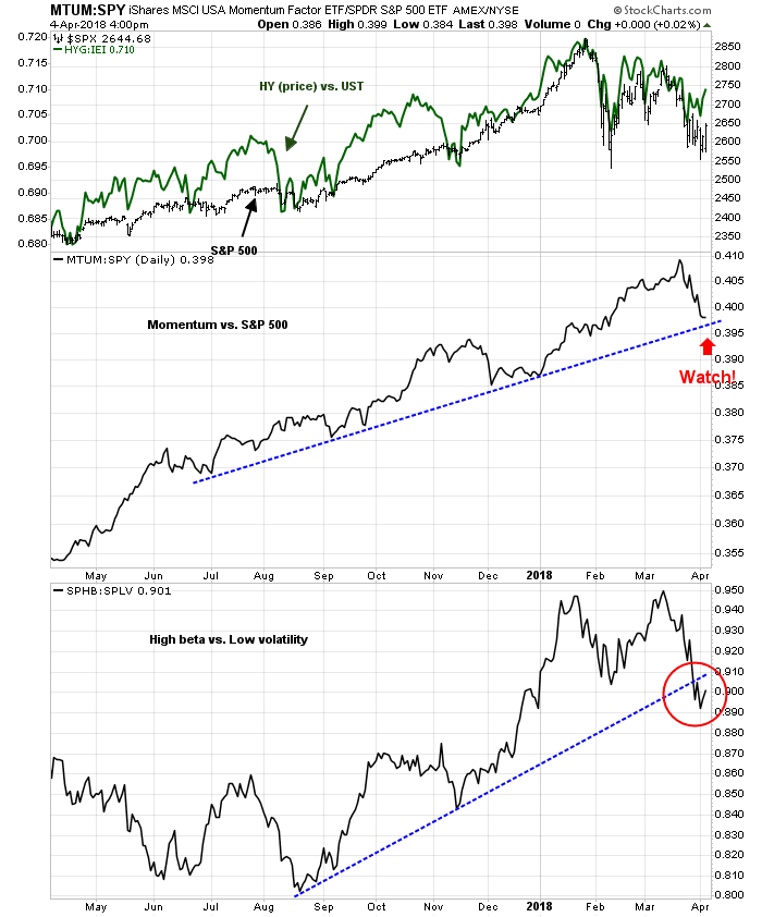
One encouraging sign for the broader market can be found in my risk appetite metrics. High yield bonds (top panel) are not confirming the weakness in stock prices, though momentum (middle panel), and high beta (bottom) panel are struggling.
Notwithstanding the weakness in the technology sector, where can investors find opportunity (or places to hide) in light of the constructive view on the broader equity market?
Quality and Value the emerging leadership
We can get some clues with the use of RRG charts. The Relative Rotation Graph (RRG) is a way of depicting the changes in leadership in different groups, such as sectors, countries or regions, or market factors. The charts are organized into four quadrants. The typical group rotation pattern occurs in a clockwise fashion. Leading groups (top right) deteriorate to weakening groups (bottom right), which then rotates to lagging groups (bottom left), which changes to improving groups (top left), and finally completes the cycle by improving to leading groups (top right) again. Instead of applying RRG analysis to sectors, I decided to think laterally and apply rotation analysis to factors, or styles.
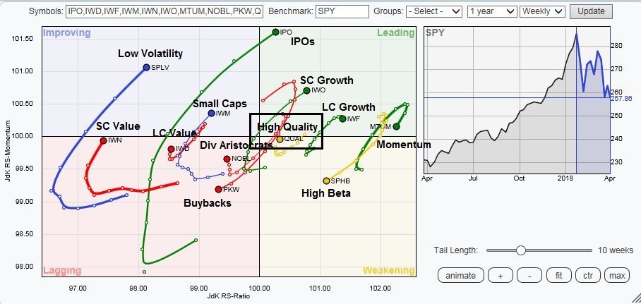
A number of observations stand out from this RRG analysis:
- Momentum and growth, which are in the top right leading quadrant, are in the process of rolling over;
- Emerging leadership does not just consistent of defensive styles, such as low volatility, but…
- Quality, and Value.
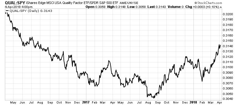
We can see how leadership is changing. I have already shown how price momentum, and high beta vs. low volatility are struggling. One interesting standout from the RRG chart is the emerging leadership of high quality stocks.
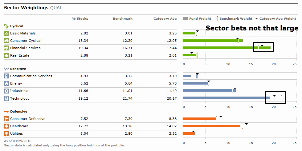
One attractive feature of the superior performance of the high quality factor is that it was largely achieved without making big sector bets. The accompanying chart from Morningstar shows the variance in sector weights between QUAL and the Russell 1000 benchmark. The biggest sector differences were only 2-3%, seen in an overweight position in Financials and underweight in Technology.
Other factors of note are large and small cap value. The superior relative performance of small cap value over large cap value is not a surprise in light of the recent revival of small cap stocks, which may also be worthwhile to consider (bottom panel).

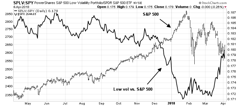
One factor that I would think twice about despite its position in the top right improving relative strength quadrant is low volatility. The recent outperformance of low volatility stocks appear to be a low beta effect. Low vol began beating the market when stock prices turned down.
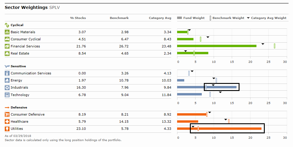
The sector exposure of SPLV can be seen in dramatic fashion from this Morningstar chart. The ETF has significant overweight positions compared to its Russell 1000 benchmark in Industrial and Utility stocks, and underweight positions in Energy, Healthcare, Communication Services, and Financials.
Think about what you are betting on. If you want to maintain some equity market exposure, but in a defensive fashion, low volatility is certainly a good candidate. However, don’t expect this factor to outperform should stock prices take off.
A plain vanilla market rotation
In conclusion, the market seems to be undergoing a plain vanilla rotation. The underlying internals appear to be constructive. Watch for high quality and value stocks to take the leadership baton from the faltering growth names.
Disclosure: Long SPXL
At the risk of being laughed out of the blog, the utility index is the new leader from the February low until now. Here is my LLLL chart of the utility ETF.
https://product.datastream.com/dscharting/gateway.aspx?guid=a715eabd-9da9-4483-92be-698c202b314a&action=REFRESH
The lowest chart shows the utility breaking out. The middle chart is of the last intermediate cycle where it underperformed hugely and possibly became a bargain.
The top chart shows it underperforming the S&P 500 over the nine month look back period.
If a bear market is starting, this area will likely do well. Everyone’s notion that rates are CERTAIN to go up may be wrong if a trade war makes the global economy stumble. BTW real retail sales are down four months in a row.
It’s much sexier to yell, “Buy the Internet ETF and GET RICH.” But that was last year. Now it could be best to whisper meekly, “Buy the Utility ETF You won’t go broke and you may make enough to pay the light bill.” LOL
As you know, these comments of mine are never recommendations. They are observations. I don’t know your situation.
Ken–This is Bob Millman, follower of Cam Hui for years now. I gather from what you have said that you manage money professionally. Perhaps we can talk about this sometime. I am an individual investor. If you care to you can reach me at rdmill69@aol.com