Preface: Explaining our market timing models
We maintain several market timing models, each with differing time horizons. The “Ultimate Market Timing Model” is a long-term market timing model based on the research outlined in our post, Building the ultimate market timing model. This model tends to generate only a handful of signals each decade.
The Trend Model is an asset allocation model which applies trend following principles based on the inputs of global stock and commodity price. This model has a shorter time horizon and tends to turn over about 4-6 times a year. In essence, it seeks to answer the question, “Is the trend in the global economy expansion (bullish) or contraction (bearish)?”
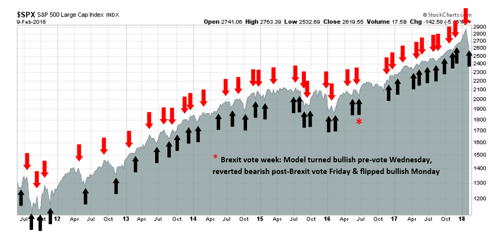
My inner trader uses the trading component of the Trend Model to look for changes in the direction of the main Trend Model signal. A bullish Trend Model signal that gets less bullish is a trading “sell” signal. Conversely, a bearish Trend Model signal that gets less bearish is a trading “buy” signal. The history of actual out-of-sample (not backtested) signals of the trading model are shown by the arrows in the chart below. The turnover rate of the trading model is high, and it has varied between 150% to 200% per month.
Subscribers receive real-time alerts of model changes, and a hypothetical trading record of the those email alerts are updated weekly here.
The latest signals of each model are as follows:
- Ultimate market timing model: Buy equities
- Trend Model signal: Neutral
- Trading model: Bullish
Update schedule: I generally update model readings on my site on weekends and tweet mid-week observations at @humblestudent. Subscribers receive real-time alerts of trading model changes, and a hypothetical trading record of the those email alerts is shown here.
The Bob Farrell Rule #4 correction
Volatility has certainly returned to the financial markets as the Dow experience two 1,000 point downdrafts in a single week. The long awaited correction arrived as stock prices retreated 10% from an all-time high in just under two weeks. Over at Bloomberg, there were six separate and distinct explanations for the correction. I prefer a far simpler reason. Stock prices went up too far and too fast. Call it the Bob Farrell Rule #4 correction: “When prices go parabolic, they go up much further than you expect, but they don’t correct by going sideways.”
As the market cratered last week, subscriber mood began on an air of cautious optimism, which turned to concern, and finally panic. By the end of the week, I was getting questions like, “I know that the market is oversold, but could it go further like 1987, 1929, or 2008?”
Relax, most of the concerns raised are red herrings. Here are what I am not worried about:
- Equity valuation,
- Macro outlook,
- Equity fundamentals,
- Investor sentiment, and
- Market technical picture, otherwise known as the “animal spirits”..
- The inflation outlook and Federal Reserve policy, and
- Possible changes in White House policy, such as trade and immigration.
Stocks are not expensive anymore
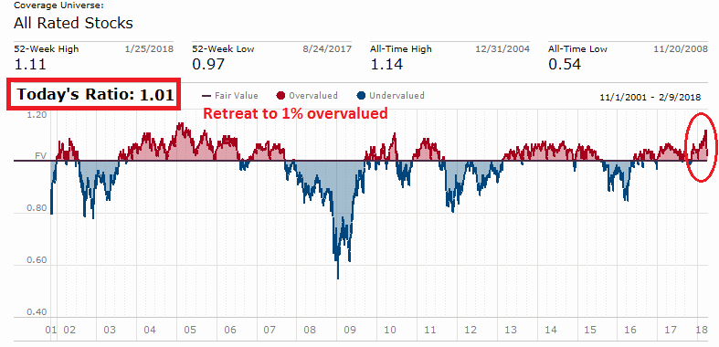
One of the risks that the bears have raised in the last few months is the overvaluation of stock prices. The good news is equity valuations are not stretched anymore. The Morningstar fair value estimate retreated from an 11% overvaluation in January to a 1% overvalued reading. Stocks are by no means cheap, but valuation no longer poses a headwind for prices.
Another way of approaching the valuation question is Ed Yardeni’s Rule of 20, which states that equity risk is heightened when the sum of the forward P/E and headline CPI exceed 20. The latest readings have retreated from its January high of 20.5 to 18.4, based on the latest FactSet report that forward P/E has fallen from 18.4 to 16.3.

If valuation is no longer a headwind, what about the outlook for based on macro and fundamentals?
A healthy macro outlook
One of the key questions for equity investors (not traders) is whether recession risk is rising. I suggested in last week’s post (see A house on fire?) that recession risk is low in 2018. The New York Fed’s recession odds estimate has been creeping upwards, but only stands at 10% for the next 12 months. Recessions are bull market killers, and every recession has seen a bear market, though not every bear market has resulted in a recession.

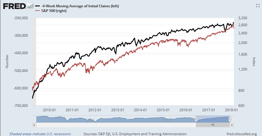
Another quick-and-dirty way of measuring the near-term equity outlook is through the use of initial jobless claims. This statistic has shown a near perfect inverse correlation to stock prices. The 4-week average of initial claims fell to a new cycle low last week, which is supportive of higher stock prices.
Strong fundamental momentum
In addition to bullish top-down macro picture, the bottom-up outlook is equally strong. The latest earnings update from FactSet reveals that bottom-up estimates continue to rise. EPS estimates have been rising for two reasons. First, the new tax bill provided a one-time boost to earnings. and bottom-up 2018 estimates have risen 6.4% since bill’s passage. The 6.4% increase is in the range of the 6-9% growth effect projected by top-down strategists. As most of the tax cut adjustments have been made, this component of positive EPS estimates is likely to slow dramatically in the near future. The second component of bottom-up EPS estimates stems from operational results, which can be seen in the latest Q4 earnings repots. Q4 EPS, which was unaffected by the corporate tax cuts, saw both EPS and beat rates well above the historical average. Equally bullish is forward Q1 guidance, which is much better than the historical experience.

In short, equity investors have little to worry about from the economy or the earnings front.
Washed out sentiment
As the market tanked last week, there was plenty of evidence that investor sentiment was nearing or at the capitulation stage. Bloomberg reported that 401k investors were selling into the panic. As this is a group that normally puts their allocation on autopilot, this kind of behavior indicates that robo-advisors were getting turned off and overridden as investors stampeded for the exits.
After racing into equities in January, they did an about-face as markets fell on Friday Feb. 2. Savers moved into money and fixed-income funds, trading at close to three times the norm, according to Alight Solutions’ 401(k) Index.
On Monday, when the Dow Jones Industrial Average plummeted 1,175 points, they repeated the pattern, this time trading at 12 times the typical pace. The next day, as the market recovered some losses, 401(k) savers kept selling stocks, trading at a rate of four times the usual.
The last time trading reached 12 times the norm was on Aug. 8, 2011, when markets dropped on concerns about a global debt crisis.
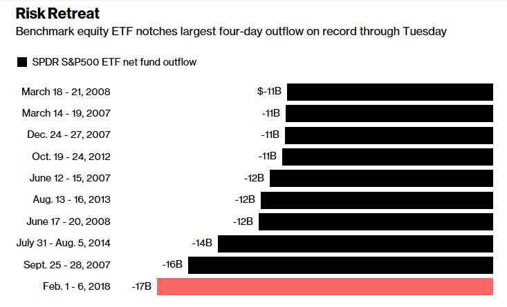
In a separate report, Bloomberg also reported that the 4-day outflows in SPY were the highest in its history.
As another sign that speculative excesses are being wrung out, the WSJ reported that the AUM of leveraged ETPs have plunged back to 2012 levels.

SentimenTrader pointed out that we saw a rare double last week, a CNBC “Market in Turmoil” report, and Trump tweets complaining about the stock market. Both events have historically been interpreted to be contrarian bullish.

I could go on, but you get the idea.
Possible technical bottom in sight
From a technical perspective, the market is oversold and poised for a relief rally. Even as the market sold off, it experienced a RSI-5 positive divergence and a minor RSI-14 divergence as it tested but violated technical support last Thursday. Friday saw the VIX fall below its upper Bollinger Band, which has been a reasonably good trading buy signal in the past.
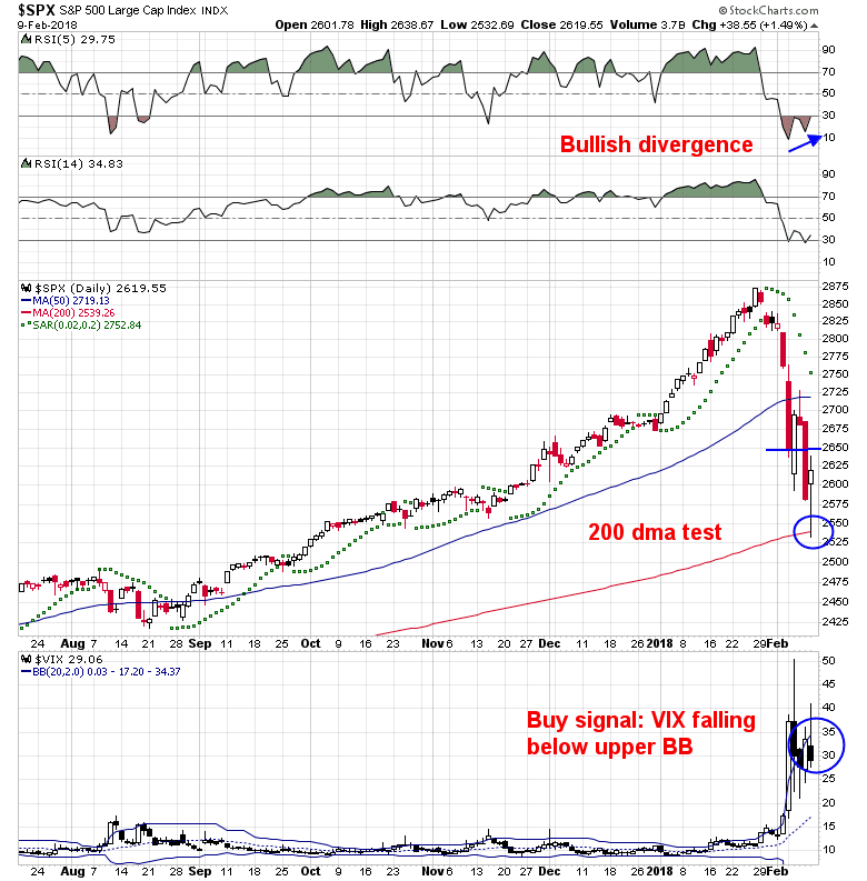
The following chart of the 5 dma of the NYSE McClellan Oscillator (NYMO) also tells a similar story of an oversold market. If history is any guide, downside risk is limited from these levels.

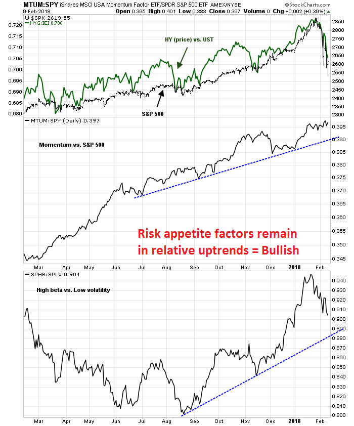
What about risk appetite? It was a surprise that I found that risk appetite factors remain bullish and supportive of higher stock prices. As shown in the chart below, price momentum remains in a relative uptrend, and so is the high beta vs. low volatility ratio. As well, I am not seeing signs of a negative divergence in the relative performance of high yield, or junk, bonds (green line, top panel).
If and when stocks can catch a bid, there is potential for the major indices to recover and test their old highs.
The inflation boogeyman
Despite my generally bullish outlook, no review of the stock market would be complete without a discussion of the risks. One major risk is how rising inflation may affect stock prices.
A common explanation of the selloff was the market was spooked by the strong Average Hourly Earnings (AHE) print in the January Employment Report. Strong wage gains puts greater pressure on the Federal Reserve to act and raise interest rates. Bond yields spiked, which spooked the stock market.

That explanation would be satisfying except for a few details. First, while headline AHE was strong, AHE for the working stiffs (production and non-supervisory employees) was rather tame. Therefore, the increase in AHE could be attributable to bonuses and other incentives paid to managers.

In addition, average weekly hours dipped. The growth in annual growth average weekly earnings, which measures the net effect of hourly earnings and hours worked, remained tame.

I would prefer to wait for next week`s Consumer Price Index report for an additional read of the inflation picture. To be sure, inflation has recently exhibited positive surprise in a number of other regions around the world, but US inflation surprise remains tame – for now.

Rising inflation expectations would put pressure for the Fed to act in a more aggressive manner, as price stability is one of its key mandates. The latest Fed Funds futures show that market expectations of rate hikes dipped slightly since the January FOMC meeting, presumably in response to the latest market volatility.

Policy surprise risk
Other possible negative surprises that investors would have to consider is White House policy. In particular, trade tensions have the potential to spook markets (see How to lose a trade war even before it begins and Sleepwalking toward a possible trade war).
As well, the market may not have fully considered the labor market tightening effects of Trump’s immigration policy (see The market effects of Trump’s immigration policy). They have the potential to drive the unemployment rate to levels that forces the Fed to act to counteract any cost-push inflationary pressures that may arise.
Bigger questions
While I believe that the current downdraft is only a correction, the bigger issue is whether this correction is the beginning of a topping process. Here are a couple of questions to ponder:
- Late cycle markets tend to rise in even as the Fed begins its tightening cycle (see Five steps, where’s the stumble?). That’s because the bullish tailwind of better growth expectations overwhelm the bearish headwind of higher rates. Did the latest uptick in bond rates signal an inflation point in market regime?
- From a technical perspective, it is said that while bottoms are events, tops are processes. That’s because market bottoms are events marked by climactic and unbridled fear, while the fundamentals behind market tops develop more slowly. Was this leg down the start of a topping process?
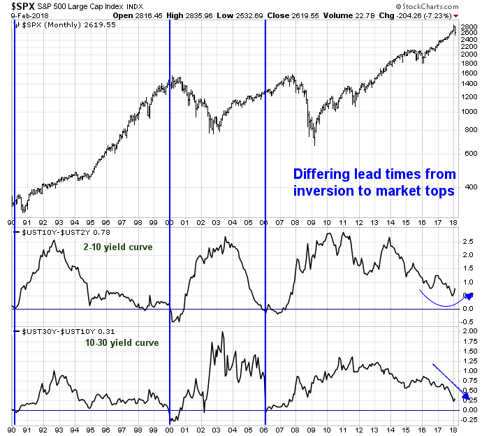
One of the ways to answer the first question is to analyze the evolution of the yield curve as the Fed proceeds through its tightening cycle. A steepening yield curve reflects bond market expectations of accelerating growth, while a flattening yield curve is a signal of falling growth expectations. Even this idealized approach yields unsatisfactory answers. Which yield curve should we focus on? The 2-10 yield curve has been volatile throughout the latest risk-off episode, and it has been steepening. By contrast, the 10-30 yield curve has been flattening with only a minor reversal in the last two weeks.
Another question for investors is whether the market is undergoing a topping pattern. The history of major tops can be seen by an initial peak, followed by a retreat, and a rally to a second bull trap top marked by a negative 14-month RSI divergence. Could the current decline the first step to a long-term top? Stay tuned.

Keep an eye on how these charts develop.
The week ahead
Looking to the week ahead, the stock market is obviously very oversold.This chart from Index Indicators shows the historical perspective of how the market is stretched to the downside on the % above 10 dma, which has a 3-5 day time horizon.

As well, the average 14-day RSI, which has a 1-2 week time horizon, is similarly oversold.

The CNN Money Fear and Greed Index has plunged to 8 in the space of two weeks. While readings have been lower, it does show how quickly sentiment has changed in a short time.

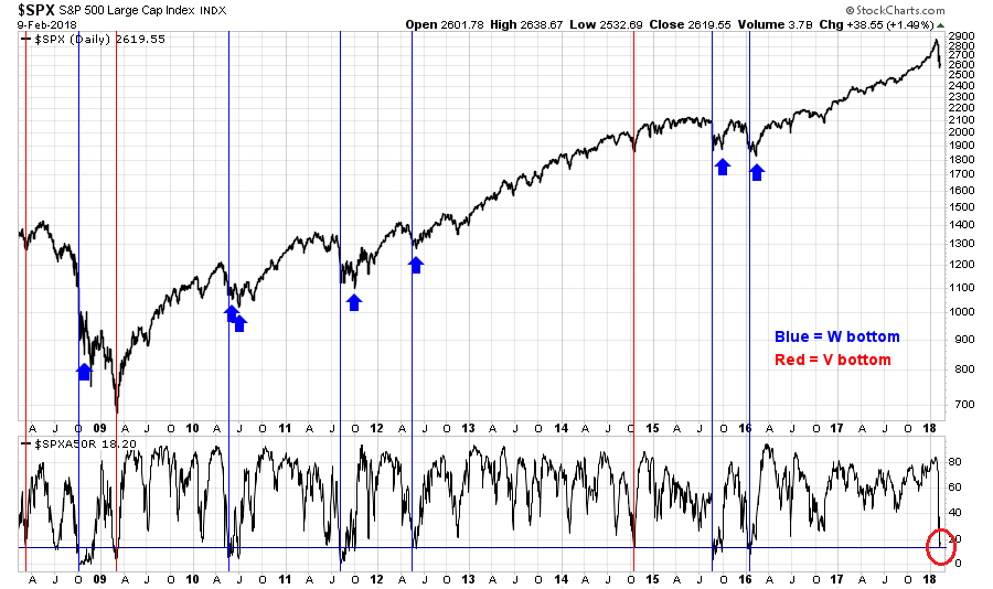
Even though the market is highly oversold and poised to rally, my inner trader has a number of concerns. First, the historical evidence suggests that oversold breadth conditions tend to resolve themselves with V-shaped bottoms. In the last 10 years, we have seen nine instances where the % above the 50 dma have reached the oversold extremes seen last week. Of the nine, the market continued to fall in one case, it formed a V-bottom in three cases (red lines), and W-shaped bottom in the other six (blue lines), where the second bottom occurred anywhere from three to seven weeks after the initial oversold bottom. If history is any guide, the odds favor a market rally, followed by a decline to a second bottom some time between late February and March.
As well, some algos may not done fully selling yet, as the carnage has been so broad and global in scope. Anecdotal trading desk comments indicate that Commodity Trading Advisors (CTAs) have reacted to such broad based weakness by reversing their long positions to short ones. While the trading system of every CTA differs from each other, the broad based weakness suggests that there may be further risk-off selling ahead in the next week. This will create headwinds for equity and other asset prices. As an illustration, the following JPM chart is an estimate of the change in futures open interest of CTAs as a result of falling prices and VaR model mandated de-risking.

My inner investor remains constructive on equities. My inner trader reversed from short to long early last week. He is crossing his fingers and hanging on for another wild ride. During these periods of heightened volatility, traders are advised to scale their positions in accordance with their risk tolerances.
Disclosure: Long SPXL
Hi Cam,
Appreciate all your insights. I was wondering if you might follow-up on your trifecta bottom spotting with the readings you received after the first bullish post. It looked to me like the trifecta hit again a few days later, or am I mistaken?
Thanks
Dave
There isn’t much more to add once the Trifecta buy signal gets hit. Essentially it just tells us that the market is highly oversold and the odds favor a short-term rally.
The caveat to that signal is oversold markets can get more oversold. There are no guarantees.
My momentum charts of a broad variety of ETFs have what I call my LLLL chart. LLLL stands for Leaders or Laggards since Last Low. I rebase the ETF and the S&P 500 to the date of a intermediate sentiment low and chart each of their performances going forward. This reveals leadership (maybe new) from the low. Leadership is sticky. Momentum theory says to own investments that are outperforming. Trends persist,
It can also shows the failure of a previous leading group (a new laggard) which, as I wrote in my book, will get you out early from a bubble group that is starting to crash.
How do I pick the low? I start looking when we get a market drop with a big shift in sentiment to pessimism as seen at sentimentrader,com and Cam’s newsletter. Then, I simply keep shifting it as new lows are made. Last week, Monday Feb. 5 seemed to be a solid low but Thursday went lower. So I rebased to Thursday’s close.
Here are four charts of key groups rebased to Thursday’s close.
U.S. Major Industry Groups
https://product.datastream.com/dscharting/gateway.aspx?guid=2f35842d-50c6-4f71-bbfa-794282ba4b05&action=REFRESH
U.S. Style Groups
https://product.datastream.com/dscharting/gateway.aspx?guid=fbf984cd-1c2a-41ae-8aa8-113293ad7789&action=REFRESH
Global ETFs
https://product.datastream.com/dscharting/gateway.aspx?guid=62453325-0dfb-4ac2-9e35-041ba78cd4ee&action=REFRESH
Interesting Industry Sub-groups
https://product.datastream.com/dscharting/gateway.aspx?guid=ec1d52b3-5c89-402a-acc5-b03e92ddd777&action=REFRESH
Already, with just one trading day in, Friday, there is some interesting first movers.
You are experienced do-it-yourself investors, so use the info the way you see fit.
As always, copy and paste the URL links somewhere where you can access them in future. They update nightly (amazing new technology). If we hit a new low, I’ll rebase to the new date and you will see it when you refresh the next day.
To buy my book, go to kenmacneal.ca
Excelent post Cam! Thank you Ken for your momentum charts, it really works! Great job guys!
One reason the market freaked could be due to high acceleration of Fed tapering at end of January: https://www.zerohedge.com/news/2018-02-06/feds-qe-unwind-accelerates-sharply
But the sharp drop is still strange. It’s probably be due to ETFs, algorithms or similar rules based transactions. As everybody uses it more these kinds of surprise drops will become more common.