Preface: Explaining our market timing models
We maintain several market timing models, each with differing time horizons. The “Ultimate Market Timing Model” is a long-term market timing model based on the research outlined in our post, Building the ultimate market timing model. This model tends to generate only a handful of signals each decade.
The Trend Model is an asset allocation model which applies trend following principles based on the inputs of global stock and commodity price. This model has a shorter time horizon and tends to turn over about 4-6 times a year. In essence, it seeks to answer the question, “Is the trend in the global economy expansion (bullish) or contraction (bearish)?”
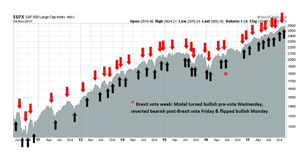
My inner trader uses the trading component of the Trend Model to look for changes in the direction of the main Trend Model signal. A bullish Trend Model signal that gets less bullish is a trading “sell” signal. Conversely, a bearish Trend Model signal that gets less bearish is a trading “buy” signal. The history of actual out-of-sample (not backtested) signals of the trading model are shown by the arrows in the chart below. Past trading of the trading model has shown turnover rates of about 200% per month.
The latest signals of each model are as follows:
- Ultimate market timing model: Buy equities
- Trend Model signal: Bullish
- Trading model: Bullish
Update schedule: I generally update model readings on my site on weekends and tweet mid-week observations at @humblestudent. Subscribers will also receive email notices of any changes in my trading portfolio.
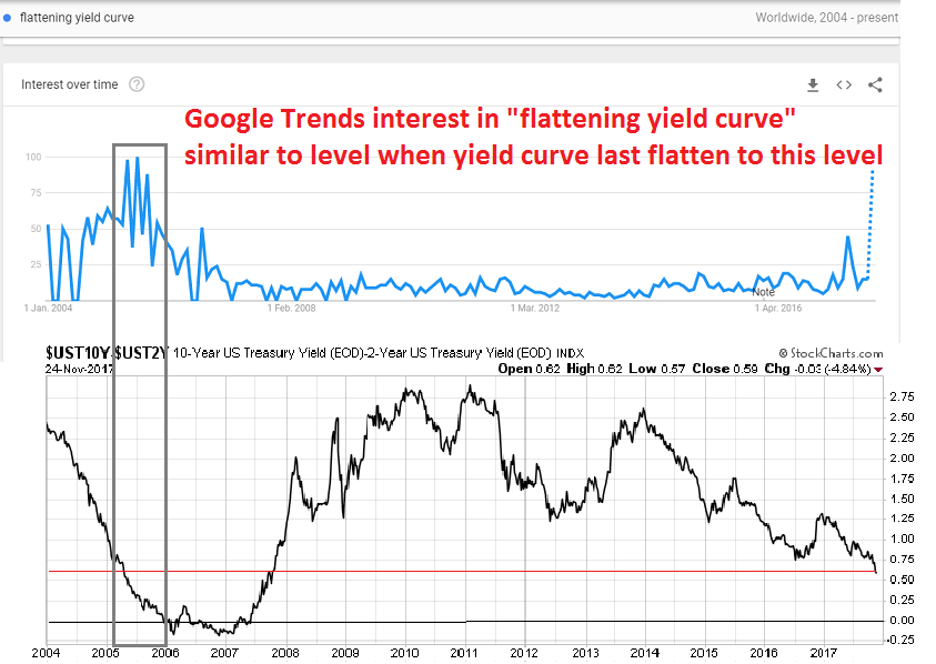
Yield Curve freakout
I received a considerable amounts of feedback to my post last week (see 2018 outlook: Last charge of the bulls) over my comments about the risks posed by a flattening yield curve. Interest in the term “flattening yield curve” has spiked, but consistent with levels last seen when the yield curve flattened to this level.
My readers highlighted some recently published articles indicating that a flattening yield curve doesn’t matter.
- Scott Grannis wrote a thoughtful piece about the contrary indicators that point to a slowdown.
- Cullen Roche at Pragmatic Capitalism concluded that a flattening yield curve isn’t a concern until it inverts, and that analysis from the Cleveland Fed indicated that the current yield curve implies a 12% chance of a recession.
- Tim Duy observed that a flattening yield curve is a typical market reaction in a tightening cycle, though it suggests that “the economy remain mired in a low rate environment for the foreseeable future” and the Fed probably didn’t expect it to flatten this much.
- Philadelphia Fed President Patrick Harder voiced concerns about inverting the yield curve in a Bloomberg interview.
- The San Francisco Fed released a paper entitled, “A new conundrum in the bond market?”, that was reminiscent of Greenspan’s hand wringing over the flattening yield curve even as the Fed raised rates in 2005.
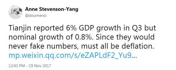
I agree 100%. The more the authorities pay attention to a metric, the less the metric matters. In some instances, the metric can be gamed, just like China’s regional GDP growth statistics.
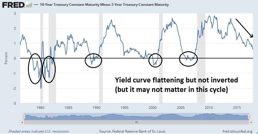
Even though an inverted yield curve has been an uncanny leading indicator of recession, it may not work this time because of the effects of the Fed’s quantitative easing (and now quantitative tightening) program on the bond market. Indeed, the Fed’s own estimates showed that its QE programs had pushed the 10-year yield down by 100 bp, which had the effect of manipulating the shape of the yield curve.
There are sufficient contrary indicators that the economy is booming, and the near-term odds of a recession is low. Those conditions are consistent with my belief that the stock market is undergoing a terminal blow-off phase, but Scott Grannis’ work also hint at how investors might look for signs of a market top.
Investors can embrace the blow-off, but I can also offer you some risk control techniques that can act as a kind of stop-loss discipline.
The yield curve is not a red flag
Scott Grannis recently outlined a well reasoned thesis of why investors should not be overly concerned about the flattening yield curve. Cutting to the chase, here is his conclusion:
Until we see the yield curve actually invert, until we see real yields move substantially higher, until we see swap and credit spreads moving significantly higher, and until inflation expectations move significantly higher, a recession is very unlikely for the foreseeable future.
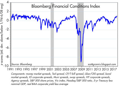
In his post, Grannis pointed out that financial conditions are loose.
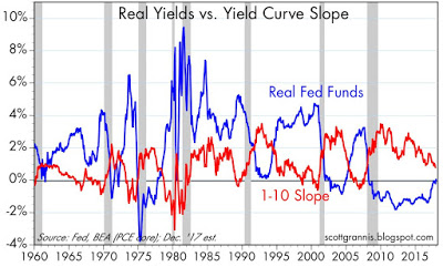
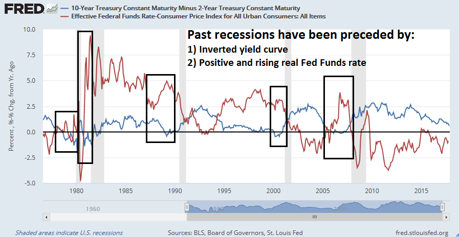
Even though the yield curve is flattening, past recessionary episodes have been preceded by a positive and rapidly rising real Fed Funds rate.
In summary, Grannis is arguing that monetary conditions are far from tight. In the past, it has been tight monetary policy that has cooled growth and plunged the economy into recession. Today, the economy is booming, liquidity is plentiful, inflation is tame, and inflationary expectations are muted. We live in a not-too-hot and not-too-cold Goldilocks period. Therefore equity investors should not get overly bearish.
I agree, to a certain extent. Here is where we differ. My scenario calls for rising inflationary pressures to appear soon, which would cause the Fed to become far more hawkish than market expectations (see 2018 outlook: Last charge of the bulls). Nevertheless, Grannis’ analysis reveals some clues of what to look for in as a top develops.
How to watch for the Top
Here is what I am watching. These signals can be divided into two categories. The first would indicate that tighter monetary conditions are starting to have a significant negative effect on either the economy or the markets.
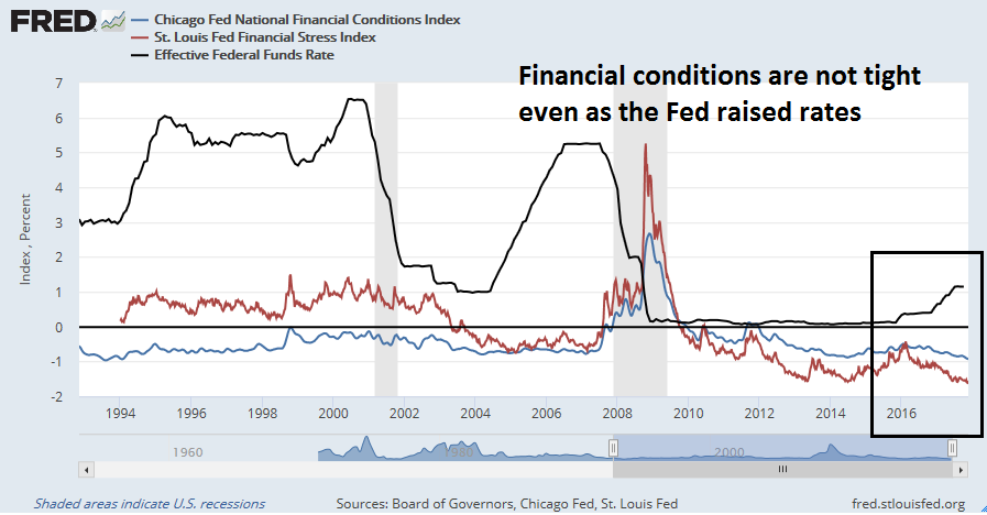
Are financial conditions tightening? Financial condition indices are currently signaling loose conditions. Equities are unlikely to get overly stress until financial and liquidity conditions tighten as the Fed raises rates.
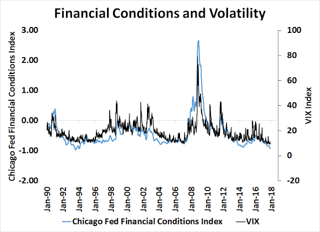
As financial conditions are historically correlated with the VIX Index, one real-time indicator of tightening liquidity might be the VIX.
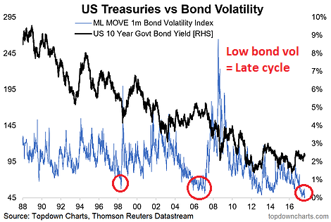
The lack of volatility is not just restricted to the VIX Index, which measures equity volatility. Callum Thomas at Topdown Charts pointed out that low bond volatility is also a characteristic of a late cycle expansion. A rise in the MOVE Index could also be a signal that the market could be topping (annotations in red are mine).
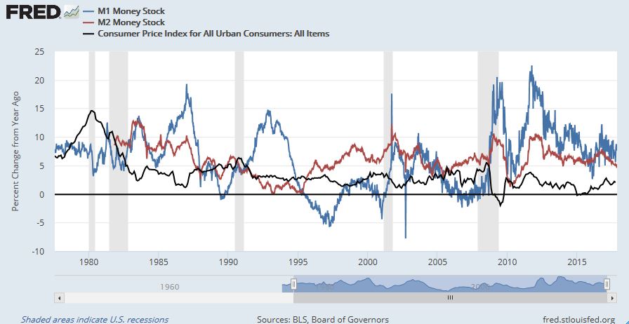
As the Fed normalizes monetary policy, money supply growth has tended to decline in response to tighter conditions. Watch for real money growth to go negative. The latest readings show that YoY real M2 growth at 2.7% and decelerating.
Grannis pointed out that past yield curve inversions have been accompanied by a positive and rising real Fed Funds rate. We are not there yet.
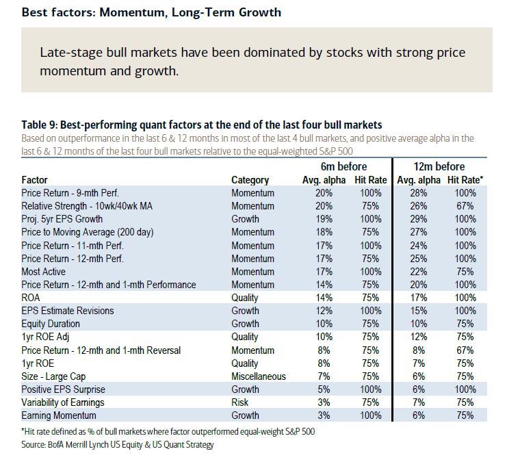
Momentum and risk-on stampede
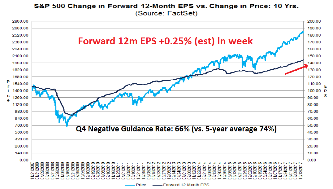
From a technical perspective, I am watching for signs of faltering momentum as a warning of a market top. The current macro environment is showing strong fundamental and price momentum. The latest update from John Butters of FactSet indicates that forward 12-month EPS continues to rise strongly, which is an indication of fundamental momentum.
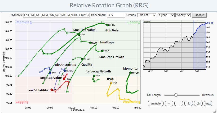
The market has been dominated by a risk-on bias. The Relative Rotation Graph (RRG) chart by style shows that leadership has been shown by high beta stocks, such as small caps, growth, and momentum stocks.
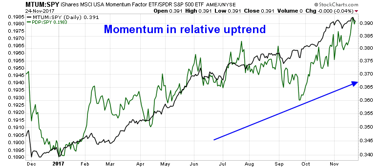
The relative performance of different flavors of price momentum factors is also strong, as measured by MTUM and PDP.
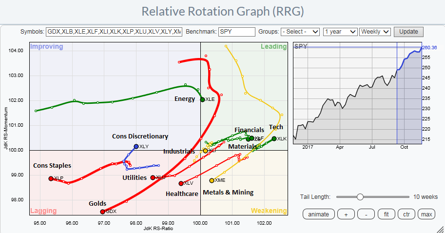
From a sector perspective, leadership is dominated by technology, as inflation hedge groups such as mining and golds starting to falter.
The technology driven momentum has the fundamental potential to continue for a few more months. Brian Gilmartin, writing at Seeking Alpha, observed that much of the sector is driven by the iPhone cycle, which has the potential to be positive in Q1.
The tech sector could see a “binary” year, with strong growth in the first half of 2018 and slower growth in the 2nd, with the variable being how “super” the iPhone SuperCycle turns out to be.
Another way of showing this for readers is to show Apple’s fiscal ’18 and ’19 EPS estimates and expected growth:
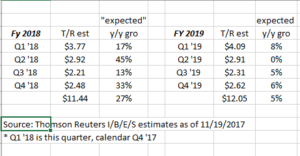
Note that estimated YoY growth in Q4 is still strong. Q4 earnings are reported during Q1, which has the potential to create a tailwind for technology stocks during that period.
BAML quantitative strategist Savita Subramanian found that this kind of growth and momentum driven leadership is typical of the behavior in a late stage bull market.
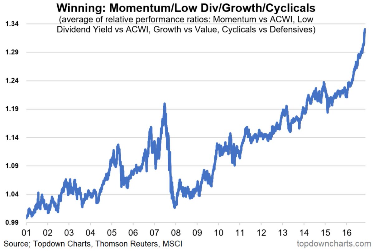
However, some caution may be warranted in making too large a bet on price momentum. Topdown Charts recently pointed out that price momentum is highly extended on a global basis.
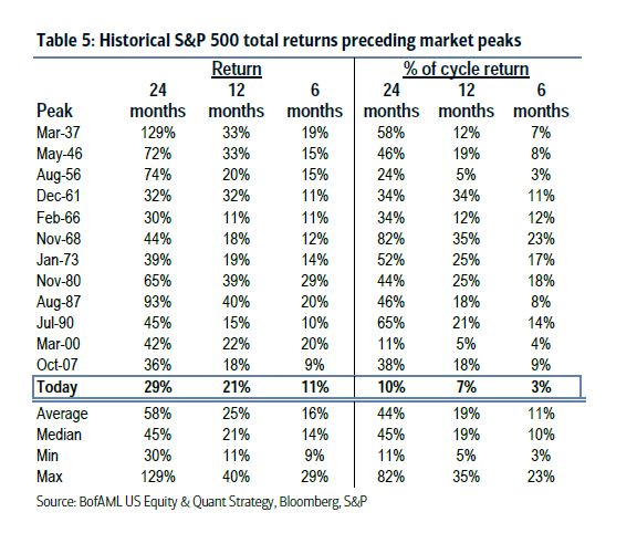
On the other hand, just because a market is overbought does not mean that it can`t become even more overbought. BAML`s Subramanian observed that the terminal stage of a market bull usually shows the best performance.

Her analysis suggests that this bull may have some upside left before it gets exhausted.
Embrace the Dark Side, buy growth and momentum.
The week ahead
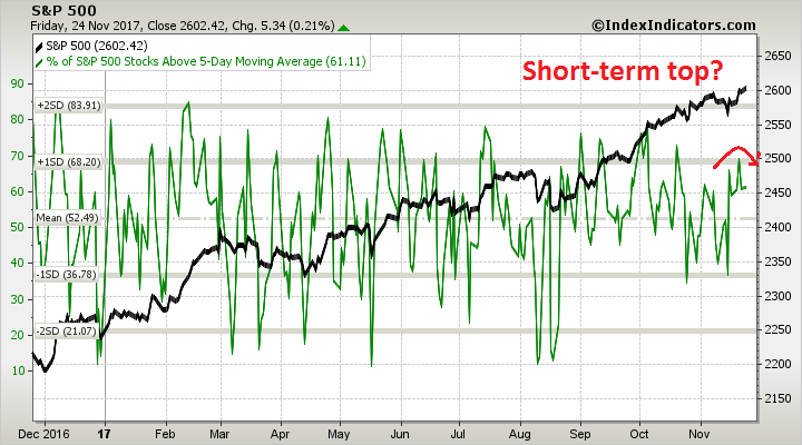
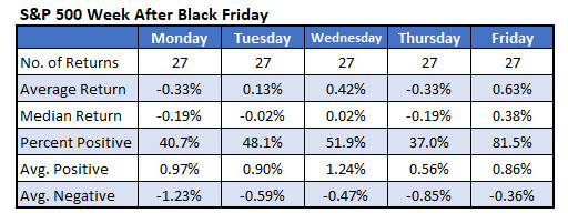
Looking to the week ahead, the outlook appears to be mixed. Subscribers received an email alert that my trading account had taken profits on all of its long positions and moved to 100% cash because of the event risk posed by the upcoming vote next Thursday on the GOP tax bill. The market was not overbought, but the lack of bullish follow through was disturbing for the bulls, and these readings could be indicative of a short-term top.
Schaeffer’s Research also found that the week after Thanksgiving has historically shown a minor bearish bias, at least until Friday.
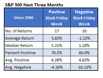
However, should the market rise next week, the odds are much better for stock prices in the next three months.
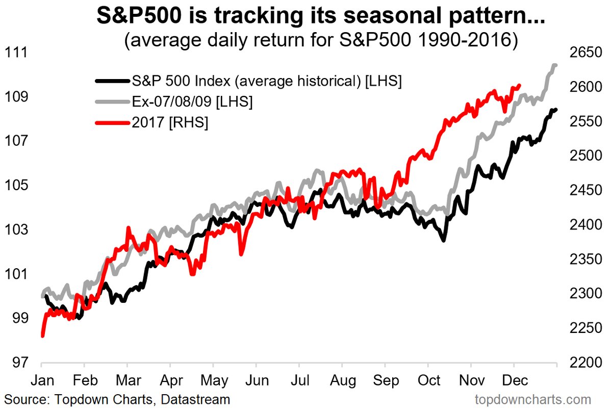
My inner investor remains constructive on stocks. He is neutrally positioned with his asset allocation at his investment policy target weight. My inner trader took profits on Friday, but he is still intermediate term bullish. He is hoping for a pullback next week so that he can buy in at lower prices. His positioning is consistent with the observation from Callum Thomas of the market seasonal pattern of a brief period of consolidation in late November and early December, followed by a rally into the year end.
Here is an investment that fits the above commentary, U.S. Market Neutral Momentum ETF (MOM). It is half long the top momentum stocks in the S&P 500 and half short the bottom performers. Market neutral refers to it being weighted along the lines of the S&P 500. For example they have 22% in IT the same weighting as in the S&P 500, 11% long and 11% short.
My specialty is avoiding bear markets. My client portfolios went up in the 2000-2003 and 2007-2009 crashes plus the 2015 turmoil. I do this by researching investments like MOM.
It’s outperforming lately, exactly like the lead up to the 2015 volatility and the 2008 crash. Here is a chart of the relative 9 month performance compared to the S&P 500.
https://product.datastream.com/dscharting/gateway.aspx?guid=6ae5c795-36ee-4406-a303-b27616d57f10&action=REFRESH
Note the strong performance in 2015. Note also that after almost two year of significant underperformance, its finally catching up.
Here is a short term chart that includes one of my LLLL charts that compare from the last sentiment low on August 18.
https://product.datastream.com/dscharting/gateway.aspx?guid=72436cb5-d78b-456e-92d9-de9e1303dd05&action=REFRESH
MOM does well late in the market cycle when the high momentum stocks start performing much better than the low momentum stocks. That is is the case even though the low momentum group is still going up and being a small drag on the long/short performance. As we can see in Cam’s above commentary, the leading stocks are VERY strong and stay that way in latter sages of the cycle.
MOM really takes off later when the market peaks and the low momentum shorts start declining and start ADDING to the performance of the long/short portfolio. It does great right to the bottom of the bear market or correction. Once the market hits its low like early 2016, MOM share price plummets because the weak shorts turn around and soar off the bottom and that kills the ETFs returns. So MOM is a thing to own in the lead up to a top and then all the way to the bottom. At one time in late 2015 I believe it was THE best ETF performer in America.
The fact that MOM is doing well lately just proves Cam’s point above, there is a big divide between the chosen few big performers and the many underperformers. The ETF profits from the spread of the difference in performance. Whether or not its current performance is an early warning canary in the coal mine that we are in the latter stages of the bull market or approaching the final peak is up to us to determine ourselves.
Ken
Thanks for introducing the idea of MOM type ETFs. Makes sense.
That said, MOM appears to be at risk of closing.
http://www.etf.com/MOM
Is there any other similar fund or mechanism to use such a strategy?
Cam, you mentioned that you could offer some risk control techniques — I’d be interested in learning more about those.
You must have misunderstood me.
The risk control techniques are the things that I am watching, such as real Fed Funds turning positive and rising, failure of price momentum, etc. They are all in the post.
Thanks for the clarification. I’ll rely on you, then, to sound the alert!