Preface: Explaining our market timing models
We maintain several market timing models, each with differing time horizons. The “Ultimate Market Timing Model” is a long-term market timing model based on the research outlined in our post, Building the ultimate market timing model. This model tends to generate only a handful of signals each decade.
The Trend Model is an asset allocation model which applies trend following principles based on the inputs of global stock and commodity price. This model has a shorter time horizon and tends to turn over about 4-6 times a year. In essence, it seeks to answer the question, “Is the trend in the global economy expansion (bullish) or contraction (bearish)?”
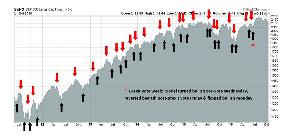
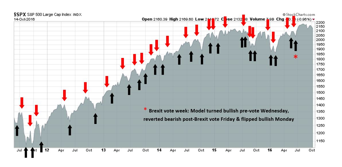
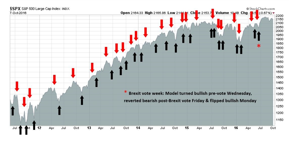
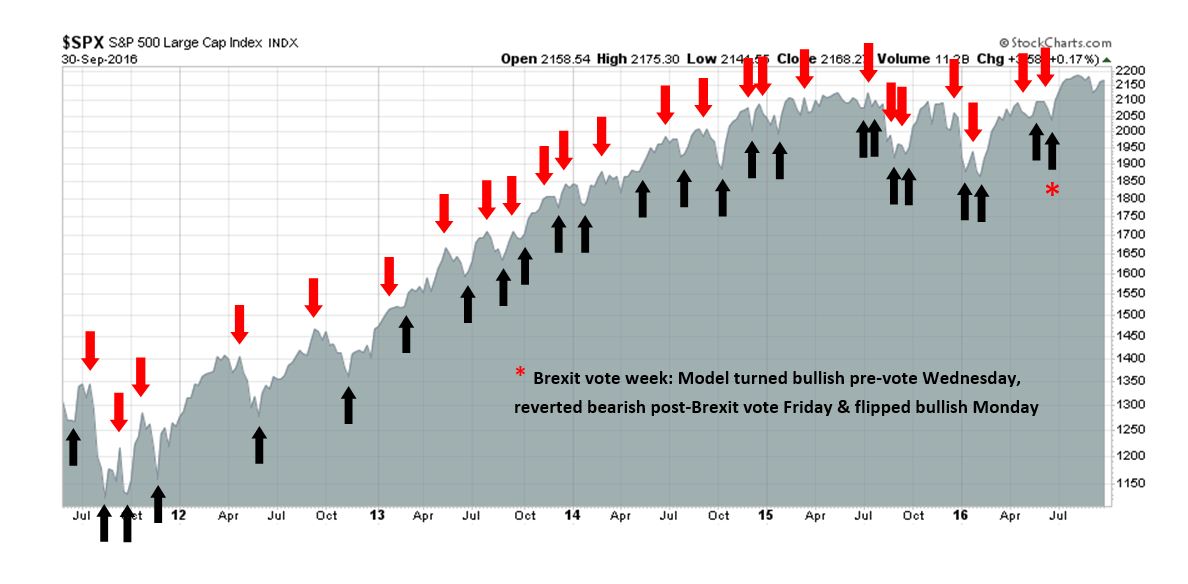
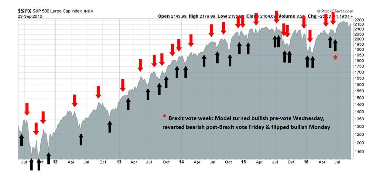
My inner trader uses the trading component of the Trend Model to look for changes in direction of the main Trend Model signal. A bullish Trend Model signal that gets less bullish is a trading “sell” signal. Conversely, a bearish Trend Model signal that gets less bearish is a trading “buy” signal. The history of actual out-of-sample (not backtested) signals of the trading model are shown by the arrows in the chart below. Past trading of the trading model has shown turnover rates of about 200% per month.
The latest signals of each model are as follows:
- Ultimate market timing model: Buy equities
- Trend Model signal: Risk-on
- Trading model: Bullish
Update schedule: I generally update model readings on my site on weekends and tweet any changes during the week at @humblestudent. Subscribers will also receive email notices of any changes in my trading portfolio.
How will the Fed fight the next war?
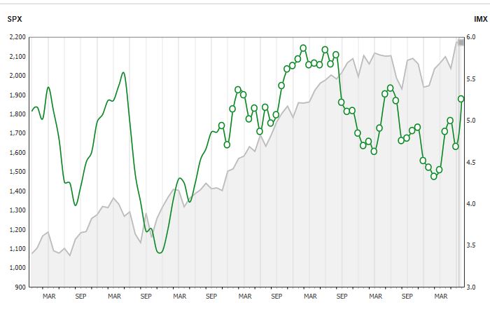
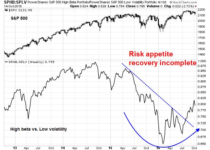
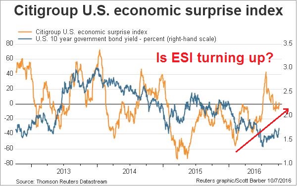
In my last post (see A sentimental embrace of risk), I showed that risk appetite was starting to perk up. Investor interest is rising in both the reflation and cyclical investment themes. So far, this risk-on thesis is showing solid fundamental underpinnings.
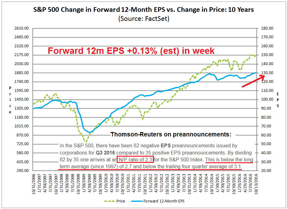
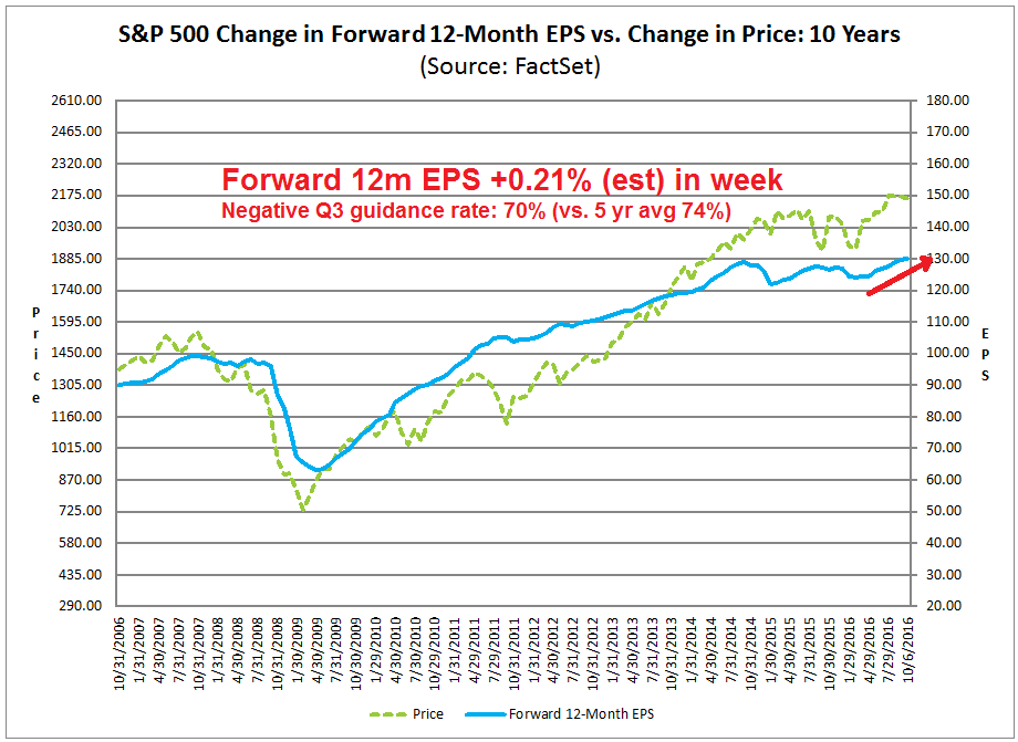
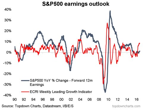
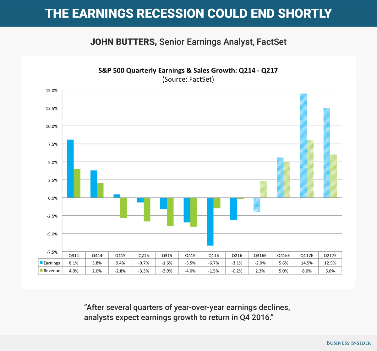
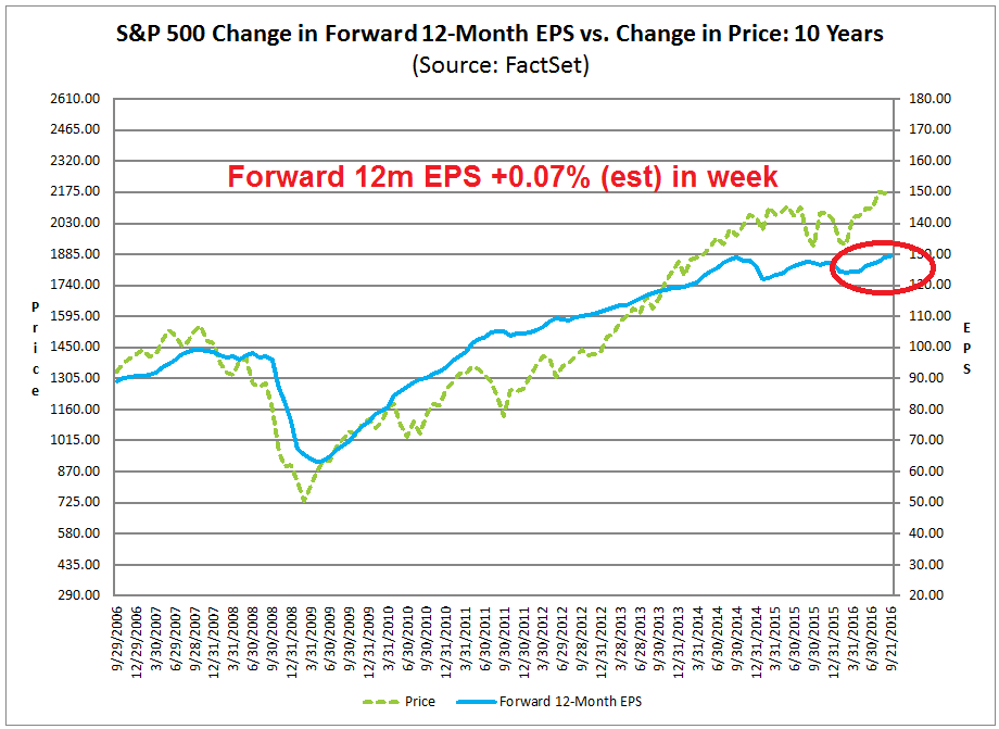
The bearish strategists at Goldman Sachs and HSBC who had forecasted a disappointing Q3 earnings season have so far been wrong (see Q3 earnings season: Stud or dud?). With 23% of SPX companies having reported earnings, John Butters of Factset observed that both the EPS and sales beat are well above their 5-year historical averages. As a result, Street optimism continues to improve as forward 12-month EPS rose another 0.16% in the week (chart annotations are mine).
The stock market is on pace to rally on the back of a growth revival and the end of the earnings recession that began in late 2014. This party is just starting to going. The only question is when the Fed will act to take away the punch bowl. This issue is becoming a crucial question for investors, as speeches from Yellen and Fischer last week may indicate that the Fed is signaling the start of a shift in thinking of how it fights the next war, persistent low growth.
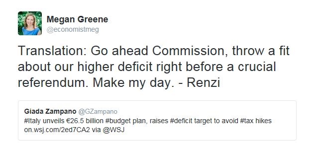
The reflation trade bandwagon is rolling
I have been writing about the reflation trade for several months (see How the SP 500 can get to 2200 and beyond published on June 19, 2016). Last week, it seemed that the whole market was jumping into the reflation and risk-on trade.
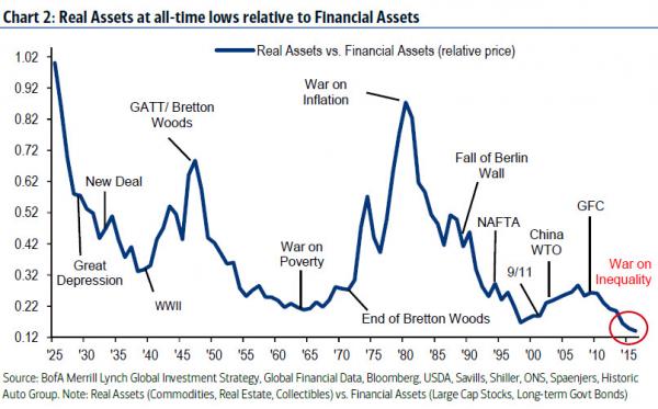
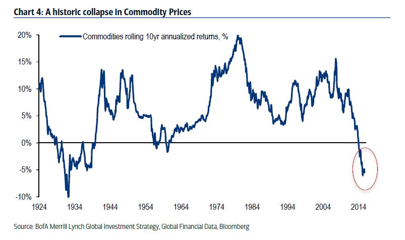
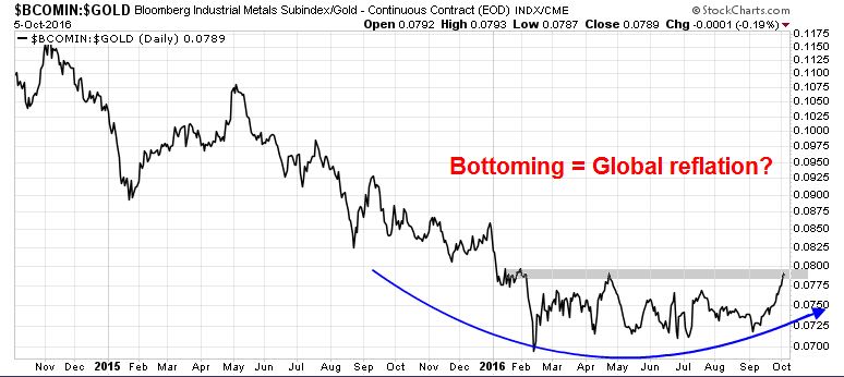
BAML strategist Michael Hartnett made the long-term case for buying hard assets because their relative value had gotten out of whack (charts via Zero Hedge).
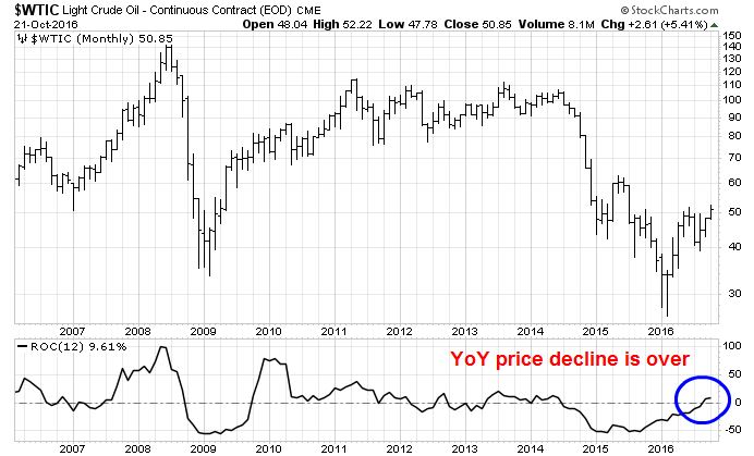
Commodity prices have become extremely cheap on a multi-decade basis.
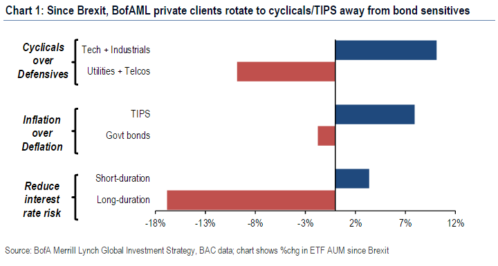
Momentum is turning positive for the reflation trade. The BAML Funds Flow report showed that clients were starting to rotate away from defensive assets and yield plays into cyclical and inflation hedge vehicles.
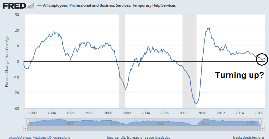
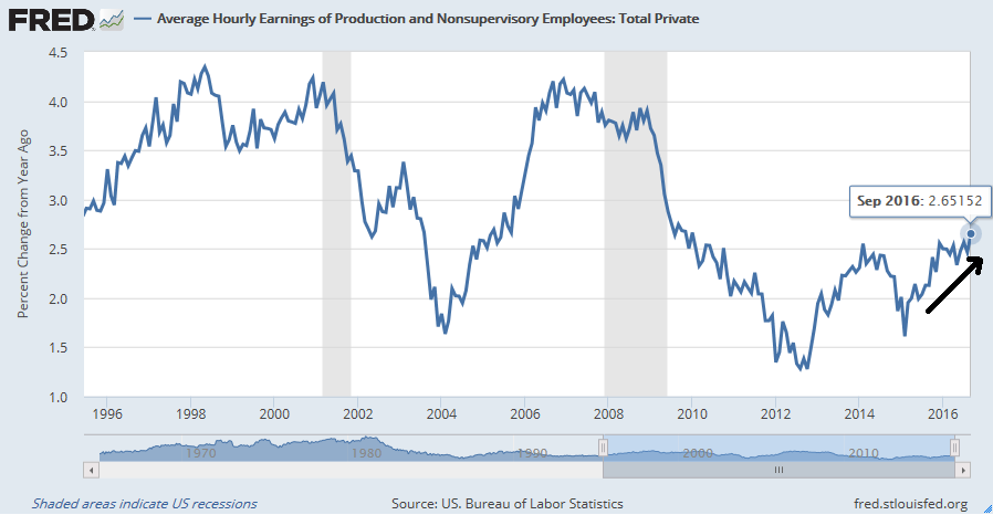
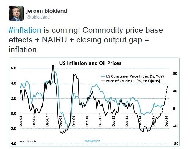
Inflationary pressures building
The market consensus is starting to shift in favor of an inflationary revival. Frederik Ducrozet noted that the return of inflationary expectations is occurring across major developed markets, with the UK in the lead, followed by the US and the eurozone.
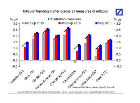
Deutsche Bank pointed out that US inflation is trending upwards, no matter how it’s measured (chart via Marketwatch).
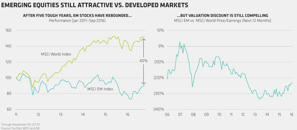
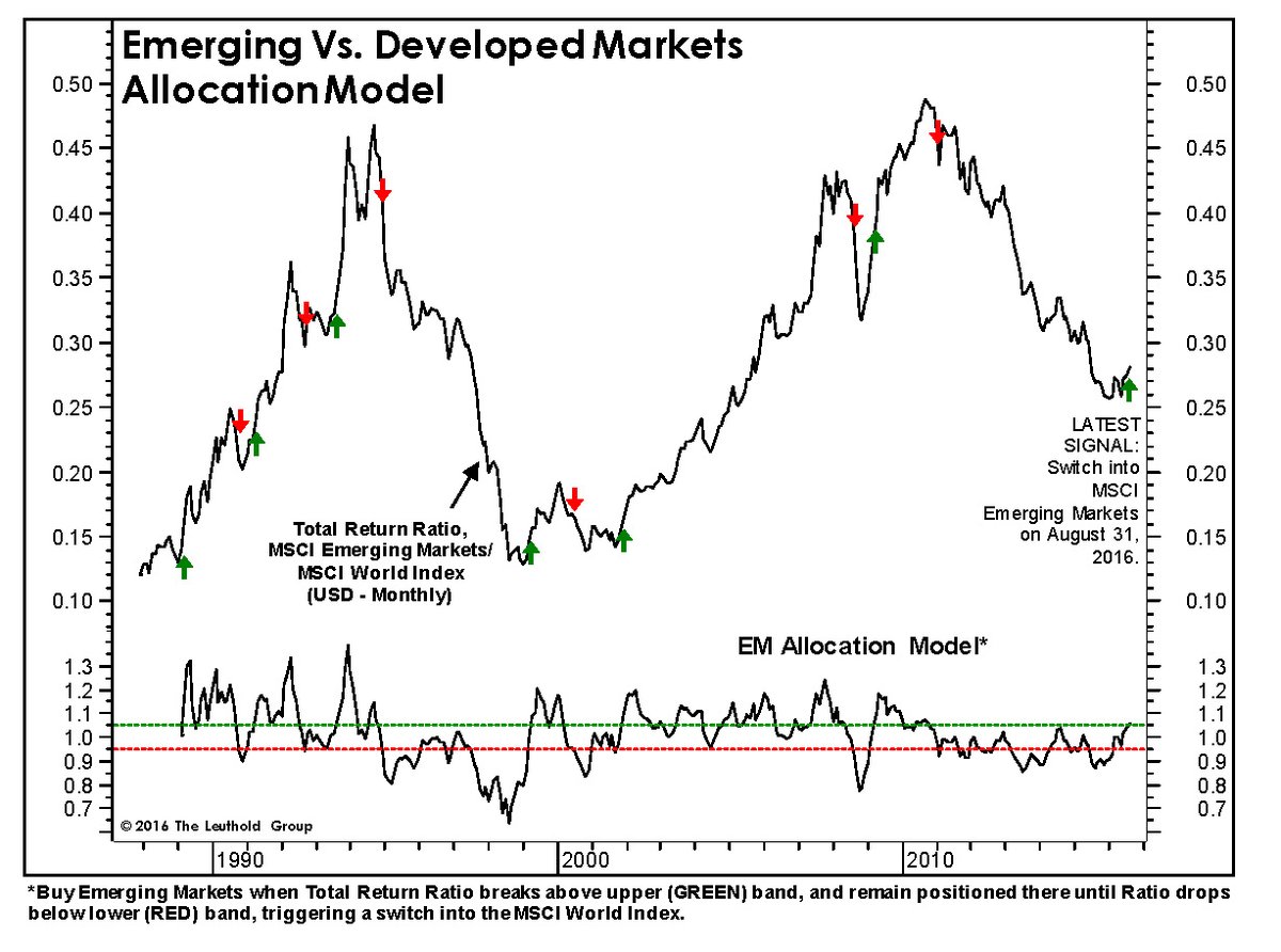
AllianceBernstein got into the act and asked if it is too late to catch the emerging market rally. The short answer is, “No”.
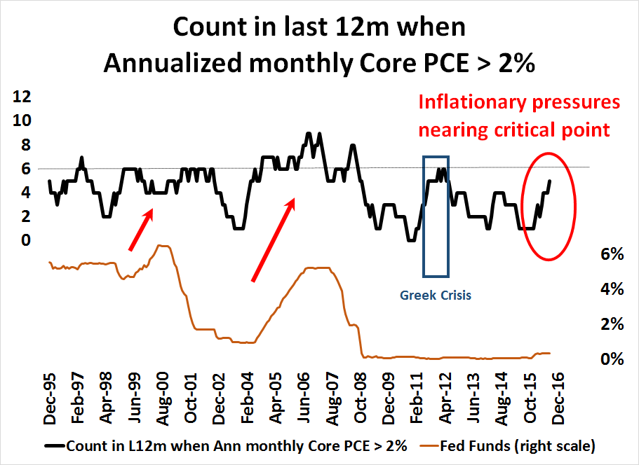
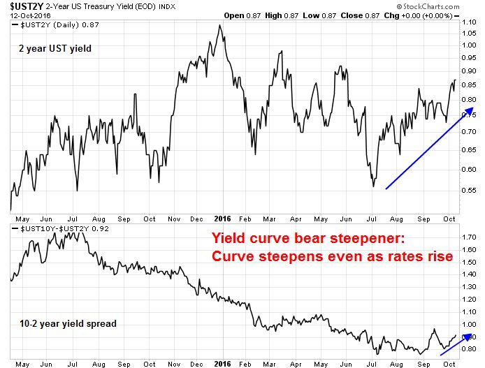
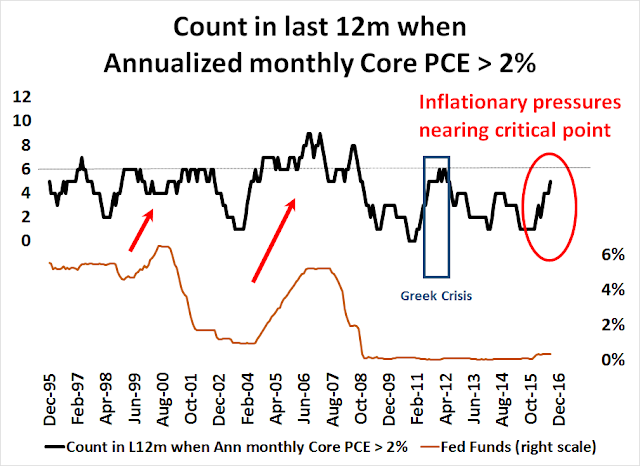
The latest update from the Fed’s Beige Book shows either “modest or moderate expansion” accompanied by “tight” labor markets, which is another signal of steady growth. In the chart below, I have calculated the number of times in a rolling 12-month period when the annualized monthly core PCE inflation rate has exceeded 2%. In the past, the Fed has begun a tightening cycle whenever the count reached six. The only exception occurred in 2011, when this metric hit the six-month tripwire as Europe underwent its Greek debt crisis. The latest reading is five – we are not far away from another tightening cycle.
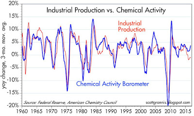
Even if the Fed were to raise rate, initial interest rate hikes tend to be stock market bullish, as market participants tend to focus more on the positive effects of rising growth expectations rather than the negative effects of rate increases. That scenario is starting to play out today. Scott Grannis pointed out that chemical activity tends to lead industrial production. Currently, chemical activity is on an upswing and industrial production should follow shortly.
Grannis also observed that swap spreads are not signaling any signs of high systemic risk, indicating a benign equity backdrop.
I’ve long argued that swap spreads are excellent indicators of systemic risk and financial market health. When swap spreads are 40 bps or less, it’s a sign that financial markets are liquid and systemic risk is very low. (See a longer explanation for the meaning of swap spreads here.) U.S. 2-yr swap spreads are just about perfect at current levels. Eurozone spreads are trading at the high end of what might be termed a “normal” range, but that probably reflects the fact that conditions in Europe are not as stable as they are here. In any event, swap spreads today are far less than what they have been during times of great economic stress and anxiety. Today’s level of swap spreads is symptomatic of healthy liquidity conditions and an economy with relatively low systemic risk, and that adds up to a bulwark against recession.

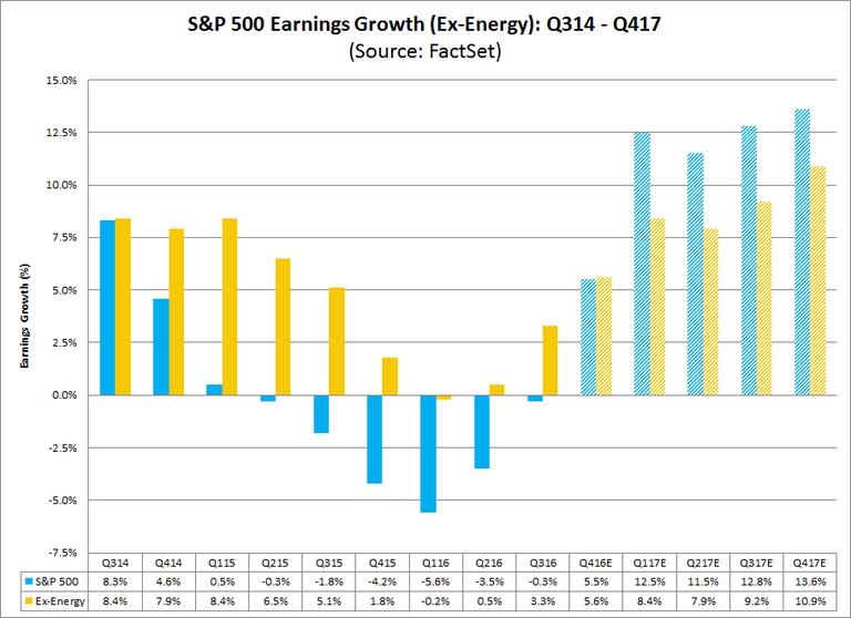
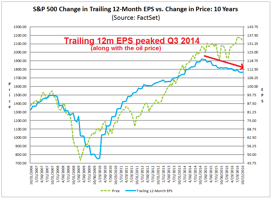
Earnings growth, which is a key driver of equity prices, looks solid. Factset pointed out that EPS growth would be positive in four of the last five quarters on an ex-energy basis.
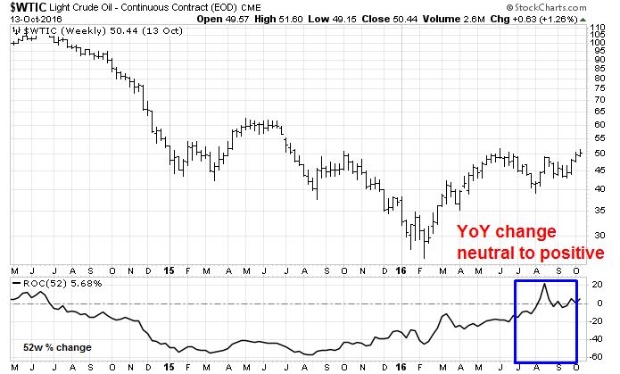
Q3 will likely the inflection point for YoY EPS growth. As the chart below shows, oil prices are no longer a drag on Energy sector earnings. Freed of this headwind, YoY earnings growth should turn positive in Q3 and accelerate into Q4 and next year.
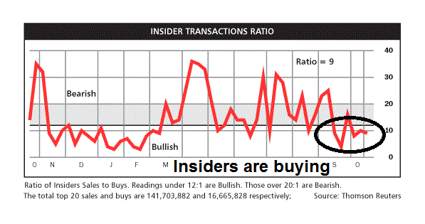
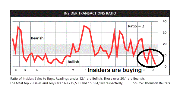
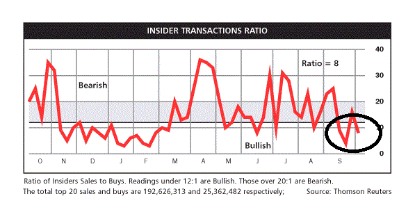
Barron’s reported that insiders are continuing to buy equities, which suggest that the intermediate term outlook for stocks is still bullish.
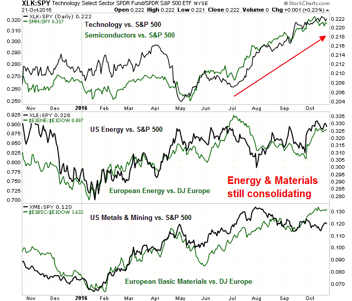
For investors who want to participate in the reflation and cyclical revival themes, the chart of relative returns below shows that the sector leadership is in technology and semiconductors. It maybe too early to buy inflation hedge plays like energy and mining as they are still showing relative consolidation patterns.
A cyclical market top in 2017?
My base case scenario has called for the stock market to rally in response to a growth revival. In response to rising growth and inflationary pressures, the Fed then begins an interest rate tightening cycle. Eventually, rising rates slow the economy down sufficiently to tank the growth outlook and stock prices. The fragility of foreign economies, particularly in China and Europe, have the potential to drag the world into another synchronized global recession and a significant equity bear market.
Ambrose Evans-Pritchard recently painted an Apocalyptic outcome where rising US interest rates topples the global economy:
The risk of a US recession next year is rising fast. The Federal Reserve has no margin for error.
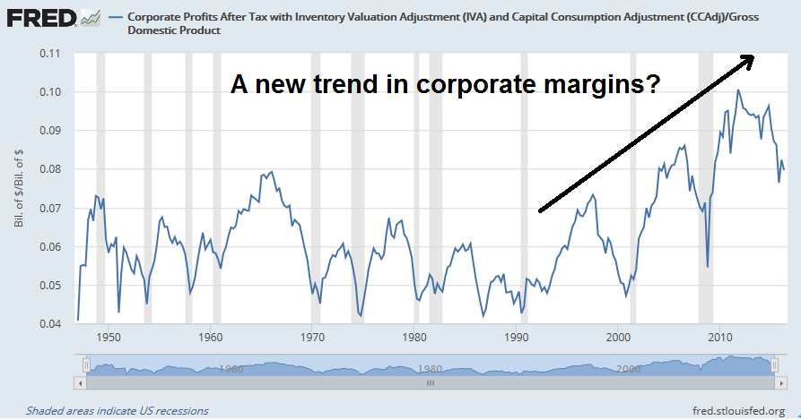
Liquidity is suddenly drying up. Early warning indicators from US ‘flow of funds’ data point to an incipient squeeze, the long-feared capitulation after five successive quarters of declining corporate profits.
Yet the Fed is methodically draining money through ‘reverse repos’ regardless. It has set the course for a rise in interest rates in December and seems to be on automatic pilot…
If allowed to happen, it will be a deeply frightening experience, rocking the global system to its foundations. The Bank for International Settlements estimates that 60pc of the world economy is locked into the US currency system, and that debts denominated in dollars outside US jurisdiction have ballooned to $9.8 trillion.
The world has never before been so leveraged to dollar borrowing costs. BIS data show that debt ratios in both rich countries and emerging markets are roughly 35 percentage points of GDP higher than they were at the onset of the Lehman crisis.
This time China cannot come to the rescue. Beijing has already pushed credit beyond safe limits to almost $30 trillion. Fitch Ratings suspects that bad loans in the Chinese banking system are ten times the official claim.
The current arguments over Brexit would seem irrelevant in such circumstances, both because the City would be drawn into the flames and because the eurozone would face its own a shattering ordeal. Even a hint of coming trauma would detonate a crisis in Italy.
A shift in Fed policy?
That dire scenario may not happen. That’s because the Fed might stretch its rate normalization process far more than anyone expects. Two key speeches from Fed officials gave important clues about how Fed policy might be changing.
The first speech was Janet Yellen’s “high-pressure economy” speech on October 14, 2016. Her discussion of “hysteresis” sounds remarkably similar to Larry Summers’ concerns about secular stagnation:
The idea that persistent shortfalls in aggregate demand could adversely affect the supply side of the economy–an effect commonly referred to as hysteresis–is not new; for example, the possibility was discussed back in the mid-1980s with regard to the performance of European labor markets. But interest in the topic has increased in light of the persistent slowdown in economic growth seen in many developed economies since the crisis. Several recent studies present cross-country evidence indicating that severe and persistent recessions have historically had these sorts of long-term effects, even for downturns that appear to have resulted largely or entirely from a shock to aggregate demand. With regard to the U.S. experience, one study estimates that the level of potential output is now 7 percent below what would have been expected based on its pre-crisis trajectory, and it argues that much of this supply-side damage is attributable to several developments that likely occurred as a result of the deep recession and slow recovery. In particular, the study finds that in the wake of the crisis, the United States experienced a modest reduction in labor supply as a result of reduced immigration and a fall in labor force participation beyond what can be explained by cyclical conditions and demographic factors, as well as a marked slowdown in the estimated trend growth rate of labor productivity. The latter likely reflects an unusually slow pace of business capital accumulation since the crisis and, more conjecturally, the sharp decline in spending on research and development and the very slow pace of new firm formation in recent years.
Yellen indicated that one possible solution would be to run a “high-pressure economy”, where policy is looser and more inflationary as a cyclical counterweight to the secular forces of low demand:
If we assume that hysteresis is in fact present to some degree after deep recessions, the natural next question is to ask whether it might be possible to reverse these adverse supply-side effects by temporarily running a “high-pressure economy,” with robust aggregate demand and a tight labor market. One can certainly identify plausible ways in which this might occur. Increased business sales would almost certainly raise the productive capacity of the economy by encouraging additional capital spending, especially if accompanied by reduced uncertainty about future prospects. In addition, a tight labor market might draw in potential workers who would otherwise sit on the sidelines and encourage job-to-job transitions that could also lead to more-efficient–and, hence, more-productive–job matches. Finally, albeit more speculatively, strong demand could potentially yield significant productivity gains by, among other things, prompting higher levels of research and development spending and increasing the incentives to start new, innovative businesses.
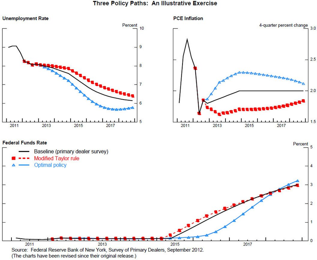
The “high-pressure economy” proposal is really a rehash of Yellen’s advocacy of optimal control theory, which she outlined in a November 13, 2012 speech:
To derive a path for the federal funds rate consistent with the Committee’s enunciated longer-run goals and balanced approach, I assume that monetary policy aims to minimize the deviations of inflation from 2 percent and the deviations of the unemployment rate from 6 percent, with equal weight on both objectives. In computing the best, or “optimal policy,” path for the federal funds rate to achieve these objectives, I will assume that the public fully anticipates that the FOMC will follow this optimal plan and is able to assess its effect on the economy.
The blue lines with triangles labeled “Optimal policy” show the resulting paths. The optimal policy to implement this “balanced approach” to minimizing deviations from the inflation and unemployment goals involves keeping the federal funds rate close to zero until early 2016, about two quarters longer than in the illustrative baseline, and keeping the federal funds rate below the baseline path through 2018. This highly accommodative policy path generates a faster reduction in unemployment than in the baseline, while inflation slightly overshoots the Committee’s 2 percent objective for several years.

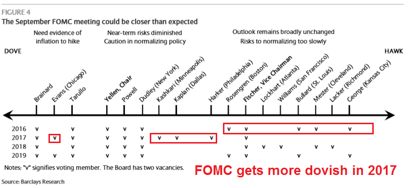
While the “high pressure economy” issue was posed as a research question by Yellen and therefore not a statement of an official shift in Fed policy, last week’s speech by the more hawkish Stanley Fischer was a surprise. Fischer has long been an advocate of higher rates. Indeed, he signaled his hawkishness by stating that the Federal Reserve is “very close” to its employment and inflation targets (see Reuters story). In the same speech, Fischer explored the problem of persistently low interest rates. He began by worrying out loud that the Fed may be running out of bullets in the next downturn when interest rates are so low, but added that raising rates may not be as simple as it looks:
Notwithstanding the increase in the federal funds rate last December, the federal funds rate remains at a very low level. Policy rates of many other major central banks are lower still–even negative in some cases, even in countries long famous for their conservative monetary policies. Long-term interest rates in many countries are also remarkably low, suggesting that participants in financial markets expect policy rates to remain depressed for years to come. My main objective today will be to present a quantitative assessment of some possible factors behind low interest rates–and also of factors that could contribute to higher interest rates in the future.
Now, I am sure that the reaction of many of you may be, “Well, if you and your Fed colleagues dislike low interest rates, why not just go ahead and raise them? You are the Federal Reserve, after all.” One of my goals today is to convince you that it is not that simple, and that changes in factors over which the Federal Reserve has little influence–such as technological innovation and demographics–are important factors contributing to both short- and long-term interest rates being so low at present.
Fischer went on to explore the problem of persistent low growth, otherwise known as hysteresis, or a low r*:
There are at least three reasons why we should be concerned about such low interest rates. First, and most worrying, is the possibility that low long-term interest rates are a signal that the economy’s long-run growth prospects are dim. Later, I will go into more detail on the link between economic growth and interest rates. One theme that will emerge is that depressed long-term growth prospects put sustained downward pressure on interest rates. To the extent that low long-term interest rates tell us that the outlook for economic growth is poor, all of us should be very concerned, for–as we all know–economic growth lies at the heart of our nation’s, and the world’s, future prosperity.
WTF? Did Fischer really say that? Is Fischer moving closer to Yellen’s position? Is this a signal that the Fed is starting to pivot towards a persistent low growth scenario, which would mean lower rates for longer?
I have no idea. As investors, however, we need to pay attention to how the Fed’s reaction function is evolving (or not). This is about anticipating how the Fed fights the next war. Investors who make the right call on that question should be able to profit handsomely.
For now, my base case scenario is still based on the standard central banker cyclical response of rate normalization. However, I am allowing for the possibility that rates could stay low for much longer than anyone expects. The latter case translates into an extended bull market for inflation hedge sectors and assets.
We should get a much better idea of the evolution of Fed policy in early 2017.
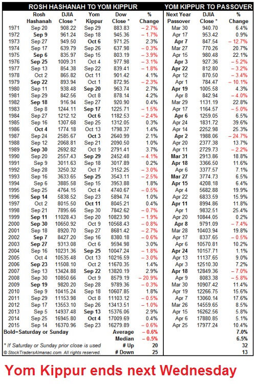
The week ahead: Don’t be short
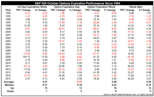
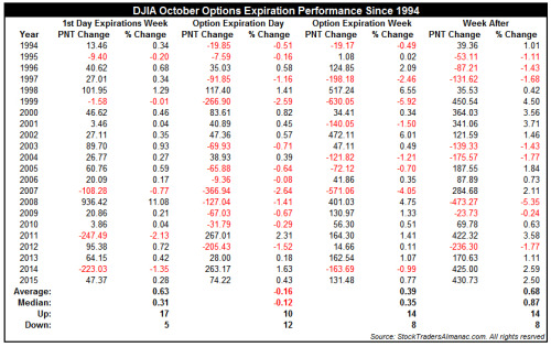
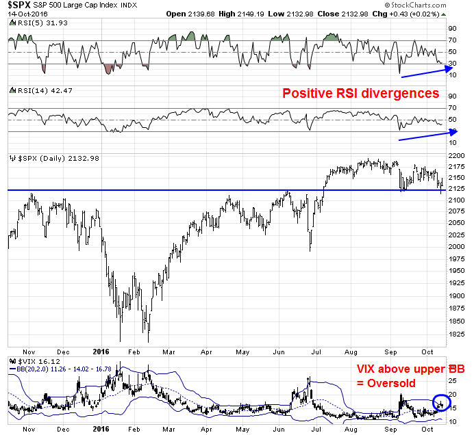
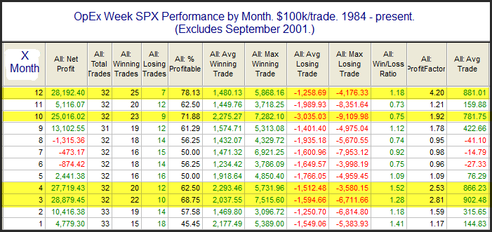
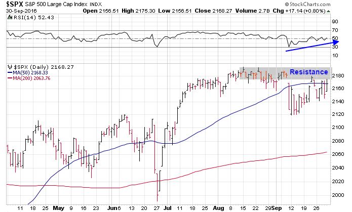
Looking to the week ahead, the combination of a better than expected Q3 earnings season, positive seasonality, and a mildly oversold condition are creating bullish tailwinds for stock prices. Last week was October option expiry. As Jeff Hirsch pointed out, October OpEx tends to see volatile swings but a positive market bias. The SPX rose 0.4% last week, which is typical of the market action in Hirsch’s historical studies.
At a minimum, traders should be wary about going short. I pointed out last week that the market is entering a period of positive seasonality (via Callum Thomas).
With SPX returns still negative for October, the potential for a rebound is high. Mark Hulbert observed that the rebound from October lows to the end of the following month, namely November, is the best of the year. Score another point for positive seasonality.
However, other historical studies are showing mixed results. On one hand, Jeff Hirsch indicated that the week after October OpEx, which is next week, has tended to see a positive market bias.
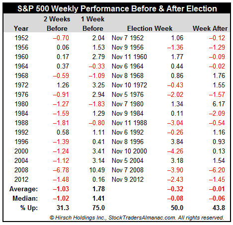
On the other hand, Hirsch pointed out in a separate post that the market tends to be weak two weeks before the election, which is also next week, and strong thereafter.
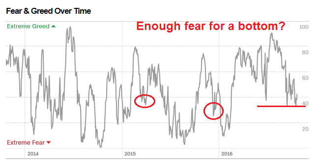
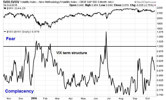
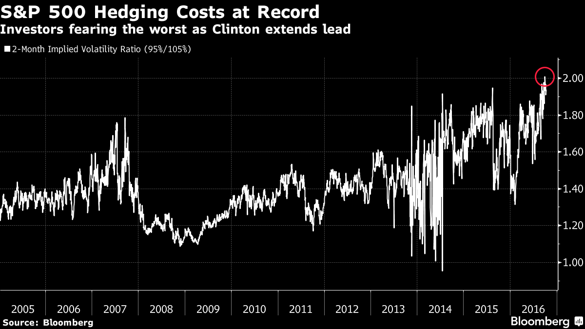
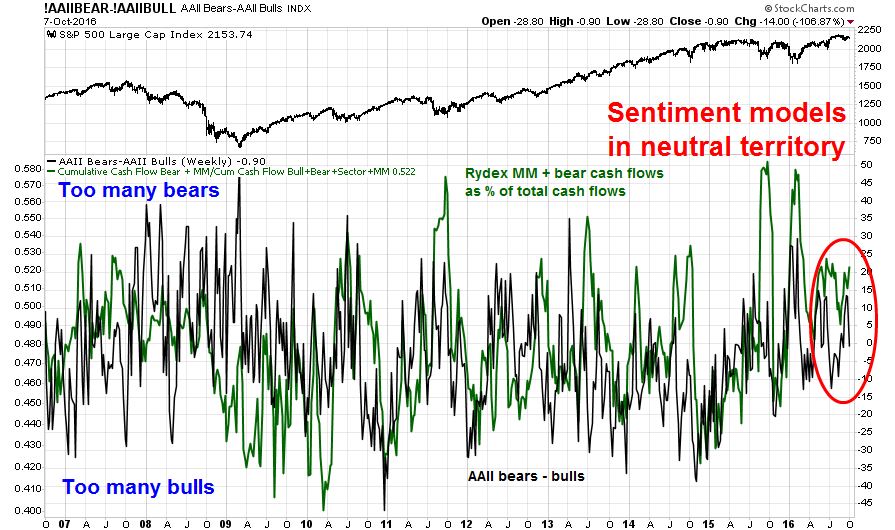
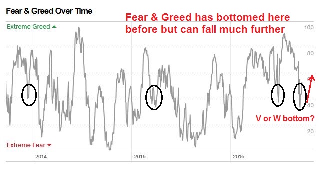
Selected short-term sentiment models are showing mildly oversold readings, though the market could get more oversold. The Fear and Greed Index is one such example.
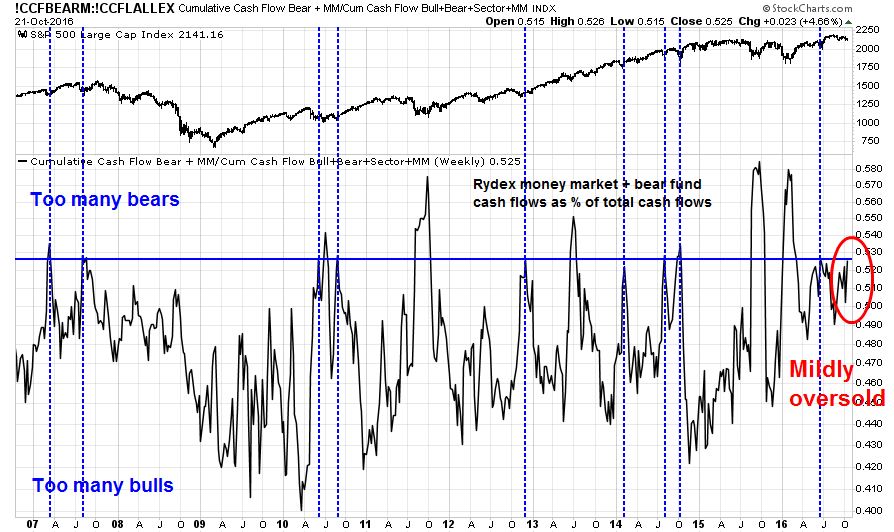
Rydex funds flows are showing a similar condition where the market has bottomed in the past. However, fear levels could go higher.
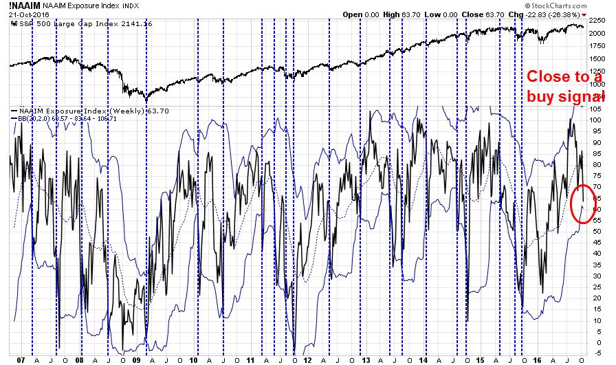
I have also found decent buy signals whenever NAAIM exposure falls to the bottom of its Bollinger Band. Current readings show that we are very close to a buy signal.
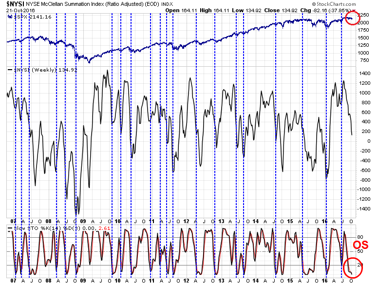
The chart below of the NYSE McClellan Summation Index is showing an oversold condition. In the past, such readings have tended to see limited downside risk for the market.
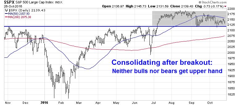
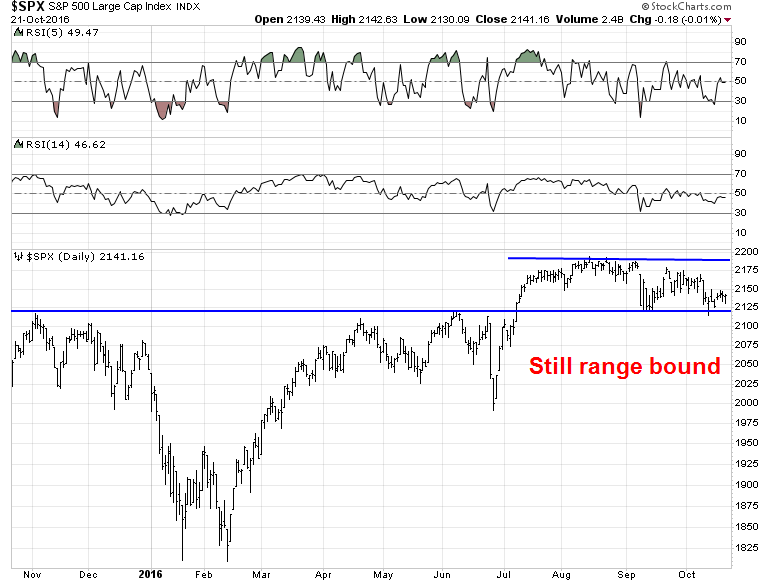
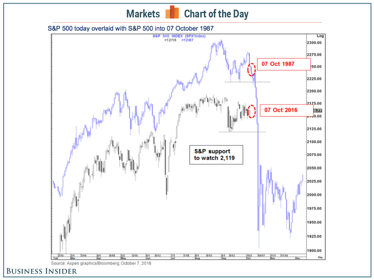
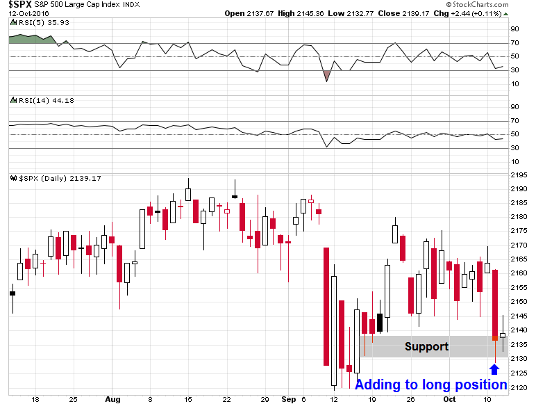
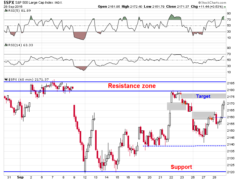
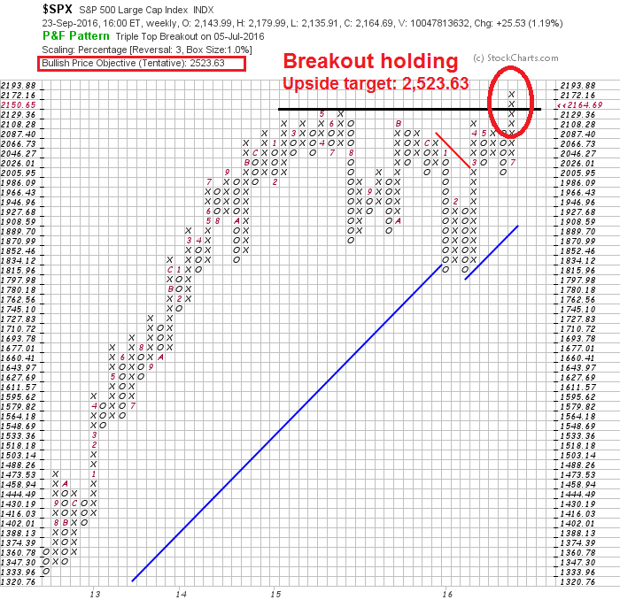
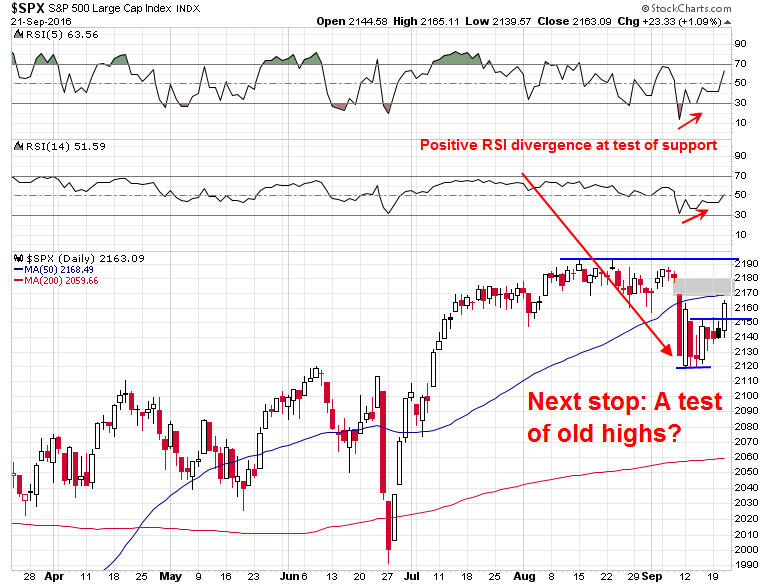
In the meantime, the market remains range bound since its July upside breakout. While it has retreated to test the 2120 breakout turned support level several times, that support has held.
I have no idea of what might happen next week, but a combination of bullish trend of earnings and sales beats, positive seasonality, and supportive sentiment readings makes me leery about being short the market. Both my inner investor and trader are bullishly positioned.
Disclosure: Long SPXL, TNA