Explaining our market timing models
We maintain several market timing models, each with differing time horizons. The “Ultimate Market Timing Model” is a long-term market timing model based on research outlined in our post Building the ultimate market timing model. This model tends to generate only a handful of signals each decade.
The Trend Model is an asset allocation model which applies trend following principles based on the inputs of global stock and commodity price. This model has a shorter time horizon and tends to turn over about 4-6 times a year. In essence, it seeks to answer the question, “Is the trend in the global economy expansion (bullish) or contraction (bearish)?”
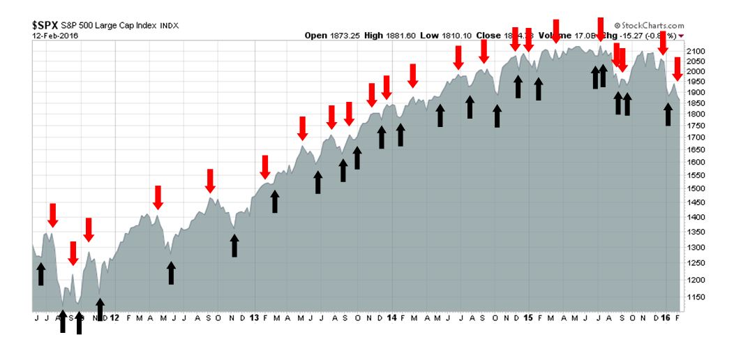
My inner trader uses the trading component of the Trend Model seeks to answer the question, “Is the trend getting better (bullish) or worse (bearish)?” The history of actual out-of-sample (not backtested) signals of the trading model are shown by the arrows in the chart below. Past trading of this model has shown turnover rates of about 200% per month.
- Ultimate market timing model: Buy equities
- Trend Model signal: Risk-off
- Trading model: Bearish
Update schedule: I generally update model readings on my site on weekends and tweet any changes during the week at @humblestudent.
The value of an investment process
In the past few weeks, I have heard from many worried investors and traders as stock prices fell. These difficult period illustrate the need for an investment process. In bull phases, no one needs a process because the market is rising, When the market declines, however, investors and traders need to have laid out a decision process that details an analytical framework of what to do ahead of time. Otherwise, they wind up panicking because they either under or over-react to the bear story du jour.
In the current case, the bear story du jour description is apt because there is no clear fundamental reason why the stock prices are falling (see the different explanations advanced in this Reuters story, What`s behind the global stock market selloff?). This decline began over concerns about falling oil prices and their possible effects on junk bonds, then it was China, then the excuse of the day became worries about European banks…and so on.
Don`t get me wrong. There are some very valid reasons to de-risk a portfolio, but unless you have laid out the proper analytical framework ahead of time, you can easily get lost.
Think like an institutional investor
A sustainable bear market needs valid fundamental and macro reasons for equity prices to retreat. That`s because, after the fast money hedge funds and nimble traders sell, the slow institutional behemoths still have to evaluate the situation and act. Institutional funds represent the Big Money. While they may not make investment shifts very often, when they do move, the fund flows are enormous, unrelenting and glacial.
As an exercise, imagine being an analyst at an institution manager with $10 billion in US equity assets. Our analyst is part of the Strategy and Asset Allocation group. The Investment Committee is meeting next week to consider what to do in light of the current market turmoil. Our analyst has been asked to prepare a report and make recommendations.
Here is some more background about the firm. It is a value oriented stock picker and typically holds between 50-100 stocks in its portfolio. The investment universe is the top 2,000 names by liquidity and market float. Its cash position is currently 7% and cash can vary between fully invested and 40%. Portfolio turnover has historically varied between 20-60% a year.
Now consider the constraints the portfolios operate under. If the portfolio holds between 50-100 stocks, then the typical position is between 1% and 2%. A 2% position in a $10 billion portfolio is a $200 million position. The smallest stocks in the investment universe will vary between $3 billion and $5 billion in market cap. A 1-2% position in a $5 billion market cap company represents between 2-4% of the outstanding shares. Even if the position is 1% of the outstanding, trading in and out of smaller positions will not be easy and the time to implement trading decisions can take weeks, maybe months. We simply cannot use the kinds of trading techniques used by the fast money traders because trading costs will crater portfolio returns.
We therefore need a longer time horizon to make our investment decisions. Based on that background of firm capabilities and constraints, here is what we observe.
Valuation: Stocks are cheap
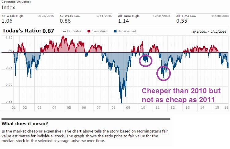
First, let’s start with market valuation. A quick-and-dirty way of determining valuation is the Morningstar fair value estimate, which shows stocks at 13% below fair value (h/t Callum Thomas). Compared to post 2008 corrective episodes, that’s cheaper than the trough in 2010 but not as cheap as the bottom in 2011 (annotations in purple are mine).
Another way of thinking about valuation is to analyze the stock market using the P/E ratio. Dissecting the P/E ratio reveals two components, the E and the P/E multiple. Data from John Butters of Factset shows that the forward P/E multiple has been falling. At 14.7, it is just above its 5 and 10 year averages of 14.4 and 14.2 respectively. If we were to exclude the troubled Energy sector, the forward P/E ratio would drop to 14.0, which is below the historical index 5 and 10 year averages (red annotations in chart are mine).

If we were to use a trailing P/E metric, market P/E is 15.9 and just above its long-term 5 and 10 year averages.

How should we interpret those P/E multiples? Are they cheap or expensive? A trailing P/E ratio of 15.9 translates to an earnings yield (E/P) of 6.3%, which compares favorably against the 10-year Treasury yield at 1.75%. Another way of thinking about the fair value using P/E is the Rule of 20, which states that an approximate fair value for the P/E ratio is 20 minus the inflation rate. Based on that rule, the market is cheap.
What about the likely trajectory of the P/E ratio based on macro developments? Analysis from Ed Yardeni shows that the P/E multiple (red line) has an inverse relationship with the Misery Index (blue line), which consists of the inflation rate + unemployment rate.
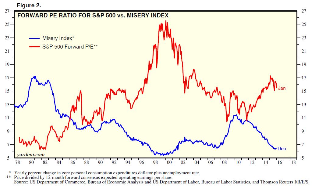
We break down the the components of the Misery Index in the chart below. Both inflation (blue line, core PCE) and unemployment (red line) have been falling, which are conducive to P/E multiple expansion. In terms of magnitude, unemployment has been falling much fast than PCE inflation. (As an aside, this observation is consistent with my view that recessions are deadly for stock prices, because unemployment spikes during recessions, which then pressures P/E multiples as risk aversion rises.)

OK, unemployment has been falling, but so what? It’s not a big surprise. The Fed has made numerous noises about watching employment statistics for signs of rising inflation pressures. Does that mean that inflation is likely to rise, which would have a downward pressure on P/E multiples? Ummm…take a look at this chart of the inflationary expectations of the bond market.

Based on this analysis of the Misery Index, the P/E multiple is far more likely to expand than to contract.
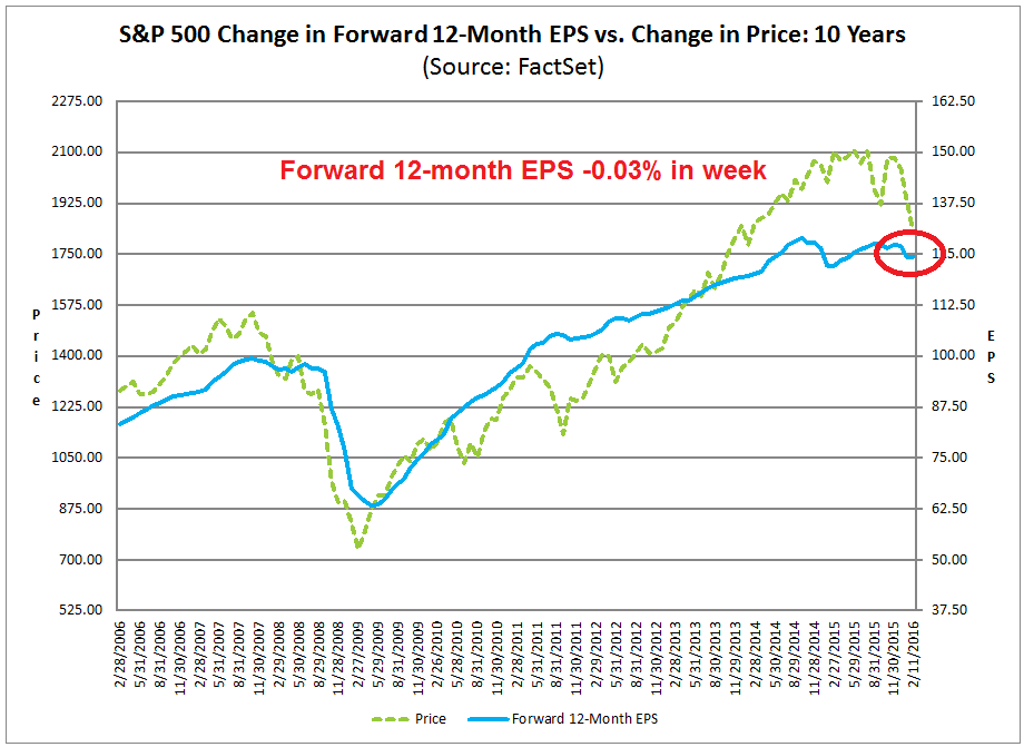
What about how the E in the P/E multiple? The latest update from John Butters of Factset shows that the growth of forward 12-month EPS is wobbly (annotations in red are mine). Until forward EPS start to improve, the tone of stock market price action is likely to be sloppy as well.
Green shoots of recovery?
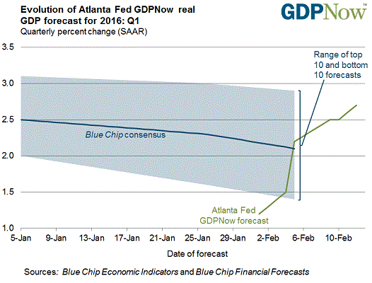
Despite the reports of wobbly forward EPS estimates, we can see some green shoots of a possible cyclical rebound from the macro data. The Atlanta Fed’s GDPNow nowcast of Q1 2016 real GDP growth has been steadily rising. The latest reading stands at 2.7%, which is well above the Blue Chip economist consensus.
The latest update from New Deal democrat, who monitors high frequency economic releases, agrees with that assessment. New Deal democrat believes that macro conditions are rapidly becoming “less worse”.
Among short leading indicators, the interest rate spread between corporates and treasuries got even more negative. Jobless claims remain positive. Oil and gas prices remain very positive, while usage, which was negative for 5 weeks, turned positive. Commodities remain a big global negative, although they appear “less worse” on a YoY basis. The big story this week, however, was that the US$ as against major currencies turned from negative to neutral. The broad US$ remains quite negative, but is also rapidly becoming “less worse.”
Among coincident indicators, steel production, shipping, staffing, and rail transport all remain negative, but all of these except for shipping have turned much “less bad. ” Consumer spending remains positive.
It is a little over one year since the downturn in coincident indicators began. The bifurcation of decent consumer economy, poor industrial economy remains. Yesterday retail sales confirmed what the weekly consumer spending measures have shown: the US consumer is alright. Meanwhile heightened inventory to sales ratios show that producers and sellers as a whole have a backlog to be worked off. But the big news is that the majority of coincident indicators have become significantly “less worse,” although none enough so for me to declare that they have bottomed.
We see a similar message from the character of market leadership. Industrial stocks have formed a relative saucer bottom and they`ve staged a relative breakout. Outside of the still dismal Energy sector, resource stocks like Metals and Mining appear to be trying to form a bottom in relative performance. Industrial metals are also bottoming, aided by weakness in the USD Index, which is inversely correlated to commodity prices.

We can also make a couple of observations about global tail-risk from Europe and China from the above chart. The behavior of the USD is a constructive signal that tail-risk from European banks may be limited. If the market was truly panicked over the outlook for Deutsche Bank, Intesa, etc., then the USDEUR should be rising, as traders pile into Treasury assets as a safe haven. Instead, the euro has strengthened against the Dollar (can anyone explain that puzzle to me?). In addition, a falling USD is helpful for US earnings growth, as the rising Dollar had been squeezing the operating margins of US exporters in the past year. Currency weakness should therefore translate into better operating earnings growth in Q1 and Q2. The market is may be poised for a growth surprise.
As well, the bottoming price action seen in industrial metals could be interpreted as a signal that deceleration in Chinese growth is also bottoming. At a minimum, things are getting less worse in China.
Supportive sentiment
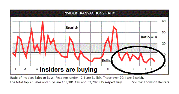
A review of sentiment models is supportive of higher prices in the next few months. Insiders, who represent a group of smart and patient investors with a long investment horizon, are buying (via Barron’s).
By contrast, the public is very bearish, which is contrarian bullish. The chart below depicts sentiment from AAII investor survey (black line) and Rydex trader fund flows (green line). Both are flashing crowded short readings, which suggest limited downside risk for stocks.

To summarize, our analyst recognizes that his institutional employer cannot react to every blip in the market because of liquidity constraints. It has therefore adopted an investment horizon of several years. He presents his reports based on the data cited above and makes a recommendation that they put some money to work in equities for the following reasons:
- Valuations shows stocks to be cheap relative to bonds and macro conditions;
- Earnings multiples are likely to expand further, or stay flat at worse;
- The fundamentals look a bit uncertain right now, but there are some early signs of a cyclical rebound;
- Macro tail-risk from Europe and China are limited; and
- Investor sentiment is at or near panic levels, which is contrarian bullish.
I went through the above exercise as an illustration of an investment process favored by institutional investors. While individual portfolio managers and analysts can over-react and panic just like the rest of us, large organizations strive to put in place a process, or a framework for evaluating all market conditions and so that they know how to react ahead of time.
I would further point out that $10 billion in equity assets in this example does not represent an especially large institution, but it is big enough to show the kinds of constraints that these organizations operate under. In other words, a $10 billion institution is a medium sized elephant. Now imagine a stampede of similar sized elephants, which leads to my final point…
The most compelling reason for studying institutional investment decision processes is they represent the Big Money. Big Money move markets.
As a result of this analysis, my inner investor remains constructive on stocks. He continues to opportunistically bottom fish at these levels,
Inner trader: Just a dead cat bounce
My inner trader is appreciative of my inner investor’s analytical approach, but he has a much shorter time horizon. Unlike the slow moving institutional behemoths, my inner trader try to be the fast money that times the short-term squiggles in the market.
He doesn’t like what he is seeing. True, the stock market did stage an oversold rally late last week, but it looks like a dead-cat bounce. This chart from IndexIndicators shows that short-term breadth metrics had gotten sufficiently oversold for stock prices to rise.

The readings from a longer term (1-2 weeks) breadth indicator of net 20-day highs-lows are more disturbing. The market rallied off a mild oversold condition last week, but it is now on the overbought side of neutral and it would become overbought on any sort of mild advance. This suggests that the upside potential of the current rally is very limited.

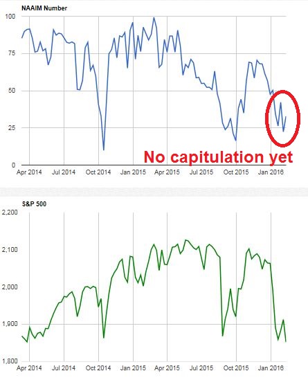
Further, my inner trader worries about the lack of panic selling (see Bracing for more pain). Admittedly, Rydex and AAII are showing crowded short conditions (see above commentary), but sentiment models are not very useful as short-term trading tools. The latest update of the NAAIM Exposure Index, which surveys of RIAs, indicates that investment advisors were buying in the face of market weakness, which also suggests a lack of capitulation.
Here are the short-term challenges facing the market next week. The SPX hourly chart shows an overbought condition on RSI 5 and nearby overhead resistance. At a minimum, the bulls have to show sufficient follow-through and overcome that resistance zone to be in control of the tape.

The daily chart appears a bit more constructive. We are seeing positive divergences in 5 and 14 day RSI. The initial target for the rally, after it overcomes any of the aforementioned resistance levels, is the first Fibonacci retracement level at about 1833-1835.

My inner trader is skeptical that the bulls can pull off a win next week. Until the bulls can show they have sufficient control of the tape to overcome resistance at 1835, he is staying in cash. Ideally, he would like to see a final panicky selloff, where the market craters and his social media feed is full of “OMG! Next stop for the SPX is 1760” comments. His base case scenario calls for further market choppiness until we either start to either see a trend of improving fundamentals in the form of rising forward EPS estimates, or a capitulation selloff.
He tells my inner investor, “Feel free to bottom fish, but don’t expect the stock market to rocket upwards next week.”
Disclosure: No trading positions
Hi Cam,
I agree with you that a capitulation sell-off is required before heading higher.
In your asset management example what if this major washout occurs and your portfolio suddenly faces massive redemptions.
In that case, regardless of the investment thesis, managers may be forced to liquidate thus exacerbating the sell-off.
Is that a risk that you would be concerned about?
It depends on the mandate. If the client is a pension fund, you will not see massive liquidation. In fact, you may get more money allocated to you as the pension re-balances by selling bonds and buying stocks.
If the client is a mutual fund, you may and you keep more cash on hand. That’s part of the business.
S&P 500 loss 13.1% from the highs
Nasdaq loss 17.9% from the highs
DJTA loss 24.2% from the highs
Russell loss 25.6% from the highs
Average loss: 20.2%
$1,000,000 down to $798,000 excluding commission.
$202,000 to $1,000,000 requires a return of 25.31%
I don’t know many money managers that provide that type of return in 2 years leave aside one year. The only way I know how to deal with this situation is that each security in the portfolio has to be individually monitored. Losses have to be taken as a position starts to go down. History is replete with stocks held by famous hedge fund managers that let their ego and conviction get in their way.
Big money is not necessary smart money. There is a herd mentality that takes over. Look at the major holding of most hedge funds and you will see the same names. FANGS today, the nifty 50 years gone by.
Finally, the moral of the story is to manage other people’s money. You get your 1 to 1.5% management fee and if you are a hedge fund manager there is icing on the cake : 20% of the gain. Losses just ride them down.
I think that you miss the point. Big Money is usually patient money. Does Warren Buffett fret about paper losses of millions if they think everything in the portfolio is on track?
I also did not make the claim that Big Money is smart money. But if you roam the savannah with a herd of elephants, you have to be aware of how they behave.
BTW, the typical fee for managing an institutional portfolio isn’t anywhere close to 1%. Fee structures are tapered and, depending on the size of the account, expect fees of 30-50bp for an active mandate. Just look at the sub-advisory fee structure of Vanguard funds (of what gets paid to the manager).
Hi Cam,
upside resistance and Fibo is probably 1935 instead of 1835?
You’re right. Sorry.
First Fibo resistance about 1935, not 1835.
Hi Cam, futures action is very strong so far. It looks like A wave has already started. I thing that the best action to contemplate is to buy dip B wave and wait for the C.
Do you still think that lower low is ahead in 1-2 week horizon? Thank you for answer. Petr
We just have to watch and take what the market gives us. Remember that this is OpEx week, which tends to have a bullish bias.
Thanks Cam!!
Cam, excellent post! This analysis is absolutely perfect feedback for a busy small time broker like myself that needs all the time he has holding clients hands through this mess. Something like this every couple of weeks from you is invaluable to guys like me that don’t have the time, or brains, to put together a report like this!
THANK YOU!
Mike
Pardon this long comment but I think something important and new is occurring. It’s my belief that we are in a new market environment where Central Bankers will not tighten and hence each industry will go through its own business and stock market cycle. The synchronized business and stock market cycles of the past are no longer going to happen for the foreseeable future. Therefor analyzing ‘The Market’ is fruitless. One must go sector by sector. Then if one wants to make a general market call, you must sew the pieces together.
From that sector standpoint, I see that many important sectors have completed bear markets over the last month and are starting new bull markets. That is gold and base metals after brutal four year bear markets, Energy after almost two years and Transports over eighteen months. The capitulation on these commodity sectors was historic and included never-before sentiment lows on commodity currencies like the Canadian dollar. The thrust up from mid-January lows is indicative of the birth of bull markets. Fundamentals of these industries match previous cycle lows with, dividend cuts, bottom line losses and commodity prices below the industry cost of production causing supply destruction.
Let’s look at other sectors where forward earnings are continuing to grow nicely; healthcare, consumer and technology. They have just completed corrections (sub-20%) within ongoing bull markets. Their fundamental outlooks are strong and stock valuations are good since these sectors have seen earnings grow by 10% plus per year while stock prices have gone sideways for almost two years. Technically, these sectors hit a lower low than mid-January on Thursday amid extreme bearishness. If one looks at them, as independent entities, you would conclude that the correction within their bull markets was sufficient (20% plus bear market pullback not required) at that point and now their bull markets will resume.
If you combine these sectors into ‘The Market’ it explains why the oversold intensity is less this week than it was on January 20th. At that time, all were hitting lows. Since then, commodity and transport have started bull markets while the other sectors needed one more capitulation downswing to complete their bull market corrections.
By this viewpoint one would conclude that ‘The Market’ will start a surprisingly strong up-leg since we have new bull markets in commodity sectors combining with continuing bull markets in the others. All this with a U.S. Fed backing away from any further tightening that keeps the way clear for stock market gains.
Thank you for this impressive post, Ken.
So, one might consider buying ETFs on Gold, base metals, energy, transport, healthcare, consumer and technology?
BINGO!
I will say that I am not buying healthcare since it may be a political football until November. Within commodities, I am choosing gold most, then base metals and energy not at all. OPEC and Middle East politics confound me.
thanks!
$SPX has had three gap up in a row and Zweig Breadth thrust may triggered today 2/17/16 ( in perhaps a record 4 session turn around). Is this supposed to be bullish?
http://stockcharts.com/h-sc/ui?s=%24SPX&p=D&yr=0&mn=6&dy=0&id=p69783399237
Looks like 2 gap ups if today holds. Not sure if Zweig will get there today or not though. May need another day or 2 to see.