Preface: Explaining our market timing models
We maintain several market timing models, each with differing time horizons. The “Ultimate Market Timing Model” is a long-term market timing model based on the research outlined in our post, Building the ultimate market timing model. This model tends to generate only a handful of signals each decade.
The Trend Model is an asset allocation model which applies trend following principles based on the inputs of global stock and commodity price. This model has a shorter time horizon and tends to turn over about 4-6 times a year. In essence, it seeks to answer the question, “Is the trend in the global economy expansion (bullish) or contraction (bearish)?”
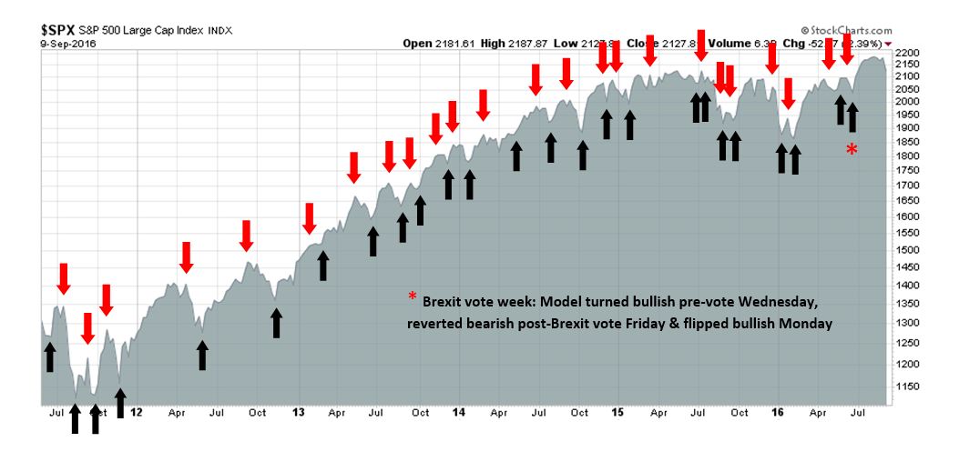
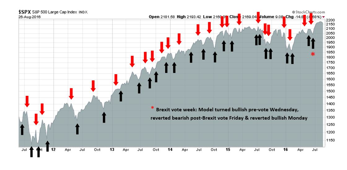
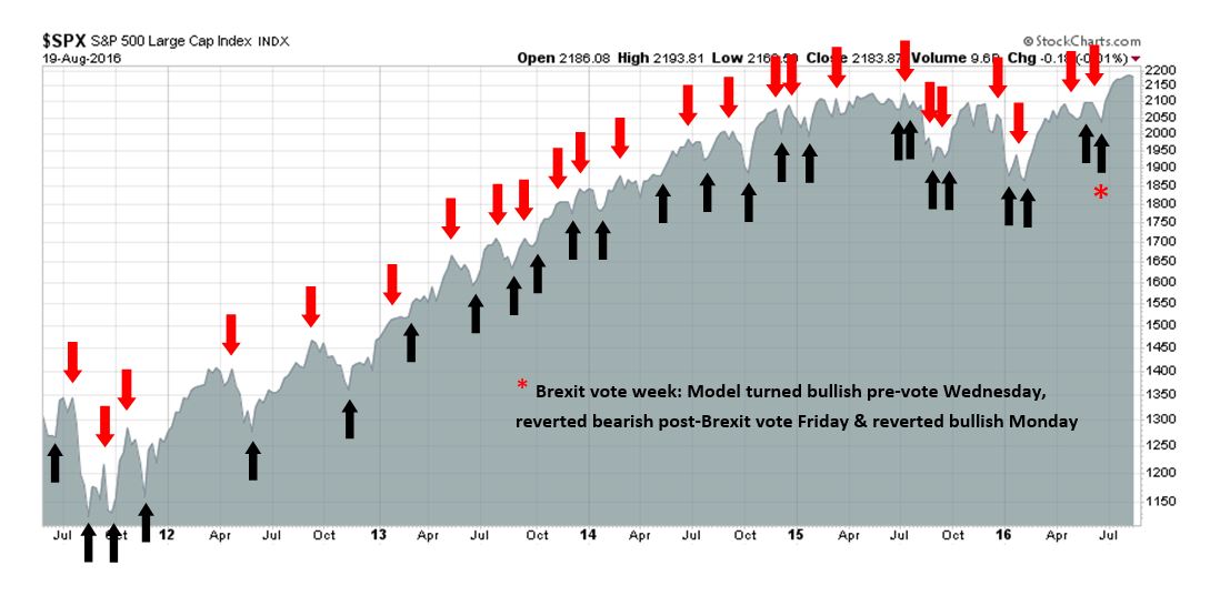
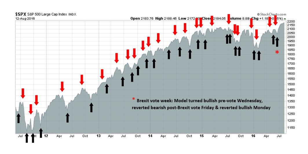
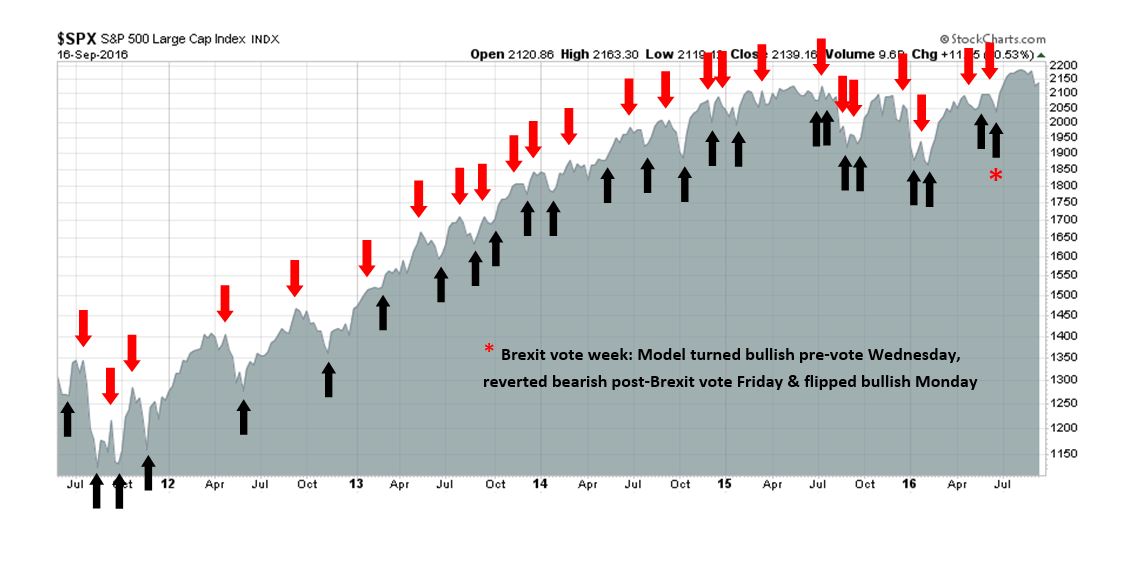
My inner trader uses the trading component of the Trend Model to look for changes in direction of the main Trend Model signal. A bullish Trend Model signal that gets less bullish is a trading “sell” signal. Conversely, a bearish Trend Model signal that gets less bearish is a trading “buy” signal. The history of actual out-of-sample (not backtested) signals of the trading model are shown by the arrows in the chart below. Past trading of the trading model has shown turnover rates of about 200% per month.
The latest signals of each model are as follows:
- Ultimate market timing model: Buy equities
- Trend Model signal: Risk-on
- Trading model: Bullish
Update schedule: I generally update model readings on my site on weekends and tweet any changes during the week at @humblestudent. Subscribers will also receive email notices of any changes in my trading portfolio.
My answer to Northy
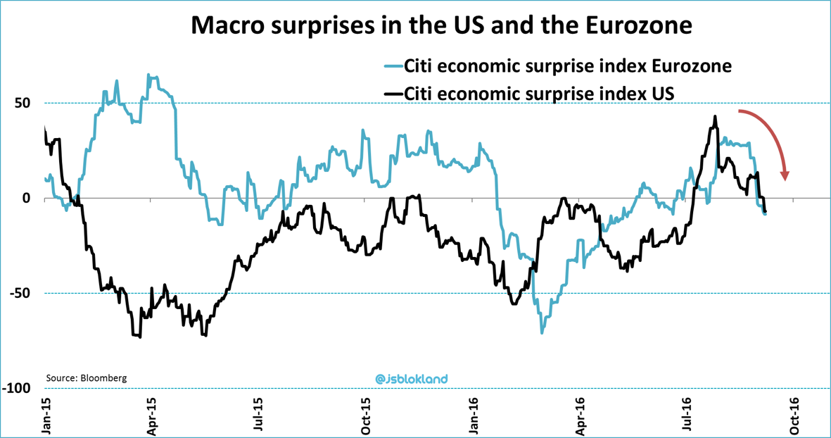
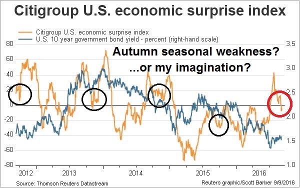
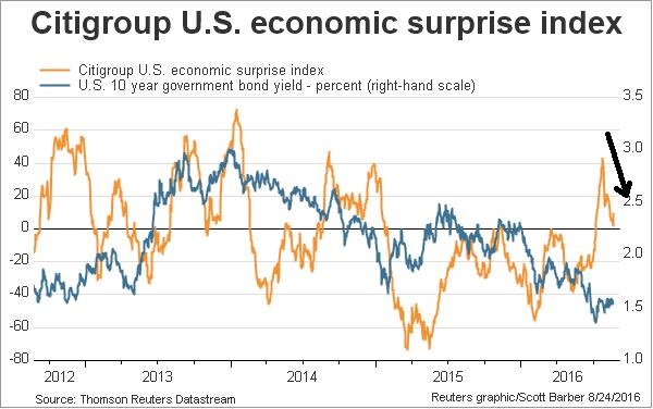
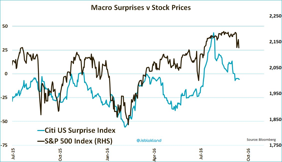
Recently, a lot of US macro economic releases has been coming in a bit on the soft side. As the chart below shows, stock prices have a high degree of correlation with the Citigroup Economic Surprise Index, which measures whether economic data is beating or missing expectations.
As a result, I am sensing a heightened level of anxiety among some of my readers. I have received several requests for comments to the macro post written by Sven Henrich, otherwise known as Northman Trader (Northy). In his post, Time to get real, Part II, Northy laid out the macro view for an impending recession. He correctly pointed out that recessions, which are bull market killers, often occur during the first year of a presidential term. So, with macro data weakening, is a recession just around the corner?
In conjunction to my response to Northy’s recessionary post, I thought that it would also be timely to review the message from my Recession Watch indicators.
Torturing the data until it talks
Good quants and traders are naturally wary of backtested results. Too often, backtested systems overfit data and yield stellar returns during the study period, but fail dismally when put into production. In his post, Time to get real, Part II, Northy also wrote that he “found 4 recurring, common elements preceding recessions”. Unfortunately, his study may be a case of data overfitting and torturing the data until it talks.
One of the basic techniques to sidestep problematical backtest results is to define what constitutes a signal ahead of time before running the test. Northy’s study appears to have violated many of those rules in his study design.
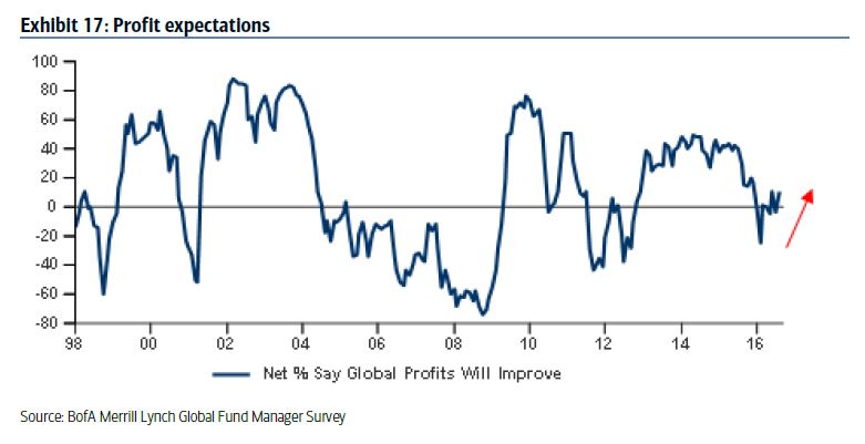
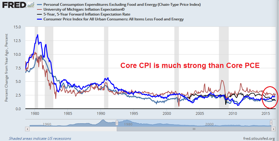
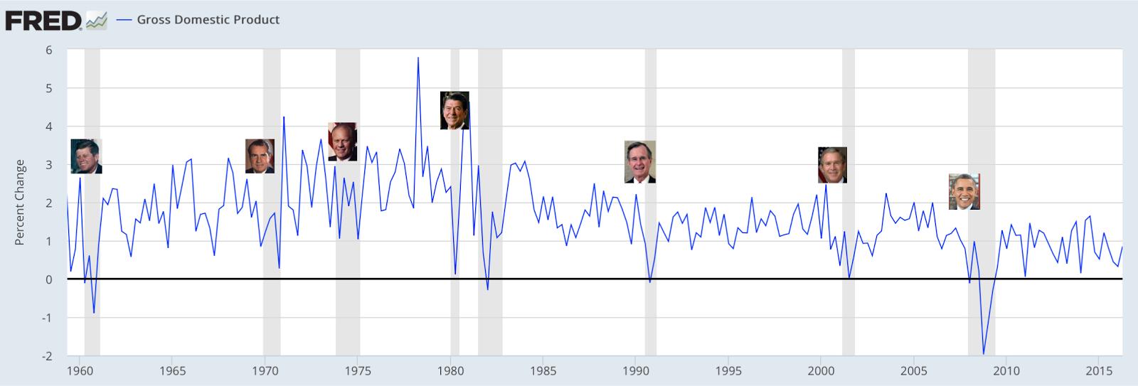
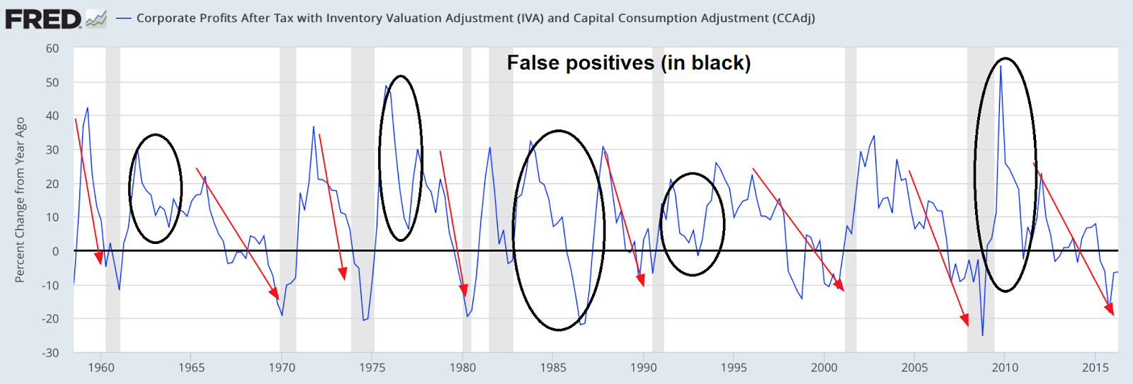
Consider that the first of the four “recurring common elements preceding recessions” was slowing corporate profit growth, shown in the chart below. But what constitutes a recessionary warning signal? If the criteria for a signal is a falling line (marked with red arrows) in the chart below, then there were plenty of false positives (black circles). Incidentally, corporate profits can be a useful recessionary indicator and it is one of my indicators. As you will see later, I use the level and look for peaks instead of YoY changes that Northy used.
The study cited falling household net worth as the second common element. When I look at this chart, two questions come to mind. What constitutes a significant enough decline to qualify as a recession warning? How many false positives were there during the test period?

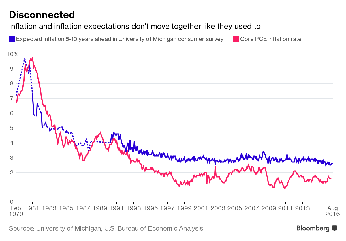
The next factor was falling consumer confidence, as measured by the University of Michigan survey. I have marked in black the instances where consumer confidence fell below the zero line. Imagine that this indicator as a trading system, what trader would bet on this kind of model?

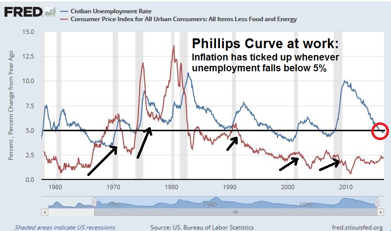
Lastly, the rate of change in U-6 unemployment was the fourth factor picked as a recession forecaster. The study showed that the rate of change in unemployment tends to rise before the last two recessions.

When I analyzed the methodology behind this indicator, the focus on the rate of change of the unemployment rate, instead of the level of unemployment, was a bit puzzling. The use of the U-6 unemployment rate (red line below) was also an odd choice as the history of U-3 unemployment (blue line) goes back much further. As the chart below of unemployment levels show, both data series are highly correlated with each other. The chart below took the data back to 1948 and shows that unemployment, regardless of how it’s measured, tends to bottom out just before recessions.

In addition, we can see that there were many false recessionary signals even if we use the same methodology of using a rising rate of change in the unemployment rate as a forecasting model.

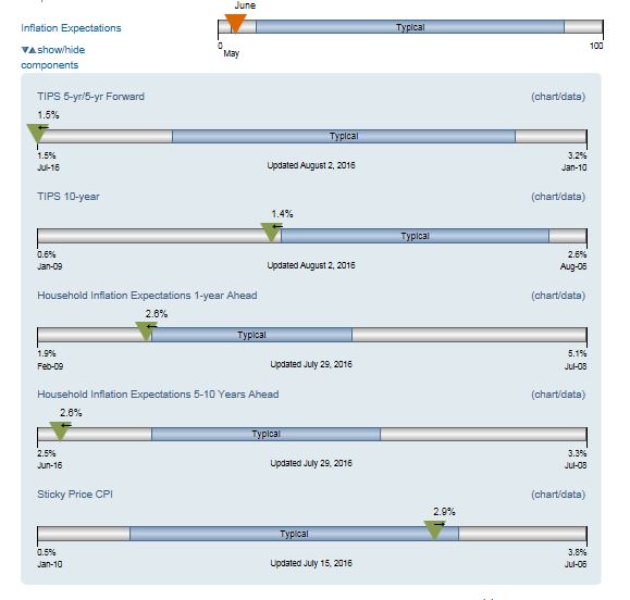
Incidentally, Georg Vrba uses unemployment data as one of his recession forecast factors. The latest update shows that recession risk is low.
Be data dependent
In conclusion, is this study just an example of poorly executed quantitative analysis where the analyst is torturing the data until it talks, or the case of starting with a conclusion first and then picking the data to support the investment case? I have no idea.
What the analysis does show is the pitfalls of building a proper quantitative investment framework. It’s easy to learn about quant tools. Applying them properly is much harder.
Recession Watch
By contrast, the Recession Watch framework is built more robustly. It was based on the work by the noted economic cycle researcher Geoffrey Moore, and adapted by New Deal democrat to build a set of long leading indicators (see the NDD post outlining his methodology here). This technique is designed to spot a recession a year in advance. NDD qualified the usefulness of these indicators this way:
Note that none of the indicators are perfect. None of them forecast the 1981 “double-dip,” which was engineered by the Volcker Fed. If the Fed similarly decided to raise rates aggressively in the next 6 – 9 months, or if there were an Oil price spike caused by a Middle eastern War, a recession could happen anyway.
Each of the seven long leading indicators and are shown below (click on links for the latest FRED charts).
- Corporate bond yields: Corporate bond yields have always made their most recent low over 1 year before the onset of the next recession.

- Housing starts: Housing starts peaked at least one year before the next recession. Housing starts may have plateaued and this indicator bears watching. Score this as neutral for now.

- Money supply: In addition to the 1981 “double dip,” on only 2 other occasions have these failed to turn negative at least 1 year before a recession.

- Corporate profits (blue line) and its more timely cousin, Proprietors` income (red line): Corporate profits have peaked at least one year before the next recession 8 of the last 11 times, one of the misses being the 1981 “double-dip”. These two indicators are currently flashing divergent readings. Corporate profits are weak while proprietors`income is robust. One possible explanation is the corporate profits sample has a higher weight in the energy producing sector, which was hurt by falling oil prices, compared to the proprietors`income sample. We saw a similar pattern in the 1990’s, when corporate profits peaked along with oil prices while proprietors’ income continued to rise. Score this as neutral.

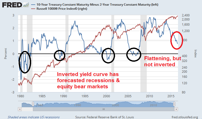
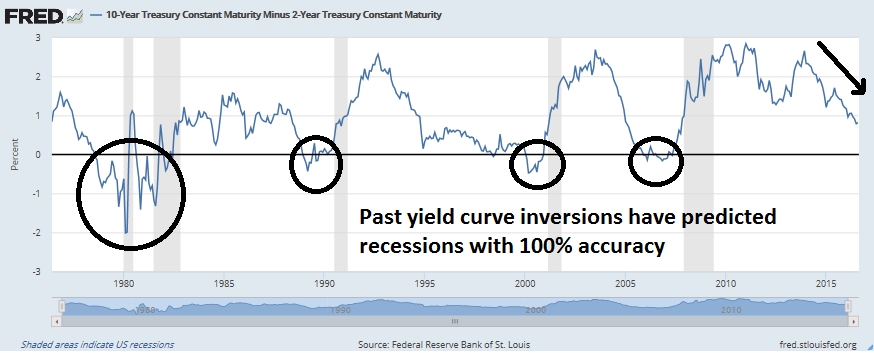
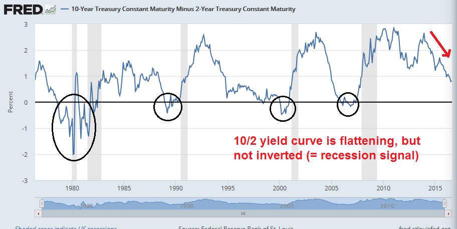
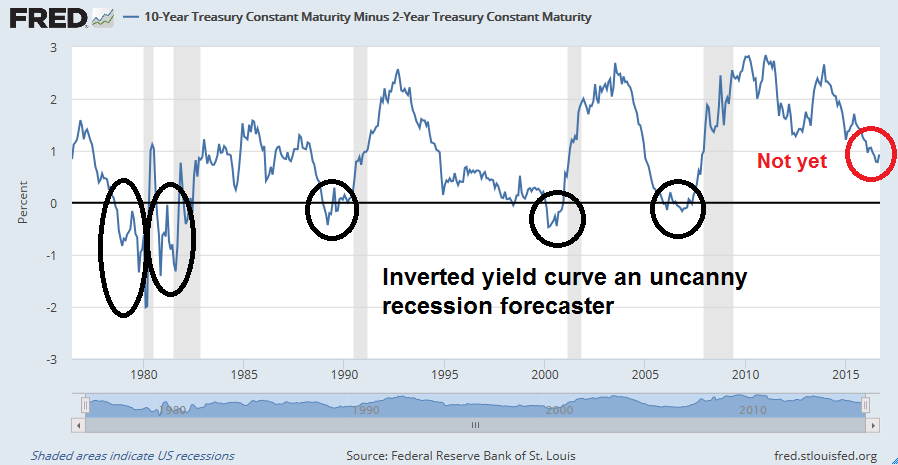
- Yield curve: The inverted yield curve has been an uncanny recession forecaster.
- Residential real private investment: Aside from the 1981 “double-dip,” and 1948, it has always peaked at least one year before the next recession.

- Real retail sales: It has peaked 1 year or more before the next recession about half of the time. Real retail sales looks rather wobbly. Score this as a negative.

Of the seven leading indicators, four are solidly green, two are neutral, and one is red. I interpret this as an economy that is past the mid-cycle phase of its expansion, but there is no recession in sight. For the last word on this topic, here is New Deal democrat’s interpretation of the latest high frequency economic data:
In general, low interest rates are really driving positivity. The recent decline in commodities and spike in bank rates suggest a further bout of global weakness, and that may also be reflected in the slight rise of the US$ and increase in Treasury yields. While US monthly data for August has generally been poor, neutral staffing and slightly negative rail — both improved from earlier this year — argue that there is no real downturn.
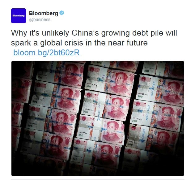
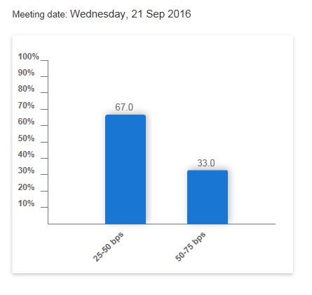
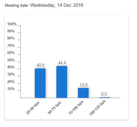
Looking out to next year, the most likely recessionary trigger is a Federal Reserve policy error that tightens rates too much and pushes the American economy into a mild slowdown with blowback coming from overseas. Deutsche Bank recently modeled the GDP effects of a quarter-point rate hike after two years and the worst hit economy is China (chart via Bloomberg). When we combine the fragility of the Chinese financial system with a US consumer led slowdown, the global effects could be devastating.

Nothing to worry about (yet)
For now, there is nothing to worry about (yet). There is no point in taking investment action based on speculation of Fed actions this year or next year (see Rate hike vs. rate hike cycle).
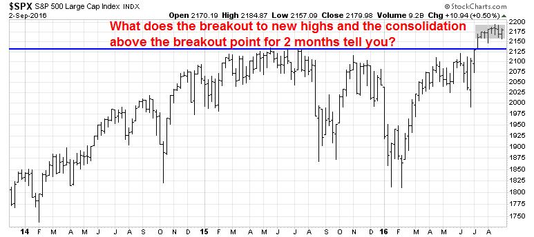
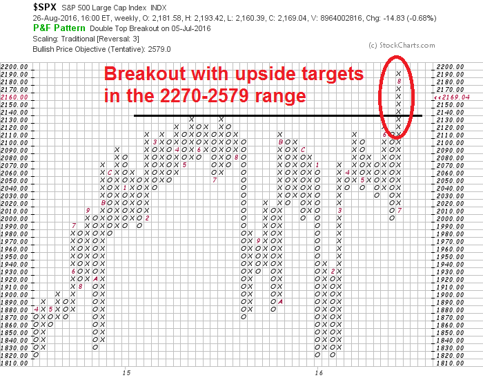
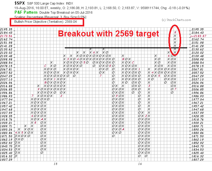
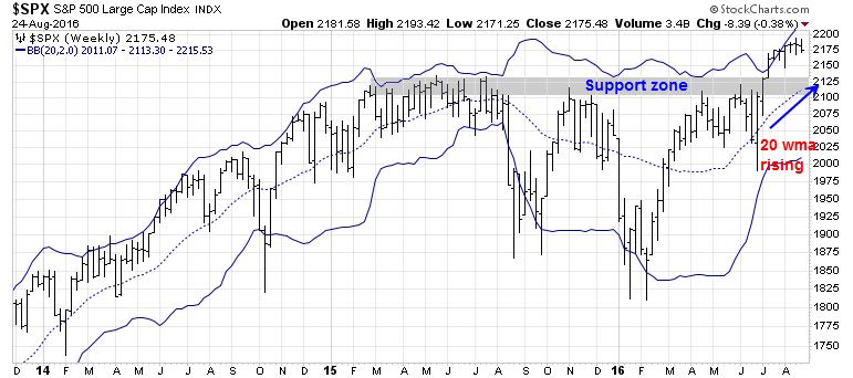
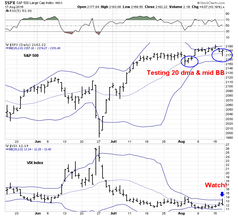
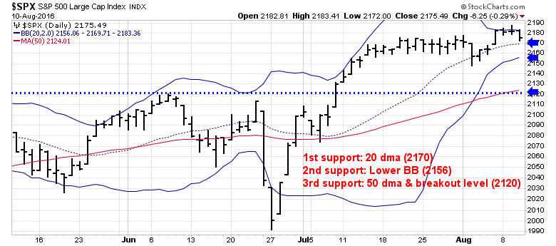
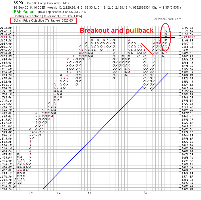
From a technical perspective, the market has pulled back to test the breakout level, which is now support. Unless we see a definitive break below the 2120 level on a weekly closing basis, the intermediate term trend is still bullish.
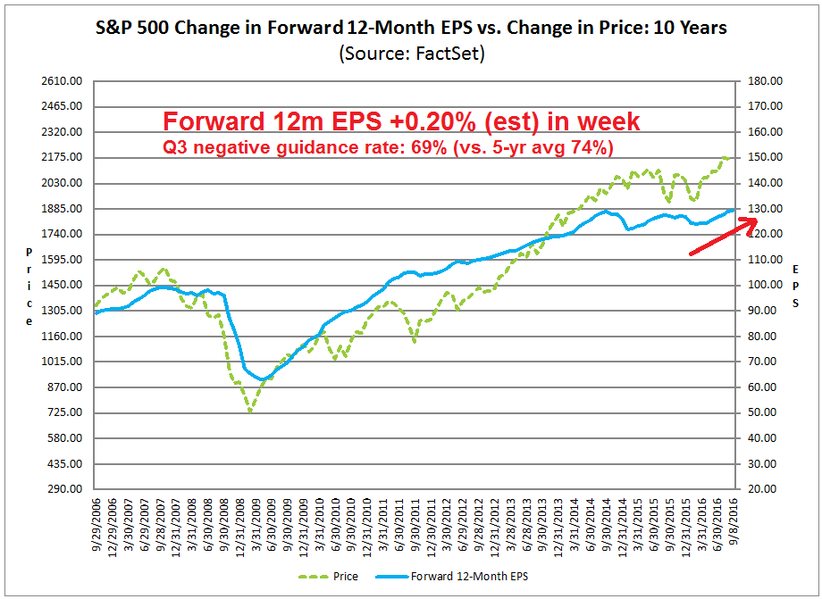
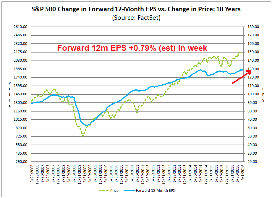
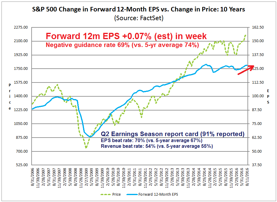
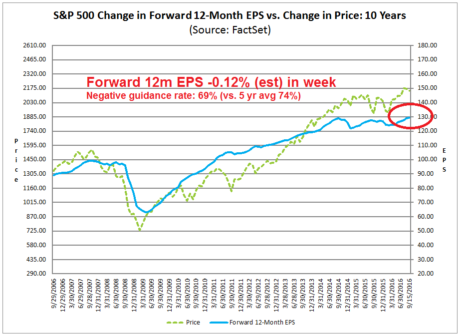
The latest update from John Butters of Factset shows forward 12m EPS edged down after rising for many weeks, possibly in reaction to the recently softer macro data. Forward EPS needs to be monitored carefully to see if this decline is just a blip in the data or part of a larger trend. On the other hand, the negative guidance rate is below the five-year historical average, which is a positive.
Lipper Alpha Insight sounded a similar optimistic note based on their assessment of earnings pre-announcements. Q3 earnings could come in well ahead of expectations, as the rate of downward revisions has been below average:
Although analysts are not especially bullish on Q3 earnings, there are some signs that the quarter could be better than expected. In a typical quarter, the EPS growth estimate falls 4.0 percentage points. As we near the end of the calendar quarter, the growth rate has fallen by only 2.9 percentage points, so the bearish analyst sentiment is actually slightly stronger than it may otherwise be.
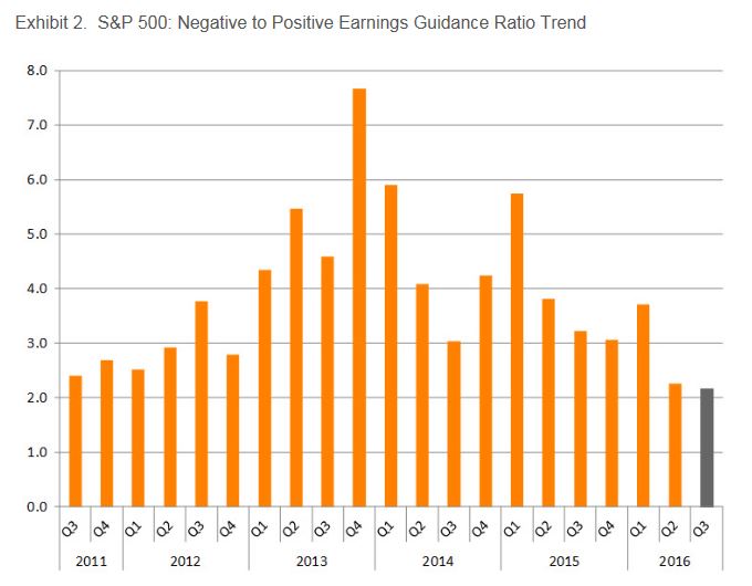
In addition to analyst sentiment, management teams are more optimistic about Q3 results than they have been in several years. The ratio of negative to positive preannouncements for Q3 stands at 2.2. As seen below in Exhibit 2, this is the lowest this ratio has been in over five years. Even though there is still more negative guidance than positive, the extreme pessimism that company management teams exhibited relative to the analysts covering their companies has abated.
If we can get to October without the market getting overly spooked by either the Fed, the BoJ, or other news, Q3 earnings season could see some bullish tailwinds.
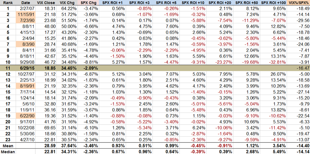
The week ahead: Not enough fear?
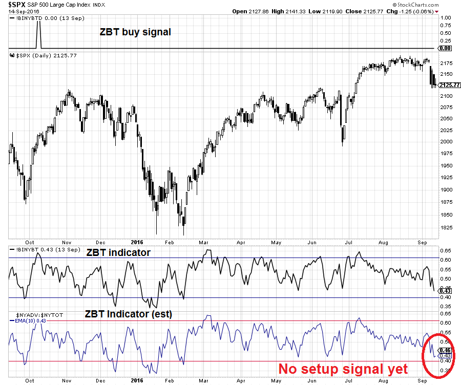
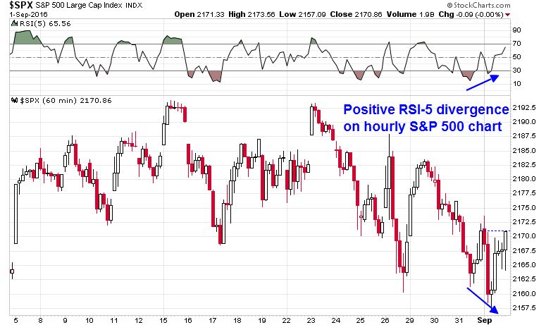
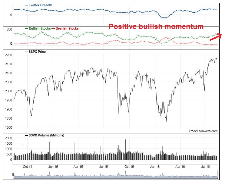
Looking to the week ahead, the most likely path for stock prices is unclear. In my last post (see Bottom spotting), I suggested watching for a Zweig Breadth Thrust setup as a possible oversold buy signal for the market. That signal has not materialized.
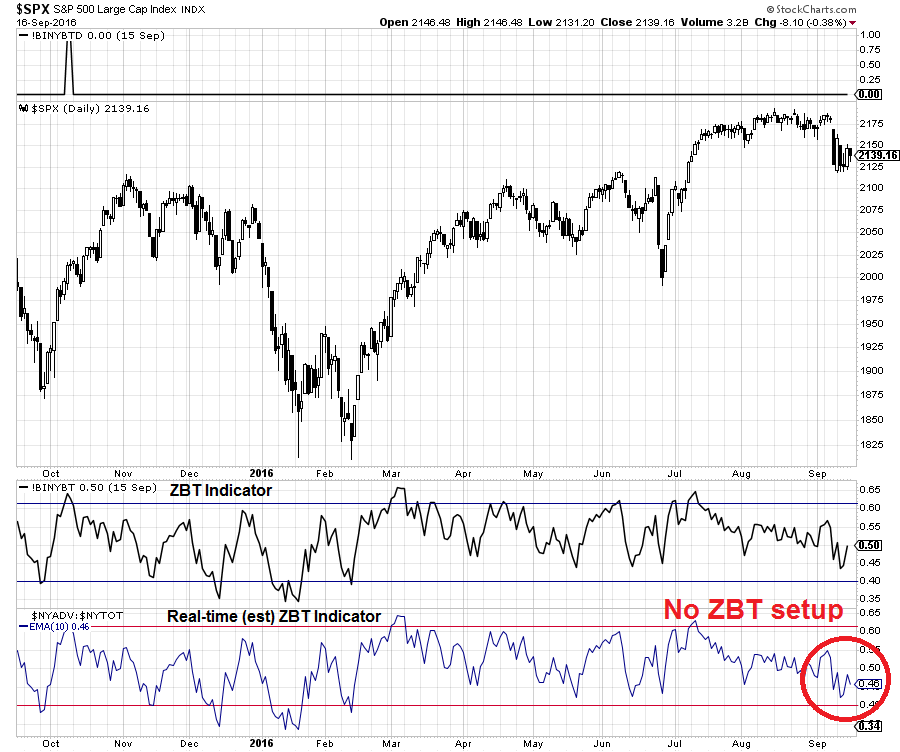
In addition, I was watching for a Trifecta Bottom Spotting Model buy signal. While two of the three conditions were satisfied last week, which makes it a Exacta buy signal that can be quite powerful, the full Trifecta buy signal hasn’t been achieved yet.
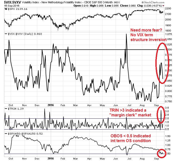
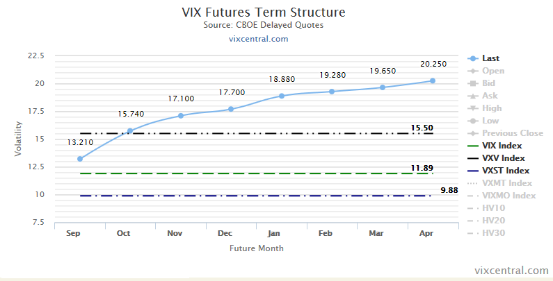
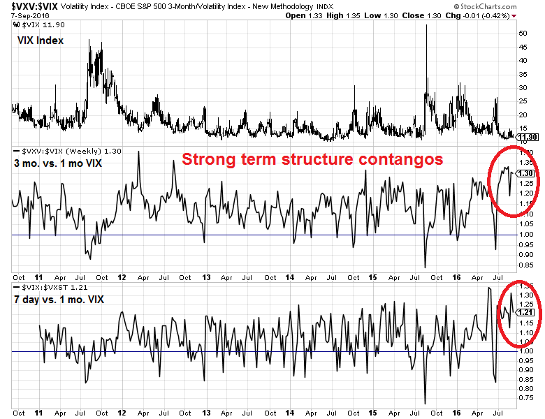
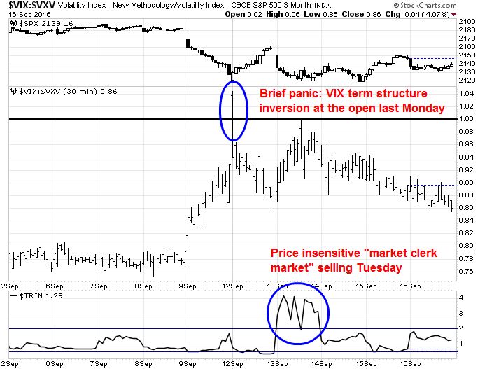
The short-term 30 minute chart of Trifecta model readings showed some signs of panic at the open last Monday when the VIX term structure briefly inverted, but that hardly counts as capitulation. More constructive were the steady signs of price insensitive selling on Tuesday. (The OBOS model readings are not updated on an intraday basis and therefore not shown in the chart below).
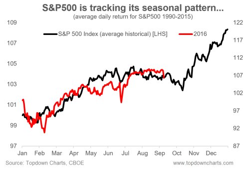
Virtually all of the historical studies, such as the resolution of tight consolidation near new highs, 90%+ down volume Fridays, and ;sharp VIX spikes, all point to higher prices in the weeks ahead. However, fear levels are elevated but not at capitulation levels and we may need a washout low before the market can bottom. I am therefore open to the possibility that the market may follow the seasonal pattern highlighted by Callum Thomas in the chart below.
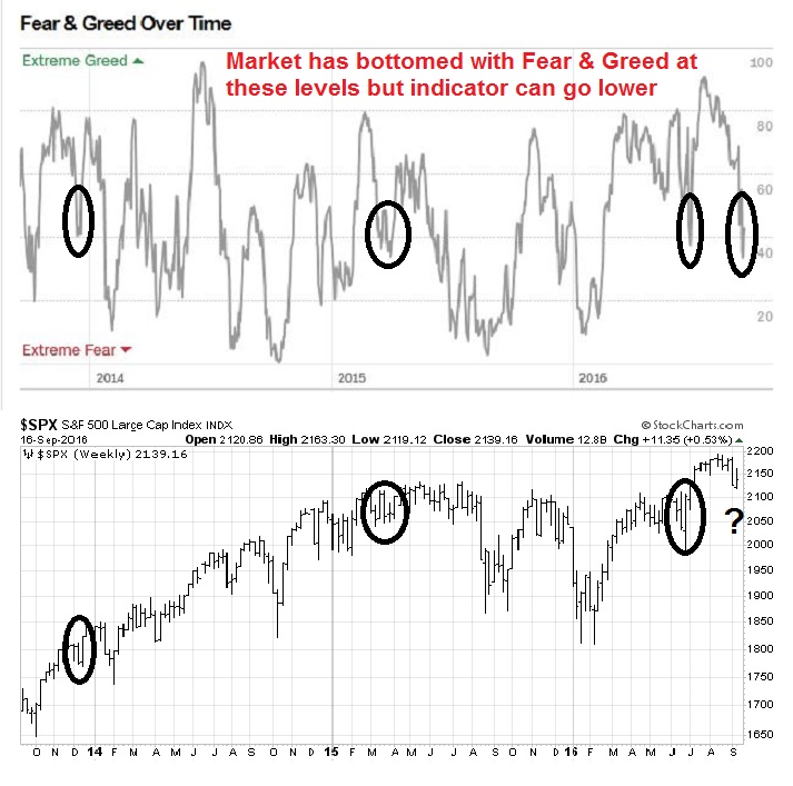
More choppiness and fear may be necessary for a durable bottom to occur. The CNN Money Fear and Greed Index has seen market bottoms at these levels, but the indicator has the potential to go much lower.
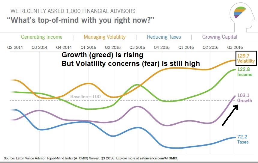
Mark Hulbert found that the bullishness of NASDAQ-oriented market timers have significantly retreated, but readings are not at capitulation levels yet. Should the stock market strengthen here, the rally is likely to stall out when it tests the all-time highs.

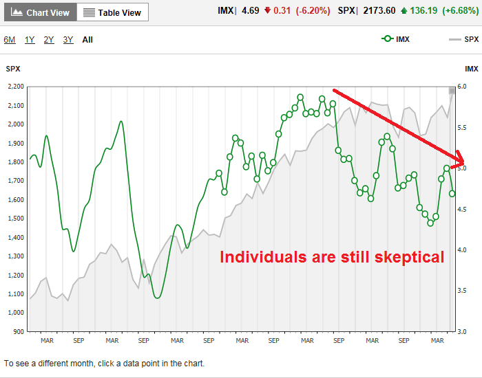
Similarly, Rydex short-term trader behavior and AAII surveys are telling a story of fading bullishness, but sentiment haven’t even retreated to the mild levels seen at the Brexit panic lows.

My inner investor is still bullishly positioned in his portfolio. My inner trader remains constructive on equities, but he is waiting for signs of a panic capitulation before committing more funds to the long side. Catalysts for a bearish capitulation could come from anywhere, such as rising risk premium over weekend events like the bombing in New York or the rebel attack in Kashmir, which India has accused Pakistan of supporting, could lead to conflict between two nuclear armed states.
Disclosure: Long SPXL, TNA