I encountered a couple of interesting observations about the bond market on the weekend. First, Tom McClellan pointed out that the latest Commitment of Traders report on bond futures shows that the commercial hedgers, who are thought to be the “smart money” are massively short the bond market.

As well, Mark Hulbert observed that bond market timers are showing an off-the-charts level of bullishness on bonds, which is contrarian bearish.

Right, the bond market is cruisin’ for a bruisin’. Since the main focus in these pages is on the stock market, the BIG QUESTION for equity investors: “What would a weak bond market mean for the stock market?”
The technical picture
As a reminder for newbies, when bond interest rates rise, bond prices fall. There are two ways that bond rates can rise (and bond prices fall). The most obvious scenario would see interest rates rise uniformly across the board, otherwise known as a parallel upward shift in the yield curve, Such an outcome would likely be equity bearish, as the inverse of the P/E ratio, the E/P, is a function of long rates. If E/P were to rise, P/E would fall (everything else being equal) and stock prices would weaken along with bond prices.
The second scenario involves a steepening of the yield curve, where long bond rates rise more than short rates, or long bond rates rise while short rates fall. In that case, a steepening of the yield curve would likely signal a growth surprise, as the E in the P/E ratio is rising because of higher than anticipated earnings growth – which would be equity bullish.
If we were to explore the first scenario of a parallel upward shift in the yield curve, let`s begin by examining the technical outlook for the long Treasury bond. As the chart below shows, there appears to be no obvious price bearish or yield bullish pattern for the long bond. In fact, the long bond yield appears to be descending in an orderly way, which is bond price bullish.
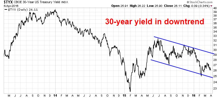
Notwithstanding the low likelihood of an aggressive Fed pushing up interest rates, we can see no help from the charts there.
A steepening yield curve?
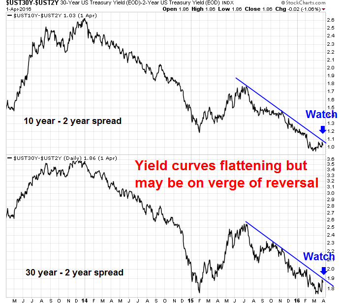
To explore the possibility of a steepening yield curve, the chart below shows the spreads in yield between the 10-year Treasury vs. the 2-year (top panel) and the 30-year UST vs. the 2-year (bottom panel). Both yield curves have been steadily falling in steady downtrends, indicating a flattening yield curve, not a steepening curve. Until those spreads break upwards through those trend lines, we cannot conclude that the yield curve is steepening, which would likely be equity bullish.
So we are stuck. Even though a trade is setting up for a fall in bond prices, there is no way of telling from the charts whether the outcome is equity bullish or bearish.
A clue from sector rotation?
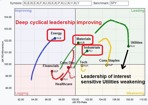
There is one data point that favors the second equity bullish scenario of better growth ahead from the the Relative Rotations Graphs (RRG) of US sector leadership. As a reminder, RRG leadership rotation generally occur in a clockwise direction, from a leadership position (top right) to weakening (bottom right) to lagging (bottom left) to improving (top left).
As the chart below shows, the interest sensitive Utilities sector had been a leadership sector, but its position has been weakening and rolling over. On the other hand, deep cyclical sectors such as Industrial stocks, which represent late-cycle capital goods manufacturers, and resource extraction stocks in the Energy and Material sectors, are taking over the sector leadership mantles.
I would add the caveat that the message from equity market leadership is suggestive of positive growth surprise ahead, I am awaiting confirmation from some definitive trend breaks from the 30-2 year and 10-2 year spreads.
In conclusion, we don`t have a trade, but only a trade setup that bond prices are vulnerable to a pullback. In addition, we have no definitive details of how a drop in bond prices (and therefore a spike in bond yields) would affect the stock market. Nevertheless, I offer you some guideposts of what to watch for when that does happen, so that you can be prepared.
Cam–aside from the fact that oil is clearly in decline again, would not one be best to look for lagging areas, like health care and bio tech, and tech that are showing signs of moving from Lagging to Improving? This is where the money is made. BobMillman
The momentum names are reviving. Your approach might not be a bad idea.
If so, it represents a healthy rotation of leadership.