Explaining our market timing models
We maintain several market timing models, each with differing time horizons. The “Ultimate Market Timing Model” is a long-term market timing model based on research outlined in our post Building the ultimate market timing model. This model tends to generate only a handful of signals each decade.
The Trend Model is an asset allocation model which applies trend following principles based on the inputs of global stock and commodity price. This model has a shorter time horizon and tends to turn over about 4-6 times a year. In essence, it seeks to answer the question, “Is the trend in the global economy expansion (bullish) or contraction (bearish)?”
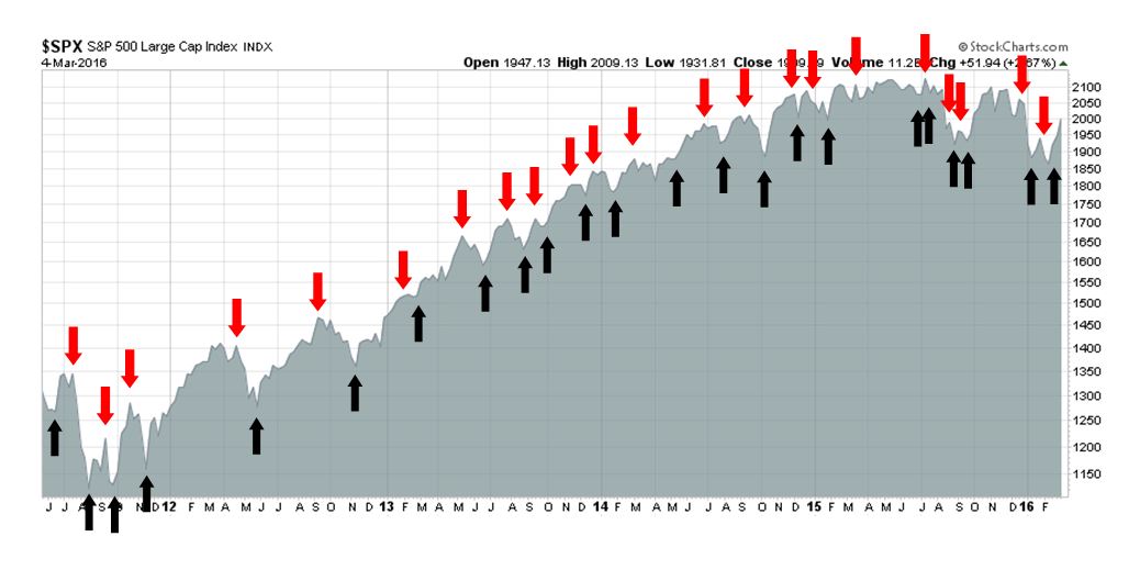
My inner trader uses the trading component of the Trend Model seeks to answer the question, “Is the trend getting better (bullish) or worse (bearish)?” The history of actual out-of-sample (not backtested) signals of the trading model are shown by the arrows in the chart below. Past trading of this model has shown turnover rates of about 200% per month.
The signals of each model are as follows:
- Ultimate market timing model: Buy equities
- Trend Model signal: Neutral
- Trading model: Bullish
Update schedule: I generally update model readings on my site on weekends and tweet any changes during the week at @humblestudent. Subscribers will also receive email notices of any changes in my trading portfolio.
Looking past the recession scare
Throughout the most recent period stock market weakness, I steadfastly maintained that the market was just undergoing a corrective period and recessionary fears were overblown (see Why this is a correction and not a bear market published January 17, 2016). Now that signs of economic growth are returning and the SPX has rallied above its 50 day moving average (dma) and stayed there for a week, it`s time to move beyond the angst of a possible bear market and look forward to what`s in store for the rest of 2016.
The return of growth
The reappearance of economic growth was not a big surprise to me. Despite all of the fears, the early warning signs of a recession were just not there (see my Recession Watch resource). The chart below of the Citigroup US Economic Surprise Index, which measures whether economic releases are beating or missing expectations, tells the story of how macro expectations got beaten down and their subsequent reversal.

The February jobs report was no exception to the story of an improvement in macro outlook. Payrolls beat expectations and saw another solid gain, in the context of an expansionary trend (chart via Calculated Risk). The unemployment rate also held steady at 4.9%.

The participation rate rose 0.2%, which was another positive. Average hourly earnings was down -0.1% from January and up 2.2% YoY, but that was likely a statistical quirk, according to Ian Shepherdson of Pantheon Macroeconomics. Shepherdson pointed out that average hourly earnings tended to miss expectations when the 15th, which is a semi-monthly payroll day, occurs after the survey period (via Business Insider):

The level of angst is also receding on a global basis. Remember all the hand wringing over European banks? Even the CoCo bond market is recovering (via Benn Steil);

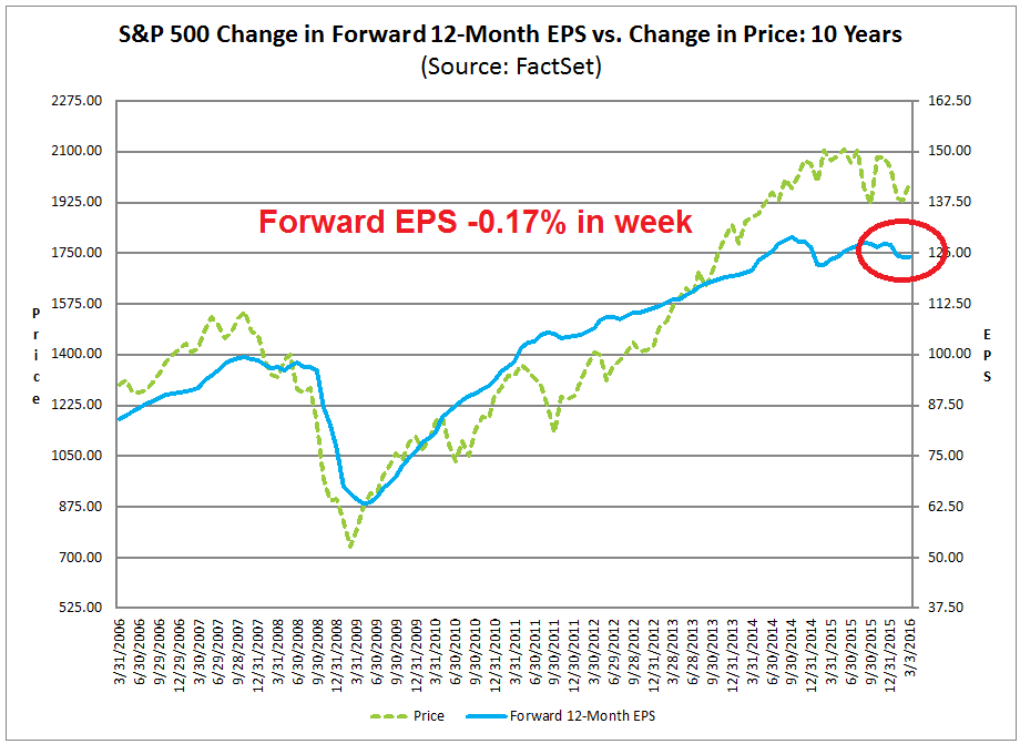
However,John Butters of Factset reported that the latest consensus forward EPS estimates continues to look wobbly. I can interpret this in a couple of ways. The bullish interpretation is that the bullish improvement in technical indicators are leading the market and fundamental analysts are behind the curve. This represents a “wall of worry” for the market to climb and suggests more price upside as investors start to react to a more positive earnings outlook in the weeks ahead. The more cautious view is that the market will find it difficult to rise in a sustainable fashion until forward EPS start to improve on a consistent basis. A review of the chart below shows a weak confirmation of the first and more bullish hypothesis as stock prices seem to slightly lead changes in EPS expectations.
For what it’s worth, Brian Gilmartin confirmed the lagging effects of the evolution of forward earnings, as least at an anecdotal level:
A friend shot me an email yesterday saying he was lightening up his equity exposure into this rally the last few weeks. My response to him was that in Q1 ’09 the SP 500’s “forward 4-quarter” estimate didn’t stop DECLINING until May ’09. The SP 500 bottomed on March 9, 2009 or a full 8 weeks before the estimate started rising.
Gilmartin went on to state that he believed that technical price action is likely to lead forward earnings estimates:
In this market environment, technical action is paramount. Can the SP 500 regain the 200 day moving average? Can the bounce in the laggard sectors of the last few years be sustained? Given the under-performance of the commodity and asset classes like emerging markets for long periods of time, I think the groups could be in the longer-term process of bottoming. The SP 500 could continue to work higher just with very different leadership than the last few years, even though the two heaviest weights in the SP 500 – Technology and Financials – could not be considered expensive on a valuation basis.
What’s next?
Leaving that technical vs. fundamental debate aside, now that recovery is becoming more evident, what’s next?
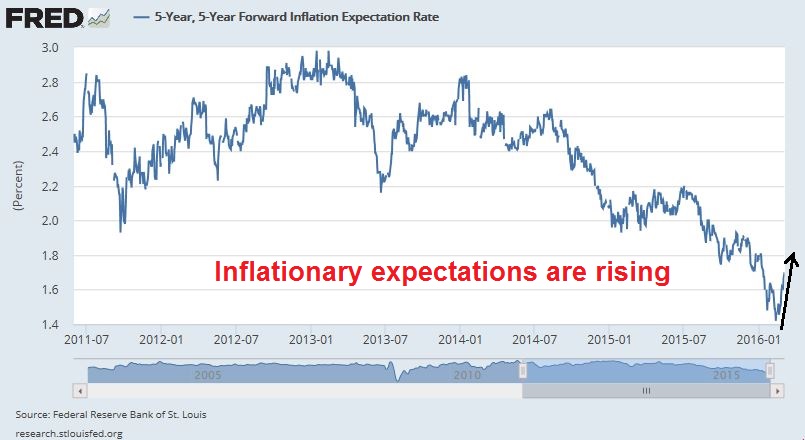
The biggest surprise for the market will be the rise of inflationary pressures. I wrote back in December that the next major shift in market leadership would be capital goods and late cycle resource stocks (see The 2016 macro surprise that no one talks about). Jim Paulsen of Wells Capital Management had pointed out that the stock market typically underwent a leadership change when unemployment fell to 5% (4.9% today, annotations in red are mine).

My own work showed that there was definite relationship between energy and unemployment. When the unemployment rate dipped to 5% or less, energy stocks tended to outperform. The only exception occurred during the late 1990’s as the cyclical effects of inflationary pressures were overshadowed by the Tech Bubble.

The behavior of commodity prices is supportive of the rising inflationary pressure thesis. Polemic’s Pains pointed out last week that he was seeing recovery in industrial metal prices, such as iron ore…

Nickel…

Zinc…
…and even *gasp* oil!

The bond market is also telling us the same story.
Emerging cyclical leadership
An analysis of market leadership is also lends credence to the bull case for cyclical stocks. The chart below shows the relative performance of cyclical sectors and industries. Industrial stocks, which represent the the capital goods stocks, have formed a relative return bottom and staged an upside relative breakout in early February; the cyclically sensitive semiconductor stocks rallied out of a relative downtrend in August and they been forming a relative base ever since; the metals and mining group also broke out through a relative downtrend in late January; and even the lagging energy sector appears to be on the verge of a breakout through a relative downtrend.

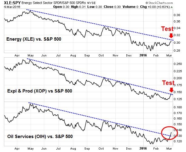
A closer examination of the relative performance of the different industry components of the energy sector indicates that this sector is about to breakout from a relative downtrend. The charts below show the relative performance of energy (XLE, top panel), exploration and production stocks (XOP, middle panel) and oil service stocks (OIH, bottom panel). The more volatile and high beta oil service industry has already staged a rally out of the relative downtrend, which is a likely leading indicator for the entire sector.
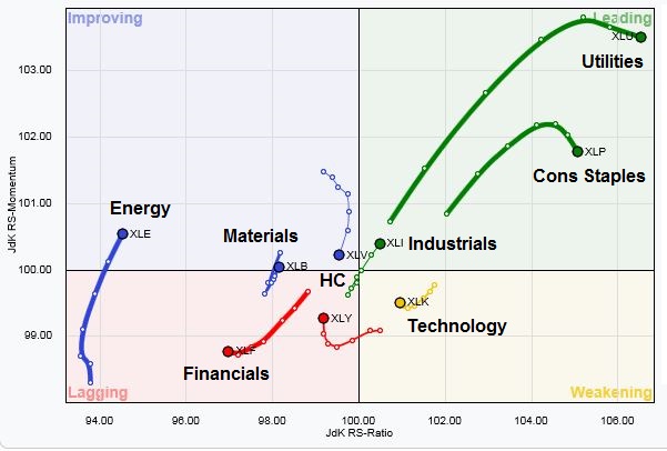
We see a similar message from Relative Rotation Graphs (RRG). RRG charts measure how a stock or sector is performing relative to a benchmark on a short and long term basis as a way of better understanding the evolution of market leadership. Rotation cycle typically move clockwise. An idealized stock or sector rotation cycle would start at the lower right quadrant (weakening), move to the lower left (lagging), then to to upper left (improving) and finally to the top right (leading).
The RRG chart below of US sectors against the SPX shows that defensive sector (Staples and Utilities) leadership is starting to roll over. The nascent leadership is coming from the aforementioned cyclical sectors, namely Energy, Materials and Industrials.
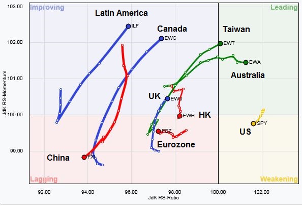
Applying RRG analysis globally to regional markets relative to the MSCI All-Country World Index also tells the same story (note that these are all US-listed ETFs so returns are all in USD). The emerging leadership is mainly coming from resource intensive countries and regions such as Australia, Canada and Latin America.
A 2016 roadmap (not a forecast)
I would point out that much of my macro assumption is based on the Phillips Curve, which postulates a short-term inverse relationship between inflation and unemployment. It is also a model that that the Fed believes in very much, particularly Janet Yellen, who was trained as a labor economist.
Here is my base case scenario for the remainder of 2016. The correction of early 2016 was a false alarm, but the stock market is undergoing the process of making a top in 2016 (also see my past post The road to a 2016 market top).
The remainder of 2016 begins with a stock market recovery, led by deep cyclical sectors such as resource extraction and capital goods. Inflationary expectations pick up. The Fed gets uneasy and, eventually, the FOMC starts to believe that monetary policy is falling behind the curve on its inflation mandate. The Fed tightens more aggressively than anyone expects. With the European and Chinese growth outlook still wobbly, a slowing American economy will be enough to push the world into a global recession. It will be ugly, but the consequences will not be felt until 2017 (also see Why the next recession will be very ugly),
I would add the caveat that this scenario represents a roadmap and not a forecast. There are far too many moving parts for this exact scenario to become reality. Here are a few wildcards that could change the timing of Federal Reserve actions for 2016:
- Market uncertainty from overseas: The Brexit referendum is June 23 and financial markets could be very fragile in the run-up to the referendum. The Fed has stated in the past that it is closely watching overseas developments. Market turmoil could cause the Fed to stay on hold for longer than expected.
- The 2016 election: As of the time of this writing, Donald Trump and Hillary Clinton are the most likely candidates to face off against each other in the presidential race. Love him or hate him, Donald Trump is a divisive figure and his utterances are likely to produce a higher level of market volatility, though the general direction of his economics is Keynesian in nature. A President Trump has a high likelihood of producing an inflationary blow-off (see Super Tuesday special: How President Trump could produce a market blow-off). How does the Fed or the market react?
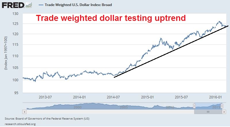
- The US Dollar: USD strength has been a headwind for economic growth and corporate earnings. However, Dollar strength is starting to roll over and the Trade Weighted Dollar is testing a technically important uptrend line. A weaker Dollar will be earnings growth positive, but interpreted by the Fed as inflationary.

The week ahead: A Wall of Worry
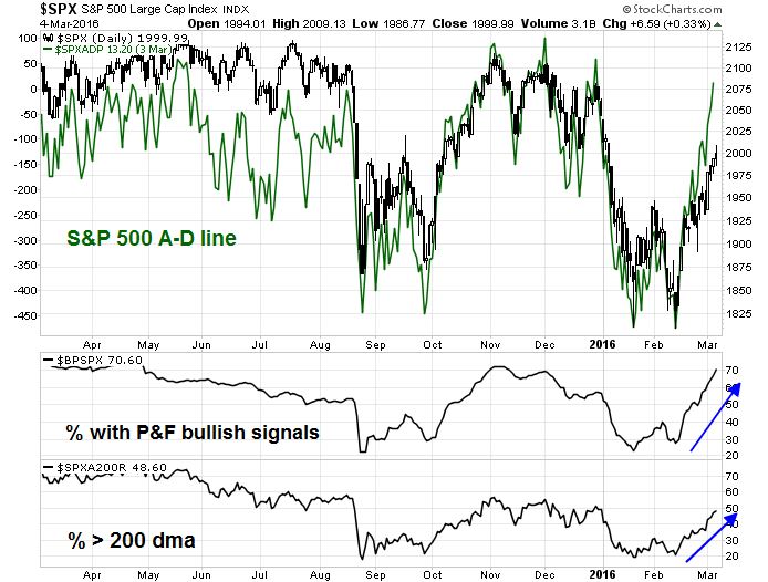
Look to the week ahead, the stock market ended on Friday with extremely overbought readings, However, a case can be made that when the market makes a powerful move upward with the accompaniment of positive breadth, it does not necessarily have to pull back, but either consolidate sideways or continue to grind upward.First of all, the good news for the bulls is that this advance was accompanied by positive breadth as measured on a number of different dimensions.
Further encouraging news came from Mark Hulbert, who pointed out that the NASDAQ market timers that he monitors remain stubbornly bearish on stocks, which is contrarian bullish. These sentiment readings represent a “wall of worry” for stocks to climb.

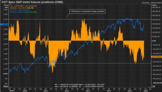
We can see a similar level of skepticism in the SP 500 e-mini Commitment of Traders (COT) report. The COT release is done on Friday, but the date of the data is Tuesday, which happened to be the day of a huge stock market rally. The lack of speculator short covering after such a powerful single day rally is another indication of a bullish “wall of worry” is forming.
Brett Steenbarger also observed a similar effect in the number of outstanding units of SPY, where investors have redeemed shares even as the market rallied, which indicates a low level of bullish conviction.
On the other hand, the market is getting seriously overbought. The NYSE McClellan Oscillator (NYMO) spike to over 100 on Friday, an overbought condition which suggests that the market is extremely stretched on a short-term basis. However, the historical evidence for this indicator is mixed. As the chart below shows, elevated levels of NYMO has seen mixed results in the last 10 years. The blue vertical lines show instances when NYMO has been overbought, but the market has either moved sideways or continued to advance, while the red lines show past cases when it has pulled back in the next few weeks.

My inner trader took an initial SPX long position on Friday, based on the assumption that we are about to experience a series of “good” overbought readings where the market grinds upwards. Should it pull back, downside risk is limited and stocks should be bought on weakness.
My inner investor has already been accumulating positions in the past several weeks, with an overweight in the resource extraction industries.
Disclosure: Long SPXL
A key date for how the market will do this year is March 16 when The Fed meets. Will they raise rates?
Last December, when the raised them for the first time, the projection was for four increases in 2016 starting with this March meeting. Then with global market turmoil early in 2016, the thinking changed to just a 50-50 chance any time in 2016 and very little chance of a March hike. But the turmoil is no longer evident.
With solid job growth, consumers borrowing at a 10% annual rate, strong new housing and auto sales, an unemployment rate sub-5% and core CPI at 2.2% which is over their target inflation rate, one could argue that the Fed should raise the rate. If they don’t, I expect the lid to come off this market. Cyclical stocks, especially commodity oriented and multinationals will soar and continue to lead. Gold will shine as people realize the Fed is just as insane as their European and Japanese counterparts.
If they surprise and raise rates, look out. The U.S. dollar will spike hurting commodities. Markets will need to regroup to access the Fed action and what it means for interest rate and currency trends. Gold bugs will have to admit there is an adult in the Central Bankers room. BTW I will have a bad day.
Tim Duy’s latest take on the Fed: http://economistsview.typepad.com/timduy/2016/03/state-of-play.html
Let me share something that is working great for me and my clients with all you smart readers.
I came to believe a couple of years ago that Central Bankers were going to be absent for a very, very long time because they fear setting off another 2008-type crash. Just this last week, Ed Hyman, the #1 rated economist for the last few decades said there will not be a recession for five years. Central Bank tightening causes recessions and general synchronized bear markets. If they are absent then each industrial sector will be on its own fundamental and stock market cycle.
I stopped looking at ‘The Market’ and now look at each sector on its own. Here is an example of how that helped recently. Rather than looking in early 2016 at ‘The Market’ being in a late bull market part of a bull market that started on 2009, I watched commodity sectors having gone down from 2 to 4 years and falling 50-73% from their peaks. That was long enough and deep enough to conclude they were in a ‘Late Bear Market’ part of their individual industry cycles. Expert commentators were saying that these industries were showing signs that normally accompany a long term turnaround (dividend cuts, mine closings, fewer oil wells drilled, losing money etc). For example, Cam had a great piece on why energy could be making a long term turnaround. For a ‘Late Bear Market’ cycle in these beaten up sectors to end and a new long term bull markets to start, we needed a final sentiment flush. Not just dislike, we needed them despised and hated. This occurred on the weeks leading to January 20 when sentimentrader.com reported that commodity sentiment hit an never-before-seen low along with commodity currencies such as the Canadian dollar at all-time sentiment lows. When they started to lift off on January 21, the day after the low, I bought the Base Metals MIning ETF, XME and a mining stock (cross my heart). I had never owned that ETF and had avoided all metal mining stocks since forever. The ETF has gone up 35% and the stock has doubled. I also made made a big shift to the the general Canadian market the second day after the low, January 22. It is up over 20% in U.S. dollar terms (11% plus 10% currency appreciation.).
Since these areas have completed full-on bear markets, I now believe they are in multi-year bull markets, not just temporary end of general stock market cycle rallies. I realize this is hard to believe. In my forty years in the investment industry, I have seen lots of unbelievable things.
There are many other sectors that have completed bear markets and could easily (to the shock of most) be starting new long term bull markets. Take the Global Index ex-U.S. It went down 25% in 2005 and has now turned up. That decline was not just a mid-cycle correction. By definition it was a bear market. The general emerging market index could also have bottomed after its bear market.
Not that this viewpoint would cause someone to be bearish on U.S. non-resource sectors. They have completed corrections within the context of their continuing bull markets as their earnings continue to advance strongly with Central Bankers not causing a recession as far as the eye can see. These sectors have seen their stocks go basically sideways for two years as earnings and dividends have risen solidly. No reason that they can’t go up very nicely this year. Any bumps along the way should just be corrections in continuing sector bull markets until the Central Bankers tighten enough to matter, likely a long time from now. The bank sector may have started its own new bear market as of the last half of 2015. Fundamentals and technicals look poor there.
Monitoring the sectors of the market rather than ‘The Market” has been a huge help to me in the last few years. I hope sharing this is helpful to you.
An interesting point of view. Thank you for the suggestion.
Hi Cam, It seems the case for the market being overbought on a technical and breadth basis is still valid. What recent change or realization in particular made you more positive about it being able to continue rising in an overbought market? Is it more of the effect of the recent jobs report or a continuing improvement of market technicals/internals over the last couple of days?
It was a combination of market internals and surprisingly bearish sentiment
Hi Cam, first off thank you for your insightful and measured analyses. I started reading your blog fairly recently and immediately got hooked because of how impartial and dispassionate you are in your analyses and forecasts.
I had a quick question on how/whether you incorporate GAAP/non-GAAP into your thinking. I agree with your article on “If I had to watch just ONE THING,” but I think (correct me if I’m wrong – Ed Yardeni doesn’t specify) that forward EPS projections are usually non-GAAP and may be masking the fact that companies are getting more aggressive at classifying de-facto recurring costs as GAAP-only.
Looking at this recent ZH post – http://www.zerohedge.com/news/2016-03-07/non-gaap-earnings-are-about-plunge-most-2009-gaap-don-even-ask – it looks like non-GAAP earnings are almost non-responsive to short-term losses these days, and GAAP P/E is at 21, which seems high.
Do you think this is a real issue or just a red herring?
Forward EPS analysis is generally on an operating non-GAAP basis. As for the Yardeni analysis, see discussion here:
http://blog.yardeni.com/2016/02/earnings-margins-different-strokes.html
Data and charts here: http://www.yardeni.com/Pub/spvstr.pdf
Look at the table on page 3 in the charts. S&P 500 ex-energy y/y EPS was -10.6% (according to S&P, which is close to GAAP). Main culprit was technology. Also look at the scale of the writeoffs on the last page.
Bottom line: The lack of earnings quality in Tech is troubling, but the writeoffs in Energy and Materials are not surprising under the circumstances. This is something to watch going forward, but does not appear to pose an immediate threat.
Thanks Cam. It’s really helpful to know that S&P can be used as proxy for GAAP EPS. Working in tech, it’s hard not to feel like there is a trend to push non-GAAP boundaries, but it does seem isolated (and to your point energy/materials is fully expected).
Cam, looks like you are on the wrong end of the stick again. I don’t mean that disparagingly – but I think your model needs some work as you were long into Jan selloff, short into Feb bounce and now got shaken out of your long as you entered long only when the market became extremely overbought.
I will have a post up shortly that addresses those issues.
Stay tuned.