Several months ago, the internet was all abuzz over the victory of Google’s AlphaGo program beating Go grandmaster Lee Sedol (see story here). As the game of Go is a computationally and mathematically complicated game and the number of variations in the game is an order of magnitude higher than chess, it was a great victory for the kinds of “deep learning” artificial intelligence (AI) techniques pioneered by Google’s Deep Mind team.
Indeed, there have been great strides by AI research teams in the fields of pattern recognition and natural language processing. As an example, the Washington Post chronicled a startup called Viv designed to be a natural language AI bot that can order you pizza, among other tasks:
In an ordinary conference room in this city of start-ups, a group of engineers sat down to order pizza in an entirely new way.
“Get me a pizza from Pizz’a Chicago near my office,” one of the engineers said into his smartphone. It was their first real test of Viv, the artificial-intelligence technology that the team had been quietly building for more than a year. Everyone was a little nervous. Then, a text from Viv piped up: “Would you like toppings with that?”
The engineers, eight in all, started jumping in: “Pepperoni.” “Half cheese.” “Caesar salad.” Emboldened by the result, they peppered Viv with more commands: Add more toppings. Remove toppings. Change medium size to large.
About 40 minutes later — and after a few hiccups when Viv confused the office address — a Pizz’a Chicago driver showed up with four made-to-order pizzas.
The engineers erupted in cheers as the pizzas arrived. They had ordered pizza, from start to finish, without placing a single phone call and without doing a Google search — without any typing at all, actually. Moreover, they did it without downloading an app from Domino’s or Grubhub.
Invasion of the stock bots
There have been also great strides in the application of AI in finance as well. The WSJ reported that Nasdaq is using AI systems to try and detect financial crime:
Nasdaq Inc. is trying to identify would-be white-collar criminals by using artificial intelligence systems originally built to track terrorists and sex traffickers. The exchange is testing systems that analyze data about trading activity against what traders say on their corporate chat and email accounts, in an effort to spot potential insider trading, market manipulation and other crimes faster and more accurately than current surveillance systems can.
Parsing the chatter of traders in the time before, during and after transactions – and matching those findings with trading data — provides “holistic surveillance,” said Bill Nosal, vice president of business development for market technology at Nasdaq. “This can show what was happening in the trader’s head,” Mr. Nosal said.
Asia Nikkei reported that Nomura is experimenting with AI driven HFT:
In the age of ultra-high-frequency trading, financial institutions are turning to artificial intelligence to improve their stock trading performance and boost profit.
One such company is Japan’s leading brokerage house Nomura Securities. The company has been pursuing one goal: to simulate the insights of experienced stock traders with the help of computers. After years of research, Nomura is set to introduce a new stock trading system for institutional investors in May.
The new system stores vast amounts of price and trading data in its computer. By tapping into this reservoir of information, it will make assessments — for example, it may determine that current market conditions are similar to a moment two weeks ago — and predict how share prices will be trending a few minutes down the line.
Goldman Sachs is reported venturing into AI assisted trading of macro-economic data (via Singapore Strait Times):
When Mr Daniel Nadler woke on Nov 6, he had just enough time to pour himself a glass of orange juice and open his laptop before the Bureau of Labour Statistics released its monthly report on the US job situation at 8.30am. He sat at the kitchen table in his apartment in Chelsea, nervously refreshing his Web browser as the software of his company, Kensho, scraped the data from the bureau’s website. Within two minutes, an automated Kensho analysis popped up on his screen: a brief overview, followed by 13 exhibits predicting the performance of investments based on their past response to similar job reports.
Mr Nadler couldn’t have double- checked all this analysis if he wanted to. It was based on thousands of numbers drawn from dozens of databases. He just wanted to make sure that Kensho had pulled the right number – the overall growth in American payrolls – from the report. It was the least he could do, given that within minutes Kensho’s analysis would be made available to employees at Goldman Sachs.
The analysis isn`t just restricted to macro data, but macro events such as predicting the market reaction to events like wars:
Kensho’s main customers at Goldman so far have been the salespeople who work on the high-ceiling trading floors. In recent months, they have used the software to respond to incoming phone calls from investors who buy and sell energy stocks and commodities, wondering how they should position their portfolios in response to, for instance, flare-ups in the Syrian civil war. In the old days, the salespeople could draw on their own knowledge of recent events and how markets responded. For a particularly valuable client, the sales representative might have called a research analyst within Goldman to run a more complete study.
Now a salesperson can just click an icon and access the Kensho interface, which consists of a simple black search bar. Mr Nadler showed me how the process worked on his laptop. Type in the word “Syria”, and several groups of events related to the country’s civil war appear. Among the top event groups are “Advances Against ISIS”, which includes 25 past events, and “Major ISIS Advances and Brutal Atrocities”, with 105 events.
Back on the trading desk, after picking out one group of events – the 27 incidents of “Escalations in the Syrian civil war”, say – a sales trader can pick from a series of drop-down menus that narrow the search to a specific time period and a specific set of investments. The broadest set includes the world’s 40 or so major assets, including German stocks and a few varieties of crude oil. They can then click on the green Generate Study button, and a few minutes later they’ll have a new page full of charts.
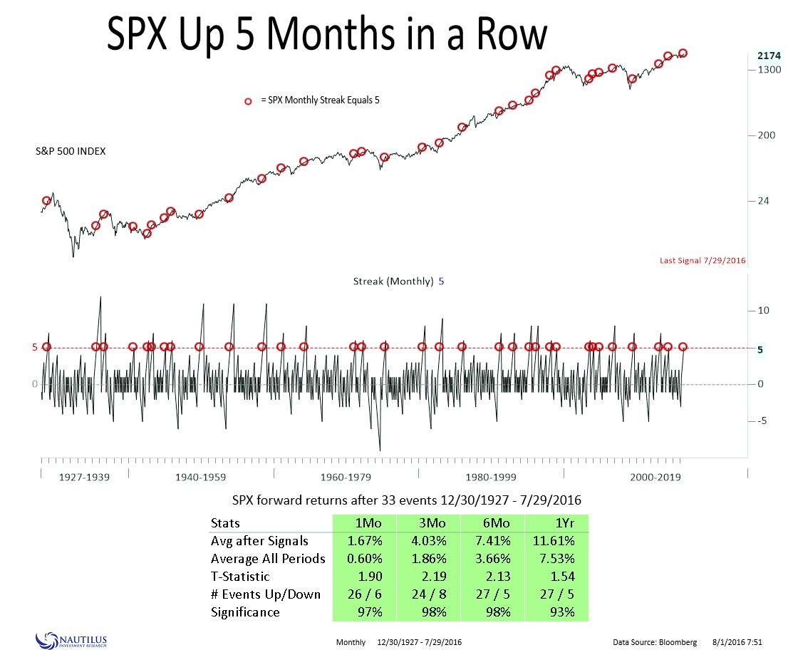
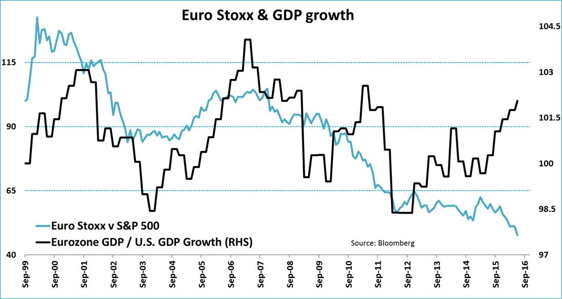
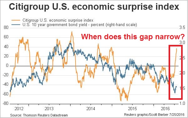
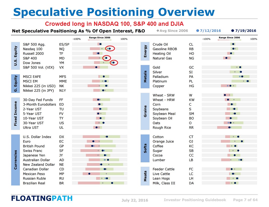
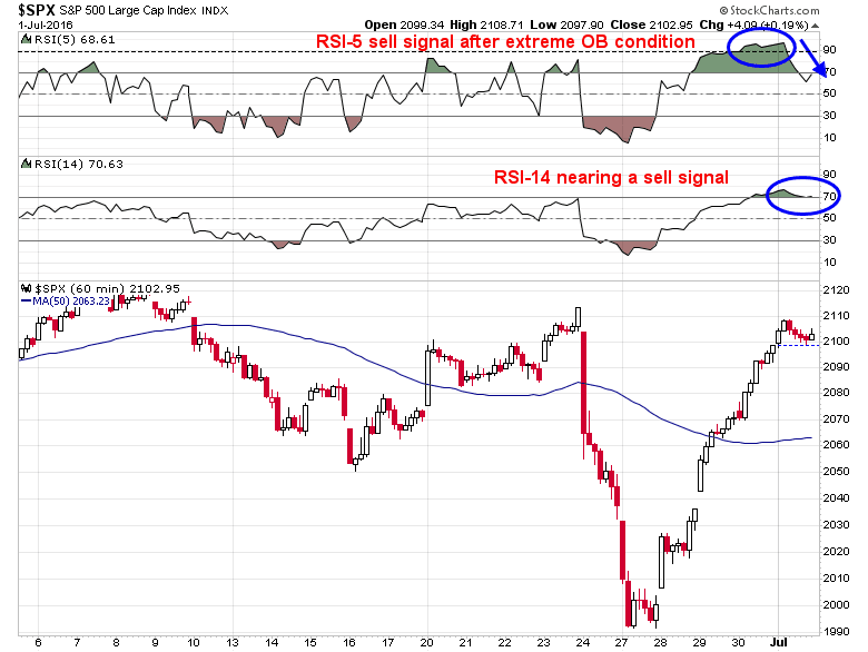
Stories like these can easily be extrapolated to an invasion of stock bots, all trading against each other and wiping out humans in finance. How realistic is this scenario of automated trading bots taking over the markets?
The uniqueness of alpha
I believe I can offer a unique perspective to this question, as I spent most of my investment career as a quant trying to gain an edge over human analysts, While there will always be great strides in automation, the machines will have great difficulty taking over for a number of reasons:
- Generating alpha is a highly creative activity
- Generating alpha is an activity with a low signal-to-noise ratio
- There is no unique underlying model of what drives markets
- There are problems with transparency, ethics and compliance
The uniqueness of creativity
In a recent post, James Kwak derided the cookie-cutter approach to education that turns out engineers and analysts, who wind up engaged in groupthink:
Just this week, the president of Queen’s University in Belfast said this (explaining why students will no longer be able to concentrate in sociology or anthropology):
Society doesn’t need a 21-year-old who is a sixth century historian. It needs a 21-year-old who really understands how to analyse things, understands the tenets of leadership and contributing to society, who is a thinker and someone who has the potential to help society drive forward.
That’s the new conventional wisdom: we need “leaders” who can “help society drive forward,” whatever that means.
By contrast, Kwak pointed to David Silbersweig’s defense of a liberal arts education:
If you can get through a one-sentence paragraph of Kant, holding all of its ideas and clauses in juxtaposition in your mind, you can think through most anything. If you can extract, and abstract, underlying assumptions or superordinate principles, or reason through to the implications of arguments, you can identify and address issues in a myriad of fields.
I certainly agree. And I also agree that society needs people with a broad range of intellectual perspectives. This is the kind of thing you would expect me to agree with. I majored in social studies and got a Ph.D. in French intellectual history, of all things (and one of my fields for my orals was philosophy). But there’s an important caveat, which I’ll get to.
Unlike, say, learning Java, it isn’t easy to specify exactly what you learn in the humanities that turns out to be useful later. You do a lot of reading and writing, but of course those are things you knew how to do before going to college. You may learn how to check out boxes of documents at the archives, but that turns out not to be so useful unless you stay in academic research.
One thing I think I learned was dealing with ambiguity. In fields like social studies and history, you rarely find explanations of the world that are unequivocally correct. You don’t even have the pretense, which many economists labor under, that there is an unequivocally correct explanation out there, and you are just trying to find it. As a result, one thing I became pretty good at was using words fill to gaps—manufacturing connections and relationships between different phenomena. This, it turns out, is a very useful skill in the business world where, to tell an old consulting joke, two data points are a trend and three data points are proof. The ability to come up with a story that is convincing—and that very well may be true—based on limited information can be worth a lot in the business world.
In other words, a liberal arts education teaches you how to think critically and deal with ambiguity. Those are not the same skill set you acquire while going through engineering or business school. In my personal experience, it is the combination of critical thinking skills and hard analytical skills that are the ingredients for individual success.
Contrast the above picture with this account of the problem of Chinese university students studying in the West. These students came from an educational system that emphasizes rote learning, which can produce students with off-the-charts SAT scores who aspire to professions like engineering and accountancy, but they tend to be lacking in critical thinking skills.
There is no shortage of complaints to be addressed. Problems facing Chinese students overseas – a lack of social integration, poor English, weak critical thinking and a tendency to produce poorly referenced essays that land them in hot water for plagiarism – are well documented.
A recent Wall Street Journal investigation painted a bleak picture. On the one hand, it found Chinese students so surrounded by their compatriots that the most English they spoke all day was to order a burrito. On the other, academics were frustrated by having to modify their lectures and complained that Chinese students often lacked analytical or writing skills.
Is the Asian model the way to “produce leaders with the potential to help society drive forward”?
The challenge of ambiguous markets
Now think about the kind of ambiguity that the markets represent and how the practice of professional investing has evolved in, say, Warren Buffett’s lifetime. In the 1950s and 1960s, investors were mainly stock pickers. You learned to be a good security analyst. The dream, at the time, was to find the next IBM, or the next Xerox.
The 1970s saw a revolution in the paradigms of investing. Markets were said to be efficient. The Capital Asset Pricing Theory postulated that investors only had one dial on his portfolio. It’s called “beta”. If the investor was bullish on stocks, he raised the portfolio beta. If he was bearish, he lowered it. At the same time, numerous researchers found “anomalies” in the efficient market hypothesis, such as the low P/E effect, the low P/B effect, the small cap effect and so on. Thus, value investing was born – just as the Nifty Fifty growth-at-any-price stock bubble blew up in the 1974-75 bear market and ushered in a period where the new value investing style became dominant.
The 1980s ushered in the era of international diversification. Back then, what self respecting American investor would have even dreamed of putting money in strange places like *gasp* Japan? In addition, investors paid far more attention to the idea of making the capital structure more effective. You could lower your cost of capital, i.e. make the assets sweat more, by varying the debt to equity ratio. Boring, stable companies with low debt became restructuring targets – and the Leveraged Buyout (LBO) binge began.
Investing fashion changed again in the 1990s as the internet craze took hold of the markets. The emphasis turned to growth and growth potential. Valuation didn’t matter, neither did cash flow – until it all blew up in March 2000.
I could go on, but you get the idea. There is no central unifying theme behind what makes stocks go up or down. Regimes change. Paradigms change. Themes evolve. The late Peter Bernstein summarized the evolution of academic research this way in his book, Capital Ideas Evolving:
Before Harry Markowitz’s 1952 essay on portfolio selection, there was no genuine theory of portfolio construction — there were just rules of thumb and folklore. It was Markowitz who first made risk the centerpiece of portfolio management by focusing on what investing is all about: investing is a bet on an unknown future. Before Bill Sharpe’s articulation of the Capital Asset Pricing Model in 1964, there was no genuine theory of asset pricing in which risk plays a pivotal role — there were just rules of thumb and folklore. Before Franco Modigliani and Merton Miller’s work in 1958, there was no genuine theory of corporate finance and no understanding of what “equilibrium” means in financial markets — there were just rules of thumb and folklore. Before Eugene Fama set forth the principles of the Efficient Market Hypothesis in 1965, there was no theory to explain why the market is so hard to beat. There was not even recognition that such a possibility might exist. Before Fischer Black, Myron Scholes, and Robert Merton confronted both the valuation and the essential nature of derivative securities in the early 1970s, there was no theory of option pricing — there were just rules of thumb and folklore.
The academic creators of these models were not taken by surprise by difficulties with empirical testing. The underlying assumptions are artificial in many instances, which means their straightforward application to the solution of real-time investment problems is often impossible. The academics knew as well as anyone that the real world is different from what they were defining. But they were in search of a deeper and more systematic understanding of how markets work, of how investors interact with one another, and of the dominant role of risk in the whole process of investing. They were well aware that their theories were not a finished work. They were building a jumping-off point, a beginning of exploration, and, as each step led to the next, they began to search for an integrated structure to simultaneously explain the performance of markets and to solve the investor’s dilemma in trading off risk against return. That structure is still evolving.
If ideas about finance are constantly evolving, then how do you build an AI algo for all seasons under these circumstances? The FT reported that even quants are questioning AI’s place in finance:
Popular AI approaches such as machine learning can be used by computers to learn and develop autonomously. For example, a machine learning algorithm can learn to play and master a computer game such as Super Mario independently, at first playing the arcade classic randomly but quickly figuring out how the controls work and how to get to the end of the level.
There is therefore widespread enthusiasm over the potential of unleashing machine learning algos to find fleeting but profitable patterns in the vast sea of data.
“I think of algos as little children that can scale tremendously. And you can teach them to read millions of books at the same time,” says Brad Betts, a former Nasa computer scientist working in BlackRock’s San Francisco-based Scientific Active Equity arm.
Yet scepticism, even among many quants, is still pervasive. They see areas such as machine learning and deep learning — the latter underpinned DeepMind’s Go exploits — merely as extensions or enhancements of techniques that have for long been in use.
“Lots of people use techniques that could be called machine learning for decades,” argues Robert Hillman, head of Neuron Capital. “There’s a huge difference between image recognition and using AI in markets. Will this be a paradigm change for investing? I don’t think so . . . It’s not a fundamental change, it’s an efficiency improvement.”
Mr Kirk points out that most common AI approaches are focused on pattern recognition, such as telling the difference between a cat and a dog in an image. But markets are dominated by noise and chaos, the patterns are harder to find.
“As a geek I’m super-excited about AlphaGo, but it’s a big leap from beating a game with clearly defined rules and objectives and investing,” he says.
Even quants that are cautiously optimistic on the future of AI in investing warn of many pitfalls. Algorithms that may look ingenious and backtest superbly against historical data have a nasty habit of unravelling when confronted with unforgivingly fickle financial markets.
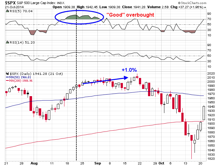
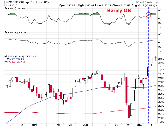
Finance quants suffer from what I call “physics envy” in wishing that their models are as precise as the kinds of models found in the hard sciences such as physics and chemistry. The fundamental problem is that investing has what engineers call a low signal-to-noise ratio (see my previous post A cautionary tale for quants and system traders). As the above FT article pointed out, even Isaac Newton, who was one of the greatest scientific and mathematical geniuses of his time, lost a fortune in the markets:
Isaac Newton may have been one of the finest minds of all time, but he turned out to be a miserable investor. “I can calculate the motions of the heavenly bodies, but not the madness of people,” he lamented after losing a fortune in the South Sea bubble.
Ethics, compliance and transparency
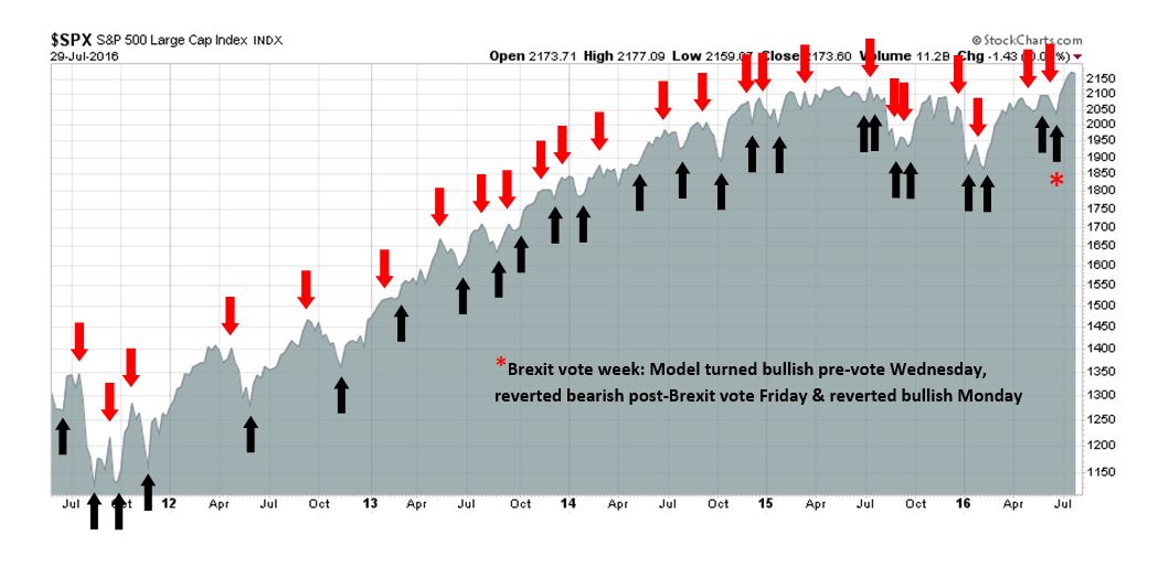
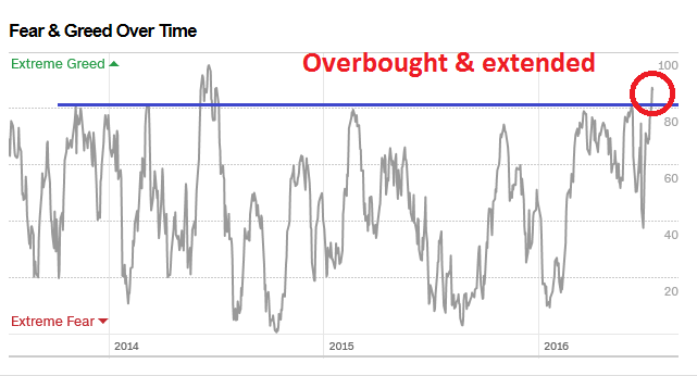
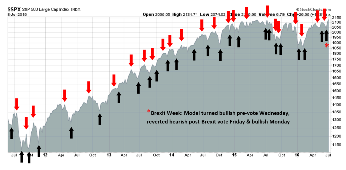
Notwithstanding the implementation issues of AI trading algos, which I predict will work spectacularly until one day they blow up because of a regime change, what is to stop Terminator-Skynet bots from dominating finance in the meantime?
There is the problem of ethics and compliance. Bloomberg reported that Google is struggling with these challenges when trying to build intelligent machines:
The report describes some of the problems robot designers may face in the future, and lists some techniques for building software that the smart machines can’t subvert. The challenge is the open-ended nature of intelligence, and the puzzle is akin to one faced by regulators in other areas, like the financial system; how do you design rules to let entities achieve their goals in a system you regulate, without being able to subvert your rules, or be unnecessarily constricted by them?
For example, if you have a cleaning robot (and OpenAI aims to build such a machine), how do you make sure that your rewards don’t give it an incentive to cheat, the researchers wonder. Reward it for cleaning up a room and it might respond by sweeping dirt under the rug so it’s out of sight, or it might learn to turn off its cameras, preventing it from seeing any mess, and thereby giving it a reward. Counter these tactics by giving it an additional reward for using cleaning products and it might evolve into a system that uses bleach far too liberally because it’s rewarded for doing so. Correct that by making its reward for using cleaning products tied to the apparent cleanliness of its environment and the robot may eventually subvert that as well, hacking its own system to make itself think it deserves a reward regardless.
Izabella Kaminska at FT Alphaville demonstrated another version of this problem in a recent post:
It was a fake jury summons that put an algo on trial:
It’s a fake jury summons to Southwark Crown Court for the trial of a theoretical rogue algorithm called Superdebthunterbot. It was, of course, just a bit performance art, the brainchild of Goldsmiths College artist Helen Knowles.
But it was also a wonderful exercise in what might happen if a free-thinking evolutionary algorithm, hatched to maximise the efficiency of bad debt collection, took any means possible to meet its objectives.
In this case Superdebthunterbot had supposedly encouraged indebted students — through digital marketing trickery — to sign-up for unregulated medical trials in a bid to raise the cash they owed to the debt collection agency.
It was emphasised to the jury that whilst a human programmer had engineered the algorithm, it was not he who had concocted the plan to use such a strategy for debt collection. It was not the programmer who was on trial, but the algorithm. And the question being asked was whether the algorithm — echoing Asimov’s laws of Robotics — had a duty of care to the individuals it was dealing with.
Kaminska asked a very valid question. What happens when one of these algos starts to harm human beings? Who pays? Who is liable?
It’s all very well using AI to make trading strategies more effective, but we have to acknowledge that if these AIs are being designed without a duty of care for the humans in it, they will have no qualms about exploiting or manipulating humans to ensure the assets they’re trading perform in a way that they can control. After all, any asset class is ultimately tied to the human behaviours which underpin them, meaning it’s only if the humans can be gamed, manipulated or their behaviours controlled, that the AIs can predict asset movements accurately enough to be able to collect outsized returns from each other.
Ultimately, it may be the lawyers and compliance officers to puts the brakes on any runaway AI train. One of the basic due diligence techniques for hiring an investment manager are the 3Ps:
- Performance: What was the performance and what was the risk profile of the manager, or strategy?
- Philosophy: What makes you think you have an alpha?
- Process: How do you implement your philosophy?
An deep learning AI-bot that evolves will have a philosophy and process that will be virtually impossible to describe because of its evolving nature. With “normal” human based investment processes, an investment manager can describe what went wrong if the strategy underperforms and explain why they are either staying the course or making changes to address the problem. An AI-based process suffers from the problem of a lack of transparency. It will be a far more difficult conversation with the client when portfolio performance blows up to say, “I don’t know, the AI bot did it.”
Ironically, it may ultimately be the fear of legal liability of trustees that will ultimately restrain the growth of AI in finance.
* The title was inspired by an old science fiction short story entitled “If all men were brothers, would you let one marry your sister?“