Model signal summary
Ultimate market timing model: Buy equities
Trend Model signal: Risk-off
Trading model: Bearish (downgrade)
The “Ultimate Market Timing Model” is a long-term market timing model based on research outlined in our post Building the ultimate market timing model.
The Trend Model is an asset allocation model which applies trend following principles based on the inputs of global stock and commodity price. In essence, it seeks to answer the question, “Is the trend in the global economy expansion (bullish) or contraction (bearish)?”
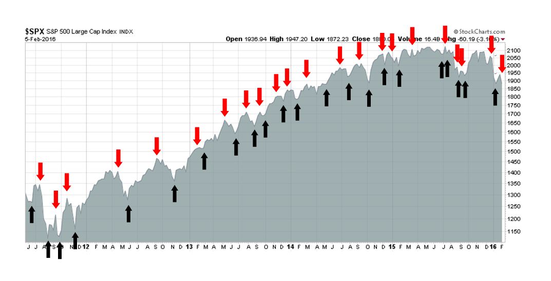
My inner trader uses the trading model component of the Trend Model seeks to answer the question, “Is the trend getting better (bullish) or worse (bearish)?” The history of actual out-of-sample (not backtested) signals of the trading model are shown by the arrows in the chart below.
Update schedule: I generally update model readings on my blog on weekends and tweet any changes during the week at @humblestudent.
Forming a bottom
Despite the recent recession scare that’s been spooking markets, I have been saying for the past few weeks that disciplined macro and fundamental analysis do not support a recession call (see Bottomed, but wait for a re-test of the lows). So equities should rise in the absence of a recession, right? Wrong! From a macro and fundamental perspective, much damage has been done to risk appetite by the recent episode of industrial weakness in the US. In parallel, we have also seen a lot of technical damage in the charts. The market needs time to heal before stock prices can rise again in a sustainable way.
The stock market is only undergoing a correction. The key difference between a correction and a bear market is how fundamentals develop. In the beginning, the first leg down is driven by the fast money, composed of the hedge funds and nimble individual traders, That initial decline could be sparked by no fundamental reason (as an example, see The Ebola correction? Oh, PUH-:LEEZ!). For selling pressure to become sustainable, the big money institutions need to feel the need to sell That depends on a deteriorating fundamental and macro backdrop, which is not present right now (see Why this is a correction and not a bear market). To the contrary, intermediate term indicators are bullish, although these indicators are not very useful in calling market direction in the next few days or weeks.
The latest constructive macro data point comes from the Employment Report, whose internals of were generally positive, despite a miss on the headline Non-Farm Payroll figure. These are signs of macro healing:
- All of the gains were private sector jobs, government jobs shrank slightly
- The average manufacturing workweek rose (recall that manufacturing has been the weak spot in the economy)
- Manufacturing jobs up by 29K
- Construction jobs up by 19K (and housing is one of the most cyclical elements of the economy).
- Rising average wages and aggregate hours
- Part time unemployment for economic reasons continues to fall
- The labor participation rate ticked up again
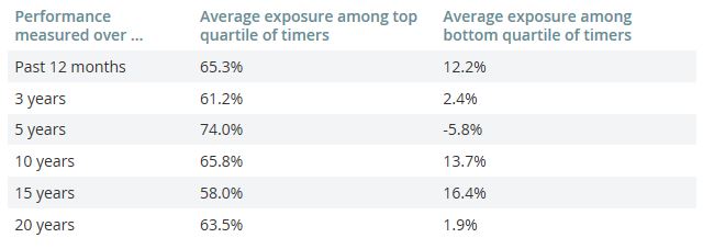
The intermediate term technical outlook is bullish as well. If I had to point to a single thing, it would the Mark Hulbert observation that his sample of best market timers are bullish, while the worst timers are bearish.
Sentiment models are also telling a tale of limited downside risk and intermediate term upside potential. The chart below of Rydex fund flows is showing a crowded short among Rydex traders, which is contrarian bullish. Such conditions have tended to resolve themselves with sideways consolidations, followed by rallies. This is nothing like 2008 when Rydex traders bought stocks as they declined.

The market is also intermediate term oversold as measured by the McClellan Oscillator. In the chart below, I have shown the Common Stock only measure in the middle panel and the more popular NYSE McClellan Oscillator in the bottom panel. Both are telling the same story. The market should bottom in the next few weeks.

These are all intermediate term indicators, however. None of them have much insight on how the stock market will behave tomorrow, or next week.
Short-term weakness ahead
By contrast, the short-term technical condition of the market is weak. Consider this SP 500 chart as a window on market internals. The index is in the process of testing a support zone that stretches back to last August. Last week, it broke down through a short-term uptrend and the weakness is also evident in the breakdowns in the 5 and 14 day RSI. Readings are not oversold and I would expect more downside next week as negative momentum pushes the market to test the support zone again.

The technical condition of the market also appears problematical from a sector leadership viewpoint. The chart below shows the market relative performance of selected sectors. The leadership sectors are defensive in nature (Consumer Staples and Utilities, middle panel), while Financial (top panel) and resource oriented stocks (bottom panels) underperform.

An analysis of the other major sectors show a more mixed picture. Industrial stocks seem to have bottomed and appear to be staging an upside relative breakout (top panel) and the Technology relative uptrend continues (third panel). However, the relative performance of the Consumer Discretionary stocks are rolling over and breaking down on a relative basis, which is worrisome as consumer spending has been the linchpin of economic growth (second panel). The high flying biotech stocks are also breaking down (green line, bottom panel), though the relative performance of the Health Care sector appears to be stable.

Could these be the early signs of a cyclical revival? Well…
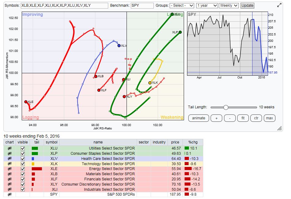
Another way of analyzing sector rotation is through the use of Relative Rotation Graphs (RRG). RRG charts, which show the Julius’ Relative Strength Ratio indicator on the horizontal axis and Relative Strength Momentum indicator on the vertical axis. An idealized sector leadership rotation would see sectors move in a clockwise fashion, from a weakening position in the bottom right quadrant, rotating to lagging (bottom left) to improving (top left) and to finally a leading position (top right).
The chart below shows the RRG of US sectors. Leading sectors (in green) are the defensive Consumer Staples and Utilities. The only sector in the improving category (blue) is Health Care. This is a bearish picture for the stock market outlook from a sector rotation analytical framework.
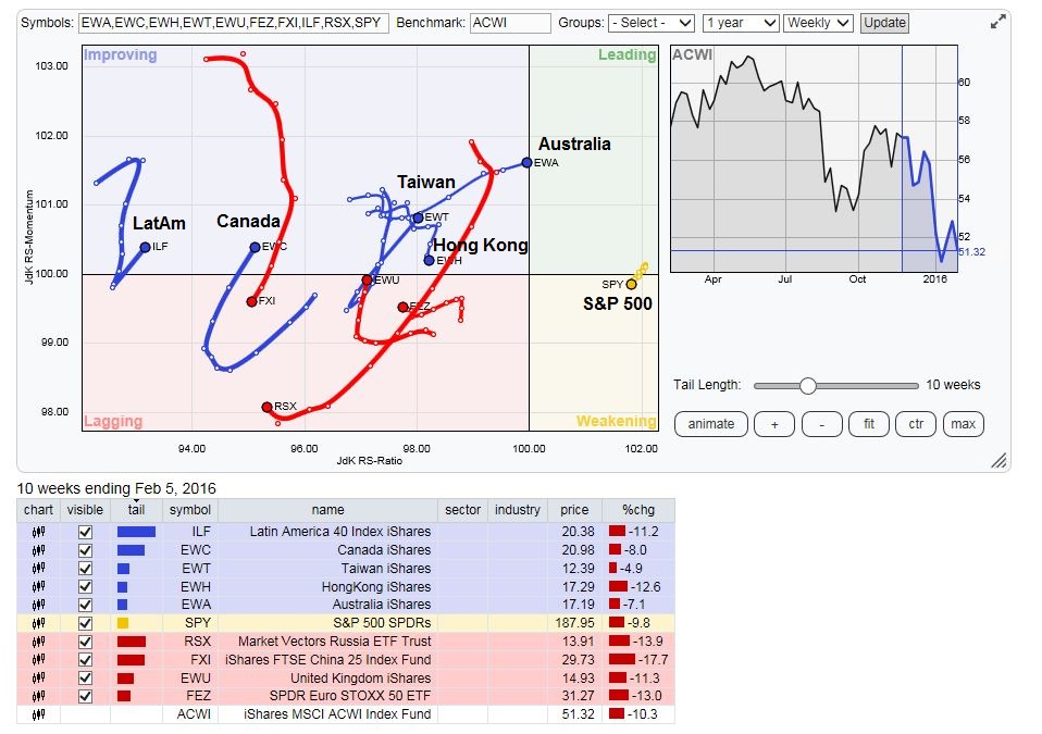
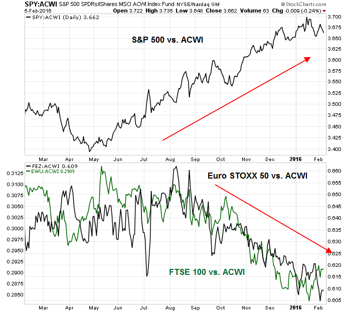
If we analyze the RRG chart by country, however, the technical picture looks brighter. (Note that these are all US-listed ETFs so their performance are all measured in a single currency.) US stocks have moved from the leading to weakening quadrant, though the deterioration is very minor (more on that later). The most problematical region is Europe (eurozone and UK), while China related plays and resource producing countries are showing the greatest level of improvement, which are suggestive of a global cyclical rebound.
Here is the relative performance of US and European stocks relative to the MSCI All-Country World Index (ACWI). US stocks remain in a relative uptrend, while European stocks are in relative downtrends.
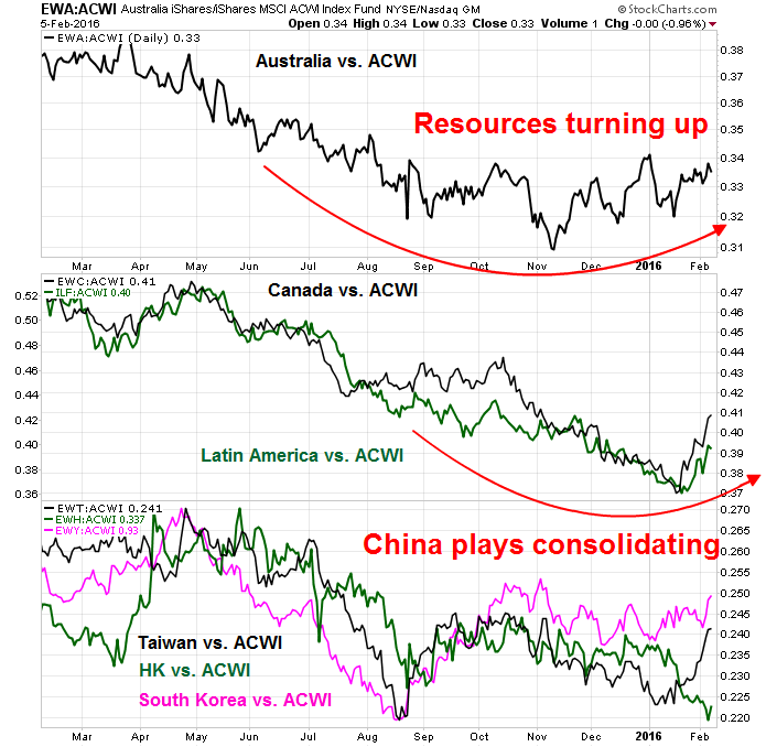
The picture for resource and China related Asian markets point to a story of global healing. The relative performance of resource-rich and China-sensitive Australian market is turning up (top panel). So are Canada and Latin America (80% combined weights in resource heavy Brazil and Mexico, middle panel). The stock markets of China`s major regional trading partners are consolidating sideways relative to ACWI (bottom panel), indicating that diminishing short-term tail-risk from a China hard landing. The Apocalyptic scenario of a Chinese devaluation starting a currency and trade war seems to be off the table. Even the perennially bearish site Zero Hedge has thrown in the towel on that story, at least in the short-term.
Here is the big questions in the days and weeks ahead: The global markets are showing signs of healing, when will that start to show up in US sector leadership? Until it does, expect further uncertainty, volatility and choppiness.
The week ahead
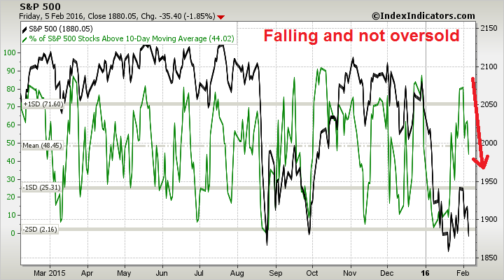
As we approach the week ahead, further stock market weakness is the most likely outcome. Breadth indicators from IndexIndicators are falling. Readings are only neutral and not oversold, but momentum is negative.
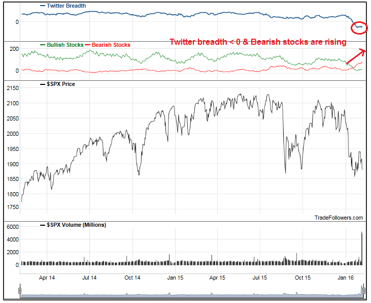
As well, analysis from Trade Followers show that Twitter breadth is negative, which is bearish, and bearish tweets are overwhelming bullish tweets, which are also bearish (annotations in red are mine).
My inner investor remains constructive on stocks as he believes that this recession scare presents a buying opportunity. He is long equities with an overweight position in the resource sector.
My inner trader is anticipating more choppy markets in the near term. He was stopped out of his long position on Tuesday and he is staying in cash. He is wary of going short except opportunistically for a brief trade. The combination of crowded short sentiment readings and positive intermediate term macro and fundamental backdrop means that any good news could see a rally that could rip the face off any short-seller.
His base case scenario for the upcoming week postulates a re-test of the recent lows with a possible undercut of major support, which would create a panic among traders and give the bulls the sentiment shakeout that`s been lacking in the current decline. If that were to happen, it would be a major buying opportunity. (Don`t even try to ask about downside target levels, because my inner trader has no idea and he will be watching for extreme oversold readings to step up and buy.)
Disclosure: No trading positions
Zerohedge has predicted 140 of the last 2 pullbacks.
Cam,
Could you expand on your “crowded short” comment re the Rydex investors ? My data don’t even show them net short. I think they are still net long by a fair amount.
Rydex ratio = (Rydex money market cash flows + Rydex bear fund cash flows) / Total Rydex cash flows
Note that this ratio measures cash flows, which are the trades, or asset shifts at the margin. Readings are at an extreme indicating panic among Rydex traders.
What do you think about the recent projections of the Atlanta FED … was surprised to see the uptick in GDPNow
https://www.frbatlanta.org/cqer/research/gdpnow.aspx?panel=1
Speaks for your correction and not recession argument you make in the first part of the article
One more question Cam … Do you give any significance to chart signals?
For example I follow Chris Ciovacco on Twitter and watch his weekly video. There it’s all about charts and technical analysis and how today could turn into 2008 by the look of the indicators.
How’s your take on this way to analyze the current state of the market?
Of course I do. Charting is part of my tool set and I was part of the US technical/market analysis team at Merrill Lynch before I entered semi-retirement in early 2007. (I would have had Steve Suttmeier’s job had I stayed and chosen to endure the painful years of the post-Lehman era).
Having said that, technical analysis should form only part of a balanced analytical framework. Just because a stock or index violates a support level or trend line is not necessarily a reason to panic. You have to see if the fundamentals and macro conditions are confirming that view. Sometimes the charts are signaling something important, other times they are just displaying the all the exuberance of traders behaving like 12 year-olds.
As for my take for the state of the market, please re-read the current post.
thank you!
What do you make of the fact that cds on all major banks have blown out and of course we have a route in banking stocks. Maybe the market knows about something we don’t and the next crisis is not yet common knowledge.