Preface: Explaining our market timing models
We maintain several market timing models, each with differing time horizons. The “Ultimate Market Timing Model” is a long-term market timing model based on research outlined in our post Building the ultimate market timing model. This model tends to generate only a handful of signals each decade.
The Trend Model is an asset allocation model which applies trend following principles based on the inputs of global stock and commodity price. This model has a shorter time horizon and tends to turn over about 4-6 times a year. In essence, it seeks to answer the question, “Is the trend in the global economy expansion (bullish) or contraction (bearish)?”
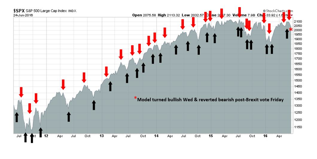
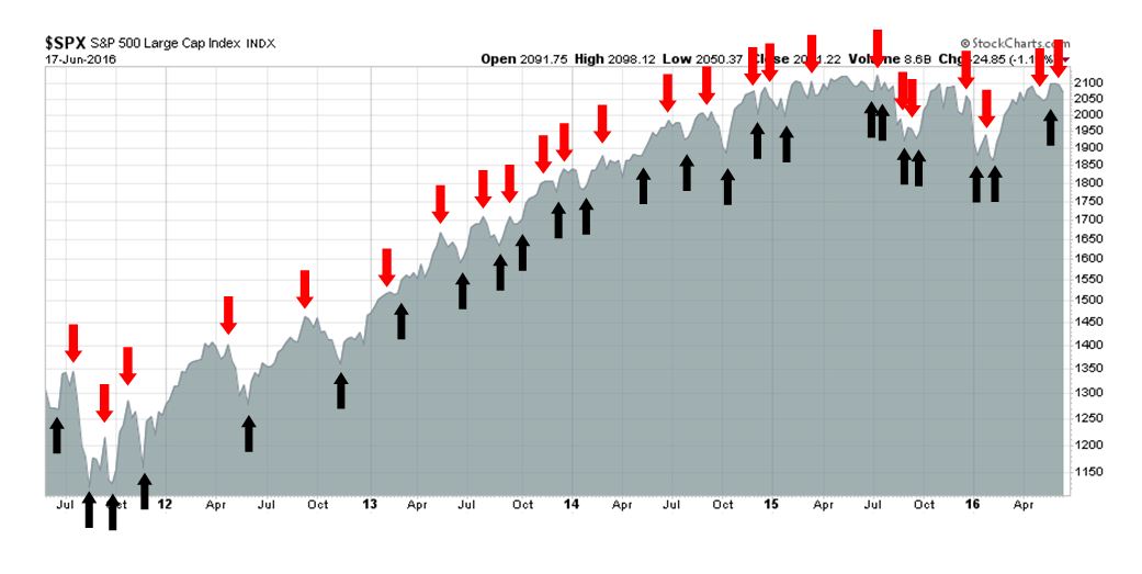
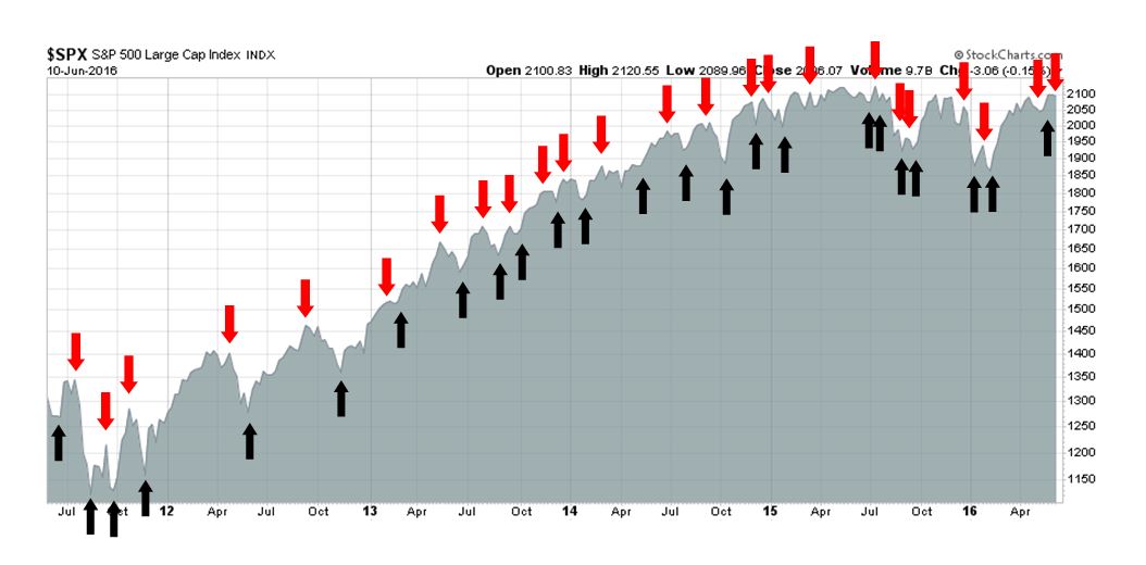
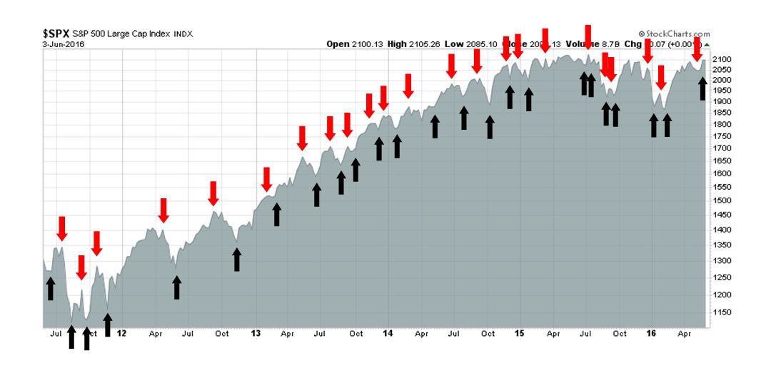
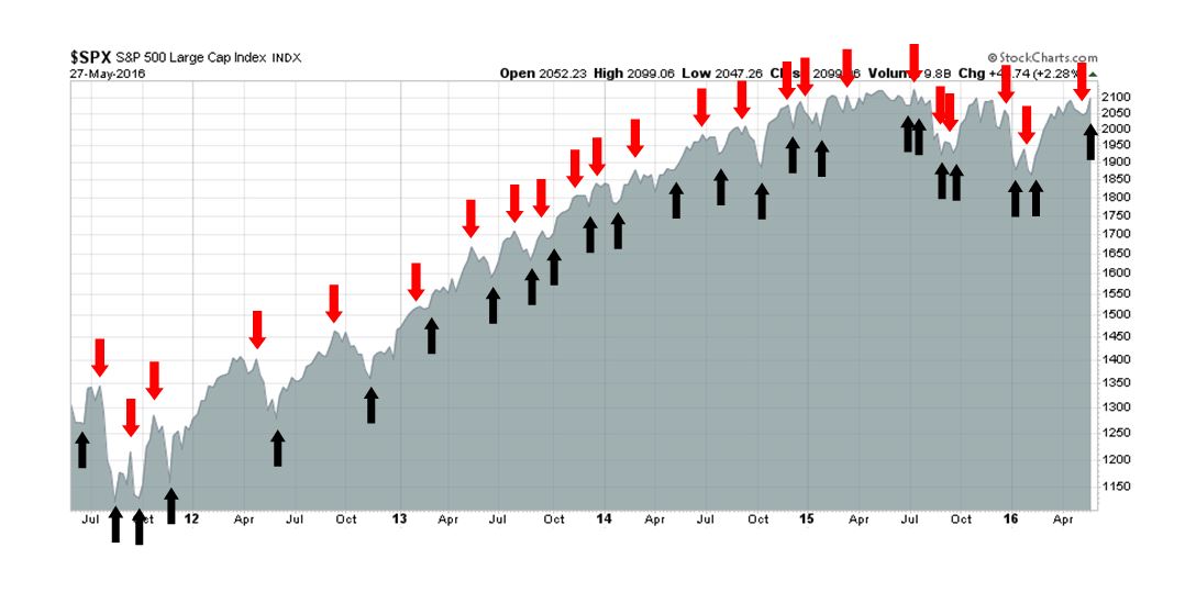
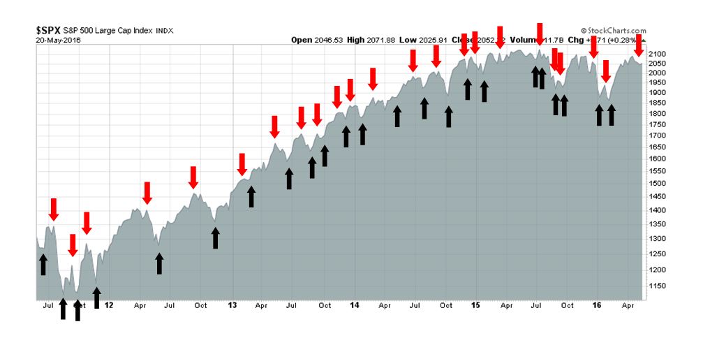
My inner trader uses the trading component of the Trend Model to look for changes in direction of the main Trend Model signal. A bullish Trend Model signal that gets less bullish is a trading “sell” signal. Conversely, a bearish Trend Model signal that gets less bullish is a trading “buy” signal. The history of actual out-of-sample (not backtested) signals of the trading model are shown by the arrows in the chart below. Past trading of the trading model has shown turnover rates of about 200% per month.
The latest signals of each model are as follows:
- Ultimate market timing model: Buy equities
- Trend Model signal: Neutral
- Trading model: Bullish
Update schedule: I generally update model readings on my site on weekends and tweet any changes during the week at @humblestudent. Subscribers will also receive email notices of any changes in my trading portfolio.
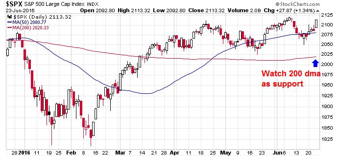
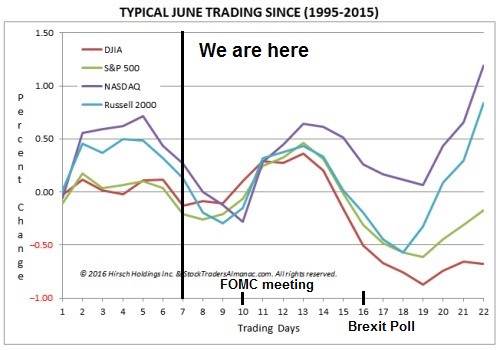
A June swoon before SPX 2400?
Well, that Jobs Report certainly changed the tone of the market! The massive disappointment of Friday’s Employment Report, combined with other weak macro data such as ISM services, is setting up for a choppy market of maximum frustration. I am seeing cross-currents that could be treacherous for both bulls and bears. Here is my market outlook for differing horizons:
- Medium term (6-12 month time horizon) bullish: The disappointing Employment Report gave the FOMC doves to stay cautious and push out its schedule of interest rate normalization. When combined with a picture of a steadily growing US economy, it gives room for the SPX to reach the 2400-2500 area late this year before the market tops out for this cycle (see my previous posts How the SP 500 could get to 2400 this year and The roadmap to a market top).
- Short term (1-2 months) bearish: On the other hand, the massive Non-Farm Payroll (NFP) miss, along with weakness in forward EPS, is setting up for a growth scare that is likely to spook the markets.
- Trading (1 day to 1 week) bullish: The inability for equity prices to fall in the face of bad news suggests that the bears are exhausted. It therefore sets up the market for a rip-your-face-off rally should there be any sign of positive news.
The stage is set, pick your poison. Be careful – even a slight timing mistake could turn a trading profit into a loss.
Anatomy of a market top
Last week, I laid out the broad macro-economic outline of how the stock market might make a cyclical top for this cycle (see The roadmap to a market top):
In his post, New Deal democrat laid out a very sensible checklist for anyone watching for the next recession (comments in parentheses are mine):
- Interest rates continue to fail to make new lows. (Check: he means short rates).
- House prices and stock prices stop meaningfully appreciating. (Stocks, yes. Houses, not yet but it could be soon as sales lead prices – and sales have stalled).
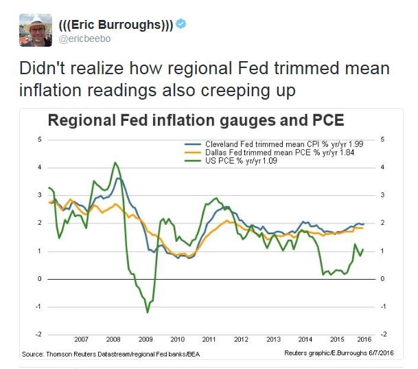
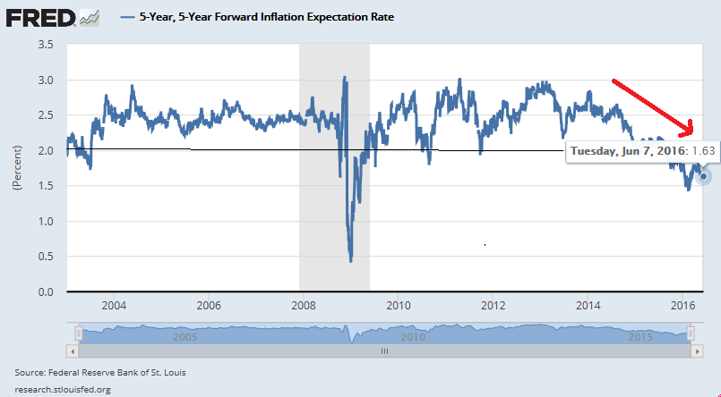
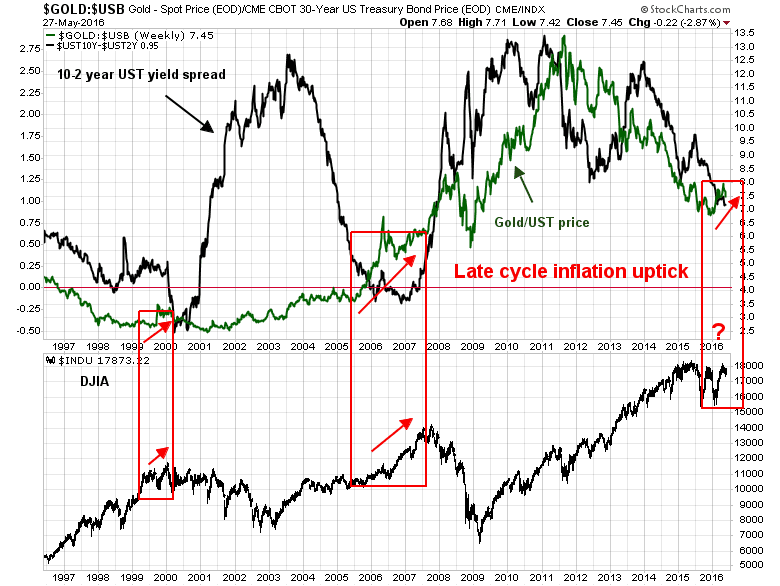
- Inflation picks up to 2% or more as energy prices begin to go up again. (Check: see Core CPI).
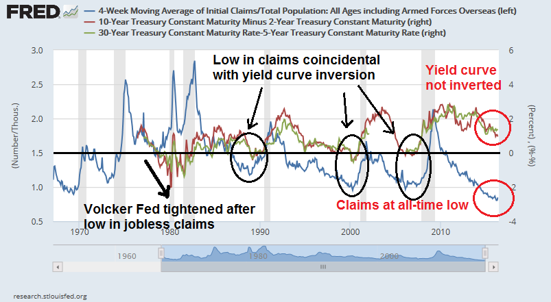
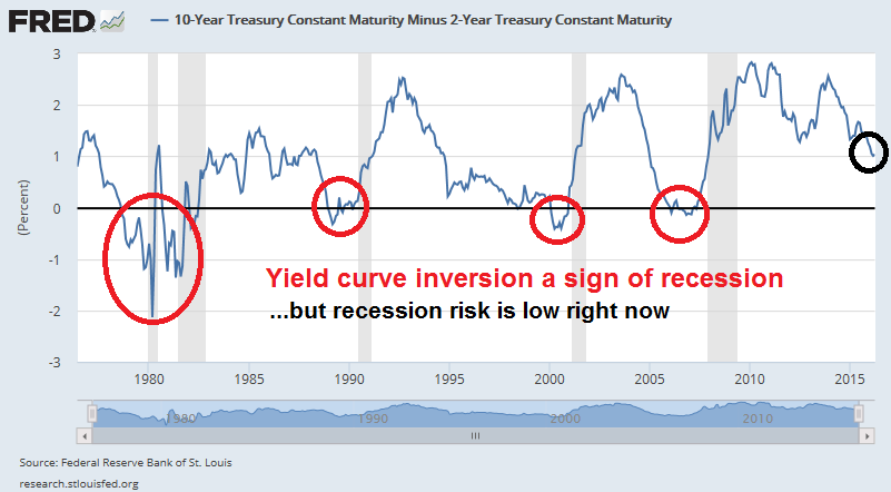
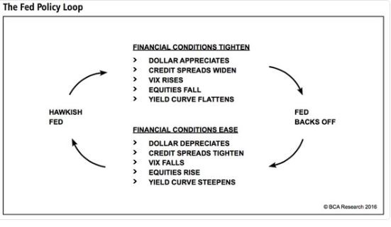
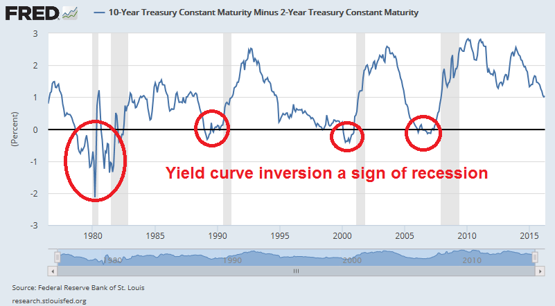
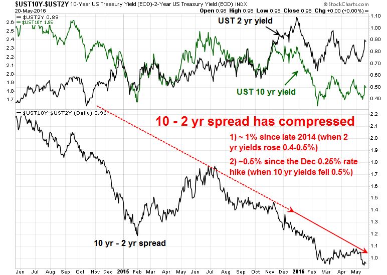
- Maybe – the Fed raises rates in response to increased CPI readings, perhaps enough to invert the yield curve. (Yield curve is not inverted, but see the risks in my post Three steps and a stumble).
- Corporate lending stalls, housing turns down, and consumer spending begins to turn down, resulting in a recession.
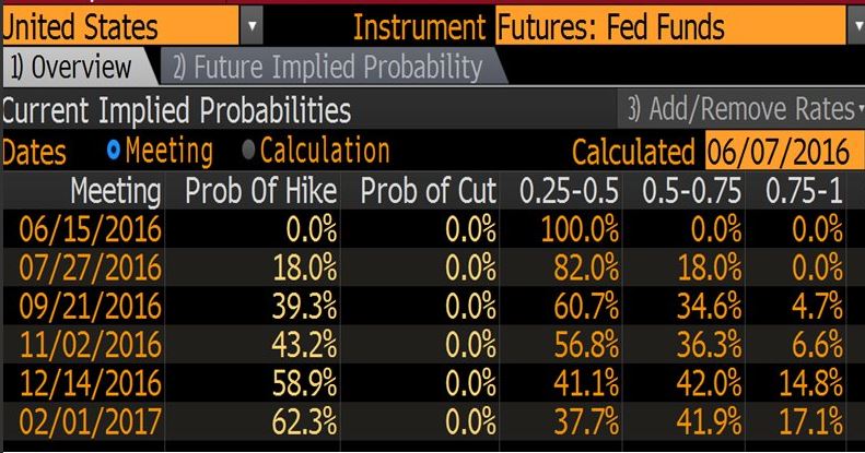
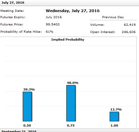
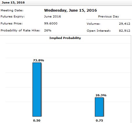
We are somewhere between phase 3 and 4, but the question remains one of timing. Last week, it appeared that the Fed was ready to raise rates by a quarter point in either June or July, with another hike in December. Today, June is off the table, though July remains a possibility. I had penciled in 5-10% EPS growth for the remainder of the year, a dovish Fed could accommodate some P/E expansion, which puts a 2400-2500 SPX target within reach this year. Without the Fed, the best the index could do would be 5-10%, or 2200-2300.
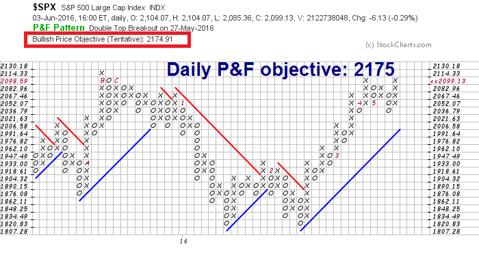
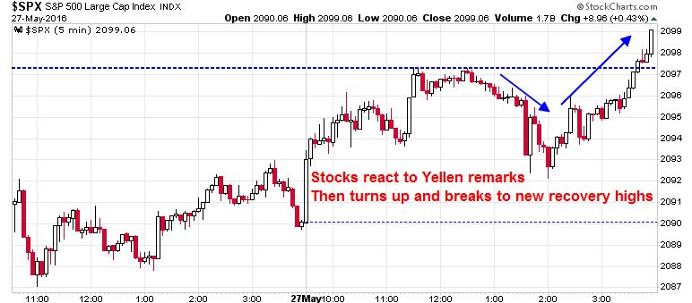
From a technical viewpoint, the 2200-2400 target is roughly in line with the range obtained from point and figure charting. Using daily price data, this technique indicated a price objective of 2175 based on the double-top breakout on May 27, 2016.
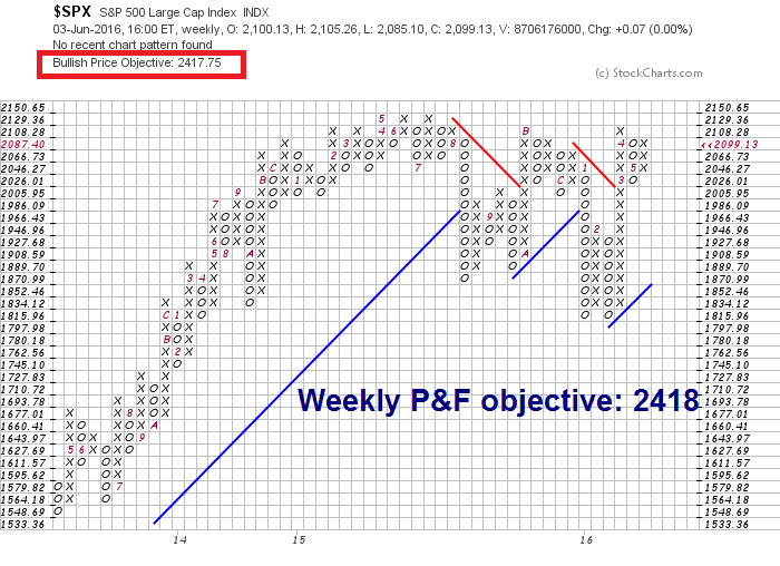
Using weekly data, the upside objective is 2418 should the index stage an upside breakout, which hasn’t occurred yet.
Weakening growth expectations
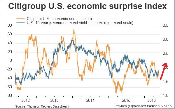
However, the dramatic NFP miss on Friday has totally changed the conversation. The question has stopped being about whether a 2200 or 2400 target is appropriate, but what the downside risk is. To put some perspective on how bad the Jobs Report was, Bloomberg pointed out that this was the worst release since 2010.
The downward revisions of previous months didn’t help matters either. Even worse, temporary employment (blue line below), which is a leading employment indicator, continued to weaken. The report screamed “pre-recession”, but when will the market react to that possibility?
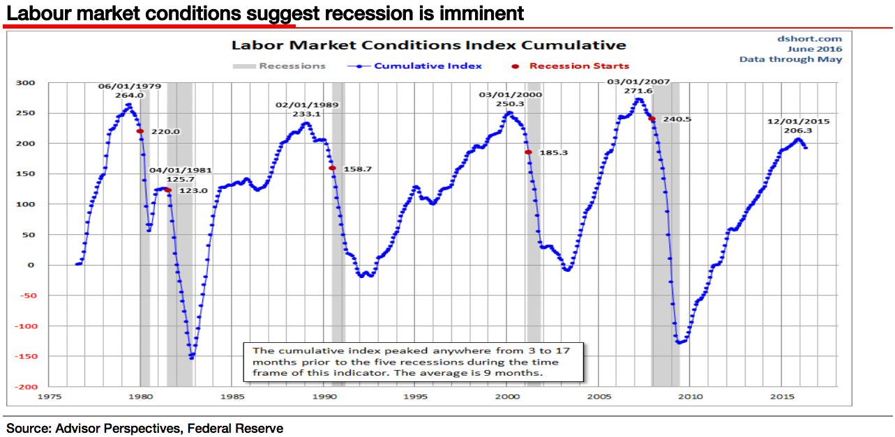
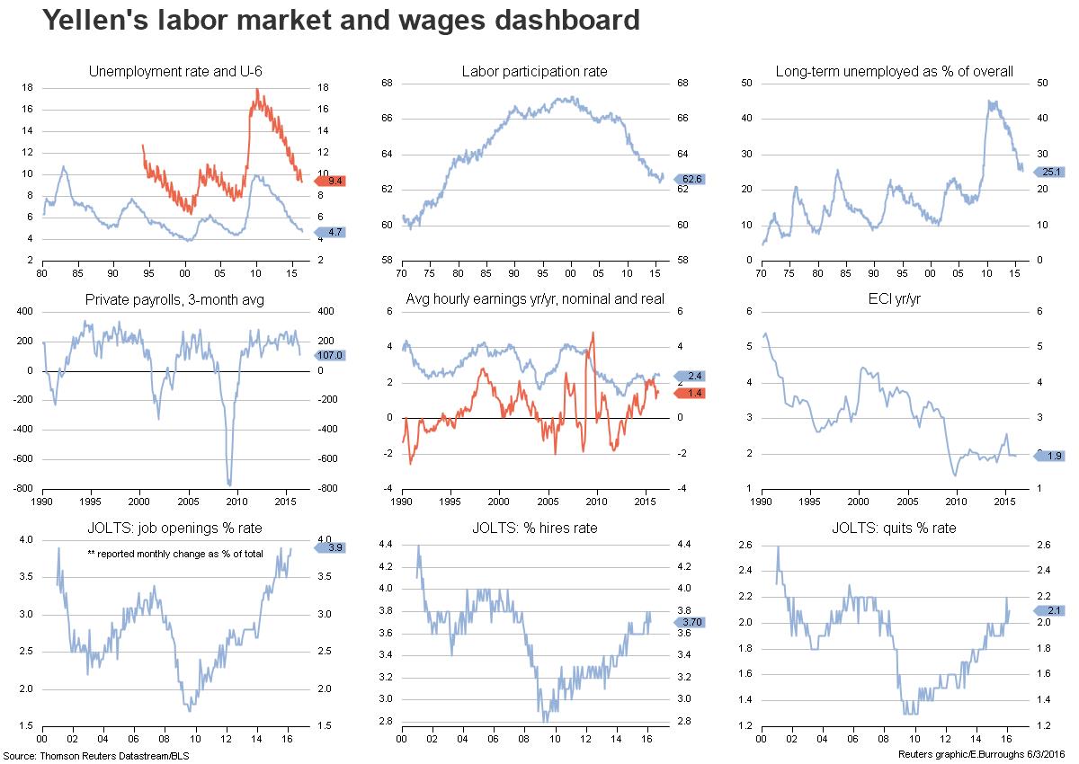
There are reasons not to panic and over-react. NFP is a noisy number. The trends in Janet Yellen’s labor market dashboard are still moving in the direction of continued improvements in wages and labor market conditions.
Nevertheless, The combination of disappointment in a number of other measures such as the Jobs Report, ISM services and consumer confidence has spiked the recession odds in JP Morgan`s model to 36% (via Business Insider):
JP Morgan’s proprietary model that gauges the risk of a recession starting over the next 12 months also hit its highest mark since the financial crisis on Friday. Most of this was on the back of lackluster economic data.
“With the rally in risk markets over the last month, our models based on financial market pricing now see a recession risk moderately below our model based on macroeconomic data,” wrote JP Morgan economist Jesse Edgerton.
“Since last week, we have seen disappointments in the Dallas Fed measures of manufacturing and nonmanufacturing sentiment, the ISM nonmanufacturing index, and the Conference Board measure of consumer confidence.”
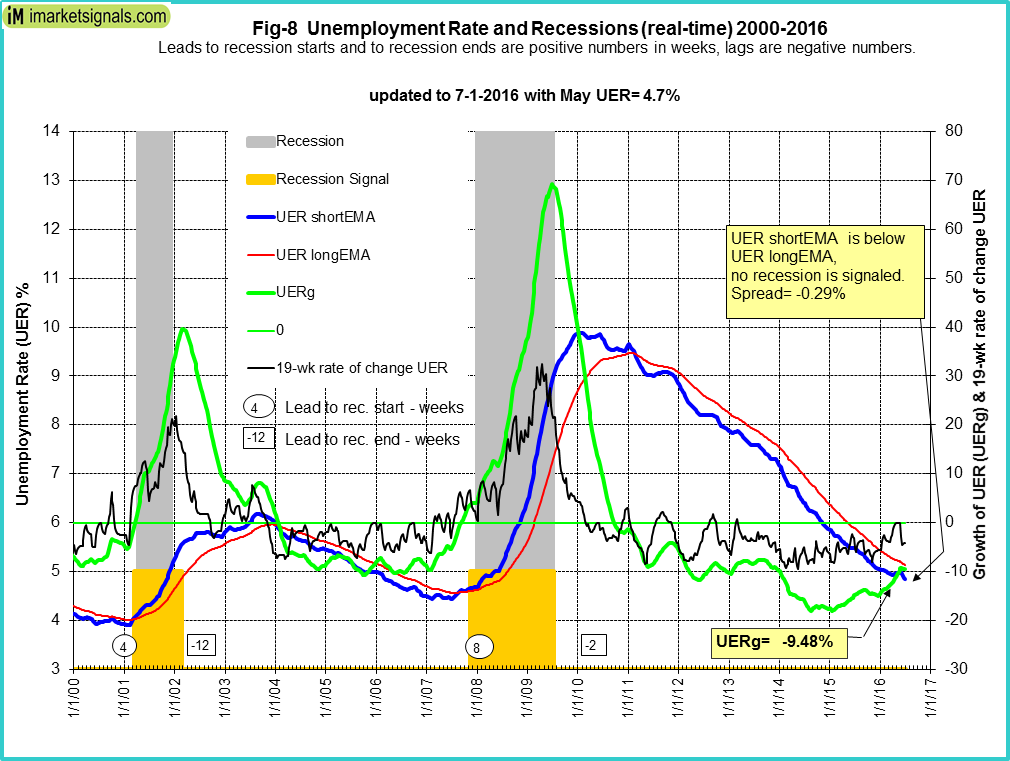
I am not inclined to panic in the face of this news as recession risk models with a longer term track record, such as Georg Vrba`s work on unemployment, is not signaling recession – and neither is his Business Cycle Index.
New Deal democrat agrees that recession risk is low in his weekly assessment of high frequency economic indicators. The economy is weak, but his short and long leading indicators are nowhere near recessionary levels.
[T]here is very little in the high frequency data that is outright negative. In fact, the long leading indicators are about as positive as I have ever seen them. With the Fed presumably on hold again after Friday’s jobs report, perhaps the broad US$ will also fall back from negative to neutral. Taking the K.I.S.S. approach of simply looking at the Index of Leading Indicators, they have been basically flat since last summer — implying an economy limping along but not falling into outright recession this year.
The Street turns cautious
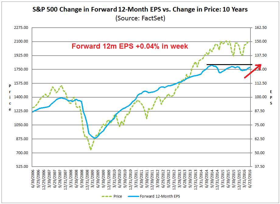
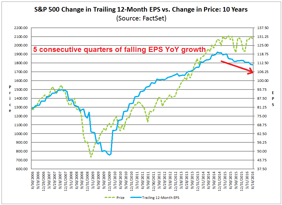
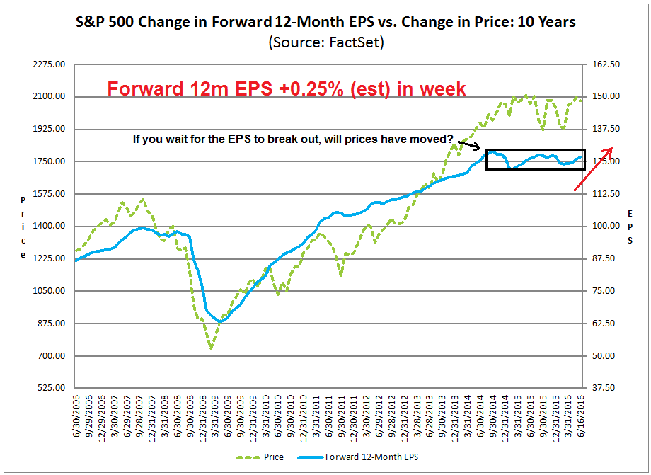
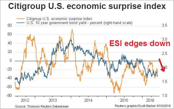
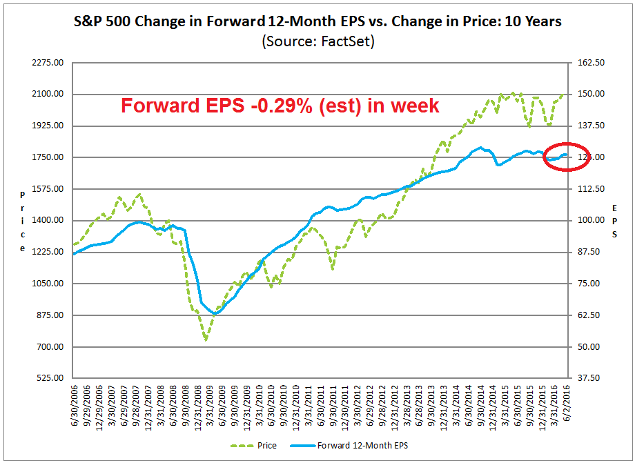
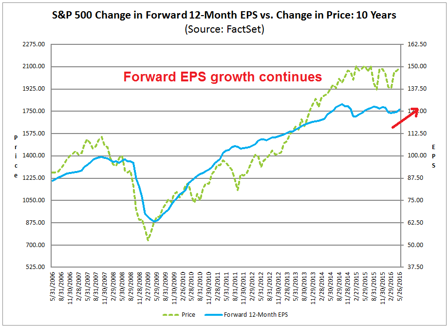
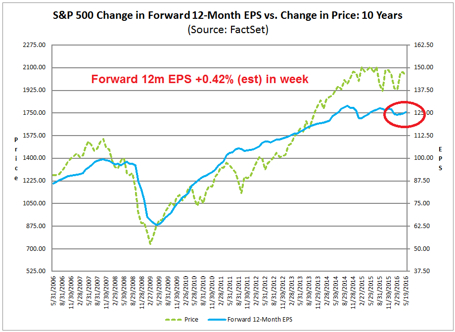
Coincidentally, the Street’s analyst sentiment is turning down. The bottom-up driven forward 12-month EPS metric is falling, which will likely create headwinds for equity prices. The latest data from John Butters of Factset shows that forward EPS fell -0.29% (my estimate) last week.
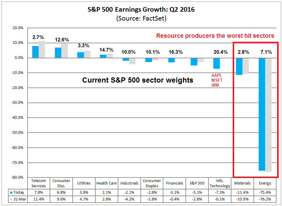
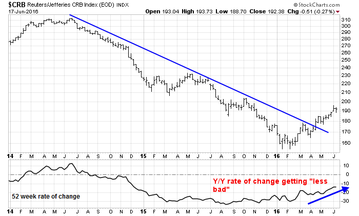
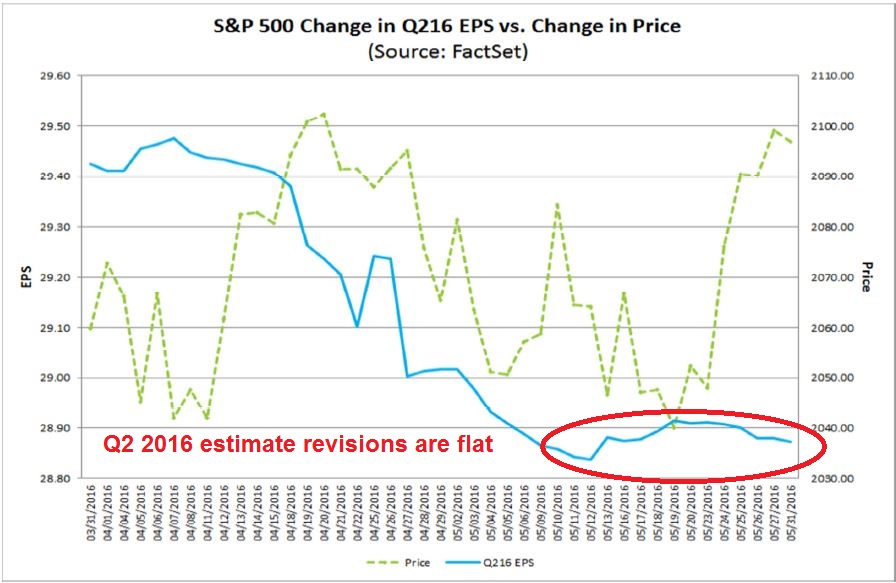
Still, any correction stemming from a growth scare may be milder than the January/February episode. Factset also reported that Q2 EPS estimates have been flat for the last few weeks, which is a positive sign. Brian Gilmartin attributed the flattening earnings estimates to better growth in energy and materials, which is a bullish sign for late cycle cyclical stocks.
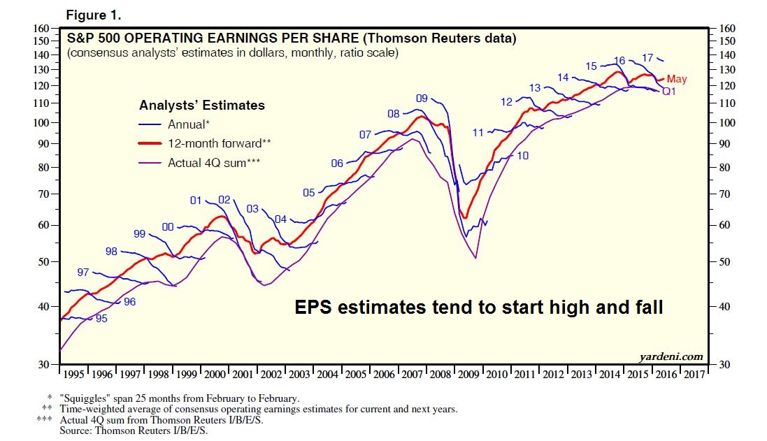
I view the lack of downward estimate revisions constructively because EPS estimates for any single period, whether annual or quarterly, have shown a tendency to start high and fall. Just take a look at the historical record from Ed Yardeni. Flat revisions is the new up.
So where does that leave us? How real is this growth scare? I would make the case that any slowdown is temporary and a data blip. Consider the latest Fed Beige Book report, which showed modest expansion:
Economic activity in April through mid-May increased at a moderate pace in the San Francisco District, while modest growth was reported by Philadelphia, Cleveland, Atlanta, Chicago, St. Louis, and Minneapolis. Chicago noted that the pace of growth slowed, as did Kansas City. Dallas reported that economic activity grew marginally, while New York characterized activity as generally flat since the last report. Several Districts noted that contacts had generally optimistic outlooks, with firms expecting growth either to continue at its current pace or to increase.
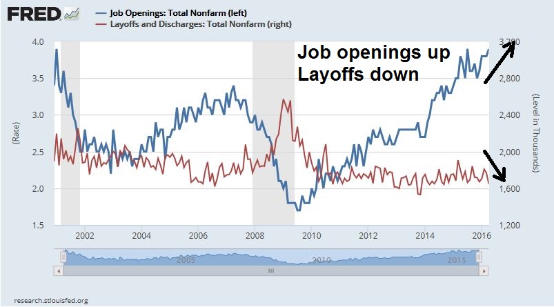
Labor markets were reportedly tightening, which does not square with the downbeat Jobs Report:
Employment grew modestly since the last report, but tight labor markets were widely noted; wages grew modestly, and price pressure grew slightly in most Districts.
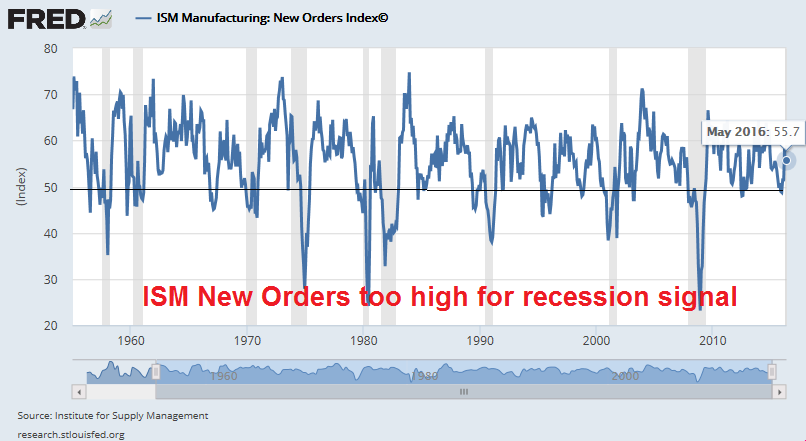
In addition, the latest ISM report showed New Orders at above 55 for three months running, which is hardly a recessionary signal. In fact, ISM New Orders can be seen as a sign that the shallow industrial recession that began late last year has ended.
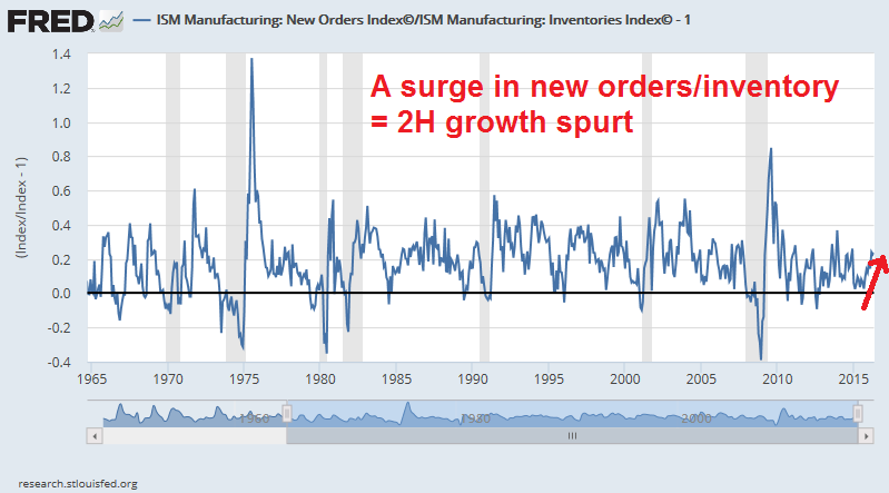
In fact, the surge in new orders to inventory ratio is suggestive of a 2H growth spurt, not a slowdown.
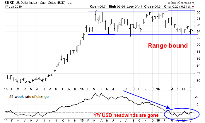
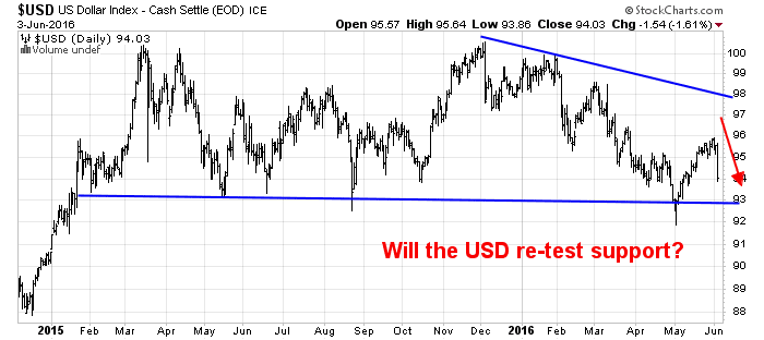
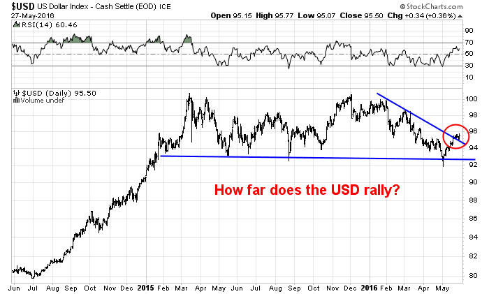
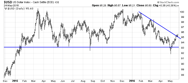
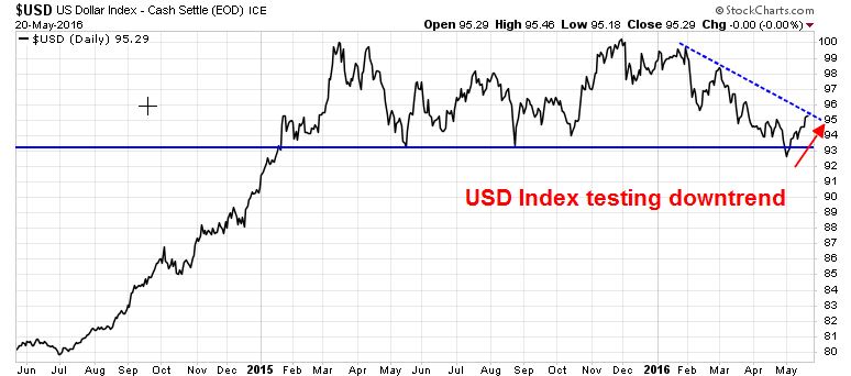
Further, the USD fell in reaction to the NFP Report surprise, which is supportive of equity strength. A strong USD had been squeezing the operating margins of multi-national stocks. Conversely, a weak Dollar should therefore provide an earnings tailwind. Given the reaction on Friday, it would be no surprise to see the USD Index eventually retreat and test support at about the 93 level.
The Fed`s reaction
Bloomberg reported that Cleveland Fed President Loretta Mester, who is the first Fed official to speak after the Jobs Report, stated that the Fed should stay the course on interest rate normalization and dismissed the weak jobs number as a possible data blip. Jon Hilsenrath of the WSJ summarized the likely Fed reaction to the NFP Report as taking a June rate hike off the table, but July remains a possibility.
I interpret current conditions as the early signs of a temporary growth scare. Investors shouldn’t freak out, however, as a bear market is unlikely to begin from current levels. First of all, the US economy remains robust and the growth scare is probably just a data blip. However, should the economy start to truly weaken, the Fed has the capability to put its rate normalization on hold and possibly even begin easing with another QE program. A more plausible bear market scenario is a Fed policy miscalculation that over-tightens monetary policy which plunges the US and global economy into a recession. For that to happen, we need more growth – and more inflation to fuel the Fed’s determination to raise rates. Near-term equity market weakness is therefore likely to be short-lived and should be viewed as a buying opportunity.
Traders: Don’t get too bearish just yet
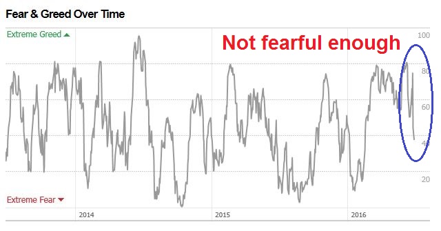
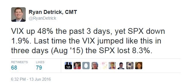
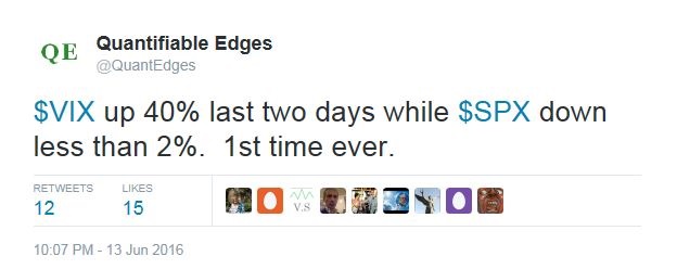
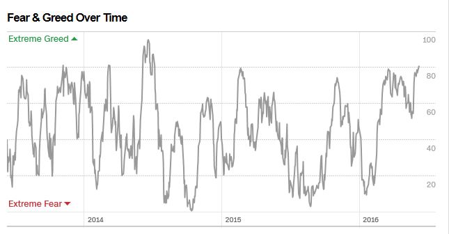
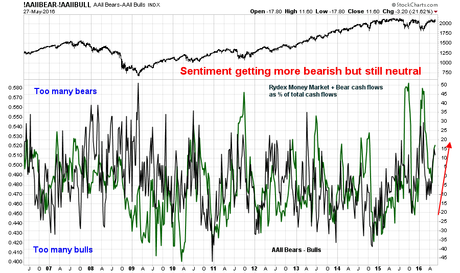
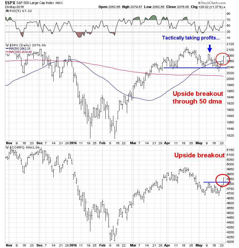
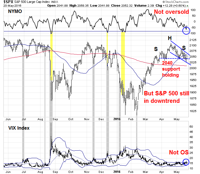
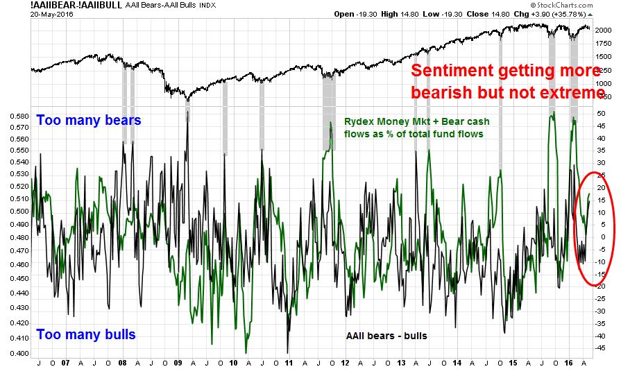
While my inner investor remains constructive on stocks, my inner trader is a nervous wreck. You can read the tone of a market by how it responds to news. When the disappointing NFP news hit the tape, the stock market fell about 1% on the day, but recovered to close at -0.3%. This kind of market action is a sign of bearish exhaustion. There are just too many bears, so it may be too early for traders to get bearish just yet.
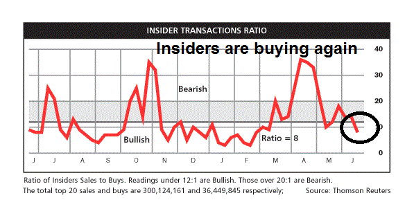
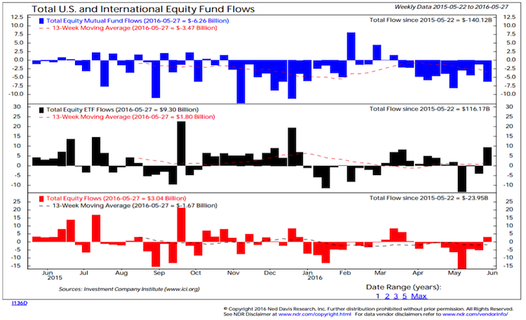
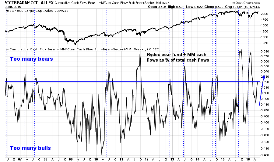
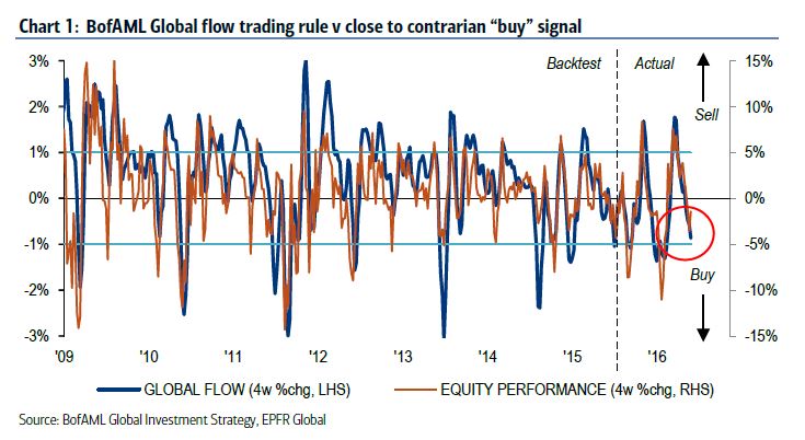
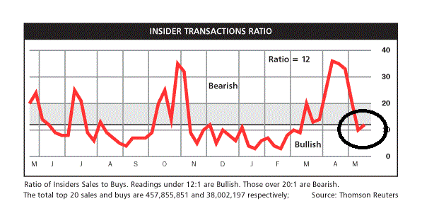
There are many ways to measure market sentiment, but for the purposes of this exercise, I’ll ignore the surveys and stick to the indicators where traders and investors have real money on the line – and those indicators are tilted bearishly. Willie Delwiche noted that fund flows have shown a high demand for “safety”, as investors have been pouring money into bond funds:
…while pulling money out of stock funds:
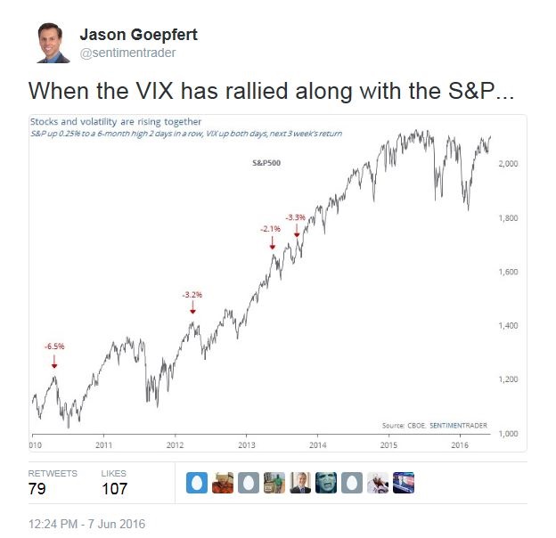
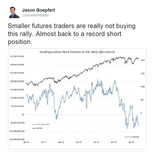
Jason Goepfert documented the crowded short position of small futures traders, which is contrarian bullish.
Rydex data also shows that sentiment has been getting more cautious and nearing a crowded short condition. Current circumstances are unusual as investor sentiment has been getting more bearish as the stock market advanced, while similar past similar readings (see vertical lines) have been seen during periods of market weakness.
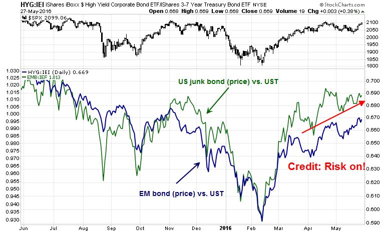
Bullish internals
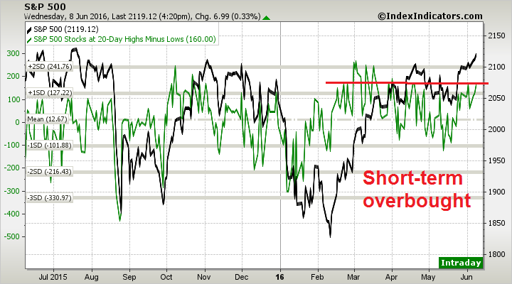
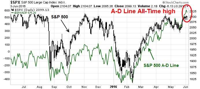
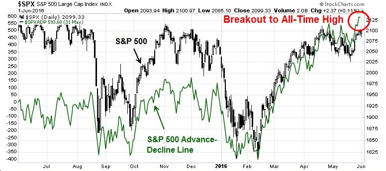
In addition, a number of technical internals are bullish. The SPX Advance-Decline Line made an all-time high last week. While that does not mean that stock price can`t pull back, it does suggest that any correction is likely to be shallow.
Barron’s also featured analysis from Jason Goepfert of SentimentTrader which indicated the current backdrop of positive price momentum after the February low is bullish:
Through May, the SP 500 logged three straight months of gains since its 12-month low in February. That’s an encouraging sign for the rest of the year, if the experience of May 2009 holds true. That was the last time the market rose for three consecutive months after a 12-month low. Then, the market gained 16.8% in the following nine months and was up by more than 46% some two years later.
This insight comes courtesy of Jason Goepfert, founder, president, and chief number cruncher at SentimenTrader, which tracks sentiment measures to glean insights from the market’s action.
Examining data beginning in 1928, Goepfert notes that in 12 out of 14 years in which the SP 500 posted three consecutive months of gains following a 12-month low, the market rallied for the next three months. If the fourth month rose as well, future gains in the months ahead were even better, except for 1930 and 1940, periods of extended losses. In 2009, the fourth month neither advanced nor retreated but stayed flat, and yet the market never looked back.
Goepfert sees parallels between now and 1953, when stocks underwent a minor correction after a multiyear bull market. Then, as now, the advance/decline line hovered near its all-time high and market breadth was strong. Mimicking 1953 would be the best of all scenarios: The SP rose 24.7% in the nine months following the three-month signal and went on to return 83.8% two years out.
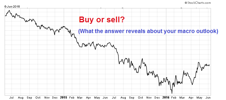
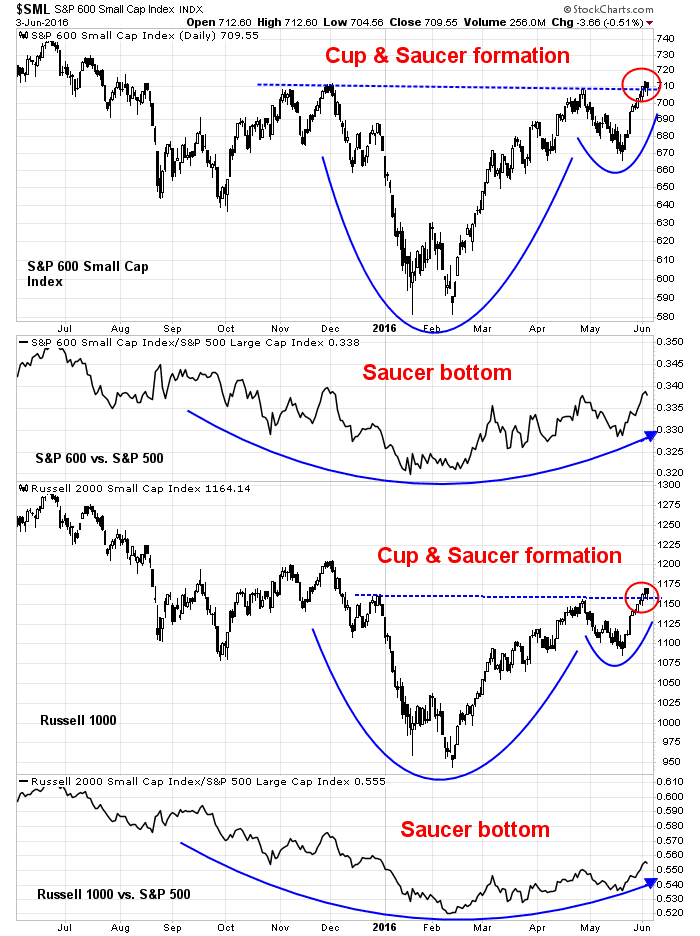
As well, the behavior of high-beta small cap stocks is signaling a pending risk-on environment, not a correction. As the chart below shows, both the SP 600 and Russell 2000 are breaking out of cup and saucer formations and their relative return charts are displaying the classic signs of saucer bottoms (ht Greg Harmon). I recognize that the charts can reverse and fake out even the best traders, but do many major pullbacks start with sentiment, breadth and high-beta small caps behaving in this way?
My inner investor remains constructive on stocks. The talk of minor pullbacks is just noise. A June swoon is well within the realm of possibility but he is prepared to buy on weakness.
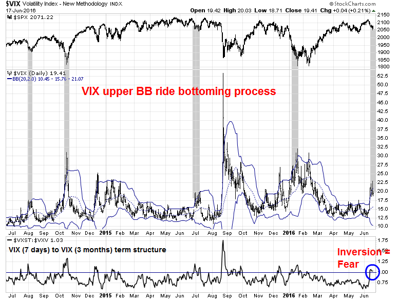
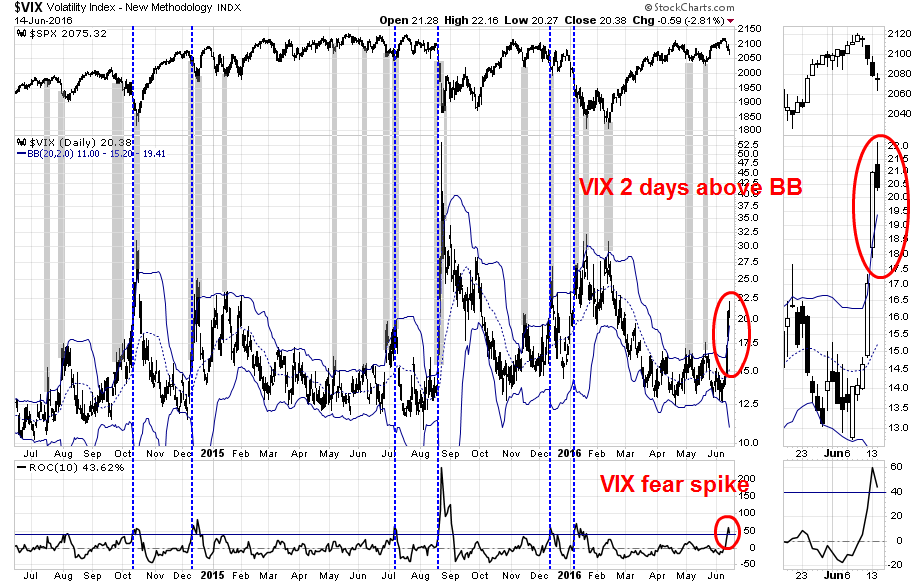
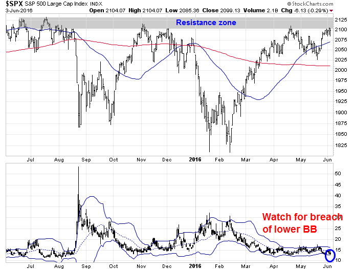
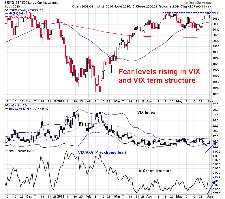
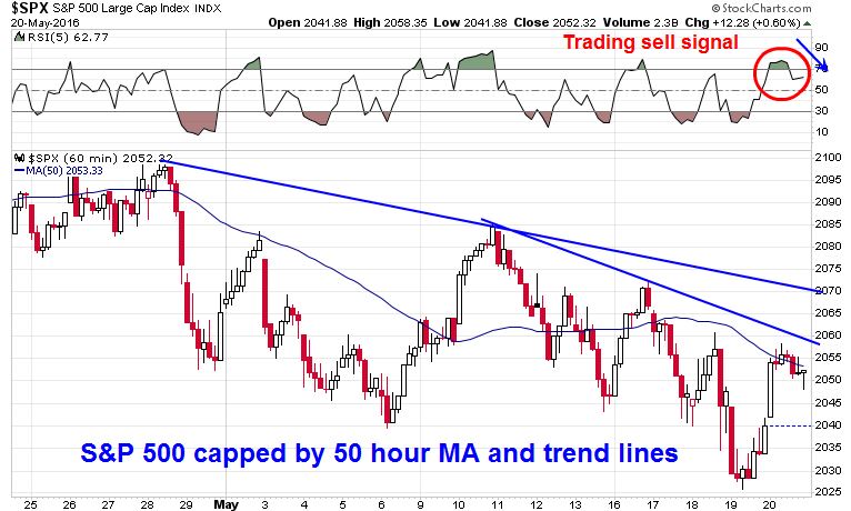
My inner trader is nervously staying long the market for now and tightening up his trailing stops as market strength could reverse itself at any time. On the other hand, he would not be surprised to see the SPX test the top of its resistance zone and fake out all the bulls and bears before reversing direction. He will also be watching for the VIX Index (bottom panel) test its lower Bollinger Band, which would be indicative an overbought condition and a sell signal.
Just don’t ask me what the downside target is in a correction. I have no idea. My inner trader will be grateful if he manages to make the right directional call in a timely fashion in this potentially volatile environment.
Disclosure: Long SPXL