Preface: Explaining our market timing models
We maintain several market timing models, each with differing time horizons. The “Ultimate Market Timing Model” is a long-term market timing model based on the research outlined in our post, Building the ultimate market timing model. This model tends to generate only a handful of signals each decade.
The Trend Model is an asset allocation model which applies trend following principles based on the inputs of global stock and commodity price. This model has a shorter time horizon and tends to turn over about 4-6 times a year. In essence, it seeks to answer the question, “Is the trend in the global economy expansion (bullish) or contraction (bearish)?”
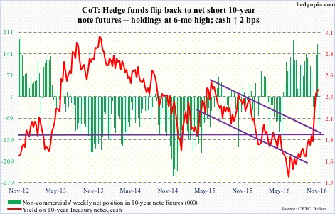
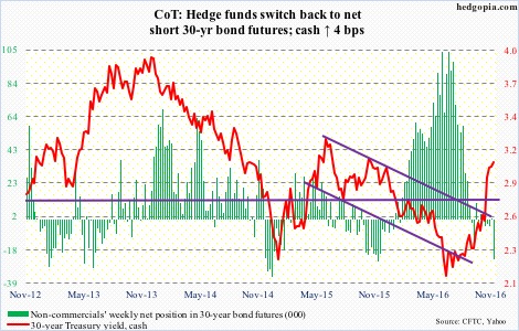
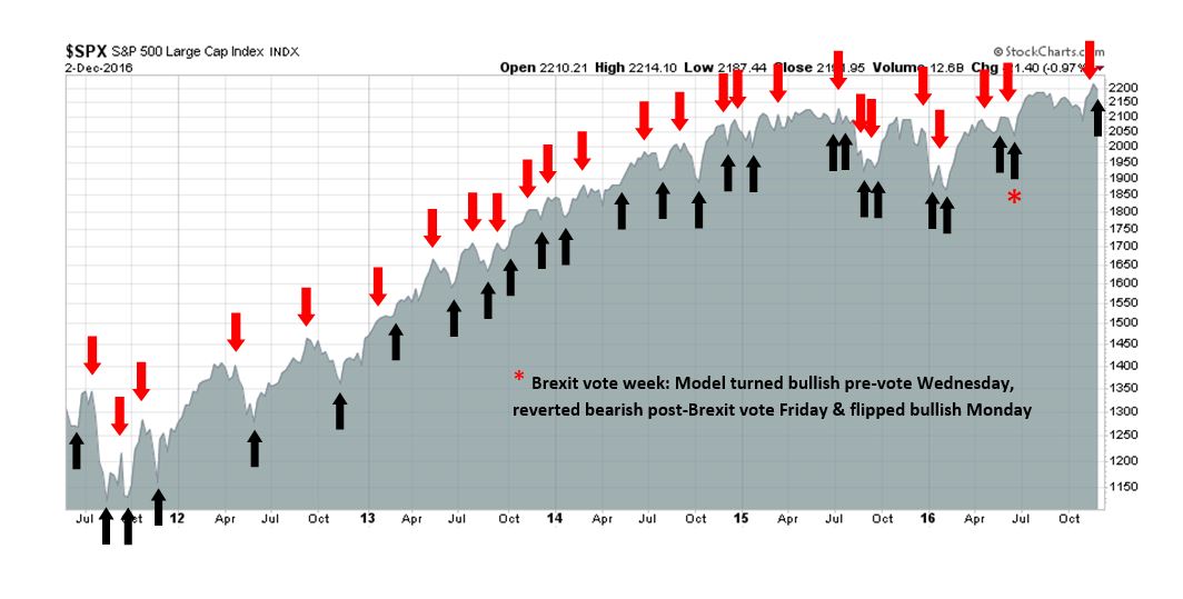
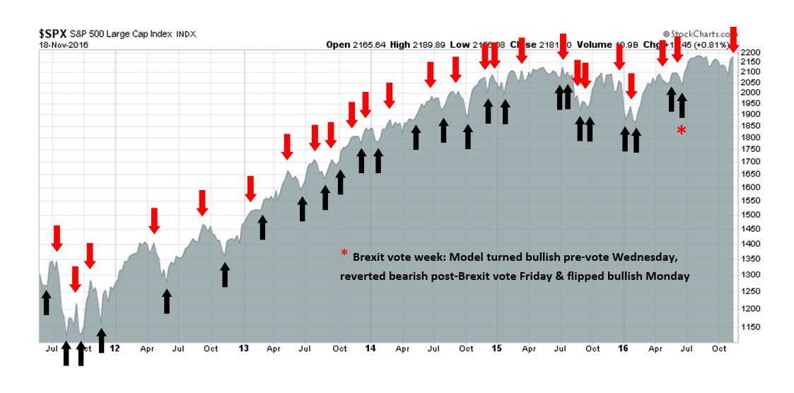
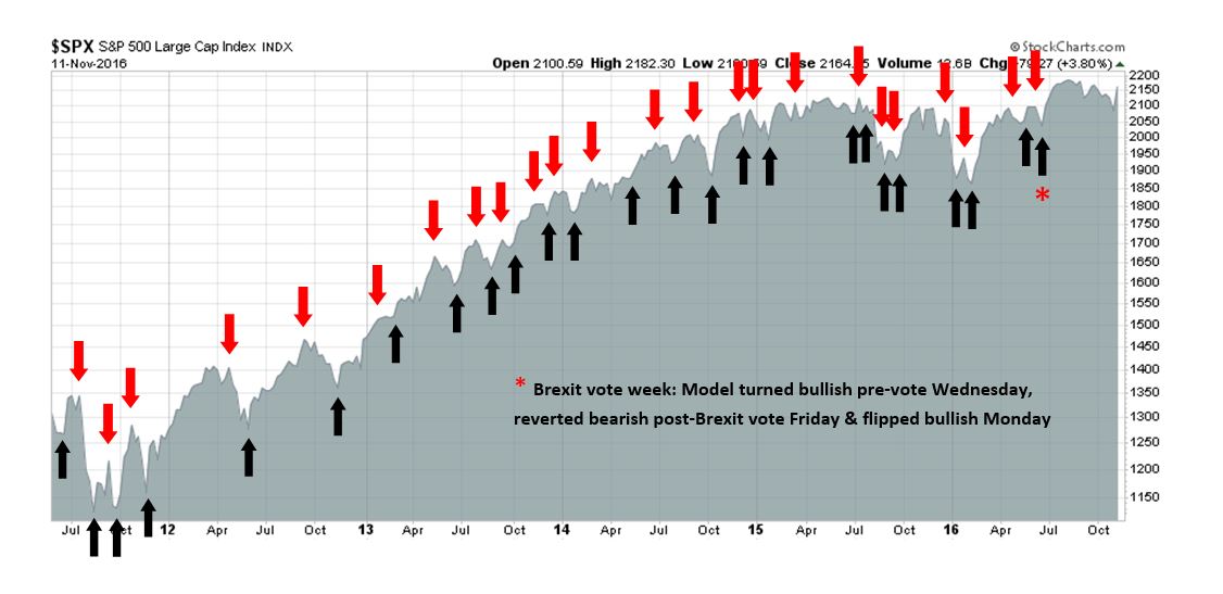
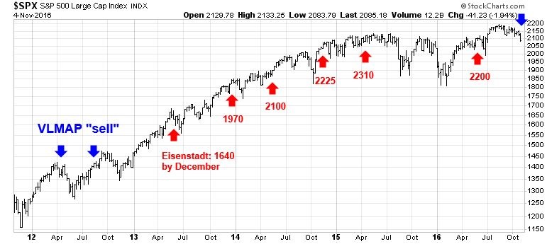
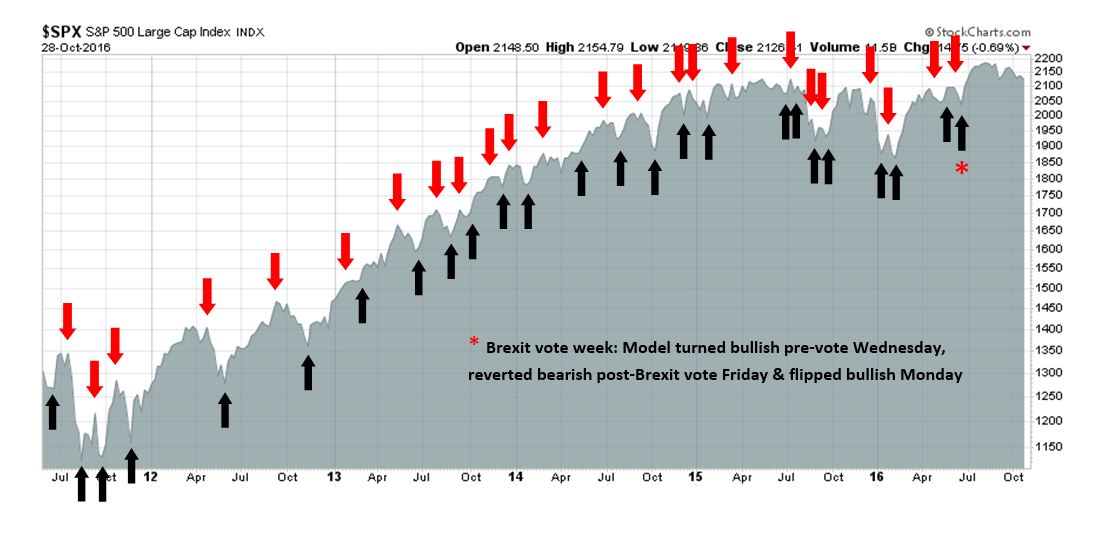
My inner trader uses the trading component of the Trend Model to look for changes in direction of the main Trend Model signal. A bullish Trend Model signal that gets less bullish is a trading “sell” signal. Conversely, a bearish Trend Model signal that gets less bearish is a trading “buy” signal. The history of actual out-of-sample (not backtested) signals of the trading model are shown by the arrows in the chart below. Past trading of the trading model has shown turnover rates of about 200% per month.
The latest signals of each model are as follows:
- Ultimate market timing model: Buy equities
- Trend Model signal: Risk-on
- Trading model: Bearish (downgrade)
Update schedule: I generally update model readings on my site on weekends and tweet mid-week observations at @humblestudent. Subscribers will also receive email notices of any changes in my trading portfolio.
Dark clouds on the horizon
Regular readers know that I have been bullish on stocks for much of this year, but I am now going on “recession watch”. Josh Brown agrees. He tweeted the following last Thursday:
While Brown may have gone on “recession watch” for contrarian reasons, I am on “recession watch” because of a deterioration in macro data. But don’t panic. A “recession watch” is emphatically not a forecast of an impending slowdown, nor is it a forecast of an imminent bear market. Macro readings are starting to look a little wobbly and therefore some caution may be warranted. The scenario that I outlined before of a cyclical top in 2017 is playing itself out (see Roadmap to a 2017 market top).
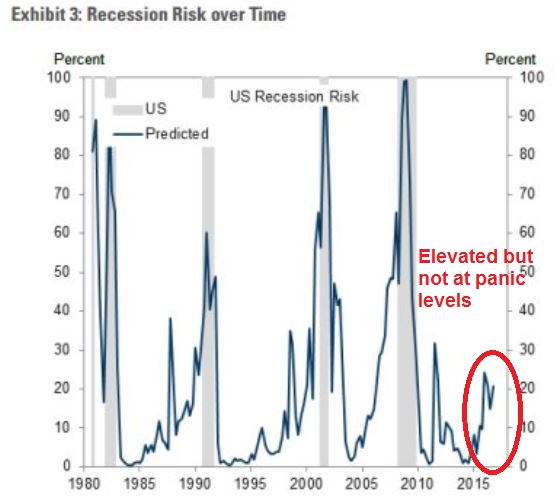
The chart below shows Goldman Sachs’ depiction of US recession risk. While I don`t necessarily agree with Goldman`s probability estimates, I do agree that risks are rising but they are not at levels that warrant a full-scale defensive portfolio position (annotations in red are mine).
This week, I would like to expand on the threats that faces the US and global economies, and by implication the stock market. I would further point out that the data began to deteriorate before the election and my change in view has little to do with the electoral results. Only one of the Trump proposals have an unexpected side-effect of exacerbating the downside vulnerability of the global economy in a downturn, but that effect is relatively minor.
Wobbly data
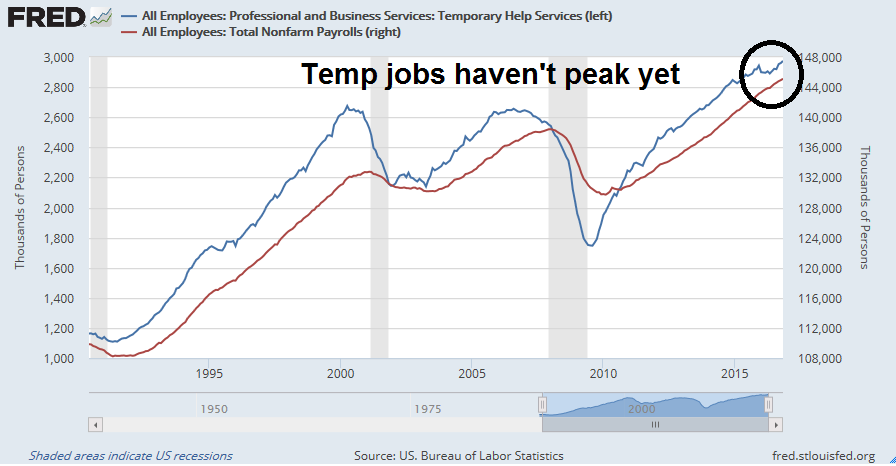
I started getting worried when Dwaine Van Vuuren sounded warnings about the labor market. He pointed out that the trend in online help wanted ads have deteriorated, though the weakness has stabilized.
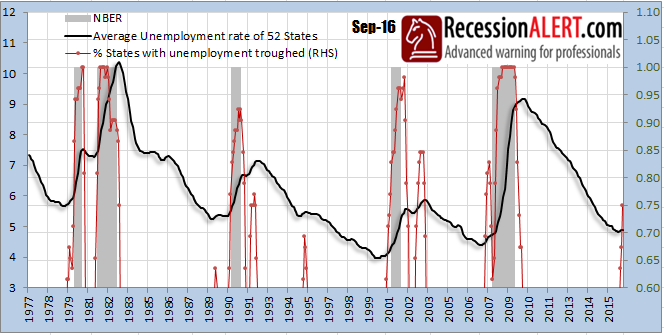
Even though initial claims and non-farm payroll figures show a relatively upbeat picture, a diffusion index of the number of states with unemployment rates higher than the lowest, or best, value seen in the expansion to date provides a somber look. Readings are not at levels seen in past recessions, but they are rising and they are warning that this expansion is very long in the tooth.
Independent of Van Vuuren’s work, New Deal democrat also warned about wobbly macro data. NDD reviewed his suite of long leading indicators and found that a number of them were starting to turn down. Most notably, he fretted about the negative effects of rising bond yields and their dampening effects on the cyclically sensitive housing sector.
So, to summarize:
- There is only two outright negatives: the labor market conditions index, and credit conditions.
- Positives include corporate bond yields, real money supply, and the yield curve, and 2 of 3 real retail sales measures, although corporate bond yields are not far from turning negative.
- Several series — housing and corporate profits — are too mixed to be scored either positive or negative. UPDATE: with October’s data, housing can still be scored a positive.
Enough of these metrics have made recent peaks that, for the next several quarters, growth should continue. Beyond next summer, however, the picture is simply too mixed to make a call. Much depends on whether the recent spike in interest rates continues, and causes the housing market to roll over, or whether last summer’s post-Brexit lows in interest rates finally show up unambiguously in new post-recession highs in housing construction. UPDATE: they just did! So it is not out of the question that I could turn negative on Q4 of next year depending on data between now and the end of the year. UPDATE: I will still withhold judgment on Q4 of 2017, but Q3 now looks positive.
The analysis from both Van Vuuren and NDD both point to the same conclusion. Conditions have deteriorated sufficiently that some caution is warranted. However, there is no need to panic as a downturn is not imminent.
Modeling recessionary effects
For equity investors, recessions can be devastating to stock returns. They are periods when the excesses built up in the previous boom are unwound. There is a key difference in this cycle. Should the US economy slow, there are few excesses to unwind outside of some overvalued unicorns in Silicon Valley. A slaughter of unicorns, on its own, not enough for the economy to tank into recession.
As per JPM Asset Management, household balance sheets are in good shape:
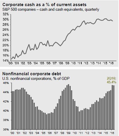
Corporate leverage has risen, but interest rates are low and a high level of cash should cushion any negative impacts of any downturn.
What’s different with this economic cycle is that the excesses are to be found outside the US. A US downturn could therefore become the catalyst for a global synchronized recession, or the proverbial last straw that breaks the camel’s back.
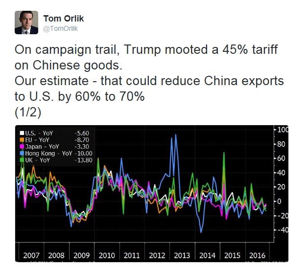
Rising vulnerability in China
Consider the sources of vulnerabilities posed by global excesses, starting with China. By now, we’ve all heard the stories about China. The white elephant infrastructure projects, the debt buildup, and the tales of impending doom are well known (see How much “runway” does China have left? and How bad could a China banking crisis get?).
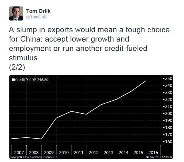
As the chart below shows, while debt levels are well under control in the US and other developed markets, they have been growing exponentially in the emerging markets, and particularly in China. Michael Pettis nailed it when he wrote that China has the unenviable policy choices of more debt, more unemployment, or more transfers to households that gores the ox of established interests and party cadres.
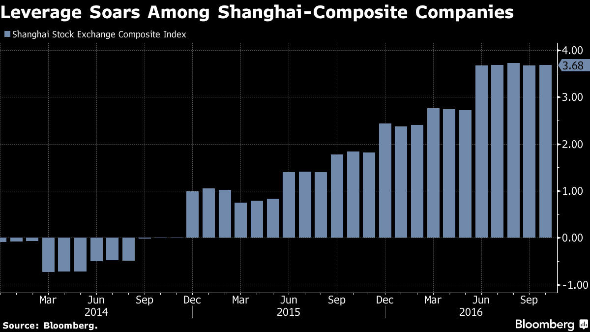
Meanwhile, financial leverage in Shanghai Composite listed companies is soaring.
Bloomberg recently reported that some Chinese banks are seeing their loan-to-deposit ratios rise above 100%. A loan-to-deposit ratio of over 100% exposes a bank to the wholesale funding market, which can be fickle. As long as growth is healthy, there is nothing to worry about. Should the economy hit a speed bump, conditions such as excess banking leverage only serves to exacerbate downside volatility.
One of the steps that the Chinese authorities have taken to dig themselves out of their debt hole is to gradually reduce moral hazard. The South China Morning Post recently reported that the Beijing has taken steps to rein in excessive credit by state owned enterprises (SOEs) and local authorities. While these steps can reduce financial risk in the long term, they also heighten default risk in an over-leveraged financial system in the short-term:
The Ministry of Finance has withdrawn “implicit support” for the debt of entities linked to regional governments, making it clear that state-owned enterprises will not be in a position to benefit from a provincial government bailout.
“The debt of enterprises owned by local governments, including financing vehicles, is not government debt,” the Ministry of Finance said in a statement released on Friday, “local governments will not assume responsibility for repayment of these borrowings.”
Any outstanding borrowings that don’t meet the strict definition of local government debt from January 1, 2015 must be repaid by the entities that raised the funds, the statement said.
Bloomberg also reported that one of the steps is to allow the trading of credit default swaps (CDS). There is just one teensie weensie problem with that initiative:
Just who, asks Goldman Analyst Kenneth Ho, is selling CDS protection on Chinese corporates?
Credit-default swaps represent a binary bet on a company’s creditworthiness, with the buyer of protection paying premiums to a protection-seller in return for an insurance-like payout should the bonds sour. In the event of a dramatic increase in Chinese corporate defaults, protection sellers could be on the hook for significant payouts. And while the Chinese government is clearly keen on transferring credit risk through the use of such instruments, one wonders just who they are transferring risk to.
“Although such products will provide lenders with a tool to hedge their credit exposures by purchasing CDS protection, it is unclear who will be the seller of the protection, and if the sellers are other financial institutions, the credit risks are merely transferred to other parts of the financial sector,” writes Ho.
Just imagine. Start with a lots of leverage in a financial system, withdraw central government protection for SOEs and local authorities, and then allow the speculative trading of CDS contracts. What could possibly go wrong?
Notwithstanding the risks of rising American tariffs and a trade war with the Trump administration, all of these measures add to downside volatility should the Chinese economy slow dramatically. So far, this is just a “this will end badly” story, with no obvious trigger. So don’t panic – yet.
Europe: It’s not just Deutsche Bank
The other major point of global vulnerability is Europe. Steve Eisman was recently quoted in Bloomberg as being worried about European banking system:
Steve Eisman, a fund manager at Neuberger Berman Group who was profiled in “The Big Short,” says Europe still faces the risk of a financial crisis like the one portrayed in the book while the probability of such an event in the U.S. is very low.
“So much leverage in the United States has been taken out of the financial system,” Eisman said on Bloomberg Television on Wednesday. “I don’t think you can say the same thing about Europe, unfortunately.”
The recent hiccup in Deutsche Bank is just a good example of the vulnerability of the European banking system. While the American banking system has addressed many of the excessive leverage problems in the wake of the Great Financial Crisis, many European banks are still sporting leverage ratios of 30x and 40x. In other words, the excesses of the last crisis have not yet been repaired!
The chart below comes from the NYU Stern School’s V-Lab, which modeled a worst case analysis of a banking system’s systemic risk by country. A significant number of European countries are at risk of losses amounting to 4% of GDP or more should the region encounter a banking crisis.
The Trump effect
What about the election of Donald Trump? What effect will have have on the US and global economy? After all, the Trump budget proposals are expected to be stimulative, business friendly, and reflationary? Shouldn’t that forestall an economic downturn?
Jan Hatzius of Goldman Sachs believes that the Trump proposals are positive for America, but negative for the rest of the world (via Business Insider):
In his 2017 outlook, Jan Hatzius, chief economist at Goldman, laid out just what he and his team expect the effect of Trump’s policies as president will be on the global economy.
Hatzius examined the key Trump policy proposals — higher tariffs on trade, curbing illegal immigration, increased federal stimulus, tax cuts for corporations and Americans — and found that while the plan would give the US a short-term bump in GDP growth, it would be a drag on global growth.
“This has negative spillover effects on other economies, especially in EM economies with partially fixed exchange rates or dollarized economies,” Hatzius wrote to clients in the outlook on Wednesday. “The reason for the greater impact there is that the Trump agenda is likely to result in higher US interest rates and therefore a stronger dollar.”
Essentially, lower imports to the US and a stronger dollar from Federal Reserve rate hikes, combined with higher servicing costs for debt held in dollars, would curtail economic activity, especially in emerging markets, and drive global GDP lower than it would be otherwise.
Trump might Make America Great Again, but at a price to non-US economies. Bloomberg recently highlighted an unexpected side effect of Trump’s proposal of a tax holiday for companies to repatriate offshore cash. Combined with the uncertainties of American relationships with other major global central banks, it could create a USD shortage, which would have the effect of tightening credit and raising financial stress levels in offshore USD liquidity.
Trump’s plan to repatriate corporate profits to the U.S. could take a chunk out of the world’s available dollar funding, since as much as $2 trillions’ worth of corporate earnings currently sit outside country, according to Deutsche Bank’s estimates. “A U.S. corporate tax holiday or even a simplification of the tax code to encourage repatriation would be most likely to impact the availability of dollar liquidity for European banks, where most U.S. corporate earnings have been re-invested,” the analysts wrote.
While scarce dollar funding could be combated by central banks aiming to ease strains in the bowels of the financial system, Trump’s populist rhetoric puts the availability of dollar swap lines from the Federal Reserve in doubt, according to Deutsche Bank. Such dollar swap lines, in which central banks agree essentially to swap currencies with each other, saw the Fed provide some $600 billion worth of dollar liquidity during the 2008 financial crisis.
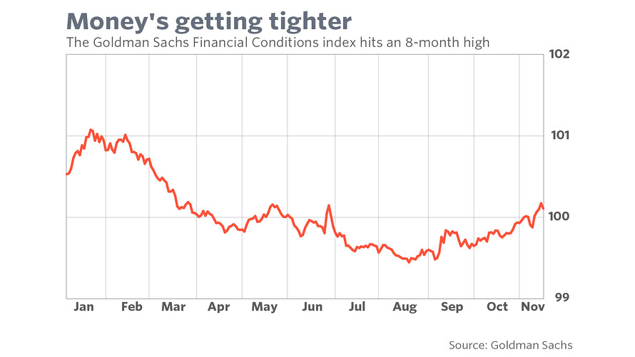
Already, we can see the Goldman Sachs Financial Conditions Index racheting upwards, which reflects a higher cost of USD funding. This is the picture of how a credit squeeze starts.
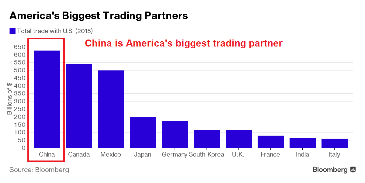
All this, and we haven’t even discussed the downside of protectionism, which history has shown that China has been quick to retaliate should a trade war break out.
Peering into 2017
Consider the following (best case) scenario for 2017. Soon after his inauguration, Trump goes to Congress with his budget proposal to slash taxes and revive growth with infrastructure spending. Assuming that the Republican controlled Congress cooperates, which is a big “if” as the GOP budget hawks might balk at Trump’s plans, Trump’s budget measures would get passed some time mid-year. It would then take time for the federal bureaucracy to implement those measures. The soonest that any tax cuts could start to affect the economy would be late 2017. By contrast, infrastructure spending take much, much longer. A realistic estimate would be late 2018 or even as late as 2020.
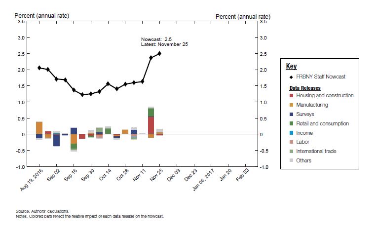
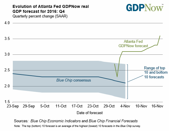
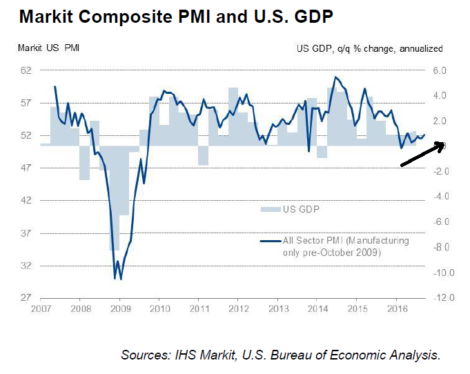
Back on Wall Street, the future looks bright in the short-term. CNBC reported that Citi estimates that the Trump tax plan could raise SPX earnings by as much as 9%. Bill McBride at Calculated Risk observed that the economy is booming (see The cupboard is full). The Atlanta Fed’s Q4 GDPnow is 3.6% and rising.
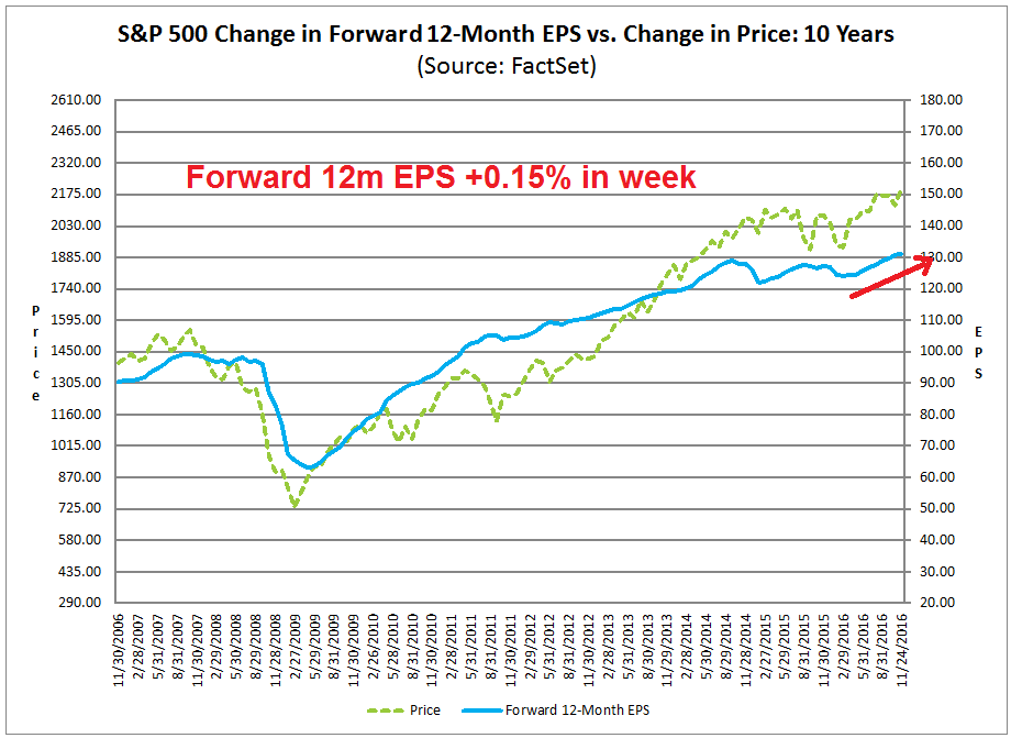
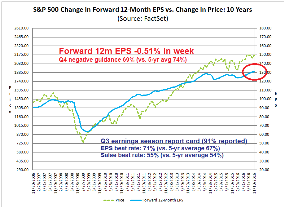
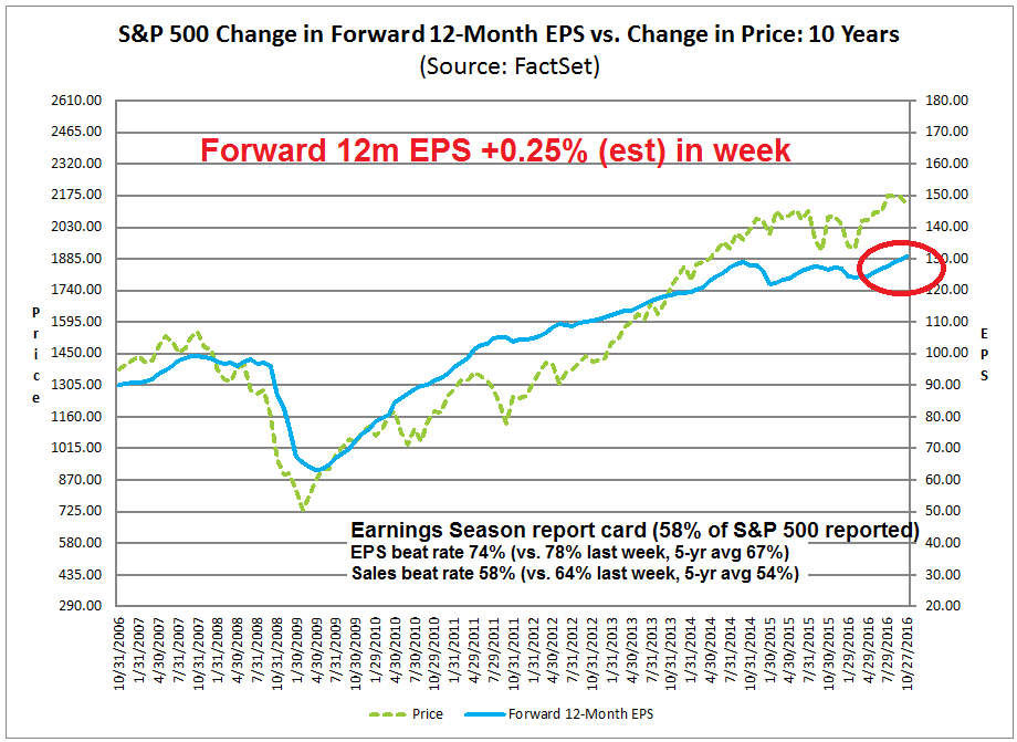
John Butters at Factset reported that forward 12-month EPS rose 0.18% last week. The decline the previous week in forward EPS appears to have been a data blip. Q4 negative guidance is also running at below average rates.
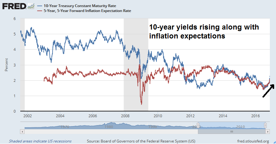
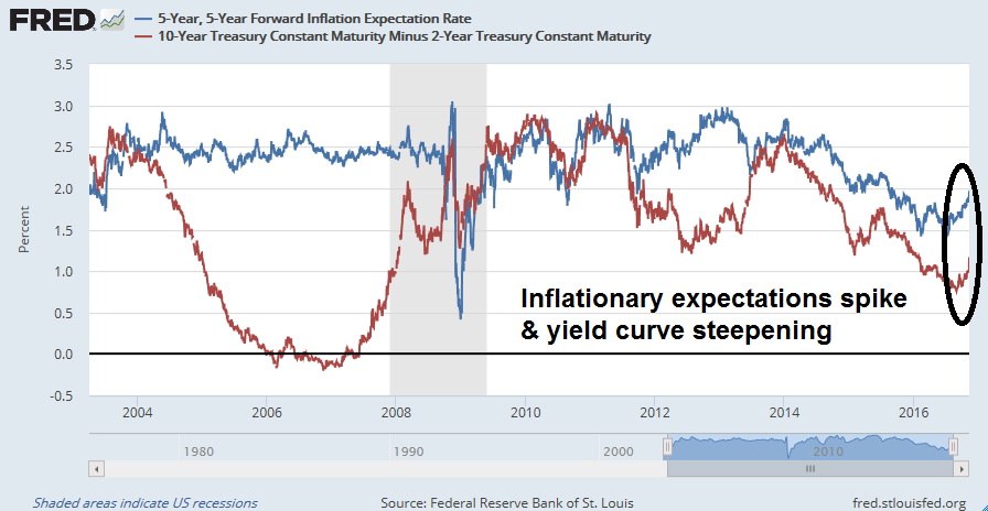
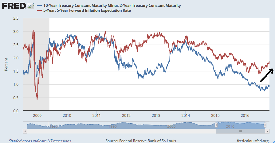
Economic growth is strong. Inflationary expectations are rising, along with bond yields. It’s time for the Fed to start normalizing monetary policy. The market expectations for a quarter-point hike at the December meeting is a virtual certainty.
We can talk all day about monetary offset, which is the practice of tighter monetary policy in the face of looser fiscal policy, but there is another wildcard. Trump’s economic advisers have also called for a normalization of the Fed’s quantitative easing policy. What happens to interest rates if the Fed passively shrinks its balance by doing nothing as its Treasury holdings mature? We can see the effects starting to hit hard in 2018.
The macro indicators monitored by Dwaine Van Vuuren and New Deal democrat are already starting to look a little shaky. As 2017 progresses, they will likely wobble further as interest rates rise. How long before the Fed tightens the economy into recession even with a fiscal stimulus package?
Bear market now, or later?
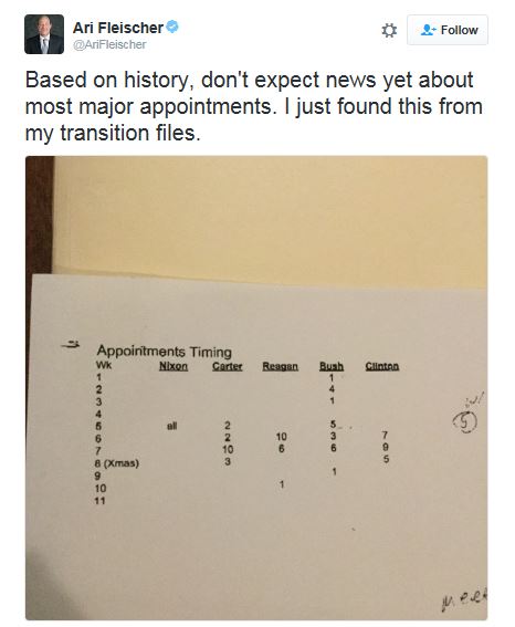
The timing of these developments are still highly uncertain. As I write these words, the Trump has not even announced his full cabinet appointments. Ari Fleischer, former press secretary to George W. Bush, observed that these delays are not unusual at all. The cabinet of the incoming administration is typically not totally assembled until mid-December.
Based on Trump’s stated desire for a major stimulus plan, we may not see the recession until 2018. However, the president-elect may be better served politically to allow the recession to occur in 2017 so that he could label it the “Obama recession”. Much depends on the interaction between growth and inflationary expectations in 2017 and the Fed’s reaction function.
Investment implications
Under these circumstances, the prudent course of action to go on “recession watch”. My Ultimate Market Timing Model calls for long-term investors to remain long equities. It’s time to rely on the Trend Model to take them out of their equity positions should the macro trend falter.
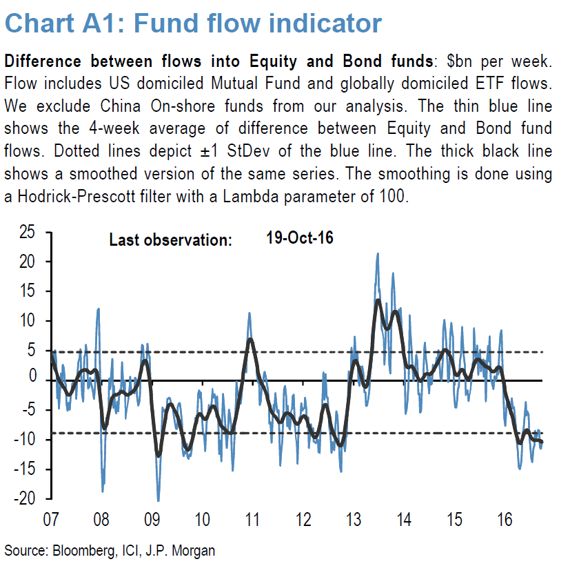
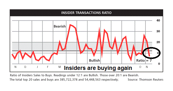
I remain constructive on the outlook for stocks for the remainder of 2016 and early 2017. Investors have been piling into bond funds at the expense of equity funds for much of this year. Now that bond prices have gotten clobbered and equities have rallied, fund flows will inevitably follow performance and greater commitment into equities are highly likely for the next few months. Long term investor sentiment is cautious, we need to see more bullishness before a top can be formed.
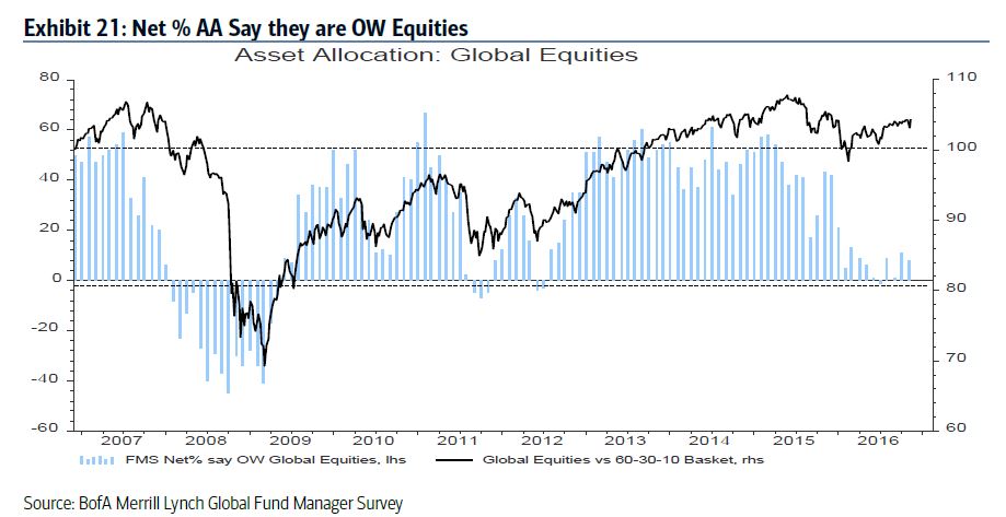
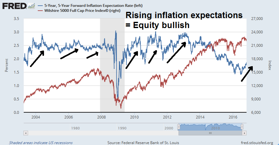
The latest BAML Fund Managers Survey shows that growth expectations are rising.
Inflation expectations have shot up in the wake of the Trump win.
But managers are only neutrally weighted in equities, which gives them more room to buy should macro and fundamental factors continue to strengthen.
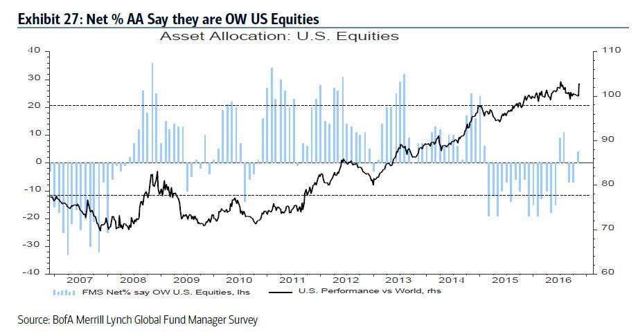
In the US, equity weights are only at a neutral level.
As we approach year-end, investment and hedge fund managers are subject to what Josh Brown called “the career risk” trade as equities rally and they scramble for returns. The WSJ reported that a number of major hedge funds with poor performance are benefiting from market moves in the wake of Trump’s electoral win. If the stock market continues to run, these funds could turn returns from flat to negative into positive.
Brevan’s latest letter to investors shows the fund was positioned to benefit from a rise in the U.S. dollar and from falling European currencies. The fund also benefited from spikes in bond yields, said a person familiar with the matter.
The gain means the fund, which has already recorded two consecutive calendar years of losses in 2014 and 2015 and which has seen billions of dollars of redemptions from investors, is now down just 0.7%, having been down 3.4% at the end of September.
Another macro hedge fund, London-based Rubicon, was down almost 18% this year through early November, according to performance data reviewed by the Journal. But it has surged by around 10% last week, said two people who had seen the numbers. The fund made money from bets on rising bond yields, said one of the people. A spokesman for Rubicon declined to comment.
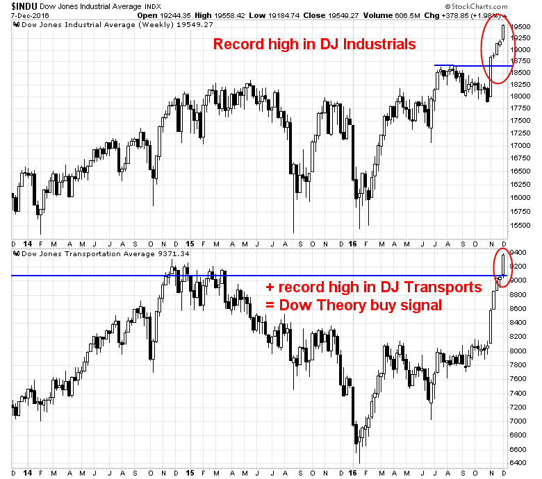
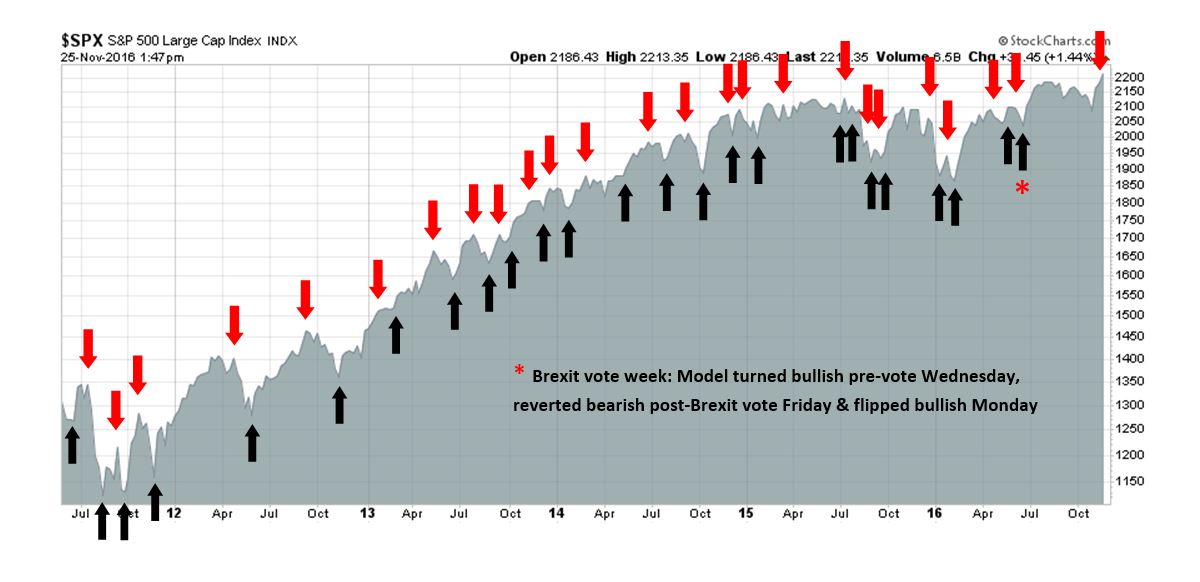
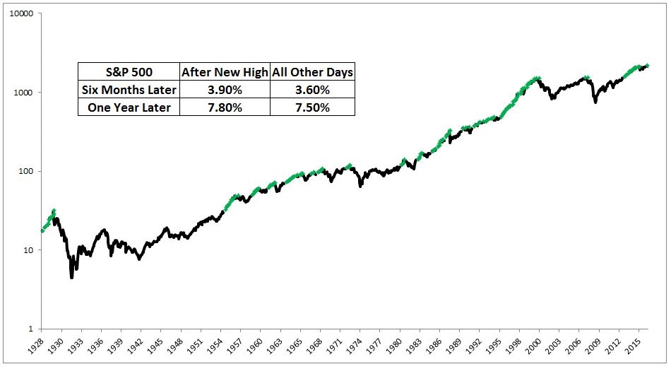
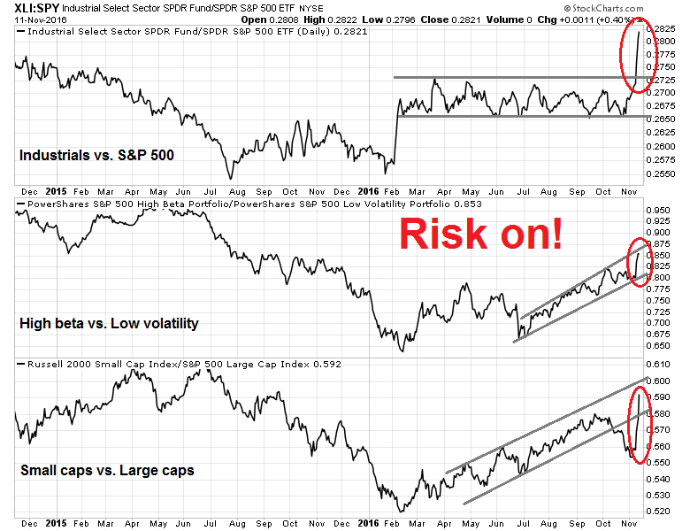
The DJIA, NASDAQ Composite, and Russell 2000 have all reached record highs, which are bullish signs indicating momentum sponsorship. With fundamental and macro factors looking positive, it bodes well for stock prices for the rest of this year.
The week ahead: Watch for choppiness
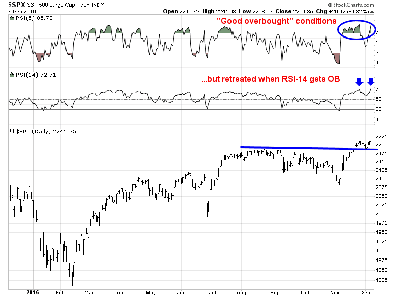
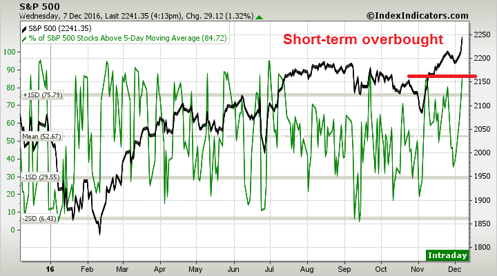
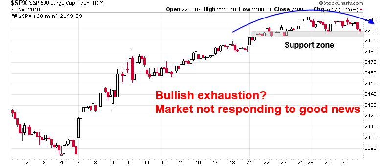
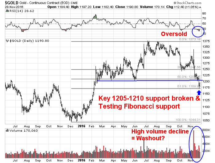
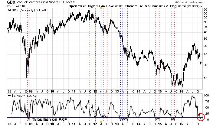
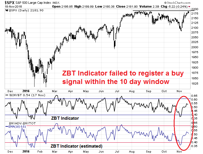
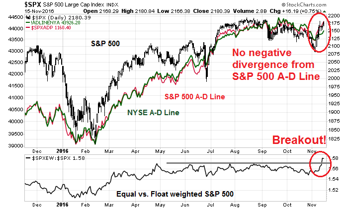
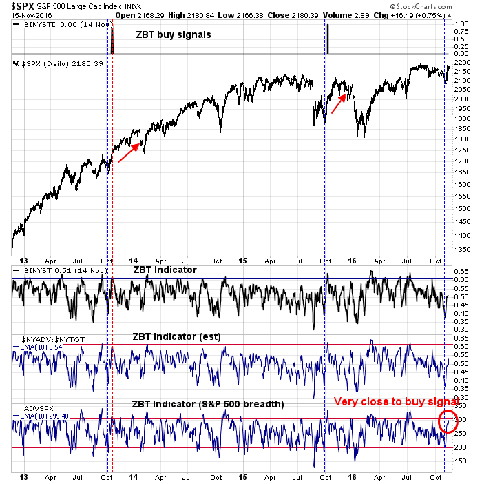
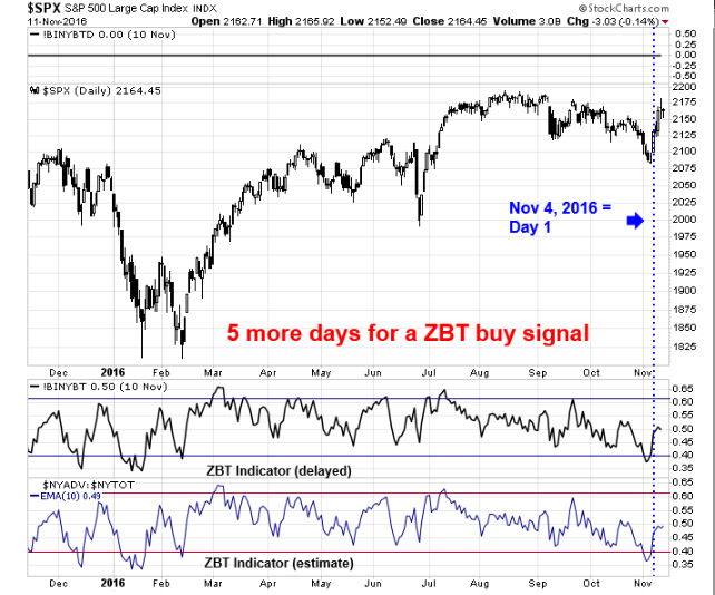
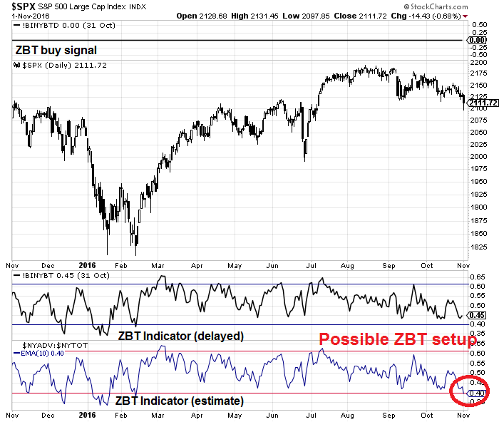
From a trader’s perspective, however, the stock market’s recent advance may have gotten a little ahead of itself. The market’s failure to flash a Zweig Breadth Thrust buy signal by the deadline on Friday was a disappointment for price momentum bulls (see Don’t worry about bad breadth, NYSE edition).
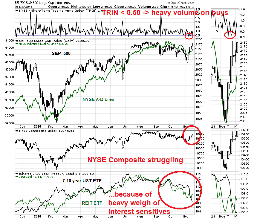
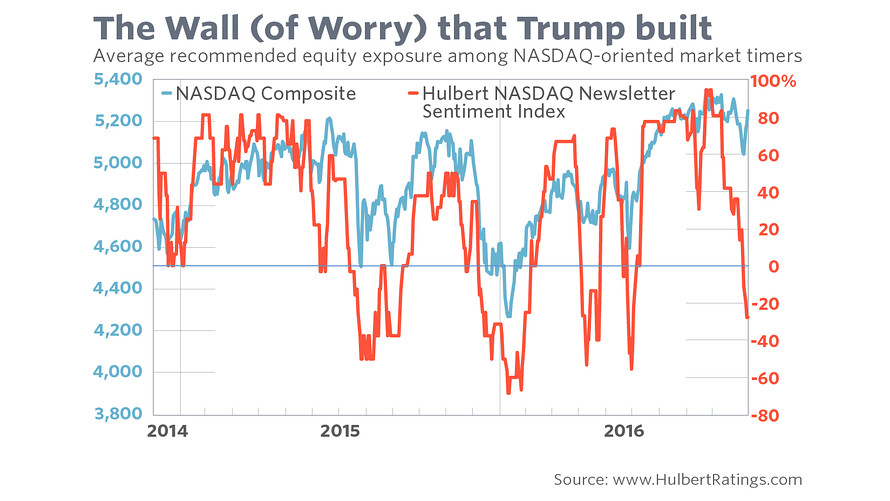
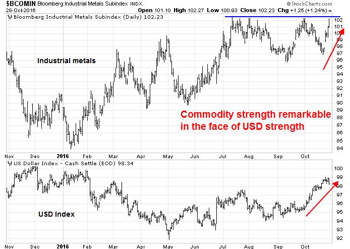
Already, we are starting to see signs of reversals in other markets, which is a worrisome sign from an inter-market, or cross-asset, analytical viewpoint. Mark Hulbert point out that bond bearishness got to an extreme and it is starting to reverse itself.
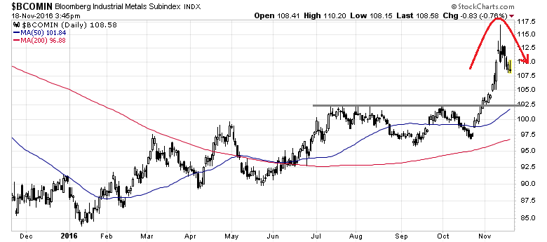
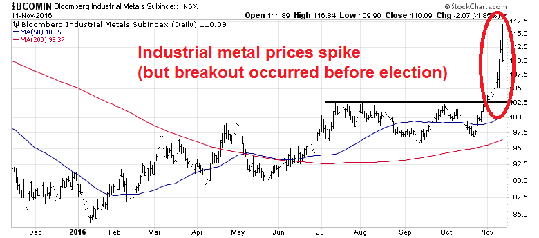
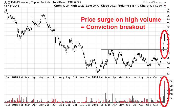
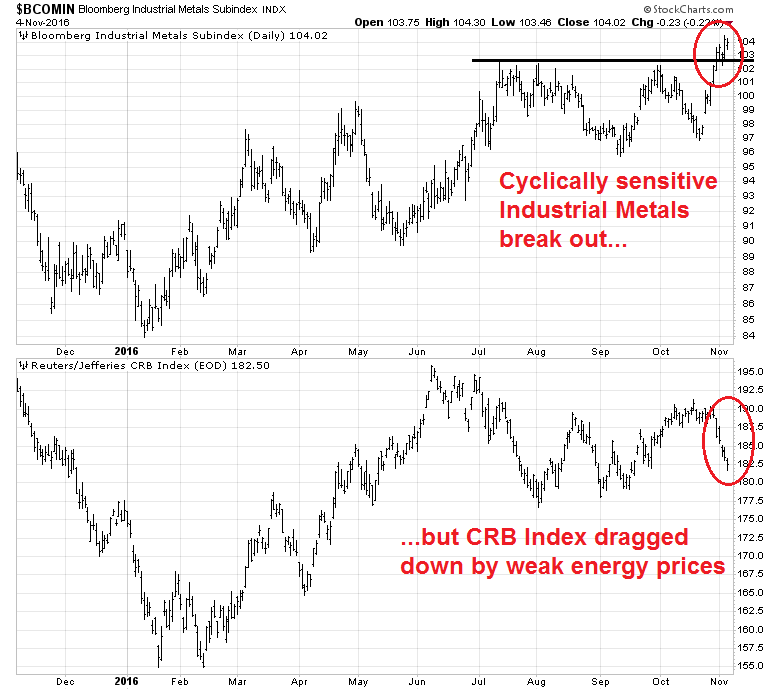
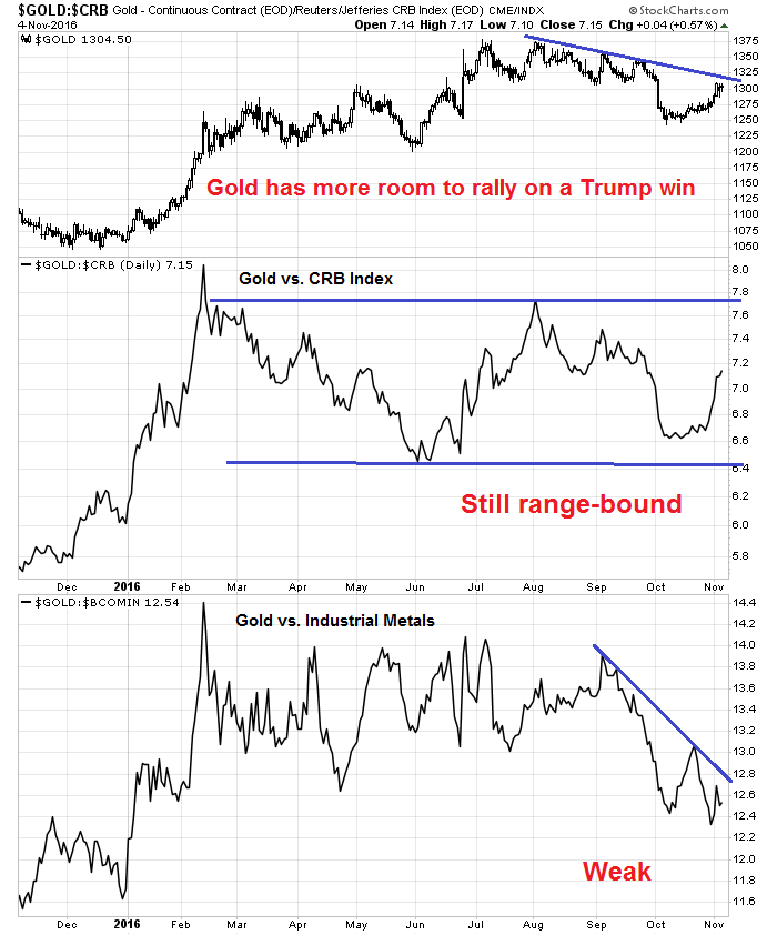
Industrial metal prices spiked in anticipation of better demand from Trump stimulus, but they have retraced some of their gains. Don’t be too surprised if stock prices follow suit in the near future.
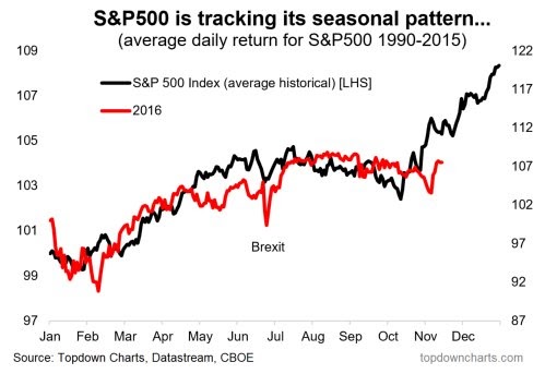
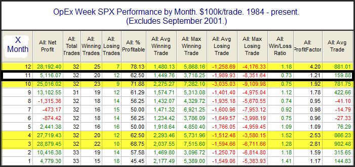
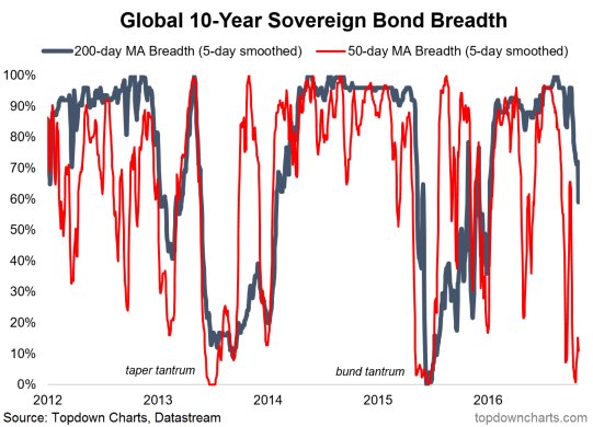
On the other hand, the stock market is in a period of positive seasonality (via Top Down Charts):
Next week is US Thanksgiving week. Rob Hanna, of Quantifiable Edges, showed a study of the seasonal pattern exhibited by stock prices during the week. There was no significant edge to be found on the Monday or Tuesday, but there was a definite bullish bias on the day before and after Thanksgiving.
I concur with Brett Steenbarger‘s assessment of the short and intermediate term outlook. He has become more cautious short-term:
After a number of days in moderately bullish territory, the ensemble trading model has fallen back to a reading of -1. This is very modestly bearish over a several day horizon, and I take it more as an indication of a maturing trend than as an outright bearish signal. Indeed, as we saw in the rallies off the February and late June lows, the model will often pull back as a trend matures, with the upside continuing but moderating. There has been sufficient upward thrust to the present move–note the expansion in the number of stocks registering fresh annual highs–that such a moderating scenario is my base case. With VIX back to low levels and volume tailing off as we approach holiday season, I anticipate narrower trading ranges going forward–a change from the volatile action we saw after the election.
However, he sees further upside potential in the weeks ahead:
With considerable cash on the sidelines, we could see a move out of bonds and into stocks, which would be supportive of continued market strength. Interestingly, my model of sentiment, which looks at a “pure” put/call ratio with recent price movement and volatility stripped out, has remained above average in bearishness. It is not clear to me that, despite the vigorous stock rally, that sentiment has become over-the-top bullish.
My inner investor remains constructive on equities, and he is monitoring how macro and fundamental conditions evolve. Subscribers received an email alert indicating that my inner trader had sold out all of his long positions and moved to 100% cash. Despite the trading model`s sell rating, bullish seasonality should be respected. The prudent course of action is to take profits and move to the sidelines.