Preface: Explaining our market timing models
We maintain several market timing models, each with differing time horizons. The “Ultimate Market Timing Model” is a long-term market timing model based on research outlined in our post Building the ultimate market timing model. This model tends to generate only a handful of signals each decade.
The Trend Model is an asset allocation model which applies trend following principles based on the inputs of global stock and commodity price. This model has a shorter time horizon and tends to turn over about 4-6 times a year. In essence, it seeks to answer the question, “Is the trend in the global economy expansion (bullish) or contraction (bearish)?”
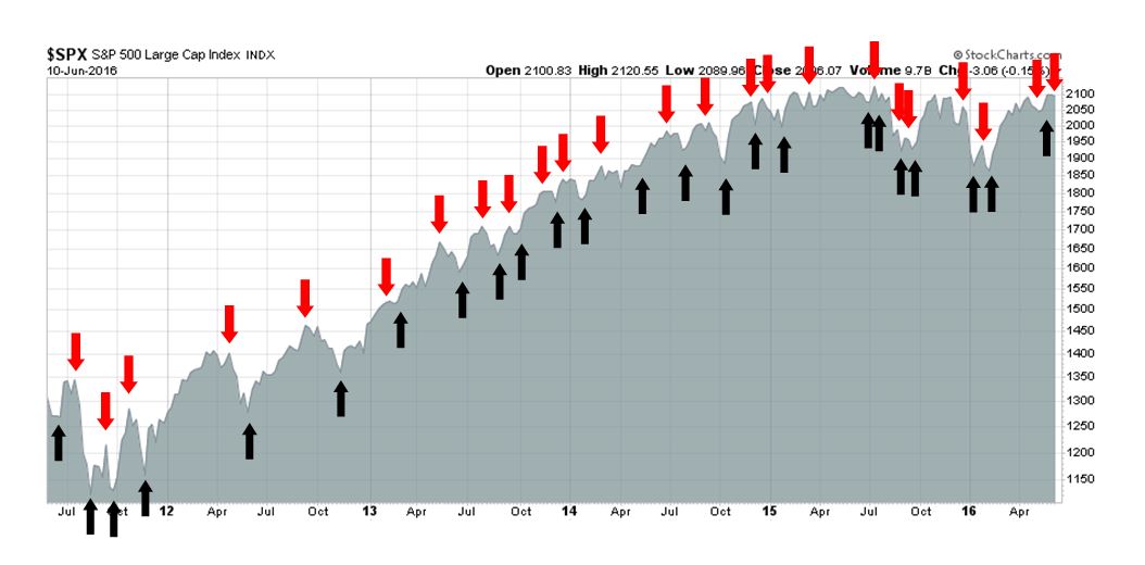
My inner trader uses the trading component of the Trend Model to look for changes in direction of the main Trend Model signal. A bullish Trend Model signal that gets less bullish is a trading “sell” signal. Conversely, a bearish Trend Model signal that gets less bullish is a trading “buy” signal. The history of actual out-of-sample (not backtested) signals of the trading model are shown by the arrows in the chart below. Past trading of the trading model has shown turnover rates of about 200% per month.
The latest signals of each model are as follows:
- Ultimate market timing model: Buy equities
- Trend Model signal: Neutral
- Trading model: Bearish
Update schedule: I generally update model readings on my site on weekends and tweet any changes during the week at @humblestudent. Subscribers will also receive email notices of any changes in my trading portfolio.
Here comes the June swoon
The market seem to be following the script that I laid out last week (see Get ready for a market of maximum frustration). I wrote that I remained bullish into year-end, but the short-term outlook was corrective. From a very short-term trading perspective, however, the tendency for the market to rise in the face of bad news like the Jobs Report, indicated that stocks needed to move higher before correcting.
The market did climb the proverbial Wall of Worry until mid-week before weakening (see my mid-week comment Adventures in Option-Land). As the market ground higher last week, I could see the bears starting to capitulate and sentiment gauges becoming more bullish, the major indices topped on on Wednesday. The market narrative then changed to focus on the deteriorating macro outlook. Indeed, the Citigroup Economic Surprise Index, which measures whether macro data is beating or missing consensus estimates (gold line in chart), is turning down again.
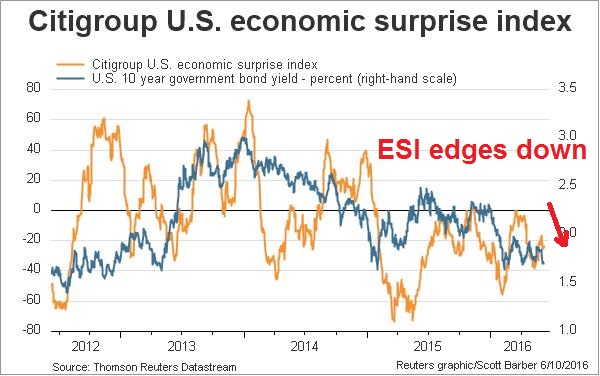
It’s time for stocks to pay the macro piper. However, these indications of weakness are temporary. Once the growth fears clear, stock prices should recover and push to new highs later this year.
The recession calls
Recently, we have seen several recession calls from the Street. First, there was the news of rising recession risk from the JP Morgan model.

Albert Edwards also issued another one of his imminent recession alerts (via Business Insider):
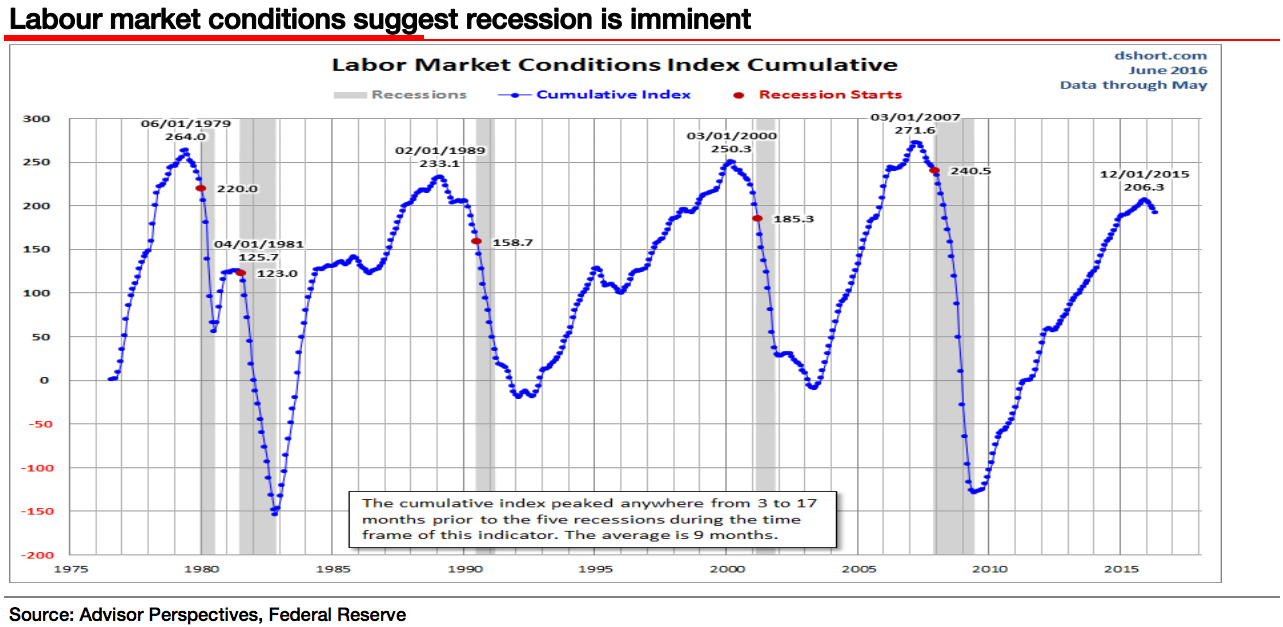
In the aftermath of the latest, weaker than expected, nonfarm payroll data, economists are certainly more worried. The excellent folks at Advisor Perspectives highlight the Feds Labour Market Conditions Index as suggesting a recession is imminent (the cumulative peak is an average of 9 months ahead of the start of recession and we are now four months beyond a peak. For investors who think copper still has some predictive power, its recent move is disturbing.
As Edwards has tended to be a permabear, I am not going to dignify his recession call with a rebuttal (see this Business Insider account of how he predicted doom and an SPX target of 400 in 2011).
A more serious warning came from David Rosenberg, who was freaking out over the dismal May Jobs Report (via Business Insider):
This is the biggest “miss” by the economics community since December 2013, and the worst headline since September 2010 when the Fed was more preoccupied with its next round of quantitative easing than with raising the funds rate.
Not just that, but there were downward revisions to the prior two months totaling 59,000 – something we have not seen since June of last year.
Look at the pattern; +233,000 in February, +186,000 in March, +123,000 in April and +38,000 in May. Detect a pattern here (he asks wryly)?
He went on to sound the recession alarm:
I don’t want to alarm anyone but the facts are the facts, and the fact here is simply that this is precisely the sort of rundown we saw in November 1969, May 1974, December 1979, October 1989, November 2000 and May 2007.
Each one of these periods presaged a recession just a few months later – the average being five months.
Counterpoint: A job market at full employment
Most of the recession calls were based on the awful Jobs Report, which may be problematical as it focuses on a single metric and can be said to be cherry picking data. Nevertheless, there were a number of Street analysts who interpreted the poor employment picture as a labor market at or near full employment, or the non-accelerating inflation rate of unemployment (NAIRU), which is good news. These analysts include Liz Ann Sonders of Charles Schwab, Ethan Harris at BoAML and Torsten Sløk at Deutsche Bank (via Business Insider). Just click on each of the links to see the full details of their analysis.
Remember, an economic recession represents broad-based weakness on many fronts, not just a single indicator. So it’s important to look for confirmation of weakness from other macro variables.
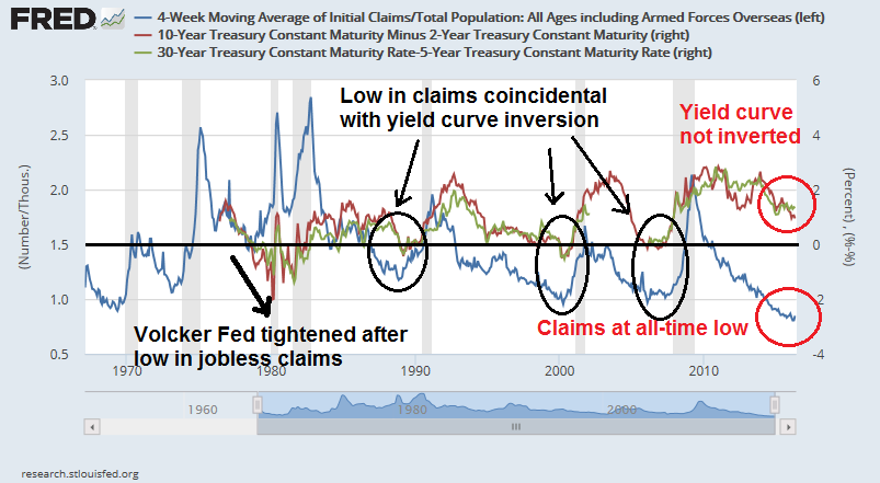
Consider, for example, initial claims as a proxy for the employment picture and how it has behaved along with the yield curve, which has been a sure-fire recession indicator in the past. As the chart below shows, recessions have followed occasions when initial claims (blue line) has bottomed out and started to rise. Initial claims are now at an all-time low. If the labor market is indeed deteriorating, then initial claims should start to rise soon. Further analysis showed that lows in claims have coincided with periods of yield curve inversion (circled). Only once in the days of the tight monetary policy era of the Volcker Fed in late 1970s, has the yield curve continued to invert after the bottom in initial claims. Currently, the yield curve, regardless of how it’s measured (2/10 or 5/25), is not inverted. This divergence casts doubt about whether a recession is imminent.
I have also plotted initial claims against ISM Manufacturing and ISM Services, which are also indicators of economic strength and weakness. As ISM readings above 50 are considered to be expansionary and below 50 contractionary, I normalized ISM by subtracted 50 to make the zero line as the delineation between expansion and contraction. As the chart shows, ISM has tended to flash more recessionary signals, some of which were false (see circled past divergences). Currently, ISM Manufacturing dipped into contractionary territory and started rising again, while ISM Services, though weak, is still in expansionary mode. This is another divergence that argues against a recession call based on the employment picture.

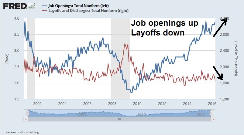
The JOLTS report was helpfully released last week, which provided another window into the labor market. If the job market is so bad, can someone tell me why job openings are rising and layoffs are falling?
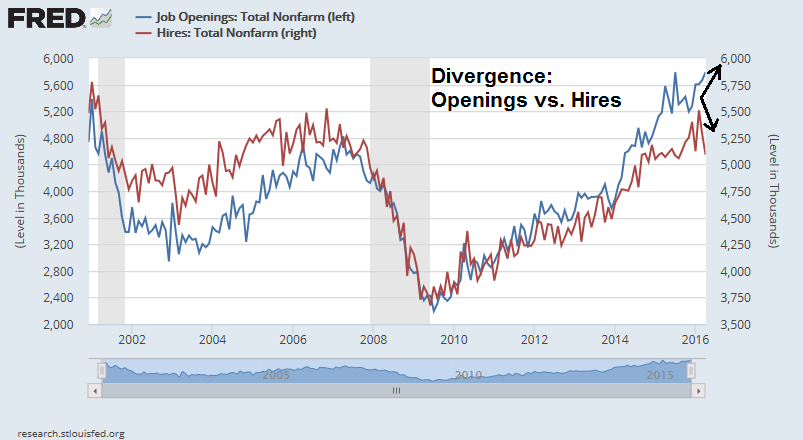
Why are job openings rising while hiring is falling?
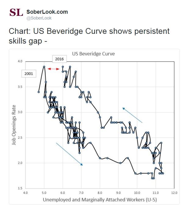
The more likely explanation is a skills gap, as explained by the Beveridge curve (via Sober Look).
Indeed, the Atlanta Fed’s Wage growth tracker shows a median wage increase of 3.4%, which is well above the Fed’s 2% inflation target. Wage hikes above the inflation rate (and inflation target) seems to be a sign of a tight labor market.
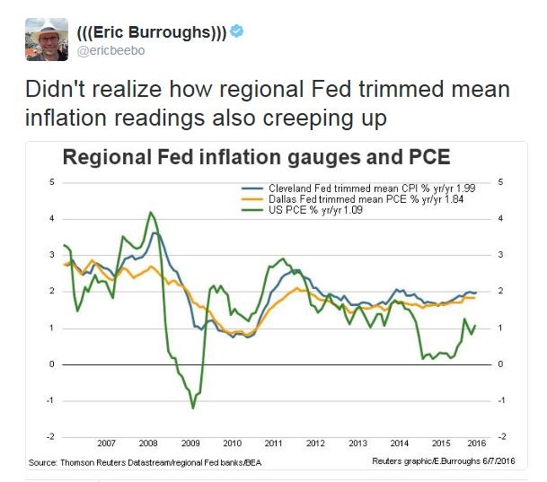
This analysis leads me to conclude to side with the labor market at full employment, or NAIRU, camp. In the past, labor markets at NAIRU have coincided with rising inflationary pressures. Indeed, Eric Burroughs pointed out that regional Fed inflation metrics have started to creep up and they are nearing the Fed’s 2% inflation target.
A market friendly Fed
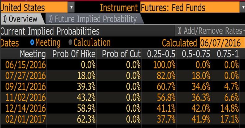
Despite these signs of rising inflationary pressures, the WSJ pointed out that the latest University of Michigan survey showed that long-term inflationary expectations fell to an all-time low. This latest data point will undoubtedly create further debate within the FOMC, about whether inflationary expectations are becoming unanchored to the downside (see my post What I learned about Fed policy this week about Ben Bernanke`s comments about the Phillips Curve). As the debate continues over the next few months, the FOMC is likely to stay on hold until these issues are resolved.
In the meantime, the latest speech from Janet Yellen pushed probability of the next rate hike, which I define at the as being above 50% as a threshold, out to December.
At the same time, growth is returning despite the recession scare. New Deal democrat‘s weekly assessment of high frequency economic releases is projecting a return to economic growth in the months ahead:
When all but one of the few negatives are among coincident indicators and both long and short leading indicators are uniformly positive to neutral, we should expect improvement in the months ahead.
In addition, the Street is projecting more growth. The latest update from John Butters of Factset shows that forward EPS estimates are rising again after a brief growth hiccup.

An easy Fed and more growth – what more can the stock market ask for?
Dueling gurus
The markets may also have been spooked by the WSJ article about how George Soros was stepping back into his firm and his bearish stance, citing the his concerns over China and Europe as reasons for his negative outlook.
While Soros is unquestionably an investment legend, his calls have not always been infallible. This Bloomberg article details some of his most recent hits and misses over the last few years. The WSJ article also prompted reminders of how many times journalists have published “Soros is bearish” stories in the past.
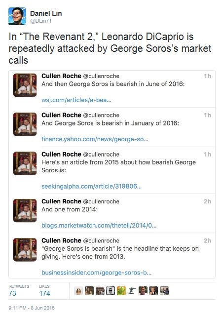
The moral of this story: Investing is a business with a low signal-to-noise ratio. Even gurus can be wrong.
By contrast, Mark Hulbert highlighted the views of another investment guru, retired Value Line research director Sam Eisenstadt, whose market forecasts have tended to be far more right than wrong – and the consistency of his forecasts are statistically significant, which is a test that few market analysts can pass. Hulbert went on to detail that the last Eisenstadt forecast, which was made in December, called for an SPX target of 2050 by the end of June:
Though the last six months are just one data point, his model has been more right than wrong over the last half-century, according to results of statistical tests that Eisenstadt has shared with me.
Eisenstadt’s latest SPX target for year-end 2016 is 2220, which represents a modest gain from current levels and it is at the lower end of my estimate of 2200 to 2400 for the index. The Eisenstadt forecast is also consistent with the daily SPX point and figure upside objective of 2219.

A mild pullback
Last week, my inner trader believed that the prudent course of action was to start scaling out of his long positions near the highs (see Adventures in Option-Land), which he did, and keep tight stops. He flipped from his remaining long position to a short on Friday (see tweet here).
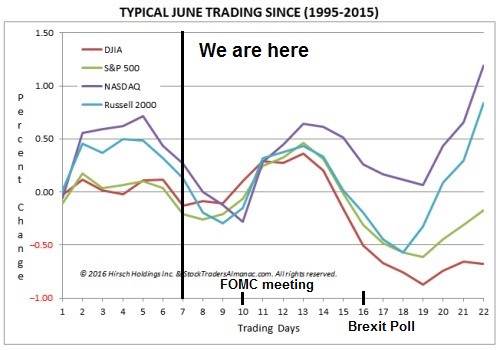
Looking to the week ahead, most of the downside damage may have already been done if the historical June trading pattern depicted by Jeff Hirsch repeats itself. There will be two key events in June with unpredictable binary outcomes, namely the FOMC meeting next week and the Brexit referendum on June 23. If I were to take a wild-eyed guess (and remember it’s only a guess), the trading pattern identified by Hirsch is consistent with a scenario of a positive surprise at the FOMC meeting, followed by a declined caused market anxiety over the Brexit referendum and a relief rally based on a Remain outcome. Barring any big surprises from the FOMC meeting, the most likely scenario is a sloppy range-bound market until the Brexit question gets resolved.
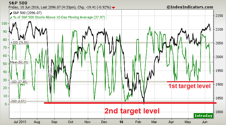
From a technical perspective, the latest breadth readings from IndexIndicators show that the market is rapidly approaching a minor oversold condition based on the net 20-day highs-lows.

…and % of stocks above the 10 dma. These readings are supportive of the thesis that the correction may be nearly over.
My mild pullback scenario calls for an initial target level of about 50 on the Fear and Greed Index, which has retreated rapidly from an overbought reading.

My inner investor thinks that this is all noise and he is preparing to add to his equity positions next week should the market significantly weaken. My inner trader is intensely watching the market action and he is preparing to take profit and cover his short position should readings become oversold. In all likelihood, the SPX decline will stop at support at about the 50 day moving average level of 2076.

Disclosure: Long SPXU
My modest bit’s worth: Friday’s high volume down promises a rebound, and the A-D change out of proportion to the S&P 500 change suggests perhaps that smart money is buying nearly as fast as others are selling.
That’s why I think downside risk is relatively limited here. We should get decent support at the 50 dma.
Hi Cam Hui, in your opinion if Brexit occurs what would happen to asset prices afterwards? Is this a clear binary event of good vs bad or will it have muted effects? Thanks.
If the UK votes to leave, then you could get a significant downdraft in global asset prices. It would put into question the political stability of Britain and the EU.
The latest from Matt Singh, who is the British version of FiveThirtyEight, indicates that possibility isn`t very likely: http://www.ncpolitics.uk/uk-eu-referendum/
I’m just thinking that another terror attack on EU soil and the brexit would happen. Add to that the loss of lives and EU instability the effects are far reaching. That and I still feel that market’s starting to price in what little chance Brexit has.
I can come up with all sorts of dire scenarios, e.g. the US west coast gets hit with the Big One – what happens to NDX then?
There is no certainty in the markets. We do what we can to play the odds.
True that. I was off tangent musing at how brexit can be used by some group to disrupt the whole of EU. A single attack to break up the EU. One bad movie material right there.
Sorry back to trading, this link boosts your oversold shorter term bullish thesis further: http://quantifiableedges.com/sharp-drops-from-intermediate-term-highs-a-short-term-bullish-setup/