Preface: Explaining our market timing models
We maintain several market timing models, each with differing time horizons. The “Ultimate Market Timing Model” is a long-term market timing model based on research outlined in our post Building the ultimate market timing model. This model tends to generate only a handful of signals each decade.
The Trend Model is an asset allocation model which applies trend following principles based on the inputs of global stock and commodity price. This model has a shorter time horizon and tends to turn over about 4-6 times a year. In essence, it seeks to answer the question, “Is the trend in the global economy expansion (bullish) or contraction (bearish)?”
My inner trader uses the trading component of the Trend Model to look for changes in direction of the main Trend Model signal. A bullish Trend Model signal that gets less bullish is a trading “sell” signal. Conversely, a bearish Trend Model signal that gets less bullish is a trading “buy” signal. The history of actual out-of-sample (not backtested) signals of the trading model are shown by the arrows in the chart below. Past trading of the trading model has shown turnover rates of about 200% per month.
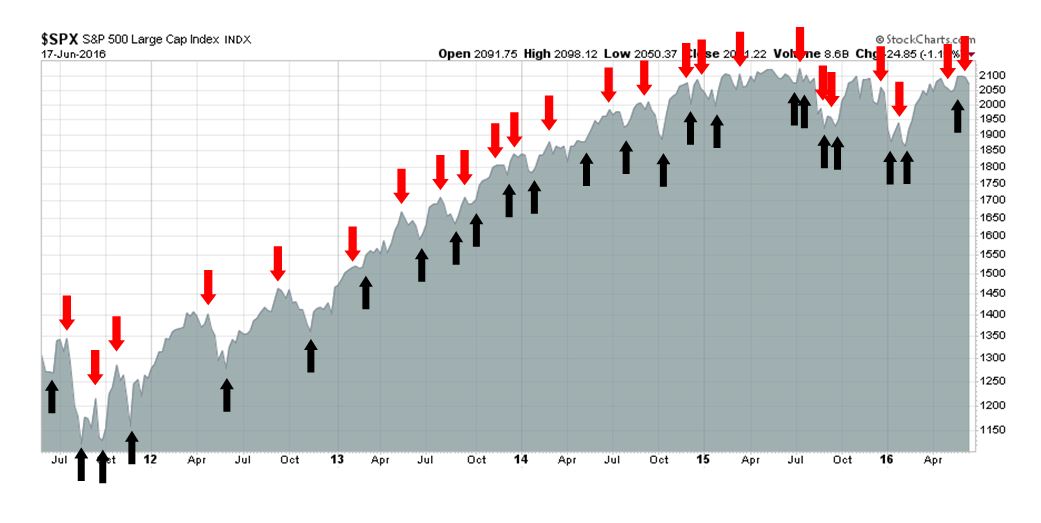
The latest signals of each model are as follows:
- Ultimate market timing model: Buy equities
- Trend Model signal: Neutral
- Trading model: Bearish
Update schedule: I generally update model readings on my site on weekends and tweet any changes during the week at @humblestudent. Subscribers will also receive email notices of any changes in my trading portfolio.
Where’s the growth?
My last post (see Why you need to give the bull case a chance) elicited a considerable amount of comment. Most of the pushback I got on the equity bull case amounted to a question of, “Where’s the growth coming from?”
I recognize the concerns. As this chart from Factset shows, the equity market has had to endure five consecutive quarters of falling year-over-year EPS growth. How can anyone possibly be bullish under such circumstances?
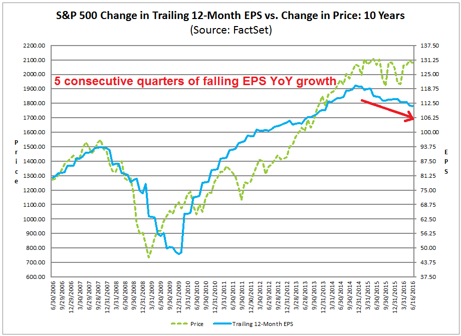
In this post, I would like to explain my bull case for stocks, with an initial SPX target of 2200 and, depending on the Fed’s reaction function, up to 2400-2500.
Backward vs. forward growth
Looking backwards in the rear view mirror, I can sympathize with many of the growth concerns. The chart below shows YoY GDP growth (blue line) and ISM Manufacturing (red line). US economic growth decelerated for most of last year and suffered a mild industrial recession in Q4 2015 and Q1 2016, from which it appears to be starting to recover.

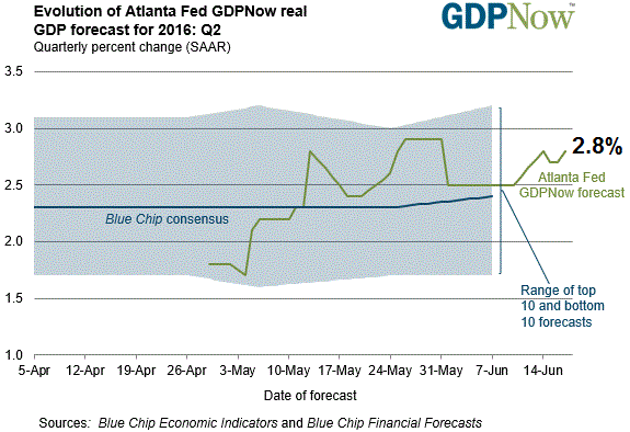
On a forward looking basis, the latest Atlanta Fed’s nowcast of Q2 GDP growth stands at 2.8%, which represents a robust recovery from the winter months.
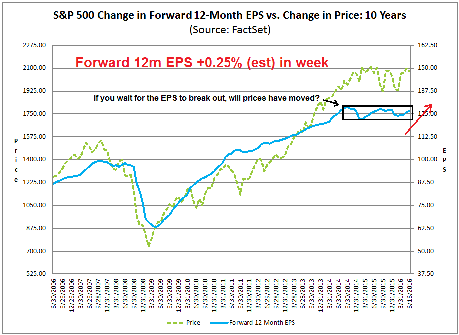
Also on a forward looking basis, the bottom-up outlook for earnings looks brighter too. Based on this chart from Factset, I make the following observations (annotations are mine):
- Stock prices had been range bound and sloppy because forward EPS was not growing (see box), but…
- Forward EPS is rising again, which is bullish for equities, and…
- If you decide to stay cautious and wait for forward EPS to break up out of the box, it may be too late as prices may have already moved by then.
The stock market is forward looking, not backward looking. So don’t make the mistake of only looking in the rear view mirror.
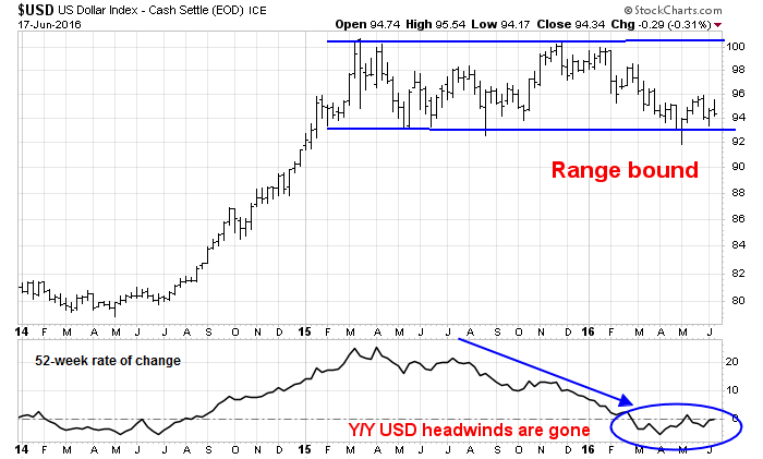
I would also like to address the perennial bearish objection that Street analysts are terrible at calling turning points in the economy and therefore rising forward EPS mean nothing. Much of the recent earnings decline can be attributable to two factors, namely USD strength and the weakness in oil and other commodity prices. Arguably, they are the same macro factor as the direction of the USD is inversely correlated with commodity prices.
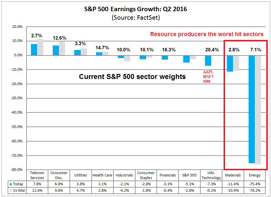
This chart of Q2 2016 EPS revisions by sector tells the story of YoY EPS growth. The worst hit sectors are the commodity producing sectors of Energy and Materials. In addition, downward estimate revisions in the Technology sector is mainly attributable to highly stock specific factors in three large cap stocks: AAPL, MSFT and IBM.
From a macro perspective, however, we can see that many of the earnings headwinds abating. The USD Index has stopped strengthening and it has been range bound for about a year. The bottom panel of the chart below shows the YoY rate of change in the USD, which has fallen to the zero line. A rising USD created an earnings headwind for exporters as the negative currency translation squeezed their operating margins. A flat USD on a YoY basis eliminates that headwind and should result in better earnings growth, starting in Q2 2016.
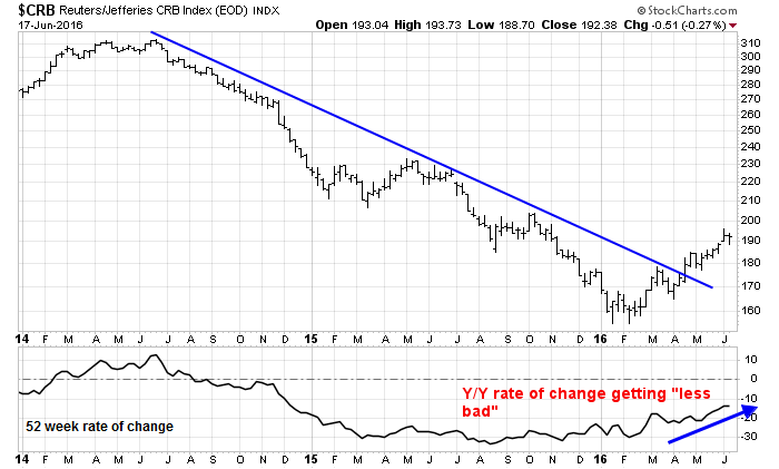
This chart of commodity prices, as measured by the CRB Index, tells a similar story. The CRB Index has stopped falling and it has rallied out of a downtrend. The rate of change chart also shows that prices are steadily getting “less bad”, which should be constructive for the earnings of companies in Energy and Mining.
So even if you believe that Street analysts are idiots and know nothing, there are definite macro forces that are supportive of better earnings growth in Q2 2016. An EPS growth projection of 5-10% is a reasonable assumption for the H2 2016. Assuming no changes in P/E multiples, this should result in a stock market advance of 5-10%, which makes an SPX target of 2200 quite feasible.
Analyzing the Fed’s reaction function
In order for SPX to rise significantly higher than 2200, we need P/E expansion. P/E expansion is a function of higher growth expectations, or a lower discount rate, or bond interest rate. The latter is highly dependent on the Fed’s reaction function to economic conditions.
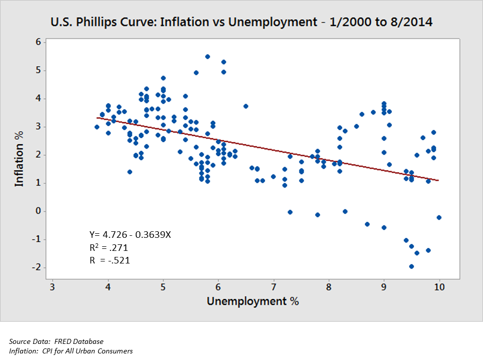
First, some basics – the Federal Reserve has a dual mandate, price stability (fighting inflation) and maximizing employment. So let’s think like Fed bureaucrats and address how they think about their dual mandate. The Fed uses a Phillips Curve modeling framework, which states that policy makers can trade off unemployment and inflation rates in the short run (chart below via Wikipedia). In addition, they have stated that they are aiming for an inflation rate of 2% and they are watching labor markets to see how close the economy is to full employment.
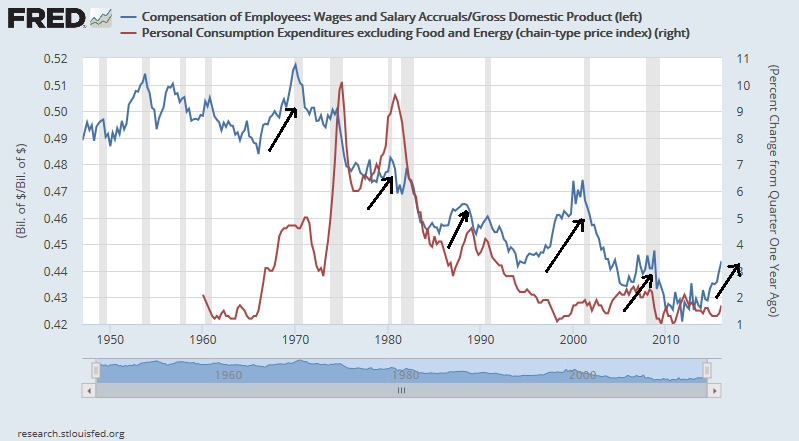
Currently, core Personal Consumption Expenditure (PCE), the Fed’s preferred inflation rate metric, is creeping up towards the Fed’s 2% inflation target and wages are displaying the typical rising pattern seen in the latter stages of an economic expansion when labor markets get tight.
So the Fed should start to raise rates, right? Well, it depends. Take a detailed look at the Phillips Curve chart above. What does the Fed plug into the y-axis to measure inflation? Does it use a measure like core PCE, which is backward looking, or it does it use inflationary expectations?
Tim Duy recently detailed Janet Yellen’s inflation dilemma. In her latest speech, Fed Chair Yellen made many references to inflationary expectations:
Uncertainty concerning the outlook for inflation also reflects, in part, uncertainty about the behavior of those inflation expectations that are relevant to price setting. For two decades, inflation has been relatively stable, reacting less persistently than before to temporary factors like a recession or a swing in oil prices. The most convincing explanation for this stability, in my view, is that longer-term inflation expectations have remained quite stable. So it bears noting that some survey measures of longer-term inflation expectations have moved a little lower over the past couple of years, while proxies for these expectations inferred from financial market instruments like inflation-protected securities have moved down more noticeably. It is unclear whether these indicators point to a true decline in those inflation expectations that are relevant for price setting; for example, the financial market measures may reflect changing attitudes toward inflation risk more than actual inflation expectations. But the indicators have moved enough to get my close attention. If inflation expectations really are moving lower, that could call into question whether inflation will move back to 2 percent as quickly as I expect.
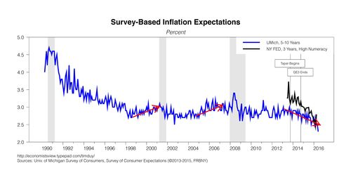
Here is the problem. In past cycles, inflationary expectations had risen as the economic expansion matured. In this cycle, inflationary expectations have been falling. Here is a chart (via Tim Duy) of survey based inflationary expectations.
Here are the inflationary expectations as determined by the bond market, which is also falling.

The Fed pays a lot of attention to inflationary expectations because if expectations start to rise uncontrollably, it faces a risk of runaway inflation. Today, it has the opposite problem, inflationary expectations are falling.
More upside before the market top?
Street analysts spend a lot of time trying to figure out what the Fed will do next. By contrast, I spend more time trying to determine the Fed’s reaction function to data development. So here’s the tricky part of forecasting interest rates. Assuming that the economy stays on its current path of slow and steady growth, employment continues to rise and so does current inflation metrics such as core PCE and wage growth. On the other hand, inflationary expectations stay muted. What does the Fed do?
An educated guess (and it’s only a guess) is the Fed stays on hold longer than the market expects while the internal debate rages as to whether inflationary expectations are becoming un-anchored to the downside. In practice, we may see a single rate hike in December after the election. This do-nothing policy would eventually reach a tipping point at some time in the future, but that’s a problem for later.
This scenario leaves the door open for greater P/E expansion this year as it becomes evident that growth is returning and the Fed remains dovish. That’s how the SPX can get to 2400-2500, as growth expectations ramp up later this year and the rate environment stays benign.
The Brexit wildcard
Any market analysis today would be incomplete without addressing the elephant in the room, the Brexit referendum later in the week. There are all sorts of opinions about what might happen under Brexit, from benign (Warren Buffett) to dire (Bank of England). Markets would undoubtedly become highly volatile should the UK vote to leave the EU.
Opinion polls in the past few weeks show that the Leave camp has been steadily gaining ground, but several polls released this weekend shows a substantial swing in Remain’s favor. The polling firm BMG recently provided a fascinating window on the science of polling. Business Insider reported that a (pre-Jo Cox killing) BMG telephone poll had given Remain a 7 point lead, while a separate BMG online poll indicated a 10 point lead for Leave. What gives?
The discrepancy can be explained by the methodology detailed on the BMG website. Simply put, Remain supporters are difficult to reach and BMG’s polling results show that when the pollster persists in calling target respondents who don’t answer the phone, polling results change. The Remain lead rises dramatically after the second call, then falls back and steadies after the third call.

For some context of why this is important, most pollsters had missed the move towards the Conservatives in the last UK general election. The few who called it right tried very hard to poll these “hard to reach” voters. So getting a complete picture is critical to getting the right forecast.
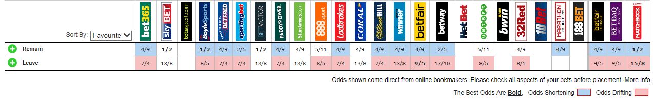
Viewing the Brexit referendum through another lens, I could put on my market technician’s hat and assert that price gives us all the information we need. The bookmakers, who are putting actual money on the line, are giving the Remain side about 66% chance of succeeding. More importantly, momentum is currently in Remain’s favor. The Oddschecker site shows that Remain odds are shortening (blue) while Leave odds are rising (pink).
If these results hold up, then expect a relief rally to start when the referendum results become known.
The week ahead
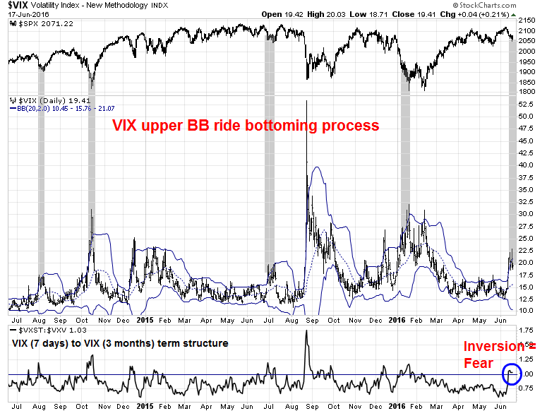
In an earlier post last week (see The VIX tail wagging the SPX dog), I noted that the VIX Index, which is a measure of fear, had surged above its upper Bollinger Band (BB), but the market decline was fairly mild relative to other VIX spike episodes. The general level of anxiety is probably attributable to the Brexit referendum, as GBP (Pound Sterling) volatility had leaked into the VIX.
The bottom panel of the chart below shows the short-term VIX (VSTX) has inverted against the three month VIX (VXV), which is an indication of short-term market fear and GBP volatility hedgers coming into the equity market. In addition, the VIX upper BB ride is becoming a template of a stock market bottoming process. In the past, the market had bounced when the VIX Index rose above its upper BB, rallied and then fallen back about a week later to test the previous low.
The rally and re-test is consistent with the pattern observed by Rob Hanna at Quantifiable Edges of 5-day declines that remain above their 20-day lows (Day 0 = last Thursday). If history is any guide, then market strength should top out on Monday or Tuesday.

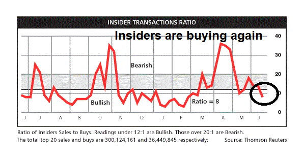
My inner investor remains constructive on stocks. The latest update from Barron’s of insider trading activity shows that this group of “smart investors” are buying again after spending several weeks at a neutral reading. This data point is mildly supportive of the bull case and suggests that, at a minimum, downside risk is limited.
My inner trader took profits and covered his short position, albeit a little early, and he is waiting for an opportune entry point on the long side next week.
Disclosure: No trading positions
I have read that the week after June monthly option expiration is a down week for the SPY, this coupled with Brexit paranoia makes me think that the rally will come on Friday &it would be wise to get long during an early week sell off
It seems that the notion that the coming week is very likely to be weak (post OpEx, etc.) is prevalent, which makes me wonder if the lion’s share of selling has already been done, and the coming week will be stronger than expected.
BINGO! This appears to be a likely case scenario. I agree
Cam, about the Atlanta FED GDP tracker – they are WORSE than analysts. In february they were calling for 2.7% GDP growth in Q1. In April they were calling for .1%. Next, there is no argument about forward EPS. The truth is that 12 or 24 months out the forecast error for research analysts is 90%. It’s a joke. It is wallstreet where you need to be bullish to generate commissions. Sell Equity research is really a joke.
The 2200 target is 200 points less than your last 2400 target, you mention you are not a permabull but your bullish evidence always outweighs your bearish evidence, yet for the entire picture the bearish evidence overwhelms the bullish evidence. For example, on one of your recent articles “5 technical reasons to be bullish on stocks” you completely left out the CPCE ratio being at levels historically consistent with short term tops. You now also disclose that you now have no position.
I’m very skeptical that the S&P gets to 2200.
This chart of Q2 2016 EPS revisions by sector tells the story of YoY EPS growth. The worst hit sectors are the commodity producing sectors of Energy and Materials.
Cam, about the Atlanta FED GDP tracker – they are WORSE than analysts. In february they were calling for 2.7% GDP growth in Q1. In April they were calling for .1%. Next, there is no argument about forward EPS. The truth is that 12 or 24 months out the forecast error for research analysts is 90%. It’s a joke. It is wallstreet where you need to be bullish to generate commissions. Sell Equity research is really a joke.
The 2200 target is 200 points less than your last 2400 target, you mention you are not a permabull but your bullish evidence always outweighs your bearish evidence, yet for the entire picture the bearish evidence overwhelms the bullish evidence. For example, on one of your recent articles “5 technical reasons to be bullish on stocks” you completely left out the CPCE ratio being at levels historically consistent with short term tops. You now also disclose that you now have no position.
I’m very skeptical that the S&P gets to 2200.
“This chart of Q2 2016 EPS revisions by sector tells the story of YoY EPS growth. The worst hit sectors are the commodity producing sectors of Energy and Materials.” What about retail? Retail has been bent over a railing!
Anyways Cam, thanks for the post but if you don’t have a position is your post really worth reading?
Hi Cam, my apologies on that last point, I’ve had a few and missed that you are planning on going long this week. Looks like you’ll be buying the rips though!
Brexit % at 71.
Rob
Hi Cam, my apologies on that last point, I’ve had a few and missed that you are planning on going long this week. Looks like you’ll be buying the rips though!
Brexit % at 71 stay.
Rob
Retail is an industry, which is a subset of sectors, and it is part of the Consumer Discretionary sector.
David Rosenberg highlighted in his newsletter that the Brexit vote is not binding. To exit would take a vote of Parliament that is overwhelmingly in favor of staying. So if the vote is close, and the exits win, there is little likelihood of an exit. If there is a landslide to leave then the government would likely negotiate with the Euro parliament for a better deal. This would get the lawmakers off the hook. In any case, the process would take a couple of years.
The bottom line is that the vote is not the end.
I am placing orders on the morning after the vote for clients to buy the UK ETF at prices below the January low. That would need a big drop this week and it is likely I won’t buy it but you never know. Liquidity can dry up at the opening after a negative event and the ETF could open very low before recovering. Last year I bought the German ETF one morning at 15% below the DAX close on the opening trade in New York when the DAX had fallen only 3% overnight. The ETF rallied 12% in an hour after the opening to get back to a reasonable price.
In my last posting I had mentioned the large exposure the European Banks had to the zero interest policy and hence the risk they have in their derivative books. Doug Kass has written an interesting article on Deutsche Bank:http://dougkassblog.blogspot.ch/
I would urge people to look at long term charts of the Dow Transportation Index, The Nasdaq 100, The Biotechnology Index. In each case the topping process is very mature. The Dow Transportation Index is normally considered a leading indicator of the economy (Rail, Truckers etc.). This index peaked in December 2015. Unless the downtrend lines are broken to the upside we can only state at best the market is in a trading range with elevated risk.
Cam,
I admire that you keep such a sober look on these economic issues. I mean, many people are already waiting for the end to come and have a hard time focussing on the present matters. At least, I have.
I heard about the dividends and stock buybacks which are very high right now. And it must be easy in this low interest climate to buy stocks back with loaned money. But not if the stock market isn’t rising anymore or if interest rates would be rising. So what I guess I’m trying to say is: if this market is propped up already, if the bubble is already here, who would want to keep investing in it? In the previous two bull markets, there was the fear of missing out. But in this market, pessimism might prevent any fear of missing out. By which I mean, the economic data you’re showing seems to indicate that a rise in stocks should be reasonable. Unless there’d be so much pessimism to prevent them from doing so.
Now, I do understand that valuations aren’t particularly high. If investors feel like the market should go up, it might become a self fulfilling prophecy. But… do you see any signs of a bubble bursting? or a house of cards collapsing? Like Japan, for example.
There is a myth about buybacks that you need to understand: The vast majority of share buybacks are funded from cash flows, not debt.
As for the question of a bubble, where is the bubble? Typically, we see all sorts of excesses at the end of an economic expansion such as stupid deals getting done. The problem can be exacerbated by debt.
In this cycle, there are few signs of excesses in the American economy. Sure, there are some Unicorn valuation problems in Silicon Valley, but that`s localized. IPO and M&A activity is more consistent with market bottoms, not tops. Households have been deleveraging and they are just starting to take on some debt but levels aren’t excessive. Corporate leverage is not that high either. Much of the debt can be found at the government level, which is more manageable as the government can, at the extreme, print more money – at this point, the world can use more inflation.
The vulnerability to the systems exists outside the US. China is trying to prop up its economy with more debt with more and more construction of white elephant projects. Europe is fragile and the problems of excess leverage in its banking system are not solved. But the US is still in relatively good shape.
Thank you, Cam. Your reply is much appreciated.