Preface: Explaining our market timing models
We maintain several market timing models, each with differing time horizons. The “Ultimate Market Timing Model” is a long-term market timing model based on research outlined in our post Building the ultimate market timing model. This model tends to generate only a handful of signals each decade.
The Trend Model is an asset allocation model which applies trend following principles based on the inputs of global stock and commodity price. This model has a shorter time horizon and tends to turn over about 4-6 times a year. In essence, it seeks to answer the question, “Is the trend in the global economy expansion (bullish) or contraction (bearish)?”
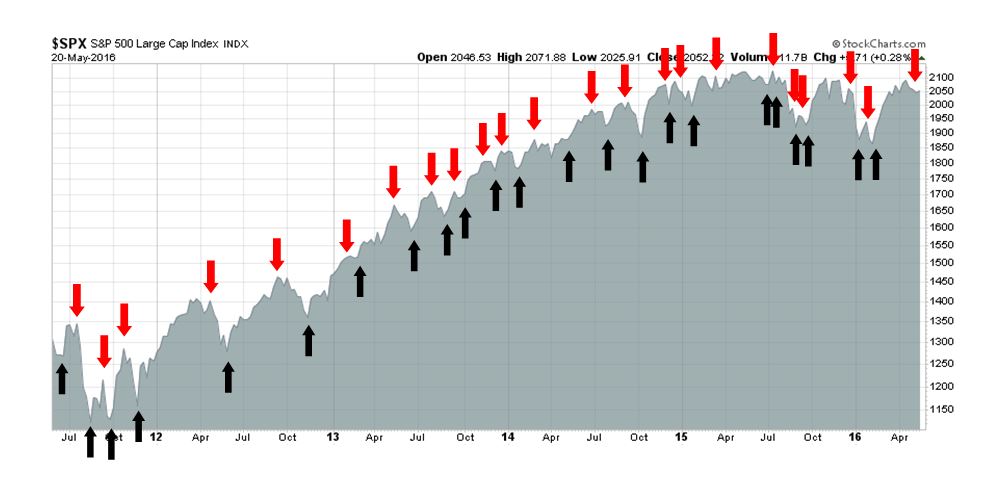
My inner trader uses the trading component of the Trend Model to look for changes in direction of the main Trend Model signal. A bullish Trend Model signal that gets less bullish is a trading “sell” signal. Conversely, a bearish Trend Model signal that gets less bullish is a trading “buy” signal. The history of actual out-of-sample (not backtested) signals of the trading model are shown by the arrows in the chart below. Past trading of the trading model has shown turnover rates of about 200% per month.
The latest signals of each model are as follows:
- Ultimate market timing model: Buy equities
- Trend Model signal: Neutral
- Trading model: Bearish
Update schedule: I generally update model readings on my site on weekends and tweet any changes during the week at @humblestudent. Subscribers will also receive email notices of any changes in my trading portfolio.
Some good news and bad news
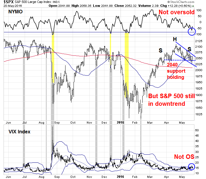
The market action last week played out roughly as I expected. Stock prices were choppy and displayed a series of lower highs and lower lows, though the technically important 2040 support neckline of the head and shoulders pattern did not break decisively (see Waiting for the storm to pass). The short-term trend remains down and key intermediate term indicators has not reach oversold levels, as measured by the NYSE McClellan Oscillator (NYMO) breaching the -80 level and VIX Index moving above its Bollinger Band, which suggests that the current corrective action isn’t finished.
There was some good news and bad news as stocks declined. As I have pointed out before, the simplest way of thinking of stocks is through the two components of the P/E ratio. First, is the E rising? The good news came from the latest round of macro data releases showed upbeat figures from industrial production and housing. That, combined with a rising CPI, paints a picture of a US economy with robust Q2 growth.
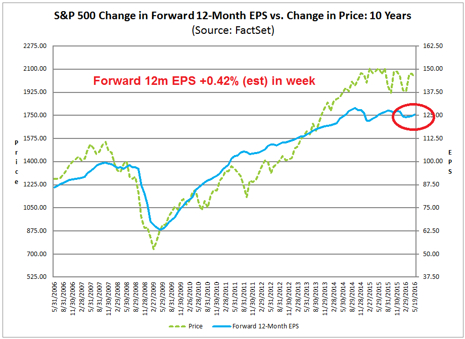
As well, John Butters of Factset reported that forward 12-month EPS continues to climb, which is reflective of improving optimism from the Street (chart annotations in red and estimated revision are mine). Score a couple of points for the bulls.
The less certain news comes from an evaluation of the likely direction of the P/E multiple. The inverse of P/E, or E/P, is a function of interest rates and expectations of future growth (which is why growth stocks trade at high P/E multiples). The decidedly hawkish tone from the Fed officials and the FOMC minutes spoiled the party for the bulls.
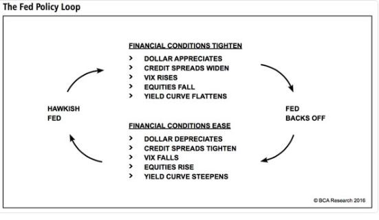
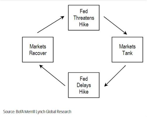
One of the wildcards of my generally bullish outlook for equities has depended on a relatively dovish Fed. The big question is whether the Fed is continuing on the Fed policy loop of stop-start hawk-dove cycle, or if it’s actually serious about embarking on a policy of rate normalization.
The fragile economy
While the following does not represent my base case projection, I would like to explore the possibility of the bearish three steps and a stumble scenario, which follows the old trading adage of three Fed tightening moves will tend to lead to a stock market stumble. This scenario is becoming a real possibility as the US economy is still in a fragile state.
The fragility of the current economic expansion was highlighted by a WSJ interview with Steven Blitz, chief economist at ITG Investment Research. Blitz is no Zero Hedge doomster, but he assigned a 60% chance of probability of recession in the next 12 months, largely because of possible policy error:
My 60% probability really means to convey a sense that the economy is nearing a point where policy mistakes can kick it into recession. A lot of data appear to be more middle or end-of-cycle in their behavior. This means to me that the economy is more susceptible to a policy mistake. The Federal Reserve really needs to be careful and more recent statements from [Chairwoman Janet] Yellen suggest they are.
Blitz went on to outline his bearish scenario:
Understand the Fed tightening began after QE3 ended, and the forward market started pricing an aggressive forward trajectory for Fed policy, aggressive for this economy. Media focuses on the funds rate, but forward pricing matters most. Forwards determine the Treasury yields against which mortgages, corporate borrowing, and dividends are priced. As an increasingly aggressive Fed policy tack was priced in, capital markets reacted as they always do once the Fed starts in this direction—the 2s/10s yield curve flattened, equity markets weakened, and economic growth began to decelerate, which continued into the first quarter.
In other words, don`t focus on the Fed Funds rate, focus on forward rates and the yield curve because the market prices risk off forward rates. Indeed, the market implied policy rates rose and the forward curve steepened after the release of the minutes of the April FOMC meeting. The green line in the chart below shows the implied policy rates after the release of the minutes, while the yellow line shows what they were a week ago.

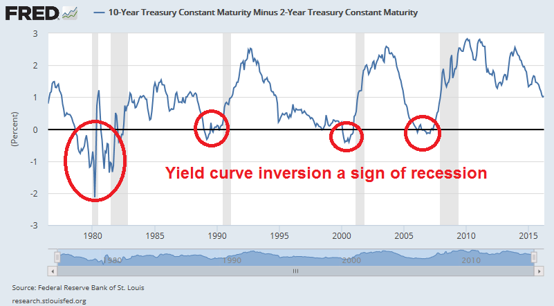
Another indicator of bond market expectations, namely the 2/10 yield curve (2 year vs. 10 year UST yield spread), has been a very accurate recession forecaster in the past as it has inverted (short yield trading above long yield) 100% of the time ahead of the past five past slowdowns. The good news so far is the 2/10 yield curve is nowhere near an inverted state yet.
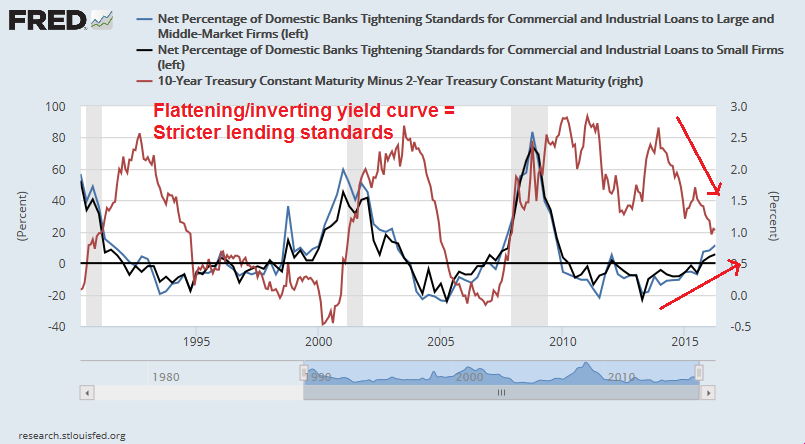
As Blitz pointed out, the financial system takes signals from forward rates and the yield curve. As the chart below shows, a flattening yield curve (red line) has led to tightening credit standards (black and blue lines) in the past two cycles. In the current cycle, lending standards are starting to tighten already, in line with the flattening yield curve.
The chart below from Tobias Levkovitch at Citi shows that tightening credit conditions lead business loan volumes by about 18 months. In effect, Federal Reserve actions are already starting to withdraw the financial oxygen needed for firms to invest and expand. It just goes to show how sensitive the economy can be to shifts in monetary policy. It`s not just the quarter point rate hike that matters, but the side-effects of the rising rates that affect this fragile economy.

Another indication of the fragility of the US economy comes from the Fed report on the Economic Well-Being of U.S. Households in 2014, published in May 2015. Of the people earning $40-100K, which is a moderately well-off segment of the population, 44% reported they couldn’t come up with $400 in an emergency. The more astonishing detail of the survey showed that 27% of those making $100K or more couldn’t either. That`s a lot of people living from one paycheck to another.
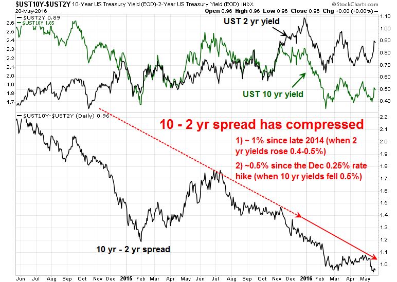
Right now, there is no need to panic just yet, as the 10-2 year yield spread has been bouncing around between 90-100 basis points and nowhere close to a negative reading (inversion), which has been a warning sign of a recession. However, the chart below shows that the yield on the 2-year Treasury rose about 0.5% between late 2014 and late 2015. During the same period, the 10-2 year spread flattened by about 1%. Moreover, the 10-year yield fell about 0.5% and the yield curve flattened by about 0.5% in the same period since the December 2015 quarter point rate hike, which is reflective of the bond market’s judgement of a weakening economy. If that pattern were to repeat itself, the yield curve could invert or come either very close to inversion after two quarter point rate hikes.
Three steps and a stumble could be just around the corner.
What the Fed is more likely to do
Having outlined the dire bearish scenario, whose probability I would guesstimate at 15-20%, here is what I think is far more likely to happen.
First, the FOMC is likely to stand pat in June. The Yellen Fed has made a big deal about communication policy. It has had a history of not wanting to surprise the markets. If the Fed wanted to make sure that the market understood the June meeting is “live”, they certainly took action to “correct” market perceptions last week.
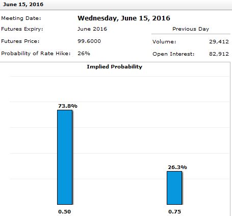
Still, the probability of a June rate hike is still relatively low. The latest reading from the CME Group Fedwatch tool shows an implied probability of 26% of a June rate hike. If they are serious about raising rates in June, watch for continued Fedspeak to raise that probability to at least 50-60%. We are not there yet.
Tim Duy had a more nuanced interpretation of the FOMC minutes as a tug-of-war between the doves and hawks within the FOMC:
There are two clear views here: One group feels the economy is near full employment, while another sees room for further improvement. The former group will want more hikes sooner, the latter fewer hikes later. Federal Reserve Chair Janet Yellen should be taking a side in this critical debate and thus driving the direction of policy. Watch for her to provide guidance on this and inflation when she speaks on June 6.
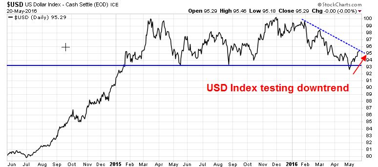
As well, the Fed officials have indicated that the USD is an important barometer for its monetary policy. A rising dollar has the dual effect of tightening monetary policy for the Fed and it could be viewed as a sign of secular stagnation, as there is much concern at the Fed over the ability of other major central banks like the BoJ and ECB to escape the deflation trap. As the USD Index has recently bounced off an important support level and started rally, its continued strength would be a factor for FOMC decision makers to put a rate hike on hold.
Reading between the lines, many of the more hawkish “participants” quoted in the FOMC minutes are the regional Fed Presidents, not all of whom vote. On the other hand, the voting bloc within the FOMC, which are tilted towards the Fed governors, tend to be more cautious and dovish. As Janet Yellen has voiced concerns about global financial instability, I would be utterly shocked if the FOMC voted to raise rates just days ahead of the Brexit referendum at its June meeting. One way to resolve the hawk-dove dilemma would be to stay on hold in June, but prepare the market for a July rate hike if there is no Brexit.
An even more dovish interpretation would be the Fed stays in the hawk-dove stop-start cycle, but without taking actual action, at least until the December meeting.
Stay tuned and watch how the Fed Fund probabilities evolve.
Waiting for capitulation
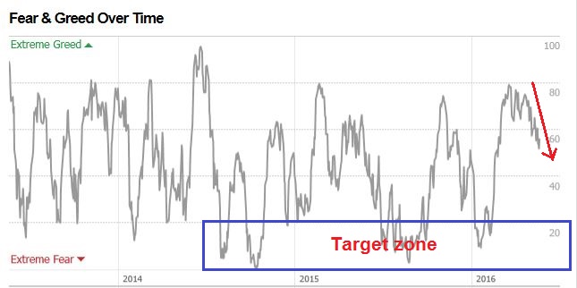
In the meantime, my inner trader is waiting for further weakness and signs of capitulation and oversold conditions before fully covering his short position. The readings on short and intermediate term sentiment models can be described as either neutral or slightly bearish, but not at extremes. The CNN Money Fear and Greed Index is one example out of many.
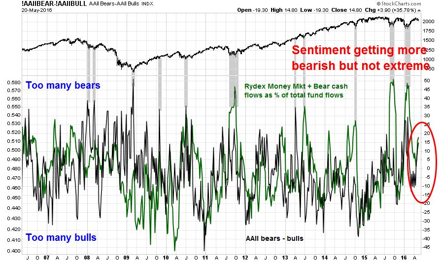
Rydex and AAII sentiment data are also showing similar readings – slightly bearish, but nowhere near a crowded short.
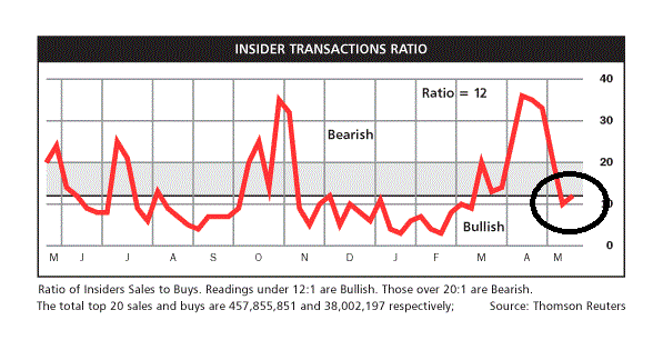
The latest update of insider activity from Barron’s shows a constructive reading. A minor retreat in stock prices has produced to a neutral to slightly bullish reading from this group of “smart investors”.
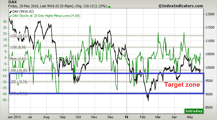
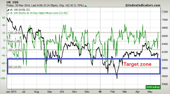
More conventional measures of breadth from IndexIndicators show that the net 20-day highs-lows, which is an intermediate term (2-3 week) trading indicator, is not oversold.

As the current bout of market weakness began overseas, European markets are not oversold either:
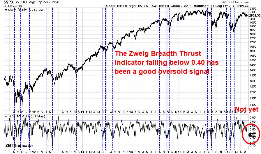
While it was not meant to be primarily used in this fashion, but the Zweig Breadth Thrust Indicator falling below 0.40 has also shown itself to be a pretty good oversold signal in the past. Note that the oversold condition is only the setup for the ZBT signal and the market has to stage an upward momentum thrust for the ZBT signal to be triggered (see A possible, but rare bull market signal). As the chart below shows, the ZBT Indicator is getting close, but it is not oversold yet.
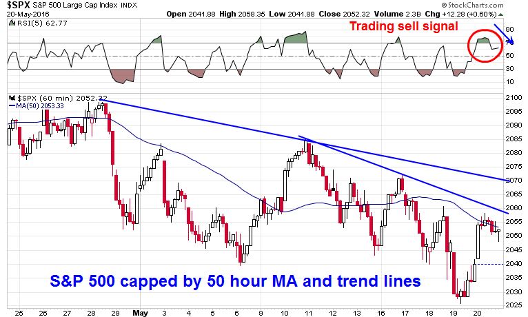
From a trader’s perspective, the bears still have control of the tape as momentum is still pointed downwards. The hourly SPX chart below shows that the market remains below key resistance levels, such as the 50 hour moving average and a couple of downtrend lines. The inability of the market to convincingly rise above its 50 hour MA and its weakness on Friday generated a very short-term sell signal on RSI-5.
Until we either see an oversold and capitulation extreme or significant improvements in the overseas stock markets and commodity markets, my inner trader is inclined to stay with his short position.
When I lengthen my time horizon, my inner investor is still constructive on stocks. Rising forward EPS is a sign of supportive growth fundamentals and while sentiment is not at bearish extremes, the lack of bullish enthusiasm during the rally off the February bottom suggests that equity downside risk is limited right now.
Disclosure: Long SPXU
Hi Cam,
Another website I follow is quite bearish at the moment based on the following data.
a) Cass Transportation Index is down -4.9% year on year (YoY).
b) US railroad traffic is down -11% YoY.
c) Baltic Dry Index continues to trend down YoY.
d) April blended earnings is down -7.1 %
e) Total Business Inventories to Sales Ratio is up from about 1.3 to 1.41 since 2014.
f) Layoff announcements have increased 24% this year
g) Stock buybacks fall the most since 2009, by 38% in the last 4 months.
h) Money velocity M2 is still trending down.
i) Lots of Hedge funds are selling out of stocks.
Is this just too much “looking in the rear vision mirror” ?
What are your thoughts on the usefulness of these indicators ?
Thanks for your insights.
It’s hard for me to comment without reading the commentary and see how it has evolved over time. However, it does sound like that the analyst *may* (underline the word may) have cherry picked the data. New Deal democrat has always been an excellent source of macro data. See http://community.xe.com/blog/xe-market-analysis/weekly-indicators-appearance-ghosts-2015-edition
With respect to the specific points that you raised, here are my comments. Transportation data has been soft, which is a negative (see NDD link above), but he has also pointed out the positive points.
a) Cass Transportation Index is down -4.9% year on year (YoY).
b) US railroad traffic is down -11% YoY.
c) Baltic Dry Index continues to trend down YoY.
Earnings are backward looking. I have found that a blended 12-month forward looking EPS estimate is a much better way of measuring Street sentiment:
d) April blended earnings is down -7.1 %
Inventory to sales is probably the worst economic ratio right now, but is this cherry picking?
e) Total Business Inventories to Sales Ratio is up from about 1.3 to 1.41 since 2014.
You can’t look at layoffs without looking at hiring. The job market is extremely healthy. Also see https://fredblog.stlouisfed.org/2016/05/quits-are-recovering/
f) Layoff announcements have increased 24% this year
We heard lots of scare stories about how buybacks were getting suspending over Earnings Season and how the market was going to crater. The market rose in April and pulled back in May, but it was no disaster.
g) Stock buybacks fall the most since 2009, by 38% in the last 4 months.
Money velocity has been falling forever, but the stock market has been rising. So what?
h) Money velocity M2 is still trending down.
If HFs are selling and they represent a significant source of demand, then we should have seen an immediate effect on prices. Did that happen? (The same could be said of buybacks, see comment above)
i) Lots of Hedge funds are selling out of stocks.
Bottom line: This sounds like a cherry picked list of bearish data points, some of which are not very relevant. If you are looking out 6-12 months, focus on what is happening to E (forward earnings rising) and P/E ratio, which is a function of Fed policy (a bit uncertain right now) and changes in growth expectations (positive). If you have a shorter term horizon, see my “inner trader” commentary.
You can’t get an inverted yield curve under ZIRP. That’s why significant flattening in Japan has led to recession after its ZIRP was implemented over a decade ago – while prior to that it had been inversion that signaled enough credit tightening to lead to recession. It is therefore possible that we’ll experience similar behavior going forward – and we’ve had enough flattening to be concerned at this point.
That’s why we look at the 2-year UST yield instead of the 3-month yield. Incidentally, the 30-5 year spread looks about the same as the 10-2 year spread.