Preface: Explaining our market timing models
We maintain several market timing models, each with differing time horizons. The “Ultimate Market Timing Model” is a long-term market timing model based on research outlined in our post Building the ultimate market timing model. This model tends to generate only a handful of signals each decade.
The Trend Model is an asset allocation model which applies trend following principles based on the inputs of global stock and commodity price. This model has a shorter time horizon and tends to turn over about 4-6 times a year. In essence, it seeks to answer the question, “Is the trend in the global economy expansion (bullish) or contraction (bearish)?”
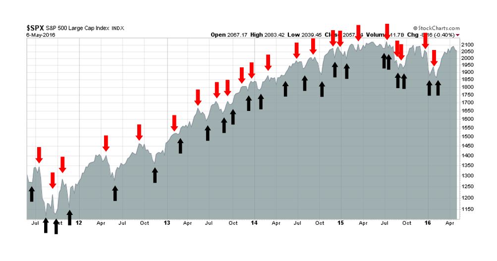
My inner trader uses the trading component of the Trend Model seeks to answer the question, “Is the trend getting better (bullish) or worse (bearish)?” The history of actual out-of-sample (not backtested) signals of the trading model are shown by the arrows in the chart below. Past trading of this model has shown turnover rates of about 200% per month.
The latest signals of each model are as follows:
- Ultimate market timing model: Buy equities
- Trend Model signal: Risk-on
- Trading model: Bullish
Update schedule: I generally update model readings on my site on weekends and tweet any changes during the week at @humblestudent. Subscribers will also receive email notices of any changes in my trading portfolio.
Price vs. fundamental momentum
The stock market got another growth scare last week when it weakened last Tuesday, after a dismal set of PMI reports, and ended with a Non-Farm Payroll miss in the US Employment report. I was reminded of an article by Kurt Feuerman and James Tierney Jr. of AllianceBernstein entitled Don`t Confuse Price with Business Momentum:
Momentum is a funny thing. Share price momentum isn`t necessarily an indicator of business momentum. Sometimes a stock is falling simply because investors are taking profits after its outperformance or because a portfolio is changing its risk profile in a volatile market. There are countless reasons why share prices move.
Last year’s narrow market is a case in point. Investors might assume that the underperformance of a large swath of the U.S. stock market means that most companies are in bad shape. There is, however, another plausible interpretation: It could also mean that there are a lot of buying opportunities in undervalued companies, ones that have a much better business than is widely believed.
In other words, don`t confuse price momentum with fundamental momentum. So what’s the trend in macro and fundamental momentum?
Oh PUH-LEEZ! How real does the latest growth scare look to you?
The latest update from New Deal democrat, who keeps an eye on high frequency economic releases, shows an economy that is recovering from the mild industrial recession in Q4 and Q1:
The has been a broad improvement to neutral or outright positive among a number of a variety of indicators in the last month or so. The negatives are reduced to rail, Harpex, and bank lending rates, with even staffing turning less negative – and staffing is coming up to an important negative inflection point from late last May.
A report from Gavyn Davies indicated that his nowcasts of global economic growth remains healthy.

Davies went on to state that their nowcasts show that global growth is recovering, with Japan and UK being the weak spots:
In the last edition of our monthly report card on Fulcrum’s global nowcasts, we commented that economic activity had turned a corner in the US and China, but this was offset by continued weakness in several key economies, including Japan and the UK. A similar pattern is apparent in this month’s nowcasts. Global recession risks, which seemed elevated in January and February, have now receded, but the world economy is far from robust.
We therefore leave the overall verdict unchanged from last month: global activity growth is somewhat better, especially in the emerging economies, but it is still a long way from being satisfactory.
What about China, whose April PMI readings missed expectations and spooked markets?
In China, the recovery in the mini-cycle is alive and well, despite a slightly weaker PMI in April. A sharp easing in fiscal and monetary policy has resulted in an early rebound in activity, as it has done many times in the past. Activity growth is now well above the official target at 7.5 per cent, but this is based on a renewed rise in leverage in the public and private sectors, and a further delay in the rebalancing of the economy away from reliance on excessive investment spending.
In other words, China’s economy faces many challenges and things may not end well, but a hard landing is not imminent.
Forward EPS still rising
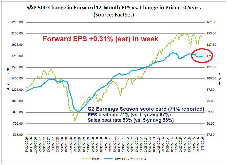
The work by ECRI, New Deal democrat and Gavyn Davies form a top-down perspective of the global economy. The bottom-up view from John Butters of Factset shows that forward 12-month EPS is still rising, which is another sign of positive fundamental momentum. With 71% of SPX companies reported, The Q2 Earnings Season interim report card shows that the EPS beat rate at 71%, well above its 5-year average, though the sales beat rate slipped to 53% from 55% last week (chart annotations and weekly changes in forward estimates are mine).
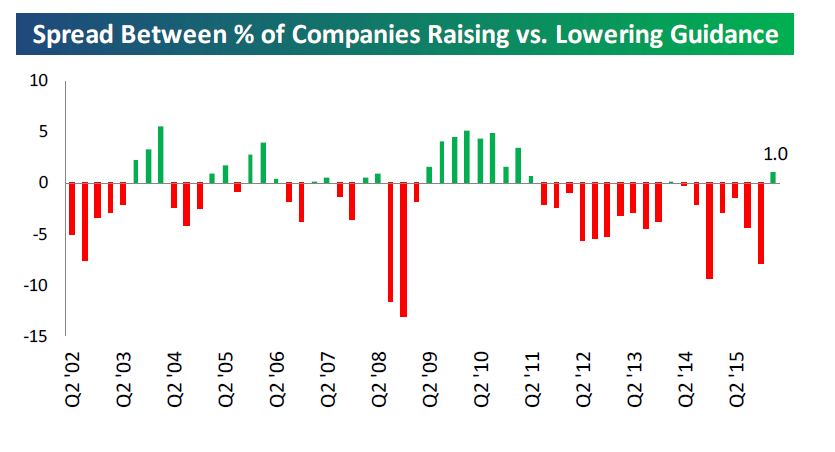
Another positive sign came in the form of corporate guidance. Bespoke pointed out that the difference between positive and negative company guidance recently turned positive (via Brian Gilmartin). While such a development may be interpreted bullishly as positive fundamental momentum, the downside is this just sets a higher bar for future EPS expectations.
Technical picture still constructive
The article from AllianceBernstein adheres to a strictly fundamental viewpoint of equity analysis and totally ignores the technical element. There is certainly much to be said for using a multi-faceted approach to market analysis and I don’t discount the technical picture.
So what does the technical picture look like? Let`s consider the internals.
It is always instructive to see how the market reacts to good and bad news. Friday’s Employment Report of 160K jobs fell far short of expectations at 200K, though there were suggestions that the shortfall was weather related. The knee-jerk reaction of the bond market was to take any prospect of a June rate hike off the table.
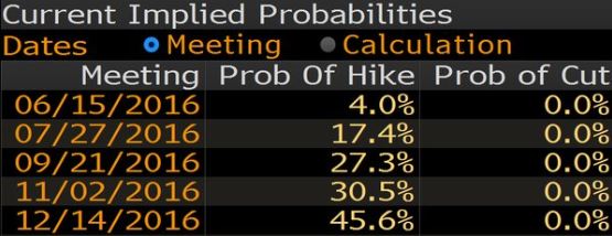
Even as short-term interest rates fell in response, I tweeted the unusual reaction of a steepening yield curve. Wait a minute! Why are short yields falling (a logical response to lower expectations of an immediate rate hike) but long rates rising (reflecting expectations of rising growth and inflation)?
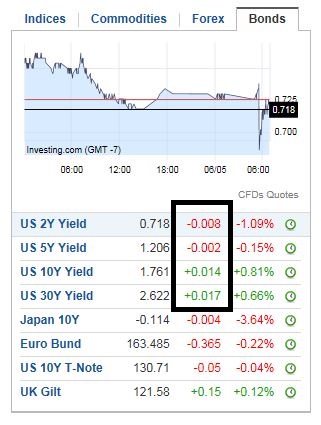
Here is a longer term chart of Treasury yields, the yield curve and the relative performance of deep cyclical sectors like the resource stocks. As the stock market weakened last week, yields fell, the yield curve flattened and cyclical stocks pulled back. On the other hand, the longer term trend of a steepening yield curve and resource stock market leadership remains intact, In short, Mr. Market is still expecting a growth rebound.

The message from market breadth is telling a similar story of a short-term setback in a longer term uptrend. The chart below shows various flavors of market breadth, namely the SPX Advance-Decline Line (an apples-to-apples analysis of breadth that dispels any discussion about the differences between the more conventional NYSE A-D Line and other indices), % bullish, % above the 50 day moving average (dma) and % above the 200 dma.

Looking at the different breadth metrics, here is what I found by observing the divergences between the short-term trend, as measured by April support (dotted lines), and longer term trend, as measured by the November highs (solid lines):
- A-D Line was positive on a short and longer term basis. The A-D Line recently made an all-time high and showed a higher low when SPX pulled back to its April support at about the 2040 level.
- % bullish had a short-term negative divergence but longer term positive divergence. When the market pulled back, % bullish broke down through its lows in April, but it remains above its November highs.
- % above 50 dma had a short and longer term negative divergences. This breadth measure deteriorated badly in the latest pullback and remains below the November highs.
- % above 200 dma had short and longer term positive divergences.
Sentiment: A lack of bulls

In addition, Mark Hulbert pointed out that NASDAQ timers are throwing the towel, which is also contrarian bullish. However, NASDAQ timer sentiment has not fallen to capitulation levels, which may indicate further near-term choppiness ahead.

The week ahead

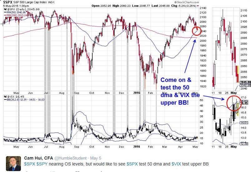
I tweeted the following chart last Thursday, indicating that the market was starting to see oversold conditions, in the form of the VIX Index testing its upper Bollinger Band, and nearby SPX support at the 50 dma at around 2040. Just get oversold, test support and get it over with!
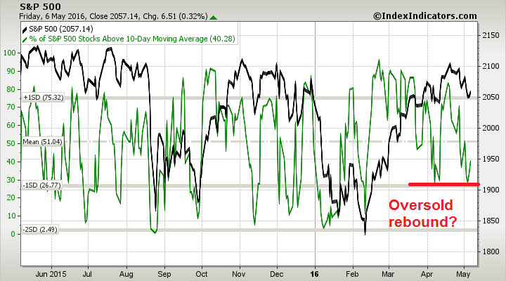
This chart from IndexIndicators shows that stocks may be about to undergo an oversold rebound.
Life (and trading) is never that easy. One of the key tests will come next week, as any rally will define the relative strength of the bulls and the bears. If the bears are truly exhausted, we will see a V-shaped recovery to test the old highs. If the growth scare continues, we may see a up-and-down trading range for the next few weeks. With readings looking oversold, downside risk is likely to be low from current levels, but the market may need a final flush and capitulation before the current corrective episode is over.
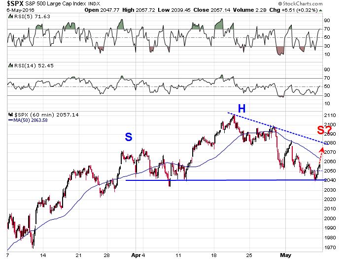
The hourly SPX chart shows a falling trend line with resistance at 2075-2080. While this scenario is highly speculative, a head and shoulders pattern may be forming and a bear case would see the market break support with a measured downside target of 1970-1980, but a good chartist knows that these formations are not confirmed until the neckline shows a definitive break.
My inner investor remains bullish, with an overweight position in the resource stocks. He is getting ready to buy should the growth scare get worse.
My inner trader is also long equities, with a stop loss just under the 50 dma (on a closing basis). He has an open mind and he is watching the character of the market should it rebound next week.
Disclosure: Long SPXL
Cam-
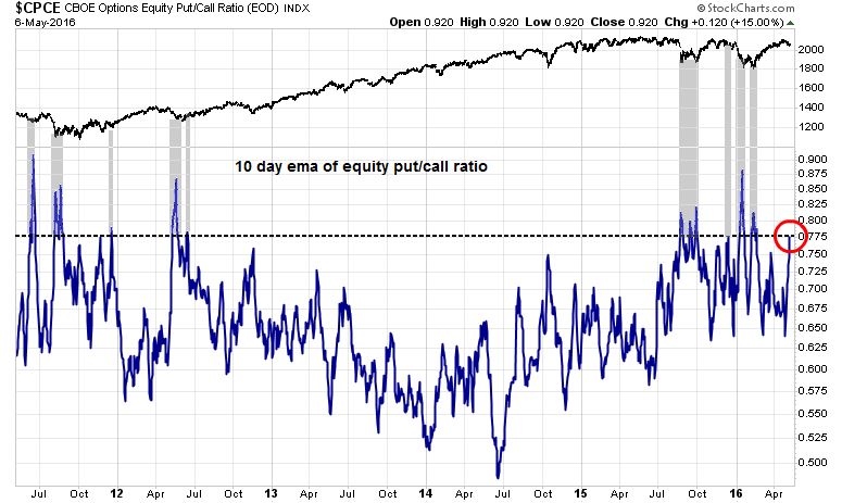
I think the CPCE bears close watching. Friday’s put:call ratio was .92. The last time the 5 and 10 day averages reached current levels was the first week of January and the end of the first week of February, both periods of strong decline. We will have to see if the ‘wall of worry’ is scaled this time.