Preface: Explaining our market timing models
We maintain several market timing models, each with differing time horizons. The “Ultimate Market Timing Model” is a long-term market timing model based on research outlined in our post Building the ultimate market timing model. This model tends to generate only a handful of signals each decade.
The Trend Model is an asset allocation model which applies trend following principles based on the inputs of global stock and commodity price. This model has a shorter time horizon and tends to turn over about 4-6 times a year. In essence, it seeks to answer the question, “Is the trend in the global economy expansion (bullish) or contraction (bearish)?”
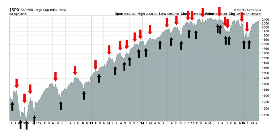
My inner trader uses the trading component of the Trend Model seeks to answer the question, “Is the trend getting better (bullish) or worse (bearish)?” The history of actual out-of-sample (not backtested) signals of the trading model are shown by the arrows in the chart below. Past trading of this model has shown turnover rates of about 200% per month.
The latest signals of each model are as follows:
- Ultimate market timing model: Buy equities*
- Trend Model signal: Risk-on*
- Trading model: Bullish*
Update schedule: I generally update model readings on my site on weekends and tweet any changes during the week at @humblestudent. Subscribers will also receive email notices of any changes in my trading portfolio.
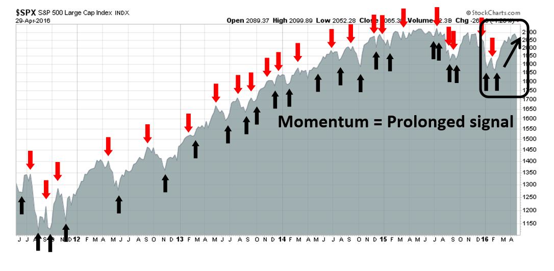
Strong momentum = Bullish
Call it what you want: momentum, broad based breadth, price trend. Despite the short-term consolidation shown by the stock market, the signs of positive momentum make it difficult to be intermediate term bearish.
I can see it in the trading signals of my Trend Model, which turned bullish soon after the February bottom. The prolonged length of the signal is indications of momentum, trend and powerful breadth thrust.
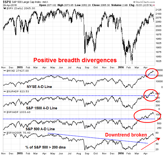
It is also manifested in broad based breadth participation. The chart below shows upside breakouts to all-time highs by different flavors of the Advance-Decline Line. In addition, the % of stocks above their 200 day moving average (dma) has strengthened out of a downtrend, which is another indication of breadth improvement.
Strong breadth readings have been a characteristic of the rally off the February bottom. Dana Lyons observed that the stock market experienced a strong positive breadth day last Tuesday but without any significant overall advance. Such episodes have seen further gains in the past, though the sample size is a bit small to make definitive conclusions.
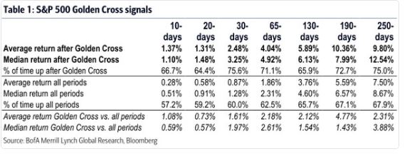
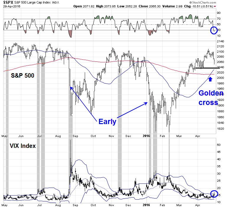
The surge in stock prices has been persistent enough to manifested itself in a Golden Cross, where the SPX 50 dma has crossed above the 200 dma from below. As an avid user of trend following models, I believe that most of the public interpret golden crosses and its inverse dark crosses incorrectly. The cross shows the trend, which in this case is bullish. What many traders is they failed to use the shorter and faster moving average as a trailing stop to manage risk. Regardless, here is the BoAML on the better than average historical returns that occur after a Golden Cross.
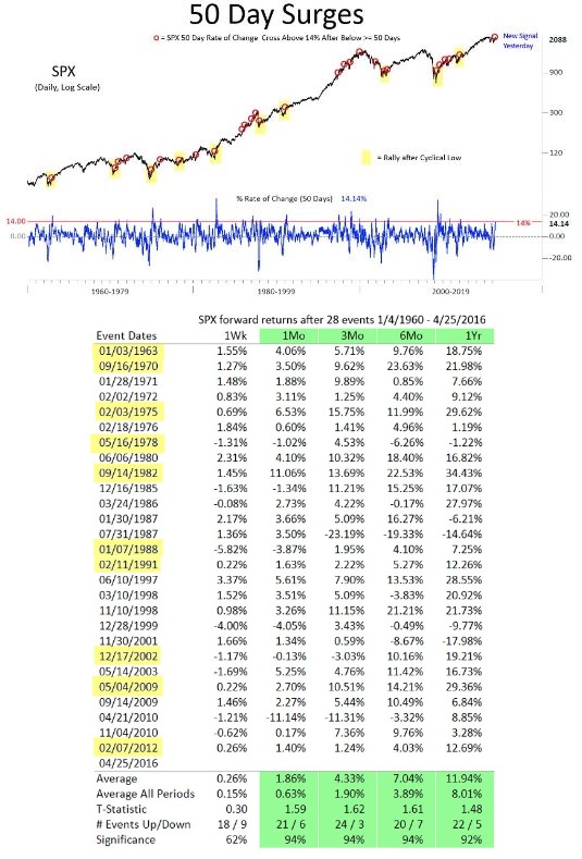
Nautilus Research also pointed out that the market recently experienced a 50-day price surge and those episodes have led to better returns in the past.
As well, I wrote last week about the broad based signs of rising risk appetite globally and across different asset classes (see How the SP 500 could get to 2400 this year). In short, we are seeing a broad based surge in asset prices across the board that is difficult to ignore.
Improving growth outlook
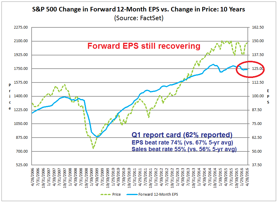
In addition to technical momentum, I am also seeing signs of better fundamental momentum in the form of a better growth outlook. Notwithstanding the disappointment exhibited by large cap technology stocks like AAPL last week, the interim report card for the current Earnings Season is coming in with a solid passing grade. The latest update from John Butters of Factset shows an EPS beat rate of 74%, which is well above the historical average, and a sales beat rate of 55%, which is roughly in line with history. Equally important to the growth narrative has been the evolution of forward EPS, which continues to recover after the growth scare earlier this year (annotations in chart are mine).

When analyzing earnings estimates, I prefer to use a continuously rolling forward 12 month EPS metric because analysts have shown a tendency to be overly optimistic in their estimates, which drop over time. The forward 12 month normalization process corrects for the downward revision bias. Even if we were to use just quarterly estimates as a metric, John Butters showed that their decline pattern so far has been “less bad” as they dropped 1.8%, which is better than the 5-year average of 2.2% and 10-year average of 2.3%:
During the month of April, analysts lowered earnings estimates for companies in the SP 500 for the quarter. The Q2 bottom-up EPS estimate (which is an aggregation of the EPS estimates for all the companies in the index) dropped by 1.8% (to $28.90 from $29.43) during this period. How significant is a 1.8% decline in the bottom-up EPS estimate during the first month of a quarter? How does this decrease compare to recent quarters?
During the past year (4 quarters), the average decline in the bottom-up EPS estimate during the first month of a quarter has been 2.8%. During the past five years (20 quarters), the average decline in the bottom-up EPS estimate during the first month of a quarter has been 2.2%. During the past ten years, (40 quarters), the average decline in the bottom-up EPS estimate during the first month of a quarter has been 2.3%. Thus, the decline in the bottom-up EPS estimate recorded during the first month of the second quarter was smaller than the 1-year, 5-year, and 10-year averages.
Viewed through this lens, the results this Earnings Season are not awful. In fact, they have been pretty good.
The verdict from the bond market
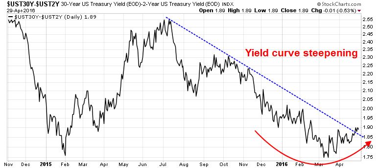
I wrote last week about how to interpret the FOMC statement (see What happens if the Fed gets less dovish?). One of the key indicators that I said to watch was the shape of the yield cuve. As the chart below shows, the 2-30 year curve wobbled a bit after the FOMC meeting, but the steepening trend continued. In effect, the bond market is in effect expecting higher economic growth and rising inflation.
I am no permabull, but it`s hard to get overly bearish in the face of this combination of improving breadth, momentum, golden crosses and better growth outlook. This is not a freight train that I want to stand in front of.
Skeptical sentiment
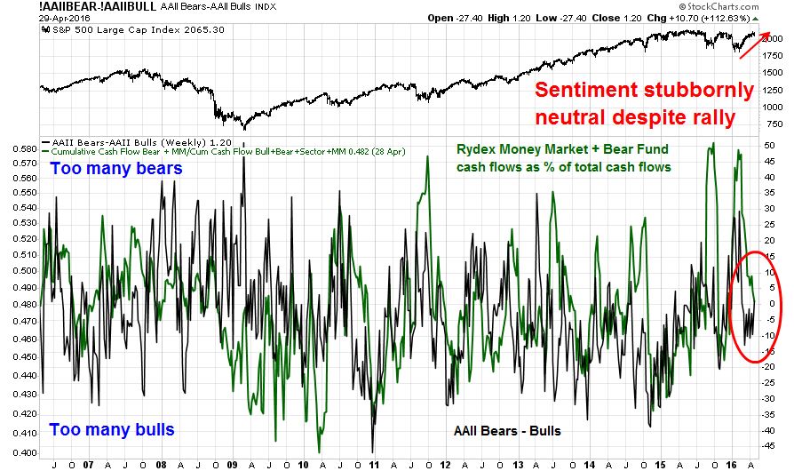
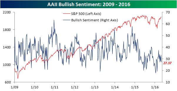
It would be easier for me to get more cautious about the stock market if sentiment models showed that traders and investors weren’t so skeptical about this rally. Normally, you expect that sentiment would get absolutely euphoric after a 15% surge in stock prices. Instead, the latest reading from AAII and Rydex show that sentiment is still stuck in neutral.
In fact, Bespoke highlighted that the percentage of AAII bulls edged down this week:
…and AAII bears ticked up:
Skepticism is evident not only for individual investors, but institutions as well. I pointed out last week that surveys show that both global institutional investors (BoAML Fund Manager Survey) and US institutions (Barron’s Big Money Poll) show that fund behemoths are cautious and under-invested in US equities (see How the SP 500 could get to 2400 this year). The only group that has embraced this rally are the RIAs, as measured by the NAAIM survey.
This equity rally is by no means hated, but there is a high degree of disbelief in the face of a breadth and momentum surge. These readings are setting the stage for a Fear of Missing Out rally should price and fundamental momentum continue upwards, especially if the SPX were to break out to new all-time highs, which isn’t that far away from current levels.
Sell in May seasonality
What about the well-known “Sell in May and go away” negative seasonality for stock prices over the next six months? Should that be ignored?
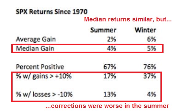
While I do pay attention to seasonal patterns, current conditions are far more important than the historical pattern. Urban Carmel recently wrote a post (see Sell in May and buy back higher in November) that put the “Sell in May” returns into context. As the table below shows, the May-November has shown an weaker than usual average return, but the spread in median returns between summer and winter weren’t that far off. Further analysis showed that average returns were pulled down by a greater downside volatility during the May-November period.
While returns over the next six months may have been subpar, they were nevertheless positive.
So do you want to sell in May and buy back higher in November?
The week ahead
The equity bull case I have outlined so far is an intermediate term outlook. There is no assurances that stock prices must go up next week. In fact, the market is facing an important short run technical test for bulls and bears alike.
The weakness late last week has left the market mildly oversold. We can see that using these charts from IndexIndicators. Based on % of stocks above their 10 dma, the market has retreated to levels where it has bounced in the past.
Similarly, net 20-day highs-lows breadth has retreated to levels where the decline was arrested in the current rally episode.
Looking over a 1-3 day horizon, the 5-day RSI has dipped into oversold territory. Moreover, the VIX Index tested its upper Bollinger Band, which is another oversold indicator. VIX tests of the upper BB have been periods where downside risk has limited in the past year, with two exceptions. These two exceptions appeared in the August 2015 and January 2016 declines. In other words, oversold markets can get more oversold.


Thanks for the great overview. Really hope bulls win this one. Last week there was a few things I heard such as stagflation (due to bad GDP numbers and uptick in inflation) and Mr El Erian saying something along the line of Japan being the third largest economy and if the USD-JPY deteriorates further it may affect the global markets. Would like to hear your thoughts on these issues.
I woke up at 4:00 AM and started to pen an email to colleagues about how dividend yields versus bond yields made stocks look like a bargain. Half-asleep, pre-caffeine I got into a rant. Thought you folks might be interested.
The dividend yield on the TSE Composite has gone from 2.5% to 3% while 10 year bonds have gone from 4.5% to 1.5% since 2007.
The stock market in Canada is such great value versus bonds that I wonder if our worries about earnings being up or down a bit or the PE at that level or this versus history, are just our industry navel gazing. The U.S. market dividend yield isn’t as extreme but still very good versus bonds..
Our only excuse for not being totally bullish is that we think the Central Bankers have engineered artificially low rates that will ramp up when they stop easing. This seemed a possible scenario in December when we had our first rate increase and the Dot Plots showed a ramp up coming over the next few years. Veteran portfolio managers who have 4-5% rates imprinted in their brains as a ‘norm’ sent stocks down to a low in February. They knew that fulfilling the Dot Plot trajectory would send the S&P 500 finally into the bear market they were holding their breath expecting.
The great unwashed public redeemed mutual funds at rates last seen at the bear market lows in 2009 because they were getting vertigo when looking at the chart of the S&P 500. It looked like the mountaintops of 2000 and 2007 before the 50% crashes into valleys. They can be excused because they don’t understand that the Dow Jones Industrials have gone from an index level of a few bucks to thousands over the last hundred years because earnings compound and stock markets don’t go sideways for decades. They invest on chart pictures and negative talking heads on T.V.
Back to the veterans expecting a ramp up of rates along a ‘Dot Plot’ trajectory. The four rate increases expected in 2016 started vanishing. It became three, then two, then one and now it’s a toss-up if it will be even one. That V bottom in rates and a return to ‘normal’ is fading, fading, fading. As it fades, the focus on dividends comes more, and more and more. Over the next six months, it will dawn on those veterans that are not thick-headed, that we are not returning to ‘their’ normal. Portfolio managers who can accept reality will buy as stocks hit new highs based on strong dividends and a much lower than expected long term interest rate outlook. The laggards will be kicked out of portfolio management for poor performance. The general public will witness for the first time (for most of them) stock markets hitting new highs and just keep on going higher. Zero percent deposits will suddenly seem a bad choice and money will pour back into stocks, ETFs or mutual funds.
My model portfolio is up 18% in $US or 8.8% $Canadian YTD for the first four months. That is due to looking at individual industry sectors and countries rather than just the U.S. general stock market index. Veterans were mesmerized by watching the S&P levitating near its highs and seeing its bull market aging from six to seven years and ‘knowing’ that there was a comeuppance coming any time just like old ‘normal” times. The area above the S&P 500 highs just seemed like it wouldn’t have enough oxygen to sustain life.
I was looking at the reality that many sectors were nearing the end of obvious bear markets. The list of bear market sectors and countries is too long so it’s easier to just say the S&P 500 and the DJIA are the ONLY indexes that didn’t have a defined bear market, minus 20%, plunge. How could anyone think that the Canadian stock market, commodity sectors and so many other sectors and countries were in the seventh year of a bull market and ready to head down any moment when they had already been crushed? Bear markets end with extreme pessimism and start new long term bull markets. The bearish extremes happened on January 20th for value stocks and February 11th for growth in those sectors and countries that were in bear markets. I bought the commodity and value bear market casualties on January 21 and 22. The results speak for themselves. So we are in a new bull market. Simple, but true. Unbelievable to most, but true. Cam’s technical work is showing characteristics of the lift-off phase of a new bull market cycle.
I have been around long enough that I have seen the S&P 500 break above 1000 in 1982, the top of a 16 year trading range, and go to 5000 in seven years. Yes, Virginia, stock markets can go up and up because earnings and dividends go up and up. Other ‘veterans’ might not have been around long enough to experience how stocks can go up and up and up and up.
But aren’t earnings locked in a perpetual funk as gurus say? No, companies will reinvest profits and grow earnings and dividends forever. This bull market will see commodity producers go from basket cases at the beginning of the year to profitable in the not too distant future. That alone will take indexes higher. It will see dividends become the focus of investing over earnings and a higher revaluation of all dividend stocks. That will give the non-commodity stocks a big boost. Technology will bring amazing new advances and their stocks will go up. Countries with failed austerity programs will rediscover Keynes and rebuild boosting economies and corporate profits. We will see peace and prosperity break out in the world where now we see only destruction and chaos in the media. There will be a Marshall Plan to rebuild devastated homelands to let refugees return and live in dignity. The companies and workers that rebuild will earn well-deserved monies boosting economies and stock markets. Life will get better. Stocks will go higher.
Hey Ken,
I’m reading you and Cam. Then, I recall Greenspan in a recent YouTube telling the audience there’s no productivity. He has no confidence in this market. He has never seen anything like it. He has no idea how it will end. A bit ironic coming from one of the men who engineered it all.
https://youtu.be/v8sI1DQvvZ8
He’s the guy that shouted “irrational exuberance” just before the stock market doubled.
Excellent article pointing out many positive points. My concerns for the market at this juncture are 1) Graveyard Doji candlesticks in first week of November and third week of April on S&P 500 2) Consensus bulls at 59% 3) S&P 500 daily MACD bearish divergence 4) Contracting new highs on S&P 500 5) Lowry’s buying power weak. Picture seems very mixed to me as we are stuck in this trading range. Your thoughts on these other indicators I find relevant?
I’ve been watching the technical signs that you point out with interest. My take is we differ on time horizons.
The market is likely undergoing either a corrective or consolidative period within the context of an intermediate term uptrend.
If that’s the case, how much do you care about short-term squiggles?
And doping in sports is still illegal?!