Preface: Explaining our market timing models
We maintain several market timing models, each with differing time horizons. The “Ultimate Market Timing Model” is a long-term market timing model based on the research outlined in our post, Building the ultimate market timing model. This model tends to generate only a handful of signals each decade.
The Trend Model is an asset allocation model which applies trend following principles based on the inputs of global stock and commodity price. This model has a shorter time horizon and tends to turn over about 4-6 times a year. In essence, it seeks to answer the question, “Is the trend in the global economy expansion (bullish) or contraction (bearish)?”
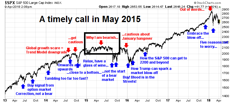
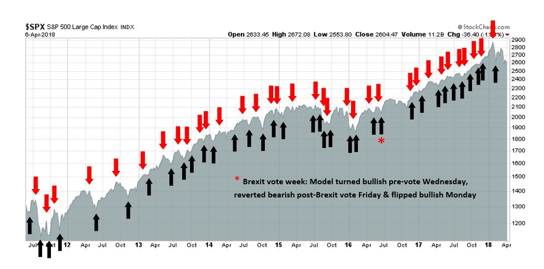
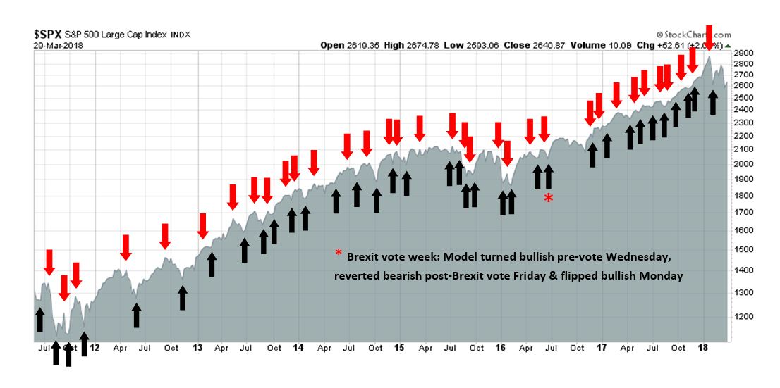
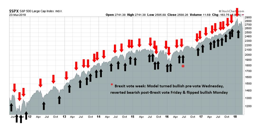
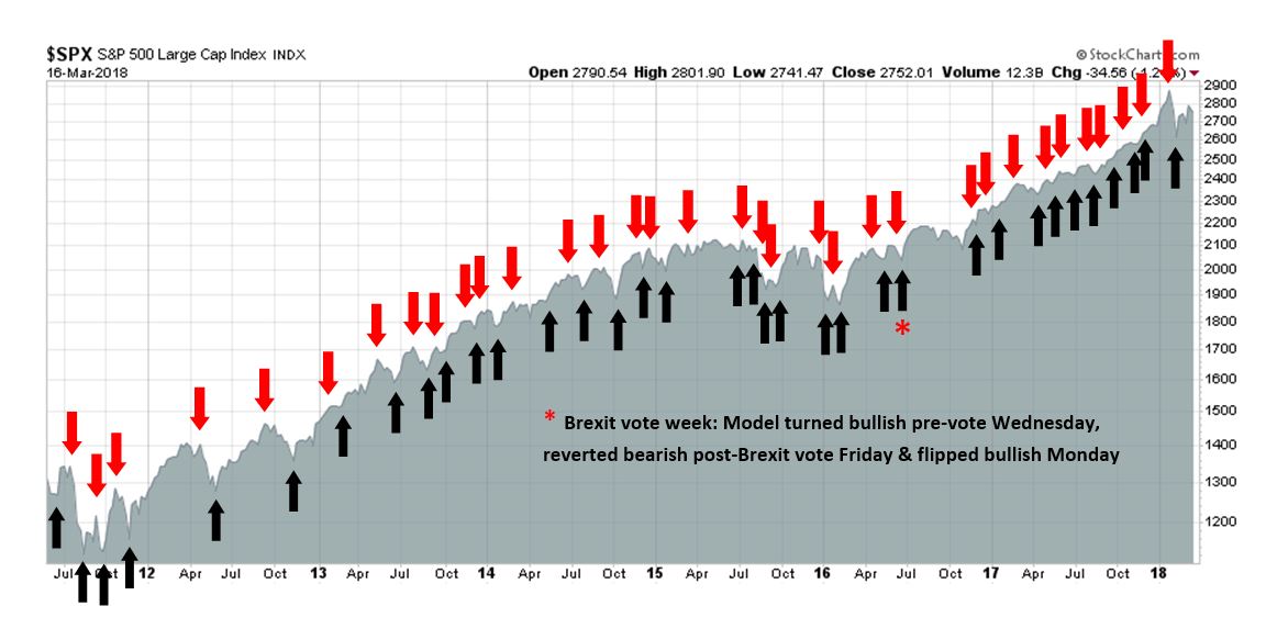
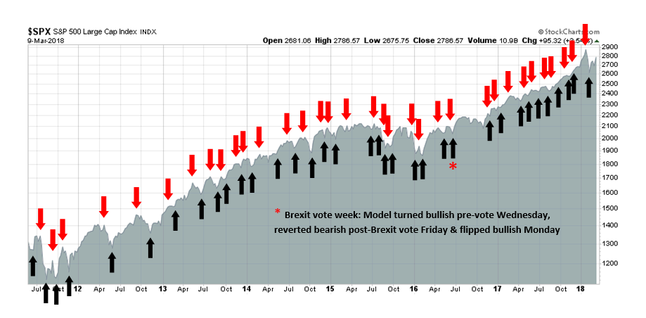
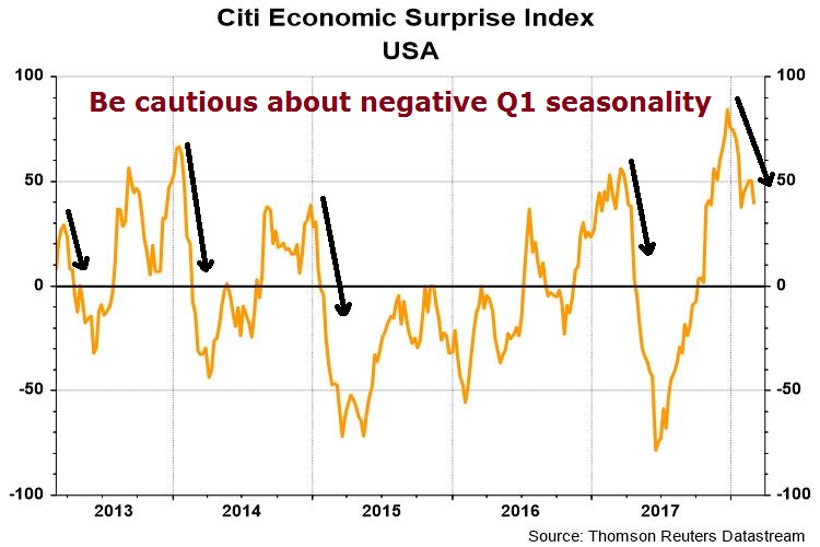
My inner trader uses the trading component of the Trend Model to look for changes in the direction of the main Trend Model signal. A bullish Trend Model signal that gets less bullish is a trading “sell” signal. Conversely, a bearish Trend Model signal that gets less bearish is a trading “buy” signal. The history of actual out-of-sample (not backtested) signals of the trading model are shown by the arrows in the chart below. The turnover rate of the trading model is high, and it has varied between 150% to 200% per month.
Subscribers receive real-time alerts of model changes, and a hypothetical trading record of the those email alerts are updated weekly here.
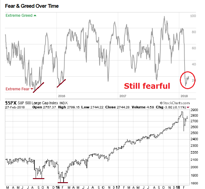
The latest signals of each model are as follows:
- Ultimate market timing model: Buy equities
- Trend Model signal: Neutral
- Trading model: Bullish
Update schedule: I generally update model readings on my site on weekends and tweet mid-week observations at @humblestudent. Subscribers receive real-time alerts of trading model changes, and a hypothetical trading record of the those email alerts is shown here.
Will Treasuries continue to be diversifiers?
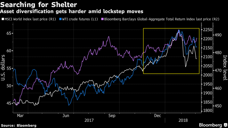
Bloomberg recently reported that Sanford Bernstein declared the 60/40 portfolio to be doomed, because the prices of different asset classes, which were believed to be diversifying, are moving together.
This brings up an interesting point, will bonds do their part to diversify portfolio returns and cushion equity downside risk in the next bear market? In the last crisis, fixed income investments proved to be a poor diversifier as credit spreads blew out, and only Treasuries rallied. In the next bear market, will Treasuries be able to fulfill their role as diversifying investments?
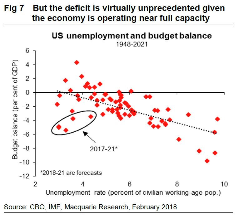
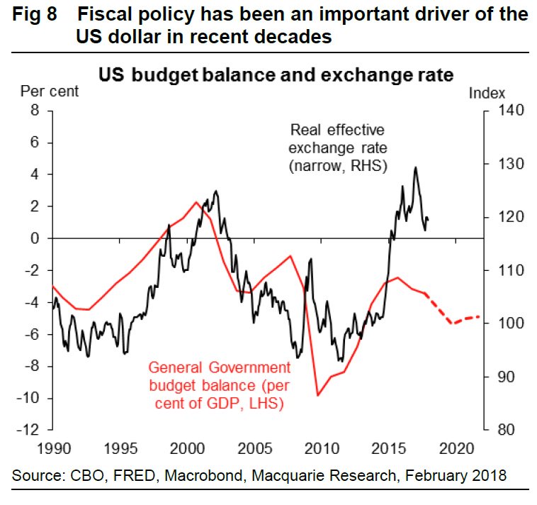
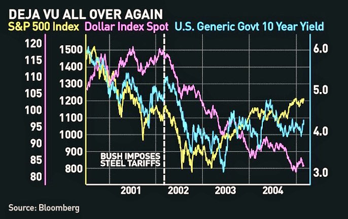
In the wake of widespread worries over the Republicans’ latest fiscal experiment with tax cuts during the late phase of an expansion, a number of strategists have voiced concerns about the downward pressure that exploding fiscal deficits would put on the US Dollar. Macquarie pointed out that priming the fiscal pump during a period of low unemployment is highly unusual.
If history is any guide, then the USD is likely to face significant downward pressure in the future as deficits explode upwards.
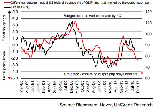
The FT reported that Vasileiocs Gkionakis of UniCredit came to a similar conclusion.
That got me thinking. A falling USD implies that the market is losing confidence in the value of USD assets. If the greenback is going to be under such pressure, what happens in the next recession?
In the past, USD assets, and Treasury securities in particular, have been the safe haven asset of choice during periods of economic stress. If the USD and USTs lose their safe status, what happens to diversified portfolio returns? Will the decline in their asset values accelerate because bonds, and especially USTs, fall in value along with the price of other risky assets like stocks?
Dire projections
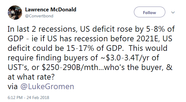
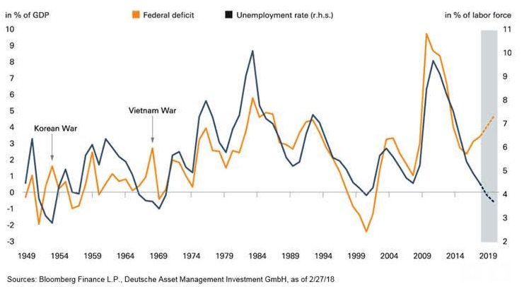
The projections look dire. The deficit is likely to surge by 5-8% of GDP in the next recession. Lawrence McDonald rhetorically asked who the buy of all the Treasury assets.
The market response in the next recession, whenever that occurs, could look like a gold bug fantasy.
What are the alternatives?
Let’s consider the possible range and supply of safe haven assets for major reserve managers. From a practical standpoint, the world has three major trade blocs, the US, Europe, and Asia, and two major currencies with sufficient liquidity to hold as reserves, the dollar and the euro. The other currencies do not trade in sufficient size for the reserve managers of a central bank to hold in size. Currencies such as the JPY and GBP can be best described as secondary holdings and cannot constitute the first or second largest weight in currency reserves, other than in the special case where that country is a major trading partner.
Swiss Francs (CHF)? Gold? Collectibles? Cryptocurrencies? You’ve got to be kidding. If any major central bank decided to devote a significant portion of its reserves to CHF, the Swissy would soar instantly. As for gold, the US Treasury is one of the biggest holder of physical gold reserves. If it were to sell off all of its reported reserves at current market values, and they are all available for sale and not lent out as theorized by a number of gold bugs, the sale would net a little over $300 billion. In other words, the sale of the Treasury entire gold reserves would not pay for a single year’s fiscal deficit. It’s a drop in the bucket. As for collectibles and cryptocurrencies, their liquidity are an order of magnitude worse than gold.
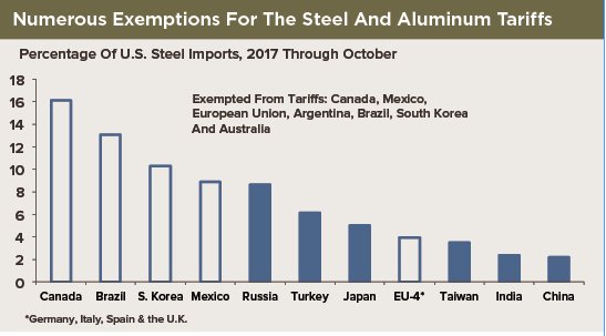
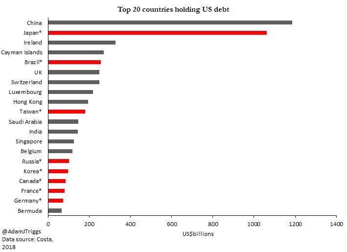
As well, consider the Triffin dilemma, which states that the country whose currency is the global reserve currency must be willing to supply the world with an extra supply of its paper to fulfill world demand for these foreign exchange reserves, thus leading to a current account deficit. Notwithstanding Trump`s obsession with trade deficits, foreigners have been financing US trade deficits by buying USD assets. As the chart below shows, it is no surprise that the two largest holders of US debt are China and Japan, which have been running sustained current account surpluses for years.
Stress points in the next recession
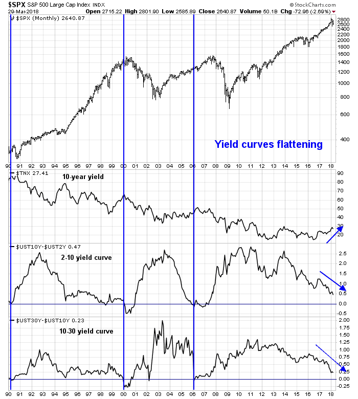
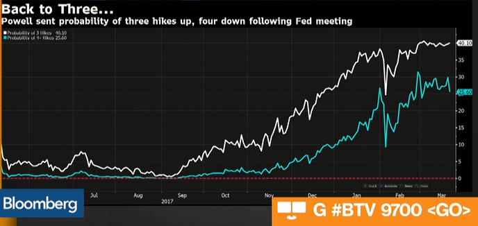
Imagine the following scenario. The Fed makes a policy mistake in 2018. It either finds itself behind the inflation fighting curve and steps on the monetary brakes to induce a recession; or it tightens too quickly into a slowdown. Fed chair Powell has already alluded to the possibility of four quarter-point rate hikes this year. Four rate hikes could easily invert the yield curve, which would be a signal of a recession in 2019.
With that in mind, let take a trip around the world to consider the issues facing each trade bloc and region, and evaluate where we may find safe haven assets.
Starting in the United States, former IMF chief economist Simon Johnson believes that the latest wave of financial deregulation puts the banking system at risk of Lehman Brothers II.
A serious legislative effort, supported by the Trump administration, is underway to reduce the level of scrutiny applied to banks that are on the verge of becoming systemically important. If congressional Republicans have their way, financial stability will be at greater risk than at any time since the 2008 crisis.
Edward Harrison of Credit Writedowns fretted about the risk of implosion by defined benefit pension plans, and public sector plans in particular:
Walters is talking about dire state and municipal finances during the best economic conditions of this business cycle. What happens when the economy turns down? And what happens in the next tough bear market in equities or bonds? The seven percent annual return assumption will look ridiculously optimistic then.
And California’s problems will be repeated throughout the country in places like Illinois and New Jersey. Those are two of the biggest states that have precarious municipal finances. And have you seen what’s happening in Oklahoma, with teachers working at Walmart on Mondays? That’s not the future that other states want to reckon with.
No one’s talking about this – at least not in my circles. I don’t hear it on the news or read about it in the paper. For me, the potential for a state and municipal fiscal and public pension crisis is a defining issue for the next downturn. Problems in this arena are guaranteed given the underfunding of public pensions throughout the United States. The question is whether the downturn in the economy and in financial markets crystallizes a crisis.
If we do have a pension crisis, it will be a systemic issue, both economically and politically. The issue with CalPERS tells you that.
If either of the scenarios outlined by Johnson or Harrison were to realize themselves in the next downturn, credit spreads would undoubtedly blow out in the corporate bond market and the municipal bond markets. Such episodes would detract from the attractiveness of USD assets.
One of the open questions in the next downturn is the reaction function of the Federal Reserve. They would undoubtedly lower interest rates in the face of economic weakness, but when happens at the zero bound? The solution so far, has been more quantitative easing. Edward Harrison suggested that the Fed could resort to more extreme forms of QE, such as the purchase of municipal bonds issued by states facing severe pension funding shortfalls. If QE isn’t proving to be effective, there is always helicopter money, otherwise known as “the government spends it, we’ll monetize the debt”. Ben Bernanke explained in his famous 2002 helicopter money speech:
A broad-based tax cut, for example, accommodated by a programme of open-market purchases to alleviate any tendency for interest rates to increase, would almost certainly be an effective stimulant to consumption and hence to prices. Even if households decided not to increase consumption but instead rebalanced their portfolios by using their extra cash to acquire real and financial assets, the resulting increase in asset values would lower the cost of capital and improve the balance sheet positions of potential borrowers. A money-financed tax cut is essentially equivalent to Milton Friedman’s famous ‘helicopter drop’ of money.
Another solution advocated by Marvin Goodfriend, Fed governor nominee, is the use of negative interest rates in lieu of QE in a Jackson Hole paper he presented in 2015. Goodfriend believes that the Fed can drive rates to significantly negative levels by breaking the link between the value of money in the banking system and paper currency. The Fed could take steps to either restrict or refuse the issuance of paper currency, e.g. $100 bills. It could also encourage banks to charge customers a fee if a depositor withdraws money in paper currency. Those steps would discourage customers from asking for currency and coins, and therefore remove the arbitrage between balances earning negative interest rates in a bank and taking the money out and putting it under a mattress.
Eurozone: Lingering problems from the last crisis
If investors were to flee from USD assets, one possible alternative is eurozone paper. Unfortunately, Europe has yet to fix the banking leverage problems left over from the last crisis. While the ECB managed to paper over the problem, bank leverage ratios remain highly elevated. The lack of an agreement on the socialization of risk in the eurozone has meant that the banks still own significant amounts of the sovereign debt of their own countries, e.g. Spanish banks own Spanish debt, while at the same time each sovereign is responsible for bailing out their own banks. (Wait a minute…if Italy gets into trouble, but Italian banks own Italian debt, how does Italy bail out its banks?)
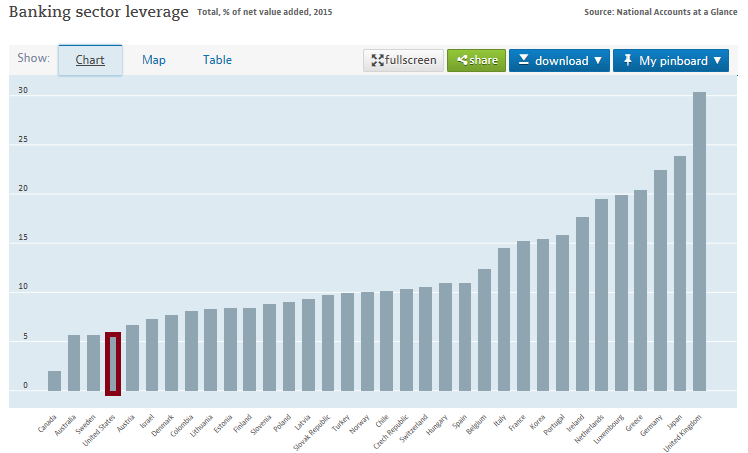
The OECD data on banking leverage shows that European banks are highly levered by global standards. American banks, by comparison, have their leverage ratios well under control.
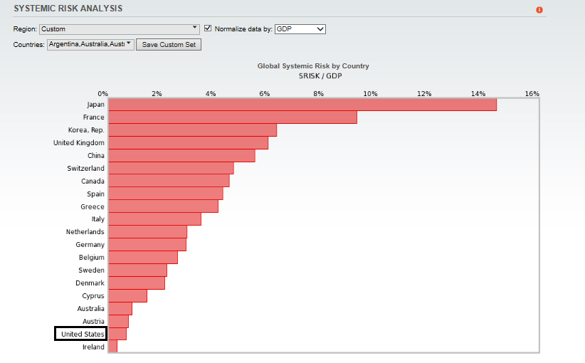
Analysis by V-Lab at the Stern School of long-term value-at-risk tells a similar story. European banks are highly exposed, while the leverage of American banks is much lower.
If the global economy were to slow, major cracks are likely to develop in the European banking system. As I pointed out in my previous post (see The rise of populism and the policy challenge for global elites), the formation of the Merkel government gives Europe a small window for the Macron-Merkel alliance to create fiscal shock absorbers to cushion the next economic downturn. If they fail, then the risk of political swings to populist governments in Europe rises dramatically.
Don’t expect the euro to become a safe haven currency under such circumstances.
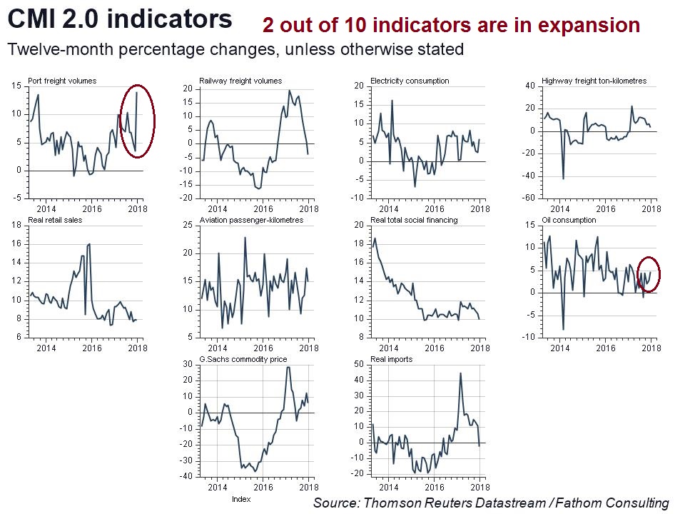
China: Hard landing risk
What about China? Could the CNY become a safe haven currency?
There are two problems with that thesis. First, China is a current account surplus country. Countries with a history of current account surpluses will not, by definition, have any need of external debt. As a results, there is just not enough RMB sloshing around the global financial system for the RMB, or CNY, to be a significant reserve currency (see above discussion of the Triffin dilemma).
China bears also like to refer to their favorite chart of Chinese debt. Debt to GDP readings are already at levels consistent with past global financial crises. Since China is a major exporter to the US, it is unclear what the effects are should the US slow into recession. As the Chinese financial system is opaque, and it has not been fully stress tested under the current conditions, risk levels are at uncharted levels.
Under those conditions, would anyone really want to hold CNY as a major safe haven asset?
Japan: Safe haven?
Finally, there is Japan. The JPY has been regarded by currency traders as a safe haven currency. However, the historical record is mixed at best. Up until the GFC, JPYUSD had weakened into recessionary periods. It has only been recently that JPY has been seen as a safe haven.
That said, the BoJ has taken a concerted effort to buy up the supply of JGBs during its numerous rounds of QE programs. This creates the problem of insufficient liquidity should investors decide to buy JPY during a recession or financial crisis.
Good news, bad news
In conclusion, this analysis reveals both good news and bad news. The good news is the USD will still be the least dirty shirt in the neighborhood during the next global slowdown. Expect that Treasury securities will retain their safe haven status in the next recession by virtue of their default-free characteristics and the status of the USD as a major reserve currency.
From a portfolio construction viewpoint, investors can relax. USTs will remain a diversifying asset class and tail-risk hedge in the next economic downturn, and serve to reduce the volatility of a diversified portfolio.
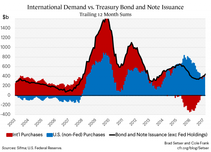
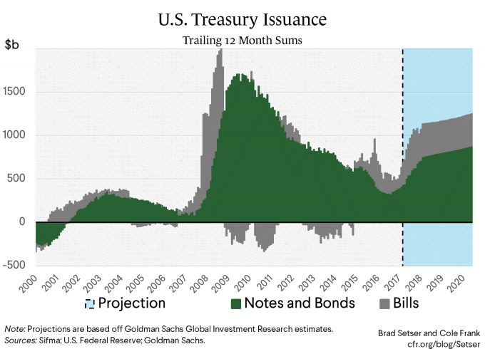
Here is the bad news. This analysis is silent on the behavior of USD assets while the global economy is not in crisis. Brad Setser at the Council for Foreign Relations summarized the problem by observing that the international demand for Treasury paper has been in decline.
With the fiscal deficit expected to balloon, financing rising debt levels will be increasingly challenging.
In a non-recessionary environment, it becomes an open question whether rising rates, a falling USD, or a combination of both would become the safety valve for these imbalances. That said, USD safe haven demand should still spike when the next crisis hits.
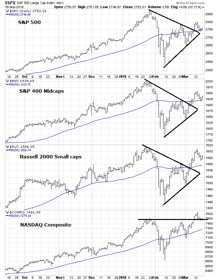
The week ahead
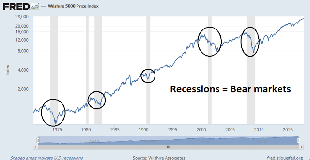
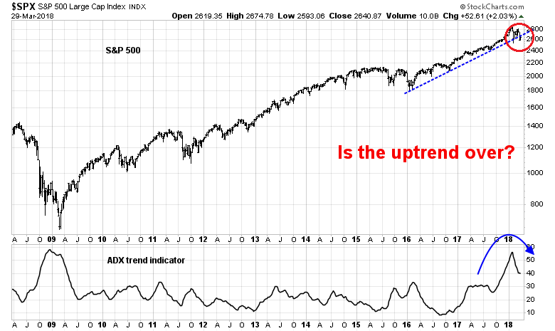
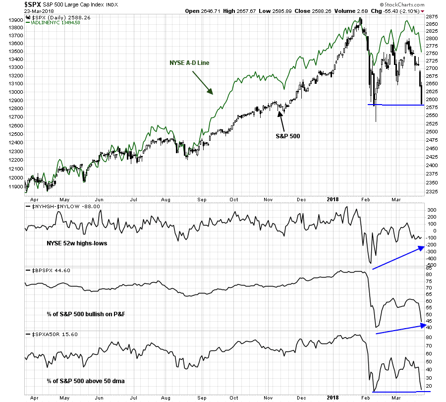
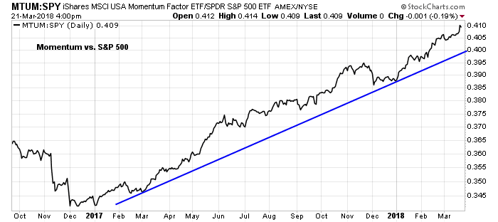
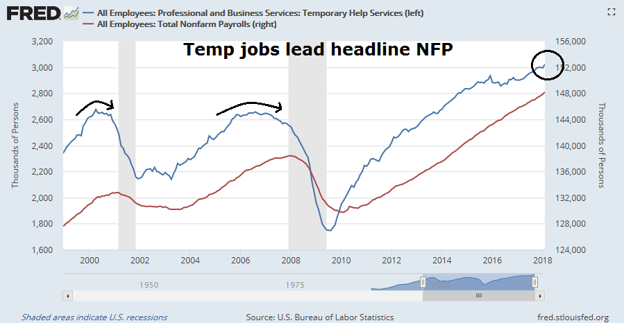
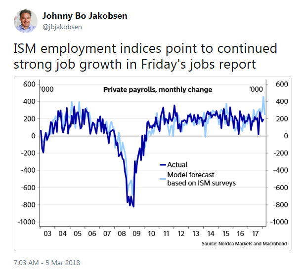
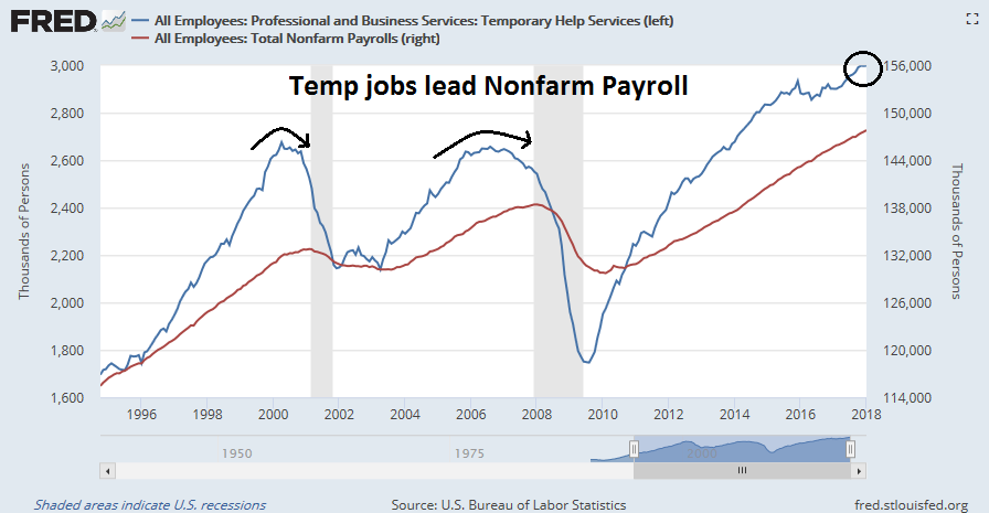
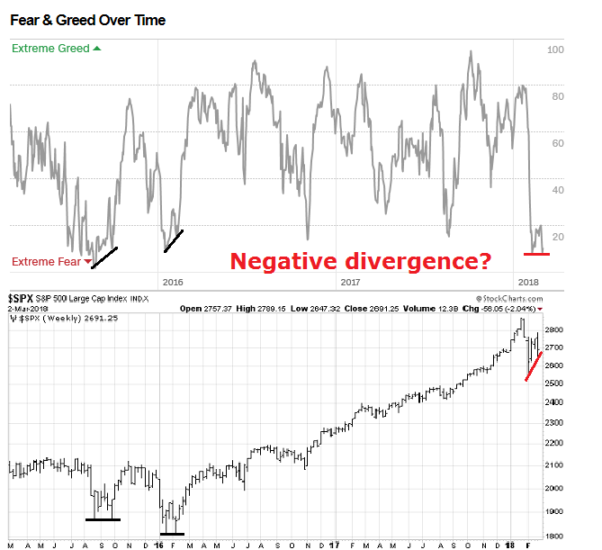
Looking to the week ahead, most indications suggest that the correction is over. The upside surprise from the February Jobs Report conveyed a message of strong non-inflationary growth. More importantly, temp jobs started growing again after a brief pause – and temp jobs have led headline NFP in the last two cycles.
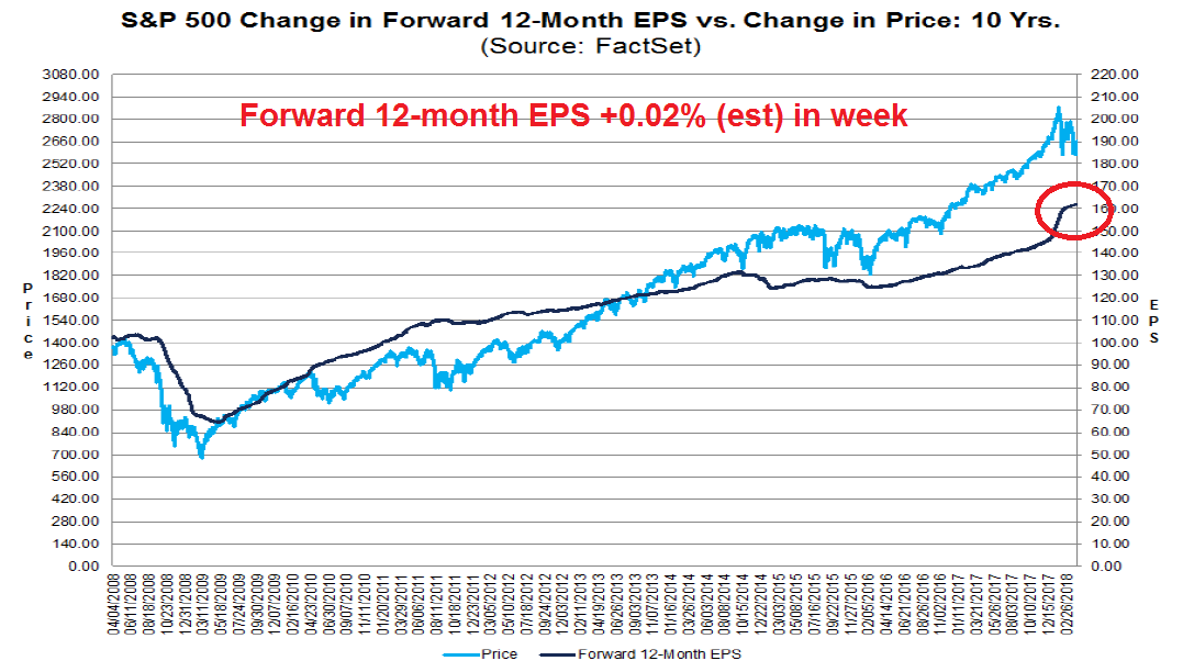
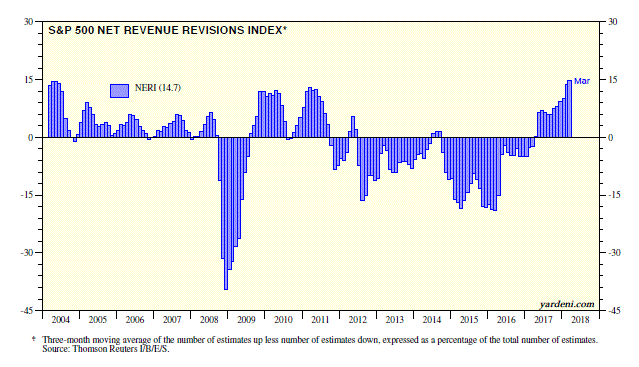
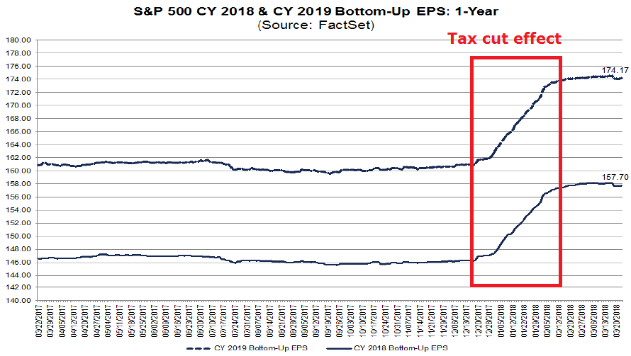
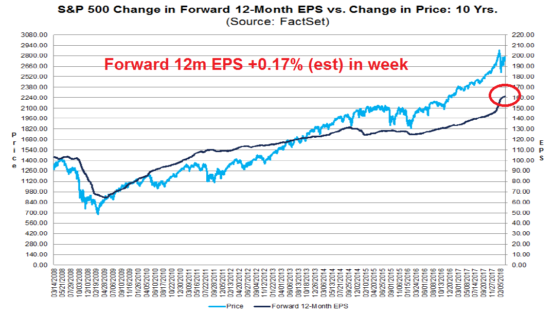
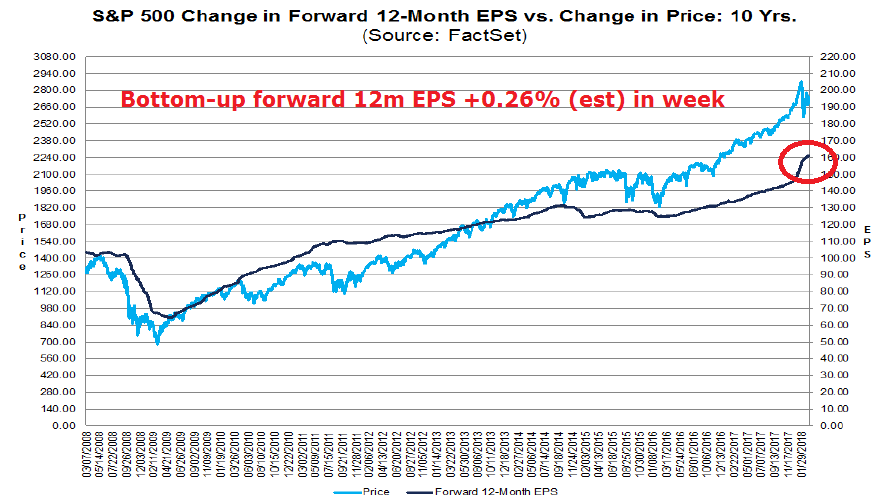
In addition, the latest update from FactSet shows that forward 12-month EPS are continuing to rise, indicating positive fundamental momentum.
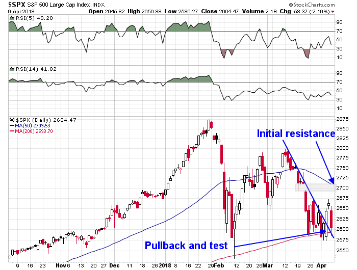
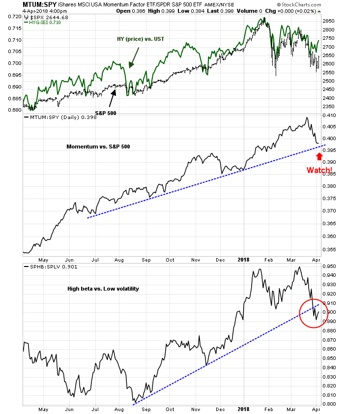
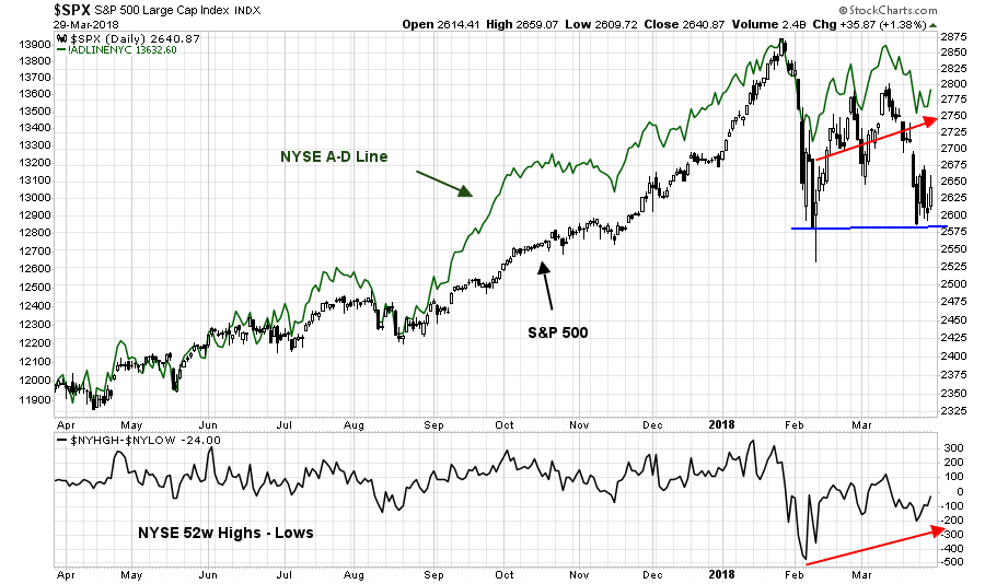
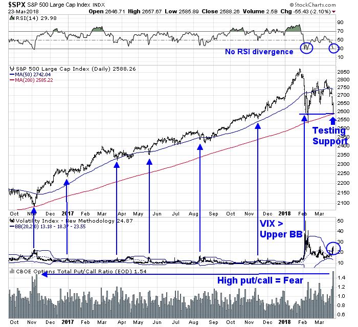
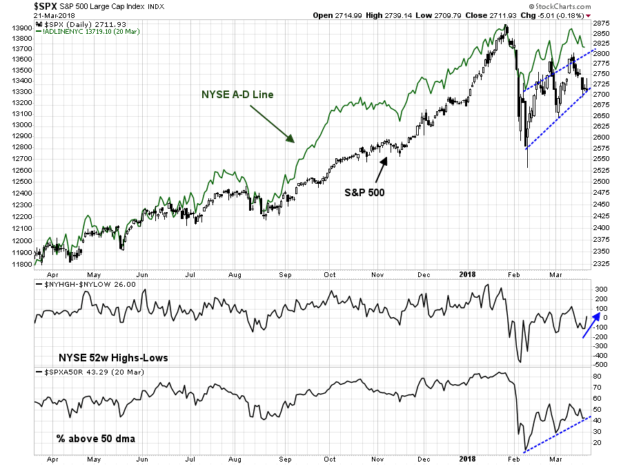
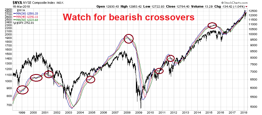
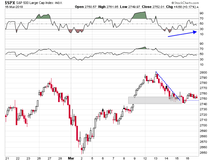
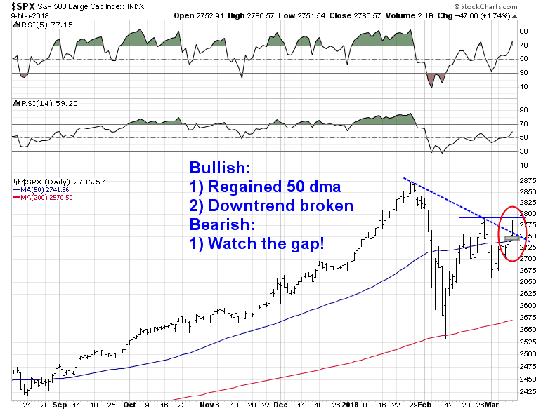
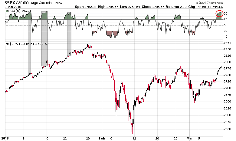
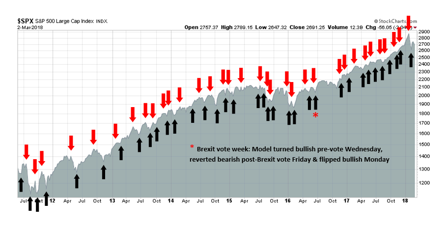
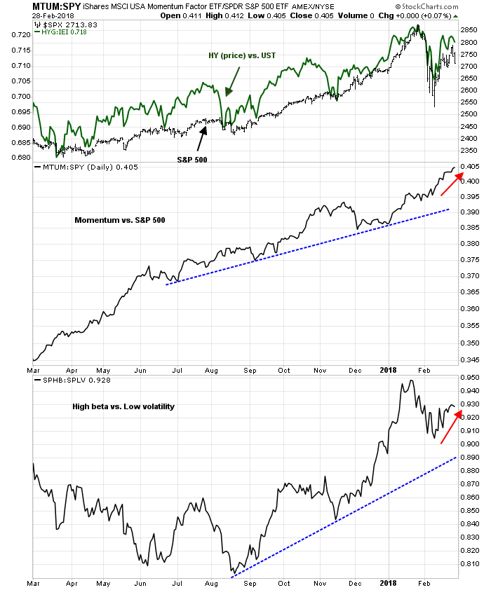
From a technical perspective, the SPX regained the 50 day moving average (dma) and rallied through a downtrend line. It is now testing a short term resistance level defined by the February highs. The near-term downside risk may see the market decline to close the gap set last Friday, which stands just above the 50 dma.
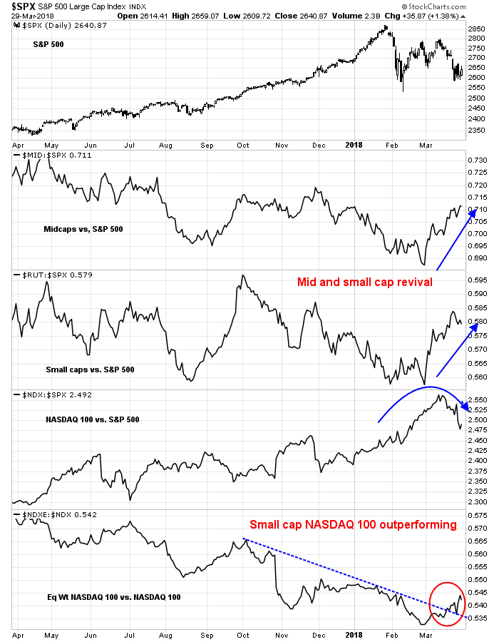
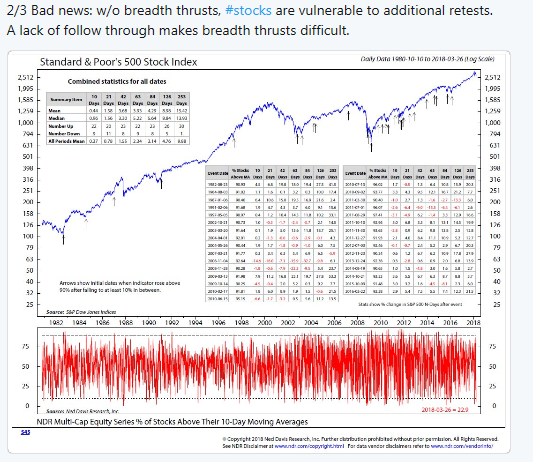
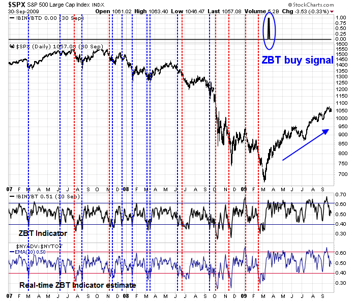
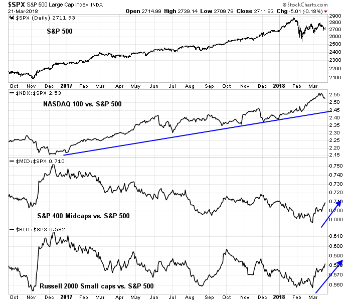
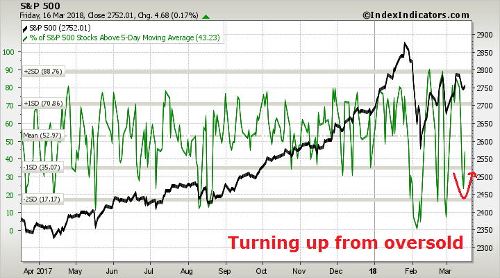
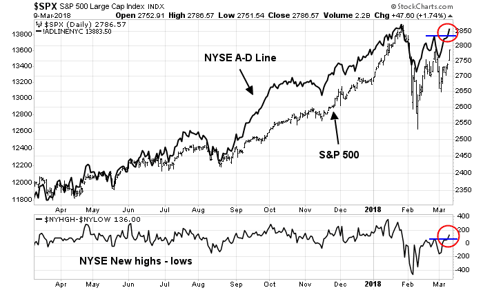
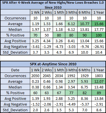
Breadth indicators are supportive of further gains. Both the NYSE Advance-Decline Line and New Highs-Lows are stronger than the SPX.
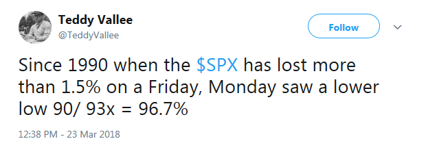
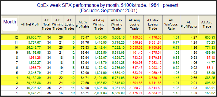
Next week is option expiry week (OpEx). Rob Hanna of Quantifiable Edges observed that March OpEx week is one of the most bullish OpEx weeks in the year.
In a separate post, Hanna also found that Friday’s NASDAQ market action on a Jobs Report day had bullish tailwinds for the following week.
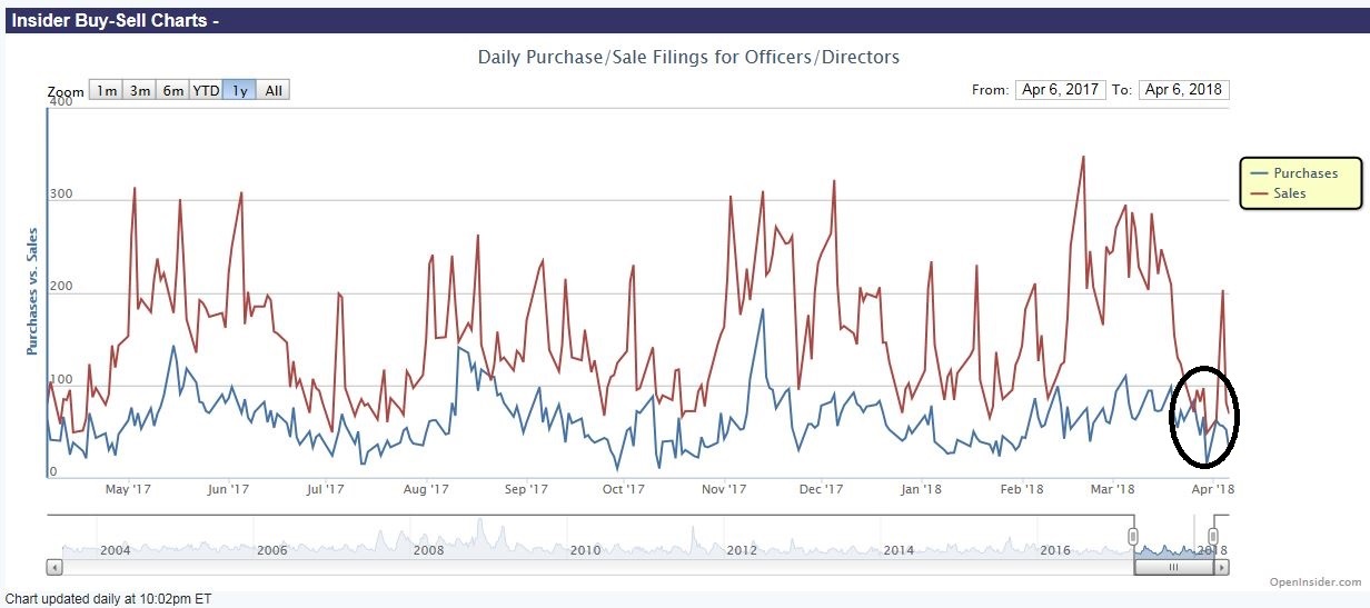
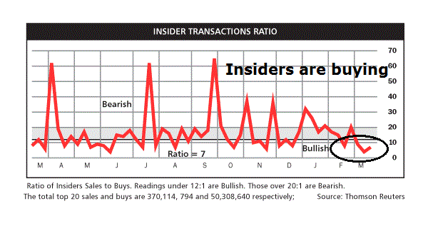
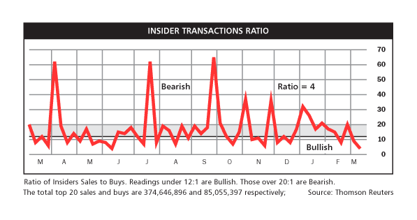
As well, the latest update of insider activity from Barron’s is supportive of higher prices.
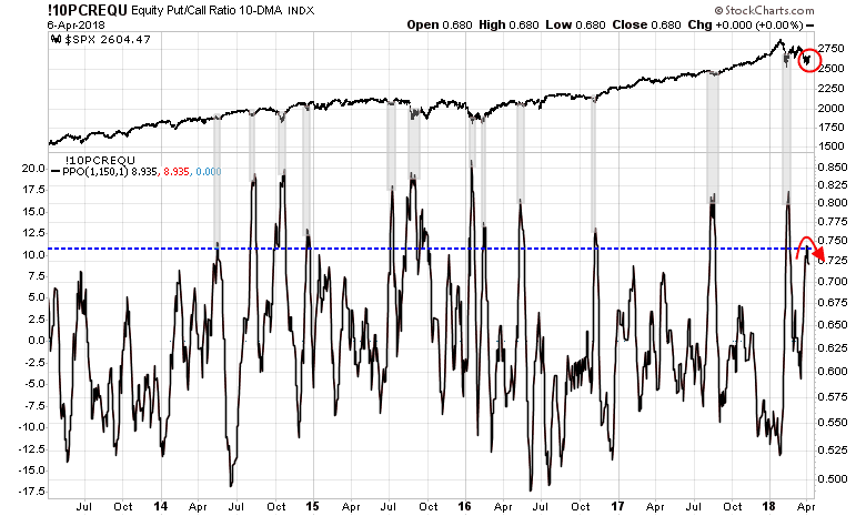
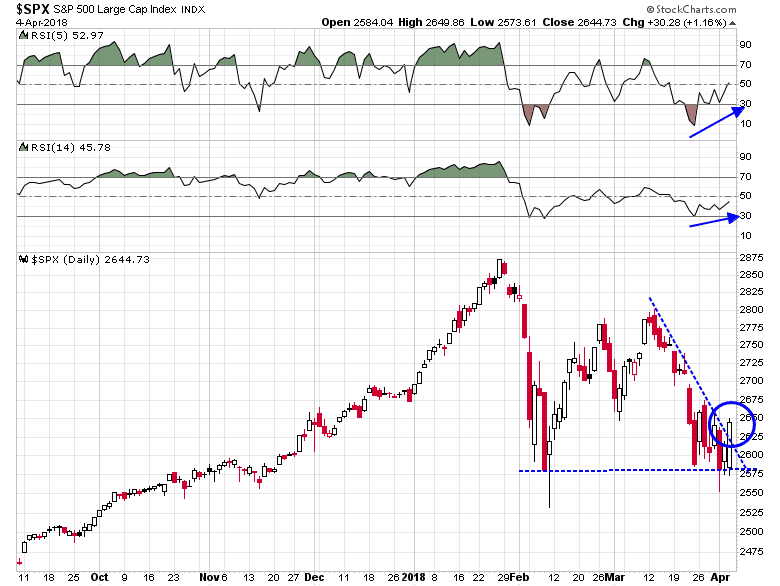
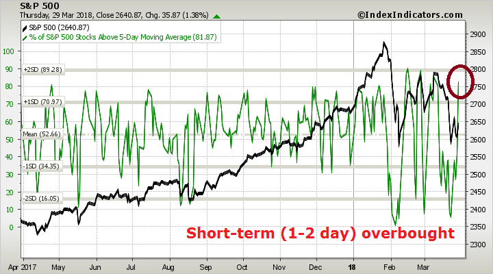
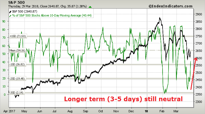
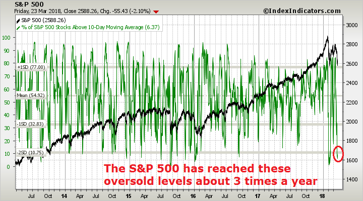
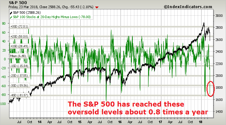
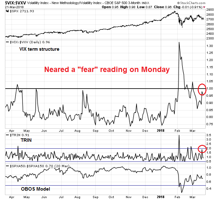
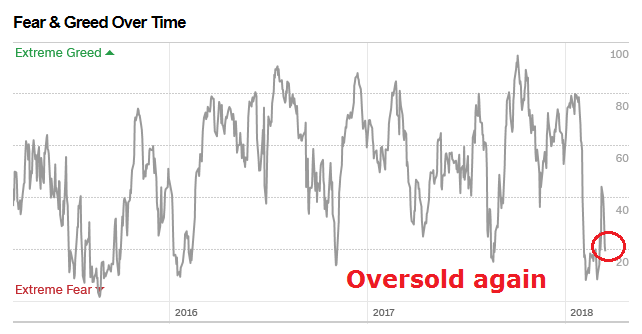
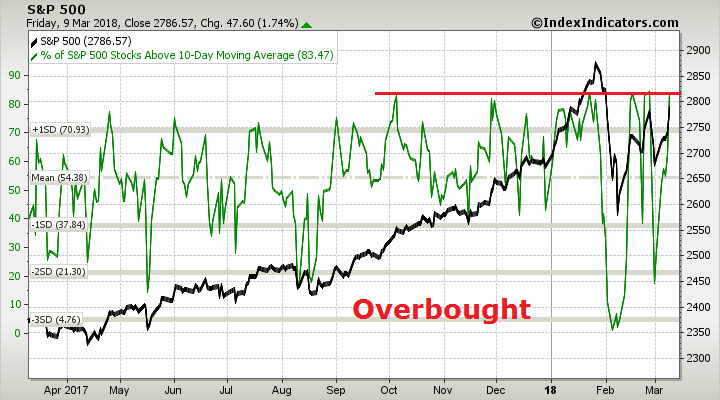
While the market is exhibiting strong “good overbought” momentum which is supportive of higher prices, there could be a brief pause or pullback early in the week. Breadth indicators from Index Indicators show that market is overbought at multiple time frames.
Hourly RSI-5 of the SPX has exceeded the highly overbought 90 level, which is not a sustainable condition. Even during the January melt-up, similar past episodes had seen the market either pause or weaken under such conditions.
My inner investor remains constructive on stocks. My inner trader is turning increasingly bullish. Should the market weaken in the near term, he is ready to buy the dip.
Disclosure: Long SPXL