Preface: Explaining our market timing models
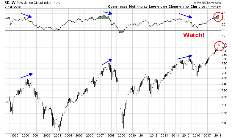
We maintain several market timing models, each with differing time horizons. The “Ultimate Market Timing Model” is a long-term market timing model based on the research outlined in our post, Building the ultimate market timing model. This model tends to generate only a handful of signals each decade.
The Trend Model is an asset allocation model which applies trend following principles based on the inputs of global stock and commodity price. This model has a shorter time horizon and tends to turn over about 4-6 times a year. In essence, it seeks to answer the question, “Is the trend in the global economy expansion (bullish) or contraction (bearish)?”
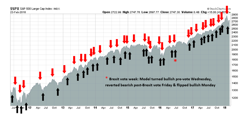
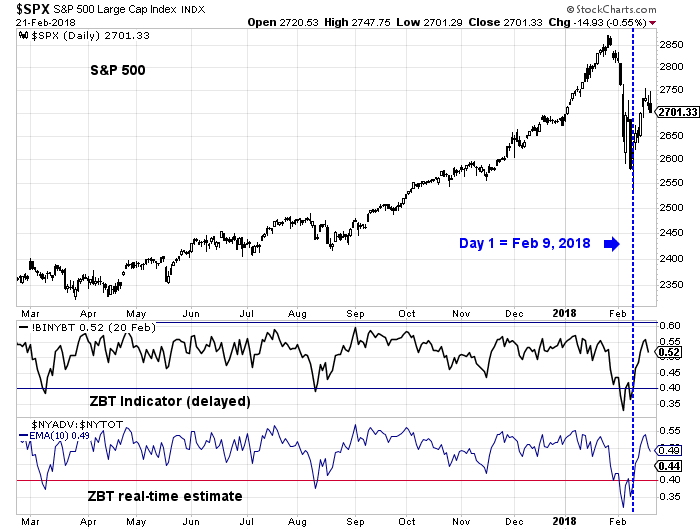
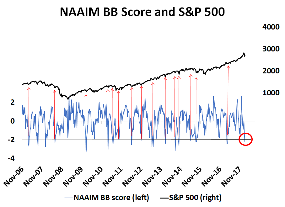
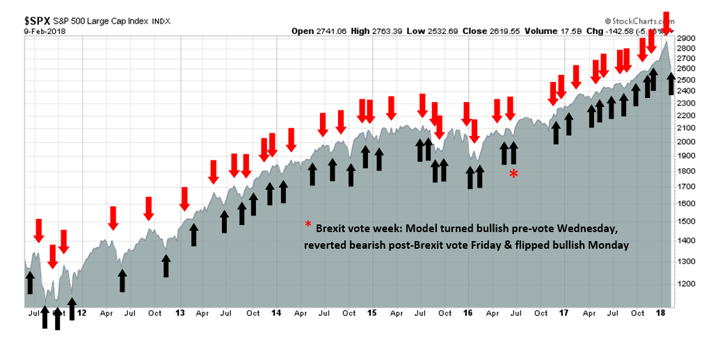
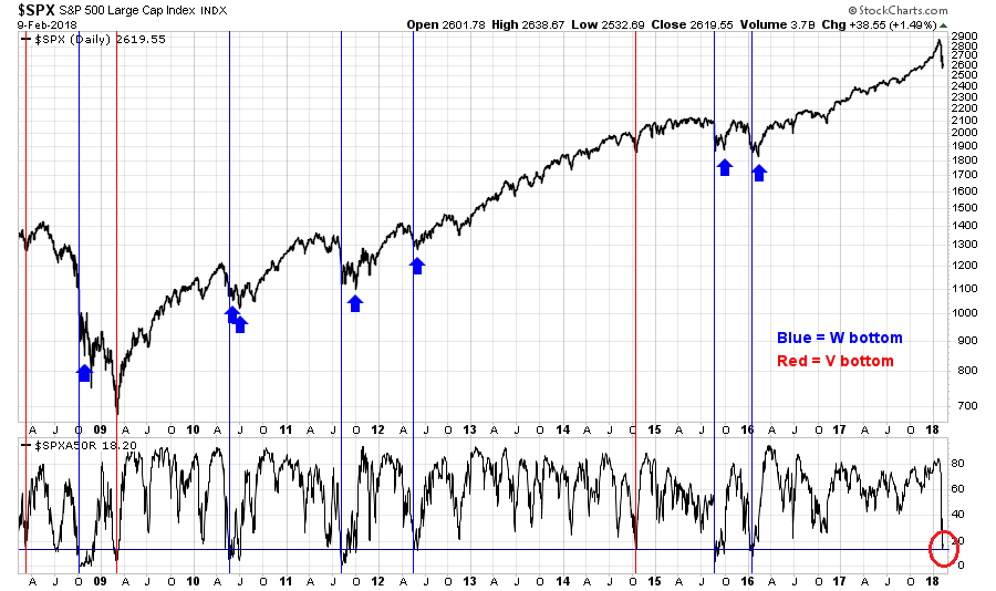
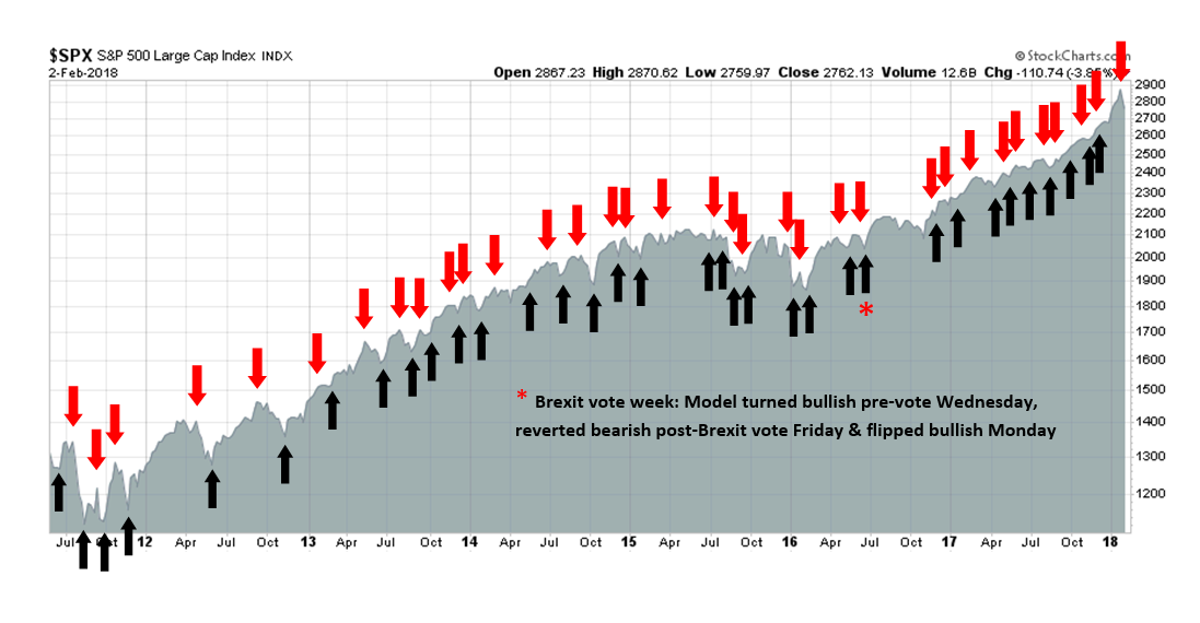
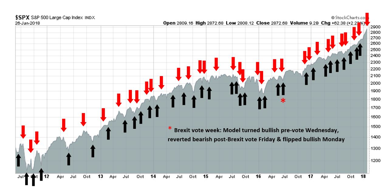
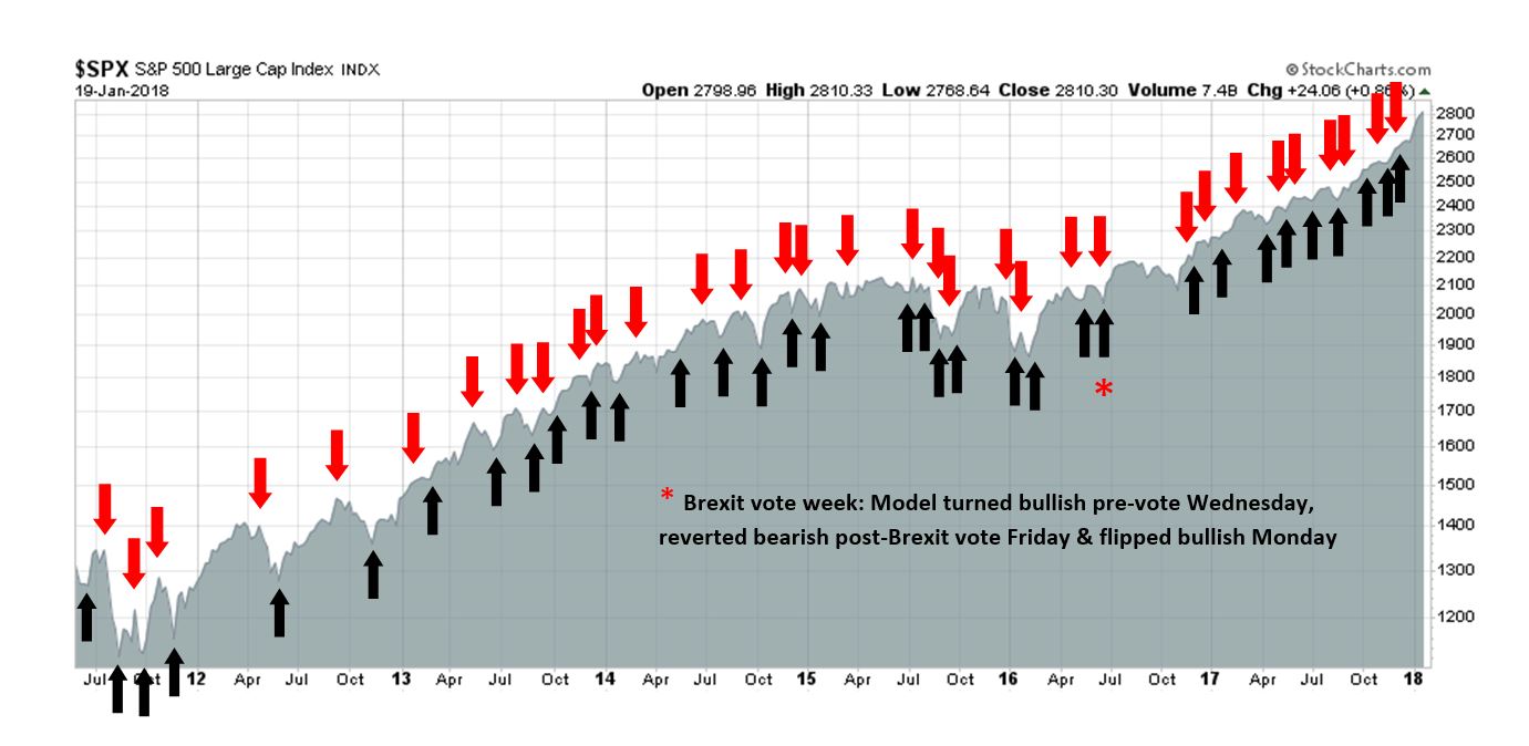
My inner trader uses the trading component of the Trend Model to look for changes in the direction of the main Trend Model signal. A bullish Trend Model signal that gets less bullish is a trading “sell” signal. Conversely, a bearish Trend Model signal that gets less bearish is a trading “buy” signal. The history of actual out-of-sample (not backtested) signals of the trading model are shown by the arrows in the chart below. Past trading of the trading model has shown turnover rates of about 200% per month.
The latest signals of each model are as follows:
- Ultimate market timing model: Buy equities
- Trend Model signal: Bullish
- Trading model: Bullish
Update schedule: I generally update model readings on my site on weekends and tweet mid-week observations at @humblestudent. Subscribers will also receive email notices of any changes in my trading portfolio.
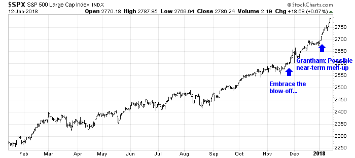
Looking for the bearish trigger
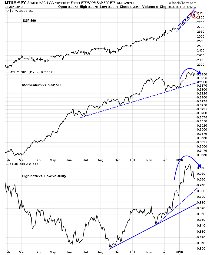
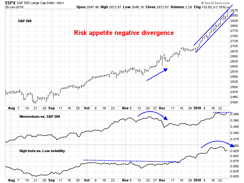
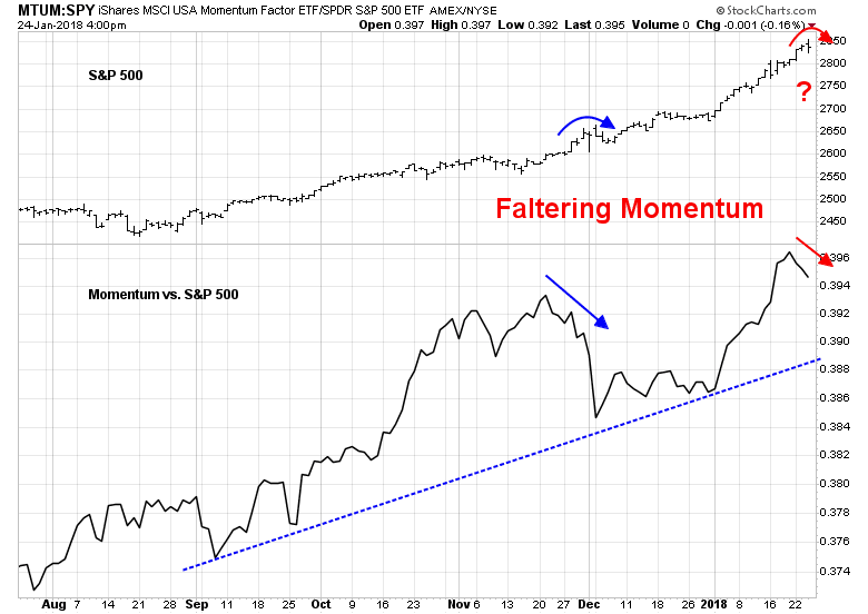
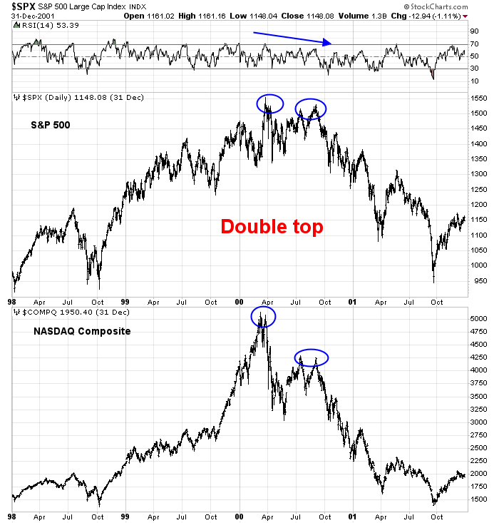
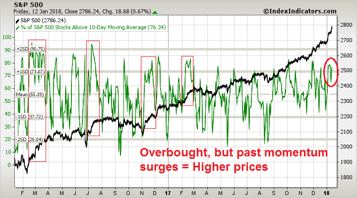
Last week, I wrote about how the price momentum factor is dominating equity returns (see Bubbleology 101: How to spot the top in a market melt-up). Most intermediate term tops, even with a parabolic market, saw double tops that are marked by negative technical divergences at the second top. As stock prices continue to rise, we have not even seen the first retreat yet.
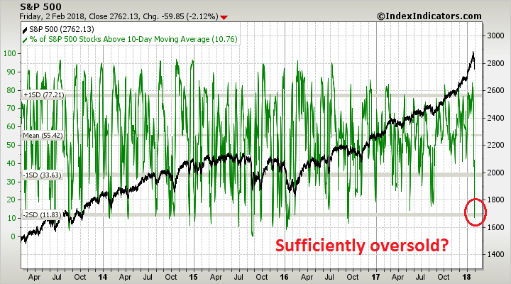
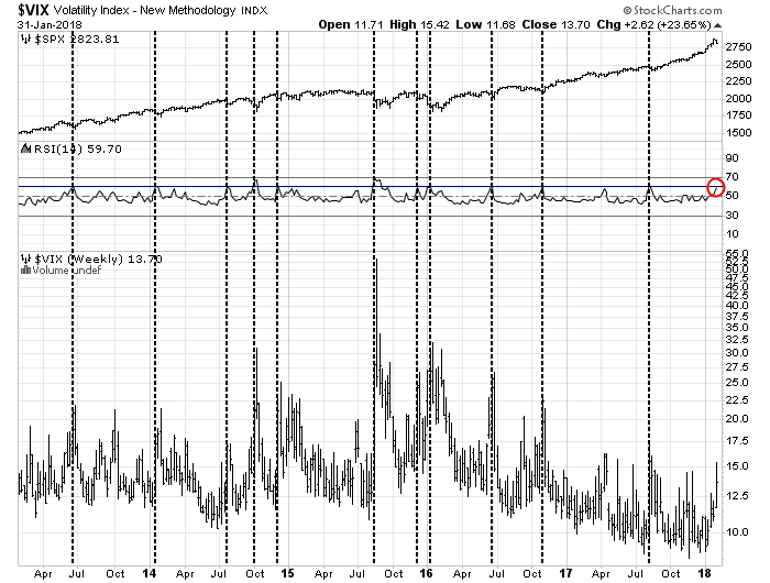
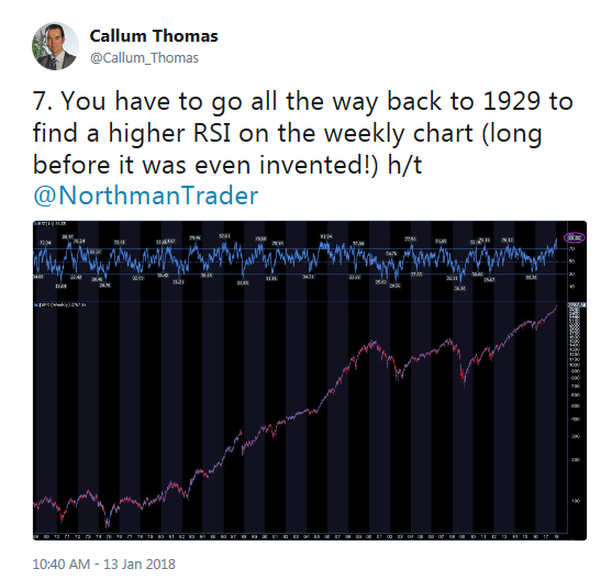
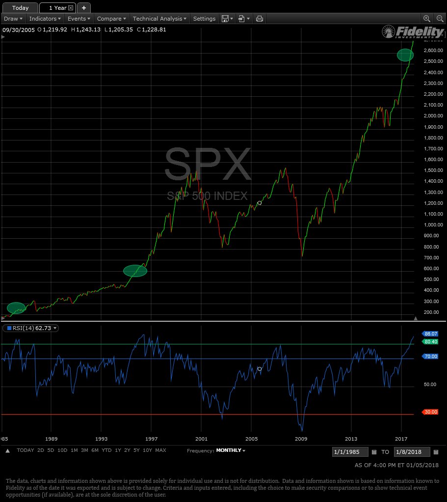
What is likely to spark the first pullback? Recently, a number of extreme overbought readings have appeared, indicating risk levels last seen before the major market crashes in 1929 and 1987. Callum Thomas highlighted analysis by Sven Henrich, otherwise known as Northman Trader. Henrich found that you would have to go back to pre-crash 1929, before the RSI indicator was invented, to see weekly RSI as high as they are today.
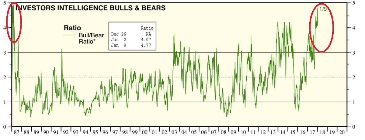
Callum Thomas also highlighted this chart from Ed Yardeni which indicated that the II bull/bear ratio has not seen these heights since pre-crash 1987.
Are the appearance of these ominous signs warnings of an imminent market crash?
Beware of red herrings
I beg to differ about these depictions of excessive market risk.
First, the appearance of high RSI extremes is a red herring. I wrote in last week’s post (see Bubbleology 101: How to spot the top in a market melt-up) that extremely high RSI readings should really be interpreted as “good overbought” readings that characterize momentum thrusts. If history is any guide, these kinds of overbought conditions have led to multi-month rallies to substantially high prices.
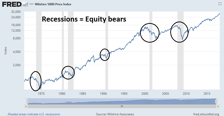
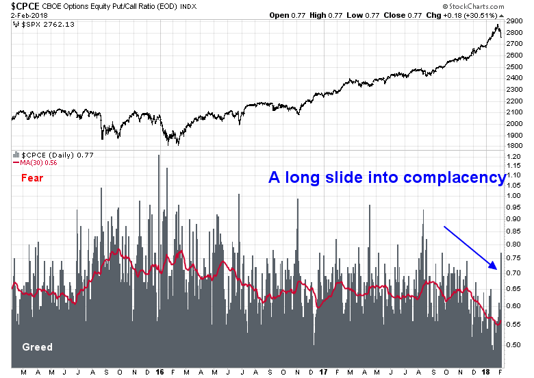
Yardeni’s chart of II bulls and bears also has to be viewed in the context that crowded long sentiment readings do not represent actionable sell signals. The chart below shows the history of the market, with the red zones indicating when the II bull/bear ratio exceeded 3. The leftmost part of the chart shows the market staged a minor pullback after the first II bull/bear ratio extreme, but went on to advance before crashing. In addition, the market did not decline immediate during past periods where the bull/bear ratio was above 3.
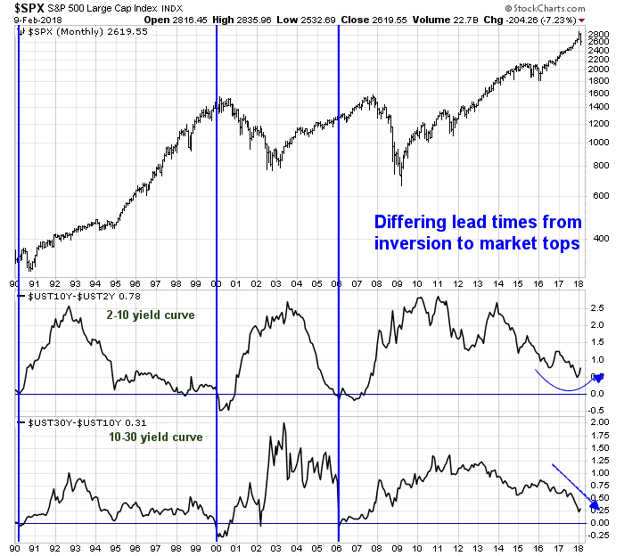
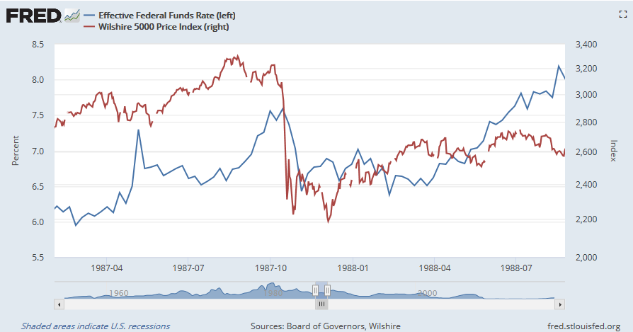
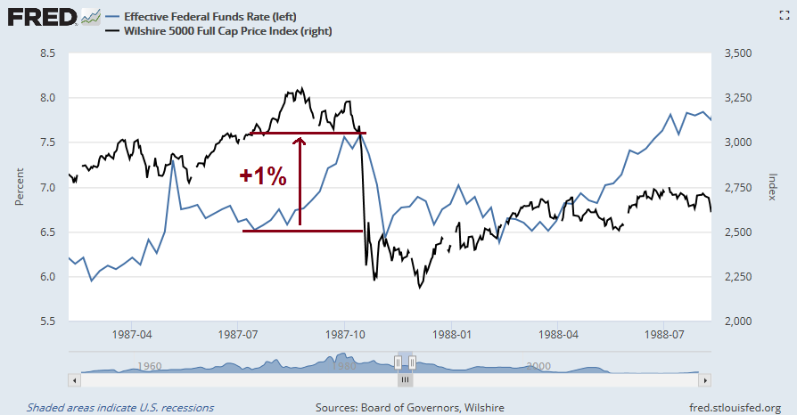
The market action in 1987 serves as a good case study for the analysis of market tops. Stock prices generally don’t enter bear market spontaneously without a reason. In 1987, it was the aggressive action of the Federal Reserve to raise interest rates by about 1% in the space of two months.
Bearish triggers
Fast forward to today’s momentum driven market frenzy. What are the fundamental and macro driven catalysts that could spark an equity pullback?
There are three obvious sources of negative surprises on the horizon:
- Rising trade tensions
- Negative macro surprises
- Rising inflation and rising bond yields
Let’s consider each, one at a time.
Trade tensions
While a trade war is not my base case scenario, I recently wrote about the likely fallout from trade tensions (see Could a Trump trade war spark a bear market?). Here are some key news developments that have occurred since the publication of that post:
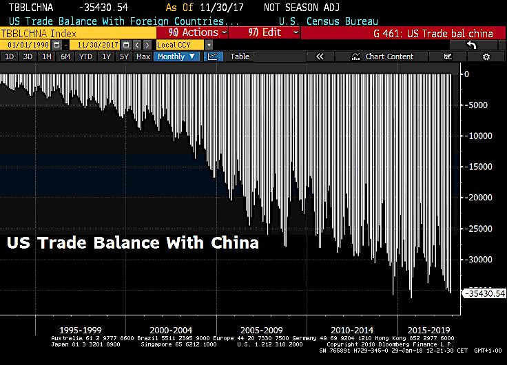
- China’s surging exports widen trade surplus with the US (CNN Money)
- Trump considers big “fine” over China intellectual property theft (Reuters)
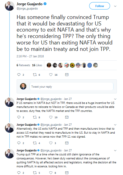
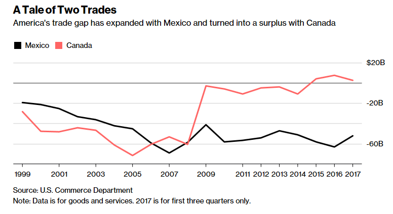
- Trump says terminating NAFTA would like “best deal” in re-negotiations (Reuters)
The most disturbing comment from Trump came from the Reuters story about Chinese trade action:
Trump said he would be announcing some kind of action against China over trade and said he would discuss the issue during his State of the Union address to the U.S. Congress on Jan. 30.
Asked about the potential for a trade war depending on U.S. action over steel, aluminum and solar panels, Trump said he hoped a trade war would not ensue.
“I don’t think so, I hope not. But if there is, there is,” he said.
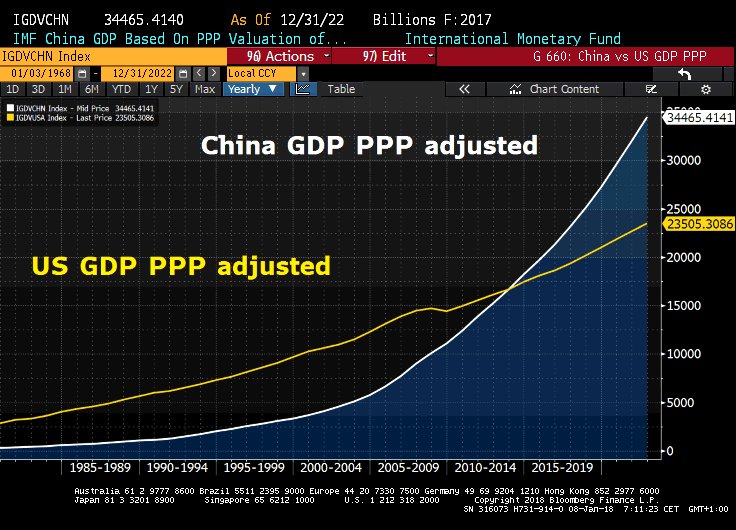
American trade action against China would come at a particularly troublesome time for the Chinese economy. Business Insider reported that China is becoming increasingly dependent on exports as a source of economic growth, as Beijing acts slow down domestic credit growth.
China’s reported gross-domestic-product growth held up at 6.8% in Q4, but the perplexing story in the numbers is that China’s domestic economy is slowing down under purposely tighter economic conditions.
Societe Generale called this “an uneven picture of very strong external demand and weakening domestic demand” and noted that net exports’ contribution to GDP increased during 2017. At the same time, both domestic consumption and investment saw their contributions to GDP decline from 2016.
Chinese officials are tightening credit to slowly ween the country’s financial and corporate sectors off of debt financing. Now, this isn’t to say policymakers have taken a hatchet to the system or anything, but what little they have done is starting to make an impact.
This makes the economic health of the rest of the world incredibly important to China, because as its domestic economy slows it will depend on demand from the rest of the world to keep its economy going. It also means Trump’s promises to control imports from China to the US could make things particularly painful — if he follows through.
If the Chinese economy were to slow, it would drag down her Asian trading partners, as well as resource exporting countries such as Australian, Brazil, Canada, and South Africa. None of these developments would be equity friendly.
Negative macro surprises
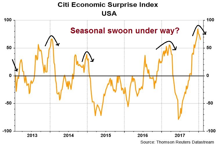
Another possible negative surprise that may not be in anyone’s spreadsheet model is an abrupt loss of macro momentum. The US Economic Surprise Index, which measures whether economic statistics are beating or missing expectations, has shown a seasonal tendency to peak out early in the new year. It does not appear that 2018 will be an exception.
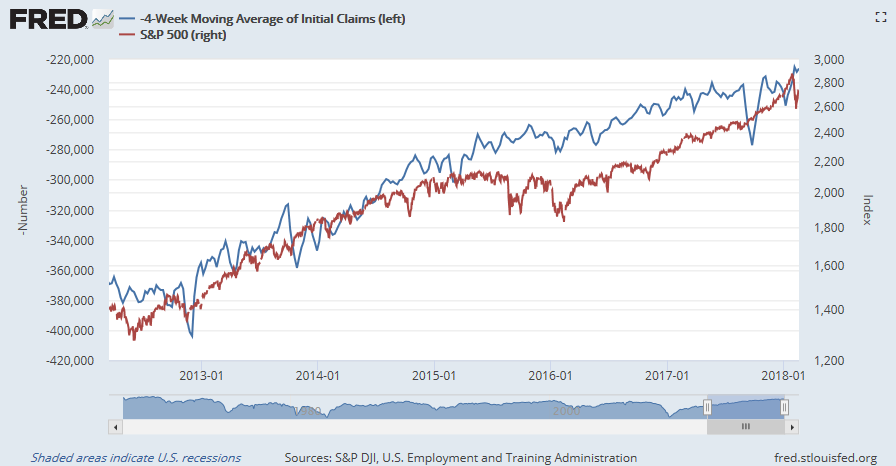
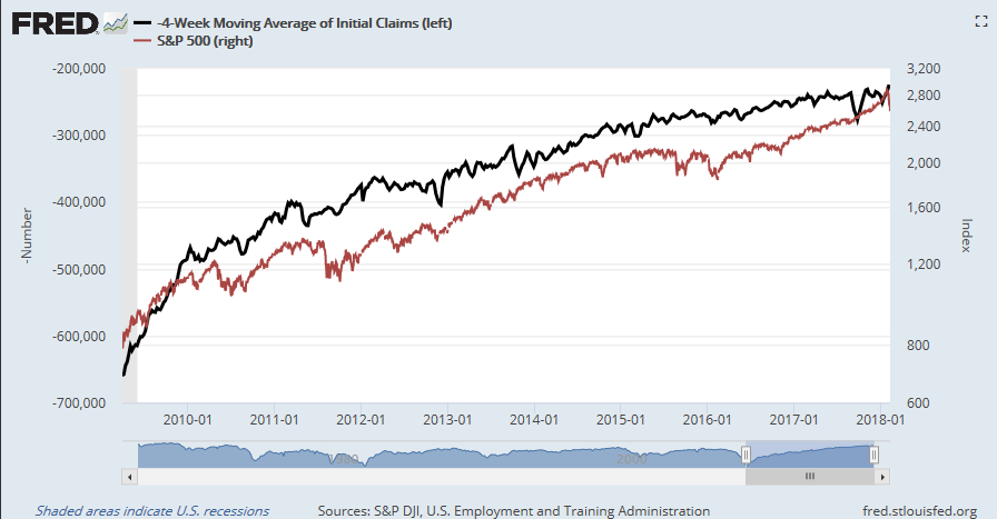
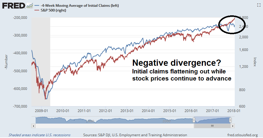
Already, there are some cracks appearing in the edifice of macro strength. Initial jobless claims has shown a remarkable inverse correlation with stock prices this cycle. The latest data shows that initial claims are starting to roll over, while stock prices continue to rise. Is this negative divergence just a temporary data blip? If not, how long can stock prices defy gravity?
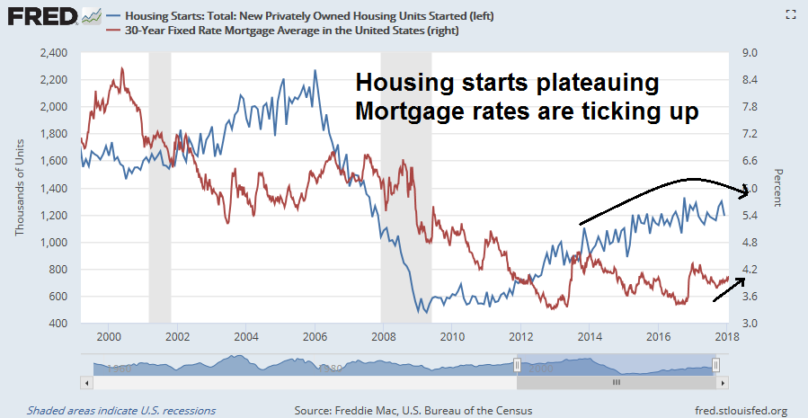
Another example of a negative macro surprise came from the housing report last week. Housing starts appear to be plateauing, and possibly rolling over. The sector is further pressured by rising mortgage rates. While the deterioration in these indicators are not immediate harbingers of doom and recession, negative developments in cyclically sensitive sectors like housing will eventually feed through to consumer and investor confidence.
Rising inflation risks
Finally, investors need to be wary of rising inflation as it could spark a mini-panic. The inflation theme should be no surprise to institutional investors. The latest BAML Fund Manager Survey lists “inflation and bond crash” as the top market tail risk.
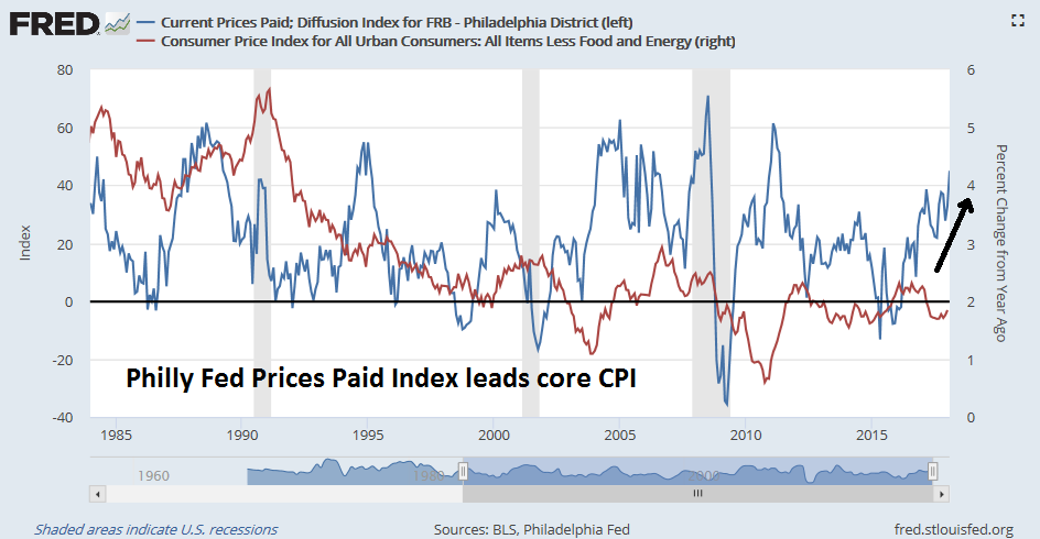
Inflationary pressures is already rising. Nordea Markets observed that the New York Fed’s Underlying Inflation Gauge appears to lead core CPI by about 15 months.
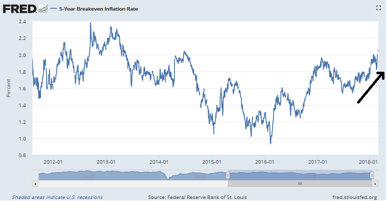
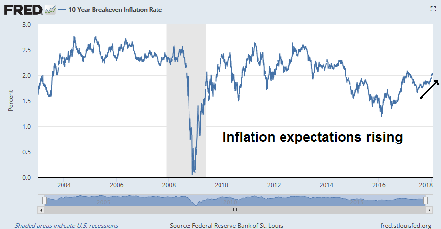
Over in the bond market, inflation expectations are rising as breakeven rates climb.
None of these developments are surprising. That’s because the economy is starting to run hot and above potential.
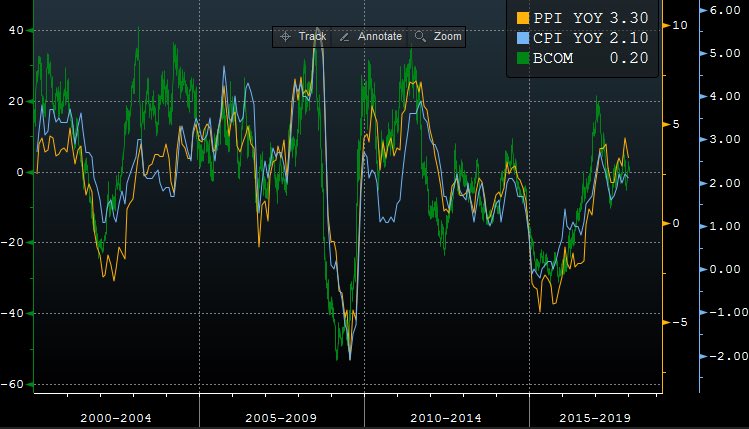
Inflationary pressures are also manifested by rising commodity prices. Notwithstanding the Fed’s use of core inflation gauges, commodity price movements have historically been correlated with CPI and PPI.
James Hamilton is known for his excellent work documenting the link between oil shocks and recessions. Hamilton found that “every recession (with one exception) was preceded by an increase in oil prices, and every oil market disruption (with one exception) was followed by an economic recession.”
The chart below depicts the 20-year history of oil prices. Whenever the year/year change in oil prices reaches 100%, a recession and bear market has ensued. (I discount the 2010 episode because of the low base effect as the economy had fallen into recession in 2009).
If oil were to reach $85-90 by July, we could see a similar warning signal from the crude oil market.
Is $85-90 oil possible by this summer? The WSJ recently published a story entitled “Whispers of $80 oil are growing louder”, which is supportive of higher prices:
Byron Wien, vice chairman of the Private Wealth Solutions group at Blackstone, put $80 West Texas Intermediate on his annual list of 10 surprises in store for markets this year.
“Demand is going to continue to increase faster than supply,” he said in an interview. “It’s out of consensus, but people are underestimating the expanding middle class in the developing world and their resultant demand.”
Shrinking inventories, commitment by the Organization of the Petroleum Exporting Countries to cut output through the year, and only modest production growth from outside the group could all also push prices higher, he said.
Production cuts by OPEC and other major producers and unexpectedly strong demand were a potent mix last year, helping pull prices out of a three year downturn.
Citigroup also said $80 is a possibility. In a note Tuesday, the bank said the right combination of geopolitical crises could tip crude prices into the $70 to $80 range. With supplies already so tight, any unexpected disruption could cause prices to surge.
Oil analyst Peter Tertzakian pointed out that, historically, $60 has not been an equilibrium price for oil. Either it rises dramatically, or falls back because of the supply response to prices.
Iil service giant Schlumberger stated in its Q4 2017 report that it is seeing a supply response to low oil prices. Production is showing “signs of fatigue after three years of unprecedented underinvestment”:
Looking at the oil market, the strong growth in demand is projected to continue in 2018, on the back of a robust global economy. On the supply side, the extension of the OPEC- and Russia-led production cuts is already translating into higher-than-expected inventory draws. In North America, 2018 shale oil production is set for another year of strong growth, as the positive oil market sentiments will likely increase both investment appetite and availability of financing. At the same time, the production base in the rest of the world is showing fatigue after three years of unprecedented underinvestment. The underlying signs of weakness will likely become more evident in the coming year, as the production additions from investments made in the previous upcycle start to noticeably fall off. All together this means the oil market is now in balance and the previous oversupply discount is gradually being replaced by a market tightness premium, which makes us increasingly positive on the global outlook for our business.
Another possible short-term bullish development is the likely launch of oil futures trading in China (via Platts). In the past, China’s great big ball of liquidity has rolled from the property market, to the stock market, and metals market. Just wait until Chinese speculators start trading oil futures.
Is $85-90 oil by this summer a possibility? Definitely. Spiking oil prices would be a signal of a global boom and inflationary pressures, which would force the Fed to react with a faster pace of rate hikes.
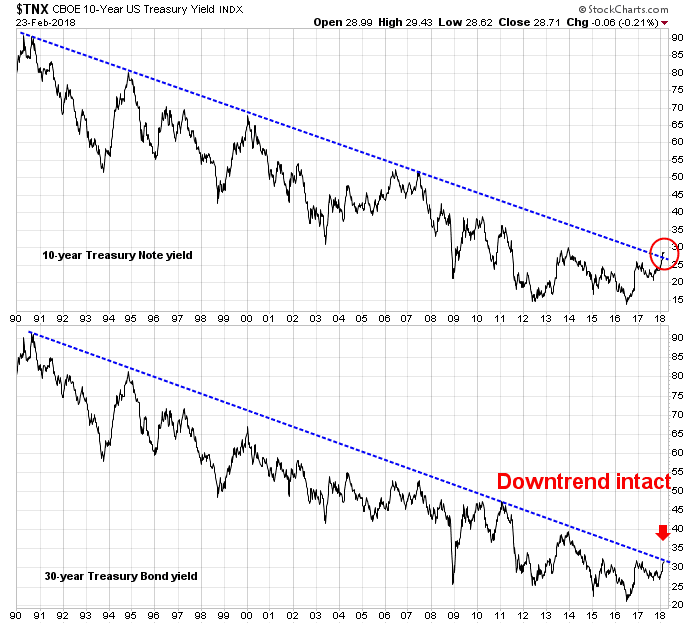
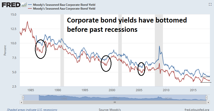
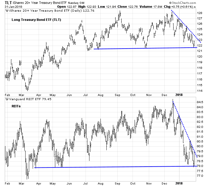
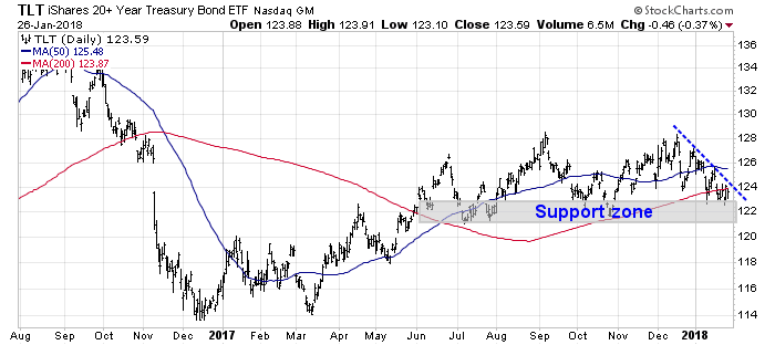
Bond market tantrum?
Already, the yield on the 10-year Treasury note reached 2.66% last Friday, which represents an upside breakout in yields that could spook the equity market.
If the bond market were to throw a tantrum because of rising inflationary expectations, then any yield spike could be exacerbated by demand-supply pressures from the effects of the recently passed tax bill. Bloomberg reported that Deutsche Bank strategist Torsten Slok warned about excess Treasury supply flooding the market because of rising US deficits:
A “dramatic” increase in U.S. bond supply over the next year risks unhinging global markets from their bullish foundations, warns Torsten Slok at Deutsche Bank AG.
The supply of U.S. government debt will almost double to $1 trillion this year to finance a widening budget deficit as the Federal Reserve whittles down its holdings. Unless new buyers emerge, the overhang could be far-reaching.
“If demand for U.S. fixed income doesn’t double over the coming years then U.S. long rates will move higher, credit spreads will widen, the dollar will fall, and stocks will likely go down as foreigners move out of depreciating U.S. assets,” the chief international economist at the German lender wrote in a note Tuesday. “And this could happen even in a situation where U.S. economic fundamentals remain solid.”
A separate Bloomberg report warned about American multi-nationals redeploying offshore corporate cash that is mainly invested in USD paper to dividends and buybacks.
The implications for the financial markets are huge. The great on-shoring could prompt multinationals — which have parked much of their overseas profits in Treasuries and U.S. investment-grade corporate debt — to lighten up on bonds and use the money to goose their stock prices. Think buybacks and dividends.
It’s hard to say how much money the companies might repatriate, but the size of their overseas stash is staggering. An estimated $3.1 trillion of corporate cash is now held offshore. Led by the tech giants, a handful of the biggest companies sit on over a half-trillion dollars in U.S. securities. In other words, they dwarf most mutual funds and hedge funds.
Equity valuation warning
At this point, we can only guess at the magnitude of these effects on bond yields and credit spreads. At best, the effects will be benign. At worst, bond yields will rise and spook equity prices. Antonio Fatas recently updated his calculation of the US equity risk premium based on a 10-year Treasury yield of 2.64%. Readings are falling, and they are approaching the levels seen at the last market peak in 2017.
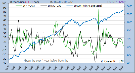
Dwaine Van Vuuren of RecessionAlert came to a similar conclusion about equity market valuation. His 10-year forecasts of equity returns have an astounding r-squared of 0.89. Investors can also back out a one-year forecast from his 10-year forecast by using the past returns of the last 9 years. The one-year forecast has an r-squared of 0.40, which is also quite remarkable. The latest forecast have one-year returns plunging to 0%.
Ouch!
The bull and bear cases
Putting it all together, are stock prices like to rise or fall? Here are the short-term bull and bear cases.
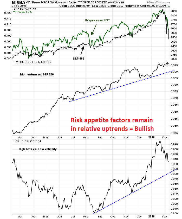
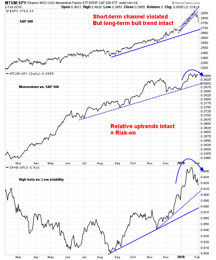
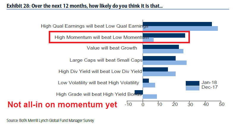
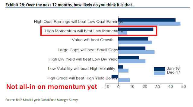
On one hand, the market is undergoing a powerful momentum driven FOMO rally. As I pointed out in last week’s post (see How far can this momentum rally run?), the latest BAML Fund Manager Survey indicates that institutional investors have not fully capitulated to the FOMO stampede. If this is indeed a melt-up and market blow-off, then there is considerable upside potential for the animal spirits to run up stock prices.
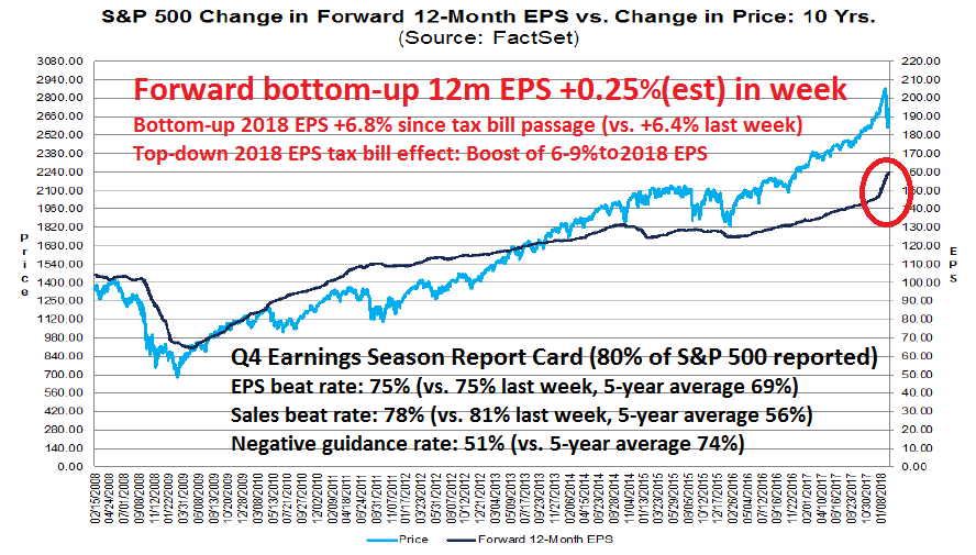
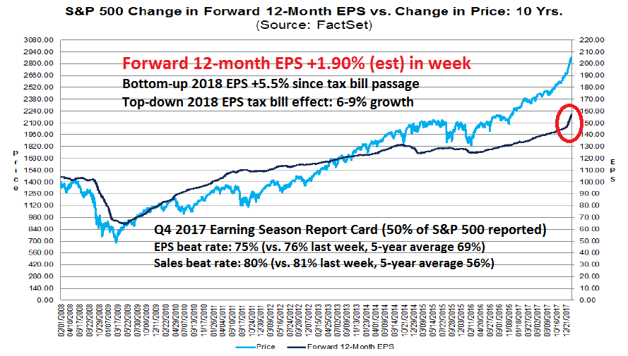
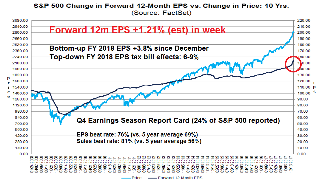
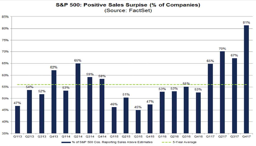
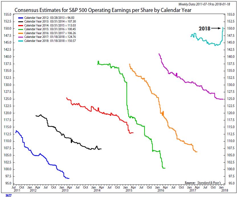
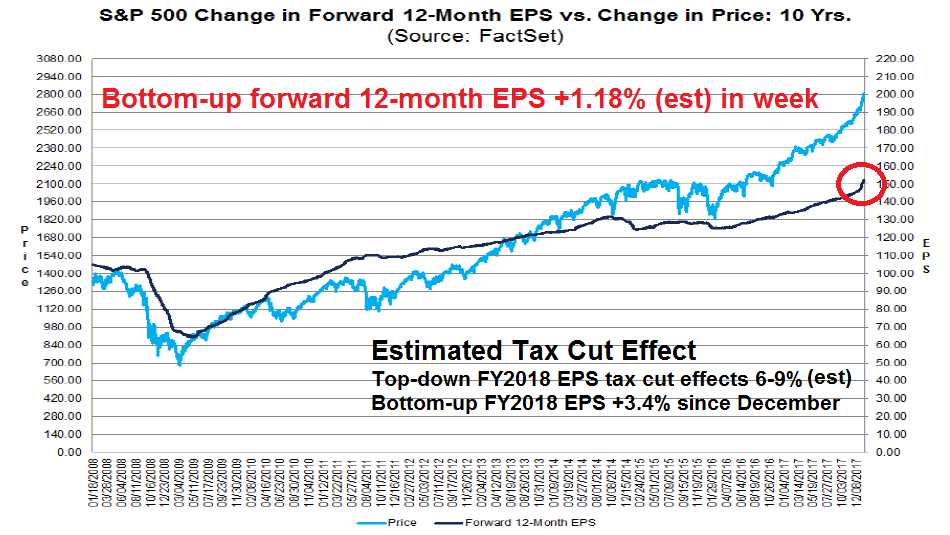
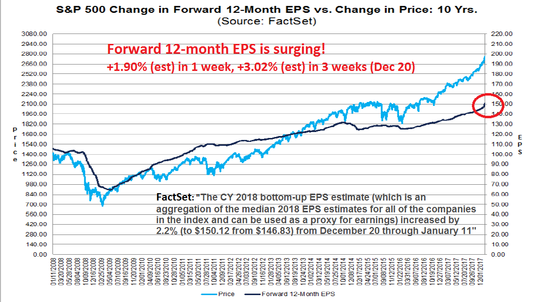
Moreover, fundamental earning momentum have further to run. The latest report from FactSet shows that bottom-up forward 12-month consensus EPS are still surging, and the rise is mainly attributable to the tax cuts. Top-down strategists have already adjusted their 2018 estimates, and most estimates indicate a 6-9% boost to 2018 EPS. Bottom-up analysts are roughly half way through their own upward estimate revisions, as their 2018 aggregated EPS is up 3.4% since December. If estimate revisions were to continue at the current pace, bottom-up tax cut related improvements would exhaust themselves by early February.
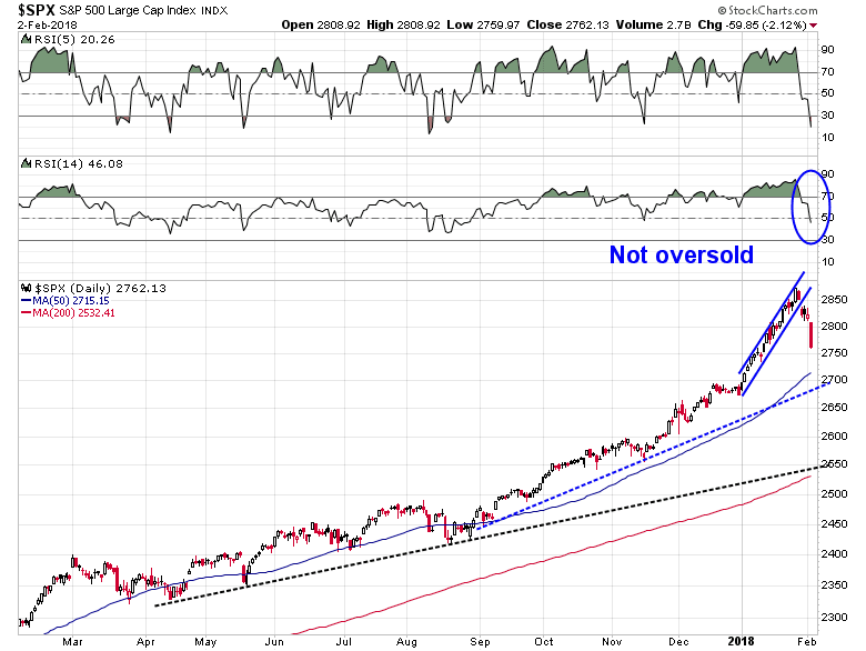
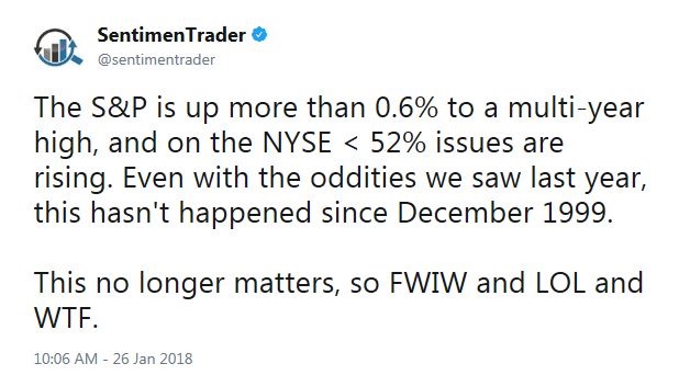
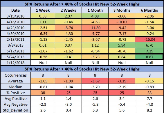
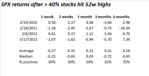
On the other hand, there are a number of serious technical and sentiment cracks in the short-term outlook. Schaeffer’s Research observed that 40% of the SPX hit 52-week highs two weeks ago. This is a rare condition (N=8) that has led to poor subsequent market returns.
The history cited by Schaeffer’s has four observations that overlap. Eliminating those leaves an even smaller sample size (N=4). Near term returns have not been positive under those historical conditions.
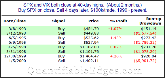
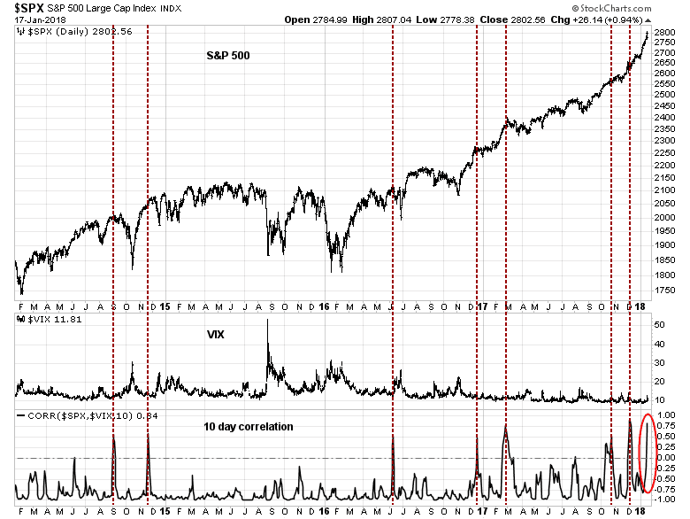
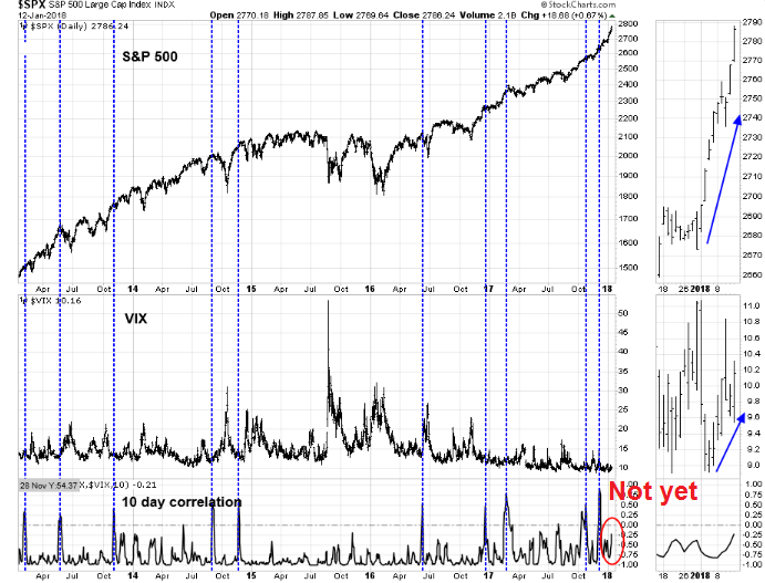
Rob Hanna at Quantifiable Edges studied past instances when SPX and VIX rose together to new highs. Past returns were negative, but Hanna went on to warn about the small sample size (N=4), which is an indication of the unusual circumstances that the market faces today.
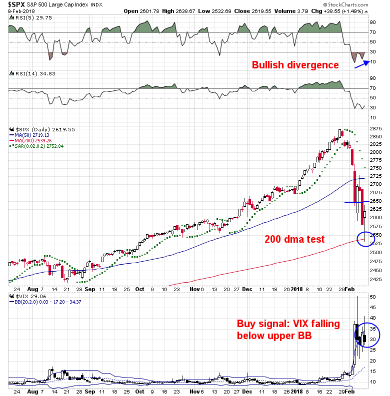
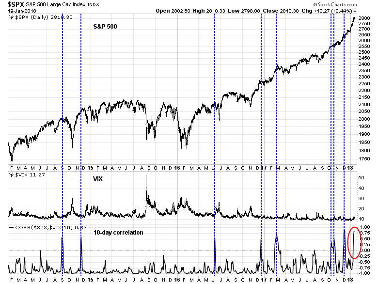
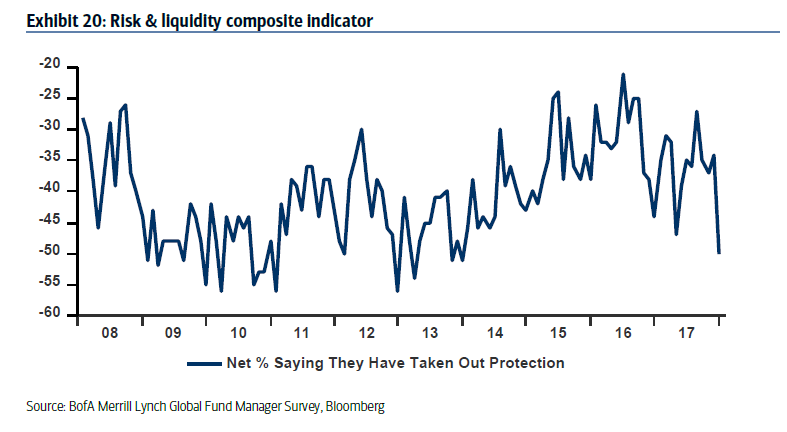
Along with Rob Hanna, I continue to be concerned about the spike in SPX-VIX correlation. Past episodes have seen the market struggle to advance.
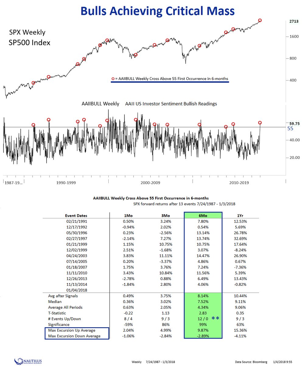
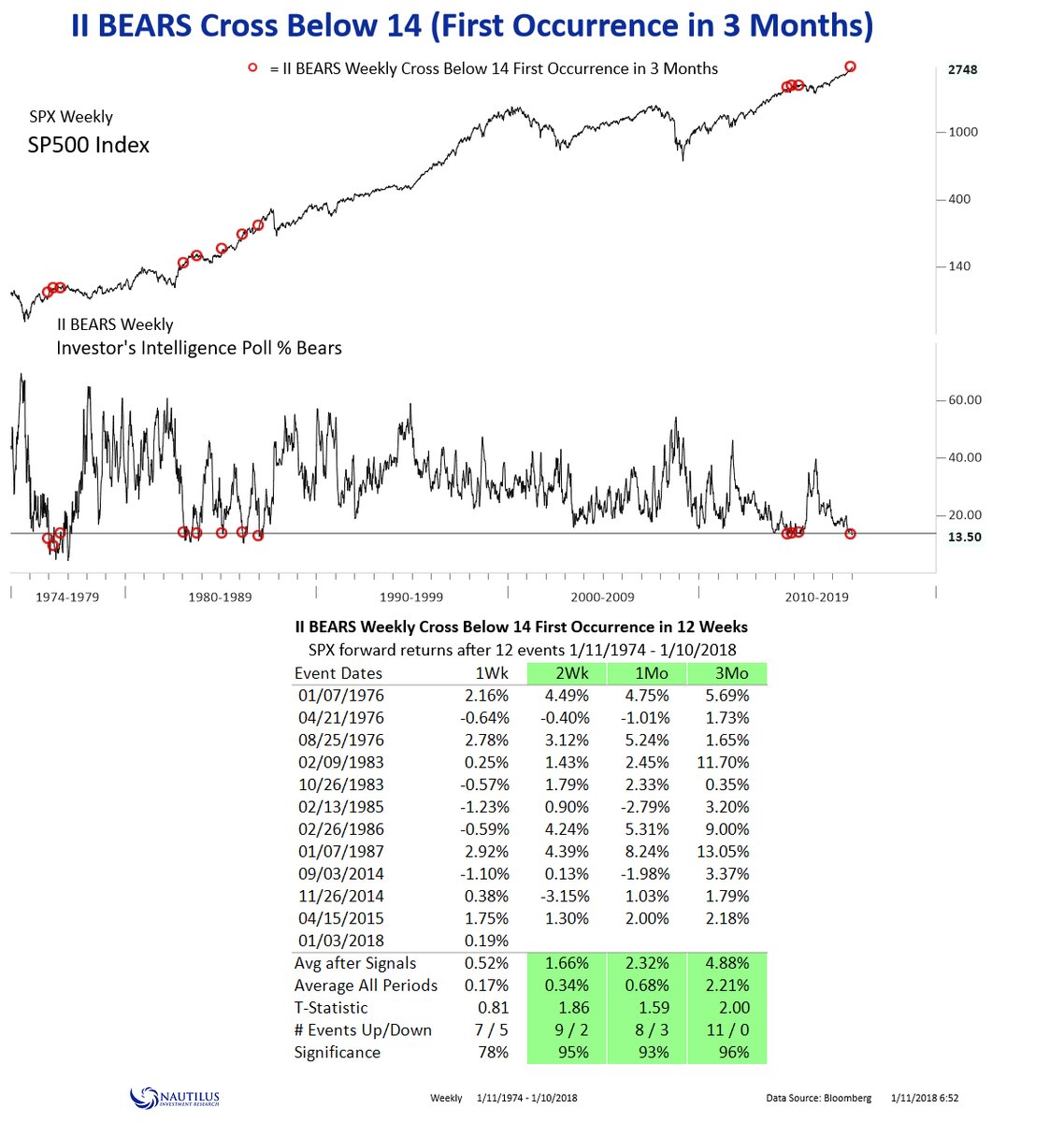
What does this all mean? Here is how I put the bull and bear cases into context. Canaccord Genuity strategist Tony Dwyer found that a low level of II bears have not bee contrarian bearish. If history is any guide, expect heightened volatility and higher highs.
That sounds about right. My base case scenario calls for some chop ahead, but the momentum rally to continue. I am awaiting possible bearish catalysts that can derail this bull. The most likely trigger will by a Trump administration action to impose tariffs on China later this month.
My inner investor remains bullish on equities. My inner trader is stepping aside from the potential volatility for the moment. Even though the trading model remains on a buy signal, I cannot characterized it as a high conviction buy. The prudent course of action is to stay in cash for the moment – and be “data dependent”.
Stay tuned.