Mid-week market update: As the major US equity indices reach fresh all-time highs, it is time to ponder the question of how far the current upleg is likely to carry us. While technical analysts have several techniques available at their fingertips, I rely mostly on the venerable point and figure charting system (click link for primer), which was first used in the late 19th Century, to determine upside targets.
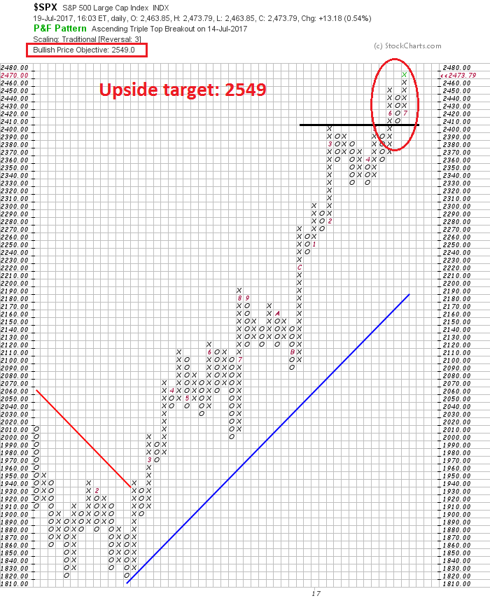
Using the point and figure charting tool at stockcharts, I get an upside target of 2549 for the SPX with a traditional box size and 3 point reversal.
If I vary the parameters to a 1% box size and a 3 point reversal, the upside target is 2524. The difference seems to be the width of the consolidation pattern and the site of the upside breakout.
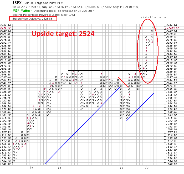
Is the target 2524 or 2549? What gives?
Your mileage will vary
Good technical analysts understand that point and figure charting is a tool. Just like any tool, it has its limitations. Your mileage will vary, depending on what question you ask of the tool.
With the point and figure tool, you can use different time frames, such as daily, weekly, or monthly prices, depending on your own time horizon. As well, you can vary the sensitivity of your analysis with differing box sizes and reversal parameters.
As a test of the sensitivity of this tool, the table below shows the SPX upside targets using daily, weekly, and monthly prices. As well, I used both traditional, 0.5% and 1% box sizes, along with 2 and 3 box reversals.

The results were remarkably similar. There were a few outliers, which are highlighted. Most of the upside targets were clustered between 2500 and 2600. The monthly price analysis using a 1% box and 3 box reversal arrived at an astounding 3350 target. On the other hand, monthly price analysis using a 2 box reversal, regardless of box size, showed that market had exceeded its target.
The median upside target 2536, and the average was 2586. If we take the midpoint of the two, we get 2561. Interestingly, the midpoint of the median and average targets if we removed the highlighted outliers comes to 2563, which is indicative of the stability of the estimates.
Based on this analysis, the target for this upside breakout is 2536 to 2586, or about 2560.
Nearing THE TOP?
Here is some context to those upside targets. What is remarkable about this exercise is the convergence of the targets to the 2560 region using daily, weekly, and monthly prices (except for a few outliers). By implication, a long-term cyclical top is not very far away.
About a year ago, I wrote that the likely cyclical market top would occur in the second half of 2017 (see The roadmap to a 2017 market top). I amended that forecast in May 2017 to allow for the timing of a top to extend to the first half of 2018 (see When does the market top out?).
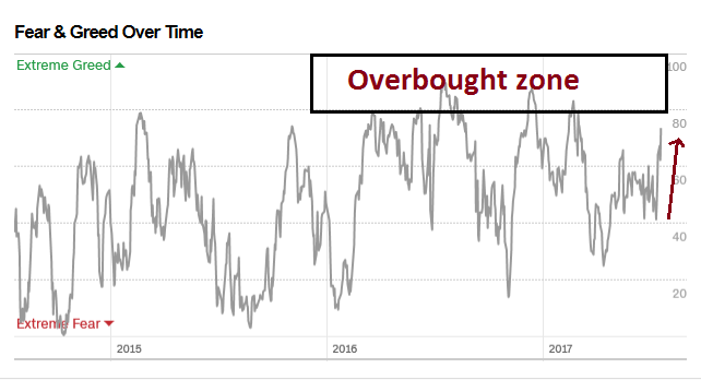
As stock prices break out to new highs, but with the upside point and figure target only about 4% away, the technical picture suggests that a market top is likely to occur in the next few months, if not weeks. With the Fear and Greed Index at an elevated reading of 73, it also suggests that the market is likely to top out when this index reaches an overbought condition.
My base case scenario still calls for a Fed induced economic slowdown from tight monetary policy, which drags down stock prices (see How the bull will die). There are still many moving parts to this scenario. Much depends on the path of wages, inflation, the growth outlook, the Fed’s reaction function, as well as possible changes at the Fed’s Board of Governors. I am not ready to turn bearish just yet.
My short-term indicators are mainly bullish, but I remain, as always, data dependent.
Disclosure: Long SPXL
I think you should give yourself some credit for calling the weakness early in the week (Monday and Tuesday), nice buying opportunity, for me at least after lightening up before sailing/ scuba adventure in British Virgin Islands the weeks before.
Cam
Thanks for introducing the concept of P&F charts. It would be immensely helpful, if you would update the current chart in the near future (say when the next support hits, give or take 2-4 weeks), as the gyrations of the market are smoothed out. In your chart, you have used each y axis unit measurement as 10 points on the S&P, or so it seems. Again, thanks for teaching how to fish.