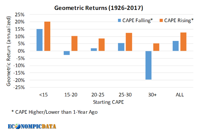
Preface: Explaining our market timing models
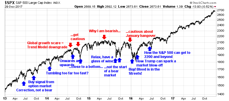
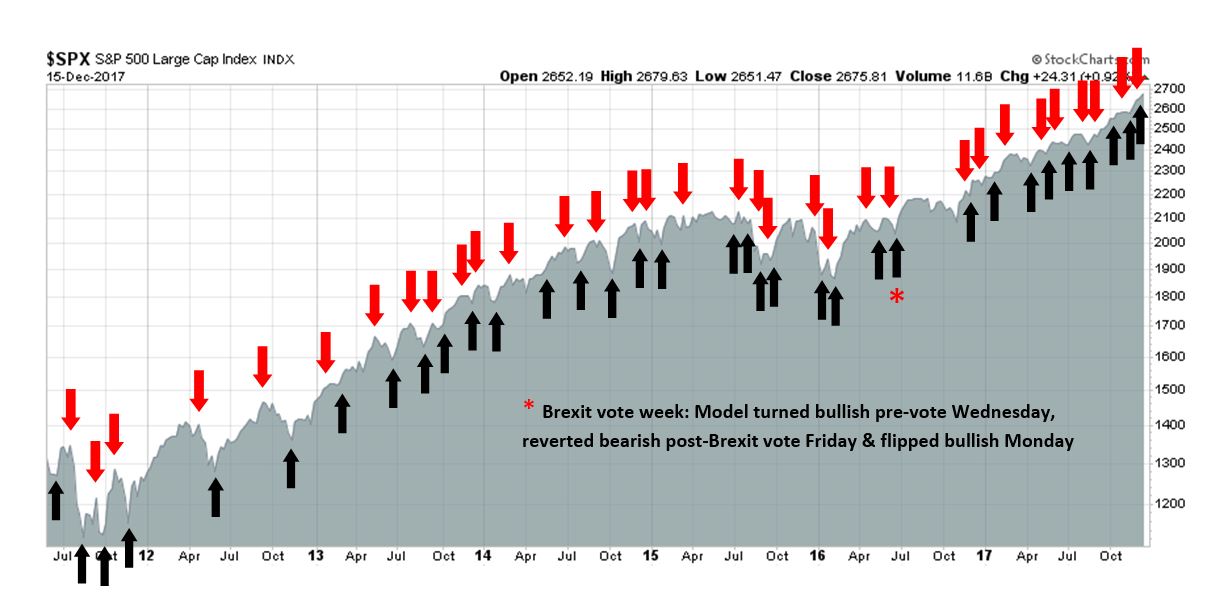
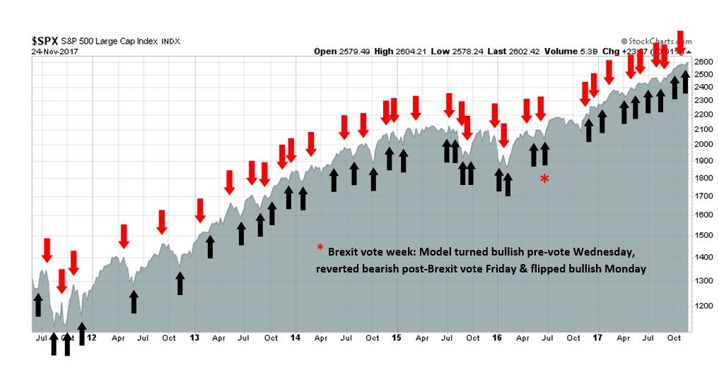
We maintain several market timing models, each with differing time horizons. The “Ultimate Market Timing Model” is a long-term market timing model based on the research outlined in our post, Building the ultimate market timing model. This model tends to generate only a handful of signals each decade.
The Trend Model is an asset allocation model which applies trend following principles based on the inputs of global stock and commodity price. This model has a shorter time horizon and tends to turn over about 4-6 times a year. In essence, it seeks to answer the question, “Is the trend in the global economy expansion (bullish) or contraction (bearish)?”
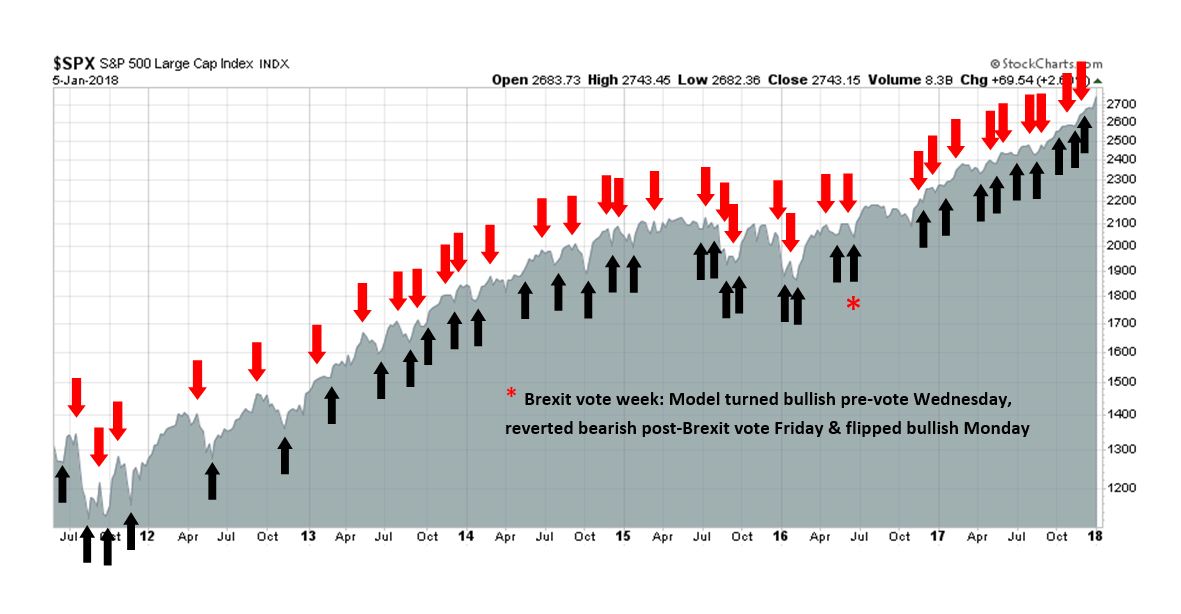
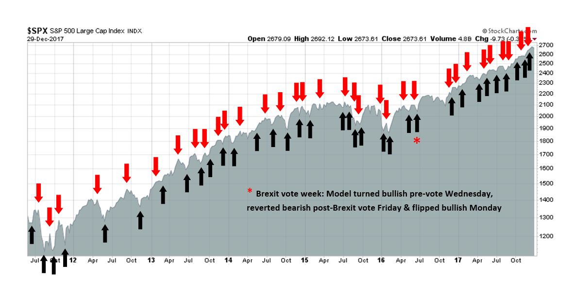
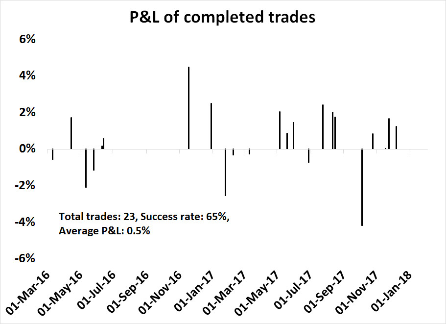
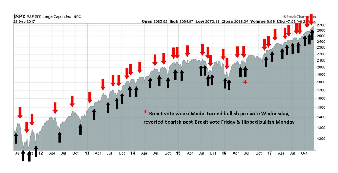
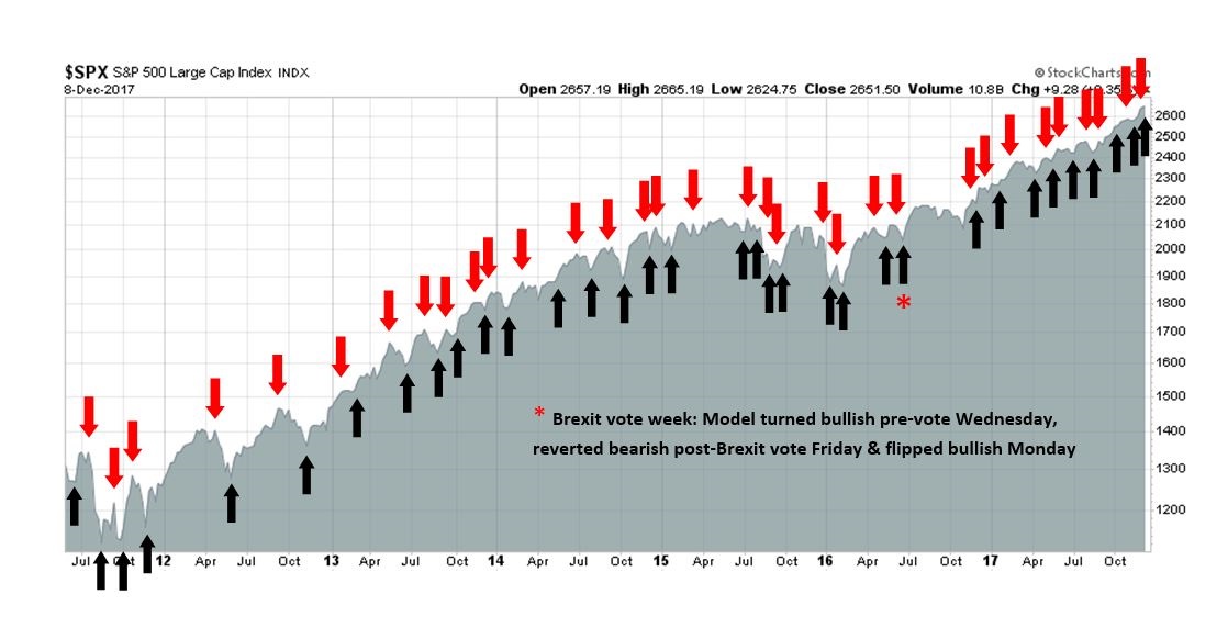
My inner trader uses the trading component of the Trend Model to look for changes in the direction of the main Trend Model signal. A bullish Trend Model signal that gets less bullish is a trading “sell” signal. Conversely, a bearish Trend Model signal that gets less bearish is a trading “buy” signal. The history of actual out-of-sample (not backtested) signals of the trading model are shown by the arrows in the chart below. Past trading of the trading model has shown turnover rates of about 200% per month.
The latest signals of each model are as follows:
- Ultimate market timing model: Buy equities
- Trend Model signal: Bullish
- Trading model: Bullish
Update schedule: I generally update model readings on my site on weekends and tweet mid-week observations at @humblestudent. Subscribers will also receive email notices of any changes in my trading portfolio.
Staying ahead of the curve
It is gratifying to be ahead of the curve and anticipate the changes in the market narrative. The two themes du jour are Jeremy Grantham’s call for a market melt-up (see Embrace the blow-off, but with a stop-loss discipline), and concerns about rising inflation, which I have been writing about endlessly (as an example, see Five steps, where’s the stumble?).
What’s next?
How about the risk of rising protectionism? The news site Axios reported that 2018 will bring “full Trump”, with a dramatic change in policy tone after the legislative tax cut victory:
Trump keeps asking for tariffs — on steel and aluminum, in particular. He wants a trade war, and has for many years. His economic and diplomatic advisers persuaded him to delay trade actions in 2017.
- Those advisers recognize that the day of reckoning will come in 2018, regardless of whether economic adviser Gary Cohn and Secretary of State Rex Tillerson — who advocated restraint — stay or go.
- Cohn and Treasury Secretary Steve Mnuchin successfully persuaded Trump not to do anything rash while tax reform was being negotiated.
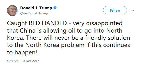
- Trump also saw the advantage of trying to use that as leverage with China to get help on North Korea. He said yesterday in an interview with the N.Y Times: “China’s hurting us very badly on trade, but I have been soft on China because the only thing more important to me than trade is war. O.K.?”
- And he tweeted yesterday, in response to Chinese ships secretly delivering oil to North Korea: “Caught RED HANDED – very disappointed that China is allowing oil to go into North Korea. There will never be a friendly solution to the North Korea problem if this continues to happen!”

The Washington Post also reported that the Trump Administration is close to imposing trade sanctions on China in January:
The Trump administration is setting the stage to unveil tough new trade penalties against China early next year, moving closer to an oft-promised crackdown that some U.S. business executives fear will ignite a costly battle.
Several corporate officials and analysts closely tracking trade policy said that President Trump is expected to take concrete actions on a range of disputes involving China within weeks.
Trump is due by the end of January to render his first decision in response to petitions from U.S. companies seeking tariffs or import quotas on Chinese solar panels and washing machines manufactured in China and its neighbors.
The Trump Administration’s newly unveiled National Security Strategy reframes the China relationship in an adversarial fashion. As a result, the latest anticipated pivot on trade policy is therefore not an unexpected development, though the scale of the reaction is likely to surprise the market:
White House action is due on a separate Commerce Department probe triggered by worries about the national security impact of rising imports of Chinese steel and aluminum.
“Their intent is to bring shock and awe,” said Scott Kennedy, an expert on Chinese trade at the Center for Strategic and International Studies. “They’re not kidding around.”
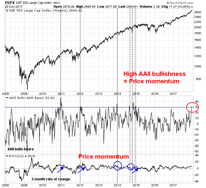
My base-case scenario calls for an equity market melt-up, supported by a combination of fundamental growth momentum and technical price momentum. It would end with aggressive Federal Reserve action to cool an overheated economy. In other words, an equity bear market would begin with a classic Fed-induced slowdown.
What if the economic slowdown is not caused by monetary policy but by trade policy? What would happen if the growth outlook slowed because of a trade war? What would be the damage, both to the economy and stock prices?
While I am not forecasting a trade war-induced bear market, good investors engage in scenario modeling in order to be prepared for different possibilities. I explore the ramifications of a trade war as an exercise in investor preparation.
Modeling a trade war
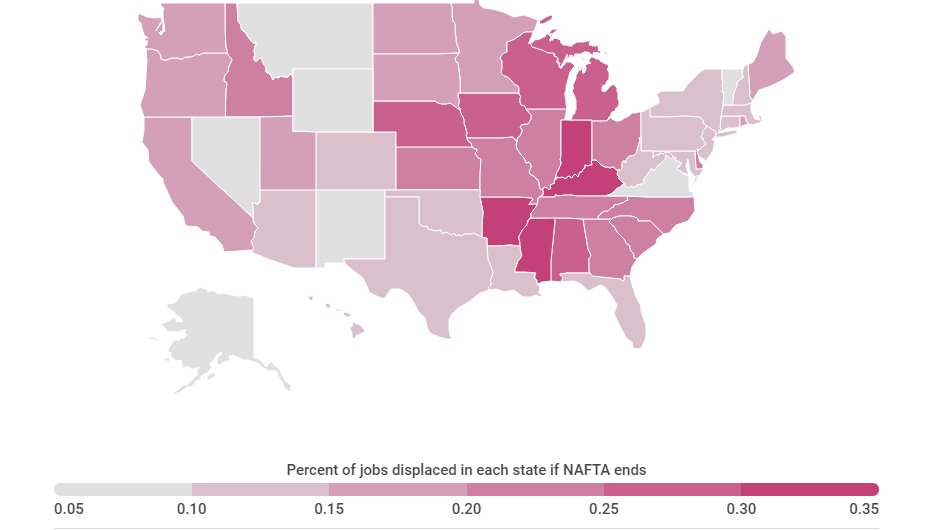
In September 2016, the Petersen Institute published an analysis of the effects of a Clinton and Trump Presidency on trade policy. Part of that study was to estimate the likely effects of a trade war using a model developed by Moody’s Analytics (Zandi et al. 2016). While that analysis is a little dated, as economic growth exceeded expectations in 2017, that model can still provide some clues on the likely consequences of a trade war. The study modeled three trade war scenarios:
- In the full trade war scenario, the United States imposes a 45-percent tariff on nonoil imports from China and a 35-percent tariff on nonoil imports from Mexico. China and Mexico respond symmetrically, imposing the same tariffs on U.S. exports.
- In the asymmetric trade war scenario, China and Mexico do not retaliate symmetrically with an across-the-board tariff. China retaliates on specific U.S. goods and services. With the dissolution of NAFTA, Mexican tariffs on all U.S. goods would snap back to their MFN levels, which currently average about 8 percent. The modeling in this scenario is not contingent on the Moody’s macro model or the imposition by the United States of across-the-board tariffs of a specific level on China and Mexico.
- In the aborted trade war scenario, U.S. tariffs are imposed for only a single year, because China and Mexico concede to U.S. demands, the U.S. Congress overturns the action, or President Trump loses in the courts, or the public outcry is such that the administration is forced to stand down.
The author of the study cited three important limitations to the model. First, the simulation is unable to model the effects of widespread effects of global supply chains. As well, it is difficult to predict the substitution effects. As an example, Petersen Institute’s discussion with the executives of multi-national corporations indicated that, in the event of a breakdown in NAFTA, they would seek to relocate plants from Mexico to other countries. In addition, the model cannot forecast the secondary effects of the loss of corporate confidence and the effects on investment.
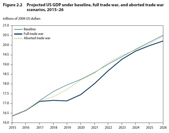
With those caveats in mind, the effects on economic growth are shown in the chart below. In a full trade war, GDP growth would flatten out for two years and the economy would enter a mild recession. The aborted trade war, on the other hand, would see growth slow, but the economy would be able to avoid recession.
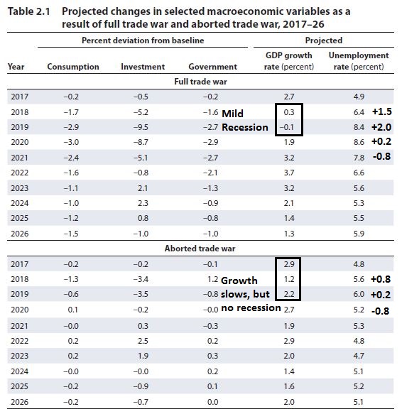
The numeric forecasts are shown in the table below (annotations are mine). In particular, I focus on the effects of a full and partial trade war on the unemployment rate.
While I find it quaint that the 2016 modeled unemployment rate for 2017 was 4.9%, when the actual November 2017 stood at 4.1%, this analysis nevertheless provides valuable insights into the like effects of a trade war. Under the full trade war, unemployment rises dramatically and does not begin to decline until the fourth year. The limited trade war sees the unemployment rate rising by 1% over two years, and then begins to fall in the third. Even then, the non-recessionary conclusion of the limited trade war model may be overly optimistic. New York Fed President Bill Dudley pointed out in a 2016 speech that the economy “has always ended in a full-blown recession” whenever unemployment has risen by 0.3% to 0.4%.
None of the scenarios are equity friendly, and those are just the first order effects.
Trade war second order effects
The second order effects are even more difficult to model, and therefore they become open questions for investors should a trade war develop.
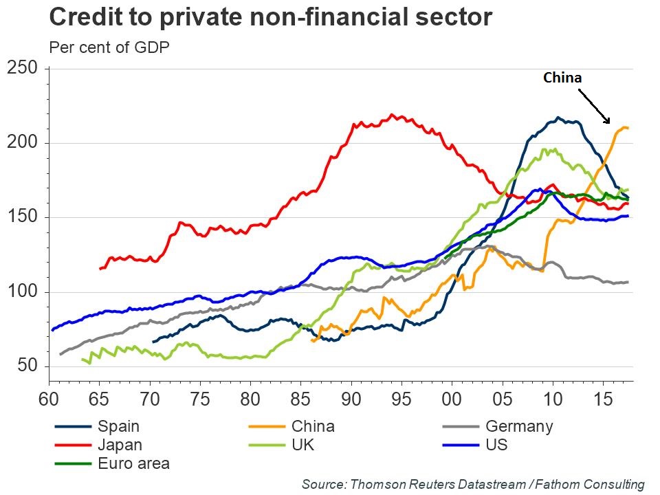
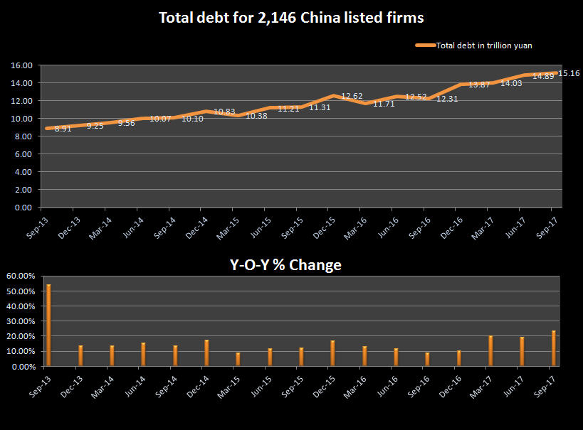
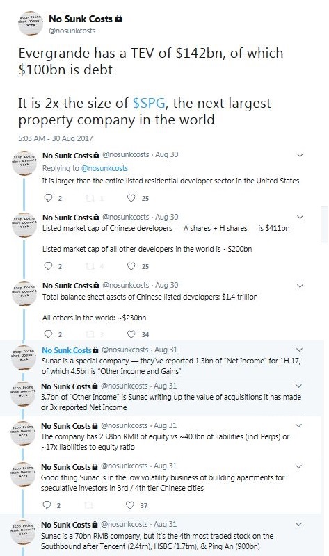
First and foremost, how does Beijing react? Investors must have been hibernating for the last 10 years not to realize that China’s debt load has skyrocketed since the Great Financial Crisis, and levels are consistent with readings seen at past major economic crises. Should a trade war push China into a hard landing, then all bets are off.
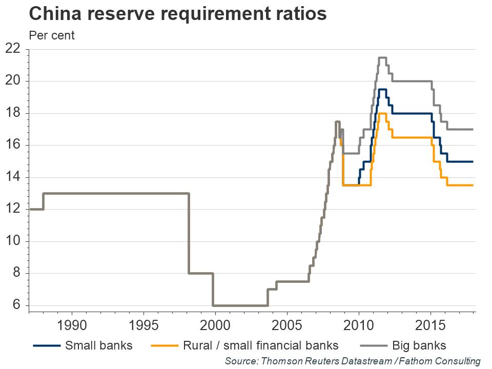
On the other hand, the PBoC has plenty of ammunition left to cushion the effects of a downturn. Should the PBoC dramatically loosen monetary policy, the yuan exchange rate will crash, and would that spark another round of Trump Administration trade retaliation? What happens to Chinese capital flows under such a scenario? Would China impose some form of foreign exchange controls?
These are all good questions that I have no answers to.
What about the Fed? How would it react to a trade war? On one hand, it would likely pause its monetary policy normalization in the face of a slowdown in growth. If the growth outlook deteriorated sufficiently, it would take action to ease.
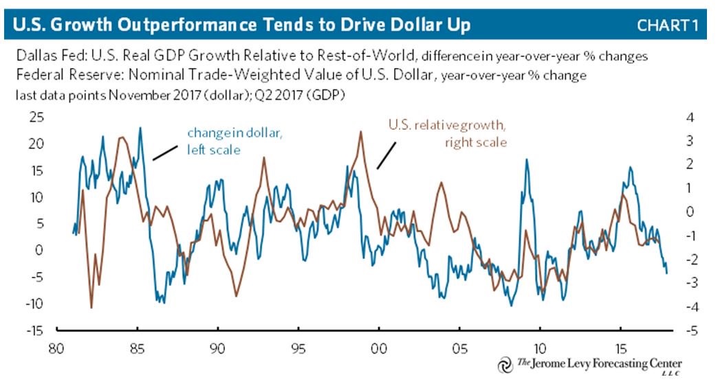
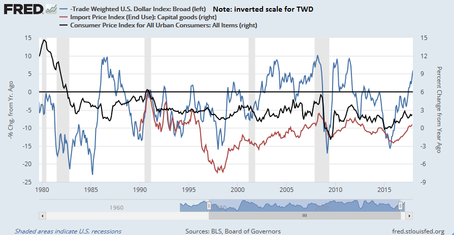
On the other hand, how would it react should inflationary pressures strengthen even as trade tensions rise? The historical evidence indicates that USD strength is correlated with differences in economic growth. Supposing that multi-nationals respond to tariffs by shifting production to other countries not affected by trade sanctions, such a development would lower the relative US growth potential against other countries, and therefore put downward pressure on the greenback.
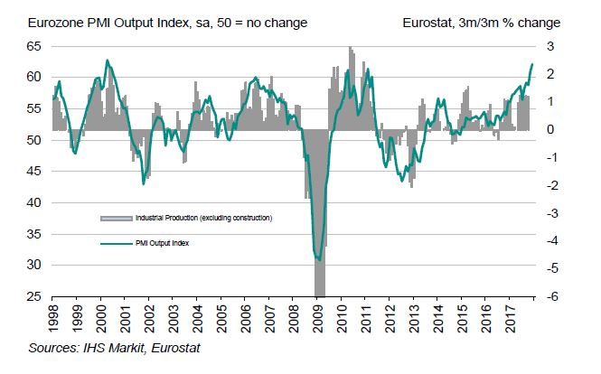
The latest report shows that eurozone manufacturing PMI ending 2017 at record highs, with all-time highs seen in Germany, Austria, and Ireland. Will Europe outperform the US should a trade war erupt? How this question of relative growth rates resolves itself will matter the the direction of the USD, inflation, and Fed policy.
A falling USD puts upward pressure on inflation because of the higher cost of imports. The Fed would be caught in a dilemma. On one hand, trade policy is slowing growth, and the normal reaction function would be to ease. On the other hand, a falling currency puts upward pressure on inflation, and the Fed needs to be mindful of its price stability mandate.
My head hurts from all this thinking. There are too many moving parts to accurately forecast the future.
What to watch for
I resolve this dilemma by using the following framework. The prospect of trade sanctions and protectionism is likely to be a shock to the stock market. Should such a scenario unfold, the most likely outcome is Petersen Institute’s “aborted trade war”, whose first order effects sees growth slow, but the economy avoids a recession. The stock market would likely react by entering a correction.
From a macro and fundamental perspective, I would then monitor the reaction of the Chinese authorities. As well, I would monitor developments in inflation and inflationary expectations in order to better forecast the Fed’s reaction function in order to determine the likelihood of an equity bear market.
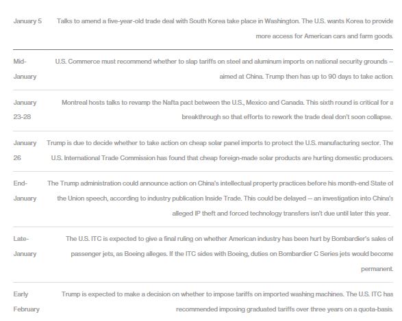
Bloomberg has helpfully provided a trade policy calendar for the coming weeks that is a useful guide. The KORUS discussions will give us some clues and could set the tone for the Trump administration’s approach to trade policy.
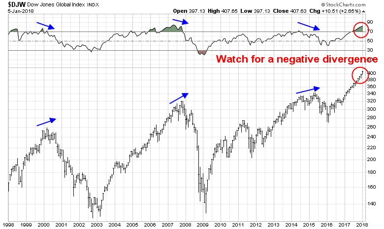
As well, technical analysis can provide some clues. The global stock market historically did not top out spontaneously in the last two cycles. Instead, the topping process saw an initial peak, a correction, followed by a second rally to either test the previous highs or make a new high, but with a negative divergence on the 14-month RSI. If a trade war were to spark a bear market, I would look for a similar technical pattern seen in previous major tops.
The weeks ahead: Momentum, momentum!
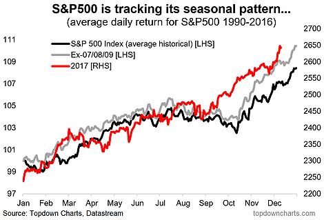
As a reminder, the trade war scenario that I have outlined is not a forecast, but scenario analysis for investment planning purposes. Looking to the weeks ahead, both technical and fundamental momentum are dominating the market action in early January.
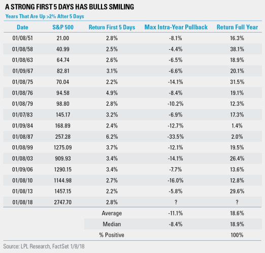
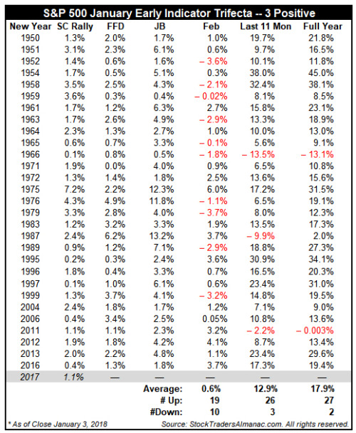
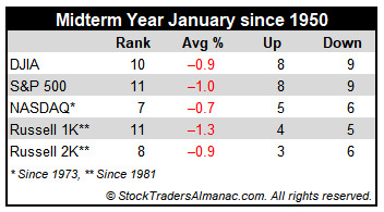
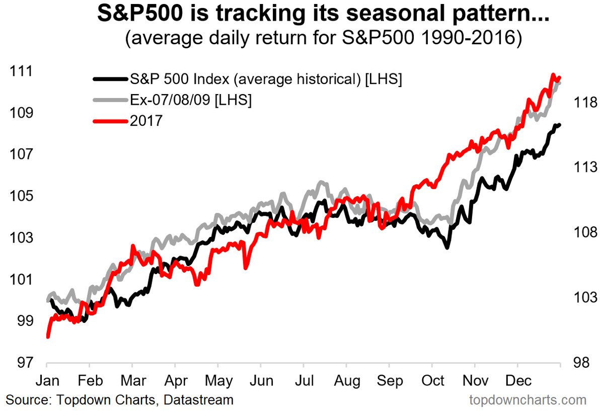
The analysis from Jeff Hirsch of Almanac Trader of January’s market action is particularly revealing. Hirsch has three indicators, the Santa Claus rally indicator, which covers the seven trading days that ended January 3 (SC Rally), the first five days of the year indicator (FFD), and the January Barometer, based on the return of the market in January (JB).
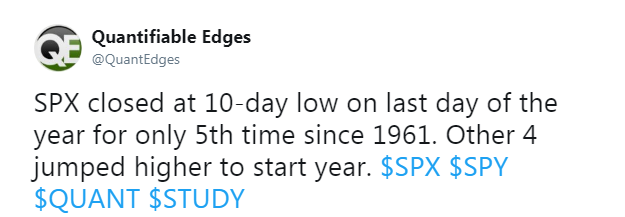
While not everyone believes in the January Barometer, which states that January sets the tone for the rest of the year, the historical evidence shows a definite price momentum effect based on the first five days (FFD) for the rest of January. The above table shows that there were 29 instances where the FFD was positive. Out of that sample, the return for the rest of January (JB – FFD) was positive 26 times (86%), for an average return of 2.6% and median return of 2.1% for the rest of January.
As the SPX is up 2.6% for the first four days in January, the market would have to really crater on Monday for FFD to be negative for 2018. If history is any guide, the SPX is likely to be up between 4.5% to 5.0% in January 2018.
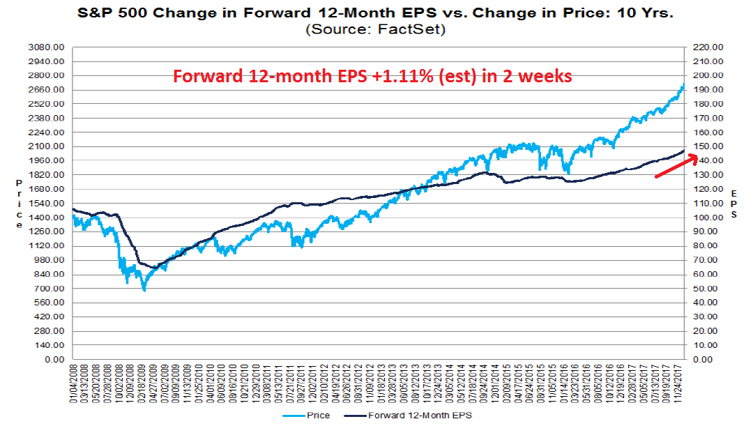
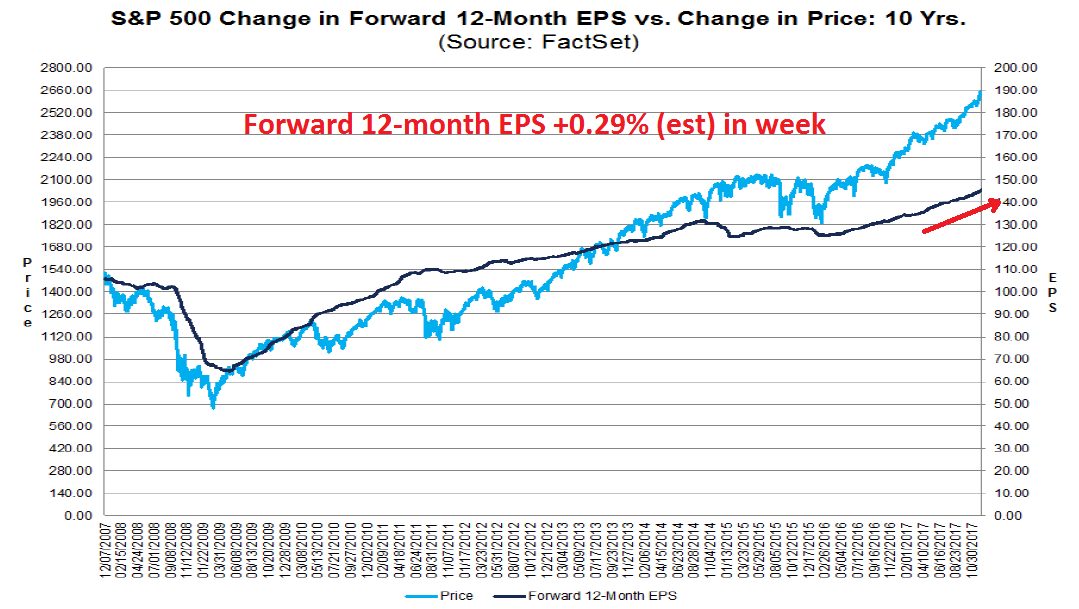
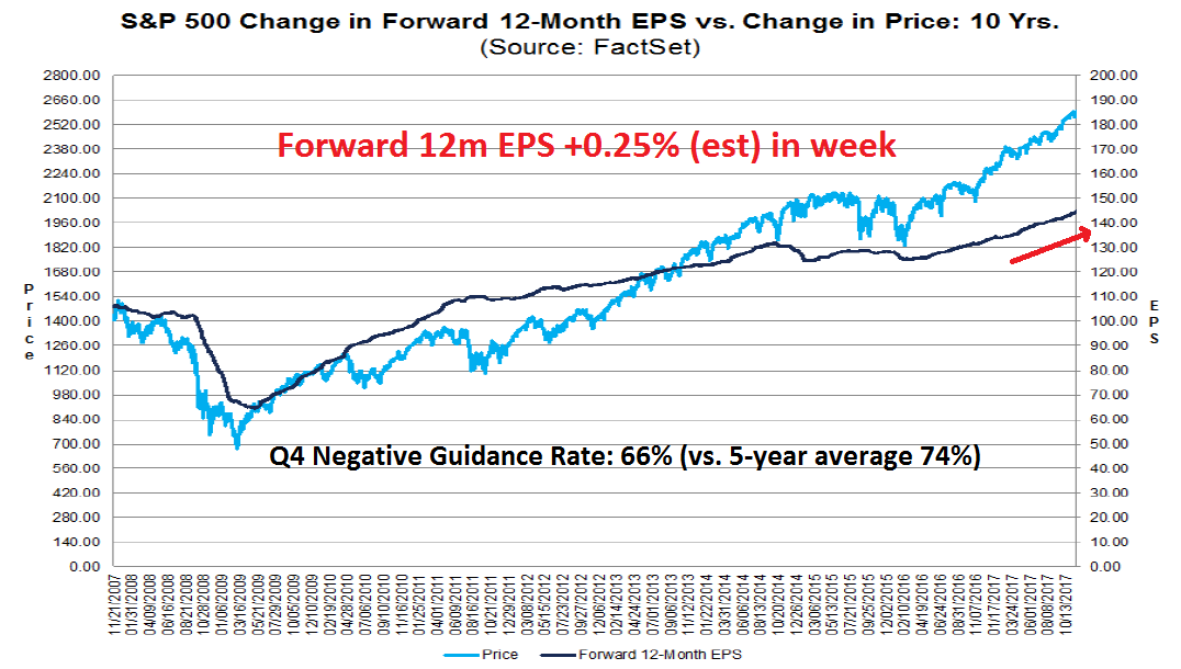
The case for fundamental momentum is equally compelling. The latest update from John Butters of FactSet shows that forward 12-month EPS was up an astounding 1.1% in the last two weeks, indicating a surge in earnings expectations. The weekly rise in forward EPS is normally in the 0.10% to 0.20% range, so a 1.1% increase is quite extraordinary.
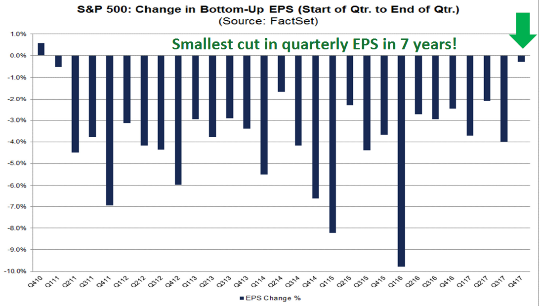
Looking ahead to the upcoming Q4 2017 earning season, earnings expectations are upbeat. Company analysts have had a historical tendency to be overly optimistic in their earnings estimates, and then revise down slowly as time progresses. Butters observed that we are seeing the smallest cut in quarterly EPS estimates in seven years.
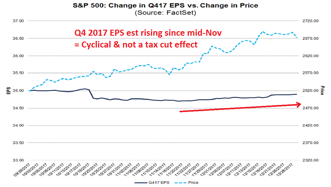
It does not appear that the optimism in Q4 earnings estimates is attributable to the recently passed tax cuts. The effects of any tax cut would not take effect until 2018. As well, analysts began revising Q4 estimates upwards in mid-November, which was a period when there was still a high degree of uncertainty over tax legislation. I therefore conclude that the optimism over Q4 2017 earnings is a cyclical effect due to the synchronized global rebound.
As earnings season progresses, expect company analysts to begin revising their 2018 EPS upwards as companies give guidance about the expected effects of the newly passed corporate tax cuts. Bottom-up oriented company analysts cannot revise estimates upwards because they don’t have the exact details of tax cut effects. However, top-down strategists have already incorporated these effects, and they amount to a 6-9% boost to EPS in 2018.
As long as the market can sidestep potential potholes like a trade war, expect strong fundamental momentum in the next couple months in the form of boosts to EPS estimates from cyclical strength, and the one-time benefit from tax cuts.
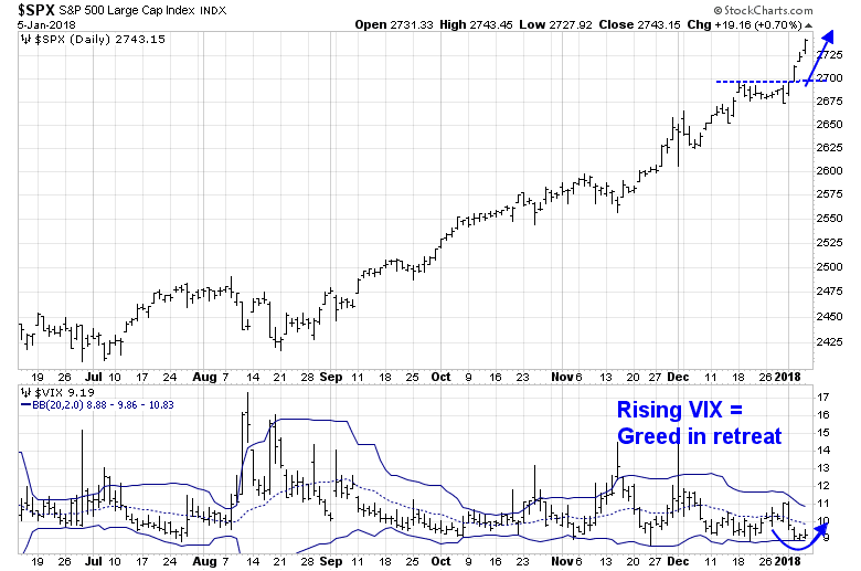
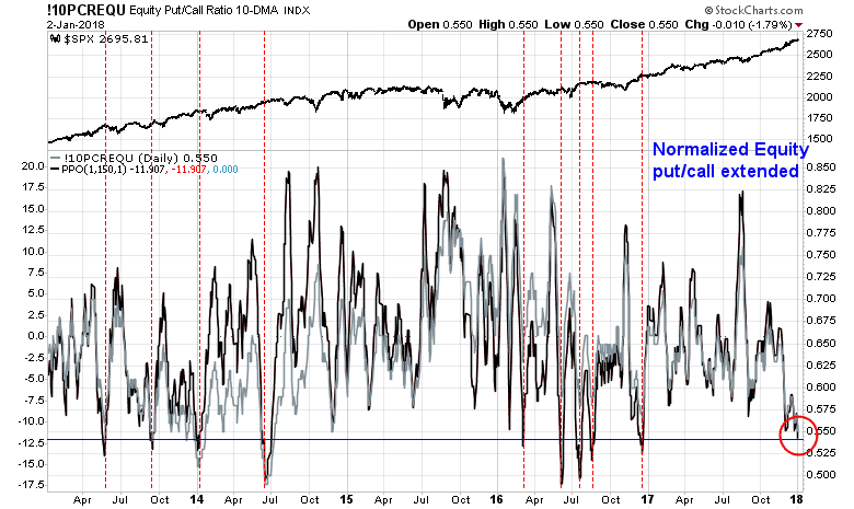
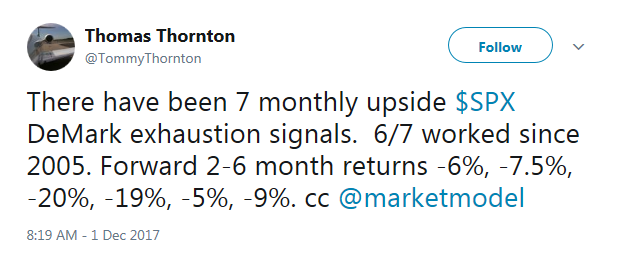
What about the signs of excessively bullish sentiment outlined in my last post (see A frothy rally, but…)? It appears that some of the signs of over the top greed is in retreat. The VIX Index, which usually moves inversely to the market, rose for the last two days, even as the market ground upwards to fresh highs.
The term structure of the VIX is also showing signs of a retreat in greed. I interpret these conditions as sentiment correcting sideways, which suggests further possible near term upside in light of the powerful price momentum historical analysis from Jeff Hirsch.
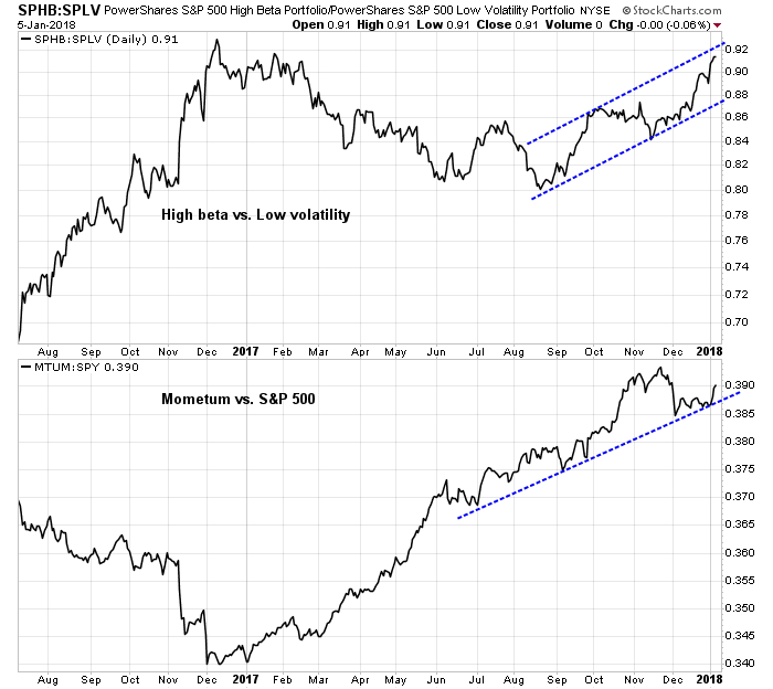
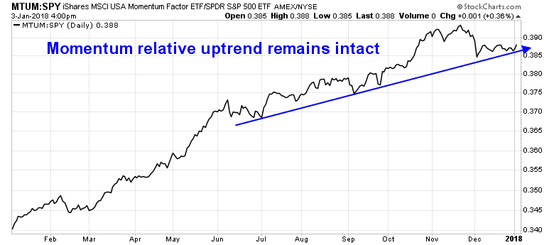
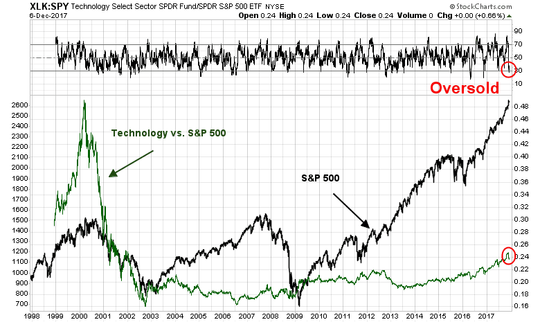
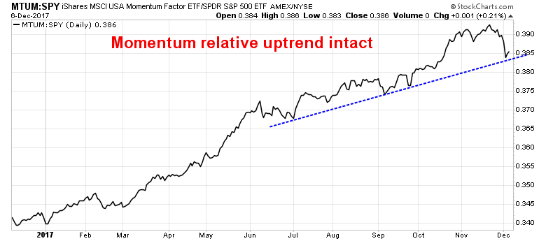
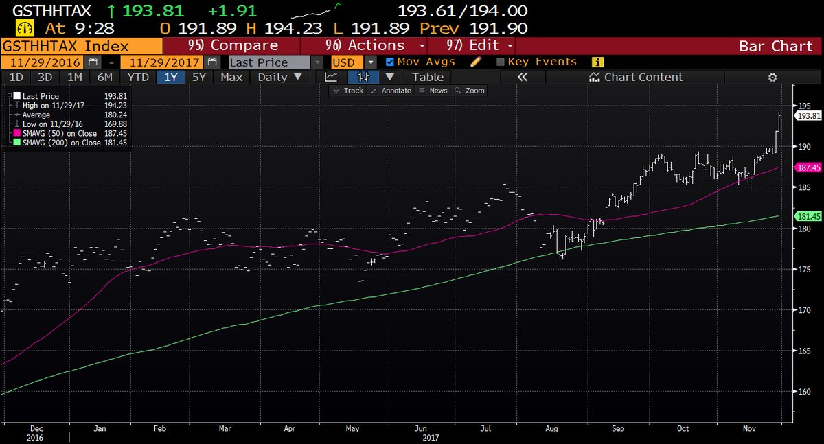
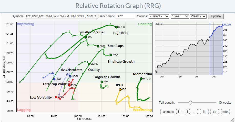
At the same time, risk appetite remains healthy. High beta stocks are in a relative uptrend against low volatility stocks, and price momentum is in a well-defined relative uptrend.
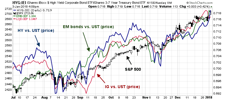
Credit market risk appetite metrics are also confirming the new all time highs set by the major stock market indices.
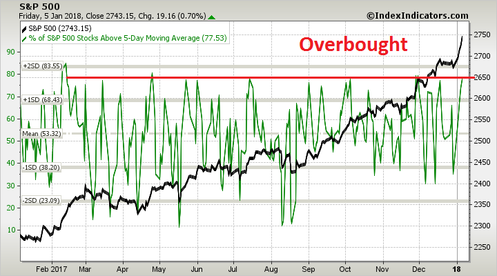
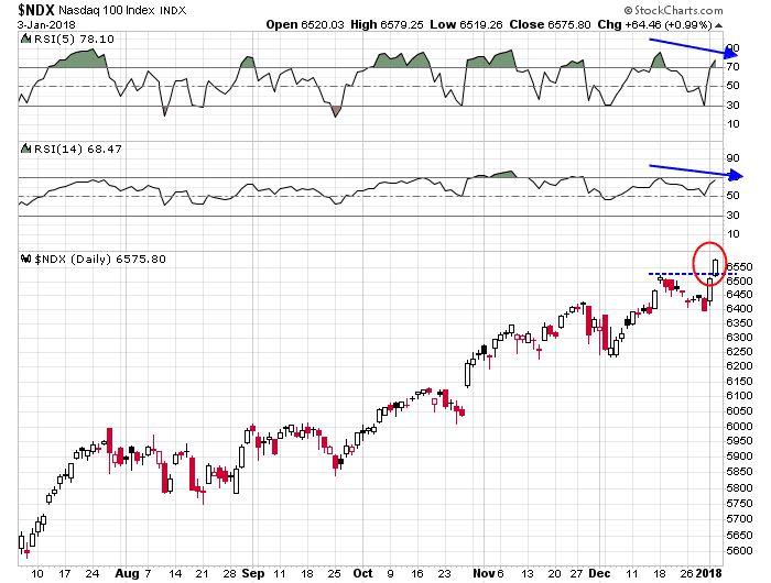
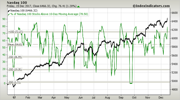
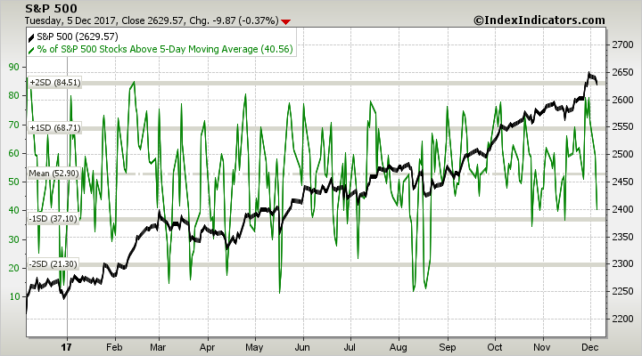
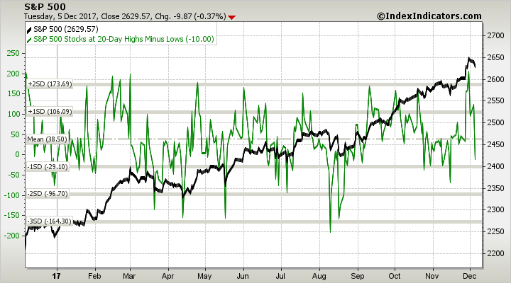
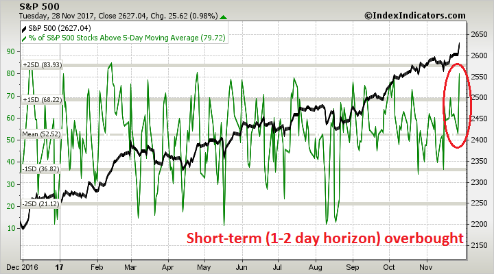
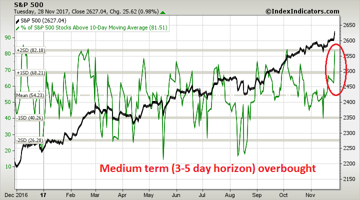
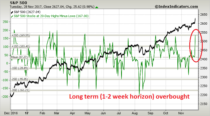
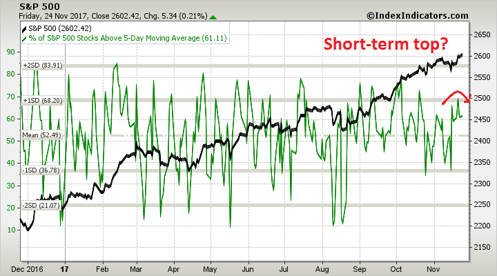
Despite the strong momentum, all breadth indicators from Index Indicators, are overbought. From short term (1-2 day time horizon)…
…to long term (1-2 week time horizon). These conditions suggest that either a brief and shallow pullback or sideways consolidation may be in order.
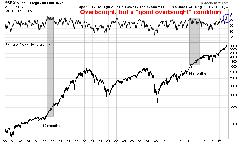
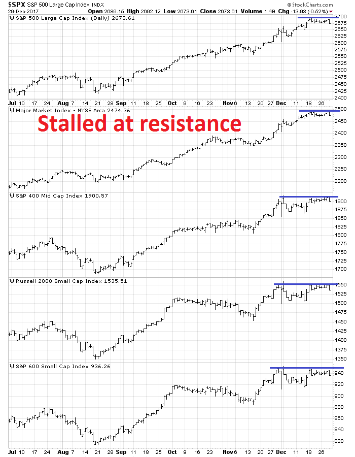
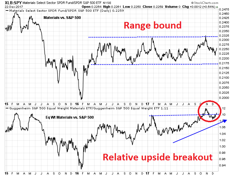
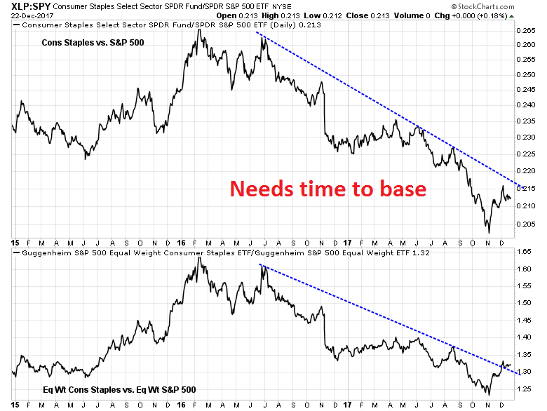
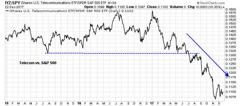
Two weeks ago, I wrote that the market was undergoing a melt-up characterized by a series of “good overbought” conditions (see A sector review reveals animal spirits at work). So far, market action is following the path I set out for it. Expect further intermediate term upside ahead.
My inner investor is bullish on equities. My inner trader is also long the market and, barring any trade policy surprises, he is prepared to buy any weakness that may appear next week.
Disclosure: Long SPXL