Preface: Explaining our market timing models
We maintain several market timing models, each with differing time horizons. The “Ultimate Market Timing Model” is a long-term market timing model based on the research outlined in our post, Building the ultimate market timing model. This model tends to generate only a handful of signals each decade.
The Trend Model is an asset allocation model which applies trend following principles based on the inputs of global stock and commodity price. This model has a shorter time horizon and tends to turn over about 4-6 times a year. In essence, it seeks to answer the question, “Is the trend in the global economy expansion (bullish) or contraction (bearish)?”
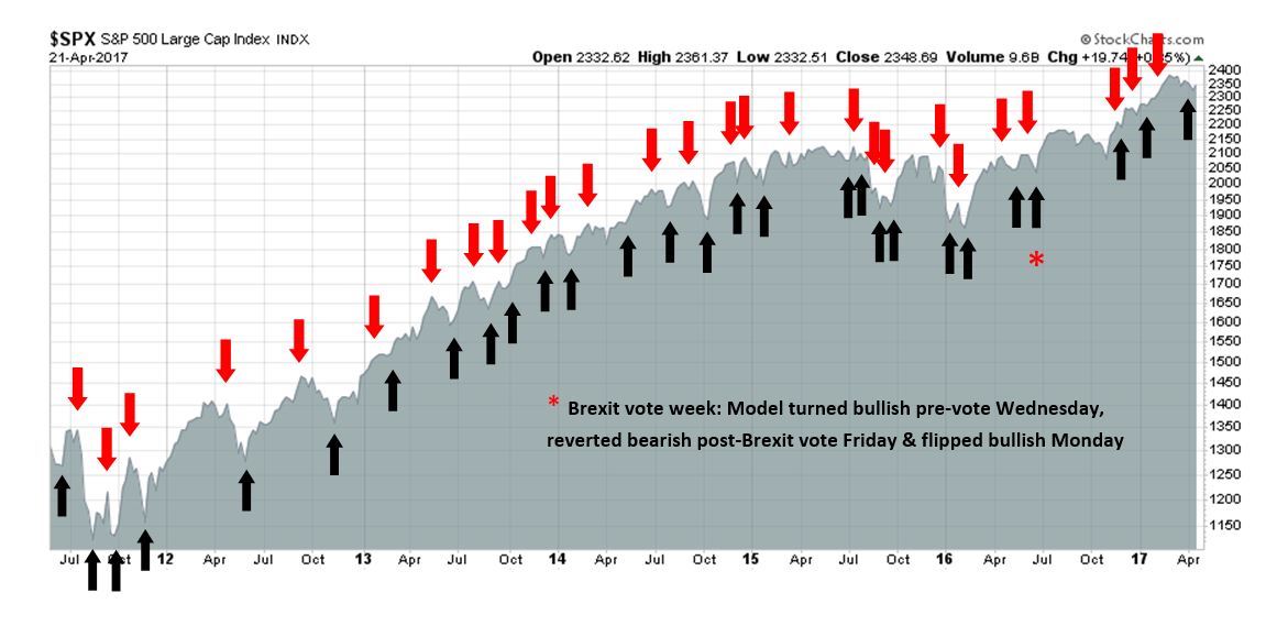
My inner trader uses the trading component of the Trend Model to look for changes in the direction of the main Trend Model signal. A bullish Trend Model signal that gets less bullish is a trading “sell” signal. Conversely, a bearish Trend Model signal that gets less bearish is a trading “buy” signal. The history of actual out-of-sample (not backtested) signals of the trading model are shown by the arrows in the chart below. Past trading of the trading model has shown turnover rates of about 200% per month.
The latest signals of each model are as follows:
- Ultimate market timing model: Buy equities
- Trend Model signal: Risk-on
- Trading model: Bullish
Update schedule: I generally update model readings on my site on weekends and tweet mid-week observations at @humblestudent. Subscribers will also receive email notices of any changes in my trading portfolio.
Market cycles explained
When I first got interested in the stock market (back in the day when we programmed computers with punched cards), I learned the principles of market cycle analysis from a grizzled veteran of technical analysis. Markets are said to move in cycles.
Here is how an idealized cycle works. In the initial phase of an expansion, central banks lower rates to boost the economy, and the market leaders are the interest sensitive stocks. As the cycle matures, leadership rotates into consumer stocks, followed by capacity expansion, which leads to capital goods sector leadership. The late phase of the cycle is characterized by tight capacity and rising inflation, which is an environment where asset plays and commodity extraction industries outperform.
I never forgot that lesson. I also learned that while the market cycles thematically parallel economic cycles, they are different. Market undergo mini-cycles of changes in sentiment whose length are much shorter than economic cycles. Nevertheless, the broad principles of market cycle analysis remain valid today.
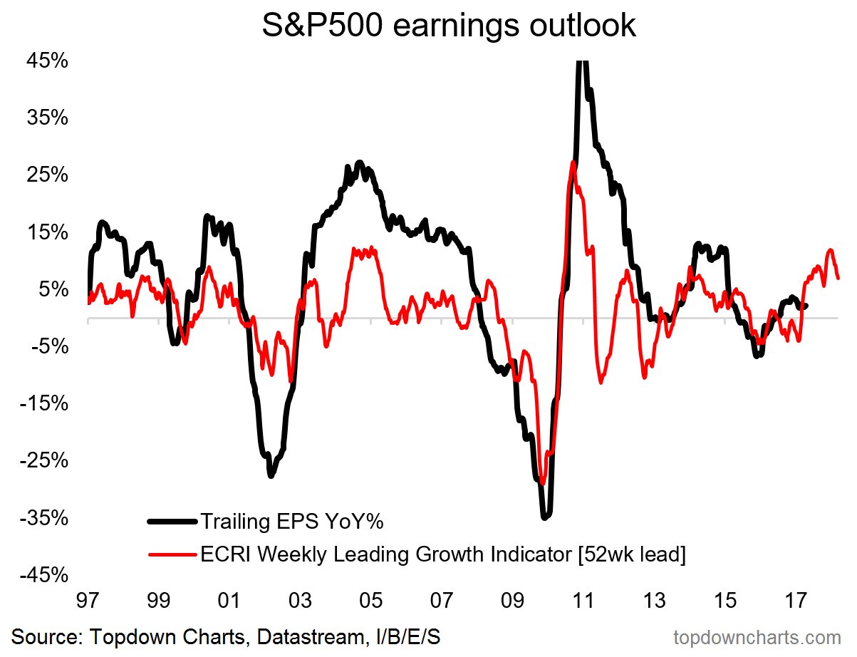
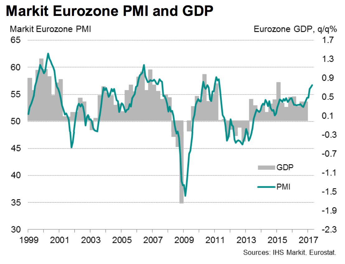
In the past few weeks, I have been repeating the message that the intermediate term equity market outlook appears bullish (see Buy the dip! and Buy! The party is still going strongly). There is a growth surge, not only in the US, but around the world. This chart from Callum Thomas of Topdown Charts summarizes the growth outlook perfectly.
In addition, the recent 2-3% pullback saw sentiment tank to bearish extremes, which is contrarian bullish. Last week, oversold markets began to bounce, which is an indication of an inflection point (see Buy signals everywhere). As well, Tom McClellan observed that the 10-day Open ARMS index was also signaling a bottom.
Rather than repeat the same bullish message for another week, I thought that a sector review from a market cycle analytical framework would be a good change of pace. Interestingly, the broad message from this analysis tells the story of a global upturn, and we are roughly only in the third inning of an intermediate term bull phase.
Synchronized US and Europe
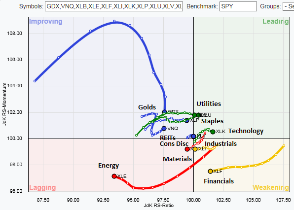
One of the tools of any sector review is the Relative Rotation Graph (RRG, click link for full explanation), Market leaders tend to rotate in a clockwise direction in an RRG chart, from lagging (bottom left), to improving (top left), to leading (top right), to weakening (bottom right), and then finally reverting to lagging again.
Here is the RRG chart of US sectors. It shows the revival of “animal spirits”, in the form of enthusiasm for high beta, high octane stocks, and the rising leadership of interest sensitive stocks. The laggards are mainly the late cycle plays, namely as energy and materials. Gold stocks, which are also inflation hedge stocks, appear to be rolling over while in the emerging quadrant before it can take over the leadership mantle.
Interestingly, the RRG chart of Europe tells a similar story. Technology stocks are leading the way, followed by interest sensitive sectors. Energy and Basic Material stocks are lagging.

The combination of these two RRG charts indicate that the dynamics of the market cycle are global in nature. The combination of the current picture of sector leadership, and the idealized template of sector rotation that I described above, suggests that we are only in the third inning of an intermediate term cycle which can carry the SPX to the 2500-2600 region before it’s all over.
A detailed look at sectors and industries
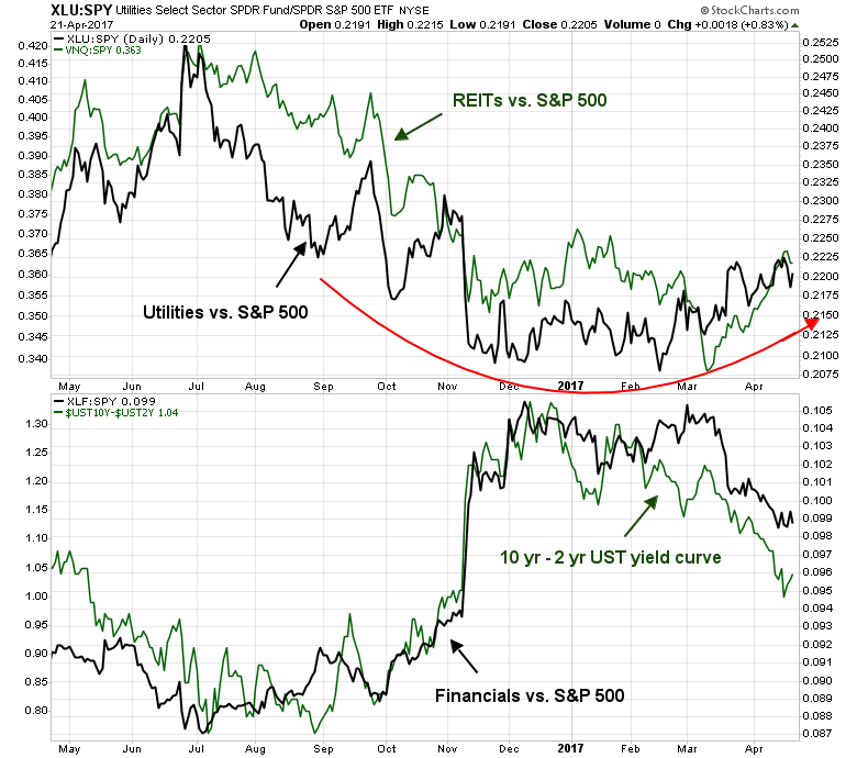
Here is a more detailed look at sectors, starting with the relative performance of the interest sensitive groups. The top panel below shows the relative returns of Utilities and REITs against the market. As the chart shows, these sectors are tracing out a rounding bottom relative to the market. The bottom panel shows the relative returns of Financials compared to the market. There has been much discussion in the blogosphere and social media about these stocks. As the chart shows, their relative returns have been highly correlated to the shape of the yield curve. A flattening yield curve has been detrimental to relative strength of Financial stocks.
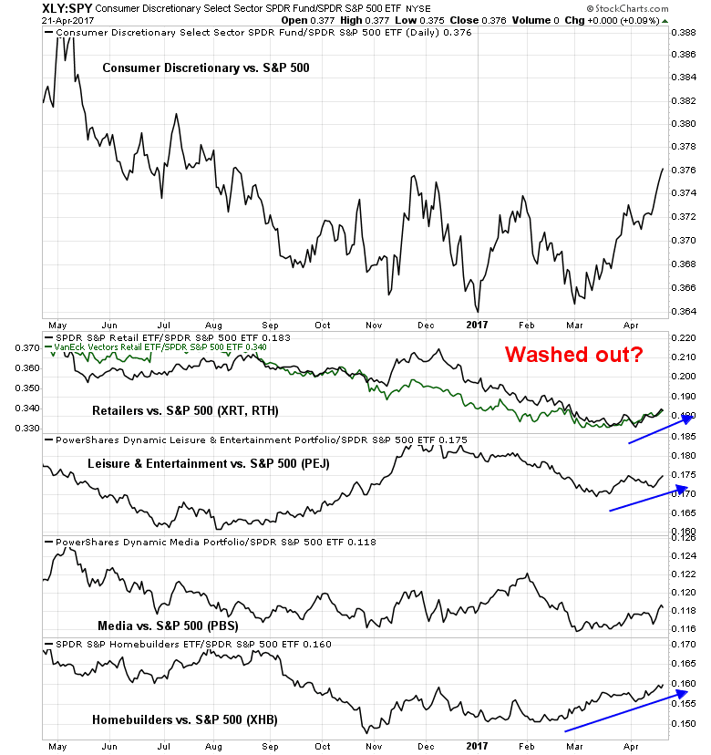
Here is a chart of some mid-cycle sectors. Consumer Discretionary stocks are bottoming. Late cycle industrial stocks are struggling, and it’s too early to be overweight this sector. Health Care is starting to trace out a relative bottom. Biotech, which is the high beta “canaries in the coalmine” of this sector, remains range-bound compared to the market.

The emergence of Consumer Discretionary stocks as a leadership sector was a bit of a surprise. Here are the relative performance charts of selected industries within the sector. Most of the industries within the sector, with the exception of Media, are starting to turn around. Even the much maligned Retailers look washed out and they are starting to bottom.
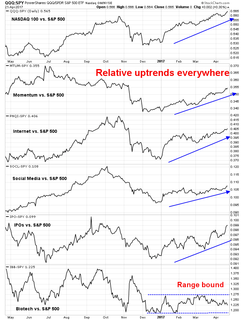
Technology was another surprising leadership sector, especially in light of the pattern exhibited by the other sectors in a market cycle analytical framework. As the chart below shows, enthusiasm for high beta FANG and FANG-like stocks are rising again, except for biotech stocks.
Finally, here is the relative return chart of late cycle inflation hedge sectors. Energy and mining stocks (top panel) have broken out of relative downtrends. They need some time to consolidate and bottom before they can become market leaders. The same goes for gold stocks (bottom panel).

In addition, there are signs that gold is reaching a bullish sentiment extreme, which is contrarian bearish. A recent Bloomberg survey found a similar reading of excessive bullishness.
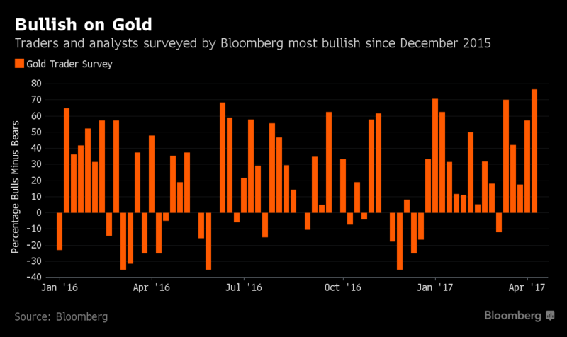
Mark Hulbert also found that gold market timers were in a crowded long:
Consider the average recommended gold market exposure level among a subset of short-term gold market timers that I monitor (as measured by the Hulbert Gold Newsletter Sentiment Index, or HGNSI). This average earlier this week rose to as high as 57.7%, the highest level in nearly 12 months.
As recently as mid-March, in contrast, the HGNSI stood at minus 27.7%. So in six weeks’ time the average gold timer increased his recommended exposure level by more than 85 percentage points. No wonder gold’s rally ran out of steam earlier this week.
In summary, bullish enthusiasm has returned to the market, in the form of FANG leadership. In addition, the emergence of leadership of interest sensitive and consumer discretionary stocks suggests that the market is still in the early phase of an intermediate term bull move.
The week ahead: Still anxious
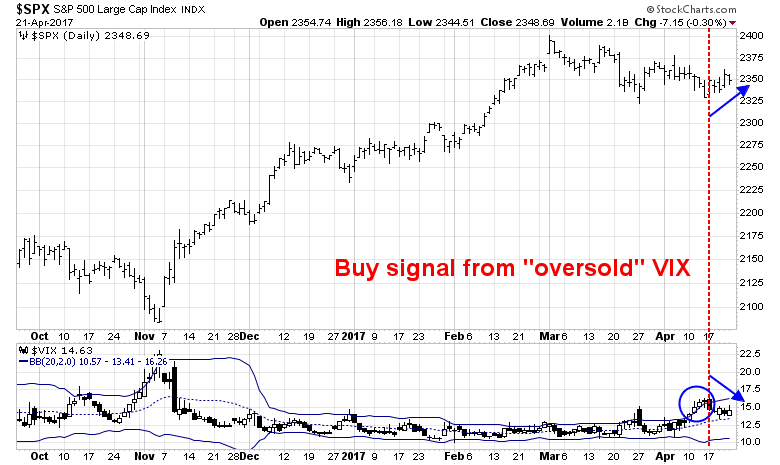
Last Wednesday, I wrote that the VIX Index was flashing buy signals (see Buy signals everywhere). While fear levels have receded, short-term fear levels spiked again on Friday. The chart below depicts the VXST (9-day) to VIX (1-month) ratio, which has spiked indicating fear.
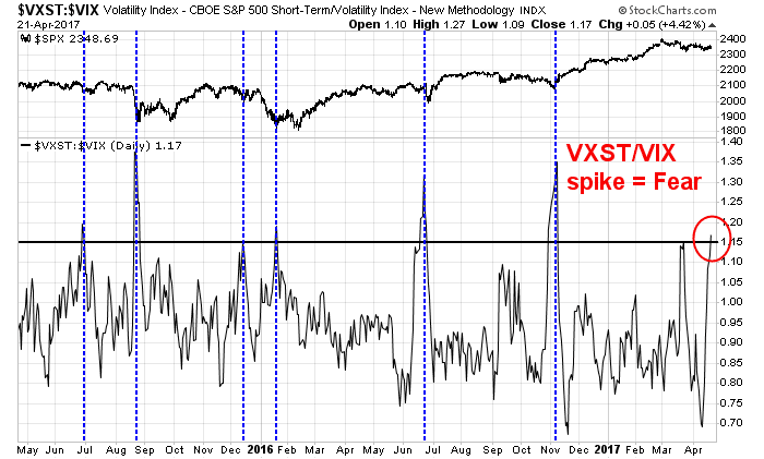
Past buy signals where an indicator has become oversold and mean reverted to neutral has resulted in powerful bullish thrust. The current episode is unusual as the bullish follow through has not materialized. The VXST/VIX spike is probably indicative of rising fear over the French election, whose first round is occurring this weekend.
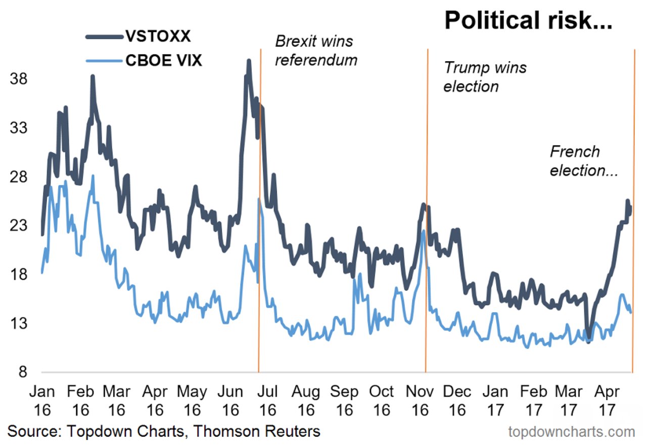
For a different perspective, the chart below shows the spike in VSTOXX (via Callum Thomas). In all likelihood, any outcome other than where Le Pen/Mélenchon, or Fillon/Mélenchon victories will spark a relief risk-on rally.
In the meantime, eurozone PMI has risen to a six year high and Bloomberg reported that French companies are adding staff and shrugging off election uncertainty. The view from the ground in France doesn’t sound too bearish to me.
In addition, President Trump has announced that he will be unveiling his tax reform and reduction proposals next Wednesday. Even though the announcement is expected to be heavy on broad principles and light on details, the announcement has the potential to be the bullish catalyst that the stock market has been waiting for.

My inner investor remains bullishly positioned and overweight equities. My inner trader is nervously long. At a minimum, he would not want to be short in light of all of these potential
Disclosure: Long SPXL, TQQQ
You say the third inning, but 2600 is only a bit less than 11% higher than where we are currently. Perhaps you are saying the ultimate top, before the next bear market appears, is much higher than 2600, in which case we may be only in the third inning. If, however, 2600 is viewed to be the ultimate upside target for this secular market cycle then we are way past the third inning in terms of both time and price.
Sorry, let me rephrase that. The third inning of the intermediate term advance, which began from the last corrective low in November. The third inning reference refers to time, not magnitude of price move.
If I understand Cam, the fourth innings is penciled in at present, in time. Target price is yet unknown. As I write this, May VIX contract has collapsed from 1430 to 1325. That is a massive one handle move. The mini S&P June contract is 20 points higher and the 10 year note June contract has also sold off (only about 10-15 ticks give or take, not much). All in all, looks like a large move up tomorrow right at the gate. Let us see where we close. The trifecta bottom was spot on. So far text book picture of an intermediate bottom. Seasonally, late april rally is where we are in time. Tax cut announcements on Wednesday should juice the market. Let us see where we close by end of April. The whole thing of being long, seems logically right, but almost too text bookish to be working the way it is supposed to. Let us see.
I agree. It looks a bit too textbook, but sometimes the textbook works.
From a market cycle and sector leadership viewpoint, I would watch for the emergence of late cycle inflation hedge leadership as a signal of an intermediate term top.
Thanks – informative as always, but I must add that Trump tweets should be seen as a catalyst for comedy and not much else.
Cam, this sector analysis is excellent and very helpful for those of us that manage funds for clients. In this market, or any market for that matter, being tactically nimble is a must, and this presentation is great help! I would love to see you do this twice a month regularly. This kind of analysis alone is well worth my check to you!
Thanks
Mike
Ditto!
Europe is soaring today. Here is how I bought it last month using the strategy outline in my new book.
In a humblestudent post last month I showed this chart and said I just bought Europe for the first time in many years.
https://product.datastream.com/dscharting/gateway.aspx?guid=e769a68e-e43c-4635-b0a3-e1d19f20573b&action=REFRESH
I had created the chart after the solid pro-Euro election results in Holland. In it, I rebased European ETFs to the March 15 election starting date versus the S&P 500. My book is about Momentum-style investing. One could not buy Europe using momentum strategy because it was underperforming. BUT I’ve cure that flaw of momentum by allowing the purchase of an underperforming asset when it hits a possible major bottom inflection point with a safety valve of this type of rebased chart. If the supposed turning point is false and the Europe ETF would have failed to keep on outperforming the S&P 500, I would have sold. The kiss of death to performance according to momentum theory is holding underperforming assets. One can be easily fooled into thinking a downtrend is over when in fact it still has a long way to go down. This discipline of a safety valve works to prevent that while allowing you to bottom feed. January 2016, I bought for my clients the commodity ETFs that were hated and underperforming for years with this strategy and it was incredibly profitable.
So Europe continued to outperform as you can see in the chart and we stayed in. It’s turning out to be a winning trade. I will add to the position. The only problem with the European stock market was politics since the economy is recovering beautifully. Now it can outperform, maybe for a long time.
Buy the book at; http://www.thepathway.ca/
Ken,
Look forward to reading purchased last week. Great commentary and thanks for sharing.