Mid-week market update: Technical analysts monitor market breadth, as the theory goes, to see the underlying tone of the market. If the major market averages are rising, but breadth indicators are not confirming the advance, this can be described as the generals leading the charge, but the troops are not following. Such negative divergences are signs of technical weakness that may be a precursor to future market weakness.
That’s the theory.
I have been highly skeptical of breadth indicators as a technical analysis tool because breadth divergences can take a long time for the market to resolve, if at all. The chart below shows the SPX, the “generals”, along with several indicators of how the “troops” are behaving, namely the mid-cap and small cap indices, as well as the the NYSE Advance-Decline Line.

The behaviour of these indicators during and after the Tech Bubble was problematical. During the advance from 1998 to 2000, the NYSE A-D Line fell and flashed a negative divergence sell signal. At the same time, both the mid- and small-cap indices continued to rise and confirmed the market advance. Which divergence should investors believe?
After the market peaked in 2000, the mid and small caps traded sideways, which represented a non-confirmation of the bear market. Investors who followed this buy signal would have seen significant drawdowns during this bear market.
To be sure, there were periods when breadth indicators worked. The NYSE A-D Line traded sideways during the market decline of 2011, which was a buy signal. As well, it correctly warned of market weakness in 2015.
Putting it all together, the report card for these indicators can best be described as inconsistent and the timing of the signal uncertain. At a minimum, no investor would use breadth indicators in a trading system.
I believe that I discovered a solution to the problems that technicians struggle with when they use breadth indicators.
An apples-to-apples breadth indicator
Part of the problem of breadth indicators can be attributable to an apples-to-oranges comparison of breadth. The NYSE breadth universe contains many closed-end funds and REITs whose trading patterns are different than the SPX. Similarly, mid-cap and small cap sector weights can be considerably different than the SPX.
I solved that problem by using the Equal-Weighted SPX (SPXEW) as a breadth indicator. Both the equal-weighted and float-weighted SPX have the same companies in the index, with the only difference being the individual company weights in each index.
I studied the return pattern of SPXEW and SPX from 2003 and created a trading system based on the following rules:
- Look for divergences: I first calculated a rolling 26-week correlation, the SPXEW/SPX ratio with SPX. We define a divergence as the 26-week correlation falling below 0.25. The first occurrence of a divergence would create a trade signal.
- Signal direction: The trading system then buys or shorts the SPX based on whether SPXEW/SPX was outperforming or underperforming. An outperformance would translate into a buy signal, and underperformance, a short signal. In other words, we allowed the “troops” to tell us what the “generals” are likely to do.
The chart below shows the results of our study. There were 15 signals during the test period, and average returns beat the SPX one week after each signal.
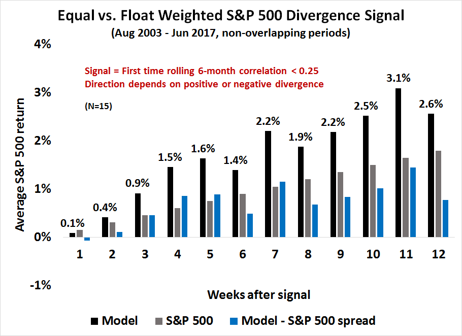
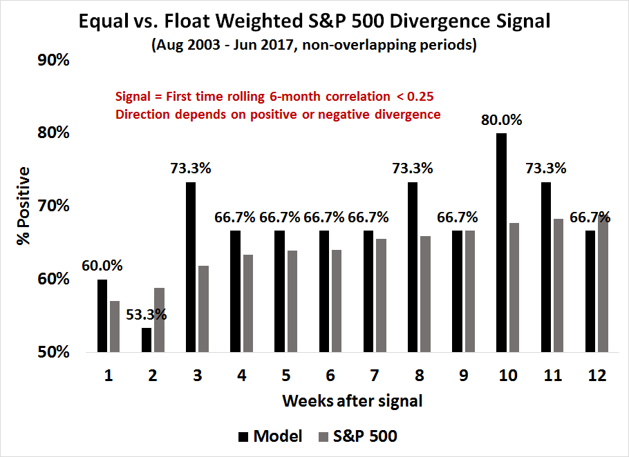
Another way of analyzing the model is to monitor the success rate, or percentage of times the returns are positive, after the signal. Based on the combination of the chart above showing average returns, and the chart below showing success rate, the optimal holding period is roughly 7–10 weeks after a signal.
Negative divergences everywhere
What is the SPXEW Breadth Model telling us now?
The chart below graphically depicts the results of our study of this model. It shows the SPX (black, top panel), the SPXEW/SPX ratio (green, top panel) and the rolling 26-week correlation (bottom panel) since 2007. Past positive divergence are marked in blue, and negative divergences marked in red.

Currently, the SPXEW Breadth Model is on a severe negative divergence, and therefore a sell signal, which began in early March. I am somewhat puzzled by these readings. Either the model is turning out to be ineffective this time as we are almost past the optimal holding period, or it is warning of a significant correction in the near future.
The negative divergence exhibited by the SPXEW Breadth Model has been confirmed by negative divergences elsewhere. As the chart below shows, The SPX is showing negative RSI-5 and RSI-14 divergences even as it tested upside resistance at all-time highs this week.
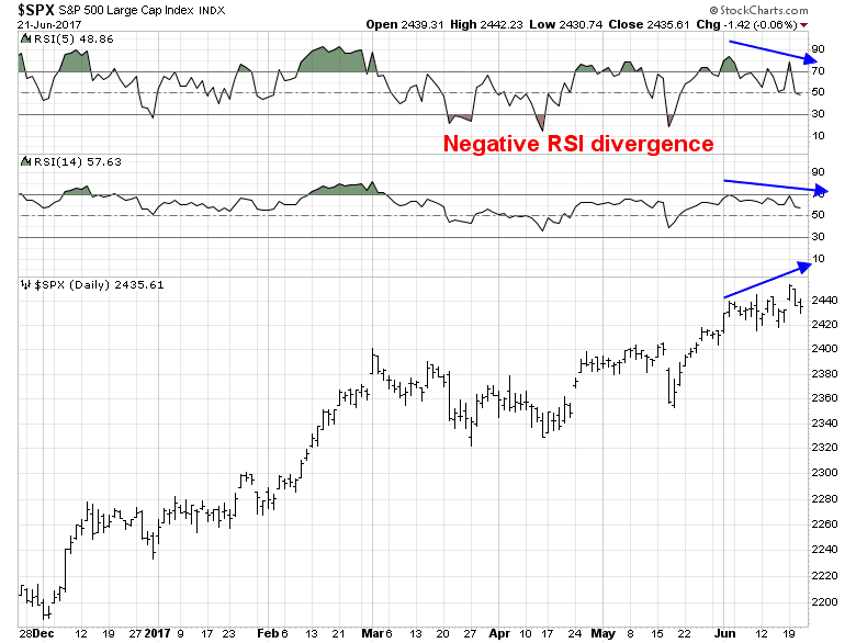
In addition, negative divergences could be seen in the weekly SPX chart, though only one out of the last three negative RSI divergences on the weekly chart was resolved bearishly.

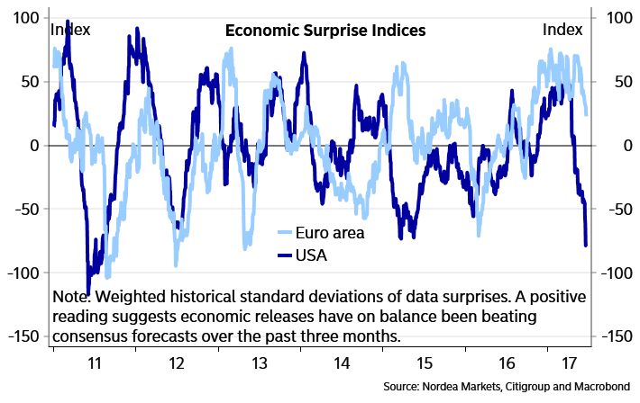
In conclusion, the US equity market still faces near-term downside risks and sloppy market action. As long as the US Economic Surprise Index (ESI) remains weak, the market may continue to struggle. As the chart below shows, a far more likely outcome is some degree of convergence between eurozone ESI and US ESI in the months ahead.
Disclosure: Long TZA
Very interesting. Let me share some thoughts. The equal weight to cap rate ratio is like a quality ratio. You can see that clearly in the period right after the 2008 GFC where the ratio soars.
So a non-confirmation that leads to a big market downswing will be one where the falling equal weighted index of weaker companies is signaling deteriorating economic conditions that the larger cap weighted stocks are blind to. When the realization of the bad conditions becomes obvious to the large caps, the whole stock market plunges. Bingo a big gain.
I checked the Junk Bond Spread chart with the signals. Here it is.
https://fred.stlouisfed.org/series/BAMLH0A0HYM2
BTW the St. Louis Fed will email this to you regularly if you ask.
You can see that the profitable signals happen when the junk spread is widening, indicating deteriorating business conditions. The tiny drops in the market after the two 2014 signals came when spreads were tightening showing improving business conditions.
What would that say about the current signal? Well the junk spreads are stable at a very low level not rising. I must say with crude oil plunging that’s amazing but still one must conclude investors are not worrying about slowing business conditions. So I would say, this current signal will not produce a big decline unless junk bonds start falling in price.
Another thing, this equal weight/cap weight index acts a lot like the momentum index. After a bear market ends, the momentum does very poorly because the stocks that fell the most in a bear, recover the most in the year or so into the next bull market. So the momentum chart would be similar to the equal weight/cap weight. But here is the difference as the bull market proceeds, the cap weighted can go up because a few big stocks are outperforming dramatically not because the smaller companies are tumbling. That is the case today. The FAANG stocks are soaring while the others are flattish. I saw something recently that said the SPX was up 8% but without the FAANGs it would be flat. That does not portend a weaker economic environment ahead especially since the junk bond spread is stably low. We may just experience an overbought correction in the FAANGs and little nastiness for the rest of the market. Note also that the general market is being given a boost by bond yields falling which makes their dividends more attractive.
So today we don’t have the dangerous combination of the big stocks flat with the smaller guys falling giving us a non-confirmation (plus a nasty widening of the Junk Bond spread). That’s what happened in 2011 and 1015. That dangerous combination portends a silent but deadly building negative force on business conditions.
Bottom line, expect a small correction if any. Watch for future widening Junk Bond spreads to signal a time when a future non-confirmation will predict a big decline ahead.
Cam
Would a correction in time rather than price be what we are seeing currently (signal from early March)? In fact, were it not for oil scrips, we would be making new highs on S&P. One may still some weakness going forward, though. That said, A/D line does not appear to be a slouch either.
A correction in time is certainly a possibility. We could see an internal rotation where the major averages churn sideways as leaders weaken and new sectors and groups take up the leadership mantle.
Cam,
I have a question. Of the two components to your system one is described very specifically (“Look for divergences”), while the other (“Signal direction”) seems a bit more ambiguous. Do you look at the current SPXEW/SPX versus its level from a fixed amount of time in the past or is it more of an impressionistic interpretation of the direction of the trend? Thanks.
The direction is based on whether SPXEW is outperforming or underperforming SPX over the test period. Sorry I was unclear on that point.