Preface: Explaining our market timing models
We maintain several market timing models, each with differing time horizons. The “Ultimate Market Timing Model” is a long-term market timing model based on the research outlined in our post, Building the ultimate market timing model. This model tends to generate only a handful of signals each decade.
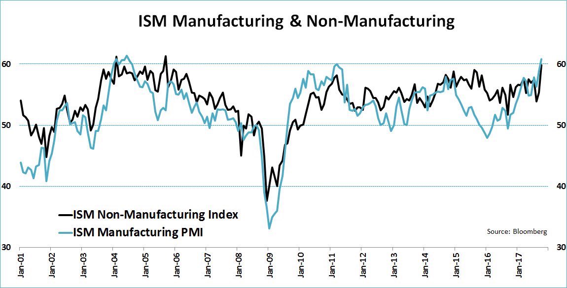
The Trend Model is an asset allocation model which applies trend following principles based on the inputs of global stock and commodity price. This model has a shorter time horizon and tends to turn over about 4-6 times a year. In essence, it seeks to answer the question, “Is the trend in the global economy expansion (bullish) or contraction (bearish)?”
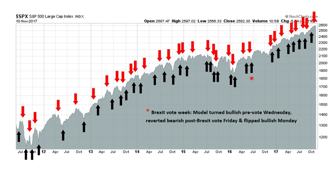
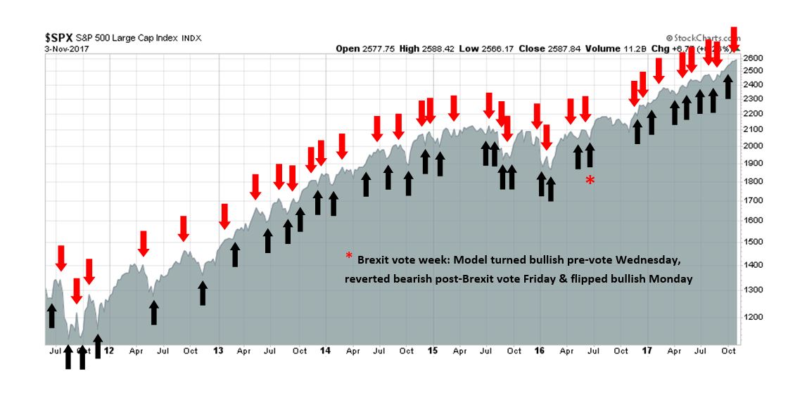
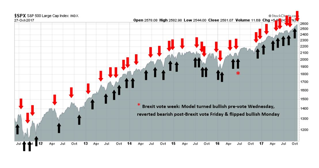
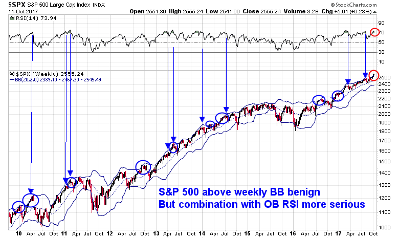
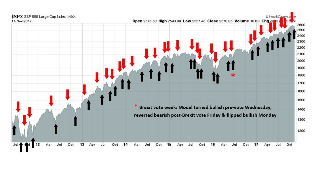
My inner trader uses the trading component of the Trend Model to look for changes in the direction of the main Trend Model signal. A bullish Trend Model signal that gets less bullish is a trading “sell” signal. Conversely, a bearish Trend Model signal that gets less bearish is a trading “buy” signal. The history of actual out-of-sample (not backtested) signals of the trading model are shown by the arrows in the chart below. Past trading of the trading model has shown turnover rates of about 200% per month.
The latest signals of each model are as follows:
- Ultimate market timing model: Buy equities
- Trend Model signal: Bullish
- Trading model: Bullish (upgrade)
Update schedule: I generally update model readings on my site on weekends and tweet mid-week observations at @humblestudent. Subscribers will also receive email notices of any changes in my trading portfolio.
The outlook for 2018
It`s that time of year, when investment strategists look ahead to the following year. I favor the analytical framework of New Deal democrat, who views the economy through the prism of coincident, short leading, and long leading indicators. I agree with NDD`s latest assessment that the short term outlook is very strong. While NDD scores the long term outlook as neutral, long leading indicators have been gradually deteriorating. A continuation of the Fed tightening cycle could see downward pressure to equities from either valuation or recessionary warnings by mid-year.
Enjoy the party for now. The global economy is undergoing a reflationary surge, and the outlook for Q1, and possibly Q2, is bright. Consequently, equity bulls are responding with one last charge.
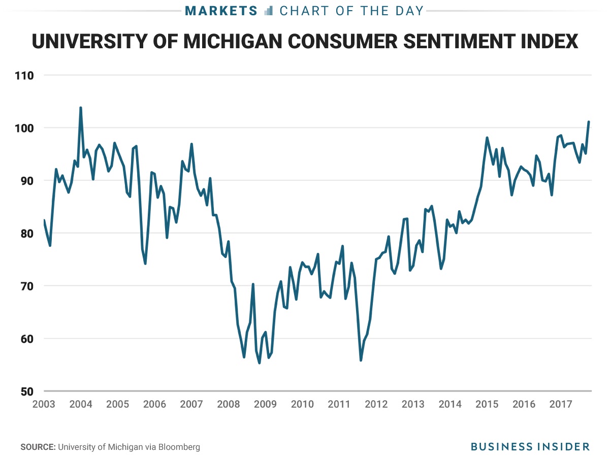
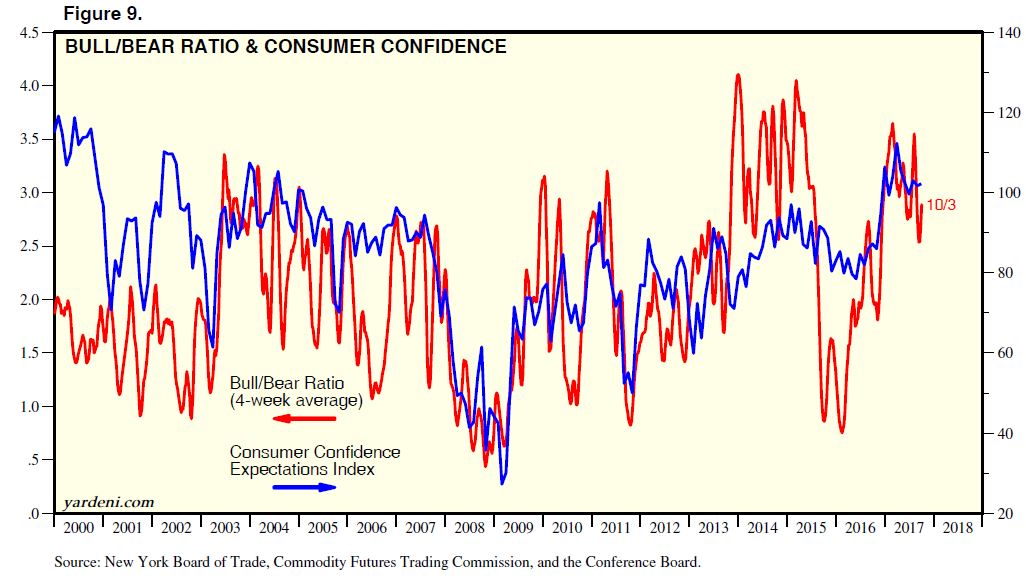
Be warned, however, that the early part of 2018 could be as good as it gets for this cycle. Chris Puplava observed that consumer confidence is nearing the 90th percentile level going back to 1967.
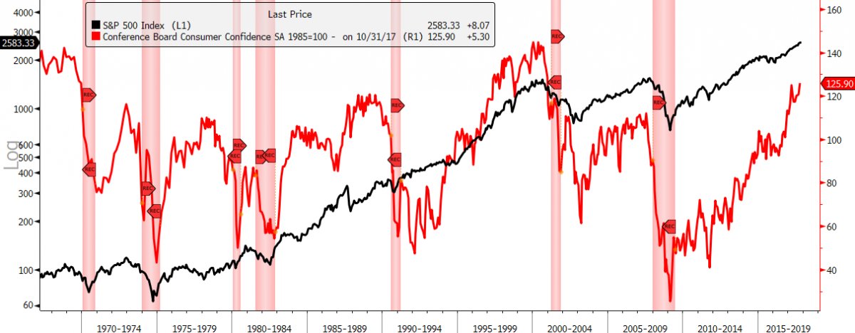
Such readings have seen stock prices perform poorly over a 1-2 year time horizon. The latter half of 2018 could therefore be very bumpy.

Short leading indicators all green
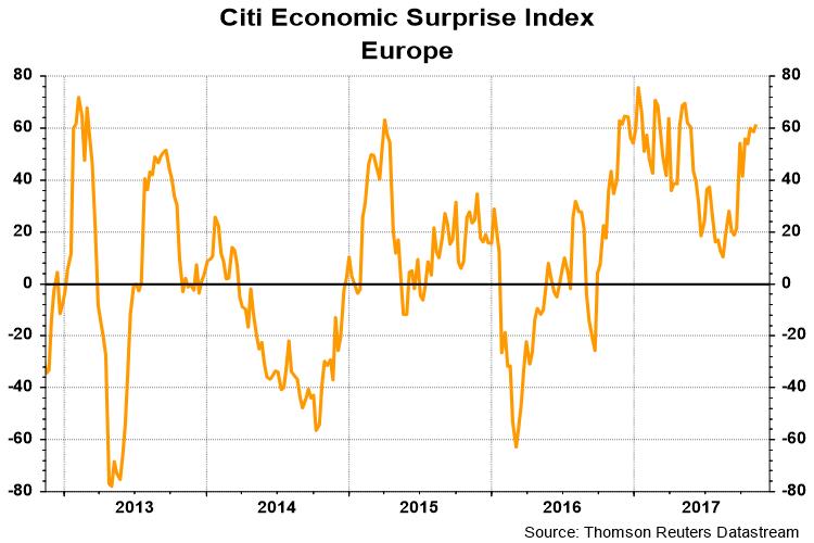
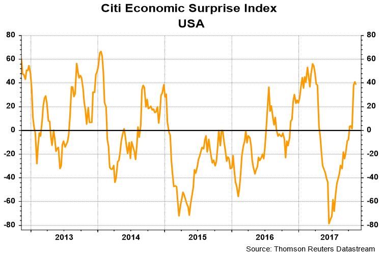
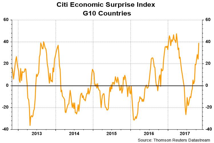
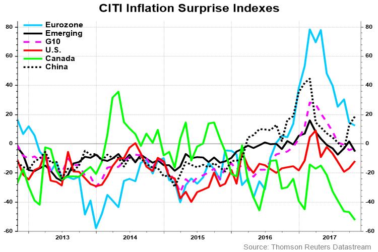
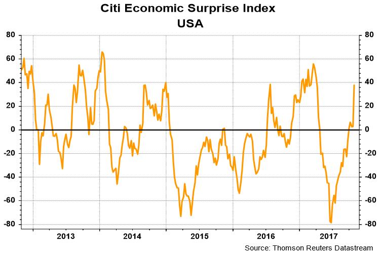
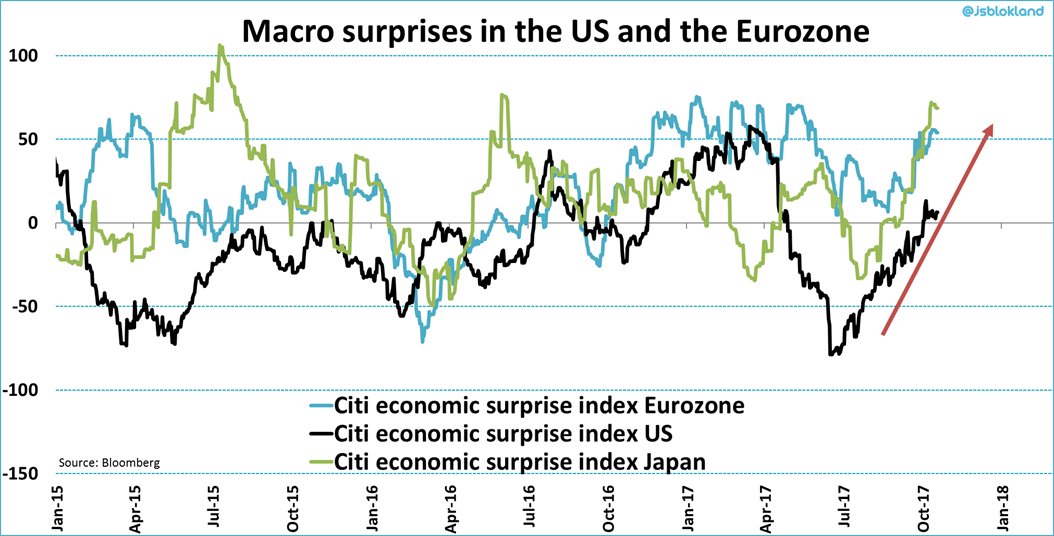
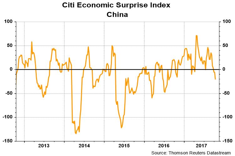
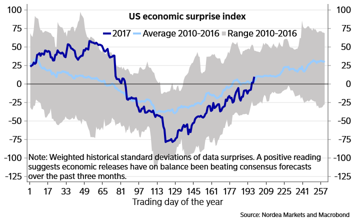
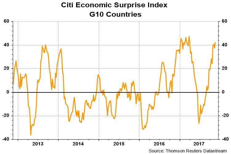
Looking over the next few months, it`s hard to argument with the combination of positive fundamental and price momentum. The US Citigroup Economic Surprise Index, which measures whether high frequency economic releases are beating or missing expectations, is surging (orange line). While high than expected growth is likely to put upward pressure on interest rates and bond yields, that`s a worry for later.

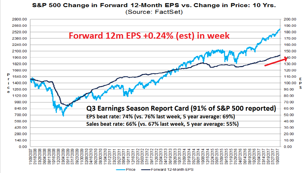
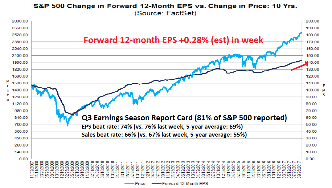
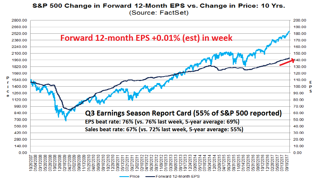
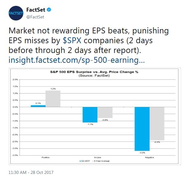
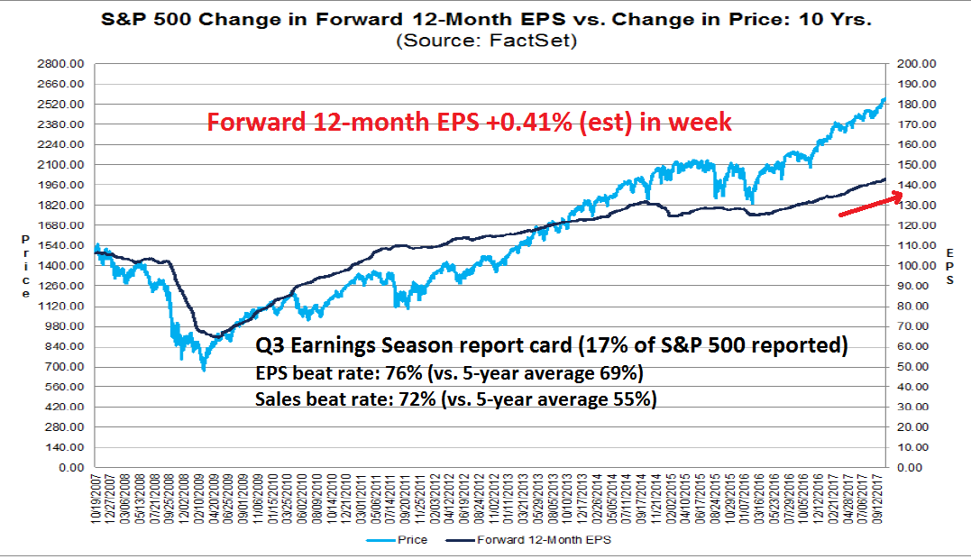
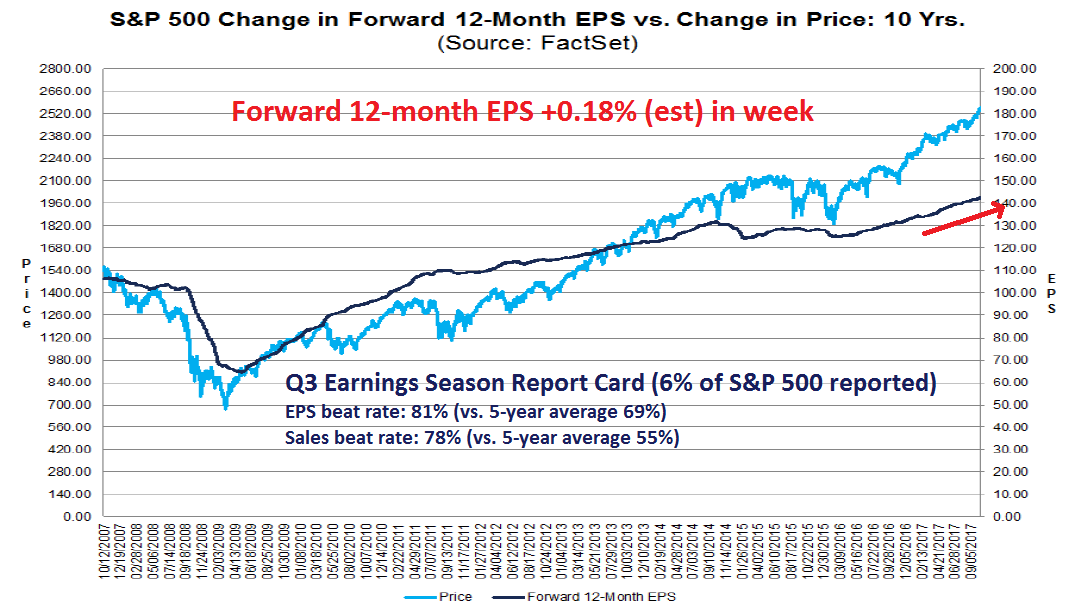
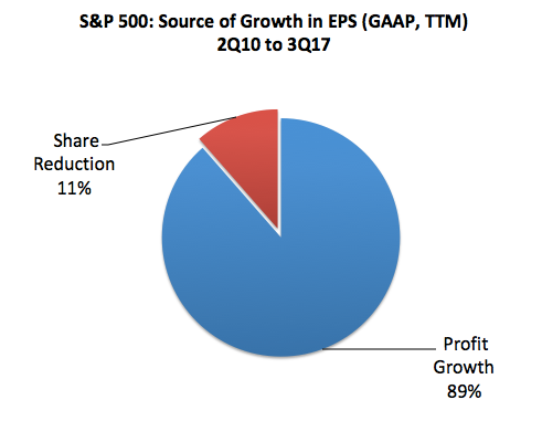
Now that Q3 earnings season is mostly done, it was a quarter of strong results. Urban Carmel, writing at The Fat Pitch, pointed out that stock market gains were mainly driven by earnings growth. About two-thirds of the rise in the market was the result of profit increase, and about one-third from multiple expansion, based on the expectations of further growth ahead.
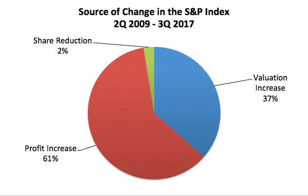
EPS gains were not illusory, either. Virtually all (89%) of the growth in EPS was organic profit growth, and only 11% attributable to buybacks.
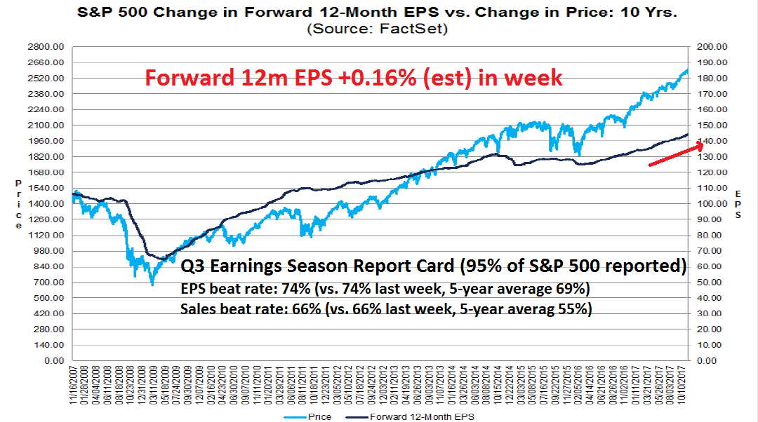
The latest update from John Butters of FactSet tells the story of Wall Street optimism. Forward 12-month EPS estimates are rising, indicating positive fundamental momentum.
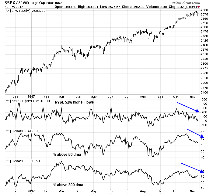
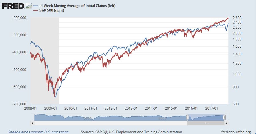
Forget about the sensational warnings about the combination of a Hindenburg Omen and Titanic Syndrome, the stock market is unlikely to crash during Q1 2018. New Deal democrat`s weekly assessment of high frequency economic indicators found that “all short leading indicators…remain positive”. Equity investors can’t ask for much more than that.
Watching for inflation in 2018
Looking further into 2018, however, some dark clouds are gathering on the horizon. The biggest macro risk for the US economic outlook in 2018 is the re-emergence of inflation.
Rising inflationary pressure is especially insidious as some Fed officials have been reluctant to normalize rates due to the absence of inflation. Should inflation begin to rise again, those objections are likely to be stilled, and market expectations of a December rate hike, followed by two more quarter-point hikes in 2018 may prove to be overly dovish.
Last week’s October CPI report may be the indication of an inflationary revival. Core CPI came in slightly ahead of expectations (blue line), while Median CPI, which has been significantly more elevated than Core, is also rising.

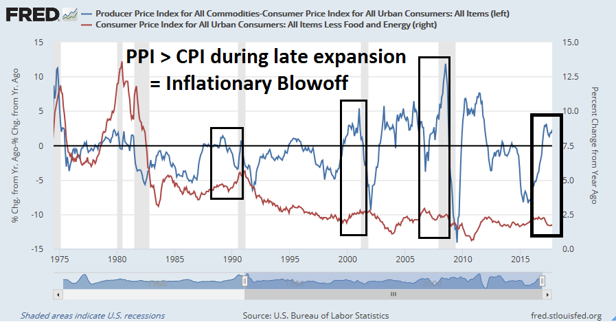
Inflation internals are also signaling an acceleration. The blue line below shows the difference between PPI and CPI, while the red line is Core CPI. When the PPI-CPI spread rises sharply during a late cycle expansion, which is what the economy is experiencing now, it is often a signal of an inflationary blow-off to which the Fed would undoubtedly respond.
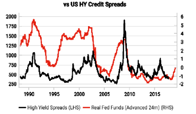
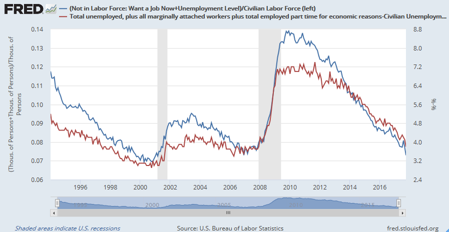
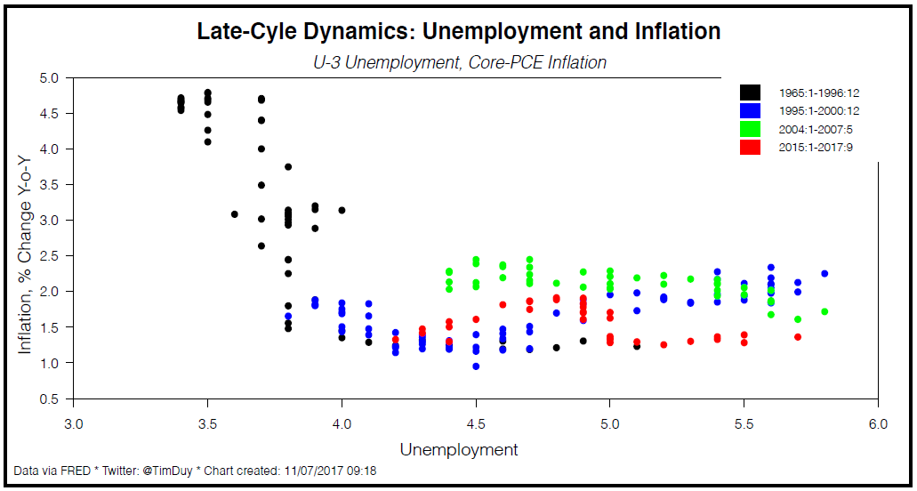
Since the Fed’s operates mainly from a Phillips Curve framework, measures of labor market slack are important metrics to the determination of monetary policy. Labor market slack, as measured by slack as a fraction of the labor force (blue line), or the spread between the U6 and U3 unemployment rates (red line), are at levels seen at the lows in the previous economic cycle. While acceleration in wage growth has not made an appearance yet, these statistics are likely to make Fed policy makers sit up and take notice.
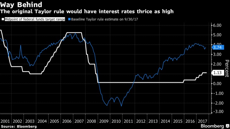
Fed watcher Tim Duy believes these low unemployment rates leave the Fed no choice but to hike rates. The experience of the late 1960’s, when unemployment fell below 4% and inflation accelerated from 1.5% to 4.8%, showed that the slope of the Phillips Curve steepened dramatically. Rate hike delays would run the risk of the Fed finding itself significantly behind the inflation fighting curve.
The market effects of higher rates
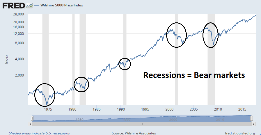
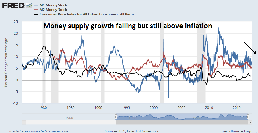
The conditions that I just described are likely to be equity negative and push the economy into recession. Past tightening cycles has seen real money supply growth go negative, which has been a signal of recession. In the past, it has been M1 growth (blue line) that has fallen below inflation (black line). The current cycle is seeing an unusual condition where M2 growth (red line) decelerating to about 3%, which is a cautionary signal. Continued normalization of monetary policy should see real money supply growth decelerate further and becoming negative in the near future.

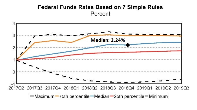
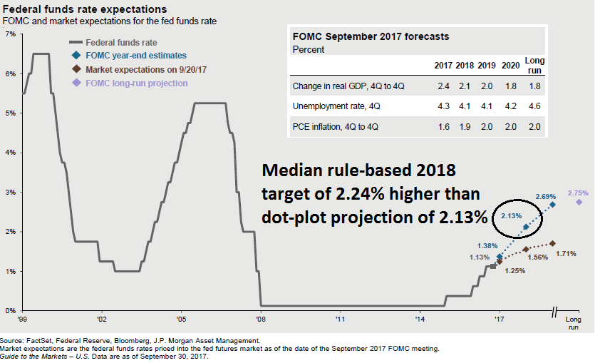
Another factor that is likely to spook the markets is the gap between the market and the Fed’s expectations of monetary policy. While a December rate hike is a near certainty, the market believes that the Fed will only raise rates only twice next year, while the dot plot calls for three hikes. Should signs of inflation start to appear, the probability of three hikes will begin to rise and even four hikes would become a real possibility.

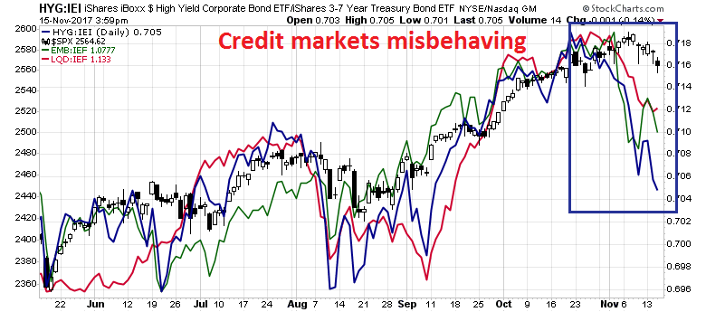
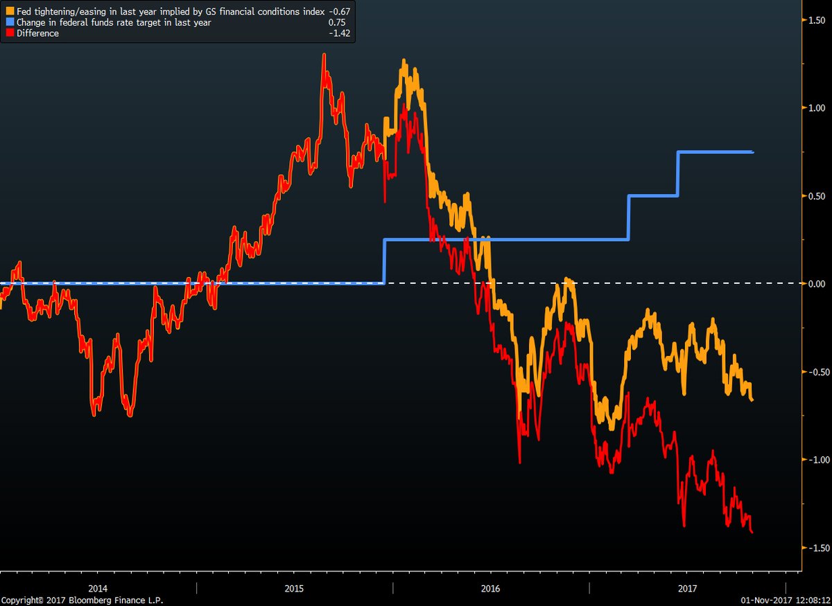
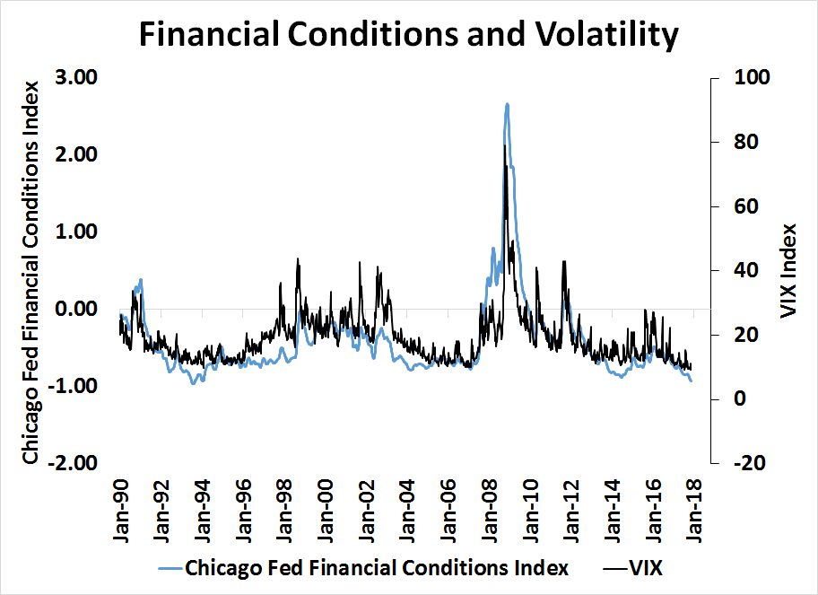
Another concern is the effects of rising rates on financial stability. New York Fed President Bill Dudley has been in favor of further rate normalization because financial conditions have been loosening even as the Fed raised rates.

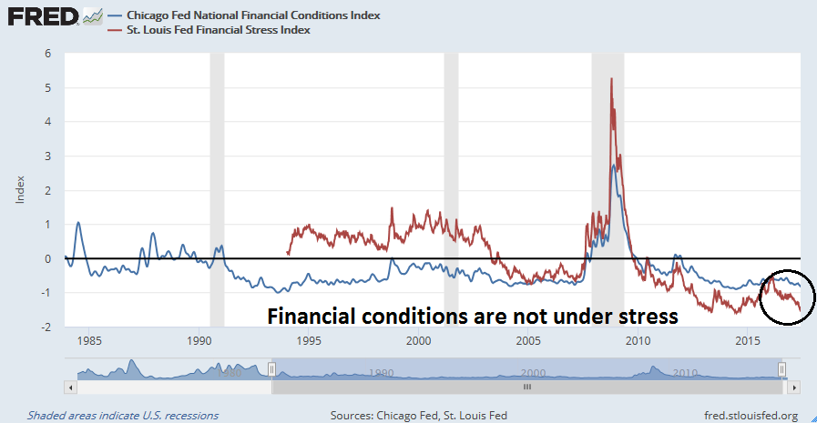
While that interpretation is correct, the Chicago Fed’s Financial Condition Index has shown a near 1 for 1 correlation with the VIX Index. As the Fed tightens, it will eventually tighten financial conditions, and market volatility is sure to follow.
Equity investors caught between Scylla and Charybdis
Should the Fed embark on an aggressive rate hike cycle, it would put equity investors in a difficult place as they try to navigate between the metaphorical Scylla and Charybdis of monetary policy.
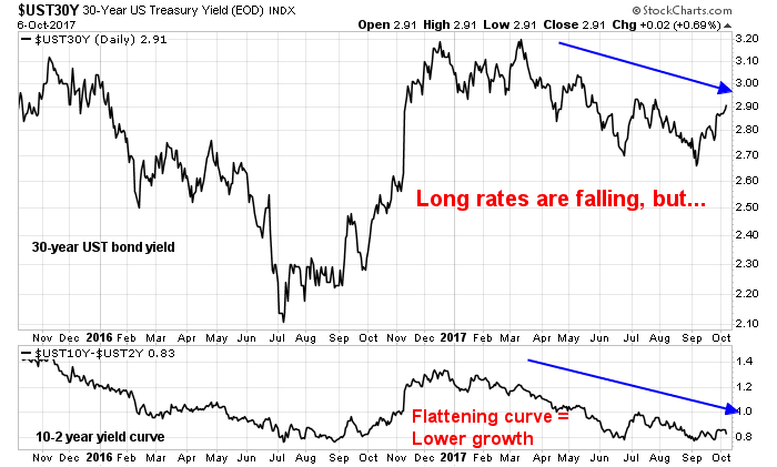
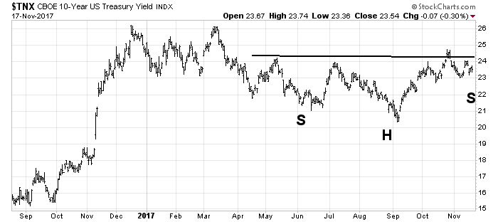
On one hand, should we see a parallel upside shift in the yield curve in response to monetary tightening, it could cause dislocation in equity valuation. The 10-year Treasury yield is forming a potential inverse head and shoulder pattern. Should the pattern complete with an upside break in the neckline, the measured upside target is in the 2.8-2.9% region, which would enough to cause a significant degree of P/E compression.
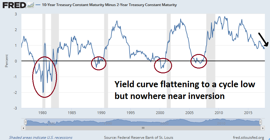
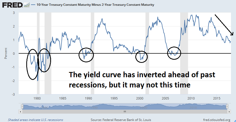
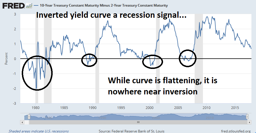
On the other hand, the 10-2 year spread has already flattened to 62bp, which is a cycle low. Should the yield curve flatten in response to rising rates, it would only take two or three rate hikes to invert the yield curve, which is a warning of a bull market killing recession.
Party’s not over yet
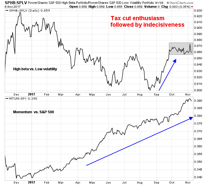
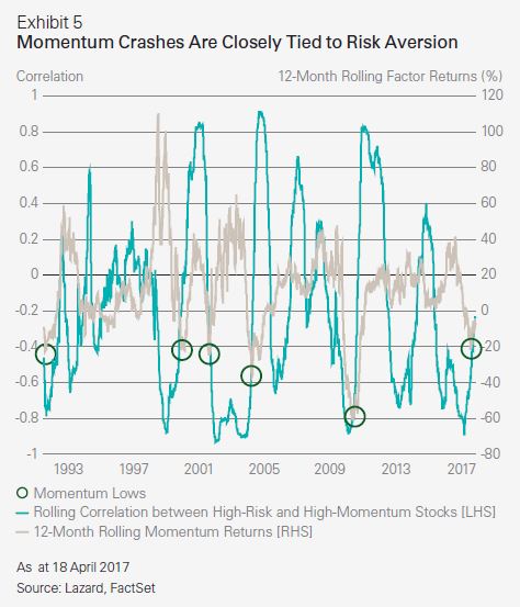
That said, all of these negative factors are unlikely to be important until Q2 2018 at the earliest. Relax, and enjoy the momentum party. Momentum remains a dominant factor in today’s market. As this smart beta analysis from Lazard Asset Management shows, returns to momentum are tied to risk appetite and the market just saw the start of a momentum cycle that probably has further to go (grey line).
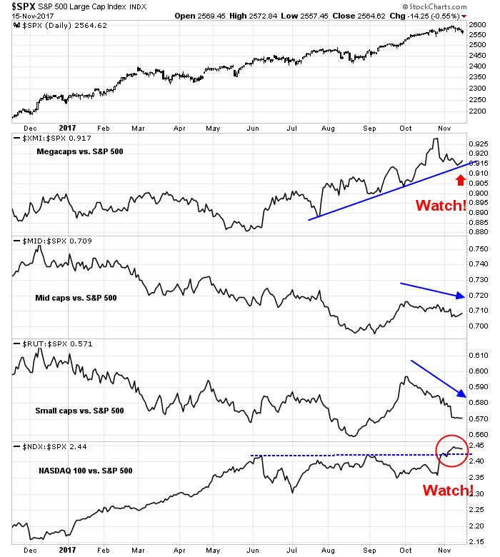
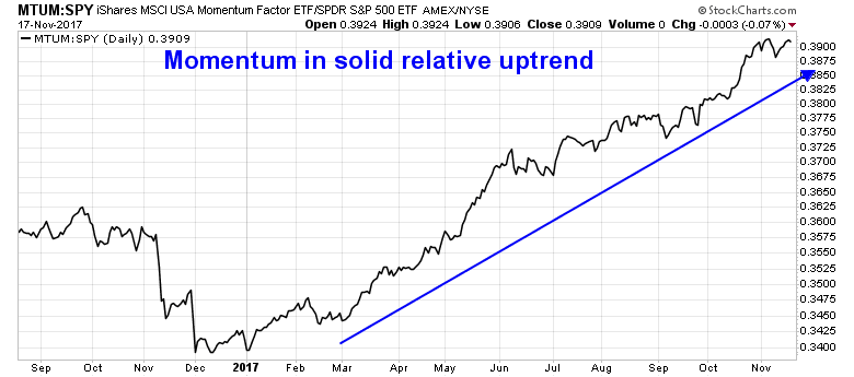
Momentum stocks (MTUM) are in a solid relative uptrend against the market.
Callum Thomas pointed out that upside potential is considerable, especially if the market is undergoing a blow-off.

The week ahead
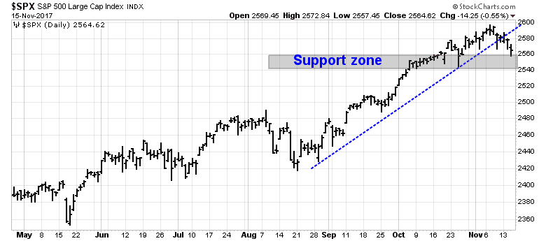
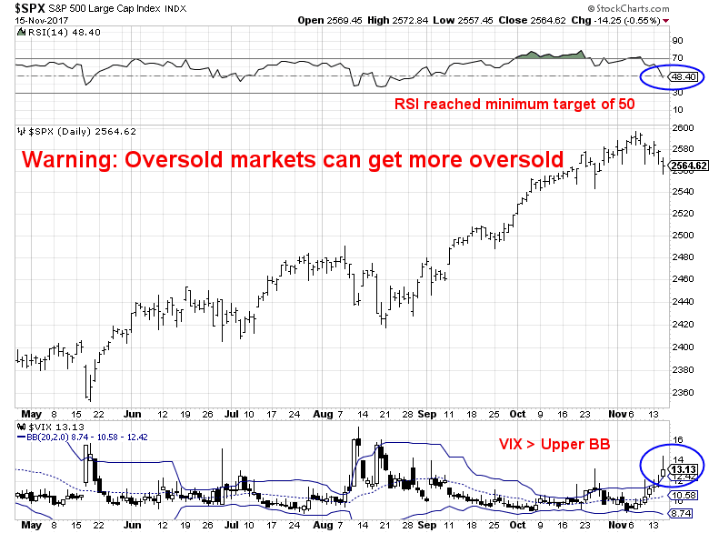
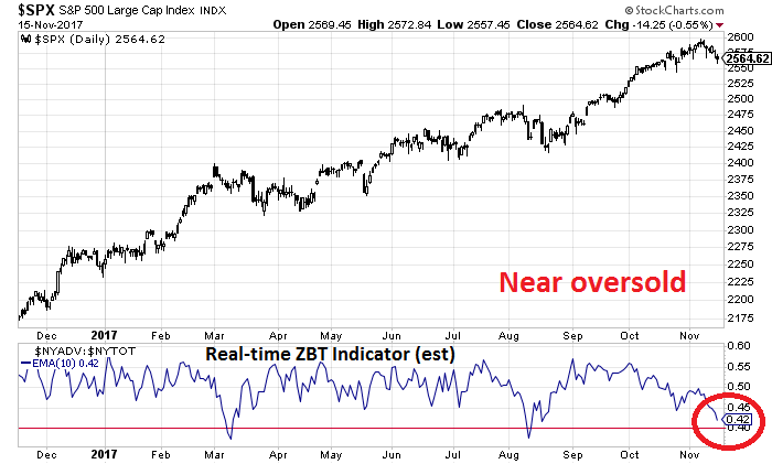
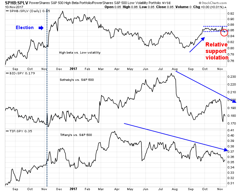
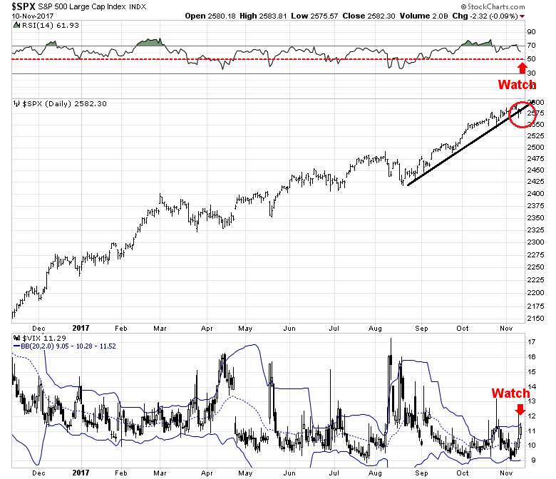
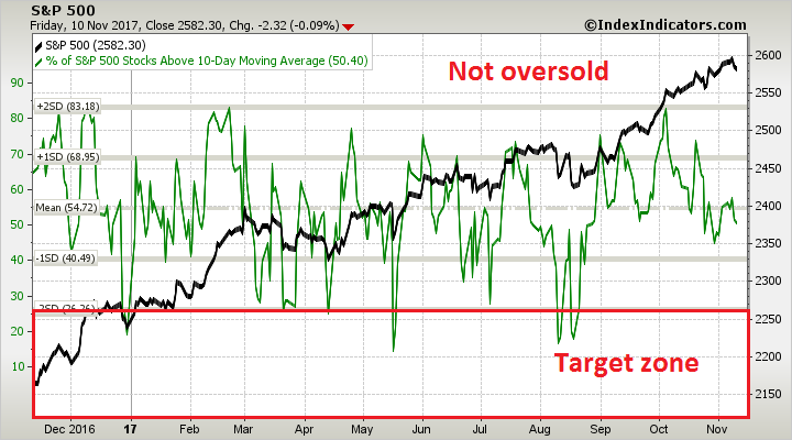
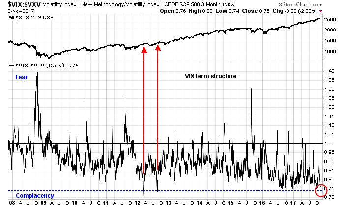
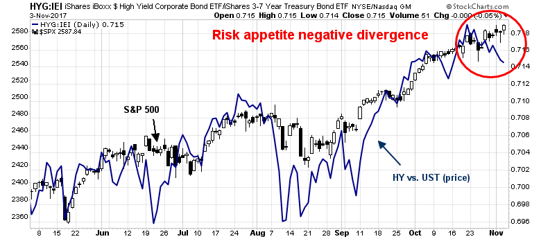
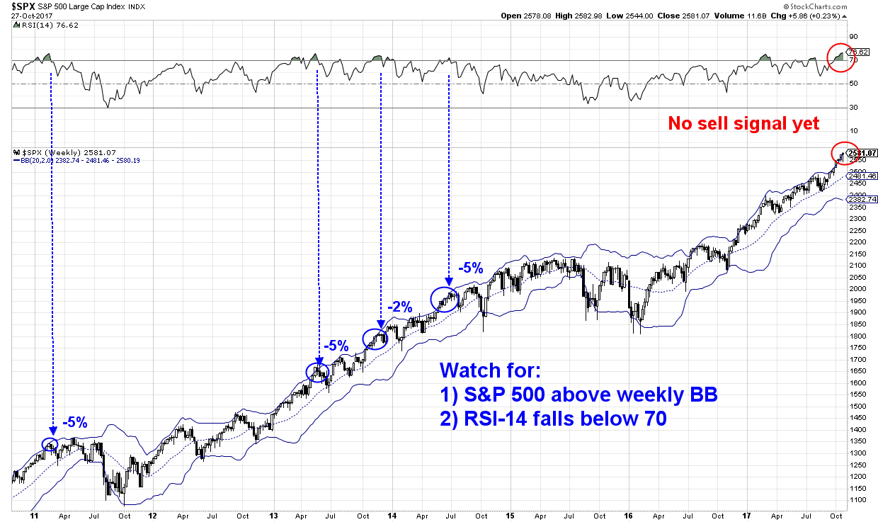
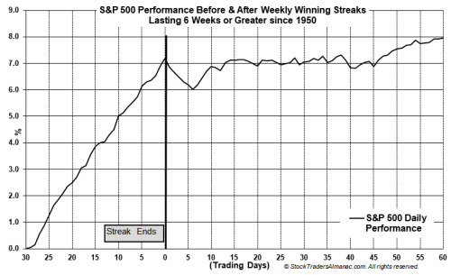
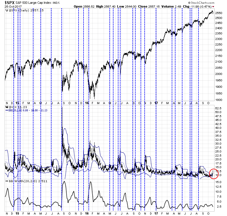
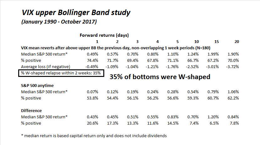
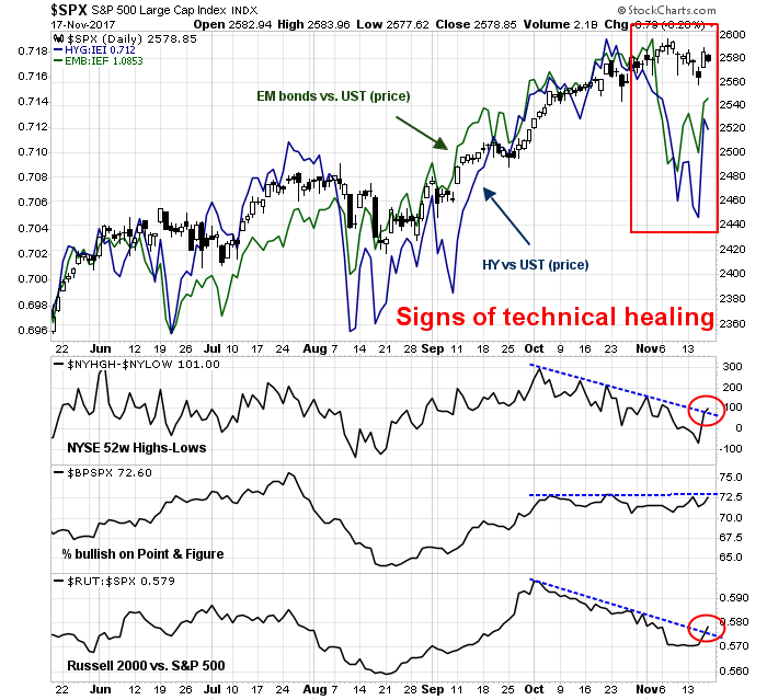
The near-term market outlook is a bit more uncertain. Subscribers got a trading alert on Friday when the trading model flipped from bearish to bullish. The market had gotten oversold when the VIX Index rose above its upper Bollinger Band and mean reverted below.

A historical study of such signals has seen mainly bullish outcomes. However, 35% of past signals have resolved themselves with W-shaped recoveries, where the market rallied, stalled and fell to test the previous low. The lack of fear and capitulation selling in the last pullback, which was extremely shallow, raises the probability above 35% in the current case.
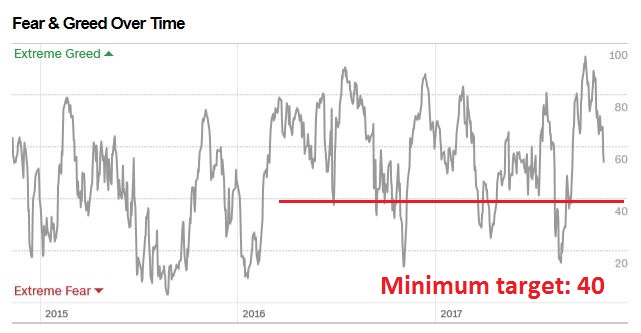
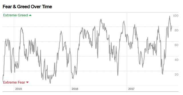
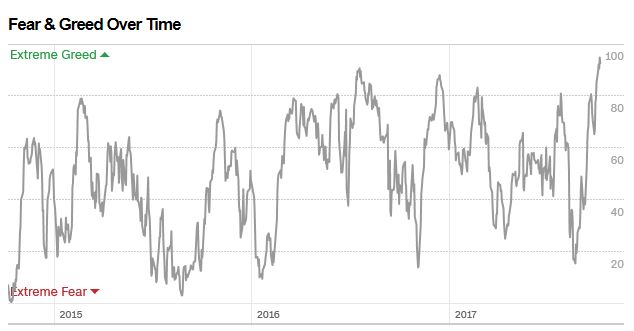
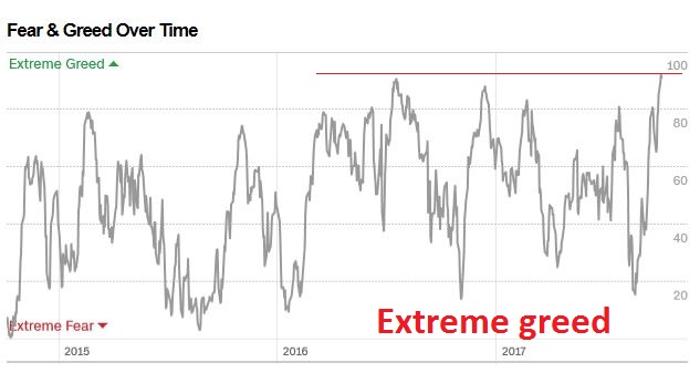
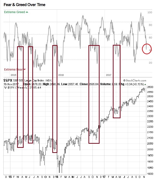
I also wrote last week that I was waiting for the Fear and Greed Index to fall to a minimum of 40 before I can declare it to be oversold. The index did fall below 40 on Wednesday, but recovered on Thursday to 55 and closed Friday at 44. Past episodes where this index bottomed at 40 saw the stock market chop around for several weeks afterwards. This is also consistent with my belief that the market is likely to experience greater volatility for the next few weeks.
Next week is the week of American Thanksgiving. Jeff Hirsch at Trader’s Alamanac found while performance on Monday tended to be mixed, there was a bullish bias for the other days of the week. My inner trader is leaning bullish after the VIX buy signal, and breadth indicator showed signs of technical healing.
Nevertheless, there are a number of potential sources of downside volatility next week from the GOP tax bill and NAFTA negotiations. While I don’t expect much breaking news from the NAFTA talks, the Republican Senate bill faces a few major hurdles:
- The bill funds the tax cuts by repealing the ACA individual mandate, which is politically risky in light of the last healthcare bill fiasco.
- One hidden “feature” of the bill that has not been widely publicized is the CBO assessment that it would trigger about $100B in entitlement cuts, including $25B from Medicare, because of the PAYGO law. Such cuts are politically toxic, especially in a midterm election year.
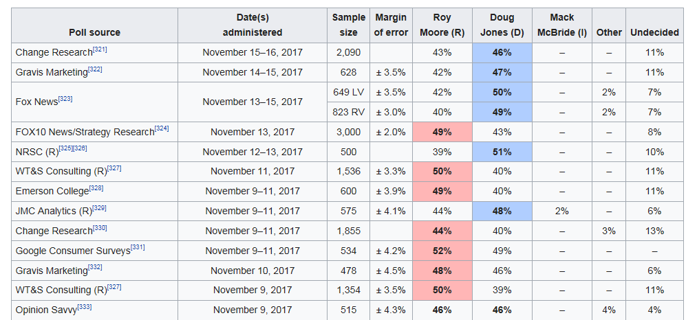
- The Republicans look increasingly likely to lose the Alabama special election, where the latest polls show that Democratic challenger Doug Jones trending ahead of the scandal ridden Republican Roy Moore.
- The latest Joint Committee on Taxation assessment of the GOP tax plan on who gets a tax cut and tax increase could be problematical for the Republicans as the midterm elections approach.

- The Republican margin in the Senator is extremely narrow. Ron Johnson of Wisconsin has already announced his opposition to the bill, which means that Majority Leader Mitch McConnell can only lose one more vote. Should Roy Moore lose the Alabama special election on December 12, or other potential GOP mavericks like Collins, McCain, Corker, Flake, or Paul move into the “no” column, tax reform will go down in flames.
On the other hand, stock prices could catch a bid if we get confirmation that the White House nominates Mohamed El-Arian to the post of Federal Reserve vice chairman (via CNBC). El-Arian would be welcome by the markets as a triumph of the pragmatists within the Trump administration over the rules-based ideologues in the Republican Party.
My inner investor remains neutrally positioned at the weights specified by his investment policy asset mix. My inner trader went long on Friday, but he believes that this is a market where traders should opportunistically buy the dips on weakness, and sell the rips on strength.
Disclosure: Long SPXL