As China approaches its 19th Party Congress, there has been no shortage of analysis about what to watch for. Here are a couple of examples worth reading:
- The meeting that could seal Xi’s grip on China (Bloomberg)
- Beijing’s Game of Thrones: Signaling loyalty before the Party Congress (China Focus)
Of particular importance is the Reuters report that the Party plans to amend its constitution at the Party Congress as a sign that Xi Jinping is tightening his iron grip:
China’s ruling Communist Party is expected to amend its constitution at a key party congress next month, state media said on Monday, in a sign that President Xi Jinping aims to enshrine his guiding ideological doctrine in the charter.
Since assuming office almost five years ago, Xi has rapidly consolidated power, with moves such as heading a group leading economic reform and appointing himself military commander-in-chief, although as head of the Central Military Commission he already controls the armed forces.
The Politburo, one of the party’s elite ruling bodies, deliberated a draft amendment to the constitution to be discussed at the congress that would include “major theoretical viewpoints and major strategic thought”, the official Xinhua news agency said.
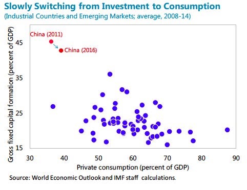
For investors, the main focus is how China plans to continue its objective of rebalancing growth from the old credit driven infrastructure building model to an economy based on household consumption. As the IMF recently noted, some progress has been made, but the transition has been slow.
Reform with Chinese characteristics
One lurking surprise for investors is Beijing’s change of reform direction, as reported by SCMP. The economy is headed towards greater state control, not less, as SOEs are expected to reassert their economic dominance.
China’s government is speeding up a massive ownership change among its largest state-owned enterprises designed to make them richer, bigger and stronger, a process that may reshape the future landscape of the Chinese economy by cultivating a group of influential “national champions”.
The government is encouraging state financing institutions and the country’s private technology giants to invest in weak state enterprises grappling with debt and inefficiency under its “mixed ownership reform”.
The state parent of China Unicom, the weakest of the country’s three telecom operators in profitability, sold a combined 35.2 per cent equity stake to more than a dozen investors as part of a 78 billion yuan (US$11.9 billion) deal. Among the new investors are Tencent Holdings, JD.com, Baidu and Alibaba Group, which owns the South China Morning Post.
China Railway Corp, with outstanding debt of more than US$700 billion, says it wants to undergo similar mixed ownership reform and it has sent “invitations” to a number of potential investors, including FAW Group, the country’s state-owned car maker. Private courier SF Express said it would “seriously study and proactively participate” in the railway firm reforms.
China’s top state-run firms told to become joint stock corporations by year’s end…
The deals are taking place in answer to President Xi Jinping’s call for China to have a group of powerful and loyal state enterprises. Unlike the former Soviet Union in the 1990s when Moscow decided to fully privatise former state assets and the ongoing privatisation push in Brazil, Beijing’s latest shakeup of ownership of its state industrial enterprises is intended to be anything but a loosening of the Communist Party’s party’s grip on state assets.
What happened to the Third Party Plenum economic goal of allowing market forces to play a more “decisive role” in the economy? The effort to create “national champions” is reminiscent of western government failed efforts at “industrial policy” of the 1960’s and 1970’s. We know what happened next.
These initiatives are disappointing inasmuch as they are likely to create headwinds to the rebalancing process. It is unclear how reverting to the command economy model is likely to address China’s economic challenges.
Indeed, Bloomberg reported that China Beige Book has observed that the Chinese economy is only rebalancing in name only:
- Capacity cuts in steel and other commodities aren’t happening in reality
- Corporate borrowing continues to rise; deleveraging is a myth
- The economy isn’t re-balancing to services from manufacturing
- China isn’t reflating in the sense of faster growth, but profits are up
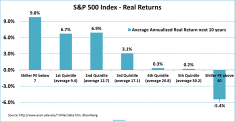
China’s challenges
To reiterate, here are some of challenges presented by her growing credit bubble.

The credit bubble does not just stop at China’s borders. It has migrated to Hong Kong and other countries in the region.

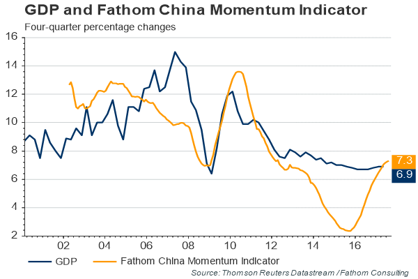
Here is the good news. Growth has been re-accelerating, possibly because of the Party Congress “put”. Collapse is imminent.
However, much of the growth is coming from real estate. Is this what rebalanced growth looks like?

While the longer trend of rebalancing has been in the right direction, Chinese rebalancing has stalled in the last few years.

Waiting for the Minsky Moment
Growing Chinese indebtedness has been worrying investors for years. Year after year, China bears have been waiting for that Minsky Moment, or the sudden collapse after a long period of stability. For now, the upcoming 19th Party Congress has provided a put option to the market.
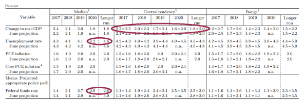
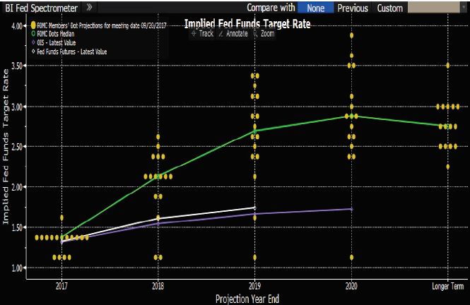
John Authers, writing in the FT, thinks that investors should look to the US, specifically the Fed, as the trigger for a possible collapse. Simply put, the weak USD has created a flood of liquidity into Asia.
Asian stocks outside Japan have performed fantastically so far in 2017. MSCI’s Asia excluding Japan index has gained 30 per cent year to date, beating developed world stocks by almost 15 percentage points. This has been done despite little evidence of inflationary growth, outside of mainland China.
The lack of inflation across the region is startling. In Thailand, consumer price inflation has dropped to zero. And expectations remain very contained. Most countries in the region do not have inflation-linked bond markets, so it is difficult to obtain a market forecast. But 10-year inflation break-evens in South Korea suggest that investors see slow non-inflationary economic activity long into the future, with average inflation below 1 per cent.
Where has the rally come from, then? It appears to emanate from the Federal Reserve. The correlation between the euro-dollar exchange rate and the MSCI Asia excluding Japan index has topped 90 per cent this year. As the dollar has cheapened, so the dollar value of Asian central banks’ reserves has increased, while liquidity has flowed into the region.
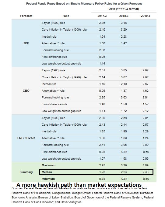
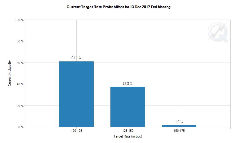
Correlations so strong are reminiscent of the synchronised markets that preceded the crash in 2007 and 2008, and they suggest that the greatest concern in the near term is not a Minsky moment in China, but rather a hawkish surprise from the Federal Reserve.
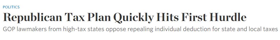
So what happens if Fed policy becomes more hawkish than market expectations, which sends the USD soaring? These words were ominously written before the announcement of the GOP tax proposals, which has sparked a risk-on Trump rally.
This raises the risk that a couple of policy surprises that hurt the dollar could also send Asian assets into reverse. Judging by the extreme underperformance of relatively highly taxed companies in the US so far this year, the US stock market has given up any hope of corporate tax cuts in 2017. That may not be wise; a failure of a Republican president and two Republican houses of Congress to agree on a tax cut would be remarkable, even in a nation that is growing used to political miscues.
Auther’s cautionary comments have echoes of Ray Dalio’s recent warning about a possible Fed policy error that could see a repeat of the 1937 collapse in growth (via Business Insider):
In my opinion, the risks are asymmetric on the downside. In other words, if you tighten monetary policy, certainly by more than is discounted in the market — and what’s discounted in the market is very minor rising market — that will reverberate through asset class prices, as well as then you can have a situation in terms of the economy. So, what’s similar in that: interest rates are close to zero, not much room on the downside, obligations are large, there was a political division, there is more populism. Therefore there’s more conflict. And therefore we need to be very careful at this moment. That’s what I’m basically saying.

What to watch
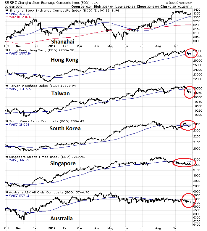
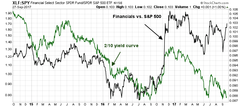
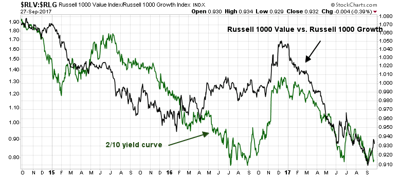
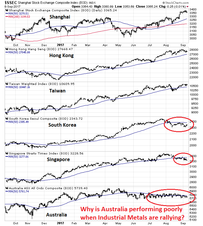
Current conditions show that the stock markets of China’s Asian trading partners are struggling. With the exception of Shanghai, all other markets are struggling with their 50 day moving averages.

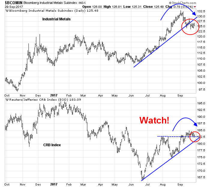
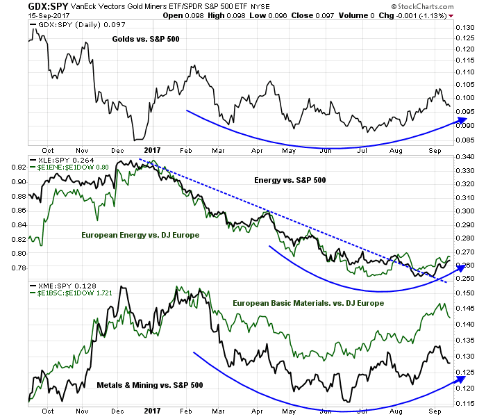
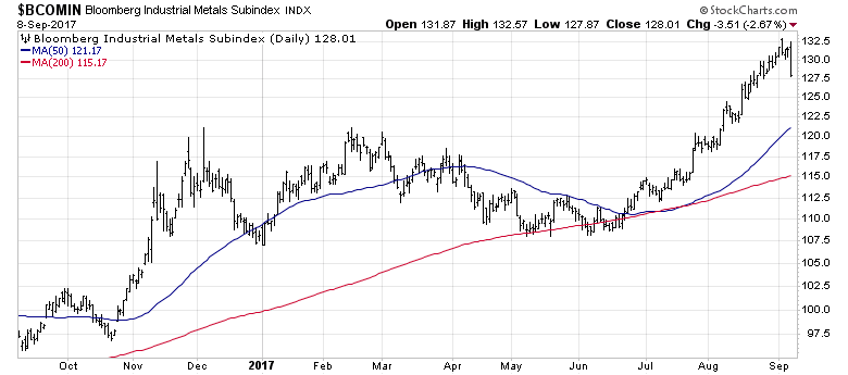
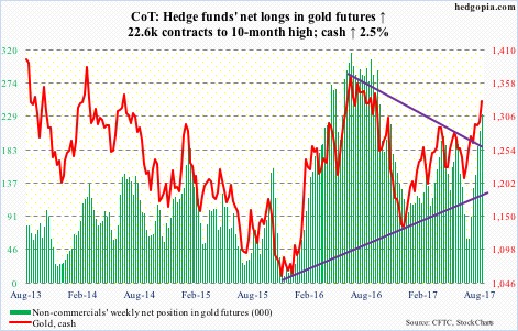
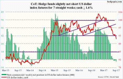
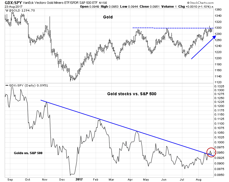
The USD Index has reversed a downtrend and begun a relief rally. At the same time, the American economy is in the late stages of an economic expansion, where inflationary pressures start to manifest themselves. Such conditions have seen emerging leadership shown by late cycle inflation hedge stocks, such as energy, mining, and golds. Similar episodes has seen the Fed respond with rate hikes to cool off the economy.
For investors, the risk is that Fed hawkishness not only slows the American economy, but begins to unravel China and the rest of Asia as well. Under these conditions, it is especially important to monitor the evolution of the trajectory of the USD, as well as the relative performance of inflation hedge stocks, both in the US and Europe.
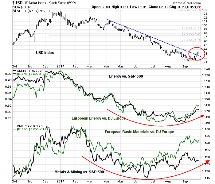
Continued leadership by inflation hedge vehicles would signal market confidence in the resilience of the Asian and global economy. On the other hand, significant underperformance by these stocks would be a warning that the China Minsky Moment may be at hand.