Preface: Explaining our market timing models
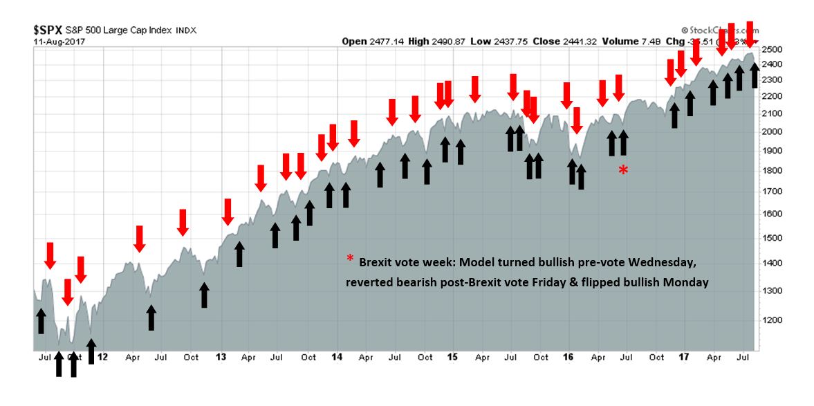
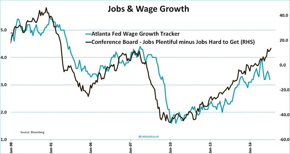
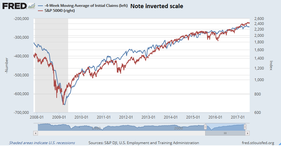
We maintain several market timing models, each with differing time horizons. The “Ultimate Market Timing Model” is a long-term market timing model based on the research outlined in our post, Building the ultimate market timing model. This model tends to generate only a handful of signals each decade.
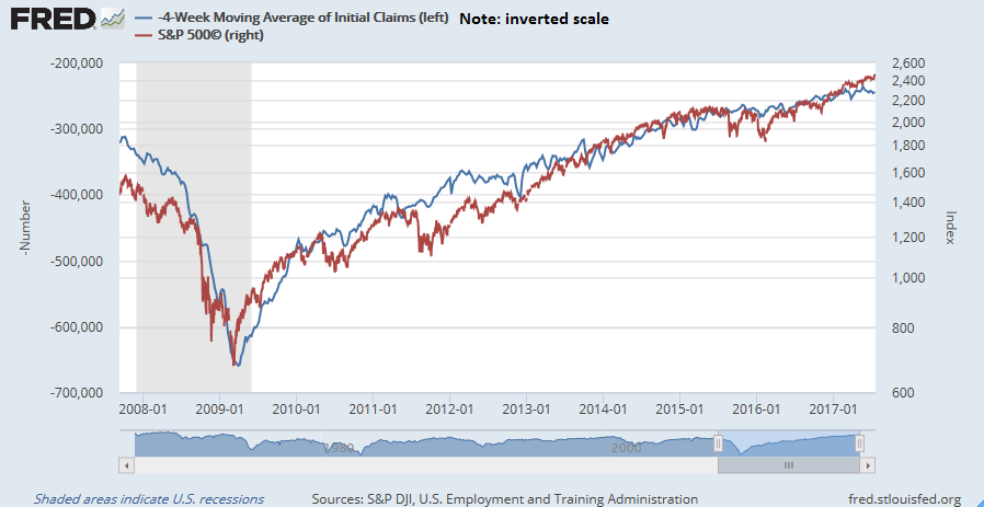
The Trend Model is an asset allocation model which applies trend following principles based on the inputs of global stock and commodity price. This model has a shorter time horizon and tends to turn over about 4-6 times a year. In essence, it seeks to answer the question, “Is the trend in the global economy expansion (bullish) or contraction (bearish)?”
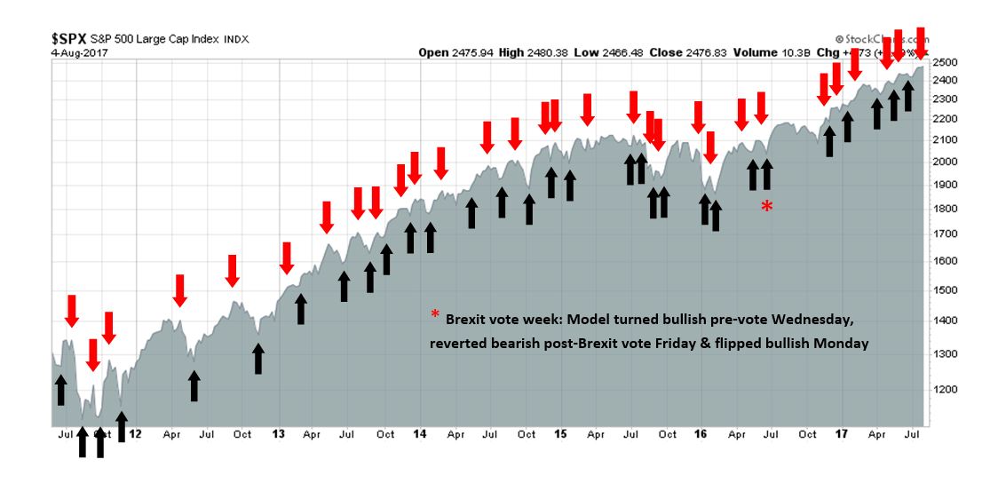
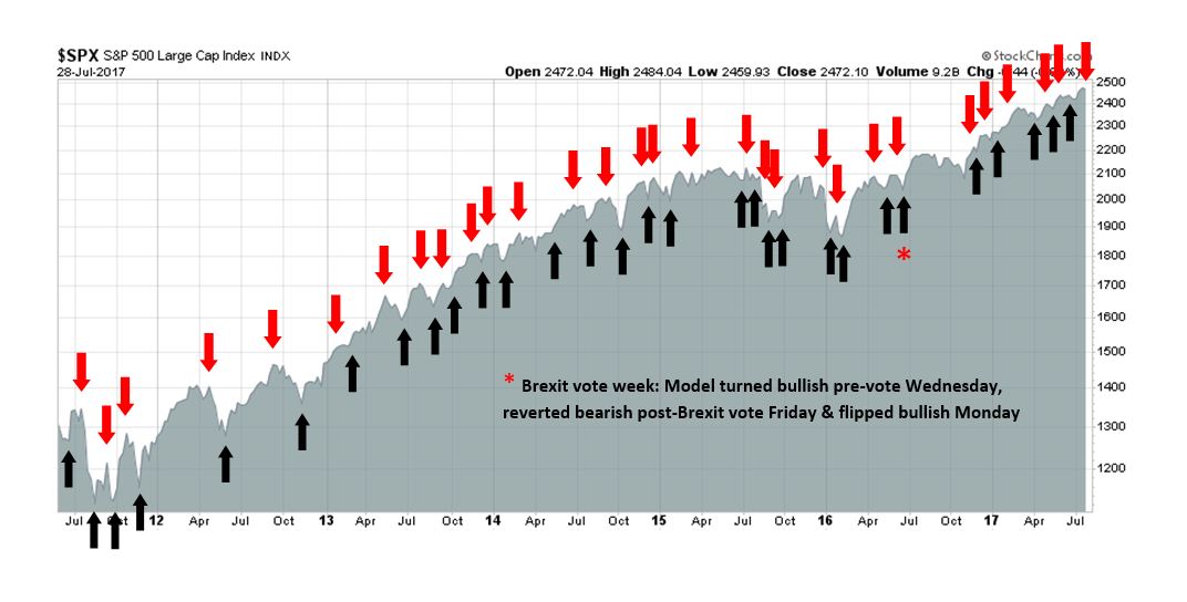
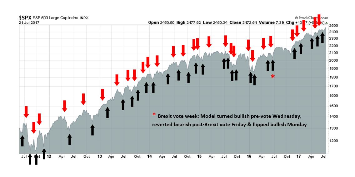
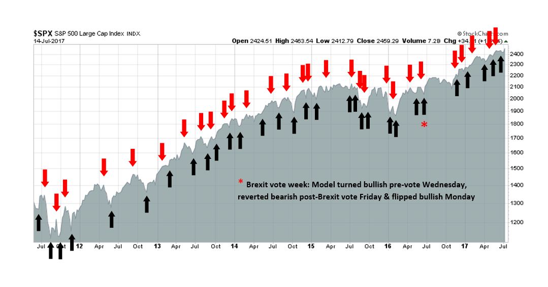
My inner trader uses the trading component of the Trend Model to look for changes in the direction of the main Trend Model signal. A bullish Trend Model signal that gets less bullish is a trading “sell” signal. Conversely, a bearish Trend Model signal that gets less bearish is a trading “buy” signal. The history of actual out-of-sample (not backtested) signals of the trading model are shown by the arrows in the chart below. Past trading of the trading model has shown turnover rates of about 200% per month.
The latest signals of each model are as follows:
- Ultimate market timing model: Buy equities
- Trend Model signal: Neutral
- Trading model: Bullish (upgrade)
Update schedule: I generally update model readings on my site on weekends and tweet mid-week observations at @humblestudent. Subscribers will also receive email notices of any changes in my trading portfolio.
War is hard
President Donald Trump has achieved few major legislative victories in his six month presidency, despite the Republican majority in both the Senate and House. One disappointment was the failure of the Republicans to repeal Obamacare because of disagreements between different wings of the GOP. Trump has learned that “healthcare is hard”. Similarly, “tax reform is hard”.
By design, American government was built on a system of checks and balances. While Trump’s legislative initiatives may be held up by Congressional dissension, the President has far fewer constraints in the conduct of trade policy, foreign policy, and military affairs. In particular, he can do more or less what he wants without Congressional oversight when it comes to his role as Commander-in-Chief of the American military.
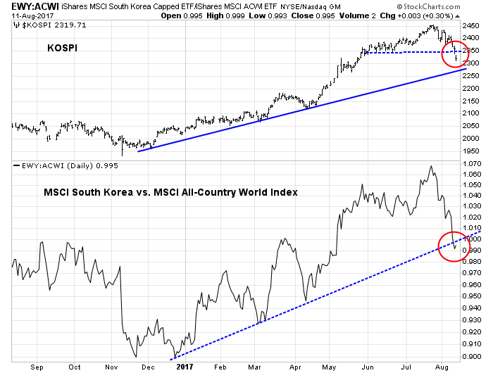
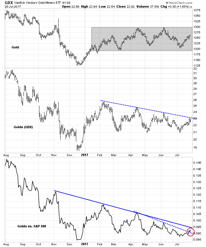
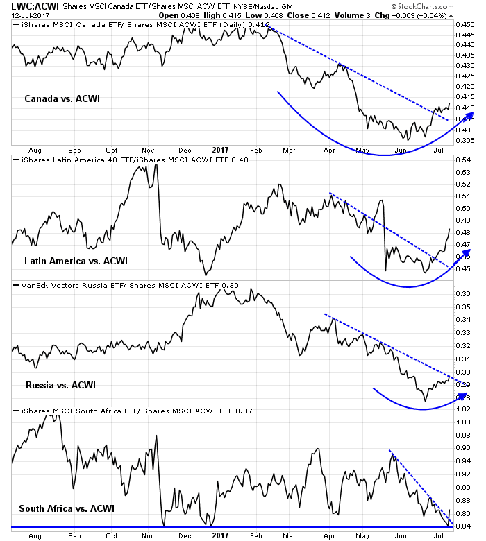
As the markets are gone risk-off in light of Trump’s “fire and fury” comment about North Korea, I am going to depart from the usual economic and market analysis this week and focus on the question of the constraints on President Trump in a conflict with North Korea. To be sure, the markets are showing a high degree of fear that war could break out on the Korean peninsula. Past scares has seen little reaction from the Korean Won (KRW) or Korean equities. This time, South Korean stocks are tanking, both on an absolute basis and relative to global stocks.
Investors should relax. As Donald Trump is about to find out, “War is hard too”.
North Korean capabilities
Let’s begin with an assessment of North Korea’s nuclear and missile capabilities. Consider this interview with Siegfried Hecker, former director of Los Alamos National Laboratory. Hecker was the last American scientist to visit North Korea and he has toured their nuclear facilities seven times. Here are his views on the state of DPRK missile technology:
The missile tests on July 4th and 28th were the first that had intercontinental ballistic missile (ICBM) capabilities. They were intentionally launched at lofted angles, most likely so they wouldn’t overfly Japan. According to the Korean Central News Agency, North Korea’s state news outlet, the most recent Hwasong-14 missile reached an altitude of 3,725 kilometers (2,315 miles) and flew a distance of 998 kilometers (620 miles) for 47 minutes before landing in the water off the Korean peninsula’s east coast, close to Japan. If launched on a maximum-range trajectory the missile could travel more than 10,000 kilometers (6,200 miles), giving it the ability to reach much of the US mainland…
I think not yet, but these two tests demonstrate substantial progress and most likely mean they will be able to master the technology in the next year or two. The North Koreans have very cleverly combined various missile stages and rocket engines to get this far, but a reliable, accurate ICBM will require more testing. In addition, it is not clear whether they have sufficiently mastered reentry vehicles, which are needed to house the nuclear warhead on an ICBM. Advanced reentry vehicles and mechanisms to defeat missile defense systems may still be five or so years away. However, make no mistake, North Korea is working in all of these directions.
Even if Kim has perfected the ICBM, another hurdle is to make a nuclear warhead that will not burn up on re-entry and detonate as expected:
I think the warhead is still the least developed part of North Korea’s plans for nuclear ICBMs. It must survive such extreme conditions, and it must detonate above the target by design. It can’t accidentally detonate on launch or burn up during reentry. North Korea likely made some of the key measurements required to define those extreme conditions during the two July tests, but I can’t imagine it has learned enough to confidently make a warhead that is small and light enough and sufficiently robust to survive.
Achieving these goals is very demanding and takes time, particularly because warheads contain materials such as plutonium, highly enriched uranium, high explosives, and the like. These are not your ordinary industrial materials.
His assessment of Kim Jong-un:
I do not think that North Korean leader Kim Jong-un is a madman. We can’t even call him unpredictable any more—he says he will launch missiles, then he does. The madman rhetoric only flames the panic we see in this country because it makes Kim Jong-un appear undeterrable, and I don’t believe that to be the case. He is not suicidal. Nevertheless, it is possible that in his drive to reach the US mainland to achieve a greater balance with the United States, Kim could miscalculate where the line actually is and trigger a response from Washington that could lead to war. The problem is that we know nothing about Kim Jong-un and the military leaders that control his arsenal. It’s time to talk and find out.
In short, the North Koreans don`t have a fully functional ICBM with an operative warhead yet. The Kim regime is a rational actor and therefore can be bargained with.
The speed bumps to war
Bloomberg published an article summarizing the steps that the US takes to launch of her nuclear arsenal, from how POTUS consults with staff and orders the strike, down to what happens with submarine commanders and land-based missile crews. While it is true that no one within the military or civilian establishment can countermand a presidential order to launch, there are nevertheless a number of speed bumps on the way to war.
Here is the first speed bump to war. The city of Seoul is right on the border with North Korea, and its population is roughly 10 million people. North Korea has numerous artillery batteries aimed at the South Korean capital, ready to strike the second hostilities begin. Estimates of civilian loss are in the 100,000 to 200,000 range, which represents a casualty rate that is the same order of magnitude as the Hiroshima or Nagasaki bombs – and that’s done with conventional weaponry.
Newly elected South Korean President Moon Jae-in is known to take a softer line with the North and favor greater dialogue with the Kim regime. Moon is not likely to look kindly on an American plan to strike the North and risk Hiroshima sized civilian casualty counts. For some perspective, that figure represents a multiple of the number of names of American military deaths etched on the Vietnam Memorial after over a decade of war.
Air and missile strikes require South Korean assent, cooperation, and coordination at many levels. If Trump were to move unilaterally, which may or may not be possible in practice, what would that do the American relations with other allies? Would would NATO allies, especially in the Baltic States of Latvia, Estonia, and Lithuania view Trump’s willingness to sacrifice civilians as cannon fodder? How much trust would, say, the Israelis have in American intentions after such a decision? What would the consequences be in the cooperation on anti-terrorist intelligence activities after such an act?
That’s the first speed bump to war. Fire and fury is hard.
Comrade Xi’s veto
In addition, the logistics of a strike is formidable. Since North Korean nuclear sites are well hidden, fortified and dispersed, an American strike would have to hit them all to eliminate the threat of retaliation. In addition, the Pentagon would also target radar, communications, command and control facilities, as well as the numerous artillery batteries in order to suppress the effects of a counter-strike. All of this would have to occur at the same time.
One way to hit all these sites remotely is through the use of nuclear tipped ICBMs or submarine launched nuclear missiles. Herein lies the problem, if you look at the map, Beijing is awfully close to North Korea.
China would have to be informed of a strike well in advance. I have no idea what the state of Chinese satellite technology is, but imagine that you are a Chinese military officer who detected American ICBM launches headed towards North Korea. You may only have a minute or so to decide whether those missiles are headed for Pyongyang or Beijing. In the a latter case, a counter-strike is in order. Does Trump really want to risk a nuclear confrontation with a nuclear superpower with real ICBMs aimed at American cities?

Imagine that Russia wanted to nuke Canada, and its first target is Toronto, and the Kremlin informed the Americans of their intention. An American officer would similarly have only a minute or two to decide whether the missiles are headed to Toronto, New York City, Buffalo, or Detroit, and act accordingly. I have no idea the state of satellite technology and the trajectory algos, but a estimate error of a degree or two in trajectory could lead to a very different conclusion. Even if the Russians were to invite American observers into their Situation Room(!) to observe the attack, the observers have no way of knowing if they are seeing an actual attack, or a realistic simulation.
Bottom line, the Chinese would have to be informed of a pre-emptive nuclear attack, and not at the last minute. Such an early warning effectively gives Xi Jingping a veto over an American attack. Supposing that the Chinese opposed the attack, and announced that North Korea is under their nuclear umbrella. Does Trump want to risk a nuclear confrontation with the Chinese?
If the strike uses conventional (non-nuclear) weapons, then the US would have to assemble a massive armada of air assets, along with several carrier task forces, and cruise missiles launched from ship and submarine based platforms. The concentration of a fleet of that size in the North Pacific will undoubtedly be noticed by Beijing.
Similarly, this would also give the Chinese a veto over a conventional strike. Indeed, Global Times, which is a semi-official organ of the Chinese Communist Party, stated that China would stay neutral if Kim were to attack first, but would come to the aid of North Korea should the US execute a first strike:
China should also make clear that if North Korea launches missiles that threaten US soil first and the US retaliates, China will stay neutral. If the US and South Korea carry out strikes and try to overthrow the North Korean regime and change the political pattern of the Korean Peninsula, China will prevent them from doing so.
Speed bump number two. Fire and fury can be really hard.
Reading past the rhetoric
Bottom line: Investors need to take a deep breath and read past the rhetoric. Consider Donald Trump’s statement, “North Korea best not make any more threats to the United States. They will be met with fire and fury like the world has never seen.” Investors should be alarmed if that was delivered if that was part of a planned speech and read off a teleprompter. Instead, it was an impromptu remark when he was supposed to be speaking about opioids. Business Insider reported that the Administration sought to walk back the bellicose tone of Trump’s comment on the next day:
“The words were his own,” Sanders said. “The tone and strength of the message were discussed beforehand. They [Gen. Kelly and others] were clear the president was going to respond to North Korea’s threats following the sanctions with a strong message in no uncertain terms.”
Trump’s statement represented a marked escalation in tensions between the two countries, and North Korea retaliated by threatening to strike a US air base in Guam.
Since Tuesday’s events, Trump’s advisers have reportedly sought to diffuse the heated situation, and Tillerson said Americans “should sleep at night” without worrying about the threat of a nuclear war.
In other words, treat the “fire and fury” comment as seriously as Trump’s numerous tweets. As the LA Times pointed out, there have been no active preparations for war:
Despite Trump’s blustery warning of “fire and fury,” which he amplified further in comments to reporters on Thursday, warships are not known to be moving toward the Korean peninsula, a tactic deliberately publicized during previous tense times to signal U.S. resolve. The U.S. has not reinforced troop levels in South Korea, as President Clinton was about to do in 1994 when the two countries did come to the brink of war. U.S. dependents have not been ordered out, nor have U.S. nuclear weapons been sent back in to South Korea.
Instead, Secretary of State Rex Tillerson said Americans should “sleep well at night” and has pressed for talks, albeit with preconditions that the North Koreans so far have not been willing to meet.
As for the North Korean threat to target Guam with missiles, analysis from Stratfor shows that the North Koreans threats are conditional, and there are lots of off ramps in their rhetoric:
North Korea has released specific details of its plan to strike the U.S. territory of Guam. According to comments attributed to Gen. Kim Rak Gyom, commander of the Strategic Force of the Korean People’s Army, the military is drawing up plans for a four-missile salvo of Hwasong-12 intermediate-range ballistic missiles to fly over Japan and land about 17 minutes later 30-40 kilometers (18-25 miles) from the island of Guam. Once prepared, the plan will be presented to North Korean leader Kim Jong Un by mid-August, after which Pyongyang will “keep closely watching the speech and behavior of the US”…
A few things are important to note about the series of North Korean comments. First is that many countries draw up operational plans — it is a standard and necessary practice for militaries, and these are frequently reviewed and updated during times of heightened tensions. Second is that the current comments are clearly conditional threats — something emphasized by Pyongyang’s assertion that the United States “should immediately stop its reckless military provocation against (North Korea) so that the latter would not be forced to make an unavoidable military choice.” Finally, while Pyongyang is very specific in its numbers (“They will fly 3 356.7 km for 1,065 seconds and hit the waters 30 to 40 km away from Guam”), the Hwasong-12 has had only a single successful launch after a series of back-to-back tests earlier this year. It is not clear that this missile is reliable enough for such a demonstration, even if the North felt it was necessary.
“Fire and fury” is hard. Just like healthcare reform, there are too many speed bumps along the way. The likelihood of another Korean war is roughly on par with the Republicans controlled Congress passing a tax reform bill before the end of this year. Risk premiums should be receding very soon and Trump tweets like this that spook the market should be viewed as a buying opportunity.
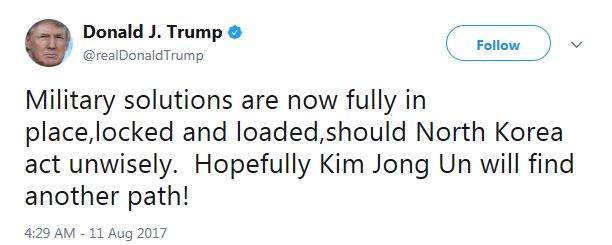
Military solutions are NOT fully in place. The US has not evacuated dependents, nor has it reinforced ground forces in South Korea. South Korean forces are not even in a heightened state of alert. Moreover, Stratfor’s assessment of the location of US naval forces do not show any strike forces in the region (CVN=carrier task force, LHA, LHD=marine assault groups).
The week ahead
The market seems to have sped up my timetable from my last post (see Correction ahead). Short term technical readings have reached sufficiently oversold levels for stock prices to temporarily bottom at these levels. Subscribers received an email alert indicating that the trading model had flipped from short to long for several reasons.
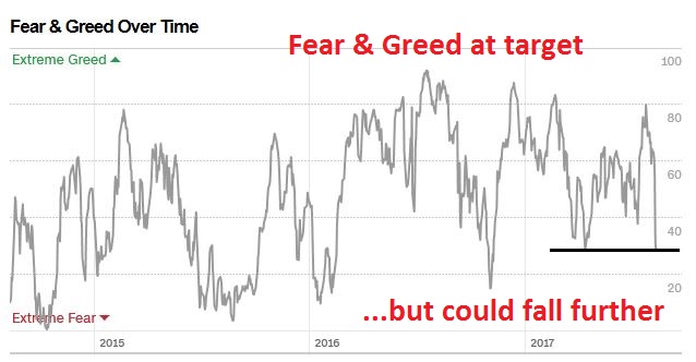
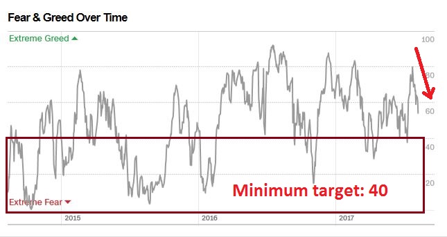
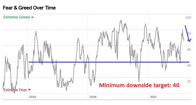
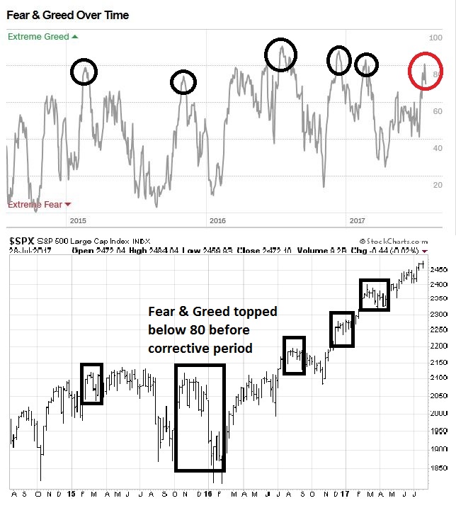
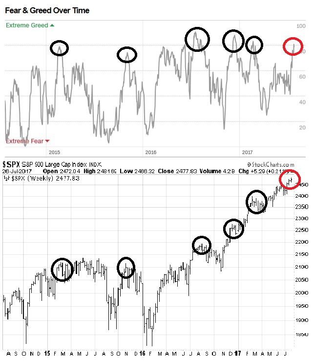
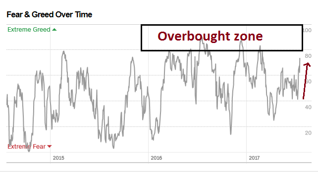
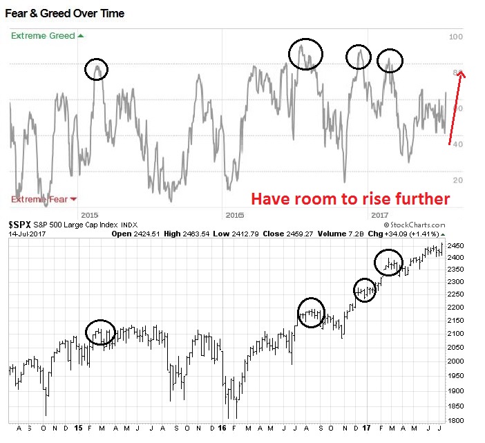
Firstly, I wrote that the Fear and Greed Index had to reach a minimum of 40 for the market to bottom. The current level of 28 is past that level, though the market has bottomed when this index has been much lower.
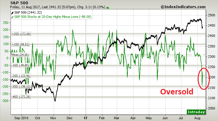
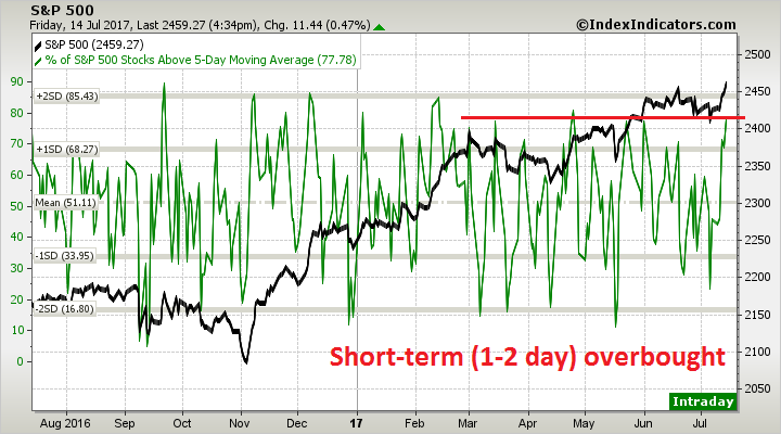
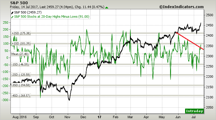
Breadth indicators from Index Indicators show that the market is oversold on a short-term (1-2 day) basis.
Intermediate term (1-2 week time horizon) indicators are also oversold.
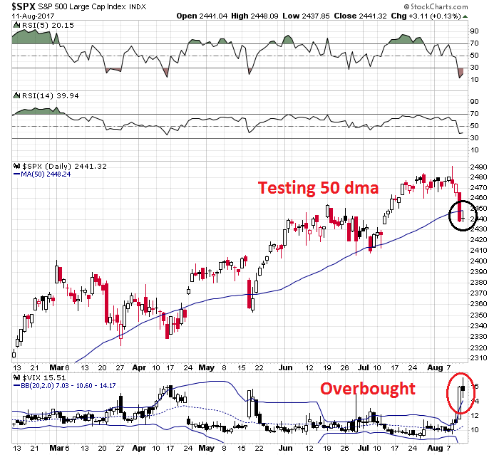
Two of my trading models (see Three bottom spotting techniques for traders) have flashed oversold signals too. The VIX Index is trading above its upper Bollinger Band, indicating an oversold condition as the SPX tests its 50 day moving average. Friday’s doji candle could indicate market indecision at a critical junction, which could indicate a short-term turning point.
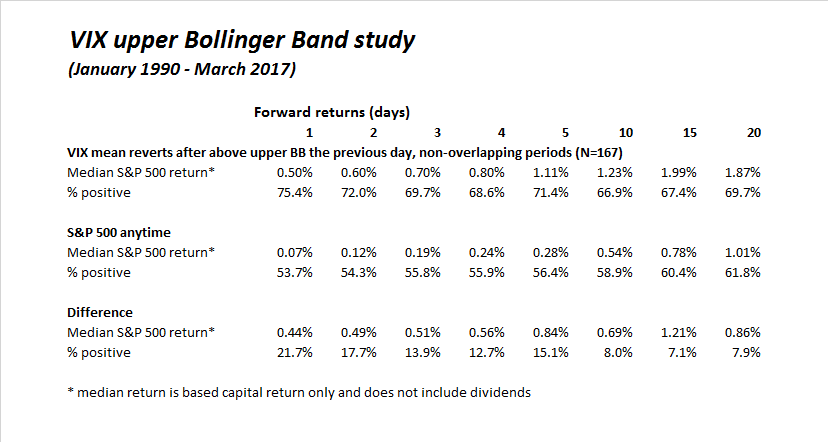
A mean reversion below the upper BB, which has not occurred yet, has historically been a good buy signal.
As well, the Zweig Breadth Thrust Indicator has reached an oversold condition, which shows that short-term selling pressure is a bit overdone. The last time the ZBT Indicator became oversold, the market staged a one-week rally of about 1%, and proceeded to weaken to new lows. I interpret these conditions to indicate that, at a minimum, a short-term bounce is ahead.
Incomplete correction
That said, the bigger test for the stock market will occur after an oversold rally. Will it recover and test old highs, or will it make a lower high and weaken?
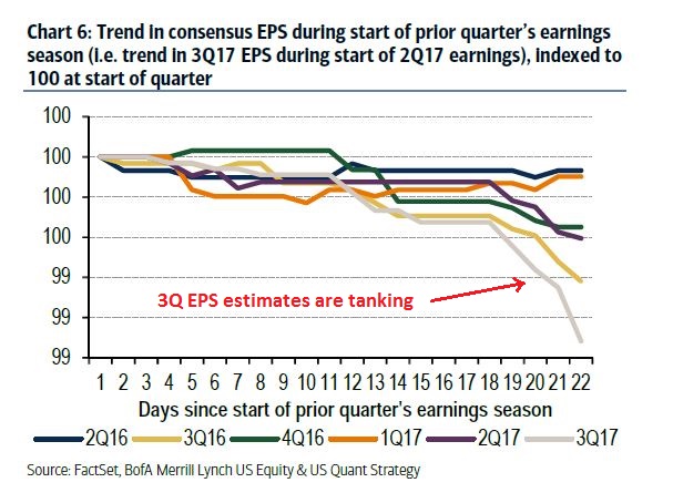
CNBC reported that JPM derivative analyst Marko Kolanovic, who correctly called the latest volatility spike, is forecasting more weakness in September:
On CNBC’s “Fast Money” on Thursday, Kolanovic said people should expect volatility to rise in September. The historic level is 19, and people should expect VIX to be in the high-teens, low-20s, he said. Right now it is at 16.04.
Congress returns next month and will have to take up the matter of the debt ceiling, the legislative cap on government debt, and a spending bill to avert a government shutdown. Tax reform, the promise of which had lifted markets, seems further off, he said.
Indeed, Business Insider pointed out that Congress has a mere 12 working days to raise the debt ceiling when it returns to work in September and avoid disaster:
Despite potentially dire consequences, there is confidence but no guarantee that factions in Congress, with a variety of competing interests, will be able to come together on a deal to raise the limit.
Currently, the two sides do not appear to be close on a deal.
“There are no talks going on right now,” one senior Democratic congressional aide told Business Insider.
Despite this, there is hope that the two sides will be able to avoid the worst case scenario.
“I think we will avoid a default,” one Republican aide told Business Insider. “I think we might have one attempt that fails and then we have to come back and do something else.”
A similar sentiment was expressed by outside analysts and economists.
“We think most policymakers are aware of the severe political and economic consequences of a failure to raise the debt limit. But September could be an anxious month for market participants,” Nancy Vanden Houten, a senior economist at Oxford Economics, wrote in a note to clients this week. “There are just 12 full days on the legislative calendar, and there is no clear legislative path as of yet for a debt limit hike.”
The NYSE Common stock only McClellan Summation Index is just starting to roll over. This is an intermediate term indicator with a time horizon of 2-4 months. From this technical perspective, it would be difficult to believe that a pullback could be complete in such a short time.
As well, my Trifecta Bottom Spotting Model (see Three bottom spotting techniques for traders) is not showing the bulls any contrarian love. The term structure of the VIX hasn’t inverted, indicating rampant fear, nor has TRIN surged above 2, indicating capitulation.
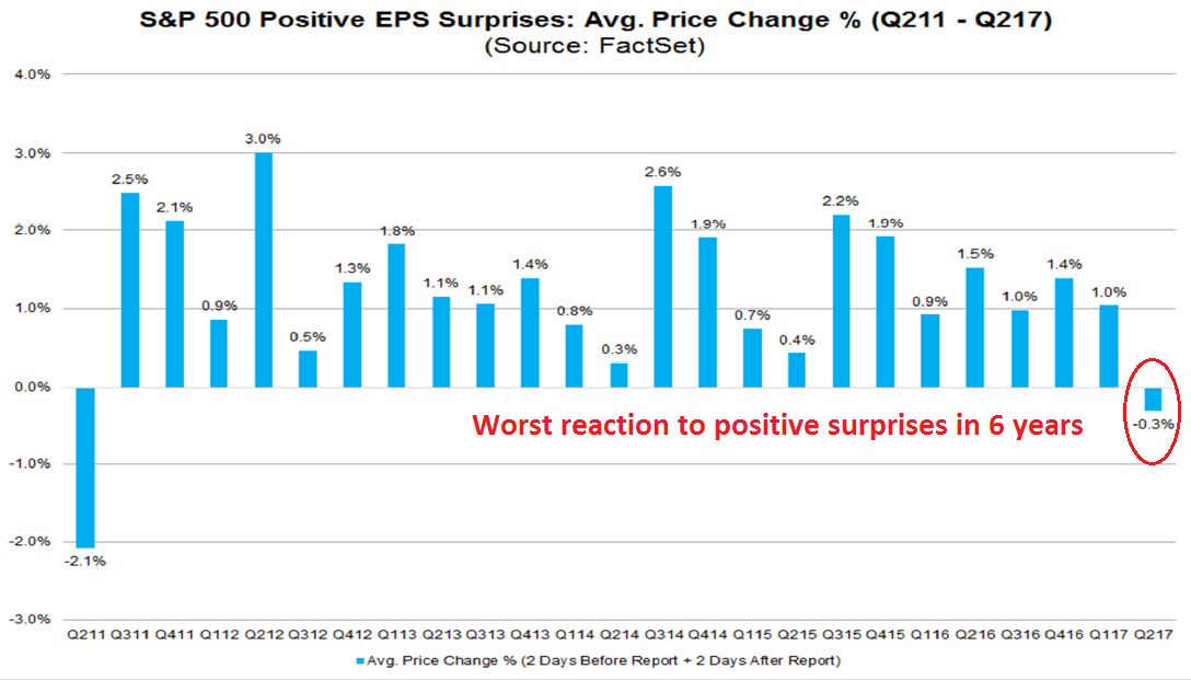
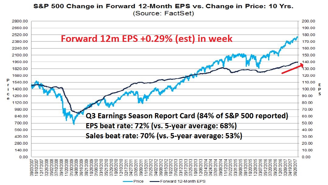
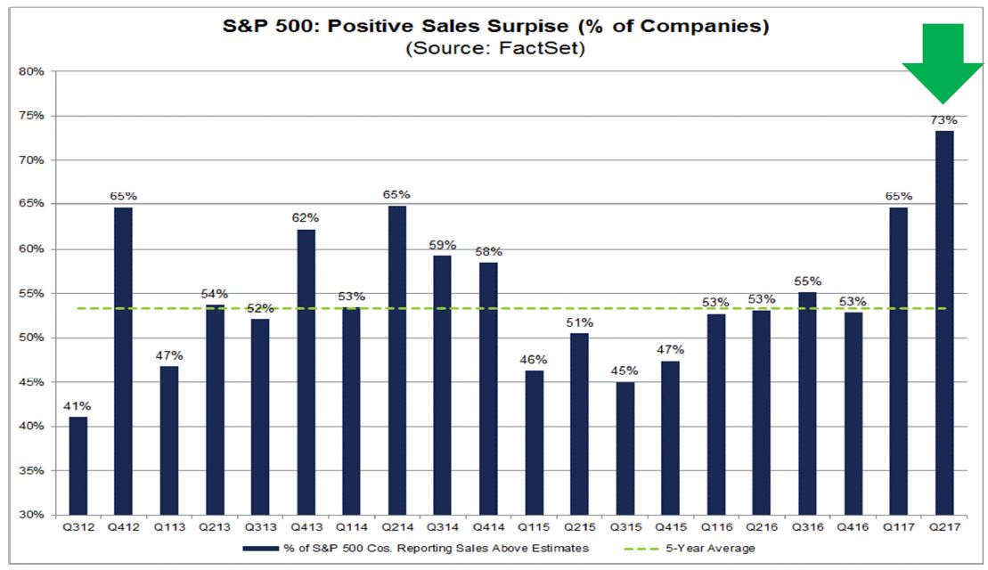
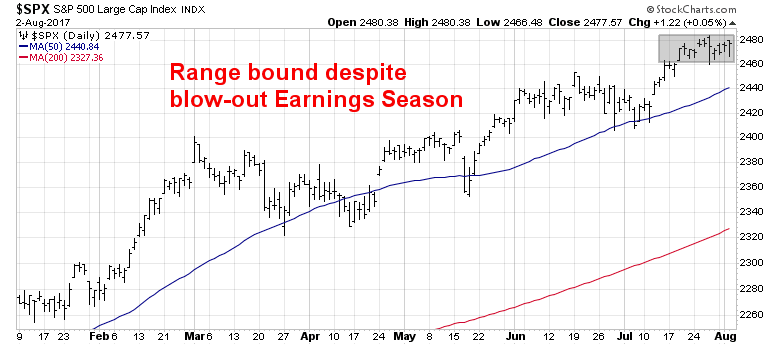
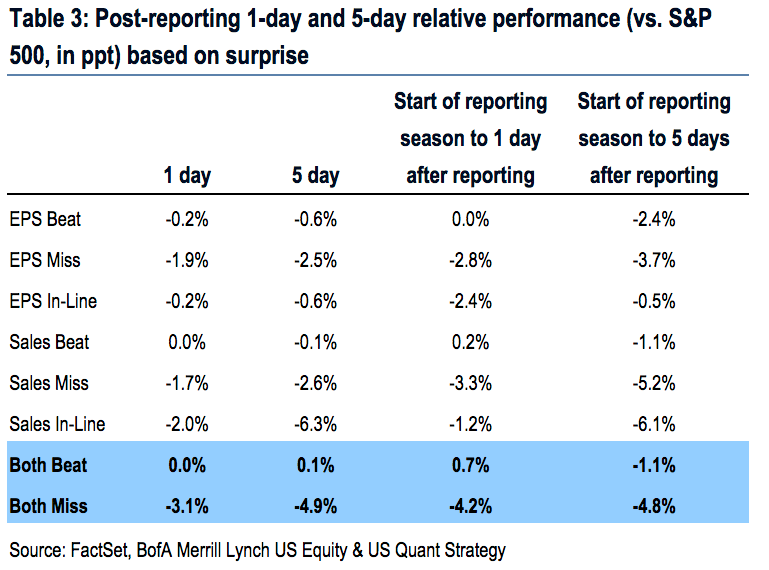
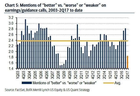
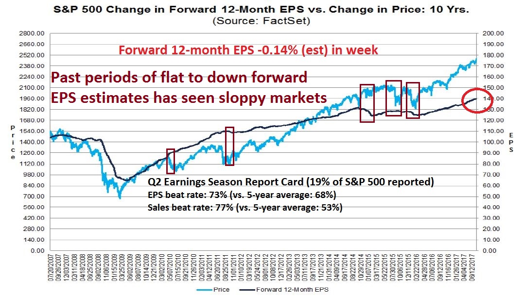
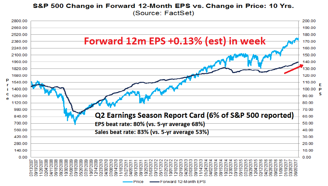
Lastly, this analysis from FactSet shows that, despite the positive sales and EPS surprises, Q2 2017 has seen the worst price reaction to positive earnings surprises in six years. This is a signal that much of the good news is already priced into the market.
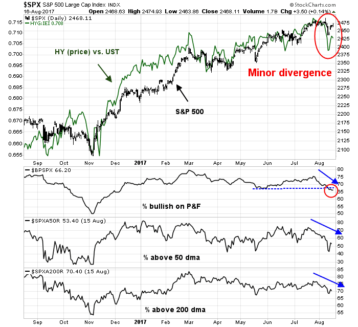
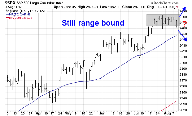
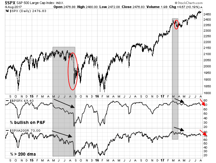
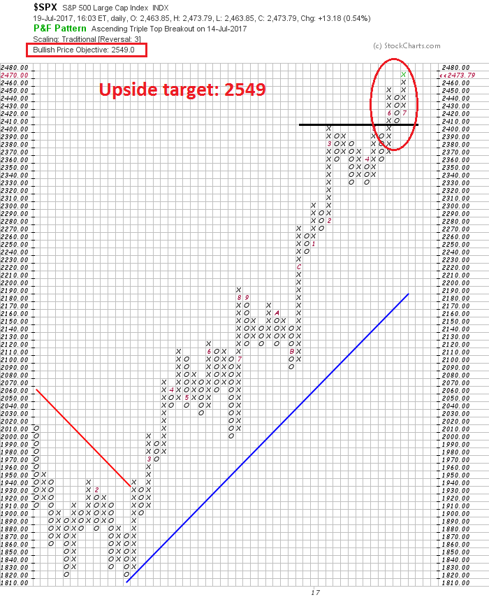
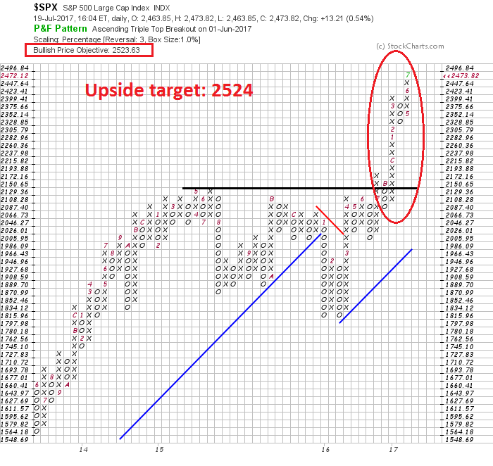
These conditions are suggestive of an oversold rally over the next few days within the context of a longer term corrective impulse that is still incomplete. The market has reached its first critical test, namely a uptrend line on SPX, and breadth support on % bullish and % above the 200 dma. The most likely scenario is to see a bounce into the 2460-2470 region, which sets a lower high, followed by additional weakness in the manner of the sell-off in the summer of 2015.
Longer term, my base case scenario calls for a correction, followed by a rally to new highs but whose strength is unconfirmed on RSI-14 (top panel). This negative divergence would mark the top of the current market cycle. As the chart below is the DJ Global Index, weakness would be worldwide in scope and signal a synchronized global economic downturn.
My inner investor is overweight stocks, but he expects to lighten up some positions and re-balance to his investment policy weight in equities on market strength. My inner trader reversed from short to a small speculative long position on Friday. He expects the time horizon of that trade to be not much more than a week.
Disclosure: Long SPXL