Preface: Explaining our market timing models
We maintain several market timing models, each with differing time horizons. The “Ultimate Market Timing Model” is a long-term market timing model based on the research outlined in our post, Building the ultimate market timing model. This model tends to generate only a handful of signals each decade.
The Trend Model is an asset allocation model which applies trend following principles based on the inputs of global stock and commodity price. This model has a shorter time horizon and tends to turn over about 4-6 times a year. In essence, it seeks to answer the question, “Is the trend in the global economy expansion (bullish) or contraction (bearish)?”
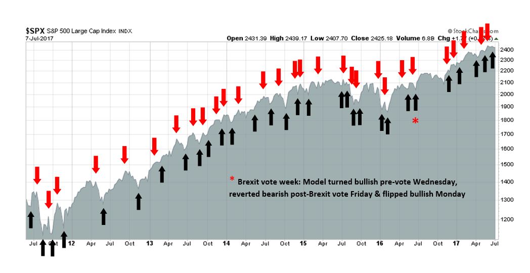
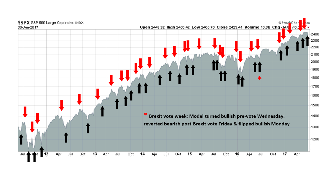
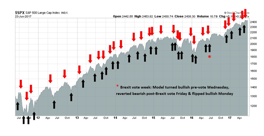
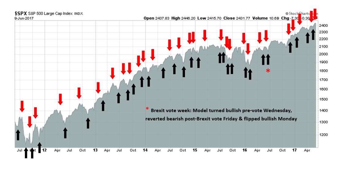
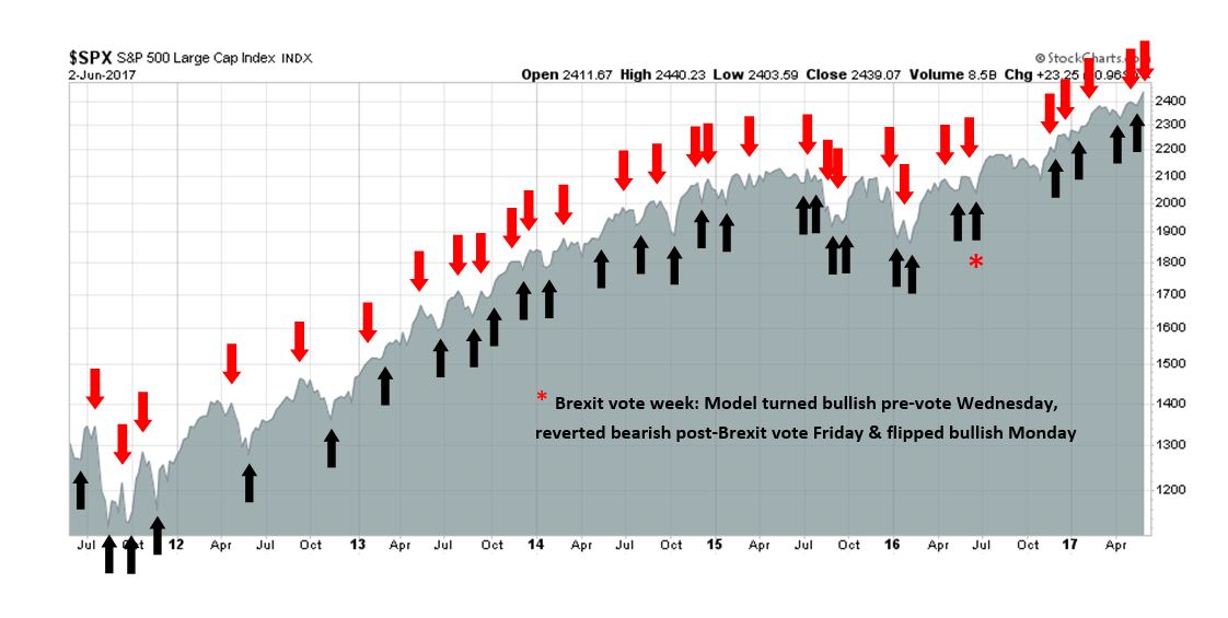
My inner trader uses the trading component of the Trend Model to look for changes in the direction of the main Trend Model signal. A bullish Trend Model signal that gets less bullish is a trading “sell” signal. Conversely, a bearish Trend Model signal that gets less bearish is a trading “buy” signal. The history of actual out-of-sample (not backtested) signals of the trading model are shown by the arrows in the chart below. Past trading of the trading model has shown turnover rates of about 200% per month.
The latest signals of each model are as follows:
- Ultimate market timing model: Buy equities
- Trend Model signal: Risk-on
- Trading model: Bullish
Update schedule: I generally update model readings on my site on weekends and tweet mid-week observations at @humblestudent. Subscribers will also receive email notices of any changes in my trading portfolio.
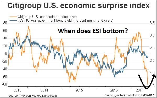
What is the risk of recession?
Over at A Dash of Insight, Jeff Miller criticized WSJ reporter Greg Ip for writing what Miller consider to be a doomster-like article about rising recession market risk. He went on to accuse Ip of cherry picking data to make his point about a heightened risk environment, and concluded:
The entire article reads like a laundry list of points that would make sense to investors with limited knowledge of economics. That is why I am disappointed. My hope is that top journalists would help explain reality rather than feed fears stoked by so many others. This article will frighten investors. Is that what the author intends?
The issue of recession risk is important to investors because every recession has been accompanied by an equity bear market. So let me put in my two cents worth in my own assessment of recession risk for the American economy.

Some time ago, I created a Recession Watch page on my website. The recession risk criteria on the page was based on the framework specified by New Deal democrat. NDD used the work of Geoffrey Moore, the founder of ECRI, to create seven long leading indicators designed to spot recessions a year in advance (click on links for the latest FRED charts):
- Corporate bond yields (Corporate bond yields have always made their most recent low over 1 year before the onset of the next recession)
- Housing starts (Housing starts peaked at least one year before the next recession)
- Real private residential fixed investment (Aside from the 1981 “double-dip,” and 1948, it has always peaked at least one year before the next recession)
- Money supply (In addition to the 1981 “double dip,” on only 2 other occasions have these failed to turn negative at least 1 year before a recession)
- Corporate profits and Proprietors` income, which can be a more timely proxy for corporate profits (Corporate profits have peaked at least one year before the next recession 8 of the last 11 times, one of the misses being the 1981 “double-dip.”)
- Yield curve, which may not be relevant in the current interest rate environment (The yield curve inverted more than one year before the next recession about half the time)
- Real retail sales (It has peaked 1 year or more before the next recession about half of the time)
A review of the seven indicators revealed both good news and bad news. Here are the details of each indicator, along with a discussion of the internals behind each indicator,
A healthy consumer (and jobs market)
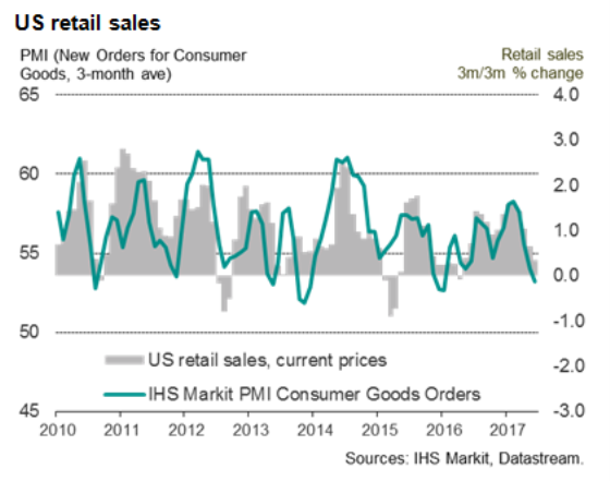
Starting with the good news, the strongest indicator is real retail sales, which has been strong and shows no sign of turning down. It is difficult to see how the economy could collapse into recession if the consumer is still spending.

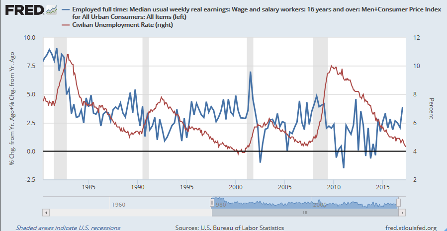
The key driver of retail sales is employment and wages. Friday`s June Jobs Report contained more good news than bad news. The good news is the headline Non-Farm Payroll (NFP) came in at 222K, which was well ahead of expectations. The closely watched participation rate edged up, indicating an expanding workforce, which raised the unemployment rate and reduced pressure on the Fed to raise rates. As well, average hourly earnings (AHE) came in at 0.2%, which was below expectations of 0.3%, indicating non-inflationary wage growth in the face of employment gains. Another positive that was buried in the report was the continuing gains in temporary jobs, whose peaks have tended to lead past NFP peaks.

It was a solid report, and we should see more details about the labor market next week when the Labor Market Conditions Index is released Monday and from the JOLTS report Tuesday. From the consumer`s viewpoint, however, there was one minor blemish that came in the form of AHE. As the chart below shows, AHE has been barely keeping pace with inflation. If real AHE does not show any progress, then how does real retail sales grow, unless the household takes extraordinary measures such as digging into savings or by borrowing?

Bottom line: The consumer is still healthy, but spending growth may be start to get pressured.
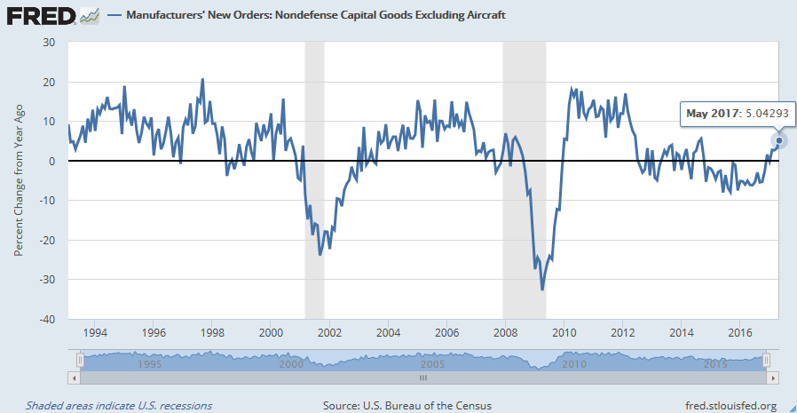
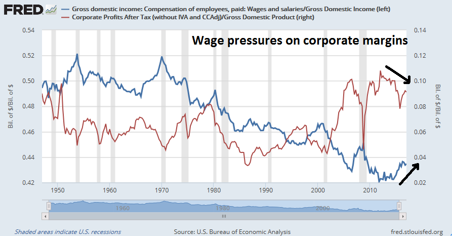
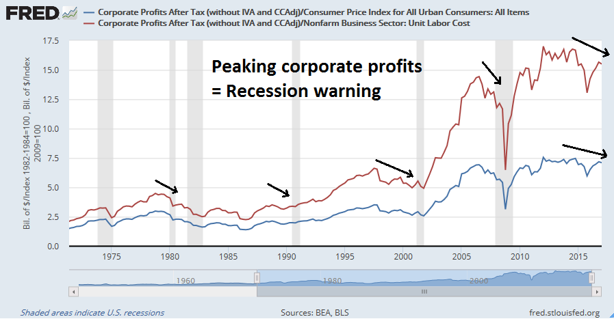
Whither corporate profits?
Corporate profits have had a record of peaking before past recessions, which makes it a good long leading indicator. As the chart below shows, corporate profits, whether normalized by unit labor costs or by inflation, have peaked for this cycle, which is an ominous sign.
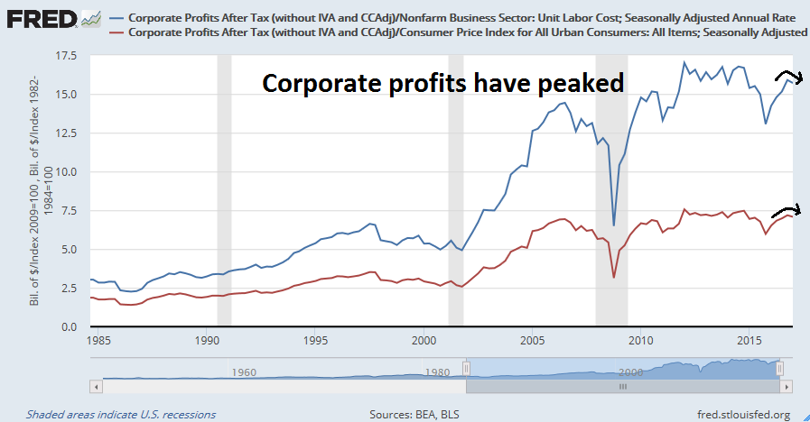
The quarterly corporate profits data series is released with a significant lag, which lessens the utility of this indicator. However, proprietors’ income is a more timely proxy for corporate profits. Proprietors’ income has not peaked and remains strong.

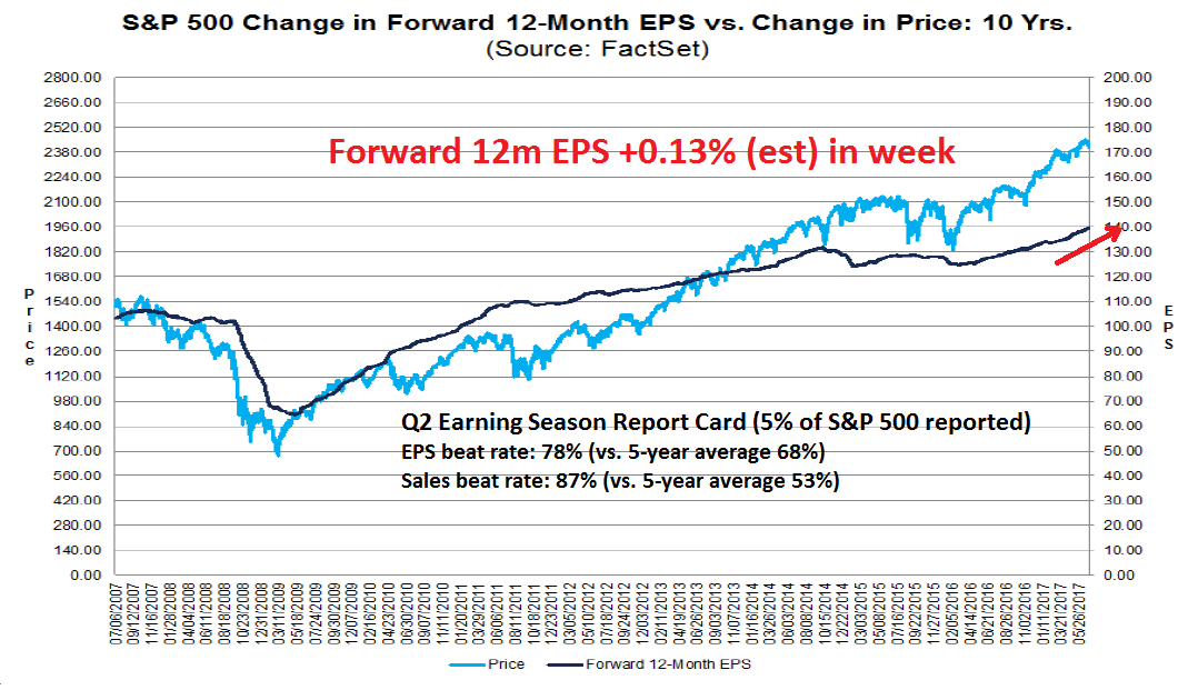
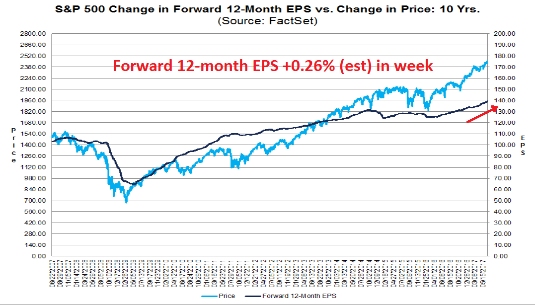
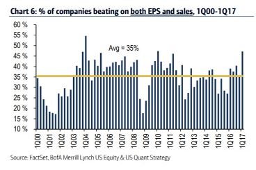
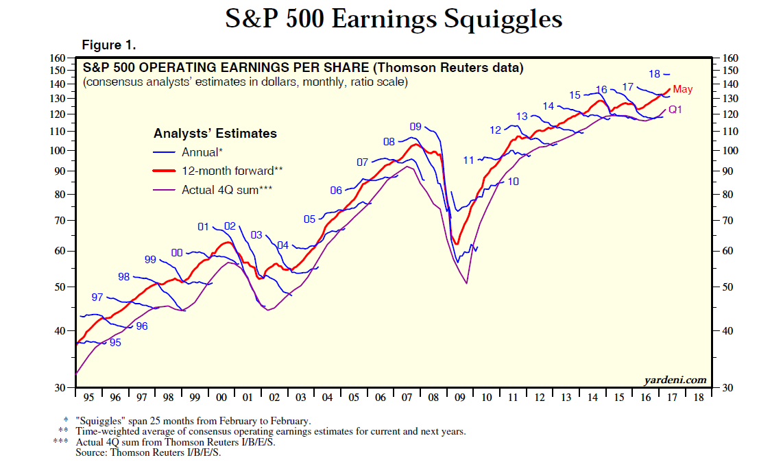
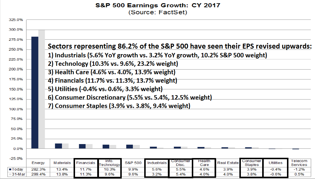
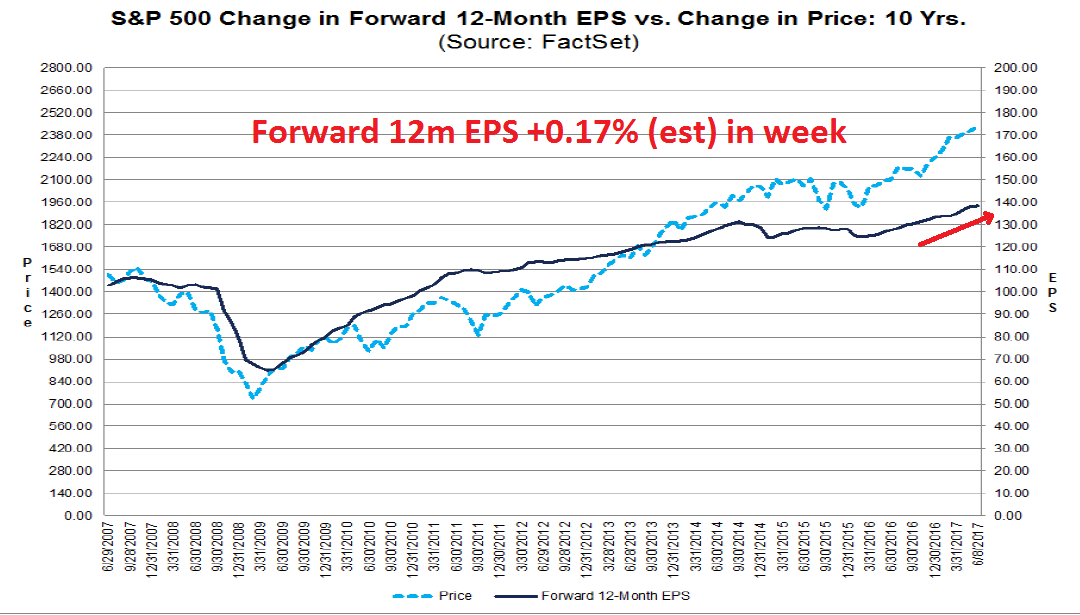
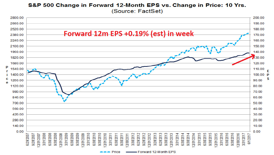
Forward looking indicators such as Street estimates from FactSet remains strong. Early indicators of the results Q2 earnings season show that both earnings and sales beat rates are above historical averages.
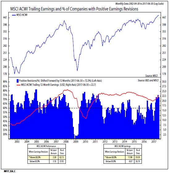
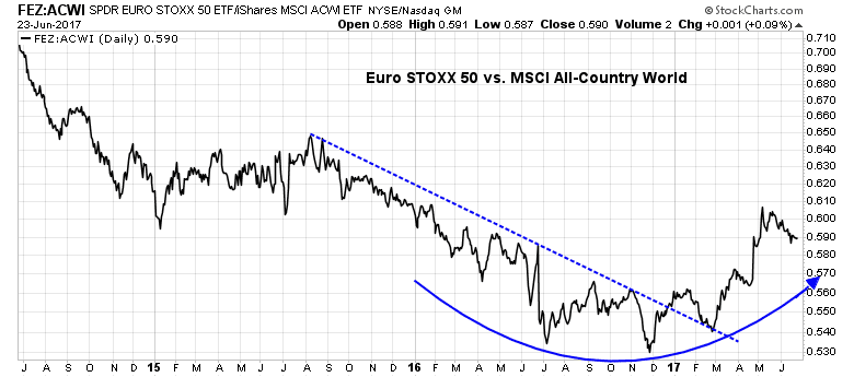
As well, Ned Davis Research reported that forward EPS estimate revisions for the MSCI All-Country World Index are still rising.
Score corporate profits as a positive, for now.
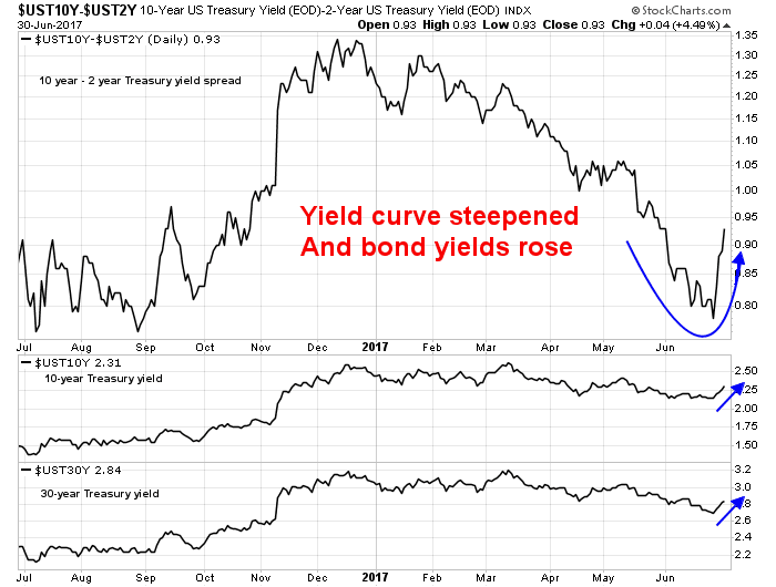
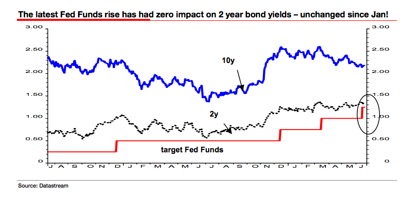
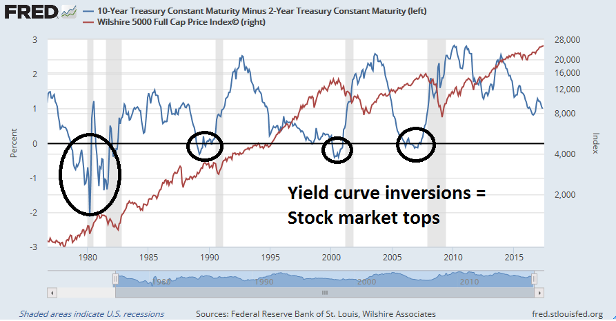
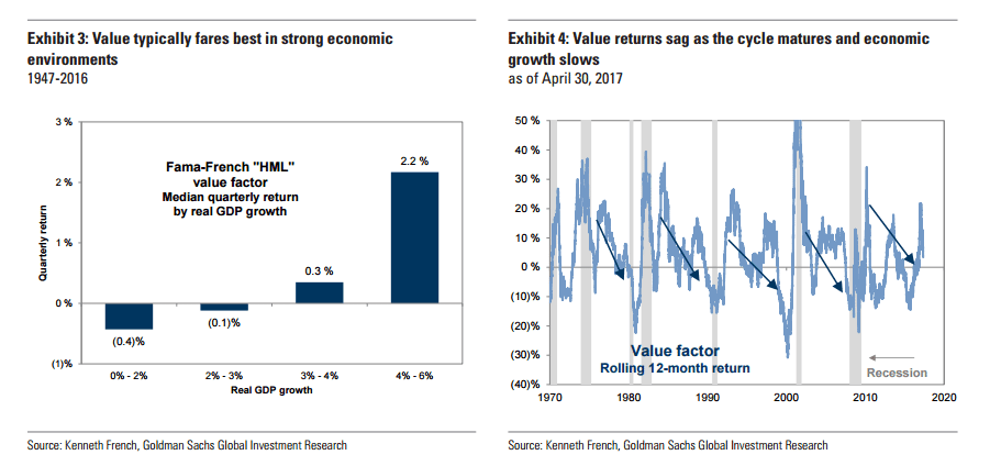
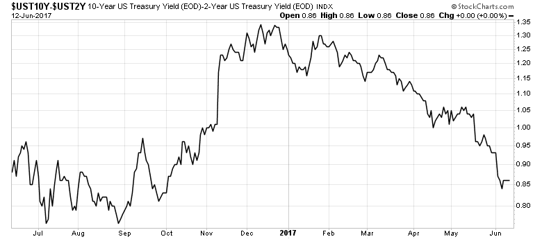
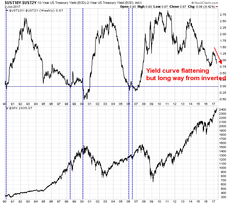
Yield curve
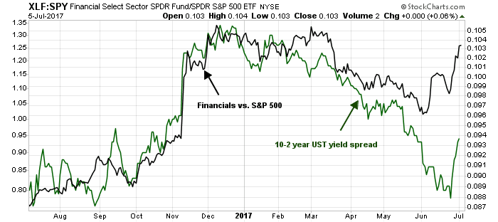
The yield curve has historically been an uncanny signal of future recession. The 2/10 Treasury curve, or spread, has inverted before every recession since 1980. However, it is unclear how effective this indicator is likely to be in this era of near zero rates and quantitative easing.

The yield curve had been flattening for much of 2017, which is usually interpreted as the bond market discounting slower economic growth. It recently steepened dramatically. However, much of the steepening effect can be attributable to hawkish comments from the ECB about the prospects for the reduction of their QE program. In effect, an ECB induced “taper tantrum” has traveled across the Atlantic.
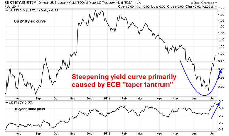
Rank the yield curve indicator as neutral, though the readings are confusing.
Money supply
One of the best known monetary equations in economics is PQ = MV, where P (price) X Q (quantity) = overall economy, or GDP, is equal to M (money supply) X V (monetary velocity). Theory holds that V is held constant over time, so the quantity of money determines how much liquidity is in the economy to power growth. Too much money sloshing around the economy will result in inflation. Too little, you get recession.
Here is the chart of real M1 and M2 growth over time. Real money supply growth has historically turned negative before past recessions. Current reading are still positive, but money growth is decelerating. The current expansion is unusual in that M1 velocity (dark blue line) has turned up in past cycles, but haven`t even risen once during this cycle and continues to fall.

The above chart uses a monthly M1 and M2 money supply data series to coincide with the monthly CPI data. Here are more timely weekly nominal money supply data series overlaid with monthly CPI. The story remains the same. Money growth is decelerating, though real growth is not negative yet.
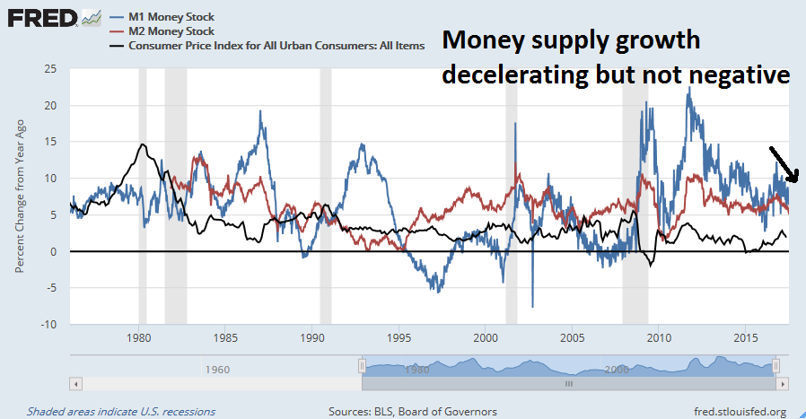
Rank this indicator as neutral to negative, and deteriorating.
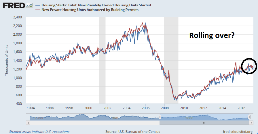
Is housing rolling over?
One of the key canaries in the coalmine of the American economy is the housing and construction sector. That’s because of the extreme cyclical nature of that industry. The latest data shows that both noisy housing starts and housing permits tends appear to have peaked for the cycle, which is a negative.

Another way to gauge the health of the housing and construction sector is real private residential investment, which amounts to spending on private housing as a percentage of GDP. This metric (black line) has not rolled over, but it is a quarterly data series that is reported with a delay, compared to the noisy monthly housing starts and permits data. Looking ahead, the recent rise in long bond yields is pushing up mortgage rates, and that will be another headwind for housing.

Bottom line: The housing sector looks wobbly. Rank this sector as a negative.
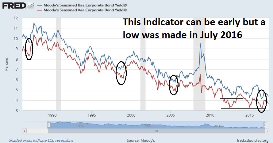
Corporate bond yields
Corporate bond yields have historically bottomed well before the onset of the next recession. Corporate yields bottomed a year ago, but this indicator has had a history of being extremely early in its recessionary warnings.
The midyear winner…
When I put it all together, the snapshot shows two positive, two negative, and three neutral indicators, with a negative direction of change. If this was a race and if were to end now, the verdict would call for low recession risk. Greg Ip would be declared an excessive worry wart and should be banished to write for Zero Hedge.
However, the race is no sprint but a marathon. Much of the future direction of recession risk depends on Fed policy, which is becoming increasing hawkish in tone.
The Fed policy wildcard
Even though the nowcast snapshot of recession risk remains relatively low, aggressive Fed policy to normalize monetary policy is likely to significantly raise the odds of a recession in 2018. Last Wednesday’s release of the FOMC minutes had the financial press interpreting the minutes as “deep divisions within the Fed”. Tim Duy cut through the BS and explained the “divisions” this way.
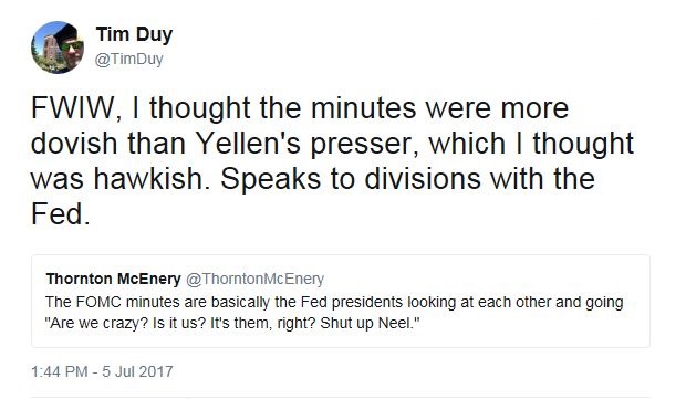
Recently Fedspeak from the important voices within the FOMC, such as Yellen and New York Fed President Dudley showed a determination to stay the course and normalize policy. Writing at Bloomberg, Duy thinks that the Yellen Fed is changing its focus towards financial stability as an objective:
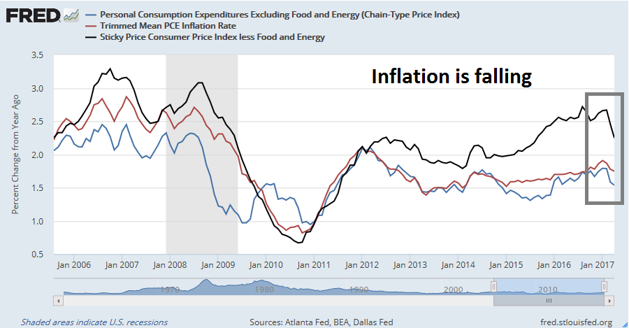
Core leadership at the Federal Reserve appears determined to normalize policy via interest-rate hikes and balance-sheet reduction. But they have run up against a significant roadblock because the inflation data stubbornly refuse to cooperate with their forecast. Don’t expect that to deter leaders of the U.S. central bank just yet. They generally view the inflation weakness as transitory. A labor market circling around full employment serves as the justification they need to keep their foot on the brake.
And if that weren’t enough, they can pivot their focus toward financial stability. Indeed, that’s already under way. But be warned: That road will almost certainly lead to excessive tightening. In it you can see one path by which this expansion comes to an end.
Does that mean the return of the Yellen Put? Well, sort of. But Duy thinks such a shift brings enormous risks as the Fed does not have a roadmap that specifies a well-test reaction function. Consequently, they are more likely to fall behind the curve and react too late:
When central bankers lose focus on their primary mandates — inflation and unemployment — the odds of a policy mistake rise sharply. Remember that the most likely cause of a sustained drop in asset prices will be a recession and the associated fall in profits. That means that if central bankers wait until asset prices roll over before they stop tightening, they have almost certainly waited too long. I don’t think the Fed is in imminent danger of making such a mistake, but I can see the genesis of such a mistake if the bank turns rate decisions too much toward financial stability concerns.
If the Fed were to stay on this path, then expect the rate hike and balance sheet normalization path to be far more hawkish than the market expects. The hawks have plenty of ammunition to justify their course of action. The latest research from Goldman Sachs (via CNBC) which suggests that the opioid epidemic is affecting the employment eligibility of the labor force may provide the Fed a figleaf to justify ignoring feeble rise in the labor force participation rate and proceed with its normalization policy. As well, any likely Trump appointees to the Fed’s Board of Governors, as well as possible Fed chair replacement, are likely to lean towards a rules-based approaches to monetary policy and be even more hawkish than Janet Yellen (see A Fed preview: What happens in 2018?).
With the nowcast of recession risk reading in neutral, but deteriorating, how many much rate hikes and balance sheet reductions will recession risk rises into the danger zone?
Investment implications
Here is where the rubber meets the road. In light of these recession risk readings and likely path of Fed policy, what should an investor do?
Barry Ritholz recently wrote a Bloomberg article that castigated the doomsters, An Expert’s Guide to Calling Market Tops. To sidestep the problems that Ritholz hat identified, I prefer an approach of outlining an analytical framework ahead of time and then applying that framework to the current data.
Some time ago, I laid out a model for calling a market top for long term investors (see Building the ultimate market timing model). The technique calls for using a model to determine recession risk. If recession risk is high, or if it is evident that the economy is in a recession, use moving average techniques to take you out and back into the equity market. It is an extremely low turnover strategy that is useful for long-term investors who don’t want to trade a lot.
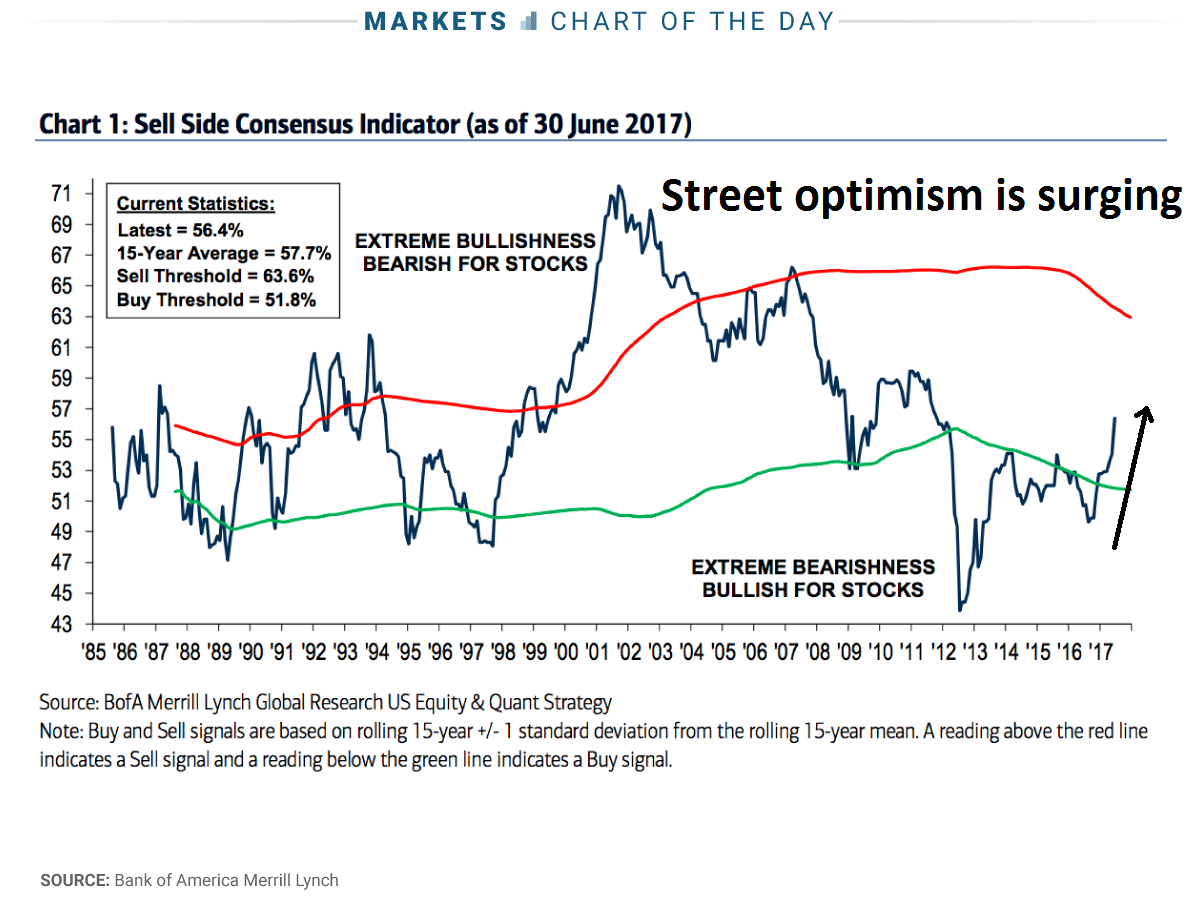
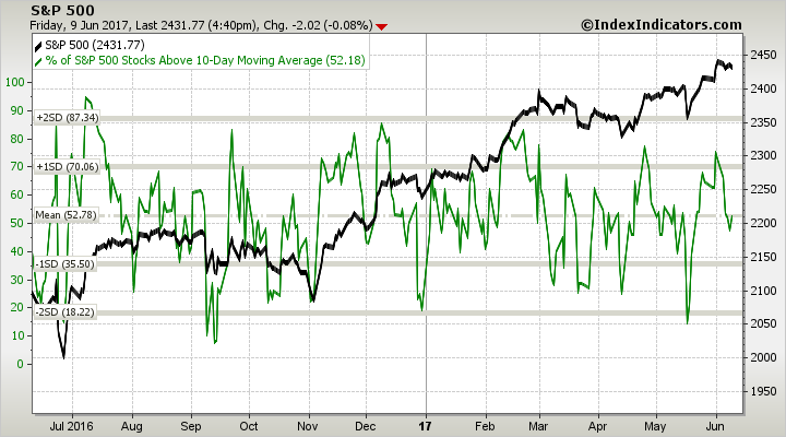
So where are we now? Despite the clouds on the horizon, the nowcasts of market and economic outlooks remain positive. FactSet‘s analysis of forward 12-month EPS revisions continue to be positive, which is bullish. As long as the Trump Administration doesn’t impose tariffs on steel and initiate a trade war, which could have unpredictable effects on the earnings outlook, the macro backdrop is bullish.
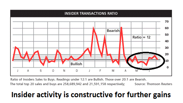
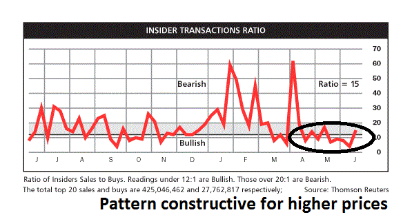
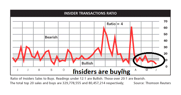
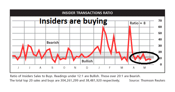
As well, Barron’s latest update of insider activity is constructive for further equity gains.
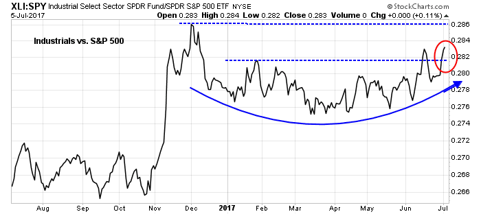
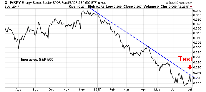
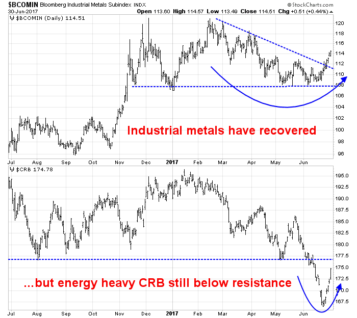
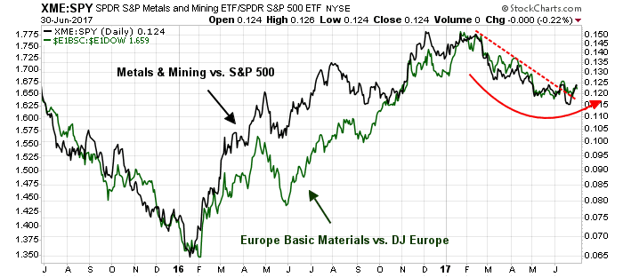
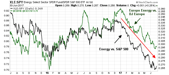
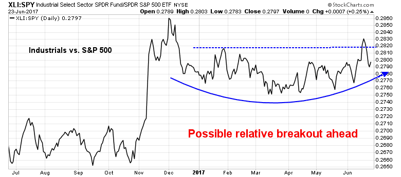
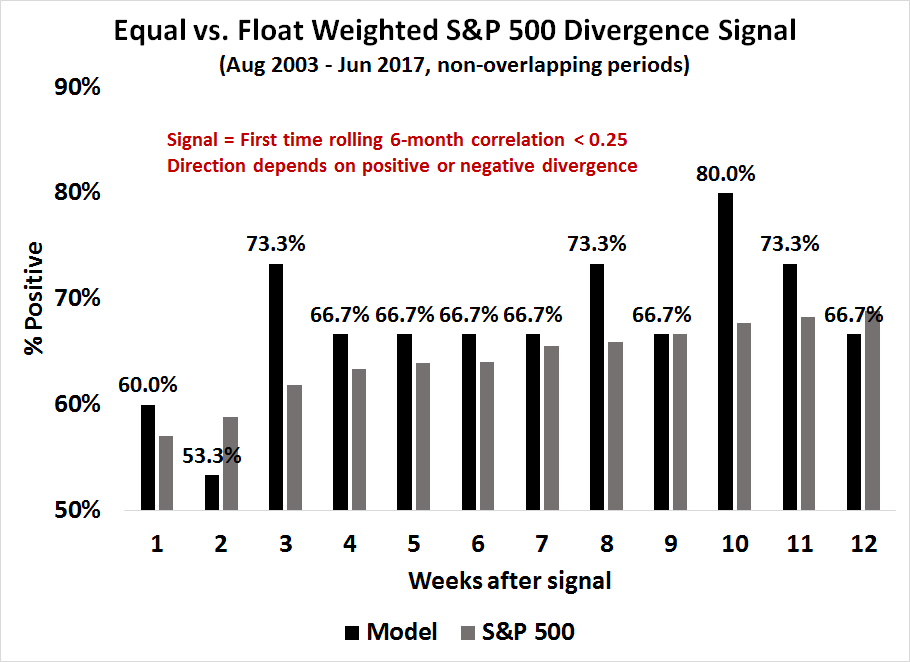
The sector rotation script based on a reflationary rebound that I wrote about is developing more or less as expected (see More evidence of a reflationary rebound). Capital-goods intensive industrial stocks are staging upside relative breakouts and assuming the market leadership mantle. The chart below depict the float weighted Industrial market performance in the top panel, and the equal weighted Industrial market performance in the bottom panel. The equal weighted relative breakout is of particular importance because of the dominance of heavyweight GE in the Industrial index.
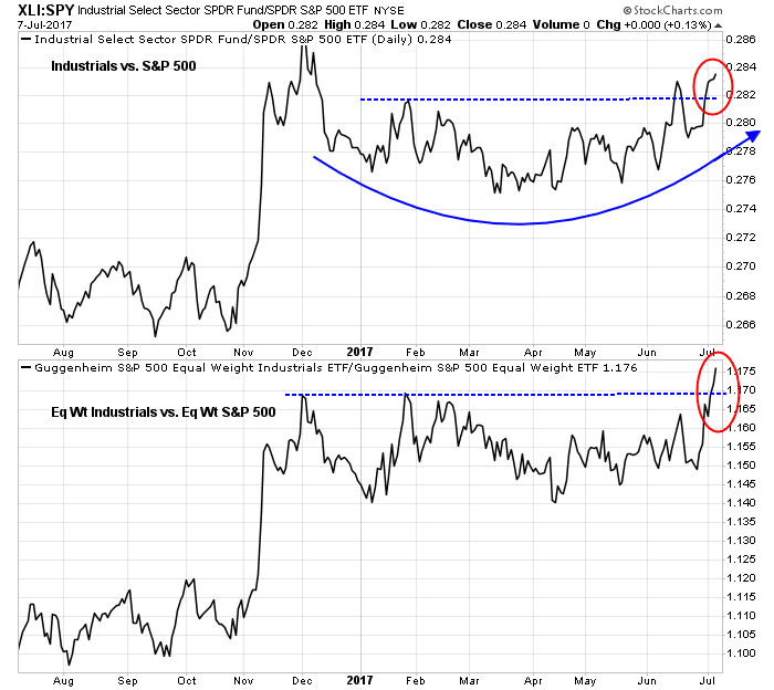
The cyclically sensitive industrial metals are also holding up well, and they are staying above their 50 and 200 day moving averages.

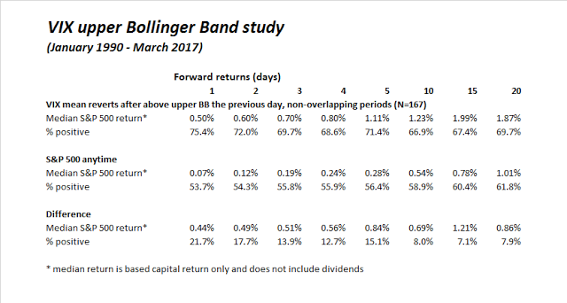
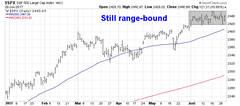
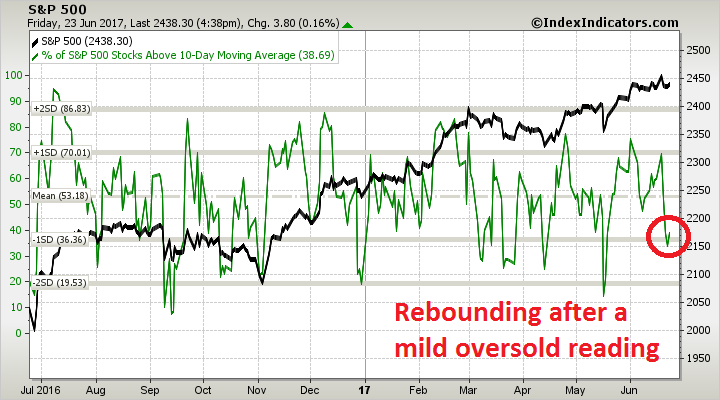
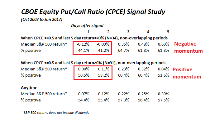
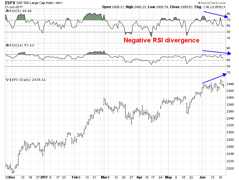
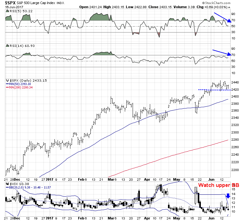
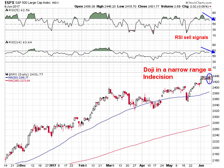
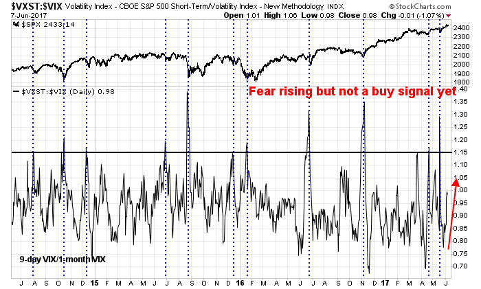
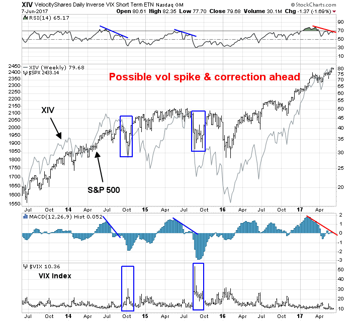
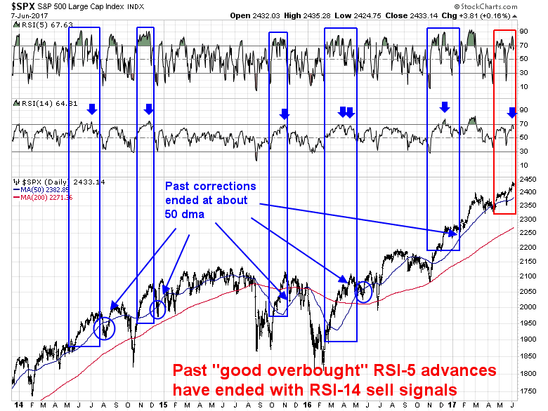
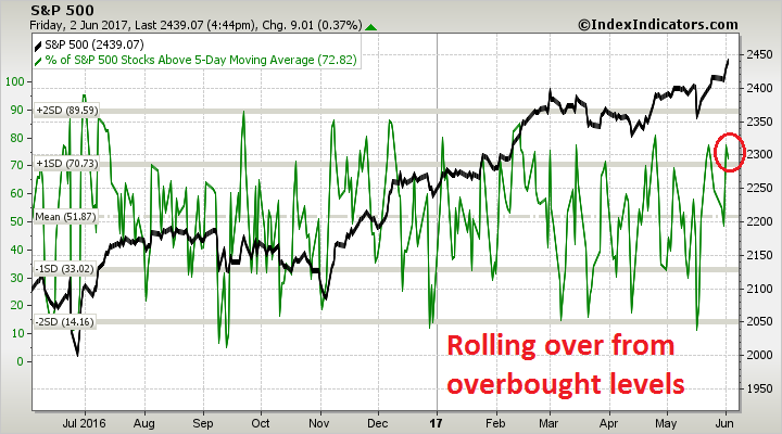
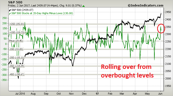
The VIX Index rose above its upper Bollinger Band and mean reverted below over a week ago and flashed a SPX buy signal, which didn’t work. The same buy signal occurred last Friday, just as the index tested its 50 day moving average and exhibited a bullish divergence on RSI-5.
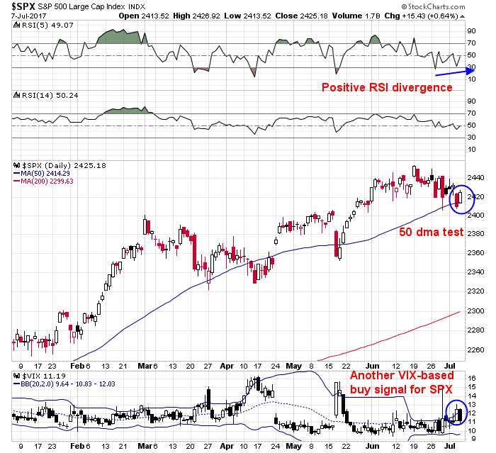
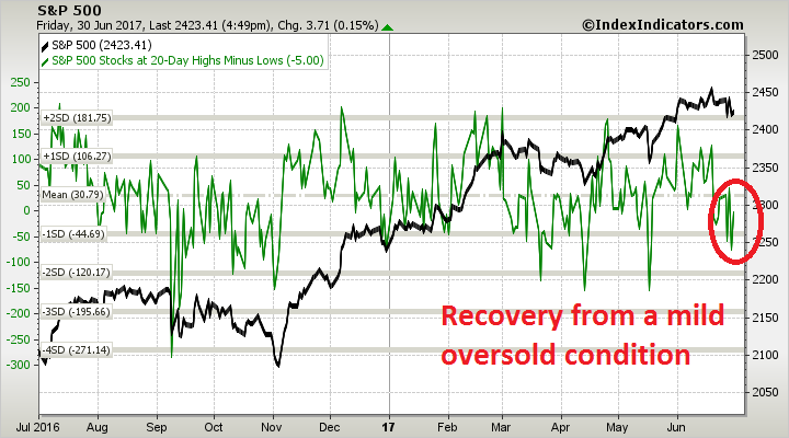
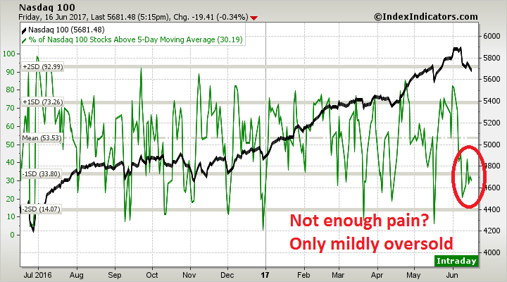
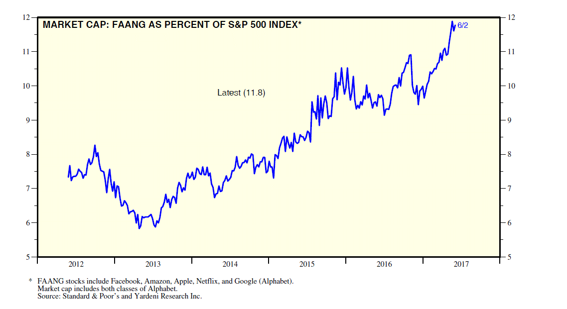
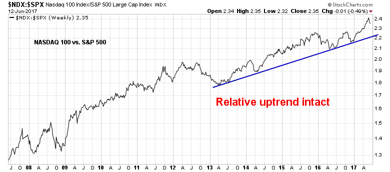
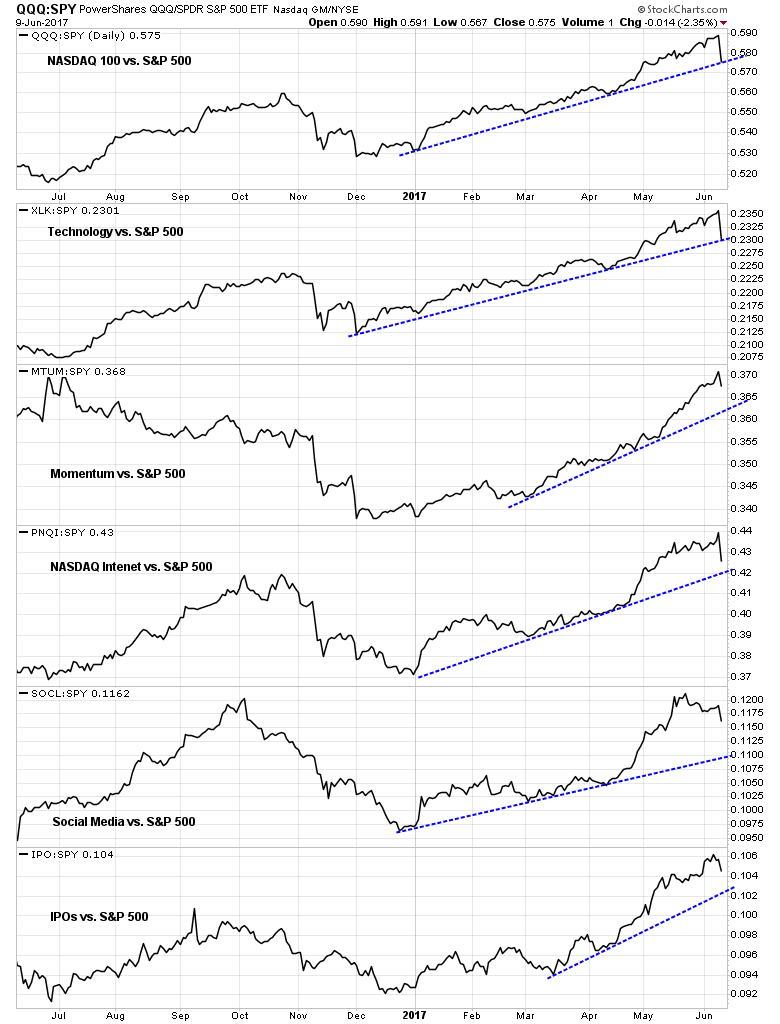
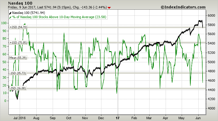
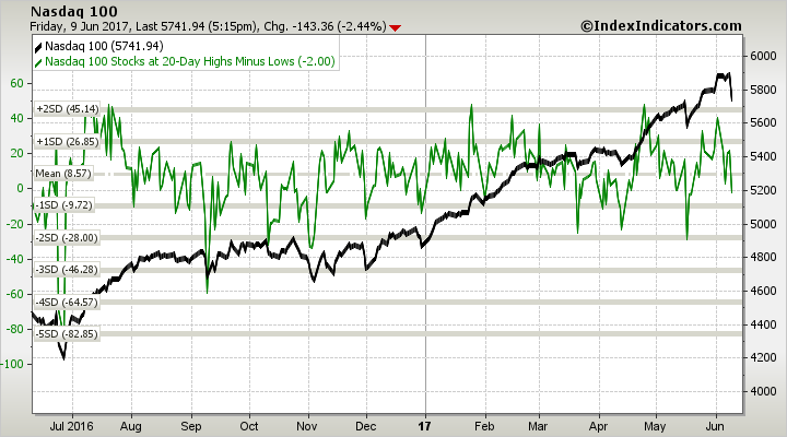
Even NASDAQ breadth is holding up relatively well despite the recent weakness.

As we proceed through Earnings Season in the upcoming weeks, expect the market to grind upwards in a choppy fashion as it reacts to the day-to-day earnings news from individual companies. My inner investor remains bullish on equities, and my inner trader got long the market last week.
Disclosure: Long SPXL


