Preface: Explaining our market timing models
We maintain several market timing models, each with differing time horizons. The “Ultimate Market Timing Model” is a long-term market timing model based on the research outlined in our post, Building the ultimate market timing model. This model tends to generate only a handful of signals each decade.
The Trend Model is an asset allocation model which applies trend following principles based on the inputs of global stock and commodity price. This model has a shorter time horizon and tends to turn over about 4-6 times a year. In essence, it seeks to answer the question, “Is the trend in the global economy expansion (bullish) or contraction (bearish)?”
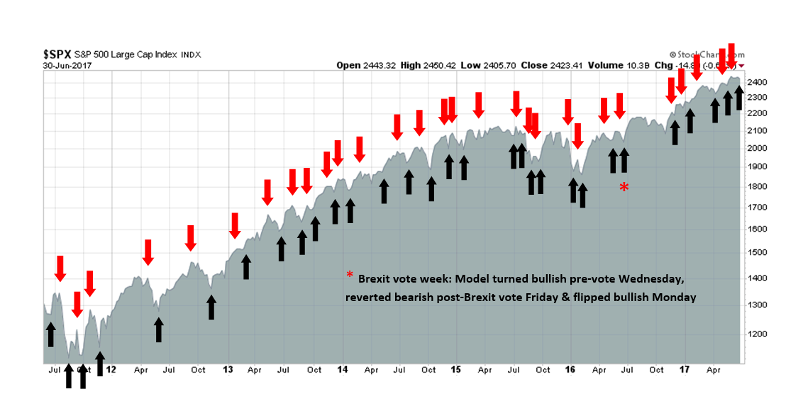
My inner trader uses the trading component of the Trend Model to look for changes in the direction of the main Trend Model signal. A bullish Trend Model signal that gets less bullish is a trading “sell” signal. Conversely, a bearish Trend Model signal that gets less bearish is a trading “buy” signal. The history of actual out-of-sample (not backtested) signals of the trading model are shown by the arrows in the chart below. Past trading of the trading model has shown turnover rates of about 200% per month.
The latest signals of each model are as follows:
- Ultimate market timing model: Buy equities
- Trend Model signal: Risk-on
- Trading model: Bullish (upgrade)
Update schedule: I generally update model readings on my site on weekends and tweet mid-week observations at @humblestudent. Subscribers will also receive email notices of any changes in my trading portfolio.
Charting the pain trade
Even as the recent SPX stays in a narrow trading range, there was plenty of pain to go around beneath the surface. The drubbing taken by NASDAQ stocks were largely offset by rallies in Financials and Healthcare.
So what are the next pain trades, and what are the implications?
Hedgopia documented how large speculators (read: hedge funds) have moved from a crowded short in the 10-year Treasury Note to a crowded long.

Similarly, large speculators are also in a crowded long in the T-Bond futures.
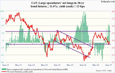
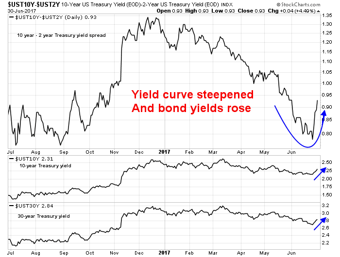
Bond yields began to rise, and the yield curve steepened dramatically.
Those are the first major pain points for traders. These dramatic reversals have further implications for the equity market.
Here comes the reflation trade
Two weeks ago, I highlighted a scenario for how an equity bear market may begin (see Risks are rising, but THE TOP is still ahead). It called for one last reflationary blow-off, led first by capital-goods intensive industries, and then spreading to the late cycle inflation hedge and hard asset sectors such as energy and mining. One important sign of this reflation theme taking hold would see bond yields starting to back up and the yield curve steepening.
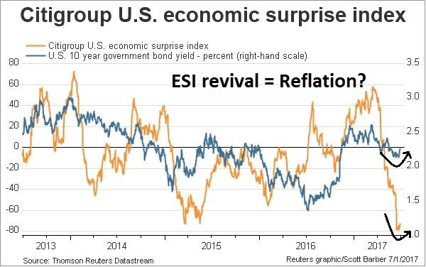
It appears that the developments that I had outlined are coming to pass. There are signs of a turnaround in both the Citigroup US Economic Surprise Index, which measures whether economic statistics are beating or missing expectations, and bond yields.
Another bullish development that was largely ignored by the market was the better than expected Manufacturers’ New Orders, which is an indication of a capex revival.
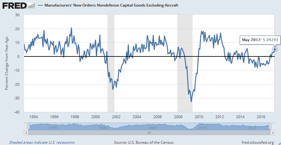
The market relative chart of the capital-goods heavy Industrial stock sector looks constructive as it nears another relative upside breakout after a pullback test after the initial breakout.

Is an inflation blow-off around the corner?
Hot on the heels of a capital-goods revival is the rise of inflation and inflationary expectations. I had highlighted analysis from New River Investments manager Conor Sen who postulated an oil spike would signal the end of the economic expansion:
Every boom in the U.S. economy is different, but over the past several decades, each has ended the same way. First you get full employment. Then you get a spike in the price of oil. And then there’s a recession.
When Sen wrote those words, I was skeptical that the current cycle would necessarily be marked by a surge in oil prices. Instead, I generalized the analysis to rising commodity prices would be the signal for rising inflationary expectations, to which the Fed would have to respond with more aggressive tightening.
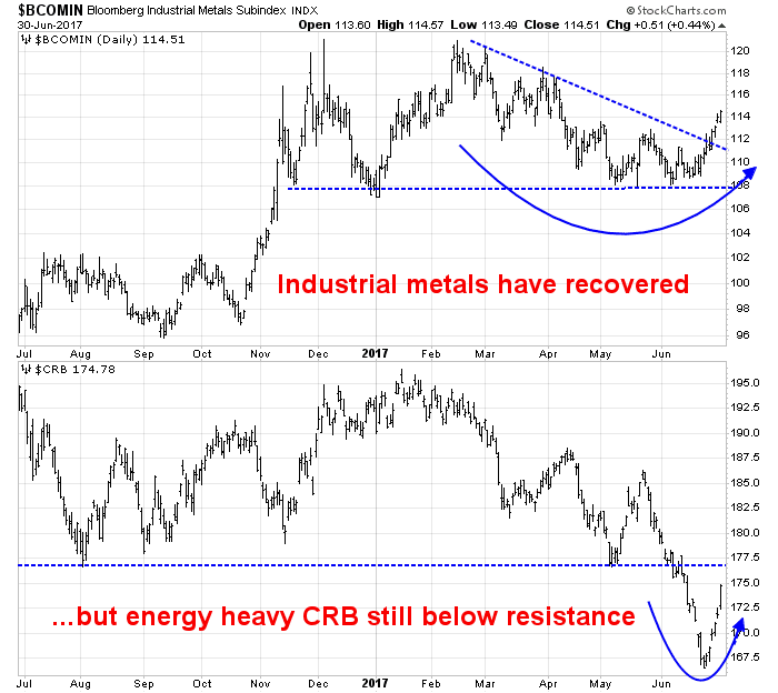
Indeed, the prices of industrial metals have staged an upside breakout from a downtrend. By contrast, the energy heavy CRB Index is still struggling to test a key technical resistance line.
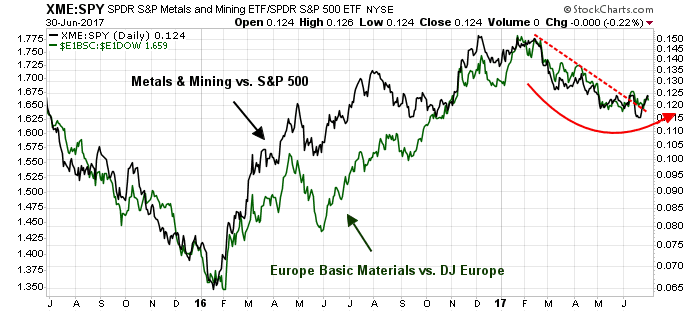
The relative market performance of mining stocks in the US and Basic Material companies in Europe are also tracing out constructive bottoming and recovery patterns, indicating the global nature of the upturn.
By contrast, both American and European Energy sectors remain in relative downtrends.
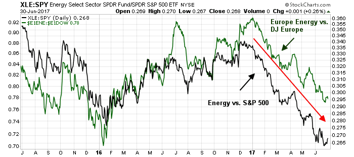
Even though the above chart shows that Energy stocks are staging a relative strength rally, there are no definitive signs that their relative strength is anything more than just a blip in relative downtrends – until now.
The energy pain trade
Short energy stocks is another potential pain trade. Sentiment in the energy sector is getting washed out. Should oil and commodity prices turn up, that would be the setup for a second pain trade that could rip the faces of the shorts. Sentiment Trader recently documented how Rydex assets in energy is at all-time lows.

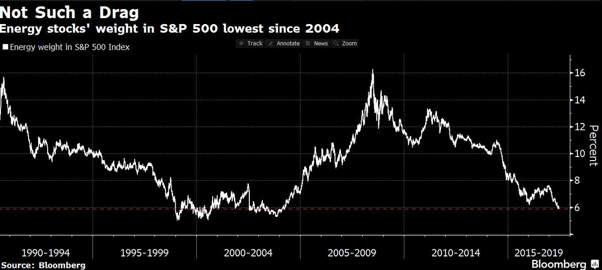
Here is another way of thinking about this sector, the weight of Energy in SPX hasn’t been this low since 2004.
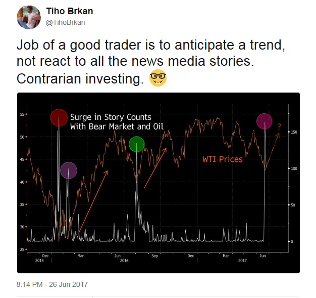
Tiho Brkan pointed out that Google searches for “bear market” and “oil” have spiked, an levels are consistent with readings at past market bottoms in oil prices.
Washed out sentiment aside, it is unclear what the exact catalyst is for an oil price revival, but there are two possible fundamental candidates. Marketwatch recently reported that energy analyst Phil Flynn’s forecast of a shale oil production crash. Low prices have prompted wildcatters to cut back on their exploration budgets. Consequently, the discovery of new fields have plummeted. While rig counts remain steady, their productivity is starting to fall, which led to Flynn`s conclusion of a shale oil production crash.

As well, the elevation of Mohammed bin Salman (MbS) as the new Crown Prince raises the risk of geopolitical disruption in oil prices. MbS has been the architect of Saudi Arabia’s more aggressive foreign policy, such as its military adventure in Yemen, which has turned into a quagmire, and the isolation of Qatar. These foreign policy initiatives have been aimed at curbing Iranian influence in the Gulf. Therefore the risk of either a Saudi-led diplomatic or military confrontation with Iran in the near future has risen considerably. Such an event has the potential to disrupt oil supply from the region and spike prices.
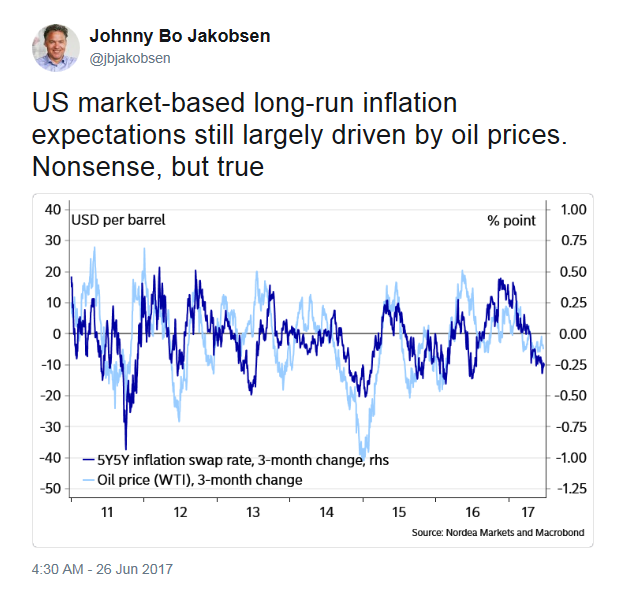
Here is why the price of crude matters. Johnny Bo Jakobsen documented a long-term relationship between oil prices and inflationary expectations.
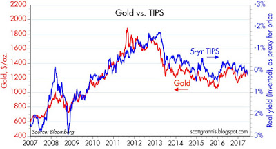
Scott Grannis found a similar relationship between gold prices and 5-year inflation-indexed bond yields.
If commodity prices were to start rising again, it will lead to rising inflationary expectations. The Fed, which is already intent on rate normalization, will have no choice but to respond with a more hawkish monetary policy. The combination of more rate hikes and balance sheet reduction will, at some point, choke off growth enough to push the economy into recession.
It is said that no one rings a bell at market tops, but a recovery in commodity prices is as close to a signal as investors are likely to get. I would caution, however, that a definitive turnaround in oil and other commodity prices hasn’t occurred yet.
The trade war wildcard
Last week, I wrote that policy was likely to be a bigger driver of market returns than economic data in a data light week (see All eyes on policy makers). That is especially true today, as Axios reported that the US is on the verge of imposing broad tariffs on steel:
One official estimated the sentiment in the room as 22 against and 3 in favor — but since one of the three is named Donald Trump, it was case closed.
No decision has been made, but the President is leaning towards imposing tariffs, despite opposition from nearly all his Cabinet.
As the imposition of tariffs has the potential to set off a trade war, such a development could freak out the markets. Business Insider reported that the estimated effects of a trade war could cut 0.5% to 1.0% from GDP growth next year:
Michael Gapen, a chief US economist at Barclays, in December estimated the economic drag that broader tariffs on imports from China and Mexico, two of Trump’s favorite targets, may have on US GDP growth.
One idea floated by the Trump team previously was a 15% tariff on Chinese imports and a 7% tariff on Mexican imports — modestly above their current levels of 2% to 10%, depending on the good. In this scenario, Gapen estimated that the US would see a 0.5% reduction in annual GDP growth in the year after implementation.
Meanwhile, Buiter said Citi estimates trade and other policy uncertainties could be a 1% drag on US GDP over the next year.
A decision to impose tariffs on steel has a geopolitical dimension as well. Among countries that are likely targets of sanctions are China and South Korea. Such a move would setback American efforts to contain North Korea’s nuclear and missile development ambitions, and would have the effect of raising tensions in North Asia.
Under more “normal” circumstances, late cycle expansion accompanied by inflationary pressures from rising commodity prices would see an inflationary driven equity market blow-off, led at first by Industrials, followed by Energy and Materials. All bets are off if the Trump Administration’s steel tariffs spark a trade war.
Under those conditions, we may see a choppy market top develop characterized by sector rotation. Winners would include Energy and Materials, especially the steel producers. Losers would be concentrated in Consumer Discretionary and Industrials as cost of inputs rise, which would squeeze margins.
In short, market conditions are setting up for a last gasp market blow-off. However, we have to allow for the possibility that the market may have already made its high for this cycle, and the major averages will consolidate in a choppy sideways pattern before the bearish fundamental fully assert themselves. My inner investors remains constructive on equities, but he is inclined to replace his long equity positions with buy-write ETFs such as PBP as a way of controlling his equity risk.
The week ahead: Another pain trade setup
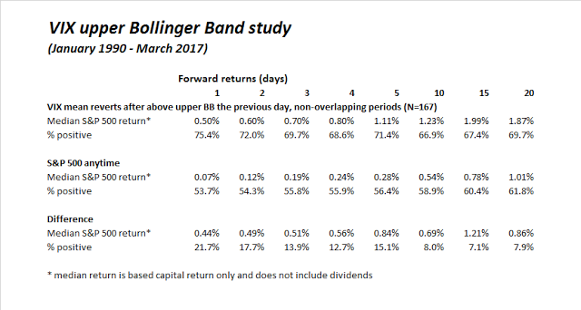
In the short-term, there is another possible pain trade setup. The SPX tested its 50 day moving average on Thursday and recovered Friday. In the course of that test, the VIX Index closed marginally above its upper Bollinger Band (by 0.01), and mean reverted.

I had outlined a VIX upper Bollinger Band study several weeks ago (see A market top checklist). The market action on Thursday and Friday constituted a buy signal for this model whose past returns are shown below. Consequently, the trading model has flipped from a “sell” to a “buy” signal, and the “arrow” now points upwards.
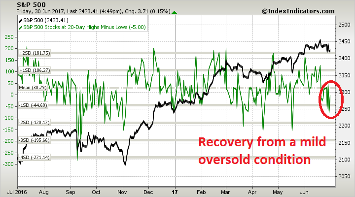
The latest readings from Index Indicators show that the market reached a minor oversold reading and recovered. A rally from these levels to test and possibly break out from all-time highs is well within the realm of possibility.
I took a few days off with my family late last week after the end of the school year and my inner trader did not recognize the signal until after the close on Friday. Barring any surprise announcements on the steel tariff front, he expects to enter into a small long position in the SPX on Monday.

A positive for oil related stocks is the high yield bond spread has not widened as the crude price fell from mid 50s to low 40s. Remember the high yield crash in 2015 when crude was falling back then. Seems investors recognize the companies are adapting successfully.
One extremely positive sign for an intermediate turnaround in energy stocks is that the underperforming, low quality names are finally starting to outperform the quality companies. This is what I call a “Twist”. It kicks off a new uptend and lasts for a few months.
The sentiment exhaustion that Cam refers to plus this Twist led me to buy the energy ETF this week.
Here is the Crash Victim chart I made with a rebased June 22 low point.
https://product.datastream.com/dscharting/gateway.aspx?guid=7dde9731-2fd2-4d94-8683-0e7c5d27c20e&action=REFRESH
As I say in my book, I will stay in energy until it underperforms the general market index on this rebased chart. This is how one builds a safety valve against making a mistake of buying too early in a continuing downtrend.
A positive for oil related stocks is the high yield bond spread has not widened as the crude price fell from mid 50s to low 40s. Remember the high yield crash in 2015 when crude was falling back then. Seems investors recognize the companies are adapting successfully.
One extremely positive sign for an intermediate turnaround in energy stocks is that the underperforming, low quality names are finally starting to outperform the quality companies. This is what I call a “Twist”. It kicks off a new uptrend and lasts for a few months.
The sentiment exhaustion that Cam refers to plus this Twist led me to buy the energy ETF this week.
Here is the Crash Victim chart I made with a rebased June 22 low point.
https://product.datastream.com/dscharting/gateway.aspx?guid=7dde9731-2fd2-4d94-8683-0e7c5d27c20e&action=REFRESH
As I say in my book, I will stay in energy until it underperforms the general market index on this rebased chart. This is how one builds a safety valve against making a mistake of buying too early in a continuing downtrend.