Preface: Explaining our market timing models
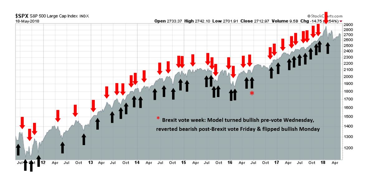
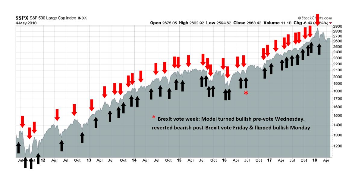
We maintain several market timing models, each with differing time horizons. The “Ultimate Market Timing Model” is a long-term market timing model based on the research outlined in our post, Building the ultimate market timing model. This model tends to generate only a handful of signals each decade.
The Trend Model is an asset allocation model which applies trend following principles based on the inputs of global stock and commodity price. This model has a shorter time horizon and tends to turn over about 4-6 times a year. In essence, it seeks to answer the question, “Is the trend in the global economy expansion (bullish) or contraction (bearish)?”
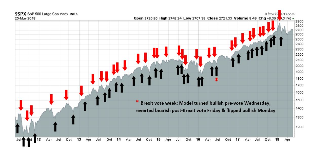
My inner trader uses the trading component of the Trend Model to look for changes in the direction of the main Trend Model signal. A bullish Trend Model signal that gets less bullish is a trading “sell” signal. Conversely, a bearish Trend Model signal that gets less bearish is a trading “buy” signal. The history of actual out-of-sample (not backtested) signals of the trading model are shown by the arrows in the chart below. The turnover rate of the trading model is high, and it has varied between 150% to 200% per month.
Subscribers receive real-time alerts of model changes, and a hypothetical trading record of the those email alerts are updated weekly here.
The latest signals of each model are as follows:
- Ultimate market timing model: Buy equities
- Trend Model signal: Bullish
- Trading model: Bullish
Update schedule: I generally update model readings on my site on weekends and tweet mid-week observations at @humblestudent. Subscribers receive real-time alerts of trading model changes, and a hypothetical trading record of the those email alerts is shown here.
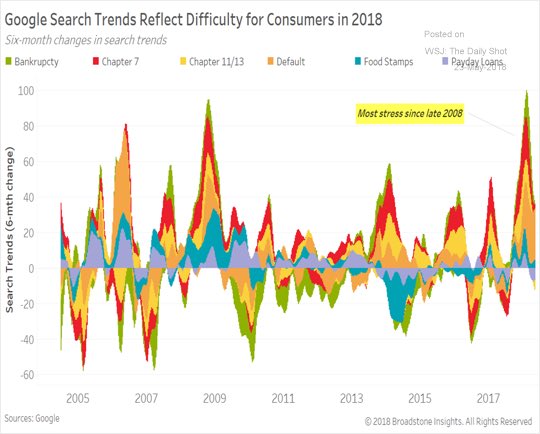
Rising household stress
The headlines look dire. CNN proclaimed that “40% of Americans can’t cover a $400 emergency expense”, according to the Fed’s annual Report on the Economic Being of US Households. Further research from Google Trends showed that interest in consumer items is tanking.

In addition, searches for bankruptcy and financial reorganization spiked recently, indicating rising stress in the household sector.
Last Friday’s release of consumer sentiment missed expectations and readings are continue to deteriorate.

The economy is at or near full employment. Is this as good as it gets? Is this what prosperity looks like? What does this mean for policy makers?
For investors, the key question are:
- How stressed is the household sector; and
- Is this precursor to a bull market killing recession?
A household sector report card
To assess the financial status of the American household, let us first consider real retail sales, which is an important driver of economic growth. History shows population adjusted real retail sales has topped out before past recessions, and the latest data shows a possible plateau, but the jury is still out on that score. In the past, it takes about six months to confirm an actual peak in retail sales. The last peak occurred in November 2017, and the May 2018 data has not been reported yet.

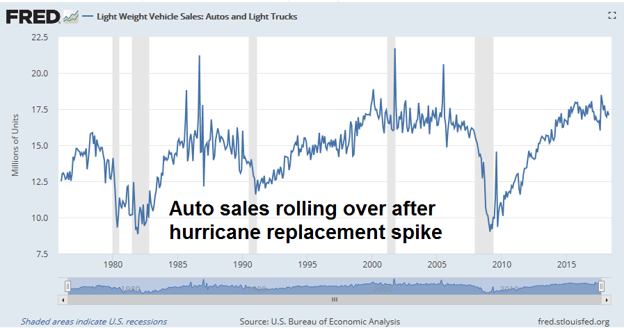
If consumer spending were to weaken, it would show up in the cyclically sensitive consumer durable sector. The report is also mixed. On one hand, auto sales appear to be rolling over after the most recent hurricane replacement spike.
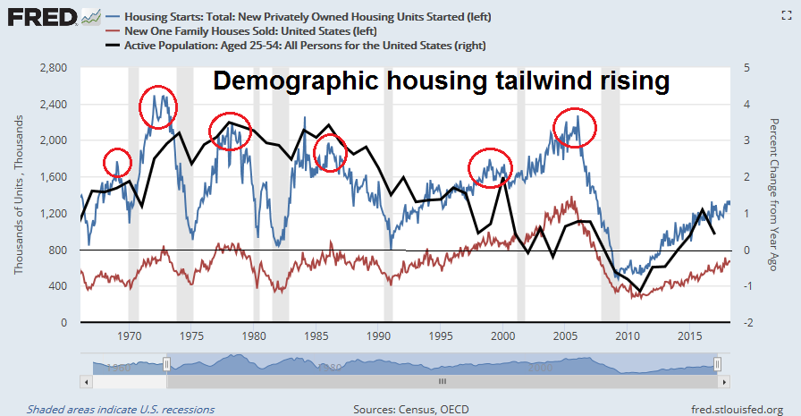
On the other hand, the housing sector appears to be still healthy. This cyclically sensitive sector has topped out ahead of past recessions, though it is enjoying a start of a demographic tailwind as millennials begin to enter the market and raise housing demand.
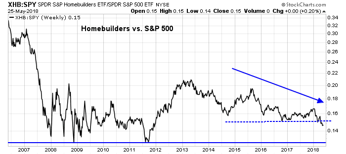
That said, the weak performance of the homebuilding stocks relative to the market has to be regarded as disappointing for the housing outlook.
Score retail sales and consumer durable sales growth as neutral. Real retail sales are trending up but may be plateauing, but the jury is still out. Auto sales are rolling over, but the housing sector remains strong, buoyed by positive demographics. The dire stories about a tanking consumer may be overblown.
The anatomy of consumer finances
Still, there is an element of truth that household finances are becoming more fragile. My analysis of consumer spending considers its underlying elements. It all begins with wage growth. While average hourly earnings have been rising steadily and annual growth now stands at 2.6%, the level of wage growth has been extraordinarily muted by historical standards. The unemployment rate is 3.9%, which was last seen in 2000, and before that, the 1960`s.
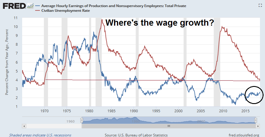
One of the puzzle that has bedeviled economists and policy makers is the lack of wage growth in the current tight labor market. A number of explanations have been advanced, such as demographics, where retiring well paid Baby Boomers are replaced by younger and less well paid Millennials. Another is the rise of an employer monosony holding down wages. The following chart from the San Francisco Fed shows “wage rigidity”, or the percentage of employees who have received no wage increases. Even with the unemployment rate at 3.9%, the current level of wage rigidity is higher than the peak seen in the last cycle.

Wage growth is the primary driver of consumer spending. As this chart from Political Calculations shows, median real household income has been flat since 2000.

Still, households have other ways of coping in the face of stagnant pay increases. The first avenue of coping is to spend more by saving less.

After drawing down savings, consumers could borrow to finance spending. The Fed’s flow of funds data shows that households are funding virtually all of their marginal expenditures with debt, up from 40% in 2013.

Rising debt raises financial risk for households. An analysis of the credit card delinquencies shows that as interest rates rise, delinquencies are likely to rise to recessionary levels by next year.

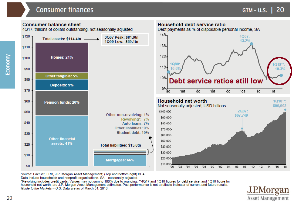
Despite the dire picture, household finances are not that dire as they seem. The latest update from JPM Asset Management shows that household debt ratios are still low, and their balance sheets are in good shape (annotations are mine). In other words, they have plenty of room to borrow if they want to.
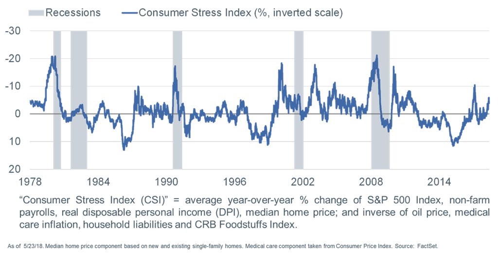
Liz Ann Sonders at Charles Schwab has created a Consumer Stress Index to measure the state of household finances. The latest readings indicate that consumer stress is rising, but readings are not in the danger zone yet.
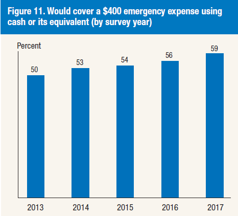
Oh, and the headline about 40% of American households who can`t cover a $400 emergency expense? While the absolute level is still worrisome, the same Fed survey shows that the trend has been steadily improving.
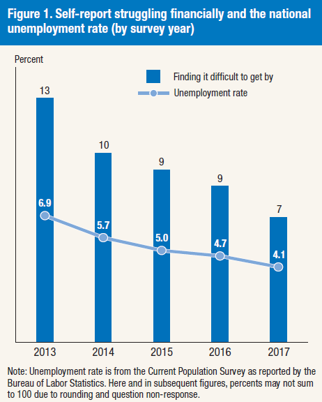
Moreover, the percentage of survey respondents who report that they are “finding it difficult to get by” has been falling as well.
A growing financial divide
Does this mean the ominous headlines about deteriorating consumer finances are overblown and it’s time to sound the all clear? Not so fast!
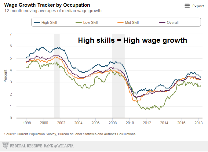
Detailed analysis an picture of bifurcated consumer finances and rising household fragility that will haunt the economy in the next downturn. The Atlanta Fed’s wage growth tracker captured this effect. People with high skill sets consistently enjoyed higher wage growth compared to the rest of the population. Remember your math, a consistently higher wage growth will lead to an acceleration in wealth differences over a lifetime.
While the relationship is less clear, skill sets can be proxied by education levels.

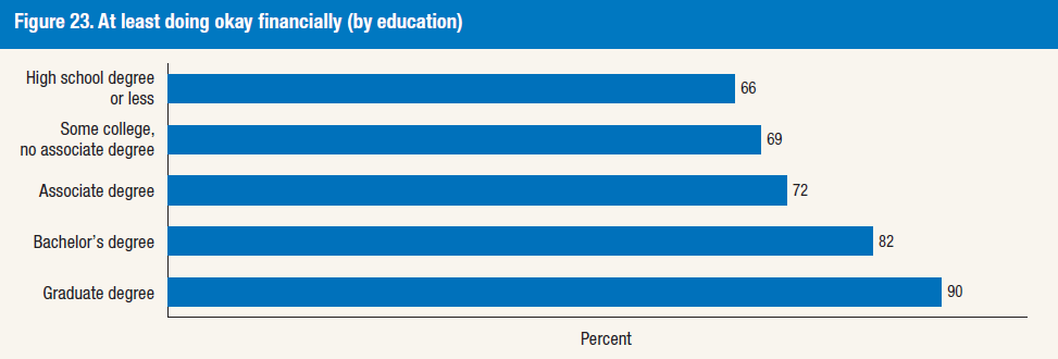
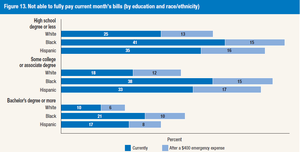
The Fed’s annual Report on the Economic Being of US Households tells a similar story of a financial divide is by education. Survey respondents were asked if they were “doing okay financially” and results increased steadily as education levels rose.
The flip side of the coin shows the respondents who were unable to fully pay the current month’s bills. We can observe a marked deterioration by education, and within each educational grouping, by race.
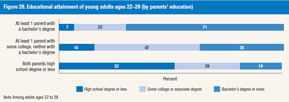
What about the American Dream and the idea of America as the land of opportunity? If education is the great equalizer, then the future looks problematical. Survey results show that parental educational attainment affect their children’s education levels.
In conclusion, aggregate statistics of household finances indicate that while consumer stress is rising, they do not constitute a danger signal of looming recessionary conditions. However, aggregates don’t tell the entire story, and further detailed analysis shows a bifurcation of household finances that will exacerbate the magnitude of the next downturn, and create longer term political problems in the United States.
The week ahead
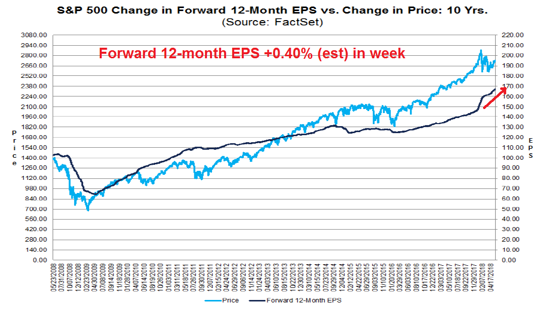
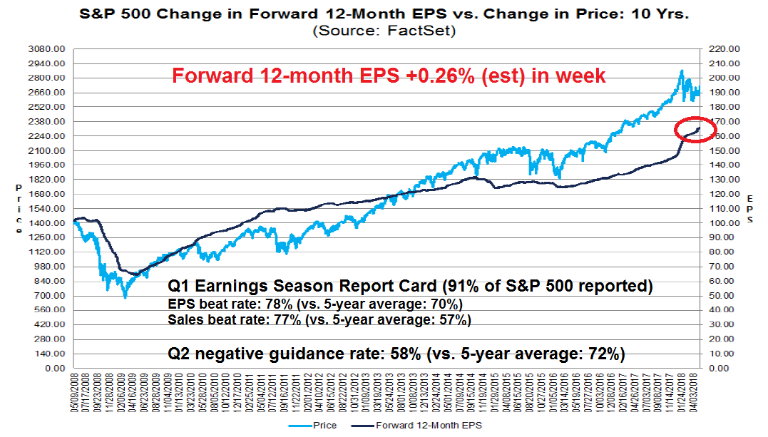
Looking to the week ahead, positive macro momentum is holding up this market. The latest update from FactSet shows that forward 12-month EPS continues to surge upward.
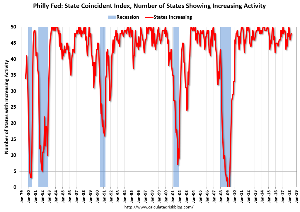
Other nowcast indicators are flashing bullish readings. The Philly Fed coincident state indices rose in 45 states, and the three month diffusion index was up in 49 states out of 50 (via Calculated Risk). Other elements of the Philly Fed indices are also upbeat (see Bear markets simply don’t start this way).
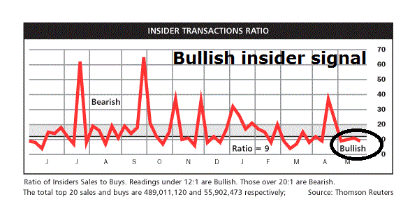
From an intermediate term technical perspective, the outlook is bullish. This chart from OpenInsider shows that insider selling usually exceeds insider buying and rarely do the two lines cross. In the last two instances where the two lines have intersected, downside equity risk was minimal.
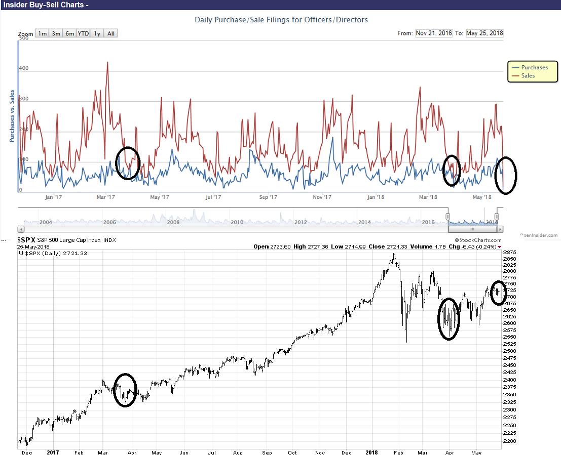
The OpenInsider buy signal was confirmed by the weekly summary of insider activity from Barron`s.
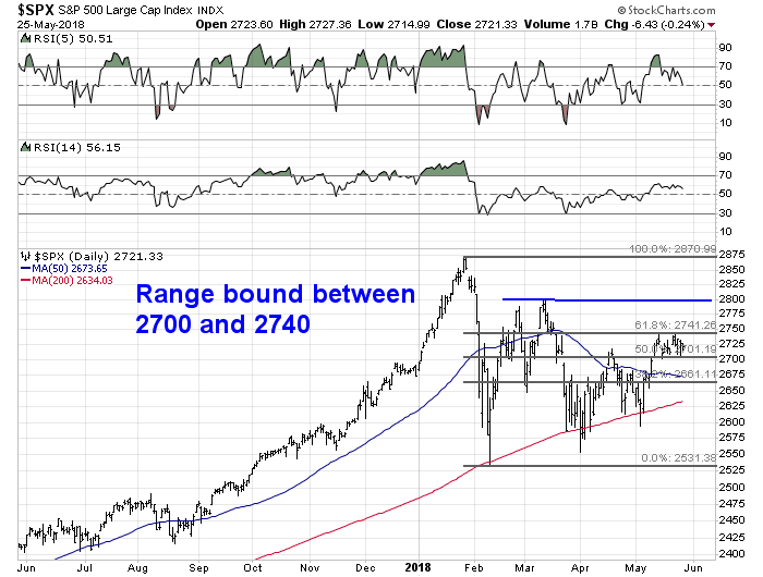
Shorter term, the SPX remains in a short-term no-man’s land between Fibonacci retracement levels of 2700 and 2740, with further resistance at 2800. Until either the bulls or bears can demonstrate sufficient resolve to break either of these levels, my inner trader is leaning slightly bullish but he is playing a waiting game.
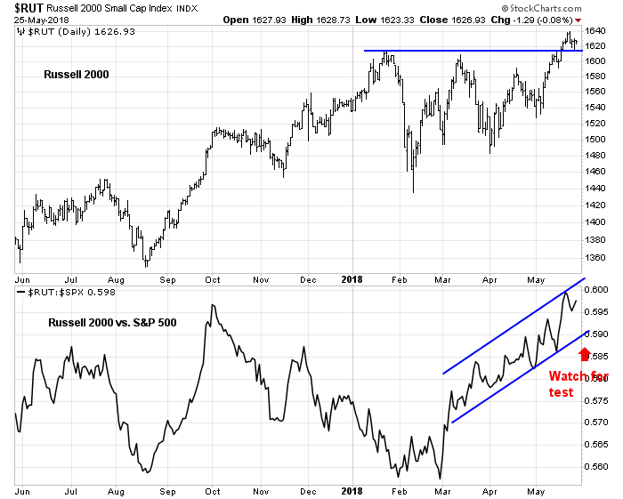
Small cap stocks, as measured by the Russell 2000, remains the market leaders as they staged upside breakouts to fresh highs and the index has held above the breakout level. However, the relative performance chart (bottom panel) shows that small caps are in the middle of an upward sloping relative uptrend channel and have little information about short-term direction. My inner trader is still watching for a test of the channel as a possible buy signal.
Stock prices are likely to grind higher into the summer months, and my inner investor is bullishly positioned. My inner trader has partial long market positions, and he is prepared to add to them on pullbacks.
Disclosure: Long SPXL
Cue the fiscal and inflation fears
Was the recent big tax cut not enough? CNBC reported that President Trump is proposing further tax cuts before November. He went on to pressure Congress to enact funding for his budget priorities on Twitter.
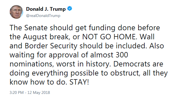
These actions prompted Steve Collender (aka @thebudgetguy) to declare in a Forbes article that Trump May Be The Most Fiscally Reckless President in American History:
But think about why Trump is asking for rapid action on the 2019 appropriations: He wants even more spending. Even though his policies have spiked the annual budget deficit to a new normal of a $1 trillion (with $2 trillion definitely within view) and interest rates are now starting to go up in large part because of his out-of-sync-with-the-economy stimulative fiscal policy, Trump is demanding that federal spending and the government’s red ink be increased even further.
There was no hint in this or any other subsequent tweet that Trump is going to propose offsetting spending cuts (or, heaven forbid, revenue increases) to compensate for the additional spending he’s demanding.
Trump’s recently-announced rescission package (which is already in a great deal of political trouble with congressional Republicans) doesn’t come close to offsetting the new spending Trump said he wants. It also won’t come close to being an offset even if the first package is followed with that second rescission plan Trump has said is coming, but which so far seems to be totally imaginary.
Here at Humble Student of the Markets, I believe that the determination of the proper path of fiscal policy is above our pay grade. Instead, my focus is on positioning portfolios for any changes in government policy.
Plenty of concerns
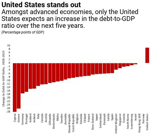
Steve Collender is not the only one to raise the alarm about the US fiscal position. The IMF also expressed concerns, as the US is the only major industrialized country projected to see increases in its debt-to-GDP ratio.
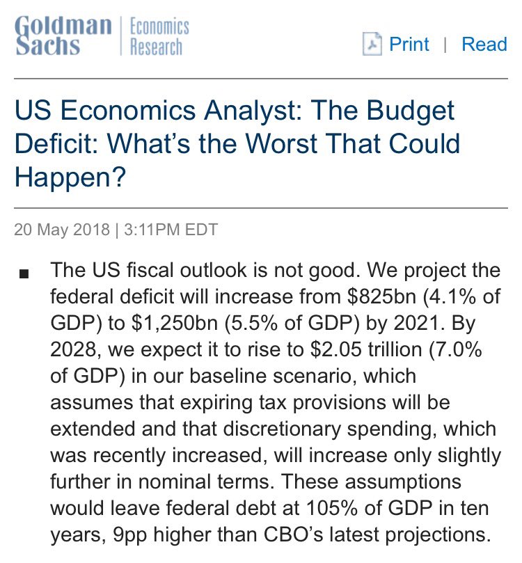
Goldman Sachs also recently raised questions about the fiscal outlook.
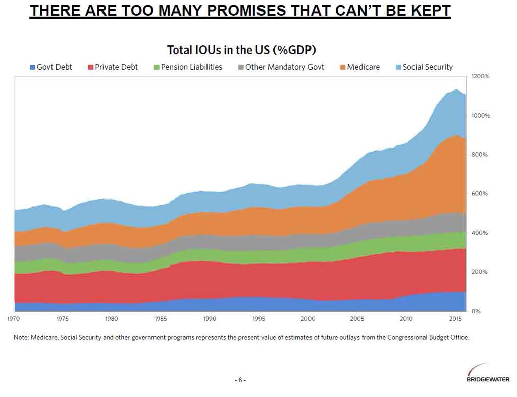
Federal debt is just the tip of the iceberg. Bridgewater Associates recently published a chart of out of control IOUs.
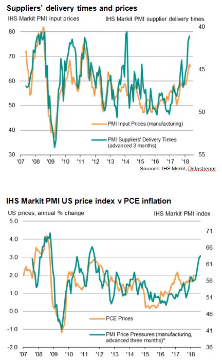
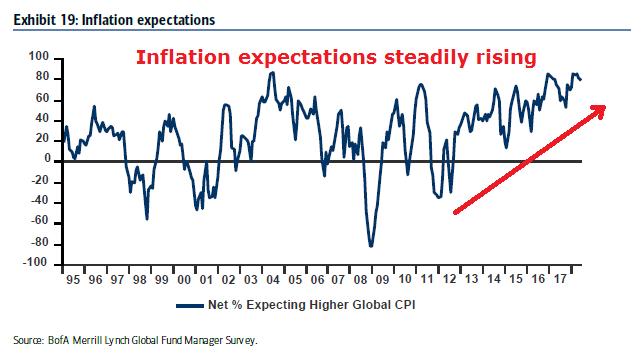
Rising inflation fears
The usual solutions to runaway debt are either default or inflation. For a country whose currency is a major global reserve currency, the easy answer is inflation. Already, the latest update from Markit shows rising inflationary pressures.
The latest FOMC minutes added fuel to the inflation fire by affirming the symmetry of the inflation target at 2% and signaling a tolerance for an overshoot [emphasis added]:
With regard to the medium-term outlook for monetary policy, all participants reaffirmed that adjustments to the path for the policy rate would depend on their assessments of the evolution of the economic outlook and risks to the outlook relative to the Committee’s statutory objectives. Participants generally agreed with the assessment that continuing to raise the target range for the federal funds rate gradually would likely be appropriate if the economy evolves about as expected. These participants commented that this gradual approach was most likely to be conducive to maintaining strong labor market conditions and achieving the symmetric 2 percent inflation objective on a sustained basis without resulting in conditions that would eventually require an abrupt policy tightening…It was also noted that a temporary period of inflation modestly above 2 percent would be consistent with the Committee’s symmetric inflation objective and could be helpful in anchoring longer-run inflation expectations at a level consistent with that objective.
What to buy?
Regardless of my personal beliefs about the correct path for US fiscal and monetary policy, I believe investors in an era of rising fiscal tension and rising inflationary expectations should be buying inflation hedge vehicles for protection.
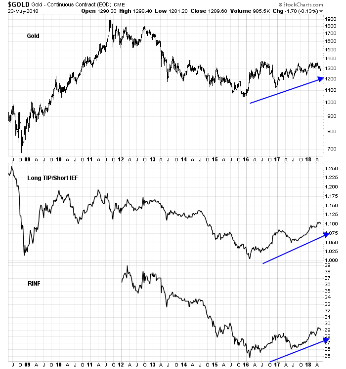
I have two suggestions. The classic inflation hedge is gold. From a technical perspective, gold has been basing since 2013, and in an uptrend that began in early 2016. More remarkable is the resilience of gold in the face of recent USD strength, which has shown an inverse correlation to bullion.

Absolute return oriented investors may wish to consider buying inflation breakeven in the credit markets. Kevin Muir, otherwise known as the Macro Tourist, explains it this way:
Although my short-term forecast is uncertain, I have a long-term one. Eventually, the Federal Reserve will lose control of inflation expectations. When that happens, owning TIPS might not be a winning trade in absolute terms, but rather simply offer relative protection versus traditional bonds from a rising inflation environment. If you want to profit from this widening, you need to have the other side of the trade on too. You have to be long TIPS, but also short Treasuries. Owning TIPS outright is not good enough.
Muir went on to outline two ways of trading inflation expectations. One is to buy TIP and short a Treasury ETF (IEF or TLT) at the right hedge ratio. The other is to buy an illiquid inflation expectations ETF (RINF) with a high (3.87%) gross expense ratio. Please note that the accompany chart showing a long TIP and short IEF position is for illustrative purposes only as it takes duration risk and therefore not interest rate neutral.
None of these hedges are perfect. You pay your money and take your chance.
Bear markets simply don’t start this way
Mid-week market update: There remains a fair amount of stock market skittishness among my readers and on my social media feed. Let me assure everyone that bear markets simply don`t start this way.
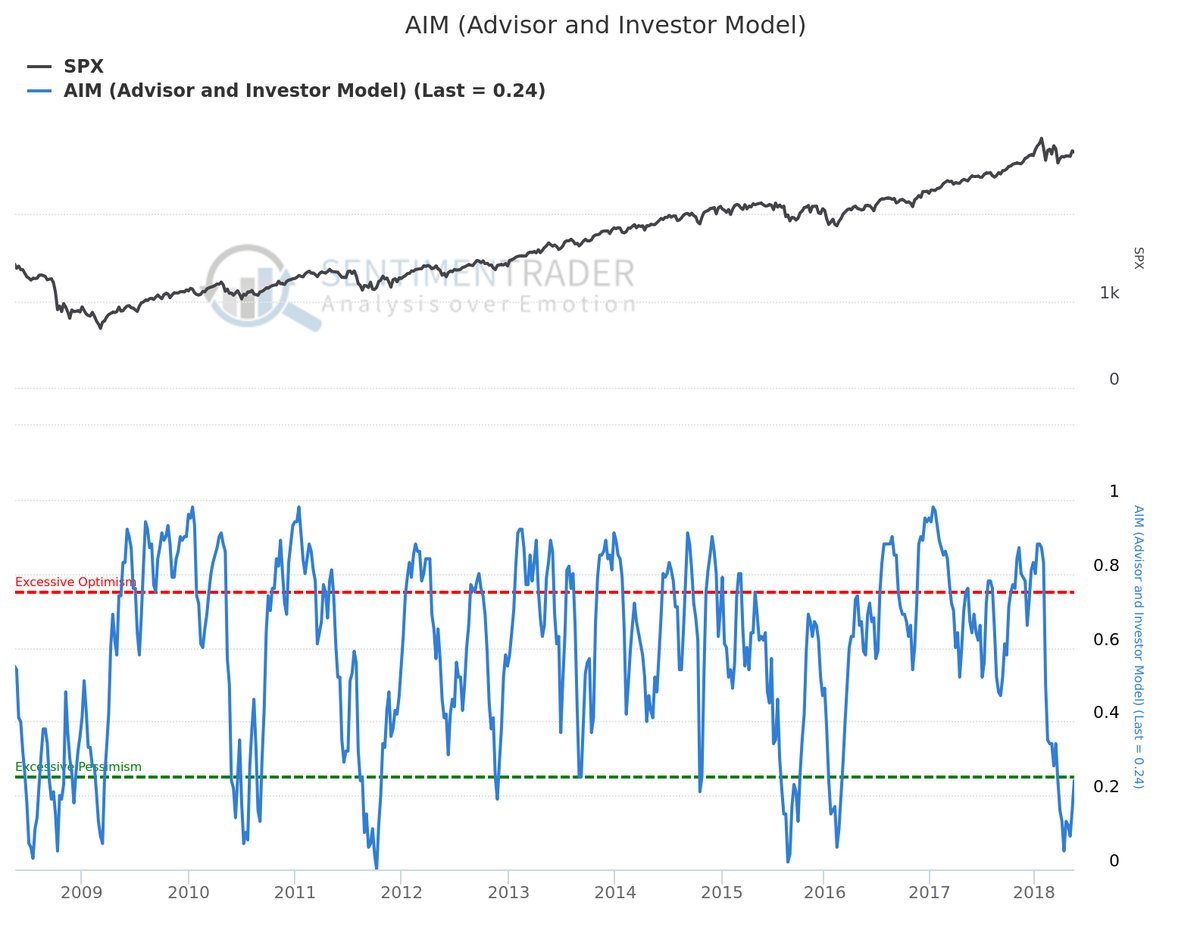
SentimenTrader has an intermediate to long-term sentiment model called AIM “which averages the momentum of the four major sentiment surveys”. This model is not perfect at calling the exact bottoms or spotting exact turning points. Nevertheless, it has done a good job of defining the risk and reward of owning stocks when readings are at bearish extremes, which is contrarian bullish. The model is currently on a buy signal.
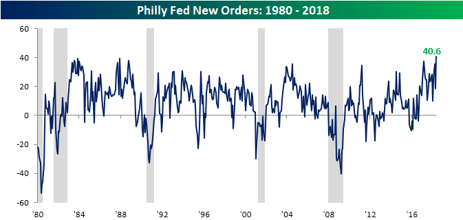
From a top-down macro perspective, Bespoke recently pointed out that the Philly Fed General Conditions Index hasn’t been this high for some time. Despite the mutterings of permabears (I’m looking at you Rosie), recessions simply do not start this way.
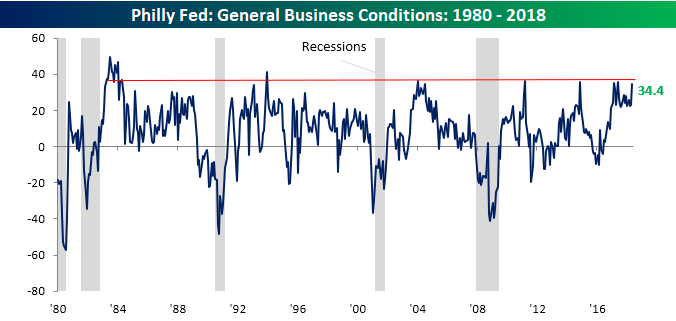
BTW, the Philly Fed New Orders component surged to an all-time-high, and the last time it rose this much in a single month was October 2005.
These conditions are all pointing to further intermediate term equity strength. Expect a test of the old highs in the major equity indices this summer, and probably new all-time highs.
However, stock prices don’t go up in a straight line. The short run equity outlook is a little different.
Trust the bull, but verify the trend
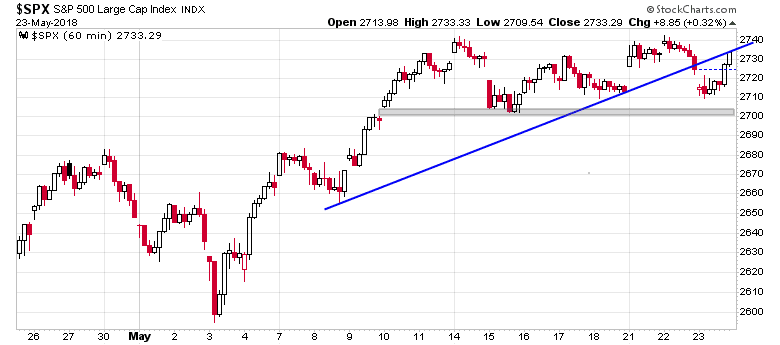
In the short-term, the bulls face a number of challenges. While the upside breakout through the downtrend line is constructive, the SPX failed at 2740 resistance while exhibiting a negative RSI-5 divergence. These conditions suggest some consolidation or pullback over the next few days. Likely support can be found at the partially filled gap at about 2700.
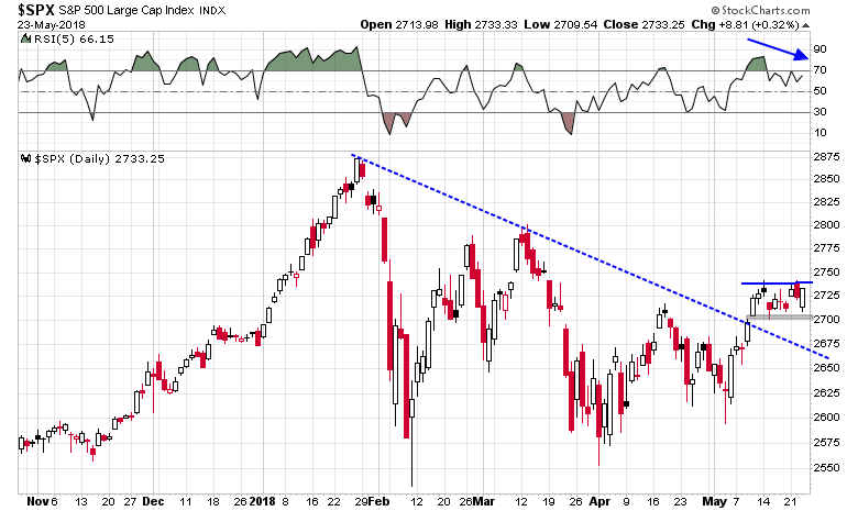
The hourly chart is also supportive of the minor pullback thesis. The index breached an uptrend line that began on May 8, 2018. Under these conditions, minor weakness is likely, and it will be up to the bears to see if they can take control of the tape.
In light of the recent resurgence of small cap leadership and likely short-term market weakness, my main working hypothesis calls for either a successful SPX test at 2700, or a test of the small cap relative uptrend as signals that the pullback is over.

My inner trader remains partially long the market. He trusts the bull, but he is verifying the short-term trend.
Disclosure: Long SPXL
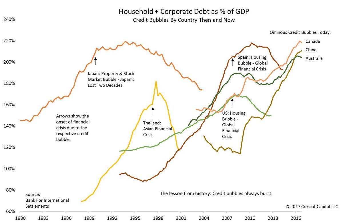
The struggling Canadian canary
Back in March, I wrote about the new Fragile Five, which were five highly leveraged developed market economies that were undergoing property booms. The five countries are Australia, Canada, New Zealand, Norway, and Sweden.
As a reminder of how insane property prices are in Vancouver, which is one of the epicenters of the real estate boom, I highlighted this little gem that was listed for about USD 1 million.

Here is the same beauty from the back.

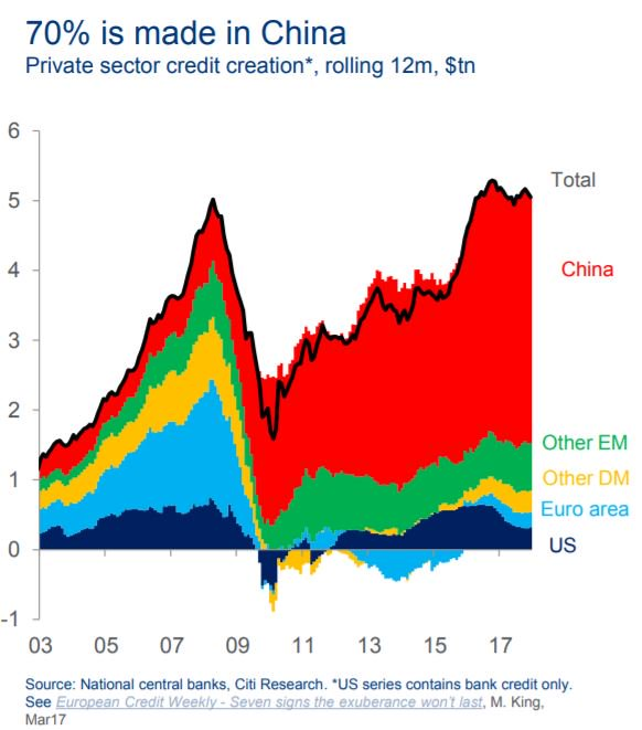
For some perspective. This chart depicts the debt bubble in Canada and Australia. If you are worried about runaway debt in China, then you should be equally concerned about the property bubble in the other Fragile Five countries.
So far, this has been a “this will not end well” investment story with no obvious bearish trigger. Now, there seems to be signs of a turning point in the Canadian economy.
The canary in the coalmine
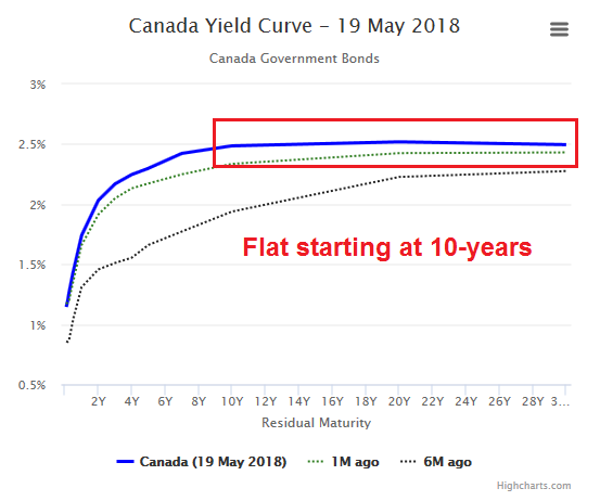
The Financial Post reported last week that the long end of the Canada yield curve had inverted.
The yield on Canada’s 10-year government bond briefly rose above the nation’s 30-year securities for the first time in more than a decade Thursday. The shorter-maturity notes have sold off in the last few days, pushing yields above 2.5 per cent for the first time since 2014. Canada is the only developed economy with that part of its yield curve inverted, according to data compiled by Bloomberg.
While I recognize that most investors monitor the yield curve at the short end, because central bankers control the short rate and short-to-long yield curve inversion is a signal of the central bank’s monetary policy. An inversion at the long end is equally disturbing, because it is reflective of the market’s growth expectations.
By week’s end, the yield curve had steepened and the 30-year Canada was trading 1bp above the 10-year. Whew!
Nevertheless, the Canada yield curve is very flat starting from the 10-year mark. This is a sign that the Canadian canary in the economic coalmine is struggling.
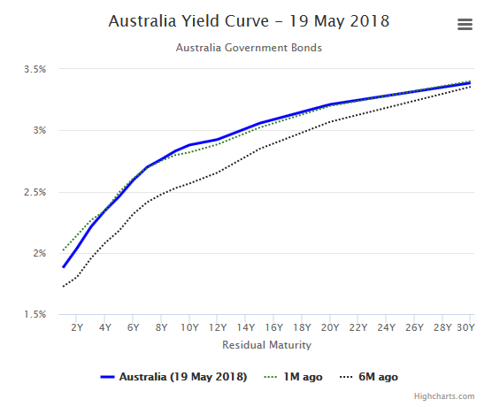
To be sure, the yield curves of the other Fragile Five countries continue to be upward sloping and there are no other danger signals. Here is Australia as an example.
How bad can it get?
While property bubble in Canada has begun to spread to a number of Canadian cities, it has largely been concentrated in Vancouver and Toronto. The rise in prices began with the leakage of excess liquidity from China into overseas property markets (see How China’s Great Ball of Money rolled into Canada). Locals joined the buying stampede, fueled by cheap and easy credit.
Not all bubbles are the same, but the Canadian experience is reminiscent of the Spanish experience with Costa del Sol before the Great Financial Crisis. Foreign (European) money poured in the region, attracted by the warm climate, and the location within the EU. Fueled by cheap credit, a buying and construction stampede followed. We know how these bubbles all end.
The historical experience shows that prices fell by between one-third and one-half over the course of several years. Expect a similar price adjustment process for Vancouver and Toronto real estate.

While a 30-50% price decline is painful, it can wipe out late buyers, as many bought in with 5-10% down payments. Moreover, the local papers was full of stories of homeowners who borrowed at 2-3% with home equity lines to fund mortgage lending pools that were lending at 5-8%. It was free money! What could possibly go wrong?
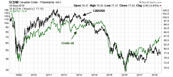
I have been asked for ways to short Canadian real estate, but there are no obvious plays. Much of the pain will be borne by the Canada Mortgage and Housing Corporation, which is a federal government entity that sells mortgage insurance. In that case, one way to play a collapsing Canadian property bubble would be to short the Canadian Dollar. The risk to that trade is CADUSD has historically been correlated to oil prices, which has been trending upwards.
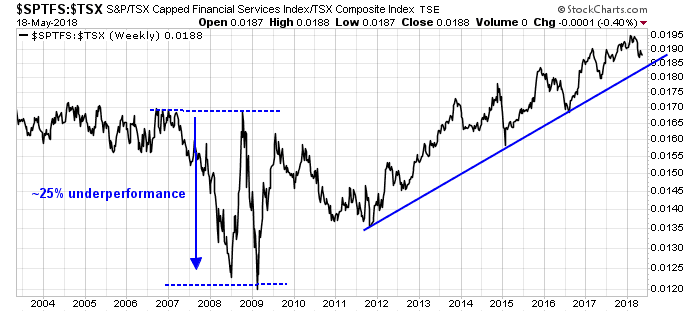
The carnage will also be felt by much of the financial sector. Canadian financial stocks underperformed the market by 25% in the last crisis, but banks had adhered to far more prudent lending standards compared to America in 2007. This time, Canadian institutions have been piling into property lending like drunken sailors, and expect loan losses to exceed the experience in the last cycle. The key risk to this trade is timing. While Canadian financials have begun to roll over relative to the market, the sector remains in a multi-year relative uptrend.
Rather than try to profit from a bursting Canadian property bubble, I prefer to take a global view and monitor the situation. Should Canada be the first of the G-7 markets to roll over into recession, it will serve as a warning to the other Fragile Five economies – and the rest of the world.
Disclosure: As a Canadian resident, I am naturally long CAD
Deconstructing the institutional pain trade
Preface: Explaining our market timing models
We maintain several market timing models, each with differing time horizons. The “Ultimate Market Timing Model” is a long-term market timing model based on the research outlined in our post, Building the ultimate market timing model. This model tends to generate only a handful of signals each decade.
The Trend Model is an asset allocation model which applies trend following principles based on the inputs of global stock and commodity price. This model has a shorter time horizon and tends to turn over about 4-6 times a year. In essence, it seeks to answer the question, “Is the trend in the global economy expansion (bullish) or contraction (bearish)?”
My inner trader uses the trading component of the Trend Model to look for changes in the direction of the main Trend Model signal. A bullish Trend Model signal that gets less bullish is a trading “sell” signal. Conversely, a bearish Trend Model signal that gets less bearish is a trading “buy” signal. The history of actual out-of-sample (not backtested) signals of the trading model are shown by the arrows in the chart below. The turnover rate of the trading model is high, and it has varied between 150% to 200% per month.
Subscribers receive real-time alerts of model changes, and a hypothetical trading record of the those email alerts are updated weekly here.
The latest signals of each model are as follows:
- Ultimate market timing model: Buy equities
- Trend Model signal: Bullish
- Trading model: Bullish
Update schedule: I generally update model readings on my site on weekends and tweet mid-week observations at @humblestudent. Subscribers receive real-time alerts of trading model changes, and a hypothetical trading record of the those email alerts is shown here.
Institutions and the pain trade
The BAML Fund Manager Survey (FMS) is one of the most interesting surveys around, as the frequency is regular (monthly), extensive, and it has a long history. For readers who are unfamiliar with the survey, it reflects mainly the views of fund managers with global investment mandates.
Reading between the lines of the latest FMS results, I found that institutional managers are positioned for a late cycle inflation surge, but they are starting to de-risk their portfolios in anticipation of weaker growth. To summarize, institutional managers believe that:
- Growth momentum is slowing, but
- Inflation expectations are rising, but
- The day of reckoning, as defined by either a recession or even a yield curve inversion, is still a long way in the future.
Fund managers have positioned their portfolios:
- In commodities, which I interpret as positioning for a late cycle inflation surge, but
- They are de-risking by selling equities,
- Selling their emerging market (EM) positions, and
- Buying bonds, but
- Portfolio risk appetite remains above average.
The highlights of the consensus portfolio bets amount to long energy, short USD, and short bonds. This analysis is highly speculative, but if I were the market gods and I wanted to inflict the maximum level of pain on market participants, here is what I would do.
What institutions believe
Let`s start by unpacking the FMS results. Institutional investors believe that the economic cycle is in the late phase of an expansion. Growth momentum is slowing.
Inflation expectations are rising and they have been steadily increasing for several years.
Here is a possible anomaly. Even though managers believe that they are seeing classic signs of a late cycle expansion, the median manager believes that a yield curve inversion, which has preceded past recessions, will not occur until some time in 2019. How late cycle can the markets be if a yield curve inversion is that far off?
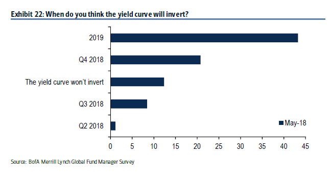
As well, the median manager expects the next recession will not occur until late 2019.

Buying inflation hedges, but de-risking
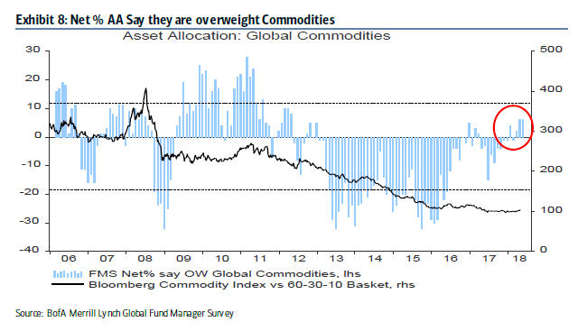
In accordance with the belief in rising inflation expectations, institutional managers are overweight late cycle inflation hedges such as commodities, though positions are not excessive.
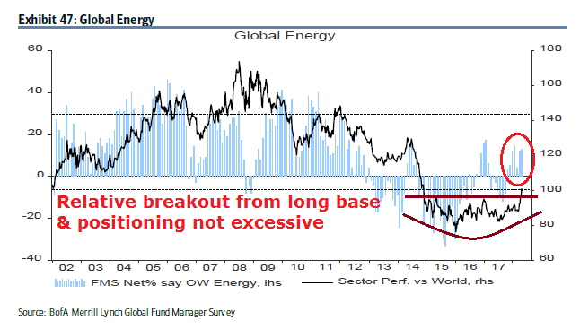
Similarly, energy stocks have staged an upside relative breakout from a multi-year base. Managers are also overweight, but positions are not extreme.
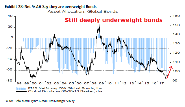
Risk on? Not so fast. Managers have begun to de-risk their portfolios by unwinding their extreme underweight bond positions, though they remain deeply underweight.
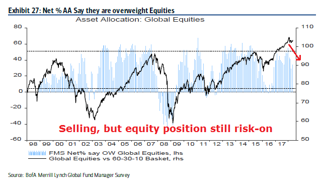
At the same time, they have begun to lower their equity weights, though their positioning remains risk-on and above average.
The de-risking starts with a sale of their high-beta EM positions.
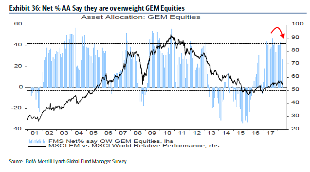
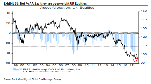
The equity weights in most developed regions have been falling.

The only major exception is the UK, which enjoyed a rebound. However, the weight of the UK in the MSCI All-Country World Index (ACWI) is only 5.8%.
The weight of US stocks, which has a 52% weight in ACWI, has been mixed. While US portfolio weights have been trending up for the past few months, it ticked down in the latest month.

How can managers be selling stocks while you espouse a belief in rising inflation, and overweight commodities? Shouldn’t they be buying beta instead of selling beta under these circumstances?
How the pain trade could develop
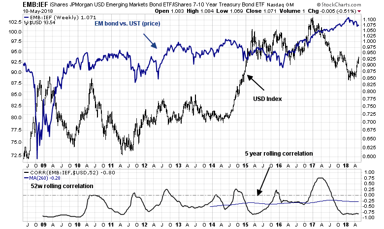
One of the clues to the pain trade comes from the recent EM weakness. What was unusual about the sale in EM positions is that that rush for the exits was not accompanied by other signs of risk appetite pullback. The chart below shows the price performance of US high yield debt relative to their duration equivalent Treasuries, and that of EM bonds. Note the yawning price gap that began in early April.

The weakness in EM debt can be attributable to the strength in the USD. As the USD rises, the risk of a crisis in overly indebted EM countries with USD denominated debt rises. The bottom panel of the following chart shows that the history of EM debt relative performance is negatively correlated with the US Dollar.
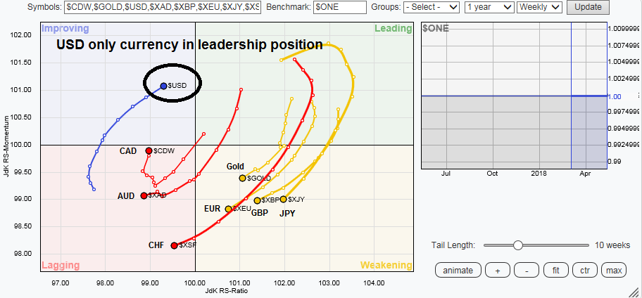
Here is how a pain trade might develop. What if the US Dollar were to strengthen further? Continued intermediate term USD strength makes sense from a technical perspective. The RRG chart, which is used to measure group rotation, shows that the USD is the only currency that is in a leadership position. All other currencies, which includes gold, are either in the weakening or lagging quadrants.
The recent USD strength caught most market participants by surprise. The USD is currently overbought, and a minor pullback or consolidation would be no surprise. What if it paused briefly here and continued to rally?

Commodity prices are historically inversely correlated with the USD, and further USD rally would cause managers with overweight positions in commodities and energy stocks considerable pain.
But first, a USD pullback
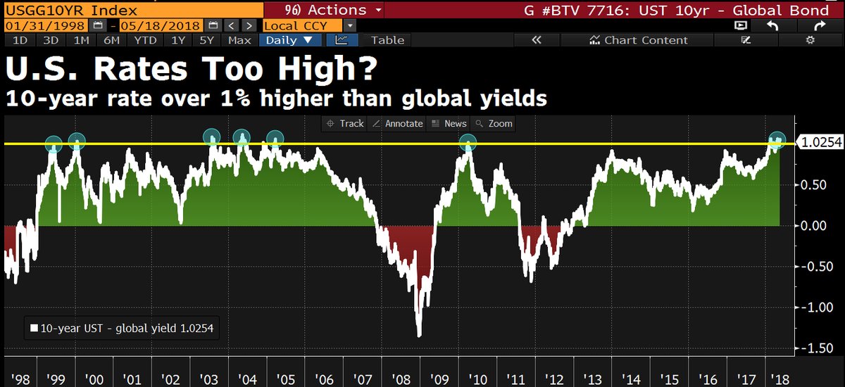
To be sure, the market gods are tricksters who like to draw their victims in so that they can suffer maximum pain. The USD rally is probably unsustainable in the short run, as the spike in US yields have pushed the greenback up against other currencies. The differential between the 10-year Treasury note and other global yields has reached 1%, which is extreme by historical standards. Something has to give, and expect some pullback in Treasury yields, which would weaken the USD.
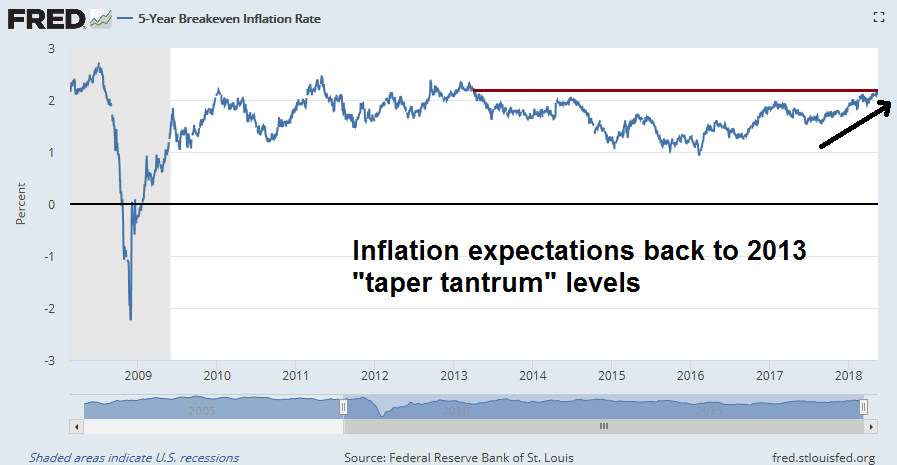
At the same time, there is ample evidence that inflationary pressures are rising. Inflation expectations, as measured by the 5-year breakeven rate, is back to 2013 “taper tantrum” levels.
The combination of near-term USD softness and rising inflation expectations should draw in buyers into inflation hedge vehicles. In that case, watch for gold prices to stage an upside breakout from a multi-year base should the USD decline. In the interim, gold’s ability to remain in an uptrend in the face of USD has to be regarded as constructive for the precious metal.

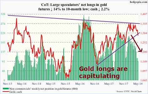
A summary of the latest Commitment of Traders from Hedgopia shows that large speculators are bailing out of their long gold positions. This is a sign of capitulation, and counter-trend USD weakness that buoys gold prices will be another source of trader pain.
At the same time, the erosion in large speculator long positions in crude oil even as prices advanced is a sign that oil prices are climbing the proverbial Wall of Worry.

All we need is one or more catalysts, such as a falling USD, or tighter supply from Iranian oil embargoes, to spike the oil prices. CNBC reported that Paul Hickey of Bespoke indicated that the current combination of rising oil prices and rising USD, while unusual, has historically been bullish for oil prices:
When we looked back at these prior periods in the market when you see these simultaneous rallies, crude oil has had a little bit better-than-average returns. The energy stocks have done really well going forward as well as the overall stock market.
A separate CNBC article indicated that expectations are building for $100, or possibly even $150 oil prices:
- The geopolitical risk premium in oil has driven crude prices to nearly four-year highs and shows no signs of abating.
- The U.S. exit from the Iranian nuclear deal, the rocket attacks between Iranian and Israeli forces and the general belief among the U.S., Saudi Arabia and Israel that Iran’s regional expansion needs to be stopped all argue for a continued rise in the price of crude.
- President Trump’s position on Iran has emboldened both Israel and Saudi Arabia, together, to challenge Iran more openly than at any time in the last four decades.
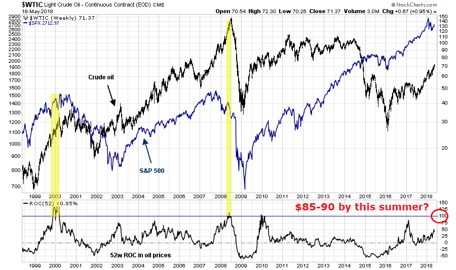
I have pointed out before that one-year changes in oil prices of 100% or more have tended to coincide with stock market peaks, largely because of a combination of the recessionary effects of higher oil prices and the Fed reacting to the leakage of commodity inflation into core inflation statistics. All that is needed is a WTI price of $85-90 by this summer.
Under such a scenario of near-term USD weakness, and upside breakouts in gold and oil price spikes, it would draw in the FOMO traders in a bullish stampede. Evidence of rising inflation and inflation expectations would likely result in a Fed-induced tightening cycle that puts upward pressure on the USD.
That’s how the ultimate pain trade would develop. One particular point of vulnerability are the EM economies. Bloomberg reported that Carmen Reinhart stated that EM countries are highly exposed in the current environment:
While money managers from Goldman Sachs Group Inc. to UBS Wealth Management still tout investing opportunities in emerging markets, the asset class has one notable critic: Harvard professor Carmen Reinhart.
The Cuban-born economist points to mounting debt loads, weakening terms of trade, rising global interest rates and stalling growth as reasons for concern. In fact, developing nations are worse off than during their two most recent moments of weakness: The 2008 global financial crisis and 2013 taper tantrum, when equities endured routs of 64 percent and 17 percent respectively.
“The overall shape they’re in has a lot more cracks now than it did five years ago and certainly at the time of the global financial crisis,” Reinhart said from Cambridge, Massachusetts. “It’s both external and internal conditions.”
Edward Harrison at Credit Writedowns suggested that Fed chair Powell is prepared to throw the EM economies under the bus. These countries are on their own if there is a crisis. In a recent speech, Powell stated:
Monetary stimulus by the Fed and other advanced-economy central banks played a relatively limited role in the surge of capital flows to EMEs in recent years. There is good reason to think that the normalization of monetary policies in advanced economies should continue to prove manageable for EMEs.
It also bears emphasizing that the EMEs themselves have made considerable progress in reducing vulnerabilities since the crisis-prone 1980s and 1990s. Many EMEs have substantially improved their fiscal and monetary policy frameworks while adopting more flexible exchange rates, a policy that recent research shows provides better insulation from external financial shocks.
Translation: The Fed is only responsible for the American economy. EM countries are on their own.
In addition, some Fed researchers published a rather timely discussion paper on the effects of Fed tightening cycles on foreign economies [emphasis added]:
This paper analyzes the spillovers of higher U.S. interest rates on economic activity in a large panel of 50 advanced and emerging economies. We allow the response of GDP in each country to vary according to its exchange rate regime, trade openness, and a vulnerability index that includes current account, foreign reserves, inflation, and external debt. We document large heterogeneity in the response of advanced and emerging economies to U.S. interest rate surprises. In response to a U.S. monetary tightening, GDP in foreign economies drops about as much as it does in the United States, with a larger decline in emerging economies than in advanced economies. In advanced economies, trade openness with the United States and the exchange rate regime account for a large portion of the contraction in activity. In emerging economies, the responses do not depend on the exchange rate regime or trade openness, but are larger when vulnerability is high.
Ouch! As a reminder. Even though the FMS shows that institutional managers are de-risking, their portfolios remain in a risk-on mode.
Should the pain trade scenario develop as I outlined, the fake-out begins with inflation exposure in institutional portfolios growing as the USD initially weakens and commodities rise, drawing the momentum players. Once it becomes an unbearable crowded long, interest rates would rise, the USD rally, and the trade would reverse itself, causing much pain and misery.
Near-term bullish
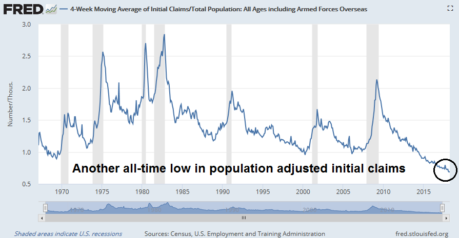
In the meantime, the near-term outlook is still bullish. The 4-week moving average of initial jobless claims, which is inversely coincident to stock prices, fell to another cycle low and to levels not seen since 1969. Population adjusted initial claims is already at another all-time low.
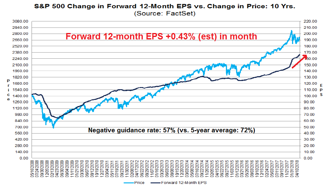
Forward 12-month EPS estimates is another indicator that is coincident to stock prices. The latest update from FactSet shows that forward EPS continues to rise, and Q2 guidance is better than the historical average.
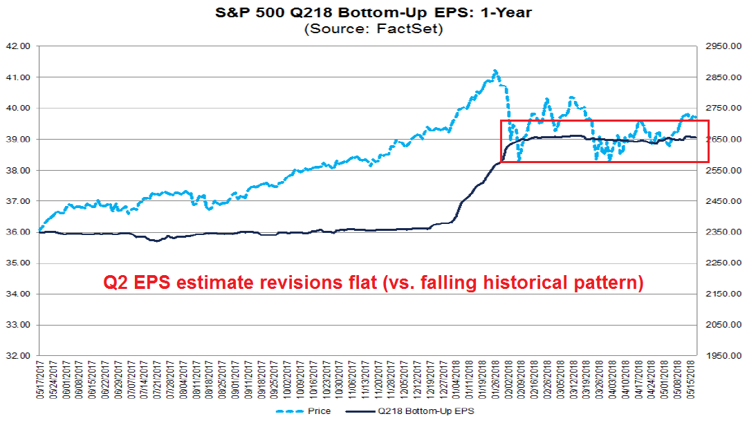
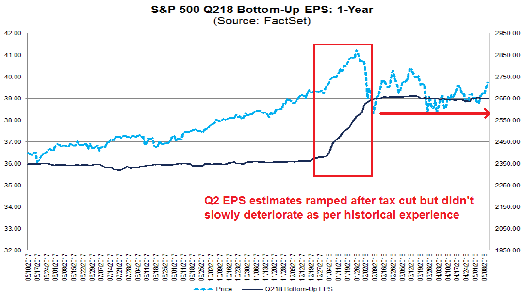
Drilling down further, the evolution of Q2 EPS estimates is encouraging for the growth outlook. Historically, Street analysts tend to be overly optimistic about earnings. Initial estimates tend to be high, and they slowly deteriorate over time. Q2 2018 EPS breaks that pattern. After an initial ramp because of the tax cut, estimates have stayed flat instead of degrading.
The week ahead
Looking to the week ahead, it’s hard to discern likely market direction despite my bullish intermediate term outlook. The bulls can be encouraged by the recent upside breakout from the downtrend (solid line), and stock prices appear to be in a rising channel (dotted lines). As well, last week’s weakness was halted at the 50% retracement level.

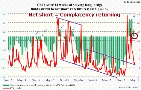
The latest CoT data shows that large speculators have moved from a net long to a net short position in VIX. Complacency is returning to the markets, but readings are not extreme and rising VIX shorts can be interpreted as a sign of positive equity price momentum.
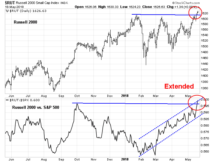
On the other hand, the current rally off the bottom has been led by small cap stocks, and the small cap move looks extended and due for a pause.
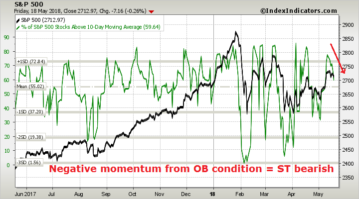
In addition, breadth indicators from Index Indicators show that the market is working off an overbought condition and exhibiting negative momentum, which is short-term bearish.
These kinds of market conditions call for a careful assessment of risk and reward. While my inner trader is leaning bullish, this is not the time to take excessive risk, and he prefers to step back and he is prepared to be not fully invested should the market rally from these levels. At the same time, he is keeping dry powder to buy the dips should they materialize.
My inner investor remains constructive on equities.
Disclosure: Long SPXL
Market waves and ripples
Mid-week market update: Charles Dow once characterized the stock market`s price movement as being composed of tides, waves, and ripples. We can see a mini version of this thesis by the market’s action in the past week. The major indices had staged an upside breakout through a downtrend and sentiment had turned bullish.

This week, the narrative became more cautious:
- 10-year bond yields had spiked significantly above 3%.
- The US-North Korea summit is at risk of going off the rails.
- The anti-migrant Lega Nord and anti-establishment Five Star Movement are on the verge of forming the next Italian government.
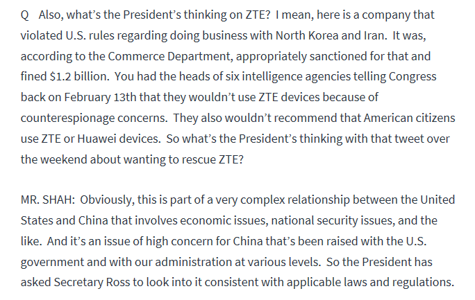
- The Sino-American trade talks are undergoing their own roller coaster. Trump’s weekend “rescue ZTE” tweet was followed by a White House clarification that walked back some of rhetoric.
Which is the wave? Which is the ripple?
Intermediate term trend is up
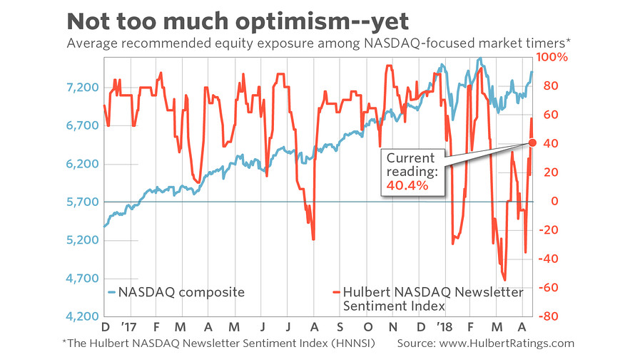
From a technical perspective, the intermediate term trend remains constructive. Breadth, as measured by the NYSE Common Stock only McClellan Summation Index, has broken out to the upside, and stochastics are not overbought.

Another constructive data point comes from Mark Hulbert. Hulbert’s sample of NASDAQ market timers have turned bullish, indicating positive momentum, but readings are neutral and not extreme yet.
Risk appetite, as defined by HY relative price action, and price momentum, remain in uptrends.

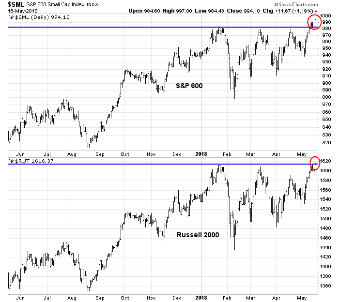
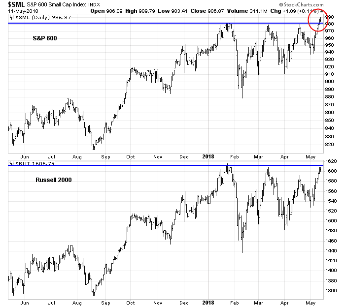
The high beta small caps are breaking out to the upside. The S&P 600 had already broken out to all-time highs, and the Russell 2000 just made a new high today.
Watch the ripples
I had suggested that there was support for the SPX at about the 2700. An open gap was partially filled, and the area is also the site of the downtrend line which the market could test on a pullback.
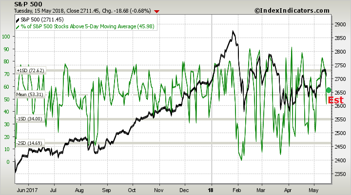
Short-term breadth (1-2 day time horizon) from Index Indicators is sloping downwards and have not reached oversold levels, which suggest that the pullback may not be over.
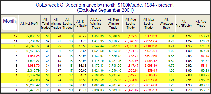
This week is OpEx week, and Rob Hanna’s study found that the historical pattern for May OpEx had no edge, with 17 up weeks and 17 down weeks.
I interpret the current market action as the stock prices undergoing a minor pullback in an intermediate uptrend. Short-term indicators are not oversold, and history suggest further choppiness. The path of least resistance is up, but the correction has probably not fully run its course.
My inner trader is long the market and he is buying the dips.
Disclosure: Long SPXL
Tame inflation? Don’t get too complacent!
The Treasury market rallied last week when the 10-year Treasury yield tested the 3% level and pulled back.
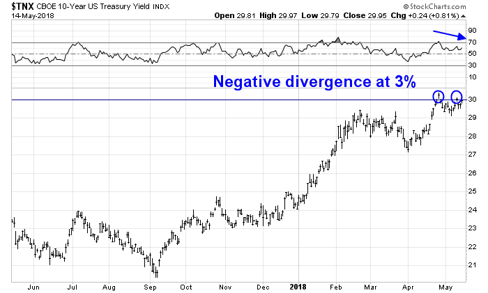
The decline in yields (and bond prices rally) was not a big surprise for a number of reasons:
- 10-year yields (TNX) was exhibiting a negative RSI divergence
- A tamer than expected Consumer Price Index
- Hedge funds were in a crowded short in the 10-year T-Note and T-Bond futures
While the bond market rally is likely to have a bit more leg over the next few weeks, my inclination is to enjoy the party, but don’t overstay the festivities.
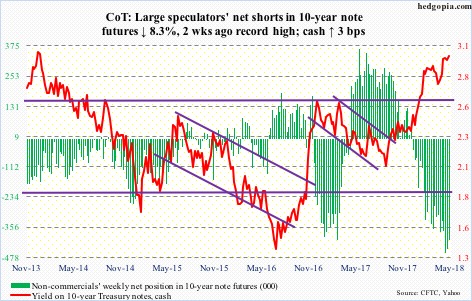
A crowded bond short
The latest Commitment of Traders readings from Hedgopia shows that large speculators, or hedge funds, were in a crowded short in the 10-year Treasury Note.
Their positioning in the long Treasury bond also shows a lack of bullishness.
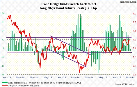
The combination of nervousness over a surge in a fiscal deficit induced Treasury issuance, which tactically put upward pressure on yields, a crowded short, and a positive inflation surprise were enough to spark a bond market rally.
Don’t get too complacent
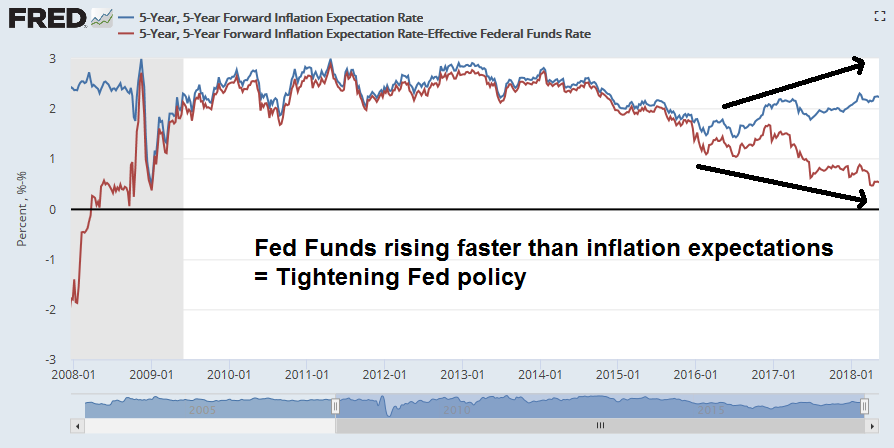
However, I would advise against getting overly complacent about inflation. Here is the big picture. Inflation expectations (blue line) have been steadily rising, and the Fed has been tightening in response. The spread between inflation expectations and the Fed Funds rate (red line) has been falling, indicating an increasingly tight monetary policy.
In the short run, inflation surprise began to tick up in early 2018 globally and readings have flattened out. Inflation momentum may be taking a hiatus, but the underlying dynamics still call for more upward pressure.
How pervasive is inflation pressure? The New York Fed’s Underlying Inflation Gauge stands at 3.2%, which is well above the Fed’s 2% inflation target.

The inflation “tell” from small business
Aside from the top-down analysis, the bottom-up view also shows a story of escalating price pressures. Eric Cinnamond pointed out a long list of 64 companies talking about inflation.
The latest NFIB survey also provides a fascinating window on inflationary pressures. These results are important because they come from small businesses, which are mainly price takers and have little bargaining power, and therefore provide a highly sensitive gauge of the economy.
First, small businesses are seeing upward pressure on prices.

What about the labor market and wages, which is closely watched by Federal Reserve officials? Job openings have been rising steadily since the Great Financial Crisis.
As a consequence, small businesses are seeing increasing wage pressure. Unfortunately, the NFIB survey readings are a diffusion index (net up vs. down), we cannot quantify the actual level of wage increases.
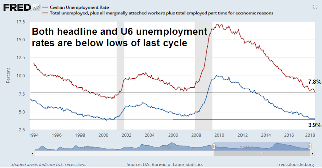
Even though the unemployment rate has been falling steadily during this expansion and now stands at a cycle lows for both the headline and U6 unemployment rates, the lack of wage growth has been a puzzle for many policy makers.
Moreover, this chart from the WSJ is remarkable as the JOLTS report shows that there is one job for every job seeker.

One theory advanced for the lack of wage growth is a labor monopsony, where the number of employers are highly concentrated in labor markets and therefore have greater bargaining power. Marshall Steinbaum at the Roosevelt Institute plotted the average HHI across occupations (and quarters) in each commuting zone. Commuting zones shaded orange and red have HHI greater than 2500, based on the CareerBuilder data. He found that the only labor markets that are unconcentrated by the standard of the Horizontal Merger Guidelines are the largest metropolitan areas.

Noah Smith, writing in Bloomberg, agreed with Steinbaum’s assessment:
New evidence is showing that employers have more market power than economists had ever suspected. Two papers — the first by José Azar, Ioana Marinescu, and Marshall Steinbaum, the second by Efraim Benmelech, Nittai Bergman, and Hyunseob Kim — find that in areas where there are fewer employers in an industry, workers in that industry earn lower wages. The two papers use very different data sources, look at different time periods and different geographical units, and use different statistical methodologies. But their findings are completely consistent.
I have no strong opinion as to whether the monopsony labor market thesis is correct. But if it is accurate, then we should be able to find evidence of wage pressure from small business surveys, as small businesses have minimal bargaining power.
One of the key indicators that I am watching is the spread between labor compensation (thin line) and prices (thick line). Both have been rising steadily for about two years, and the gap between the two have been stable. This indicates that small businesses have been able to pass through their labor cost increases, which puts upward pressure on inflation.
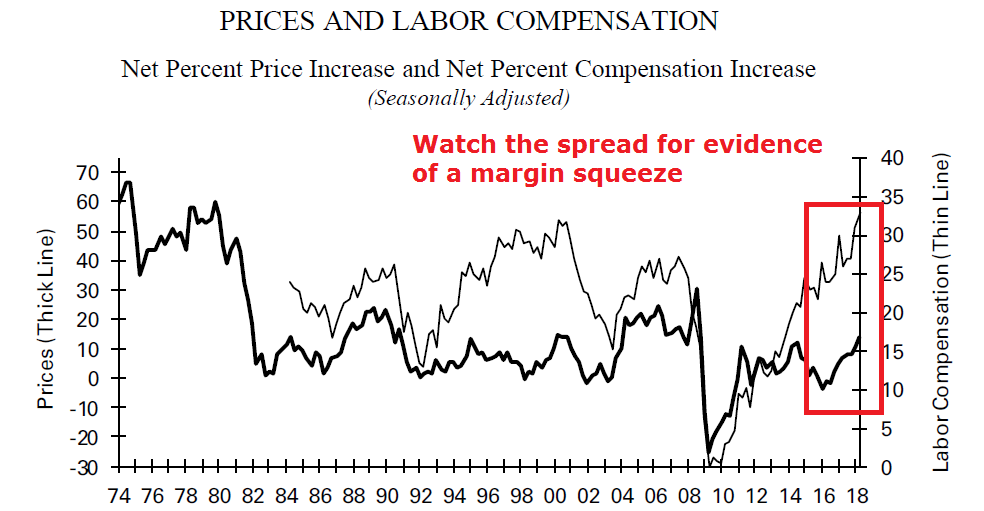
We are not at the point in the cycle where the two lines are converging, which would indicate a margin squeeze and downward pressure on earnings growth.
Asset inflation on the rise
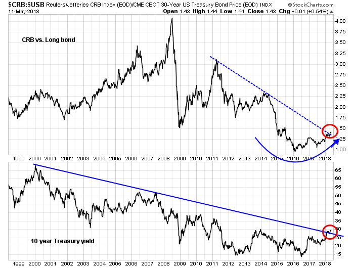
For the last word, consider this chart showing the ratio of the CRB Index to the US long Treasury bond as a way of measuring the inflation/disinflation trend. The ratio bottomed out in early 2016 and it has been rising slowly, and it recently breached a downtrend line that began in 2011. The downtrend breach also coincides with the downtrend violation of the 10-year Treasury yield. This is an indication that the cycle has turned. Asset inflation is on the rise and disinflation is in retreat.
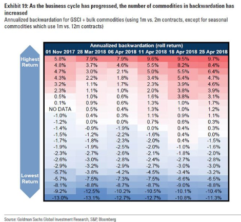
From a tactical perspective, Goldman Sachs recently pointed out that 13 out of 24 commodity contracts that they monitor is in backwardation (red). As a reminder, backwardation is the condition where the near-term futures contract is trading above the long-dated contract. This is usually an indication of a supply shortage which puts upward pressure on prices.
Now tell me that there is no inflationary pressure.
In conclusion, bond yields are tactically falling because of market positioning and a short-term inflation surprise. Recognize these circumstances as a trading opportunity, but don’t mistake it for a long-term trend.
How I learned to stop worrying and love rising rates
Preface: Explaining our market timing models
We maintain several market timing models, each with differing time horizons. The “Ultimate Market Timing Model” is a long-term market timing model based on the research outlined in our post, Building the ultimate market timing model. This model tends to generate only a handful of signals each decade.
The Trend Model is an asset allocation model which applies trend following principles based on the inputs of global stock and commodity price. This model has a shorter time horizon and tends to turn over about 4-6 times a year. In essence, it seeks to answer the question, “Is the trend in the global economy expansion (bullish) or contraction (bearish)?”
My inner trader uses the trading component of the Trend Model to look for changes in the direction of the main Trend Model signal. A bullish Trend Model signal that gets less bullish is a trading “sell” signal. Conversely, a bearish Trend Model signal that gets less bearish is a trading “buy” signal. The history of actual out-of-sample (not backtested) signals of the trading model are shown by the arrows in the chart below. The turnover rate of the trading model is high, and it has varied between 150% to 200% per month.
Subscribers receive real-time alerts of model changes, and a hypothetical trading record of the those email alerts are updated weekly here.
The latest signals of each model are as follows:
- Ultimate market timing model: Buy equities
- Trend Model signal: Bullish
- Trading model: Bullish
Update schedule: I generally update model readings on my site on weekends and tweet mid-week observations at @humblestudent. Subscribers receive real-time alerts of trading model changes, and a hypothetical trading record of the those email alerts is shown here.
Yellow flags galore, but no red flags
In the wake of last week’s publication (see Why I am not ready to call a market top), I had a number of discussions with investors that amounted to, “What about _________ (insert the worry of the day)”.
The main themes discussed, in no particular order, were:
- Rising rates and the flattening yield curve;
- Trade war;
- Oil price spike; and
- Fed policy error as they tighten into a decelerating economy.
I conducted an (unscientific) Twitter poll, and respondents were mostly concerned about a Fed policy error, while the oil price spike was the least of their worries.
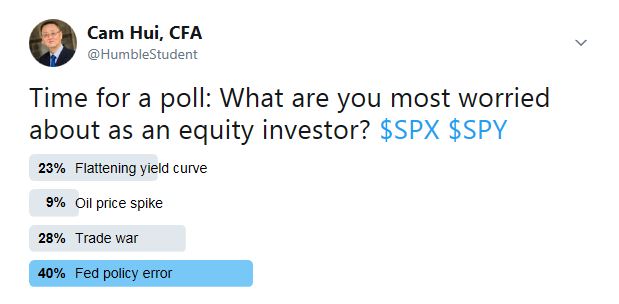
While I believe that all of these risks are legitimate, they can be characterized as yellow flags, but there are no red flags that signal an imminent recession or equity bear market.
Fed policy error risk
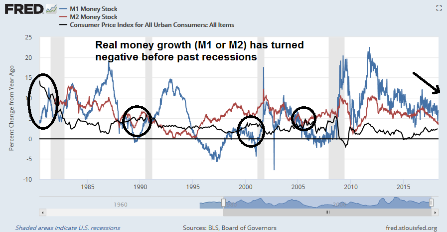
Let’s consider each of these risks, one at a time. The greatest fear cited by investors is a Fed policy error, where the Fed tightens monetary policy into a weakening economy and pushes it into a bull market killing recession. I have expressed concerns in the past about such a scenario, and there are signs that monetary policy is starting to bite.
The effects of monetary policy normalization can be seen in money supply aggregates. In the past, either negative real M1 or M2 growth has been recession warnings. The latest readings show that real M2 growth is steadily decelerating and below 1%, and it is on pace to turn negative later this year. Call it another yellow flag, but no recessionary red flag warning.
In addition, New Deal democrat constructed a simple recession forecasting model based on Non-Farm Payroll and the Fed Funds rate:
1. a YoY increase in the Fed funds rate equal to the YoY% change in job growth has in the past almost infallibly been correlated with a recession within roughly 12 months.
2. the YoY change in the Fed funds rate also does a very good job forecasting the *rate* of YoY change in payrolls 12 to 24 months out.
As the chart below shows, YoY jobs growth (blue line) is converging with YoY Fed Funds rate changes (red line). While the two lines are close, they have not crossed yet.
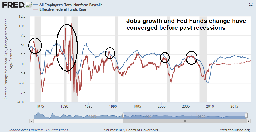
New Deal democrat went on to interpret the data in a cautionary, but benign fashion:
Because the Fed funds rate has been hiked by 0.75% in the last year, that suggests that a further YoY% decline in payrolls growth is already “baked in the cake” over the next 12-24 months, to a level of roughly +0.8% YoY.
That suggests that if the Fed makes 3 more 0.25% interest rate hikes in the next year, the “red flag” will be triggered at some point in that 12-24 month window.
In other words, the risk of a Fed policy error is a yellow flag, not a red flag.
Rising rate risk
One of the most often cited worry is the combination of rising rates and a flattening yield curve. Indeed, 10-year Treasury yields have been rising, and they have breached a multi-decade downtrend. Moreover, both the 2-10 and the 10-30 yield curves are flattening to 43bp and 13bp respectively. Past instances of yield curve inversions have been sure fire recession signal.
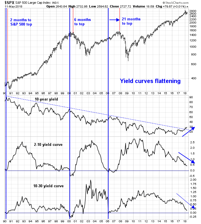
There are two issues here. Let us first consider the problem of rising yields, which I addressed in a past post (see How much does 3% matter to stocks?). I had pointed out that the historical data from JPM Asset Management showed that rising yields have not been a problem for equity prices until yields reached 5%.
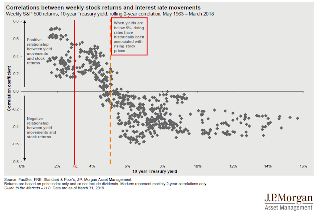
The key to the relationship between yield and stock prices is a tradeoff between rising growth expectations, which is bullish, and rising rates, which is bearish. Early in the Fed’s tightening cycle, the market tends to focus more on growth expectations. At some point, psychology switches to the bearish effects of rising rates. The simple question is, “Is good (economic) news good (equity) news, or bad news?”
So far, good news is still good news. Call rising rates a yellow flag, but the red flag of “good news is bad news” has not appeared yet.
Too early to worry about a flattening yield curve
Once investors recognize the evolution of market psychology of the Fed’s tightening cycle, it should naturally follow that they should not worry about a flattening yield curve. True the yield curve tends to flatten as the Fed’s begins its tightening cycle. But flattening yield curves are not danger signals for equity prices – yet.
Liz Ann Sonders at Charles Schwab found that stock prices tended to risen as the 2-10 yield curve flattened below 50bp. The 2-10 curve currently stands at 43bp, and if history is any guide, there is still upside in stock prices.
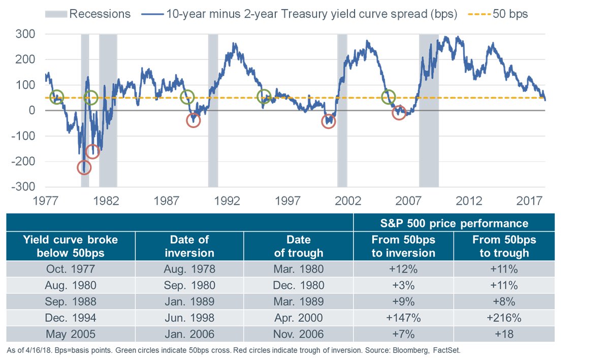
Kent Petersen at Insights From A Quant also studied the past history of yield curve inversions, as measured by the spread between the 2-year and 3-month Treasury Bill for the period starting from 1960. He found that US stock prices were flat to up 3-4 months after an inversion before falling. The current spread is a positive 63bp, which is a far way from an inverted condition.
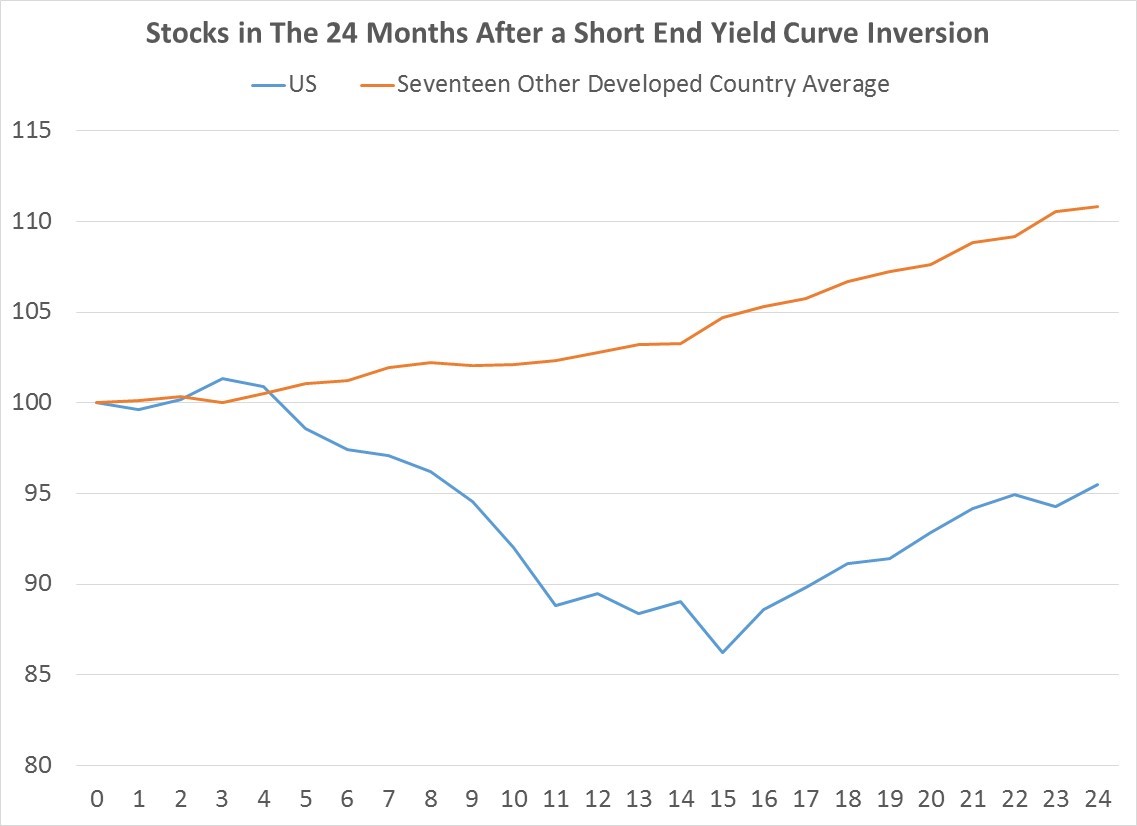
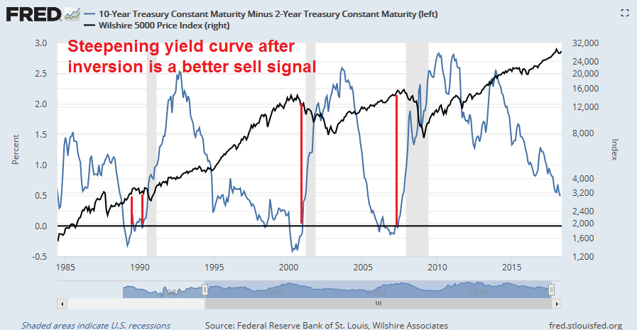
Even an inverted yield curve may not be a bear market signal. Even though the sample size is small (N=3), the historical evidence suggests that investors may be better served by holding stocks until after the 2-10 yield curve inverts, and then selling when it steepens back above positive.
In effect, a flattening yield curve can only be characterized as a yellow flag, not a red flag for equity prices.
Can a trade war sink the economy?
Before the election of 2016, when the prevailing consensus called for a Clinton presidential, my scenario for the next bear market was based on a Fed induced recession. The emergence of Trump’s America First policy raises the risk of a trade war that tilts the global economy into a synchronized slowdown.
A recent CNBC report highlighted the risks of how a trade war could tip China into a hard landing.
- Nearly 20 percent of China’s exports go to the U.S.
- If a trade war ensues with the U.S., China’s GDP growth would drop 0.5 percent and could continue to fall as things heat up, the IMF warns.
- China’s debt-to-GDP has ballooned to more than 300 percent from 160 percent a decade ago.
- Chinese officials now warn of a financial-sector debt bubble that’s waiting to burst.
The risks are high. China has accounted for most of the global credit growth since the Great Financial Crisis. A trade induced slowdown has the potential to tip the Chinese economy into a hard landing, and drag down the economies of its trading partners.
The American economy is not immune to a slowdown in China. As an example, Ford’s recent temporary decision to suspend production of their most top producing F-150 light truck because of a fire at a supplier plant in Michigan is an eerie reminder of the catastrophic consequences of even small disruptions in the supply chain. Multiply those results by a hundred or thousand-fold in the event of a full trade war, and we can see the resulting production havoc from the current era of global supply chains. If Trump wants the trade deficit to fall, he can achieve those results with a trade war induced recession.
Geoffrey Gertz at Brookings characterized Trump’s adventures into the arena of trade and foreign policy as more bark than bite:
There is one fundamental rule for making sense of trade policy over Trump’s first 16 months in office: Do not overreact to new announcements. Indeed, with the benefit of hindsight, we can observe a growing list of at-the-time seemingly newsworthy policy announcements that ultimately went nowhere. For instance, back in January 2017, Trump suggested that he would pay for a border wall by imposing tariffs on Mexico. That never happened. In an April 2017 interview, Trump suggested he was interested in a “reciprocal tax” on imports, meaning the U.S. should tax imports from other countries at the same rates as those applied to American exports. In February of this year, he resurrected the same idea, declaring that the United States would “soon” announce a reciprocal tax, with more information forthcoming “as soon as this week.” Meanwhile, we’re still waiting. In late January, U.S. Trade Representative Robert Lighthizer suggested that “before very long” the administration would select an African country to begin new free trade agreement talks. The pro-trade U.S. Chamber of Commerce enthusiastically nodded its head. So far nothing seems to have happened.
Former Korea CIA analyst Sue Mi Terry characterized Trump’s negotiating style as transparent. While her remarks were in the context of American negotiations with North Korea, her comments are applicable to trade policy as well. She characterized Trump as someone who is looking for the affirmation of “a win”, regardless of whether the deal is substantive. Foreign leaders have figured out to flatter and praise him, while offering only token concessions but give the impression of “a win” (use this link if video is not visible).
We saw this pattern in the KORUS negotiation. The revised agreement was hailed as a great victory by the Trump administration, but the tweaks were only cosmetic in nature. The South Koreans agreed to two concessions. In return for an indefinite exemption from the steel and aluminum tariffs, Seoul agreed to a steel export quota to the US, but the quotas are toothless because they are contrary to WTO rules and could be challenged at anytime. In addition, South Korea doubled the ceiling on American cars which could imported into that country. The ceiling increase was meaningless because American automakers were not selling enough cars under the old ceiling. In other words, the KORUS free trade deal was a smoke and mirrors exercise and a face saving out of a potential trade war.
The trade negotiations with China appear to conform to a similar template, according to this CNBC report:
- Commerce Secretary Wilbur Ross said China appears open to some of the White House’s requests.
- “I think they agreed to the concept of a trade deficit reduction,” Ross said.
- The U.S. requested the majority of China’s deficit reduction come from purchases of U.S. goods — an idea Ross reiterated Thursday.
In short, the risk of a trade war induced recession is a yellow flag. Until a trade war actually erupts, it cannot be regarded as a red flag for the stock market.
Oil spike risk
Now that oil prices have spiked, concerns are appearing that rising oil prices could derail the economy. James Hamilton has been a pioneer in researching the link between oil shocks and recessions, and he found that 10 out of the 11 last US recessions were associated with oil price spikes. For more details, see his testimony before the Joint Economic Committee of Congress on May 20, 2009, and his study of historical oil shocks.
A 2014 Federal Reserve study agrees with Hamilton`s conclusion:
Although oil price shocks have long been viewed as one of the leading candidates for explaining U.S. recessions, surprisingly little is known about the extent to which oil price shocks explain recessions. We provide a formal analysis of this question with special attention to the possible role of net oil price increases in amplifying the transmission of oil price shocks. We quantify the conditional recessionary effect of oil price shocks in the net oil price increase model for all episodes of net oil price increases since the mid-1970s. Compared to the linear model, the cumulative effect of oil price shocks over the course of the next two years is much larger in the net oil price increase model. For example, oil price shocks explain a 3 percent cumulative reduction in U.S. real GDP in the late 1970s and early 1980s and a 5 percent cumulative reduction during the financial crisis. An obvious concern is that some of these estimates are an artifact of net oil price increases being correlated with other variables that explain recessions. We show that the explanatory power of oil price shocks largely persists even after augmenting the nonlinear model with a measure of credit supply conditions, of the monetary policy stance and of consumer confidence. There is evidence, however, that the conditional fit of the net oil price increase model is worse on average than the fit of the corresponding linear model, suggesting much smaller cumulative effects of oil price shocks for these episodes of at most 1 percent.
Should investors be concerned about rising oil prices tanking the economy and the stock market? Not yet. As the chart below shows, the historical evidence suggests that stock prices do not top out until the 12-month rate of change in oil prices reach 100%. They are only at about 50% right now.
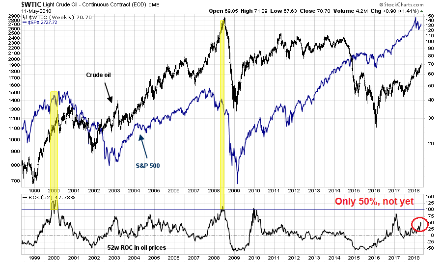
This does not mean, however, that the market is out of the woods. WTI oil bottomed out last June in the low 40s. The combination of base effects, tight supply from collapsing Venezuelan production, and a looming Iranian oil embargo could produce an oil price spike. If prices rise to the $85-90 level this summer, then the 100% rate of change rule will be triggered. Such a level for oil prices is well within the realm of possibility. Bloomberg reported that BAML is forecasting that oil could hit as much as $100 next year.
For now, rising oil prices represent a yellow flag that needs to be monitored, and it is not a red flag sell signal.
Risks are rising, but too early to get overly bearish
In conclusions, warning signs are appearing for the stock market but there are no sell signals. The equity bull that began in 2009 is mature, but it is still alive and snorting.
Accounts with long term horizons could respond to these conditions with a neutral stance by re-balancing their portfolios back to their target asset mix. Investors with greater tactical orientation should remain bullish, as the final price top is likely still ahead.
The stock market will get bumpy, but the outlook is still bullish.
The weeks ahead
Looking to the weeks ahead, the intermediate term equity outlook looks encouraging. The latest update from FactSet shows that Q1 earnings season is mostly over and results have been solid. Both the sales and EPS beat rates are well above historical averages, and Street estimates continue to rise. Moreover, the negative guidance rate for Q2 is better than average, indicating further near-term fundamental upside.
Another way of thinking about the earnings outlook is to monitor the evolution of quarterly earnings estimates. Historically, Street analysts have tended to be overly optimistic in their EPS estimates, and estimates tend to degrade slowly over time. In this instance, Q2 estimate rose sharply due to the effects of the corporate tax cuts, and they stayed flat instead of falling slowly. I interpret this lack of EPS deterioration as equity bullish.
From a technical perspective, breadth indicators are flashing bullish signals. Even though the S&P 500 is below its highs, both the NYSE Advance-Decline Line and S&P 500 Advance-Decline Line, which is an apples-to-apples breadth indicator, have achieved all-time highs.
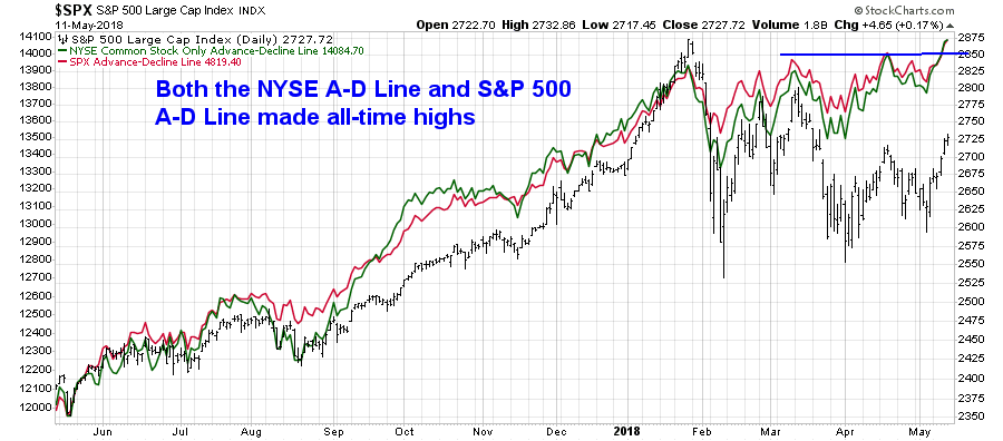
The S&P 600 Small Cap Index also reached an all-time high last week, though the Russell 2000 is just a hair below fresh highs. The troops are leading the charge, the generals (major large cap indices) are likely to follow soon.
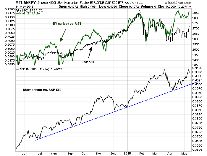
Risk appetite indicators from both the credit and equity markets appear to be healthy, which is bullish.
To be sure, short-term breadth (1-2 day) indicators from Index Indicators shows that the market is overbought, and some minor pullback or consolidation is to be expected.

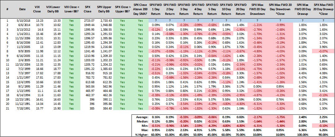
The market has broken a downtrend that began from the January highs, though it remains range-bound between 2560 and 2800. RSI(5) is overbought, and initial support on a pullback can be found at trend line and gap at about 2700. If stock prices were to begin grinding up from these levels, the challenge for the bulls will be to sustain a series of “good”overbought readings as prices rise. I had also previously highlighted a condition where the VIX falling below its lower Bollinger Band (BB) indicating a short-term overbought reading for the market (see The bulls are back in town).
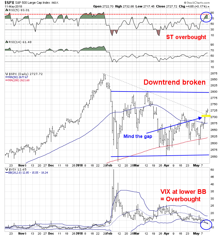
Steve Deppe conducted a study where the S&P 500 closes above its daily BB, and above its 200 dma, combined with the VIX below its BB. Returns are flat to slightly negative near term, but going out 10-20 days.
My base case scenario calls for some minor weakness or consolidation into mid-week, with a likely pullback to the 2700 area, followed by further strength for the remainder of May. My inner investor remains constructive on stocks. My inner trader lightened up his long positions late last week, and he is waiting for either the pullback or a breakout to buy more.
Disclosure: Long SPXL
The bulls are back in town
Mid-week market update: In my last mid-week market update (see Still choppy, still consolidating), I highlighted the weekly (unscientific) sentiment survey conducted by Callum Thomas. The poll showed fundamentally oriented investors to be very bullish, while technical survey was bearish. I suggested at the time that one of the signs that the sideways consolidation may end was an agreement between the fundamental and technical survey, indicating either positive or negative momentum.
The latest survey shows that such an event has occurred as technicians have flipped from bearish to bullish.
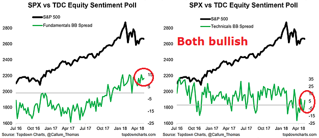
While this is not an unqualified trading buy signal, there are plenty of indications that the bulls are back in town.
Bullish indicators
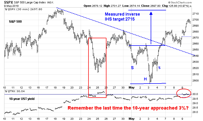
I can point to a number of constructive technical and sentiment indicators with bullish implications. From a short-term tactical perspective, the SPX has staged both an upside breakout through a downtrend, and broken out of an inverse head and shoulders (IHS) pattern. In addition, the market shrugged off a rise in the 10-year Treasury yield up to the 3% level. Remember how stock prices reacted the last time this happened?
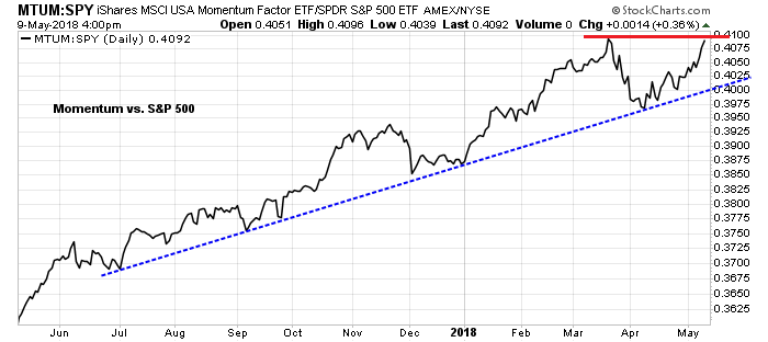
If the bulls gain control of the tape, then price momentum is likely to become dominant again. This factor remains in an relative uptrend and it is poised for an upside breakout to new highs.
To be sure, I don’t pretend that this is an unqualified buy signal. There is plenty of overhead resistance that could stall this rally, starting with an initial resistance zone at about 2865. There is also a second declining trend line, which will act as secondary resistance. Beyond that, the IHS measured target of about 2715 also coincides with the upper Bollinger Band. The rally could stall at any of these levels in the near future. In addition, the VIX Index has breached its lower Bollinger Band, which is often the sign of either a short-term top, or a brief consolidation period.
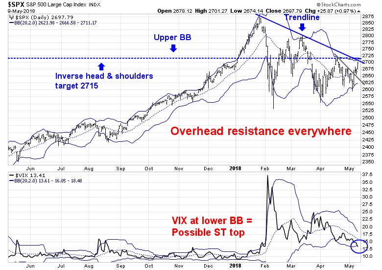
Nevertheless, these developments are signals that the bulls are slowly gaining the upper hand and a summer rally may be just starting. My inner trader has been bullish for much of the consolidation period, but he is not so blind as to believe that stock prices are going to go up in a straight line. He is likely to take some partial profits should the market hit some of these resistance levels, and buy back in on the pullbacks.
Disclosure: Long SPXL
Why you shouldn’t get wedded to any market indicator
Over the years, I have had a number of discussions with traders who have religiously embraced specific trading systems and investment disciplines. This is a cautionary tale of how systems fail.
Charlie Bilello won the NAAIM Wagner Award for his work on the lumber/gold ratio:
Lumber’s sensitivity to housing, a key source of domestic economic growth in the U.S., makes it a unique commodity as it pertains to macro fundamentals and risk-seeking behavior. On the opposite end of the spectrum is Gold, which is distinctive in that it historically exhibits safe-haven properties during periods of heightened volatility and stock market stress.
When you look at a ratio of Lumber to Gold, it is telling you something about the risk appetite of investors and the relative strength or weakness in economic conditions. When Lumber is leading Gold, volatility in equities tends to fall going forward. When Gold is leading Lumber, the opposite is true, and equity volatility tends to rise.
History shows that the lumber/gold ratio has been an excellent indicator of risk appetite. The bottom panel of the accompanying chart shows the rolling correlation of the lumber/gold ratio (cyclical indicator) to the stock/bond ratio (risk appetite indicator). The lumber/gold ratio is rising, which is a buy signal for risky assets.
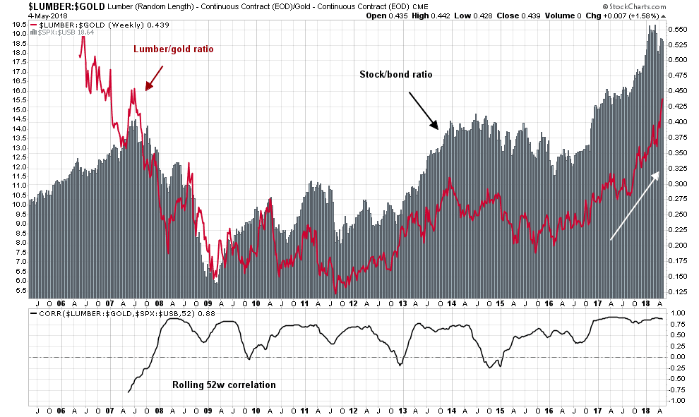
Does that mean that you should bullish on stocks? Maybe.
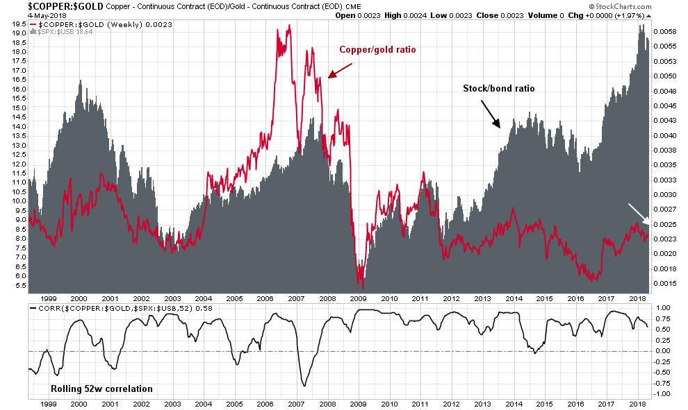
Consider the copper/gold ratio, which is another cyclical indicator based on a similar theme. The copper/gold ratio is telling a story of economic softness.
Should you be buying or selling? Which indicator should you believe?
Analyzing the indicators
I have long been an advocate of understanding the assumptions behind indicators and models. Let’s analyze the lumber/gold indicator and unpack its message. The lumber price being measured is an American lumber price that is affected by local conditions. Lumber prices started to take off when the US imposed tariffs on Canadian softwood lumber as part of a long running dispute between the two countries. Over time, homebuilding stocks have weakened relative to the market and breached a long term relative support level. Does the behavior of the homebuilders look like a sign of cyclical strength?

While lumber prices constitute a useful cyclical indicator because of it is mainly an input into housing, the housing sector has specific demographic characteristics that could affect its effectiveness. This chart shows prime age population demographics, and its correlation to housing starts.

Copper as China indicator
Copper has its own idiosyncrasies too. Long before China became the dominant global growth engine, copper was regarded as a good indicator of global cyclicality. Now that China has become the largest consumer of commodities, copper prices are reflective of Chinese economic activity. The chart below shows the ratio of China Materials ETF (CHIM) to Global Materials (MXI) in the top panel, and the copper/gold ratio in the bottom panel. The coincident weaknesses of the CHIM/MXI and copper/gold ratios are probably reflective of softness in China.
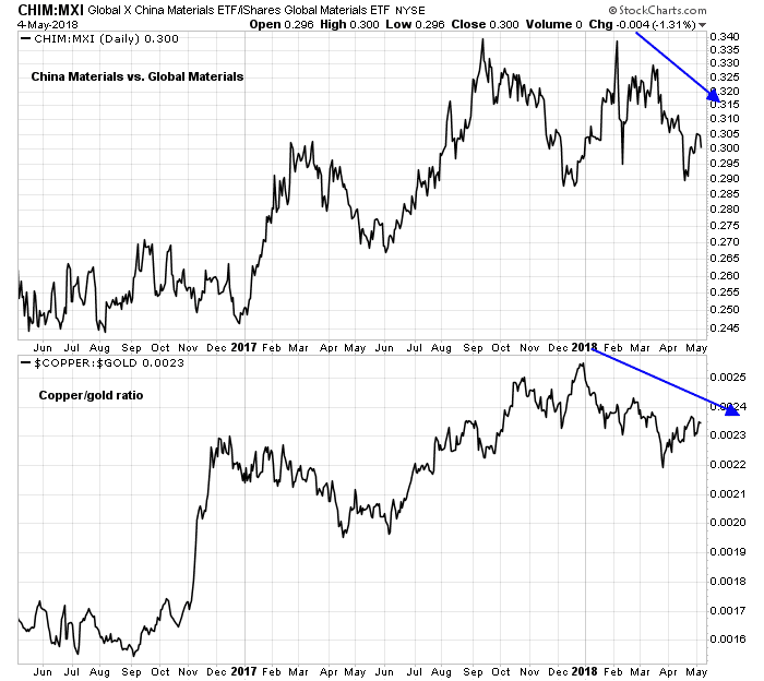
Slowing Chinese growth is also reflected in Beijing’s policy response to lower bank reserve ratios.
KOSPI: The global cyclical barometer
In addition to copper and lumber, the South Korean stock market has been regarded as a global cyclical barometer because of the significant weight of electronics giant Samsung in the KOSPI index. Moreover, the weight of Samsung`s suppliers in the Korean KOSPI index only serves to raise the weight of the “Samsung factor” to about half of the index.
The chart below shows the KOSPI (top panel), along with the relative returns of South Korean stock market to MSCI All-Country World Index, or ACWI, (second panel, all returns in USD), the copper/gold ratio (third panel), and the lumber/gold ratio (fourth and bottom panel). One of these indicators is definitely not like the other.

I began this post with the rhetorical question of which indicator investors should believe, the lumber/gold ratio or the copper/gold ratio? An analysis of the two ratios, as well as the Korea/ACWI ratio, shows that the bullish cyclical conclusion of the lumber/gold ratio as the outlier. The lumber/gold ratio has been affected by specific factors relating to US building materials market.
Further analysis of the Korea/ACWI ratio and the copper/gold ratio also reveals some differences. Both the Korea/ACWI and copper/gold ratios have been range bound for the last year. However, while Korea/ACWI has been trendless, copper/gold has entered a minor downtrend, but recovered in the last month. I interpret these conditions as copper/gold signaling some softness in the Chinese economy, but the global cycle Korea/ACWI remains trendless. Neither is signaling weakness that could lead to a recession.
The moral of this story? Models and indicators are not magic black boxes. Look under the hood before you make any investment conclusions.
Why I am not ready to call a market top
Preface: Explaining our market timing models
We maintain several market timing models, each with differing time horizons. The “Ultimate Market Timing Model” is a long-term market timing model based on the research outlined in our post, Building the ultimate market timing model. This model tends to generate only a handful of signals each decade.
The Trend Model is an asset allocation model which applies trend following principles based on the inputs of global stock and commodity price. This model has a shorter time horizon and tends to turn over about 4-6 times a year. In essence, it seeks to answer the question, “Is the trend in the global economy expansion (bullish) or contraction (bearish)?”
My inner trader uses the trading component of the Trend Model to look for changes in the direction of the main Trend Model signal. A bullish Trend Model signal that gets less bullish is a trading “sell” signal. Conversely, a bearish Trend Model signal that gets less bearish is a trading “buy” signal. The history of actual out-of-sample (not backtested) signals of the trading model are shown by the arrows in the chart below. The turnover rate of the trading model is high, and it has varied between 150% to 200% per month.
Subscribers receive real-time alerts of model changes, and a hypothetical trading record of the those email alerts are updated weekly here.
The latest signals of each model are as follows:
- Ultimate market timing model: Buy equities
- Trend Model signal: Bullish
- Trading model: Bullish
Update schedule: I generally update model readings on my site on weekends and tweet mid-week observations at @humblestudent. Subscribers receive real-time alerts of trading model changes, and a hypothetical trading record of the those email alerts is shown here.
Market top is still ahead
As stock prices chopped around in an indecisive fashion in past few weeks, the traders in my social media feed have become increasingly nervous and bearish. The bull can point to the SPX repeatedly testing its 200 day moving average (dma), which has held as technical support. However, the market’s inability to rally despite what has been good earnings news during a Q1 earnings season with solid results is worrisome.
My review of intermediate and long-term technical market conditions, as well as the macro backdrop reveals that no pre-conditions of a bear market are in sight. While there are concerns that the American economy is undergoing the late cycle phase of an expansion, which is typically followed by a bear phase. I am not ready to make the investment call that stock prices have topped out just yet.
Consider, as an example, the Relative Rotation Graph (RRG) as a way of analyzing changes in sector leadership. RRG charts are a way of depicting the changes in leadership in different groups, such as sectors, countries and regions, and market factors. The charts are organized into four quadrants. An idealized group rotation pattern occurs in a clockwise fashion. Leading groups (top right) deteriorate to weakening groups (bottom right), which then rotates to lagging groups (bottom left), which changes to improving groups (top left), and finally completes the cycle by improving to leading groups (top right) again.
The latest RRG chart depicts a stock market with the emerging leadership of late cycle inflation sectors (gold and oil), which is the result of late cycle inflationary pressures, along with interest sensitive sectors (REITs and utilities) as the result of a dovish Fed.

This combination suggests that the market is setting up for one last inflationary blow-off before the Fed steps on the monetary breaks to cool the economy into a bull market killing recession.
Listen to the market
When I listen to the message from market leadership, inflation hedge sectors appear poised to assume the mantle of new market leadership, which is an indication that the economy is in the late cycle phase of an expansion.
Three weeks ago, I rhetorically asked if it was time to buy gold for the late cycle inflation surge. Even as I acknowledged that the bull case for gold was easy to make, a rising US Dollar or tight Fed policy could derail any surge in gold prices.
From a technical perspective, the gold was making a multi-year rounded saucer bottom. The silver/gold ratio, which is a measure of precious metal risk appetite, was at historically washed out levels. However, the USD Index, which is inversely correlated to gold, was rallying and creating a headwind for gold prices.

Here is a shorter term version of the chart. Gold has been range bound and technical support is holding. The silver/gold ratio is bottoming, indicating rising risk appetite, but the USD broke out of a short-term range. The combination of emerging equity group leadership, rising risk appetite, and ability to hold support in the face of a rising USD is constructive for gold prices going forward.

In conjunction with nascent leadership from gold, crude oil, which is another inflation hedge, may be poised to rise in the near future. The chart below depicts the price of oil (top panel), and the difference between the December 2018 futures price and the June 2018 futures prices. Under “normal” conditions, the long-dated contract (December) trades at a higher price than the short-dated contract (June) and the difference reflects the cost of storage and carrying costs. When the short-dated contract trades above the long-dated contract, the commodity is said to be in “backwardation” and such conditions usually reflect tight supply conditions. Current conditions show that oil prices have staged an upside breakout to new highs, and the futures contract is in backwardation, indicating a supply shortage.

The supply shortage can be attributable to two factors. First, American fracker production is discouraging conventional oil producers from investing in new production. But the frackers are already producing at their production limits, and the combination of better global growth and restricted conventional production are bullish tailwinds for oil prices. As the chart below shows, the price spread between Midland (Permian) oil and Brent is now plunging because pipeline capacity is full and there is an abundance of Permian oil with nowhere to go.

As well, Reuters reported that Trump has all but decided to repudiate the nuclear agreement with Iran, and the Guardian reported that the Trump WH may have hired Israeli private investigators to dig up dirt on the former Obama Administration officials who negotiated the deal. The Trump White House is scheduled to announce its Iranian decision on May 12. The re-imposition of sanctions on Iran has the potential to spike oil prices, either ahead of the announcement, or on the announcement date.
In addition, a slightly more dovish Fed is providing a tailwind for inflation hedge vehicles. Last week’s FOMC announcement of a symmetric inflation target was a signal of a slight dovish tilt to monetary policy. The Powell Fed is ready for the economy to run a little “hot” and tolerate a little more inflation before reacting with an aggressive rate hike policy.
Bond yields retreated in response to the dovish message, but interest sensitive sectors such as REITs and utilities had already reacted in anticipation. The accompanying chart shows the relative market returns of REITs overlaid on top of 7-10 year Treasury returns. While the two had tracked each other closely, the divergence in the last couple of weeks may be attributable to a market reaction to excess supply from Treasury auctions.
The relative returns of utilities are also showing a similar pattern of a relative bottom, and close correlation with Treasury prices.

In short, the combination of rising inflation and a slightly more dovish Fed are recipes for a last hurrah melt-up in asset prices. Gavyn Davies‘ assessment of the interaction between rising oil prices and bond yields is probably the correct one:
It may be driven mainly by the perception of a demand shock in the US economy, stemming from the fiscal easing and confirmed by robust activity data in latest nowcasts for the economy. This is leading to an acceleration in expected Fed tightening, but not to any change in long-run inflation expectations or in terminal interest rates at the end of the cycle.
Although this shift in expected monetary tightening is not exactly good for risk assets, it might not be fatal either.
Fundamental conditions are still strong
From a macro and fundamental perspective, conditions are strong. The latest April Jobs Report showed that both the headline and U6 unemployment rates below the lows set in the last expansion. There are no signs of economic weakness here.

As well, initial jobless claims have been shown a close inverse correlation to stock prices. Initial claims are making 40+ year lows. These lows are setting up a bullish divergence with stock prices.
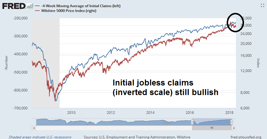
Q1 earnings season is mostly complete. Both the sales and EPS beat rates have been solid, and forward guidance is better than average. The Street has responded with upward estimate revisions, indicating positive fundamental momentum.
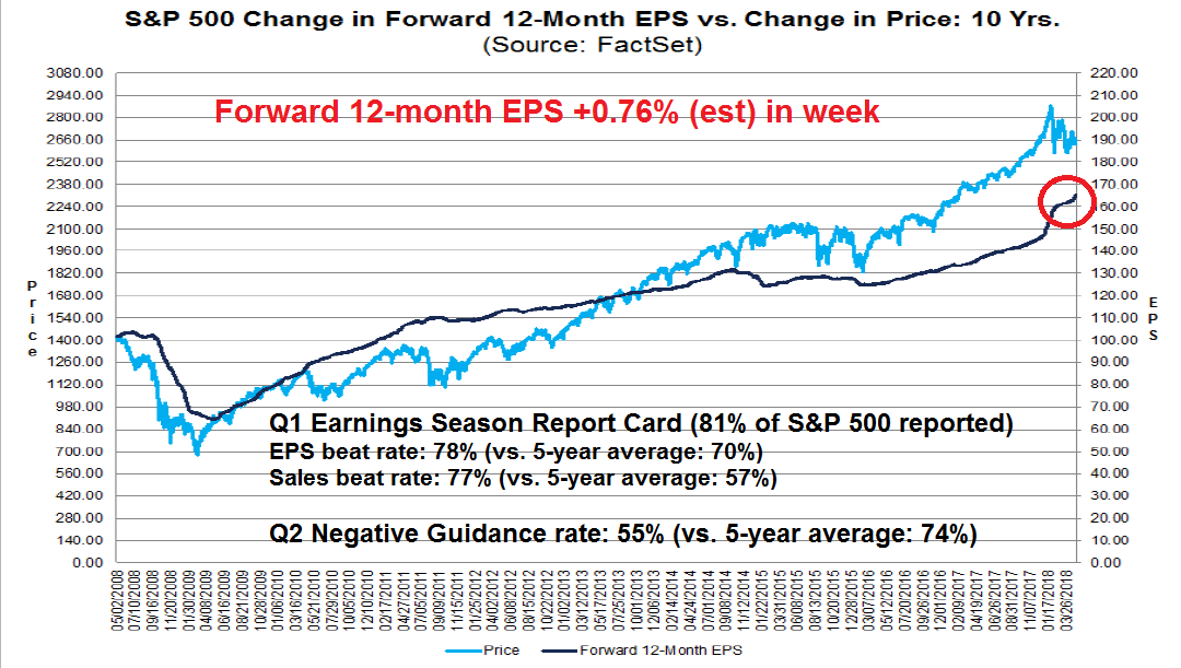
Long-term technical trends are bullish
For a longer term technical perspective, I present a number of 20 year charts from around the world. Starting in the US, Chris Ciovacco uses a series of moving averages to spot changes in price trends. The trend following system flashes warnings (shown in boxes) when the moving averages turn down and converge. The latest readings indicate that the shortest moving average is still rising and hasn’t even begun to decline. Does this look like a bear coming out of hibernation?
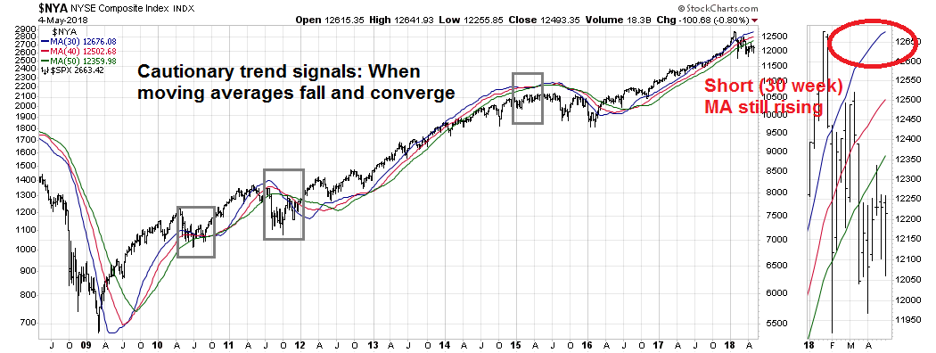
Across the Atlantic, the STOXX 600 remains in a solid uptrend. While the index may pause as it tests overhead resistance, this pattern does not appear bearish.

Regular readers know that my analytical framework calls for dividing the world into three trade blocs composed of North America, Europe, and China/Asia. The Chinese stock market remains a casino and its price signals are not always reflective free market forces. However, we can get some clues from the stock indices of China’s Asian trading partners. Here is the Hong Kong market, which recently staged an upside breakout to new highs and pulled back. The index remains in minor (dotted line) and major (solid line) uptrends. Does this look bearish to you?
Here is the Taiwan market, which broke out to new highs.
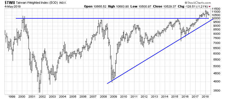
The South Korean market, which is regarded by many investors as a global cyclical barometer, also staged an upside breakout and held its highs.

Do the technical patterns in any of these global market indices look bearish to you? I didn’t think so. So why get so worried?
In short, there are no signs that a bear market has begun in any major equity markets around the world. Moreover, an analysis of sector leadership points to a classic late cycle inflationary blow-off. Fundamentals are also positive and supportive of stock prices.
Unless we see signs of fundamental weakness or long-term technical deterioration, I can only conclude that equity markets are undergoing a short-term correction. Weakness should therefore be viewed as a buying opportunity.
The week ahead
Looking to the week ahead, the stock market remains in a choppy consolidation phase. The ability of the market to hold at its 200 dma is constructive, but my inner trader is not ready to get all-in bullish just yet.
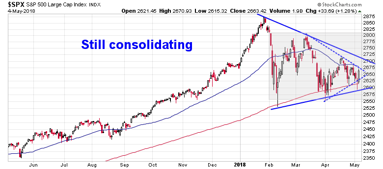
Short-term (1-2 day) breadth indicators have moved from a mildly oversold to a mildly overbought condition. The bulls need to follow through in the days ahead with further strength before this consolidation period can be declared over.
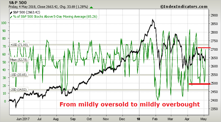
Medium term (3-7 day) breadth indicators are in neutral. If the bulls are truly in control of the tape, then the market needs to move this indicator into the target overbought zone.

Until we see either some sustained upside momentum or a downside support break, my inner trader’s base case scenario is a continuation of the choppy consolidation where he buys the dips, and sells the rips. My inner investor remains bullish on equities.
Disclosure: Long SPXL
Still choppy, still consolidating
Mid-week market update: Stock prices are still consolidating sideways. The technical pattern could either be described as range-bound, or as a triangle. The market tested the bottom of the triangle this week, but support held.
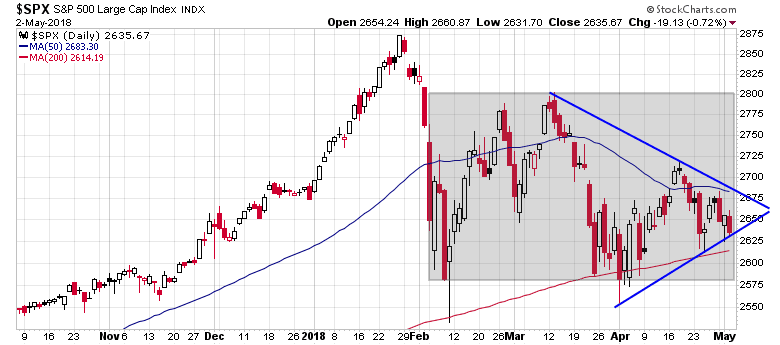
The market indecision could be traced to the continued disagreement between fundamental and technical investors. Several weeks ago, I highlighted a Callum Thomas weekly (unscientific) poll of market sentiment showing a record level of technical bears combined with a high level of fundamental bulls (see Technicians nervous, fundamentalists shrug). The latest reading shows a continued bifurcation of opinion, though the difference in opinion is not as extreme.

The market may continue to trade sideways until fundamental and technical opinions begin to agree again.
A bullish bias
I continue to believe that the consolidation is likely to resolve itself in a bullish fashion. I have detailed the many fundamental and macro reasons why I am bullish, so I will not repeat them here (see How much does 3% matter to stocks?). However, there are many technical reasons why the intermediate term trend for stock prices is up.
For one, market breadth is supportive of the bull case. Both the NYSE and SPX-only Advance-Decline Lines are exhibiting positive divergences.
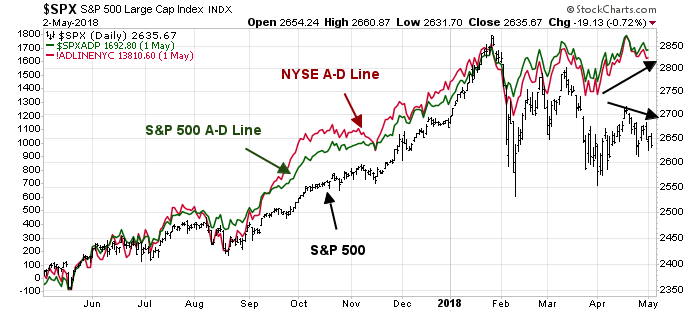
The price momentum factor remains in a long-term, albeit choppy, relative uptrend.

The uptrend in momentum has not been reflected in sentiment models. The latest update of the Commitment of Traders data from Hedgopia shows that large speculators, or hedge funds, are in a record crowded short position in the NASDAQ 100, which forms the bulk of the momentum stocks.
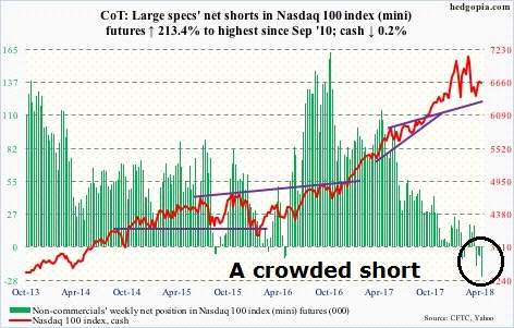
The latest II survey shows that % bulls have been declining and % bears rising. While these readings are contrarian bullish, sentiment may have to become more extreme for a durable bottom to occur.

The short-end of the term structure of the VIX is also telling a similar story. Short-term VIX (VXST) is trading above the VIX Index, indicating elevated fear levels and reflective of the anxiety evident in Callum Thomas’ technician survey. While readings are not at panic bottom levels, they do suggest limited downside equity risk.

My inner trader is bullishly positioned. In this choppy environment, he is inclined to buy the dips and take partial profits on the rips.
Disclosure: Long SPXL
How much does 3% matter to stocks?
Preface: Explaining our market timing models
We maintain several market timing models, each with differing time horizons. The “Ultimate Market Timing Model” is a long-term market timing model based on the research outlined in our post, Building the ultimate market timing model. This model tends to generate only a handful of signals each decade.
The Trend Model is an asset allocation model which applies trend following principles based on the inputs of global stock and commodity price. This model has a shorter time horizon and tends to turn over about 4-6 times a year. In essence, it seeks to answer the question, “Is the trend in the global economy expansion (bullish) or contraction (bearish)?”
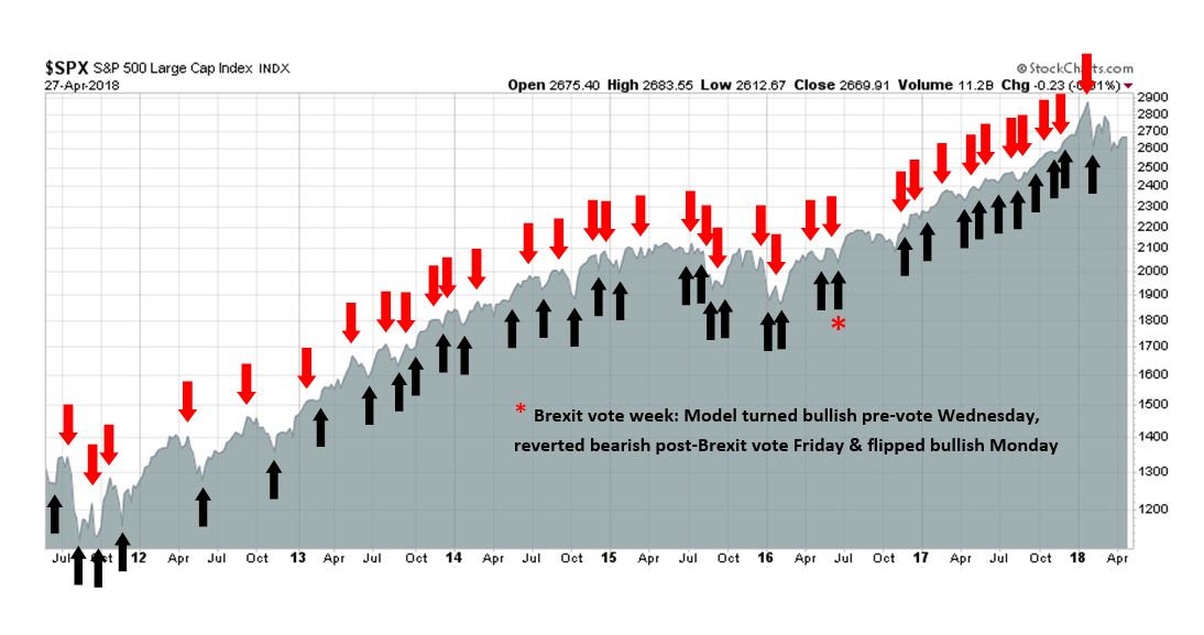
My inner trader uses the trading component of the Trend Model to look for changes in the direction of the main Trend Model signal. A bullish Trend Model signal that gets less bullish is a trading “sell” signal. Conversely, a bearish Trend Model signal that gets less bearish is a trading “buy” signal. The history of actual out-of-sample (not backtested) signals of the trading model are shown by the arrows in the chart below. The turnover rate of the trading model is high, and it has varied between 150% to 200% per month.
Subscribers receive real-time alerts of model changes, and a hypothetical trading record of the those email alerts are updated weekly here.
The latest signals of each model are as follows:
- Ultimate market timing model: Buy equities
- Trend Model signal: Bullish
- Trading model: Bullish
Update schedule: I generally update model readings on my site on weekends and tweet mid-week observations at @humblestudent. Subscribers receive real-time alerts of trading model changes, and a hypothetical trading record of the those email alerts is shown here.
The 3% question
The US equity market took fright last week when the 10-year Treasury yield rose above 3%. Stock prices recovered when yields retreated. How much should equity investors worry about a 3% 10-year yield?
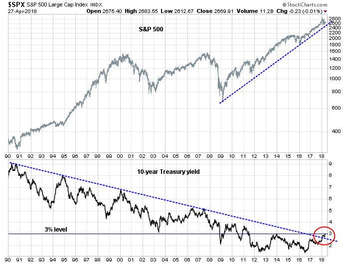
Rather than focus on any single level, investors would be advised to concentrate on the interaction between stocks and bonds. Consider the P/E ratio. The factors that drive equity prices are:
- How fast is the E in the P/E ratio likely to grow?
- What is the outlook for interest rates and how does it affect the E/P ratio?
It’s really that simple.
The history of rates and stock prices
When the stock market sold off last week, I pointed to the historical analysis from JPM Asset Management that “when yields are below 5%, rising rates have historically been associated with rising stock prices” (see Is good news now good news, or bad news?)
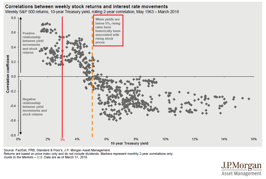
I also referred to the BAML Fund Manager Survey which indicated that fund managers were not overly worried about equities until yields approached 3.5%.

Those are all simplistic explanations that relate to valuation, but they don’t matter very much in the short run.
Good news is still good news
What really matters to stock prices is growth, and interest rates. The Q1 GDP report was an important test for investor psychology. Is good (economic) news still good (stock market) news, or bad news?
In other words, have investor focus from the bullish factors behind positive growth changing to a fear about the bearish effects of higher growth and inflation on interest rates?
As it turns out, the bulls squeaked out a narrow win on market psychology based on the results of the Q1 GDP report. Q1 GDP growth came in at 2.3%, ahead of market expectations of 2.0%. Bespoke observed that the Employment Cost Index was showing signs of acceleration. The acceleration was not just confined to higher management bonuses, but salaried staff as well.

Q1 GDP growth has historically been depressed by seasonal factors. When we unpack some of the unusual conditions, we can see that Q4 to Q1 was distorted by hurricane-driven Q4 spike in auto sales and home repairs. GDP growth ex-hurricane effects was 2.7%. YoY GDP growth, which sidesteps the seasonal issues, came in at 2.9%.
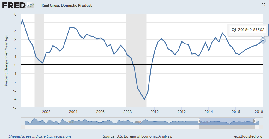
All in all, it was a strong GDP report. Moreover, inflationary factors were ahead of expectations. Core PCE prices rose 2.5% (vs. 2.4% expected), and the Employment Cost Index printed 0.8% (vs. 0.7% expected). These results should give the Fed hawks further ammunition to push for four rate hikes this year instead of three. Indeed, the latest market expectations from CME shows that the probability of four rate hikes this year has been rising, while the probability of three hikes fell. The market implied chances of three and four rate hikes are now roughly equal.
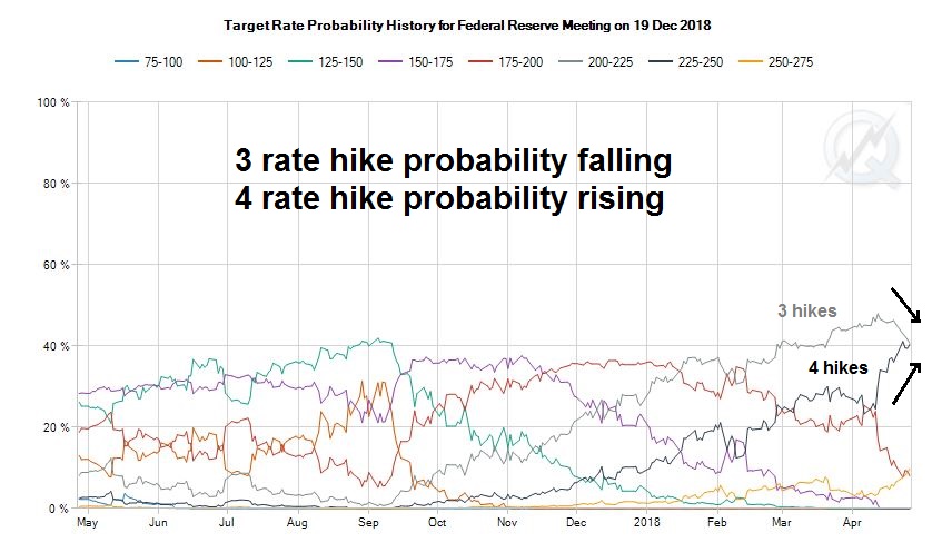
What did the market do after the GDP report? 2-year yields spiked initially but steadied to roughly flat at the close, and the yield curve flattened. Stock prices ended the day with a small gain.
Good news is still good news. It could have been a lot worse. Score one for the equity bulls in the category of market psychology.
Earnings, earnings, earnings!
What about earnings growth? The results from Q1 earnings season has been solid. The latest update from FactSet shows that both the EPS and sales beat rates are well above their historical averages. Consensus EPS estimates rose in response to the upside earnings surprise. From a longer term perspective, forward 12-month EPS changes are roughly coincident with stock prices. While upward earnings revisions are not bullish signals in isolation, they do serve as a confirmation of the direction of Street expectations.
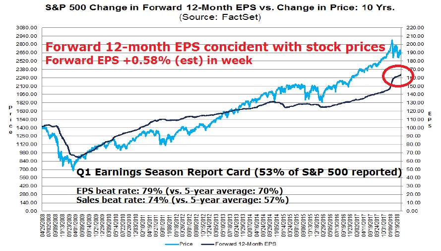
The market was spooked last Tuesday when Caterpillar, which is a major global cyclical bellwether, report blow-out results. In the subsequent call, management deflated expectations by stating that Q1 earnings “will be the high-water mark for the year”. That remark sent the stock’s price down, and the announcement went on to pull down the market as well. Investors should relax. CAT’s problems are likely specific to the company due to higher raw material prices from steel tariffs.
The CAT episode prompted some traders to panic and state that the market was not reacting to earnings beats. Analysis from FactSet shows that perception to be incorrect. On average, stocks are rising on earnings beats, and falling on misses. That said, the magnitude of the market reaction during this earnings season has been muted when compared to the historical average.

Score one for rising growth expectations in the E of the P/E ratio.
Watch the real economy
What about the problem of rising yields? 2-year Treasury yields have been rising steadily since the Fed began its tightening cycle, and 10-year yields are near the 3% level. When do higher rates start to hurt stock prices?
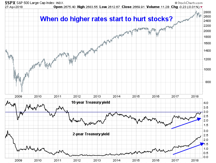
While rising yields does create competitive pressures on holding stocks, the continued dominance of the “good news is good news” narrative suggests that investors should instead focus on the secondary effects of rising rates on the real economy.
There are two likely reasons for the E in the P/E ratio to fall. Either the the Trump White House plunges the global economy into a slowdown with a trade war, or the Fed over tightens the economy into a recession. The latest news indicates that trade tensions are easing. Trump reported sounded optimistic and stated that there was a “very good chance” that a trade war could be averted. Treasury Secretary Mnuchin is on his way to China for a round of negotiations.
That leaves the Fed. The Fed is undergoing a tightening cycle. Instead of asking when rising rates are likely to hurt the stock market, the better question is when rising rates is likely to slow economic growth. Historically, recessions have followed whenever the YoY changes in Fed Funds rates have exceeded the YoY change in employment. This indicator is getting close to a recession signal, and I will be watching the April Jobs Report closely Friday to see how it is evolving.
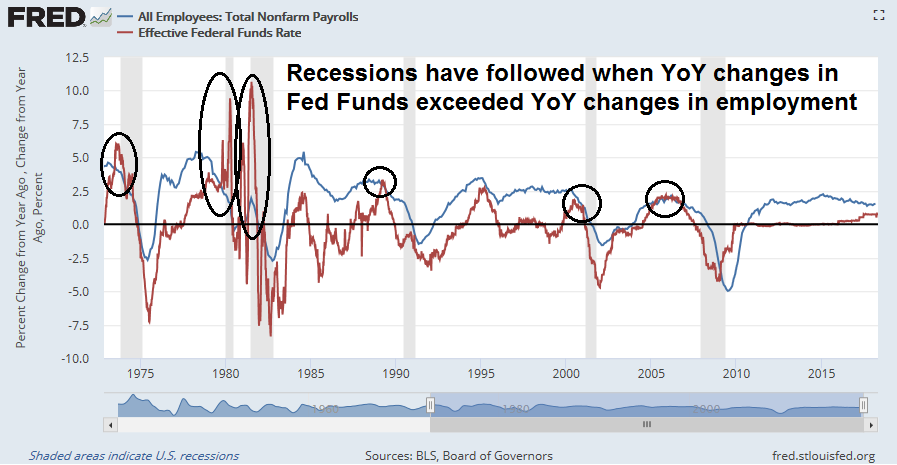
In addition, the combination of higher interest rates and quantitative tightening will have the effect of slowing money supply growth. In the past, a recession has followed whenever either M1 or M2 growth has fallen below the inflation rate. Money supply growth is decelerating rapidly, and real M2 is on pace to go negative later this year.

Watch the effects of rising rates on the real economy, not just the stock market.
Too early to get bearish
Still, it is too early to get too bearish on equities just yet. There are few signs of a bull market killing recession in sight. Initial jobless claims provide a timely high frequency pulse of the American economy. There was much excitement last week when initial claims fell to the lowest level since 1969. For a better perspective, initial claims adjusted for population has been steadily declining and making all-time lows in this expansion cycle.
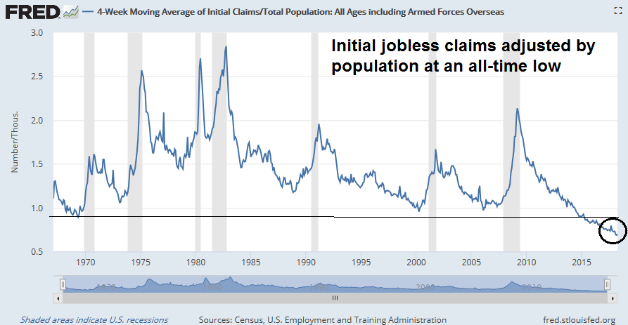
Initial claims have been inversely coincident with equity prices during the past few expansion and provides real-time confirmation of stock market trends. The bull is still alive, according to this metric.

New Deal democrat monitors high frequency economic data, and he helpfully categorizes them into coincident, short leading, and long leading indicators. His analysis indicates that there are no immediate signs of recession, though the long leading indicators are deteriorating:
The nowcast remains positive, as confirmed again by the monthly data. The short term forecast has decelerated from strongly to normally positive. The long term forecast continues to tiptoe towards neutrality, but as of now remains weakly positive, with housing, as indicated by purchase mortgage applications being the chief reason for continued positivity, although the GDP report suggests housing may be weakening slightly as well.
The exuberant reception of WeWork junk bond issue (see the details of financial analysis from FT Alphaville and Bloomberg) shows that the animal spirits are alive. The company originally tried to raise $500 million in debt, but the issue was 5x oversubscribed and upsized by 40%. The bond was priced at 7 7/8%, thought it sank to below par soon after the offering.
The WeWork offering is an indicator of low stress levels in the financial system. In general, high yield (HY) bonds have been flashing a positive divergence against stock prices, though the risk appetite of investment grade bonds is roughly tracking equity movements.
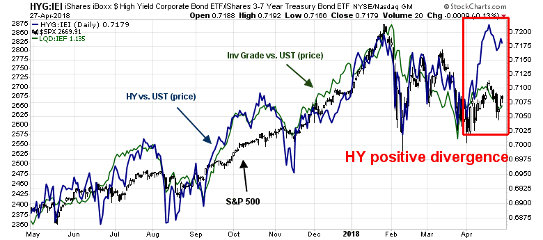
Tiho Brkan recently highlighted SentimenTrader’s AIM composite sentiment model. Readings are at levels that have produced short-term bounces. At a minimum, downside equity risk is limited at these levels.
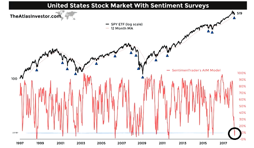
Despite the prospect of rising rates, the combination of a strong growth outlook, robust economic nowcast, lack of financial stress, and washed-out sentiment are signals that it is too early to get intermediate term bearish. While there is no doubt that the equity bull is mature, the day of reckoning is not at hand – yet.
The week ahead
Looking to the week ahead, New Deal democrat‘s comment that the “short term forecast has decelerated from strongly to normally positive” may be setting the tone for the stock market’s outlook for the next few weeks. While the short term forecast remains positive, its deceleration has provided the impetus for the current correction. Stock price are likely to consolidate and remain range bound until some of the uncertainties that overhang the market are resolved.
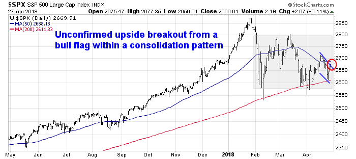
That said, the S&P 500 may be in the process of staging an upside breakout from a bull flag, which would higher prices ahead. However, the market is approaching overbought readings from a short-term (1-2 day) time frame.
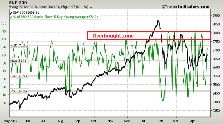
On a longer (3-5 day) time frame, breadth readings are neutral but exhibit positive momentum tendencies, which is bullish.
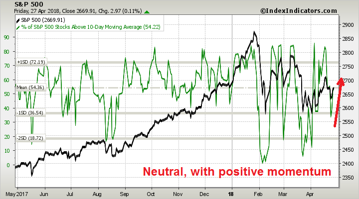
While the bias is bullish, expect lots of event driven volatility next week. From a macro perspective, the FOMC announcement on Wednesday, and the Jobs Report on Friday will undoubted create some choppiness. As well, Q1 earnings season is in full swing, and remember how AMZN, CAT, and FB created both upside and downside market swings last week?

My inner investor continues to be bullish on equities. My inner trader had taken a small long position, and he is prepared to add to his longs should the opportunity present itself.
Disclosure: Long SPXL
Is good news now good news, or bad news?
Mid-week market update: What should we make of the stock market now that the 10-year Treasury yield has breached the 3% level? Should we pay attention to the JPM Asset Management historical analysis which stated, “When yields are below 5%, rising rates have historically been associated with rising stock prices”?

Should we pay attention to the latest BAML Fund Manager Survey, which concluded that the median manager is not overly worried until the 10-year yield crosses 3.5%?
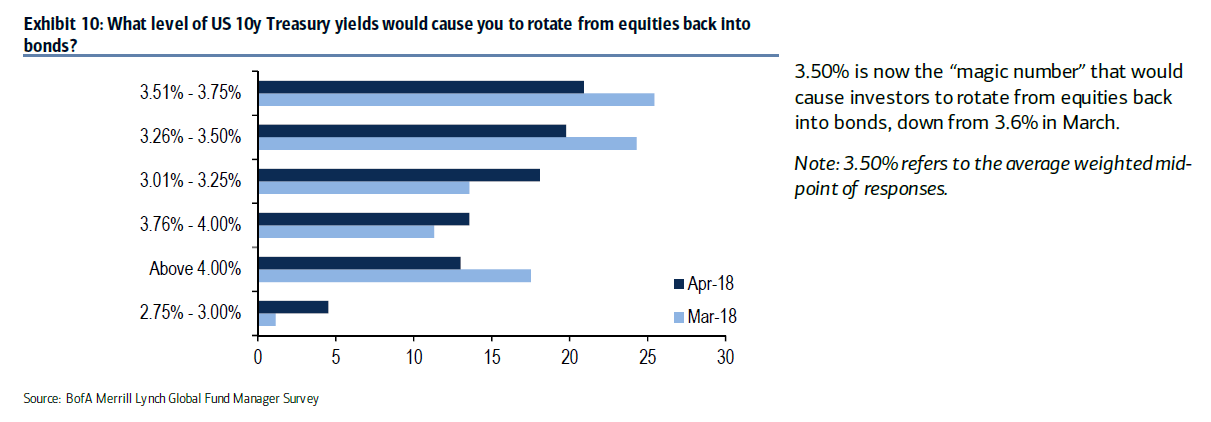
Up until now, good (economic) news has translated to good (stock market) news, and bad news has been bad news. At some point, market perception will shift to putting greater weight on the bearish factors behind higher growth because of the expectation of a more hawkish Fed response, over the bullish factors behind better earnings growth.
Is the market at that turning point when good news is bad news, and bad news is good news?
The Q1 GDP report this Friday provides an important litmus test of whether that inflection point has been reached. Supposing that GDP growth comes in at better than expectations. Will stocks rally because of higher growth expectations, or drop because higher growth will pressure the Fed to raise rates at a faster pace? Similarly, what if growth came in at below expectations?
What about the yield curve? Will it steepen or flatten in response to the GDP report?
Dissecting GDP growth expectations
Consider the market expectations of preliminary Q1 GDP, which is schedule to be released Friday morning. The market consensus is a growth rate of 2.0%, which is equal to the Atlanta Fed’s nowcast and below the New York Fed’s nowcast of 2.9%.
Market expectations have been racheted downwards because of seasonal problems. Jim O’Sullivan, who has been one of the most accurate economic forecasters in the last 10 years, recently highlighted the below seasonal trend of Q1 growth rates.
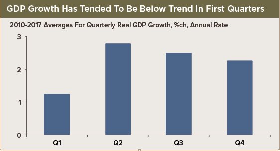
On the other hand, expectations may have fallen too much. Brian Gilmartin at Fundamentalis recounted a discussion he had with David Ranson:
On another topic, further to our recent conversation, there was a bit of a bombshell Thursday morning from the Bureau of Economic Analysis. Real intermediate output grew at a rate of 7½ percent in the fourth quarter. This is a strong leading indicator of GDP, but the neat thing is that hardly anyone is watching it! The news implies an extremely strong start to GDP growth this year – probably overriding the drag from capital-market turbulence. 2018 has begun on an unexpectedly strong note that investors haven’t yet had a chance to recognize, forecasters remaining pessimistic. I see chances for 3+ percent growth in 2018 – or even 3½ percent – greatly strengthened. More specifics available shortly.
Years ago, I worked for Batterymarch chief executive Tania Zouikin, who had been Ranson’s partner at Wainwright Economics, and I am familiar with his forecasting approach. Ranson uses real-time market data to forecast economic releases, because market data tends to be forward looking while other economic statistics have backward looking biases. That is a philosophy that I have adopted in my own work in incorporating technical analysis into my own top-down investment views.
If Ranson is right and Q1 GDP sees an upside blowout surprise, will stocks rally or deflate? That will be the litmus test of market psychology. The Fed has signaled that its base case is three rate hikes this year, with four hikes a definite possibility. The probability of four hikes is rising quickly.
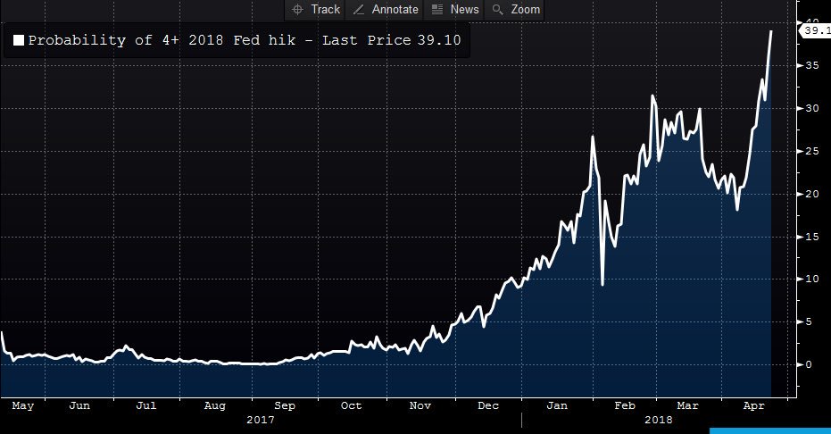
Is the market underpricing or overpricing the Fed’s interest rate policy even as earnings have beaten expectations?
Underlying conditions improving
During the jittery sentiment, macro and technical conditions may be putting a floor on stock prices. Trade war fears are receding. Reuters reported that Trump said that there was a “very good chance” of a US-China trade deal, and Treasury Secretary Steve Mnuchin is expected to travel to China to negotiate the deal. In a separate Reuters report, Trump also said that NAFTA talks are going “nicely”, and Canada expressed optimism over changes in the auto rules content of the treaty.
Risk appetite indicators based on the credit market (high yield bonds) and stock market (price momentum) remain healthy. As another measure of risk appetite, I am also watching carefully the market reception of WeWork’s unsecured junk bond offering (analysis via FT Alphaville). which is a financing from a “sharing economy” company with negative cash flows.
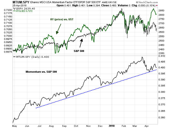
There may be further good news from the option markets. Bloomberg reported that the realized volatility of weak balance sheet companies are lower than strong balance sheet companies, which may be a confirmation of the heightened risk appetite message from the credit markets for lower credit paper. That said, some caution may be needed in embracing this such a bullish interpretation, as the higher volatility of strong credits has been distorted by the turmoil in technology stocks, which tend to have clean balance sheets.
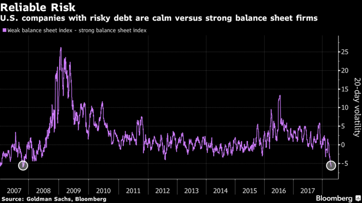
Twitter breadth, as measured by Trade Followers, has been trending positive for the last few weeks. In particular, bullish breadth has been rising even as the market consolidated sideways, which is bullish.
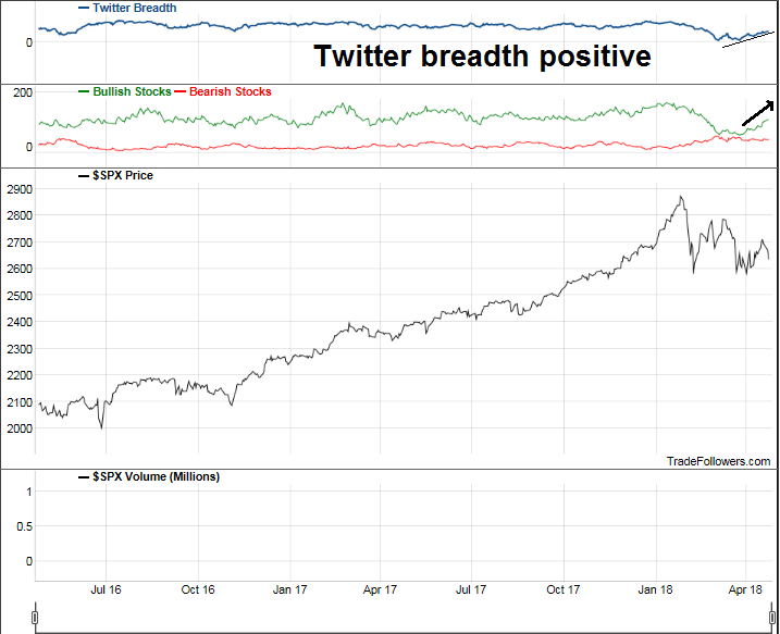
The market is flashing a mild oversold reading based on Tuesday’s close, and readings are likely to have improved based on today’s market action.

For now, the market remains range bound between its February low and March high. Until it breaks out of that range, market behavior is to be interpreted as choppy and consolidative. The bulls could even describe the recent price action as a bear flag, which is a consolidation pattern that breaks upwards.
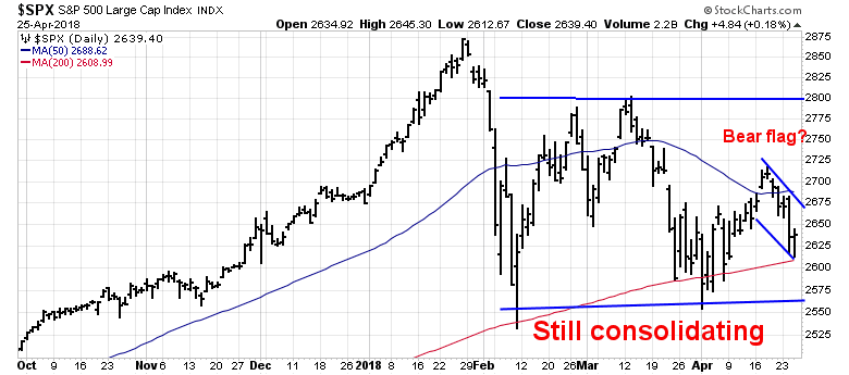
My inner trader is inclined to give the bull case the benefit of the doubt for now. The market reaction to the Friday GDP report will be an important test of market psychology as a guide to future direction.
Disclosure: Long SPXL
Don’t miss the eurozone revival!
Remember my post, Opportunity from Brexit turmoil? I suggested on February 22, 2018 that we were seeing a setup for a long trade in UK equities. Brexit political chaos was reaching a crescendo, and there was a chance that we may see another referendum where the Remainers could prevail.
Since then, while there is no news of a second referendum, Business Insider reported that Theresa May may resign if she loses a vote on leaving the customs union after Brexit. The FTSE 100 (top panel) has steadied, and rallied through resistance and a downside gap from early February. In addition, UK equities have turned up relative to global equities (bottom panel) and begun to outperform.

We may be seeing a similar buying opportunity in the eurozone.
Signs of a turnaround?
For several months, it appeared that the European economic revival was faltering, as evidenced by the falling Economic Surprise Index (ESI), indicating that macro releases were consistently missing market expectations.
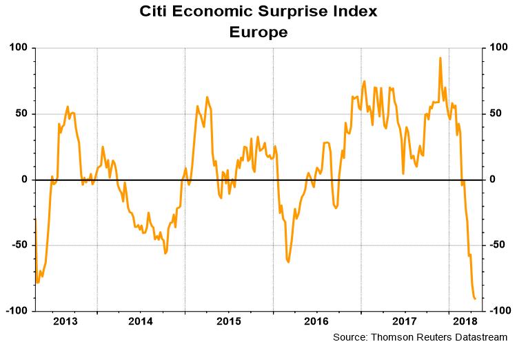
The ESI isn’t the stock market, and Citigroup found that buying the market when the ESI is extremely depressed level has been rewarding, with positive returns 14 out of 15 episodes.

The market is setting for a contrarian buy signal. The latest BAML Fund Manager Survey shows global managers have been reducing their eurozone equity weight for several months, indicating flagging enthusiasm for the region.
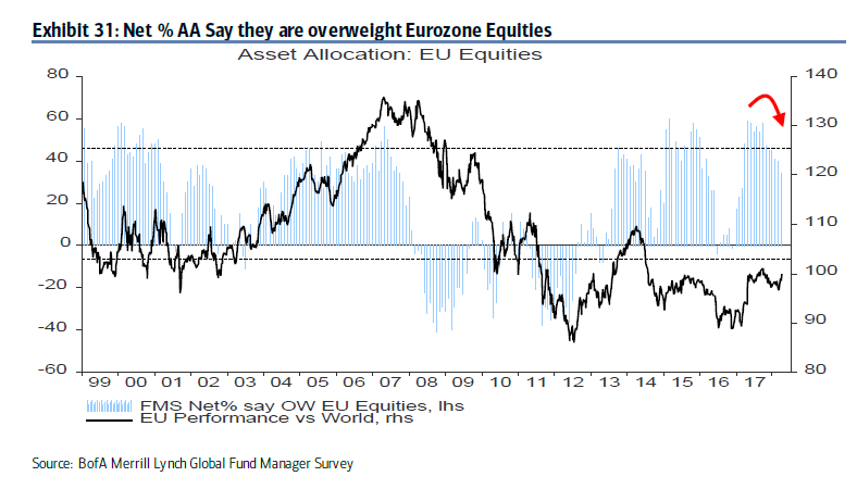
We now may have the bullish catalyst in sight. The ESI indicator is designed to be mean reverting, and today’s series of eurozone PMIs shows that the deterioration may be finding a bottom. Eurozone composite PMI was steady and beat market expectations.

The technical conditions of the Euro STOXX 50 is also supportive of further gains. The index broke up through a key resistance level, and it is now testing overhead resistance at its 50 day moving average. In addition, the relative performance of the index against global equities (bottom panel) indicates that it staged an upside breakout through a relative downtrend, indicating high outperformance potential.

In short, we have all of the elements of a buy signal in eurozone equities. Low expectations from macro deterioration, elements of a turnaround, and a positive technical backdrop. Is it time to buy?
Trade war jitters fade, but for how long?
Preface: Explaining our market timing models
We maintain several market timing models, each with differing time horizons. The “Ultimate Market Timing Model” is a long-term market timing model based on the research outlined in our post, Building the ultimate market timing model. This model tends to generate only a handful of signals each decade.
The Trend Model is an asset allocation model which applies trend following principles based on the inputs of global stock and commodity price. This model has a shorter time horizon and tends to turn over about 4-6 times a year. In essence, it seeks to answer the question, “Is the trend in the global economy expansion (bullish) or contraction (bearish)?”
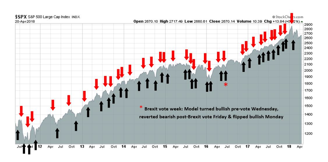
My inner trader uses the trading component of the Trend Model to look for changes in the direction of the main Trend Model signal. A bullish Trend Model signal that gets less bullish is a trading “sell” signal. Conversely, a bearish Trend Model signal that gets less bearish is a trading “buy” signal. The history of actual out-of-sample (not backtested) signals of the trading model are shown by the arrows in the chart below. The turnover rate of the trading model is high, and it has varied between 150% to 200% per month.
Subscribers receive real-time alerts of model changes, and a hypothetical trading record of the those email alerts are updated weekly here.
The latest signals of each model are as follows:
- Ultimate market timing model: Buy equities
- Trend Model signal: Bullish
- Trading model: Bullish
Update schedule: I generally update model readings on my site on weekends and tweet mid-week observations at @humblestudent. Subscribers receive real-time alerts of trading model changes, and a hypothetical trading record of the those email alerts is shown here.
Falling trade tensions = Equity bullish
I have written in these pages before that, in the absence of trade war tensions, the path of least resistance for stock prices is up (see Watch the Fed, not the trade war noise).
From a technical perspective, stock market is well supported by positive divergence from breadth indicators. Both the SPX Advance-Decline Line and the NYSE common stock only A-D Line made all-time highs last week.
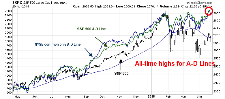
From a fundamental viewpoint, equity valuations are not especially demanding when compared to bonds. The market started to get concerned last week when the 10-year yield approached 3%, but some perspective is in order. As the following chart shows, FactSet reported that forward P/E ratio is in the middle of its 5-year range. By contrast, the 10-year yield is near the top of its 5-year range, indicating slightly equities are cheap relative to Treasuries. On a 10-year perspective, however, the forward P/E is above its historical range and so is the 10-year yield. Depending on your time horizon, valuations are either slightly cheap or slightly expensive, but levels are nothing to panic over.
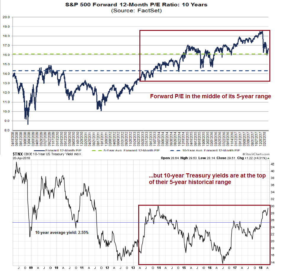
In addition, earnings are continuing to rise. Results from Q1 earnings season have been solid, with above average EPS and sales beat rates. In addition, forward 12-month EPS are rising, indicating positive fundamental momentum.
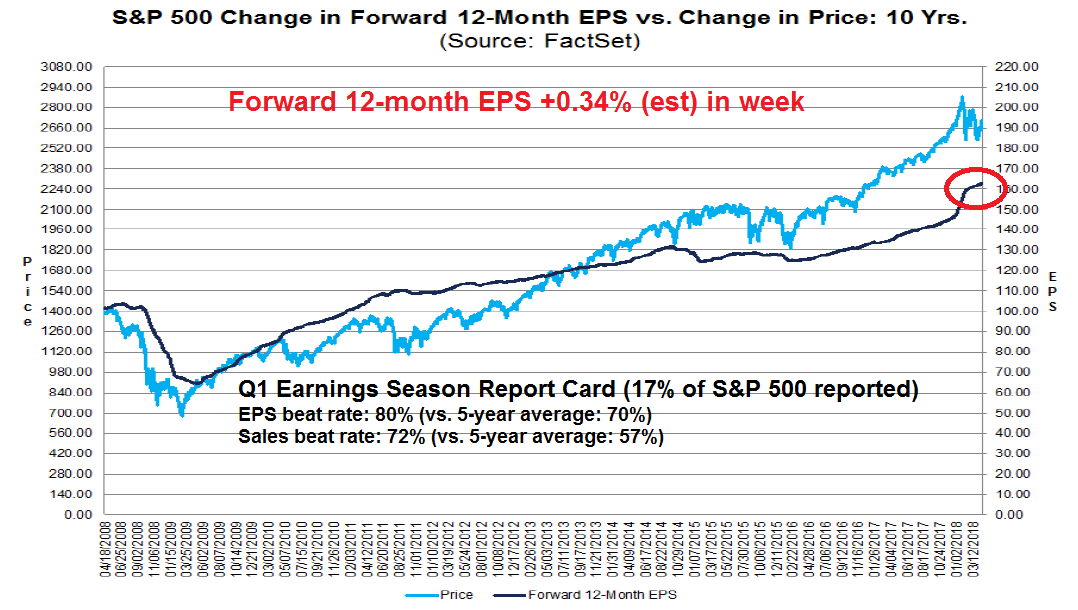
The bullishness is not just attributable earnings results. Brian Gilmartin at Fundamentalis pointed out that revenue growth and beat statistics are highly encouraging.

What could possibly go wrong?
How a trade war hurts America
How about a trade war that craters corporate earnings? For some perspective on how a full-blown trade war would hurt the American economy, we can examine the business reaction from the latest Beige Book. The latest April report contained 36 references to the words “tariff” or “tariffs”, compared to none in the previous two editions. Most of the concerns comes from rising input costs, and that`s just from the newly enacted aluminum and steel tariffs, which are minuscule compared to the next round of proposed Section 301 tariffs on $50 billion of Chinese imports.
Boston Fed [emphasis added]
Two contacts brought up the proposed China tariffs and said they represent a major risk. One was a toy manufacturer who sources 75 percent of their production from China. The second said that punitive tariffs on Chinese aluminum had already had a big effect: “Thin gauge foil” is produced only in China and tariffs raised the price three-fold; the contact argued that “these tariffs are now killing high-paying American manufacturing jobs and businesses.”
Don’t hold back, tell us how you really feel.
Philadelphia Fed
Of the 22 manufacturing firms that offered general comments, seven mentioned impacts from recent tariffs or proposed tariffs–most noted rising prices or anticipated rising prices; just one firm anticipated greater demand.
Cleveland Fed
According to contacts, recently imposed tariffs have accelerated price appreciation of steel products, in some cases at double-digit rates.
Rising freight volumes across product segments were attributed primarily to solid economic growth. There is concern about the sustainability of increasing volume because of newly enacted tariffs and potential outcomes from NAFTA negotiations.
Richmond Fed
Steel and aluminum prices rose sharply and were expected to rise further as a result of recently-imposed tariffs.
Atlanta Fed
Overall, businesses continued to report relatively benign input-cost pressures. However, some contacts noted rising prices for transportation, as well as steel as tariff rhetoric increased.
Chicago Fed
Manufacturers facing higher steel and aluminum costs because of the new tariffs expected to pass on about half of the increased costs to their customers on average.
Minneapolis Fed
Multiple contacts reported dramatic increases in the prices for steel products, partly attributable to recently announced tariffs; a manufacturer of tractor trailers said they “can’t raise prices as fast as material costs.”
Dallas Fed
Price pressures remained elevated over the past six weeks. Input cost pressures increased among energy, manufacturing, and construction firms, partly due to the announced tariffs on steel and aluminum. Upstream energy firms said the steel tariffs represent a worry, although some contacts said there shouldn’t be much of an impact on costs until 2019 when contracts roll over. Downstream energy contacts were still figuring out how much of their steel is subject to the new tariff and how that will affect their costs and investment decisions. Several manufacturers said that talk of steel tariffs immediately resulted in higher steel prices. An architecture firm noted that the increase in steel costs will impact the ability of their clients to move forward with some construction projects. Average gasoline and diesel prices were fairly stable, although transportation services contacts noted that fuel costs were up notably from a year ago.
Expectations regarding future business conditions remained optimistic, although several contacts noted that the newly enacted tariffs were creating a lot of uncertainty in their outlooks for activity and prices. Refiners and petrochemical producers specifically mentioned their views about the potential negative impact of these tariffs on construction projects.
San Francisco Fed
Contacts reported a jump in inflationary pressures for metals prices, partly due to the anticipation of tariffs and unrelated increases in raw material costs.
Most of the concerns over tariffs raised by businesses in the Beige Book pertain to higher input costs, which hurts American competitiveness. Chad Bown at the Peterson Institute broke down the list of items in proposed Section 301 tariffs and found that they are mostly capital equipment or intermediate goods that can’t be easily replace by US manufacturing because supply chains have become global:
One out of every five tariffs that he selected involved a product with the word “parts” in its description. Most were so technical that even trade experts had no idea what they were, except to know that businesses and workers rely on those “parts” from China to remain competitive in the global marketplace.
Most of those types of products go into something bigger and better being made by Americans. And especially for those on the list, the imports from China are nowhere near zero. I classified all 1,333 products and found that intermediate inputs and capital equipment comprise almost 85 percent of the $50 billion of imports subject to Trump’s tariffs.
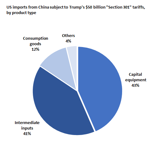
Is it any wonder why NFIB small business confidence edged down in March, albeit from a highly elevated level?
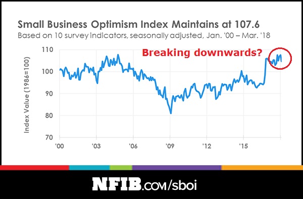
The businesses reaction so far has only been in response to the aluminum and steel tariffs. Those effects are relatively small and amount to a trade skirmish. What happens if the Sino-American trade relationship descend into a full-blown trade war? Researchers at the New York Fed recently published a study which asked, “Will new steel tariffs protect US jobs?” Here is the somewhat awkward conclusion for the Trump White House:
Although it is difficult to say exactly how many jobs will be affected, given the history of protecting industries with import tariffs, we can conclude that the 25 percent steel tariff is likely to cost more jobs than it saves.
The fastest way to reduce the trade deficit is to plunge the economy into a recession. Donald Trump appears to be unknowingly walking down that path.
How a trade war hurts China
Across the Pacific, the effects of a trade war will be very ugly for China. Even worse, a China slowdown is likely crater the global economy.
Exports account for roughly 20% of Chinese GDP. Daniel Lacalle pointed out that falling exports to the US would probably plunge China into a hard landing.
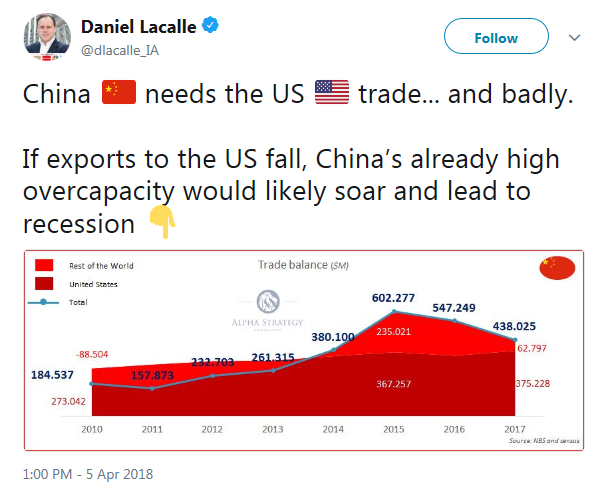
The hit to Chinese growth won’t just come from rising tariffs. Non-tariff barriers will also play a role to tank trade flows. The global nature of supply chains also makes US companies vulnerable to trade tensions. As an example, Beijing could disrupt American manufacturing by shutting down key Chinese suppliers of US companies like Apple using the pretense of failed health inspections. Tom Orlik at Bloomberg highlighted China’s vulnerability using the latest American ban on exports to Chinese phone maker ZTE as an example.
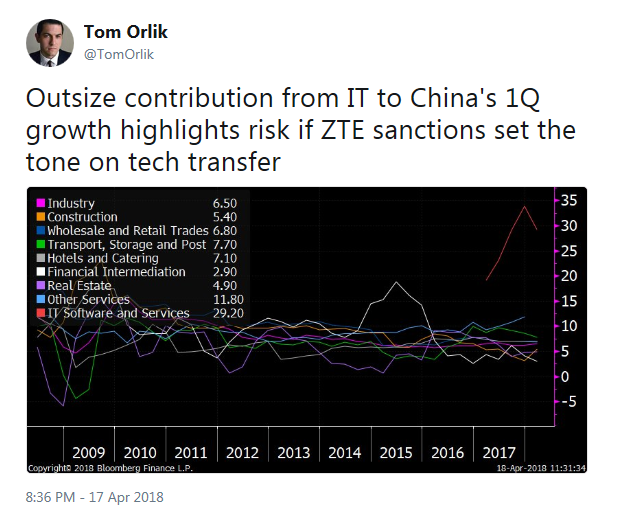
A Chinese slowdown would plunge most of Asia into recession. The sudden halt in global growth is unlikely to be firewalled in Asia. A Business Insider article pointed out that Germany would be especially vulnerable to a Chinese growth deceleration. If Germany, which has been the growth locomotive of the eurozone, were to slow, what happens to Europe?
“The German model depends on trade being as free as possible,” Dennis Snower, head of the Kiel Institute for the World Economy, an influential think tank in Germany told the Financial Times.
“If you hurt trade flows, then Germany will be hurt.”
Many German firms, particularly automakers and producers of other forms of heavy machinery have supply chains and manufacturing processes that heavily involve both China and the USA.
As an example, both BMW and Mercedes have major operations in the USA, with BMW’s plant in Spartanburg, South Carolina producing almost 2,000 cars per day. Mercedes has a major operation near Tuscaloosa, Alabama, employing upwards of 4,000 people.
In the event that China levies an import tariff on cars manufactured in the USA, it would have a major negative impact on the overall business of Daimler, the parent company of BMW and Mercedes.
According to the Financial Times, Daimler is “the largest vehicle exporter from the US by value and China is their number one market.”
In short, a Sino-American trade war will have far reaching global consequences.
Trade war fears are fading
Fortunately, the belligerent trade rhetoric is starting to fade. Xi Jinping’s speech at the Boao conference on April 10 appeared to have broken the rhetorical logjam. Even though the promises that Xi made were not very new, his conciliatory tone calmed the markets. Undoubtedly there are lots of back channel discussions about how to defuse the possible trade war.
Even though there is no “trade tension” ETF, I built a trade tension factor to measure the market’s perception of trade war risk. The blue line in the chart below shows the relative return of pure US revenue companies in the Russell 1000 (AMCA) compared to the Russell 1000. I would interpret a rising line (domestic companies outperforming) as rising trade tensions, net of currency effects. The green line is the USD Index. When the USD is rising (green line falling), multi-nationals enjoy an earnings tailwind. Even though AMCA has only had a fairly brief trading history, we can see that the blue line representing the trade tension factor has roughly tracked the green line, which represents the inverse of the USD, in 2017. Even though the USD (green line) has been range bound for much of 2018, the trade tension factor has been highly volatile, and illustrates the ups and downs of trade anxiety in the past few months.
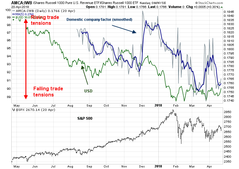
Readers who want to follow along at home can use this link for real-time updates.
Even though trade tensions have been falling recently, the market is not out of the woods. Trump’s recent broadside aimed at Rusal spiked metal prices and sent commodity markets into turmoil. Despite the market’s apparent on nonchalance on trade tension risk, the Rusal episode shows Trump’s America First policy remains in effect. Who knows what will come next?
While I am cautiously bullish on equities because of a solid technical backdrop and improving growth fundamentals, investors should keep a close eye on my trade tension factor as a way of monitoring trade tension risk.
The week ahead
Looking to the week ahead, I wrote last Tuesday that, even though I remained bullish, the market was due for a brief pause (see Time for a pause in the bulls’ charge). Stock prices subsequently topped out on Wednesday and weakened for the next two days. The market is now testing its 50 dma and a key uptrend line that began in early April. If that trend line holds, the next upside resistance is the gap at about 2750 formed on March 19. Further resistance can be found at the 2790-2800 level.
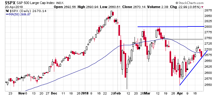
Short-term breadth indicators from Index Indicators are flashing near oversold readings that are enough for a bottom at Friday’s levels.

Another possible bullish development was the news out of North Korea. After Friday`s market close, North Korea announced that it is suspending all nuclear and ICBM tests ahead of the summit with South Korean President Moon next week. The market may interpret this event in a bullish way and it could spark a risk-on rally at the open on Monday.
My inner investor remains bullish on stocks. My inner trader went to cash last Tuesday, and he plans to re-enter the market on the long side on Monday, as long as we don`t get a rip-the-bears-face-off bullish stampede. Earnings season will be in full swing next week. Even if my inner trader doesn’t catch the initial rally on Monday, there will likely other opportunities as stocks will be volatile and reacting to the headline of the day.
The canary in the credit crunch coalmine
Historically, every recession has been accompanied by an equity bear market.
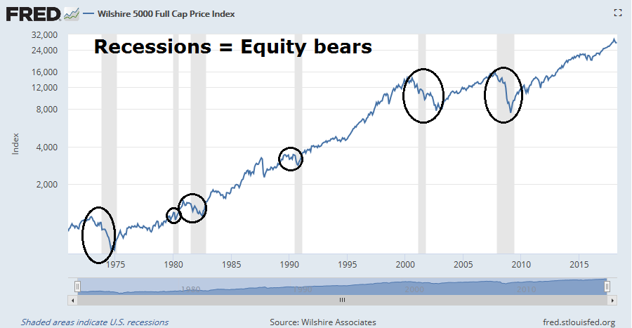
One characteristic of every recession has been a credit crunch. As the economy slows, banks react by tightening their lending criteria, which dries up the availability of credit, and eventually causes a credit crunch. There are a number of ways that investor can monitor the evolution of lending standards.
The most obvious way is to watch the Fed’s lending officer survey. The latest data shows that readings remain benign for both corporate and individual borrowers. One disadvantage of the survey is the results only come out quarterly, which is not very timely and amounts to looking in the rear view mirror.
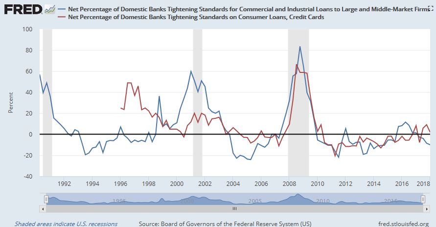
A more timely data series are the Chicago Fed`s Financial Conditions Index, and the St. Louis Fed`s Financial Stress Index. Current conditions show that Stress levels are starting to rise, though the absolute stress levels remain low. Both of these data series are released monthly, which is more timely than the lending officer surveys.
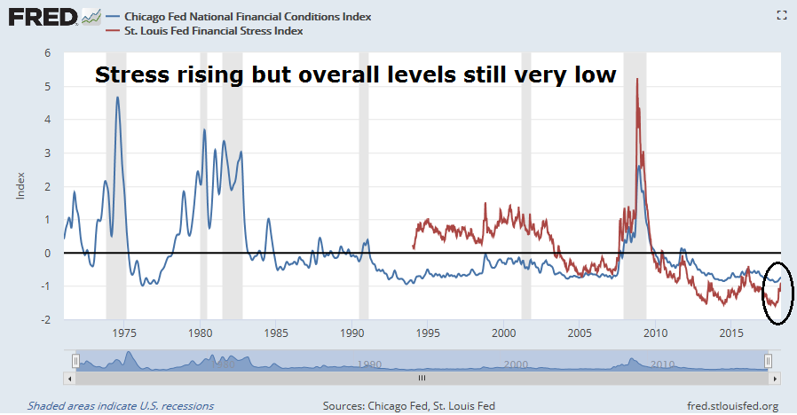
There may be a better real-time way of watching for a credit crunch.
Tesla: The canary in the credit crunch coalmine
One of the functions of recessions is to unwind the excesses of the previous cycle. The finances of Tesla (TSLA) is the poster boy of the this expansion. Recently, Tesla CEO Elon Musk shot back a reply to an article in The Economist which indicated that the company needs to raise $2.5b to $3b this year as it continues to burn cash.
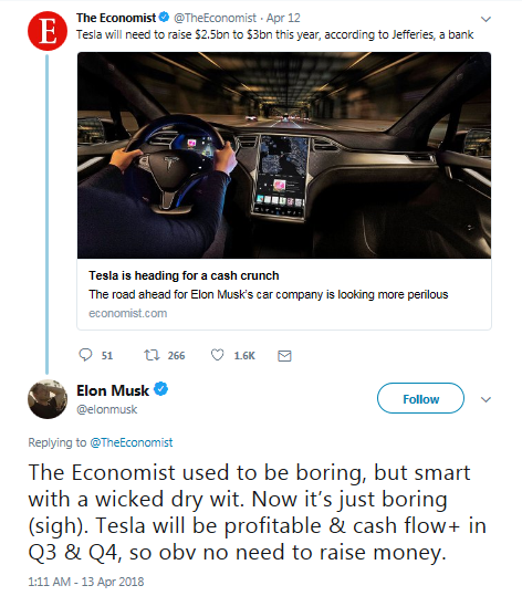
Much of the controversy surrounding TSLA hinges on whether the company can produce its mass market Model 3 cars in size. The latest lawsuit, which features a number of accounts from former employees, sheds light on that Herculean task. Here are just a few highlights from the lawsuit, starting with the key claims:
16. In May 2017, when Defendants stated that the Company was “on track” to meet its mass production goal, as production on a fully automated production line was supposed to be ready to begin, and in August 2017, when production on a fully automated production line was supposed to have already been in place and Model 3s were supposed to be coming off the line, according to a number of former employees, the Company had not yet finished building its automated production lines in either Fremont or Nevada. Tesla was neither ramping up mass production, nor “on track” to mass produce Model 3s at any time on or around the end of 2017.
17. Defendants Musk and Ahuja, who visited the Fremont facility on a regular basis, knew that the Model 3 production line was way behind the publicly announced schedule and that it would never mass produce the Model 3 in 2017.
18. As Defendants claimed to be on track for mass production in 217, the Fremont facility was assembling Model 3s, by hand , in the “beta” or “pilot” shop,” a facility to assemble prototypes. The actual mass production line at Freemont was yet to be completed. Workers in the pilot shop were not even able to build enough Model 3s to carry out the necessary testing on the vehicles, and most Model 3 workers were being reassigned, or spending their days cleaning. It was evident to anyone who visited the Fremont facility – and Musk himself visited the unbuilt production line area every Wednesday, known internally as “Elon Day” – that the production line was not yet built, that parts for the necessary robots were not present, and that construction workers were spending most of their shifts sitting around with nothing to do. Multiple former employees corroborate the fact that there was no fully functioning automated production line when Tesla was telling the world that there was, and that the construction site where the line was being built was clearly and visibly far from completion.
Skipping ahead to the accounts of the former employees:
125. Some time in late April or early May of 2016, FE1 participated in a meeting with Musk, CFO Jason Wheeler, and the Vice President of Engineering. FE1 stated that during that meeting, he told Musk directly that there was zero chance that the plant would be able to produce 5,000 Model 3s per week by the end of 2017.,,
190. According to FE9, the Gigafactory was plagued by problems related to producing usable models, and the first battery model was completed long past the deadline when the Model 3 was supposed to have been launched. The process required apply adhesive at a specific ratio, which if not done properly caused the batteries to “fall off.” Parts and spaces between parts were small, making correct module completion challenging. FE9 stated that prior to automated production, human error resulted in poorly produced modules “all the time,” with workers rushing products through the line, assuming problems “would fix [themselves],” which they did not…
195. During FE9’s tenure, which lasted almost to the end of the Class Period, the Gigafactory produced no more than two battery packs at most per day, sufficient for two cars. Realistically, it took a full day – comprised of two shifts – to produce a single battery pack, and, even then, it was not a “customer saleable pack,”, i.e., a pack that passed inspection and was ready to be installed in the Model 3.
196. The only “customer saleable pack” was completed in October 2017, shortly before FE9 left Tesla. A company-wide email was sent congratulating the engineers and production workers for their hard work.
Really? And the battery Gigafactory is TSLA’s competitive moat?
For some perspective of TSLA’s production problems, FT Alphaville reported that Max Warburton of Bernstein Research diagnosed the company’s problems as trying to automate before perfecting the production process:
What is the inspiration behind Tesla’s automation? Tesla has bought German robots and a German automation company (Grohmann). But the German OEMs – traditionally the most enthusiastic proponents of automation – have actually been rowing back on it in recent years. The best producers – still the Japanese – try to limit automation. It is expensive and is statistically inversely correlated to quality. One tenet of lean production is “stabilise the process, and only then automate”. If you automate first, you get automated errors. We believe Tesla may be learning this to its cost.
In other words, TSLA is never going to fix its production problems, and it will continue to burn cash. The latest report from Reuters that the company is pausing production for several days to fix its production problems is not helpful to its bull case. The only thing keeping the company’s finances in shape is Elon Musk’s flair at selling his vision to investors.
So what happens when the animal spirits turn and banks tighten their lending standards? That bring me up to my point. While I am not an advocate for either selling or shorting TSLA, I believe that the stock is the canary in the credit crunch coalmine for this market cycle.
The chart of the stock price shows two ranges, with the stock in the lower part of a higher range. However, the lower panel of the chart shows that the stock remains range bound relative to the market, though the stock is tracing out a minor falling channel.
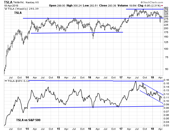
Should it break the relative range to the downside, that would be a signal to batten the hatches.
Disclosure: No positions
Time for a pause in the bulls’ charge
Mid-week market update: Don’t get me wrong, I am still bullish, but the stock market rally appear a little extended in the short run and due for a brief period of consolidation. The SPX broke out from its inverse head and shoulders (IHS) pattern this week, cleared its 50 day moving average (dma), and filled in the gap from March 22. The next upside objective is the IHS objective of 2790-2800, whic coincides with resistance defined by the highs set in late February and March.
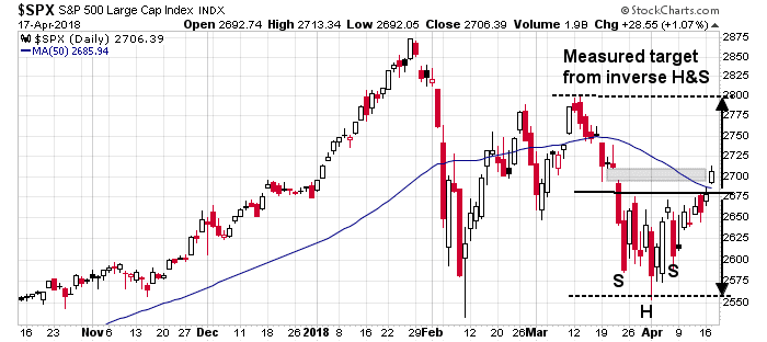
In the short run, however, the market looks overbought and may be due for a pause.
Short term cautionary signals
I am seeing a number of short term (2-5 day) cautionary signals. Breadth indicators from Index Indicators are flashing highly overbought signals.
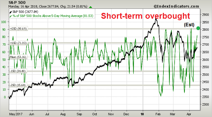
The stock market rally was strong enough to depress the VIX below its lower Bollinger Band (BB).
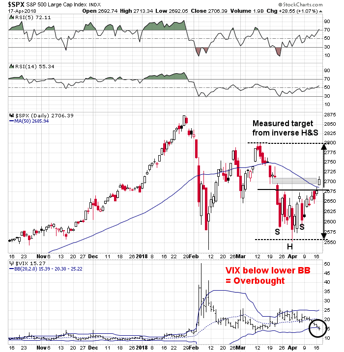
This is a setup for a sell signal for the stock market. The table below depicts a study I did last October. When the VIX falls below its lower BB and mean reverts, which hasn’t happened yet, equity returns have been subpar. However, the results are not compelling enough to go short.
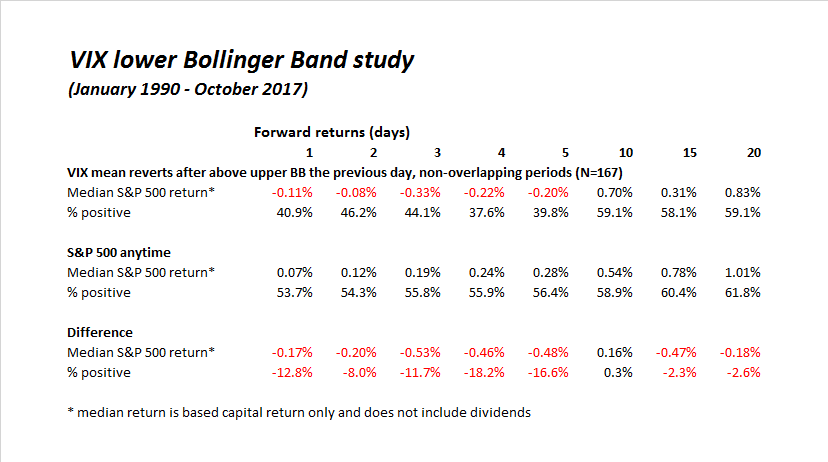
This week is option expiry week. Rob Hanna of Quantifiable Edges documented in the past that April OpEx is one of the strongest OpEx weeks of the year, but further investigation revealed that the market tends to peak out on the Wednesday of April OpEx and treads water for the rest of the week.
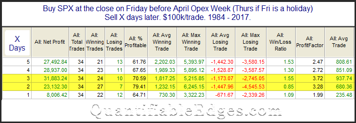
Still bullish
Despite these short term headwinds, my inner trader is still bullish and expects to buy after an expected brief pause. Breadth indicators are bullish. The SPX only Advance-Decline Line is supportive of this advance. In addition, the small cap A-D Line made a new high.

Risk appetite measures also remain healthy.
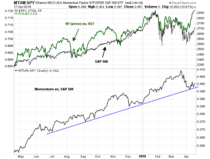
My inner trader went to cash today as he believes that short-term risk/reward is unfavorable over the next few days, especially during a volatile period such as Earnings Season. However, he expects to be buying back in after a brief period of consolidation.
Buy gold for the late cycle inflation surge?
Preface: Explaining our market timing models
We maintain several market timing models, each with differing time horizons. The “Ultimate Market Timing Model” is a long-term market timing model based on the research outlined in our post, Building the ultimate market timing model. This model tends to generate only a handful of signals each decade.
The Trend Model is an asset allocation model which applies trend following principles based on the inputs of global stock and commodity price. This model has a shorter time horizon and tends to turn over about 4-6 times a year. In essence, it seeks to answer the question, “Is the trend in the global economy expansion (bullish) or contraction (bearish)?”

My inner trader uses the trading component of the Trend Model to look for changes in the direction of the main Trend Model signal. A bullish Trend Model signal that gets less bullish is a trading “sell” signal. Conversely, a bearish Trend Model signal that gets less bearish is a trading “buy” signal. The history of actual out-of-sample (not backtested) signals of the trading model are shown by the arrows in the chart below. The turnover rate of the trading model is high, and it has varied between 150% to 200% per month.
Subscribers receive real-time alerts of model changes, and a hypothetical trading record of the those email alerts are updated weekly here.
The latest signals of each model are as follows:
- Ultimate market timing model: Buy equities
- Trend Model signal: Bullish
- Trading model: Bullish
Update schedule: I generally update model readings on my site on weekends and tweet mid-week observations at @humblestudent. Subscribers receive real-time alerts of trading model changes, and a hypothetical trading record of the those email alerts is shown here.
Late cycle expansion = Inflationary revival
The missiles have flown, and the bombs dropped. Inflationary pressures are rising. Is this the time for gold to shine?
Notwithstanding the short-term effects of geopolitical tension, consider the longer term inflationary pressures, which are building not just in the US but globally. Ned Davis Research recently pointed out that roughly two-thirds of countries are growing above their long-term potential. Unless these countries can increase their potential through faster labor force or productivity growth, inflationary pressures begin to build, followed by central bank tightening. We could reach recessionary conditions in the next year or so.
This suggests that the economy is undergoing a late cycle expansion characterized by capacity constraints, which would lead to an inflationary revival. Gold prices are currently testing a key resistance level. Should it stage an upside breakout, who know how far they could go.

The macro bull case for gold is easy to make. Gold is an inflation hedge, and inflation momentum is rising.
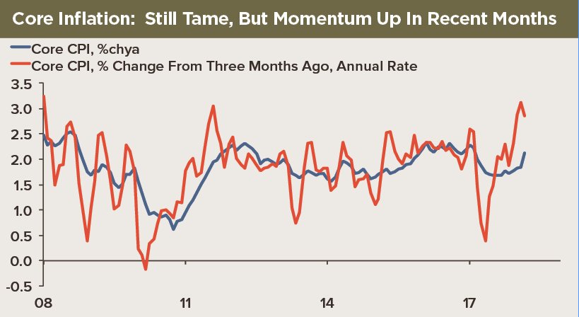
J C Parets of All Star Charts highlighted a washout in the silver/gold ratio as an indicator of precious metal risk appetite. A rising silver/gold ratio would indicate that animal spirits have taken over the precious metal complex, which would be highly bullish.
Tiho Brkan pointed out that hedge funds are in a crowded short in silver futures, which is bullish for silver, and for gold by implication.

In short, sentiment models indicate that silver prices are poised for a powerful rally. The combination of rising geopolitical tensions, and possible strength in silver prices would be highly bullish for gold and other inflation hedges.
Does that mean that investors and traders should pile into precious metals in anticipation of a late cycle inflation surge? Not so fast! There are two sides to every story, and the bull case for gold may be too facile to be true.
The bull case for gold
The underlying fundamental case for gold rests on rising inflation. The New York Fed`s Underlying Inflation Gauge (UIG) shows a distinct upward acceleration with the March reading at 3.1%, which is well above the Fed`s 2% inflation target.
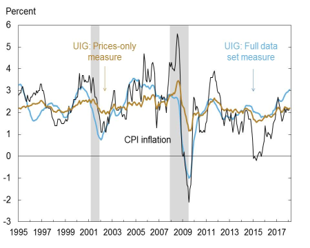
Not only is inflation rising in the US, the Citigroup Inflation Surprise Index indicates that positive inflation surprises are global in scope.
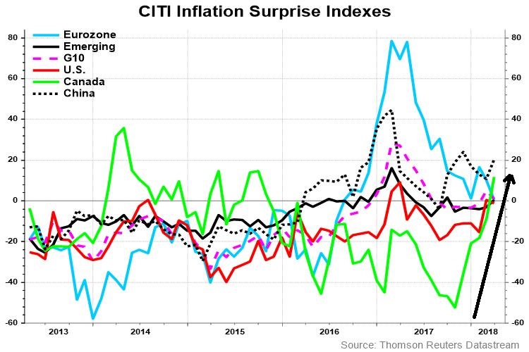
The junior/senior gold stock ratio (GDXJ/GDX) is equally encouraging for the bulls. As the following chart shows, the GDXJ/GDX ratio has tracked the silver/gold ratio very closely. Both are measures of precious metal risk appetite. Even as the silver/gold ratio languish at multi-decade support levels, the GDXJ/GDX is exhibiting a positive divergence, which could foreshadow strength in gold prices.
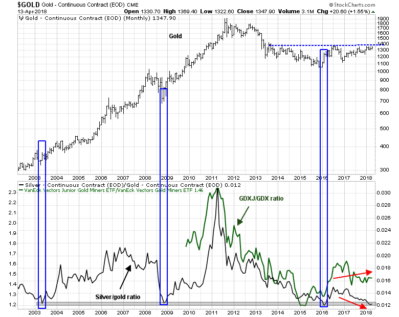
Should gold prices stage an upside breakout through resistance, point and figure charting calls for upside targets in the 1609 to 1678 range, depending on charting differences based on daily, weekly, and monthly prices, as well as box size and reversal parameters.

Stock market implications
What about the stock market? During the typical late cycle expansion phase, inflation hedge sectors become the market leaders, and stock market momentum starts to fade, but prices continue grind upwards.
As we head into Q1 earnings season, the quarter-end update from JPM Asset Management shows that the market is trading at a forward P/E of 16.4, which is decidedly average and not demanding by historical standards.
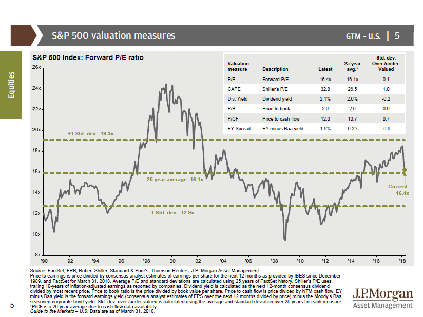
As the forward P/E ratio is average, so are expected returns.
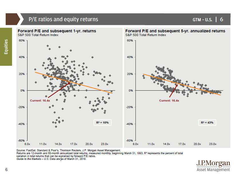
In addition, forward 12-month EPS continues to be revised upwards, which is an indication of fundamental momentum. FactSet reported that Q1 earnings guidance is the most bullish on record since they started tracking this metric in Q2 2006.
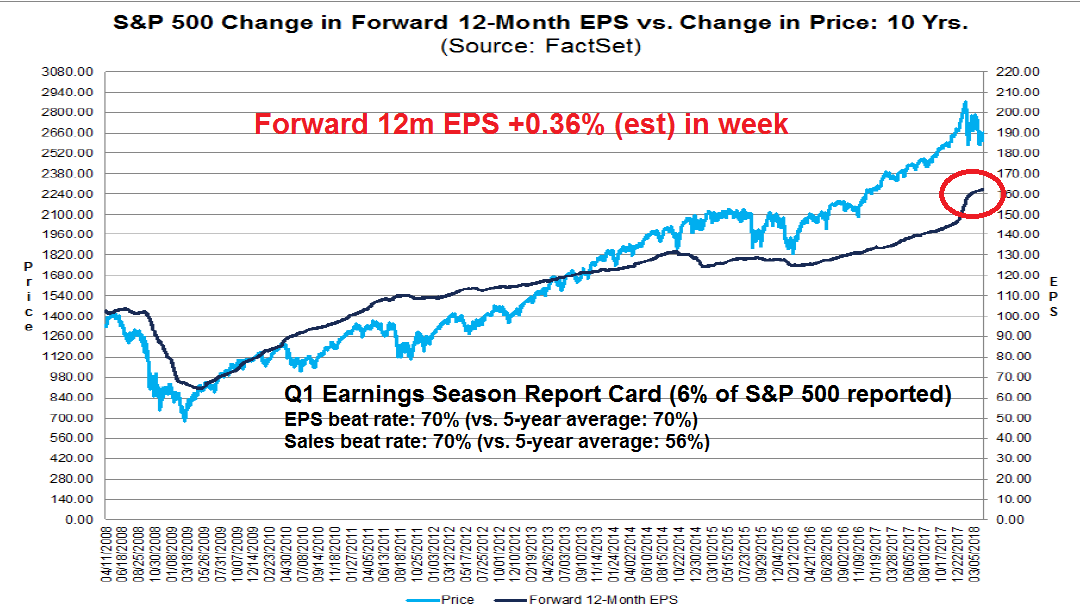
A scenario of a slow upward price grind is consistent with former Value Line research director Sam Eisenstadt’s latest forecast. I had most recently written about Eisenstadt’s track record (see Is this what a regime change looks like?) and pointed out that the r-squared on his six-month forecasts is 0.26, which is a remarkable statistic. The chart below shows the track record of his forecasts, as documented by Mark Hulbert. Hulbert reported that Eisenstadt’s latest SPX target for September 30 is 2775, which represents a price gain of 4.5% from current levels.
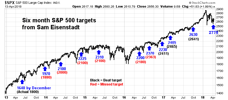
So up, up and away, for gold prices and, in the absence of trade tensions, stock prices?
The bear case
If life could be that simple!
There is a glaring anomaly in the bull case. The chart below of the silver/gold ratio shows an unusual divergence with the US Dollar Index. Gold prices, as well as the silver/gold ratio, had shown difficulty making headway in spite of the weakness in the USD, which is inversely correlated to gold (note that the USD Index is inverted on the chart). The last time this happened was in the 2007-08 period, which resolved itself with a rally in the USD (and weakness in gold prices). The bull market scenario based on a bottom in the silver/gold ratio is not that simple. Either the silver/gold ratio takes off, and which is gold bullish, or the USD rallies, which is gold bearish.
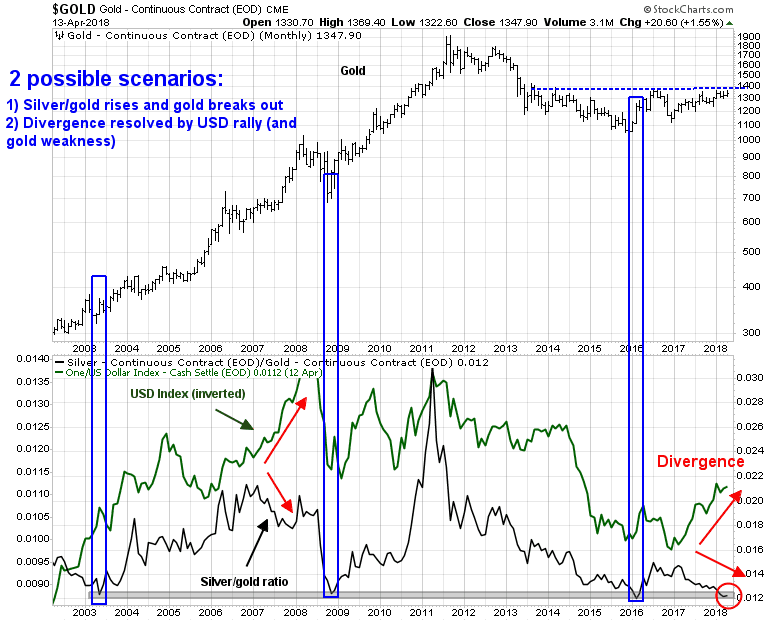
Put it another way, the price of gold is reflective of inflation expectations. But gold also depends on the degree of monetary policy accommodation. Is the Fed ahead or behind the inflation fighting curve?
The latest FOMC minutes showed that the Fed is taking a more hawkish tilt in monetary policy, which is gold bearish. A Bloomberg story made the point that there are no doves left at the Fed. The consensus has shifted from a balanced and symmetric risk assessment to a debate over the degree of upside risks to growth and inflation.
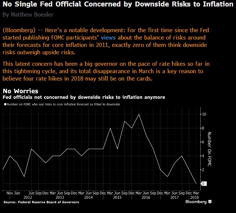
After the release of the FOMC minutes, the yield curves flattened, which is the bond market’s signal that it expects slower growth because of Fed policy. Both the 2-10 yield curve, which is now under 50bp, and the 10-30 yield curve, at 20bp, at sitting at new cycle lows.

There are a number of other factors supportive of a USD rally. The Commitment of Traders chart from Hedgopia shows that large speculators are in a crowded short in the USD Index.
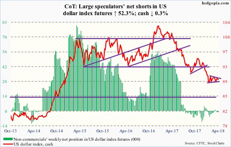
The euro is the biggest weight in the USD Index, and large speculators are in a crowded long in EUR futures.

In addition, the Citigroup Europe Economic Surprise Index (ESI) indicates that European and Japanese macro data have disappointed badly, indicating a loss of growth momentum. By contrast, US ESI is positive, elevated, and stable.
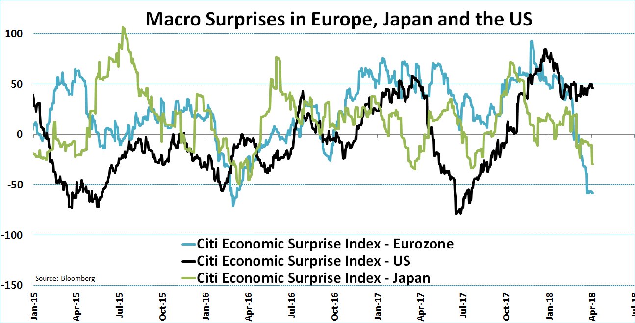
Notwithstanding the possibility of a more hawkish Fed, which is USD bullish, the widening spread between American and European growth expectations also puts upward pressure on the USDEUR exchange rate. USD strength is likely to be bearish for gold prices.
Trade the breakout
Having outlined both the bull and bear cases for gold, who is right, the bulls or the bears?
I have no idea. What I do know is the bull case is not as easy as it sounds. Much depends on the direction of Fed policy, and the perception of Fed policy. I would therefore keep an open mind, and allow the market to give us clues by watching for the following signs:
- Upside breakout in gold prices;
- Recovery in the silver/gold ratio, which is confirmed by the GDXJ/GDX ratio; or
- The USD Index breaks out of its recent trading range, either on the upside or downside.
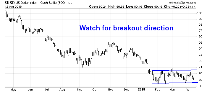
Until then, I remain “data dependent”.
The week ahead
Look to the week ahead, the SPX failed to stage an upside breakout last week from its inverse head and shoulders setup, but conditions are still supportive of the bull case. The small cap Russell 2000 did break out, and it pulled back to test the breakout turned support level.

The relative performance of high yield, or junk bonds, to duration equivalent Treasuries, and the relative performance of the price momentum factor both indicate healthy risk appetite.
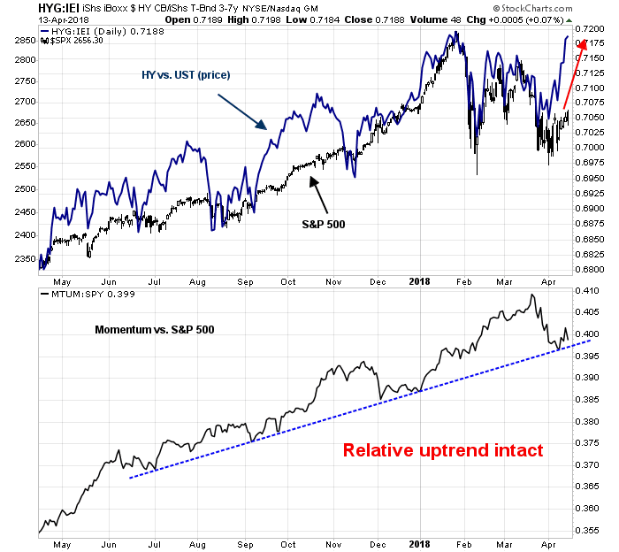
The latest AAII sentiment survey has declined to a minor bearish extreme. While sentiment indicators are highly inexact for market timing, these readings point to limited downside near-term potential for stock prices.
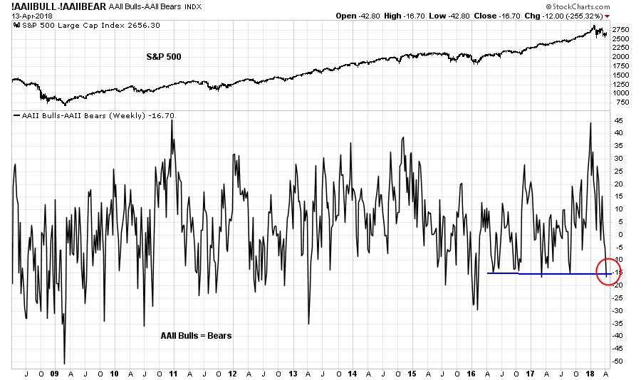
Tom Lee observed that bearish AAII sentiment at the start of Earnings Season tends to lead to higher stock prices a month later, though the data is noisy.

Seasonality is also on the side of the equity bulls. Jeff Hirsch of Almanac Trader found that the bulk of April’s stock gains tend to occur at the second half of the month. The chart below shows the seasonal stock market pattern in April. Friday was day 10, which represents the typical bottom for the month.
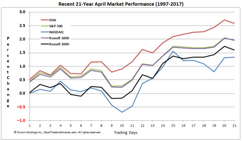
Next week is also option expiry week. Rob Hanna of Quantifiable Edges observed that April OpEx is one of the most positive OpEx weeks of the year.

The market was spared the usual geopolitical related volatility from the attack on Syria because it occurred on Friday after the market closed. Subsequent events suggest that that the Russian response will be limited, if any, and the bombing will have little effect on global tensions. I expect that the markets will therefore respond with either be a relief rally, or ignore the event and allow the fundamental and technical conditions to assert themselves.
Both my inner investor and inner trader remain bullishly positioned.
Disclosure: Long SPXL
A bottoming process
Mid-week market update: As the market bounces around in reaction to the headline of the day, it is important to maintain some perspective and see the underlying trend. Numerous sentiment and technical indicators are pointing towards a bottoming process and a bullish intermediate term outlook. Day-to-day price movements, on the other hand, are hard to predict.
Consider, for example, the positioning of large speculators (read: hedge funds) in the high beta NASDAQ 100 futures and options. Hedgopia reported that large speculators are in a crowded short in NDX.
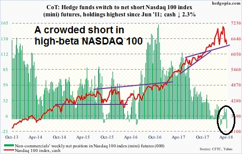
By contrast, large speculators are in a crowded long in the VIX Index, which tends to move inversely with the stock market.
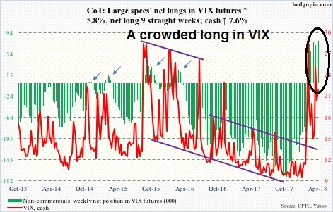
While Commitment of Traders data analysis tend to work well as a contrarian indicator on an intermediate term time frame, sentiment models can be inexact market timing indicators.
Bullish technical confirmation
In the short-term, risk appetite and breadth indicators are also supportive of higher prices. This hourly chart of the SPX suggests that the index is in the process of forming an inverse head and shoulders formation. Before jumping the gun and getting all excited, good technicians know that head and shoulders formations are not complete until the neckline is broken. Nevertheless, both the NYSE new highs-lows breadth indicator and the relative performance of high yield bonds against duration-equivalent USTs indicate positive divergences. Should the market stage an upside breakout at the 2675 neckline, the measured target would be about 2800, with initial resistance at about the 2700-2710 level.
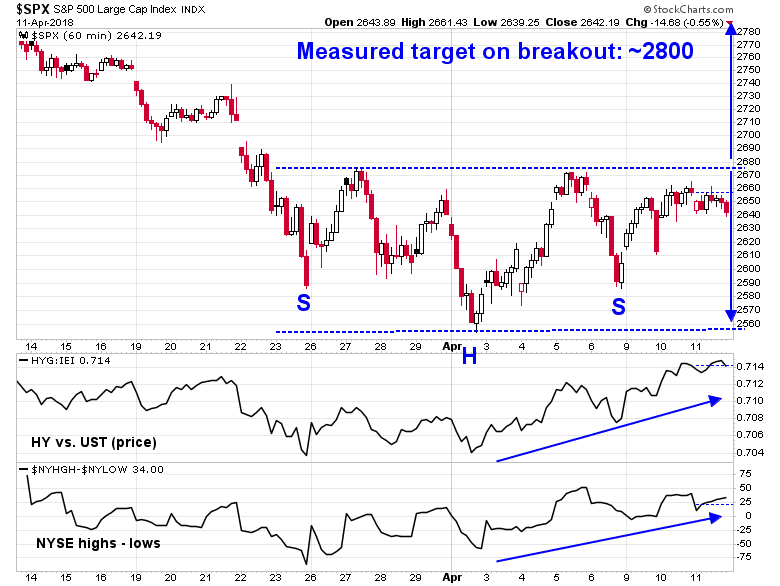
The small cap Russell 2000 is already showing signs of an upside breakout from its inverse head and shoulders pattern. The index pulled back but remains above the breakout resistance turned support level.

Equally encouraging is the behavior of Schaeffer`s open interest put/call ratio on SPY, QQQ, and IWM, which surged to levels last seen in 2011.

If history is any guide, such readings have been bullish on an intermediate term basis. Shorter term, however, results are mixed and uncertain because of the low sample size (N=8). Even though one-week average and median returns are promising, the one-week % positive statistic of 63% is virtually indistinguishable from the benchmark anytime statistic of 59%.

Greater clarity from Earnings Season
As we enter Q1 earnings season in the weeks ahead, the market may get greater clarity from the fundamental outlook. The latest update from FactSet indicates that forward 12-month EPS continue to rise, indicating fundamental momentum. As well FactSet also reported that the positive to negative guidance ratio is at an off the charts bullish reading.
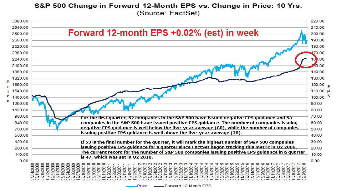
Earnings reports begin in earnest on Friday, starting with a selected financial stocks. While the market is likely to react on a daily basis to the earnings and macro news of the day, I expect that the bullish fundamental, technical, and sentiment factors outlined will assert themselves in the weeks to come.
Let the reporting season begin!
Disclosure: Long SPXL