Preface: Explaining our market timing models
We maintain several market timing models, each with differing time horizons. The “Ultimate Market Timing Model” is a long-term market timing model based on the research outlined in our post, Building the ultimate market timing model. This model tends to generate only a handful of signals each decade.
The Trend Model is an asset allocation model which applies trend following principles based on the inputs of global stock and commodity price. This model has a shorter time horizon and tends to turn over about 4-6 times a year. In essence, it seeks to answer the question, “Is the trend in the global economy expansion (bullish) or contraction (bearish)?”
My inner trader uses the trading component of the Trend Model to look for changes in the direction of the main Trend Model signal. A bullish Trend Model signal that gets less bullish is a trading “sell” signal. Conversely, a bearish Trend Model signal that gets less bearish is a trading “buy” signal. The history of actual out-of-sample (not backtested) signals of the trading model are shown by the arrows in the chart below. Past trading of the trading model has shown turnover rates of about 200% per month.
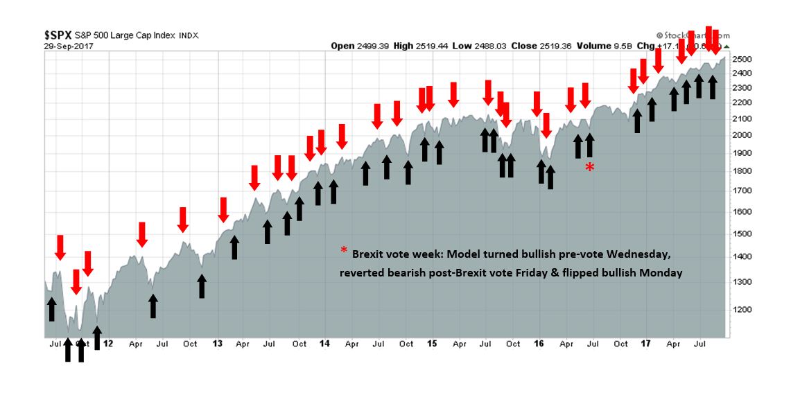
The latest signals of each model are as follows:
- Ultimate market timing model: Buy equities
- Trend Model signal: Neutral
- Trading model: Bearish
Update schedule: I generally update model readings on my site on weekends and tweet mid-week observations at @humblestudent. Subscribers will also receive email notices of any changes in my trading portfolio.
A typical late cycle advance
In a recent post (see Equity lessons from the bond market), I urged equity investors to monitor the signals from the bond market as they contained important and often overlooked information about the future direction of stock prices. In particular, the yield curve was an important indicator, as past instances of an inverted yield curve, where short rates trade above long rates, was an uncanny signal of recession, and equity bear markets.
While the shape of the yield curve is an important indicator, I may have discovered an indicator that leads the yield curve signal. As the chart below shows, the copper/CRB ratio has risen strongly ahead of yield curve inversions in the last two cycles. The copper/CRB ratio is valuable because copper is a cyclically sensitive commodity, and the ratio filters out the noise from changes in overall commodity prices.

This ratio has worked well in both disinflationary and inflationary eras. The top in the late 1990’s was a disinflationary period characterized by falling commodity prices (see bottom panel). But the copper/CRB ratio rallied out of a relative downtrend (green line, middle panel) just before the yield curve inverted (top panel). During the inflationary era that ended in 2007-08, the copper/CRB ratio flashed a parabolic climb ahead of the last yield curve inversion.
Fast forward to 2017. The copper/CRB ratio has staged a relative breakout in late 2016 and early 2017 and roared ahead, which is an indication of a late cycle blow-off. The yield curve has not inverted yet, and it may not necessarily invert this cycle because of the Fed’s extraordinary measures of the past few years. By the Fed’s own estimates, its QE program has depressed the term premium on the 10-year Treasury note by 100 basis points. Unwinding QE will put upward pressure on long dated yields, which has the effect of delaying an inversion signal – until it’s too late.
The analysis of sector and industry rotation confirms the thesis of a late cycle rotation. The Relative Rotation Graph (RRG) is a way of depicting the changes in leadership in different groups, such as sectors, countries or regions, or market factors. The charts are organized into four quadrants. The typical group rotation pattern occurs in a clockwise fashion. Leading groups (top right) deteriorate to weakening groups (bottom right), which then rotates to lagging groups (bottom left), which changes to improving groups (top left), and finally completes the cycle by improving to leading groups (top right) again. The latest RRG chart of the US market shows leadership by late cycle inflation hedge groups such as energy, mining, and gold stocks.

The same pattern of inflation hedge leadership can also be found in Europe. While US technology has revived and revised into the top right leadership quadrant, European technology stocks have weakened, which makes the tech rally suspect.

In short, the current market action has the feel of a bull market blow-off top. For investors and traders, the question is whether they should jump on the rally, with an emphasis on inflation hedge groups. This week, I examine the bull and bear cases, first for the equity market, then address the question of sector exposure.
The bull case
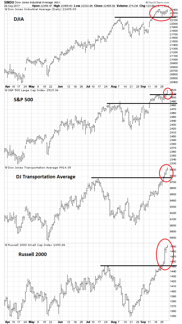
The bull case is easy to make. It’s hard to argue against momentum. The major US averages all achieved new highs last week. More importantly, past laggards such as the Russell 2000 small caps, and the DJ Transports (forget any hand wringing over Dow Theory non-confirmation) have hit new highs.
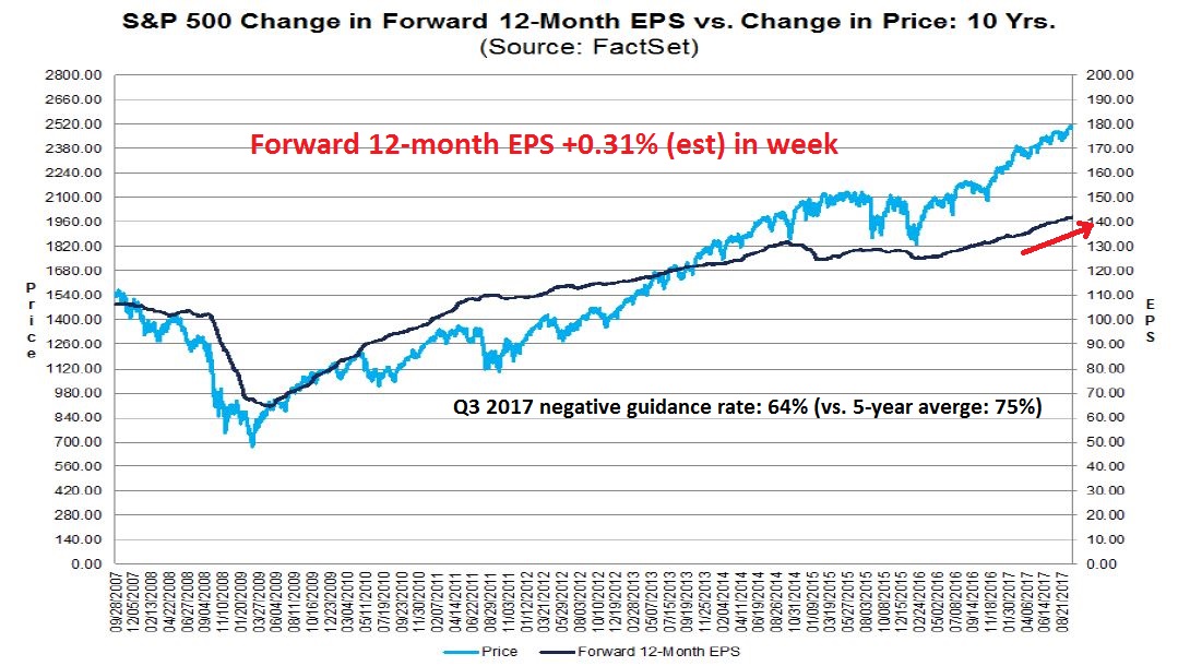
Fundamental momentum is also supportive of the bull case. The latest update from FactSet shows last week’s decline in forward 12-month EPS as a data blip. Forward 12-month EPS is advancing again. As well, the lower than average rate of Q3 2017 guidance is a positive sign for earnings season, which is about to start.
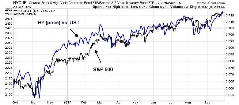
Credit market risk appetite has also confirmed the new highs in equity prices. The relative price performance of HY against duration equivalent Treasuries hit new highs in conjunction with equity prices.
As well, Callum Thomas pointed out that we are past the dreaded negative September seasonal period.
What is anyone so worried about? Risk on!
The bear case
The bear case is more difficult to make. However, there are a number of disturbing signs beneath the surface of the current equity market rally.
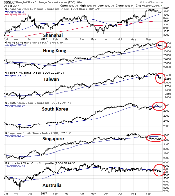
Firstly, a number of global markets are not behaving well. The markets of China’s Asian trading partners are all struggling with their 50 day moving averages (dma), which could be a signal of imminent Chinese economic weakness.
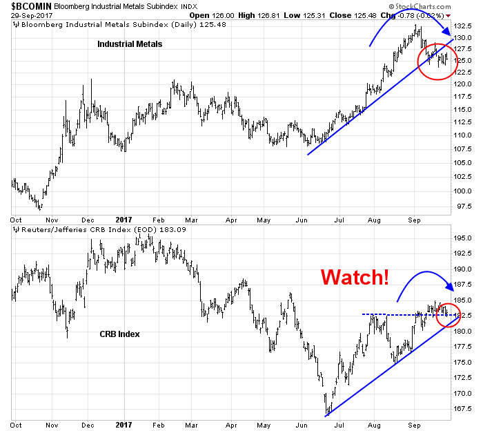
Commodity prices are also starting to roll over. In particular, industrial metals have breached an uptrend, which is worrisome. The CRB Index has been strengthening recently because of the rise in oil prices, but that index is also showing signs of weakness and testing a key support level.
European equities have also shown signs of struggle. The FTSE 100 rallied on Friday but remains below its 50 dma, though those problems could be attributable to Brexit difficulties. The one shining beacon for the bulls has been the Euro STOXX 50, which represents large cap eurozone equities.

Even then, the eurozone may face a number of near term hurdles. If Europe is to avoid future problems, the French and Germans will have to take the lead, with more common policies and, hopefully, greater fiscal integration. In the wake of the German elections, Angela Merkel will have a tough time achieving some of those goals, as one of her main political partners, the FDP, has voiced opposition to the idea of a single EU finance minister, they favor a multi-speed north/south eurozone, and oppose any fiscal transfers to weak states like Greece. Macron’s grand plans for more Europe may be dashed, and the EU is likely to pay the price in the next economic downturn.
In addition, the Catalan independence referendum is likely to cause a constitutional crisis in Spain, and add to the centrifugal forces pulling apart Europe. Looking forward into next year, the Italian election will also be a wildcard for the future of Europe.
A crowded long
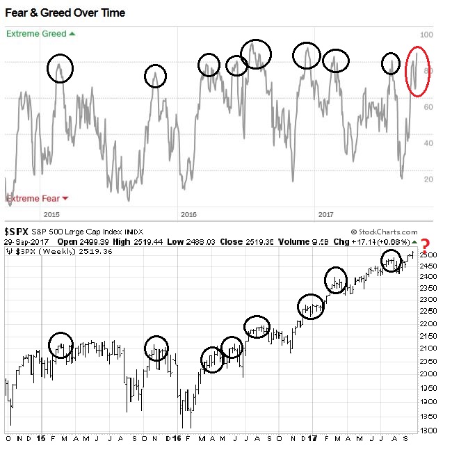
As well, psychology has become overly bullish. The Fear and Greed Index closed at 85 after hitting an intra-day high of 90 on Friday. If history is any guide, such levels has seen the market advance either consolidate sideways or pull back.
The latest NAAIM survey of RIAs paints the picture of a bullish stampede. The “most bearish” response, which has a range from -100 (bearish) to 200 (bullish), stands at 90, which is the most bullish reading in the history of the survey that began on July 5, 2006. The second highest reading is 60. Let that sink in for a moment.
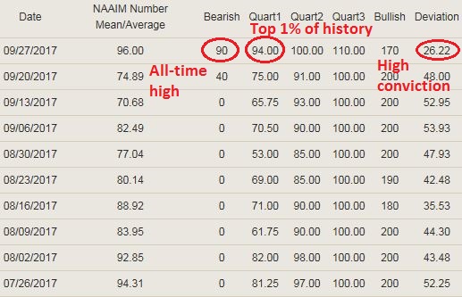
The table below is sorted by the “first quartile” reading, which represents the first quartile of bull/bear responses in the history of the survey. This week’s reading of 94 puts it in the top 1% of bullishness in the entire history of the survey. While the sample size is small (N=6), subsequent returns after such episodes indicate disappointing performance.
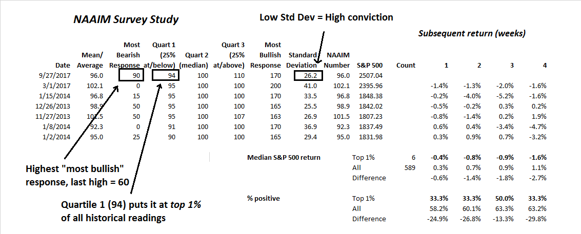
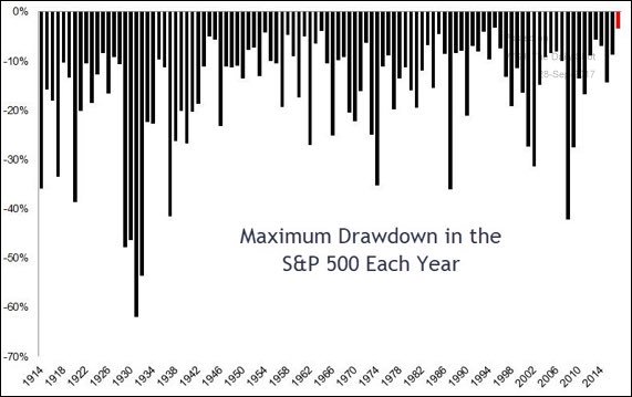
Michael Batnick also pointed out that the SPX has never experienced a maximum drawdown as low as this, ever.
Even if you are bullish, do you want to play those odds?
The lines in the sand
I resolve the bull and bear debate as a debate of time horizon. The combination of positive price and fundamental momentum leads to a bullish conclusion on an intermediate term time frame. The bull still lives, and equity prices are likely to be higher by year-end.
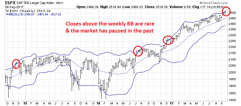
In the short term, however, sentiment is a little overdone, and the market has become overbought very quickly. The SPX closed above its upper Bollinger Band. In the past, such episodes has seen the market pause and consolidate its advance.
Here are my lines in the sand. The stock market has managed to stage upside breakouts in the major averages, but breadth indicators remain in a downtrend indicating an unconfirmed breakout. I will be watching the breadth indicators below to see if they can strengthen sufficiently to break up through the downtrend lines. Another possibility is the market weakens and the breadth indicators decline down to support before a blow-off rally can occur.

As for the question of sector allocation, much depends on how the near term psychology of the market evolves. The current rally has a similar feel as the post-election Trump rally, where companies that are likely to benefit from tax reform rose, such as Financials, highly taxed companies, and so on. We may see disappointment set in as the GOP tax proposals suffer a similar fate as healthcare reform. Tony Nitti wrote that the current proposals envisage about $5 trillion in tax cuts, but the GOP needs to find another $1 trillion in extra revenues after incorporating all of the outlined revenue proposals. Already, the WSJ reported that Republicans are rebelling against the provision to eliminate the state and local tax deduction.

Tax reform is hard. Just as healthcare reform is hard.
In all likelihood, the character of the market will revert back to the template of a late cycle expansion, where inflation hedge vehicles lead. However, the recent strength in the USD could prove to be a headwind for these stocks, as the USD has historically been inversely correlated to commodity prices. I will be monitoring whether these stocks can continue to outperform in the face of USD strength. If so, that will be a vote of confidence for my late cycle commodity leadership scenario.

My inner trader remains constructive on stock prices. This is not the top, and the best is yet to come for equity prices.
Unfortunately, my inner trader was caught short in this rally. Under the circumstances, it is far too late to cover and go long because of excessive bullish sentiment. He is staying short, and hoping for some weakness so that he can buy the dip. However, he does have a risk control discipline based on the aforementioned breadth indicators, namely the NYSE net highs – lows, % above the 50 dma, and % above the 200 dma.
Disclosure: Long SPXU
Trump has indicated he will choose a new Fed Chairman soon as well as a number of Fed vacancies. If he chooses hawkish rules-based people, the markets might react negatively.
Here is how the American market could have a swift crash in a similar fashion to the Crash of 1987 when on Black Monday, it fell over 30% in one day.
This time it could happen because of ETFs. Back then it was Program Trading.
Most serious market players have heard about Program Trading but wrongly assume it was Black Box-type computer based trading strategies gone wild. Wrong. What happened was the commodity exchanges started trading financial futures like bonds and stock indexes (S&P 500). The exchanges also offered arbitrage firms direct links between the commodity market contract and the real stock exchange. This meant if there were differences in the index on the commodity market and the 500 stocks, the firms could make a guaranteed profit by buying on one exchange and shorting the other.
This was all fine when things were trading normally but when the market index started to fall, the commodity investors bailed. Commodity investors only had to put up 5% margin versus 50% for the NYSE. They were used to trading wheat and metals. Market indexes were new.
When the commodity speculators bailed, a discount to the real value of the index happened and arbs bought the commodity S&P and shorted the 500 underlying shares on the NYSE. That put downward pressure on the index and triggered commodity trader margin calls that put even more pressure etc etc etc etc. All causing a crash. They finally broke the computer link between the two markets to take the pressure off.
So it was an accidental crash caused by unfamiliar technology.
That brings me to ETFs and how a crash could unfold. ETFs are created or destroyed throughout the day by computer arbitrage programs. If the SPY (S&P 500) ETF is trading slightly less that it’s real value, an arb computer will buy the ETF on the market and sell short the 500 underlying stocks in the index. This keeps the ETF almost exactly at it’s true value throughout the day.
But if we get a huge wave of selling, the selling on many of the 500 stocks could overwhelm the bids causing extreme weakness in the index and on the ETF just like what happened in 1987. The exchanges have instituted rules that will minimize but not eliminate extreme pressure.
There are some index stocks that have ETFs as their largest shareholders.
ETFs are much easier emotionally to sell than a portfolio of stocks where each stock in in a person’s portfolio with a story. That means we could easily see a wave of investors waking up one day and thinking, I’m getting out of the market sell my ETFs.
Recently I saw a stat that said the most percentage in history of investors expect a market downswing in the next year at the same time they are the most bullish short term. To me that says, we could see a quick change in sentiment to selling.
Ken
Thanks for explaining the anatomy of a panic sell off. What would be plausible reasons for such a sell off?
You may have seen the experiment where they slowly build a pile of sand and finally one more grain causes a collapse.
It’s about the instability of the pile that causes the collapse, not the nature of that last grain.
The monetary world is entering into a completely new period in history; the unwinding if massive QE. Call it QT, Quantitative Tightening. Nobody can know the implications.
We have an unpredictable American political scene with possible major negative consequences.
We have major digital revolutionary disruptions to business and society.
All of this while we have, on many indicators, the highest investor positive sentiment in history. When sentiment hits a high, there is nobody left to buy and the market tips, the last grain of sand starts a decline.
I’m not a doom and gloomer. I was vocally super bullish and alone in saying a new bull market started in early 2016 when almost every strategist was saying the bull market was seven years old and due for a decline. We’ve had a global bull market since then. I’m not a perma-anything. I try to be a realist.
Ken,
Thanks.