Preface: Explaining our market timing models
We maintain several market timing models, each with differing time horizons. The “Ultimate Market Timing Model” is a long-term market timing model based on the research outlined in our post, Building the ultimate market timing model. This model tends to generate only a handful of signals each decade.
The Trend Model is an asset allocation model which applies trend following principles based on the inputs of global stock and commodity price. This model has a shorter time horizon and tends to turn over about 4-6 times a year. In essence, it seeks to answer the question, “Is the trend in the global economy expansion (bullish) or contraction (bearish)?”
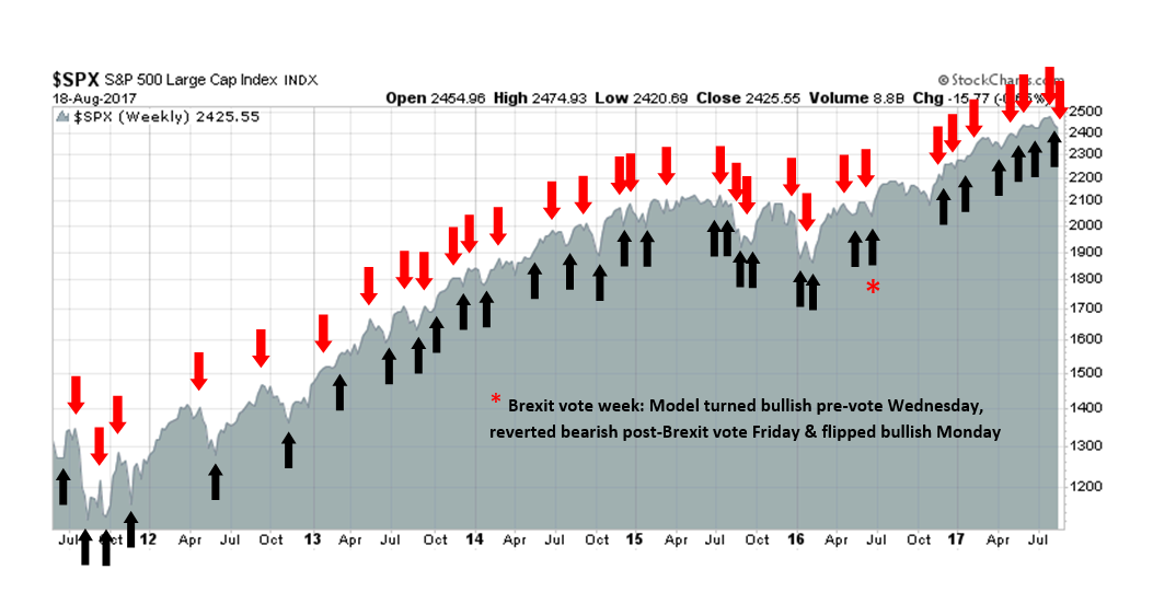
My inner trader uses the trading component of the Trend Model to look for changes in the direction of the main Trend Model signal. A bullish Trend Model signal that gets less bullish is a trading “sell” signal. Conversely, a bearish Trend Model signal that gets less bearish is a trading “buy” signal. The history of actual out-of-sample (not backtested) signals of the trading model are shown by the arrows in the chart below. Past trading of the trading model has shown turnover rates of about 200% per month.
The latest signals of each model are as follows:
- Ultimate market timing model: Buy equities
- Trend Model signal: Neutral
- Trading model: Bearish (downgrade)
Update schedule: I generally update model readings on my site on weekends and tweet mid-week observations at @humblestudent. Subscribers will also receive email notices of any changes in my trading portfolio.
What will the next bear market look like?
Recently, Lawrence Hamtil of Fortune Financial wrote an article entitled “Imagining the next bear market (with examples from the last two)“. He analyzed the effects of sector performance, large and small cap returns, asset correlations, and other characteristics of the last two two equity bears.
While that kind of analysis represents a good starting point, we know that history doesn’t repeat, but rhymes. With that in mind, here is an examination of the stress points of the next bear market, based on the assumption that it is sparked by a recession.
My main focus estimating equity downside risk. What will the next bear market look like (chart bars =annual returns, dots=annual drawdowns)? Will the recession be mild (1990), or long and protracted (1980-82, 2000-02)? Will the market crash? If so, will it be accompanied by a recession (2008) or not (1987)?
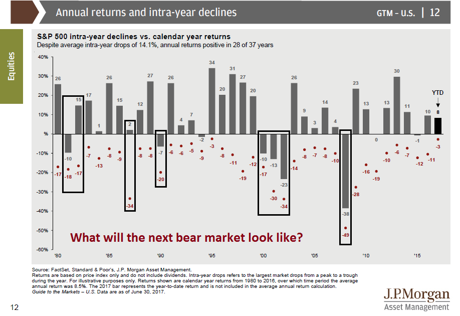
Recessions are periods when the excesses of the past expansions are unwound. Arguably, there have been few excesses in the current expansion except for the proliferation of Silicon Valley unicorns. That argues for a shallow bear market with a drawdown in the order of 20%, such as 1990. On the other hand, the excesses have occurred outside the US (see Looking for froth in the wrong places), which makes the case for higher losses if the economic downturn is global.
The answer can be found by analyzing the fault lines of the economy today for clues of how the next recession might develop.
Political fault lines
David Leonhart of the New York Times recently featured a chart that characterized how income inequality has developed in the US. In the years ending in 1980, income inequality had been falling (grey line). Since then, inequality has widened dramatically (red line) with the top 1% getting the lion’s share of the gains while the bottom half losing ground.
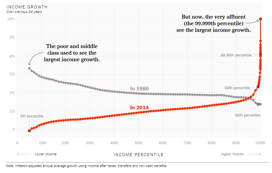
I show this chart not to start a debate, but to show how changes in income inequality have created fault lines within the American political landscape which culminated in the election of Donald Trump in 2016. Even today, 10-years into a recovery after the Great Financial Crisis, US households are still stressed.
A recent Bankrate survey indicates that only 41% of Americans have sufficient savings to rely on in an emergency, such as an unexpected car, appliance or home repair, illness, and so on. Zillow also warned about the problems of rental affordability for low-income renters (and this is occurring in a strong economy):
Rent affordability, or really unaffordability, has become a serious issue in recent years, with renters nationally spending a median 29.1 percent of their incomes on rent, up from 25.8 percent historically. Conversely, the share of income spent on mortgages remains relatively low at 15.9 percent, down from 21 percent in pre-bubble years.
While 30 percent has long been considered a reasonable amount of money to spend on housing, a median of 29.1 percent means that a lot of renters are spending more than that – and a lot of them have low incomes.
In the 25 largest metro areas in the country, people with low incomes pay far more than 30 percent for rent. The best case scenario is St. Louis, where the bottom third of renters spend 38.5 percent on the bottom third of rentals. In all the other markets, low-income renters spend more than 45 percent of their incomes on rent.
In notoriously pricey New York, Los Angeles, and San Francisco, the median low-income wage will not even cover a low-end apartment: Median bottom-tier rents in those markets require 111.8 percent, 107.8 percent, and 99.9 percent of the median low-income wage, respectively.
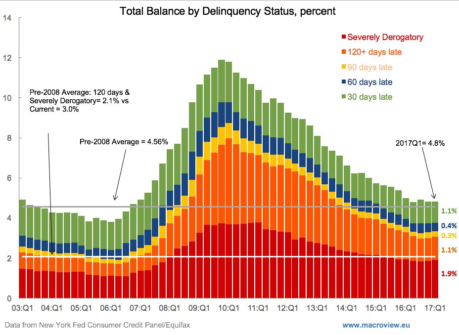
For another perspective, this chart shows that the cash flow service capacity of households have not recovered from the GFC.
In addition, corporate leverage is high. It is unclear how much stress levels will rise if interest rates rise and sales fall in a recession.

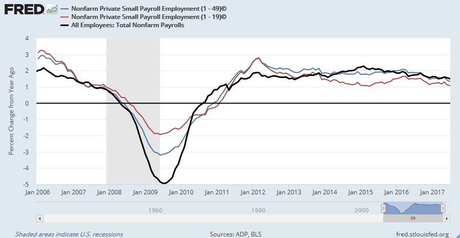
Another open question is how small business confidence is likely to evolve in a downturn. The latest NFIB confidence survey statistics remains elevated, but internals tell a different story.

Growth in small business employment (businesses with 1-19 employees, red line) is lagging Non-Farm Payroll growth (black line).
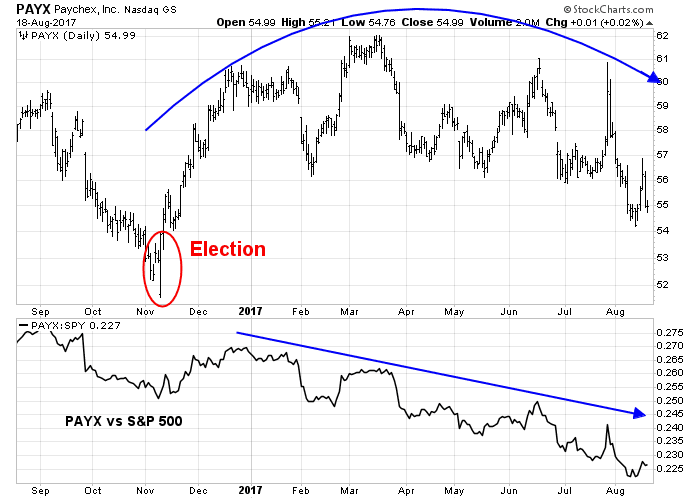
As well, some analysts have used Paychex (PAYX) as a real-time proxy for the health of small business employment. This indicator is not telling a positive story of small business America.
When the economy goes into the next recession, one of the biggest questions is how the political fault lines change. Will the bifurcation of the American electorate widen even further? While proposing workable solutions is well beyond my pay scale, the increase in political risk is not in most analysts spreadsheets in a recessionary scenario.
Equity political risk
Ned Davis Research featured analysis from a political risk analytical perspective. NDR found that stocks decline at an annualized rate of -18.8% when Gallup presidential approval falls to 35% and below. To be sure, it wasn’t just the performance of the White House occupant, most of the examples involve some form of economic malaise that plagued the economy.

Gallup’s latest figures shows that Trump’s approval is 38%, and approval fell to a low of 34% last week. Like it or not, presidential approval tends to decline when economic growth falters. So what happens to equity returns as the economy slides into recession?

Donald Trump will find out that taking credit for a rising stock market and economy is a two-edged sword.
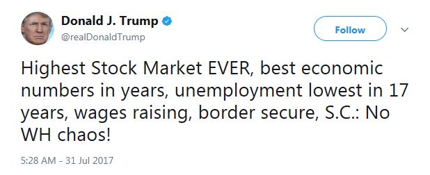
If the economy slows, and small business confidence tanks, his support will erode. Then watch out below!
Earnings (currency) risk
Should the world sink into a synchronized global recession, the safe haven of choice will be USD denominated assets. This will put upward pressure on the USD.
Here is why the level of the USD is important. Q2 Earnings Season has seen one of the best results in some time. Much of the gains has been related to USD weakness. As this analysis from FactSet shows, companies with the most non-US exposure has seen the best sales and earnings gains. USD strength will create headwinds for earnings, particularly for large cap multi-nationals.

The currency effect can also be seen in earnings guidance. Credit Suisse recently pointed out that large caps, which tend to have greater international exposure, has seen more positive earnings guidance than small caps.

A rising USD will therefore be a headwind for US equity earnings on a cap-weighted basis.
Fixed income market risks
Looking ahead into 2018, the fixed income market may not be a good place to hide. Both the Fed and ECB are expected to engage in some form of quantitative tightening (QT), either by shrinking the size of its balance sheet (Federal Reserve) or tapering its QE program (ECB). At the same time, global bond market issuance is expected to materially increase next year. At the margin, this will put upward pressure on bond prices as supply increases.

In the wake of the Volcker Rule reforms, bond market liquidity has dried up as banks have withdrawn capital from market making. Tiho Brkan observed that credit spreads are tight. While they are not as tight as the top in 2007-08, they are as tight as they were at the NASDAQ Bubble top. So what happens if the credit suffers a shock as in a liquidity starved market?

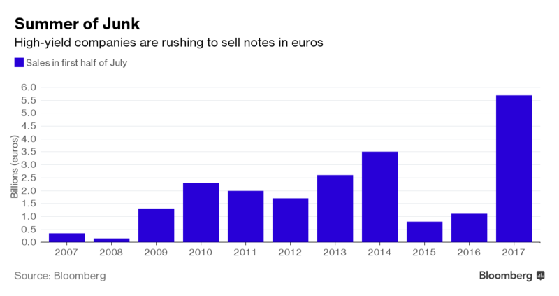
Risk is even more elevated in the eurozone credit market. Bloomberg reported that the average yields of eurozone junk bonds are at historical lows.

Issuers have stampeded to sell high yield paper.
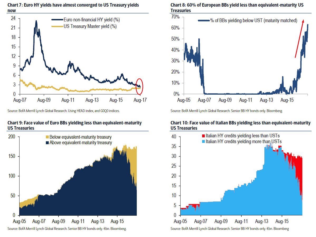
BAML pointed out that eurozone junk bonds are trading at yields roughly equivalent to US Treasury paper (top left chart), and fully 60% of eurozone BB HY trades at or below maturity equivalent US Treasuries (top right chart).
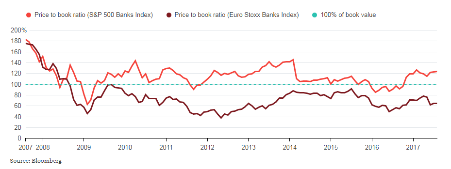
Carmen Reinhart recently penned a Project Syndicate article, “Recovery is not resolution”. Despite hopeful signs of economic recovery, the eurozone banking system is not fixed. This Bloomberg chart dramatically shows the unresolved problems with Europe’s banking system. Ten years after the GFC, European banks still trade at a discount to book value, compared to a premium multiple for US banks. In effect, the market is discounting significant non-performing loans on European banking books.
Pro-cyclical credit risk
At the same time, a Bloomberg story raised the point that the Fed’s QT program of reducing its mortgage backed securities (MBS), in additional to its Treasury paper holdings, is likely to widen the spreads on MBS paper.
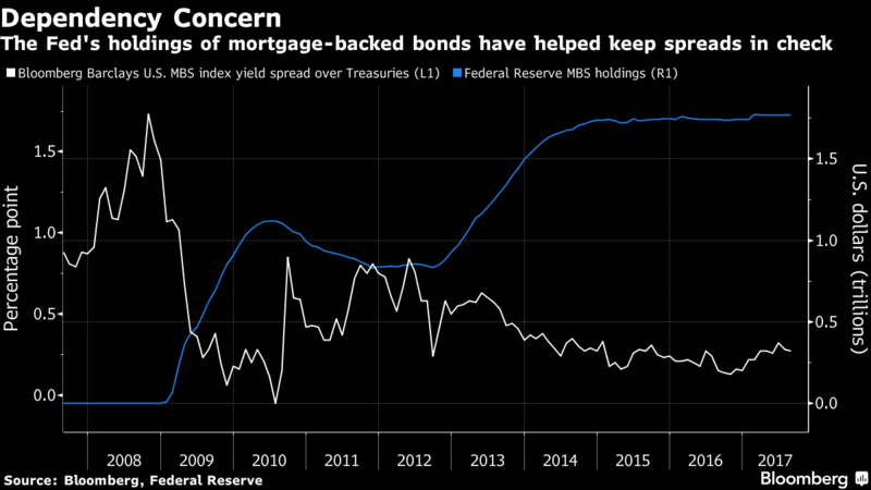
Higher mortgage rates will put even greater pressure on the cyclically sensitive housing sector, which is already showing signs of rolling over.

The combination of higher bond yields from greater issuance, and Fed’s QT program will have a pro-cyclical effect of depressing the fragile housing market even as the sector already appears wobbly. Easy come, easy go.
Equity valuation risk
As well, there has been much recent hand wringing over stock market valuation. Analysis from Goldman Sachs indicates that the stock market is at historical nosebleed levels for virtually all metrics, except one, free cash flow yield.

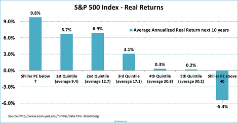
Notwithstanding the problems with Shiller CAPE, the ratio recently edged above 30, which has only been exceeded by readings seen at the height of the NASDAQ bubble and beats levels seen just before the Market Crash of 1929.

Joroen Blokland pointed out that elevated levels of CAPE have seen poor real long-term returns.
Should investors be worried about current levels of equity valuations? Yes and no. These problems have a way of not mattering until they matter.
The music is still playing
I am reminded of former Citigroup CEO Chuck Prince’s comment in the period leading up to the Subprime Crisis, “As long as the music is playing, you’ve got to get up and dance. We’re still dancing.” Reuters reported that he later qualified that remark and stated that he wasn’t referring to subprime lending, but the leveraged lending business. Nevertheless, his “the music is still playing” comment has dogged Prince’s legacy.
To be sure, analysis from EconoPic found a “music is playing”, or momentum, effect in the face of high equity valuations. High CAPE ratios have not historically been bearish for monthly returns when the CAPE ratio is rising (positive price momentum), but investors should get out of the way when valuations are high and momentum turns south.
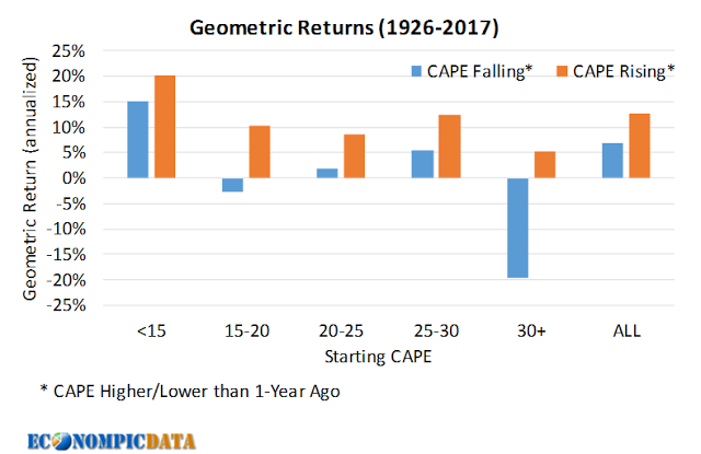
Here is the same analysis in table form.

So should you stay long stocks, as long as the music is playing? That depends on your time horizon.
Long-term balanced fund investors should take profits on their equity portfolios and re-balance their portfolios back to their policy weights defined in their Investment Policy Statement (IPS). [You do have an IPS, don’t you? If you don’t, how do you know which way to go if you don’t know where you are going?]
Investors and traders with shorter time horizons can stay long the equity bull as long as the music is playing. The evidence shows that the band is still on stage, despite my tactical call for a correction (see Correction ahead). Any setback should be relatively mild, as I do not believe that the final top has not been reached yet.
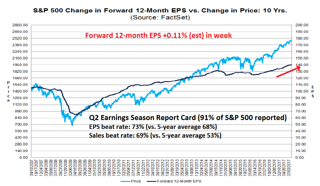
Despite the risk-off tone taken by the markets last, week, here are some examples of how the music is still playing. The latest update from FactSet shows that forward EPS is still rising, indicating positive fundamental momentum.
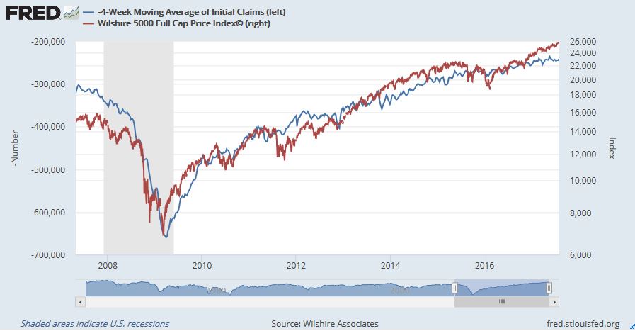
The nowcast of the jobs market remains healthy. There is a strong inverse correlation between initial jobless claims and equity prices, and the initial claims data is not flashing any signals of weakness yet.
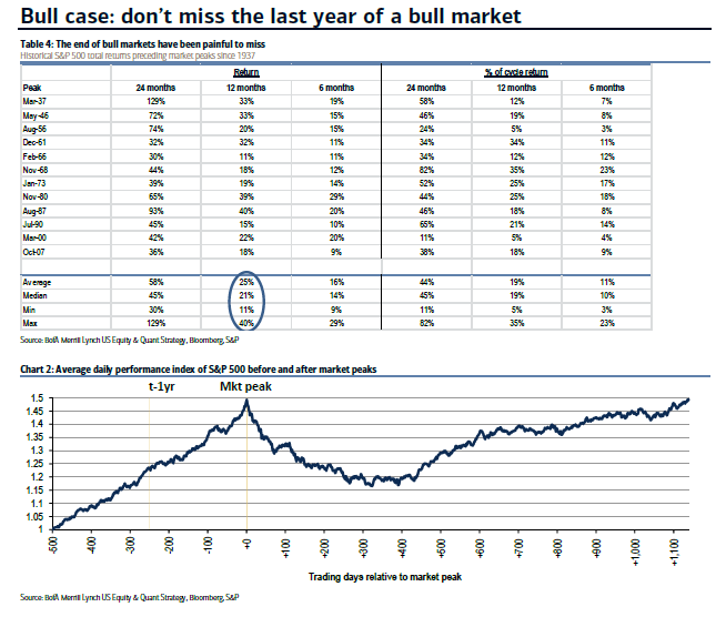
BAML strategist Savita Subramanian recently made the case for staying at the party. She pointed out that missing the terminal phase of a bull market can be painful.
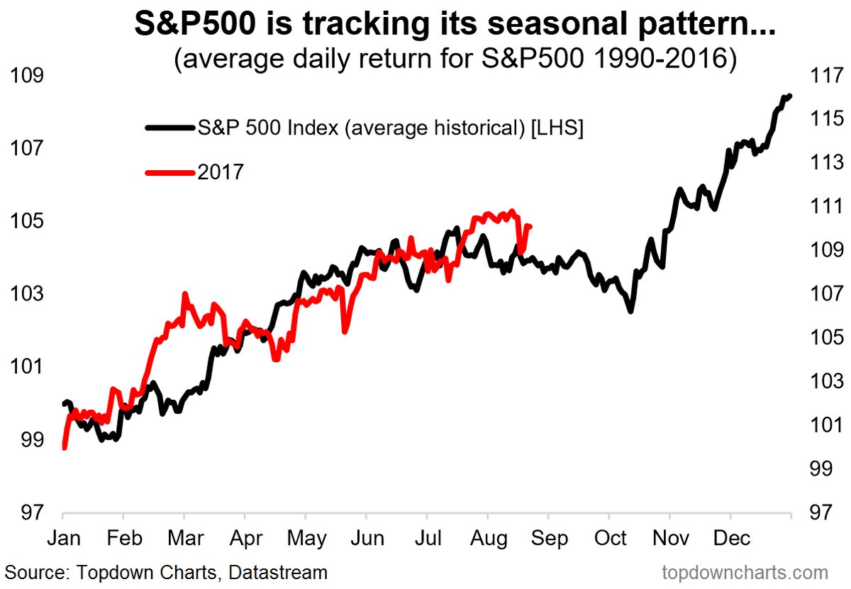
The week ahead: A correction begins
Looking to the week ahead, the market seems to be tracking the seasonal pattern identified by Callum Thomas at Topdown Charts.
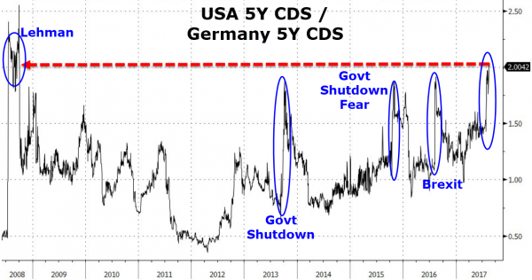
The political turmoil in Washington is likely raising market anxiety over the passage of a debt-ceiling bill in September. Zero Hedge (bless their Apocalyptic hearts) pointed out that the CDS market expects that the US is twice as likely to default than Germany.
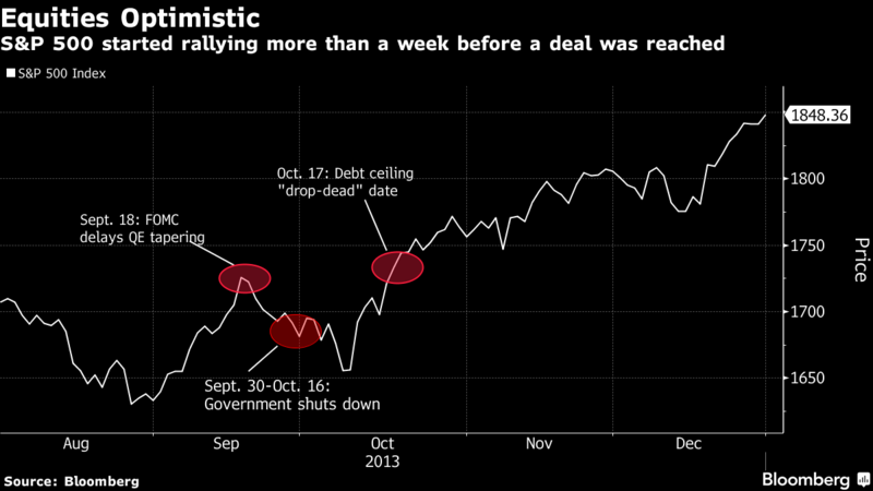
The stock market may be following a similar script as the 2013 debt ceiling experience (chart via Bloomberg). In that case, expect a decline, followed by a rally, and a fall into a final low before the political anxiety ends.
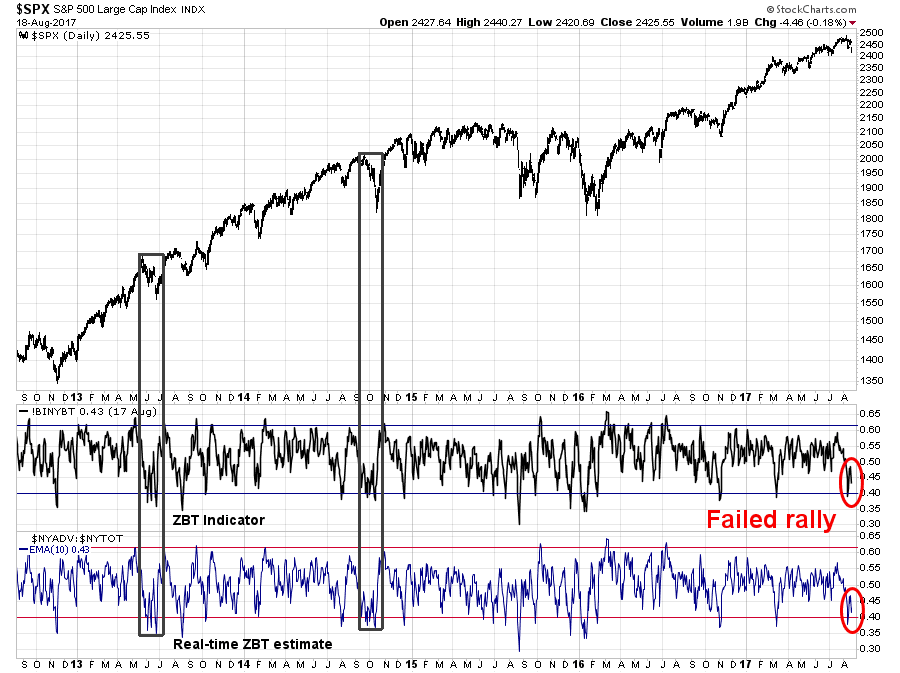
From a technical perspective, the behavior of the Zweig Breadth Thrust Indicator in 2013 and 2014 may be instructive from a historical viewpoint. The ZBT Indicator recently fell to an oversold reading last week but failed badly in its rally attempt. Should the indicator decline again back to oversold territory, we may see a similar market pattern as 2013 and 2014. During those episodes, the stock market weakened to an initial low [check], saw a failed rally [check], and then sold off again to a much lower panic low [not yet, and ZBT is not oversold yet either].
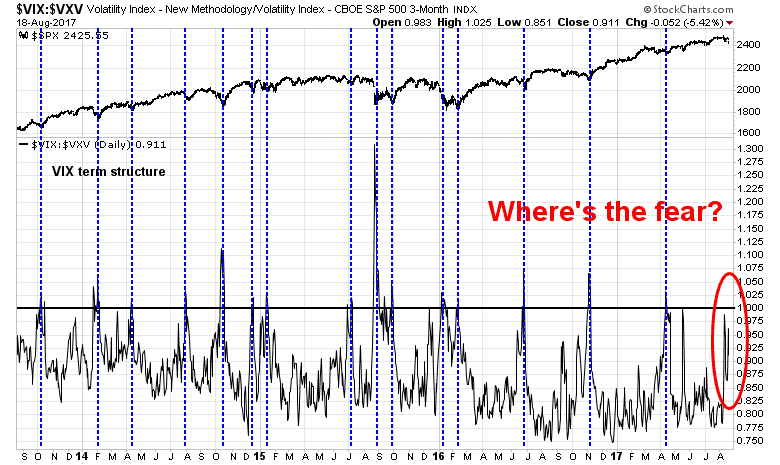
Another disturbing sign is the lack of fear that is indicative of capitulation selling. The chart below shows the term structure of the VIX as measured by the ratio of VIX vs. 3-month VIX (VXV). Ratios above 1 indicate an inverted term structure and periods of high market anxiety. Even with the recent sell-off, fear levels have not spike to washout panic levels yet.
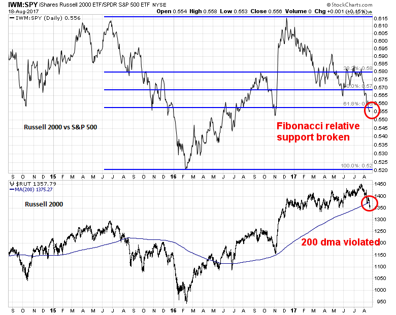
Other breadth metrics are flashing ominous signals. The relative performance of the small cap Russell 2000 (RUT) has broke its Fibonacci retracement support. As well, RUT fell through its 200 day moving average. I interpret these conditions as indications of poor market breadth, which is a signal of further weakness ahead. As well, expect higher than expected choppiness and daily volatility as the market reacts to the headline du jour.
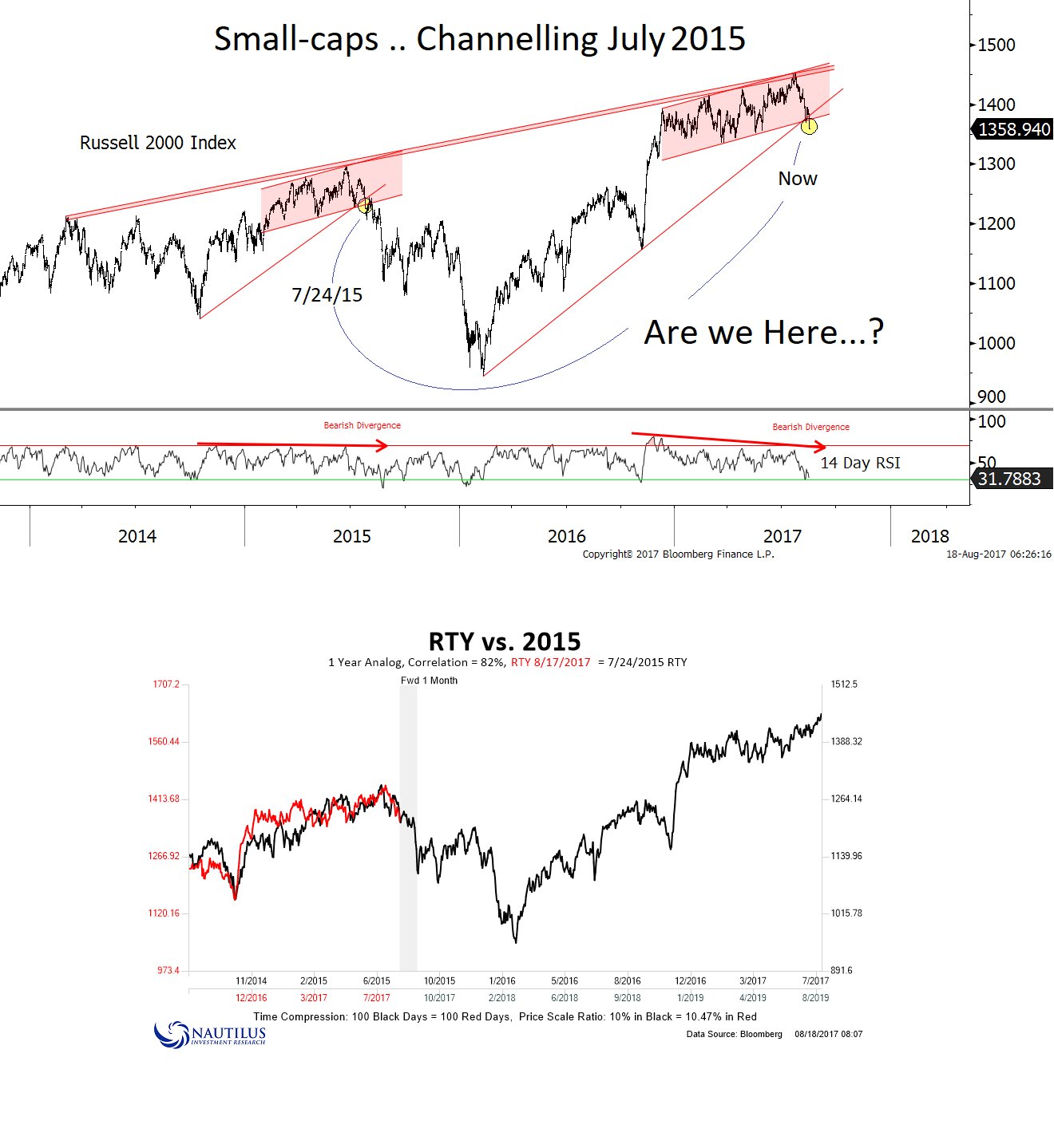
This chart from Nautilus Capital paints a even more dire picture of downside potential of the small cap Russell 2000.
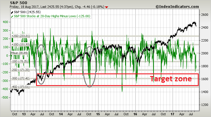
If a major correction, such as the 2013 debt ceiling sell-off, is the template to follow, then breadth indicators from Index Indicators are not sufficiently oversold. In that case, expect further near term volatility, along with a series of “bad oversold” readings that culminate in a washout low. We are not there yet.
My inner investor is neutrally positioned at his investment policy asset mix. My inner trader initiated a small SPX position late last week. He believes that rallies should be sold, or shorted, into in anticipation of further weakness ahead.
Disclosure: Long SPXU
on point as usual.
Excellent work …
Can you give us some insight to your inner investor’s “investment policy asset mix”?
Yes, with Martin; what is your inner investor’s “investment policy asset mix”?
And how large +/- is the upside for staying in until the last minute?
thanks
dg
Cam, thank you for another excellent post. I’m curious, as you often reference the CNN Fear and Greed index, which sits at 15 as I write this, why would your inner trader be short now?
I’m wondering too. It’s a little inconsistent to what you say about it. Maybe it is the same story like it was in August 2015, but what about VIX upper Bollinger Bands Study, which determined the latest UP arrow. Cam, please explain how do you make decisions in your inner trader? Are you doing it arbitrarily by choosing which indicators are the most important in the moment or do you make this in another, more systemic way?
Saying “arbitrarily” I mean subjectively.
MY MISTAKE – misread the above as a short, but it’s not, my apologies.
I’m sure he’s not doing it arbitrarily, though I am curious to hear more details.