Preface: Explaining our market timing models
We maintain several market timing models, each with differing time horizons. The “Ultimate Market Timing Model” is a long-term market timing model based on the research outlined in our post, Building the ultimate market timing model. This model tends to generate only a handful of signals each decade.
The Trend Asset Allocation Model is an asset allocation model that applies trend following principles based on the inputs of global stock and commodity price. This model has a shorter time horizon and tends to turn over about 4-6 times a year. The performance and full details of a model portfolio based on the out-of-sample signals of the Trend Model can be found here.
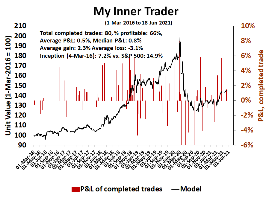
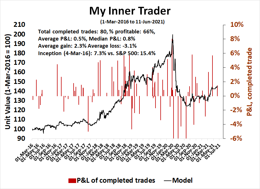
My inner trader uses a trading model, which is a blend of price momentum (is the Trend Model becoming more bullish, or bearish?) and overbought/oversold extremes (don’t buy if the trend is overbought, and vice versa). Subscribers receive real-time alerts of model changes, and a hypothetical trading record of the email alerts is updated weekly here. The hypothetical trading record of the trading model of the real-time alerts that began in March 2016 is shown below.

The latest signals of each model are as follows:
- Ultimate market timing model: Buy equities
- Trend Model signal: Bullish
- Trading model: Neutral
Update schedule: I generally update model readings on my site on weekends and tweet mid-week observations at @humblestudent. Subscribers receive real-time alerts of trading model changes, and a hypothetical trading record of those email alerts is shown here.
Subscribers can access the latest signal in real-time here.
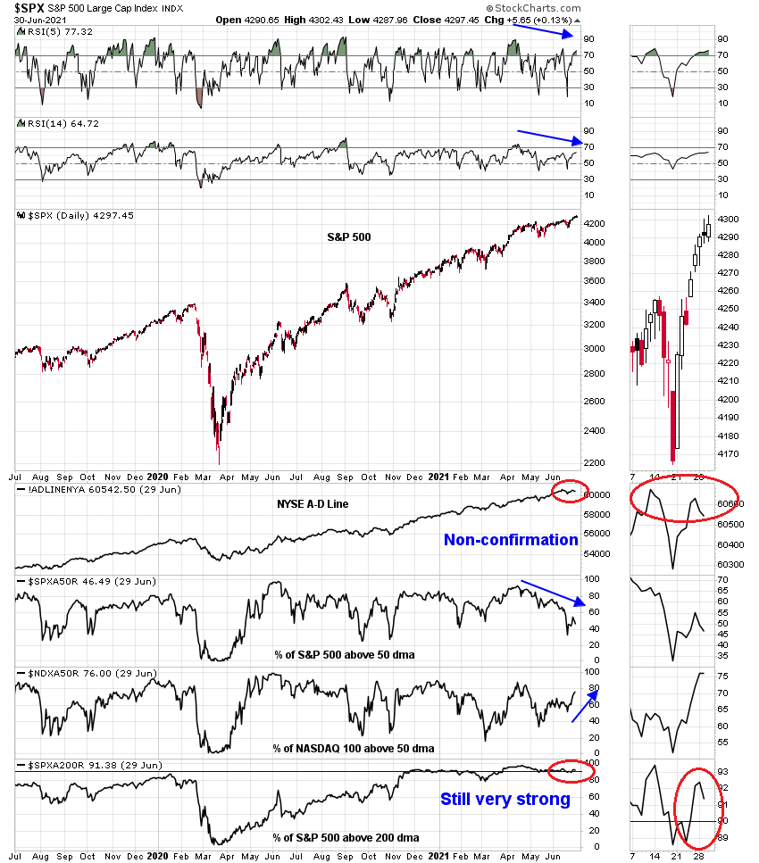
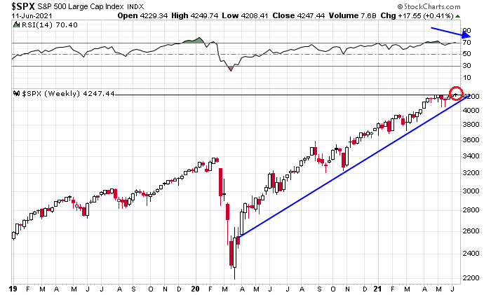
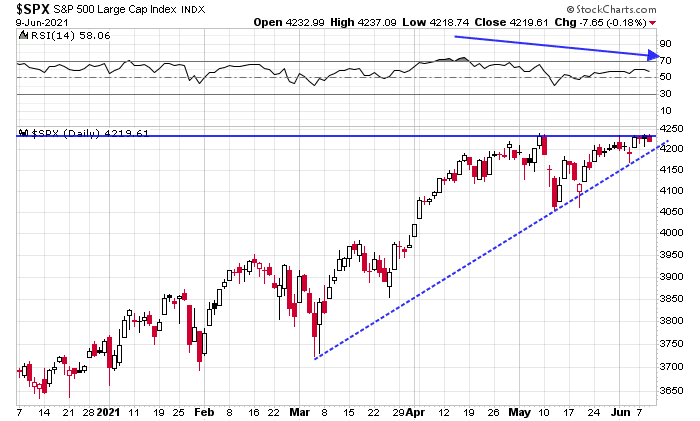
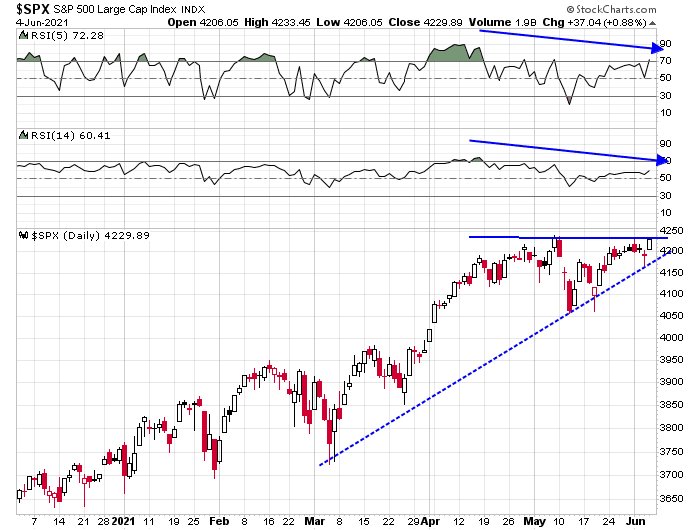
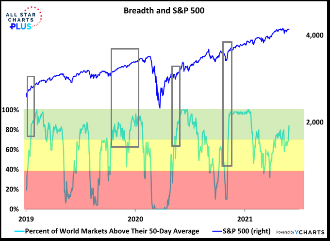
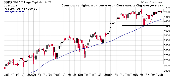
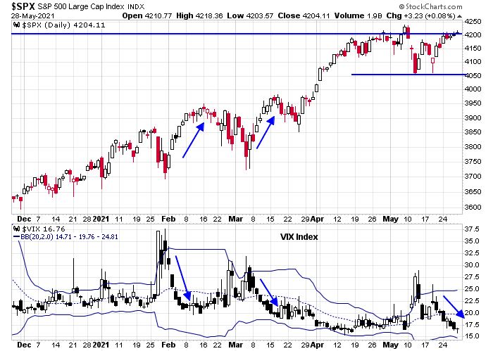
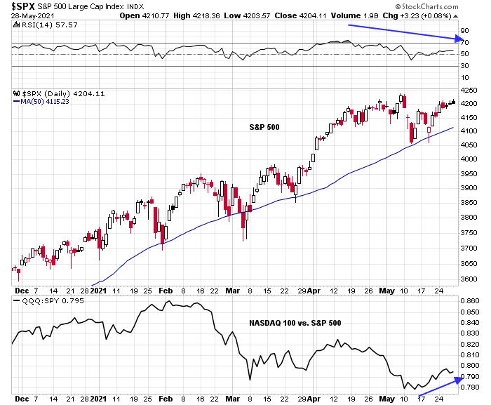
An upper BB ride
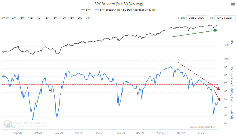
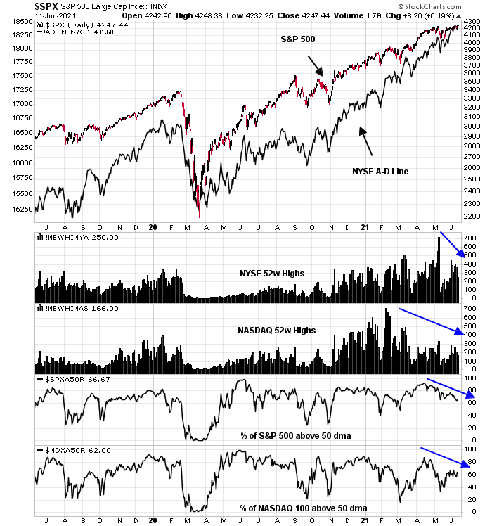
Despite all of the warnings about negative breadth, the S&P 500 has been undergoing a ride along its upper Bollinger Band while exibiting a “good” overbought condition.
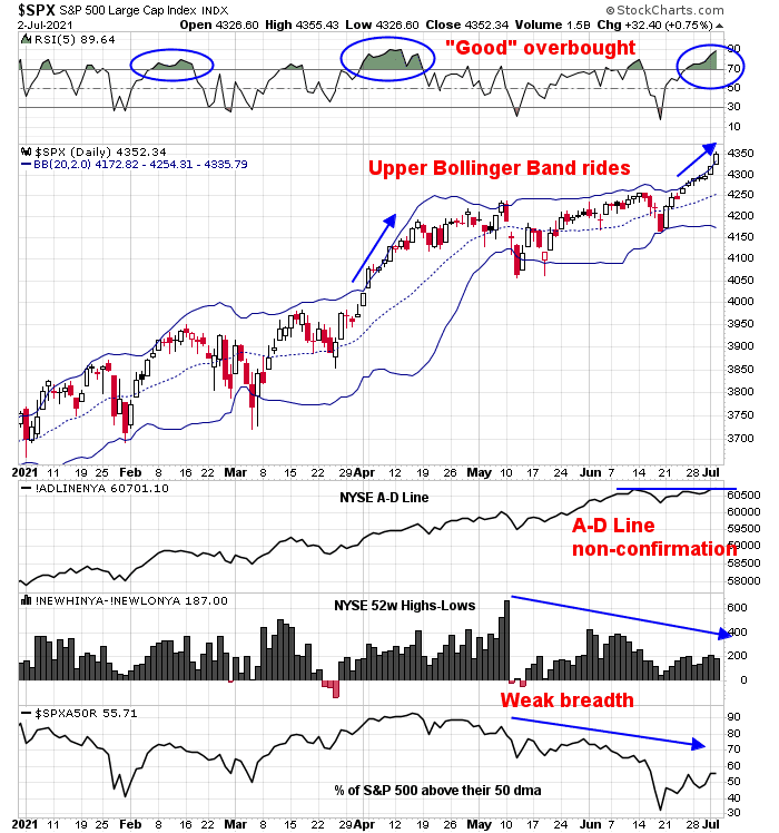
While conventional technical analysis would view episodes of negative breadth divergences as bearish, there are good reasons for the bullish resilience of the S&P 500.
Underlying strength or weakness?
Bob Farrell’s Rule #7 explains the reasoning behind the caution of negative breadth divergences.
Markets are strongest when they are broad and weakest when they narrow to a handful of blue-chip names.
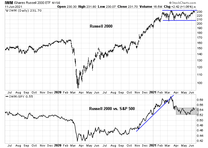
Translation: Breadth is important. A rally on narrow breadth indicates limited participation and the chances of failure are above average. The market cannot continue to rally with just a few large-caps (generals) leading the way. Small- and mid-caps (troops) must also be on board to give the rally credibility. A rally that lifts all boats indicates far-reaching strength and increases the chances of further gains.
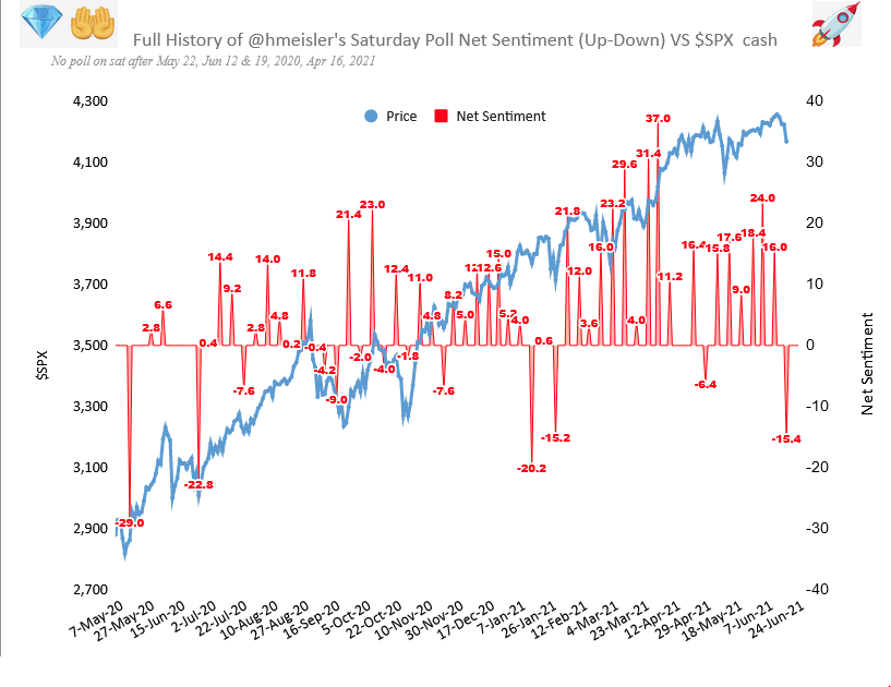
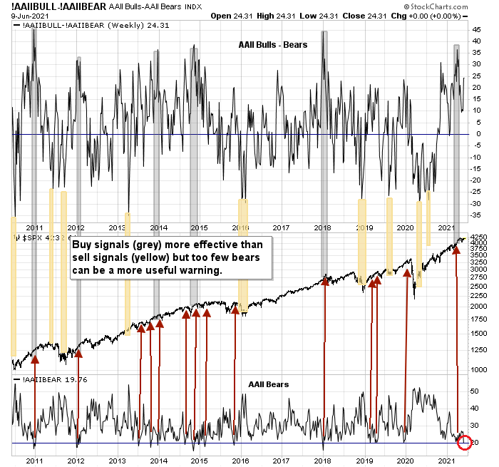
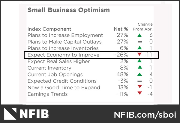
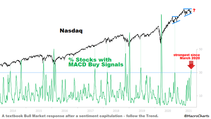
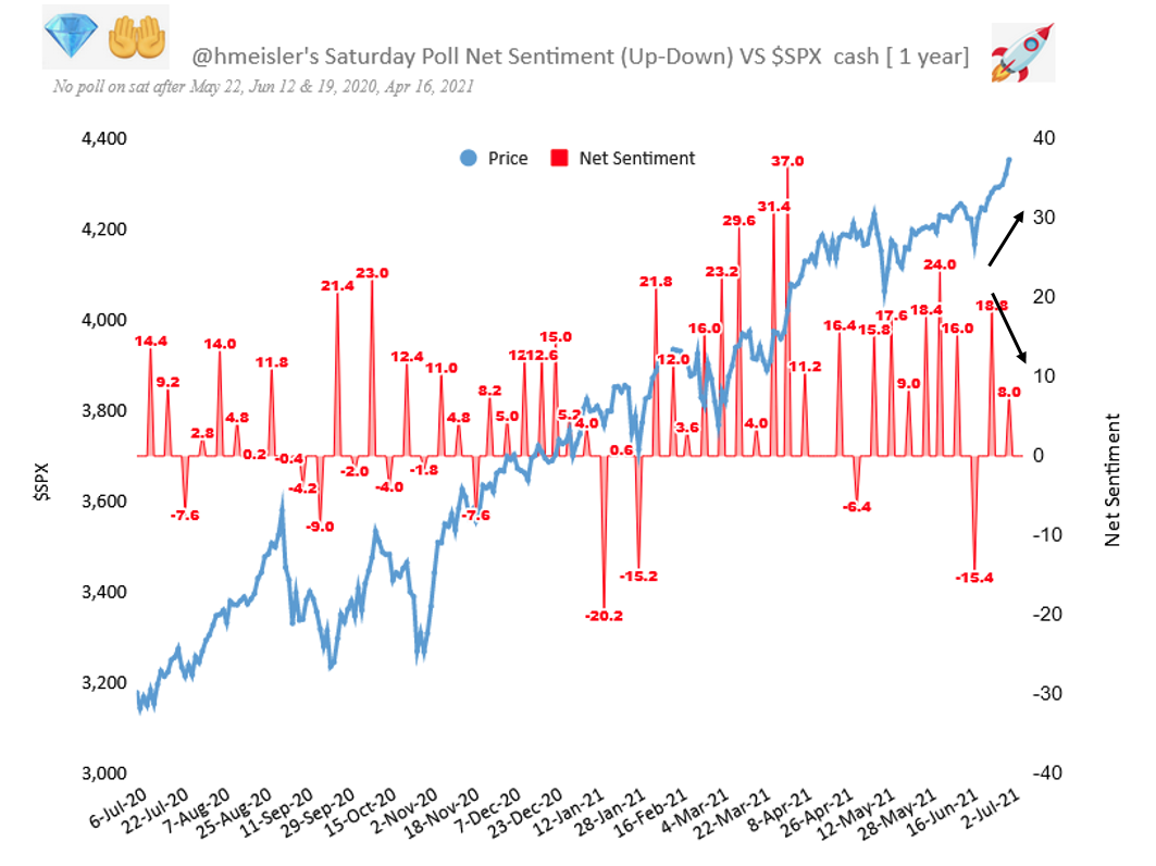
In the short term, however, Farrell didn’t count on is the improvement in sentiment. Helene Meisler conducts an (unscientific) Twitter poll every weekend. The latest results saw net bullishness decline even as the S&P 500 rose to an all-time high. The market is climbing the proverbial Wall of Worry.
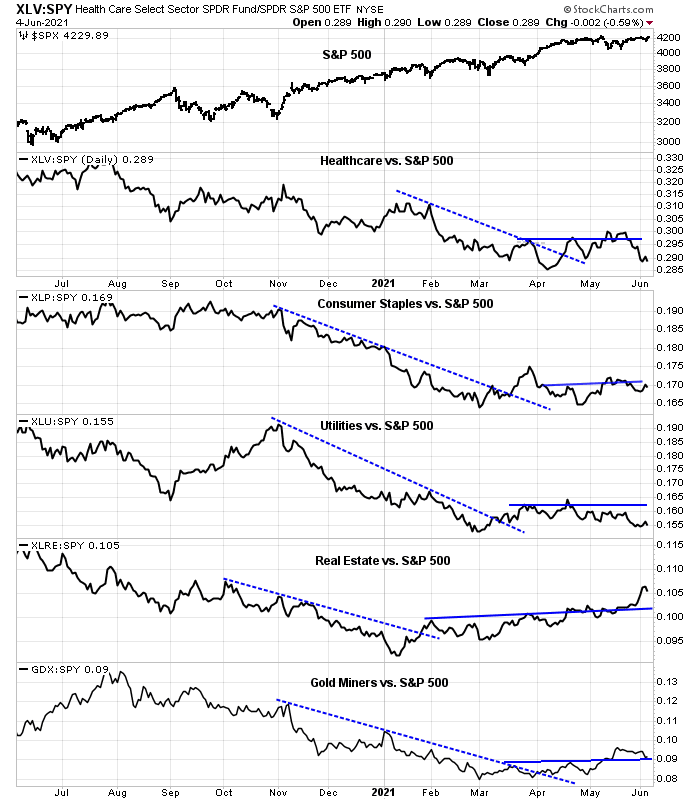
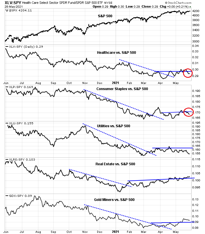
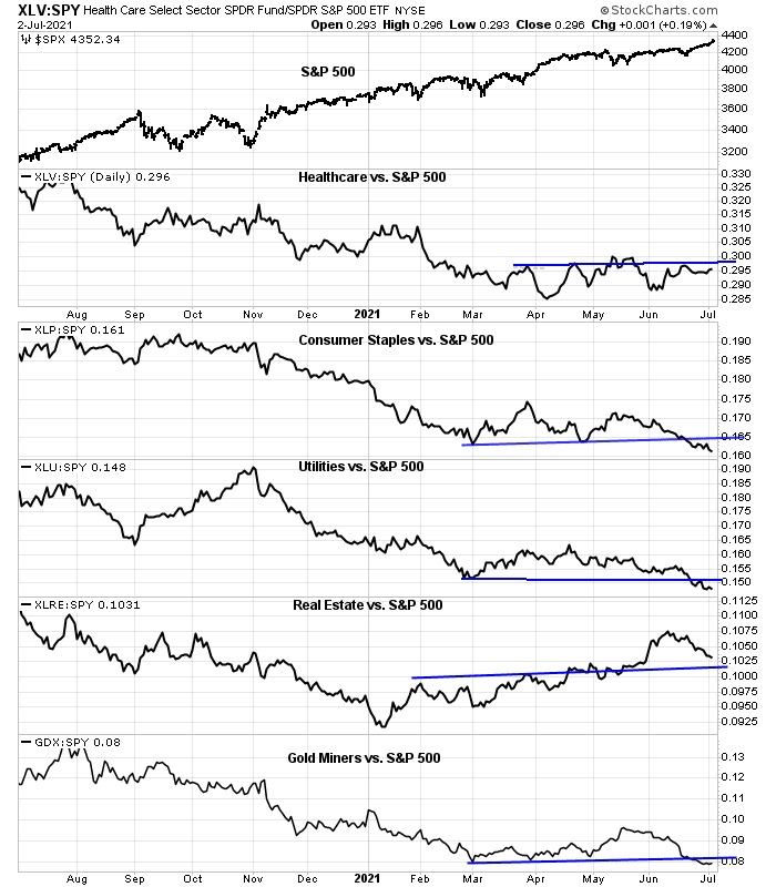
Another factor Farrell didn’t count on the composition effects of the S&P 500. The top five sectors comprise about 75% of the weight of the index, and their relative performance determines the market’s direction. An analysis of the June relative performance of these sectors shows that three of the five representing 43.4% of index weight are exhibiting positive relative strength. This is in turn putting upward pressure on the index. Healthcare is trading sideways, while Financials are weak.
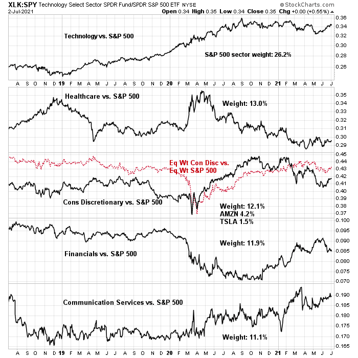
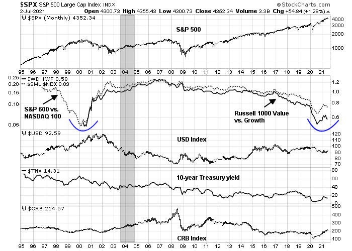
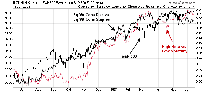
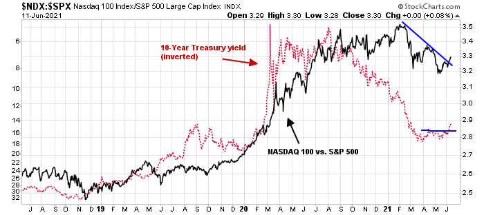
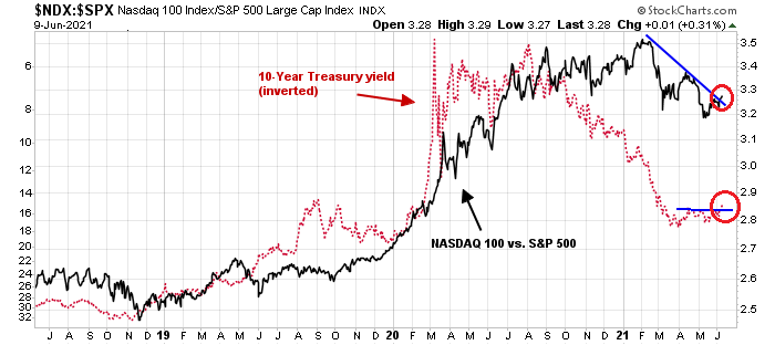
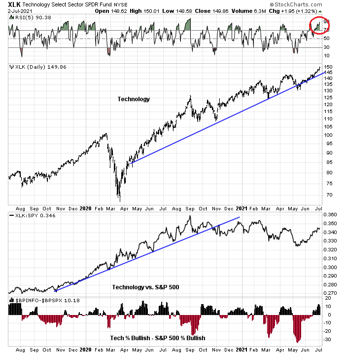
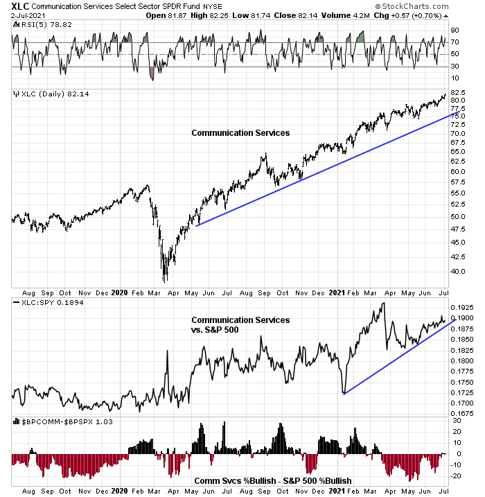
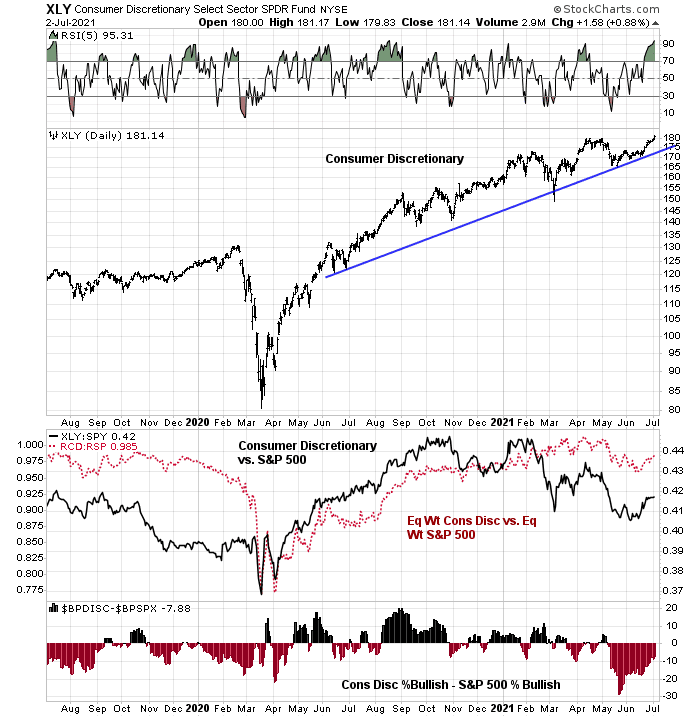
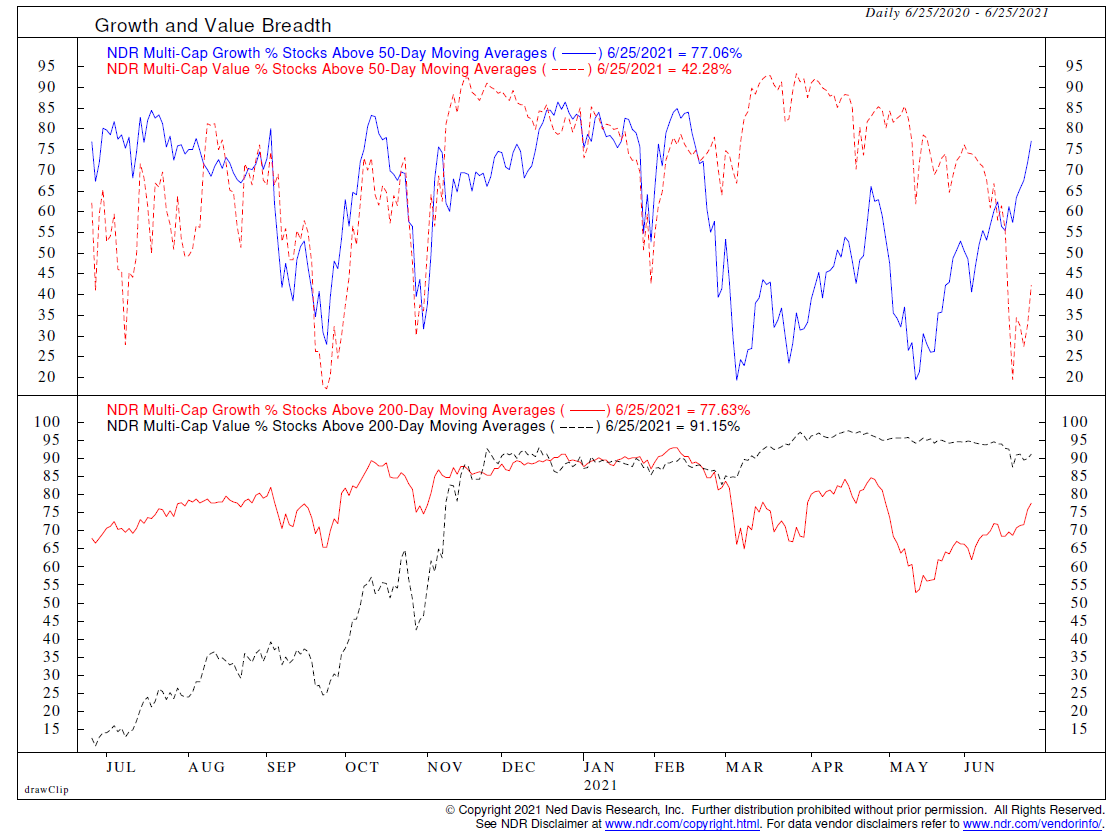
If we view the market through a style lens, it’s the growth heavyweights of the S&P 500, namely technology, communications services, and consumer discretionary (Amazon and Tesla) which are providing the bullish impulse. Value stocks are weak.
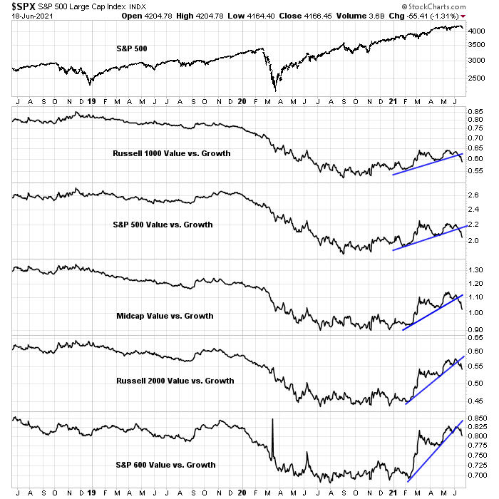
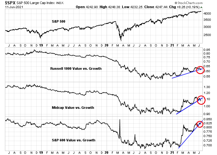
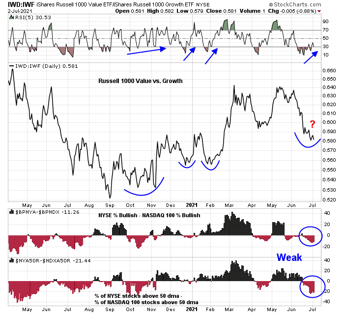
This brings up another weakness in conventional technical analysis techniques. Many technicians rely on the NYSE as a broad metric of the market, but NYSE stocks tend to be more value-oriented while NASDAQ stocks are tilted towards growth. An analysis of the relative breadth of NYSE and NASDAQ breadth reveals relative weakness in NYSE issues, which is masking S&P 500 strength (bottom two panels). However, the value/growth ratio is exhibiting a positive RSI divergence, which has led to a value revival in the past.
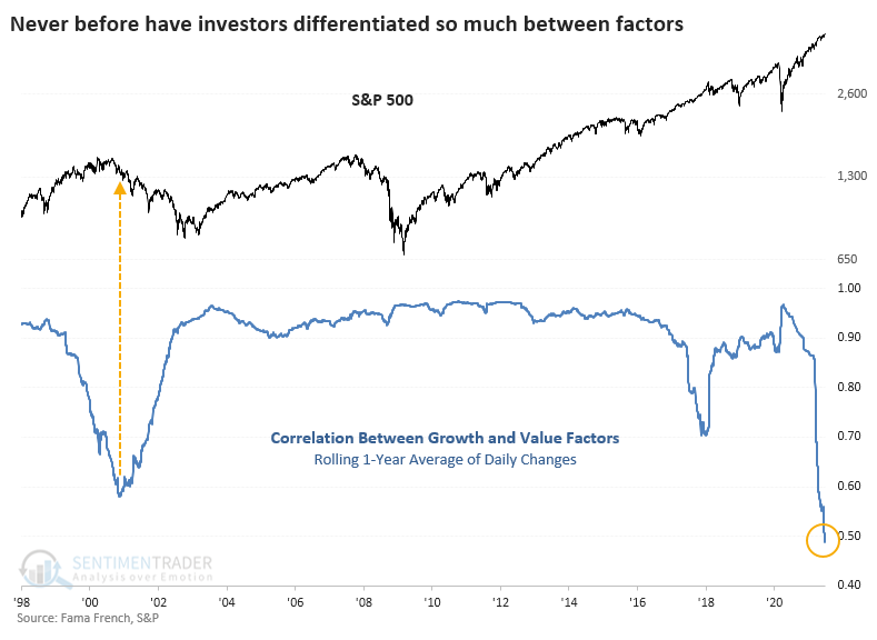
In short, this is a divided and bifurcated market. In this environment, proper market analysis involves the examination of each underlying component.
A style review
Let’s review the underlying technical conditions of the major growth and value sectors, starting with technology, which is the largest growth sector and has the heaviest weight in the S&P 500. Technology stocks are in a well-defined uptrend, though it appears to be a little extended. The sector violated a relative uptrend in November and it has been trading sideways relative to the index, though it has exhibited some recent relative strength. Relative breadth is strong (bottom panel).
Communication Services is another growth sector that is exhibiting both absolute and relative uptrends. Relative breadth has surprisingly been negative and only edged into positive territory recently.
Consumer Discretionary stocks can be classified as both growth and value. On a cap-weighted basis, the sector is dominated by two growth heavyweights, Amazon and Tesla. On an equal-weighted basis, the sector is comprised of companies with more cyclical and value exposure. The cap-weighted sector is in an extended uptrend, as evidenced by its overbought RSI reading. Both the cap and equal-weighted relative performance of the sector showed positive relative strength in June. Relative breadth is negative but improving.
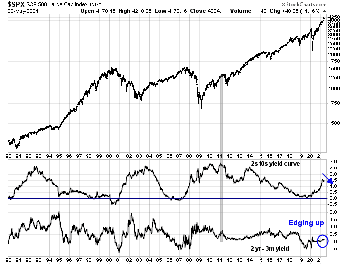
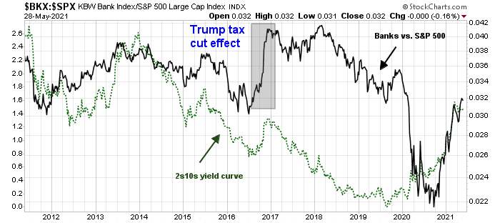
Turning to the value sectors, the largest sector is the Financial stocks. This sector violated both absolute and relative rising trend lines in June, which are indications of technical damage. The relative performance of financial stocks is closely tied to the 2s10s yield curve. As banks tend to borrow short and lend long, a steepening yield curve improves their profitability.

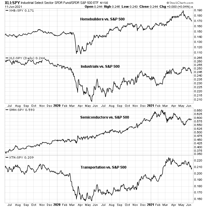
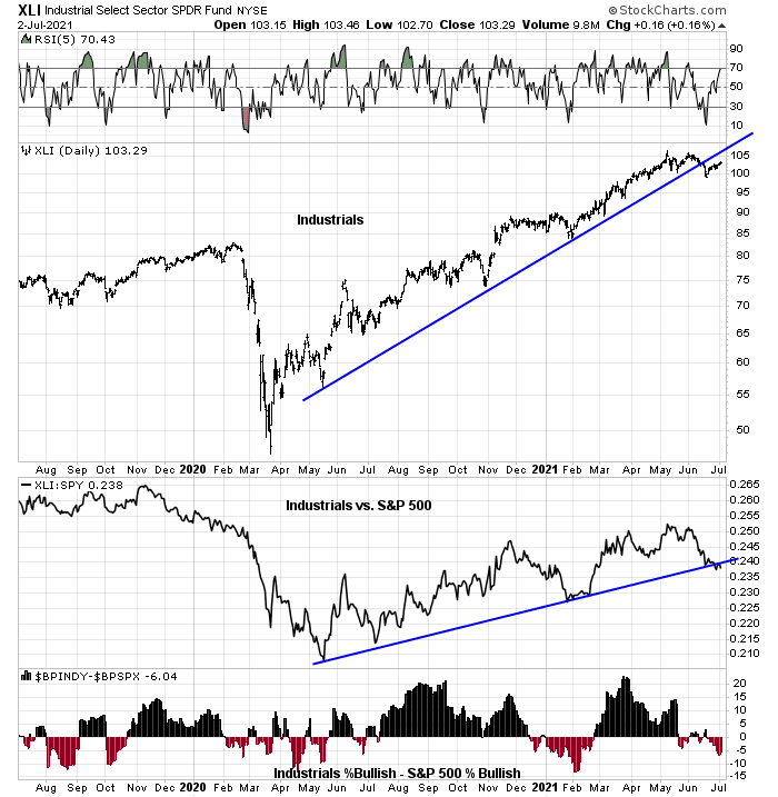
Industrial stocks are also displaying a similar pattern of the violation of absolute and relative uptrends in June. Relative breadth is weak.
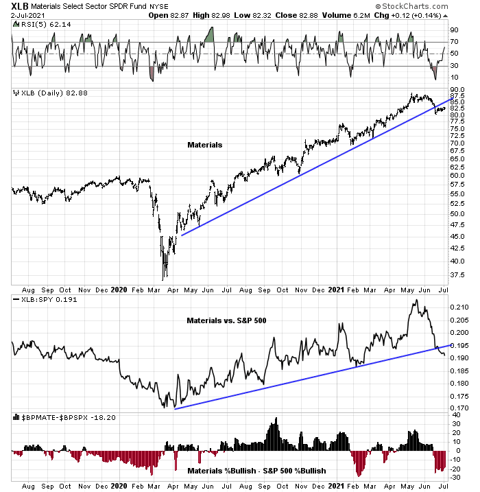
The Materials sector also violated its absolute and relative uptrends.
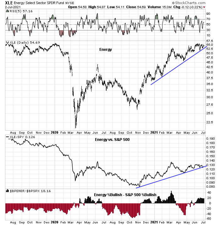
Energy stocks are the only bright spot among the value sectors. The sector is in an absolute uptrend. However, it is testing its relative uptrend to the S&P 500. Relative breadth is strong.
Why I am not bearish
In short, a review of the major growth and value sectors shows growth to be strong and value weak. But here is why I am constructive on the market overall. None of the defensive sectors or industries with the exception of Real Estate are showing any signs of relative strength. Bearish setups don’t behave this way.
I began this publication with a rhetorical question of why the S&P 500 is resilient. Ed Clissold of Ned Davis Research wrote, “The back-and-forth leadership is the reason market breadth has been so resilient.”
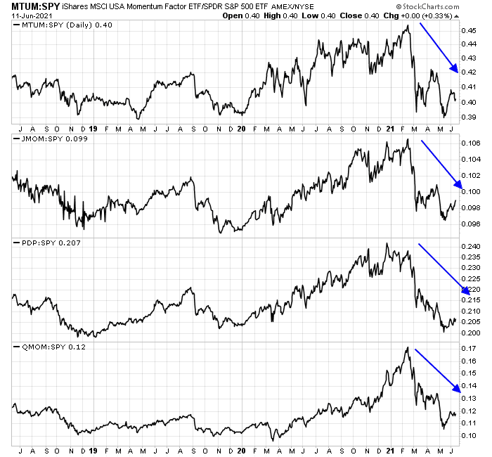
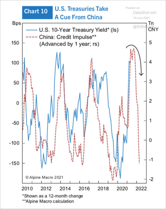
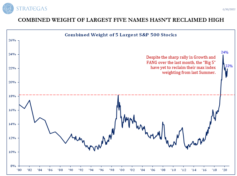
Bear in mind, however, that the sideways value and growth rotation will not last forever. It will eventually break one way or the other eventually. My base case calls for a value and cyclical revival. There are two structural reasons for this. First, the weights of the top five stocks in the S&P 500, which are all growth stocks, have fallen even as the S&P 500 has risen to fresh all-time highs. This is a sign that faltering growth leadership.
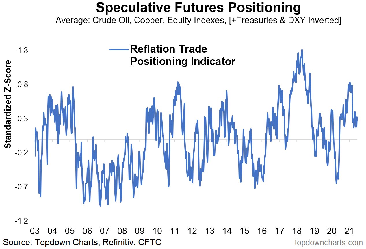
Conditions are also setting up for a value and cyclical rebound. In the wake of the Vaccine Monday rally that began in November, investors had been piling into value and cyclical stocks, and their positioning had become extended. Callum Thomas of Topdown Charts documented that speculative futures positioning in the reflation trade has retreated. Sentiment has come off the boil, and this is a setup for another leg up for value and cyclical stocks.
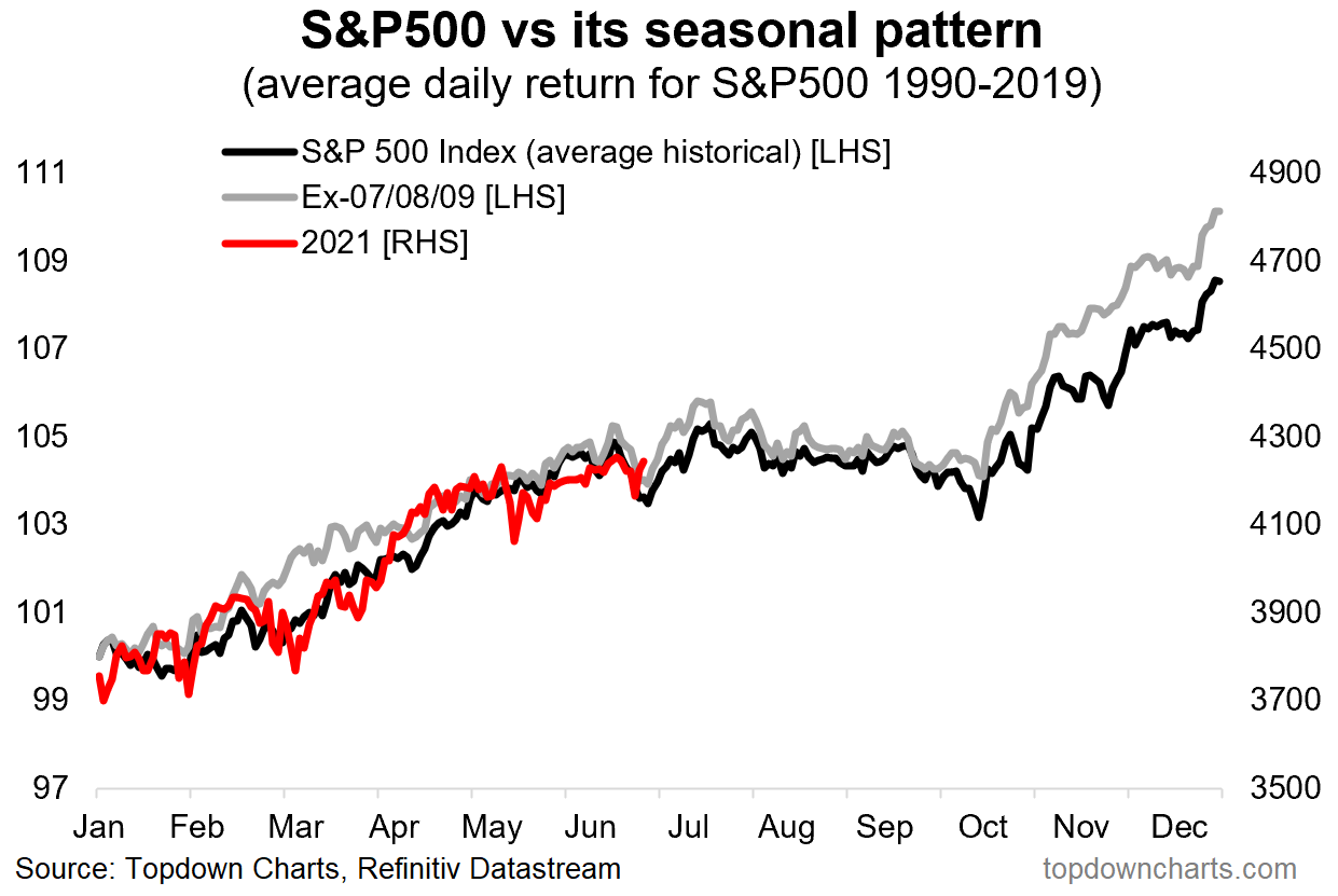
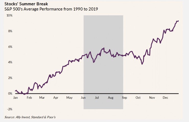
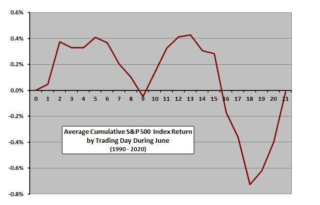
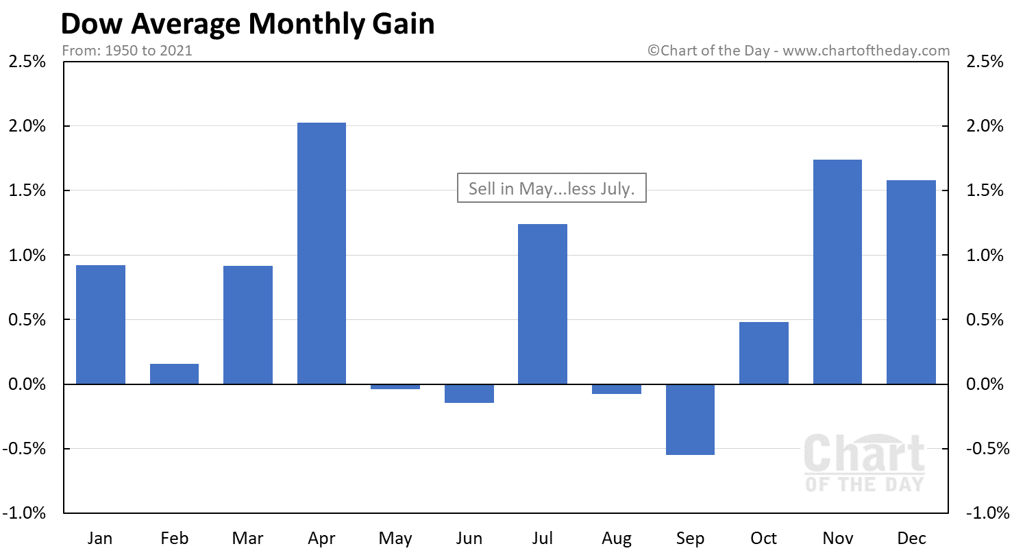
In the short run, count on more back-and-forth value and growth rotation that supports stock prices. History shows that the DJIA seasonal pattern in July is bullish.
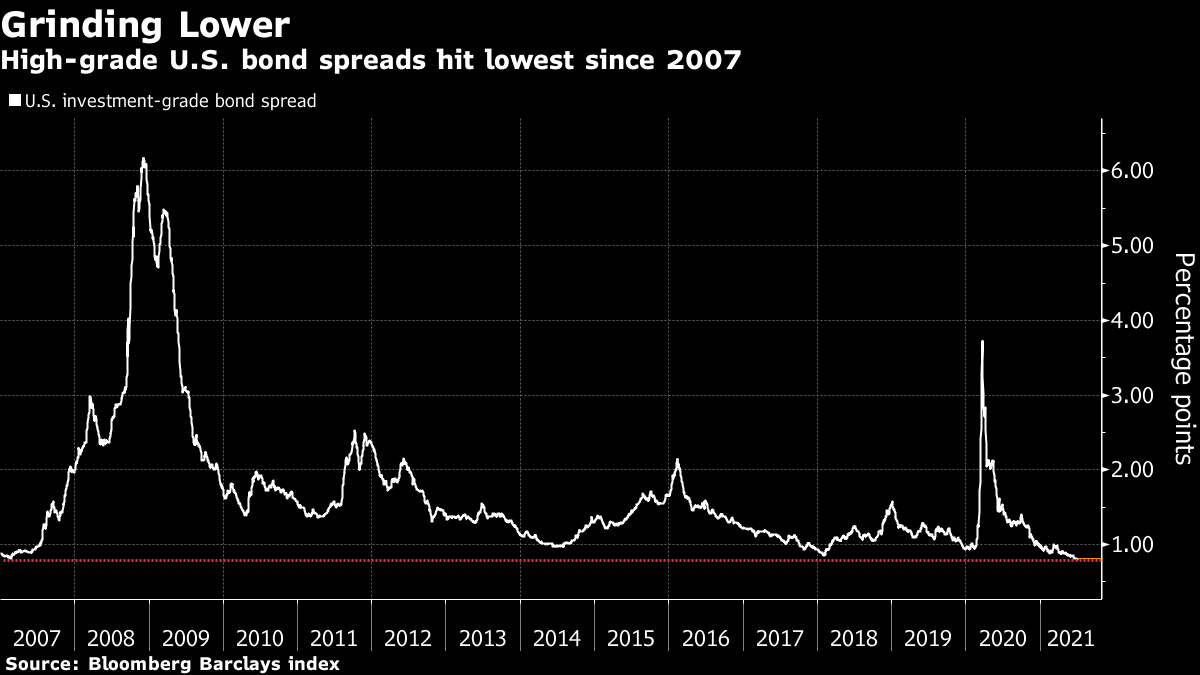
As well, the credit markets are also signaling a benign environment. Katie Greifeld of Bloomberg reported, “Bond spread have continued to narrow. Investment grade spreads to Treasuries sit at just 80 basis points, and junk spreads have tightened below 270 basis points, both the slimmest pickups in well over a decade.”