The latest signals of each model are as follows:
- Ultimate market timing model: Buy equities
- Trend Model signal: Bullish
- Trading model: Bullish
Update schedule: I generally update model readings on my site on weekends and tweet mid-week observations at @humblestudent. Subscribers receive real-time alerts of trading model changes, and a hypothetical trading record of those email alerts is shown here.
Subscribers can access the latest signal in real-time here.
An overbought market
The S&P 500 closed November above its upper monthly Bollinger Band. This is a rare occurrence and going back to 1990, there were 14 occurrences. Exactly half of the episodes saw the market continue to rise, and the other half fell.
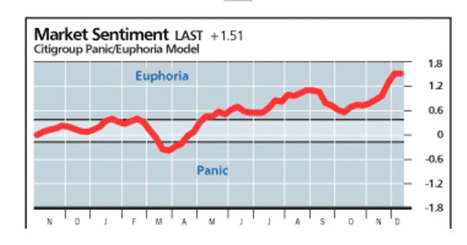
Virtually all sentiment models are screaming “caution”!
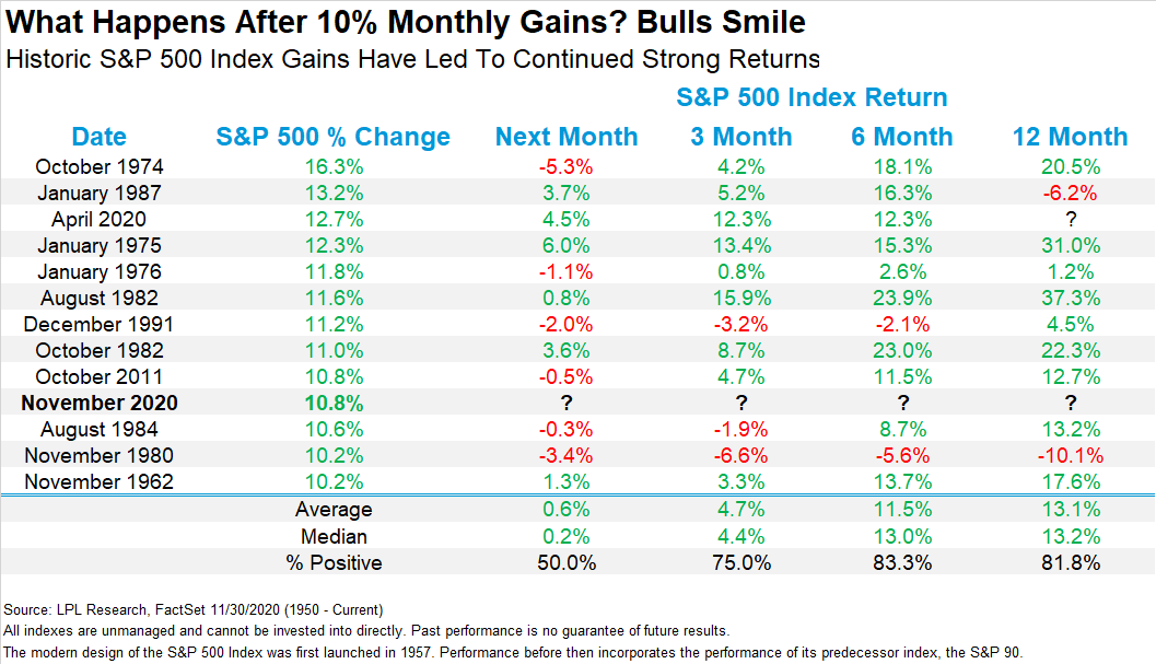
On the other hand, momentum is extremely strong after the S&P 500 gained 10.8% in November. Are these overbought conditions the signs of a melt-up, or the warnings of an imminent pullback?
Froth, froth everywhere
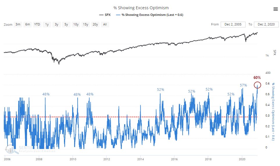
SentimenTrader observed that for the first time in 15 years, 60% of its sentiment indicators are exhibiting excessive optimism – which is a record.
However, sentiment indicators come with an important caveat. They work better at pinpointing bottoms than at calling tops. That’s because investors panic at bottoms, which are easy to spot. On the other hand, investors become complacent at market tops but need a bearish catalyst for the market to fall.
Bullish momentum = Melt-up?
In the meantime, the S&P 500 is roaring ahead after a 10.8% gain in November. Ryan Detrick of LPL Financial found that price momentum tends to persist after 10% monthly gains if you look ahead 6 and 12 months. Results for the next month, which in this case is December, show a positive average and median gain, but the success rate is a coin flip at 50%.
SentimenTrader also observed that NAAIM active managers are so bullish they’re levered long. However, the “average return 3 months later was 5%, with the 3 precedents all being higher”. The moral of this story: don’t discount the effects of price momentum.
I have been monitoring the % of S&P 500 stocks above their 200-day moving averages. Readings have spiked above 80% to over 90%. Past episodes of surges above 80% have been divided into sustained advances (in grey) and pullbacks (in pink). However, only readings above 90% have been signals of “good overbought” rallies. These conditions argue for a market melt-up despite warnings from sentiment models.

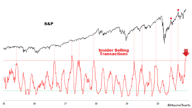
Here is an odd but bullish anomalous sign from sentiment models.
Macro Charts observed that traders are selling aggressively, and the “5-Week positioning change is one of the most negative in history – previously only seen at bottoms”.
These readings are unusual because hedge fund equity futures trading is mainly dominated by Commodity Trader Advisers (CTAs). CTAs are trend followers, and they should be buying, not selling, as prices have been rising. The most likely explanation of significant large speculator selling can be attributable to rebalancing flows by institutions. Equities have outperformed bonds so much in Q4 that large balanced funds need to sell stocks and buy bonds in order to return to their target weights. If the stock market is holding up well in the face of concerted rebalancing selling, then the underlying momentum is stronger than appears.
That’s a bullish sign.
Buy the dip!
Something truly rare is happening in financial markets right now. Both sentiment and breadth figures are at multi-year highs (if not multi-decade highs). When this happens, investors and traders split into 2 camps: those who think that stocks will crash (sentiment camp), and those who think that this is only the start of a great bull market (breadth & breakout camp).
Things are never so black and white. The 2 narratives can co-exist if we consider 2 different time frames.
While unimaginably high sentiment can and usually does lead to short term losses and market volatility, incredibly strong breadth is more of a long term bullish sign for stocks.
This year has been extremely unusual in the markets. An
anecdotal report from Goldman’s prime brokerage desk revealed that hedge funds approached the November election cautiously and they were underweight equity beta. As a consequence, “both fundamental and systematic L/S equity funds gave up nearly half of their YTD alpha (over MSCI) in November, one of the worst months for alpha performance in 5 years.”
This is a classic setup for a market melt-up. With the December quarter-end and year-end approaching, which is a deadline on which the quarterly and annual 20% incentive fees are calculated, there is a temptation for hedge fund traders to engage in a beta chase for better returns. It is noteworthy that the stock market’s reaction to Friday’s big miss in the November Jobs Report was to rise. A market’s ability to shrug off bad news is bullish. This is also an indication of the strength of price momentum.
Callum Thomas of Topdown Charts pointed out that that value-growth seasonality is tilted towards value in December and January. In light of the Great Rotation into value and small-cap stocks, a hedge fund beat chase is likely to benefit these groups should the market melt-up.
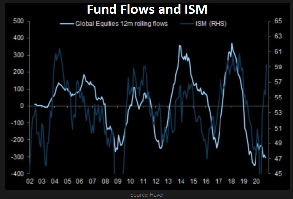
The top-down macro perspective is also supportive of a risk-on environment. Manufacturing PMIs and ISM manufacturing data are all pointing to a global rebound. Historically, such conditions have sparked a fund flows stampede into equities.
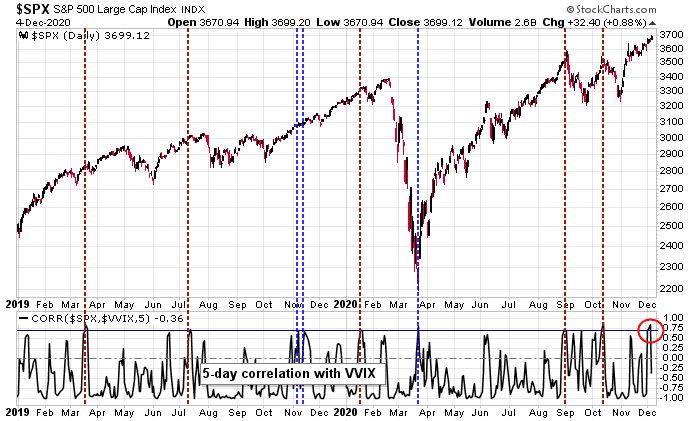
To be sure, some short-term warnings are appearing. The 5-day correlation between the S&P 500 and VVIX, the volatility of VIX, has spiked to over 70%. Past episodes have seen the market stall but pullbacks have tended to be relatively shallow.
In this environment, investors should be buying dips as the downside risk should be relatively limited.
How long can the melt-up last?
Under a melt-up scenario, how long can the rally last? I have two ways of estimating the length of an advance.
Macro Charts pointed out that corporate insider selling has risen to levels not seen in four years. However, insiders tend to be early in their trades, and the market usually doesn’t top out for several weeks or months after a spike in selling. Based on this data, pencil in a top during the January to February time frame.
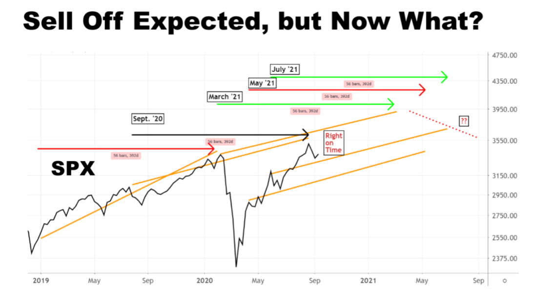
Here is how it works: any time the S&P 500 index (SPX) rises more than five percent within a 20-session stretch, 56-weeks later there is often a sell-off of varying proportions. This happens consistently enough that if you track through the data, you can calculate that the average return for the 40-day period at the end of 56 weeks is almost a full one percent lower than the average return for any other 40-day period over the past 26 years. The reason for bringing it up now is that, as shown in the chart below, the recent pullback came at the beginning of such a pattern. Even more interesting is that three more ending patterns are due to create selling in close proximity during the second quarter of 2021.
The 56-week pattern has a simple explanation. To take advantage of favorable tax treatment, many high-net worth investors and professional money managers prefer to hold positions longer than one year. What that means is that if a lot of them buy at the same time, it shows up in the market averages. A little more than a year later, there comes a point where a lot of money is ready to be taken out of one position and moved into another.

The 56-week pattern puts the timing of a significant downdraft in the March to July period. Based on this framework, we should also see some market weakness starting around mid-December 2021.
In conclusion, the weight of the evidence is supportive of the melt-up scenario. Any market weakness should be relatively shallow. You should take advantage of dips to add to long positions. The timing of a melt-up market top is less clear, but start to be cautious by late January, but the ultimate top may not arrive until February or March.


I think the stock market’s impressive performance is based on a popular delusion. The delusion : “The Fed is printing money .”
Now it’s trivial to see if this is true or not. We’ve had roughly 3 trillion in stimulus and about 1 trillion in QE and deficit spending this year. Now if the Fed is printing money, and printed all of it, the national debt wouldn’t rise. But, if the Fed had to borrow this money and had to borrow all of it to give it to other people, the national debt would rise by 4 billion, reflecting the need to return the money to the lenders.
Now you know the answer. The fed BORROWED it all, printed zero, and the national debt has increased by 4 trillion. If the “market” actually realized this I think it would behave in a different manner.
I continue to read about the Fed printing money nearly everywhere from the brightest people. Even our own Ken asks in his latest post if all this money printing will lead to inflation.
A popular delusion if I’ve ever seen one. Remember, the price of tulips increased also, until they didn’t.
National debt would have to rise by 4 “Trillion” of course.
The answer is yes, the Treasury issues bonds that are repayable BUT the Fed buys them not the public. That is what QE is. If the Fed sells them back into the marketplace fine, we can say there has been no money printing. But what if they simply let the bonds mature and make a journal entry and forgive them.
The Treasury debt is up 4 Trillion but the Fed balance sheet is up that much as an offset.
The Fed’s balance sheet is up a an offset to bank reserves (see below).
Sorry I don’t follow this. As you are aware, the Fed can only purchase in the secondary market, so from the banks. The Fed is prohibited by charter from participating in a bond auction.
The actual bond is owned by the bank. The bank may tender that bond to the Fed but receives a special credit from the Fed that only gets into the general economy when the bank lends a like amount to a borrower. Meanwhile, the money is trapped in the bank and appears as a reserve. This is QE. But until the bank can loan the money, which it is increasingly reluctant to do in this economy, this money never reaches the general economy.
Where does money go to die ?
When we make a loan payment a part of that payment
goes to reduce the loan principle. That part is taken out of the general economy. When banks are receiving more reductions in loan principle than they are lending, as they are now, the economy is in
contraction.
I believe the Fed buys QE bonds in the open market and institutions get the cash with which they can buy other investments. All I can say is that creates more bonds issued by the government and the same amount owned by the Fed.
Where the printed cash money goes is not between institutions, banks, investors or the Fed.
That is bookkeeping with a nil balance. It goes to the companies and individuals that provide services to the government or work for the government. That is government spending in the real economy that has been provided by a debit in the Fed’s balance sheet. Presto – magic money appears out of thin air.
There is much economic academic thought that says the Fed should just let the government bonds come due and expire without asking the Treasury to pay up what they owe. This is called ‘rolling off’ the Fed balance sheet. Presto- temporary magic money becomes permanent magic money.
I think the pain trade is higher. More importantly, the SPX is poised to move ‘reasonably’ higher into year end.
(a) 2020 has been volatile. We’ve experienced declines of -30%, -10%, and -9% in the past nine months. Why do we ‘need’ another major decline?
Why wait for the dip? We’ve had three declines which already collectively qualify as a major dip for the year. I’m not sure it’s reasonable to expect much more on the downside.
(b) The SPX is a whopping +3.6% above the September 2 high. The QQQ? Just +1%. Can we really say the market has gotten ahead of itself?
Well, sure we can.
Firstly, because valuation is beyond excessive by any reasonable measure, it compares only with 2000 and 1929 actually. Stocks/GDP, Stocks/Total assets, Q ratio….you name it.
Secondly, Signes of rampant speculation are everywhere, unprecedented naked call buying, Nasdaq/SP500 volume ratio, mere existance of Robinhood and its clones catering to broad public.
TSLA is a posterchild for both. By any fundamental measure this stock is basically worthless, yet blown by speculation into a huge balloon that will inevitably explode. The above analogy with tulips is more then appropriate.
Yet we now have Shiller out with his Excess CAPE Yield indicator saying valuations may not be excessive at all.
Signs of rampant speculation? They can continue for a long time before the market rolls over (and it may not roll over by mucy). Check out Ciovacco’s latest video for some interesting studies.
It is very common to speak about the FED´s balance sheet without specifying assets or liabilities. According to investopedia, The Fed’s assets consist primarily of government securities and the loans it extends to its regional banks. Its liabilities include U.S. currency in circulation. Other liabilities include money held in the reserve accounts of member banks and U.S. depository institutions. IMHO neither assets nor liabilities seem like a Treasury debt offset.
You are right. The treasury debt numbers must keep going higher. This is reflected in the National American debt.
The “member banks” as you note, are lending out capital to retire bonds. This is an indirect mechanism to reduce cost of doing business by retiring bonds from higher to lower interest rates. Such refinancing may be a lifeline to near bankrupt companies (like Shale drillers as an example or some of the REITs), but may also provide more capital for share buybacks and increasing dividends or simply shoring up balance sheets. We have used this QE mechanism from 2008 with results for all of us to see.
On Friday all the leading qqq stocks AMZN, FB etc.. were weak at the close i.e. down to flat. I would watch the open closely. It might be the start of a pull back everybody is looking for.
Very likely related to weekly option expiration. There are a lot of call options expire in these mega caps.
Starter positions opened in FXI/ASHR/ BABA/ USO in the premarket session.
Adding positions in VTV/ VEU/ EEM.
Selling PLTR.
Adding XLE/ XLF on the 15-minute pullbacks.
Now ~30% invested.
Adding JETS.
Rydex doesn’t have a fund for all-US so opened 75/25 starter positions in RYSPX/RYRHX at the 730 window.
NIO finally catching a bid. Targeting 48-50.
Will be adding positions in VTIAX/ VEMAX at the close.
Sometimes, even when everyone else is bullish – we should be bullish as well. This may be one of those times.
Adding a little KRE.
And a position in RYDHX at the close.
Closed all positions in NIO/ SNAP on the opening pop.
XLE recovered quickly! So did KRE.
There must be a ton of sidelined investors snapping up any dip.
ETCG might be worth looking at.
Starter position in QS.