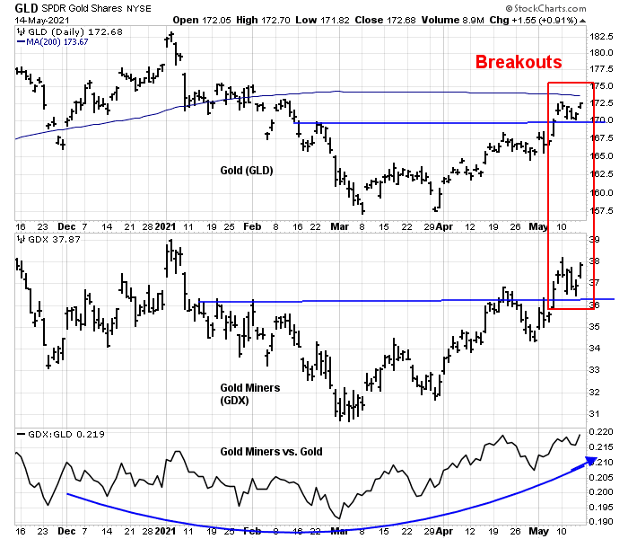
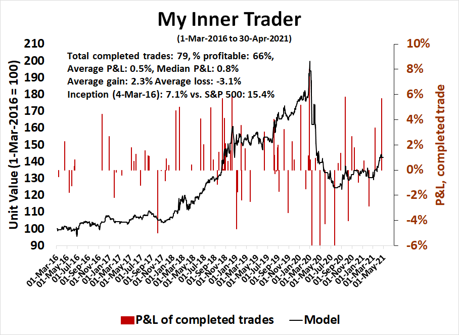
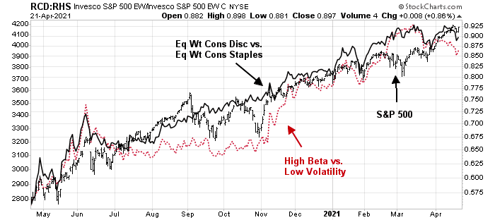
Did anyone notice the upside breakouts in both gold and gold mining stocks? In the short-term, gold may have to contend with overhead resistance at the site of its 200-day moving average (dma). While I am no gold bug, the breakout could be a technical signal of an intermediate bullish phase for precious metals.
This week, I explore the bull and bear case for gold and the macro implications of this upside breakout.
Why I am bullish on gold
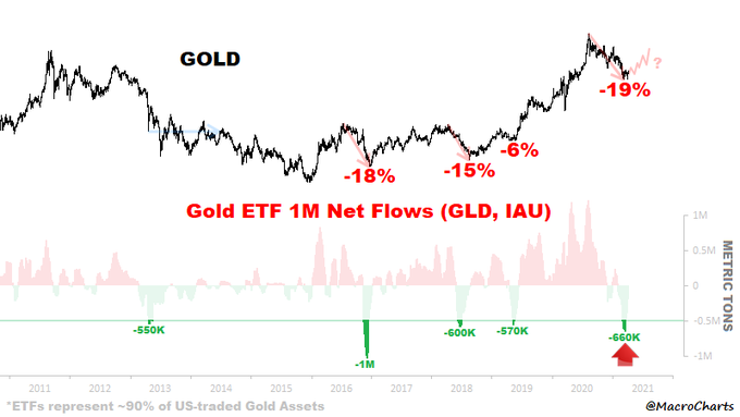
There are a number of reasons to be bullish on gold. Macro Charts reported that net fund flows into GLD, the gold ETF, had turned sufficiently negative that was consistent with past tactical bottoms.
As gold is normally thought of as an inflation hedge, a BoA survey of credit investors shows that inflation is their biggest concern, indicating a bullish setup.
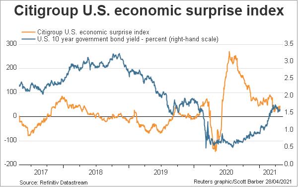
The Citi Inflation Surprise Index is rising everywhere around the world, which should be bullish for gold,
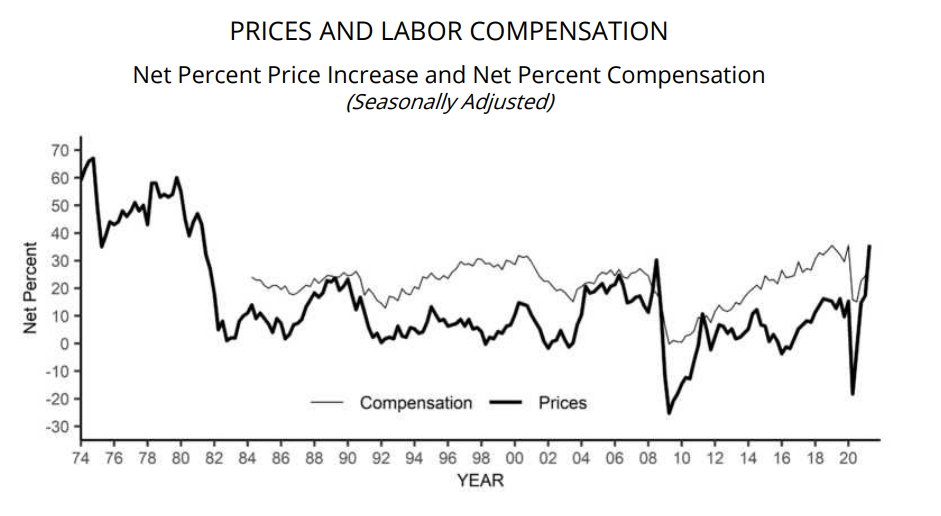
In addition, the Federal Reserve is increasingly focused on full employment and financial stability at the price of price stability, or inflation, we have the backdrop for rising inflation, which is bullish for precious metals.
From a long-term technical perspective, gold prices are highly correlated to the TIPS price, or the inflation-index bonds. Gold has either broken out or is on the verge of a breakout of a multi-month bull flag. A bullish divergence between the gold price and TIPS is pointing to higher bullion prices. The gold mining stocks have already staged an upside breakout of a similar bull flag. These are the technical ingredients for an intermediate-term bull phase for the yellow metal.
The long-term big picture
As well,
Greg Ip at the WSJ offered the following inflation bullish demographic insight: “An ample global supply of labor helped keep inflation down in recent decades. That’s reversing as China and U.S. record their slowest population growth since at least the 1950s. A diminished supply of workers could start to pressure inflation.”
I had highlighted analysis from Jurrien Timmer of Fidelity Investments in the past. Timmer had compared the current macro environment to the ’60s. Then, you had the LBJ “guns and butter” policy that ultimately led to the inflation of the ’70s. Inflation began to pick up in 1967 and the market experienced its first inflation scare in 1968. Today, you have a leftward drift in fiscal priorities and an accommodative Fed that is setting the stage for rising inflation.

Gold prices were set at $35 during the ’60s as part of an exchange rate policy, but silver prices were freely trading. Silver prices rose from $1.30 in April 1967 to $2.50 in June 1968 – a 92% gain. In the past, the terminal inflationary blow-off phase is the most profitable one for precious metals. If Timmer’s scenario is correct, precious metals are only basing for a bull run, and the parabolic phase and top will occur in 2023. (Please take note that this is not a forecast, only a scenario that outlines the upside potential of precious metal prices.)
Key risks
There are two key risks to the bullish outlook for gold prices. While gold is traditionally thought of as an inflation hedge, it’s really a hedge against unexpected inflation. In fact, gold prices are inversely correlated with real yields.
So far, the Fed is getting its way with the market and the economy. Wage growth is rising, but the effect is mostly among lower-income workers, which narrows inequality.
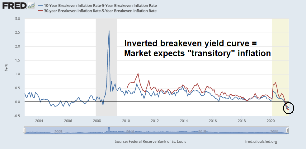
The breakeven yield curve is steeply inverted, indicating that the market expects any inflationary pressures will be transitory.
Moreover, real yields are falling. The upside breakout in gold prices is tied to a Goldilocks Federal Reserve of not too hot, not too cold policy of monetary accommodation.
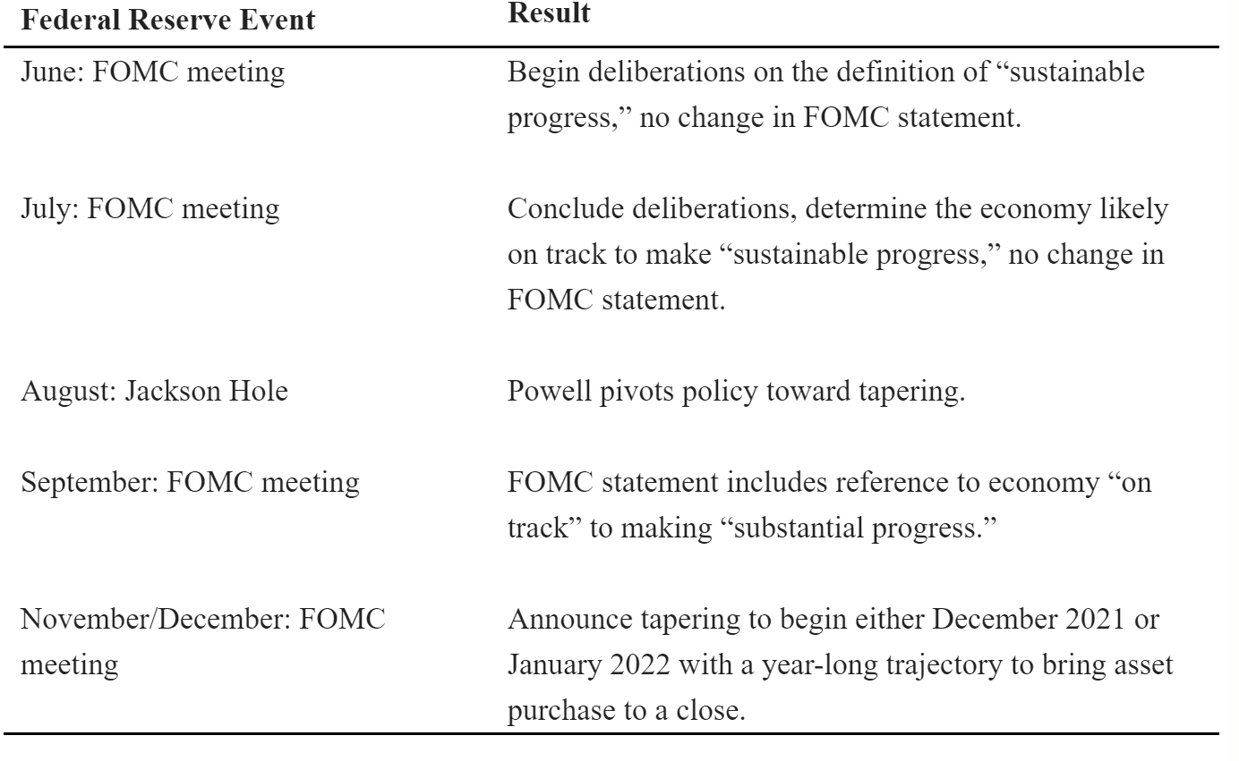
What if Fed policy were to change? The consensus belief is the Fed will start to discuss the mechanism for tapering its quantitative easing purchases of debt in August at its Jackson Hole meeting. Hints of tapering could upset the bond market, and by extension the gold market. But there may be a much more important Fed policy change this summer. Powell’s term as Fed Chair ends in February 2022.
Politico reports that Biden will have to decide if he will reappoint Powell, or replace him.
Some progressive groups are mobilizing against Powell’s reappointment, calling on Biden to pick a more liberal candidate for the country’s most important economic policy job. The groups acknowledge that he has steered the Fed toward promoting “broad-based and inclusive” job gains, a historic shift for the central bank. But they have a litany of complaints: He hasn’t done enough to prepare banks to deal with the financial risks posed by climate change, he has eased regulations on the largest lenders, and he has fallen short on closing the racial wealth gap.
The risk to the markets and gold prices is the nomination of a candidate who is perceived to be too dovish. Such a decision would cause both real and nominal bond yields to spike and cause havoc in both the equity and precious metal markets.
If the economy continues to pick up speed and markets keep rising — with inflation in check — dumping a popular Fed chair, even one nominated by a GOP president, will be especially tough to do.
Powell is a reassuring presence on Wall Street for his continued easy money policies and refusal to even suggest the Fed might start to pull back on efforts to flood the system with cash in the wake of the Covid-19 pandemic.
Even stories suggesting Powell could be on his way out could upset markets. A recent survey of investors by CNBC found that 76 percent believe Biden will re-nominate the Fed chair.
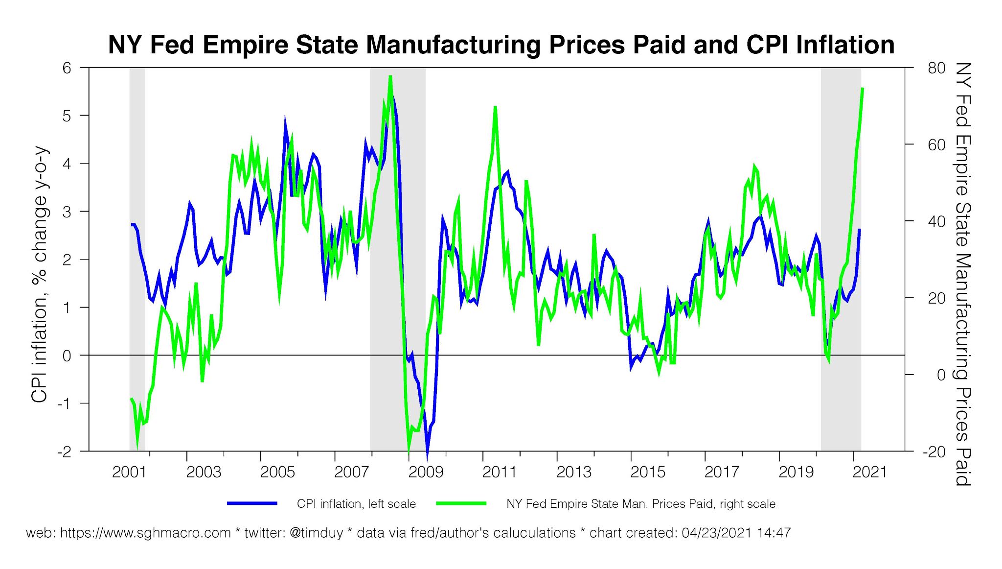
The other risk to gold prices is shorter-term in nature. What if the surge in inflation is indeed transitory? How would gold and other commodity prices react a cooling off in CPI in Q3?
Remember the hot April CPI print? Matthew C. Klein made the case in
Barron’s that the surge in CPI inflation is attributable to reopening effects, which are “transitory”. The upside surprise in April’s CPI can be attributable to two main factors, used cars and reopening categories such as hotels, food away from home, car rental, admissions, car insurance, and airline fares.
Even rising used car prices can be explained by a temporary pandemic-induced supply bottleneck effect. Car rental companies sold their inventory last year, and now they are scrambling to replace their fleet, which is driving up used car prices.
The transitory nature of the price shock can be demonstrated in a number of other ways. Global backlogs and supply chain bottlenecks are pushing up prices.

Headline commodity prices can also be deceiving. The reported headline price is the spot price. A glance at the futures curve shows that many of the commodities which have surged are in backwardation. I have constructed a composite curve composed of an average of copper, lumber, WTI crude oil, and soybeans with the cash price normalized starting at 100. All of these commodities are said to be in short supply. A curve in backwardation is one where the cash and near-term prices are higher than the prices further in the future indicating a physical shortage. A more normal futures curve, such as the one shown by gold, is in contango. A contango curve is one where prices increase steadily into the future, and each increase reflects carrying costs, or interest rates, and the price of storage.

It is an open question of how the markets will react when many of these bottlenecks start to resolve themselves. Maybe the gold market will look through these shortage expectations, or maybe that’s how it stalls at its overhead 200 dma resistance.
Investment implications
In conclusion, the upside breakout in gold and silver is constructive for the precious metals complex. While there is some debate over whether gold prices have broken out of the flag formation, which is a bullish continuation pattern, on the daily price chart, the upside breakout is more evident on the point and figure chart. Moreover, the measured upside objective based on point and figure charting is between 2000 and 2100, depending on how the box size and reversal parameters are set. Moreover, I have laid out the scenario offered by Jurrien Timmer at Fidelity of how gold prices could go parabolic by 2023.
Similarly, the point and figure chart pattern is bullish for GDX, and its measured upside objective is about 40.
Before the gold bulls get all excited, investors need to recognize that the gold and the gold-stock market represent a miniscule portion of the aggregate capital markets. For some context, the total market cap of all the stocks underlying the Gold Miners Index, which is the underlying index of GDX, is roughly equivalent to the market cap of any one of Bank of America, Home Depot, or Nvidia.
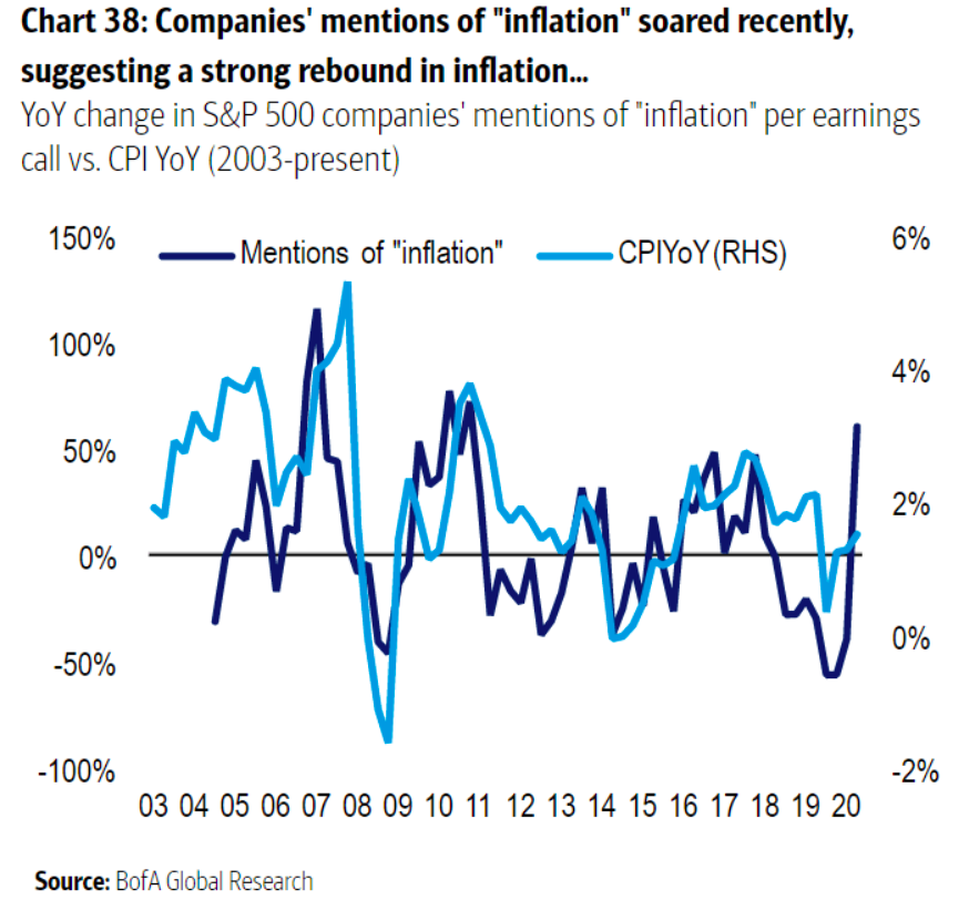
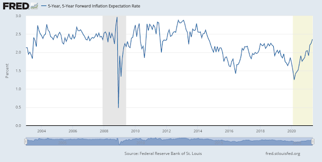
However, the price action of the precious metals has important macro implications for other asset classes, namely that inflation is on the horizon. This is confirmed by the comments of companies on earnings calls. FactSet reported the highest number of citations of “inflation” on earnings calls in 10 years.
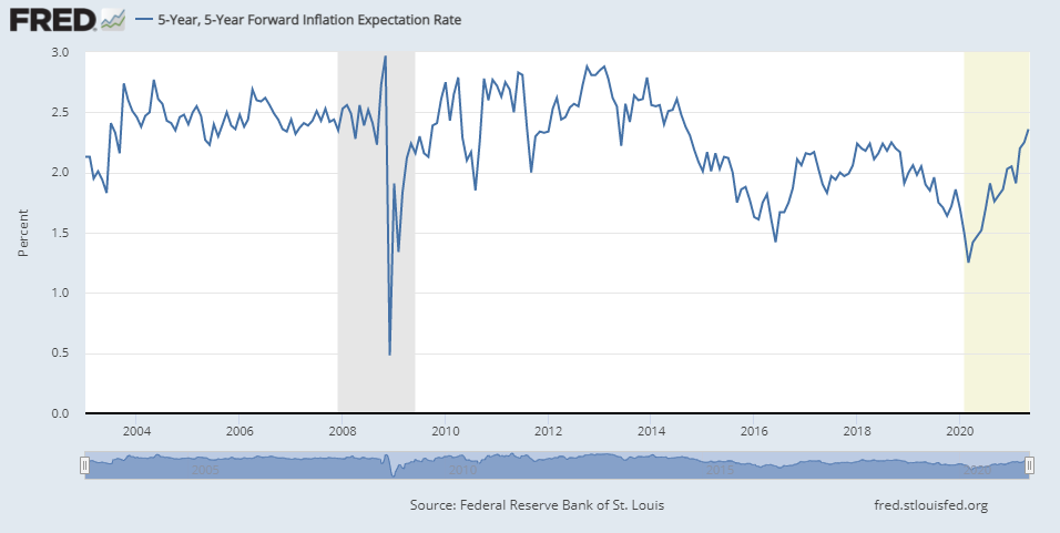
The bond market has already reacted. The 5×5 forward yield has been rising steadily.
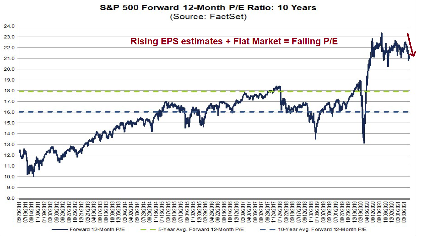
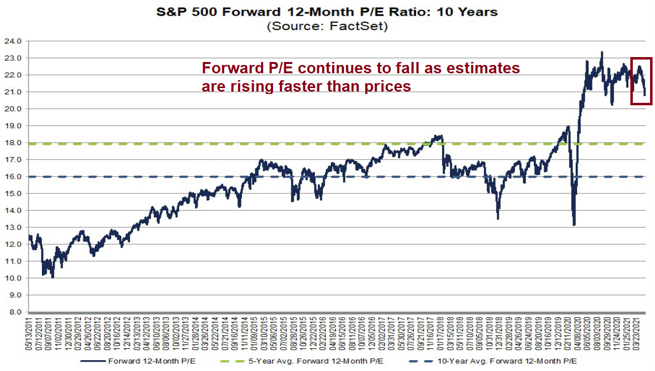
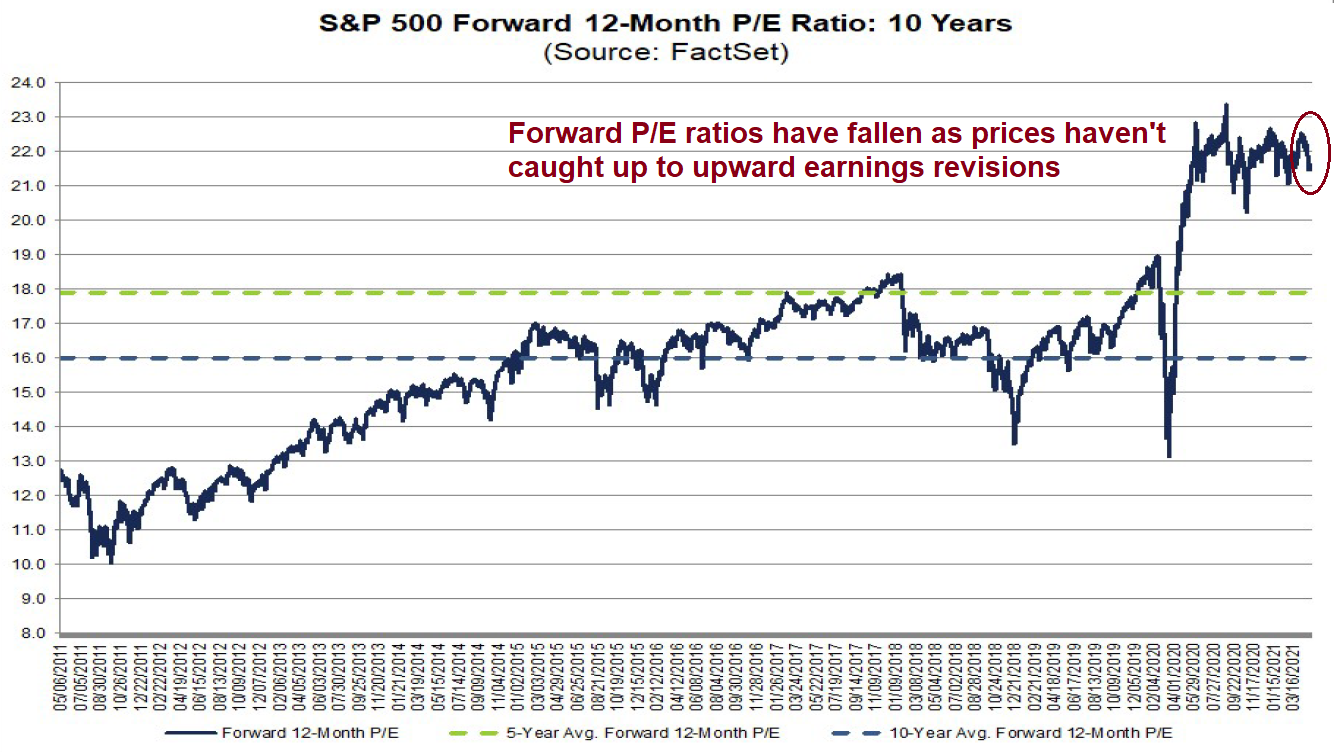
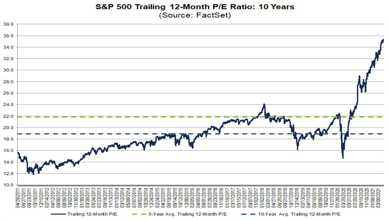
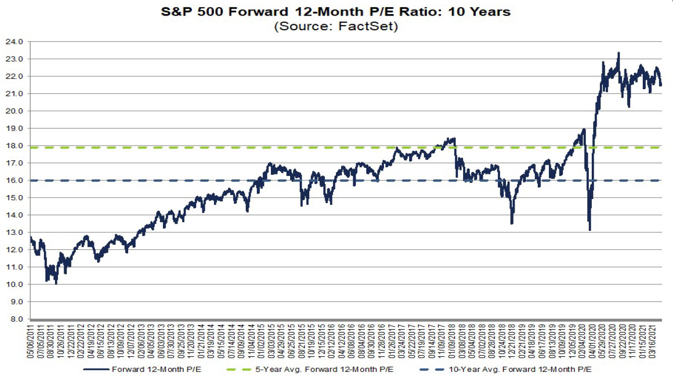
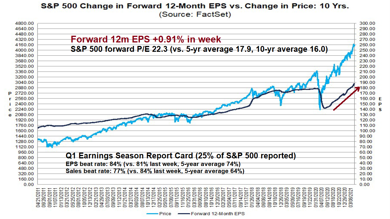
The challenge for equity investors is to pick stocks and sectors that will benefit in an environment where both rates and growth expectations are rising. Forward 12-month EPS have been moving up strongly, which is constructive for equity valuation.
In this environment, investors should focus on stocks that can continue to grow earnings in the current environment. This means companies that benefit from a steepening yield curve, such as banks; companies which can pass on their rising input costs; and cyclical sectors and industries that can benefit from strong sales growth.
Disclosure: Long GDX