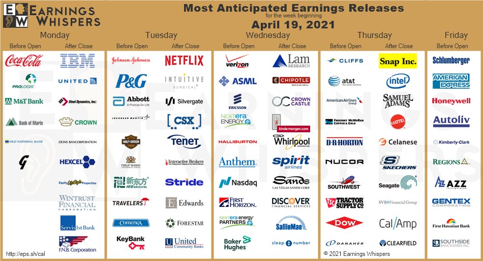
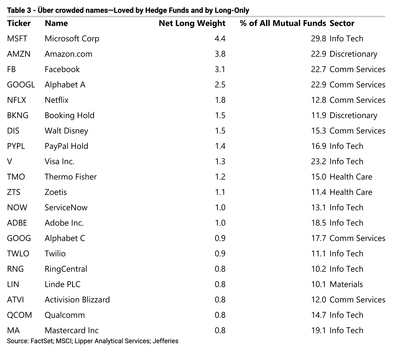
Q1 earnings season began with the reports from a number of major banks last week, and it is about to go into full swing this week. Expectations are high, but how much of the good news has been discounted by the market?
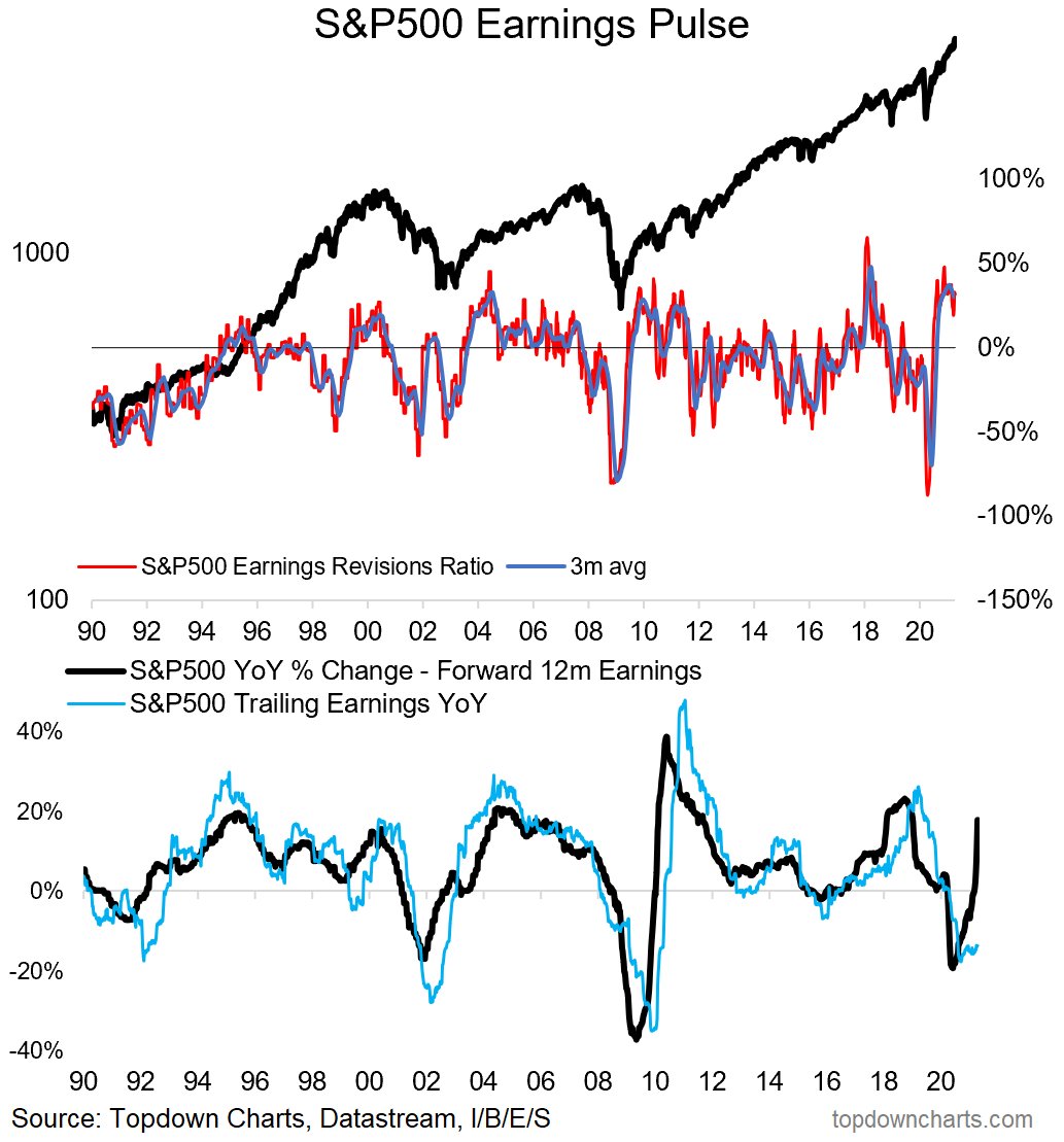
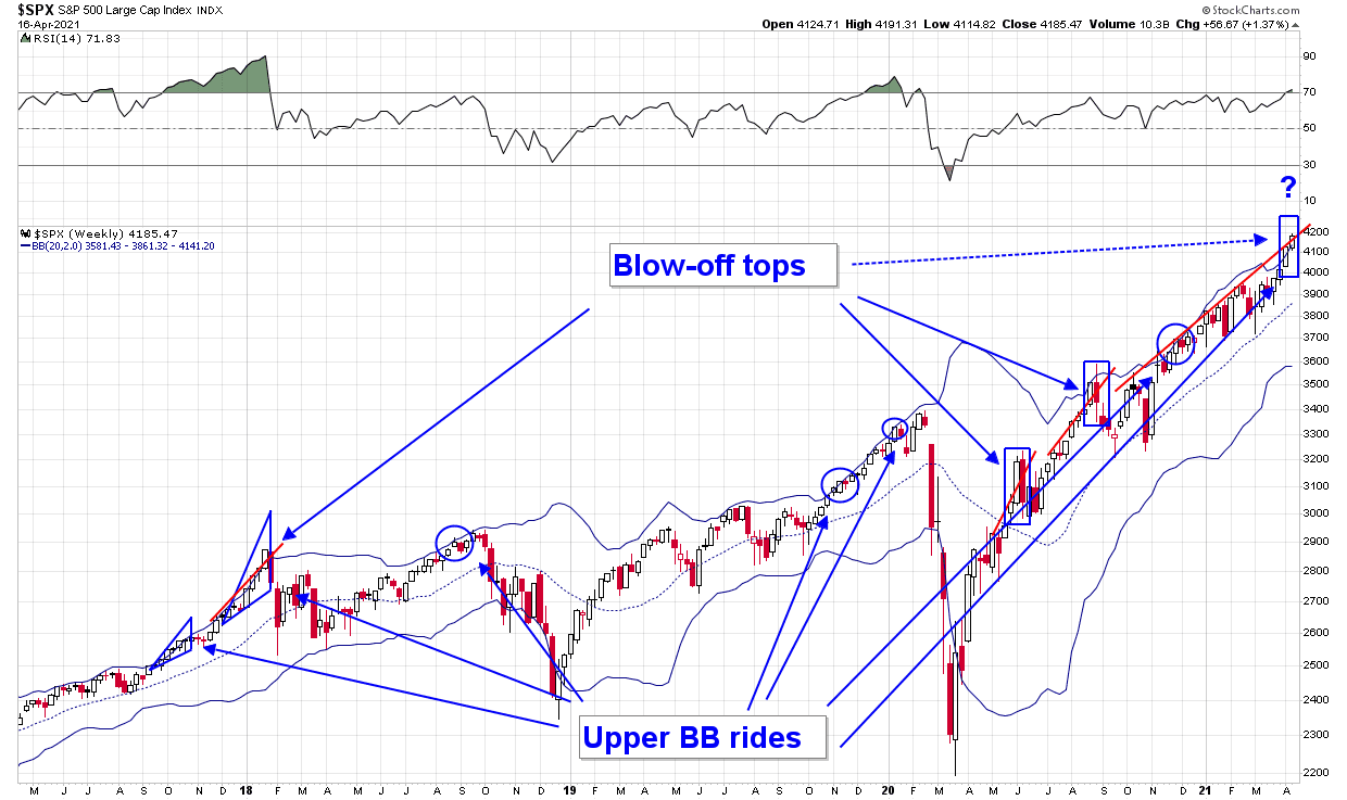
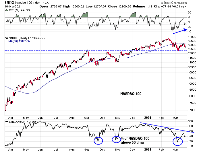
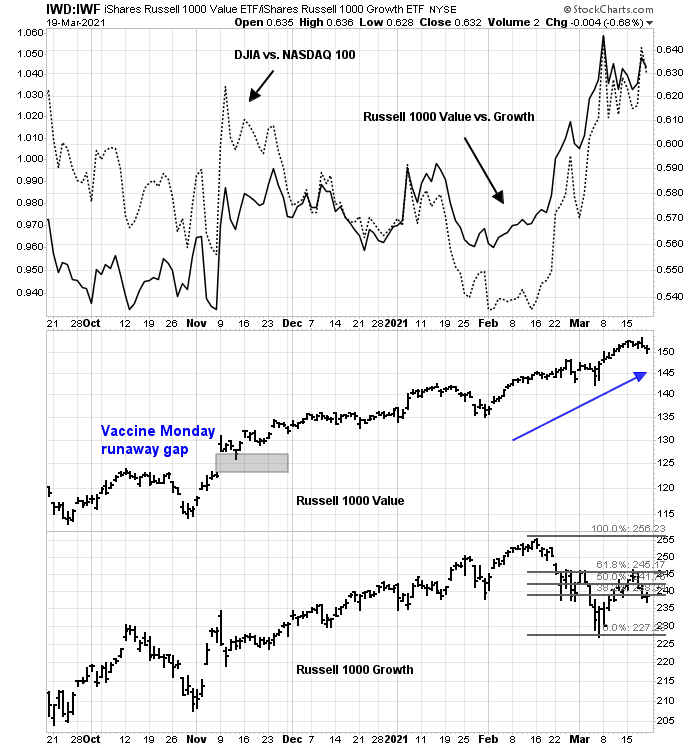
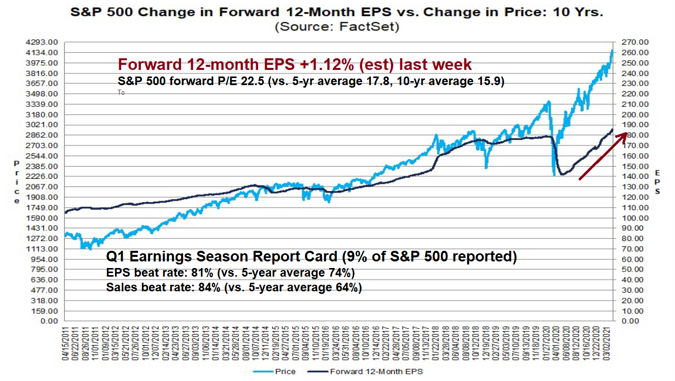
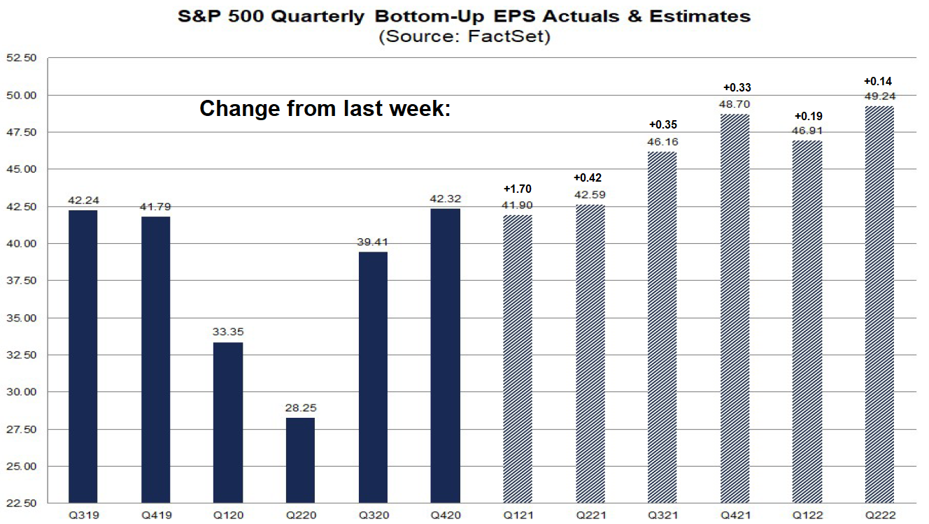
Rising estimates = Fundamental momentum
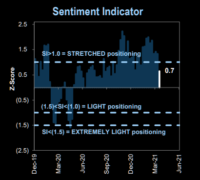
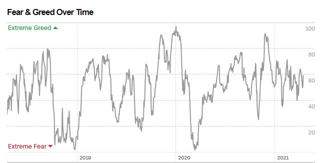
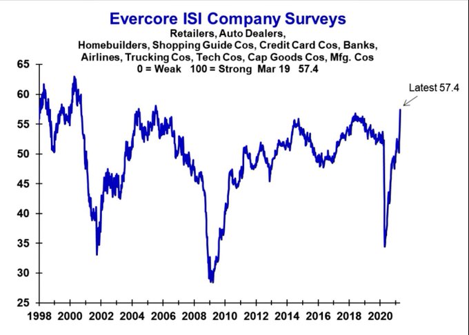
Hopeful body language
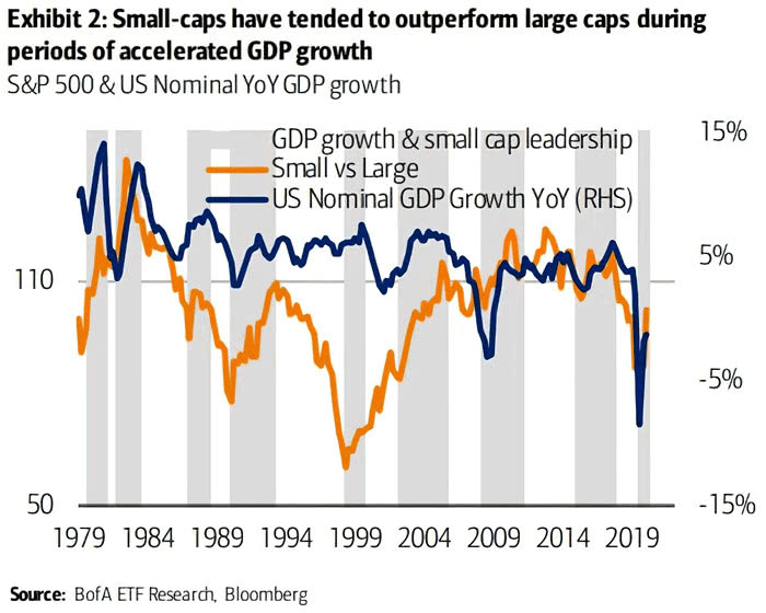
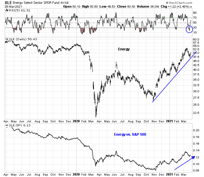
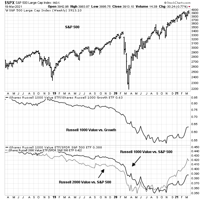
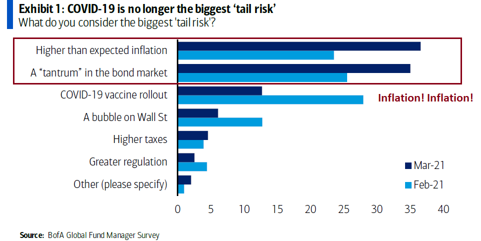
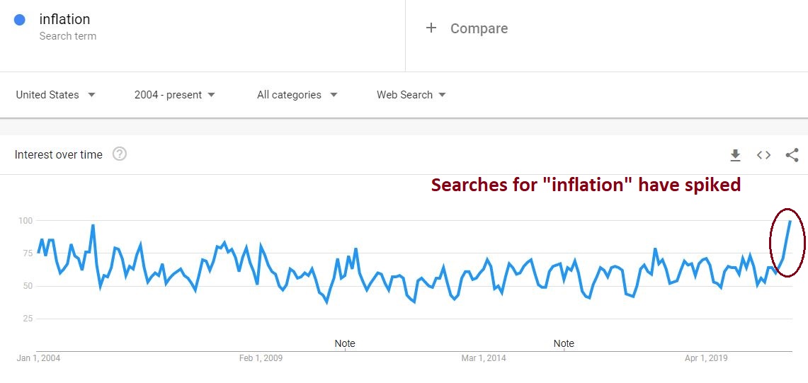
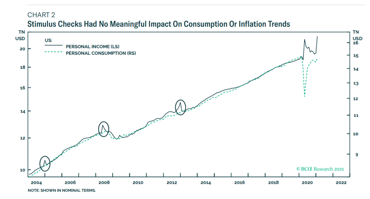
The economy is booming and companies are expecting robust growth in the second half of 2021 and 2022. Travel is starting to rebound and cities are coming back to life. Stimulus has left consumers with a tremendous amount of liquidity and we are spending. Institutional investors are increasingly concerned about inflationary pressures.
Companies are expecting robust growth in 2H 2021 and 2022“I’d state quite clearly, and I said in the prepared remarks, that we think that we’re going to have very, very robust economic growth in the second half of 2021 into 2022 as vaccines continue to accelerate, as we come out of the pandemic, as we move forward. There’s no question that there is meaningful consumer pent-up demand.” – Goldman Sachs (GS) CEO David Solomon
“…a significant acceleration of economic activity is anticipated, despite the consistently high numbers of cases around the world and now the introduction of many new variants.” – BlackRock (BLK) CEO Laurence Fink
“Certainly, there’s enormous pent-up demand. Consumers have built up a lot of wealth over the pandemic, people have really lost the connection that they look to recreate and get back together, whether that’s for leisure, purpose, or business.” – Delta Air Lines (DAL) CEO Ed Bastian
“On the commercial side, what we are seeing is that pipelines are getting stronger really across most areas in most geography. In addition, when we think about the stimulus that’s been put into the system, there’s going to be a lot of consumer spend, especially as the second half of the year develops.” – U.S. Bancorp (USB) CFO Terry Dolan
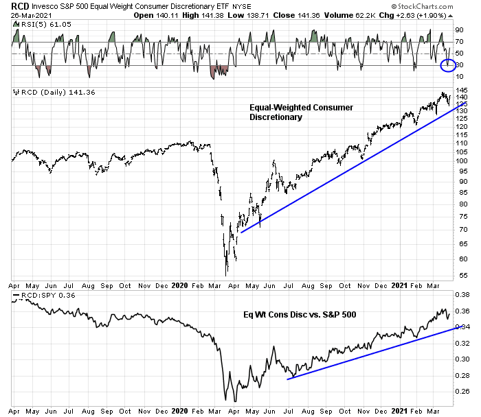
Consumer spending is hitting new records“The first quarter was a record dollar amount of money moved by Bank of America consumers. The trend is fully on track, even though the economy is not yet fully reopened. March was a record month of spending by Bank of America consumers and led to the highest ever quarter of consumer spending.” – Bank of America (BAC) CEO Brian Moynihan
Cities are coming back to life“What we’re experiencing, almost daily is a regeneration of the cities. New York, San Francisco, LA, Boston are all recovering incrementally and measurably, almost every day. Companies are beginning to announce return to office programs that are actually a little more robust, I would say, than we expected. The housing demand in the cities is now back. The prices are lower, which is a quite stimulating demand, which is good and rentals are down. And that’s pulling people back in as well. There is some movement to Texas, Florida, Wyoming, etcetera, driven probably by tax policy, but also by opportunity. And that hints kind of continue. But it’s not going to be the incremental element that changes a San Francisco or New York in our opinion and observation.” – First Republic Bank (FRC) CEO Jim Herbert
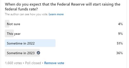
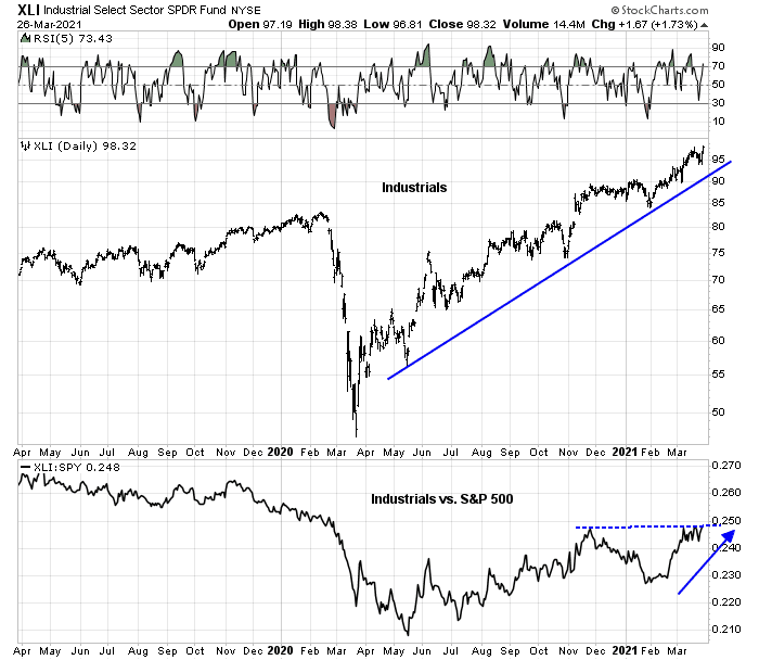
Stimulus has led to so. much. liquidity.“One of the things that I pointed out the savings rate doubled with the national average. We’ve got 15% — and households are holding 15% of GDP in cash. They’re either going to spend it investment or just let it lose value sitting in cash.” – The Bank of New York Mellon (BK) CEO Thomas Gibbons
“We think [companies] have something like $2 trillion of excess cash in balance sheets. When they raise money in public markets, they can pay down loans to banks. This is not bad news about loan demand, this is actually good news.” – JPMorgan Chase (JPM) CEO Jamie Dimon
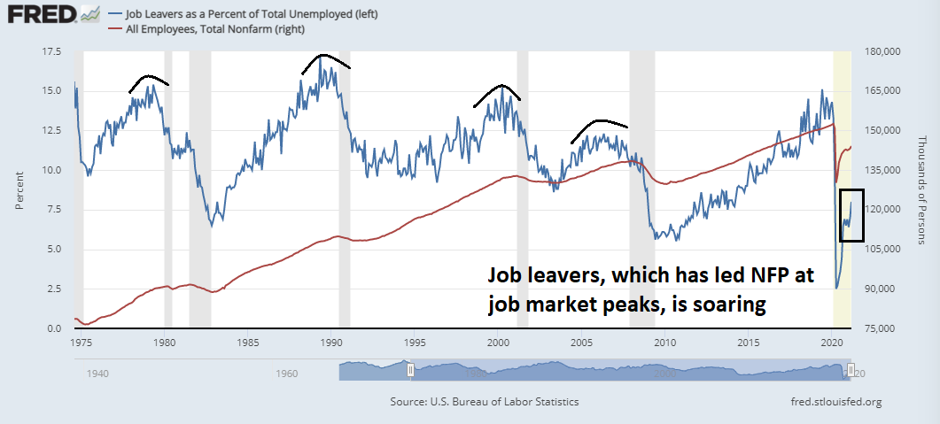
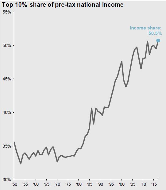
To underscore that point, household savings have surged during the pandemic. There is an excess of pent-up liquidity that individuals are waiting to spend.

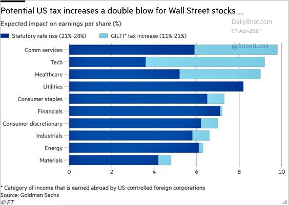
The universe of Democratic senators concerned about raising the corporate tax rate to 28% is broader than Sen. Joe Manchin, and the rate will likely land at 25%, parties close to the discussion tell Axios.
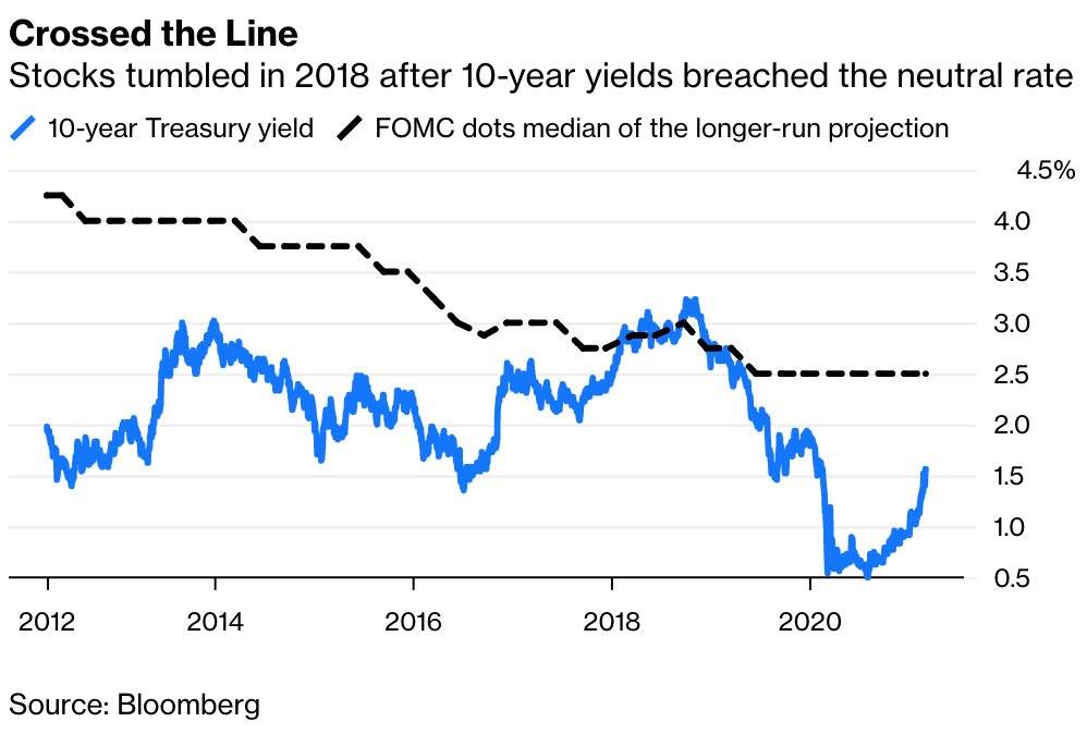
Due to increased interest rates, among the long leading indicators. Nevertheless two out of three measures of the yield curve, the Adjusted Chicago Financial Conditions Index and Leverage subindex remain positives, rejoined this week by corporate bonds and (slightly) corporate profits. Mortgage rates and the 2 year Treasury minus Fed funds yield spread are neutral. Mortgage applications, refinancing, US Treasuries, and real estate loans are negative.
In two weeks I expect the Q1 GDP report to confirm that we are in a Boom, fueled by mass vaccinations, plus the most extreme monetary and fiscal environment since LBJ’s “guns and butter” policy of 1966.
The question for 2022 is whether higher interest rates and steep rises house prices and gasoline may bring that growth to a halt. So far the evidence is tending to deceleration or slowdown rather than halt or downturn.
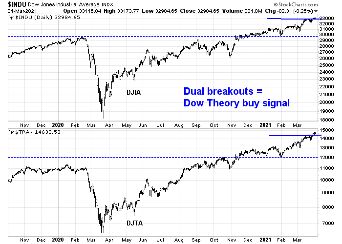
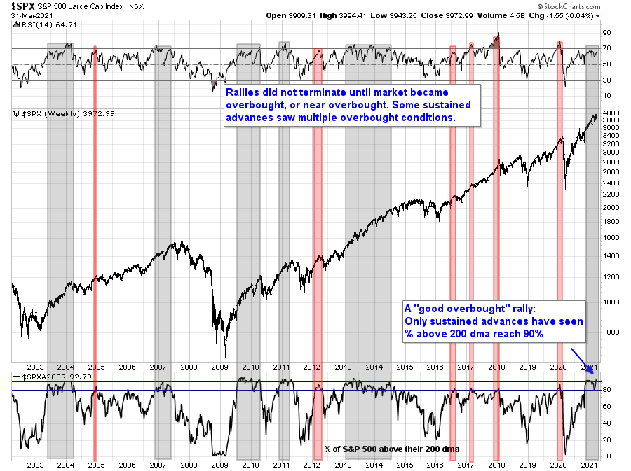
Party on!
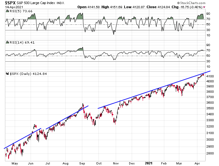
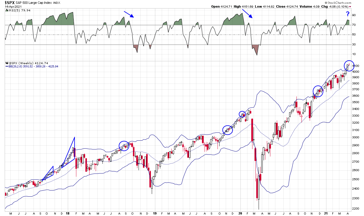
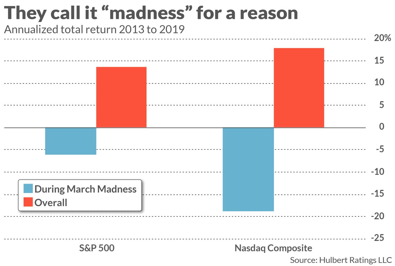
Buy the rumor, sell the news?
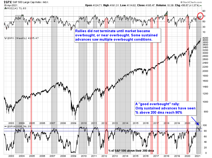
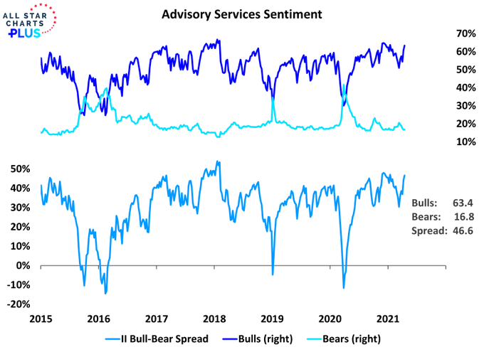
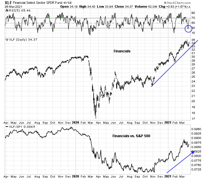
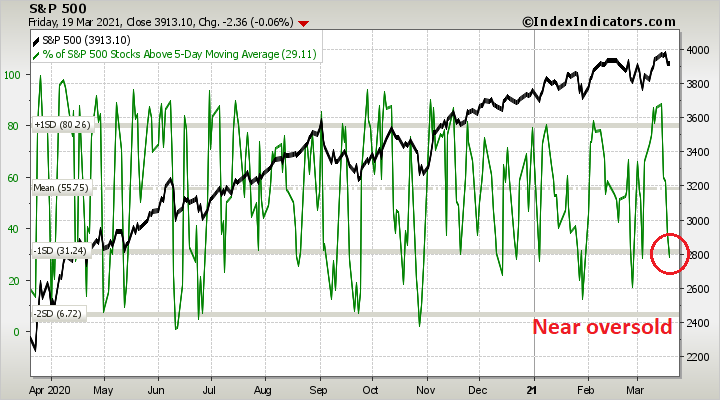
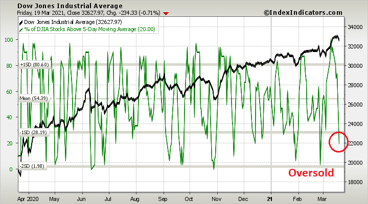
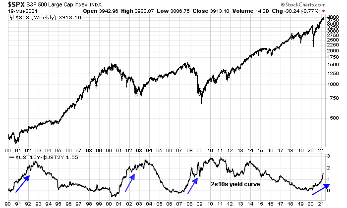
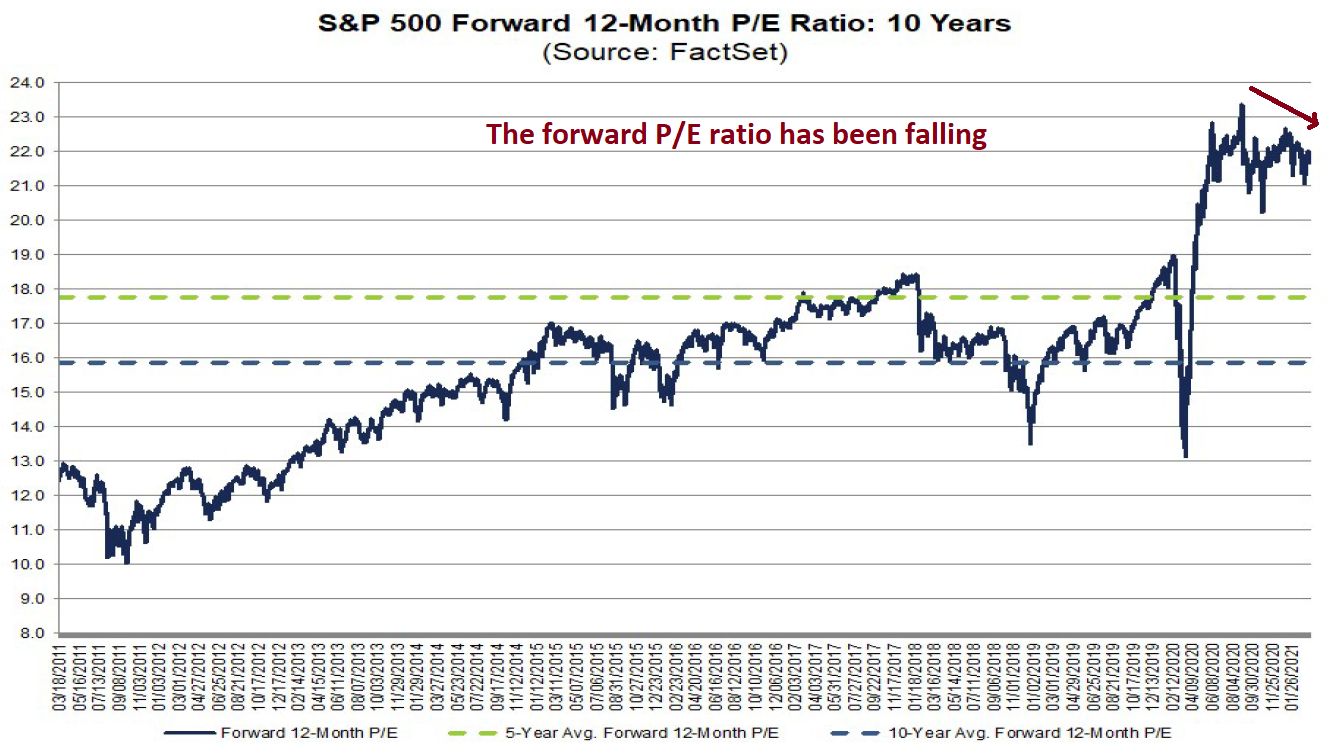
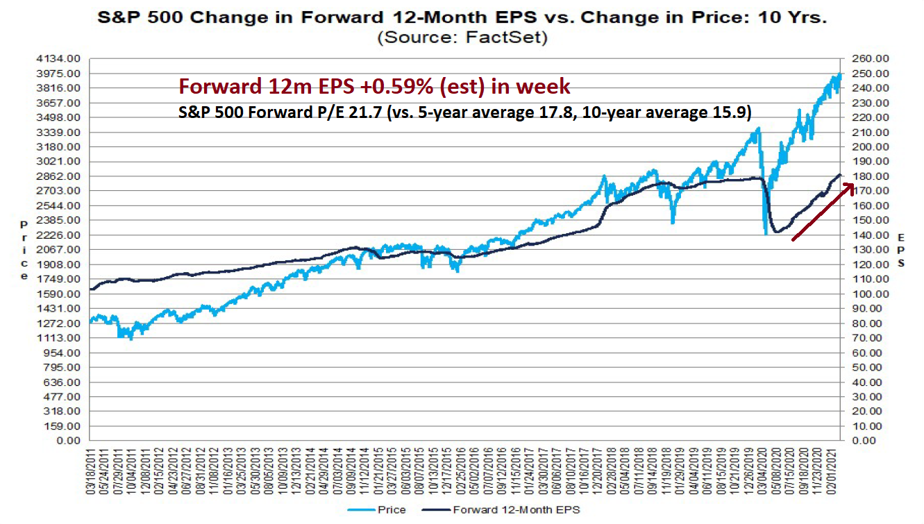
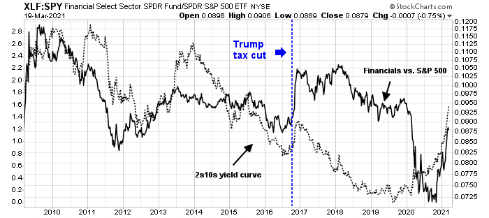
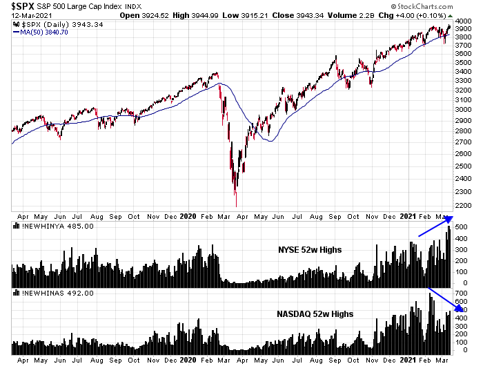
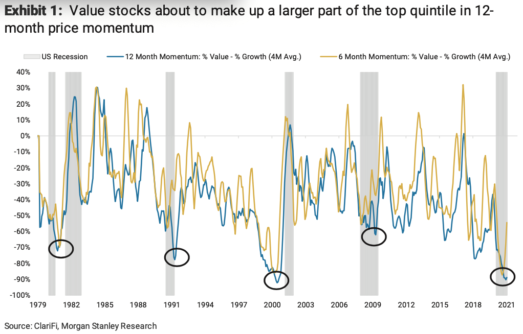
I hate to throw cold water on the stock market’s party, but you can tell a lot about market psychology by the way it responds to news. Bank earnings were strong last week. Even though the S&P 500 rose, bank stocks lagged the market. This may be an indication that much of the good news has been discounted.
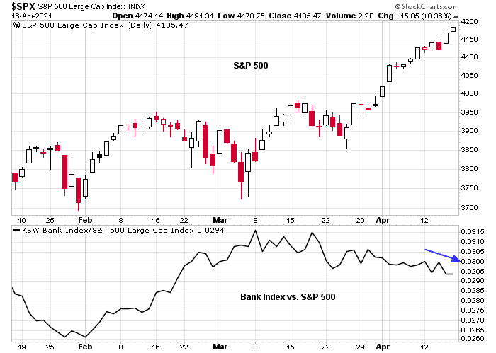
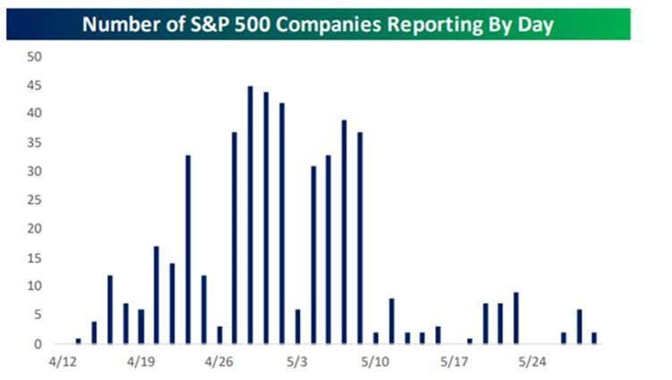
However, don’t overreact just yet based on preliminary evidence. Q1 earnings season is just getting started.
Trust, but verify! Monitor the market reaction to earnings reports for another week before making any conclusions.