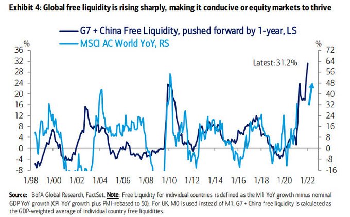
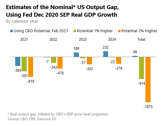
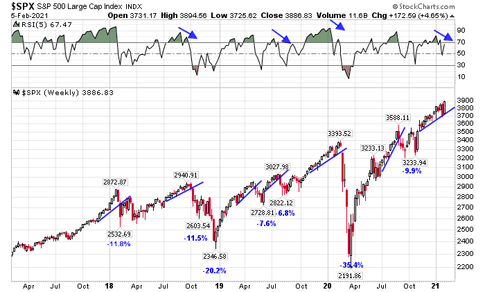
The fiscal and monetary authorities of the developed world are engaged in a great macroeconomic experiment. Governments are spending enormous sums to combat the recessionary effects of the pandemic and central banks are allowing monetary policy to stay loose in order to accommodate the fiscal stimulus. Eventually, inflation and inflation expectations are bound to rise.
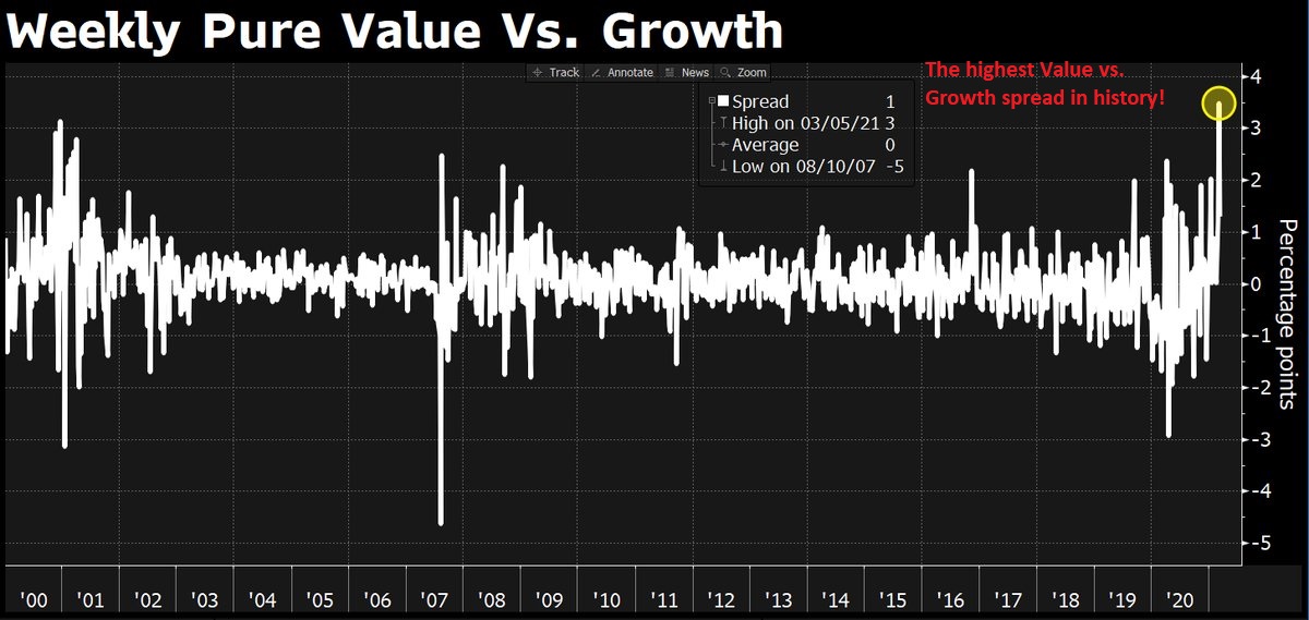
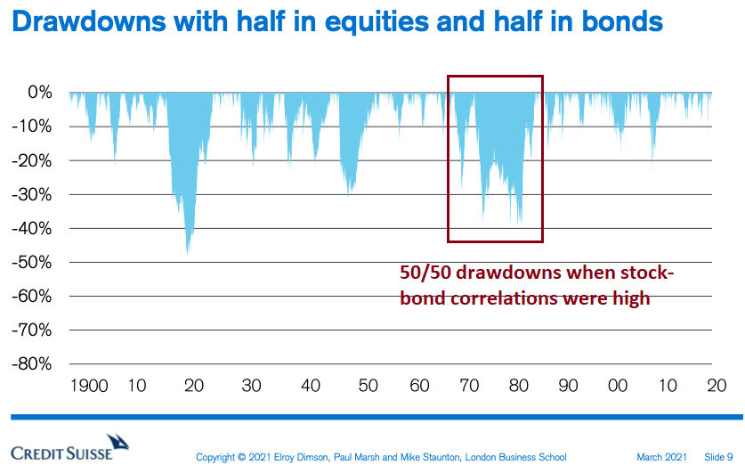
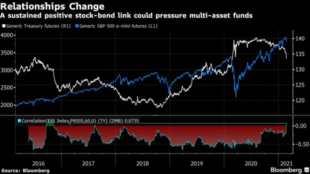
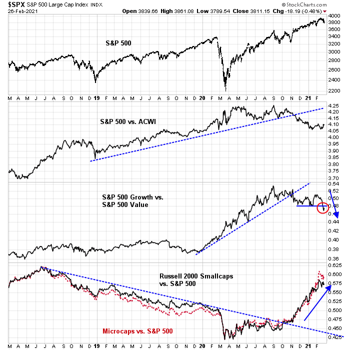
Here is what that means for investor portfolios. I recently highlighted a relationship from a Credit Suisse chart indicating that 50/50 balanced fund drawdowns rise during periods when stock-bond correlations are high (see Are you positioned for the post Great Rotation era?). Stock-bond correlations tend to rise during periods of rising inflation expectations. Balanced funds composed of simple stock and bond allocations will therefore experience greater volatility and higher drawdowns. Simply put, fixed-income holdings don’t perform well in such environment which lessen their diversification effects against stocks and damage the resilience of balanced fund portfolio to unexpected shocks.

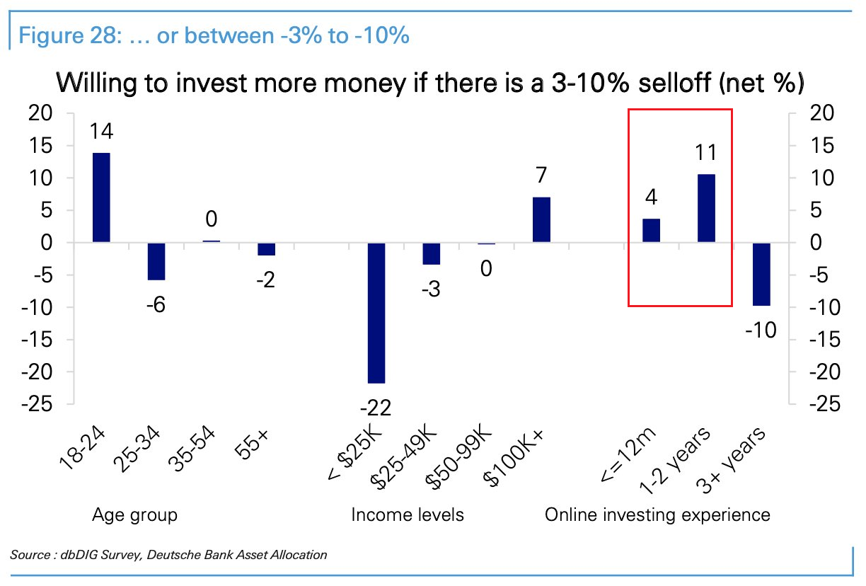
Bloomberg reported that sovereign wealth funds are becoming anxious about the 60/40 portfolio model.
Two of the world’s largest sovereign wealth funds say investors should expect much lower returns going forward in part because the typical balanced portfolio of 60/40 stocks and bonds no longer works as well in the current rate environment.
Singapore’s GIC Pte and Australia’s Future Fund said global investors have relied on the bond market to simultaneously juice returns for decades, while adding a buffer to their portfolio against equity market risks. Those days are gone with yields largely rising.
“Bonds have been in retrospect this gift,” with a 40-year rally that has boosted all portfolios, said Sue Brake, chief investment officer of Australia’s A$218.3 billion ($168.4 billion) fund. “But that’s over,” she added, saying “replacing it is impossible — I don’t think there’s any one asset class that could replace it.”
Thanks to declining returns from bonds, the model 60/40 portfolio may eke out real returns — after inflation — of just 1%-2% a year over the next decade, said Lim Chow Kiat, chief executive officer of GIC. That compares with gains of 6%-8% over the past 30 to 40 years, he said.
Norway, whose SWF is the largest in the world at $1.3 trillion in assets, had already shifted to a 70/30 target asset mix.
Norway’s $1.3 trillion sovereign wealth fund has already made the shift, winning approval to adjust its equity-bond mix to 70/30 in 2017. At the end of last year, it held about 73% in equities, and 25% in bonds.
Inflation expectations will rise in the next market cycle. The only debate is over timing. How can balanced fund investors build resilient portfolios to control risk and enhance returns during such periods?
I have some answers.
An asset return study
The most logical substitute for bonds in a balanced fund portfolio during a period of rising inflation expectation is inflation-indexed notes and bonds. But there is a data problem to testing that conjecture. Inflation-indexed instruments were not widely issued or traded during the inflationary 1970’s.
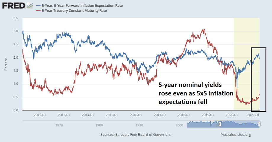
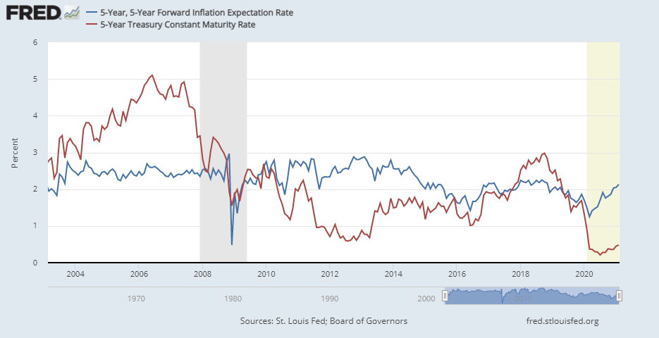
Instead, I analyzed the returns of different asset classes during different inflation expectation regimes using 5×5 forward inflation expectation rates, whose data history began in 2003.

The following asset classes were used and all returns are total returns, which include continuously re-invested dividends and interest distributions.
- Equities: As represented by the S&P 500 ETF (SPY).
- Bonds: As represented by the 7-10 Year Treasury ETF (IEF).
- Inflation-indexed bonds: As represented by the TIPS bond ETF (TIP).
- Commodities: As represented by the Invesco DB Commodity ETF (DBC).
Using the above assets, the following balanced fund portfolios were formed, which were rebalanced daily.
- 60% SPY and 40% IEF.
- 60% SPY and 40% TIP.
- 60% SPY and 40% DBC.
- 60% SPY, 20% IEF, and 20% DBC.
- 60% SPY, 30% TIP, and 10% DBC.
The study period was limiting as it was a time of flat to lower inflation expectations, I resolved this issue by creating two return buckets, when the smoothed three-month 5×5 inflation expectation rate was rising, and when it was falling. This way, the returns of these portfolios could be measured under conditions of differing expectations.
The returns were measured daily, their medians annualized based on the assumption of 255 trading days per year. The standard deviation of returns was also annualized the same way. This technique allowed me to estimate the annualized return and standard deviation of each portfolio under the two inflation expectation regimes. However, it does not imply that investors can realize these returns because they are based on continuous daily portfolio holdings.
With those qualifiers in mind, let’s look at the results.
Diversification, risk, and returns
The first statistic to consider is asset class correlations. In constructing a balanced fund portfolio, the investor is focused on both return and risk. The equity allocation can be thought of as the main driver of return, while the other components are expected to be risk-reducing. Here are the daily correlations of the different asset classes to SPY. Recall from portfolio theory, the lower the correlation, the more diversifying the asset class is to SPY.
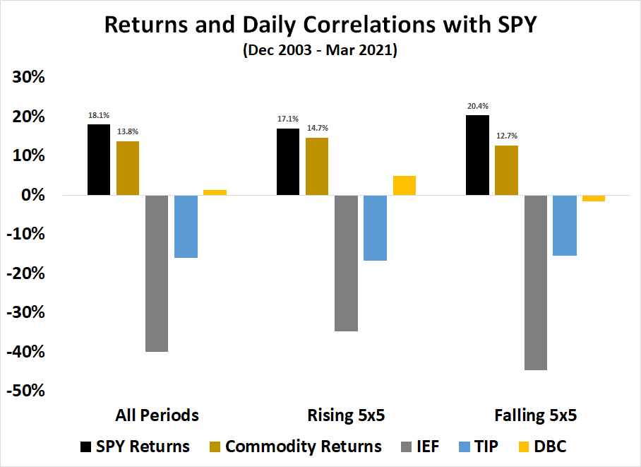
Along with the individual asset classes to SPY, the accompanying chart shows the returns of SPY and commodities for illustrative purposes. Here are my takeaways from this analysis.
- Stocks, as measured by SPY, exhibited better returns when inflation expectations are falling than when they are rising.
- Bonds, as measured by IEF, represent the most diversifying asset class to stocks, as evidenced by their highly negative correlations. But bond yields will rise in an era of rising inflation expectations, which doesn’t address the problem of diminishing balanced-fund returns.
- Inflation-indexed bonds, as measured by TIP, exhibited bond-like negative correlations to equities. The inflation-indexed nature of their coupons, however, has lessened their correlation when compared to IEF. This makes them a useful inflation hedge in a balanced fund.
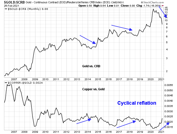
- Commodities are the ultimate and best hedge of inflation expectations. Commodities exhibits a slightly positive but near-zero correlation to SPY during periods of rising inflation expectations, and a slightly negative correlation during periods of falling expectations. In addition, commodities performs better when inflation expectations are rising than falling, which makes the slightly positive correlation useful as an inflation hedge in a balanced fund.
Here are more details about the returns of the individual asset classes and portfolios. My first advice is to focus on return difference under differing regimes and don’t overly focus on the level of returns as the specifics of the study period can color perceptions. Inflation-indexed bonds underperformed 7-10 year Treasuries during this period, it is therefore not surprising that the 60/20/20 portfolio beat the 60/30/10 portfolio. As well, commodity prices exhibited relatively strong returns during the study period, which can also biases return expectations for bullion that may not be realized in the future.
The returns of SPY, IEF, and TIP were lower during periods of rising inflation expectations and higher during periods of falling inflation expectations. It was the opposite for commodities, which raises its utility as a diversifying asset. The results were slightly surprising for TIP because they acted more like bonds than a true inflation hedge. However, the spread between the TIP returns during periods of rising and falling inflation expectations was lower at 1.0% than they were for IEF at 2.7%, indicating that TIP did act like a limited inflation hedge compared to 7-10 year Treasuries.
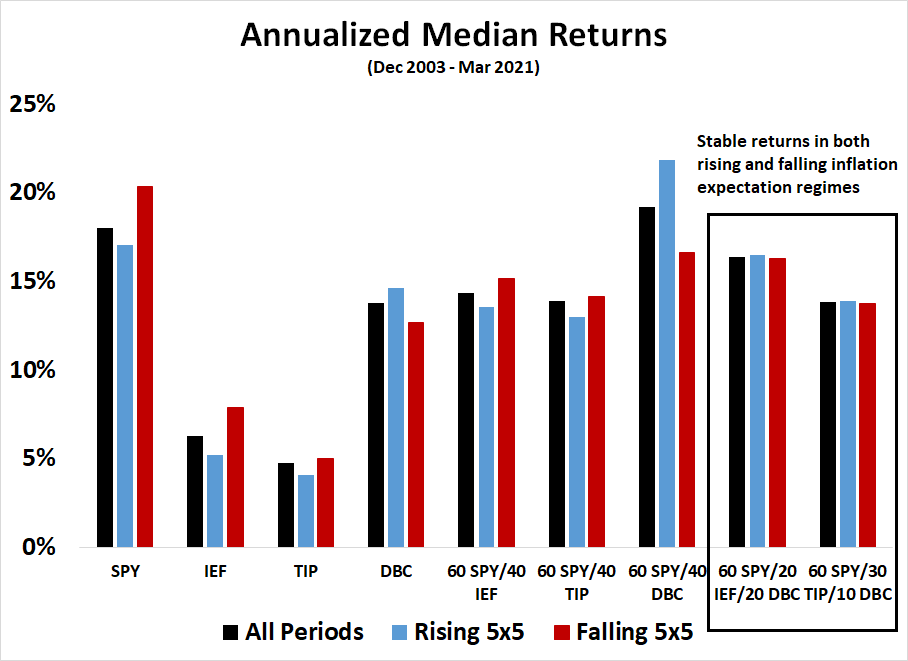
Here are my main observations of the return characteristics of the balanced portfolios, based on the criteria of the spread of returns between the rising and falling inflation expectation regimes. As a reminder, the principal objective is to measure risk and not to focus on returns.
- There were no significant differences between a 60/40 stock-bond allocation using IEF and TIP.
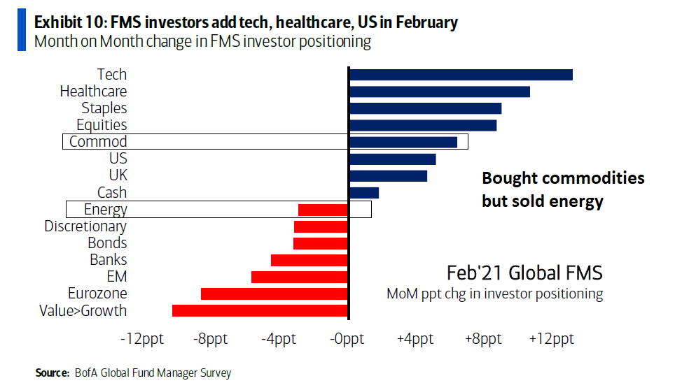
- Commodities were a strong diversifier and the 60 SPY/40 DBC portfolio performed strongly during periods of rising inflation expectations. However, advocating for such a high allocation to commodities in a balanced fund portfolio is simply not realistic.
- Both the 60 SPY/20 IEF/20 DBC and 60 SPY/30 TIP/10 DBC portfolios offered the greatest amount of stability by exhibiting similar returns during both rising and falling inflation expectation regimes.
Here are the risk characteristics of the different portfolios as measured by volatility, or standard deviation. In all cases, portfolio volatility is lower during periods of rising inflation expectations and higher otherwise.

An inexact roadmap
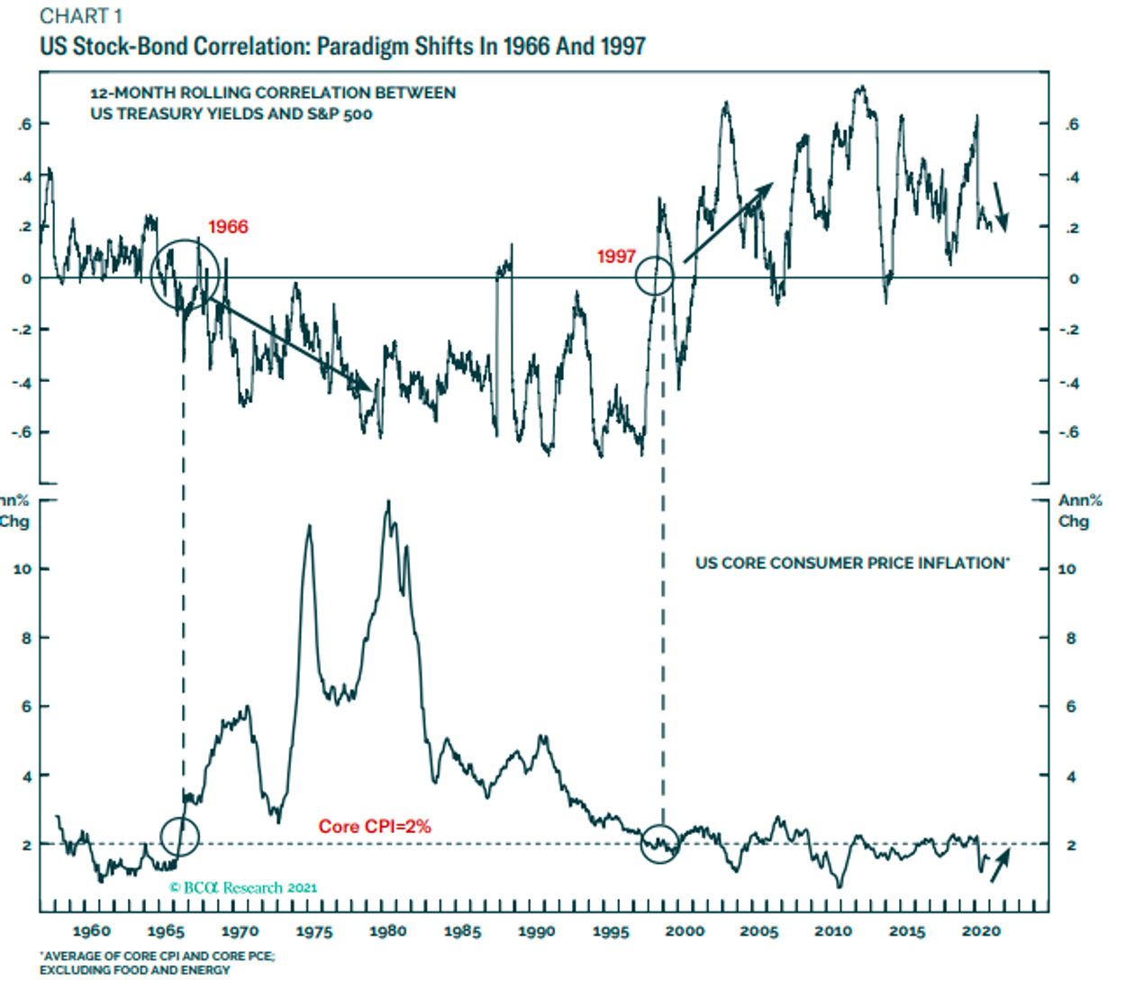
Eagle-eyed readers of last week’s publication (see Are you positioned for the post Great Rotation era) will have spotted an inconsistency that reveals the limitations of this asset return study. While my study showed a negative stock-bond price correlation, the historical record shows that stock prices were negatively correlated to the 10-year Treasury yields and therefore positively correlated to bond prices during periods of high CPI. I conclude that my study only represents a broad sketch of asset return characteristics and it does not represent an exact roadmap of what investors might expect during a period of strong inflation.
There are other limitations to the study. The asset classes chosen represent only a specific instance of a stock-bond balanced fund. Few investors would hold only the S&P 500 and 7-10 year Treasuries in their portfolio. None would rebalance their portfolios on a daily basis. The study was conducted during a period when US equities outpaced their global counterparts, biased balanced fund return estimates.
In other words, your mileage will vary depending on your choice of asset classes, investment objectives, and risk preferences.
With those caveats, this study does present some useful portfolio construction tips. During a period of rising inflation expectations, investors should substitute their bond holdings with a combination of bonds, inflation-indexed bonds, and commodities in order to better diversify risk and reduce drawdowns. Despite the lower returns shown by the asset return study, a 60% stock, 30% inflation-index bond, and 10% commodity allocation is a reasonable starting point in thinking about as a replacement for the conventional 60/40 portfolio.
This is consistent with a Bloomberg report that Bridgewater had shifted to the use of gold and inflation-indexed bonds instead of sovereign bond holdings as components of its risk-parity fund.
The shift, telegraphed by the firm in a July report, drives a new wedge between Bridgewater and risk-parity purists and speaks directly to concerns that have long dogged the systematic investing approach.
Since the strategy allocates money across assets based on how risky they are — meaning it buys more securities with lower volatility — it typically takes a heavy position in sovereign debt.
“It is pretty obvious that with interest rates near zero and being held stable by central banks, bonds can provide neither returns nor risk reduction,” a team led by Co-Chief Investment Officer Bob Prince wrote in the July report.
Bridgewater’s famous All Weather portfolio has therefore been moving into gold and inflation-linked bonds, diversifying the countries it invests in and finding more stocks with stable cash flow.
For the sake of completeness, I studied the use of gold instead of commodities in the asset return study. While the results aren’t shown, I found that substituting gold (GLD) for commodities (DBC) did not substantially change the risk and return characteristics of the balanced fund portfolios. I chose to report DBC returns because it represents a more diversified holding in that asset class than gold. Either acts as an excellent diversifying asset for a balanced fund during periods of rising inflation expectations.