Preface: Explaining our market timing models
We maintain several market timing models, each with differing time horizons. The “Ultimate Market Timing Model” is a long-term market timing model based on the research outlined in our post, Building the ultimate market timing model. This model tends to generate only a handful of signals each decade.
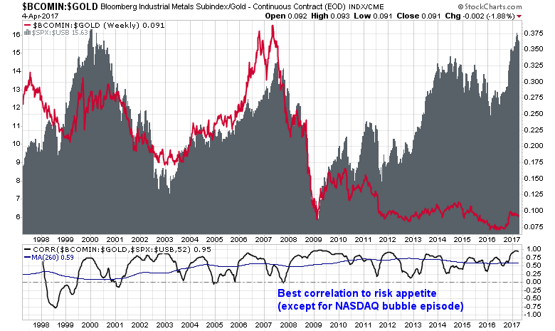
The Trend Model is an asset allocation model which applies trend following principles based on the inputs of global stock and commodity price. This model has a shorter time horizon and tends to turn over about 4-6 times a year. In essence, it seeks to answer the question, “Is the trend in the global economy expansion (bullish) or contraction (bearish)?”
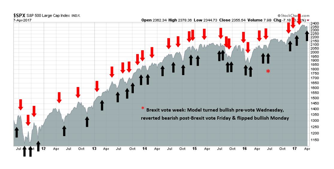
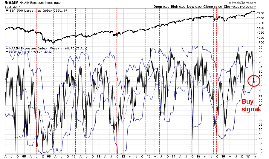
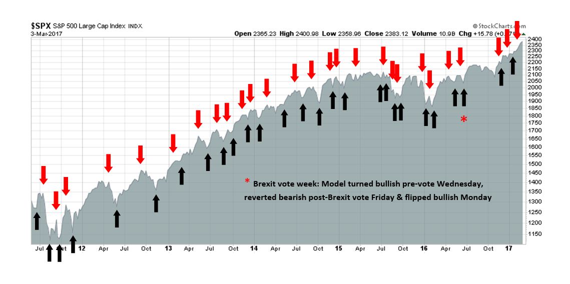
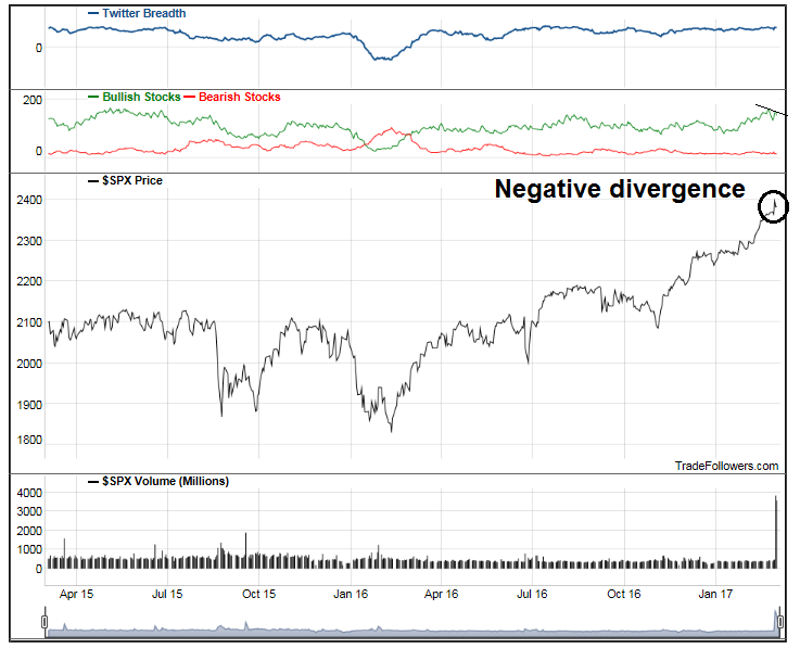
My inner trader uses the trading component of the Trend Model to look for changes in the direction of the main Trend Model signal. A bullish Trend Model signal that gets less bullish is a trading “sell” signal. Conversely, a bearish Trend Model signal that gets less bearish is a trading “buy” signal. The history of actual out-of-sample (not backtested) signals of the trading model are shown by the arrows in the chart below. Past trading of the trading model has shown turnover rates of about 200% per month.
The latest signals of each model are as follows:
- Ultimate market timing model: Buy equities
- Trend Model signal: Risk-on
- Trading model: Bearish
Update schedule: I generally update model readings on my site on weekends and tweet mid-week observations at @humblestudent. Subscribers will also receive email notices of any changes in my trading portfolio.
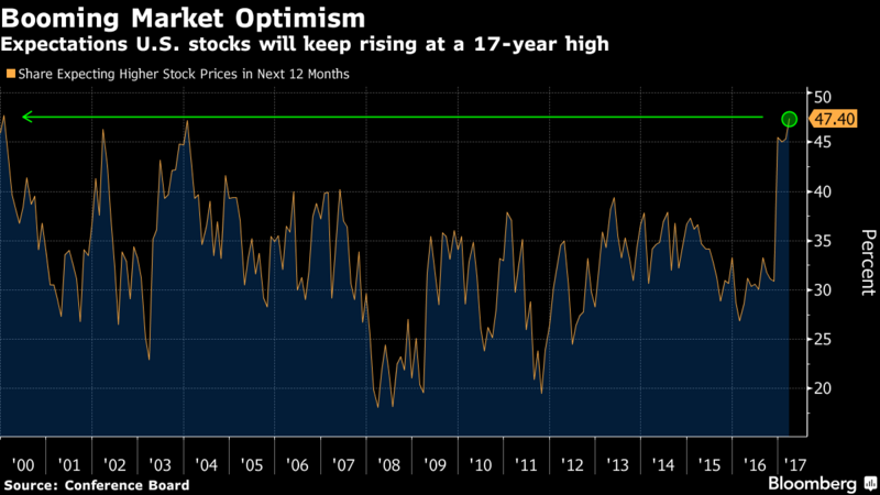
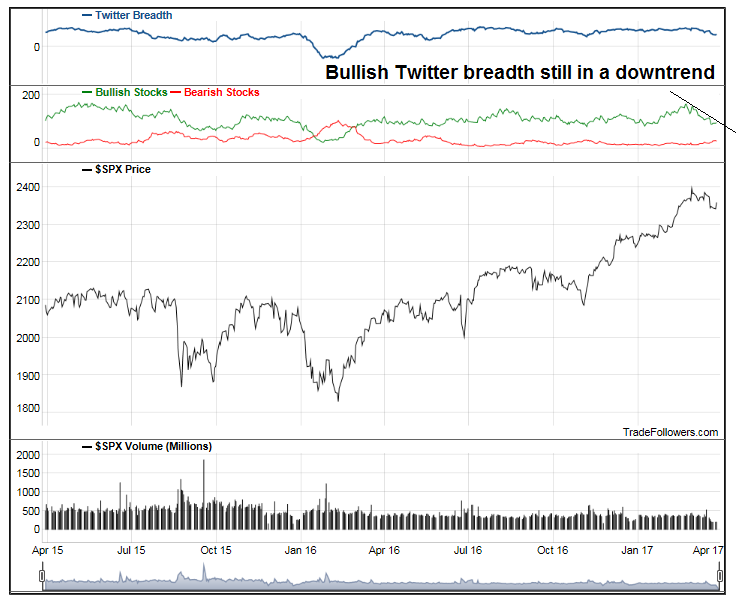
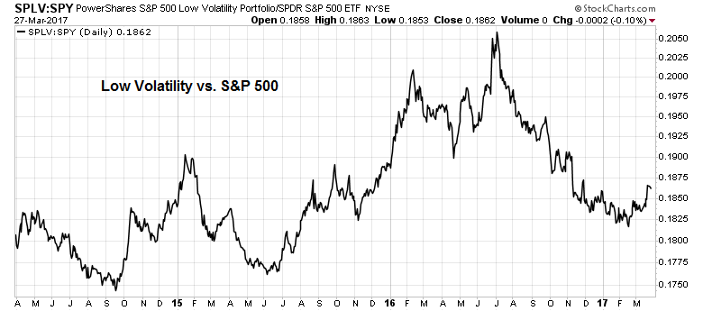
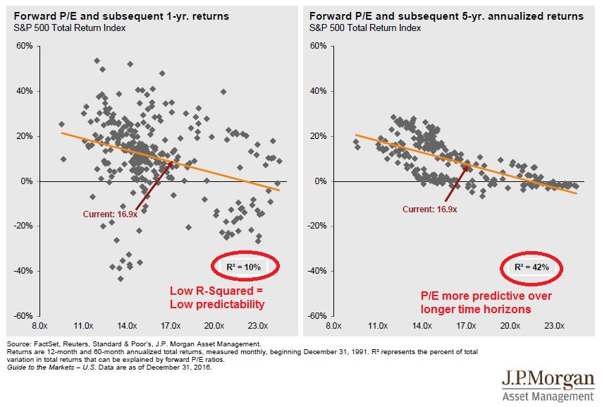
Valuation and sentiment vs. momentum
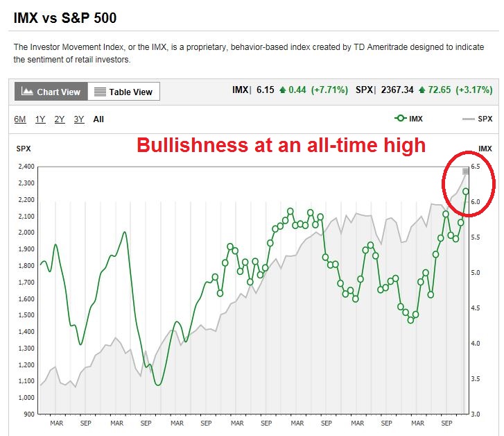
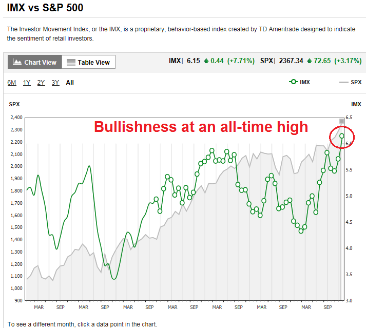
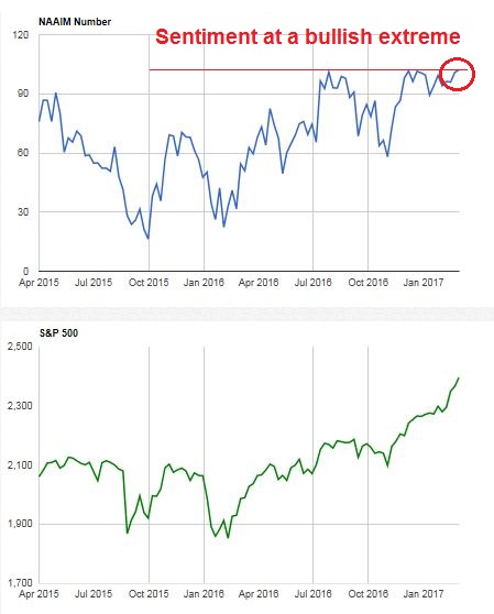
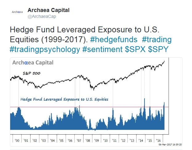
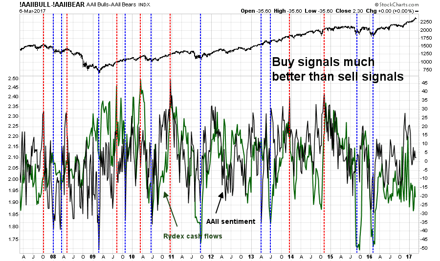
Last week, I wrote about signs of stretched stock market valuation (see Why I am cautious on the market). Last Wednesday, I warned about excessively bullish sentiment, which suggests that stock prices are likely to pull back (see A sentimental warning for bulls and bears).
Despite these red flags, I would caution that both valuation and sentiment models are notoriously bad at timing market tops. Expensive markets can get more expensive, and stock prices don`t necessarily go down if investors get into a crowded long. These models serve the highlight the risks to a market.
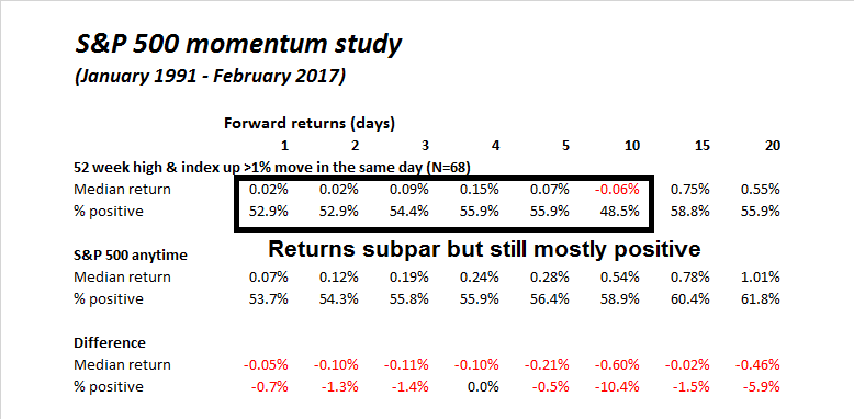
Here is another take on valuation. Taking a very long term 30-year view, Urban Carmel observed that the SPX goes up and down in fits and starts after adjusting for inflation. The key to achieving superior long-term returns is to buy when valuations are low, which is not the case today.
Michael Batnick at Irrelevant Investor showed that the Cyclically Adjusted PE ratio (CAPE) is elevated when compared to its own history.
But average CAPE has been rising over time.
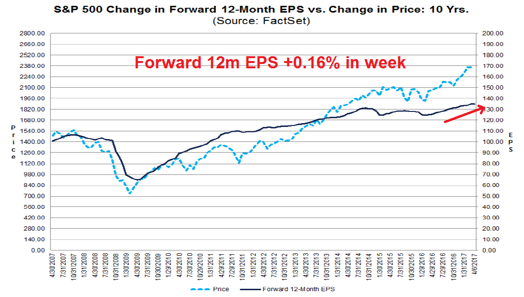
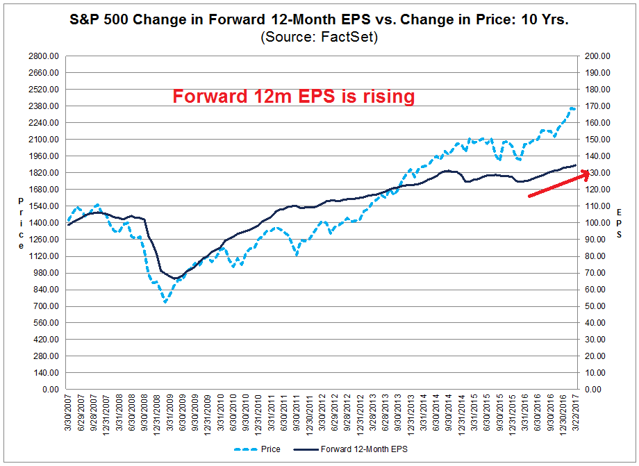
If valuation doesn’t work for short term market timing, what should investors do? In the intermediate term, a focus on fundamental and macro momentum in addition to factors like valuation and sentiment. Current conditions can more useful for market timing. Using this framework, it suggests that risks are rising, but there is no need to panic just yet.
The market is looking toppy, but this is not “the top”.
Another valuation perspective
Matt Busigin wrote a terrific piece of analysis last June that outlined a framework for valuation analysis that related returns to valuation and profit growth. In particular, his approach of using inflation adjusted metrics has shown itself to highly useful (also see this post from Wesley Grey that uses inflation adjusted CAPE for successful asset allocation).
Busigin outlined his model this way (LERP = Leveraged Equity Risk Premium, see this link for the paper explaining the concept). Note that his model forecasts 5-year returns and the fit is pretty good, with an R-squared of about 0.7.
Asset returns can be considered a function of the differential between expected real earnings growth, and realised real earnings growth. This can be borne out by solving for future S+P 500 alpha over short-term corporate bonds, using starting valuation (LERP), realised inflation, and realised EPS growth:
Busigin plugged in the (then) inflationary expectations from the bond market to derive an implied earnings growth rate of 6%, which he found problematical. Profit margins were likely to get squeezed as labor costs rise in the late stages of an expansion. (Remember he wrote this last June, when Clinton was the consensus pick for the White House. Trump’s “America First” policies are likely to put more upward pressure on wages).
The past 5 years of NGDP growth have compounded annually to 3.65%. If we extrapolate that, to get to our 6.34% EPS growth, we need profit share of GDP to rise around 84bps.
There are a few problems with this scenario. The most immediate is that the profit share of GDP is falling, and precipitously — from its peak of nearly 11% in 2012, it has fallen to almost 9%.
That analysis was done in June 2016. Busigin updated his model recently with a series of tweets:
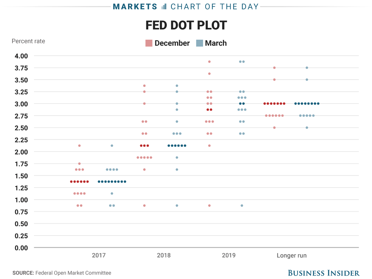
Based on Busigin’s analysis, the market is pricing in real EPS growth of 5%, which is roughly of 75th percentile of historical experience. But real unit labor costs is in the 96th percentile. The Fed is about to embark on a rate hike cycle, something has to give.
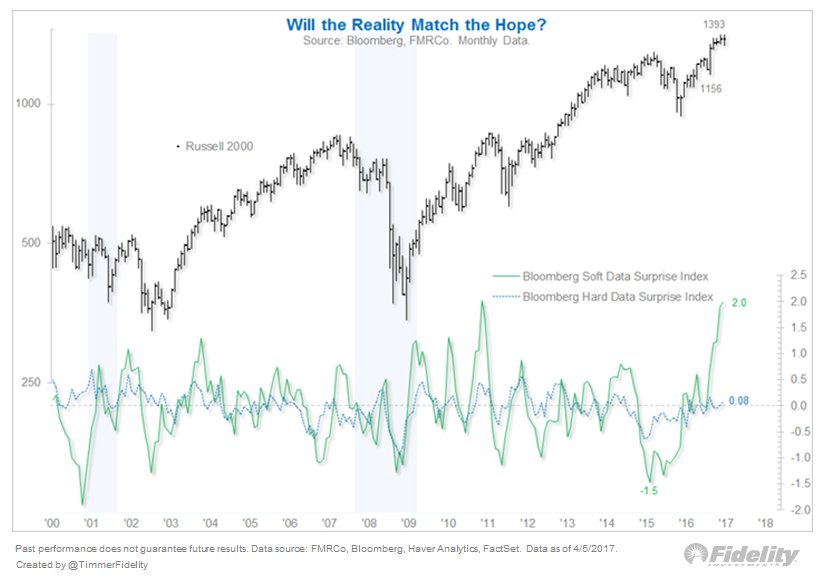
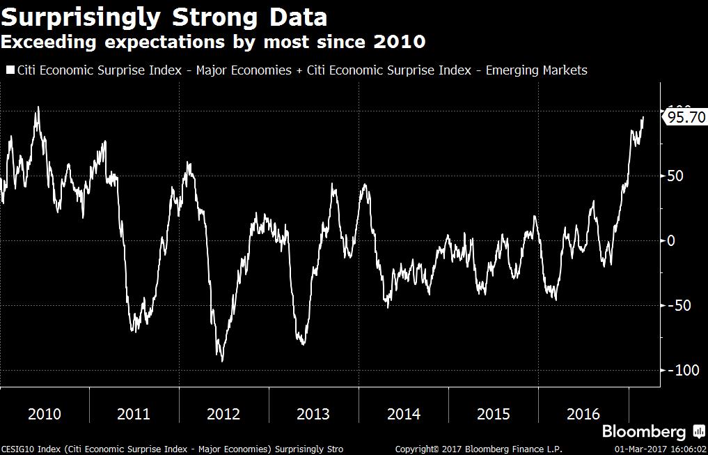
Soft vs. hard data
I have been writing about the bifurcation between soft (expectations) data and hard (reported) data (see Watch what they do, not just what they say). Variant Perception recently reiterated that point, namely that expectations are running ahead of reality and stock prices are vulnerable to a pullback.
Goldman Sachs also highlighted the gap between asset prices and the economy (via Tracy Alloway).
The music is still playing
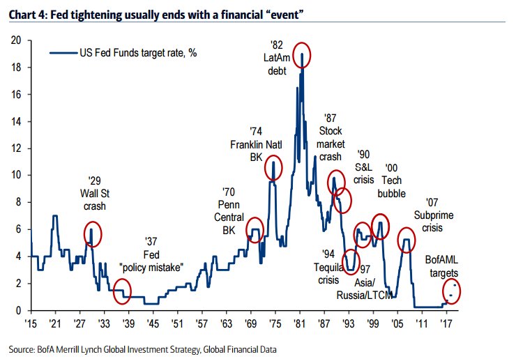
Before you get overly excited, most of the cases where Variant Perception highlighted disparities between expectations and hard data were resolved with corrections, not bear markets. For a bear market to occur, the Fed has to tighten sufficiently to push the economy into recession, which is not happening yet.
In the words of Jamie Dimon, the music is still playing. There is still time to get in another dance, another visit to the bar, or the buffet table.
David Tepper of Appaloosa Management summarized the bull case well, even as he acknowledged the challenge of stretched valuations (via Marketwatch):
“The day we had three Republican ‘houses’… that alone releases animal spirits,” Tepper said, referring to Republican Trump’s Oval Office victory over Democratic rival Hillary Clinton and both the House and Senate under GOP leadership.
“It is hard to go short when you say…when the punch bowl’s still full,” he told CNBC during a Wednesday morning interview.
Tepper said equity valuations may be pricey presently, but said a better economic environment across the globe has provided stock-market benchmarks purchase to climb higher.
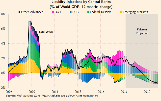
“I don’t think the market’s cheap by any stretch…but look at the backdrop around the world…with the sugar that is still being put on by the [European Central Bank], the Bank of Japan…you can’t be short in that kinda set up,” he said. Tepper is referring to quantitative-easing measures that are still in use in the eurozone and Japan.
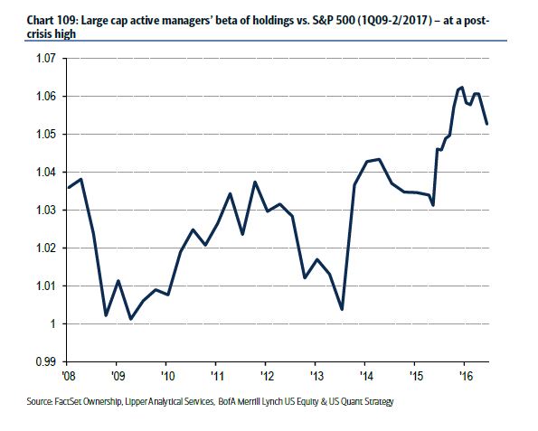
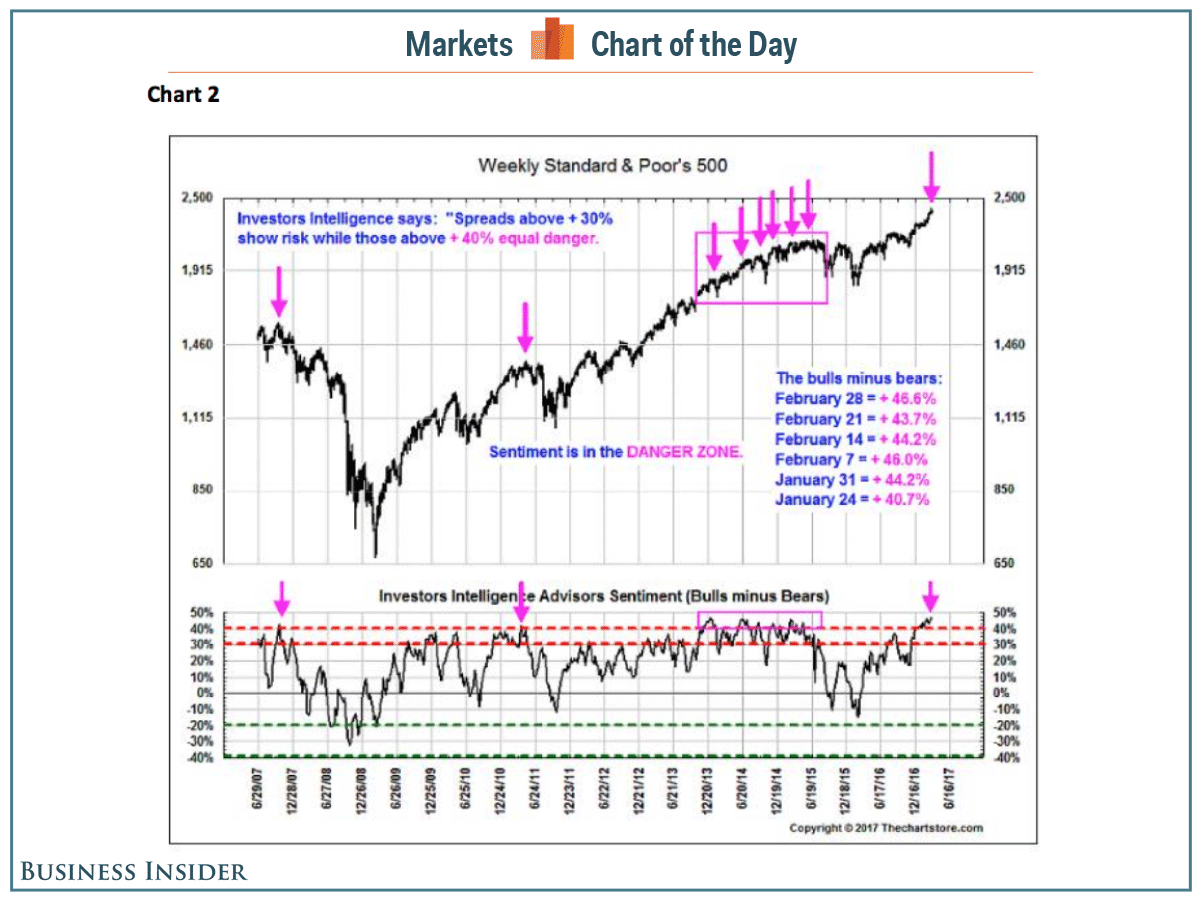
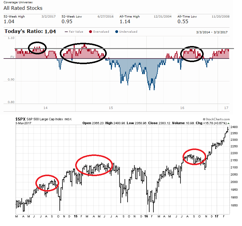
The consensus view seems to be in the Tepper camp. The latest BAML Fund Manager Survey shows that managers believe that stocks are overvalued.
But managers are still long risk, with an overweight in equities, underweight in bonds, and neutral weight in inflation and cyclically sensitive commodities.
That’s because they believe that the global reflationary trend will continue.
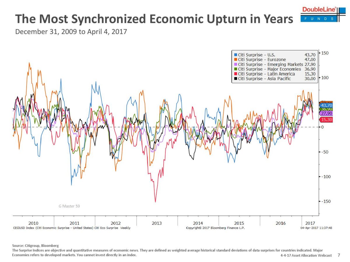
New Deal democrat has been monitoring high frequency economic releases and splits them into coincident, short leading, and long leading indicators. His recent analysis shows that virtually all of his short leading indicators are all pointed upwards, though his long leading indicators are starting to deflate. As the Fed starts its rate hike cycle, the long leading indicators are likely to weaken further. Current readings indicate that fundamental and macro momentum are likely to be positive for the remainder of 2017.
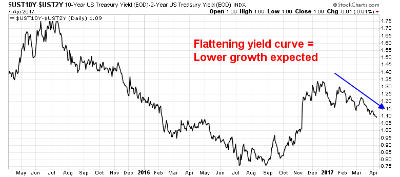
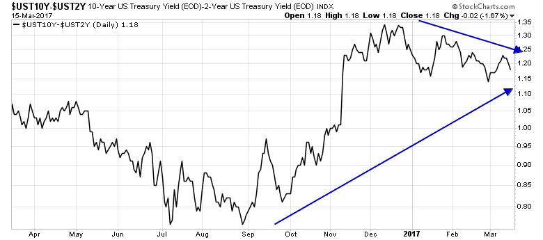
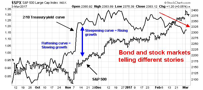
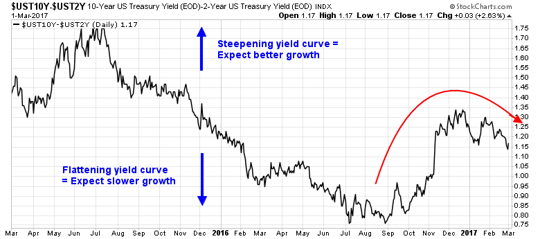
As well, the yield curve has been steepening even as the market anticipates a tighter monetary policy. A steepening yield curve is a signal that the bond market is expecting better economic growth.
Bottom line: Despite any concerns over stretched valuations, the music is still playing.
Investment implications
For a big picture perspective, here is Jean-Paul Rodrigue of Hofstra University, who is the creator of the this chart showing the different stages of an asset bubble (via Business Insider):
“I have given up a long time ago trying to make any precise assessment about market bubbles, particularly their blow-off, since a lack of rationality is more the norm than the exception these days,” Rodrigue said.
Based on the stages he outlined, though, the market is most likely somewhere between “enthusiasm” and “delusion,” before the top, he said. It’s just impossible to know how long it’ll take to peak.
For investors concerned about valuation excesses, I have a number of suggestions. If I had still been managing institutional funds, where it can take several months to re-position a portfolio, I would be moving from an aggressive risk-on position to a neutral asset allocation in line with investment policy target weights.
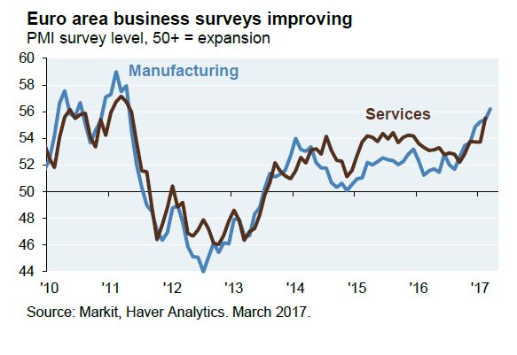
Investors who are not geographically constrained can diversify their US equity weight into foreign stocks. Eurozone equities appear to be more attractive relative their American counterparts (see the Barron’s article Why investors should say ‘oui’ to European stocks). As the relative performance chart of eurozone equities show (all figures in USD), the Euro STOXX 50 is trying to bottom against the SPX. Investors may find better returns from exposure from eurozone equities.
Ironically, Donald Trump’s anti-EU rhetoric is shoring up support for European integration (see CNN article). So are comments from Trump administration’s trade czar Peter Navarro, who has called for trade negotiations with Germany outside the EU framework (see Reuters), which is as absurd as Cuba proposing a free trade agreement with Puerto Rico.
Europeans have begun to close ranks in reaction. The next big test will be the Dutch election scheduled for next Wednesday. Geert Wilders, the populist anti-immigrant Dutch politician, has been badly losing ground in the polls (via Bloomberg). In France, centrist Emmanuel Macron has been gaining ground. These are all signs of greater European unity and falling political tail-risk in the region, which should be viewed bullishly.
By contrast, UK equities remain in a downtrend against the SPX, which suggests that Britain remains under a cloud until the Brexit question is resolved.
Investors who are willing to take more risk can consider emerging market equities (see the latest GMO commentary on EM). As the chart below shows, EM equities are also tracing out a bottoming pattern against US equities. These are constructive patterns that point to the potential of better relative performance ahead.
Toppy, not THE TOP
In conclusion, the combination of stretched valuation and overly bullish sentiment makes this stock market appear toppy, but we probably have not seen the price high for this market cycle yet. Stock prices are vulnerable to a 5-10% correction, but they should rally again as the news of tax cuts and tax reform revive expectations.
Bloomberg reported that GOP senators stated that an August time frame for passing tax reform is unrealistic. More realistic is the Goldman Sachs projection of the Trump administration’s legislative timeline. The White House is currently preoccupied with the details of ACA repeal and replacement. We likely won’t get much action on tax reform until the fall (via Bloomberg):
Undoubtedly there will many twists and turns on the path along the way between now and then. As well, much depends on the state of the economy and the Fed’s reaction function.
Ultimately, this cycle is not going to be too different from previous cycles. In all likelihood, it will be the Fed’s action to fight inflation that will send the economy into recession. A recession is when valuations will matter the most. Ben Carlson, writing at Bloomberg, highlighted research from Star Capital showing that markets go down a lot more when valuations are expensive than when they are cheap:
Recessions are also periods when excesses get unwound. While there are few excesses in the American economy, the same could not be said of the rest of the world. In particular, China has been struggling to control its debt growth. As this chart Callum Thomas shows, economies crash harder when debt levels are high.
In the meantime, investors should channel Janet Yellen, “Remain data dependent.”
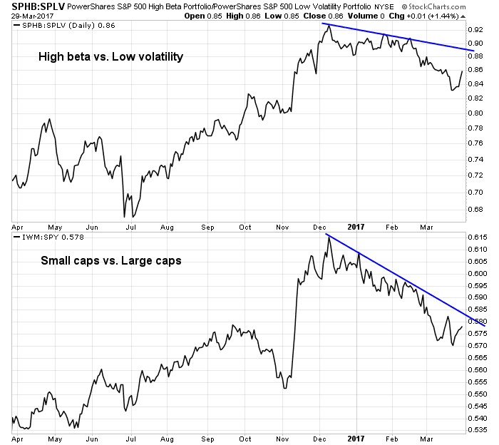
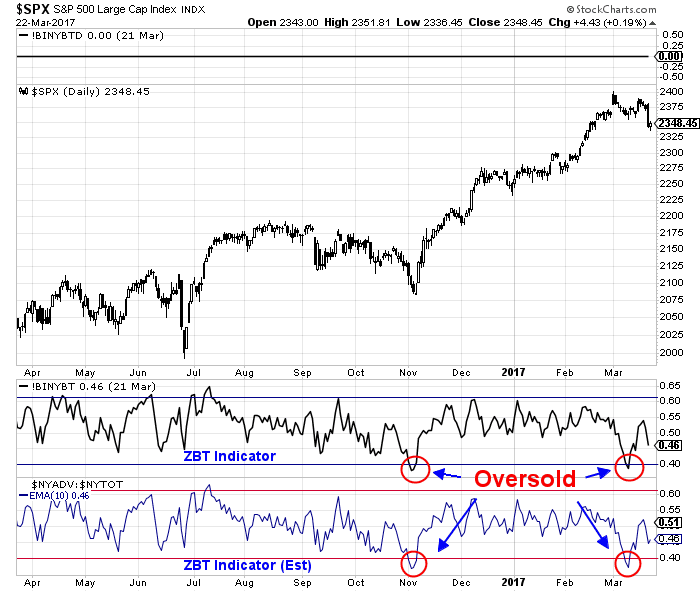
The week ahead: Both overbought and oversold
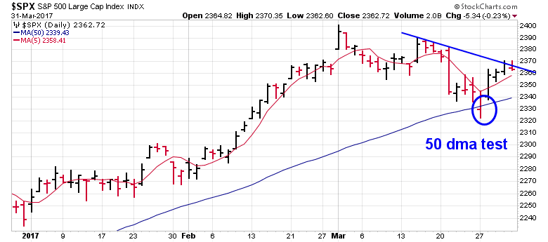
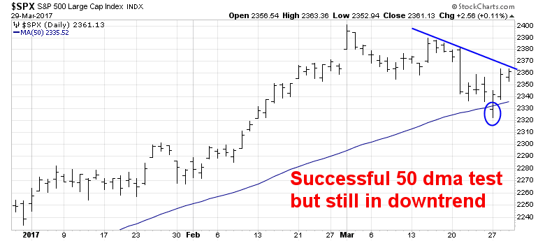
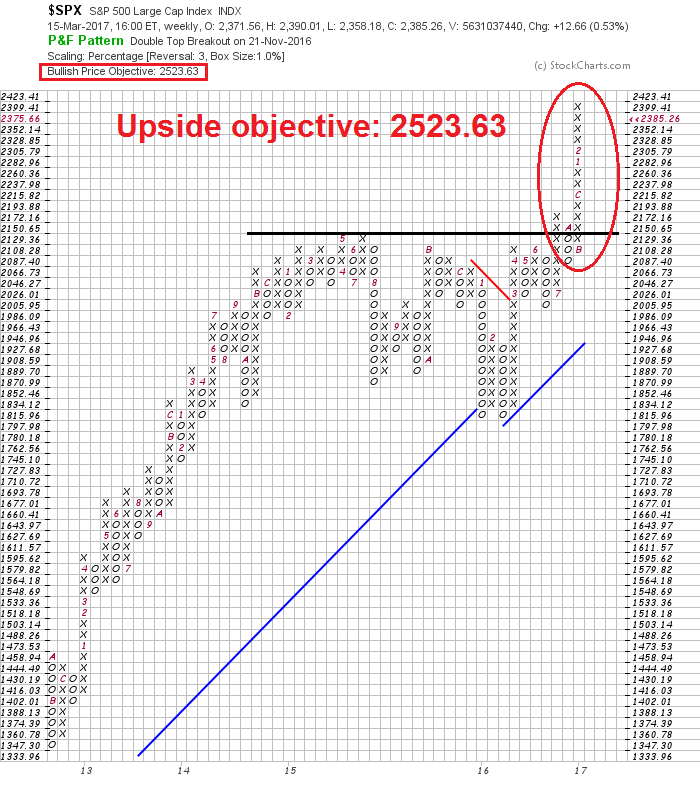
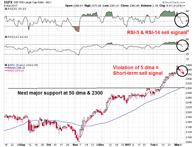
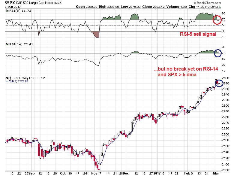
Looking to the week ahead, the market is facing a number of tricky cross-currents. From a technical viewpoint, the market is intermediate term overbought, but short-term oversold. The monthly SPX chart depicts the rare conditions when the market closed above its monthly Bollinger Band, and it was overbought on the 14-month RSI, which are both overbought signals. Even though the sample size is small (N=3), these episodes were resolved in the past with minor corrections and consolidation.
In the short run, the market has fallen enough to flash an oversold reading, which warrants a bounce. This chart from Index Indicators is typical of the short-term oversold conditions in the market. Friday’s NFP rally could be the spark for a rally up to test the old highs.
The chart below shows the NYSE McClellan Oscillator (NYMO), which fell last week to an oversold condition last week. Past instances of mean reversion in this index has also typically marked short-term rallies. However, the current episode is different because it occurred with a small decline of less than 2%. It is therefore unclear how much of a bounce the market is likely to see under these circumstances. Please note that the only time this indicator failed in the last three years occurred in September 2014, when NYMO became oversold as the market fell 3%.
I would also point out that next week is option expiry week. Rob Hanna at Quantifiable Edges pointed out that March OpEx week have tended to be particularly bullish.
My best guess is the market is poised for a countertrend rally within the context of a correction. The week ahead will see a number of potentially market moving events with binary outcomes that are difficult to forecast. So brace for greater volatility.
- Dutch election (Wednesday)
- FOMC decision (Wednesday)
- Treasury reaches its debt ceiling and will have to take “extraordinary measures” to continue funding the federal government (Thursday)
- The Trump White House presents its “skinny budget” (estimated to be between Tuesday and Thursday)
My inner investor remains bullishly positioned, though he is starting to get nervous about the market environment.
My inner trader covered his shorts and moved to an all cash position on Friday. In the interest of risk control, he has decided to step aside in light of the likely volatile environment next week.


