Preface: Explaining our market timing models
We maintain several market timing models, each with differing time horizons. The “Ultimate Market Timing Model” is a long-term market timing model based on the research outlined in our post, Building the ultimate market timing model. This model tends to generate only a handful of signals each decade.
The Trend Model is an asset allocation model which applies trend following principles based on the inputs of global stock and commodity price. This model has a shorter time horizon and tends to turn over about 4-6 times a year. In essence, it seeks to answer the question, “Is the trend in the global economy expansion (bullish) or contraction (bearish)?”
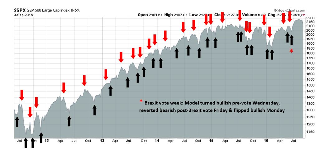
My inner trader uses the trading component of the Trend Model to look for changes in direction of the main Trend Model signal. A bullish Trend Model signal that gets less bullish is a trading “sell” signal. Conversely, a bearish Trend Model signal that gets less bearish is a trading “buy” signal. The history of actual out-of-sample (not backtested) signals of the trading model are shown by the arrows in the chart below. Past trading of the trading model has shown turnover rates of about 200% per month.
The latest signals of each model are as follows:
- Ultimate market timing model: Buy equities*
- Trend Model signal: Risk-on*
- Trading model: Bullish*
Update schedule: I generally update model readings on my site on weekends and tweet any changes during the week at @humblestudent. Subscribers will also receive email notices of any changes in my trading portfolio.
Weak macro = Weak stock market?
Friday’s dismal market action got me thinking about the Black Knight scene in Monty Python’s Holy Grail. Did his arm get chopped off, or was it just a “flesh wound”?

The macro data had been disappointing even before Friday’s market downdraft, which undoubtedly contributed to the slightly sour tone in stock prices. The combination of disappointments in ISM Manufacturing and Services, a so-so Beige Book report, and softness in the Labor Conditions Market Index all contributed to the downbeat macro-economic momentum.
One key indicator of macro disappointment is the Citigroup Economic Surprise Index (ESI), which measures whether high frequency economic releases were beating or missing market expectations. As the chart below shows, ESI has been falling in the past few weeks on both sides of the Atlantic.
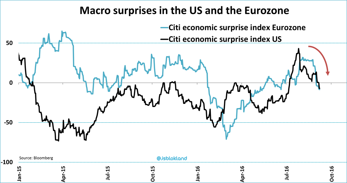
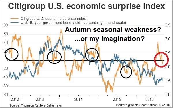
As a detailed examination of US ESI shows, there may be a seasonal pattern where the ESI weakens in the autumn and then recovers later. Or is that my imagination?
A case could be made that the dip in ESI is just a blip. A check of bottom-up fundamental indicators and technical market breadth shows that both of these other dimensions of market health are signaling further stock market gains. For now, I am inclined is to give the bull case the benefit of the doubt.
Macro disappointment spooks the market
Recent macro reports has seen a weaker tone lately. One major disappointment is the softness in both ISM Manufacturing and Services, which may be foreshadowing a loss of momentum for 2H economic growth.

Despite the apparent reported “modest pace” of economic expansion, one notable feature of the Beige Book was “flatness”. David Rosenberg observed that there seemed to be a lot of the use of the word “flat” in the report.

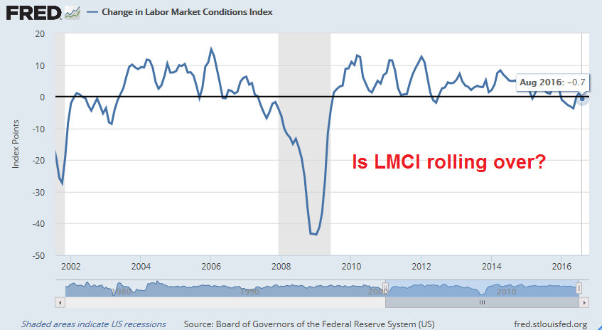
More worrisome is the softness in the Labor Market Condition Index (LMCI). The LMCI may be in the process of rolling over even as the Fed signals its eagerness to raise interest rates. A policy of interest rate normalization in the face of labor market weakness is just the kind of policy error that could push the economy into recession. No wonder the stock market was getting spooked,
Despite these signs of weakening macro data, a disconnect is appearing. As Capital Economics pointed out, one of the graphs below is wrong. Either ISM is signaling weakness in GDP growth…
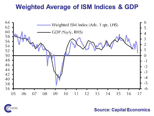
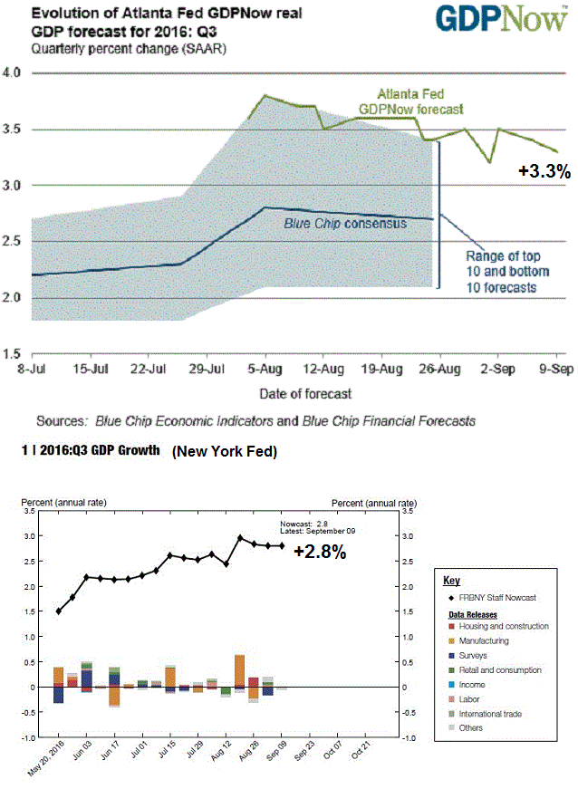
…or Q3 GDP nowcasts from both the Atlanta Fed (3.3%) and the New York Fed (2.8%) are wrong. While GDP nowcasts have declined a bit, they are nevertheless strong and remain above the Street expectations.
Here is another puzzle. Some analysts have attributed last week’s stock market weakness to rising interest rates, as the 10-year Treasury yield has risen (top panel of chart). Rates are rising because the Fed views the economy as strong enough to withstand one or more rate hikes. But the macro data that has been coming in has been a bit on the weak side. If so, why is the yield curve (bottom panel) steepening, which is a signal that the bond market anticipates a stronger economy? Isn’t stronger growth supposed to be equity bullish, not bearish?

I interpret these apparent contradictory readings as uncertainty over whether the economy has recovered from the shallow industrial recession that it experienced last winter. New Deal democrat is coming to the same conclusion from his weekly assessment of high frequency economic indicators:
Last week I noted that the recent paradigm of positive leading and mixed to negative coincident indicators wobbled some. In general, the coincident indicators, as anticipated, have followed the positive leading indicators. But some of the leading indicators themselves — in particular purchase mortgage applications and commodities — have weakened.
However, there are no signs of weakness in his leading indicators, though coincidental indicators is showing an uncertain growth picture:
The coincident indicators remain mixed…
Short leading indicators are almost all either positive or neutral..
With one exception, all long leading indicators are either positive or neutral.
In other words, don’t panic. The economy continues to expand at at “modest pace”. There is no sign of recession in sight.
Bottom-up growth still robust
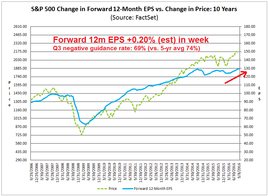
From a bottom-up basis, incoming data is inconsistent with the picture of an economy that is losing steam. The latest update from Factset shows that consensus forward 12-month EPS estimates are still rising, which is a signal of Street optimism. Moreover, Q3 negative corporate guidance is coming at slightly below average, which is another positive sign.
Avondale’s monitor of company earnings call and presentation is telling a similar story. The latest update shows a relatively upbeat assessment from a survey of corporate management. Here are some key excerpts:
- Walmart hasn’t seen any meaningful change in the consumer: “We haven’t seen a meaningful change in the consumer. I think the consumer generally is okay.”
- Industrial CEOs are starting to feel encouraged
- The impact from inventory destocking is becoming less significant
- Leaner inventories coupled with stronger demand leads to pricing power
This doesn’t sound like the economy is going through a soft patch.
Strong technical breadth underpins the market
When I view the stock market through a chartist’s lens, intermediate term technical breadth is holding up well. US investors and traders have been frustrated by the multi-week SPX consolidation as the index traded in a very narrow range. However, looking beneath the surface reveals a picture of positive breadth.
The chart below shows the price charts of the broadest US market index, the Wilshire 5000 (WLSH), the large cap SPX, and different flavors of mid and small cap indices. The SPX broke out to new highs in July, consolidated sideways, and it is now pulling back to test the breakout level, which is hardly the picture of a market that’s falling apart. Even as the SPX traded sideways and caused untold levels of frustration to traders, little noticed was the new all-time high made by WLSH last week before Friday’s weakness. As well, the other flavors of mid and small cap indices were all in a stealth bull phase instead of the sideways consolidation shown by large cap stocks. These are classic bullish signs of positive breadth that are difficult to ignore.

Evidence of strong breadth is not only found in the US, but all over the world. As an example, Nautilus Research highlighted this historical study of positive global breadth.

The Dow Jones Global Index advanced to a new high last week. We also saw similar displays of positive breadth from the major European stock indices.

Over in Asia, the Chinese stock market and the stock markets of her major trading partners are all either breaking out strongly or in uptrends. There was some minor weakness in Singapore and Australia, but those markets remain in uptrends.

To conclude, the combination of positive bottom-up fundamentals and technical breadth are the reasons why I am giving the bull case the benefit of the doubt – for now.
The week ahead
Last week, I highlighted historical analysis from Dana Lyons indicating that narrow trading ranges near new highs tend to resolve themselves with weakness for one day and a steady rebound afterwards. I am using that as my default template for current market conditions. I would be more concerned if Friday`s 2.5% sell-off occurred for some fundamental reason, but there were none (other than a surprise North Korean nuclear test).

Under these circumstances, it’s time to cue the historical studies, such as this one of 90%+ NYSE down volume days on a Friday. If history is any guide, stock prices tend to rebound soon afterwards.

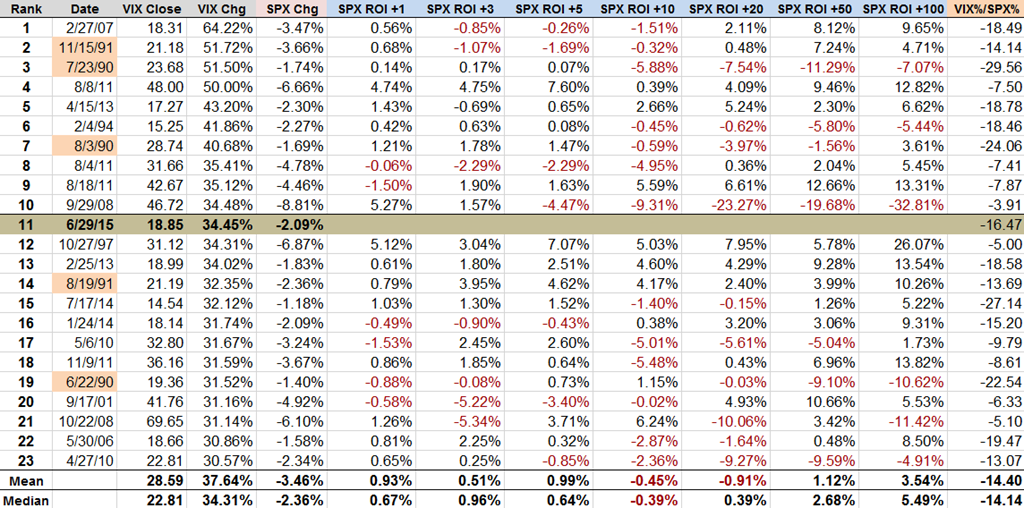
Charlie Bilello point out that Friday`s VIX spike was the 11th highest in history, with the Brexit being the 5th highest. Bill Luby of VIX and More contributed this table of of large VIX spikes. The analysis is slightly dated as it was written on June 29, 2015, but its bullish conclusions are the same.
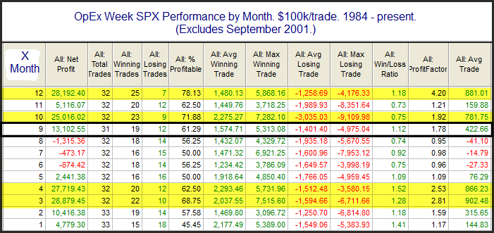
Next week is option expiry week. As this chart from Rob Hanna of Quantifiable Edges shows, September OpEx tends to have a positive bias.
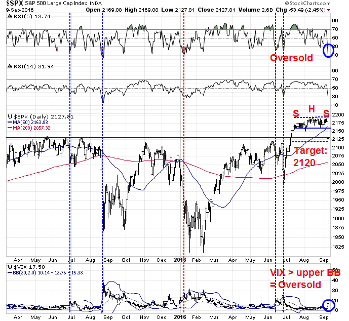
The technical damage done to the market on Friday was relatively minor (a mere flesh wound). The SPX weakened but remains above its breakout level and the index appears to be in the process of testing that breakout level. Callum Thomas identified a possible head and shoulders top on the SPX on Friday. Assuming that technical formation is valid, the measured downside target is roughly 2120, which is only a measly 8 index points below Friday`s close. The market is oversold on RSI-5 and the VIX Index has overrun its upper Bollinger Band, which is another sign of an oversold market. The vertical lines in the chart below depict past instances when these two conditions have occurred simultaneously. While the sample size is small, there have been four instances (blue lines) of market bounces, and only one instance (red line) of continued weakness.
Other breadth indicators from IndexIndicators also show the market to be oversold. This chart of stocks above their 10 dma indicates that the market is oversold on a short-term (1-3 day) basis. Readings are levels seen in past panic bottoms.

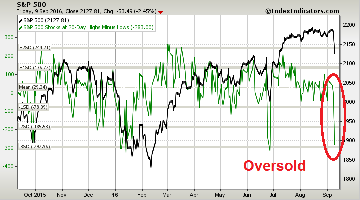
This chart of net 20-day highs-lows shows the market to be oversold on a medium term (1-2 week) basis.
Trading is about playing the odds. The combination of past historical studies and my assessments of short-term technical conditions suggest that a bottom is very near. My inner investor remains constructive on stocks and he views further weakness as an opportunity to add to his positions.
My inner trader did not sell his long positions during Friday’s sell-off. He is also bullishly positioned. In the absence of a fundamental trigger for the decline, he believes that downside risk is likely to be limited from current levels.
The one wildcard to my bullish outlook is the speech by the uber dovish Fed governor Lael Brainard on Monday. Brainard has been extremely dovish and she has indicated her reluctance to raise rates because of concerns over global financial instability. Should she change her tune to a more hawkish stance, then all bets are off and it could signal a much deeper correction.
Disclosure: Long SPXL, TNA
Last week, sovereign bond makets were very weak when the ECB and Japanese both seemed to tone down their extreme rhetoric on quantitative easing. They seemed to expressing doubts about its effectiveness. If they and especially the U.S. Fed start raising rates even with economic numbers weak, that could send the economy into recession. That is why Brainard’s speech is so important.
A big key is the September Fed meeting. If they are data dependent as they say they are, then they won’t raise rates since data has been weak as Cam outlined. Then this ‘lower for longer’ bull market will take off for another leg up.
If the Fed does raise rates, the bull market will stumble until we get a feel if it is ‘one and done’ (good) or the start of a series of increases (bad)
My guess is ECB and Japan ratchet back the extreme easing and the Fed does nothing at the September meeting and waits to see how the economy is faring.
The chart that Cam has shown shows that the low in yields was made in the 1st week of July. The TLT which is a proxy for the 20 year Bond peaked on July 8th at 143.62. Last Friday it was trading at 135.52. A drop of 5.64%. This has nothing to do with Fed speak etc.. As I have stated in the past zero and negative rates is a historical event with no similar period in the past. For all practical purpose we are now in an intermediate rally in yields i.e. decline in Bond prices. If TLT were to close below 130.10 and stay there for a week or two it would full fill the definition of a bear market (below 200 day moving average).
The Utility Index is the leading indicator for the stock market. The lead time varies for different periods from 3 months to 9 months. If it falls within those parameters then Cam’s time frame for the stock market peaking in middle of 2017 would be accurate.
An occasional 2% down day is very healthy, IMHO. Keeps the riff raff out, and the speculators on their toes. A market overheats sooner or later when there’s no real sense of danger.