Preface: Explaining our market timing models
We maintain several market timing models, each with differing time horizons. The “Ultimate Market Timing Model” is a long-term market timing model based on the research outlined in our post, Building the ultimate market timing model. This model tends to generate only a handful of signals each decade.
The Trend Model is an asset allocation model which applies trend following principles based on the inputs of global stock and commodity price. This model has a shorter time horizon and tends to turn over about 4-6 times a year. In essence, it seeks to answer the question, “Is the trend in the global economy expansion (bullish) or contraction (bearish)?”
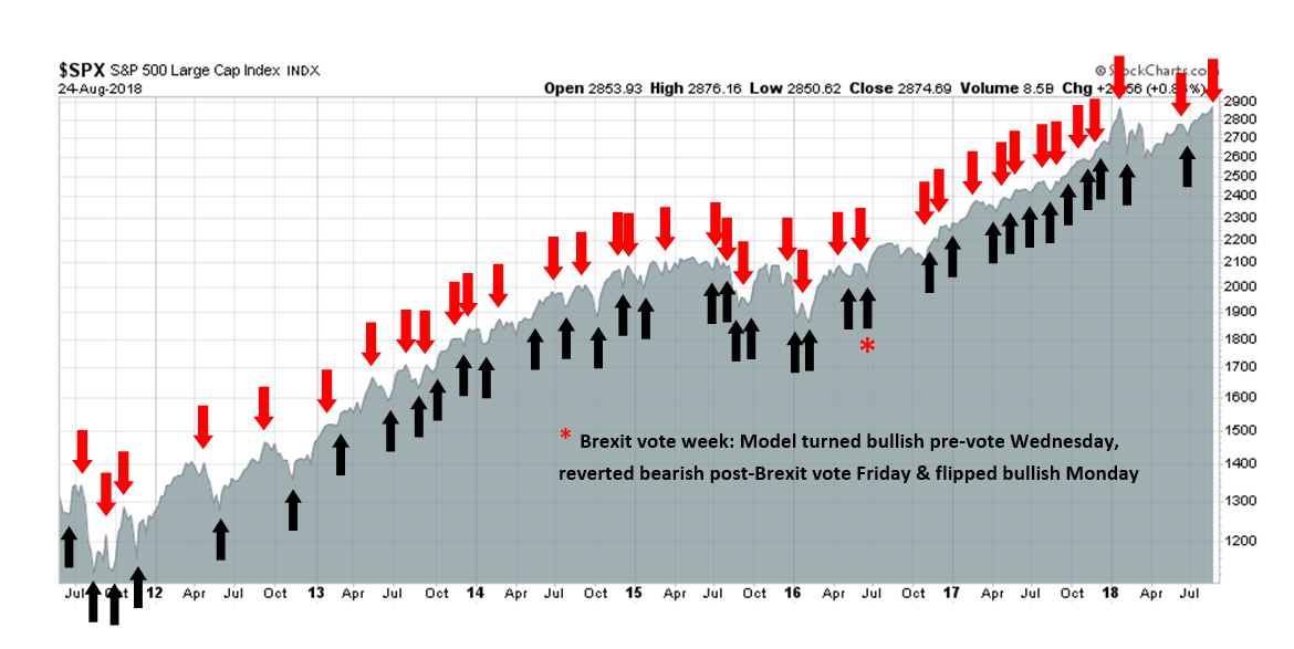
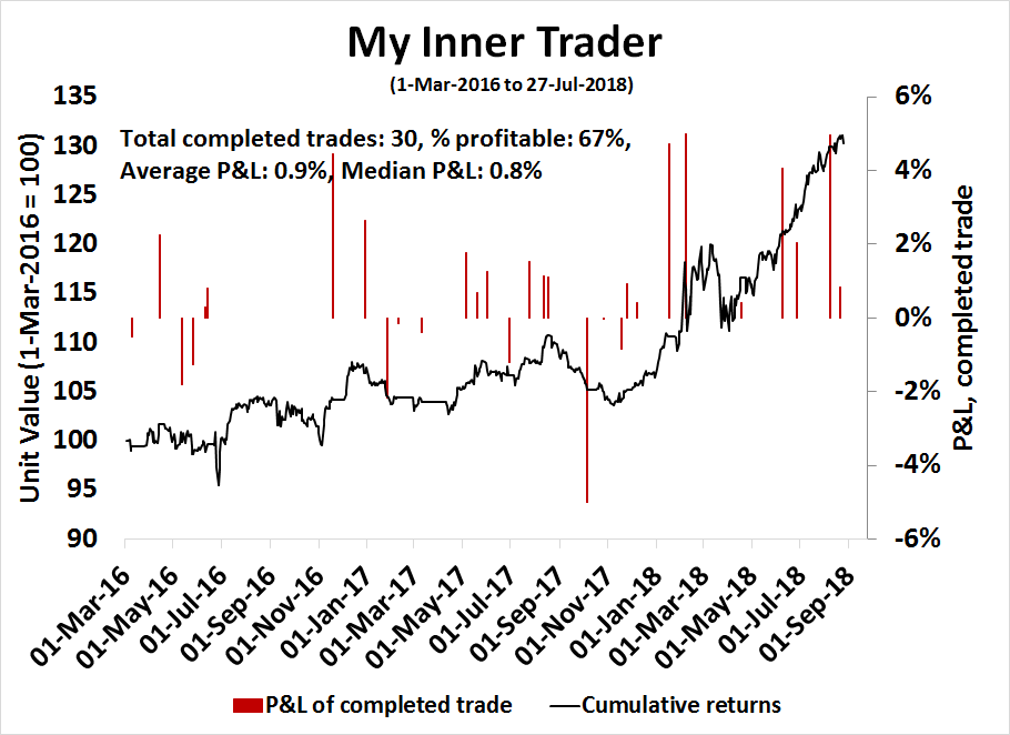
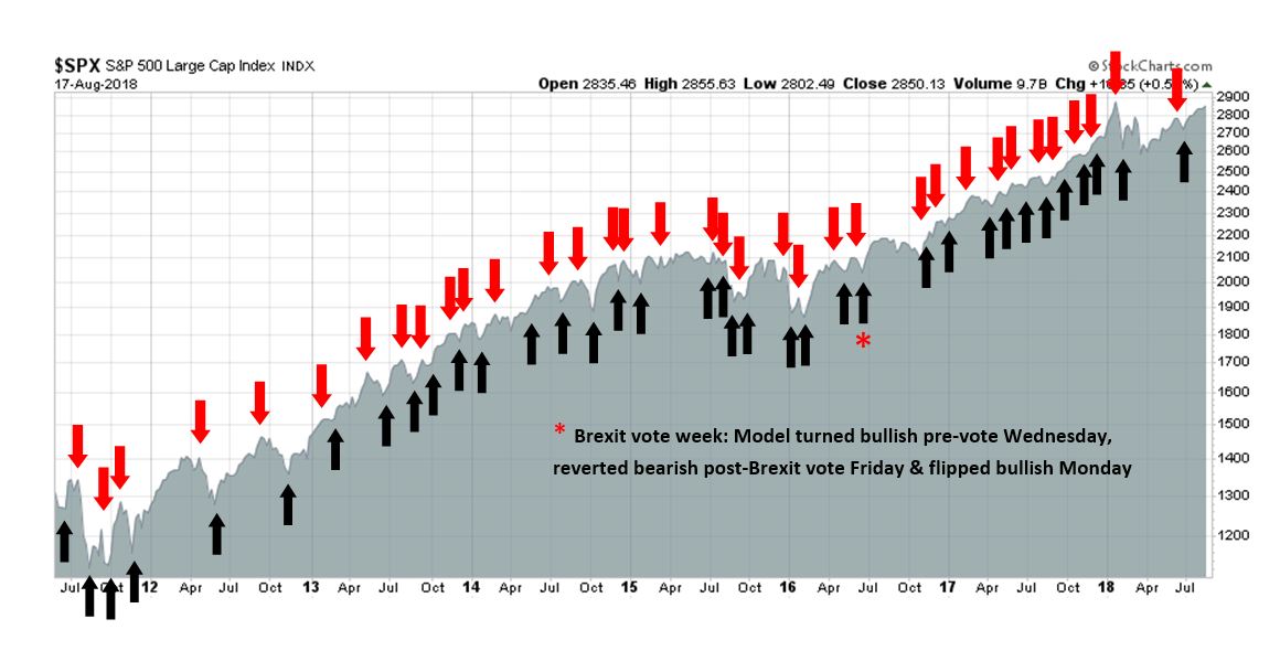
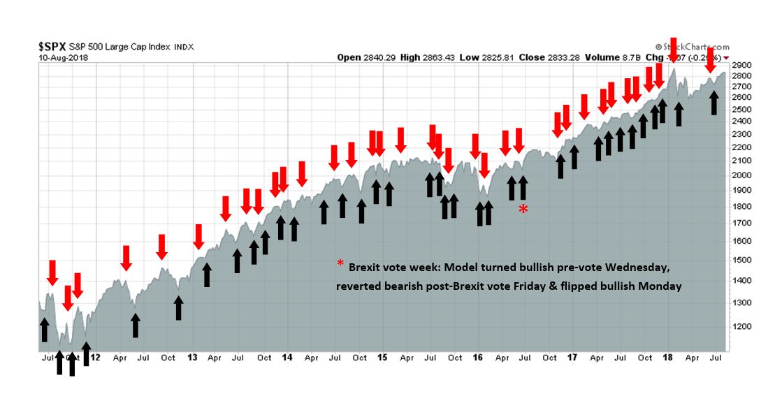
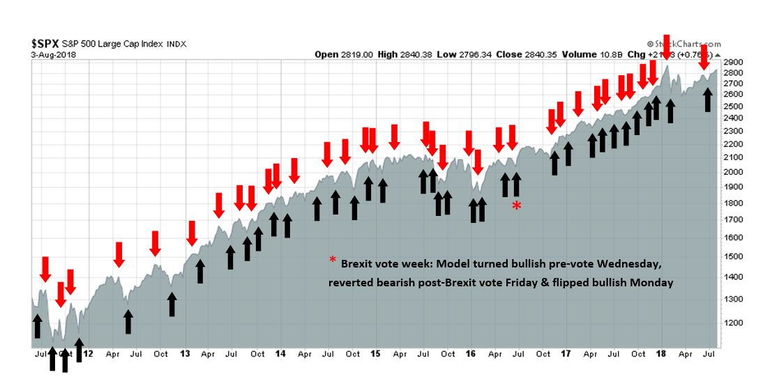
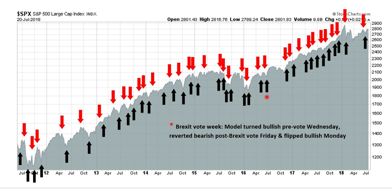
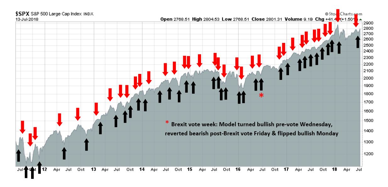
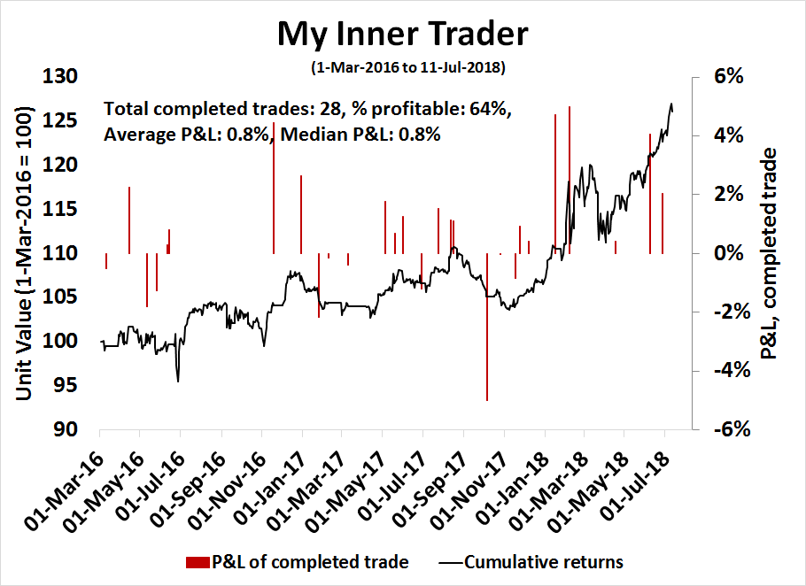
My inner trader uses the trading component of the Trend Model to look for changes in the direction of the main Trend Model signal. A bullish Trend Model signal that gets less bullish is a trading “sell” signal. Conversely, a bearish Trend Model signal that gets less bearish is a trading “buy” signal. The history of actual out-of-sample (not backtested) signals of the trading model are shown by the arrows in the chart below. The turnover rate of the trading model is high, and it has varied between 150% to 200% per month.
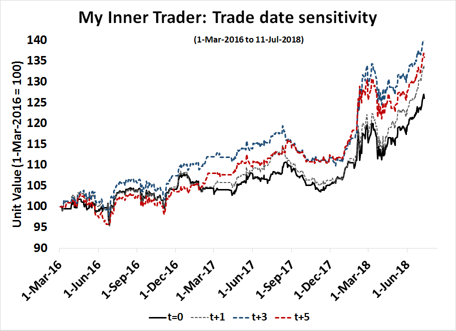
Subscribers receive real-time alerts of model changes, and a hypothetical trading record of the those email alerts are updated weekly here. The hypothetical trading record of the trading model of the real-time alerts that began in March 2016 is shown below.
The latest signals of each model are as follows:
- Ultimate market timing model: Buy equities
- Trend Model signal: Neutral
- Trading model: Bullish
Update schedule: I generally update model readings on my site on weekends and tweet mid-week observations at @humblestudent. Subscribers receive real-time alerts of trading model changes, and a hypothetical trading record of the those email alerts is shown here.
What if I am wrong?
Good investors always examine their assumptions. What if I am wrong? What are the risks to my forecasts?
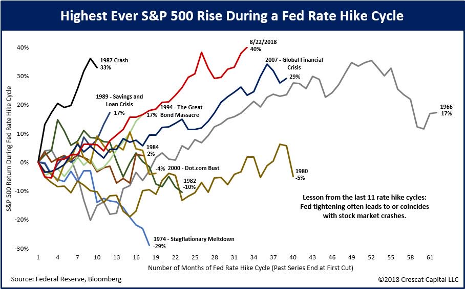
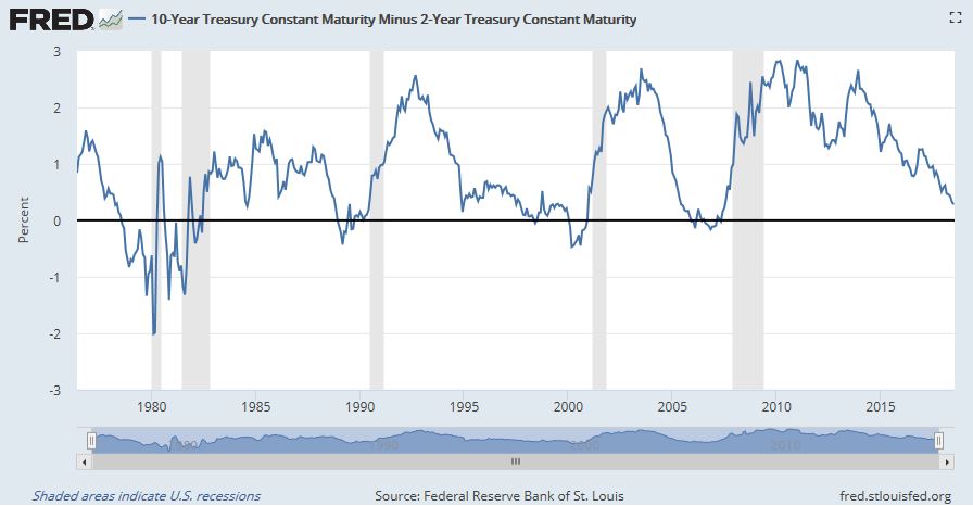
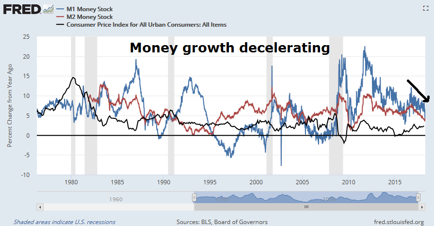
I had lunch with a friend where he pushed back on my bear case for a major market top (see Major market top ahead: My inner investor turns cautious and How far can stock prices fall in a bear market?). The macro scenario goes something like this. The Fed is on track to steadily raise rates by a quarter-point every three months. Monetary indicators, such as money supply growth and the yield curve, are on a trajectory to flash recessionary signals by year-end, if not before. The US sneezes and slows into a mild recession, China catches a cold and collapses into a hard landing because of its excess leverage. Global contagion spreads into a global synchronized recession whose magnitude could be as bad as the last financial crisis.
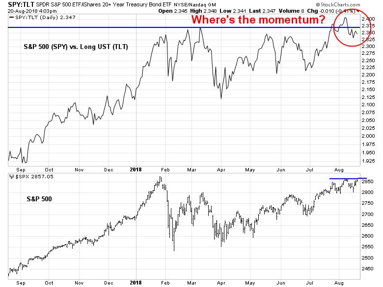
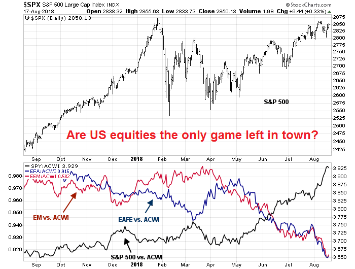
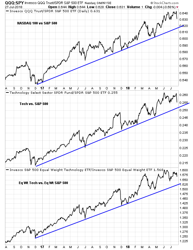
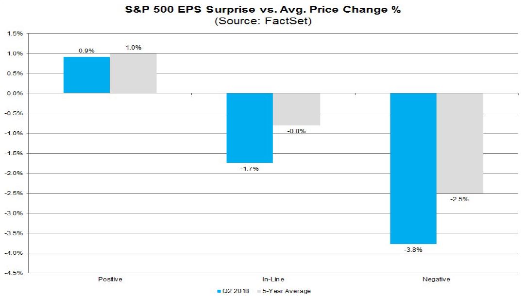
Already, the global outlook is precarious. US equities seem to be the only game left in town as everyone piles into them.
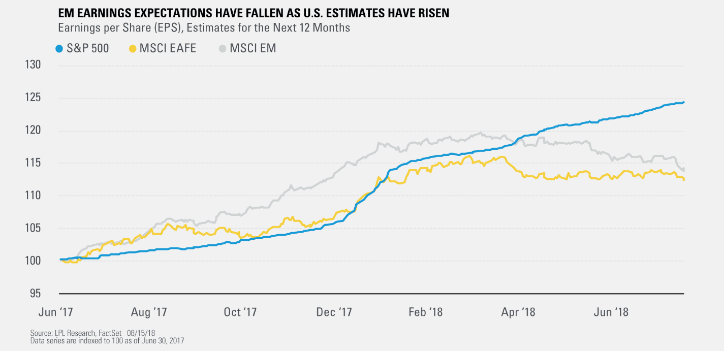
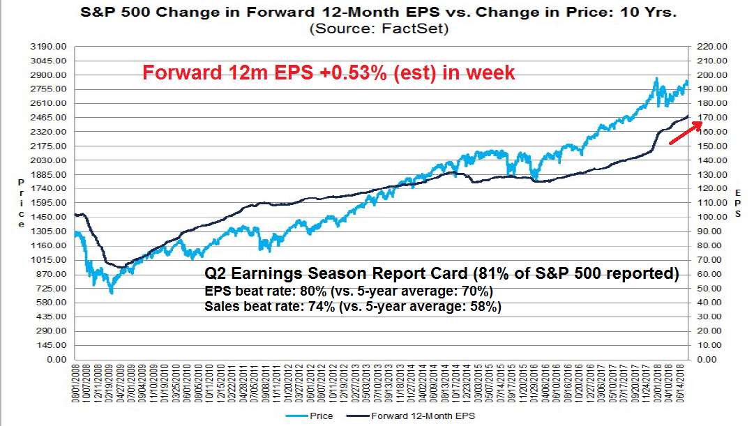
To be sure, the US is the last source of growth left standing. LPL Financial found that while US earnings expectations are still rising, they are flat for non-US developed markets (EAFE), and falling in the emerging markets. Sure, America is leading the world, but if the US slows, what happens then?
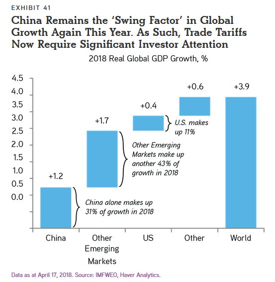
My lunch companion’s key objection to the bearish scenario is the China linkage. It is unclear whether a slowing American consumer will trigger a significant slowdown in China. Even if Chinese economic growth were to slow, Beijing still has lots of policy levers to cushion a downturn. This is an important question. China remains the big swing factor in global growth. What if China doesn’t collapse? The downside risk to my bearish scenario would be very mild by comparison.
If US growth were to falter, could China pick up the baton?
How resilient is China?
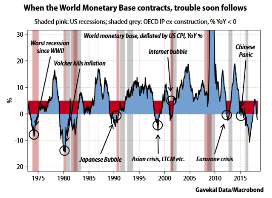
One source of Chinese resilience is their large foreign currency reserves. Louis Gave of Evergreen Gavekal recently outlined his recession scenario, based on a contraction in the World Monetary Base (WMB).
Gave wrote the following before the onset of the Turkish crisis, He observed that a WMB growth slowdown tends to create a shortage in the offshore USD market, and such shortages tend to show up in EM countries with large current account deficits and external debt. The resulting collapse in offshore USD liquidity then slows global trade flows, even without an American recession.
The first effect to watch out for is a contraction in international trade as a consequence of the US dollar shortage. Every time in the past that there has been a contraction in the WMB, six or so months later there has been a steep decline in the volume of world trade (at least since 1994—I only have the data back that far). These declines have almost always led to a recession, either in the OECD, or outside the OECD, as in the case of the Asian crisis. I see no reason why the same should not happen again this time around, especially as I am starting to detect a range of other signs that typically accompany the march towards a recession.
Gave went on to state that he believes that China and other Asian countries are more insulated from the slowdown because of large foreign exchange reserves built up at the PBOC, the HKMA, and by other Asian central banks after they learned the lessons of the Asian Crisis of 1997.
China has foreseen the danger of a US dollar shortage, and has tried to arrange things in Asia to allow the region to ride out a dollar squeeze. As a result, Asia is likely to be a zone of relative stability in the coming turmoil.
Modeling an American slowdown
My lunch companion also brought up another point. If the mechanism for a Chinese hard landing is through the trade channel, does a slowdown in trade necessarily crash the Chinese economy?
Let’s do some back of the envelope numbers. China’s exports account for roughly 20% of its GDP. Add in services, and the current account effects rise to about 30% of its GDP. Merchandise trade with the US is about 20% of its exports, but if we were to add back exports to Hong Kong and Vietnam, whose export volumes are greater than exports to Germany, as US exports, these re-exports account for 30% of its trade. Putting it all together, Chinese exports to the US in goods and services account for just under 1% of GDP. Even if trade flows were to diminish, the effect won’t be the full 1% of GDP. How can a slowdown in US trade collapse the Chinese economy?
For a big picture perspective, consider these comments from Chris Balding, who spent nine years teaching at the HSBC Business School of Peking University Shenzhen Graduate School:
As I continued lecturing I noticed an attentive student in the front tentatively appearing almost embarrassed, raise their hand just enough for me to see. Hoping to salvage a situation I could not understand I called on them hoping to elicit conversation about the implications of the unfolding events. I prepared to unleash upon this unwitting graduate student the depth of my knowledge and preparation demonstrating my profound wisdom. In a cautious almost trembling voice they asked a seemingly benign question:
“Professor, where did you get this data?”
I knew the answer. The only question to a professor discussing quantitative easing concerned data provenance? The question seemed beneath a man of my stature.
“I downloaded the Chinese data from the National Bureau of Statistics and the People’s Bank of China.”
The student paused. Hunched forward. Thought carefully how to choose their next words.
“Professor, do you believe the data?”
To make a long story short, Balding concluded that his students, some of whom were Party members and comprised the elite of China, didn’t believe the Chinese data:
What struck me most, the doe eyed innocent students within the machinery of an elite university, many of them Party members, took skepticism of government data for granted. There were no caveats. They ignored the typical academic hedging. Their message clear: do not believe the data.
Chris Balding went on to explain the *ahem* squishy nature of Chinese statistics:
Adding complexity to the morass of conflicting information, despite the widespread perception that China systematically overstated its data, Chinese statisticians and accountants over and understated outcomes depending on their specific incentive. A 2015 official report by the national auditor found that state owned enterprises both over and under stated profit, revenue, assets, and liabilities. At first it seems paradoxical that SOE’s would both over and under state key financial metrics. However, their motivation stems from their incentives. Profitable companies want to understate their profit, so the government grabs a smaller share of their free cash. Conversely, unprofitable companies overstate their profitability to gain additional funding or keep cadres employed at good positions. Call it the Goldilocks theory of data manipulation: officials wanted outcomes neither too good or too bad but just right.
He went on to give a personal example:
One day I needed to turn in some small travel receipts and took them with the appropriate form to the accounting office. Still trying to figure out the forms in China and all the regulations, I took my taxi and meal receipts to the staff accountant. Looking at them concerned, they informed me the school could not reimburse my receipts for reasons I am still not clear on. Ready to forgo the money, as it was a relatively minor amount of money, I got ready to leave. Asking what the receipts were for, I turned to explain. Content with my explanation, the accountant opened up a bottom desk drawer filled with official looking red stamped receipts, very important for Chinese public accounting, and proceeded to find a few that approximated my requested amount. They asked if I could accept the small discrepancy in my requested amount and the amount of the magical receipts. Standing mouth agape at the accountant with drawer full of receipts used to outwit public auditors, I quietly nodded my acquiescence and slipped out both thankful and concerned for my reimbursement with a lesson learned about system manipulation in China.

One of the problems for the China analyst is the opaque nature of Chinese statistics. Even if you were to trust the figures,it may be relatively easy to quantify the first order effects of a trade slowdown. However, measuring the full effects is more problematical. A recent (wonkish) paper by Baqee and Farhi, The Macroeconomic Impact of Microeconomic Shocks: Beyond Hulten’s Theorem, found that losses from trade shocks and tariffs are several orders of magnitudes higher than previously thought [emphasis added].
We provide a nonlinear characterization of the macroeconomic impact of microeconomic productivity shocks in terms of reduced-form non-parametric elasticities for efficient economies. We also show how structural parameters are mapped to these reduced-form elasticities. In this sense, we extend the foundational theorem of Hulten (1978) beyond first-order terms. Key features ignored by first-order approximations that play a crucial role are: structural elasticities of substitution, network linkages, structural returns to scale, and the extent of factor reallocation. Higher-order terms magnify negative shocks and attenuate positive shocks, resulting in an output distribution that is asymmetric, fat-tailed, and has a lower mean even when shocks are symmetric and thin-tailed. In our calibration, output losses due to business-cycle fluctuations are an order of magnitude larger than the cost calculated by Lucas (1987). Second-order terms also show how shocks to critical sectors can have large macroeconomic impacts, almost tripling the estimated impact of the 1970s oil price shocks.
There are opaque linkages everywhere. In an era of global supply chains where components are manufactured in different countries with inputs from all over the world, and then exported and assembled and re-assembled in many different plants all over the place, does trying to quantify the bilateral effects of a slowdown in one major consumer country make any sense?
The unknown effects of hidden linkages
There are hidden linkages everywhere, not just through the trade channel from a globalized supply chain, but through the finance channel. I had outlined the financial risks in a past post (see How a China crash might unfold).
To briefly recap, in early 2016, the SCMP reported how the shares of Hang Fat Ginseng, which was a well-established HK-based ginseng broker, collapsed about 90% in a single day with no warning:
This is a classic tale of what has and would happen to the dozens of newly listed companies in the past two years. It is a tale of greed.
Yeung is no stranger to the game.
The so-called “King of American Ginseng” loved to talk about his clever bets on apartments, currencies as well as derivatives…
As Hang Fat’s price shot up, so has the borrowing of Yeung and his family, as suggested by records with the Central Clearing System(CCASS)…
In the meantime, Yeung and his brother like many of the bosses of newly listed companies have made bets with all sorts of investment schemes proposed by their private bankers with money from margin finance. It was jolly good.
By summer, it was all over. The A share market crashed; the yuan depreciated; and Hang Fat’s price dropped 30 per cent.
The brothers pledged more shares to pay up the margin call and to support Hang Fat’s price.
They spent at least HK$220 million buying up Hang Fat between August and December, according to company announcements. They had no choice because the lower the price, the worse the margin calls.
It was futile. The market headed south with the renminbi…
They were forced to sell 6.17 per cent at a 50 per cent discount for a meagre HK$23 million. To who? Surprisingly, it’s the clients of CIS. Yeah it is bloody.
Bloomerg reported that the rescuer was Yang Kai, the chairman of China Huishan Dairy:
The Yeungs announced they were selling 1.23 billion of their own shares to a company run by China Huishan Dairy Holdings Co. Chairman Yang Kai in an off-market deal for HK$23.4 million. Yang sold almost all the shares a day later for HK$77.1 million, exchange filings show. A Huishan Dairy spokesman declined to comment on the transaction.
Fast forward to a year, the shares of Huishang Dairy collapsed 85% in one day without warning, as roughly USD 4 billion in market cap evaporated overnight. Bloomberg reported that money had gone missing:
A muddled tale of corporate woe has since emerged involving a missing company treasurer, a leverage-happy chairman and serious doubts about the company’s future.
Who went missing?
The executive director who managed Huishan’s treasury and cash operations. The company said on March 28 that its last contact with the director, Ge Kun, was a March 21 letter to Chairman Yang Kai explaining that work stress — heightened by Block’s critical report — had taken a toll on her health and that she didn’t want to be contacted.
So not a good day for the chairman?
It got worse, according to Huishan’s account. That same day, Yang realized Huishan had been late on some bank payments. By March 23, Huishan had arranged an emergency meeting with creditors and government officials in Liaoning province, where the company is based. Huishan said its major lenders, including Bank of China Ltd., expressed confidence at the meeting. But that was before the stock collapsed.

Huishan Dairy eventually went bankrupt. But these sorry tales are stories of hidden leverage, opaque reporting, and leverage piled on top of leverage. It also highlights the risks inherent in the Chinese financial system (and what happens when staff accountants regularly keep official looking stamped receipts in desk drawers to fool the auditors and other authorities).
Despite Beijing’s admonishments against excess debt, the excesses haven’t stopped. Reuters recently reported that Evergrande, China’s biggest property developer with USD 84 billion in net debt, is investing 1.65 billion in six high tech projects by the Chinese Academy of Sciences, including one to build the world’s fastest supercomputer. Makes total sense, right?
In the meantime, the Australian Financial Review reported that Sydney property, which has been one of the epicenters of Chinese fund flows, is melting down:
Selling agents are starting to reveal the truth behind recent listings in Sydney’s west with Belle Property Strathfield’s Jimmy Kang saying up to 50 per cent of his clients were asking him to sell their homes in Sydney’s western suburbs because they can no longer afford their new principal-and-interest mortgages.
In Hong Kong, SCMP reported that buyers are choosing to forfeit deposits and walking away from purchases:
Some buyers are so edgy about the Hong Kong property market that they are pulling out of deals, despite losing big deposits.
A buyer who agreed to buy a unit at Sun Hung Kai Properties’ St Martin II two weeks ago cancelled the purchase on Thursday. The U-turn on the HK$7.25 million studio unit in Tai Po in the New Territories meant the buyer had to forfeit the 5 per cent deposit – about HK$362,700 (US$46,200).
That followed five instances on Wednesday at Sun Hung Kai’s Park Yoho Milano in the northern Yuen Long district. A total of nearly HK$2 million will be charged for the sales terminations. The project debuted last month and was seen as the cheapest residential project this year.
Nothing to see here, move right along…What happens when an operational slowdown, such as a mild US recession or a trade war, hits a highly leveraged economy?
What about the policy response?
To be sure, the Chinese economy is still in many ways a command economy and Beijing still has deep pockets. In the wake of the Great Financial Crisis, China rescued the world with a shock-and-awe stimulus program. Beijing ordered its local authorities and SOEs to spend, and its state-owned banks to lend. In may ways, China saved the world in the same way that Japanese resilience in the aftermath of the 1987 Market Crash saved the global financial system.
Could China do it again?
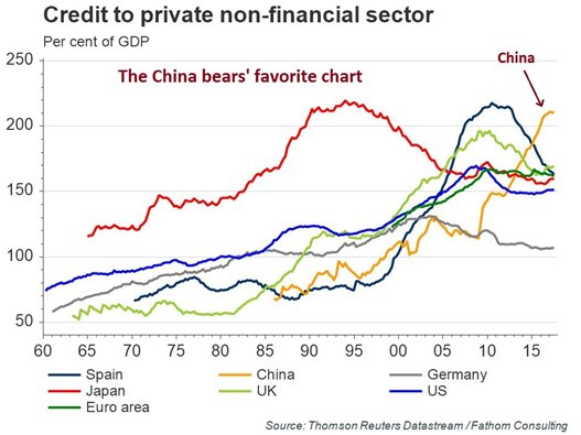
There are a couple of problems with a repeat of the 2008-2009 episode. First, the degree of financial leverage in China is much higher than it was then.
In addition, China’s RRR already stands at post-crisis levels. While they have been historically lower, those rates occurred during an era of financial repression and interest rates fell below inflation. The Chinese economy will not be able to rebalance its growth in an environment where the household sector is repressed through negative real rates.
Houze Song at Macro Polo believes that Beijing’s priorities have changed, and the imperative to deleverage and reduce financial risk ranks higher than growth priorities:
Another stimulus requires the creation of debt, which is widely viewed as a key vulnerability in the Chinese economy. In this instance, the economic vulnerability also aligns with political vulnerability, since a stimulus would be interpreted as abandoning Xi Jinping’s signature deleveraging agenda. Backing away from deleveraging would likely prove more politically damaging than most expect, particularly as Xi has banked his personal credibility on ensuring financial stability and reducing debt. Having made numerous announcements publicly himself, Xi would likely be criticized internally for deviating from such a priority at the first sign of uncertainty. In fact, Chinese state media has already sent unambiguous messages that China needs to hunker down and absorb some near-term pain to get through the deleveraging process.
The authorities have mainly imposed the deleveraging directive on what they can control, namely local governments and SOEs:
Given the severe constraint the deleveraging mandate imposes on local governments, they cannot easily fall back on capital investments to offset a potential economic shock. At the same time, state-owned enterprises (SOEs) are now also subject to the same stringent mandate. Since local governments and SOEs together account for at least one-third of China’s investment, this means that a significant part of the Chinese economy probably won’t increase borrowing even if more credit is made available.
This is the political context in which the People’s Bank of China (PBOC) recently cut the reserve requirement ratio (RRR). Although this cut was widely interpreted as a precursor to China pivoting to stimulus mode, the PBOC took this action primarily in consideration of the uncertainty trade tension has created. This was hardly a stimulative move, but should really be interpreted as an accommodative action to provide a bit more liquidity to fend off the anxiety created by the tariff that took effect on July 6.
While Song interpreted the RRR cuts as a response to the rising US tariffs, they also represent an administrative measure in support of the deleveraging effort. The PBOC has been trying to rein in the excesses of the shadow banking system (as an example, see the NY Times account Bejing Struggles to Defuse Anger Over China’s P2P Lending Crisis) by bringing the funds parked there back to the formal banking system. The RRR cuts therefore represent an accommodative measure for the banks to take on more of the burdens that were in the shadow banking system onto their balance sheets.
Song believes that Xi Jinping is willing to tolerate a slower rate of growth in order to reduce the risk in the economy:
Another aggressive stimulus akin to the 2008-2009 program is no longer an appealing policy option when the associated costs are considered. Such steroidal stimulus will only exacerbate China’s vulnerabilities and increase the likelihood of a financial crisis, something Xi is adamant about preventing. Since Xi will rule China for at least another decade, he is likely more willing to tolerate short-term economic pain without jeopardizing his signature policy on curbing financial risk. Time is on his side.
Another contributing factor is the *ahem* famous fudge in Chinese growth statistics:
Beijing can actually meet its 2020 doubling of GDP goal even if it tolerated a slowdown. According to the 13th Five-Year Plan, China needs to average 6.5% growth from 2016-2020 to achieve a doubling of GDP from the 2010 level. But that target was set before the fourth General Economic Survey and GDP accounting method revision, which will likely lead to an upward revision of China’s GDP by at least 5% in 2019 What this means is that Beijing can achieve its 2020 target with a growth rate of around 5% through the next 2.5 years.
In conclusion, while the possibility exists that China could stabilize global growth in the event of an American recession, the lack of transparency in China’s statistical data raises the risk of a disorderly unwind, especially among the more vulnerable small and medium enterprises (SMEs). As well, don’t count on China to save the world again through another shock and awe policy response. Its latest projections show that it is willing to tolerate a growth slowdown from 6.5% to 5.0% over the next couple of years, which gives the economy plenty of wiggle room to decelerate if necessary.
The week ahead
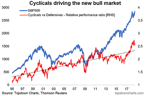
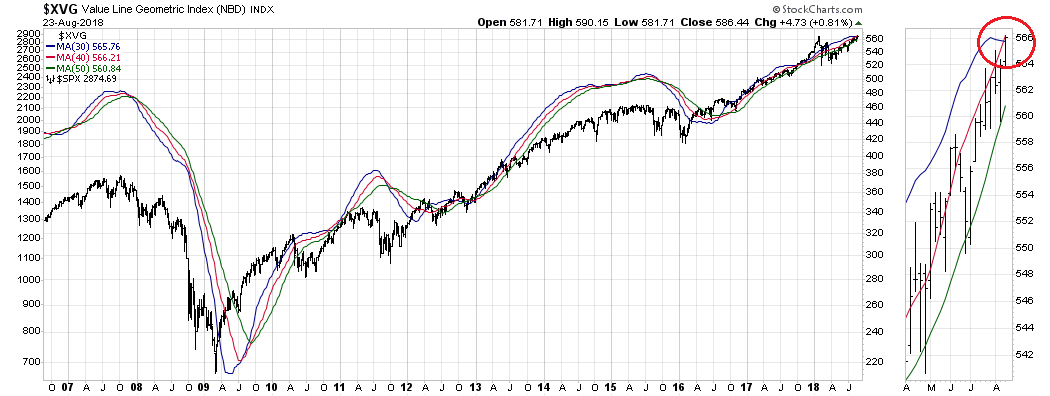
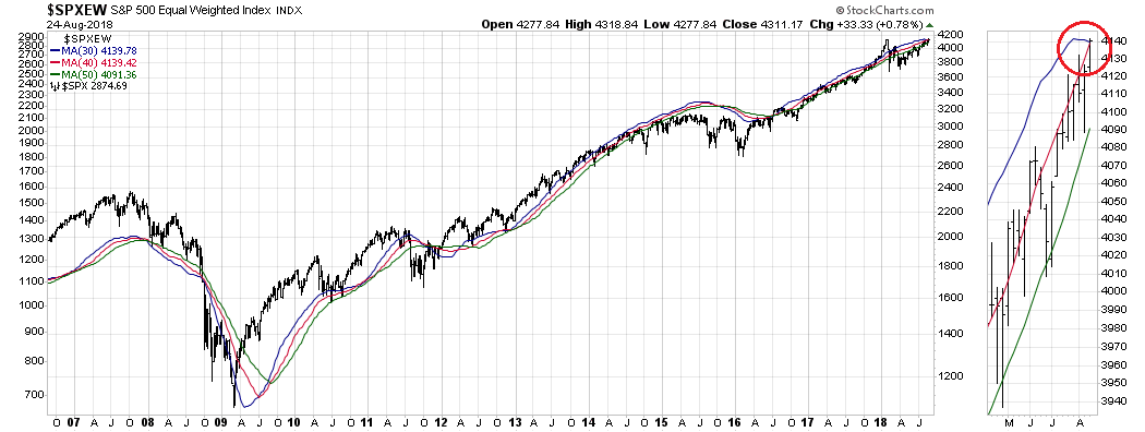
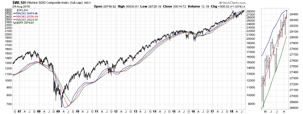
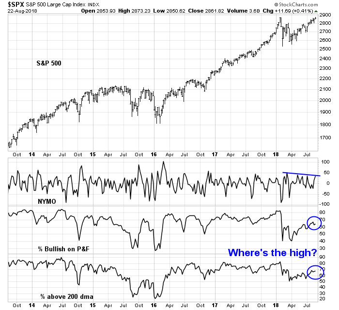
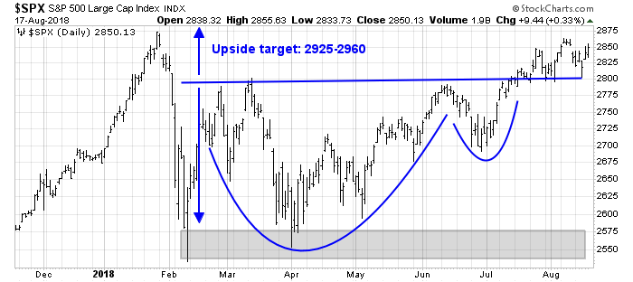
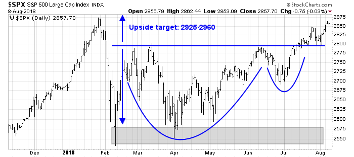
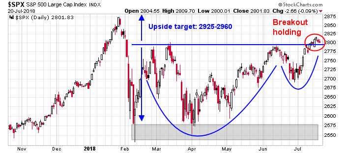
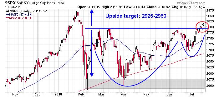
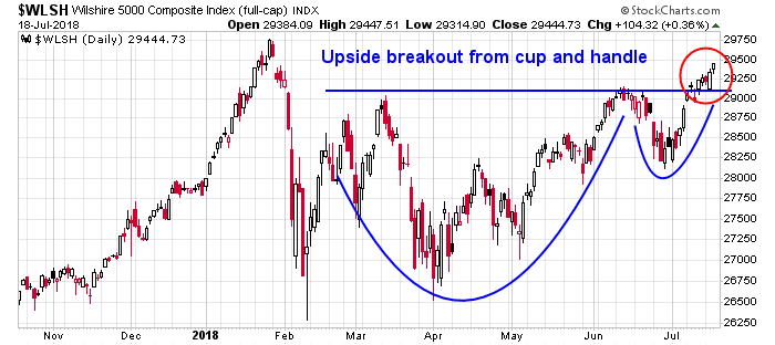
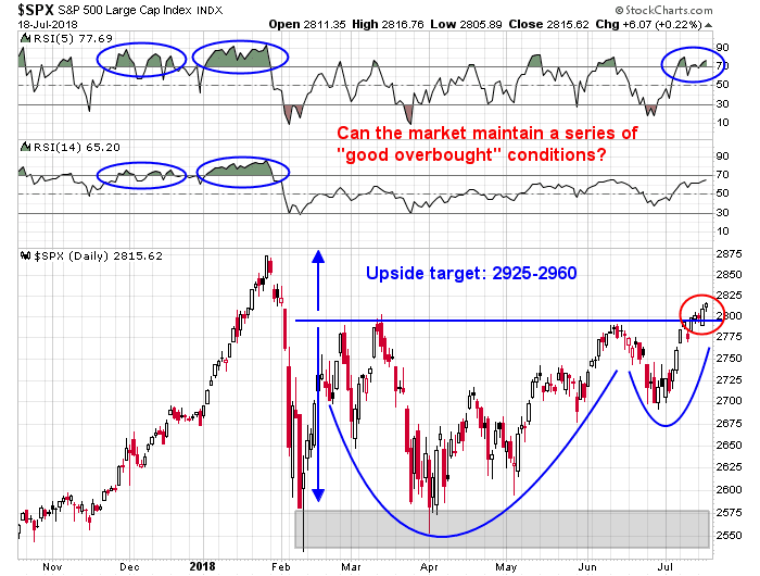
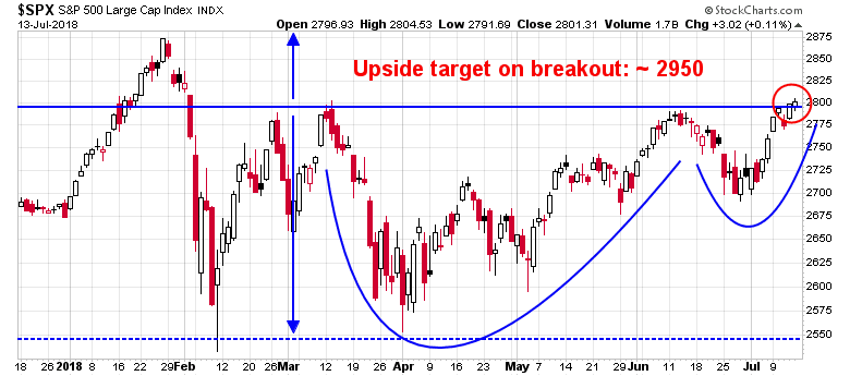
Looking to the week ahead, I can easily make both a bull and bear case. On one hand, the cup and handle breakout is still in play. Barring a pullback below the 2800 level, the upside target of 2925-2960 remains open.
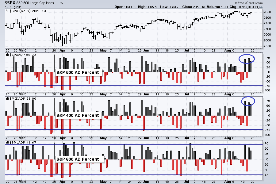
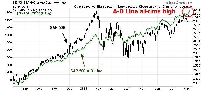
In addition, the large and mid cap advance-decline percentage readings last week are supportive of higher prices. Similar positive breadth episodes in the past six months have resolved themselves with price advances.
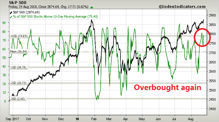
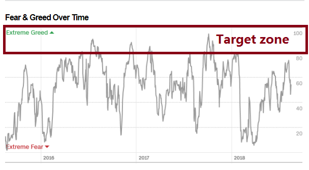
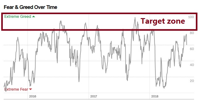
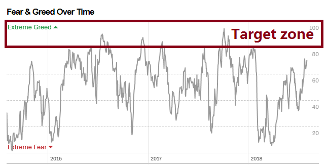
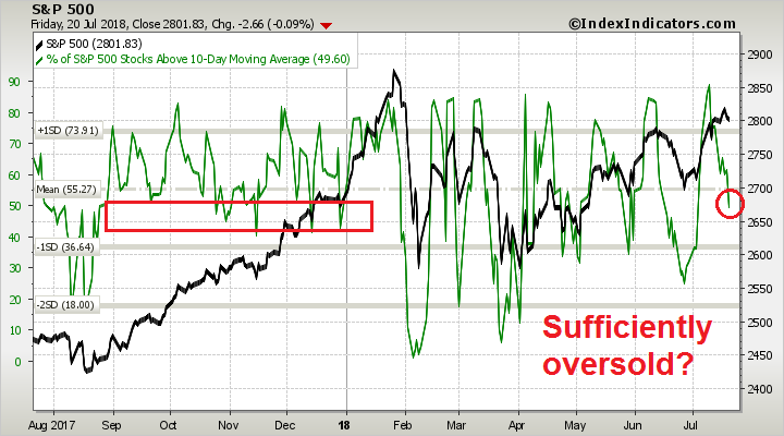
As well, the Fear and Greed Index has pulled back to neutral and it has not hit my overbought target, indicating further upside price potential. Last week’s market action highlights the jittery and headline driven nature of the market. The market was sufficiently oversold that just the hint of a further discussions in the US-China trade dispute was enough to send stock prices soaring. On the NAFTA front, the US may be on the verge of coming to a bilateral deal with Mexico next week, which has the potential to spark another risk-on rally.

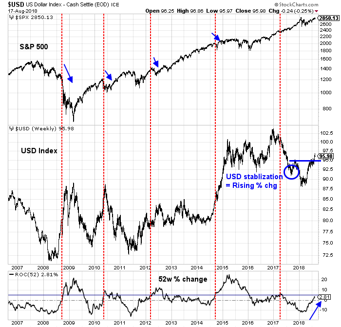
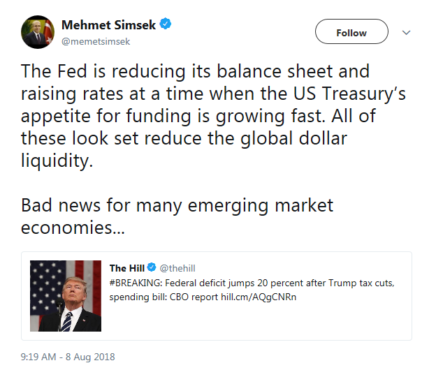
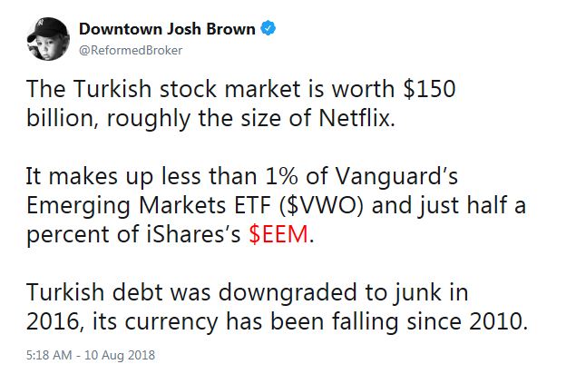
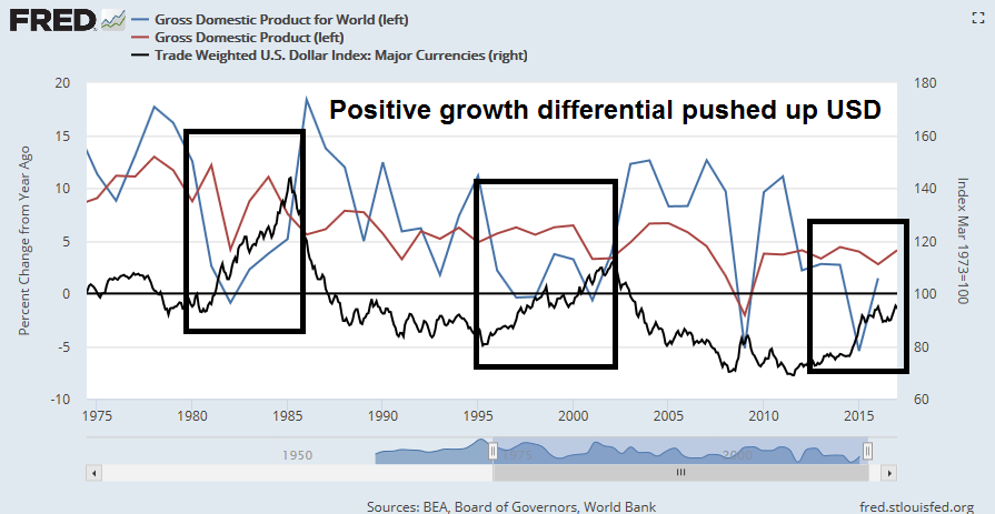
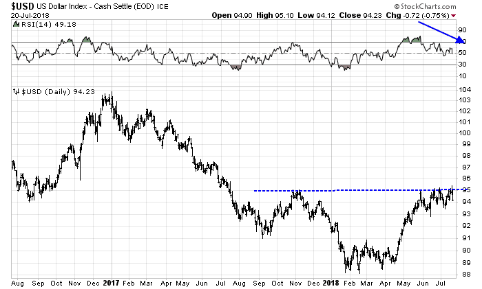
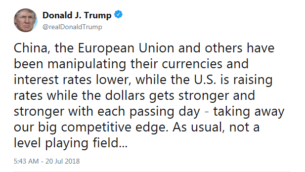
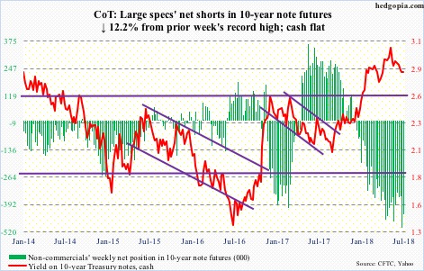
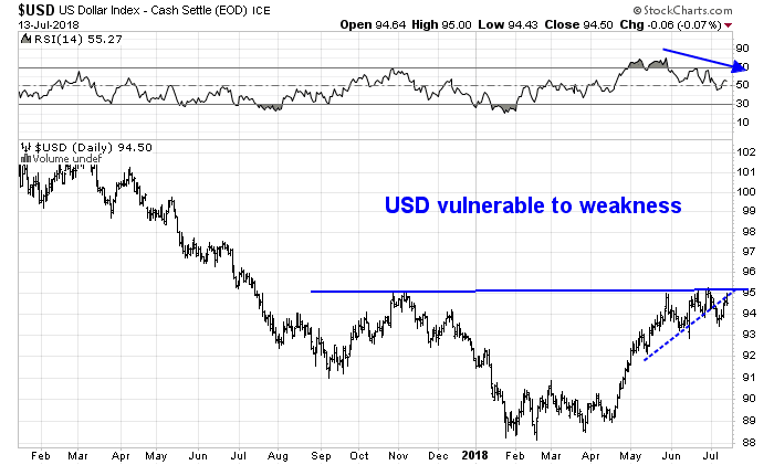
On the other hand, much depends on the fate of the USD. The historical evidence over the last 12 years shows that whenever the one-year change in the USD Index exceeds 5%, stock prices have struggled, Notwithstanding the fears caused by the Turkish Tantrum, a rising USD puts downward pressure on the Chinese yuan, and raises the risk of American accusations that China is devaluing its currency in response to tariffs. Even if the Dollar were to stabilize at these levels, the base effects of a falling exchange rate last August and September means that the one-year rate of change could easily exceed 5% in the next few weeks, which represents a danger signal for equity prices.
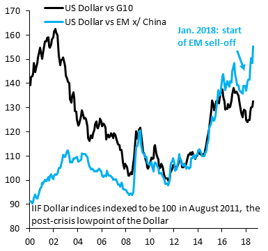
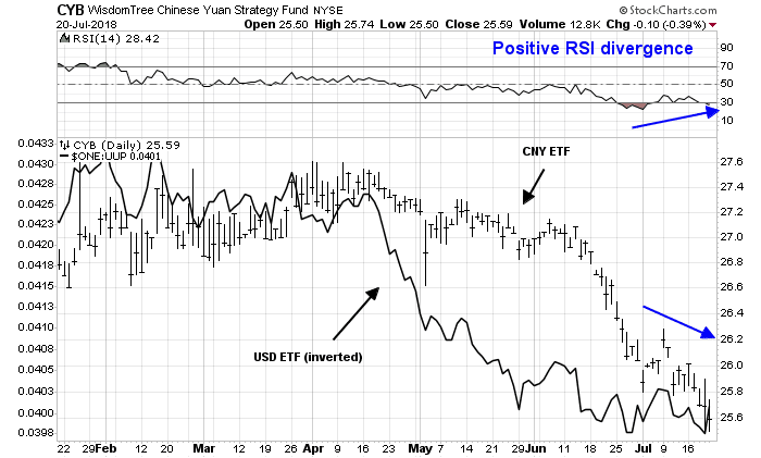
However, the USD Index doesn’t tell the entire story of currency strength. While the USD has been strong overall, its strength can be especially seen against EM currencies.
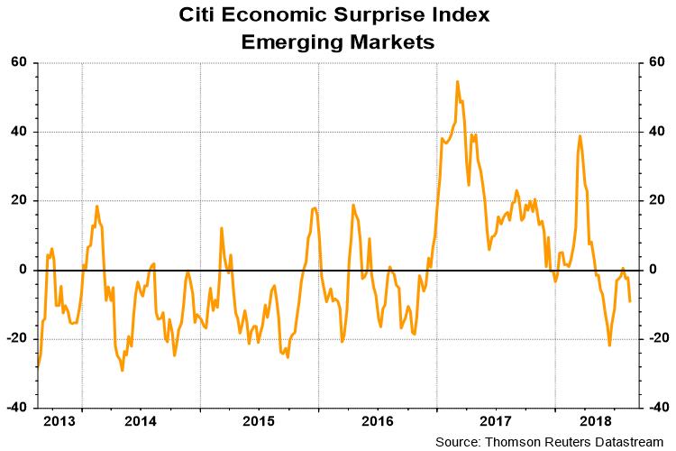
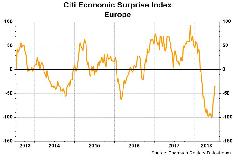
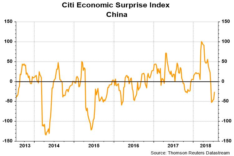
This brings up the question of whether the risk-off tone in EM is likely to continue. Notwithstanding the Turkish drama, the Citi EM Economic Surprise Index, which measures whether economic statistics are beating or missing expectations, is sliding after recently rising to the zero line. This will be something to keep an eye on.
My inner investor is de-risking his portfolio by slowly and methodically cutting back his equity exposure as prices rise. My inner trader is nervously long equities, and he is giving the bull case the benefit of the doubt.
Disclosure: Long SPXL