Preface: Explaining our market timing models
We maintain several market timing models, each with differing time horizons. The “Ultimate Market Timing Model” is a long-term market timing model based on the research outlined in our post, Building the ultimate market timing model. This model tends to generate only a handful of signals each decade.
The Trend Asset Allocation Model is an asset allocation model that applies trend following principles based on the inputs of global stock and commodity price. This model has a shorter time horizon and tends to turn over about 4-6 times a year. The performance and full details of a model portfolio based on the out-of-sample signals of the Trend Model can bsoe found here.

My inner trader uses a trading model, which is a blend of price momentum (is the Trend Model becoming more bullish, or bearish?) and overbought/oversold extremes (don’t buy if the trend is overbought, and vice versa). Subscribers receive real-time alerts of model changes, and a hypothetical trading record of the email alerts is updated weekly here. The hypothetical trading record of the trading model of the real-time alerts that began in March 2016 is shown below.

The latest signals of each model are as follows:
- Ultimate market timing model: Buy equities
- Trend Model signal: Neutral
- Trading model: Bullish
Update schedule: I generally update model readings on my site on weekends and tweet mid-week observations at @humblestudent. Subscribers receive real-time alerts of trading model changes, and a hypothetical trading record of those email alerts is shown here.
Subscribers can access the latest signal in real-time here.
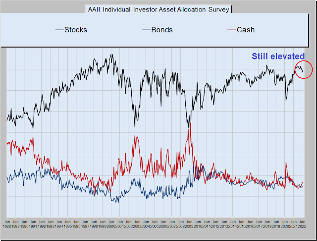
Scared enough?
Are you scared enough? The market is extremely jittery. News last week of a Russian attack that started a fire at a Ukrainian power plant sparked a risk-off episode. Further sober analysis revealed that the incident was under control and there was no radiation leak. Worries about the incident sparking a second Chernobyl disaster are overblown.
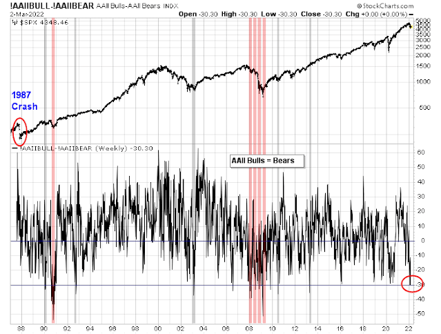
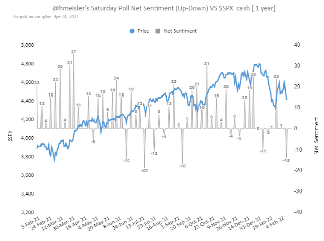
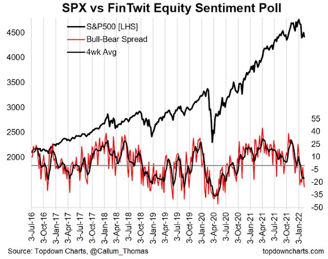
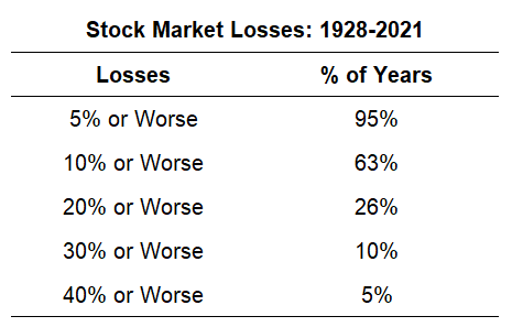
Two weeks ago, the AAII weekly sentiment survey showed the bull-bear spread had fallen to -30, but it rebounded last week to -11. Readings of -30 are rare and they have only been lower during the bear markets of 1990 and 2008 (shown in pink). These levels weren’t even seen in the wake of the Crash of 1987. In all cases, they signaled short-term bottoms.

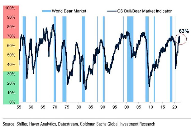
The key question for investors is whether current conditions represent a durable market bottom, or just a bear market rally.
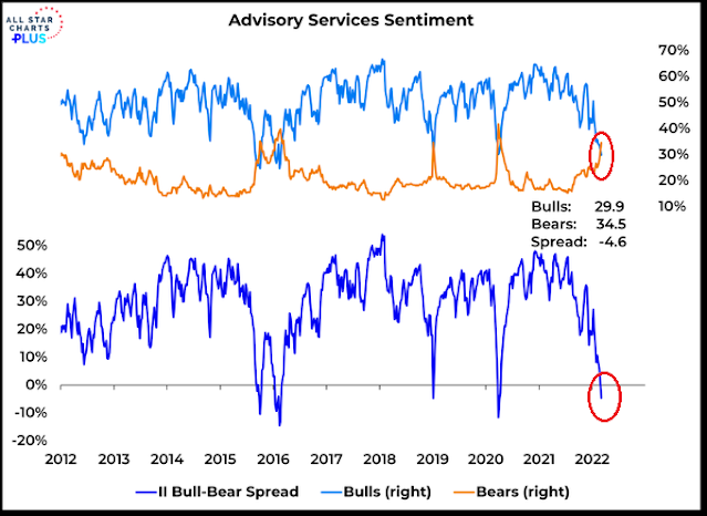
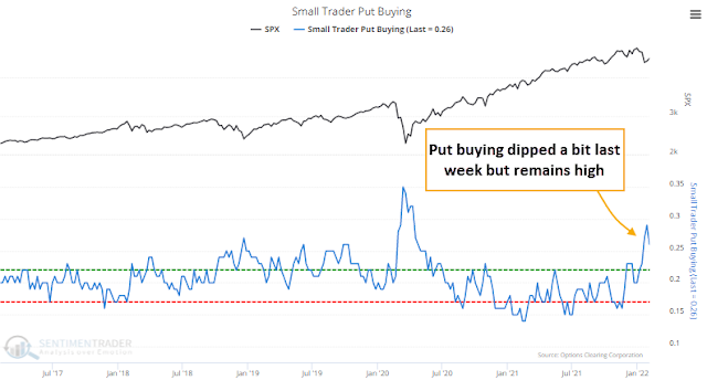
Rising fear = Bullish confirmation
The AAII buy signal is confirmed by readings from other sentiment models. The NAAIM Exposure Index, which measures the sentiment of RIAs, fell below its 26-week Bollinger Band. In the history of the NAAIM data series, such extreme conditions have been useful signals that downside risk is limited short-term and risk/reward is tilted to the upside. These buy signals, however, are not indications of a durable intermediate-term bottom, as evidenced by their behavior during the GFC bear market.

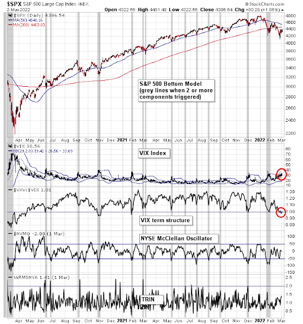
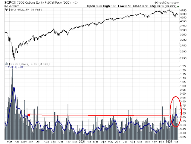
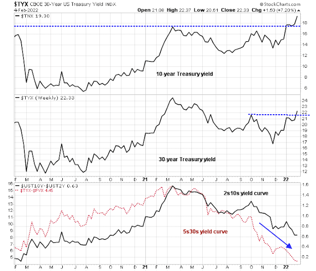
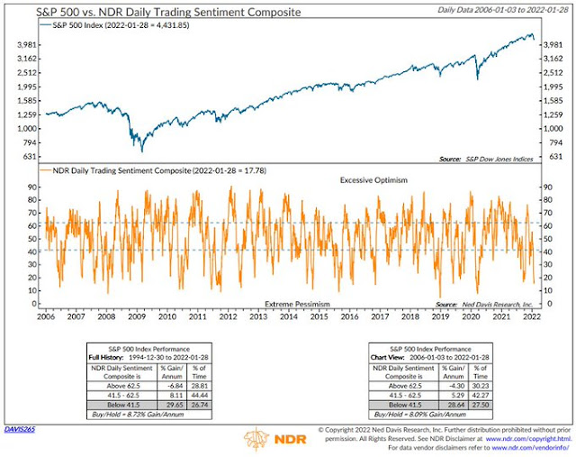
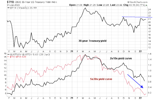
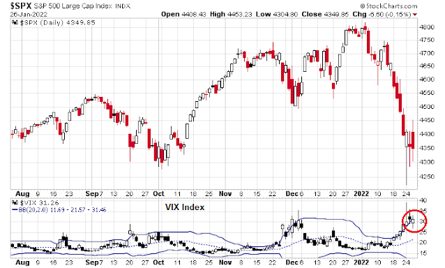
I could write about the elevated level of the VIX Index as an indication of market anxiety. Instead, I would point out that the MOVE Index, which measures the implied volatility of the bond market, is also high. For some context, a reading of 120 on MOVE implies a daily change of 7.5 bps every day for the next 30 days.

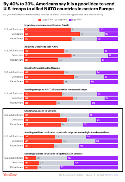
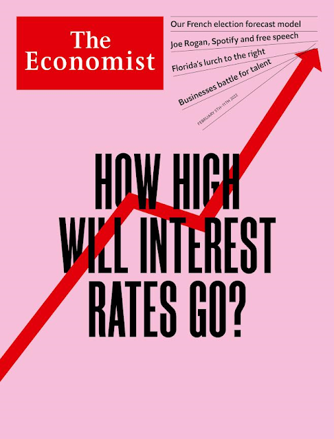
As well, does this cover from the Economist represent the peak of war hysteria, which would be a contrarian magazine cover indicator? Asking for a friend (see Wars are equity bullish, but there’s a catch).

Lastly, Mark Hulbert recently published a Marketwatch article, “The end (of the stock market correction) may be near”.
The end of the stock market’s correction may be near.
That’s because I just received an email from a prominent money manager declaring that “buy and hold is dead.” Like the first robin of spring heralding warmer weather around the corner, emails such as this one are a contrarian signal that the tide is about to turn.
That’s because the relative popularities of market timing and buying-and-holding follow a fairly predictable cycle. Buying and holding will be at its most popular at market tops and least popular at bottoms. Just the reverse will be the case for market timing.
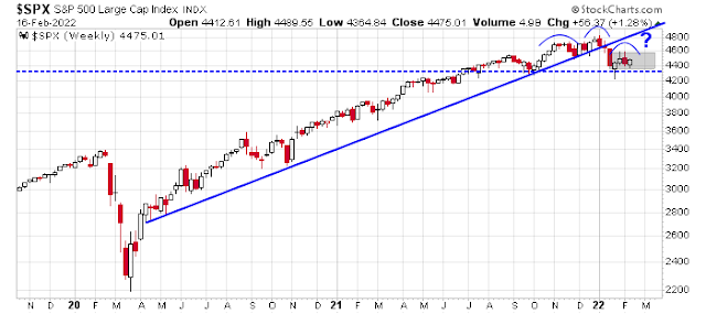
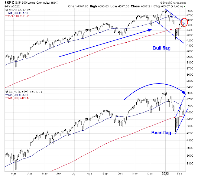
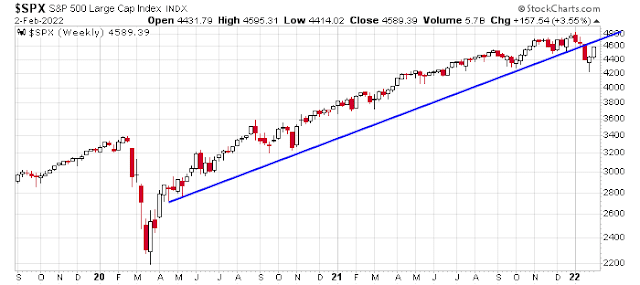
A bear market rally
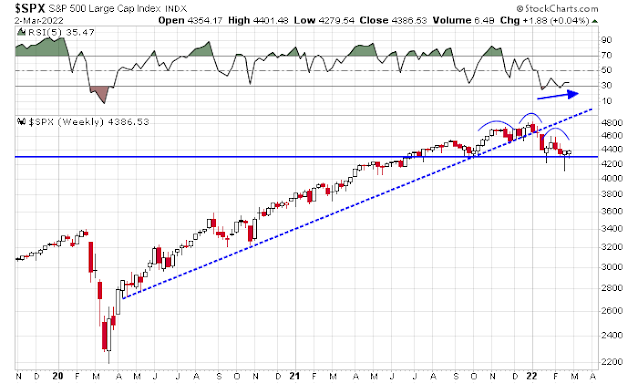
Sentiment model readings aside, I would argue that the intermediate-term trend is still down, but the stock market is poised for a bear market rally. I had highlighted the sell signal flashed by the negative RSI divergence by the Wilshire 3000. Such signals have led to significant drawdowns in the past.

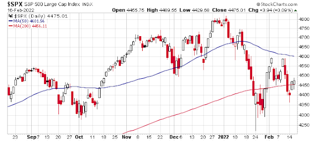
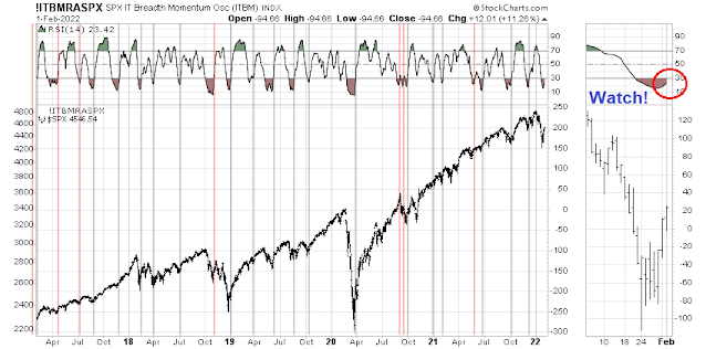
I also pointed out in the past the S&P 500 underwent a “good overbought” rally off the March 2020 bottom, as shown by the percentage of stocks above their 200 dma rising to 90% on a persistent basis (top panel). The momentum of that advance faded in mid-2021 when the indicator fell below 90%. There have been four similar episodes of “good overbought” rallies in the last 20 years. All of them did not end until the percentage of stocks above their 50 dma fell below 20% (bottom panel). That condition has not occurred yet.

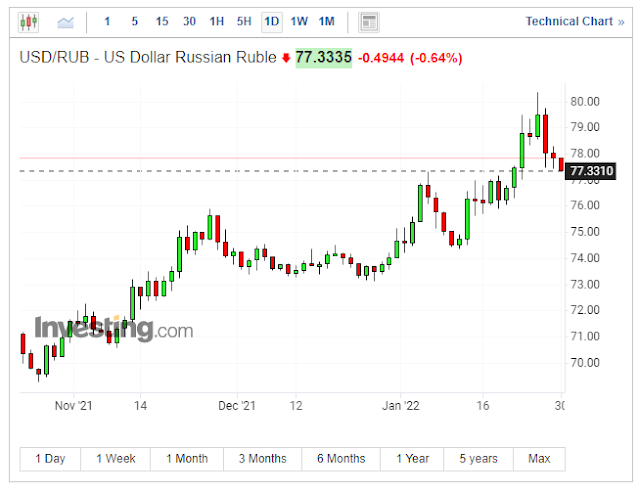
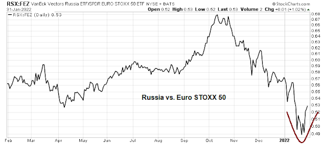
Here’s another reason why I am bearish. The Russian ETF RSX is trading at $5.65. Notwithstanding the fact that the Ruble has crashed, the underlying stocks in Moscow are halted, though the ETF holds GDRs which do trade in London, the last reported NAV is $0.89! There’s still too much bullishness.

Poised for a rally
In the short run, the S&P 500 is poised for a counter-trend relief rally. The stock/bond ratio exhibited a series of positive RSI divergences, which is constructive.

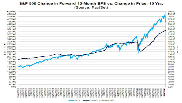
Fundamental momentum is supportive of an advance and, at a minimum, should put a floor on stock prices. Forward 12-month EPS estimates are still rising and there is no signs of earnings estimates declines that have accompanied past market downdrafts.

In conclusion, the stock market is poised for a counter-trend relief rally in the context of an intermediate-term downtrend. Investment-oriented accounts should stay cautious and take advantage of any market strength to reduce equity weights. Traders can position for the rally, which is often brief but violent in bear markets.
Disclosure: Long TQQQ