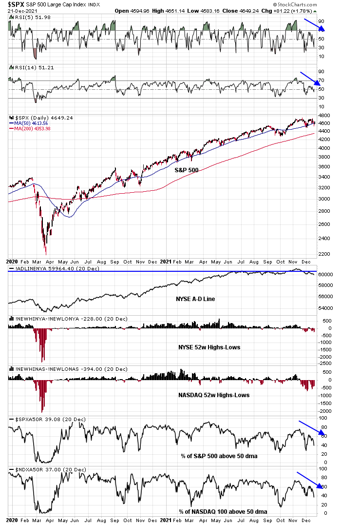
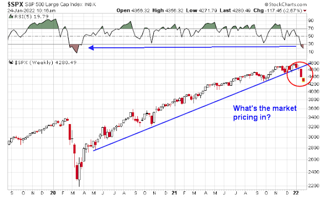
As the stock market looks forward to another exciting week of volatility, the technical damage suffered by the market is quite severe. Nevertheless, investors need to take a deep breath and ask, “What’s the market pricing in?”
The three major factors I consider in my analysis are:
- Earnings and valuation;
- Fed policy; and
- Geopolitical risk.
A valuation reset?
As we proceed through Q4 earnings season, the market hasn’t mostly reacted well to earnings announcements, headlined by the -20% air pocket suffered by Netflix. Nevertheless, the macro summary from The Transcript, which monitors earnings calls, is relatively benign.
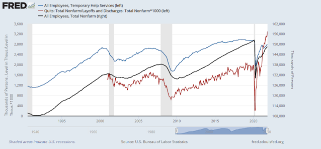
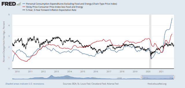
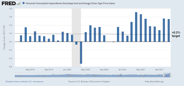
Omicron continues to sweep through the US and it’s causing some disruptions, but consumer spending continues to be strong. Inflation is also strong and inflation expectations are rising. The Fed is expected to raise rates four times this year and that is spooking investors.
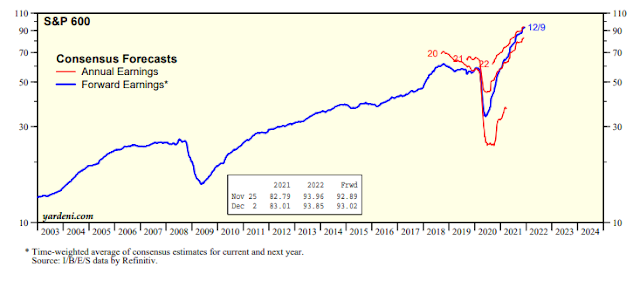
Forward earnings estimates have been steadily rising across all market cap bands.
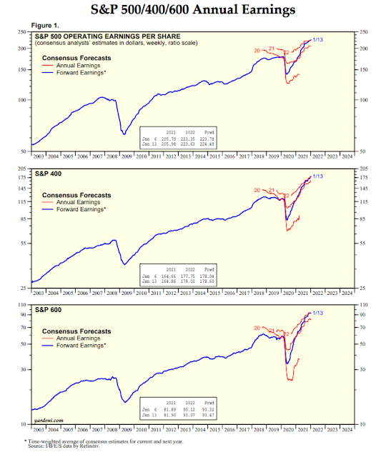
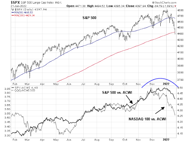
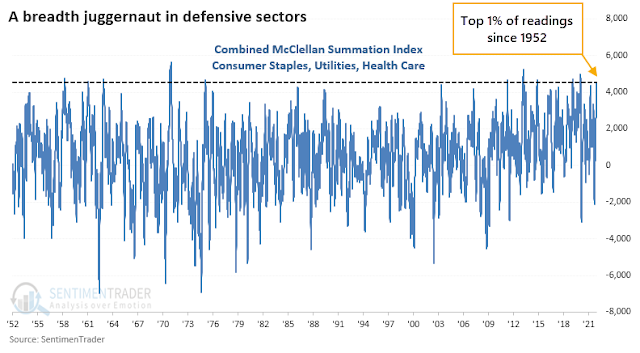
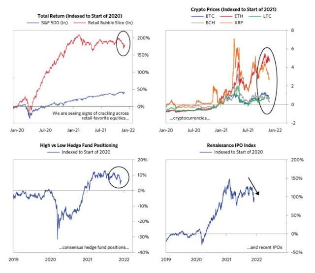
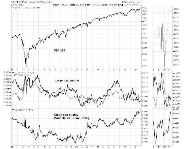
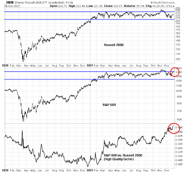
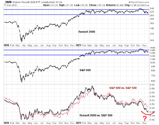
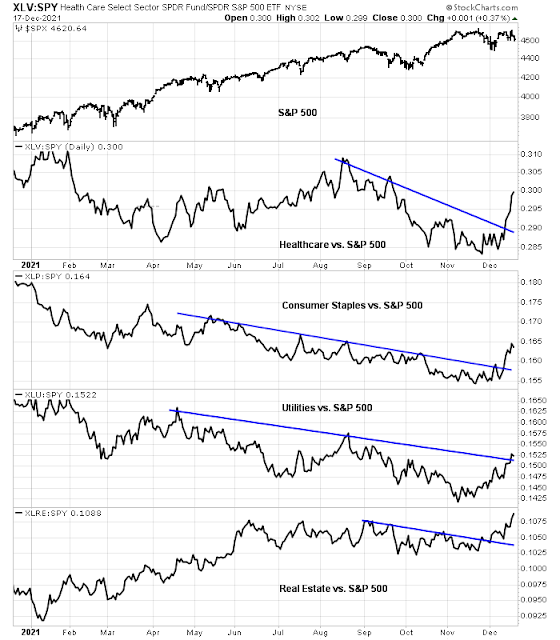
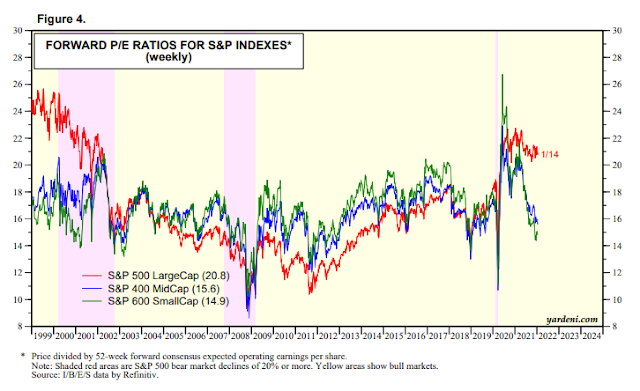
As stock prices pulled back, stock prices are undergoing a valuation reset. While all eyes have been on the large-cap S&P 500, the valuation reset has been evident in mid and small-cap stocks,
I can make two observations from this analysis. Valuation resets are a feature and not a bug of mid-cycle expansions (see How small caps are foreshadowing the 2022 market). As well, the forward P/E for the S&P 400 and S&P 600 are arguably quite attractive relative to their own history.
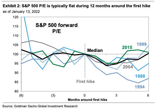
Goldman Sachs studied the history of S&P 500 forward P/E ratio around the time of the first Fed rate hike. It found that forward P/E is typically flat ahead of the first rate hike and then falls afterwards. Equity price gains are dependent on the evolution of forward EPS estimates, which have been rising so far.
While major earnings misses like the one suffered by Netflix have received the headlines, FactSet reported that the 5-year average EPS beat rate is 76% and the average sales beat rate is 68%. As more companies report in the coming weeks, the market will react on a daily basis to reports and there should be more better reactions than the Netflix debacle.
In light of the recent market weakness, earnings expectations may have become too low/
How hawkish will the Fed be?
A potential major market event will be the FOMC meeting on Wednesday. While no interest rate changes are expected, both the FOMC statement and Powell’s subsequent press conference remarks will be closely scrutinized to the direction of Fed policy. (The Bank of Canada will also announce its interest rate decision Wednesday and it is expected to chart a more hawkish course by raising rates, but that won’t be the same global market-moving implications as the Fed announcement.)
Recent Fedspeak has made it clear that there are no doves left on the FOMC. How hawkish will the Fed be?
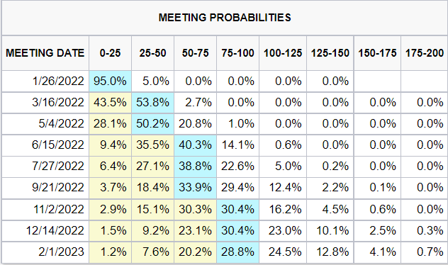
Market expectations for the rate hike path is already very hawkish. Fed Funds futures are discounting five rate hikes this year, with liftoff in March.

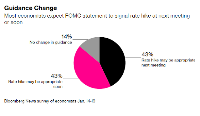
Bloomberg recently conducted a survey of economists and here’s what they said. While no rate announcement is expected at the January meeting, most expect a signal of a rate hike. Respondents were split between the language of whether the Fed would explicitly signal a March rate hike or a rate hike “soon”.
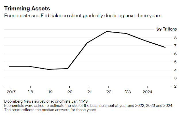
As for the Fed’s balance sheet, survey respondents expect quantitative tightening to begin in the April to June period.
Economists expect the runoff of maturing securities to commence this year, with 29% looking for a start from April to June and 40% expecting July to September. The median economist estimate looked for monthly reductions between $40 billion and $59.9 billion. The runoff would bring the size of the balance sheet down to $8.5 trillion at the end of this year and $7.6 trillion at the end of 2023, still far above pre-pandemic levels.
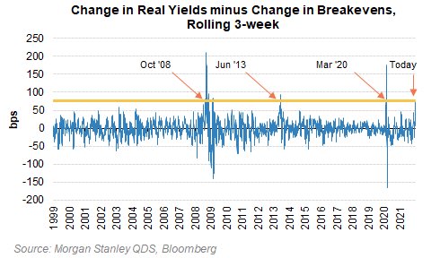
In short, market expectations are already very hawkish. While the Fed is set on a course of tightening monetary policy, it may have to exceed hawkish expectations to spark a further risk-off episode. Morgan Stanley recently highlighted analysis which showed 10 year real yields are up by over 50 bps in the last three weeks, while 10-year breakevens are down by more than 25 bps. This is an event that has only happened before at or near major market bottoms, in October 2008, March 2009, June 2013, and March 2020.
The drumbeats of war?
The headlines from Ukraine are alarming. The White House warned that an invasion could happen at any time, but there will be dire consequences for Russia if it undertakes military action. The US ordered the evacuation of families of embassy staff from the Kyiv mission. The UK has also withdrawn some embassy staff. Germany will help embassy staff family leave Ukraine.
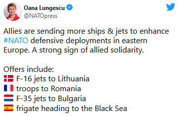
British intelligence accused the Russians of hatching a plot to install Ukrainian parliamentarian Yevgeniy Murayev to be the leader of a Russian-friendly government in Kyiv. Russia has accused Ukraine of building up forces on the border of Donbas, a separtist region, and called the threat of a Ukrainian invasion very high. The US is considering sending troops to eastern Europe and various other NATO members are mobiling and sending military assets to the region.
Even as the drumbeats of war sound, the tail-risk of an immediate invasion may be receding. While the Blinken-Lavrov meeting in Geneva broke up last Friday with no breakthrough, both sides agreed to continue a dialogue next week and there is the possibility of a direct Biden-Putin meeting in February. As well, the back channels are active on all fronts. Reuters reported that political advisers from Russia, Ukraine, France, and Germany will hold talks on Ukraine in Paris on January 25. If they’re talking, there will be no invasion, at least for now.
Moreover, a Bloomberg article speculated that the Beijing Olympics may restrain Putin’s maneuvering room in an invasion.
As the U.S. and Europe mount increasingly frantic efforts to deter Russia from any invasion of Ukraine, it’s Chinese President Xi Jinping who may have the biggest influence on Vladimir Putin’s timetable.The Russian president has said he will join Xi at the opening ceremony Feb. 4 of the Beijing Winter Olympics, where the Chinese leader has lavished billions of dollars to showcase his nation’s superpower status to the world.
The last thing Xi needs is for Putin to overshadow China’s big moment by triggering a global security crisis with the U.S. and Europe. That’s especially the case given Xi is looking to bolster his prestige at home as he seeks endorsement for an unprecedented third term later this year.
Xi called Putin an “old friend” when they chatted in mid December, while the Russian leader hailed what he said was a “responsible joint approach to solving urgent global issues.”
But kicking off an invasion of Ukraine in the middle of Xi’s Olympic moment would throw a wrench into such warmth, and risk drawing China into the diplomatic fray. It’s possible Xi asked Putin in their recent call not to invade Ukraine during the Games, according to one diplomat in Beijing who asked not to be identified talking about such scenarios. Putin has repeatedly denied he currently intends to attack Ukraine.
While an immediate invasion is always possible, the more likely time frame is mid or late February. The closing date of the Beijing games is February 20.
Putin and China have been here before. Russia’s 2008 war with Georgia erupted on the day of the opening ceremony of the Beijing Summer Olympics, to the chagrin of Chinese leaders, prompting Putin to fly home to direct military operations.
Days after Putin hosted the closing ceremony of the 2014 Winter Olympics in Sochi, on which he’d spent a record $50 billion to stage the Games, Russian forces began their operation to annex Crimea from Ukraine.
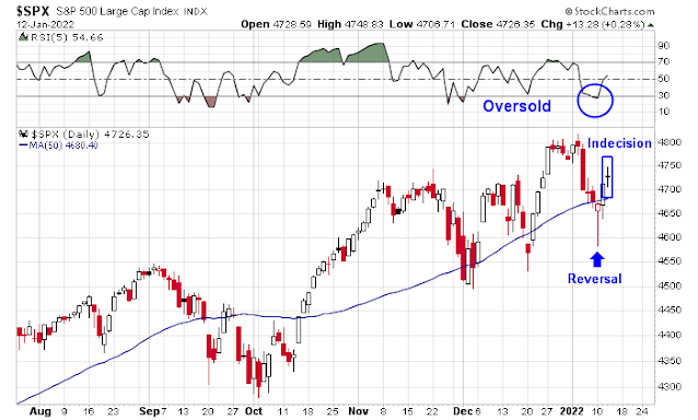
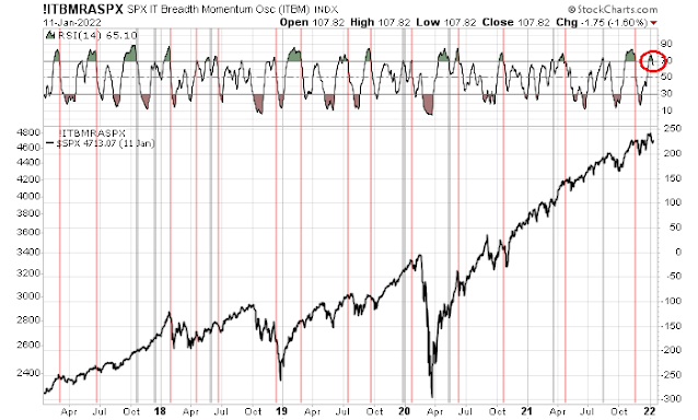
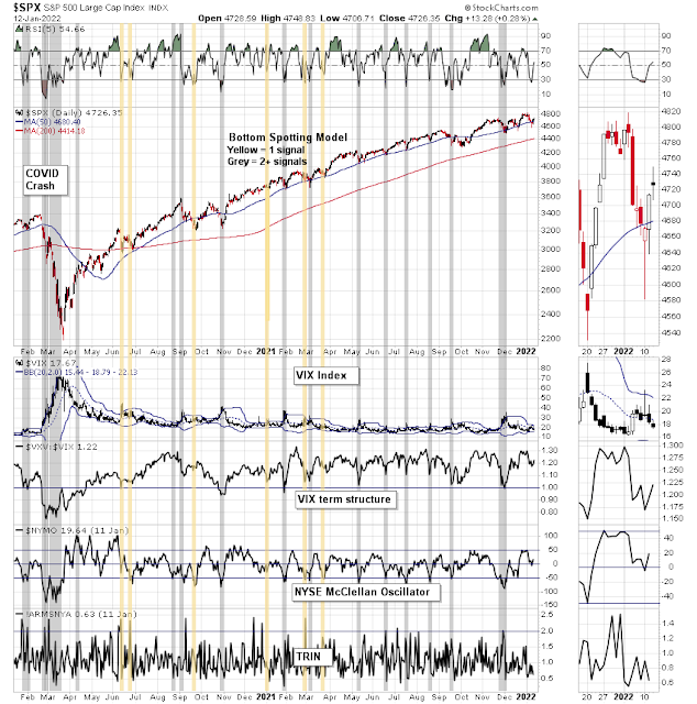
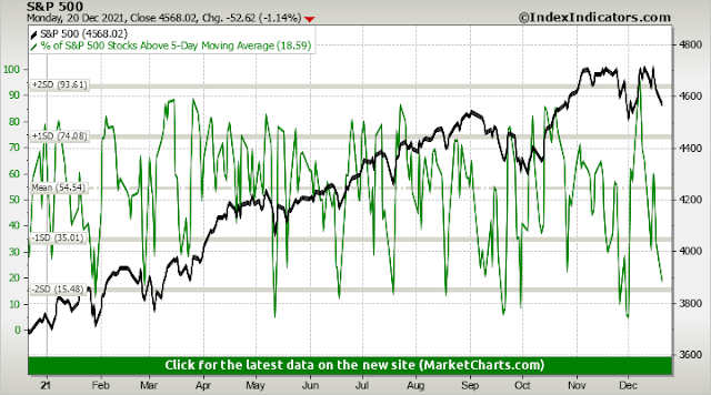
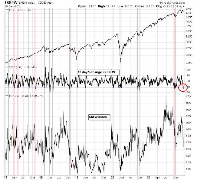
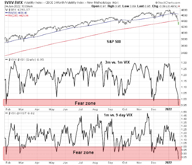
During moment of crisis, even developments that appear to kick the can down the road, such as a Biden-Putin meeting in February or the staging of an Olympic games that delay the onset of conflict, can spark a risk-on episode. Today’s market action where everything is falling except for safe haven assets has the hallmark of a panic liquidation event. The term structure of the VIX has fully inverted, which is another indication of high anxiety.
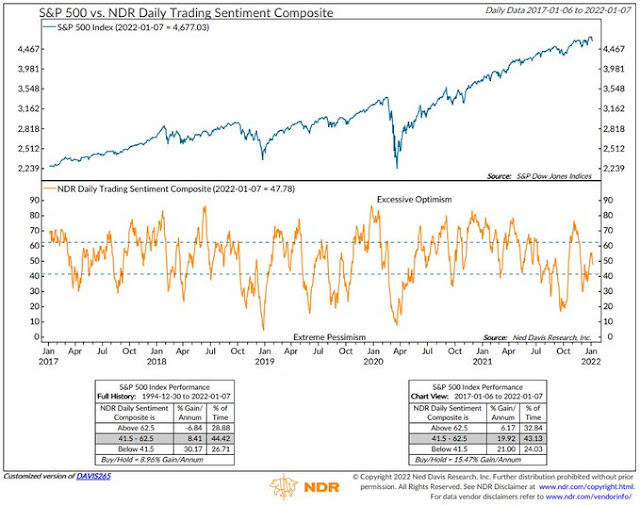
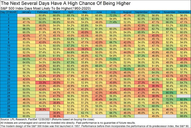
In conclusion, the balance of short-term risks is tilted to the upside. Expectations have been ratcheted down too much and the chances of positive surprises from earnings season, Fed policy, and Ukrainian developments appear to be higher than what’s in the price. Being bearish here amounts to betting on outcomes of catastrophic proportions. While that’s not impossible, the odds of rip your face off rally in light of the market’s severely oversold condition are high.
However, intermediate-term challenges remain. Technical conditions are deteriorating and the macro backdrop of a mid-cycle expansion will be headwinds for risk assets. I continue to expect stock prices to chart a choppy to down course for the first half of 2022. The recent lows set by the S&P 500 may not be the ultimate low of the latest downdraft.
Disclosure: Long SPXL