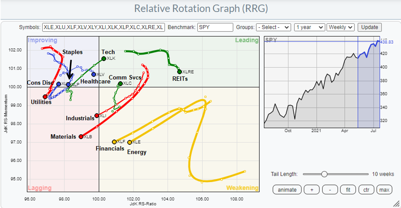
It`s time for another periodic review of sector leadership. For the purposes of analyzing changes in leadership, I use the Relative Rotation Graphs, or RRG charts, as the primary tool for the analysis of sector and style leadership. As an explanation, RRG charts are a way of depicting the changes in leadership in different groups, such as sectors, countries or regions, or market factors. The charts are organized into four quadrants. The typical group rotation pattern occurs in a clockwise fashion. Leading groups (top right) deteriorate to weakening groups (bottom right), which then rotates to lagging groups (bottom left), which changes to improving groups (top left), and finally completes the cycle by improving to leading groups (top right) again.
The latest RRG chart shows growth sectors (technology, communication services) and selected defensive sectors (consumer staples, healthcare, REITs) in the top half of the chart, indicating leadership positions. Value and cyclical sectors are the laggards in the bottom half.
While the RRG snapshot is technically correct. A more detailed factor and sector review reveal a more nuanced picture of the market`s leadership evolution.
A reversal of a reversal
The year 2020 marked a dramatic reversal in factor leadership of the Big Three: US over global stocks, growth over value, and large-caps over small-caps (dotted lines). The reversal accelerated last November on Vaccine Monday when Pfizer announced the success of its vaccine. In early 2021, the factor reversal reversed itself. US equities have reasserted their leadership position and staged an upside breakout against the MSCI All-Country World Index (ACWI). Value has struggled against growth, and small-caps have lagged large-caps.
Keep these factor reversals in mind as I conduct my sector leadership review.
Sector review
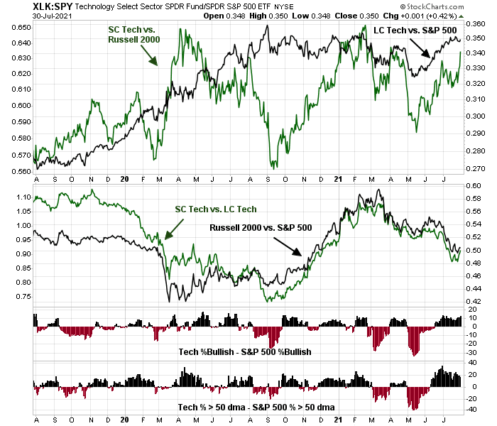
I begin my review with the technology sector, which is the largest in the S&P 500, and the large growth stock sector. The framework for my sector review is an analysis of the relative performance of sector performance by market cap. The top panel shows the relative performance of large-cap technology against the S&P 500 (black line) and the relative performance of small-cap technology against the Russell 2000 (green line). This is meant to be an apples-to-apples comparison by market cap. The middle panel shows the relative performance of the small-cap technology to large-cap technology (green line) and the Russell 2000 to S&P 500 (black line) as a frame of reference. The bottom two panels show the market breadth of the large-cap technology sector by measuring the differences in the percentage of stocks bullish on point and figure charts between technology and the S&P 500, and the difference in the percentage of stocks above their 50-day moving averages between technology and the S&P 500.
Based on this analysis, we can see that the technology sector has been improving steadily in relative performance in both large and small-cap since mid-May, as shown by the top panel and the bottom two breadth charts. However, there is no discernible difference in market cap effect as the relative performance of small-cap technology to large-cap technology has tracked the relative performance of the Russell 2000 to S&P 500.
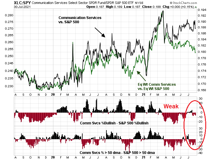
The communication services sector has no small-cap stocks. I use the relative returns of the equal-weighted sector to the equal-weighted S&P 500 as a substitute (green line). Despite the recent strength of growth stocks, the market internals of communication services is disappointing. Both the equal-weighted relative returns and breadth indicators show a picture of relative weakness.
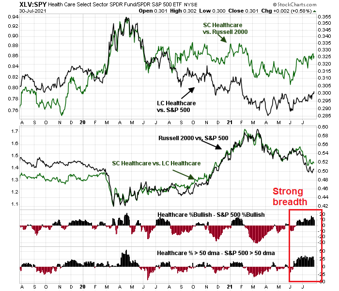
Even as the S&P 500 advanced to fresh all-time highs, the defensive sectors have been showing a surprising level of relative strength. The largest defensive sector by weight is healthcare. Both large and small-cap healthcare made relative strength bottoms during the April/May period, though the improvement was evident earlier based on the breadth indicators. However, the relative performance of small-cap to large-cap healthcare has tracked the size factor, indicating no relative leadership in small-cap healthcare.
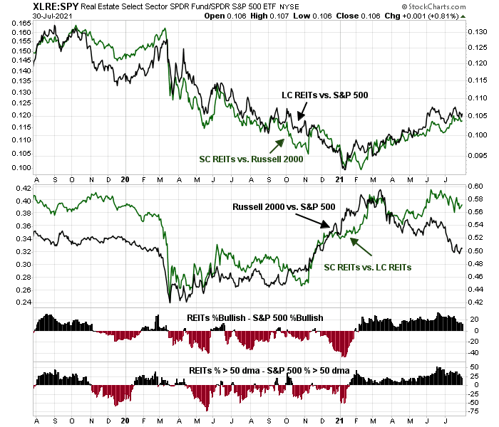
The REIT sector is another defensive sector exhibiting relative strength. Both large and small-cap REITs made a relative bottom in January, which was earlier than healthcare. Small-cap REITs are showing better leadership than their large-cap counterparts.
The relative strength of large-cap utilities (top panel, black line) appears to be trying to make a double bottom. Small-cap utilities (top panel, green line) had already exhibited a relative bottom in the December/January period and small-cap utilities are beating large caps. The improvement in breadth began in March, though there was a brief stumble in late June.
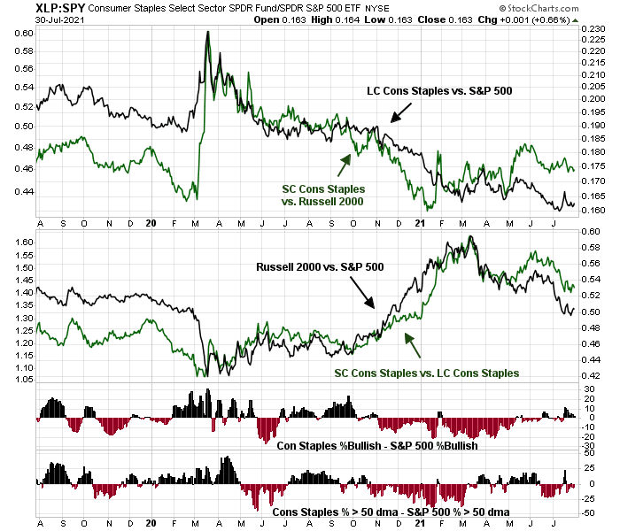
Consumer staples is the weakest of the defensive sectors. Both large and small caps are trying to make relative strength bottoms.
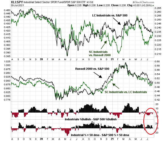
The RRG chart showed that the cyclical and value sectors are laggards. Of all the sectors in this group, industrial stocks show the most promise. While large-caps remain in a relative downtrend, small-caps are turning up. As well, large-cap breadth indicators are showing signs of improvement.
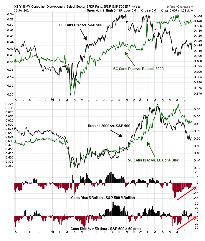
The float-weighted consumer discretionary sector is dominated by the presence of Amazon and Tesla, which gives the sector a growth tilt, and its relative performance (top panel, black line) is flat to down in 2021. However, the equal-weighted and small-cap consumer discretionary sector is more cyclically oriented. and they are performing better than their float-weighted growth counterparts. In addition, relative breadth indicators are showing early signs of a turnaround.
The rest of the cyclical and value sectors are weak. The largest sector is made up of financial stocks, and both large and small-caps are lagging compared to the S&P 500.
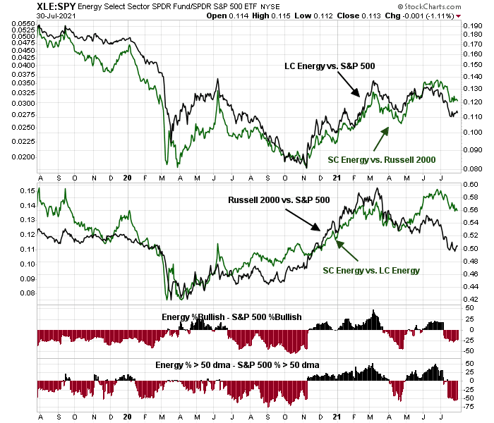
Energy stocks are also weak, but they may be trying to put in a relative bottom. The relative returns of small to large-cap energy (middle panel, green line) is performing better than the Russell 2000, which is a possible hopeful sign for value and energy bulls.
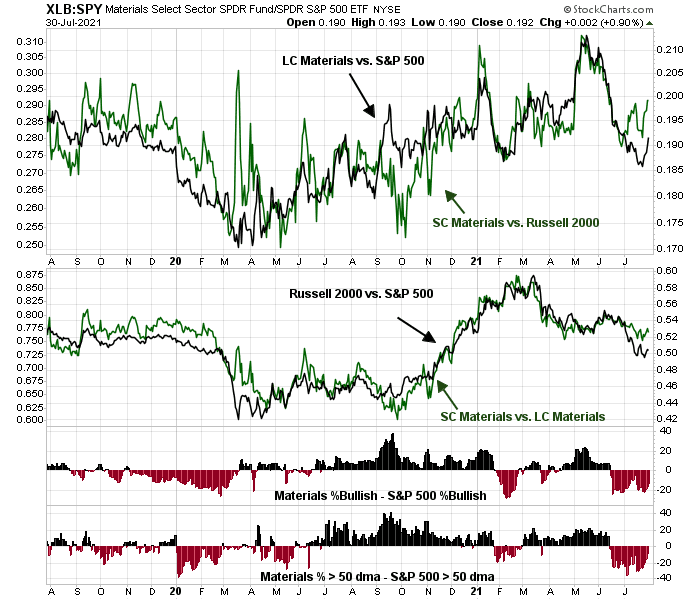
Finally, the relative performance of material stocks is highly volatile, but both large and small caps have been tanking since early June.
The evolution of sector leadership
How should investors interpret these sector leadership patterns? Defensive sectors have been exhibiting strength, which is normally a cautionary signal for stock prices. On the other hand, the relative performance of defensive sectors remains mixed, on the whole.
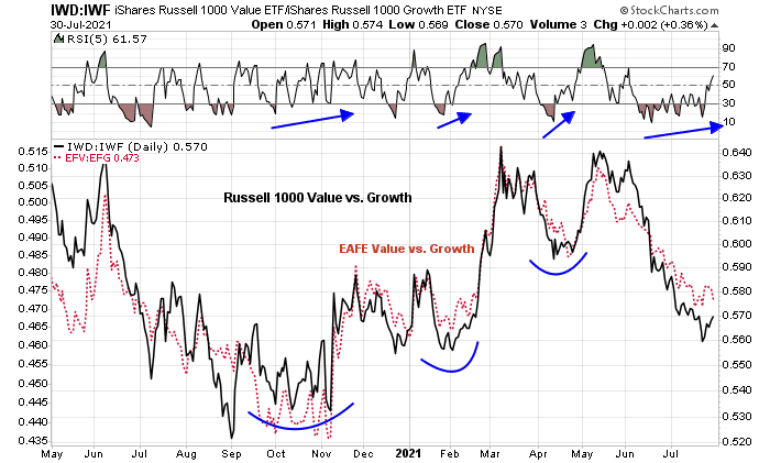
Cyclical and value sectors have been lagging growth stocks, but both the value/growth ratio is exhibiting a series of positive RSI divergences. Don’t count the cyclicals out just yet.
As an illustration of the wide divergences between sectors, this chart of the percentage of stocks above their 50 dma tells the story. The dark line shows the percentage of S&P 500 stocks above their 50 dma at 59%. The leaders are healthcare (81%) and technology (76%). The laggard is energy which recently had no stocks above their 50 dma.

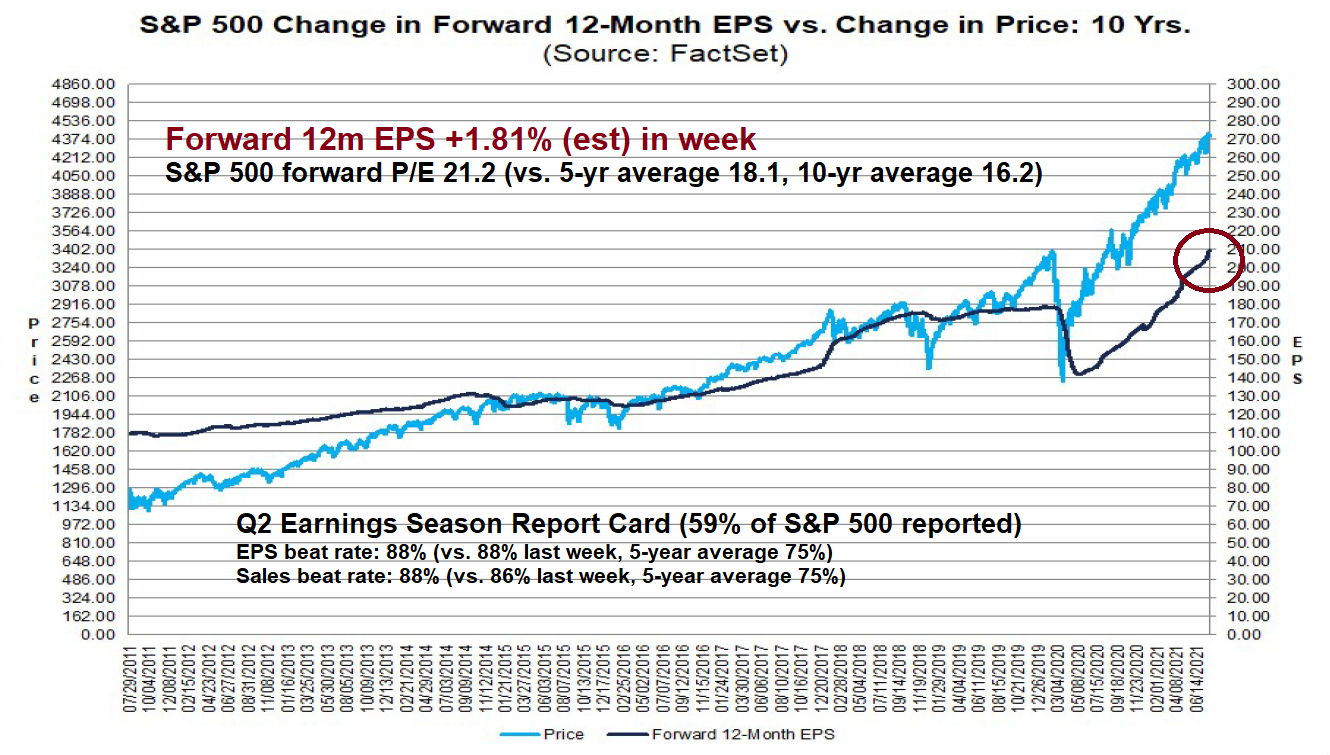
In addition, the US value/growth ratio is highly correlated to the EAFE value/growth ratio. As the US markets have more growth characteristics, the renewal of US equity leadership can be explained partially by a revival in growth stocks. How long can growth dominance continue? The latest update from Q2 earnings season shows an astounding EPS beat rate of 88% and forward EPS estimates are rising strongly. Keep in mind that my estimate of a 1.81% positive revision in forward EPS means that, unless the S&P 500 were to rise 1.81%, forward P/E would decline. Such a display of earnings beats and positive revisions should create tailwinds for cyclical and value stocks.
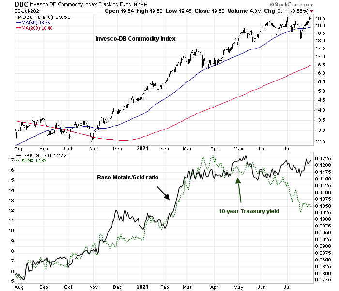
Other cyclical indicators, such as commodity prices and the base metals/gold ratio, are flat to up.
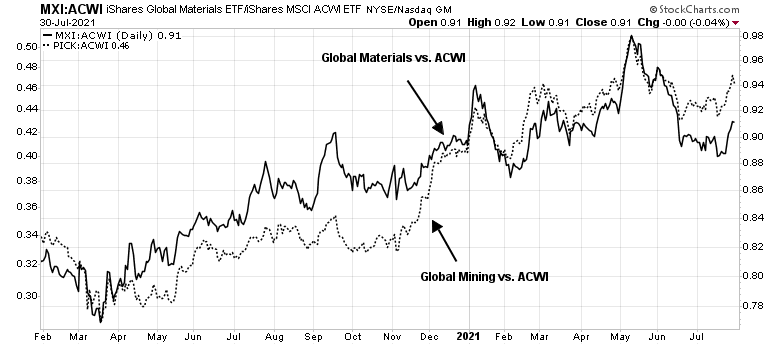
While the relative performance of US materials are weak, the relative performance of global materials and mining stocks is showing some signs of life.
I interpret these conditions as neither bullish nor bearish, but the story of balanced leadership. The high beta components of the S&P 500, growth and value, have been undergoing an internal rotation. As the economy shifted from an early cycle recovery to a mid-cycle expansion (see
How to navigate the mid-cycle expansion), market jitters over stalling global growth have risen. As a consequence, investors have rotated from the cyclical and reflation trade back into growth as growth stocks become more valuable when economic growth is scarce. At the same time, the stock market has also been supported by defensive sectors such as healthcare and real estate. Currently, value is showing some signs of early strength, but a turn in the value/growth relationship hasn’t been confirmed.
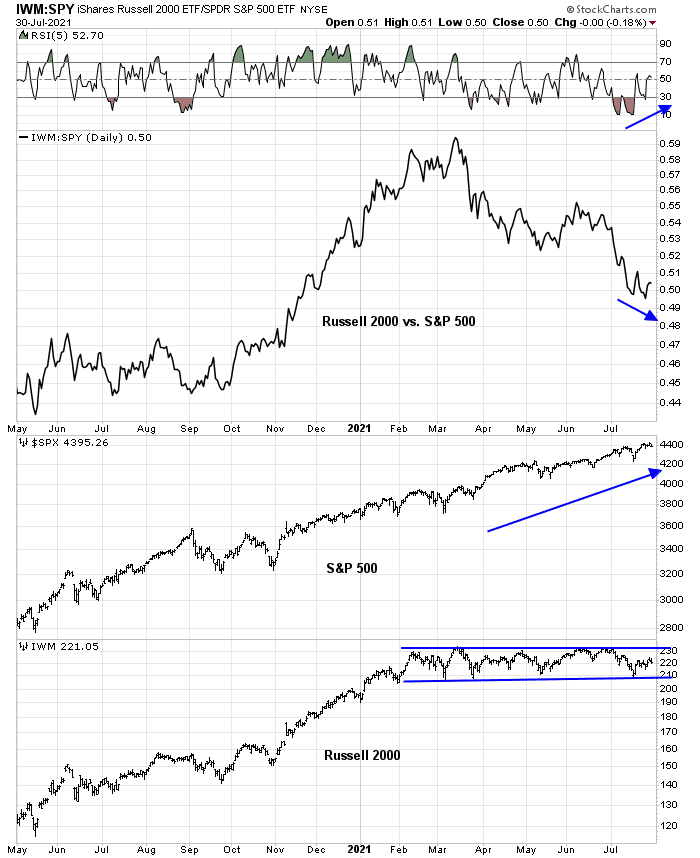
My base case scenario calls for a choppy range-bound market until the cyclical and reflation trade theme retakes market leadership. If the stock market were to definitively turn upwards, leadership may have to come from high beta small-cap stocks. Keep an eye on the relative performance of small to large caps, which is already exhibiting a positive RSI divergence. Even as the S&P 500 rises steadily, the Russell 2000 has been range-bound. The signs that the bulls have taken control of the tape would be an upside breakout by the Russell 2000 and leadership by small-cap stocks.


I suppose, S&P 500 may rise to 4600 by year end (short term volatility, this quarter expected), if one were to disregard the sector information.
This is an excellent analysis of sector momentum looking back quite a long time in today’s manic investor world. I do watch sectors on a six month momentum lookback but I have refined my momentum-style strategy by rebasing prices to start at intermediate market lows. This immediately reveals if sector and country leadership has changed or not.
The last intermediate low was July 19 as confirmed by many Sentimentrader.com and RecessionAlert indicators. Since then, leadership has shifted to Value and Resource Value. Innovative Growth is doing badly while Equal Weight Growth is doing fine. This is key. Before when Value surged, Growth fell. Now, Value is surging and EW Growth is doing okay. In all sectors, Equal Weight is doing better than Market Cap Weighted. This shows a very positive broadening of the stock market gains. This positive phenomena was very evident coming off the Vaccine Day Value turnaround in November.
I had expected earnings season to ignite a new upleg in markets and it is starting. Some of these deep value stocks are trading at 5-8 times earnings. For example, Home Construction companies have reported huge earnings and willingly have reduced their new building starts due to supply concerns. The day after they reported this, stocks crashed 4% and then when people realized housing demand was extremely strong and the disruptions going away will lead to future prosperity, the stocks have been surging higher every day. Powell amazingly said the $40 Billion a month buying mortgages would be tapered EQUALLY with the other $80 Billion tells us that this high octane low interest rate world for housing will be with us for a long time.
I mention Home Construction as a way of saying, investors are showing willingness to look past any current economic worries (Variants, Input Costs, Wages) for economically sensitive Value companies and see a bright economic and profitable future as the Fed keeps it’s monetary foot solidly on the gas pedal. Value has a strong earnings path ahead.
The thing holding back the market since the May low when Growth took off, was Value lagging, hell no, it was falling. Now Value is joining the party and we are seeing broad participation (Equal Weight doing great). If the Russell 2000 goes up 20% by yearend that chart up these could look like a broad basing intermediate pattern after surging from the 2020 lows, rather than a topping structure.
Another key to sparking my U.S. FOMO surge is the global scene. From the July 19 rebase point China and EVERY sector and country in the Far East region is basically crashing. Chinese policies are the reason and they tried to quell the fallout with a conference call with global investing powerhouses (you know the names). My guess is that they are saying Bull Shit and voting with their selling. Even Cathy Wood is selling Chinese Tech. This means more dollars for American stocks where capitalism is safer than anywhere (some think too safe). I would not touch a Chinese stock with a ten foot chopstick. It may be delisted. Please note that the Lithium ETF LIT is half in Chinese battery stocks.
Ken,
Thanks again for sharing your insights. Much appreciated.
We are entering into a seasonally weak period (Aug-Sep). Does this bull continue unimpeded, or do we get a correction?
I hope Cam also address this in tomorrow’s missive.
Thanks much!
American capital markets are the paradise for fraudsters. Rampant machinations and shenanigans, without any legal ramifications. To wit: recent so-called conf calls among Musk, Wood, and Dorsey to kill bitcoin shorts. And the ubiquitous “pay fine but admit no wrong-doings,” a long-standing American proud tradition. Murder a man and go to jail for a few short years. Evade tax and stay in jail for a long time on top of principal+fine.
Go with the flow of a terminally ill and morally bankrupt society. Make money and hopefully you can enjoy it.
Back to biz. The key going forward is long-term rates. The current rates maybe a little too low owing to technical positioning of big money. It should rebound by some degree. But that’s all.
So a balanced portfolio of good companies is a good idea. Back to stock picking.