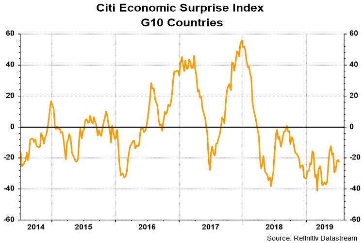
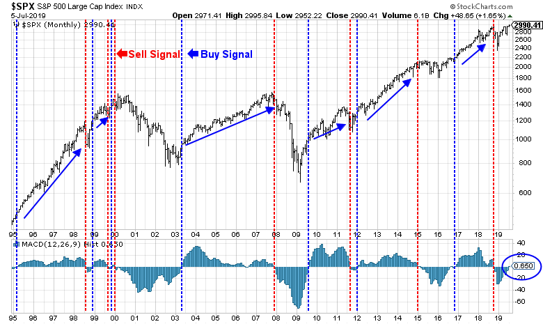
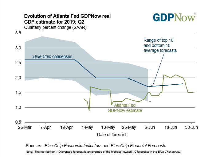
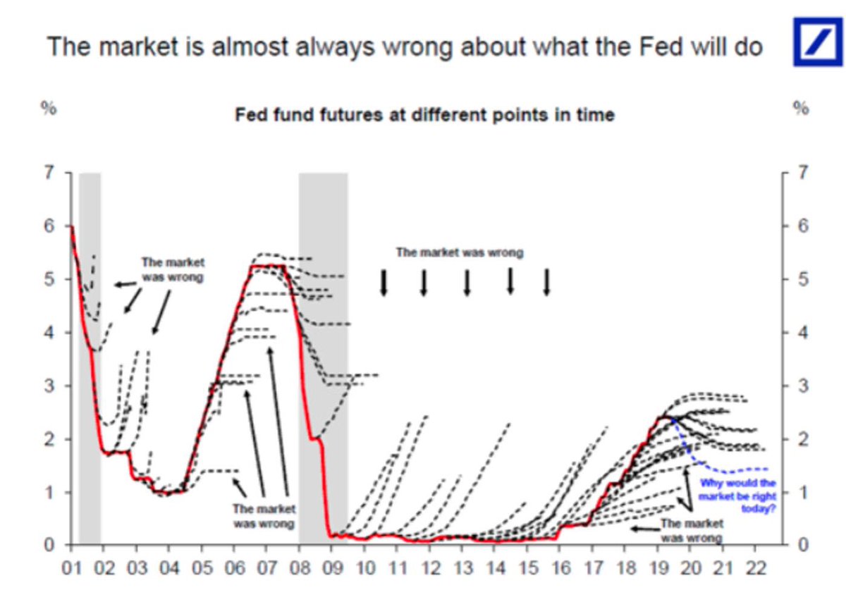
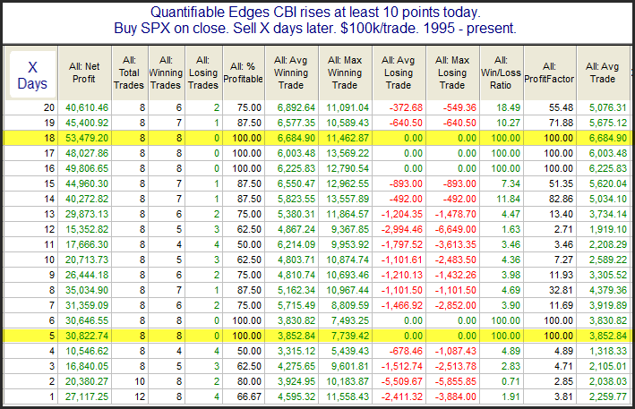
Preface: Explaining our market timing models
We maintain several market timing models, each with differing time horizons. The “Ultimate Market Timing Model” is a long-term market timing model based on the research outlined in our post, Building the ultimate market timing model. This model tends to generate only a handful of signals each decade.
The Trend Model is an asset allocation model which applies trend following principles based on the inputs of global stock and commodity price. This model has a shorter time horizon and tends to turn over about 4-6 times a year. In essence, it seeks to answer the question, “Is the trend in the global economy expansion (bullish) or contraction (bearish)?”
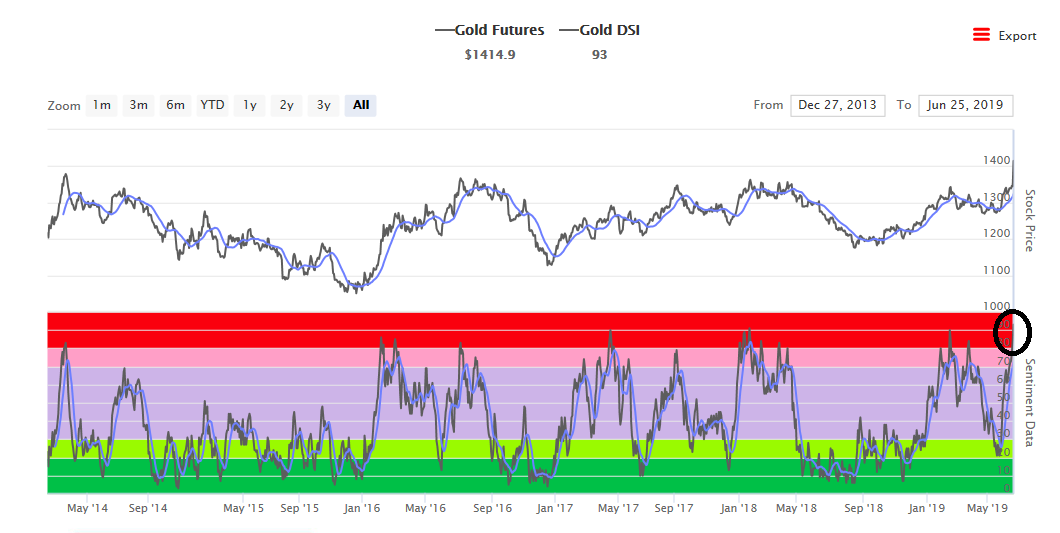
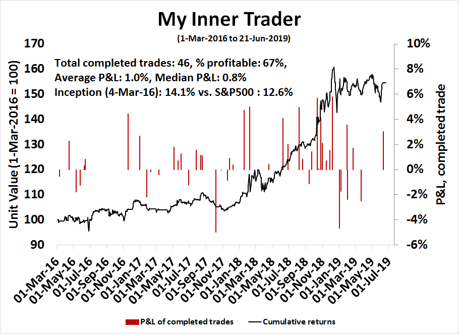
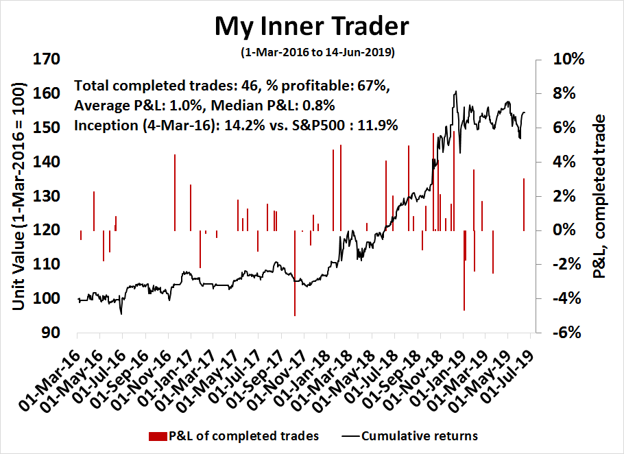
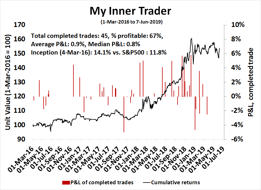
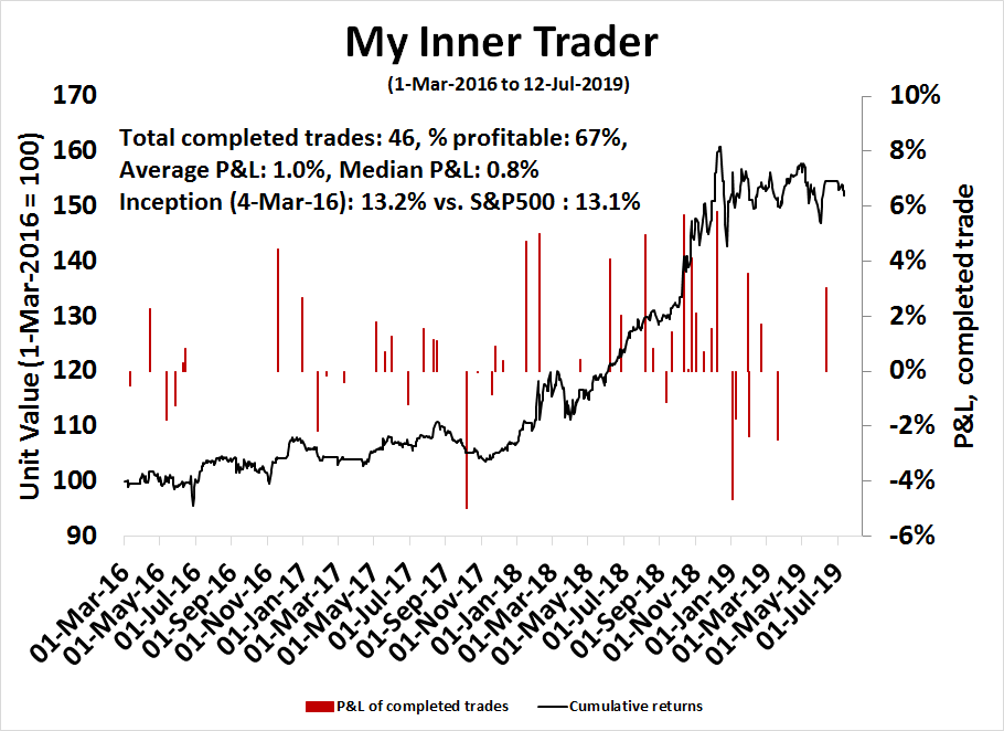
My inner trader uses a trading model, which is a blend of price momentum (is the Trend Model becoming more bullish, or bearish?) and overbought/oversold extremes (don’t buy if the trend is overbought, and vice versa). Subscribers receive real-time alerts of model changes, and a hypothetical trading record of the those email alerts are updated weekly here. The hypothetical trading record of the trading model of the real-time alerts that began in March 2016 is shown below.
The latest signals of each model are as follows:
- Ultimate market timing model: Buy equities
- Trend Model signal: Neutral
- Trading model: Bearish
Update schedule: I generally update model readings on my site on weekends and tweet mid-week observations at @humblestudent. Subscribers receive real-time alerts of trading model changes, and a hypothetical trading record of the those email alerts is shown here.
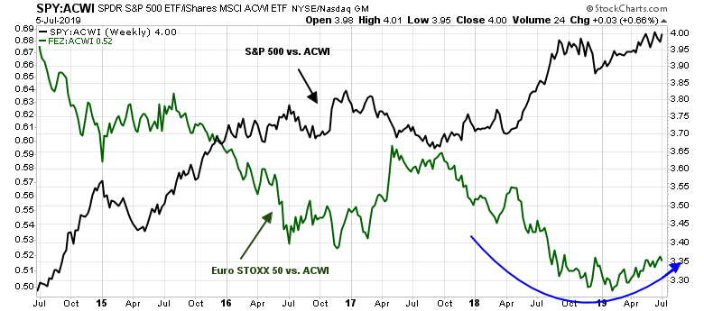
In search of the eurozone buy signal
I had a number of discussions with readers in the wake of last week’s publication, Europe: An ugly duckling about to be a swan. The topics revolved mainly around further justification for buying into Europe, when US equities had performed so well in the last 10 years. In short, the questions were:
- What is the valuation for Europe, and
- Finding a bullish catalyst for their relative revival.
As to the first question, I offer the following chart from Robeco Asset Management.

The gulf in valuation, as measured by the Cyclically Adjusted P/E ratio (CAPE), provides some clear reasoning for American investors to diversify outside their home country. As well, European stocks look cheap relative to their own history. But that is not the entire story.
Peering under the valuation hood
There are a number of criticisms of comparing P/E ratios across borders. Notwithstanding differences in accounting standards, index composition is very different in the US compared to Europe. Moreover, forward earnings grew much faster in America than in the Old World, therefore the US market deserves a premium multiple.
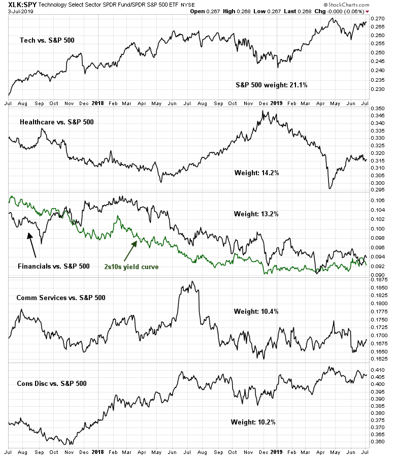
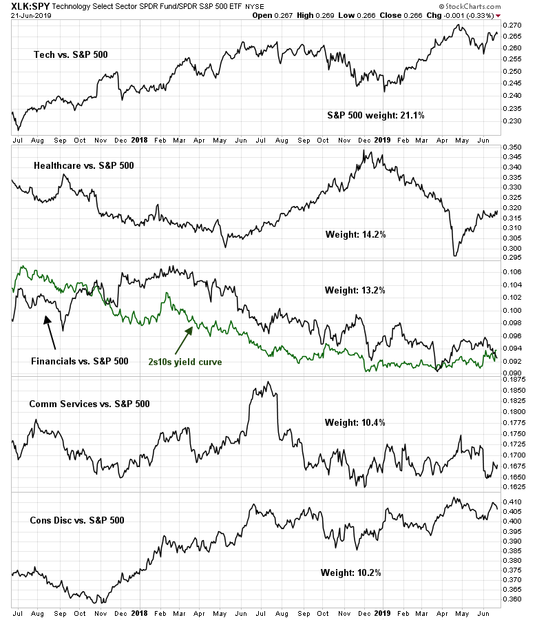
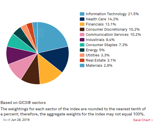
This breakdown of MSCI Europe sectors by weight and forward P/E ratio reveals one side of the trans-Atlantic coin difference.

Compare MSCI Europe to the sector weight breakdown of the S&P 500. Technology accounts for a whopping 21.5% of the index in the US, compared to a scant 5.9% in Europe. By contrast, the troubled Financial stocks is 18.0% in Europe, compared to 13.1% in the US.
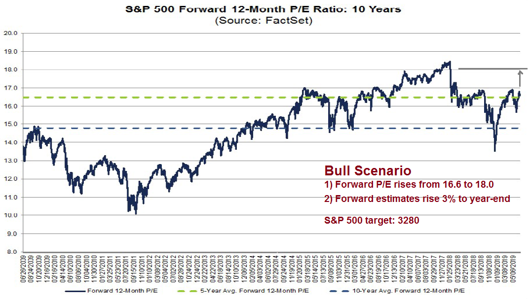
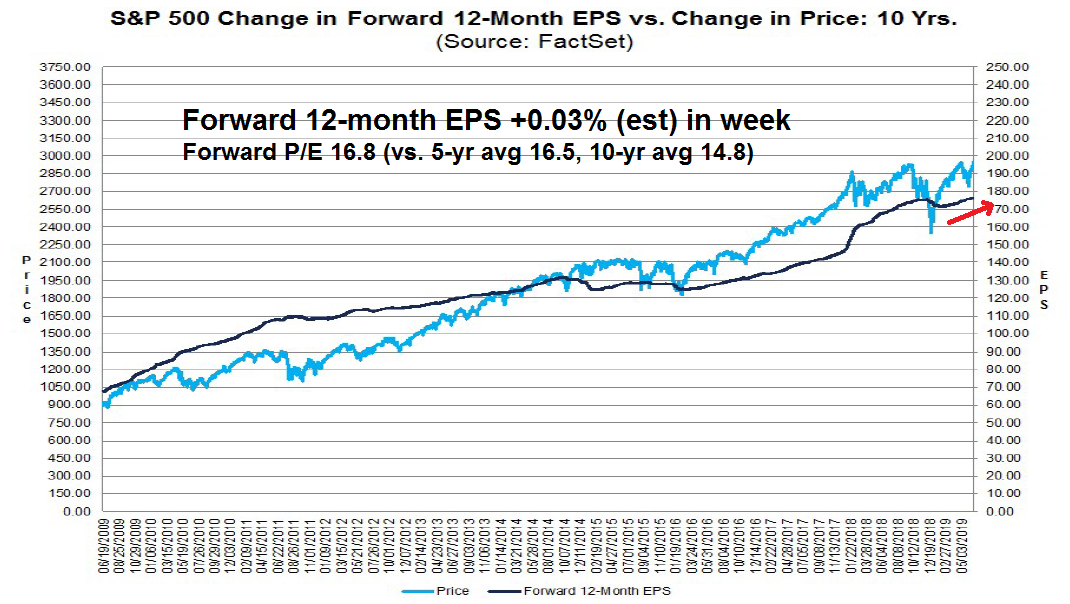
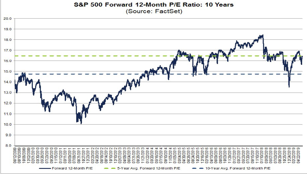
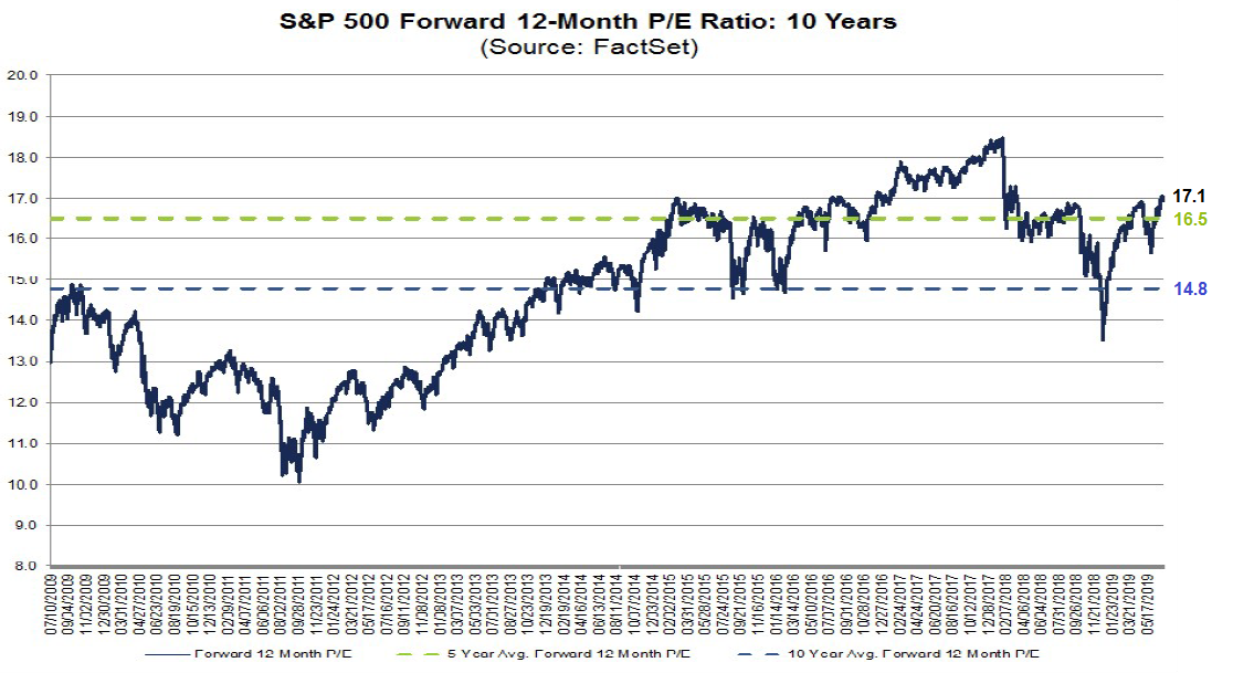
The S&P 500 currently trades at a forward multiple of 17.1 times earnings, which is above its 5-year average of 16.5 and 10-year average of 14.8. MSCI Europe trades at a forward multiple of 13.9. As a way of making an apples-to-apples comparison of the two indices, I calculated what the aggregate forward multiple for Europe if its sector composition is the same as the S&P 500, but each sector retained its forward P/E multiple.
The answer is 14.6 times forward earnings, compared to stated multiple of 13.9 for MSCI Europe, and 17.1 for the S&P 500.
Europe: A value play
In short, Europe is a diversified value play. Is it any wonder Warren Buffett did a euro-denominated bond financing? Either he is taking advantage of the ultra-low and negative rates, or he is getting ready for a major eurozone acquisition.
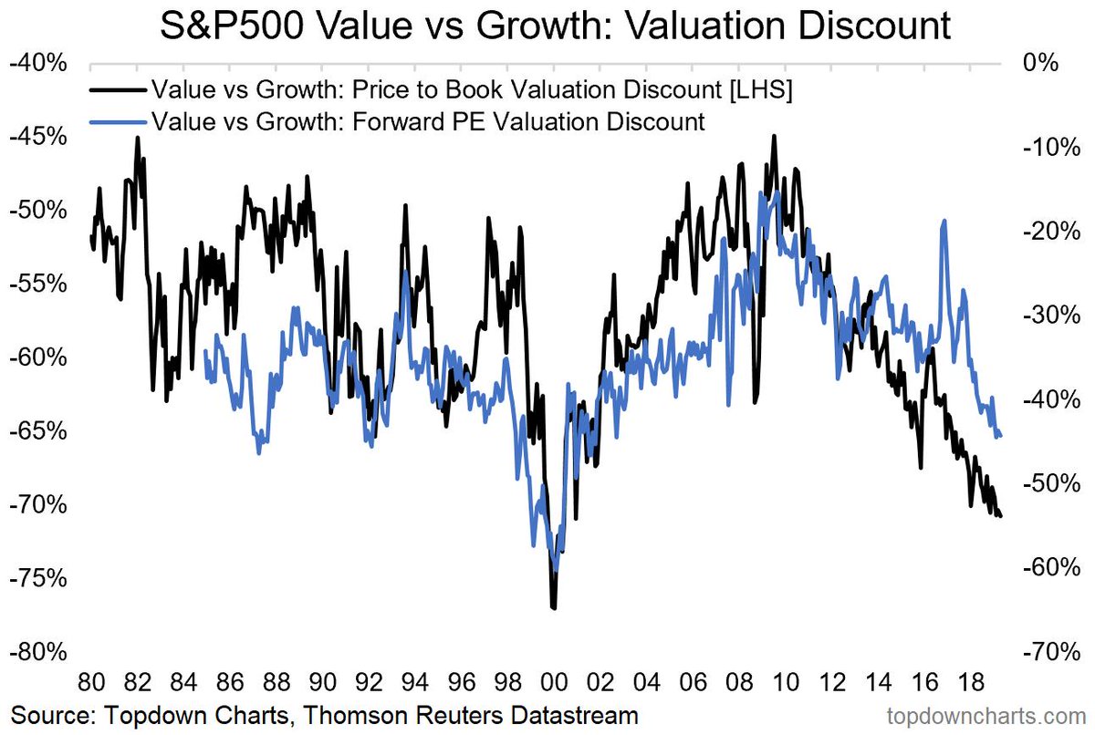
On this side of the Atlantic, value stocks have underperformed for so long that a lot of investors are giving up on the style. The discount seen in value stocks is approaching the lows last see at the height of the NASDAQ Bubble in 1999 and 2000.

I interpret these conditions to mean that Europe will start to outperform when value stocks begin to revive. But what will be the catalyst for such a turnaround?
De-FAANGing Big Data
One possible development that could see a value stock revival and the fall of FAANG, or Big Data, companies is increased anti-trust scrutiny. I wrote about this issue in October 2017 (see Peak FANG?) so I will not repeat myself. Instead, I will summarize the main points.
An academic study by Mordecai Kurz at Stanford tells a story of how technology companies are enjoying monopolistic profits. Here is the abstract:
We show modern information technology (in short IT) is the cause of rising income and wealth inequality since the 1970’s and has contributed to slow growth of wages and decline in the natural rate.
We first study all US firms whose securities trade on public exchanges. Surplus wealth of a firm is the difference between wealth created (equity and debt) and its capital. We show (i) aggregate surplus wealth rose from -$0.59 Trillion in 1974 to $24 Trillion which is 79% of total market value in 2015 and reflects rising monopoly power. The added wealth was created mostly in sectors transformed by IT. Declining or slow growing firms with broadly distributed ownership have been replaced by IT based firms with highly concentrated ownership. Rising fraction of capital has been financed by debt, reaching 78% in 2015.
We explain why IT innovations enable and accelerate the erection of barriers to entry and once erected, IT facilitates maintenance of restraints on competition. These innovations also explain rising size of firms.
We next develop a model where firms have monopoly power. Monopoly surplus is unobservable and we deduce it with three methods, based on surplus wealth, share of labor or share of profits. Share of monopoly surplus rose from zero in early 1980’s to 23% in 2015. This last result is, remarkably, deduced by all three methods. Share of monopoly surplus was also positive during the first, hardware, phase of the IT revolution. It was zero in 1950-1962, reaching 7.3% in 1965 before falling back to zero in 1970. Standard TFP computation is shown to be biased when firms have monopoly power.
The business model of advertising driven companies like Facebook, Google, and Amazon show the importance of the marriage of supremacy of scale and AI. Simply put, these companies are in the surveillance business, and it is getting creepy, especially in a winner-take-all competitive environment.
A ProPublica article about how reporters were able to target ads to a group identified as “Jew haters” on Facebook shows the ubiquitous and terrifying power of Big Data companies.
Want to market Nazi memorabilia, or recruit marchers for a far-right rally? Facebook’s self-service ad-buying platform had the right audience for you.
Until this week, when we asked Facebook about it, the world’s largest social network enabled advertisers to direct their pitches to the news feeds of almost 2,300 people who expressed interest in the topics of “Jew hater,” “How to burn jews,” or, “History of ‘why jews ruin the world.’”
To test if these ad categories were real, we paid $30 to target those groups with three “promoted posts” — in which a ProPublica article or post was displayed in their news feeds. Facebook approved all three ads within 15 minutes.
While Facebook was found to be the offender in this instance, Google has a similar tracking technology and algorithms. Amazon use similar tracking techniques to suggest other items that customers can buy on its website.
At first glance, Apple appears to be largely insulated from these privacy concerns, but they are not immune. Apple’s marketing message has been that it is concerned about privacy, and it makes no money from advertising. It only source of revenue is the sale of its devices, and services on its platform. However, a recent WSJ article exposed the privacy flaws in its systems:
Congratulations! You’ve bought an iPhone! You made one of the best privacy-conscious decisions… until you download an app from Apple’s App Store. Most are littered with secret trackers, slurping up your personal data and sending it to more places than you can count.
Over the last few weeks, my colleague Mark Secada and I tested 80 apps, most of which are promoted in Apple’s App Store as “Apps We Love.” All but one used third-party trackers for marketing, ads or analytics. The apps averaged four trackers apiece.
Some apps send personal data without ever informing users in their privacy policies, others just use industry-accepted—though sometimes shady—ad-tracking methods. As my colleague Sam Schechner reported a few months ago (also with Mark’s assistance), many apps send info to Facebook, even if you’re not logged into its social networks. In our new testing, we found that many also send info to other companies, including Google and mobile marketers, for reasons that are not apparent to the end user.
We focused on the iPhone in our testing—largely because of Apple’s aggressive marketing of personal privacy. However, apps in Google’s Play Store for Android use the same techniques. In some cases, when it comes to providing on-device information to developers and trackers, Android is worse. Google recently updated its app permissions and says it is taking a deeper look at how apps access personal user information.
The biggest problem isn’t the data collection. The company that publishes my columns makes money from advertising—publisher and advertiser alike rely on customer data. The problem is, we aren’t told what tracking is going on in our apps, and we’re given very few controls to curb it.
The rise of the trust busters
The US government is sitting up and taking notice. The Economist reported in mid-June that the Department of Justice (DOJ) and the Federal Trade Commission (FTC) have divided the objects of their scrutiny. The FTC will focus on Amazon and Facebook, while the DOJ will focus on Apple and Google.
Signs of renewed vigour in antitrust enforcement are growing. Last week it emerged that the Federal Trade Commission, another antitrust agency, and the DOJ had agreed to divvy up the work, with the former looking into Facebook and Amazon and the latter Apple and Google (an investigation of the search firm is reportedly imminent). On June 11th, a Congressional committee opened an investigation into the impact of big tech firms on the news industry. And more than a dozen state attorneys-general are soon expected to do something similar. In another sign that big business is under antitrust scrutiny, on the same day a group of states sued to block a $26bn merger between Sprint and T-Mobile, two big mobile operators.
In laying out a case against big tech, Mr Delrahim has used some of the same arguments as many of the industry’s critics. Important digital markets, he explained, tend to be dominated by one or two firms, thanks to network effects. Such dominance is not necessarily bad for consumers. Even monopolies, such as that of Standard Oil, have led to lower prices. But price effects, he correctly argued, are “not the sole measure of harm to competition”. The view in antitrust circles is that only price matters. Web browsers, for instance, are free, but in the 1990s Microsoft’s bundling of one with its dominant Windows operating system hurt competition and innovation. The government’s successful case against Microsoft, he said, “arguably paved the way for companies like Google, Yahoo and Apple to enter the market.”
Mr Delrahim also hinted at what will be scrutinised. One area is “exclusivity agreements”, where a dominant firm imposes deals on suppliers, for instance when Microsoft forced makers of PCs to give preference to its browser. The other is mergers and acquisitions. These can be good for competition, he said, but added that there is “potential for mischief if the purpose and effect of an acquisition is to block potential competitors, protect a monopoly.”
The Democrats have seized on internet privacy as a winning political issue. In particular, if Elizabeth Warren has offered scathing criticism of Big Data companies. If either she wins the White House or takes a prominent role in a Democrat-led administration after the 2020 election, Big Data companies will come under increasing political pressure. The solutions will be either a breakup, such as splitting off Amazon Web Service from Amazon, or a high degree of utility-like regulatory scrutiny.
There are additional regulatory risks. Facebook’s Libra coin initiative, which is nothing more than a thinly disguised attempt to create a parallel payment system, is an open invitation for additional scrutiny from policy makers. As well, the latest French digital tax proposal is an illustration of the global nature of the regulatory threat to Big Data companies.
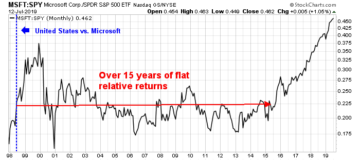
The Microsoft template
Even under a dire scenario of increased regulatory headwinds, the outlook for Big Data companies is unlikely to be extremely bearish. A useful template might be the antitrust action take against Microsoft in United States v. Microsoft Corp. The stock became a market performer for over 15 years after the DOJ filed its case in court.
The market has interpreted latest news of a FTC settlement of a $5 billion fine for Facebook’s privacy breaches as just a slap on the wrist. On the other hand, it could also signal just the beginning of a series of concerted attacks on Big Data technology companies.
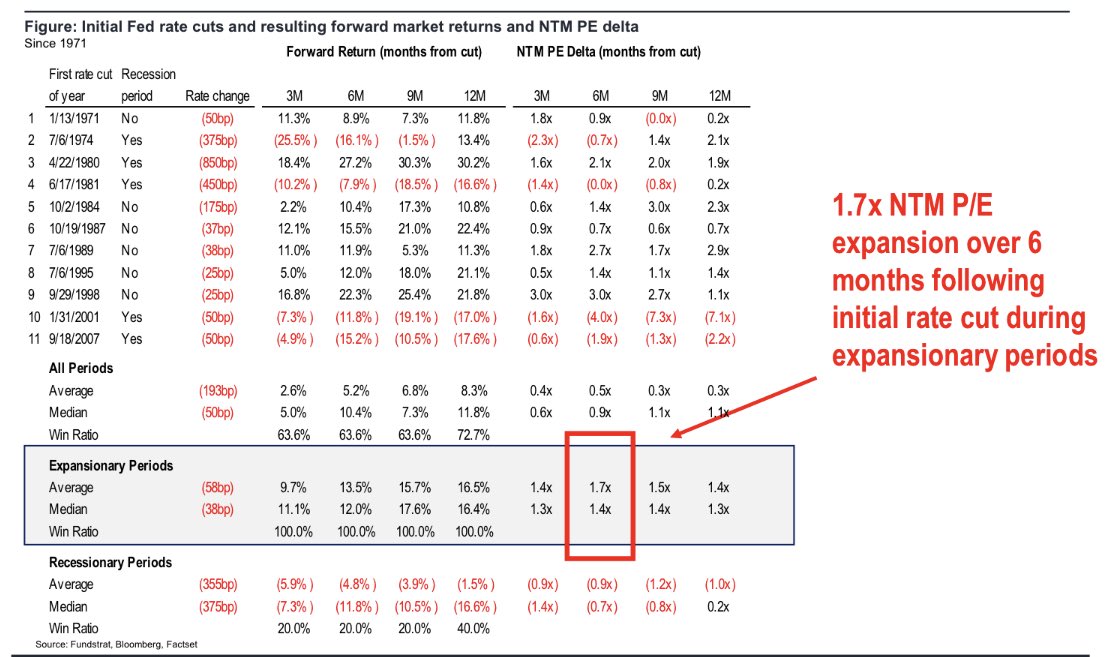
Under a scenario where government agencies pursue FAANG stocks for antitrust violations, I expect these companies would, over time, relinquish their market leadership position. That might be the opening for value stocks to step up into the vacuum and begin a revival of the value/growth cycle.
The week ahead
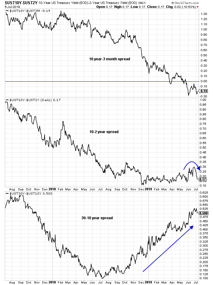
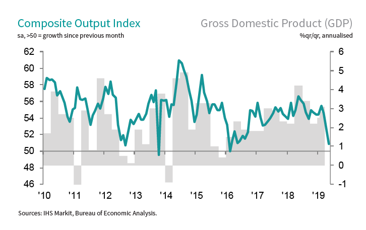
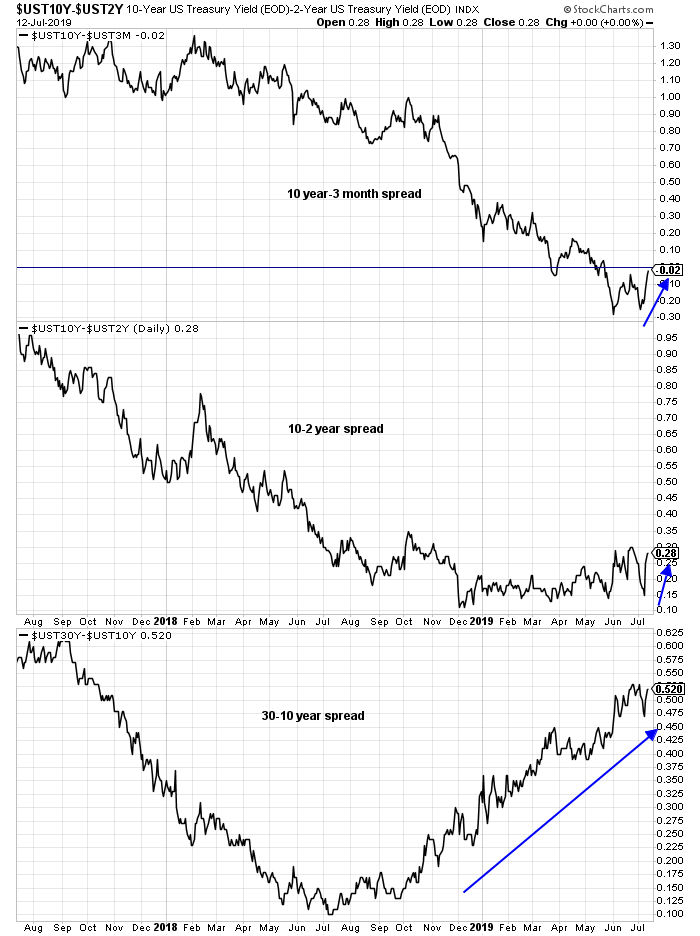
Looking to the week ahead, the big banks will be kicking off earnings season as they report next week. Q2 earnings season could be a challenge for the market as divergent trends come into focus. As bond yields at the long end edge upwards, and the yield curve steepens, the results of earnings season will be crucial to the stock market outlook. Can the positive effects of rising earnings expectations offset the negative effects of rising bond yields, and therefore a high discount rate?
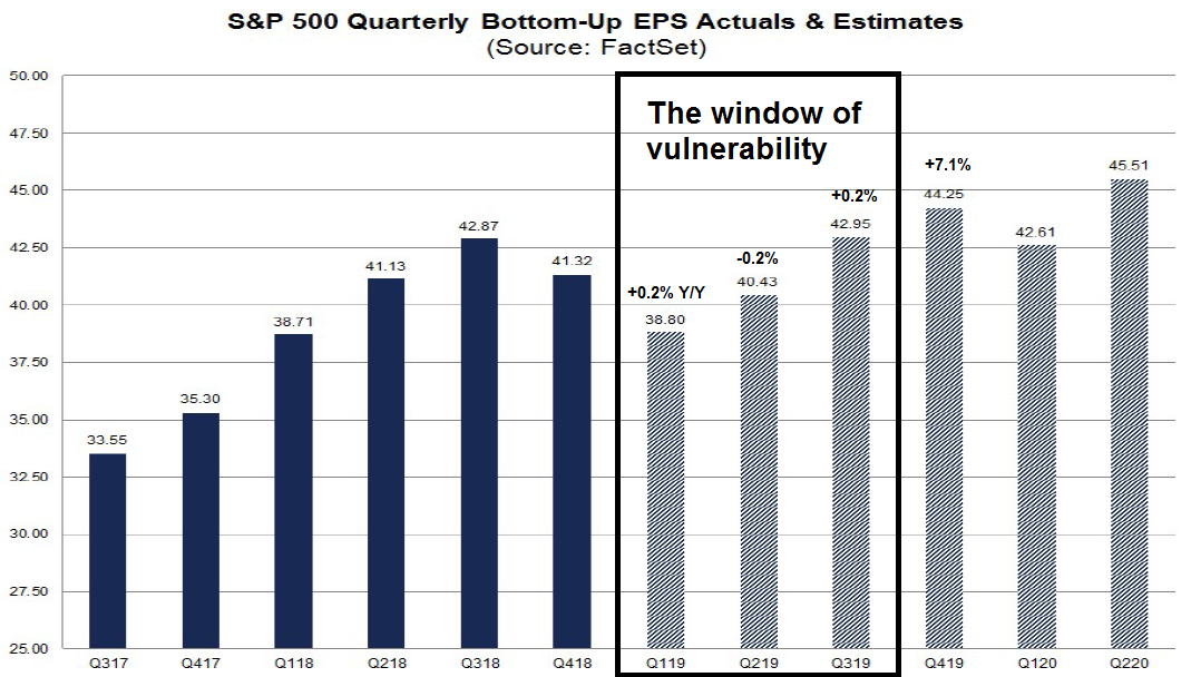
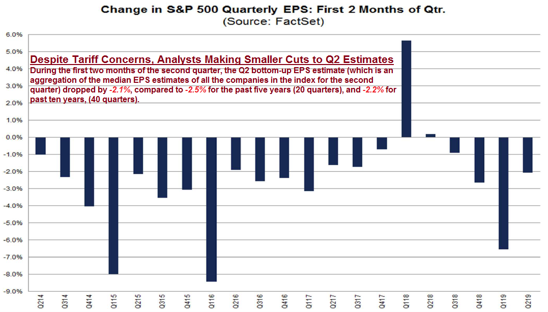
John Butters at FactSet reported that consensus expectations call for a Q2 earnings decline of -2.7%. In the past, management has tended to be overly pessimistic and the actual report beats expectations. The average five-year beat rate is 72%, and earnings have exceeded consensus by 4.8%. If history is any guide, the S&P 500 should be able to avoid an actual earnings decline in Q2.
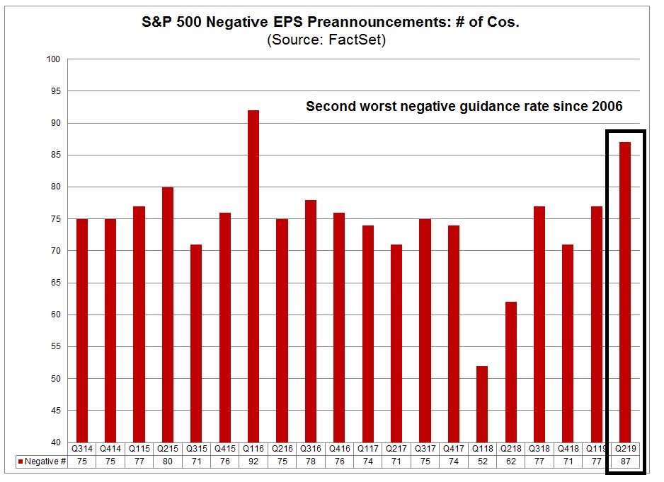
The game of lowering guidance in order to beat estimates may be harder to play this time. FactSet reported that companies have issued the second highest level of negative guidance since they started monitoring earnings pre-announcements in 2006.
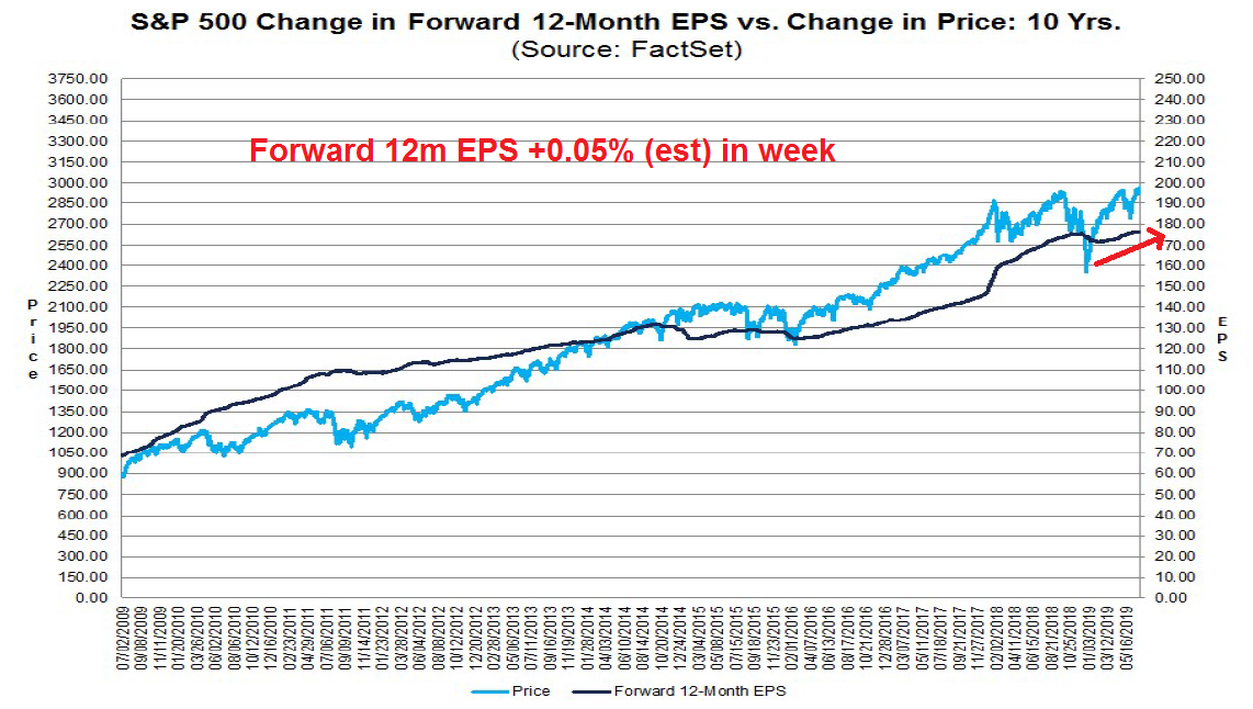
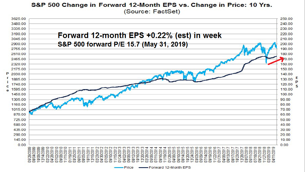
Despite the high level of warnings, forward EPS estimates revisions are still positive, though they may be flattening out.
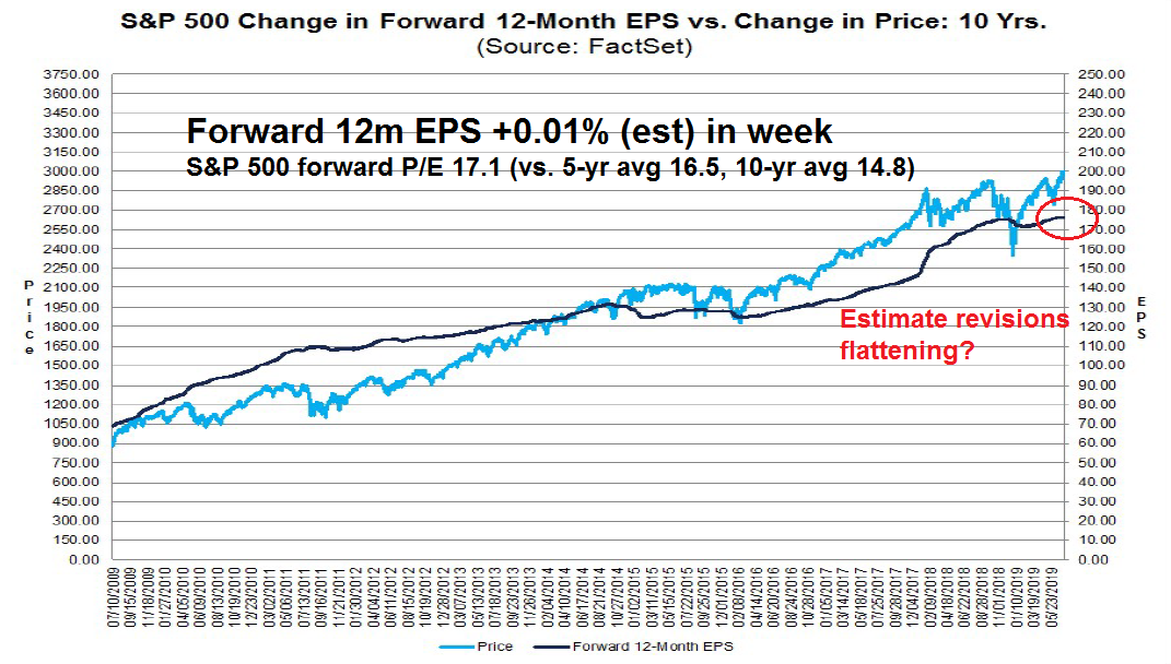
The forward P/E ratio of 17.1 is elevated relative to its own history, which leaves little margin for error should companies either disappoint, or guide downwards during their earnings calls.
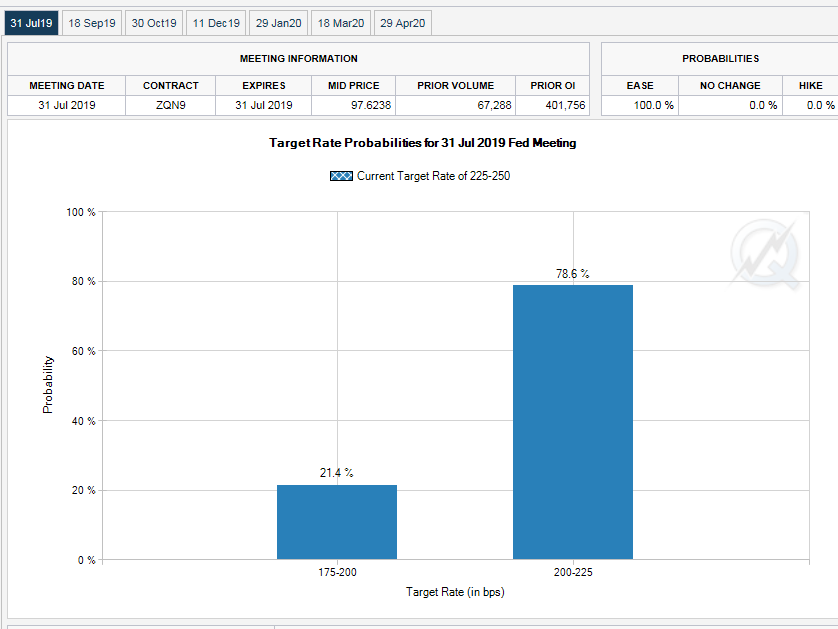
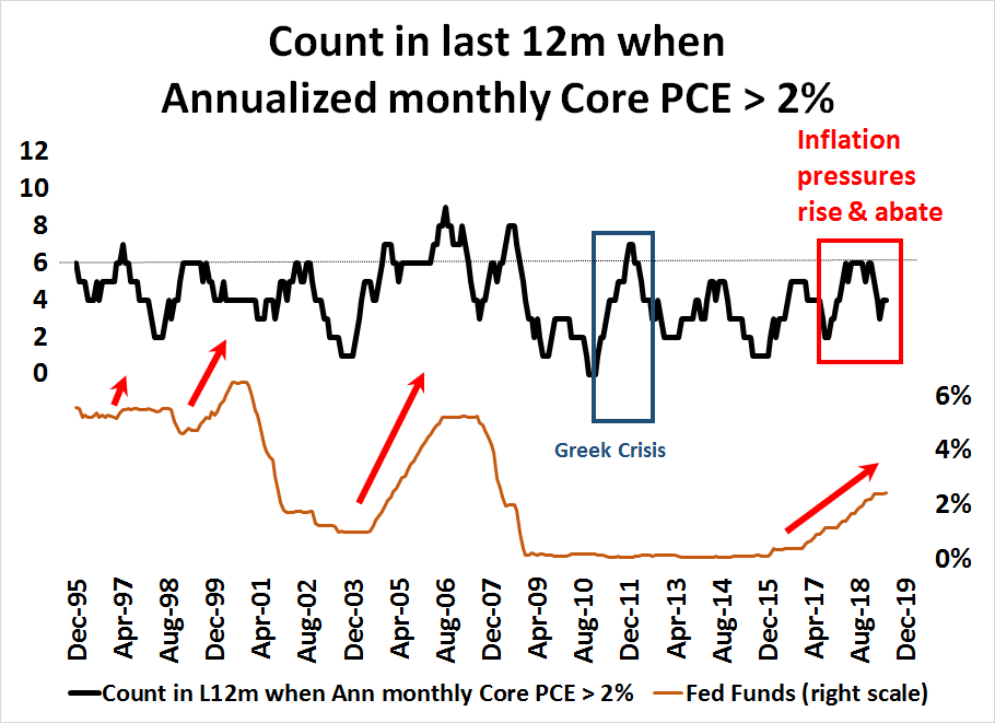
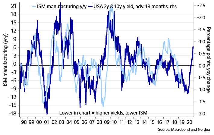
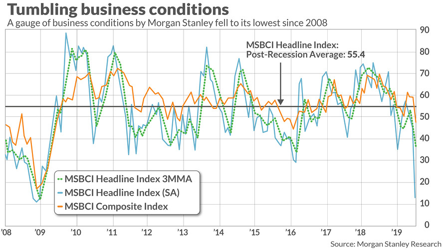
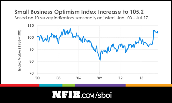
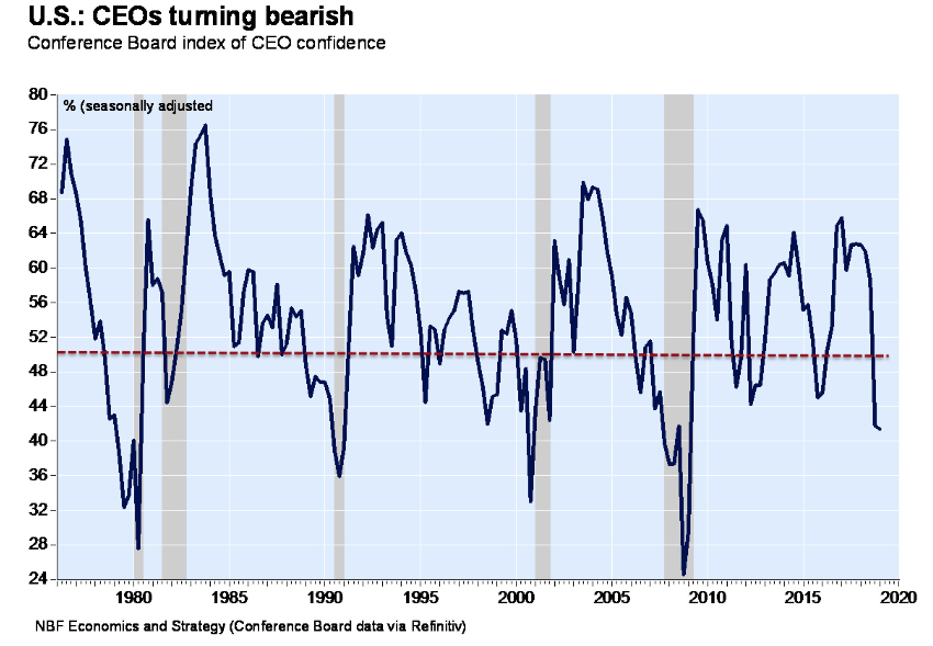
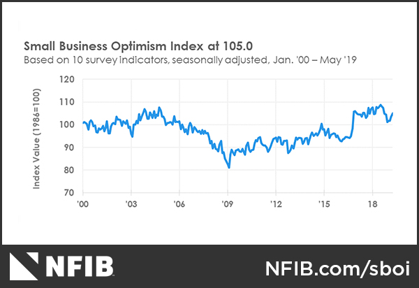
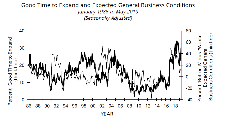
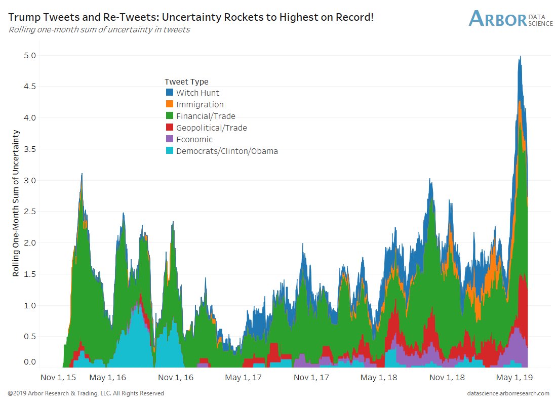
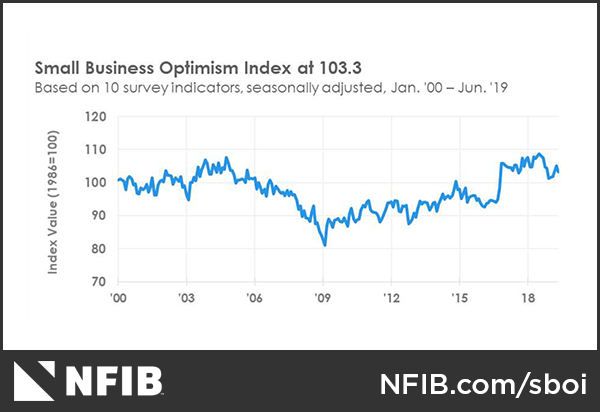
Fed chair Jerome Powell has expressed concerns over falling business confidence from the tariff disputes as one of the reasons for adopting an easier monetary policy. There were 22 references to either “uncertain” or “uncertainty” in the latest FOMC minutes that were published last week. Small business confidence and business conditions from NFIB is especially valuable as an early peek at Q2 economic conditions and as an earnings season preview. Small businesses have little bargaining power, which makes them are good barometers of the economy. The latest NFIB survey shows that optimism has pulled back.
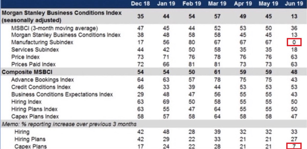
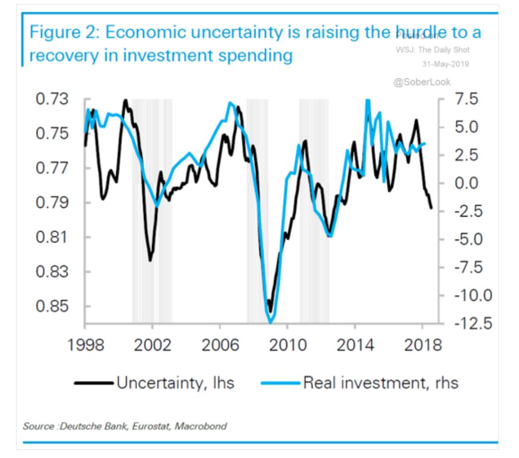
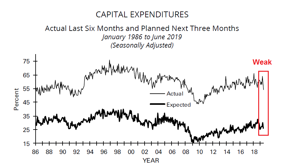
One key measure of confidence is capital investment, which is weakening.
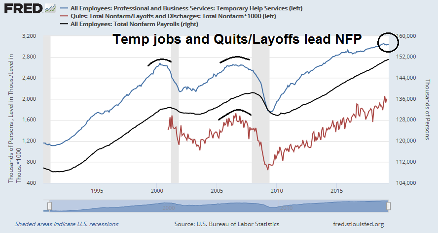
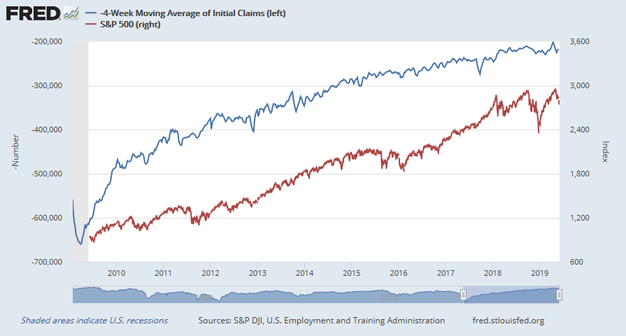
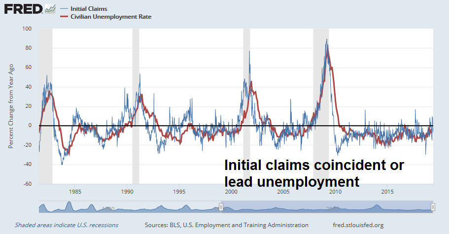
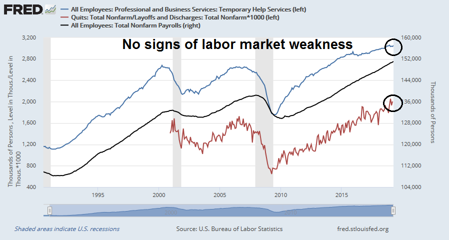
Even employment, which has been steadily improving because of the red-hot jobs market, is showing some signs of softness.

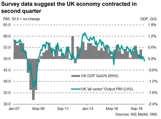
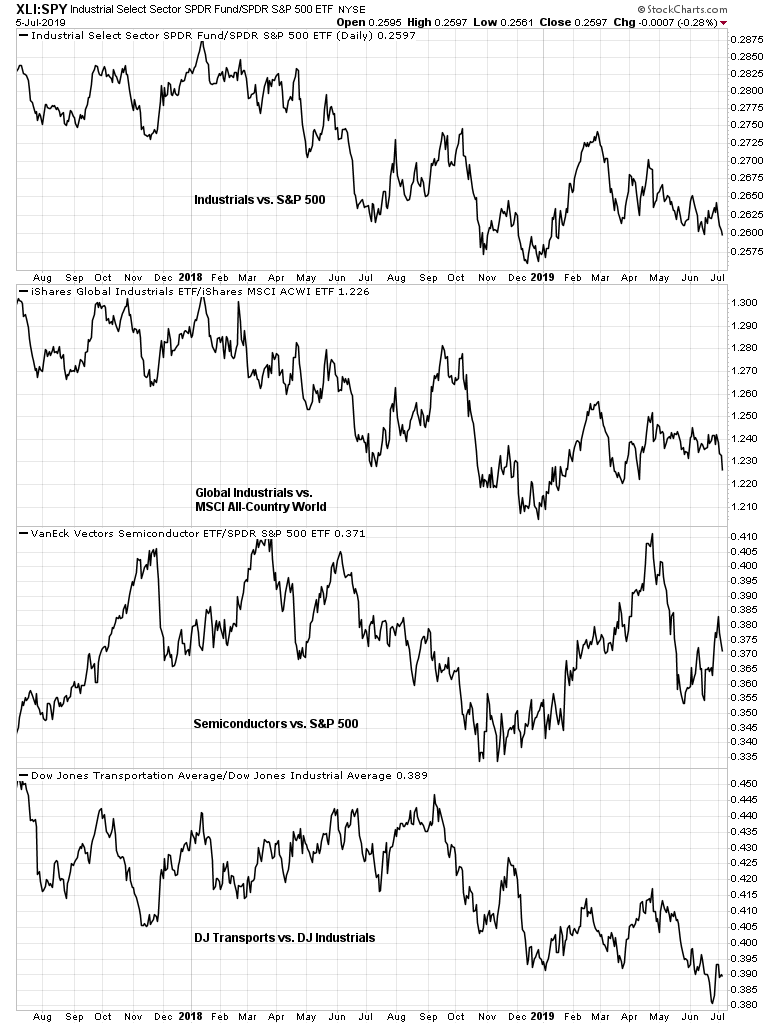
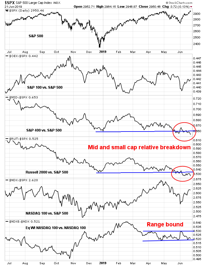
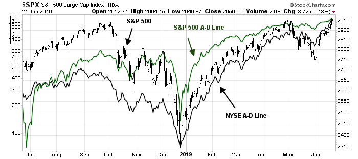
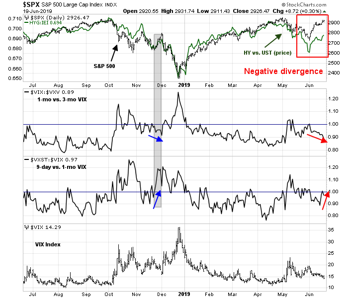
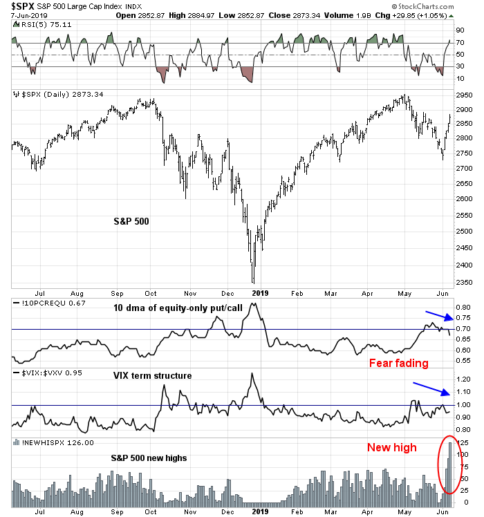
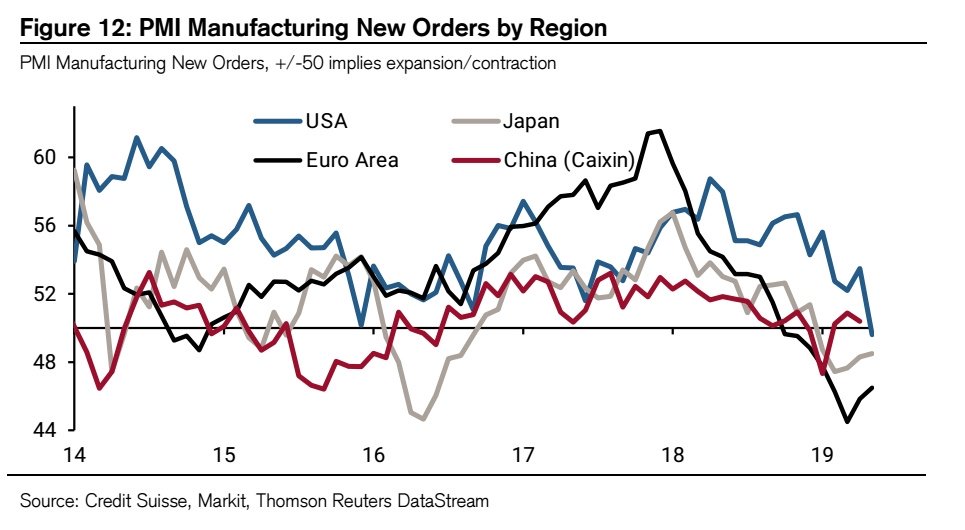
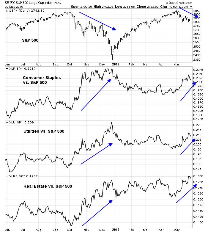
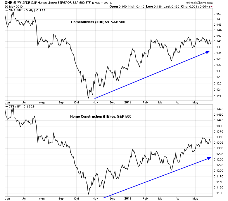
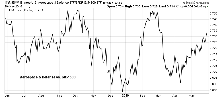
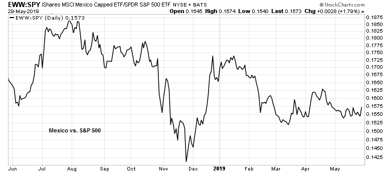
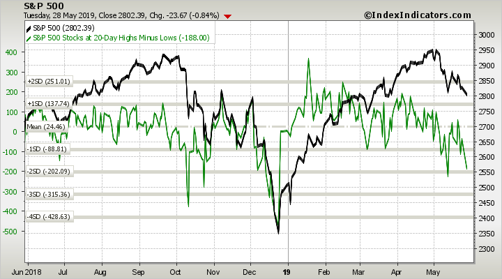
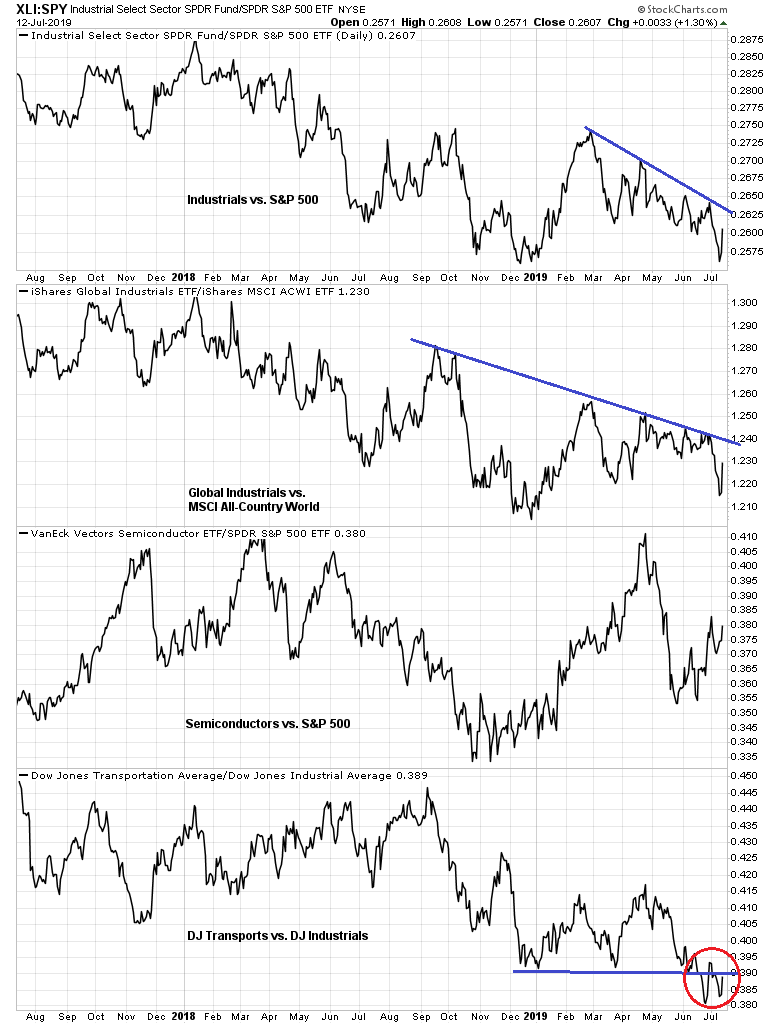
From a technical perspective, the relative performance of cyclical stocks confirms the fundamental analysis of economic weakness. In particular, the poor relative strength exhibited by the Dow Jones Transports is a concern.
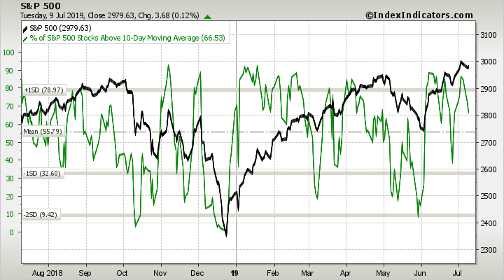
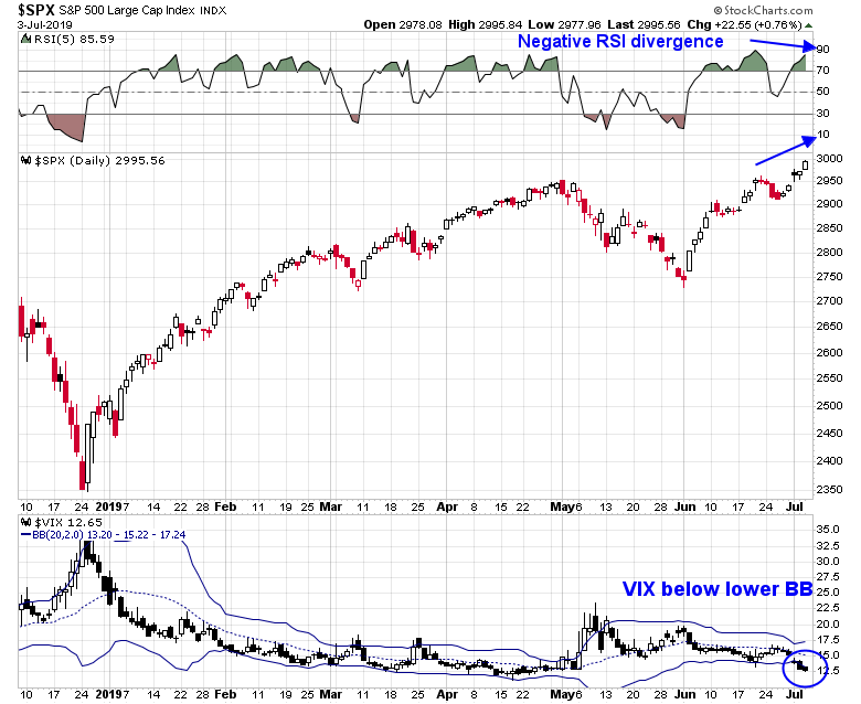
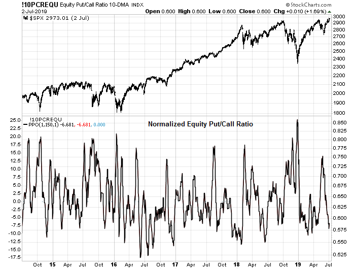
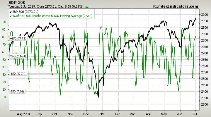
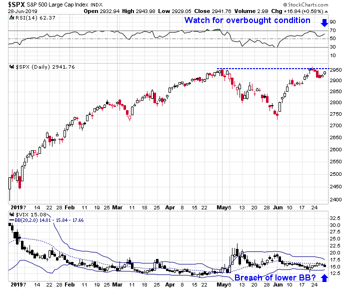
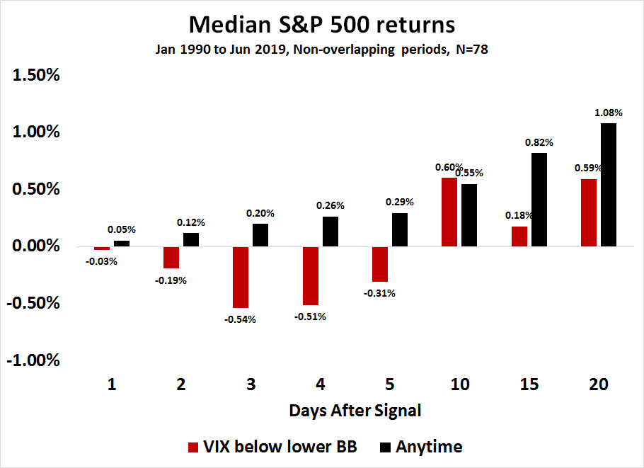
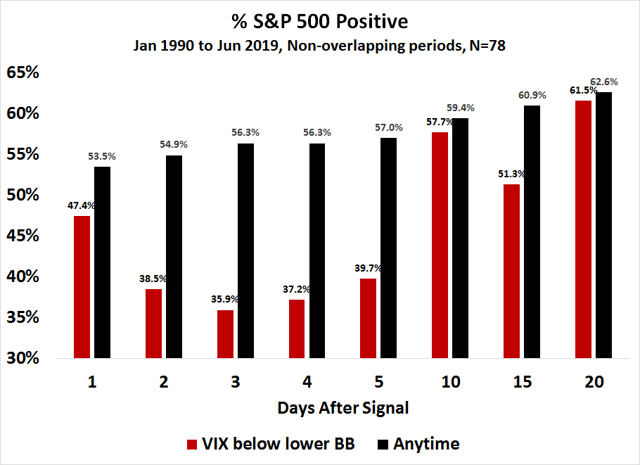
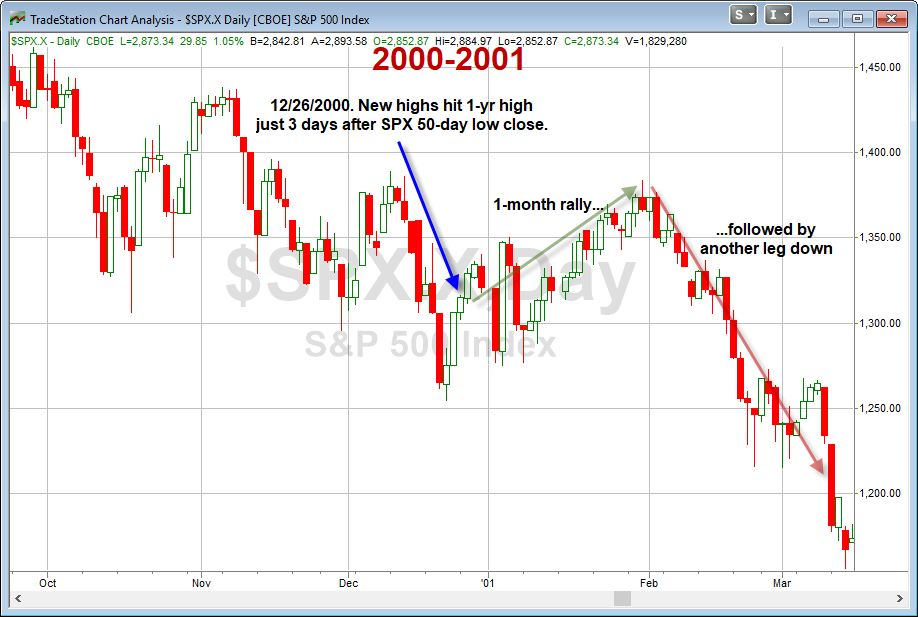
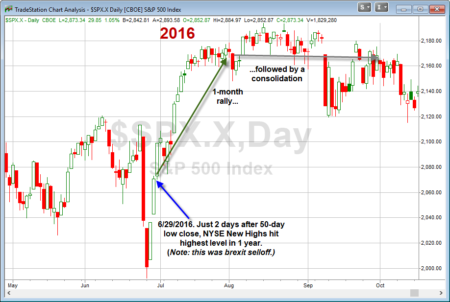
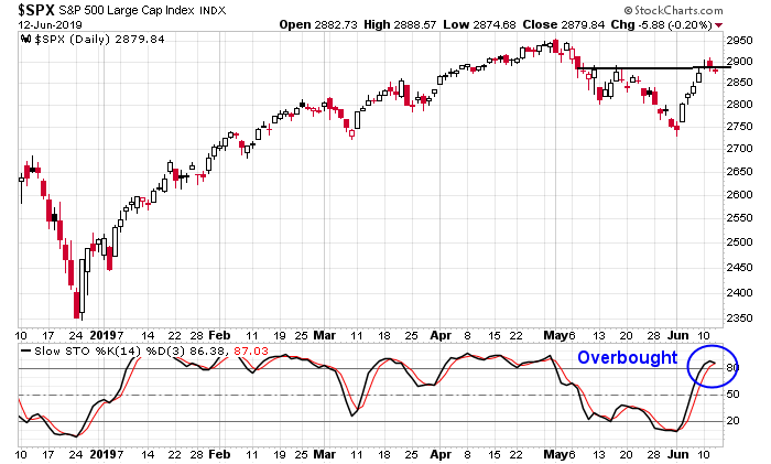
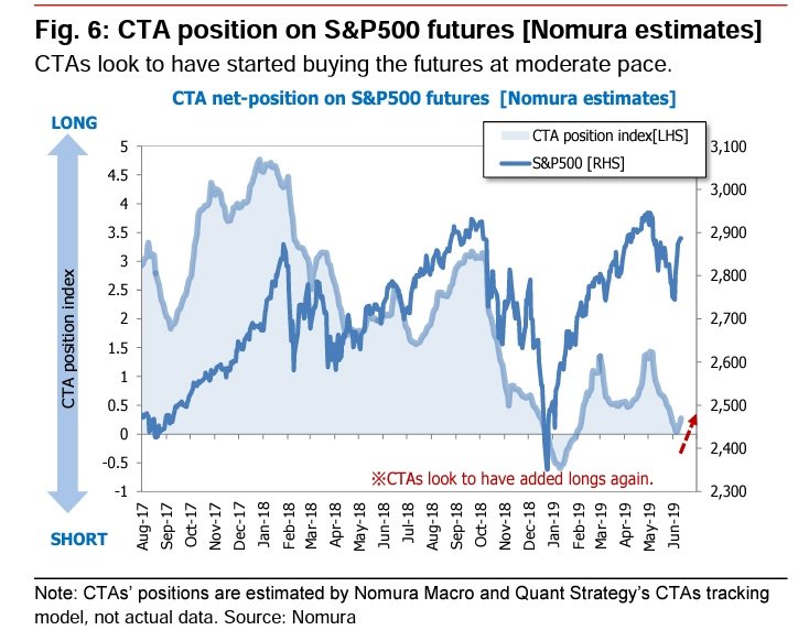
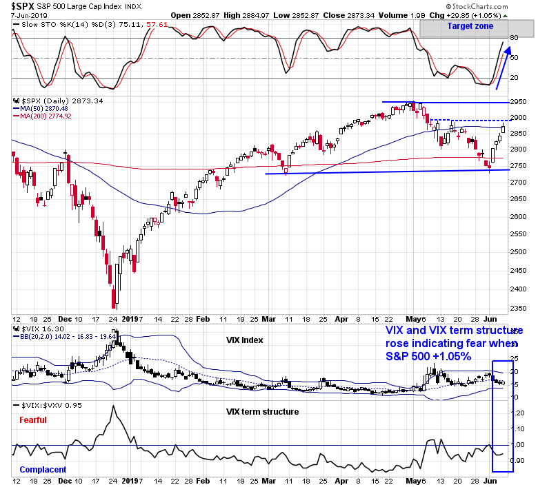
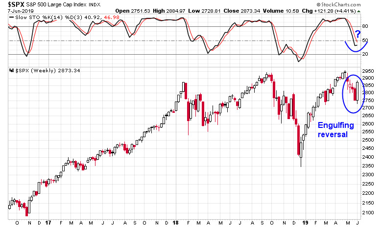
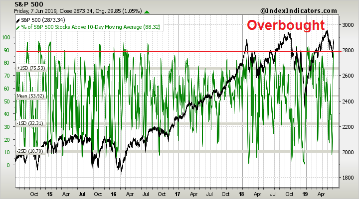
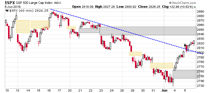
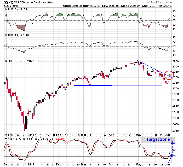
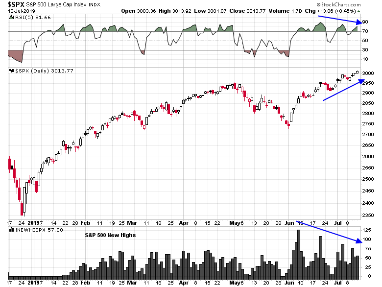
We are seeing the rare condition of negative RSI divergences across multiple time frames. The hourly S&P 500 is flashing a negative 5-hour RSI divergence.

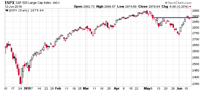
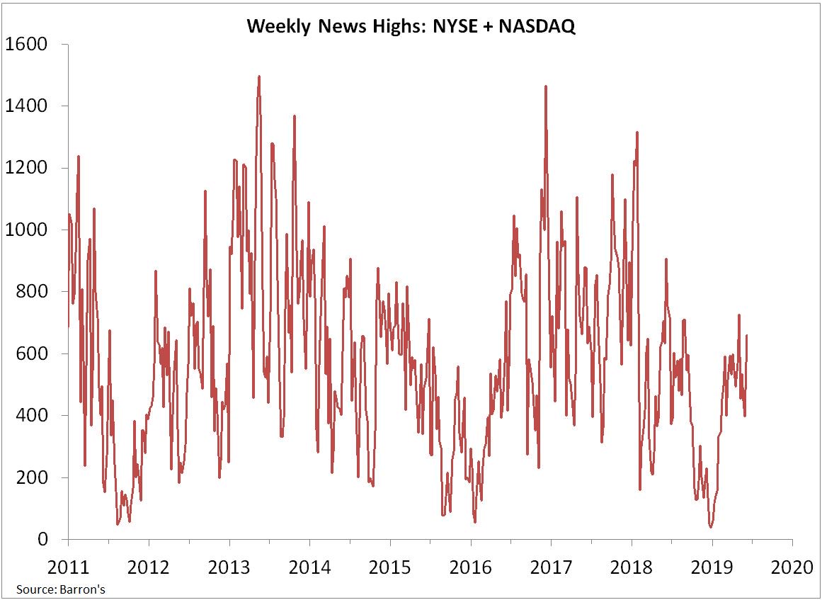
A negative 5-day RSI divergence can be seen in the daily price chart, along with fewer and few new highs even as the index rises.
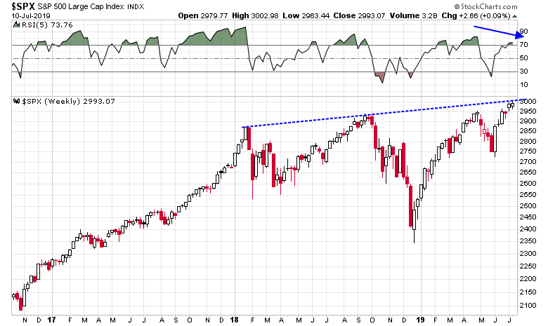
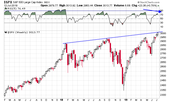
The weekly chart also shows a t-week RSI divergence, even as the index tests rising trendline resistance.
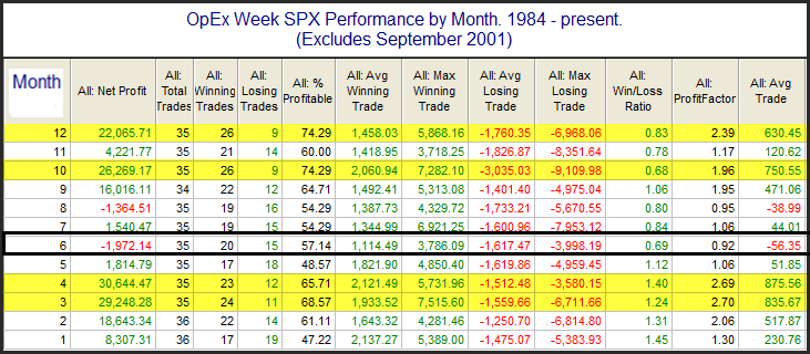
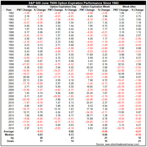
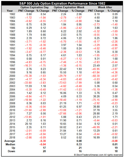
Next week is option expiry (OpEx) week. Even though OpEx week has been historically bullish, Jeff Hirsch at Almanac Trader found that both July OpEx week, and the week after OpEx has seen subpar returns.
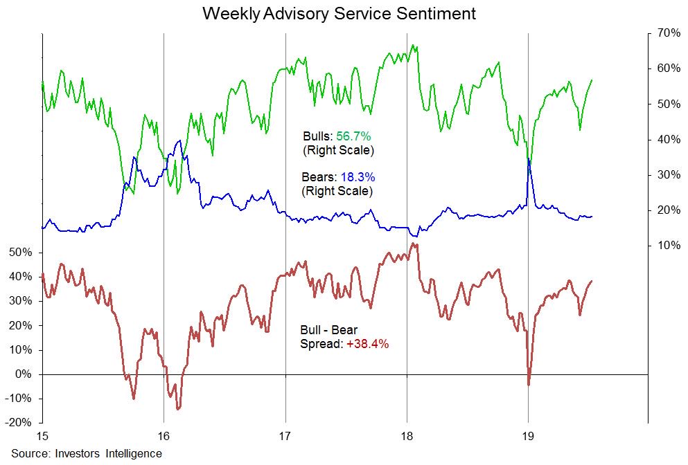
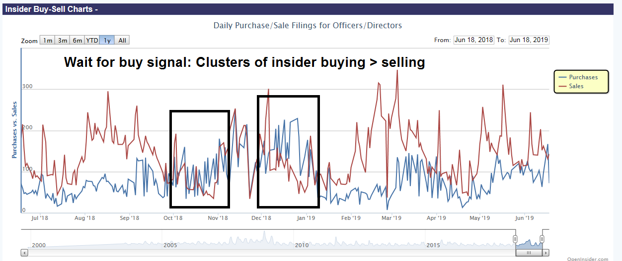
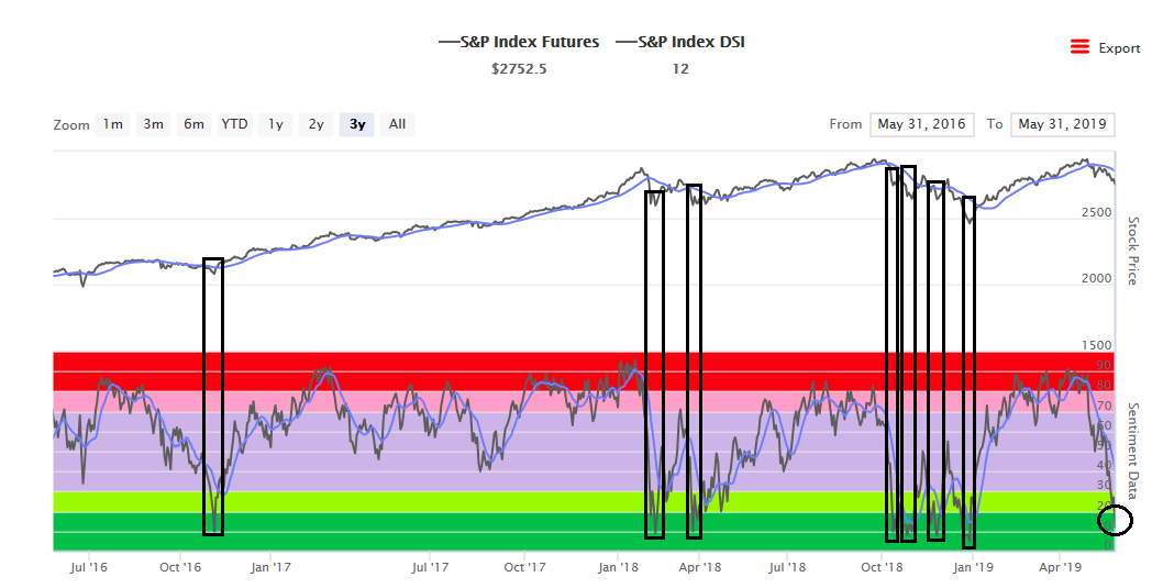
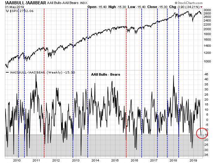
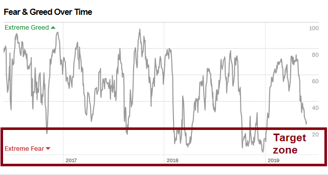
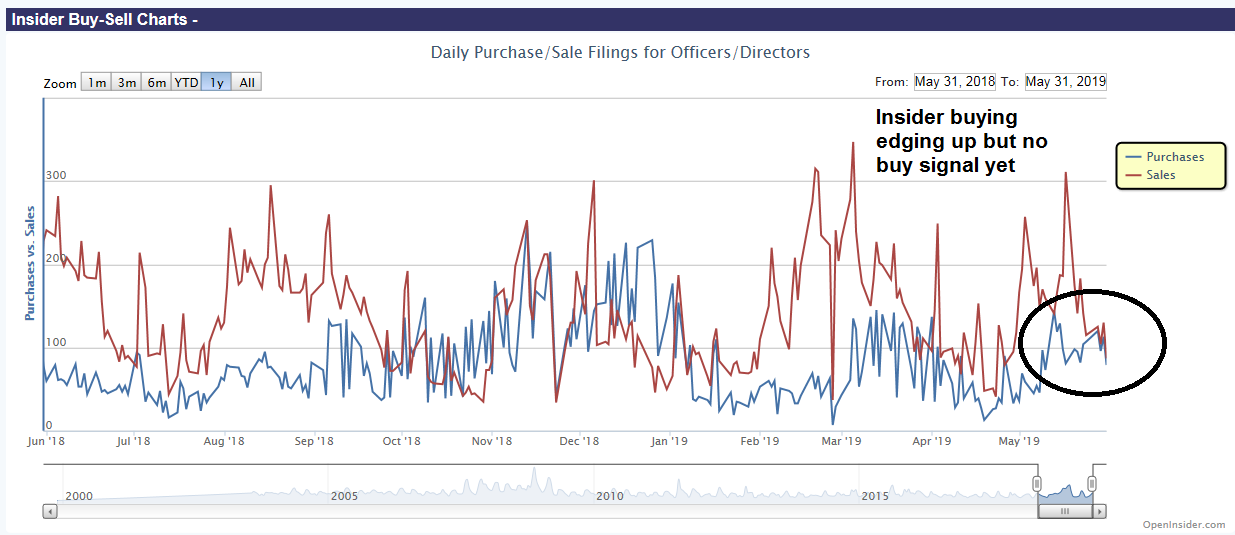
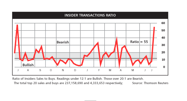
While excessive insider buying is more useful as a buy signal than selling is a sell signal, the latest Baron’s update of insider activity is not supporting the bull case.
The combination of all these factors suggest that the risks are asymmetric and tilted to the downside. While stock prices can continue to grind upwards, the risk of a downside break on either one or a series of unexpected news events is high.
My inner investor remains neutrally positioned and he is at roughly his asset allocation weights defined by long-term policy. My inner trader is holding his small market short.
Disclosure: Long SPXU