Mid-week market update: In light of the US holiday shortened week, I thought I would do one of my periodic sector reviews to analyze both sector leadership and the implications for stock market direction.
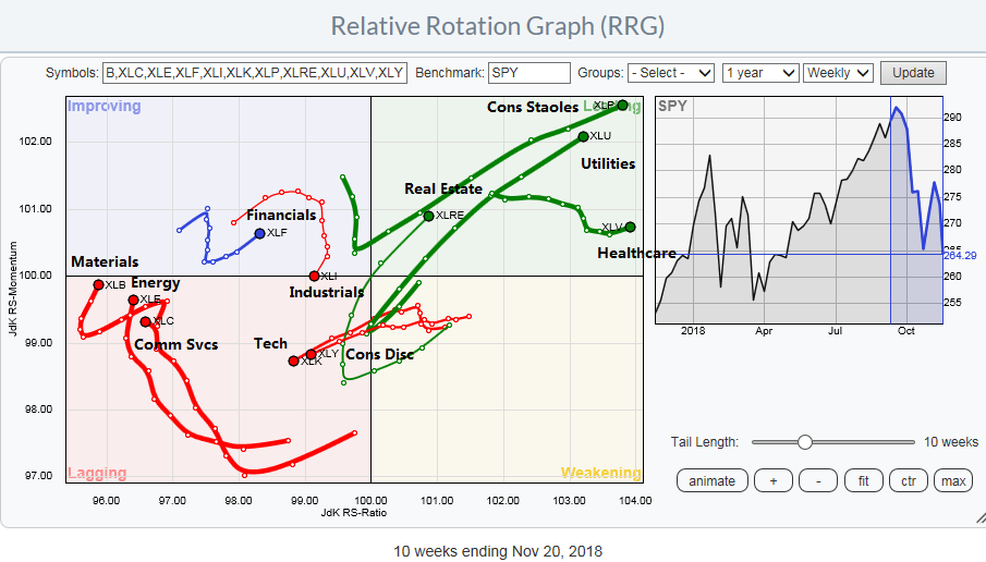
As a reminder, Relative Rotation Graphs, or RRG charts, are a way of depicting the changes in leadership in different groups, such as sectors, countries or regions, or market factors. The charts are organized into four quadrants. The typical group rotation pattern occurs in a clockwise fashion. Leading groups (top right) deteriorate to weakening groups (bottom right), which then rotates to lagging groups (bottom left), which changes to improving groups (top left), and finally completes the cycle by improving to leading groups (top right) again.
The latest RRG chart shows the defensive sectors firmly in the lead, while technology, which were the former market darlings, mired in the lagging quadrant.
While current leadership provides a useful snapshot of the current market, it does not tell the entire story.
The story of faltering leadership
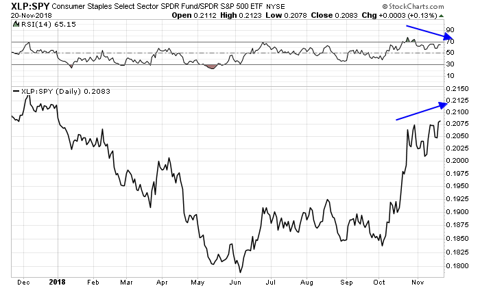
The main problem with the defensive leadership theme is the consistent trend of faltering leadership. The relative performance charts of each of the defensive sectors are all exhibiting negative RSI divergences, which are warnings of fading momentum. Here is the relative performance chart of Consumer Staples.
Here is Heathcare.

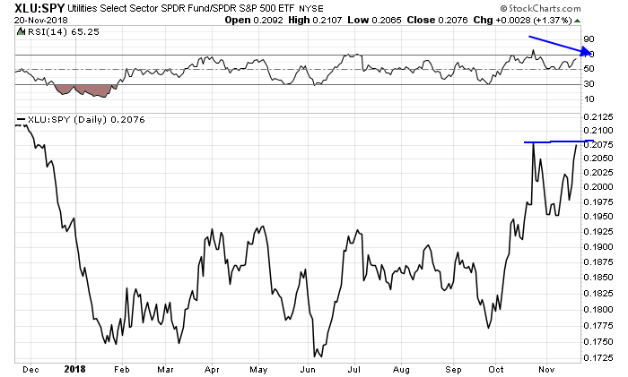
Here are Utilities against the market.
Still not convinced? JPM found that the forward P/E spread between low-volatility stocks, which is a proxy for the defensive parts of the market, and growth stocks is at all-time high. In addition, the median P/E of Utilities (17.9x) is higher than the median P/E of Technology (16.8x) and Communication Services (16.5x).

In search of emerging leaders
If defensive stocks are on the verge of giving up their leadership mantle, what will be the emerging leaders? The RRG chart gives us some clues.
One leading candidate are the Financials, which are in the top left “improving” quadrant. However, one key risk is the relative performance of this sector is highly correlated with the shape of the yield curve. These stocks do best when the yield curve is steepening, indicating expectations of better economic growth and a Fed policy that is more dovish than what is currently discounted by the market.

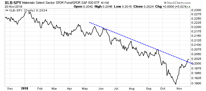
Other possible candidates of emerging market leaders are Materials, Energy, and Communication Services, which mostly represent FAANG. Wait, what?
Here are the relative performance charts of these emerging leadership candidates. Material stocks have already rallied through a relative downtrend line and they are turning up.
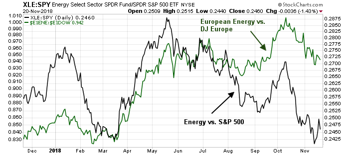
Energy stocks represent another possible new sector leader. The relative performance of European energy, whose market internals tend to be highly correlated to the US market, is much better than US energy.
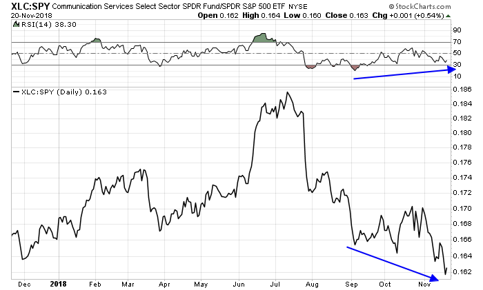
Finally, we have Communication Services, which are exhibiting a positive RSI divergence.
A W-shaped bottom
In conclusion, the picture of faltering defensive leadership is highly suggestive of an imminent rebound in stock prices. I wrote last weekend (see What is Mr. Market saying about Powell’s global slowdown?) that sentiment was becoming excessively bearish, which is contrarian bullish. The combination of panicked RIAs, as evidenced by the latest NAAIM Exposure Index, a tanking Fear and Greed Index, and elevated put/call ratios all point to a market bottom.
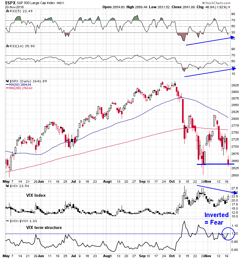
The SPX is exhibiting bullish divergence as it tests the October lows. We are seeing positive RSI divergences, the VIX Index cannot exceed its October highs, and the VIX term structure is now inverted, indicating fear.
Panic is now in the air, as evidence by these headlines from the Drudge Report.

In addition, the NYSE McClellan Summation Index (NYSI) is starting to turn up from an oversold condition. There have been 18 instances in the past 12 years when that has happened. In only three of those occasions have the market continued to decline (red vertical lines). (Note that the study period includes the market peak of 2007 and the subsequent bear market.)

My inner investor has already turned cautious because the primary trend is down. On the other hand, my inner trader remains bullish. He believe that you shouldn`t get overwhelmed by the emotion of the moment. Play the odds.
Disclosure: Long SPXL
Which tells me this puppy will rally quite spectacularly as shorts/hedges are punished.
I wonder if they are overdoing the tariffs issue. It is just the type of ploy to get people to sell. I’m not saying tariffs is not important, just that maybe there is too much waving of the red flag. A sharp rally would fit with that conjecture.
What I see now on T’Day is at 3:22 EST that the S&P 500 futures are down 16 points.
As I’ve posted, we are in the riskiest stage of the market cycle. That’s why I started the the last two risk off strategies, first using moving averages to buy and sell and the second owning long/short alternative ETFs.
The confusion expressed in this post by Cam around what the next leading sector will be is that in this part of the market cycle, everything goes down. So CASH is the sector that has to be added to the rotation graphic. It would trace a line from underperforming to leadership. It’s easy to see the relative performance of cash on any sector chart because that it what the price trades in. If the chart is falling, it’s underperforming cash.
I’m not trying to be cute here. In the bull maket phase one must be anxious to be in stocks. Cash is best ignored. Not so in the eighteen months of a topping out and into a bear.
Why use moving averages in this risky period? Why not continue to buy the dips and sell the rallies like one should in the bull market? Because a bear market dip will surprisingly crash much further than expected and lock you into a losing position that behavioral economics tells us a human will likely hold on to and lose big. A moving average strategy gives clear signals. It’s late to buy but never late to sell.
Next, long/short alternatives. These are much safer than inverse ETFs which just short. Long/short performs by the difference between two factors. My favorite now is BTAL, the Anti_Beta ETF. It is long low beta stocks and shorts high beta. It going up as the Amazon-type stocks BTAL shorts fall and healthcare and utilities types BTAL owns do better. I also own MOM the long/short momentum ETF it is down less than the market but I expect good things when economic stress hits the business environment and the low momentum stocks it shorts do poorly. Right now the high momentum popular stocks it is long are weak.
So adding cash and long/short to the rotation graphic and in an investor’s thinking when we are in the topping and bear market time is a valuable thing.
BTAL sounds good in theory, but only 5,000 shares traded today! I’ve never traded a stock or etf that was that thinly traded.
Both BTAL and MOM are very thinly traded. It is best to check their website for the closing asset value and buy or sell near that value. A few thousand is no problem but likely more needs a limit order. I’d never use a market order.
I have total liquidity for my clients because I trade (either buying or selling) at the exact closing day asset value in 50,000 shares blocks. That is the size of a single creation unit at the institution that oversees it. The market maker positions this at the close and transacts every position in the ETF portfolio simultaneously for a tiny 7 cent fee. Gotta love technology.
thanks Ken!
Ken, Always appreciate your perspective. It is always good to have an opposing view to keep one grounded.
My intermediate term view is the same as Cam’s. We both went intermediate positive in early 2016. I started scaling back in December 2017 to normal weighting, again in February to underweighting and to extreme risk-off when Cam finally and so accurately went intermediate negative in late September. His intermediate timing has been world-beating.
We talked early this year when I was de-risking. He agreed on the idea behind my actions but thought the timing was too early. He had the nerve and confidence in his indicators to wait until September and was spectacularly right.
I manage peoples life savings, not a hedge fund and hence my perspective is different, more intermediate term, than most readers. Cam’s short term trading signals are a big help when I’ve decided to trade for any reason. His macro economic background thoughts are very helpful for overall long and short term strategy.
Ken, I totally understand that you and Cam have the same intermediate term view. Thanks!
Cam, what would change your mind about the short-term bullish thesis? The H&S neckline on the 60min chart was broken earlier.
https://twitter.com/HumbleStudent/status/1064578713319133184
The market is obviously very oversold here. The more likely bearish scenario of how prices could weaken further is stock prices fail to rise significantly after a relief rally, i.e. the lack of a breadth thrust.
Nice comment Ken !
Hi Cam! At the end of your Sunday note included chart by Jesse Felder with two potential head and shoulders patterns. Wasn’t bearish pattern activated yesterday which would suggest further downside?
You are correct that a H&S pattern has been activated but not all H&S formations hit their targets. You have to consider that we are at an oversold extreme. See https://twitter.com/humblestudent/status/1065057493552906240
I agree, I woundn’t open a short position here but at the same time it seems more prudent to wait for a negation of a neckline break or for a pattern to reach its target before entering into a long position. Just my 2 cents.
was the h&s pattern on a daily chart or intra-day? At least one analyst that I know of (Peter Brandt) says that intraday patterns are not as reliable as patterns on the daily chart, FWIW.
It was an intrad-day pattern on the hourly chart.
thanks!